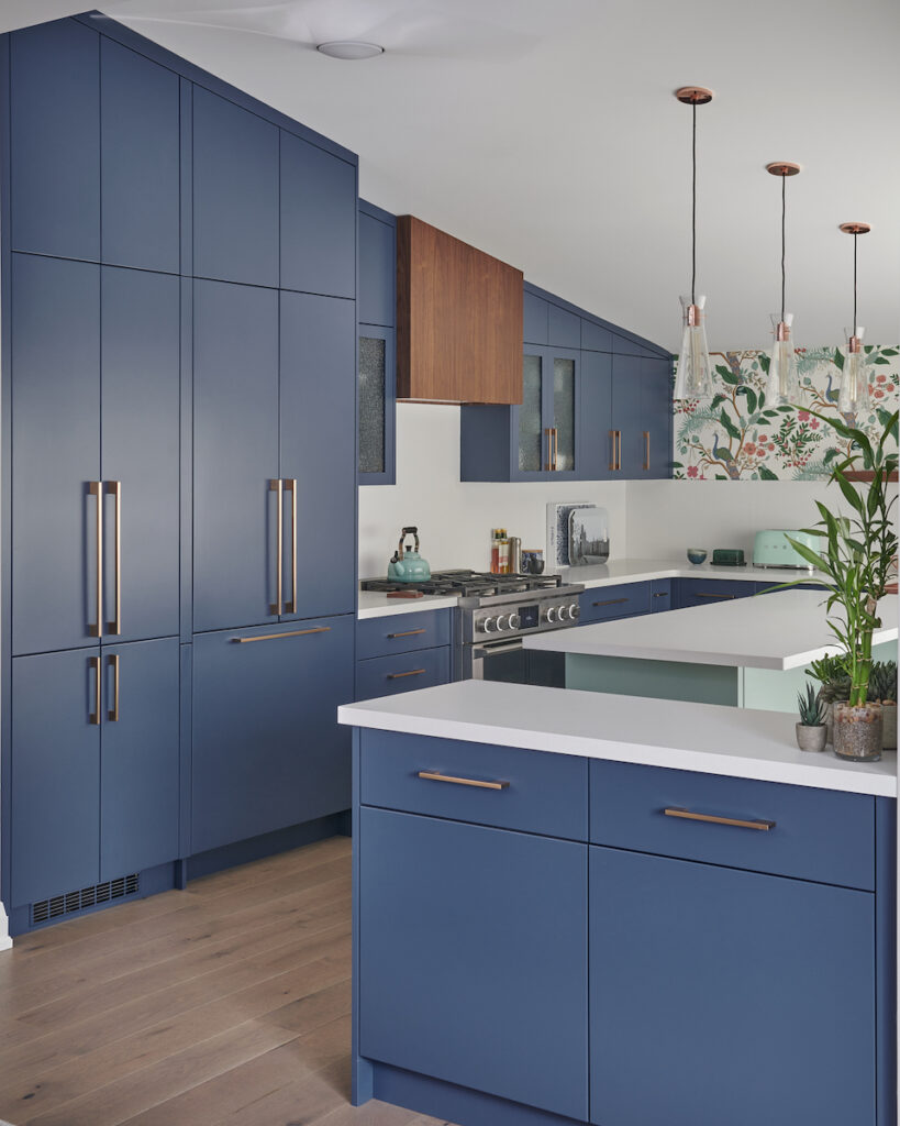
WWWOW !
What We’re Working on Wednesday
While a ‘Big Reveal’ is one of the best parts of what we do in our interior design business, it’s also ‘Big Work’!
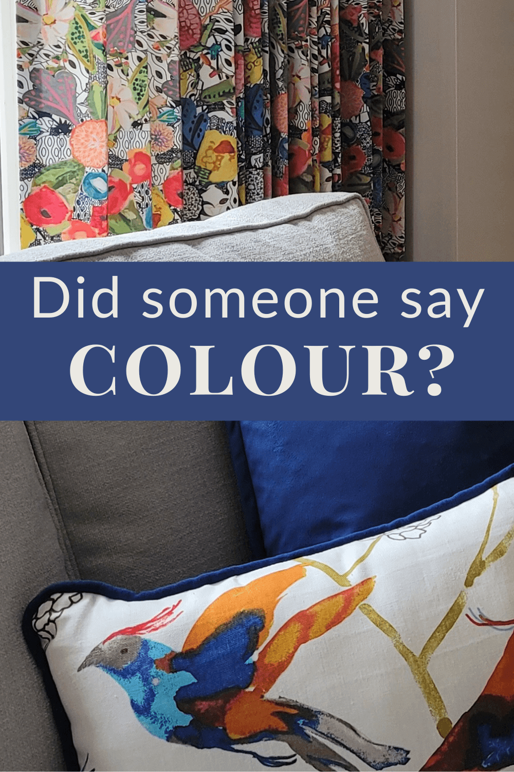
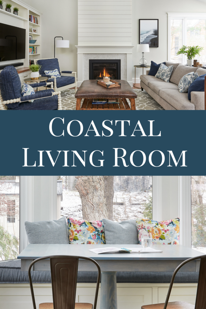
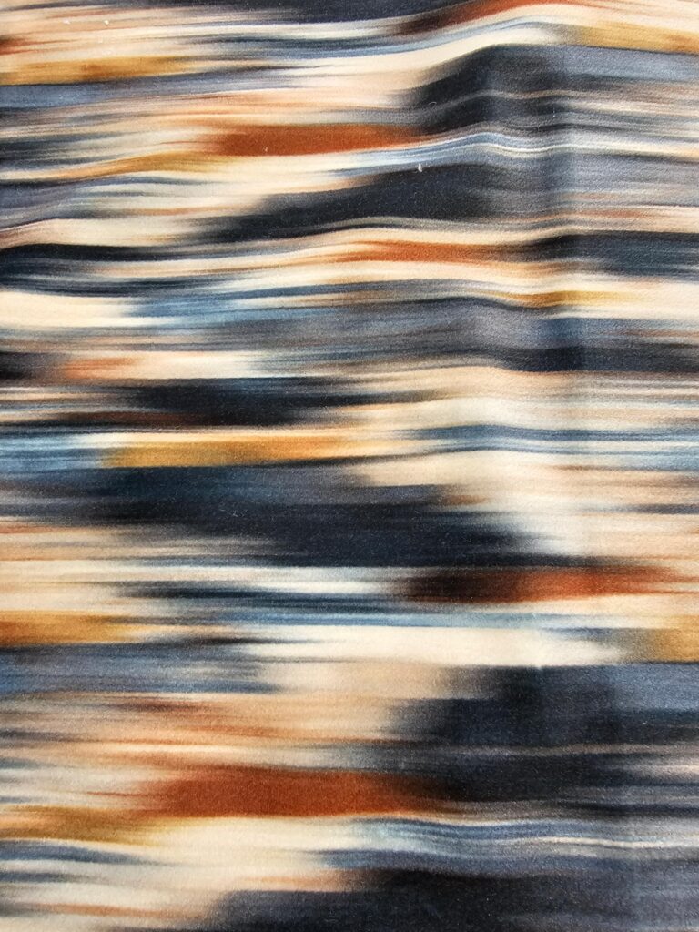
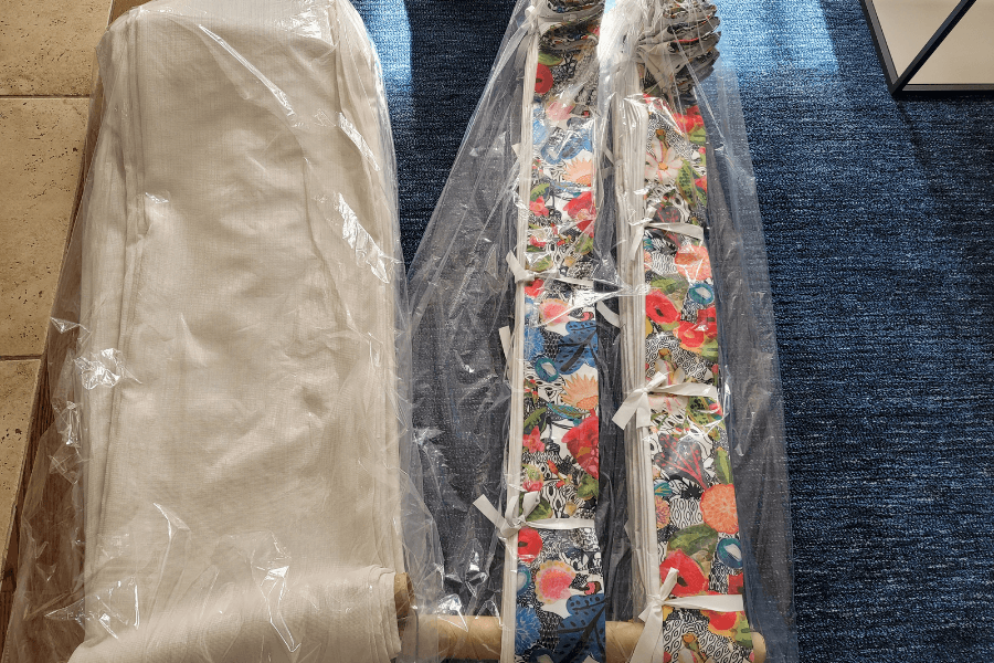
In this blog post with video, join me and Kathryn as we take you behind the scenes of an exciting installation. These brilliant Burlington clients trusted us to custom furnish their entire main floor, with a family room that I’m willing to bet has the most colourful drapery fabric you’ve ever seen.
It was a busy afternoon, but the big reveal and all the hard work we do behind the scenes to get to this point, was well worth it when you see the final results.
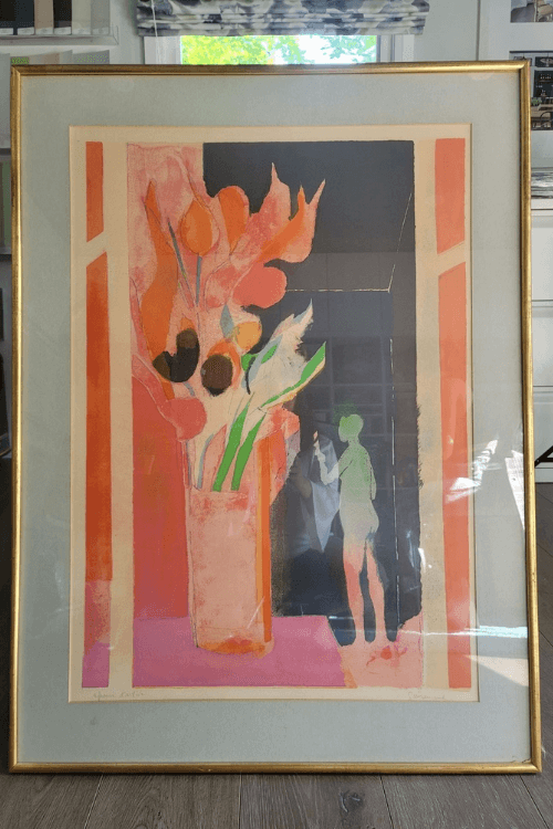
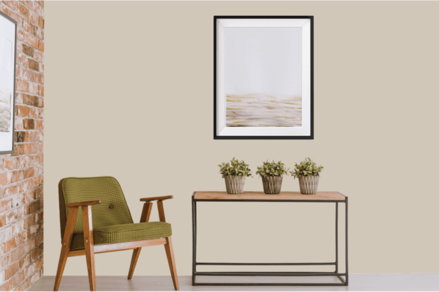
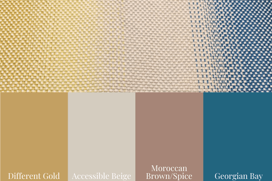
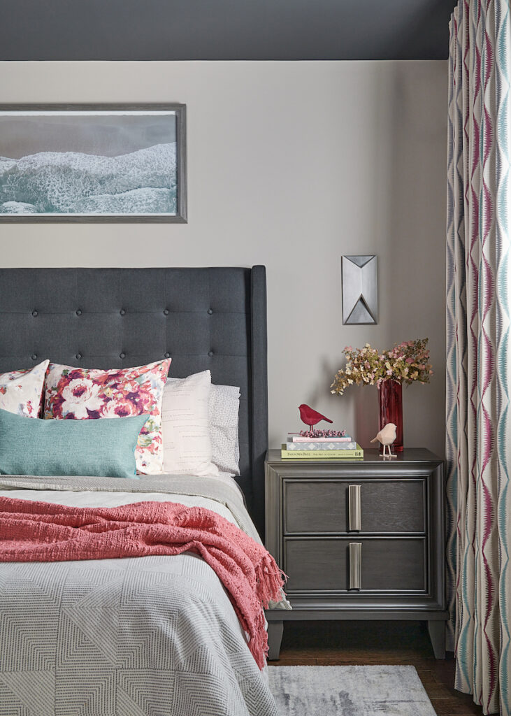
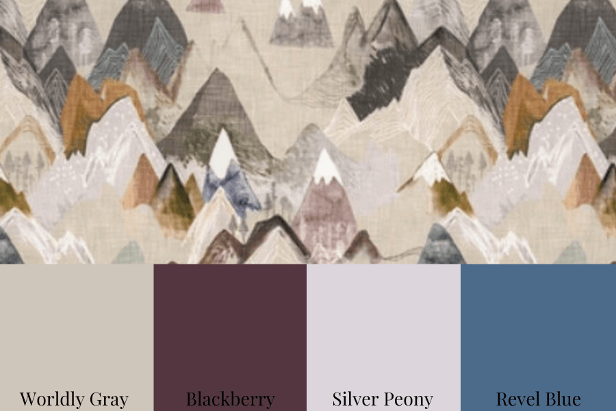
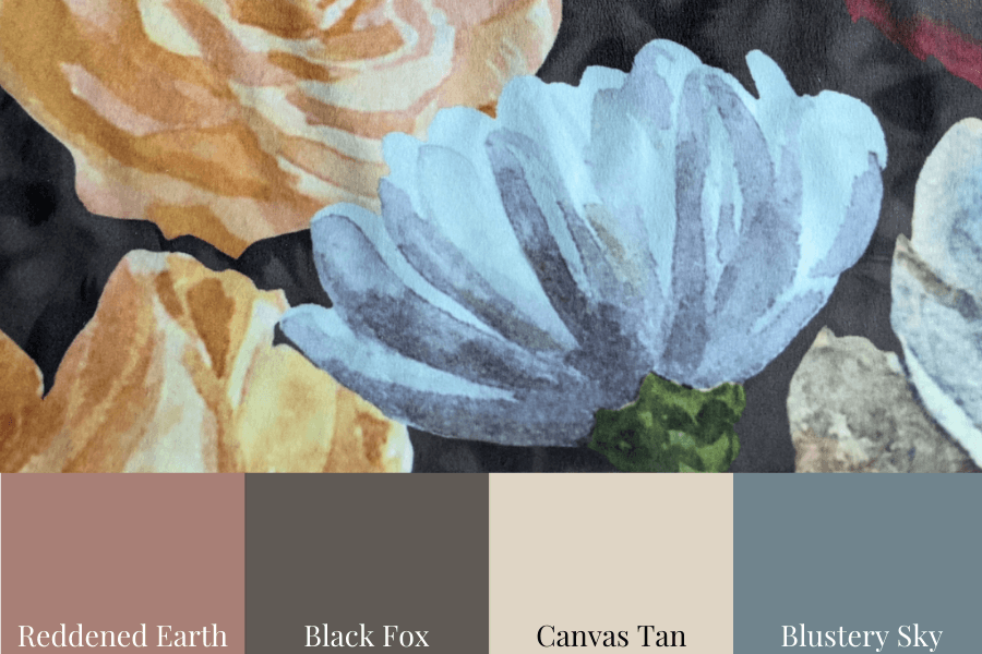
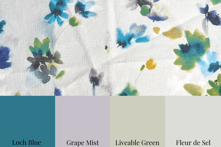
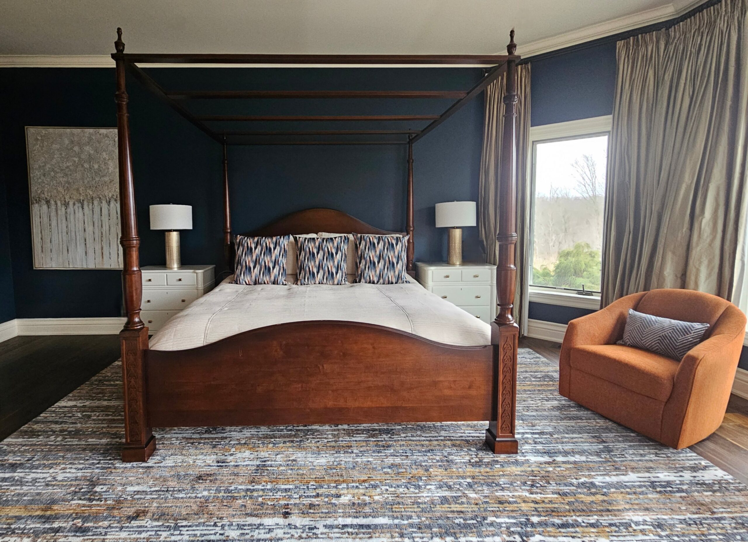
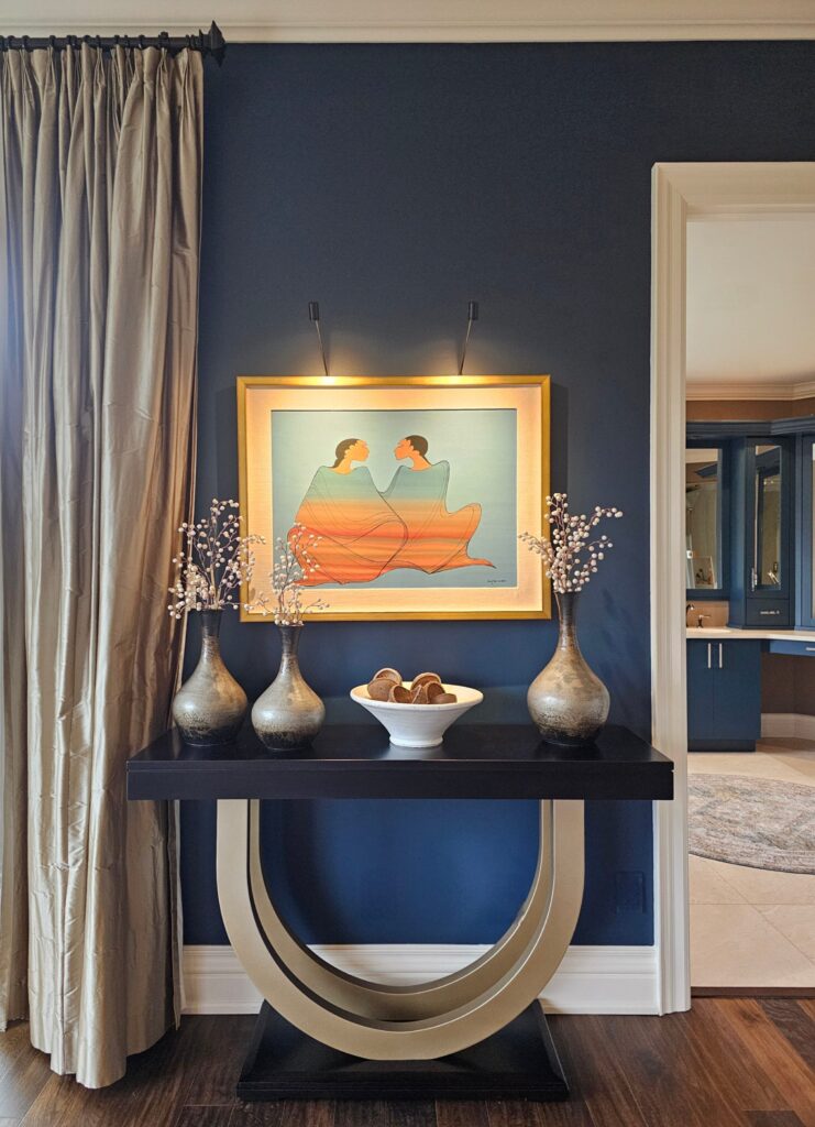
If you saw this WWWOW post, the piece of artwork above will look familiar to you.
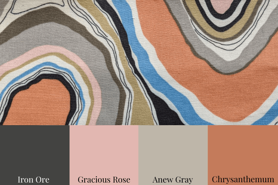
We used this single piece of art that belonged to my client’s mother to pull together a striking colour palette and be our inspiration for the entire main floor design.
Having a fabulous jumping-off point like this piece of artwork is one of the best ways to create a colour palette.
Watch our video to see just what an install day involves and how we brought our vision for these spaces to life for our wonderful Burlington clients.
From the Design Presentation
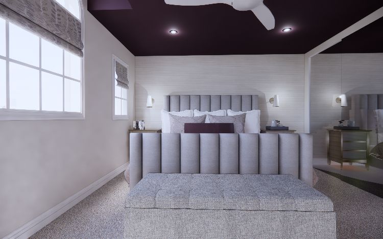
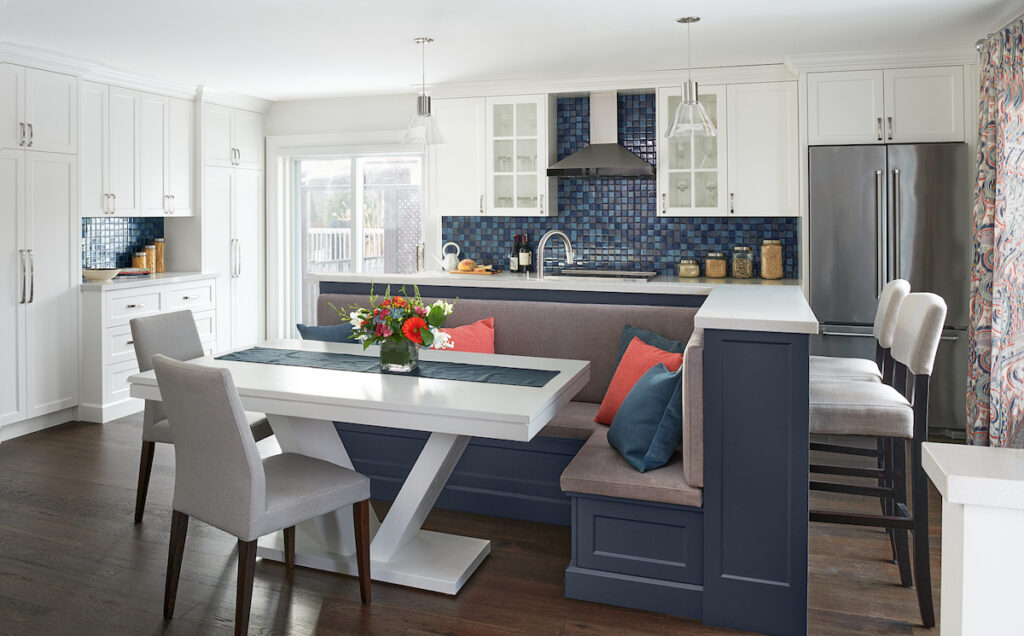
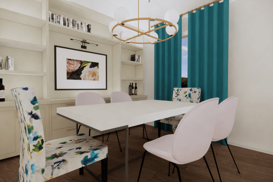
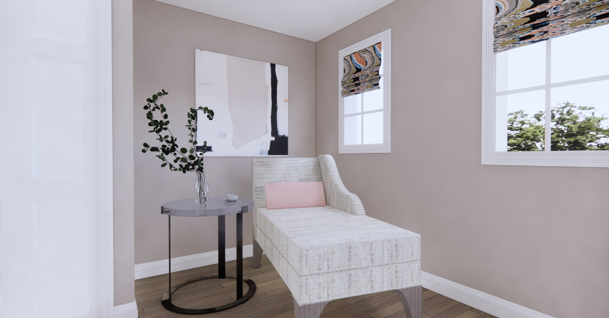
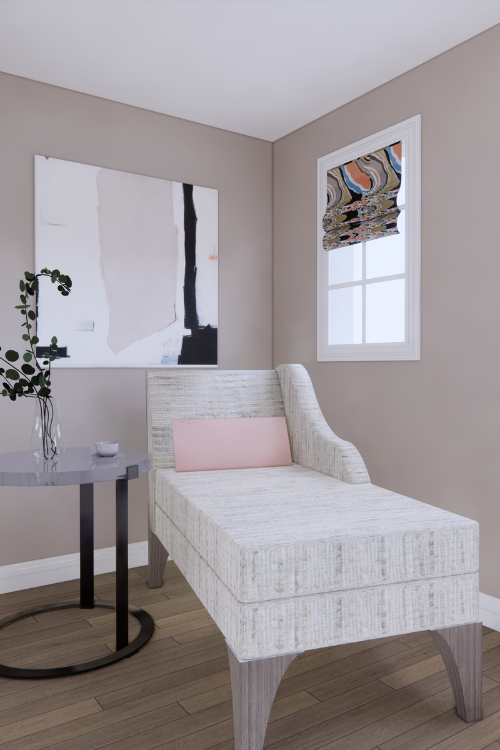
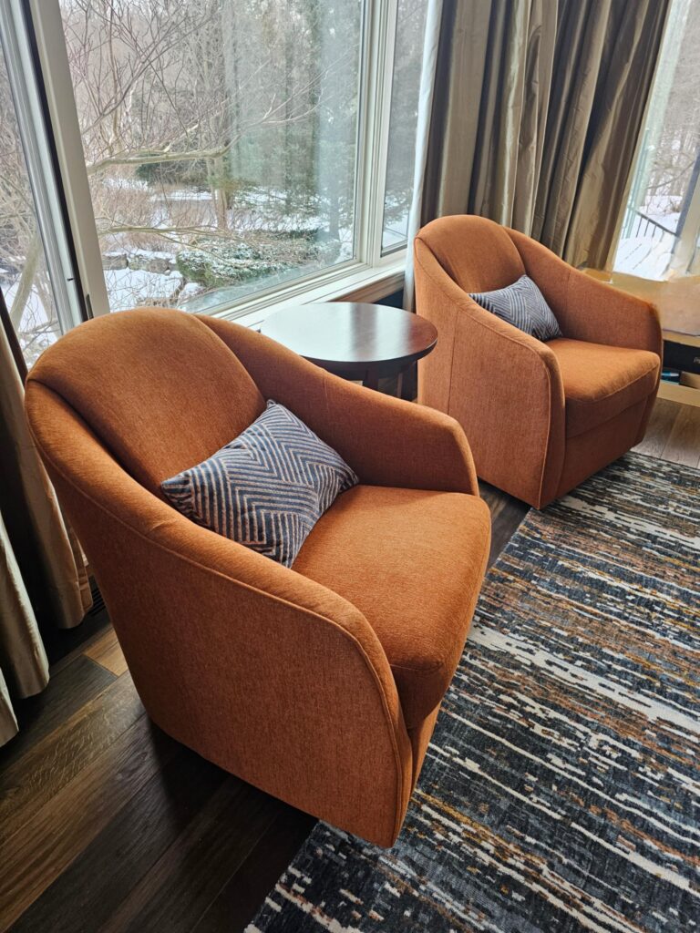
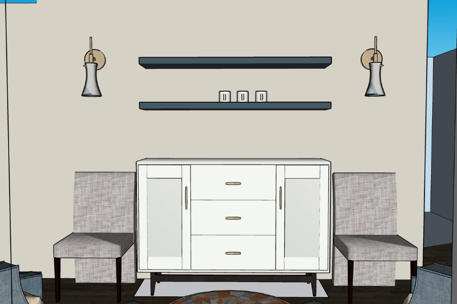
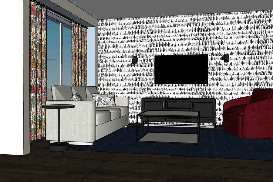
First, let’s take a look at the sitting area that is adjacent to the dining room. The image below is from our interior design presentation and shows the furnishings for the updated room.
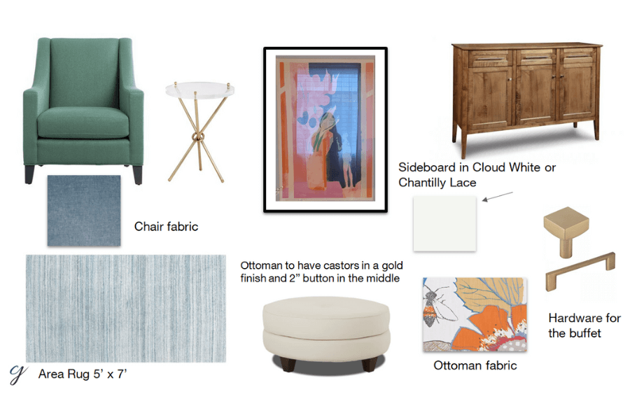
This image was taken while we were still waiting for some final pieces, but you can see how it is coming together and how amazing it’s going to look when completed.
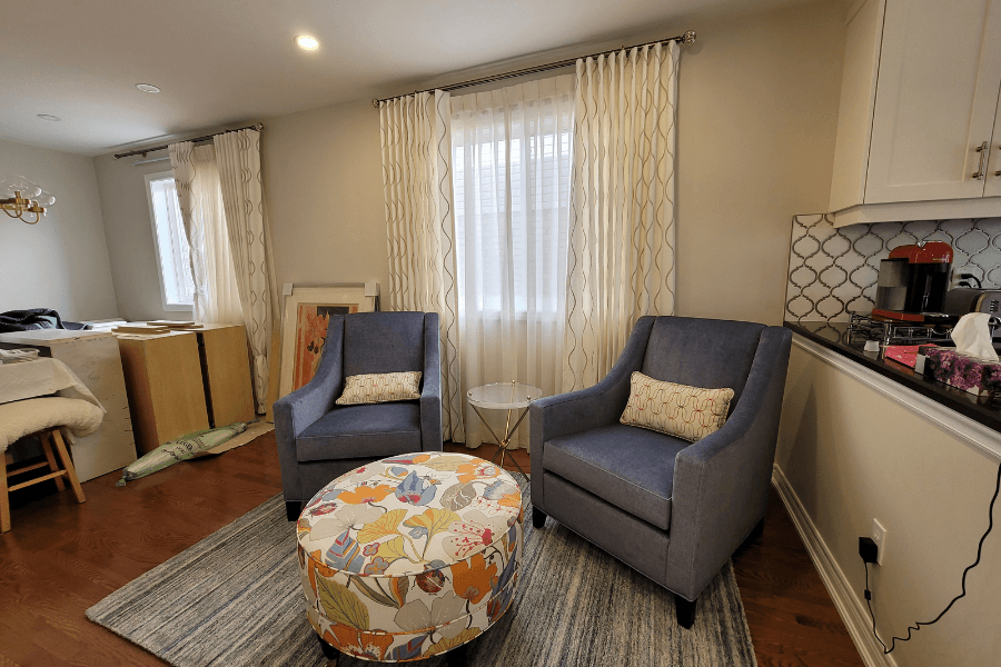
The Ripplefold draperies are up! Ripplefold refers to the header style and it is easily my favourite look. Plus, they glide so easily on the rod, which is also why we use this style in most of our designs.
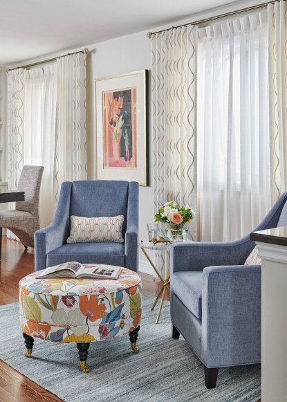
The two beautiful custom chairs with a soft blue fabric that is as soft as butter to the touch, are also in place.
And how about that ottoman? What a statement piece!
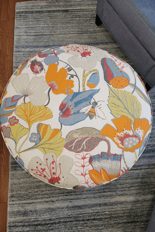
When covering furniture in a fabric such as this fun, colourful, large-scale pattern that we used on the ottoman, be sure to have discussions with the upholsterer if there is a specific part of the pattern you want to be featured or centered.
There are a lot more details that go into designing a carefully curated space than you might think, which is why our clients love to work with us.
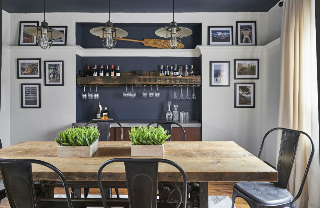
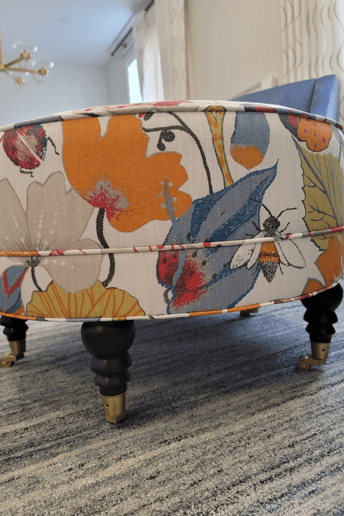
We custom designed this round ottoman with a dark leg stain to match the dining room table, and gold castors to tie in with the other gold accents in this room – like the dining room light fixture you can just see in the background of this photo in the top left. This also makes it easier to move the ottoman about as needed.
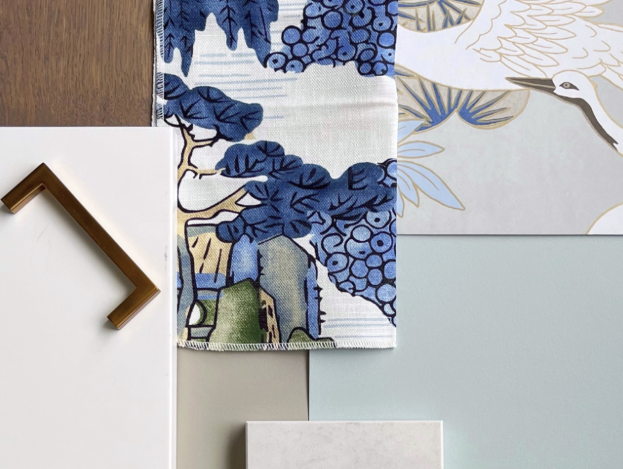
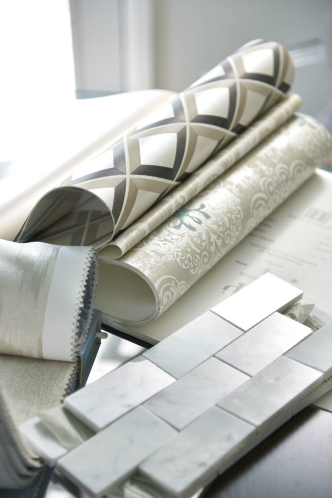
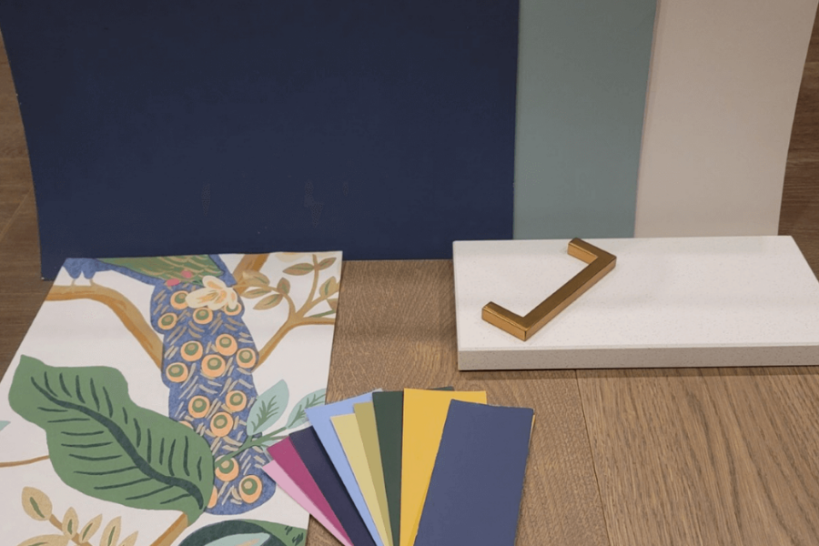
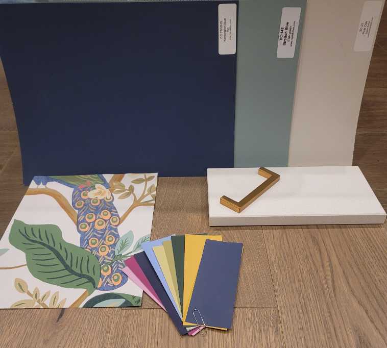
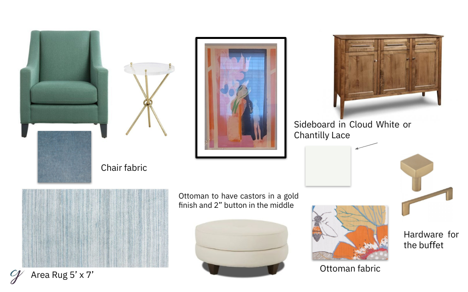
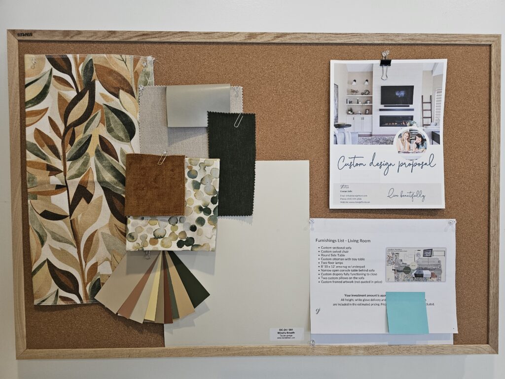
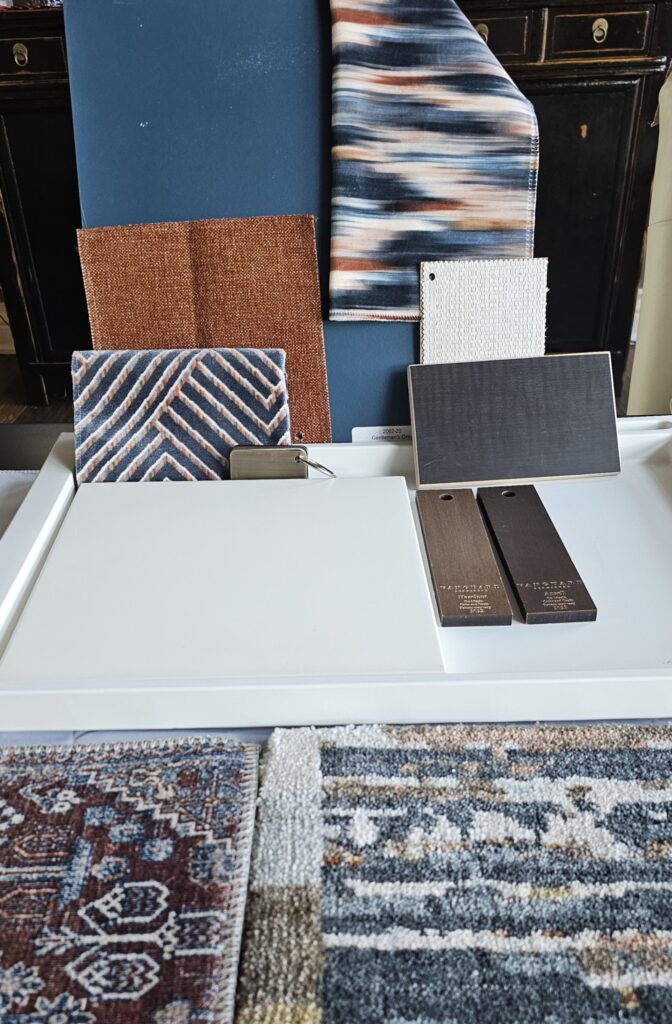
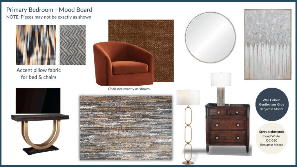
Fabrics & Finishes
We include a ‘mood board’ or what is also referred to as a ‘concept board’ to show all the fabric samples, finishes and paint colours together.
If you are a designer or simply want to learn more about why we use mood boards in our interior design projects, and how the benefits of using them, this is a good post to read.
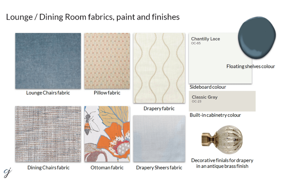
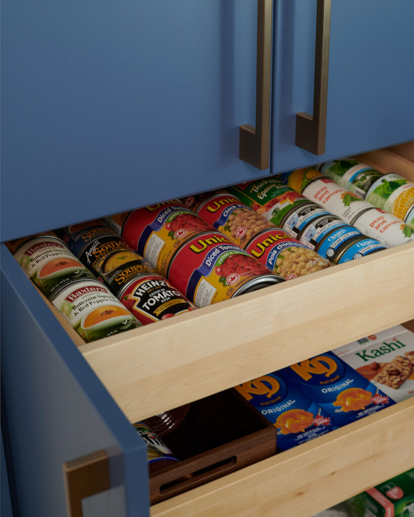
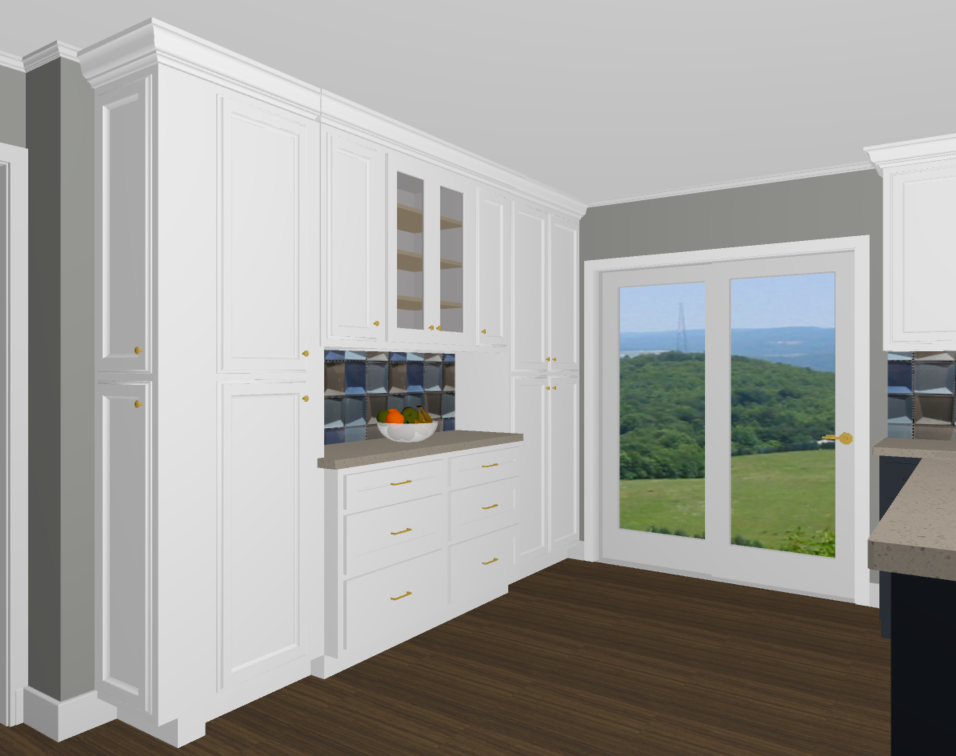
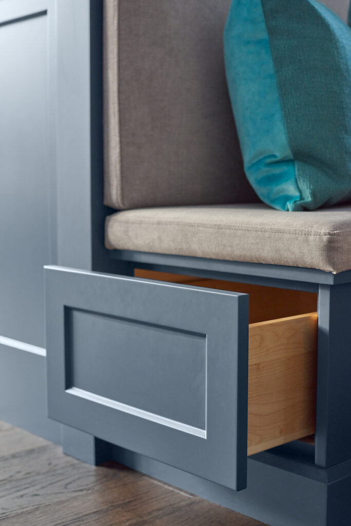
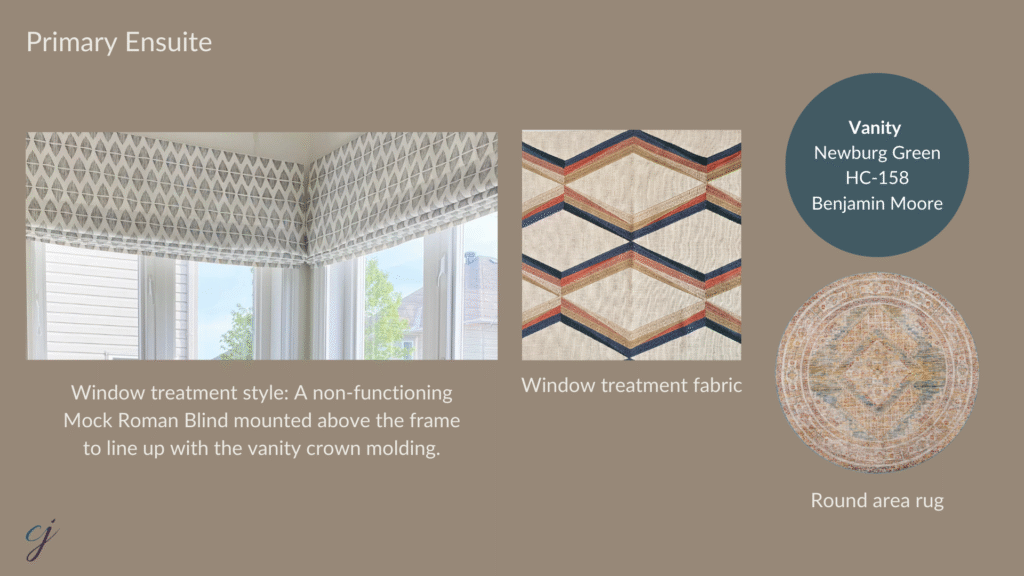
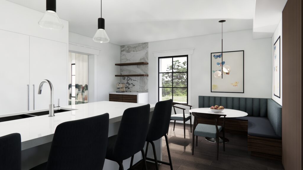
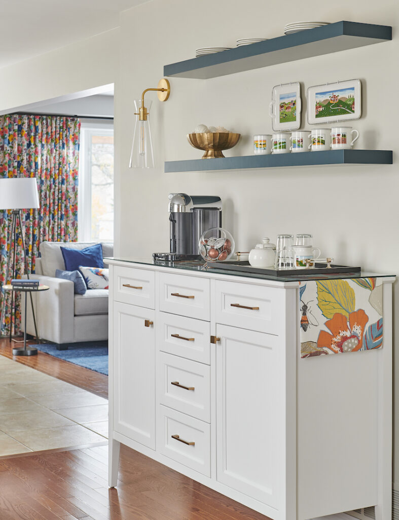
Here is a rendering of the ‘coffee barista’ area we designed where we had some fun with the colour of the floating shelves. We colour-matched and repeated the dark teal colour from the fabric in the ottoman, using Newburg Green by Benjamin Moore.
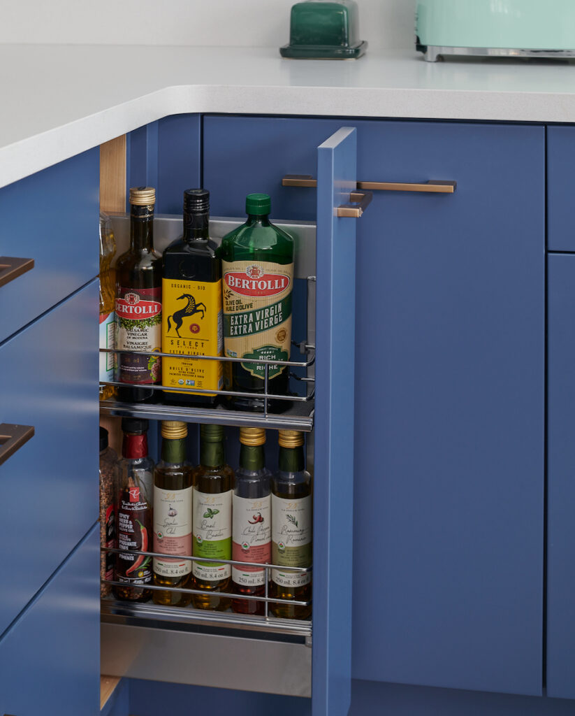
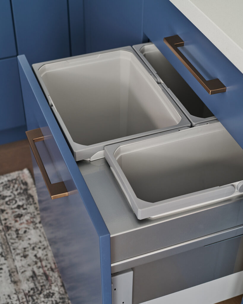
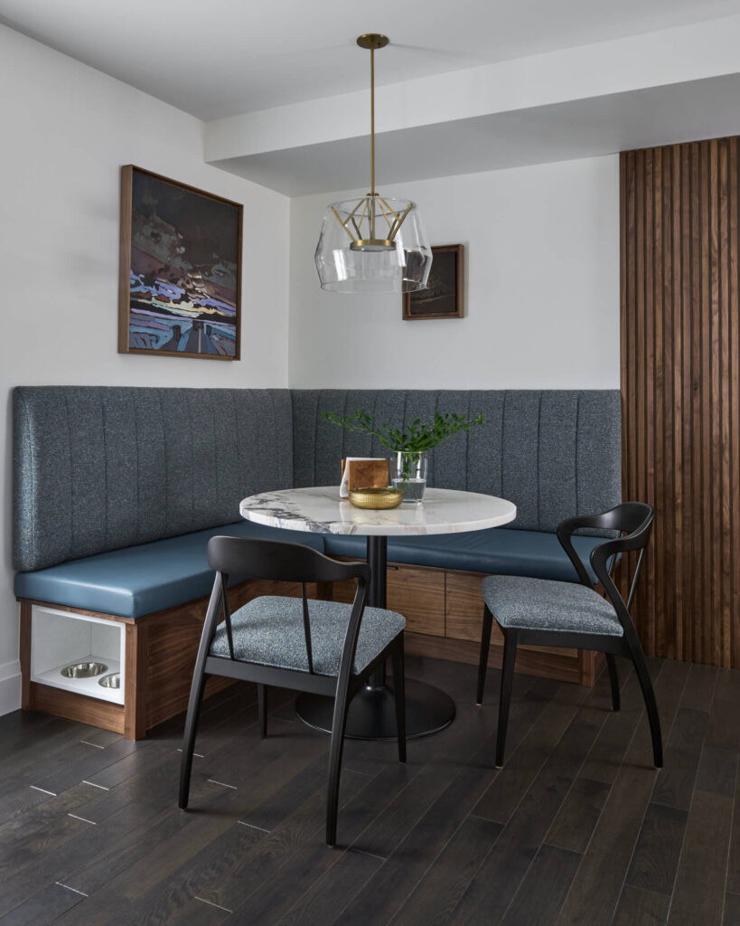
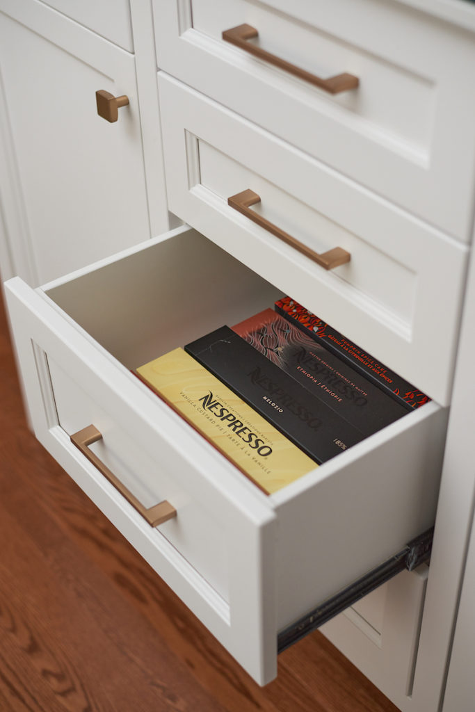
Here are the professional photos, including one with an open drawer so you can see how great the storage is for all the boxes of yummy coffee.
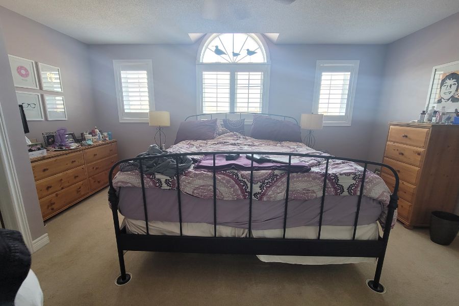
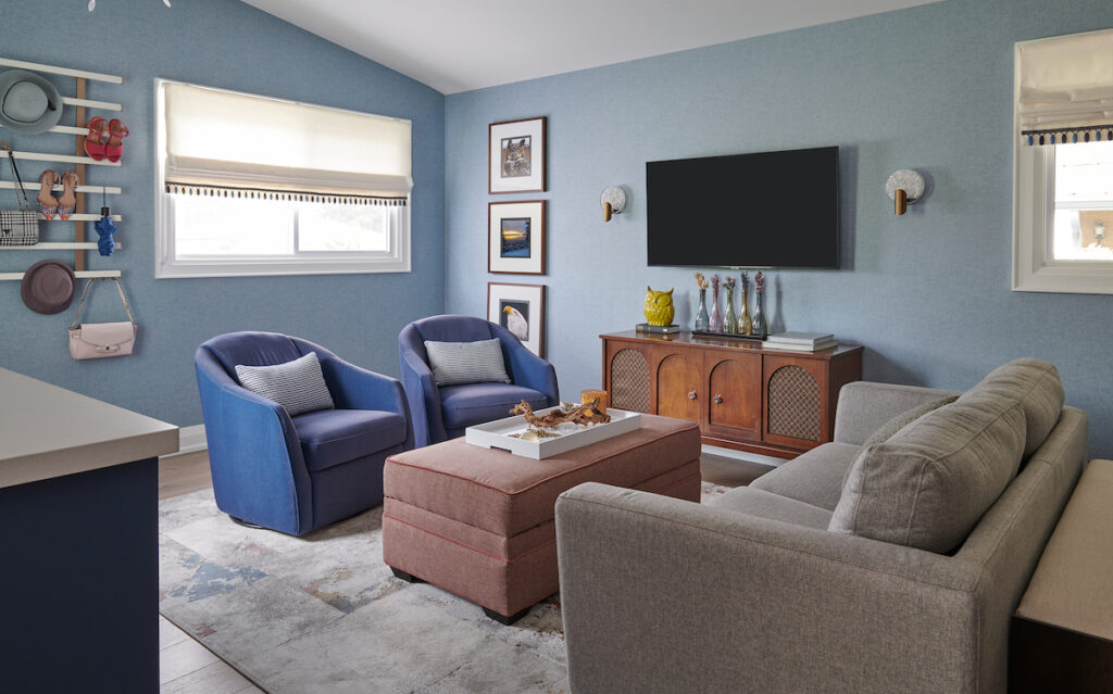
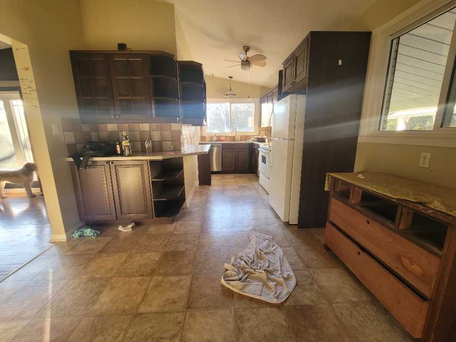
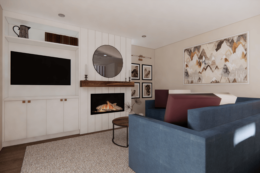
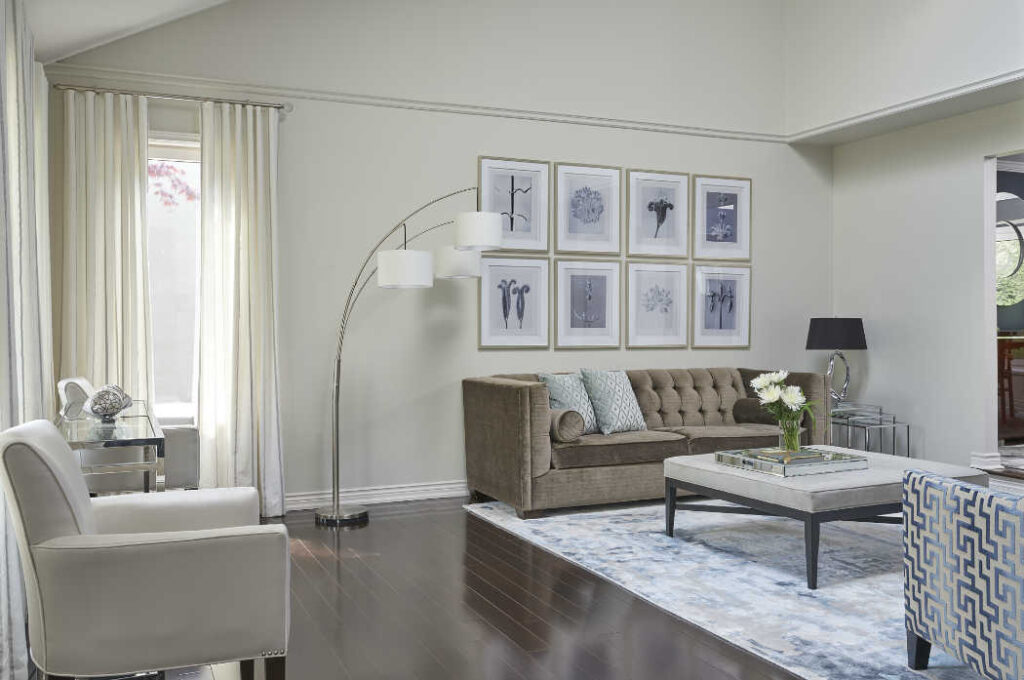
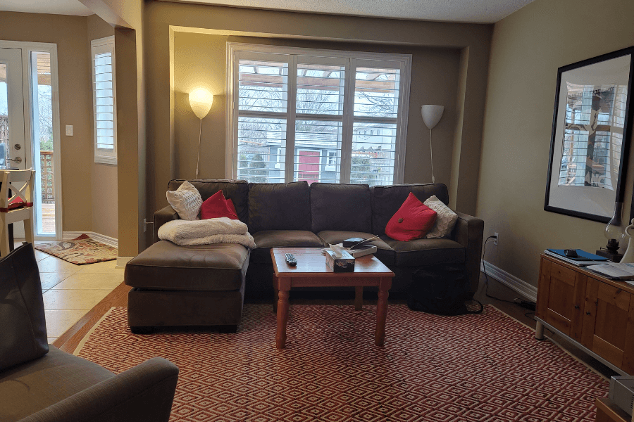
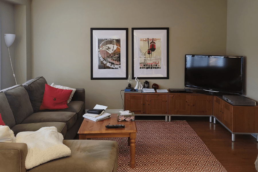
Moving into the living room, take a look at what it looked like when we first met with our clients.
As a side note, I can’t stand these type of window coverings you see in the before shot. We call them Califonia Shutters and unless you live in an extremely hot climate all year round, I highly recommend you never use this style of window treatment.
They are bulky, difficult to open fully and block out a massive amount of natural light. For the price, you are much better to invest in full functioning drapery.
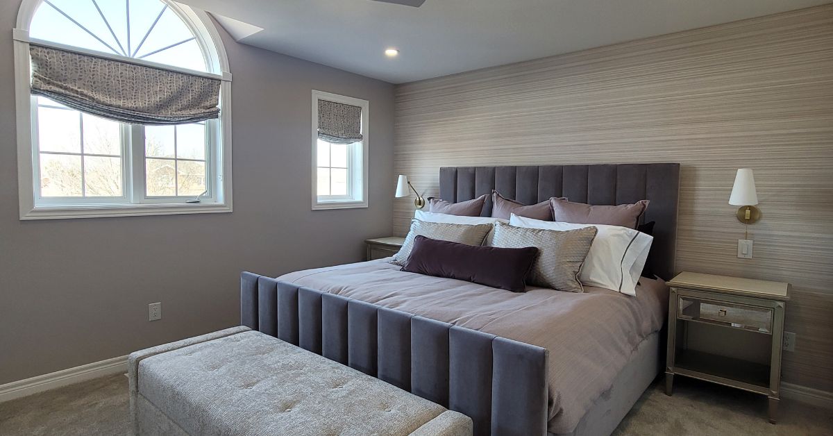
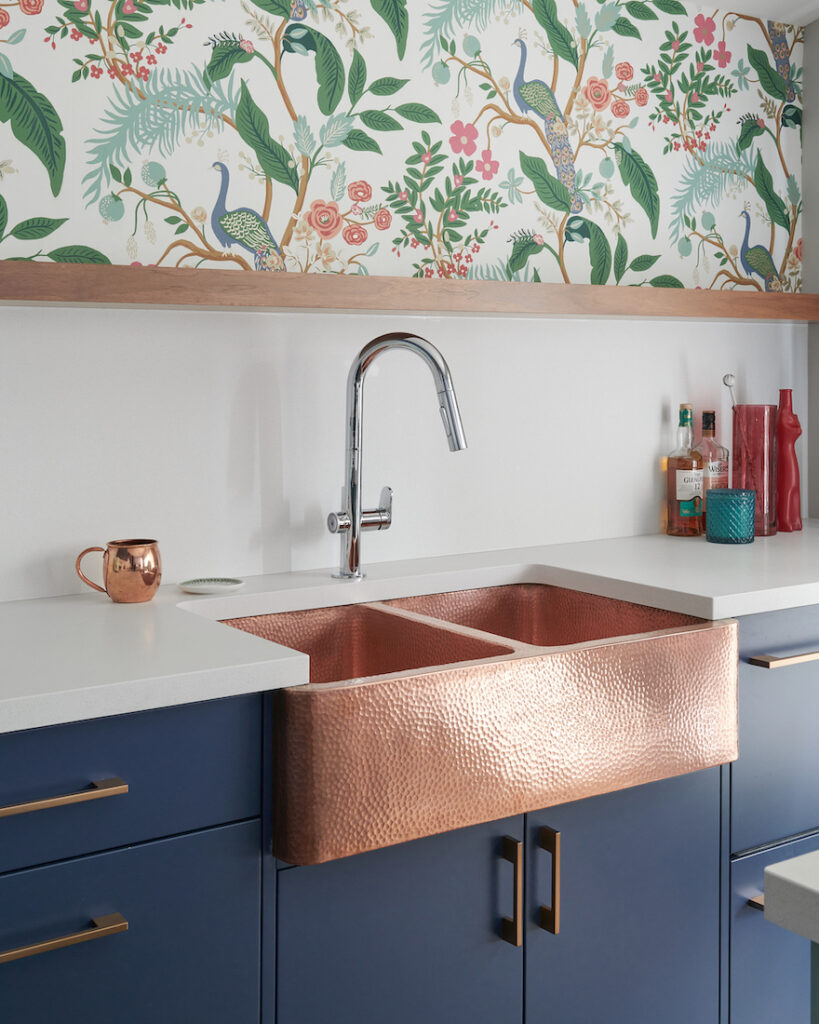
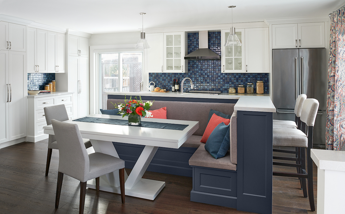
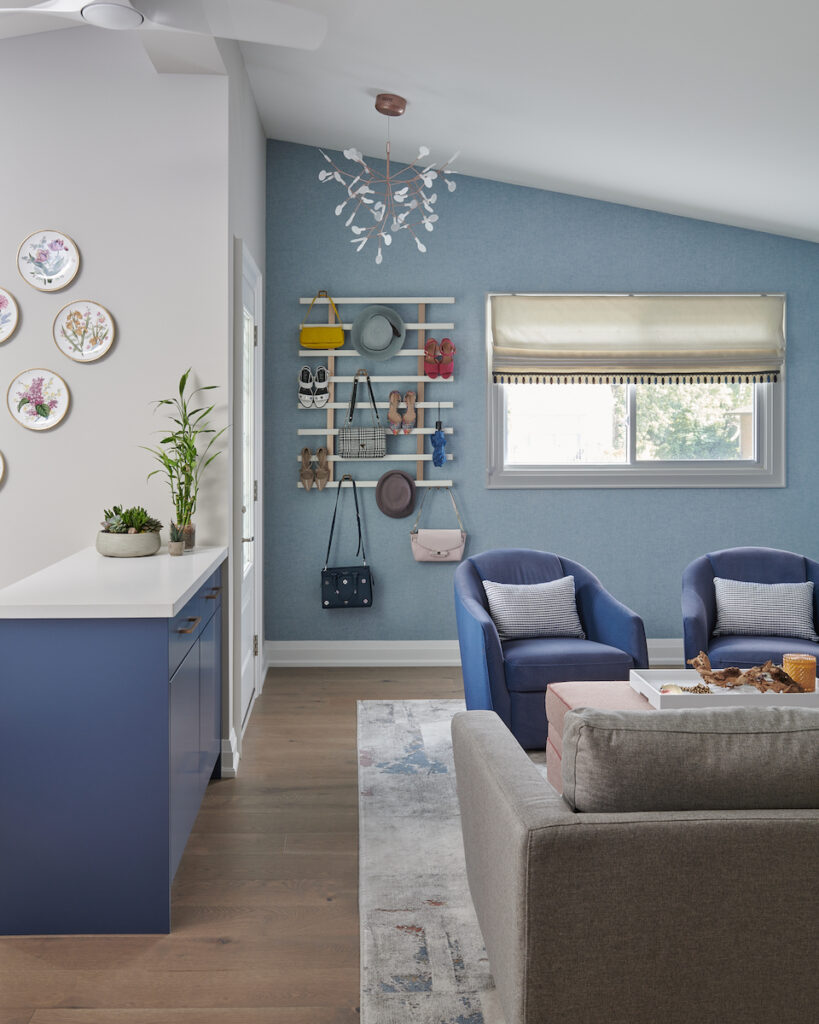
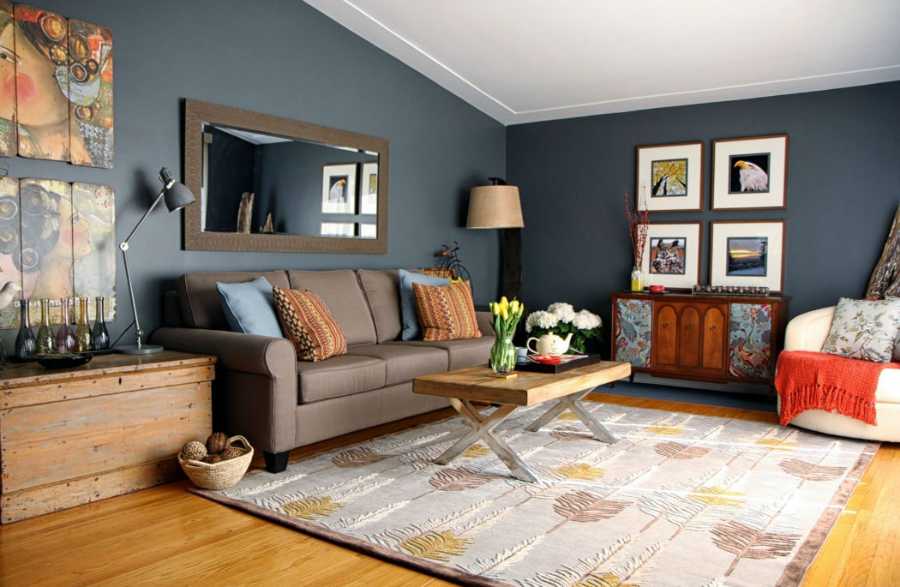
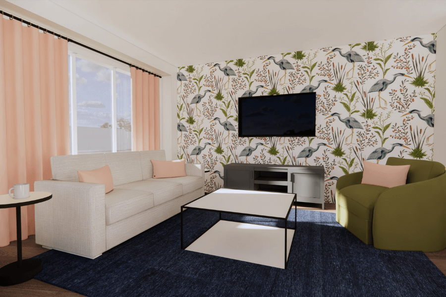
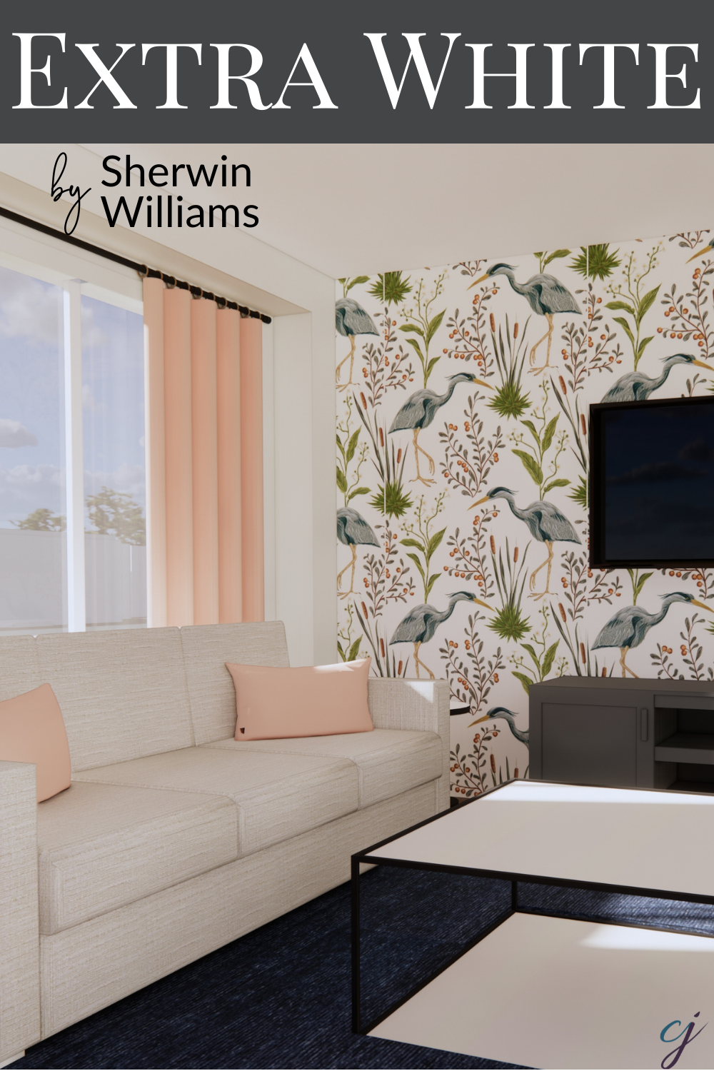
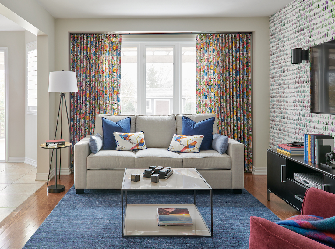
The BIG Reveal!
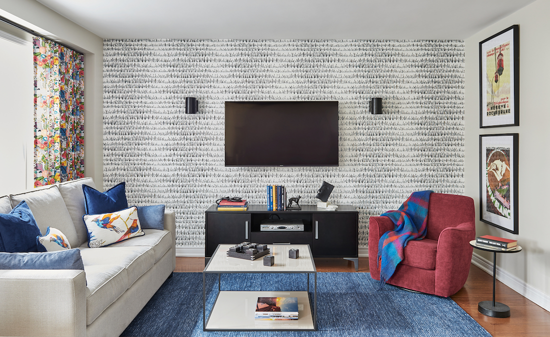

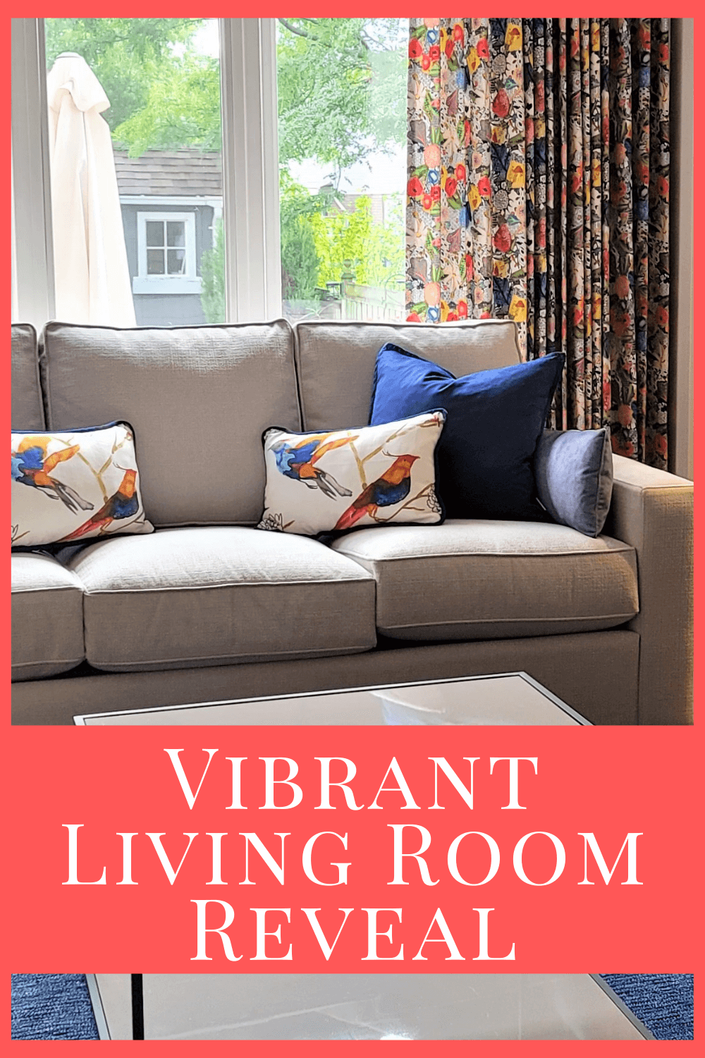
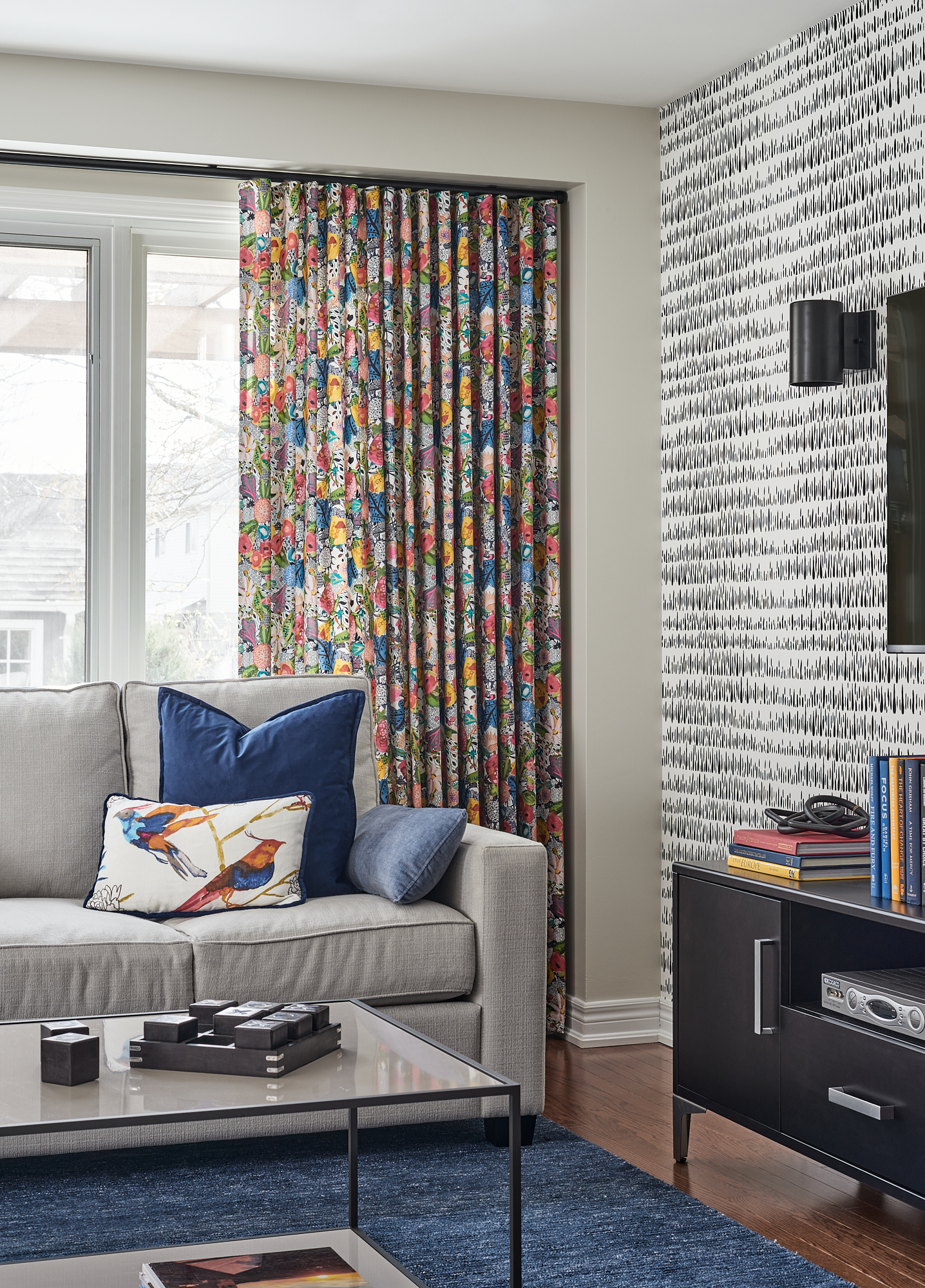
This is my favourite part of the living room design. I absolutely adore this colourful, fun fabric!
We chose to use a ceiling-mounted rod in a black finish with end caps. Look how fabulous the Ripplefold header style is for this treatment.
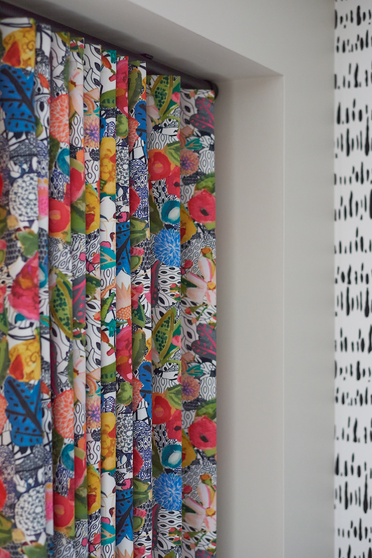
Repeating the black and white speckled pattern from the wallpaper in the drapes was ideal. And the custom-made pillows with the brilliant coloured birds tie in so beautifully!
Such a bright and cheerful space.
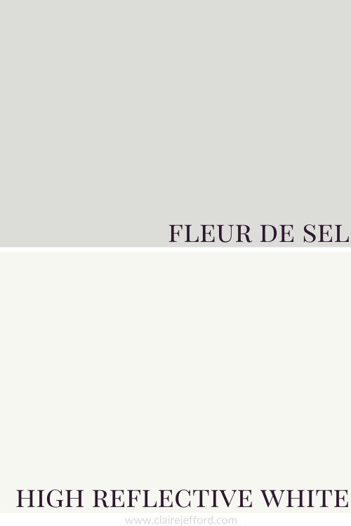
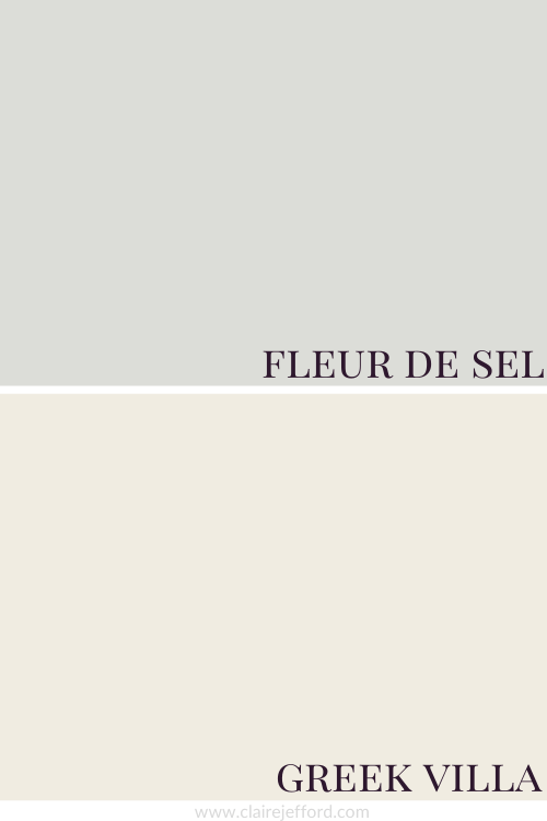
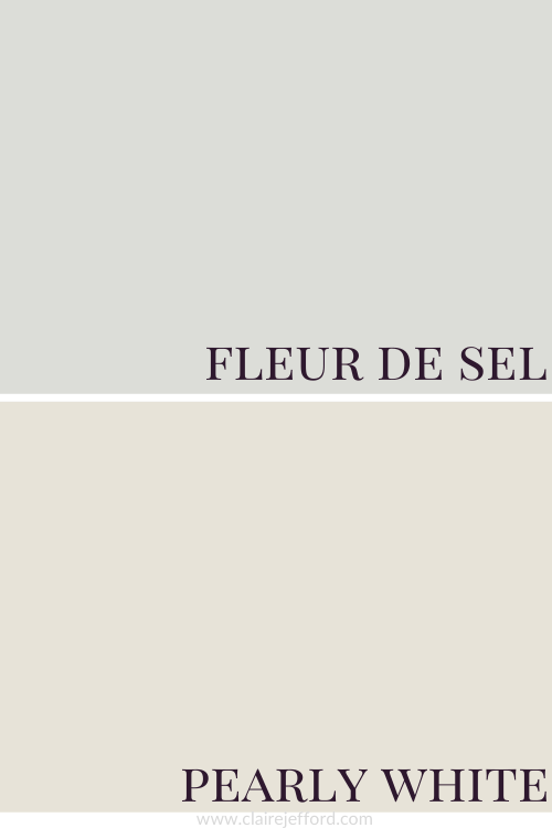
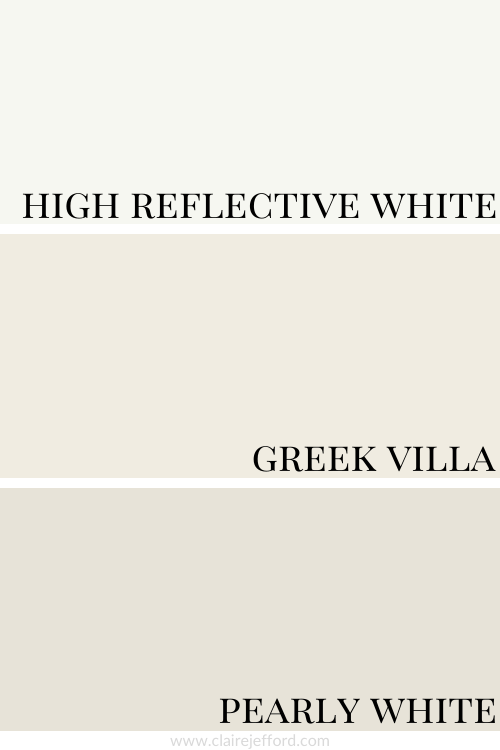
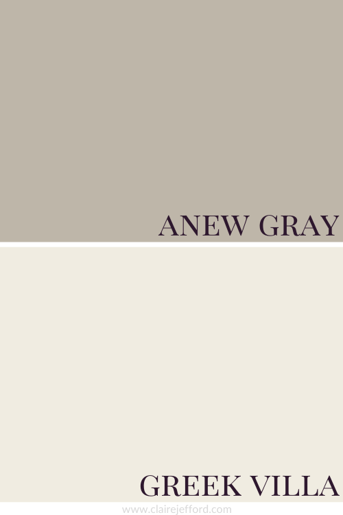
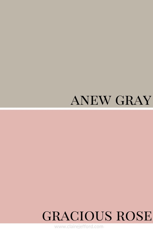
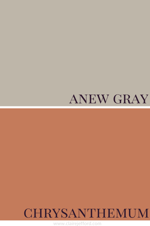
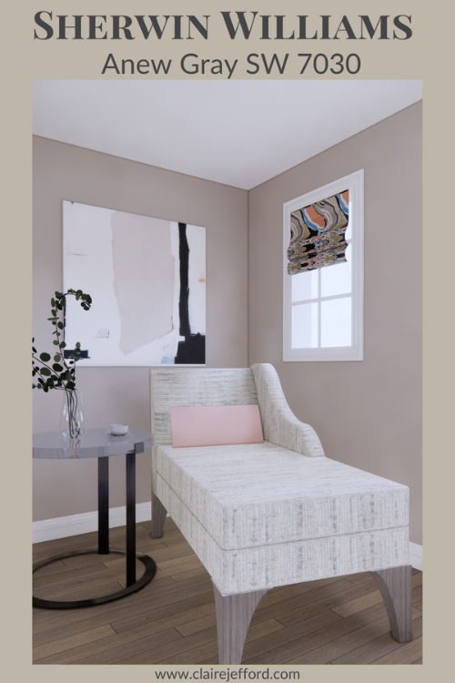
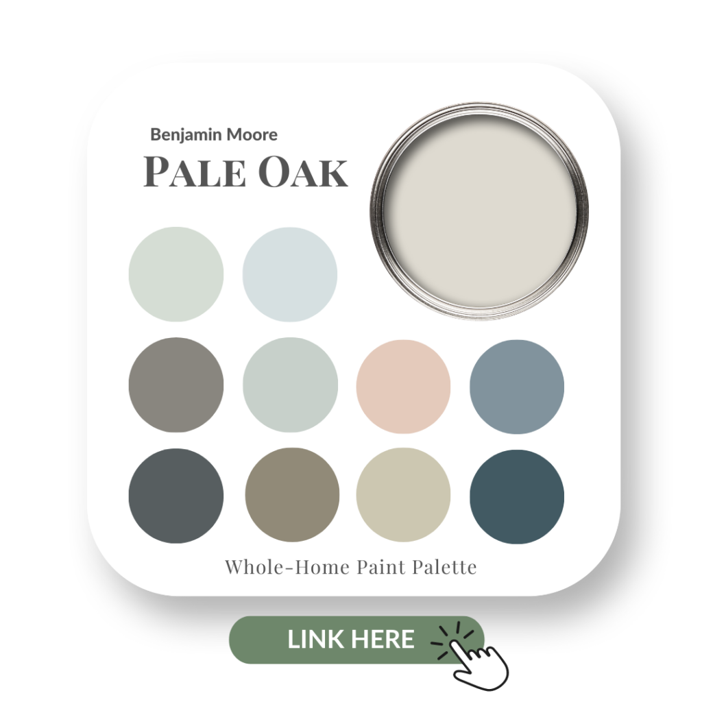
Although there is a lot of colour used as accents in these rooms, the walls are all painted a soft neutral, Pale Oak by Benjamin Moore.
It’s possible to add brilliant colour to a neutral space and this project is a great example of that. See the entire project here in our portfolio.
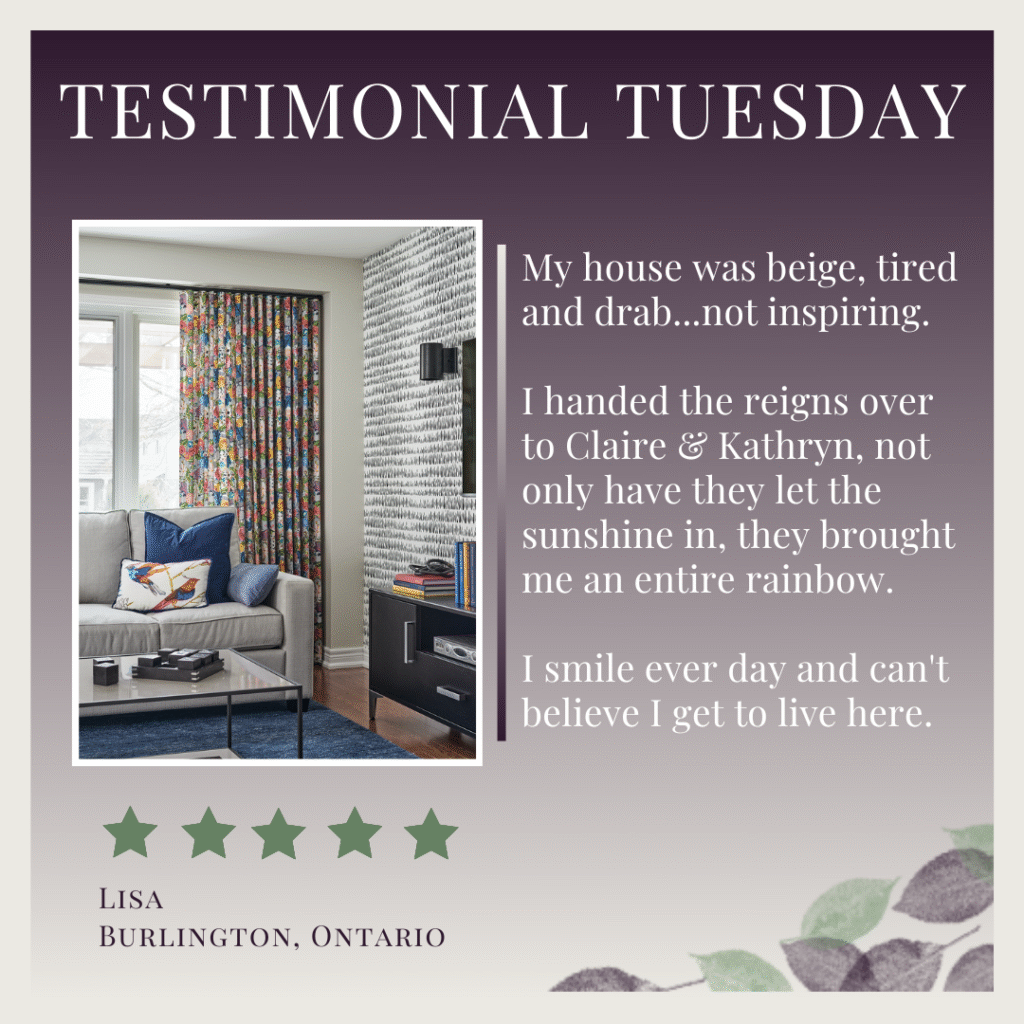
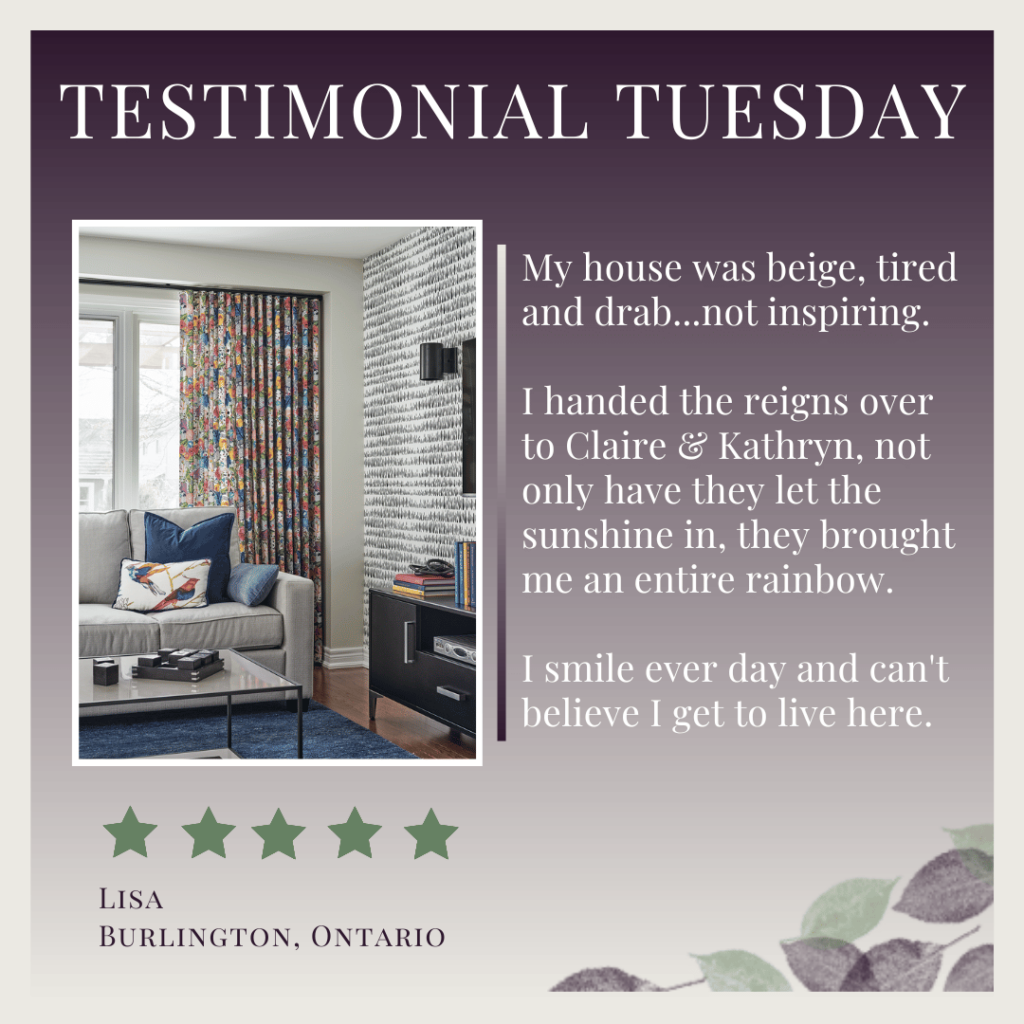
What a day it was! I’m glad you could join us and experience a little of what it’s like on install day. Here’s the review our wonderful clients wrote for us:
Helpful Design Resources For Your Next Project
If you are planning a kitchen update or home renovation of any kind and want expert guidance at any stage of your project, I can help.
‘Here & Now’ Design & Colour Consultations
I now offer 1-hour online design and colour consultations for anyone outside of my local area. With over 13 years experience of running my award-winning interior design firm and working on hundreds of projects, I can provide professional guidance for any area of your home.
Learn more about this exciting new service and book your online appointment here. I can’t wait to e-meet you and help you with your project!

Local In-Person Design & Colour Consultations
If you are local to me either in Burlington, Ontario or around the GTA (Greater Toronto Area), I can come to you for a 2-hour in-home consultation.
Click here to connect with me via my contact page.
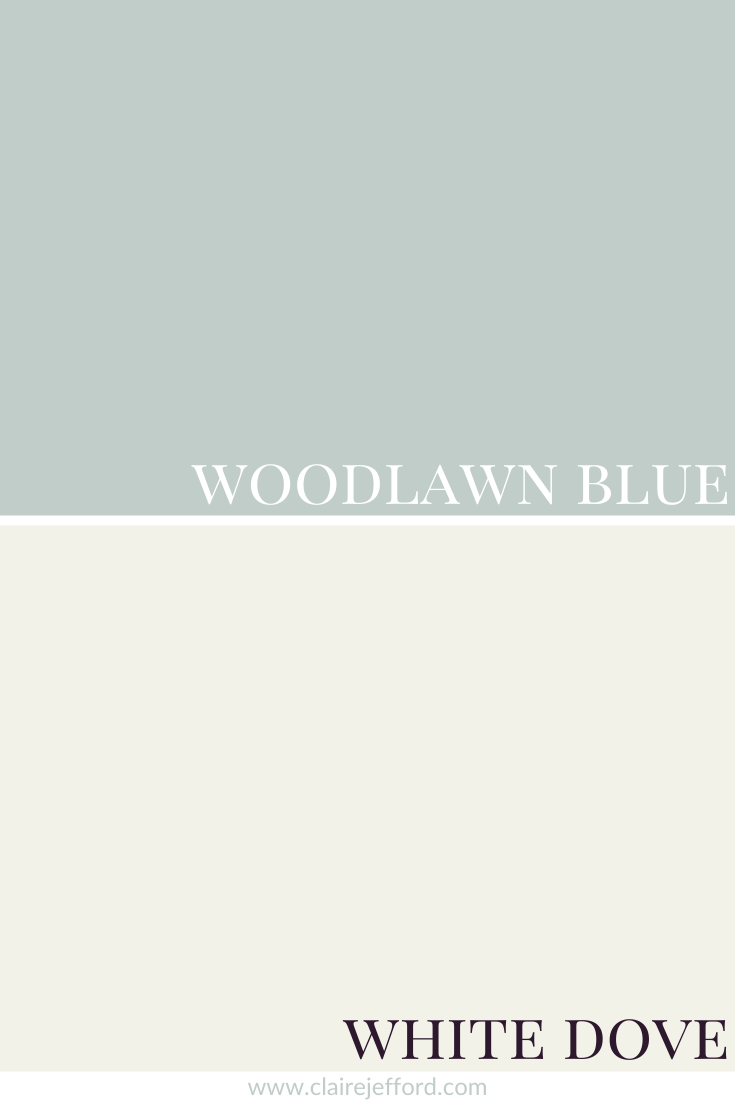
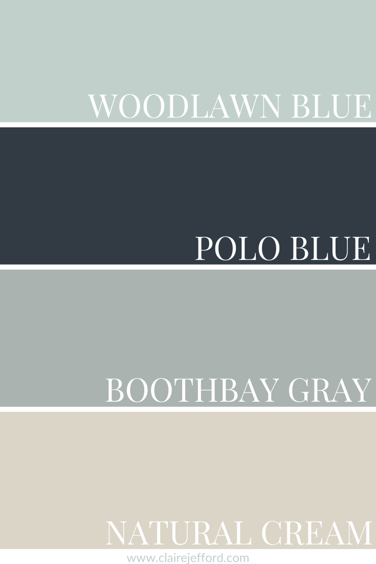
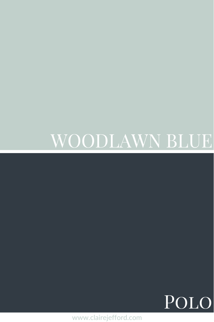
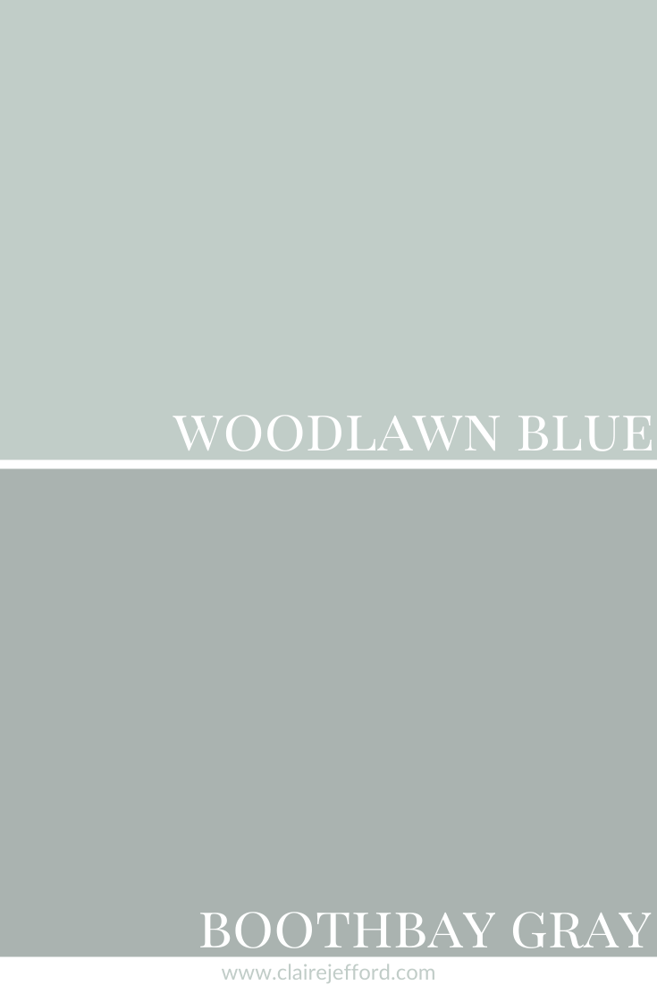
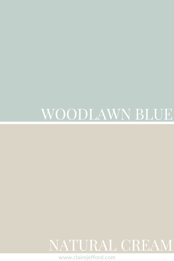
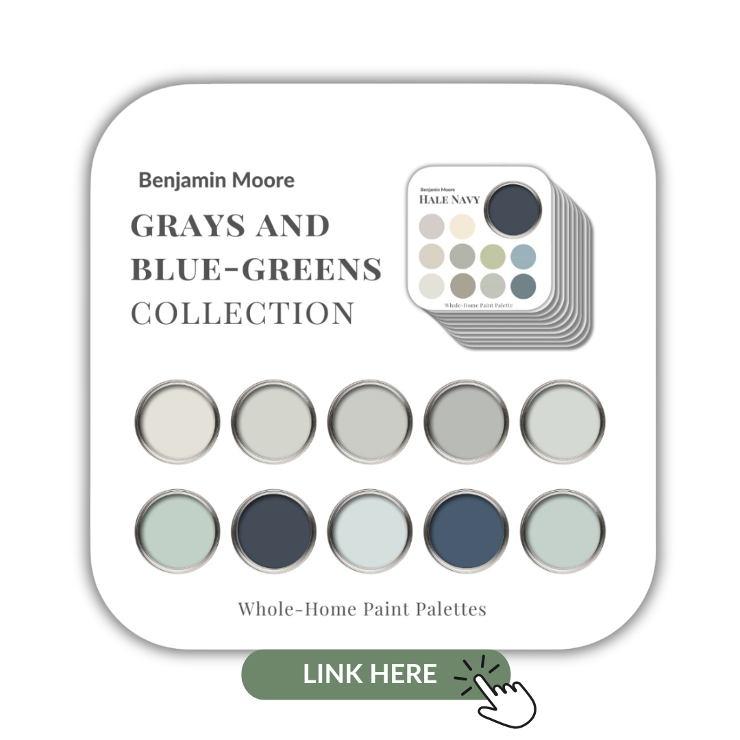
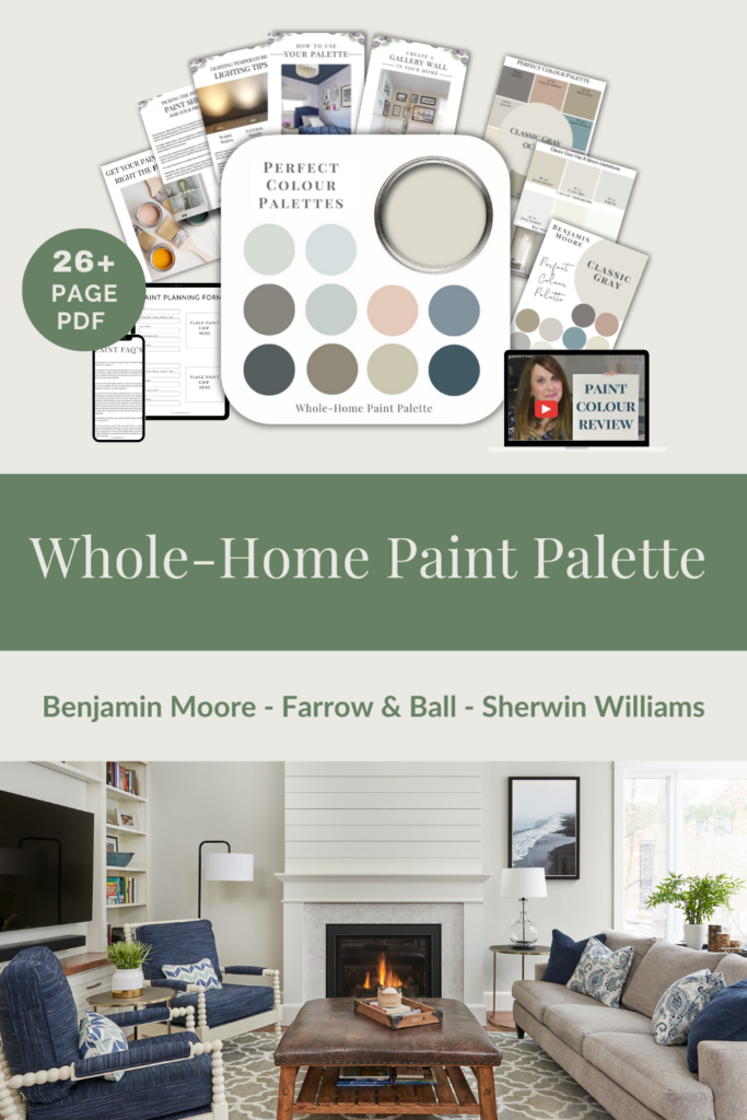
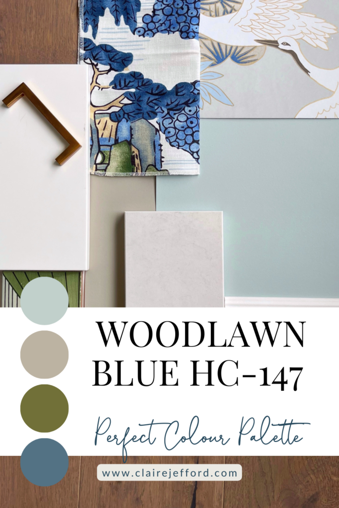
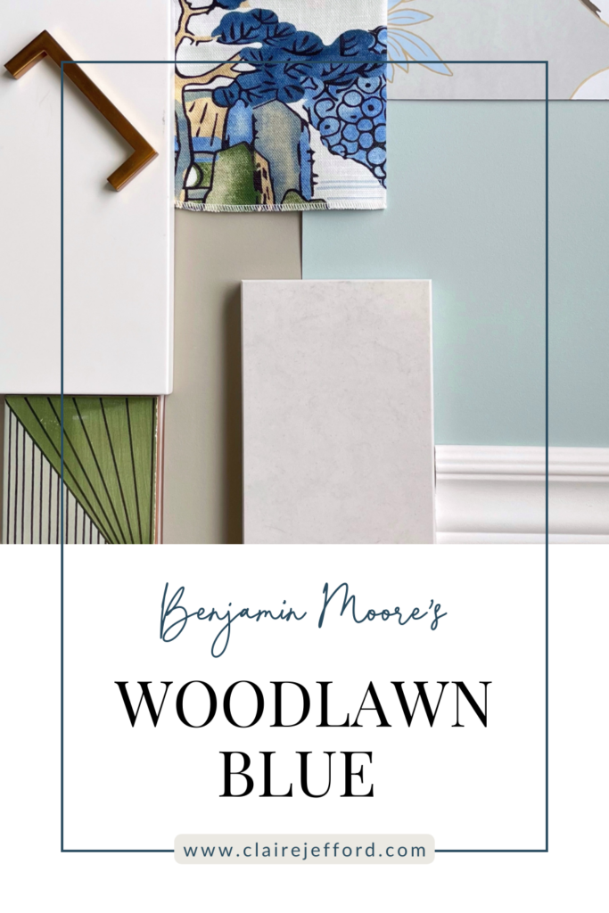
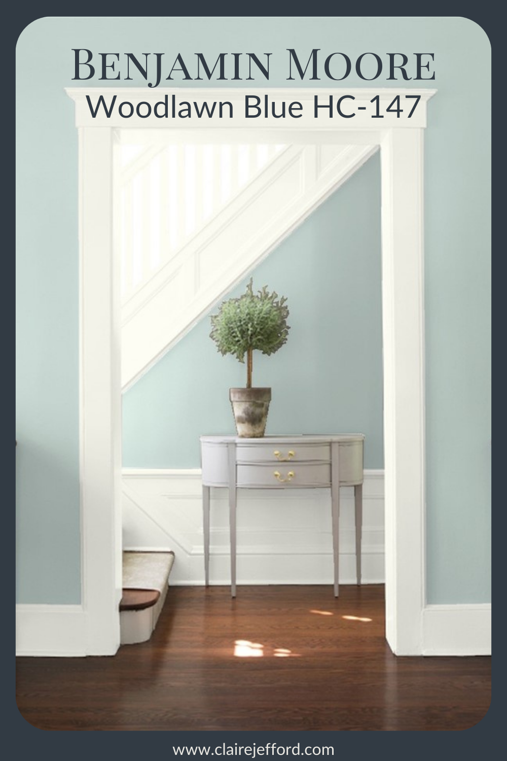
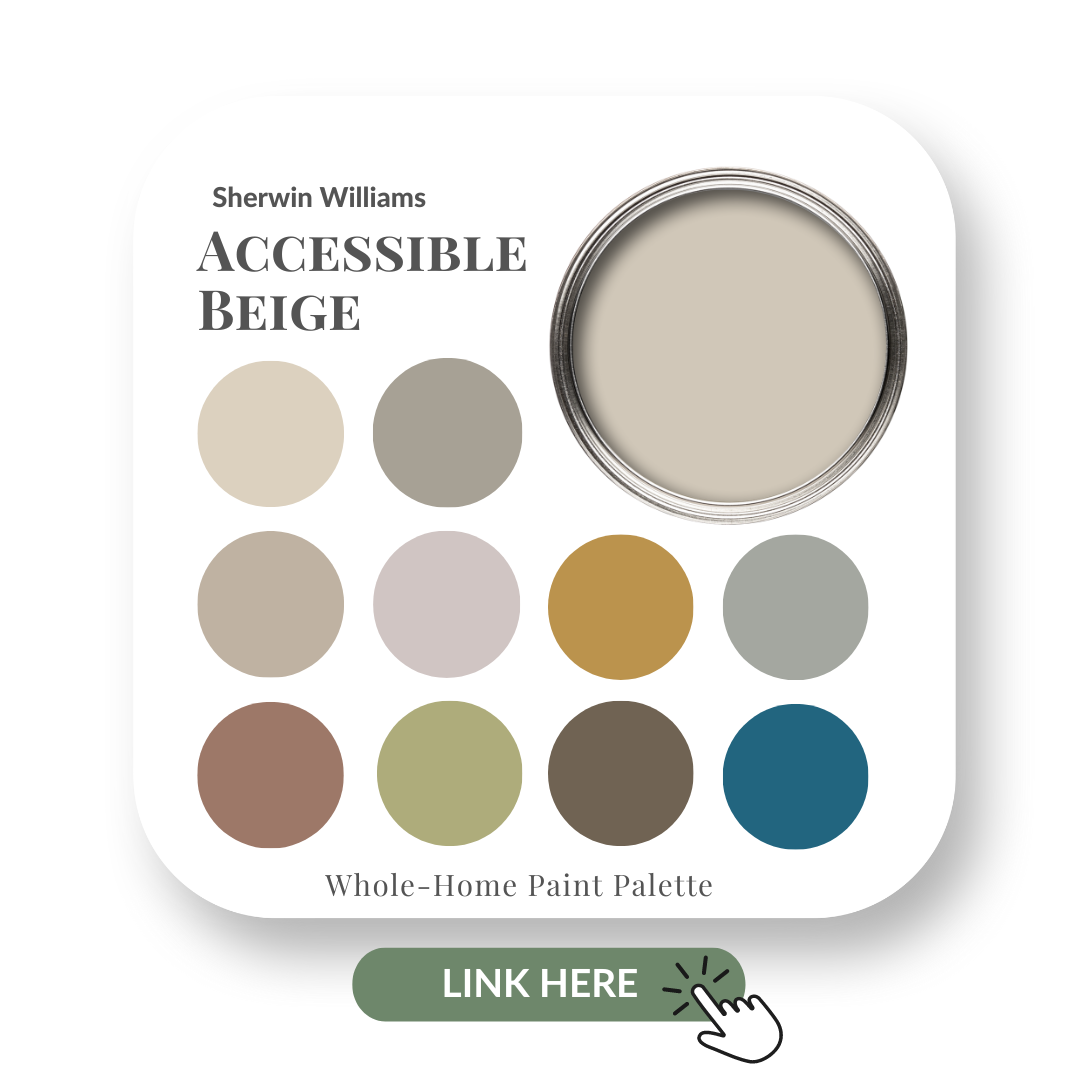
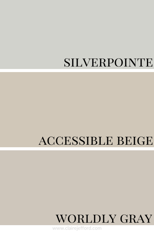
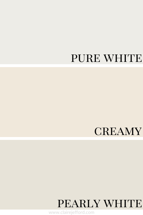
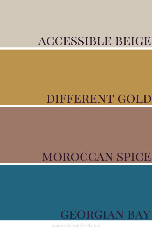
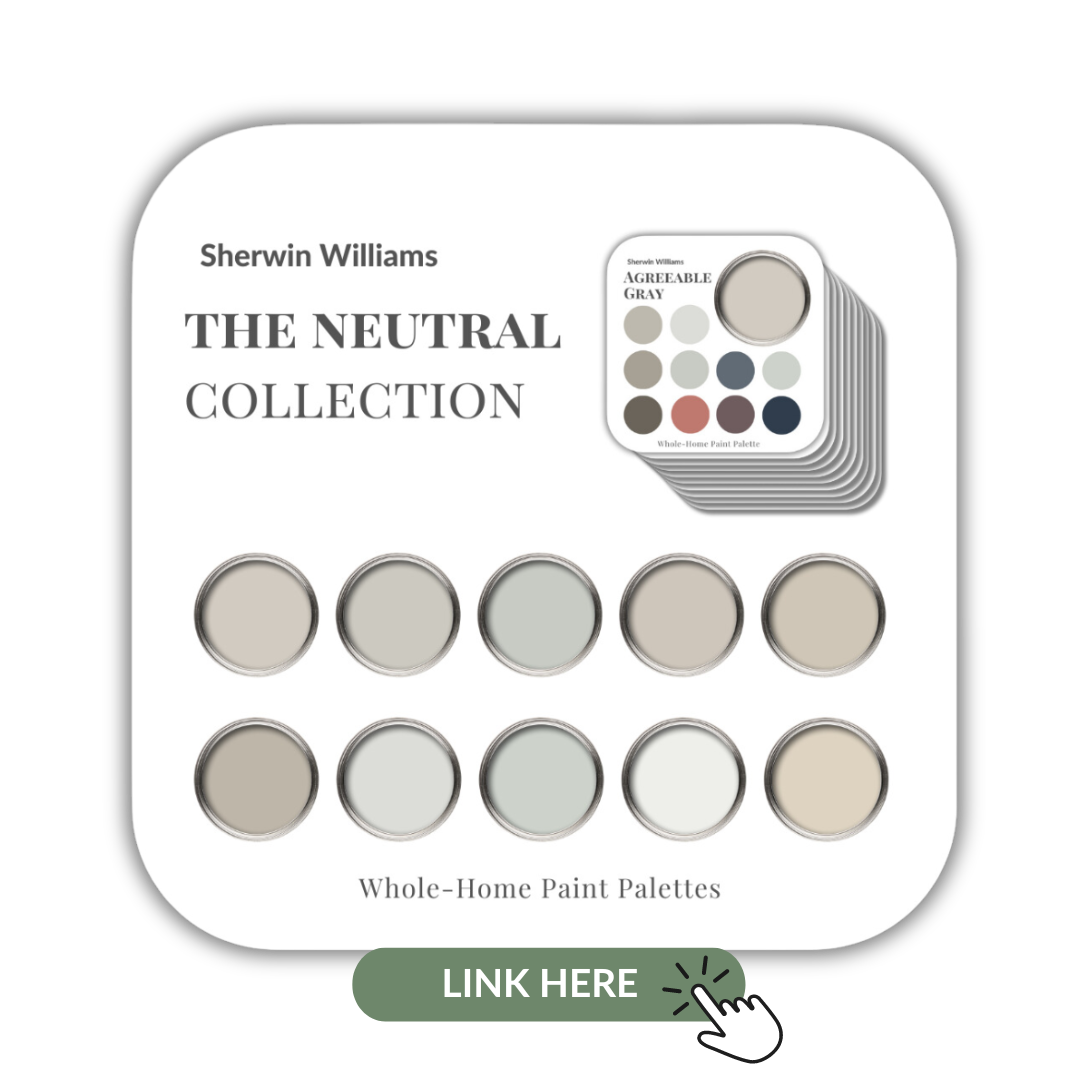
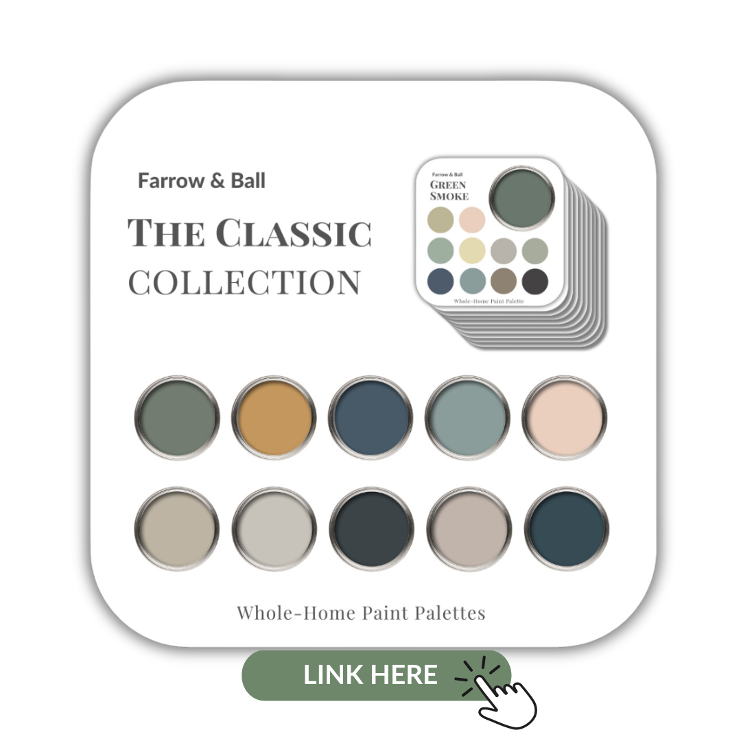
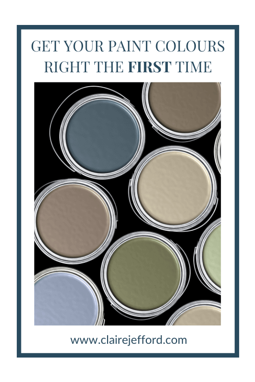
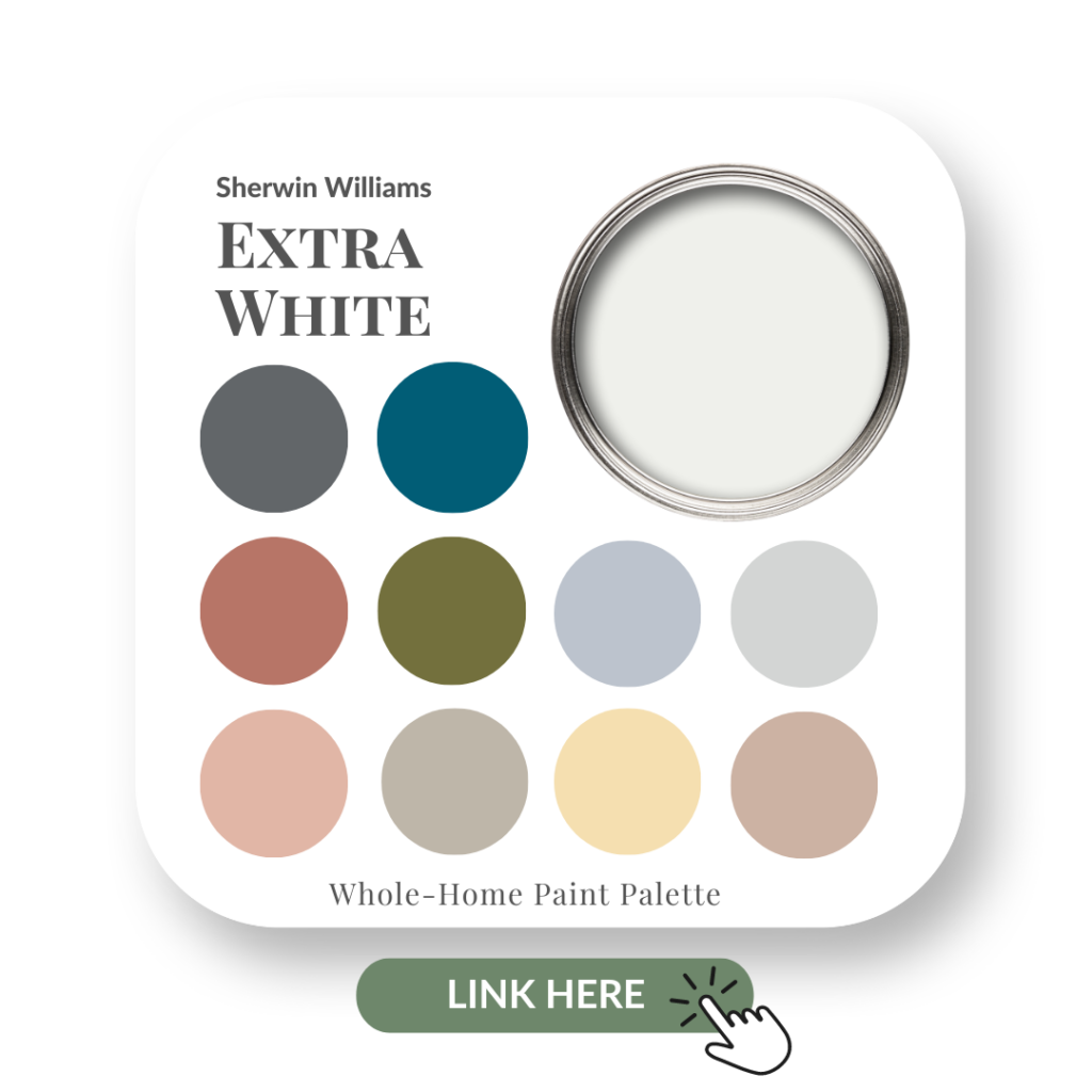
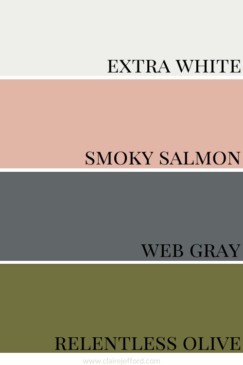
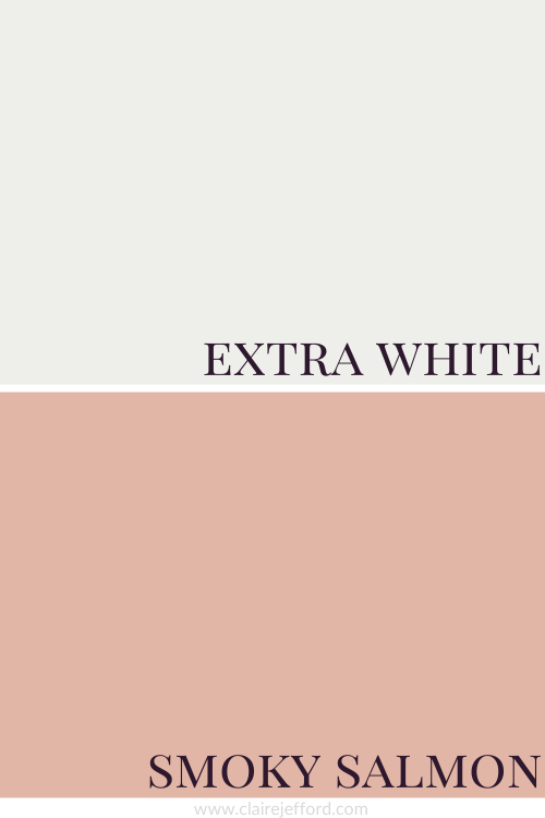
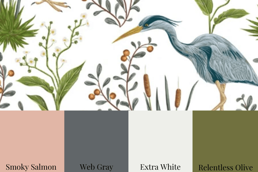
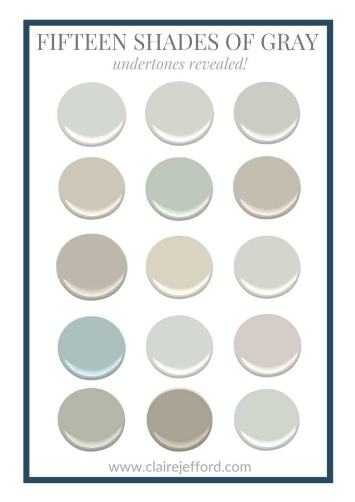
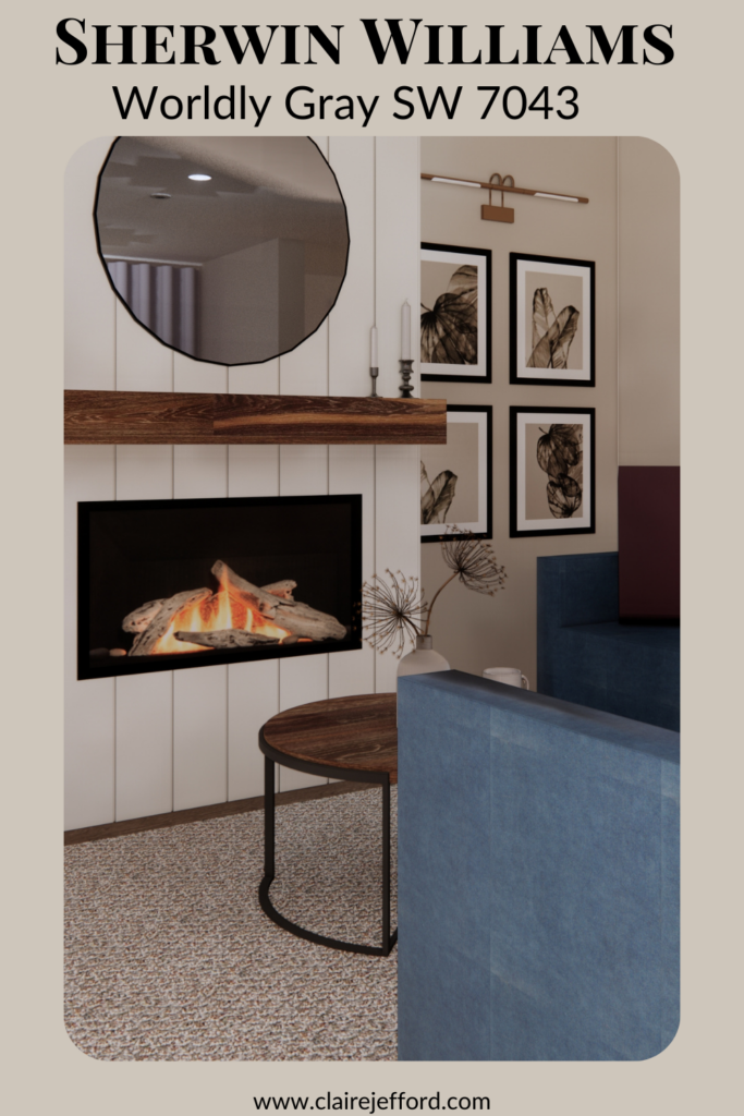
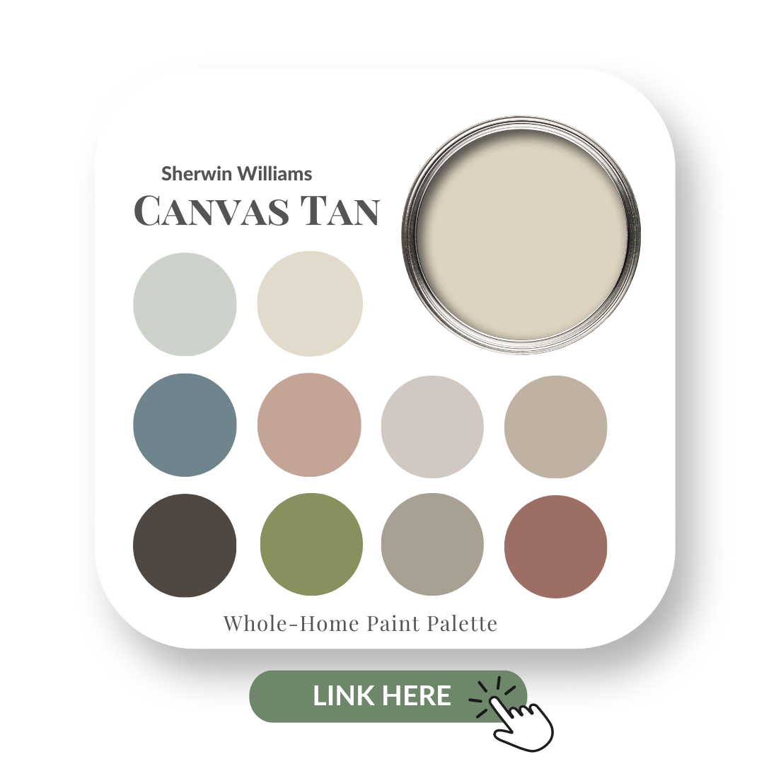
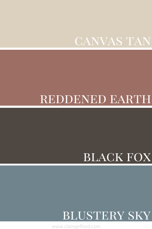
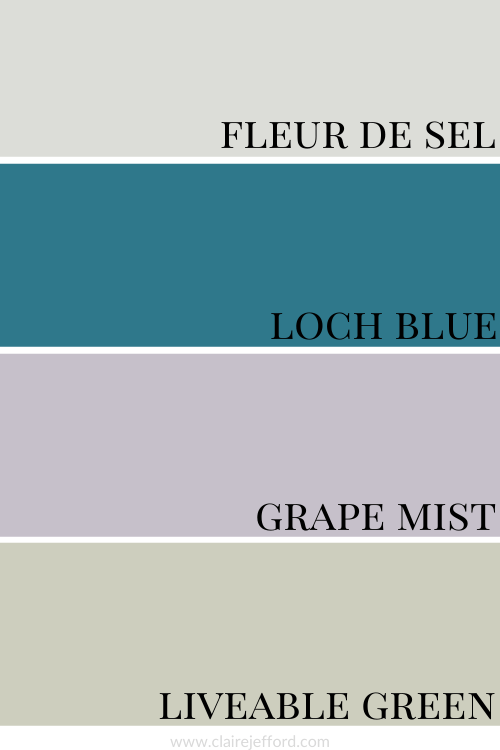
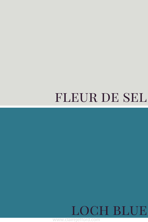
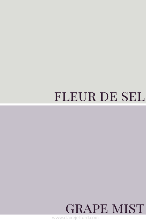
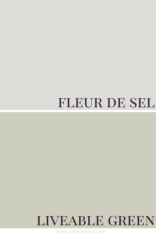
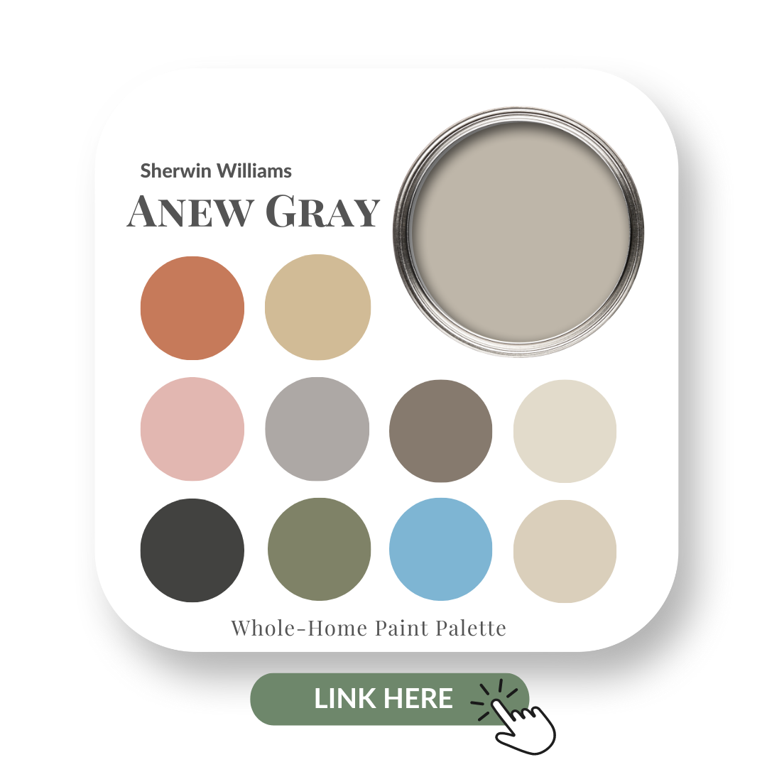
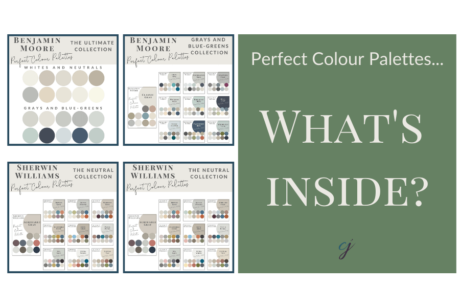
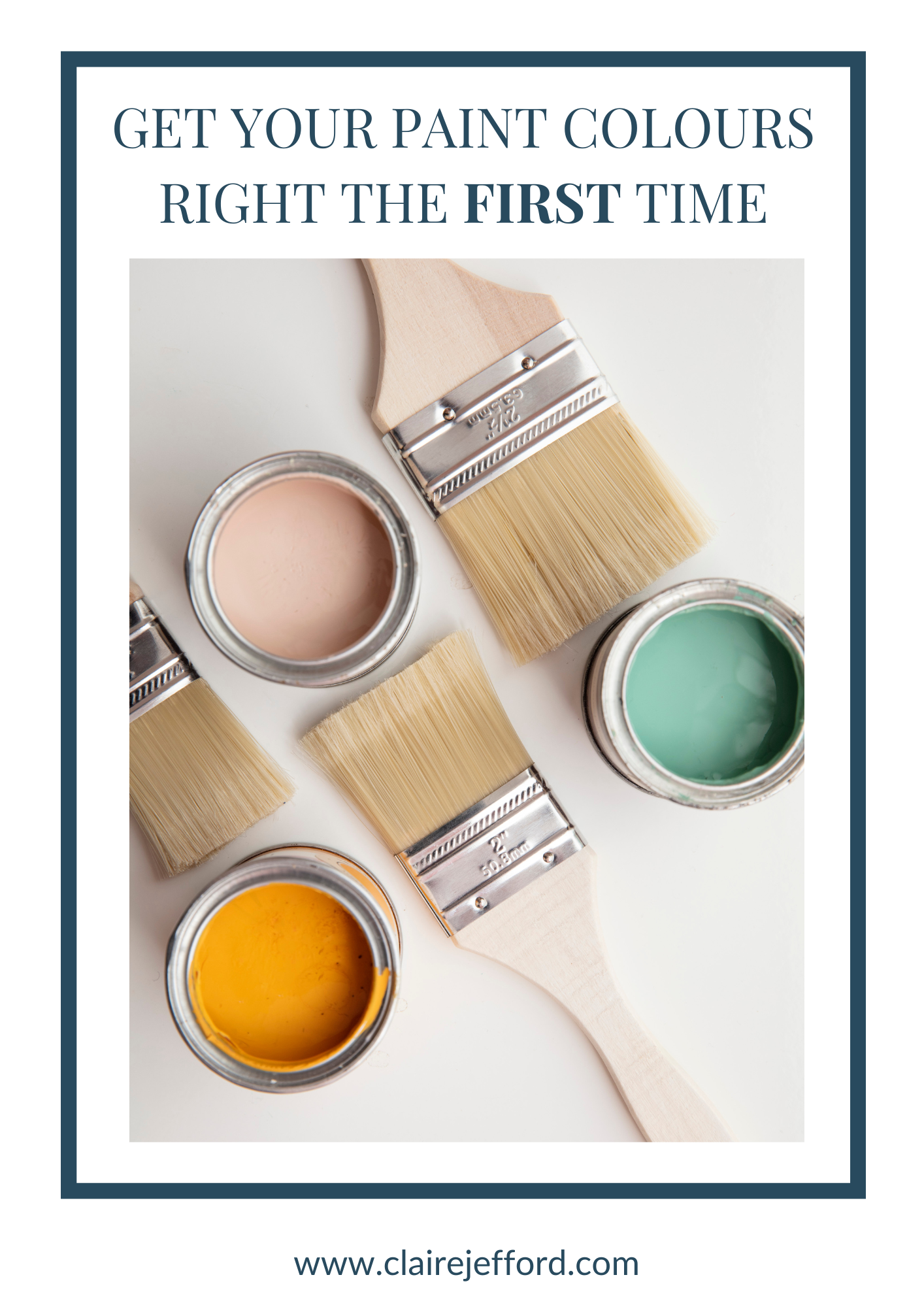
Perfect Colour Palettes
Are you losing sleep and overthinking when it comes to choosing the perfect paint colours for your home? Don’t sweat it! I’m a Certified True Colour Expert and have instant advice to make it easier for you.
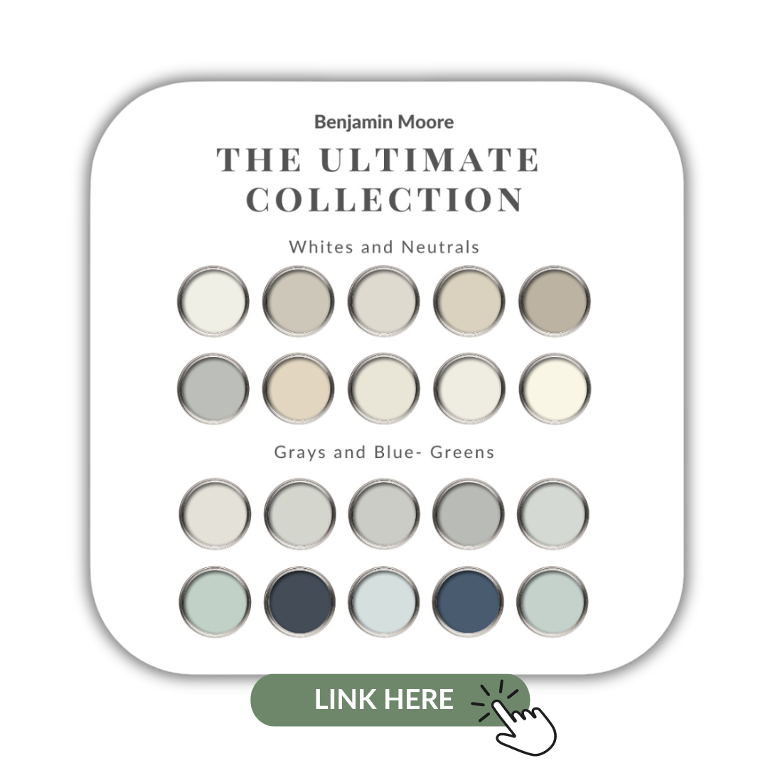
We have more than 50 Whole-Home Colour Palettes readily available for you to instantly download. All of the paint colours in each palette have been carefully selected by me personally. Plus, there’s you get tip sheets on lighting, paint sheens, how to create a gallery wall, a paint planning template, and more.

You can view the entire gallery of paint colours here.
Or, click below on your preferred brand to see the most popular paints to choose from.
Find Colour Claire-ity Here
Do you know my 5 Steps on how to choose the right paint colour the first time?

Perfect for Pinning