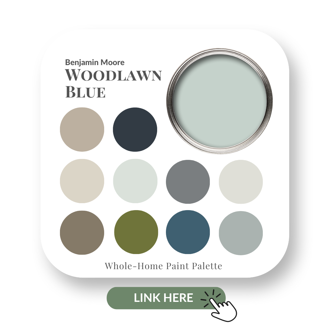
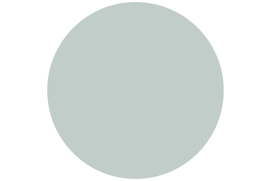
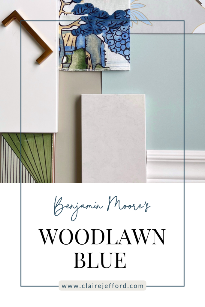
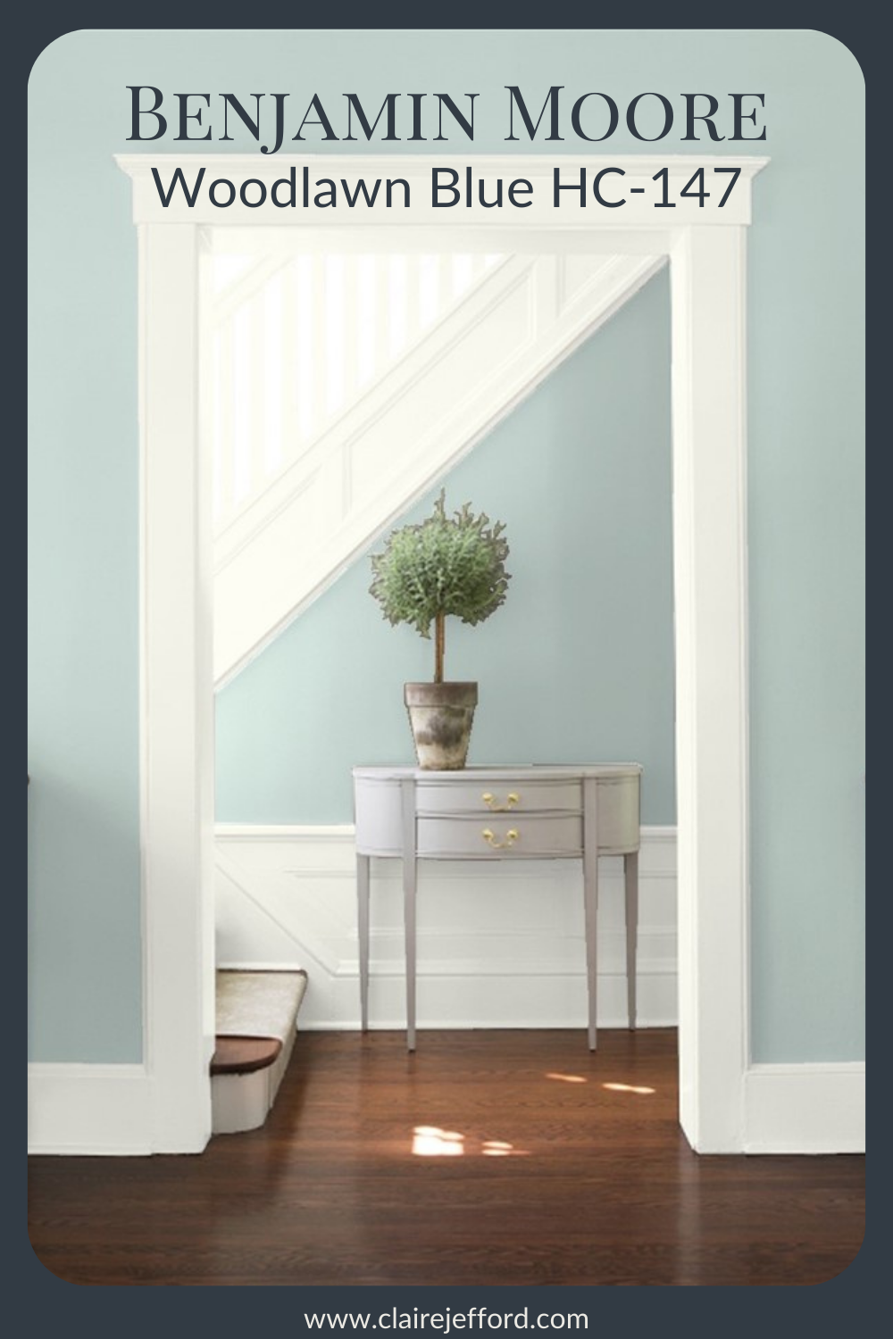
Benjamin Moore Woodlawn Blue
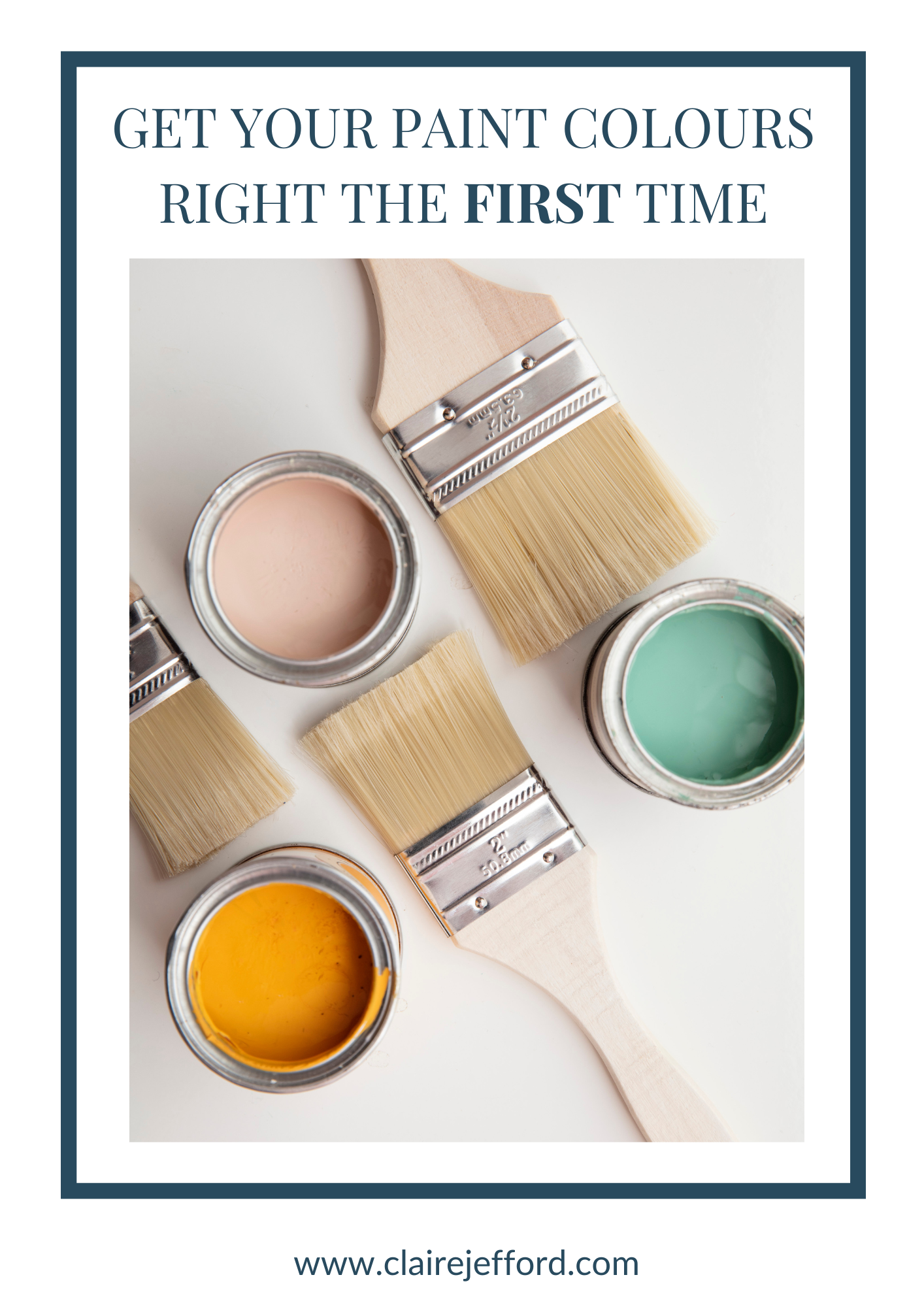
Choose the right paint colour
the first time Let me show you how in just 5 easy steps!
BONUS: The Top 15 Shades of Gray by Benjamin Moore

Woodlawn Blue HC-147 by Benjamin Moore
I just can’t get enough of blue! What about you?
Today’s review is of Benjamin Moore’s Woodlawn Blue. It is a lovely subtle shade of blue-green from their Historical Collection.
This beautiful tone would add a wonderful bit of colour to a mostly neutral home or look super in a luxurious spa-like bathroom.
In this colour review video of Woodlawn Blue by Benjamin Moore, I share:
- The undertone
- Colour comparisons to easily see the different undertones
- Best white paint colours for the trim and ceilings
- Beautiful colour combinations to inspire you for your decorating project
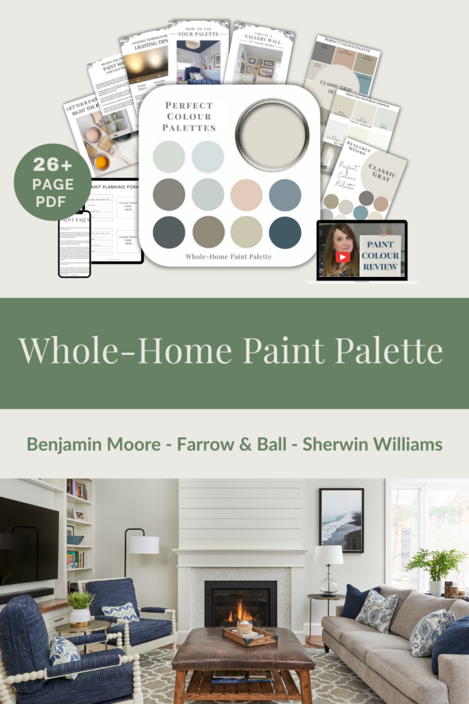
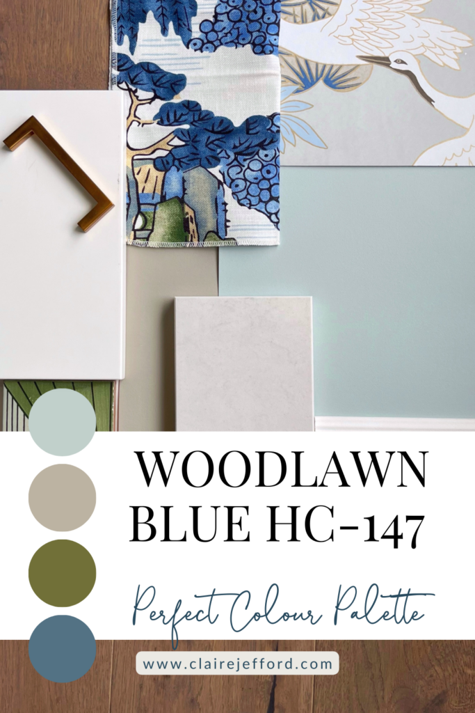
After you watch the video if you would like all this information conveniently laid out for you in one place with even more paint colour combinations to use, take a look at my Woodlawn Blue Perfect Colour Palette.
A must-have digital download for any colour enthusiast or design professional.
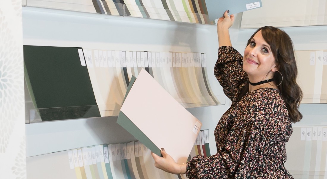
As a Certified True Colour Expert and an award-winning interior design professional, I’ve worked with many homeowners on various residential design projects.
I want to give you the confidence to make educated decisions about your own paint choices.
Let’s do this!
Undertone: blue/green
Woodlawn Blue may lean more towards blue or green in colour depending on the lighting and what other decorative elements you pair with it in your interior decorating project.
Looking at the colour comparisons below will help give you a better idea of where Woodlawn Blue fits between two similar shades, one that is more green and the other that is bluer.
Colour Comparisons
Smoky Green CC-700 & Gossamer Blue 2123-40
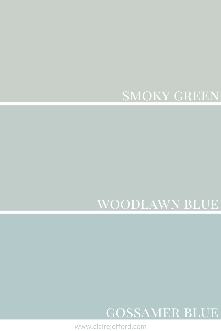
I always love to compare a paint colour so you can clearly see the true tones. It’s often not until you have a colour side by side with similar shades that the tones become obvious. Don’t miss this step when selecting your paint colours.
During a colour consultation, I always make sure to show my large paint boards against different elements such as flooring, tile, and fabrics.
I swap them out to show my client just how different similar colours can look next to their existing finishes.
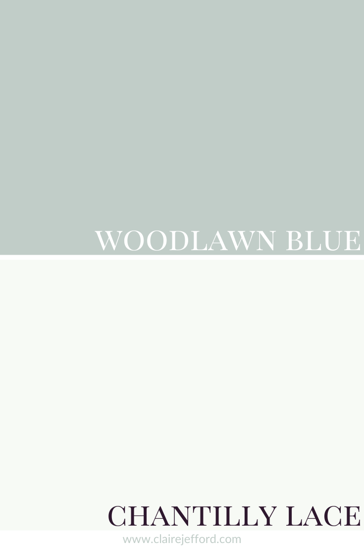
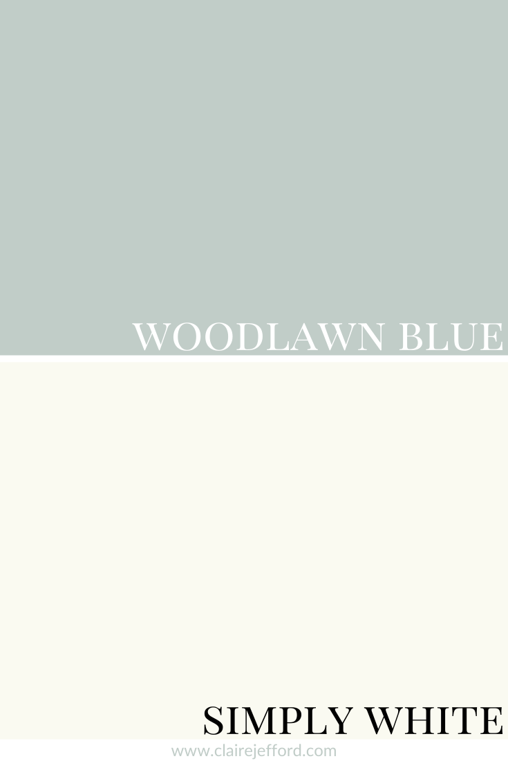
Best Whites To Pair With Woodlawn Blue
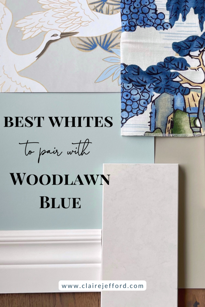
Chantilly Lace OC-65 By Benjamin Moore
Simply White OC-117 By Benjamin Moore
White Dove OC-17 By Benjamin Moore
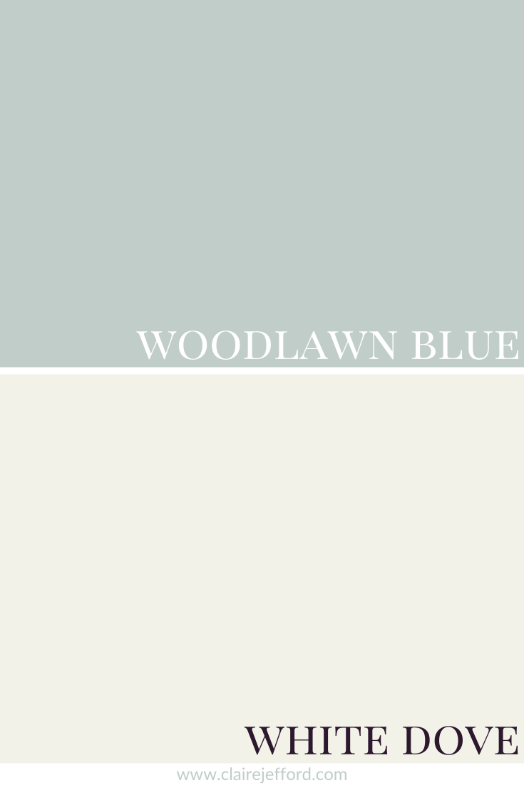
If you want to learn more about one of the most popular whites, check out my review of White Dove by Benjamin Moore.
I tend to have around 10 white paint colours that are my best whites for trim and ceilings. You don’t need to look at the thousands of whites available to find the right one and you definitely don’t need to mix two different whites or use only a certain percentage of paint colour to get the right one for you.
I can assure you that the best colour for your project already exists, you just need to know the 5 Steps on how to choose the right paint colour the first time.
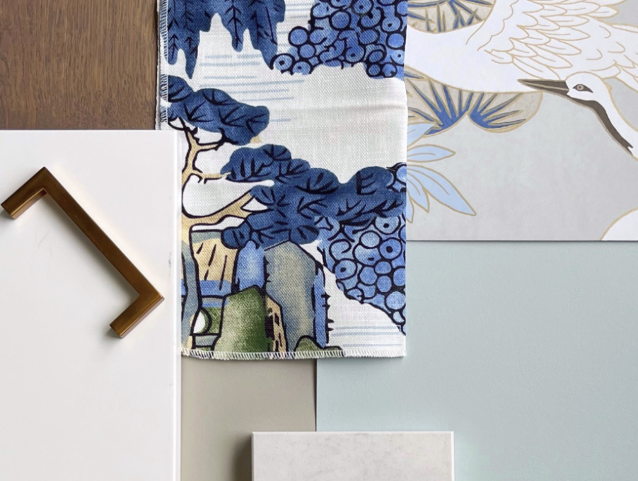
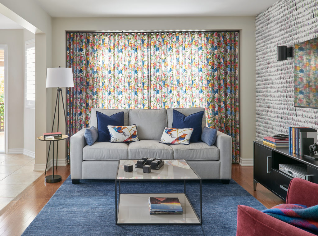
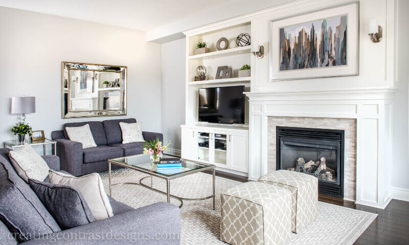
We used Woodlawn Blue for a custom vanity in a client’s powder room we redesigned. It was the perfect colour to pair with the calming blue-green tones in the bold and beautiful wallpaper we selected.
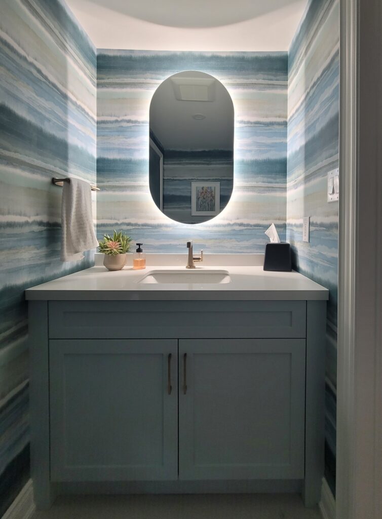
We took the photo ourselves, so while it’s not a professional photograph, hopefully, you can still see how lovely it all came together for this interior design project. (And how fabulous is that back-lit mirror?!)
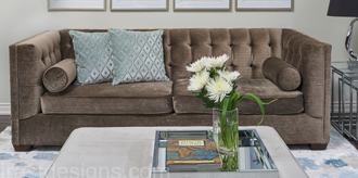
Fabulous Colour Combinations
In my video, I paired Woodlawn Blue with a few different colours, all from Benjamin Moore and all included in my Perfect Colour Palette for Woodlawn Blue.
It’s such a versatile blue. It goes well with neutrals, colours with similar tones, and those that offer amazing contrast.
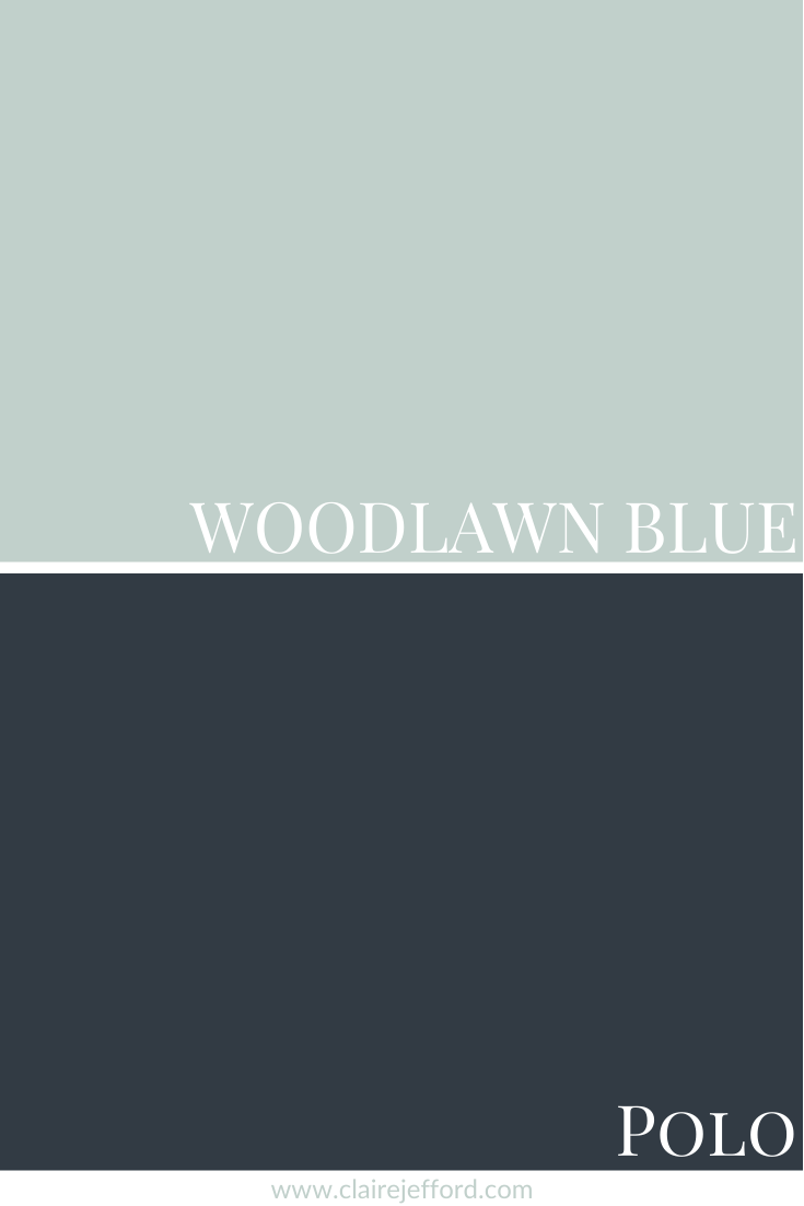
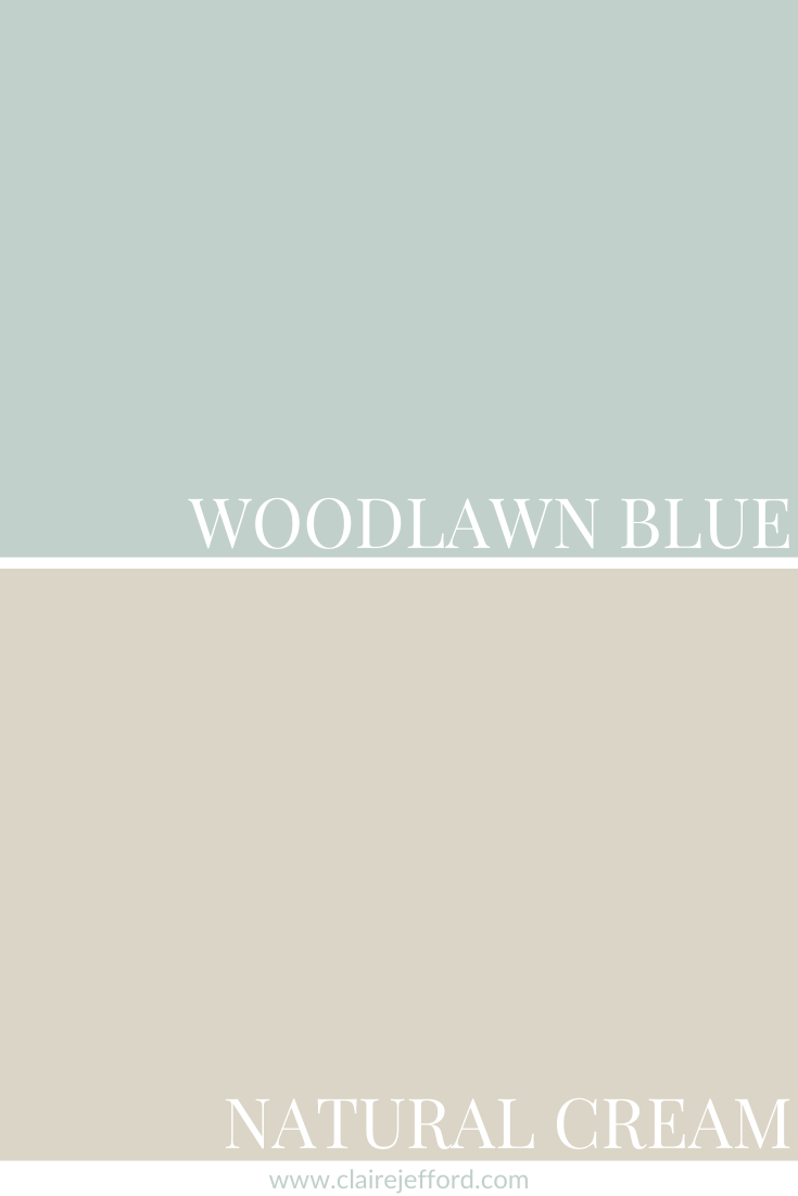
Woodlawn Blue with Polo, Boothbay Gray & Natural Cream
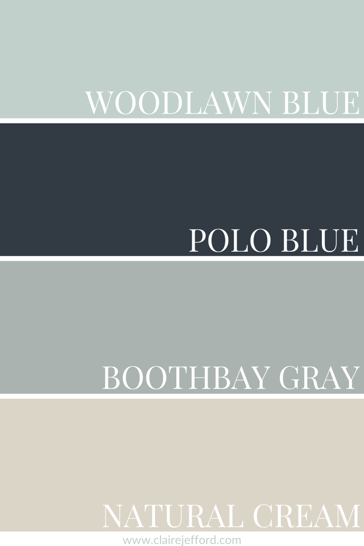
Polo 2062-10 by Benjamin Moore
Boothbay Gray HC-165 By Benjamin Moore
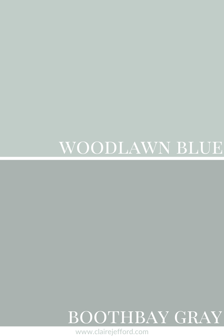
If you want to see more of Boothbay Gray, check out this Secret Xbox room we designed in a client’s basement!
Natural Cream OC-14 by Benjamin Moore
I am always curious to hear what you think of the colours I review. I have not yet had the opportunity to use Woodlawn Blue in a project, have you? Please comment below.
Convenience At Your Fingertips
All of the colour combinations shown above are included in my Perfect Colour Palette for Woodlawn Blue.

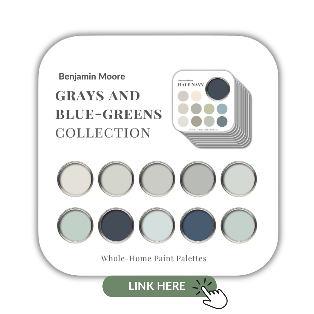
Woodlawn Blue is now part of my Benjamin Moore Grays and Blue-Green Collection showcasing all 10 of my gray and blue-green Benjamin Moore Perfect Colour Palettes.
My Perfect Colour Palette library is expanding and I now have over 50 palettes to select from. Click here to see all of them.
I’ve printed all of mine and they have proved to be a very helpful resource for consultations and client projects.
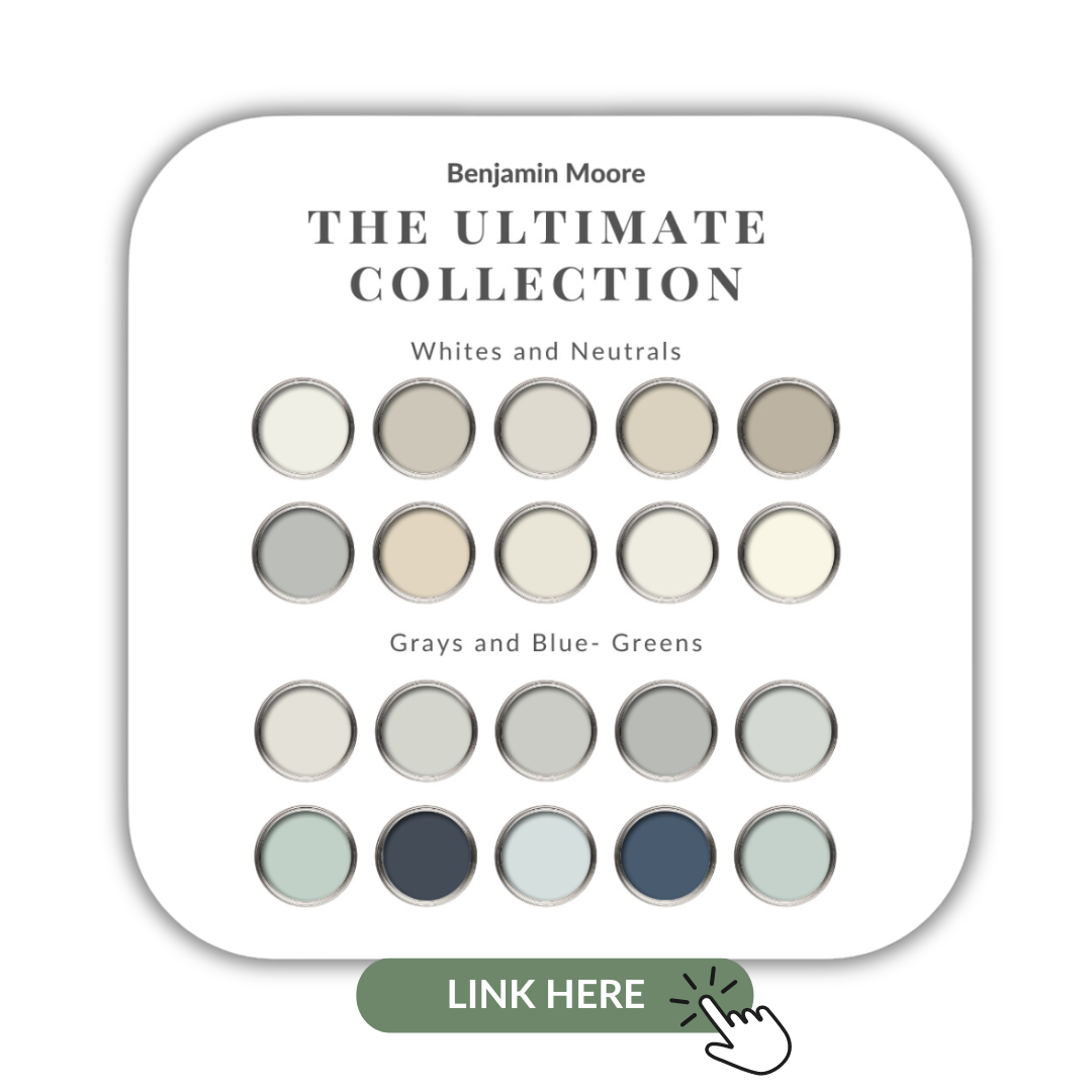
If you want to get all my Benjamin Moore colour guides in one place, look no further than my Benjamin Moore Ultimate Collection. All 20 of my Benjamin Moore palettes in one handy collection.
Remember, it only takes one mistake to take your home decorating project from divine to disaster. Don’t let the paint be what stresses you out!

Room images by Benjamin Moore Colour Viewer
Perfect for Pinning


Kathy Geiger
| 12 November 2023Love this Woodlawn Blue colour! In the palate presented, could one use Edgecomb Grey instead of the Cream Colour and Steam for White Dove. Thanks! Love your blog and videos.
Claire Jefford
| 2 January 2024Absolutely!!