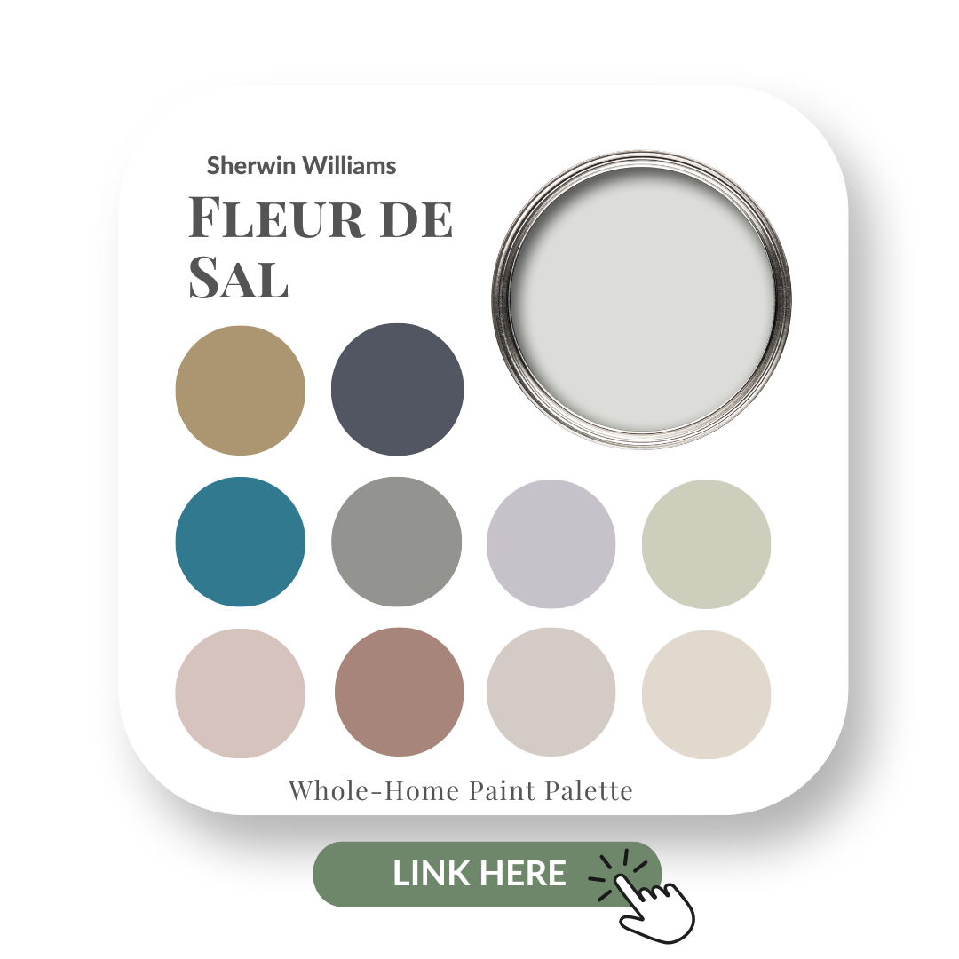
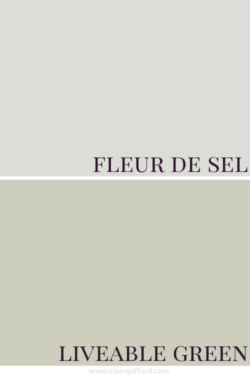
Sherwin Williams – Fleur de Sel
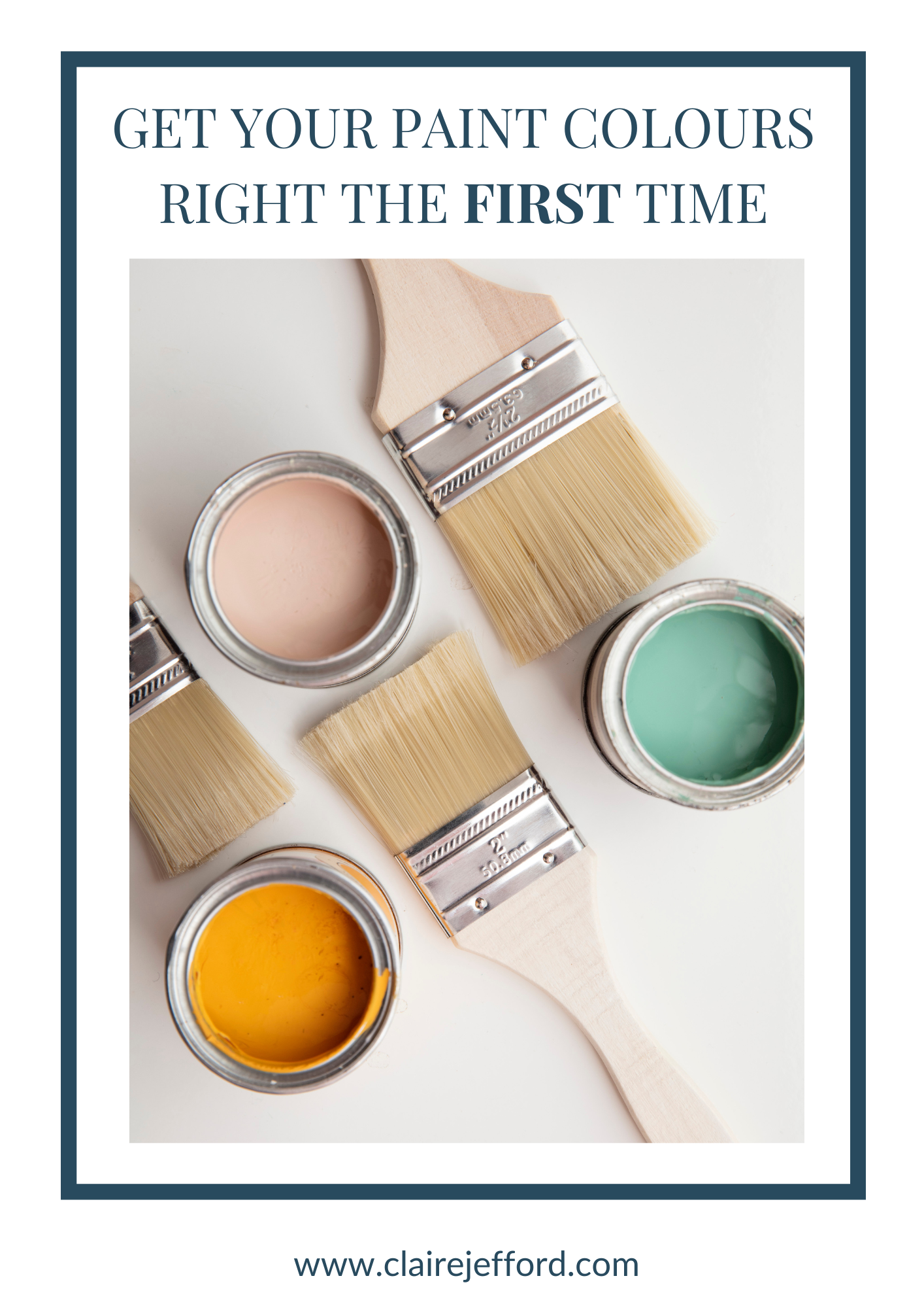
Choose the right paint colour
the first time Let me show you how in just 5 easy steps!
BONUS: The Top 15 Shades of Gray by Benjamin Moore


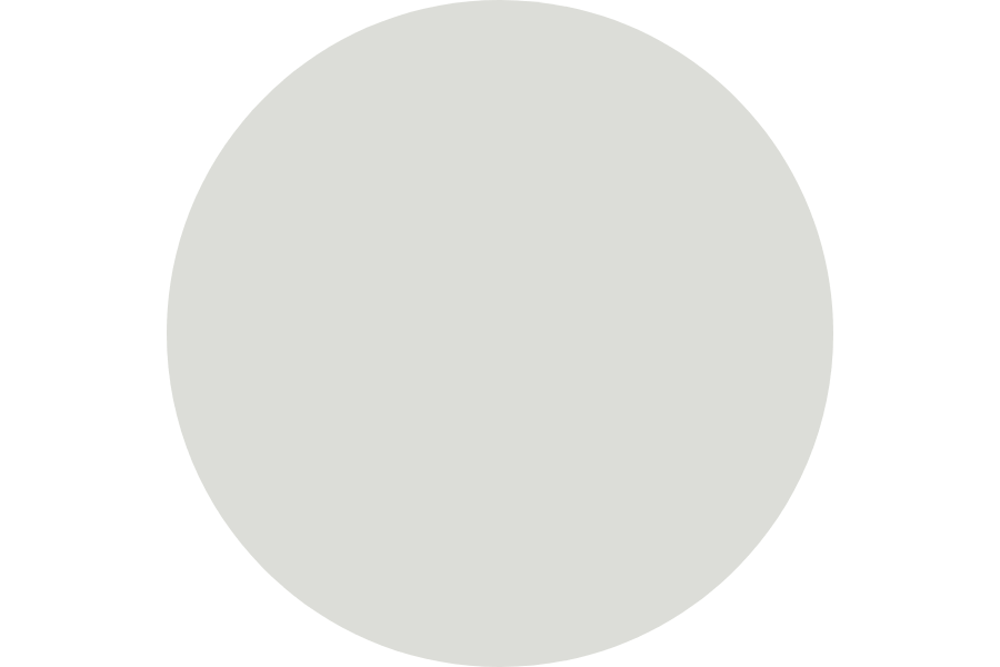
Fleur de Sel SW 7666 by Sherwin Williams
Fleur de Sel means ‘flower of salt’.
But don’t be fooled and think of the bright white processed table salt that you might find in most kitchens.
Instead, this beautiful, pale, soothing light gray resembles its namesake, the thin crust of salt that forms on the surface of seawater.
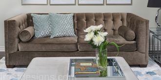
A very natural colour that is perfect if you are going for a Coastal Design Style.
If you’re new here, welcome! I’m Claire Jefford, a True Colour Expert and Certified Interior Decorator.
Below you will see what I cover in every colour review post.
In this colour review of Fleur de Sel by Sherwin Williams, I share:
- The undertone of my featured colour
- Colour comparisons in order to easily see the different colour tones
- Best white paint colours for the trim and ceilings
- Beautiful colour combinations to inspire you for your decorating project
Sherwin Williams – Fleur de Sel
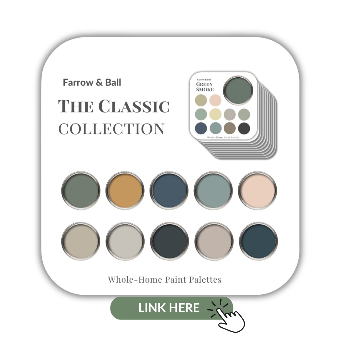
After you read this post, if you would like all the information I discuss in one convenient place look no further than my new Perfect Colour Palette for Fleur de Sel, which includes 10 colours that go beautifully with this colour.
A must-have for any colour enthusiast or interior design professional!
Fleur de Sel Colour Review
Undertone: blue/green
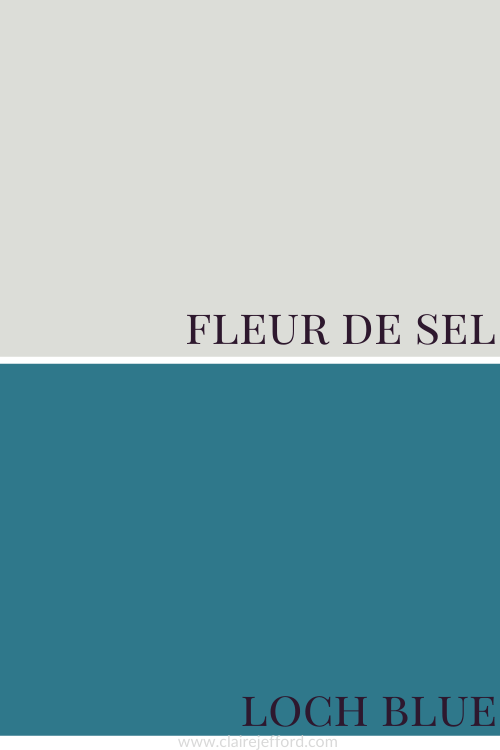
Colour Comparisons
Rhinestone SW 7656 and Sea Salt SW 6204
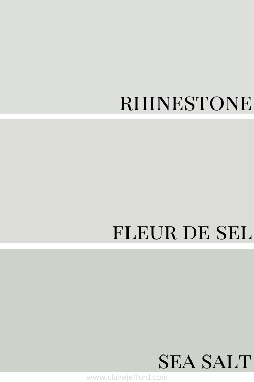
In the above comparison, it becomes a bit easier to see the true tone of Fleur de Sel. It’s not looking quite as cool as Rhinestone which has a blue undertone.
And you can see that Sea Salt, which is another popular Sherwin Williams paint colour that I have previously reviewed, has a stronger green undertone.
I also have a Perfect Colour Palette for Sea Salt available if this slightly deeper colour is more your style.
When I do Colour Consultations in a client’s home, I always compare colours so they can easily see the differences between the paint colours.
When I hold my large paint boards up to a decorative element such as fabrics, wallpaper or subway tile and then swap out one board with another board, it becomes clear as to which colour will work best.
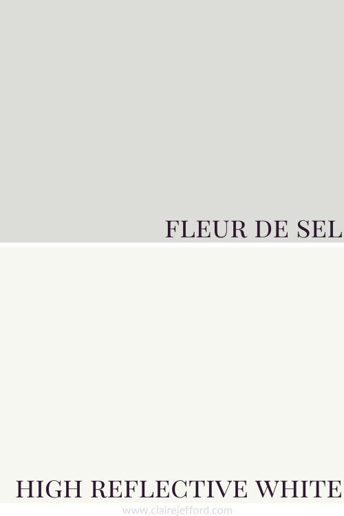
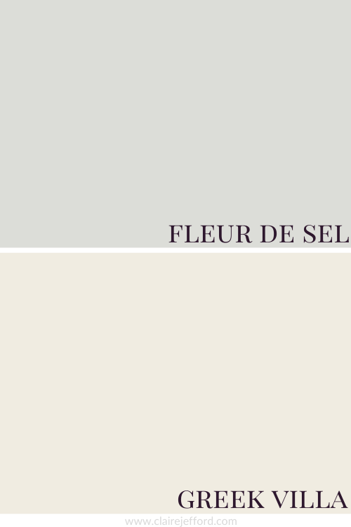
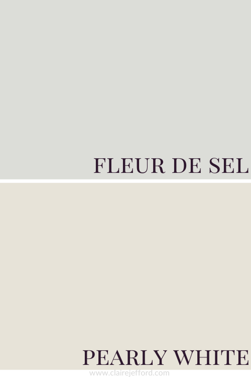
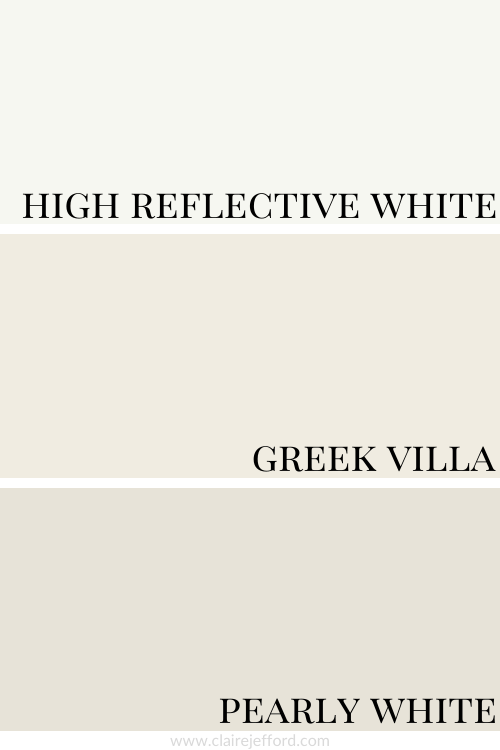
Best Whites To Pair With Fleur de Sel
High Reflective White SW 7036 by Sherwin Williams
Greek Villa SW 7551 by Sherwin Williams
Pearly White SW 7009 by Sherwin Williams
High Reflective White, Greek Villa and Pearly White
You will get quite a different look depending on which of the three whites you pair with Fleur de Sel. See the comparison graphic below with all these suggested white paint colours by Sherwin Williams to get a better idea of how each might look.
Don’t Stress Out Over Paint Colours!
I can assure you that the best colour for your project already exists, you just need to know the 5 Steps on how to choose the right paint colour the first time.
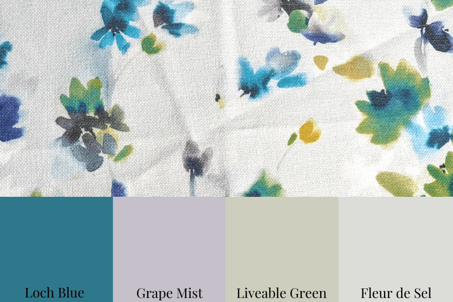
Fabulous Colour Combinations
Fleur de Sel, Loch Blue, Grape Mist and Liveable Green
Oooh, I just love this pretty colour palette, don’t you?!
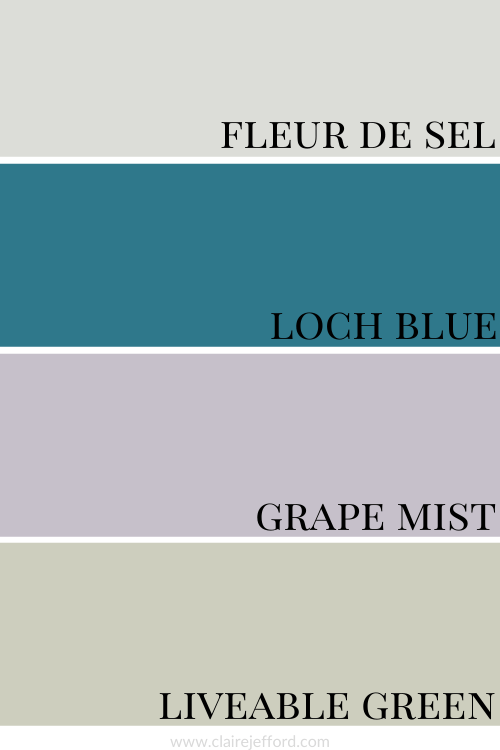
Loch Blue SW 6502 by Sherwin Williams
If Loch Blue is a little too bright for you, but you still love the richness of it, take a look at Hague Blue by Farrow & Ball to see if you prefer that colour.
Grape Mist SW 6502 by Sherwin Williams
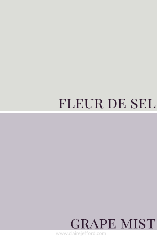
While I’m a sucker for purples, this Grape Mist is more of a lavender and reminds me of the wall tile we removed from our main floor bathroom when we renovated it in 2020.
Liveable Green SW 6176 by Sherwin Williams
We choose 3 of the complementary colours from my Perfect Colour Palette for Fleur De Sel to create this beautiful palette and pair them with the fabric below.
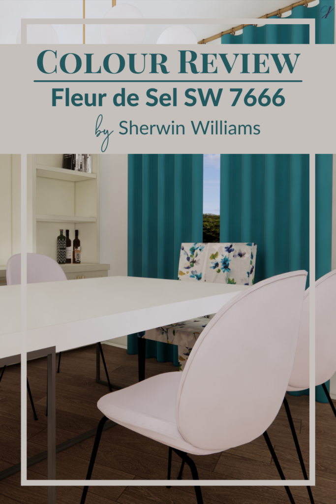
In the room rendering below you can see how we incorporate the colours from the above palette into our design.
The walls are painted the featured colour Fleur de Sel by Sherwin Williams.
We’ve shown the accent chairs at either end of the table in the beautiful fabric shown in the graphic above.
We placed Grape Mist on the other dining chairs and the bright hue of Loch Blue on the drapery.
Livable Green can be seen on the built-in cabinet that acts as our backdrop for this rendered dining room.
Convenience At Your Fingertips
All of the colour combinations shown above, plus more inspiring options for your next home decorating project can be found in my Fleur de Sel Perfect Colour Palette.
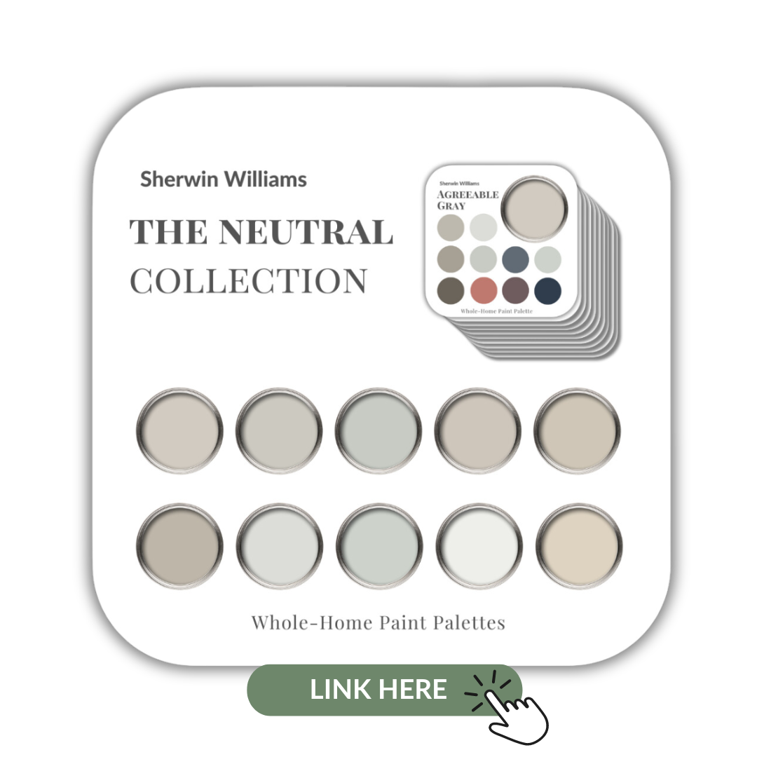
Fleur de Sel is also included in my newest Collection that showcases 10 beautiful neutrals from Sherwin Wiliams.
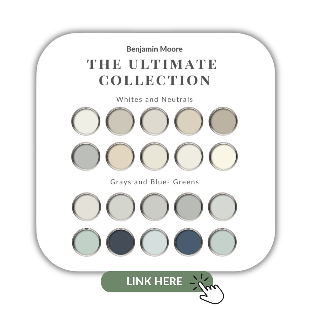
If you prefer Benjamin Moore or can’t do anything but Farrow & Ball, I’ve created collections of the most popularly used paint colours from both of the paint companies as well and you can see them here.
My Perfect Colour Palette library is expanding, click here to see all of them.

Remember, it only takes one mistake to take your home decorating project from divine to disaster. Don’t let the paint be what stresses you out!
Take my Colour Quiz to find out what your Perfect Colour Palette is.
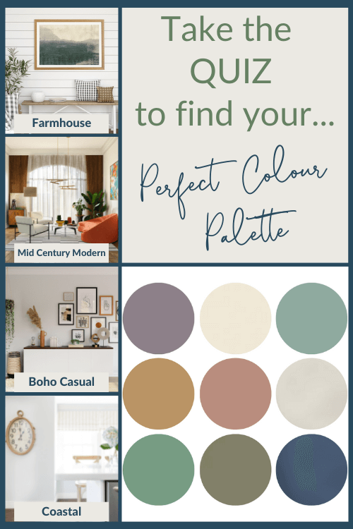
Perfect For Pinning