Front Door Paint Colours
Choose the right paint colour
the first time Let me show you how in just 5 easy steps!
BONUS: The Top 15 Shades of Gray by Benjamin Moore
Painting your front door a bold colour is a wonderful way to inject some personality into your home and enhance it’s curb appeal. With so many colours to choose from, it can be overwhelming to decide which paint colour to choose.
FREE PAINT COLOUR DOWNLOADS
I totally appreciate that choosing paint colours can be a daunting task! Let me make it easier for you and go grab my 3 FREE tips sheets for choosing paint colours here
In today’s post, I’m sharing some inspiration from a recent weekend getaway I took with my husband to the quaint little town of Niagara-on-the-Lake. If you haven’t been and you ever plan on going to Niagara Falls, you MUST take a day trip there.
We go every year to do a bit of shopping on the main street and enjoy a nice dinner out. This year we decided to mix business with pleasure and take some time to tour the mature neighbourhoods where the homes are so charming and often colourful.
10 Bold Front Door Paint Colours
In no particular order, let’s take a look at the top 10 front door paint colours that I came across. I have even matched them to Benjamin Moore or Farrow and Ball paints, so you can see similar colours if you want to use them for your own home.
1. Mosaic CC-874 Benjamin Moore
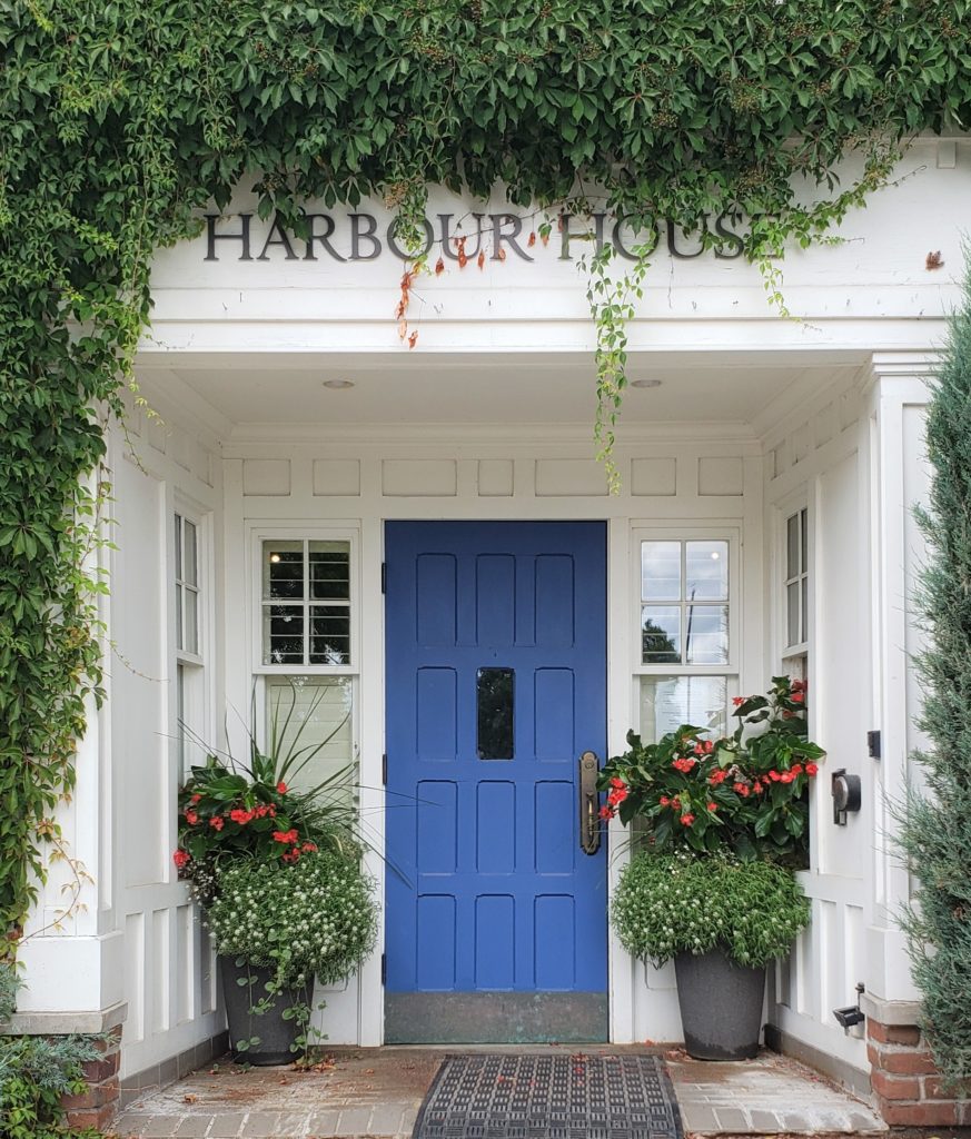
Okay, so when I said these were in no particular order, they really aren’t. However, this is my favourite image…at least, I think it is. There are many more pretty doors to come, don’t you worry about that.
I am a sucker for purple and this front door colour is like a deep periwinkle. So fun and unexpected, I just love it!
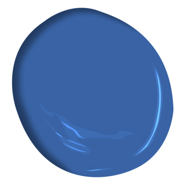
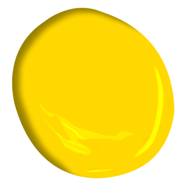
2. Sun Kissed Yellow 2022-20 Benjamin Moore
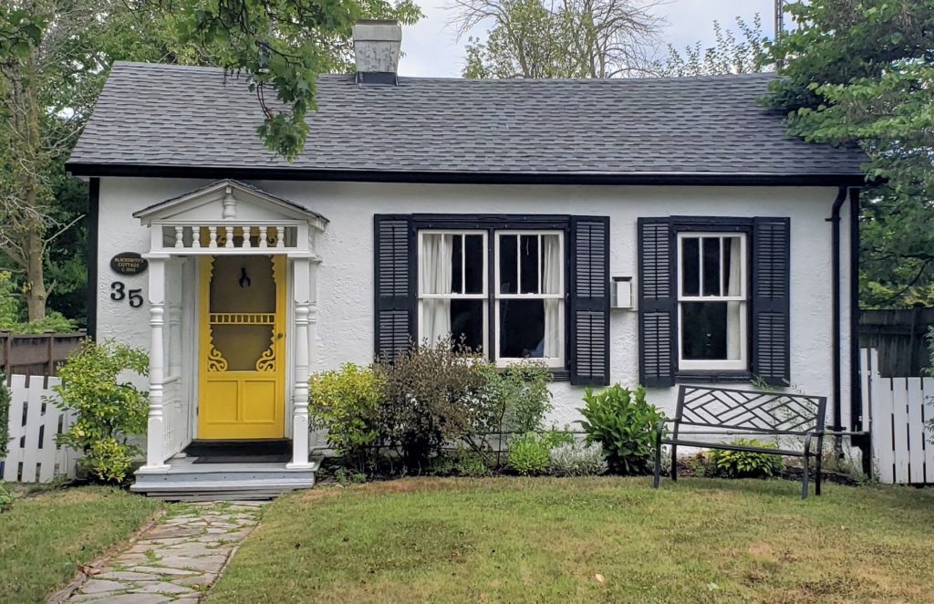
Black, white and yellow are a classic colour combination and this house is the sweetest, isn’t it!? The yellow front door pops so beautifully and is like a ray of sunshine among a white neutral backdrop.
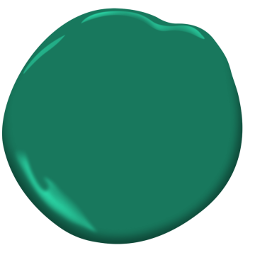
3. Very Green 2040-30 Benjamin Moore
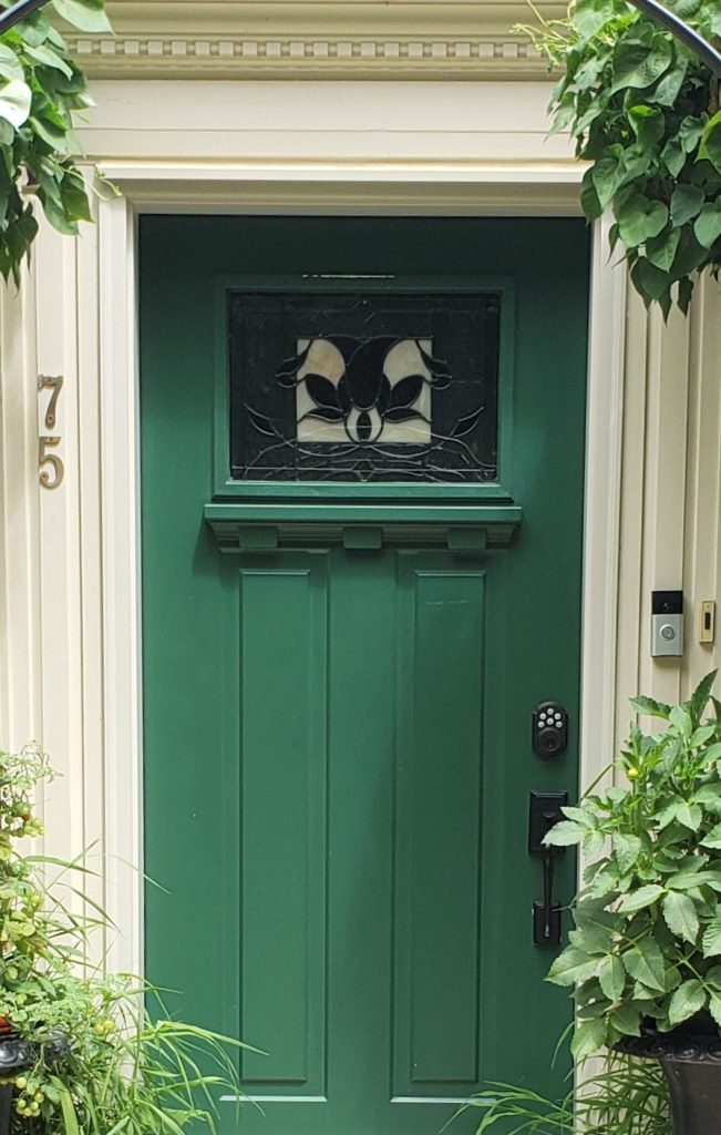
The colour green has been extremely popular this year, especially for cabinetry. You may remember where I shared a bold green kitchen in this post from the Kitchen and Bath Industry show last year.
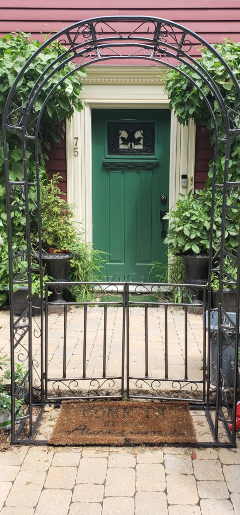
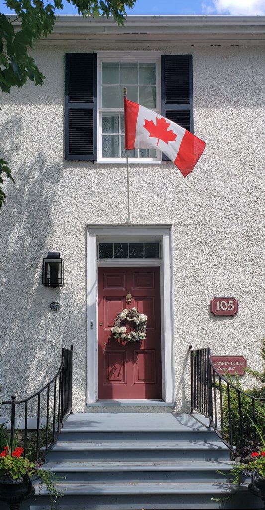
Take a look at the full image further below and note how it looks so fresh here, framed in a creamy trim tone and with a burgundy backdrop. Red and green are opposites on the colour wheel which means that they are complimentary colours and always look nice together. In this case, the duo doesn’t remind me of Christmas either!
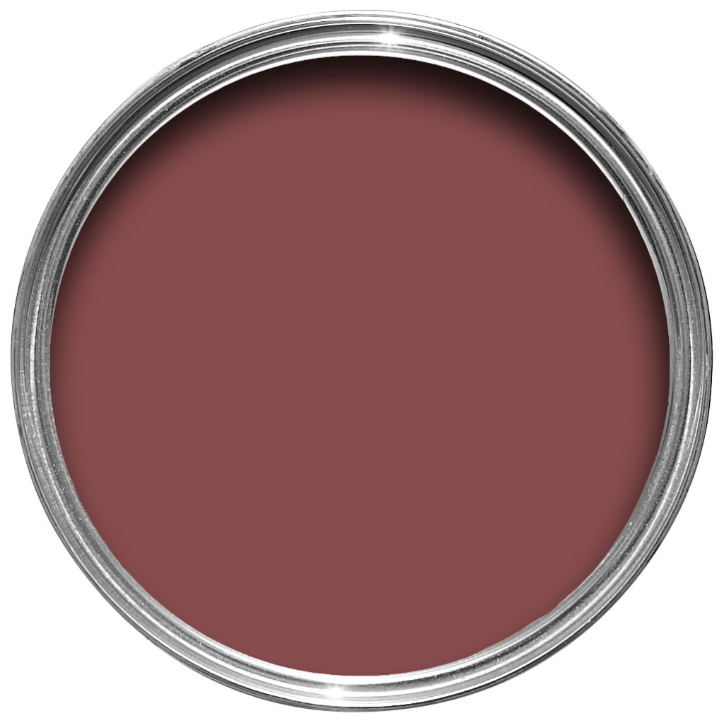
4. Eating Room Red No.43 Farrow & Ball
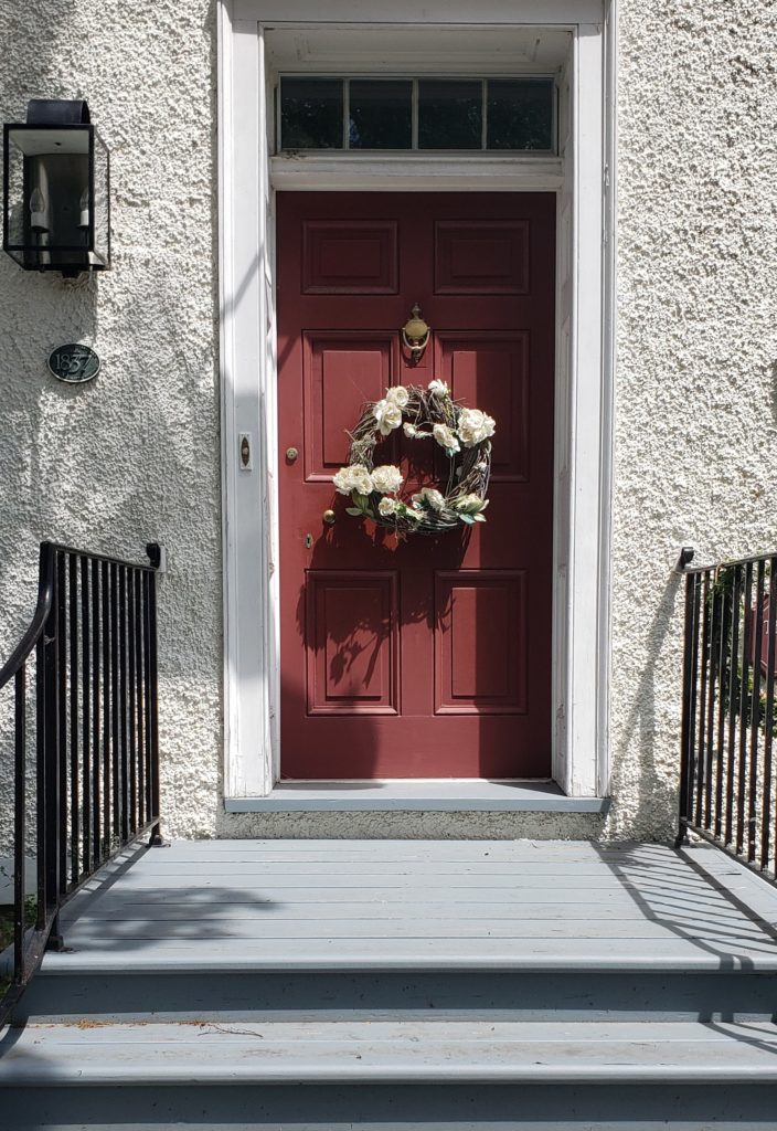
This pretty colour from Farrow and Ball is more of an intense burgundy than a red. The image unfortunately shows some shadows, but I’m not going to complain about it being a sunny day, so hopefully you will forgive me!
5. Strawberry Red 2003-20 Benjamin Moore
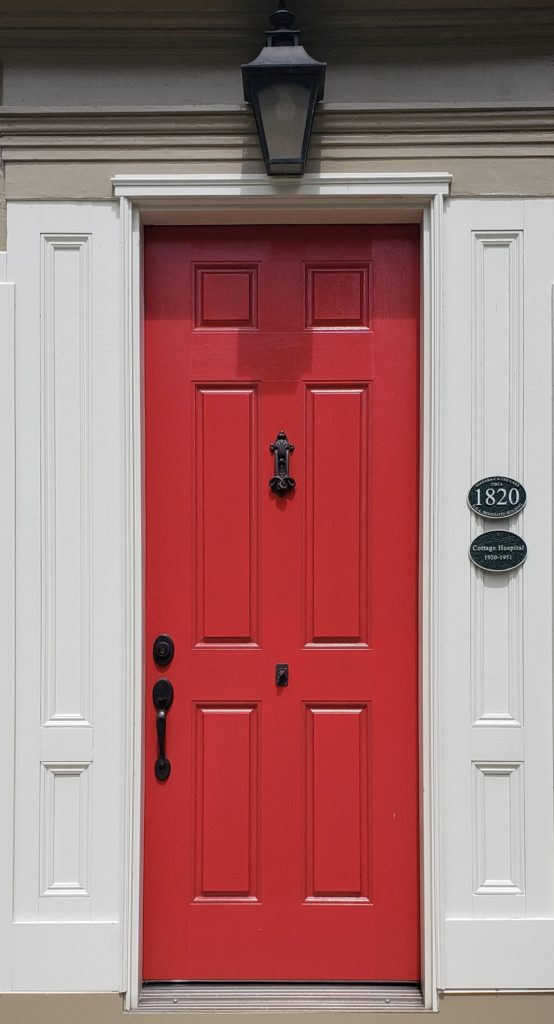
Now this colour will wake you up in the morning! This bright red is much brighter than the previous red toned door which also makes it stand out more against the white trim. I’m not a huge fan of red, so while it looks lovely here, it would not be a colour that I could ever see myself choosing for my own front door. What about you?

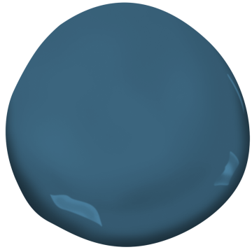
6. Lucerne AF-530 Benjamin Moore
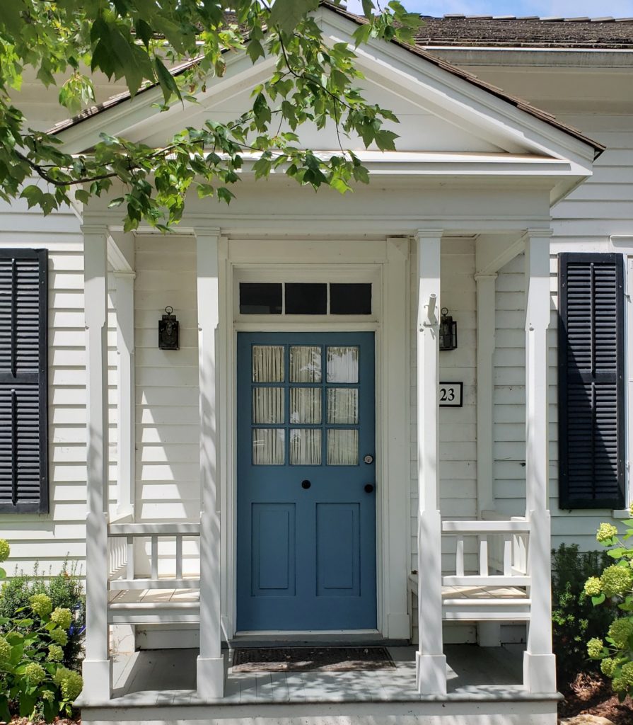
You can never go wrong with the colour blue in my opinion. Blue and white are especially popular and classic combinations in interior design. Lucerne from the Affinity Line by Benjamin Moore seemed like the best colour match to this cute front door.
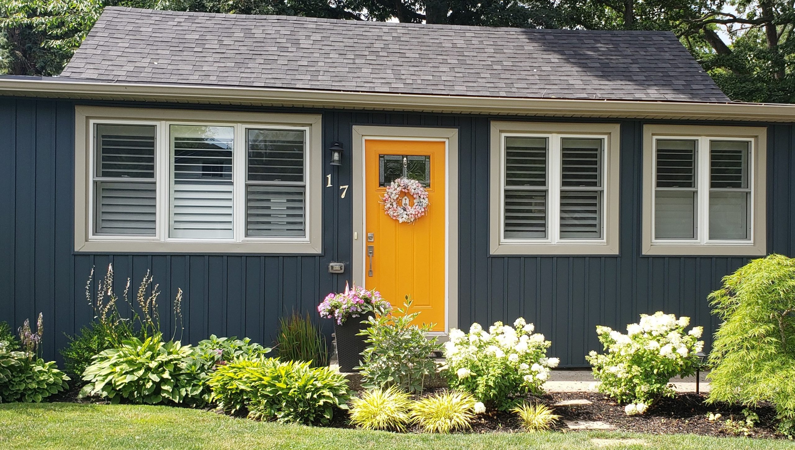
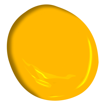
7. Golden Nugget 2019-20 Benjamin Moore
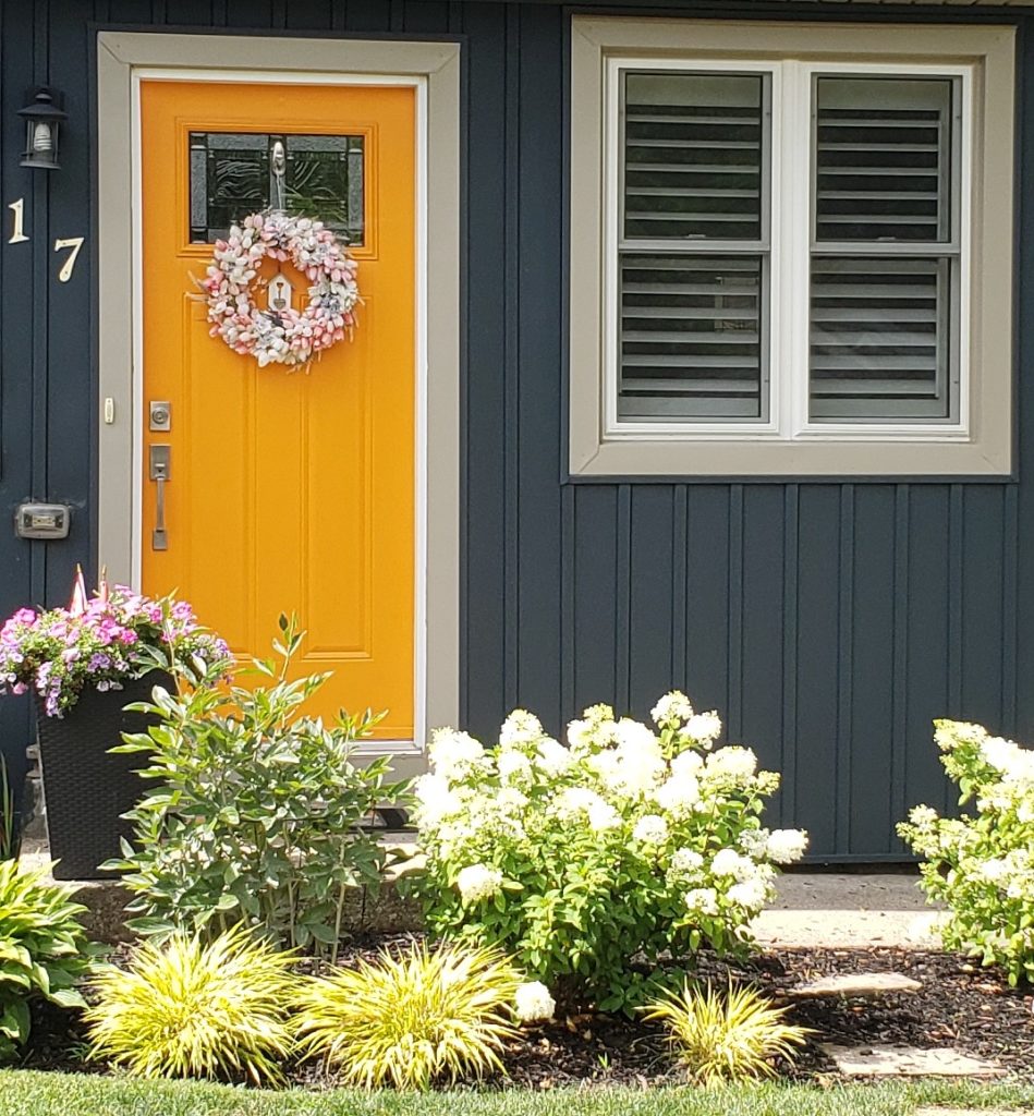
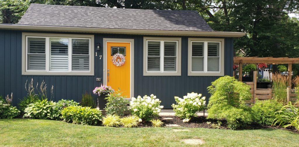
In terms of contrasting colour combinations, this house was my favourite. I’m not a fan of bright yellows, but on this house, I love how it jumps out at you in relation to the blue-gray siding.
Here you can see the charming little house in its entirety. The garden is lovely too and it had an outdoor patio area to the side with a wooden pergola that looked very inviting.
8. Studio Green No. 93 Farrow & Ball
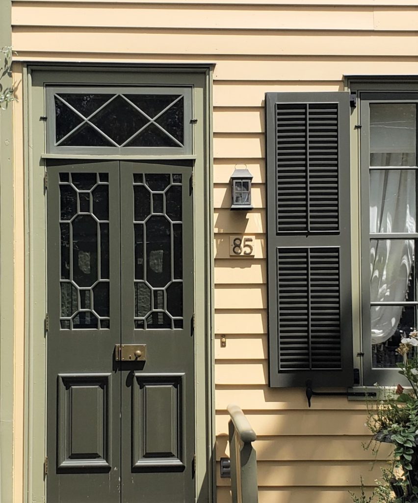
I love green tones, especially a dark khaki tone like the one used on this charming front door and shutters. The entire colour combination is so adorable that I colour matched all three hues with Farrow & Ball paints for you to see below.
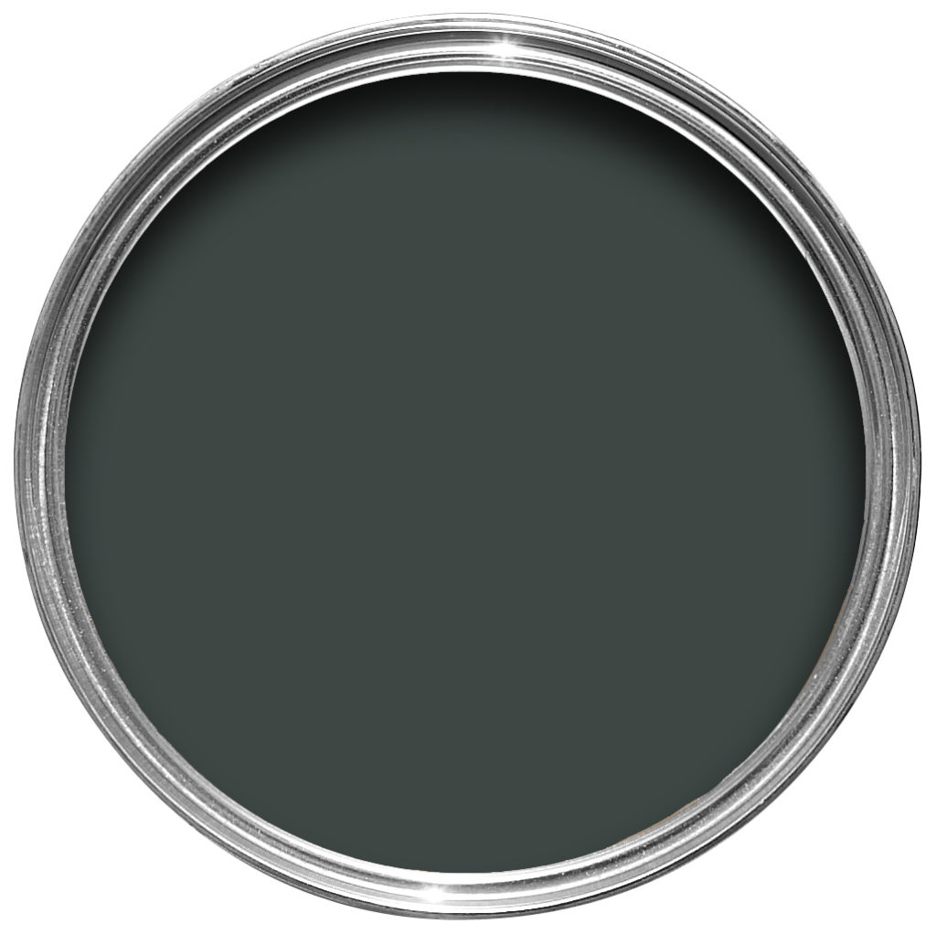
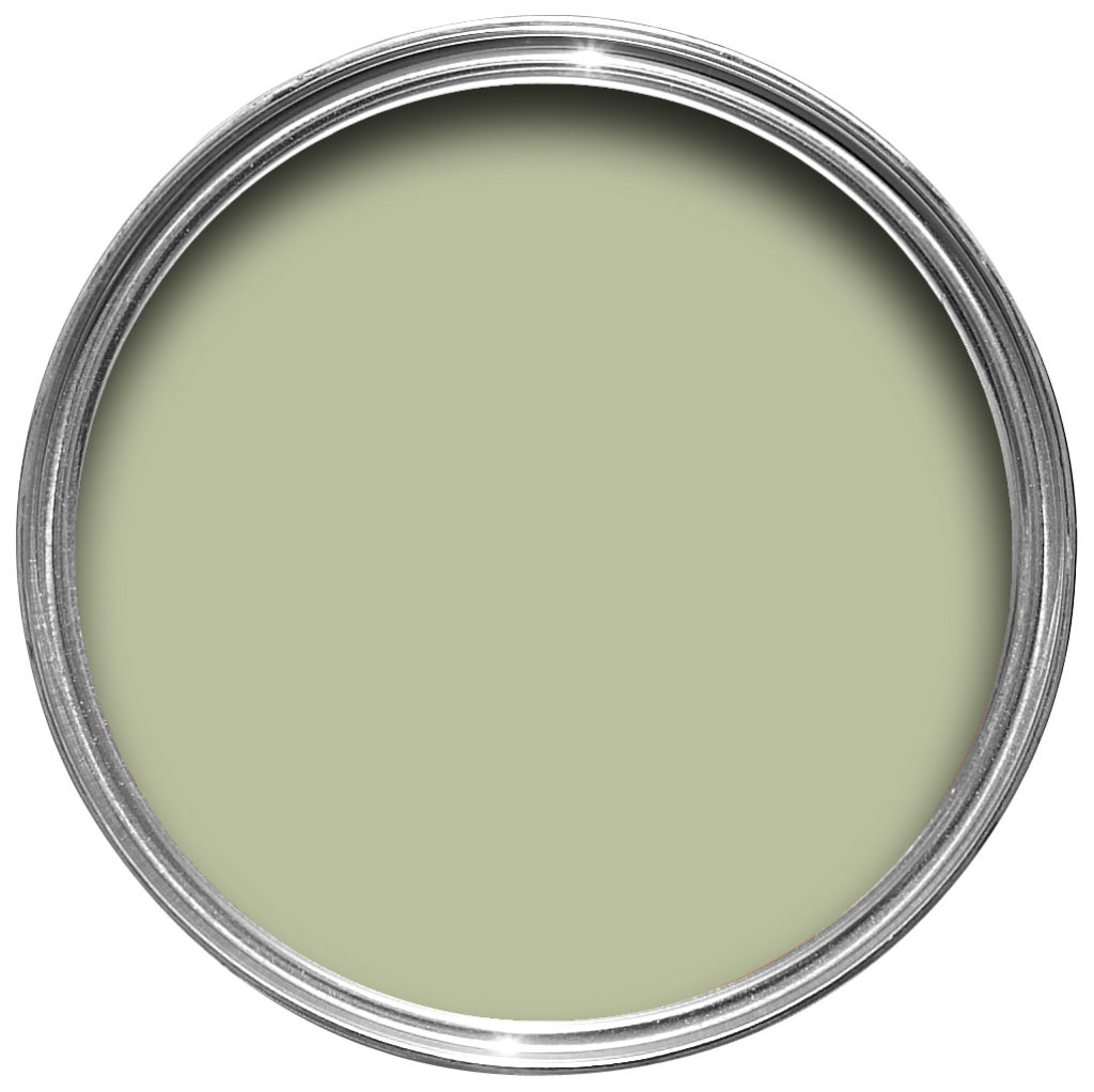
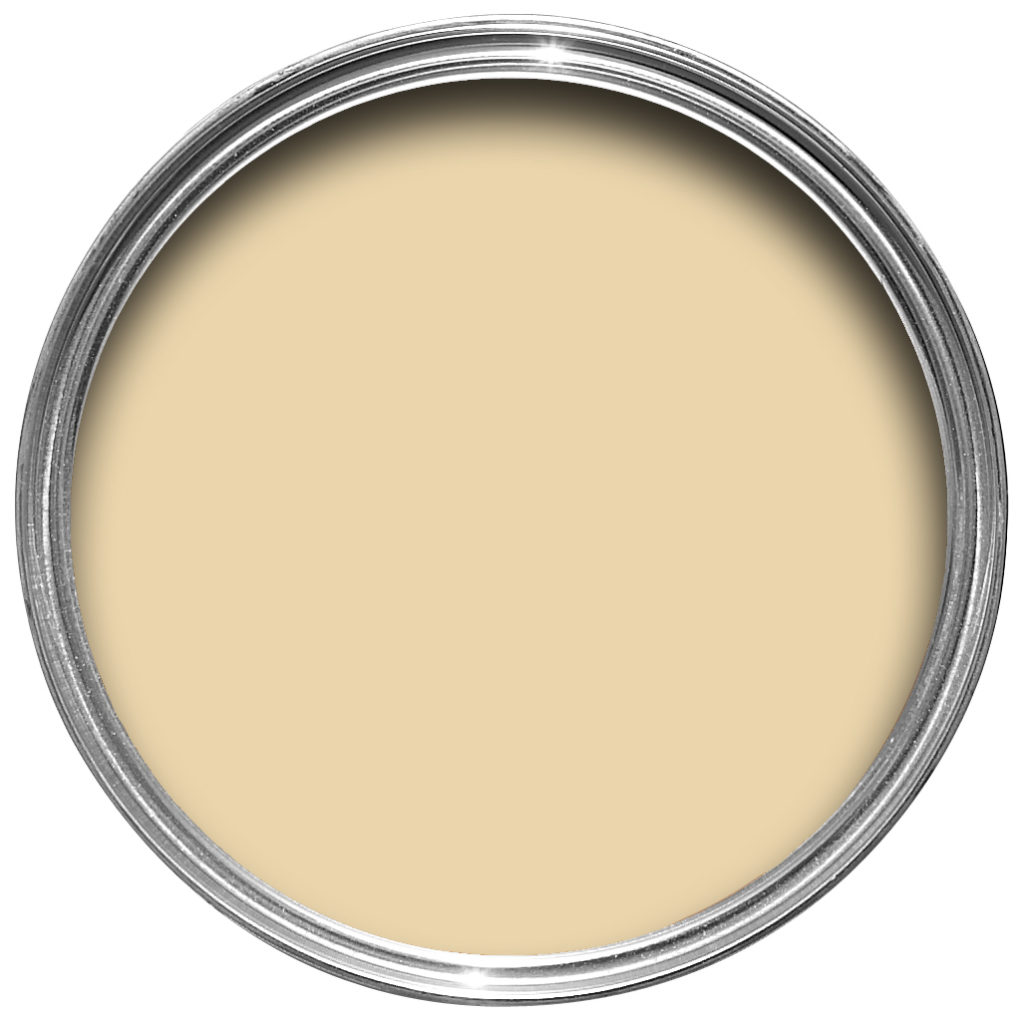
Siding Farrow’s Cream No. 67
9. Hale Navy HC 154 Benjamin Moore
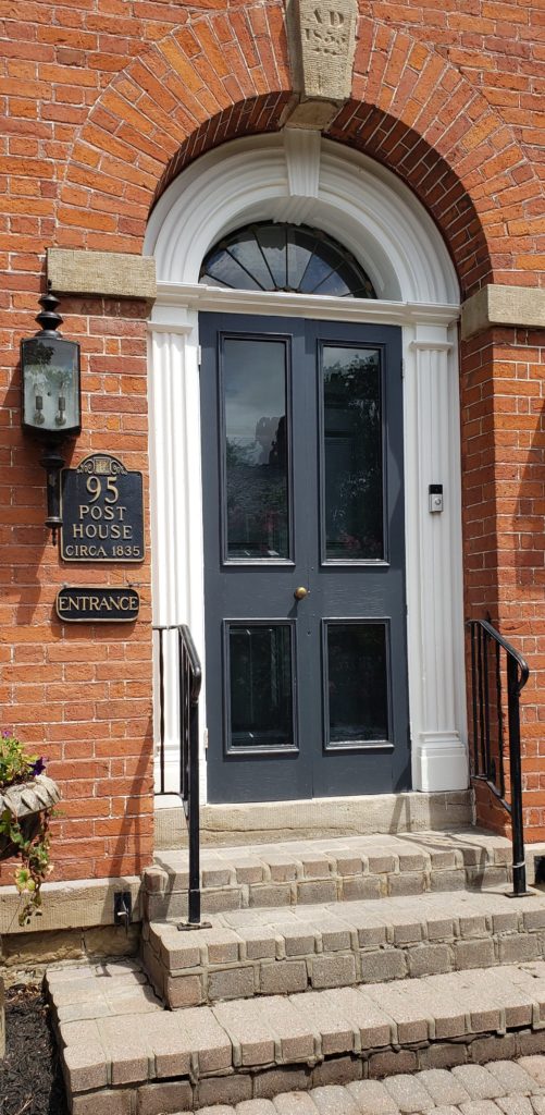
Here we have a classic red brick building with a dark blue door, arched details above and bright white trim. I adore this and the little black signs to the left with the house name and the year it was built.
This front door colour is similar to one of my all time favourite blue colours, Hale Navy by Benjamin Moore.

10. Jet Black 2121-10 Benjamin Moore
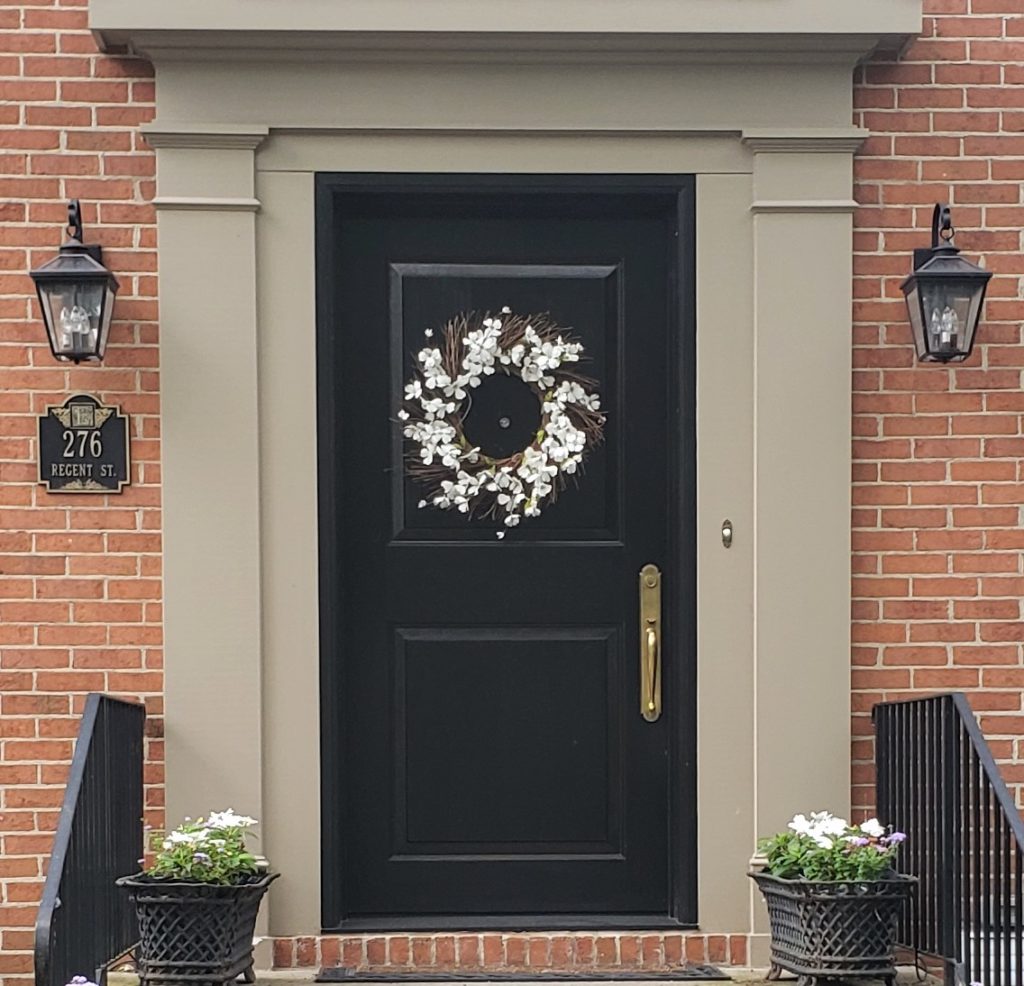
I couldn’t do a post about bold front door colours without including an all-time favourite and classic, pure black.
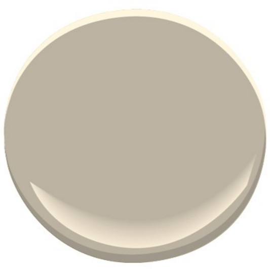
One thing I particularly love about a black door is adding a light coloured wreath as you see on the one shown here from my trip to Niagara on the Lake. Fresh greens are also nice for decorating a black front door on occasions such as Christmas.

I’ve included a paint swatch of Pashmina by Benjamin Moore as it is a close match to the trim you see in the photograph of the jet black front door.
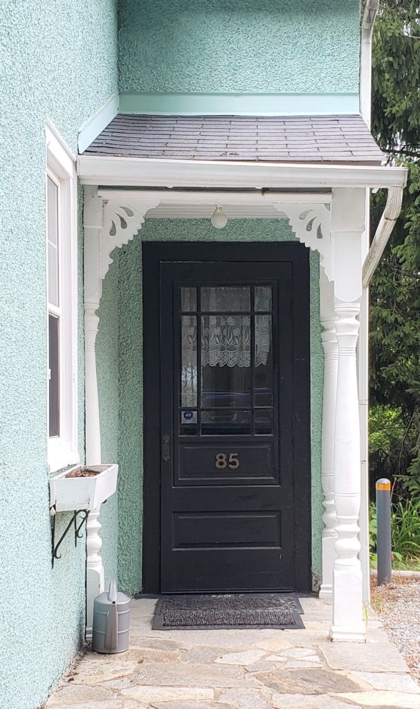
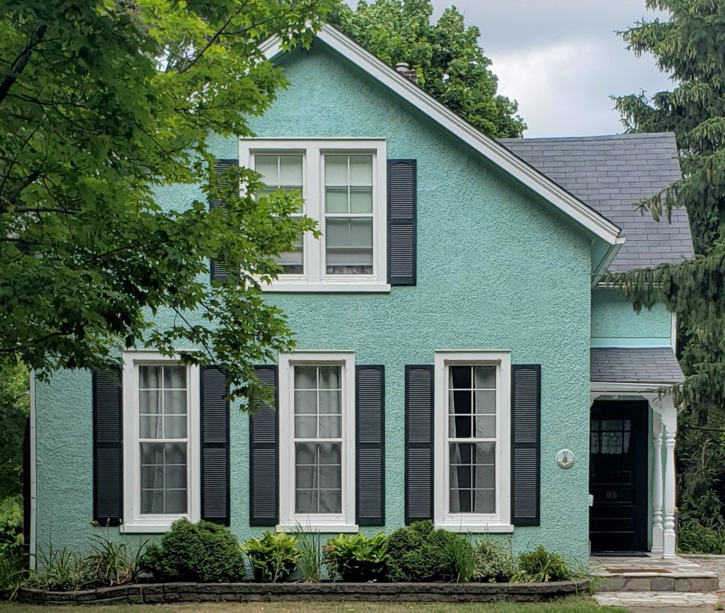
I couldn’t resist adding this second black door that pops off of the light turquoise painted character home with white pillars.
That’s my Top 10 bold front door paint colours from Niagara-on-the-Lake! It was a fabulous time away, I hope you get a chance to visit this charming town soon. Cheers!

Comment below to share which front door colour is your favourite!
Get Colour Confident
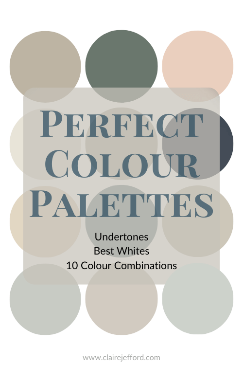
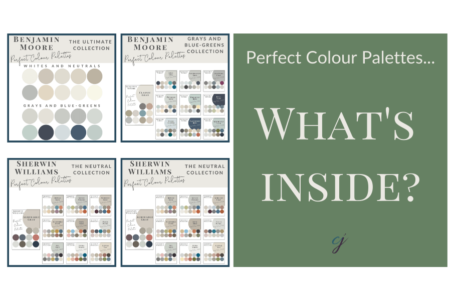
A great tool to have whether you are a homeowner or interior design professional are my Perfect Colour Palette Collections. Check out what’s inside each guide here.
Remember, it only takes one mistake to take your home decorating project from divine to disaster. Don’t let the paint be what stresses you out!
Take my Colour Quiz to discover your Perfect Colour Palette.


