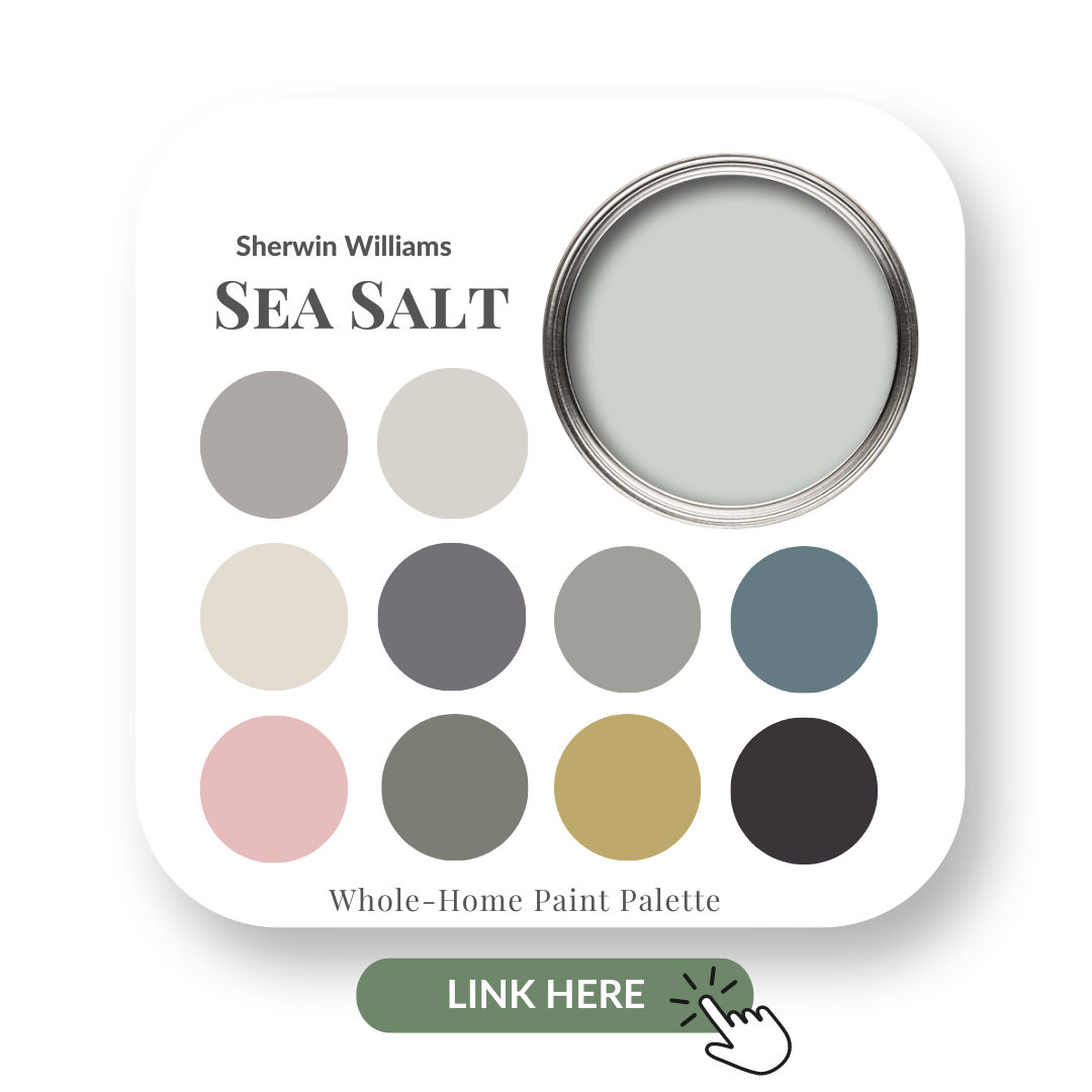
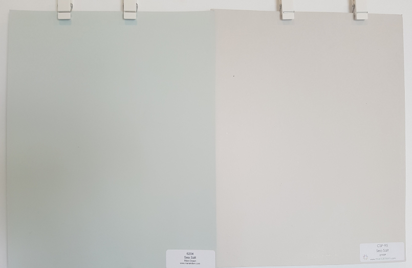
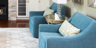
Sherwin Williams Sea Salt
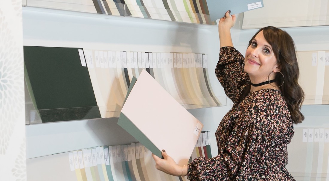
Choose the right paint colour
the first time Let me show you how in just 5 easy steps!
BONUS: The Top 15 Shades of Gray by Benjamin Moore

Sea Salt SW 6204 Williams by Sherwin Williams
Two colours with the exact same name?! Yes!
Be sure not to confuse this Sea Salt by Sherwin Williams with the Sea Salt by Benjamin Moore. They are entirely different. I’ll show you in my comparisons of both colours a little later in the post.

In this colour review video of Sea Salt by Sherwin Williams, I share:
- The undertone of my featured colour
- Colour comparisons in order to easily see the different colour tones
- Best white paint colours for the trim and ceilings
- Beautiful colour combinations to inspire you for your decorating project
After you watch the video, if you would like all this information conveniently laid out for you in one place and have even more paint colour combinations to use with Sea Salt, take a look at my Sea Salt Perfect Colour Palette.
A must-have for any colour enthusiast or design professional!
If you are new to me and my blog, here’s something you should know.
I like to strip down to the root of your Interior Design dilemmas and give you the information you NEED to know.
Decorating your home and selecting paint colours can be confusing and stressful.
My goal is to make it as simple as possible and to have FUN in the process!

But know this: I am not scientific about colour.
I do not concern myself with the LRV of a paint colour. Since starting my Interior Decorating business in 2011 and doing many colour consultations, it’s never come back to bite me in the you know what.
I never make suggestions on lightening or darkening a paint colour by a certain percentage to make it more suitable for an application.
I can always find the best paint colours for my clients.
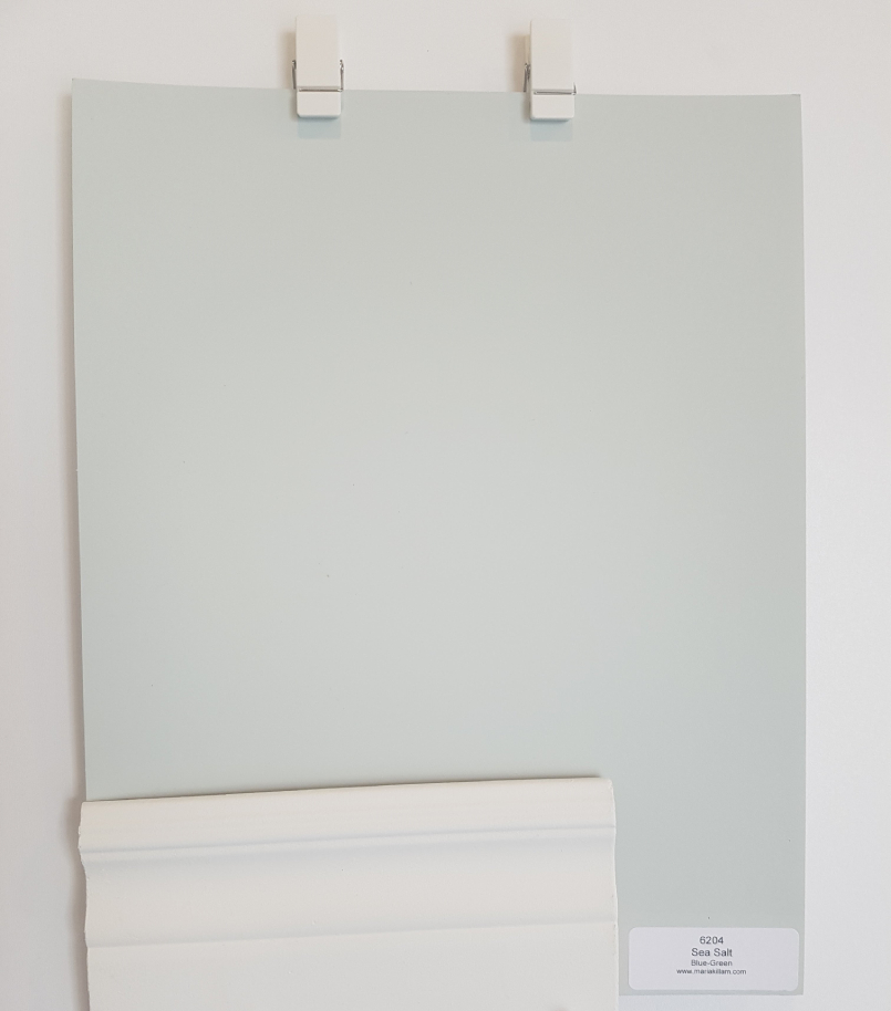
All of my large boards have been painted in a matte finish and if you are interested in knowing where to get these boards, I’ll share a link to them at the end of the post.
Sea Salt by Sherwin Williams Colour Review Video
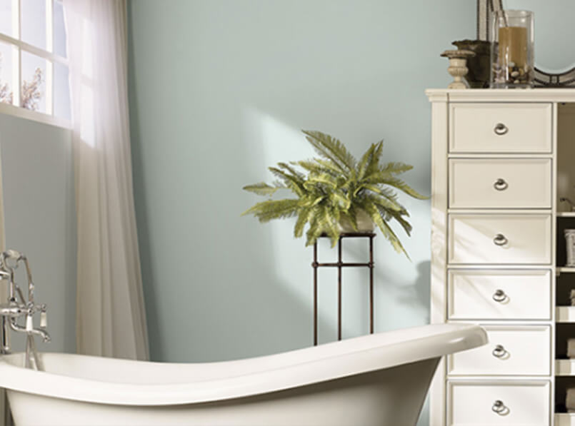
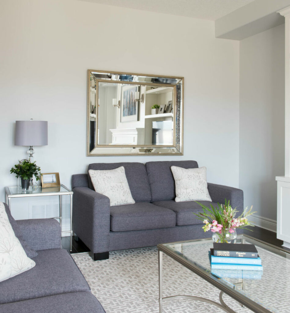
Undertones: Blue/Green
In my office, Sea Salt appeared to look more green, but there is also a blue undertone.
This is where your lighting and other elements within your own space can alter the look of a hue like this.
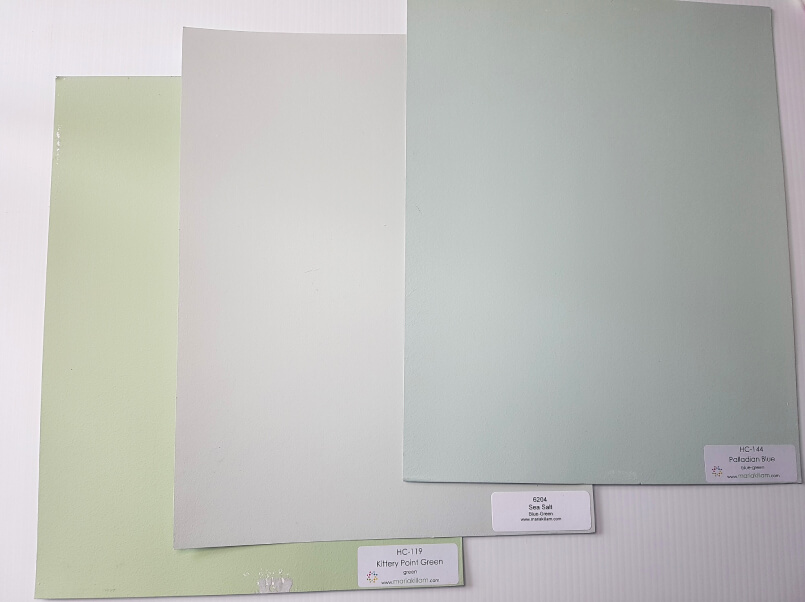
Colour Comparisons:
Kittery Point Green HC-119 & Palladian Blue HC-144
Comparing colour is so important. When you do colour comparisons, it helps you to get a better read of your focus colour. I also like to put my large colour boards up against a white background. This way, I can see the colour more clearly.
See below where I show you Kittery Point Green by Benjamin Moore (BM) on the left and Palladian Blue by BM on the right.
It’s interesting how much of a light gray tone Sea Salt takes on when you compare it with colours that are more saturated in tone.
Best Whites To Pair with Sea Salt
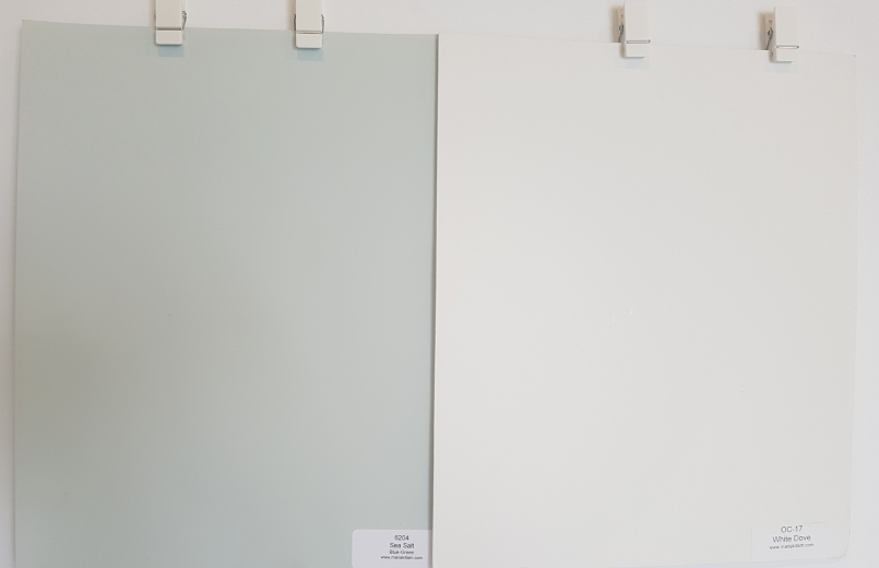
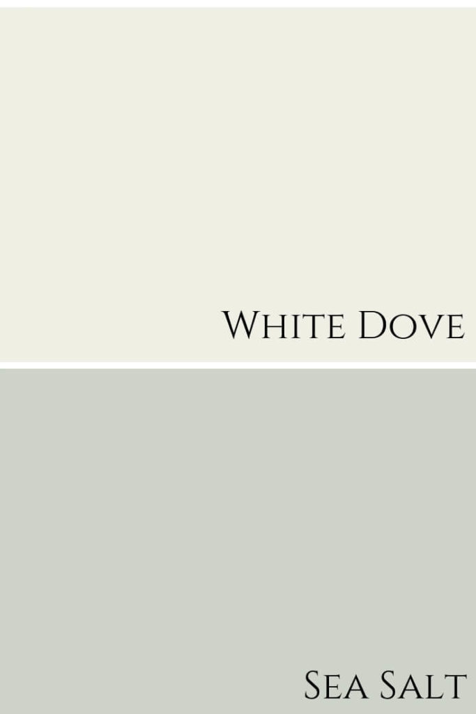
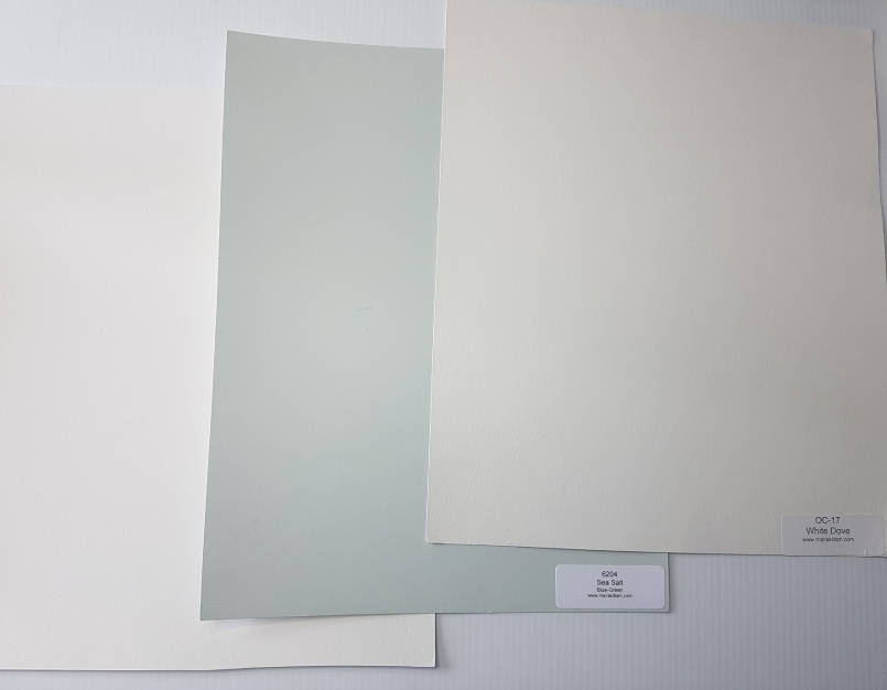
White Dove OC-17 by Benjamin Moore
There is always going to be more than one option for the best white to use for ceilings, doors and trims.
Pictured below is one of my favourites, White Dove by Benjamin Moore.
Simply White OC-117 by Benjamin Moore
If you want to pair Sea Salt with a Sherwin Williams white, you could use Greek Villa SW 7551 or Westhighland White 7566.
The latter is more on the creamy side, so be careful if other elements in your home like countertops or fireplace stone are more of a crisp white.
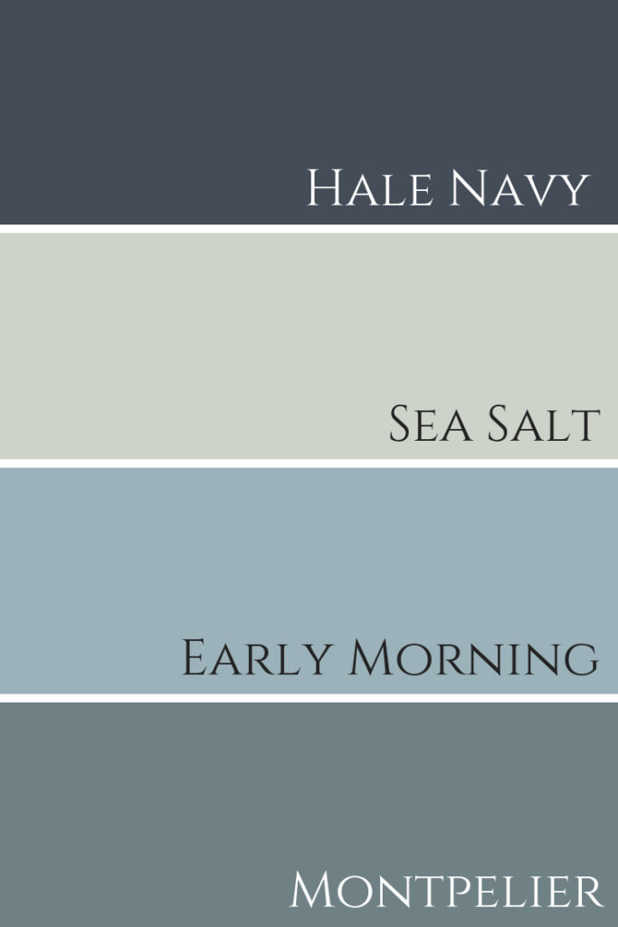
Fabulous Colour Combinations
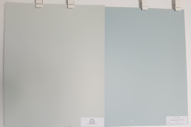
Wedgewood Gray HC-146 by Benjamin Moore
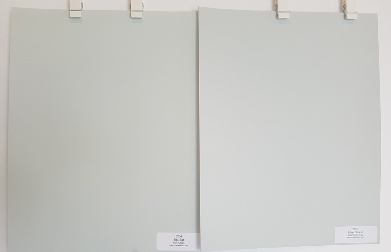
Silver Strand by Sherwin Williams SW-7057
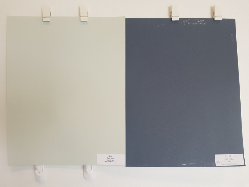
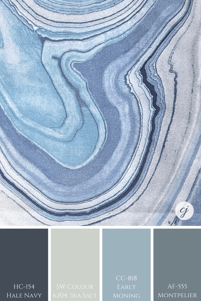
Hale Navy HC-154 by Benjamin Moore

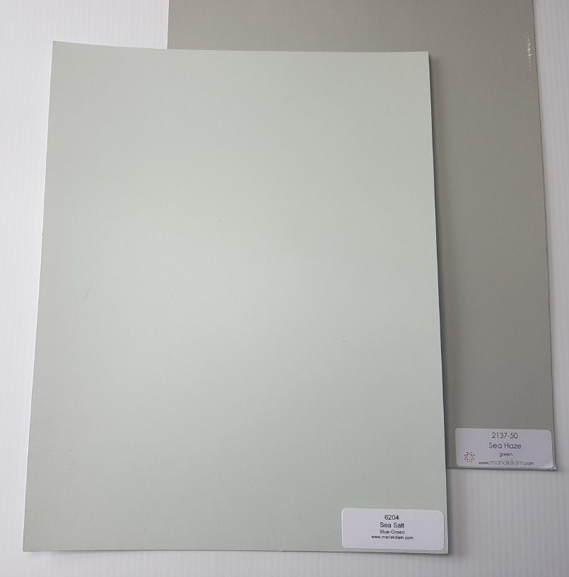
Sea Haze 2137-50 by Benjamin Moore
See how beautiful this entire colour palette is below.
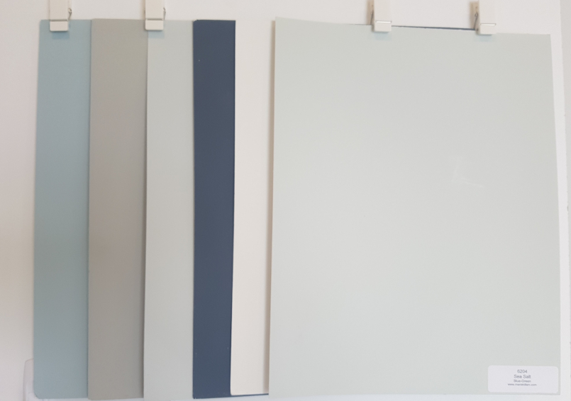
I worked on a client’s home in Toronto where we used three of these colours together and it turned out amazing.
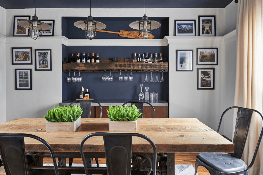
Hale Navy was used in the dining room in the alcove and the ceiling and White Dove on the walls.

We continued the flow into the living room repeating the Hale Navy shade in the bench seat and painted the walls, Sea Haze.

Before we get to even more pretty palettes, have you taken my Colour Quiz? See which Palette best suits your design style.
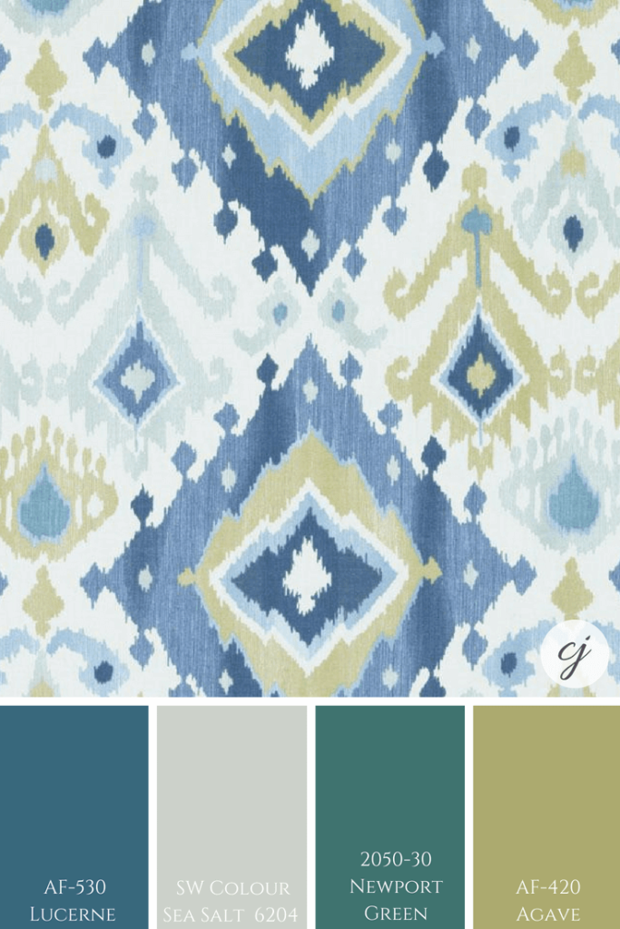
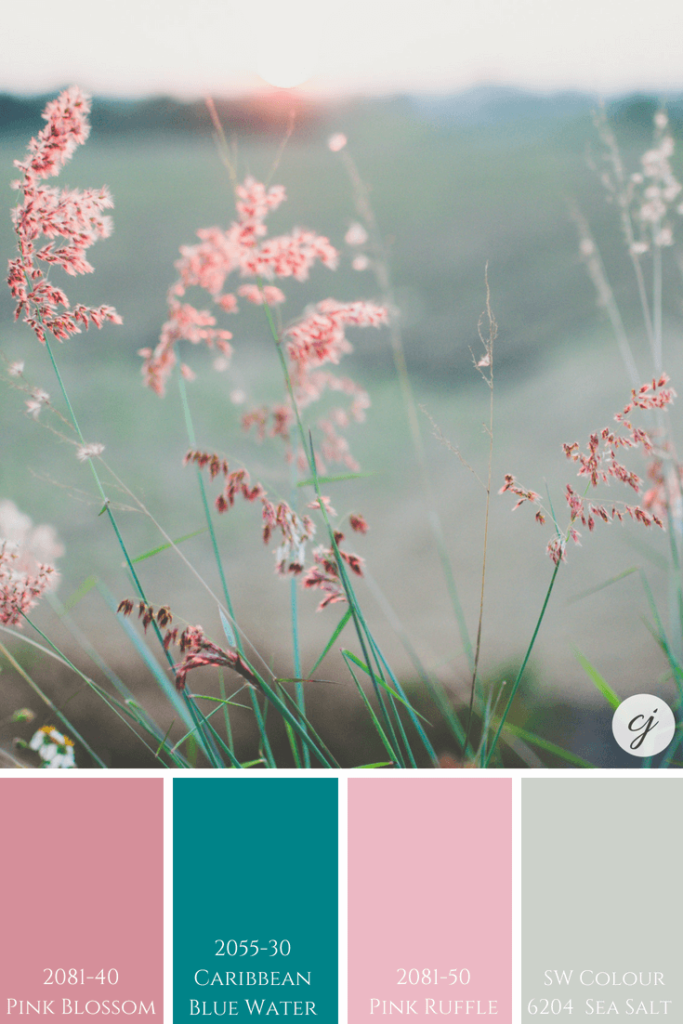
Fabulous Palettes – Perfect for Pinning!
Fun Fact
As already mentioned at the beginning of the post, there are two colours called Sea Salt. One is the Sherwin Williams colour I’m reviewing here and the other is from Benjamin Moore.
To ensure you avoid any mistakes of either picking up the wrong colour for yourself or for your client, (if you are an interior design professional or colour consultant) always write down the name AND the code once you select a paint colour.
As you can see in the photo below, these two colours are very different. The Sea Salt by Benjamin Moore is a ‘Greige’ colour and the other Sea Salt…well, you know all about it now because we’ve just reviewed it!
Similar to Sea Salt
Wickham Gray by Benjamin Moore is also a pretty blue-green and is similar to Sea Salt by Sherwin Williams. Here you can see where we used it in a clients custom living room design.
See the full portfolio of this clients living room and dining room here.
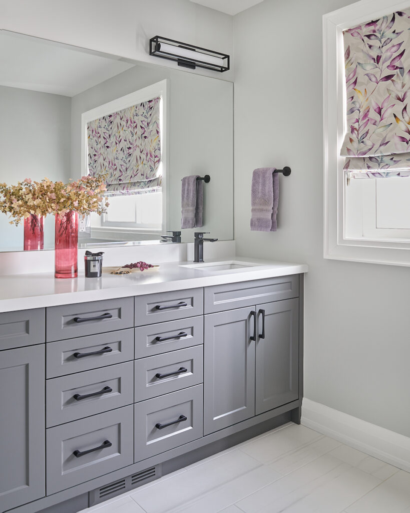
Gray Owl by Benjamin Moore is also a colour with a blue-green undertone. We used it here in a client’s bathroom.
Convenience At Your Fingertips
For more colour combinations that look fab with Sea Salt plus colour comparisons and best whites be sure to check out the Sea Salt Perfect Colour Palette.
See all colours in our Perfect Colour Palette library here.

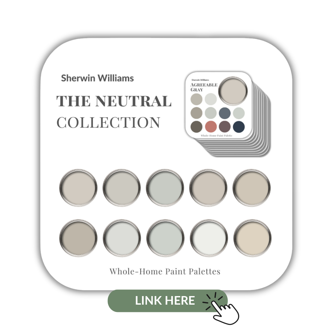
I’ve also included Sea Salt in my Sherwin Williams Neutrals Collection. This collection of 10 popular Sherwin Williams neutrals is a great resource and deal.
Remember, it only takes one mistake to take your home decorating project from divine to disaster. Don’t let the paint be what stresses you out!

Take my Colour Quiz and discover your Perfect Colour Palette.


Darla Powell
| 2 September 2018Love this color! Thank you for your in-depth review and observations. ?
Claire Jefford
| 2 September 2018So pretty right?! Cheers for stopping by!
CK
| 2 September 2018It’s such a pretty color, and I love your palettes with the pretty images showing all the complimentary colors. It really works in so many settings!
Claire Jefford
| 2 September 2018Agree! It’s so calming and soothing, works well with many colours. I could’ve easily created 100 more palettes! Thanks Christine.
Rebecca
| 2 September 2018Sea salt is one of my favorite. Just used it in a master bedroom project.
Claire Jefford
| 2 September 2018Oh, sounds lovely Rebecca! Please feel free to private message me a photo if you would like it to be featured in another upcoming video I will be publishing on Sea Salt by Sherwin Williams, to show this colour in finished spaces. Thanks!
Mary
| 17 February 2019I am also painting my master bedroom sea salt. What color did you paint the master bath?
Claire Jefford
| 25 February 2019Hi Rebecca. I’m not sure what master bath you are referring to here. The one on the post that I featured is from another designer and it was painted Sea Salt.
Julie Lampe
| 2 September 2018I adore Sea Salt!! It’s one of my favorite “go to” colors for a coastal palette! I also love BMs Newport Green! I found some great barrel chairs in the garbage and had one of my favorite painters spray them in Newport Green! Great post!
Janet Lorusso
| 2 September 2018Such a great calm color – perfect for so many applications! I love all the pairings you did – it really does ‘play well with others’!
Claire Jefford
| 3 September 2018Thanks Janet, it really is a beautiful colour tone. 🙂
Susan Okray
| 6 December 2018I’m painting my bathroom Sea Salt and high on the walls it looks very blue but down low on the walls it look like what is’s supposed to, Sea Salt. I’m going nuts because I don’t want the blue!
Claire Jefford
| 18 December 2018That is extremely odd. Have you looked at it at different times of the day? It may just be the lighting or some sort of reflection? I’ve never heard of anything like this. Please let me an update when you can. Thanks.
Sue Pitts
| 11 July 2019I have had the exact same experience with sea salt in my kitchen and breakfast room. It’s robin egg blue on upper wall and gray on the lower. I am so upset because I planned my entire color scheme around sea salt. I had painted white board and everything! What happened? Different light doesn’t change it! I have east facing window in that room.
Claire Jefford
| 16 July 2019Hi Sue. I actually experienced something similar recently with Cloud White. A pantry of my clients is painted this colour, but the crown molding of the unit looks different. We believe it’s because of the angle of the crown vs the flat cabinetry below and may also be affected by the natural light that comes in from her large back patio doors. However, it’s never happened before so I don’t have any definite answers for you I’m afraid.
Angela Rose
| 12 January 2019How would sea salt work in an East facing kitchen/breakfast nook with dark stained cabinets? I want warm but not so much that it feels cave like later in the day when there is no direct sun!
Thanks!
Angela
Claire Jefford
| 19 March 2019Hi Angela. If you are worried about the colour being dark in your space with the cabinetry, test a large sample piece first and move it around this area at different times of the day to see how it plays off the light.
Cynthia
| 2 March 2019I love sea salt painted my living room and kitchen this color. I painted the path krypton and two guest bedrooms a crisp blue the hallway in sea salt looked dirty. Everything is open so I was looking for a color for entry hall and dining room that will work but let the sea salt stand out. Wanting a calm beachy look. I tried knitting needles too dark and tried front porch but it seemed to take on an odd green next to sea salt. I loved your boards still not sure what will work for my dilema
Claire Jefford
| 2 March 2019Hi Cynthia. There is too much to consider here in terms of other decorative and fixed elements in the space to simply give you the answer you are looking for without knowing more details or seeing the space. In this post I provide quite a few ideas for colour combinations, did you look at any of those colours? If you are interested in an online colour consultation, please message me at info@clairejefford.com. Thanks Cynthia.
Lisa
| 17 April 2019Hi Claire. I have painted my office/guest room and spare bathroom Sea Salt and love it! I have a question regarding ceiling color. The previous owner’s painted the ceiling and crown molding the same color, so the crown molding just blends into the ceiling. They are painted Sherwin Williams Swiss Coffee. Would you be able to recommend a ceiling color? Should I use 20% Sea Salt / 80% White?
Pat Curcio
| 20 May 2019Reading your extremely helpful information and tips on Sea Salt by Sherwin Williams helped me to select the PERFECT color for our new sunroom. We love it and it is the best paint color we could have imagined for this relaxing and peaceful room.
I have never heard my husband rave about a paint color as he has Sea Salt once our room was painted this this soothing color.
With gratitude! Pat
Claire Jefford
| 20 May 2019This is FABULOUS to hear! Thanks for sharing Pat!
Boyd Landas
| 2 November 2019Would you recommend Sea Salt on a kitchen island? We have white cabinets. The kitchen, dining and living room all are painted Olympus White SW. It’s an open floor plan overlooking a bay. So it’s waterfront and coastal.
Claire Jefford
| 2 November 2019Absolutely you could do Sea Salt on an island. That sounds especially pretty in a coastal styled home. Exciting!
Jennifer C Clark
| 16 June 2019So if I want crisp colors to pair with sea salt, which white would you say is best? And you can pair this with gray hues with tile?
Claire Jefford
| 19 June 2019Hi Jennifer. For a more crisp white to pair with Sea Salt you could use either Chantilly Lace from BM or Extra White from SW. When selecting paint colour for tiles, be sure you can see them together, holding the paint sample vertically as it will be applied on the wall and the tile horizontally. When you position them in the context they will be applied, then it helps give you a more accurate reading.
Susan
| 25 October 2019I love SW sea salt. I’ve used it in multiple properties: 1. In a villa where the entire interior was sea salt. Even the top cabinets were painted sea salt and bottom cabinets were a gray. 2. My current home, guest bath. 3. My new home master suit including en suite. (Currently renovating) I love the look with 52 white trim – it’s so fresh and bright 4. Beach condo is sea salt and repose gray.
Claire Jefford
| 26 October 2019You really do love this colour Susan! Thanks for sharing all the places you’ve used it.
Carolyn
| 27 October 2019I am in the process of repainting the main living area. Having my dark kitchen cabinets painted white and trying to decide wall color for kitchen, dining, hall and laundry room. Sea salt or BM quiet moments. Open to living room so need a not too stark white. Has double tray ceiling that we will paint the contrasting color of the kitchen to tie it all in. Thinking white dove or similar. Any advice?
Carolyn
| 27 October 2019I am in the process of repainting the main living area. Having my dark kitchen cabinets painted white and trying to decide wall color for kitchen, dining, hall and laundry room. Sea salt or BM quiet moments. Also painting living room so need a not too stark white. Has double tray ceiling that we will paint the contrasting color of the kitchen to tie it all in. Thinking white dove or similar. Any advice?
Claire Jefford
| 31 October 2019Hi Carolyn. This is hard to say without seeing the space. Do you have my Free guide with 5 steps to choosing the right paint colour? If you follow those steps, then it should help you to narrow down your choices. Always look to your fixed elements in the space as well. I have a lot of other colour reviews on my YouTube channel and my new Essential Colour guides on my shop page. Link to my free guide is here –> https://clairejefford.com/ccd-freebies/
Rachelle
| 4 November 2019My whole house trim is off the shelf BM White. Would this be too stark for Sea Salt? Thanks.
Claire Jefford
| 12 November 2019I am not sure what BM off the shelf white looks like, so I’m afraid I can’t provide an answer on this. Check with the paint swatches in the store and bring them home to see if they would work well together. I always recommend painting a large sample board to see best results. Thanks.
Kim
| 3 March 2020I have Sea Salt in my kitchen/eating area, my pantry and master bath. It shows up differently in each area and we love it! Now, my college age girls want it in their bedrooms. One faces south and one west. They both want yellow on the accent wall. My question is what shade of yellow goes well with Sea Salt? There is a small dresser pictured above with one drawer painted yellow. I think it looks good but no mention of color name. Any suggestions before I head to store this weekend?
Claire Jefford
| 9 March 2020Hi Kim, you may have already been to the paint store by now, which is what I would recommend anyway. Take any finishes in the girls rooms that have yellow, such as a pillow or drapery fabric and see which yellow works best with both the fabric/finish and Sea Salt.
Fran
| 12 March 2020I’m trying to test with BM MATTE BATH SPA. I wonder what it will be like Sea salt 50 percent lighter? More blue or green? I wish I have formula for BM.
Claire Jefford
| 14 March 2020I never alter a paint colour, there are so many options that you can always find just the right one for what you need.
llnjrdn
| 14 March 2020I am planning on using sea salt on one wall of my living room where there is a wall unit. I would like to use a soft neutral color on the adjacent walls and really like cre’me SW7556. Would that color combination go well? Otherwise I was thinking of Greek Villa sw7551. Which would you recommend? Thank you!
Claire Jefford
| 14 March 2020Hey there. We have our Essential Colour Guides that give you 10 options for coordinating colours to use with Sea Salt. You can find out more here –> https://clairejefford.com/product-category/essential-colour-guides/ Thanks for reading my blog!
Beth Weber
| 17 March 2020Loved this post! We bought a tiny 100 year old disaster of a house in July (because it’s on half an acre, 2 blocks from the beach – impossible to find in this area) and tomorrow is demo day on the interior and then we are putting on an addition. The house is going from a 2 bed, 1 bath to a 5 bed, 4 bath and I was planning to use SW sea salt in one guest bathroom with calacatta marble floors and matte black fixtures, white marble countertop. I’m trying to decide if I want to paint the vanity or leave it white. Any thoughts? I also plan to have all painted cabinets in the kitchen (the kitchen is going to be 12 x 20 so large enough to go with something bold). I’m torn between a few blues – I love F and B Stone Blue but afraid it might be a little dark. Decisions, decisions! I loved your color combos though, thanks so much for posting.
Claire Jefford
| 23 March 2020Hi Beth. It’s hard to say without seeing everything together. What I will say though is that it sounds as though white would be a lovely option for the vanity. Sounds like you will have a lot to keep you busy with your new (but old) home. Cheers for reading the blog!
Lindsay
| 7 April 2020I have an orangey oak color flooring and have been looking at sea salt for my kitchen which has white cupboards. Do you think seasalt would be complimentary wall color to the area? Also, do you think white dove would work well on the walls in the living room area (same orangey oak flooring) and have a smooth transition to the kitchen?
Claire Jefford
| 8 April 2020Do a test sample of a large painted board. See if it works well with your floor and other elements in the space. Hold it upright and place a white board behind it and move it around the room at different times of the day, so you can see how it will work before painting the entire room any colour.
Malvina
| 27 April 2020Hi Claire, would you recommend sea salt in a basement ?
Claire Jefford
| 27 April 2020Of course Malvina! Remember that choosing the right paint colour is all about ‘listening’ to your fixed elements and then the soft decorative pieces in a space. If Sea Salt is the best option then it will work beautifully. Do you have my Top 5 Tips for Choosing the Right Paint Colour the First time? It’s free, you can get it here –> https://clairejefford.com/ccd-freebies/ Cheer for reading the blog!
Linda
| 7 June 2020Would sea salt be a good color for a small powder room with a very small window and battleship gray vanity?
Claire Jefford
| 7 June 2020Hi Linda. Battleship gray tends to be a dark blue gray, so it should create a nice contrast. However, I always advise that you check first by looking at the colours together in a space with paint chips…large painted boards are even better.
Claire
| 7 June 2020A couple of comments: a few people said that the paint color looks different high up on the wall vs low. I had a Benj Moore yellow-beige in my kitchen with white cabinets and Absolute Black granite countertop. Above the wall cabinets towards the ceiling, the color looked true and pretty. Between the upper cabinets and the counter it looked drab and drained of color. It took me 3 years to realize that the black countertop was reflecting and changing the wall color below the wall cabinets. Similarly, a color I used in a small bathroom with a tall 10 foot ceiling, the color intensified near the top because the walls (only 3 feet apart) were reinforcing the color to each other up there, while the white vanity and toilet were not reflecting extra color down in the lower part of the room. The different angles of light and reflections can make the top and bottom of a wall look a different color.
Claire Jefford
| 8 June 2020Hi Claire. Yes, this can happen sometimes. I noticed it on crown molding of white custom cabinetry in a clients home and was suprised to see the difference with the angled crown. My client was fine with how it. It’s difficult to factor in every single factor that may affect colour. It’s never been an issue that I’ve had to deal with and alter a colour because of it personally, but there will be the odd occasions that a colour does not look as you intended it to when it goes up. Thankfully that is few and far between, at least in my own experience. Thanks for sharing your feedback Claire!
Theresa
| 3 August 2020We have installed a lot of white marble in our bathroom with blue & gray veins – even some green. I was planning to use Sea Salt on the walls. That is until I found a strip of marble arabesque tiles in Wedgewood blue & a dark gray to run across the top of the marble counter. Can this beautiful Wedgewood blue color coexist with the Sea Salt (cabinets are white)?
Claire Jefford
| 10 August 2020Hi Theresa. You will need to look at the two together in your space to see if they are a good combination. It all sounds very lovely!
Jennifer
| 4 September 2020I’m starting a bathroom remodel next month. I had wanted to have my cabinets painted gray and use sea salt on the walls. Do you have any suggestions for gray’s that would go well with sea salt? I was thinking something in the med-dark shade?
Claire Jefford
| 4 September 2020Hi Jennifer. Your bathroom remodel sounds exciting!! There are so many beautiful colours to pair with Sea Salt. In my Essential Colour guide of Sea Salt, I share 10 coordinating colours, as well as the best whites for trim and a tip sheet on how to choose colour. You can learn more about that here –> https://clairejefford.com/product/sea-salt/ Good luck with your project!
Jennifer
| 6 July 2021What’s your thoughts on SW Sea salt for an exterior cottage by a lake?
Claire Jefford
| 16 July 2021Hi Jennifer! I think it’s a great option, especially by a lake to give you a real soft coastal feel. Just be sure to check the colour with any current stone, brick or siding to ensure it will work with those fixed elements. And always do a test with a larger board sample to see if you like it as much outside as you do on a paint chip. Good luck!
Kathy
| 23 August 2021Great post!!! Trying to find a colour for my front door as it needs a much needed lick of paint. Our house, cira 2003, has sand colour siding and teal trim. The trim colour is a darker version of Agean Teal. How would sea salt look with this? Or would something like BM’s Sea Salt be a better choice. We have black railings on our porch, darker sandy/grey colour floor on the porch, and we have some rock work beside the teal trim which has charcoal and grey colours with a hint of the sandy colour of the siding. The Soffits and eaves, a column and our rain downspout are also this teal colour. Perhaps just leave the door white painted in a beautiful soft white?? There is a lot going on already! But… I am going to go for sea salt in our small upstairs bathroom! Painting out the cabinets BM’s Cotton Balls (we already have a large can of it I can use) going for white cabinets and a light or white countertop. This bathroom is soooo small or else I would paint the cabinet Hall Navy!! In the master ensuite, I really have this etched in my brain…. and am going to note down your colour combos. Now to get this to all work together with the Shaker Beige with Cloud White trim throughout the rest of the house!!! (insert smile emoji)
Claire Jefford
| 8 September 2021Often less is more, so maybe the soft white is the way to go with your front door. And don’t be afraid to paint a small room a dark colour or the cabinet, as long as your lighting is decent, it shouldn’t feel dark. Moody and dramatic is how I like to describe that look. And in a powder room, you don’t need much light so you could make a bold statement there with a deep colour. Good luck Kathy and thanks for reading my blog!
Wayne
| 14 November 2021To those taking issue with SW Sea Salt or any other color “changing” based on angle, the most likely culprit for this is the use of high efficiency light bulbs. They typically emit light in the 4500-6000 Kelvin range which is a pure white to bluish white. However most incandescent bulbs are in the 2700-3500 range which is a much warmer golden light. The latest LED bulbs are now available in the lower spectrum without looking like the copper tones street lights in residential neighborhoods. Ugh! I have found that if it’s not a smart LED bulbs with customizable white light settings (preferred and cheap on Amazon) then I always opt for warm white. You may think soft white is the reasonable choice but soft white still pulls from the bluish Kelvin range. Warm white and no more than 7 watts. An LED of 9+ watts will feel like you’ve come out of a cave and stepped onto the sun itself. Too powerful and will wash out any paint color. Summary: LED, not fluorescent, bulb that is warm white (3000k is my favorite) putting out no more than 7 watts will help you reclaim the love you had for your paint choice.
One last thing to consider that is often overlooked is sheen (flat, eggshell, satin, semi-gloss etc). Rule of thumb is the higher the luster the less reliable results trying to achieve the true hue. The glossing sheens reflect light. While this is desirable in certain instances and necessary in some (you’d be brave to paint a kitchen or bath in flat paint), the paint color will surely be tinted by the reflected type of light. So a pure white, semi-gloss will appear cool and bluish in fluorescent lighting and warm and natural with late afternoon sunshine. The cure to minimize this is to use the least amount of sheen as you can get away with. Best advice, eggshell. You can’t go wrong. It’s washable and provides a “barely there” reflective sheen in which the color chosen won’t be easily skewed by different light sources. I worked as an on site cor consultant for Sherwin Williams some years ago and part of our training and troubleshooting was being able to understand all the elements to go into reproducing color correctly in your space vs what you see in the store on small chips. And hands down, luster is almost always overlooked as a contributing factor to color going awry. Pro tip: for DIYrs, try Sherwin Williams Cashmere labeled paint. It’s perfect for living rooms and bedrooms because it’s a softer formulation that reproduces colors beautifully but better still, it has self leveling agents added. Meaning, that as it dries, it literally levels out and continues to spread out slightly so that areas that you were more heavy handed on with the roller will look just like the areas that you were not as generous. It creates a lush, splotch free finish that is perfect for the amateur weekend warrior. It’s also a bit thicker than most paint formulations. I love this because it won’t easily splatter or drip. While not intended for kitchens and baths (try SW Emerald or Duralast for those), Cashmere has always been true to its namesake every time I have used it on my home. Hope all this info helps someone to not be in love with their latest color adventure. But, hey, in truth it’s just paint. It’s the easiest and cheapest way to transform a space. So if you goof, don’t sweat it, there’s a million other colors out there for only about $40 a gallon. Be brave and informed 🙂