How To Choose the Right Paint Colour
Choose the right paint colour
the first time Let me show you how in just 5 easy steps!
BONUS: The Top 15 Shades of Gray by Benjamin Moore

The biggest mistakes I see in residential design are related to colour, hands down!
Whether it’s incorrect choices in the undertones of paint colours, mismatched colour tones in counter and flooring, or home owners trying to introduce the now popular cool grays with their fixed elements of warm and beige finishes, I’ve seen it all.
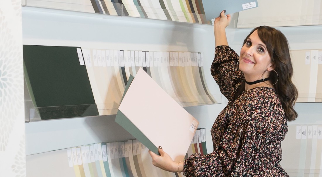
In this post I share tips on ‘How To Choose A Paint Colour’ by using large sample boards. I always encourage clients to get the largest samples of finishes that they can when trying to make informed decisions about choosing finishes for their home.
Stop Using Small Paint Chips!
Look at the difference in my large painted board in comparison to the chip colour in my Benjamin Moore fan deck. It really is no wonder mistakes are made in choosing paint colours so frequently when this is how most people pick a colour for an entire room.
I can’t imagine choosing the largest area in square footage of a room based on the smallest sample ever! If you are a colour consultant and you are still using small paint chips to specify colours for your clients, shame on you.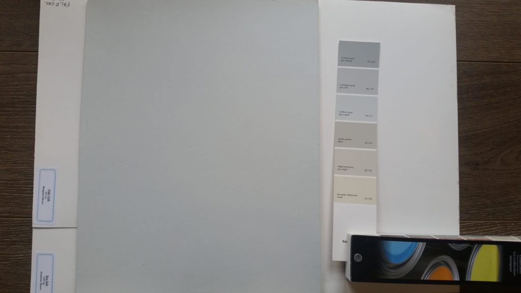
While shopping with my client to select finishes for her kitchen design, I brought all 150 of my large paint samples. We chose the counter top first, then the cabinet & island colour, followed by the subway tile for her backsplash and lastly, the paint colour for her walls.
In the photos below, it’s clear to see with the large painted board how the island and cabinet colour we choose work wonderfully with the tones in the sample of our Cambria Countertop (shown in the bottom right of the photo).
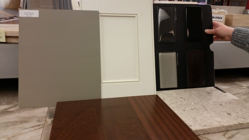
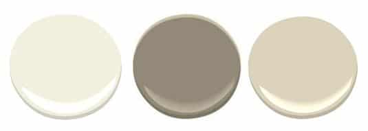
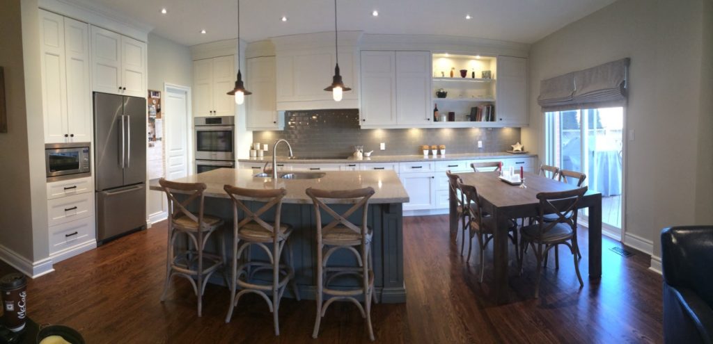
Ivory White was chosen for the rest of the kitchen cabinetry and we used Manchester Tan for the wall colour in the kitchen & throughout the main floor. I have all of these large painted boards so I was able to easily show my client why these choices all worked well together with the finishes we were using for her kitchen design.
I never worry about choosing a wrong colour for clients and am always super confident in my choices. This means no second guessing and no costly mistakes. Below is a picture I took of my clients gorgeous kitchen in Oakville Ontatio. See the full gallery in my portfolio here.
Gather ALL Your Samples
Because you know that choosing your paint colour LAST is the only way to accurately choose the best colour for your interior design project, it’s imperative to have all your samples together in order to make that informed decision.
Lay your samples out in the same way in which they will be used within your space & use large paint boards to determine which colour works best with all your finishes.
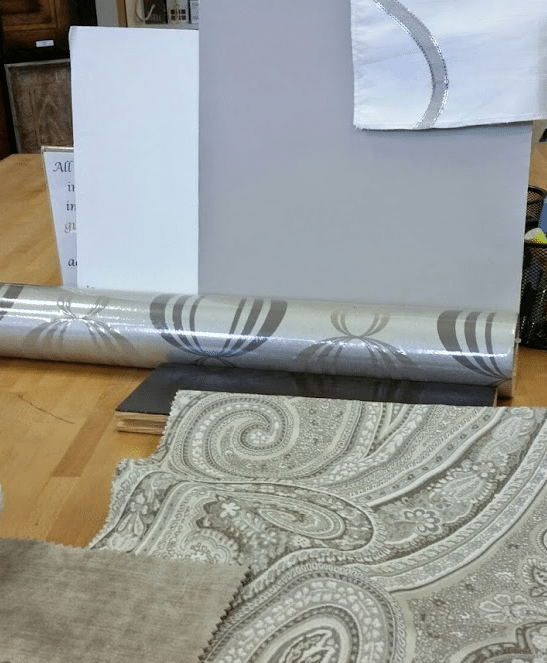
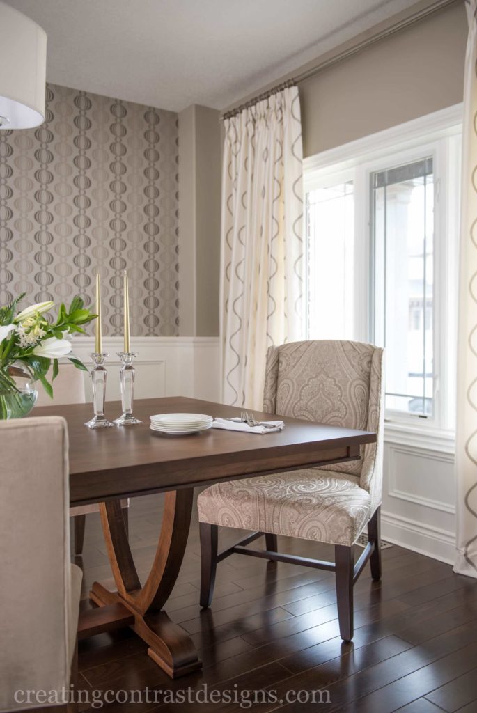
This palette was for my clients monochromatic dining room design we created. We could have gone with either Pashmina or Revere Pewter by Benjamin Moore for the wall colour.
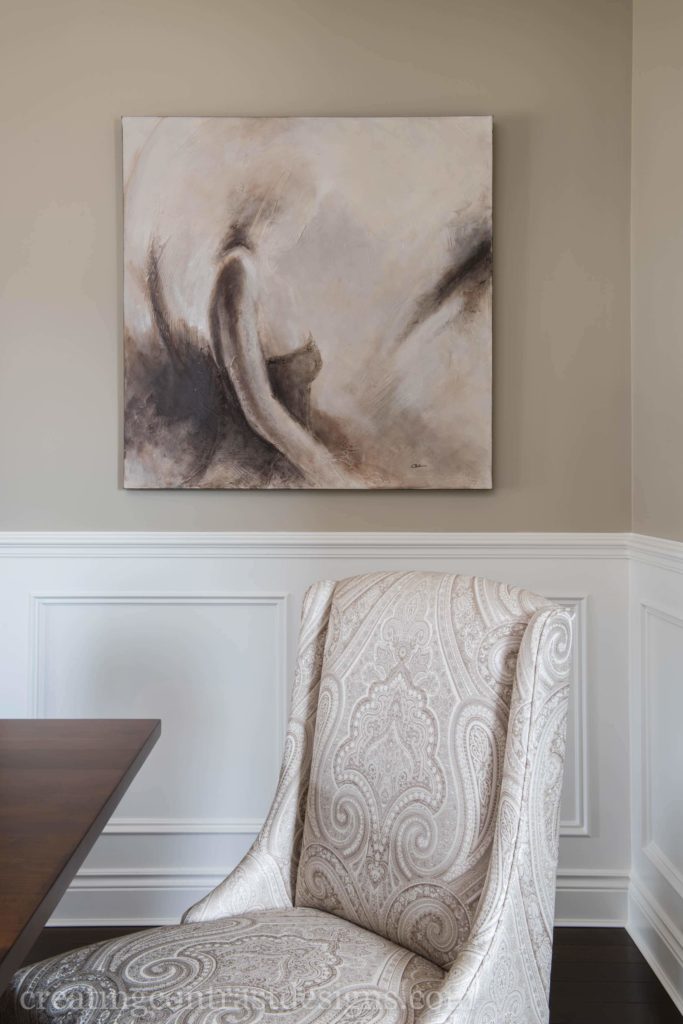
Both colour options worked well with all the finishes, but ultimately we choose Pashmina as it has slightly more intensity and depth which I felt worked best for this calming and sophisticated space.
Use a White Background When Sampling Colour Boards
It’s really important to ensure you use a white backdrop behind your painted colour board. A common mistake that people make is taking a roller and painting an area on top of their wall current wall colour, but this is incorrect for two reasons:
1) You will find yourself comparing the new colour to your current wall colour as opposed to viewing it independently with other finishes & with a neutral background.
2) You are only looking at the proposed wall colour in one area of the room, so fully understanding how it will work at various times of the day under different light sources is not possible.
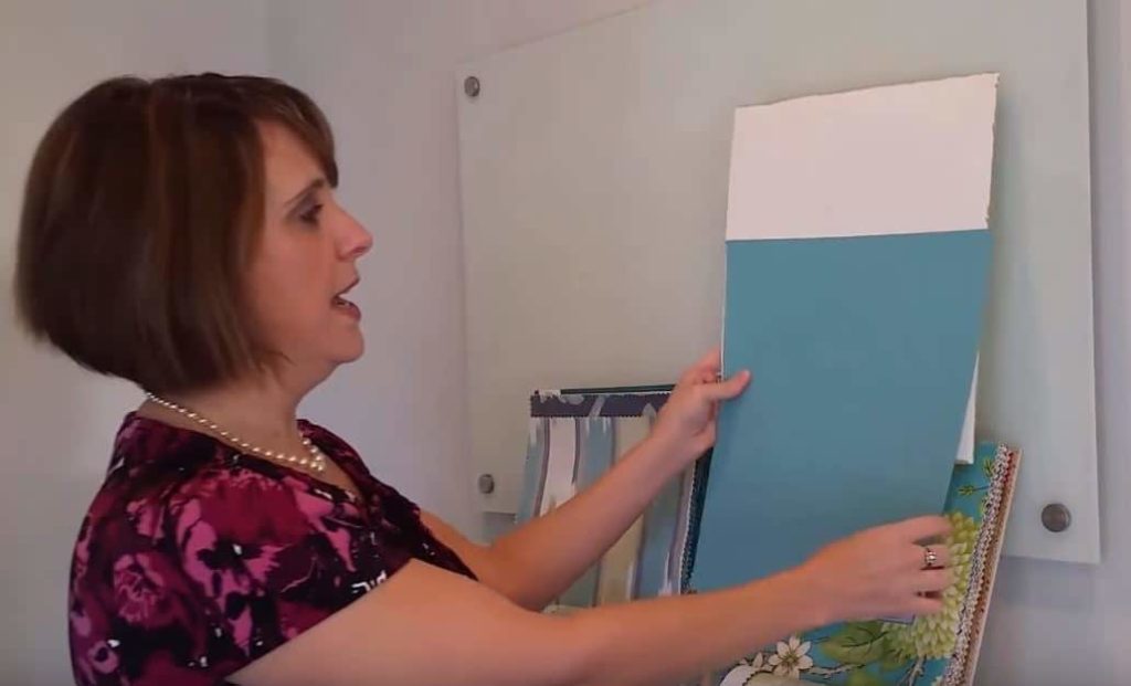
Painting is not inexpensive if you are hiring a professional to do the job. Even if you are doing the paint work yourself, it’s really time consuming. Take the extra step and save yourself time and money in the long run by painting large sample boards, you won’t regret it!
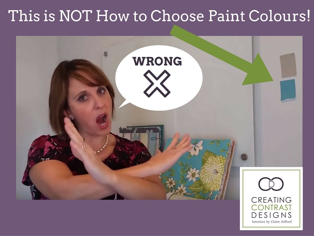
Below is my latest Youtube video on this very subject, click on the picture to watch the video.
Grab my FREE download, ‘How to Choose the Right Paint Colour the First Time’ when you sign up to get my colour and design updates here.
Do you live in my area and want help choosing the right paint colours for your home? Professional design services are just a click away. Contact me here and let me help you to Live Beautifully.
We are located in Burlington Ontario in Canada & service the following areas: Burlington, Oakville, Milton, Stoney Creek, Grimsby and the surrounding Greater Toronto Area.


