Benjamin Moore Colour of the Year 2020
Choose the right paint colour
the first time Let me show you how in just 5 easy steps!
BONUS: The Top 15 Shades of Gray by Benjamin Moore

The Colour of the Year is always a big talking point that everyone has an opinion on and I can’t say that I’m any different!

If nothing else, I love that it gets people talking about colour, as everyone is so passionate when it comes to colour and how it makes them feel.
The Sherwin Williams Colour of the Year, Naval SW 6244, was announced last month and as a huge fan of Hale Navy by Benjamin Moore, I can’t help but love Naval too.
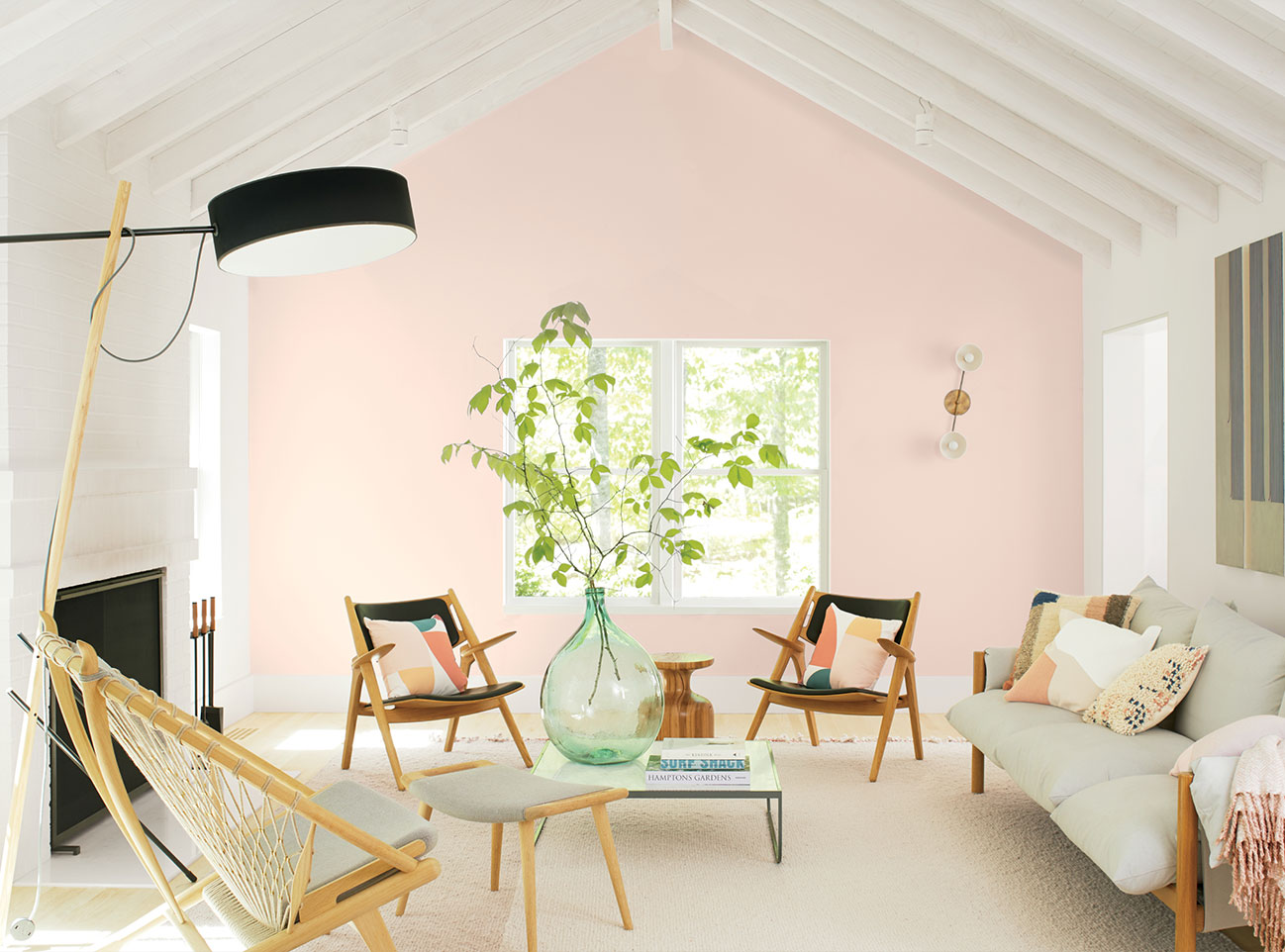
Earlier this month I was invited to the Benjamin Moore Colour of the Year event in Toronto. Although many speculated that the Benjamin Moore Colour this year would also be a dramatic, deep and moody tone, it was quite the opposite.
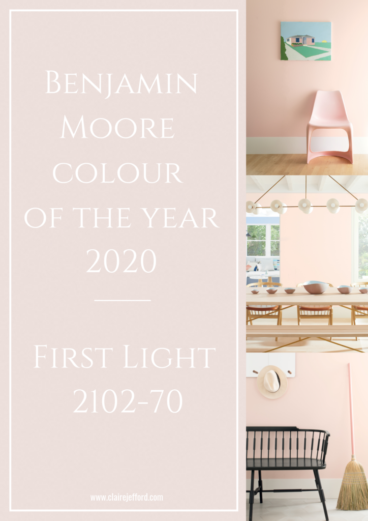
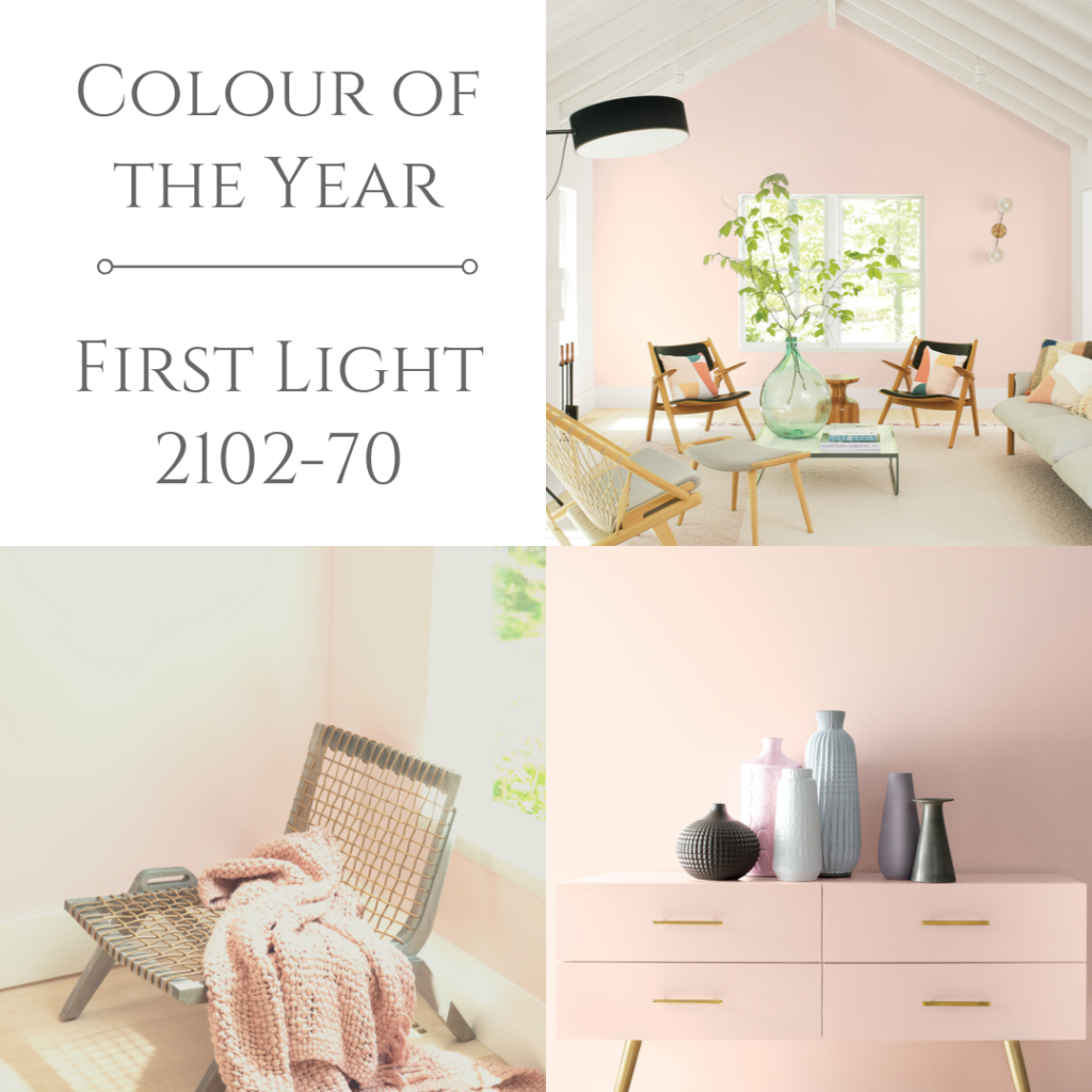
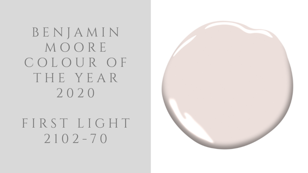
Benjamin Moore Colour of the Year:
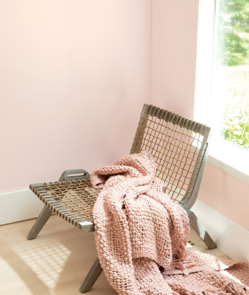
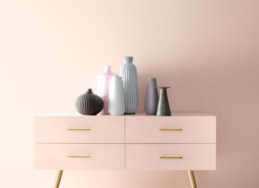
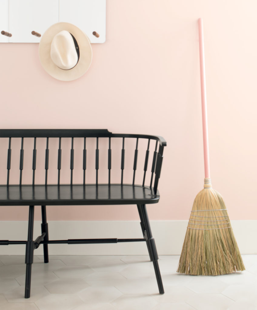
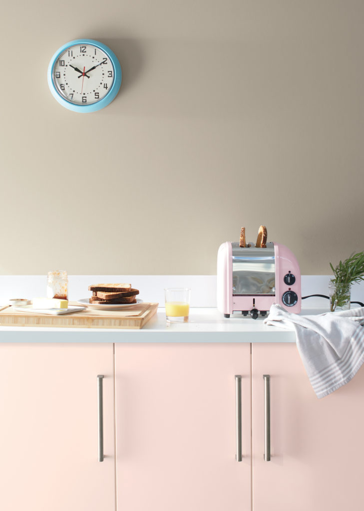
First Light 2102-70
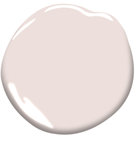
Andrea Magno, Benjamin Moore Director of Colour Marketing and Development, said “We selected First Light 2102-70 as our Colour of the Year 2020 to represent a new dawn of idealism, design and living. First Light 2102-70 reflects a new definition of the home – a shift in mindset from the material to satisfying the core needs in life: community, comfort, security, self-expression, authenticity and ultimately, optimism.”
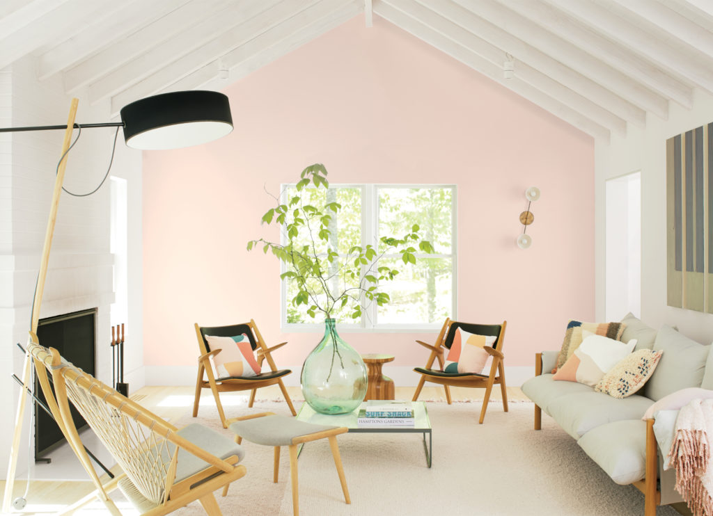
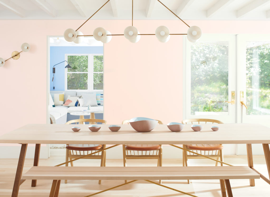
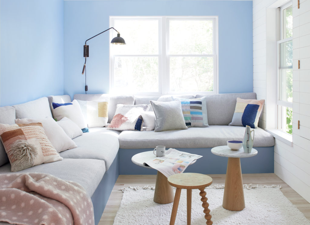
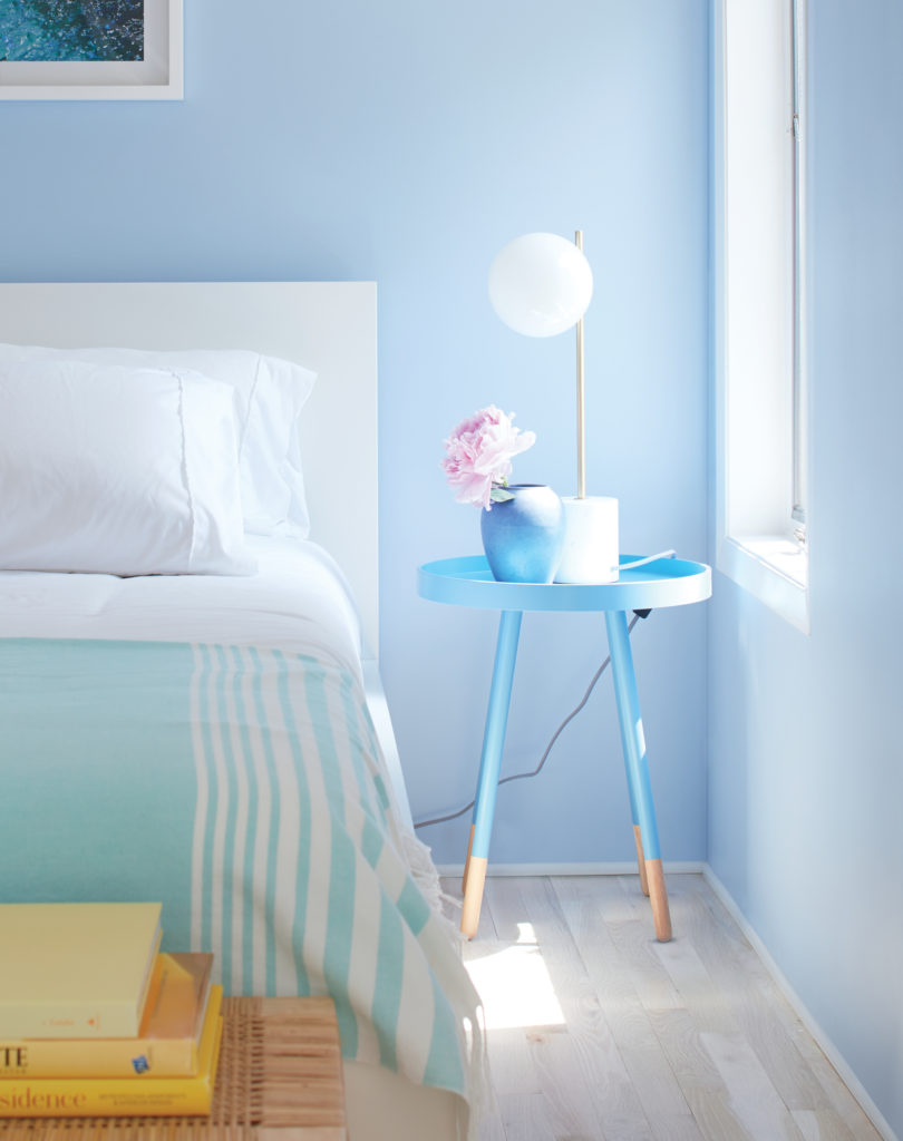
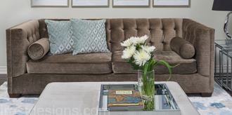
We have actually been seeing this colour for a long time in interior design, but more in soft blush accessories, fabrics and other accents. Even if you don’t love the colour for your walls, it may be the perfect accent colour to complement the main colour within your chosen colour palette or design.
Along with the Colour of the Year, Benjamin Moore also announced: Ten harmonious hues have been selected to guide us into the next 10 years and beyond.
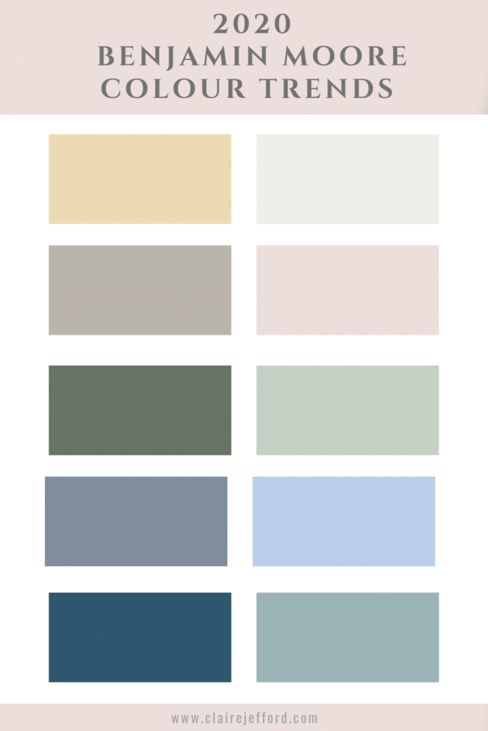
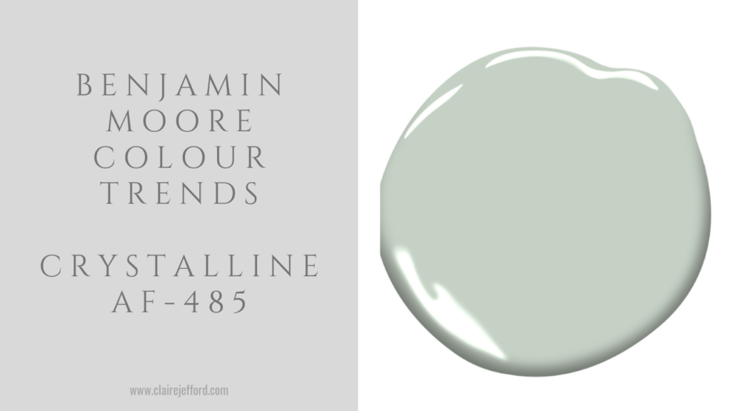
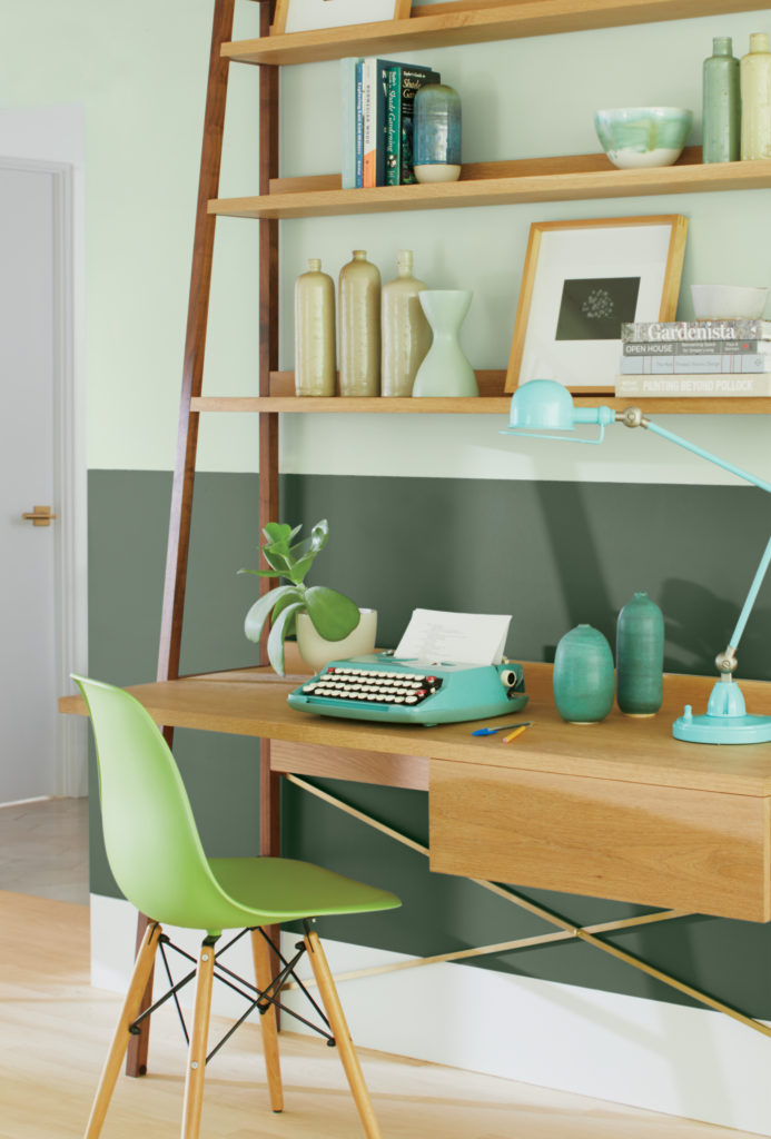
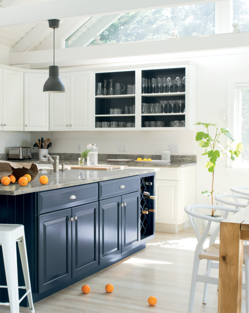
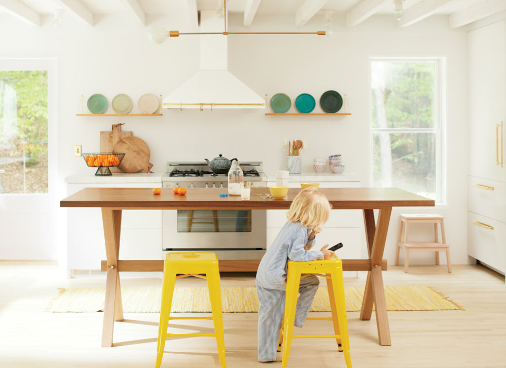
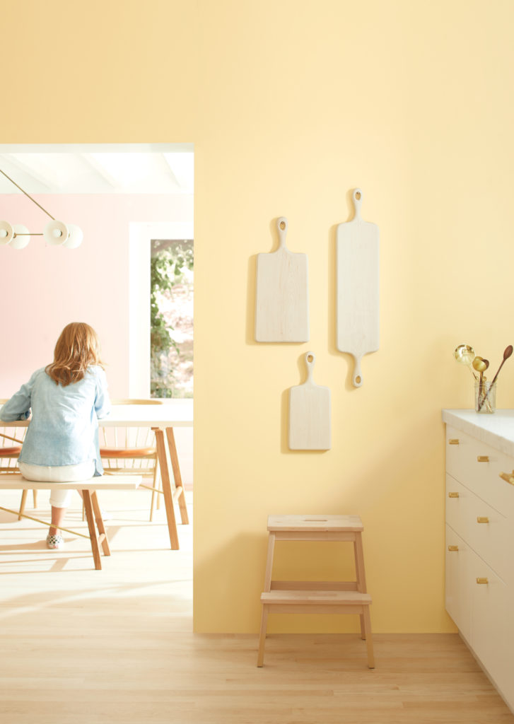
Images from the Benjamin Moore Colour Trends 2020 palette can be seen below. All photos are courtesy of Benjamin Moore.
Windmill Wings 2067-60
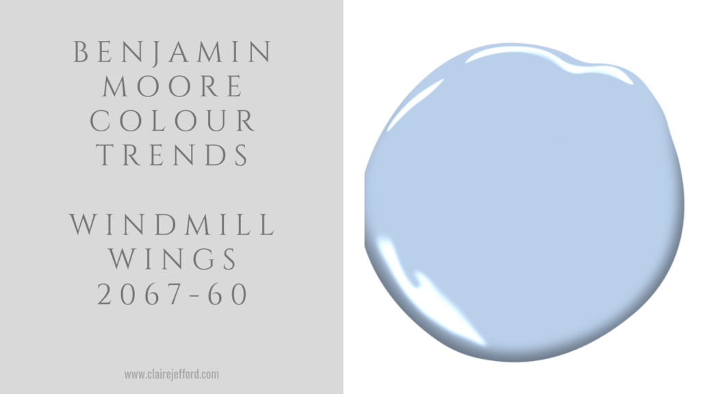
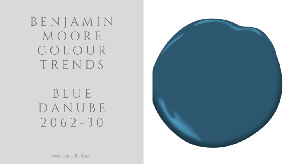
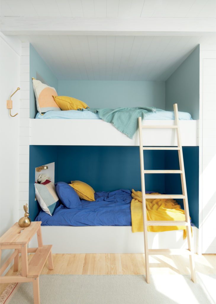
Blue Danube 2062-30
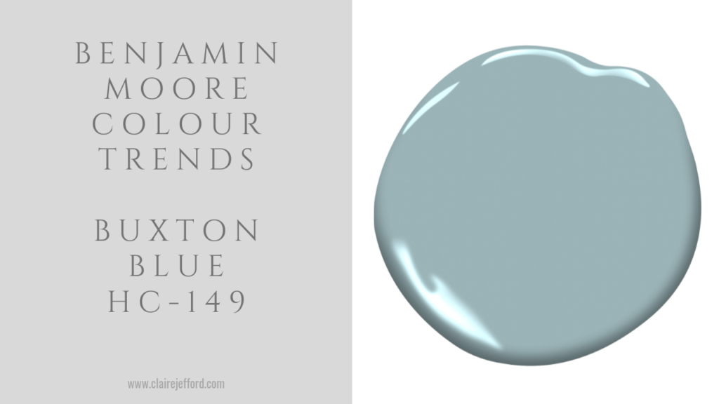
Buxton Blue HC-149
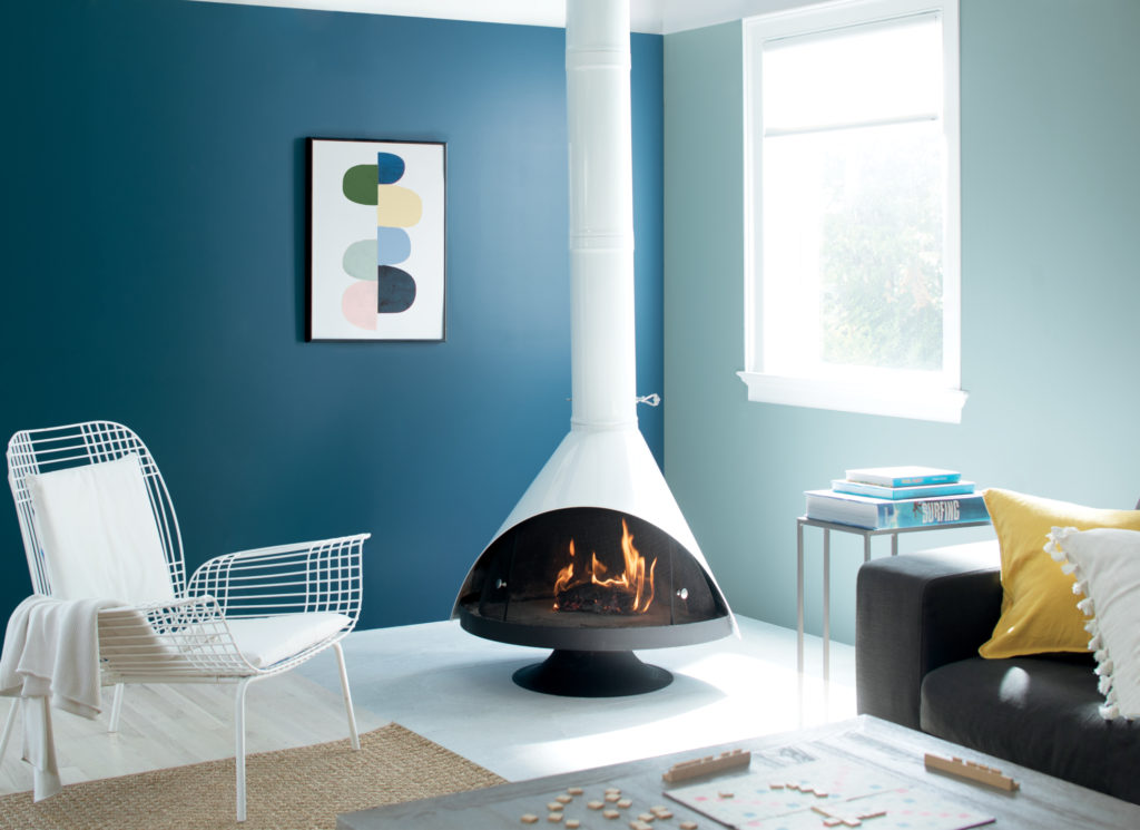
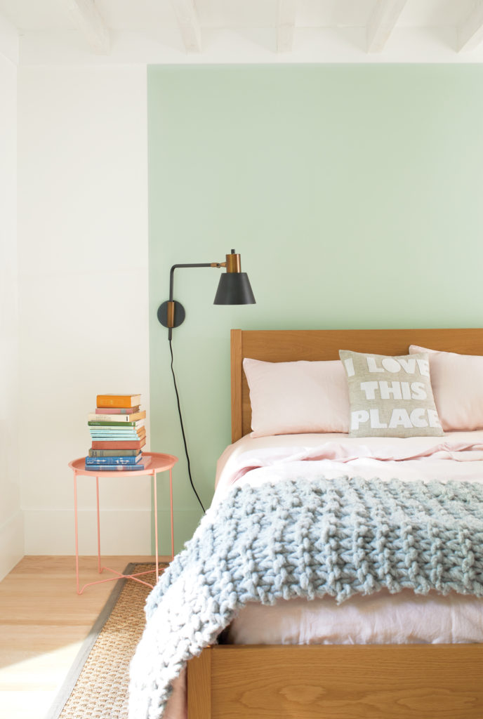
Crystalline AF – 485
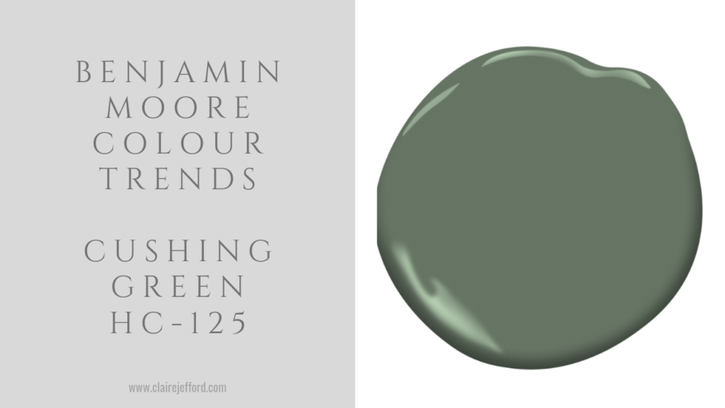
Cushing Green HC-145
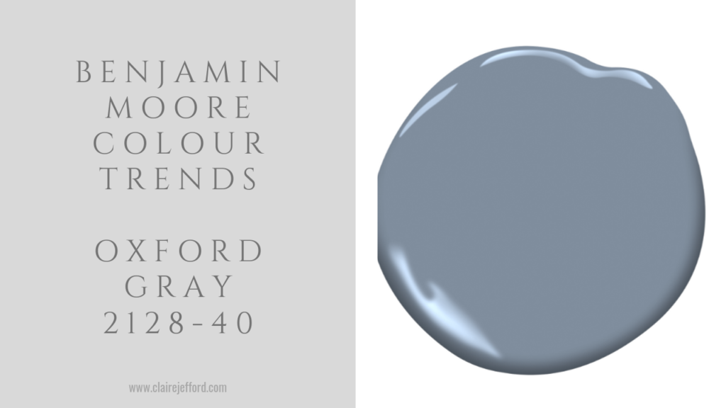
Oxford Gray 2128-40
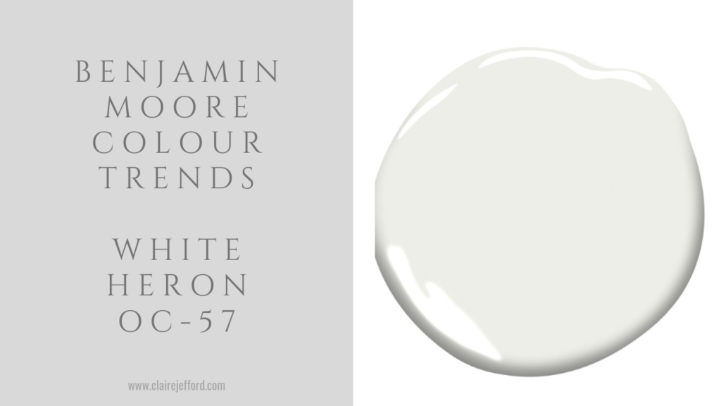
White Heron OC -57
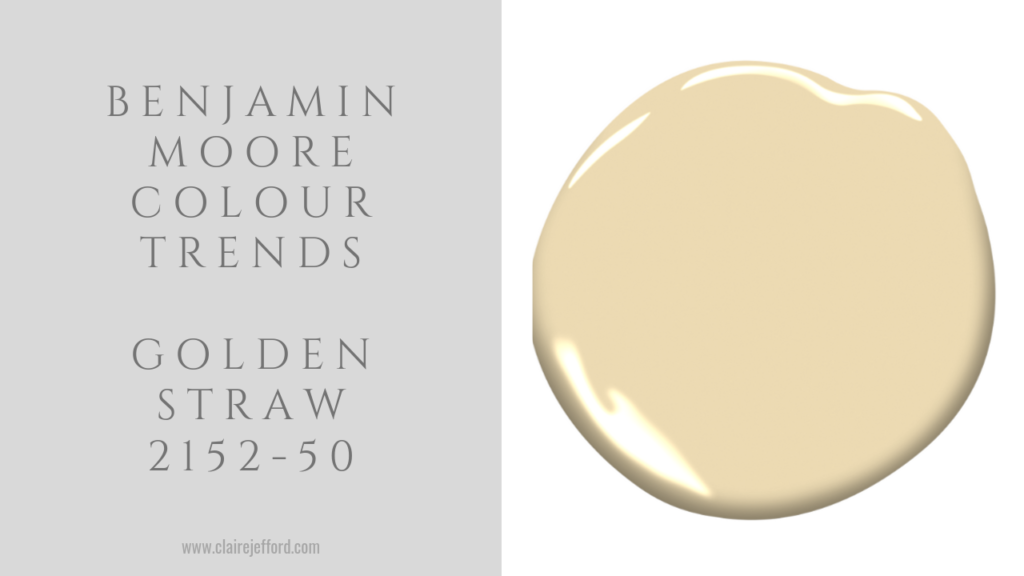
Golden Straw 2152-50
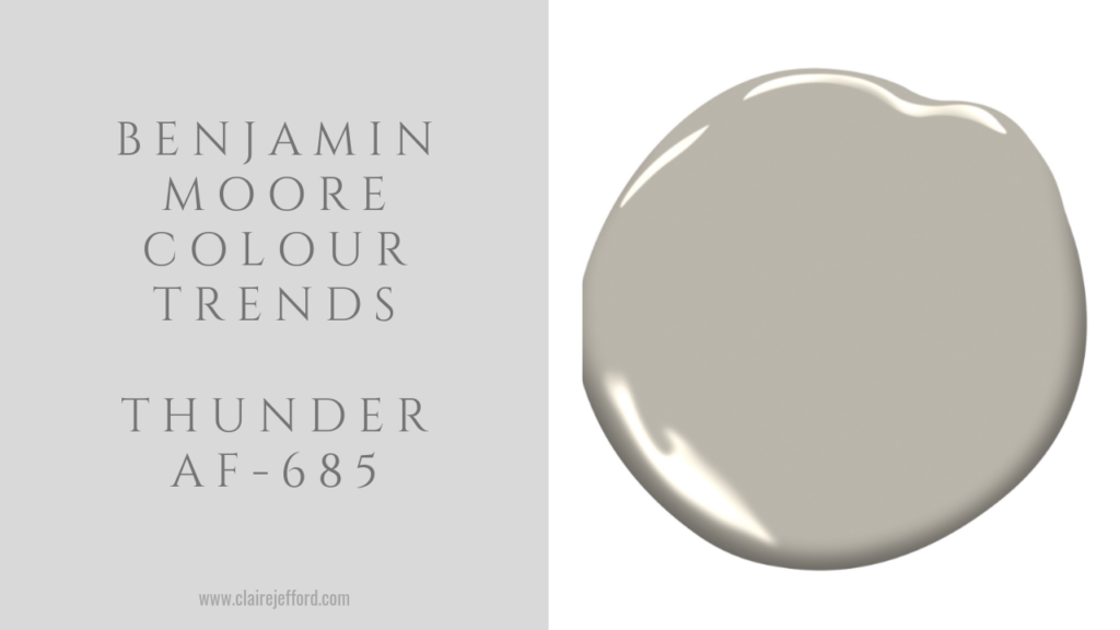
Thunder AF-685
What do you think of these Colour Trends 2020 from Benjamin Moore?
I quite like them, even though I’m not a huge fan of pastel colours. When put together in a thoughtful way in interior design, they make for gorgeous colour palettes.
Convenience at your fingertips
Remember, it only takes one mistake to take your home decorating project from divine to disaster. Don’t let the paint be what stresses you out!
Choosing Paint Colours
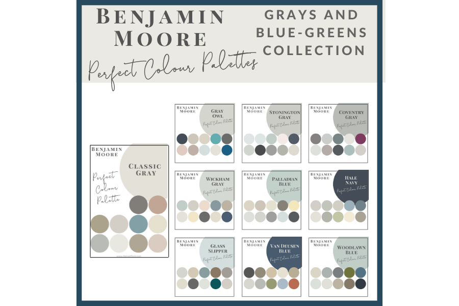
If you struggle with choosing paint colours, be sure to check out my Perfect Colour Palettes.
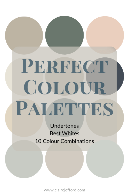
I now have 40 individual guides to help inspire you.
Collections
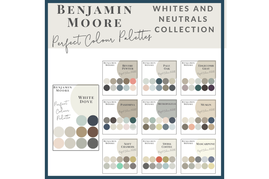
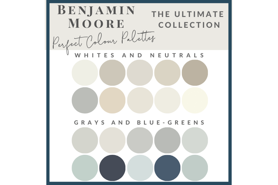
I also offer 3 collections dedicated to Benjamin Moore paint colours, 2 collections showcase a group of 10 similar colours from Benjamin Moore,
and
And if you want all 20 in one place look no further than my Benjamin Moore Ultimate Collection.
Psst! Love Colour? Take my new colour quiz to determine which colour palette suits you best!


Vicki Vaughan
| 24 October 2019Great colors. I love Benjamin Moore.
Vicki
Claire Jefford
| 25 October 2019Hey Vicki! Thanks for watching.
sandra smith
| 25 October 2019I like the new color of the year. It is soft like a cashmere sweater. It makes me smile. Calming and comfortable. Thank you again Claire for your website. It helps me a lot and you explain color that makes it easy. Thank You for being Y O U. Awesome job.
Claire Jefford
| 25 October 2019So funny you mentioned cashmere sweater because I tried on a cashmere sweater last week in this exact colour!! I never bought it, but it really was pretty. Thanks so much for your feedback Sandra!
Leslie Carothers
| 26 October 2019Hi Claire: I love this new COTY from Benjamin Moore.. thanks for sharing so many wonderful images of how it can be used. It’s so soft, so flattering, so inviting.
Claire Jefford
| 26 October 2019Thanks Leslie. I think it’s a pretty colour as well and doesn’t need to be limited to using it for paint only. Many pretty accessories and other interior design accents come in a pretty blush. 🙂
Mary Ann Benoit
| 26 October 2019I am not really a fan of First Light, although I do like some of the deeper blues and greens they selected. Thanks for sharing:)
Claire Jefford
| 27 October 2019The blues and greens are pretty, I especially like Blue Danube and was secretly hoping the Colour of the Year would be one with more richness and depth. But First Light is pretty and we’ve been seeing the similar tone – blush – for years in fabrics and accessories. Cheers for sharing your thoughts Mary Ann!
Shannon Ggem
| 27 October 2019I love the color and your synopsis is right en pointe!
Claire Jefford
| 31 October 2019Me too and thank you my dear!
Janet R Lorusso
| 27 October 2019Thanks for posting the new collection, Claire. I do like this COTY and it has a bit more personality than last year’s pick, at least! I think it would be a fabulous ceiling color and I love it for accent pieces especially. Of the others, my hands down fave is Blue Danube.
Claire Jefford
| 31 October 2019I love Blue Danube as well. That would’ve been a great choice for the COTY too! Cheers Janet.
Deb
| 27 March 2020Just painted my kitchen with Pale Oak last fall. It’s beautiful. My lower cabinets are black to match my oven and dishwasher fronts as I only have long galley style row of lower cabinets on one wall of the kitchen with no upper cabinets. ( luckily to have a large walk-in pantry). My floor is light wood my husband designed and made with pallet wood. It came out beautiful. I first painted the kitchen with Revere pewter but on one wall it had a greenish tinge to it.. So plan B,, Pale Oak,, it’s perfect. Try it you will love it too!
Claire Jefford
| 27 March 2020Hi Deb, this is so great to hear! I’m glad that Pale Oak worked out well for you. Cheers for letting us know!