Not every interior design dilemma needs a big-budget renovation. Sometimes, you just need a set of trained eyes to help you see what’s working—and what’s not.
During one of my recent 60-minute ‘Here & Now’ online design consultations, I worked with a client who was frustrated with several design challenges in her home.
There was a recent mishap with the updated paintwork of her kitchen cabinets that she wanted my advice on.
She also wanted ideas on how to tone down all the wood on her main floor, and wished for a better solution for the furniture layout in her living room.
Here’s a punch list of what we discussed:
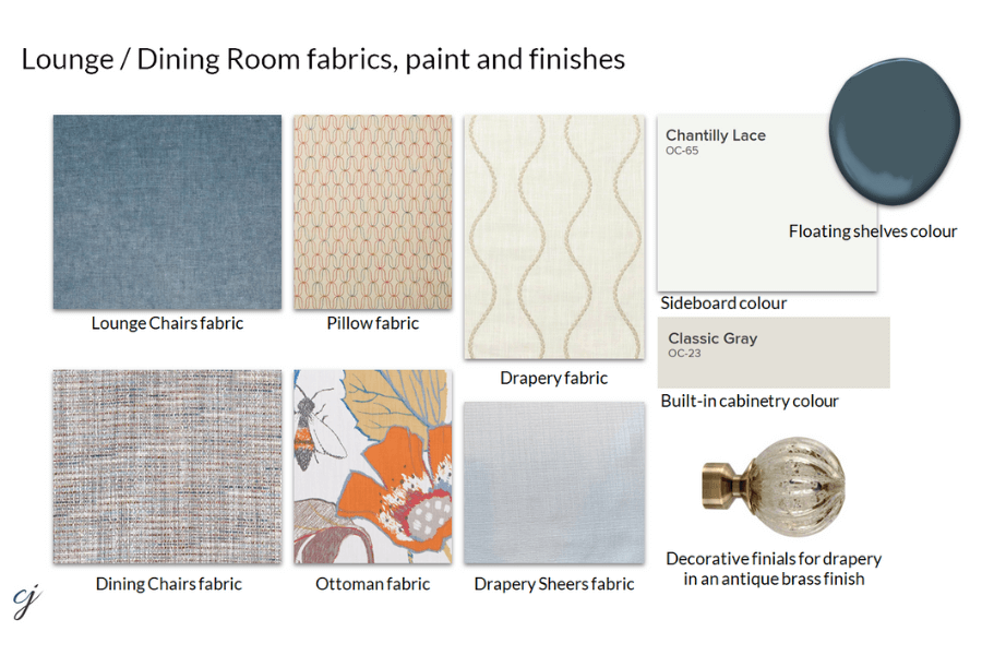
- White Dove gone wrong on the kitchen cabinets
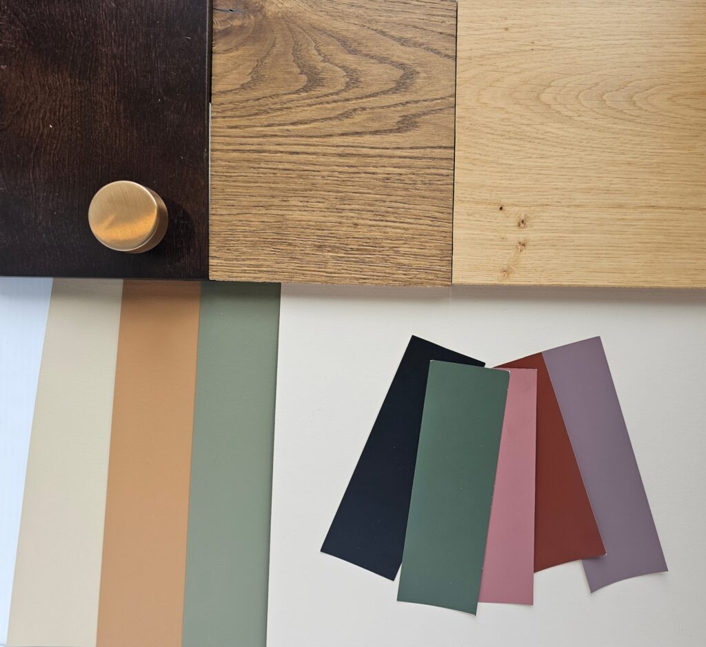
- Creating a cohesive colour palette
- Why Revere Pewter was the perfect paint
- Furniture layout in the living room
Let’s walk through what we covered, and the professional advice I provided to help her overcome this design challenges.
What Went Wrong With White Dove?
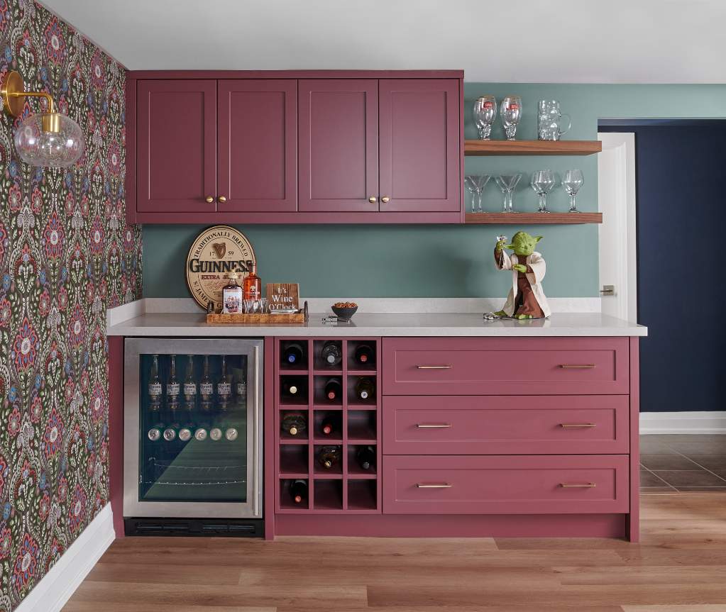
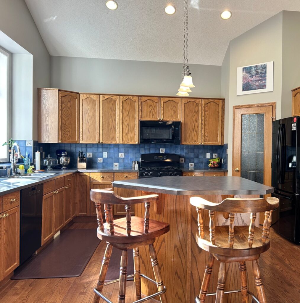
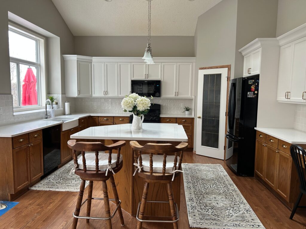
Here’s an image the client sent me prior to the renovation refresh of her kitchen.
And this is the after photo.
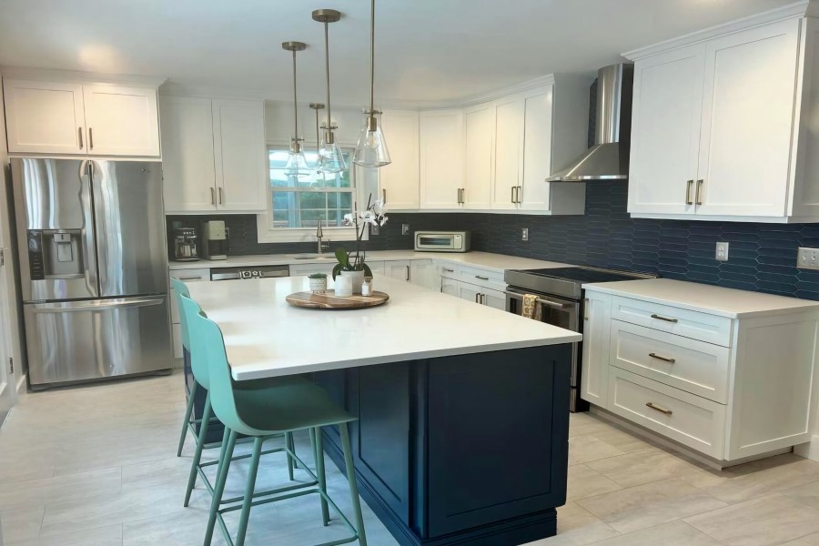
You can see from the transformation that there were 3 main updates:
- The upper cabinets were replaced, now with crown molding, new hardware, and painted white
- A new white, square Zellige backsplash tile was installed
- They updated the countertops to a white quartz with some gray veining
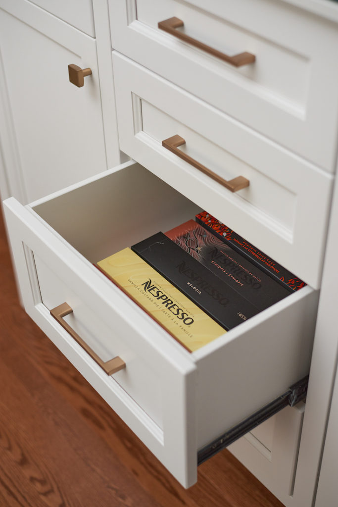
My client selected Benjamin Moore’s White Dove for her upper cabinetry colour. But the painters did a colour match and used Sherwin Williams paint instead. This is where it all went sideways!
If you look closely at the cabinetry, you can see that the cabinet doors and the crown molding are ever-so-slightly different. (My client tells me it’s much more noticeable in real life, and I believe it.)
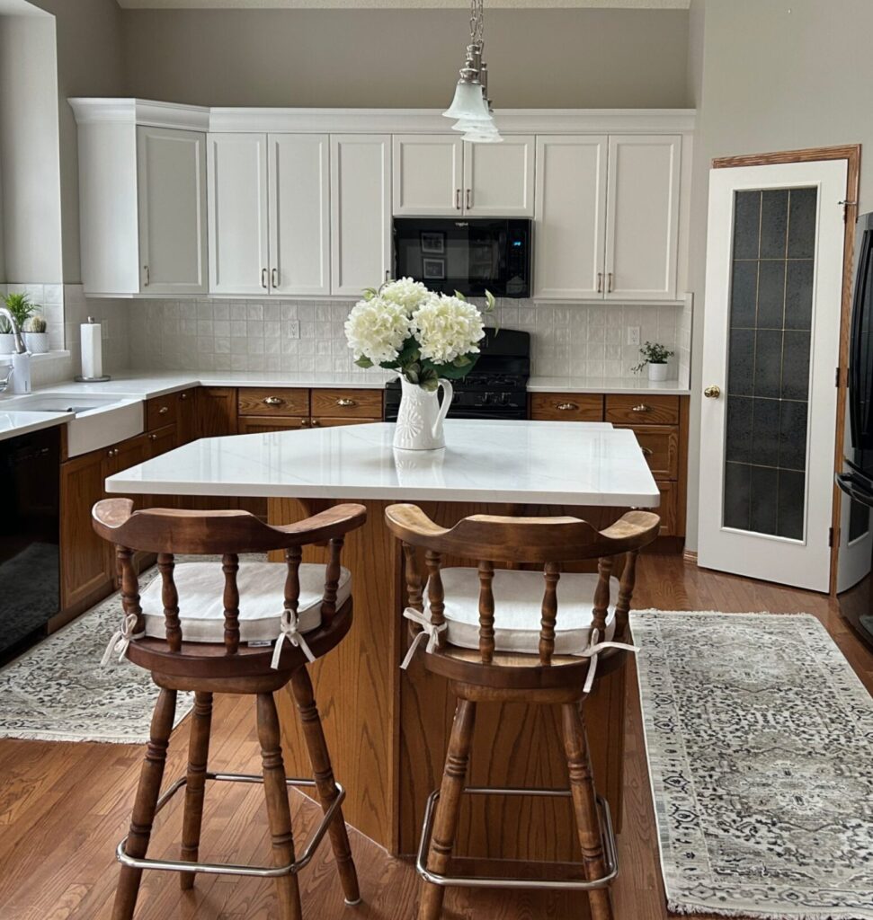
The cabinet doors appear creamy, which is what White Dove by Benjamin Moore is – a creamy off-white. But the crown piece above, as well as the pantry door, are more stark and brighter in appearance.
What my client explained happened in this instance, is that in addition to the painters attempting to colour match a Benjamin Moore colour to Sherwin Williams, the paints were also not all mixed at the same time, each one used was a different batch.
This is why when I specify paint colours, I review a waiver that I have clients sign that includes details about not colour matching paints. My client is going to have another painter come in to repaint the crown and the pantry door to match the creamier upper cabinets.
As an FYI, I have seen this happen before when we built a custom pantry with crown detail for a client and had it all painted Cloud White. Because the crown molding was on an angle, the way the light hit it, made the crown look slightly different in colour.
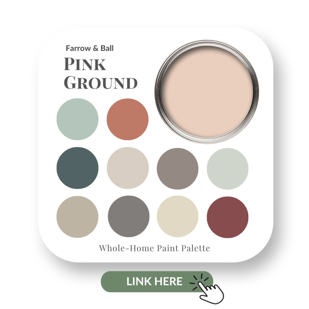
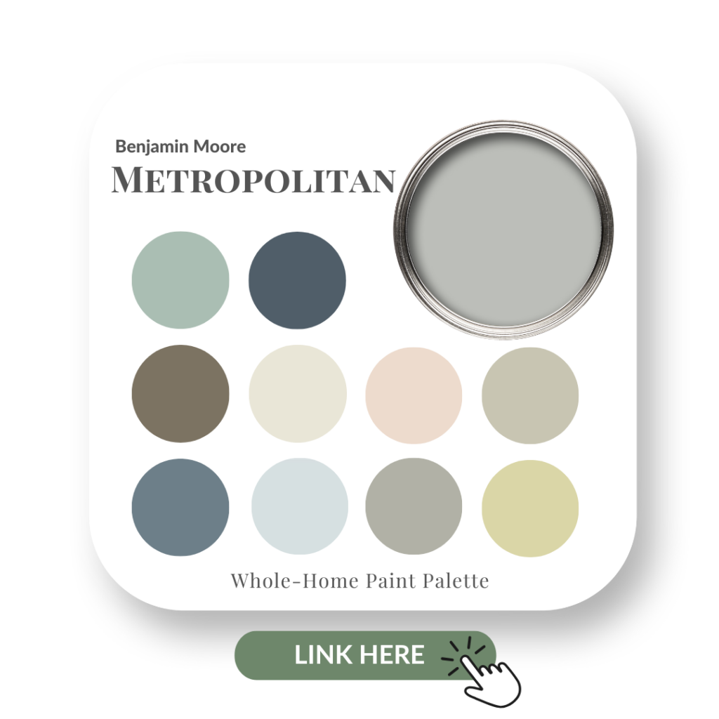
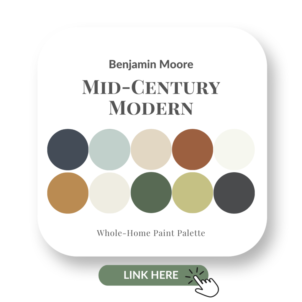
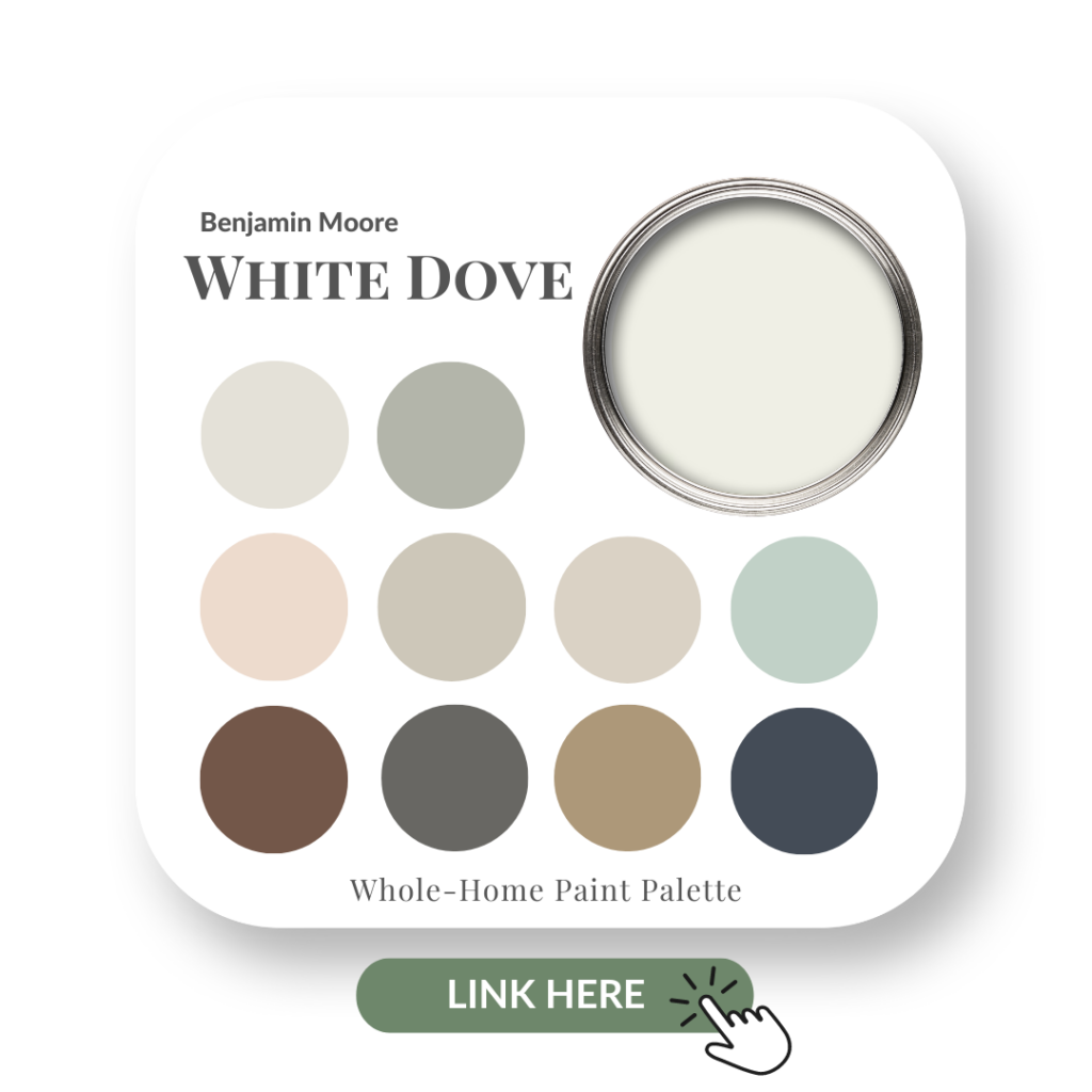
By the way, if you want to know more about White Dove, read my colour review blog and check out my White Dove Perfect Colour Palette.
Toning Down The Wood
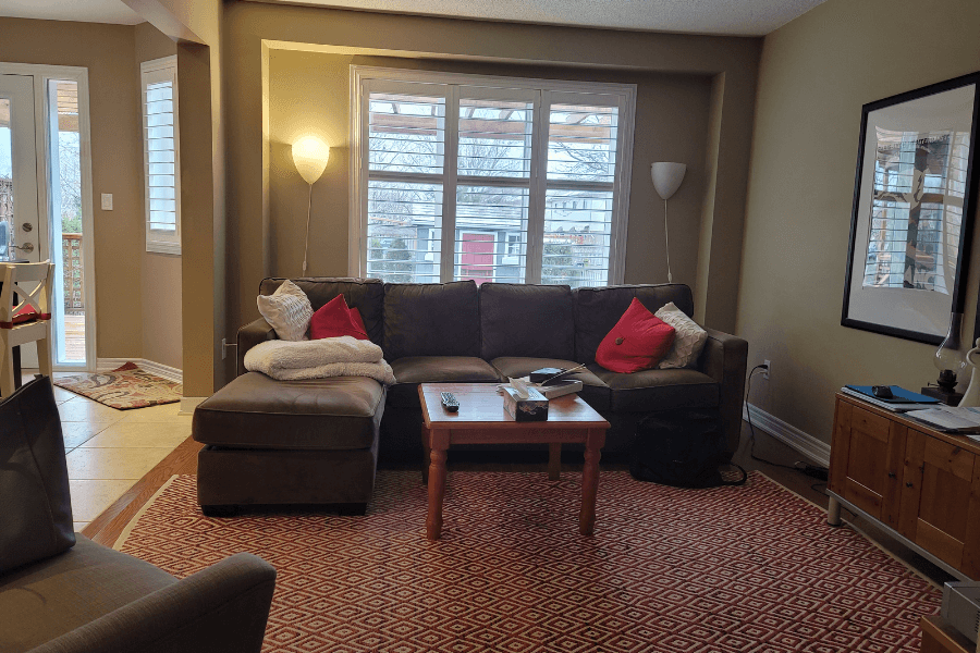
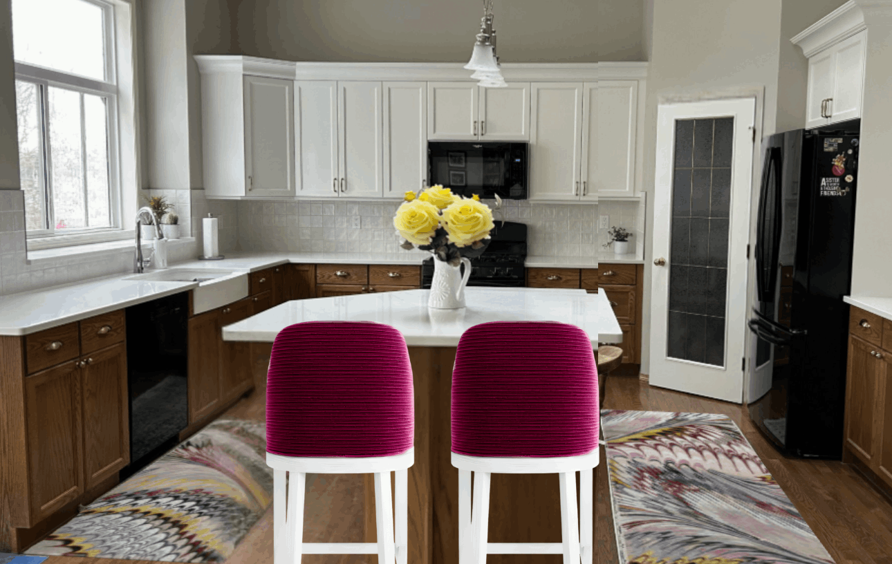
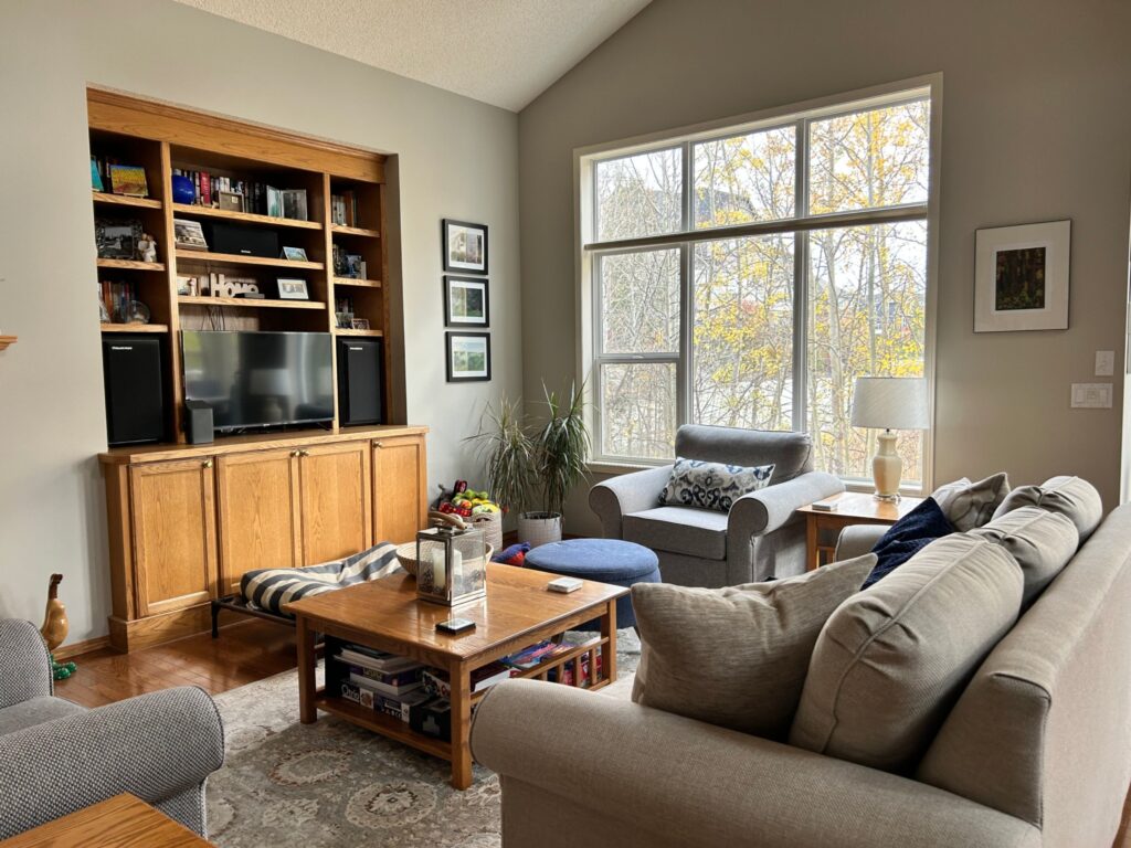
The entire main floor of my client’s home had a lot of wood. Even after the updates made to the kitchen, there were still the wood floors, wood stools, and the original wood base cabinets.
First, the oak trim around the pantry door needs to be sanded down and painted White Dove to reduce the contrast in that area.
I suggested replacing the wooden counter stools with upholstered stools that have creamy legs. Ideally, a vinyl option is best as it’s more durable and forgiving when it comes to smudges and spills.
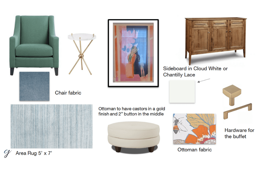
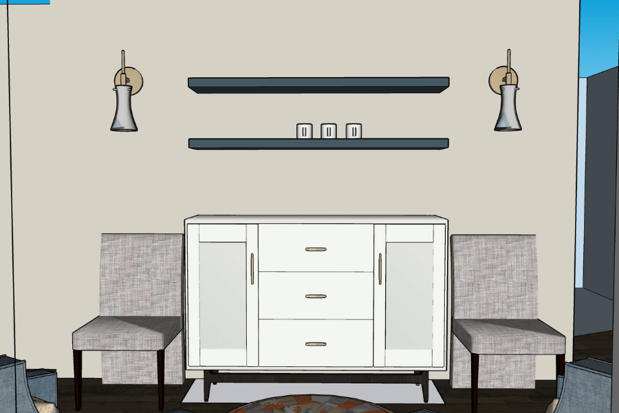
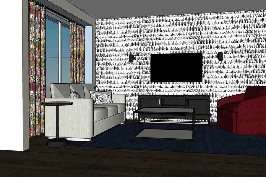
An idea like what I created in the mock-up below includes some decorative elements that soften the space and repeat various colour tones.
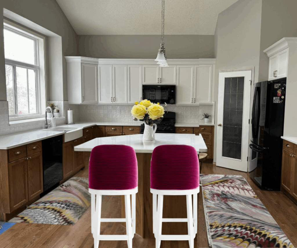
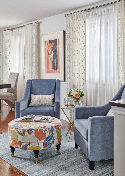
Installing an inset Roman blind on the window would provide another opportunity to add softness, as well as repeat colour tones for good flow. For a quick visual, I inserted a houndstooth fabric piece by the window in the image below.
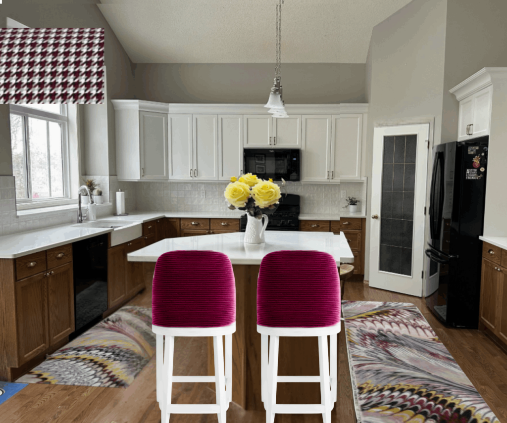
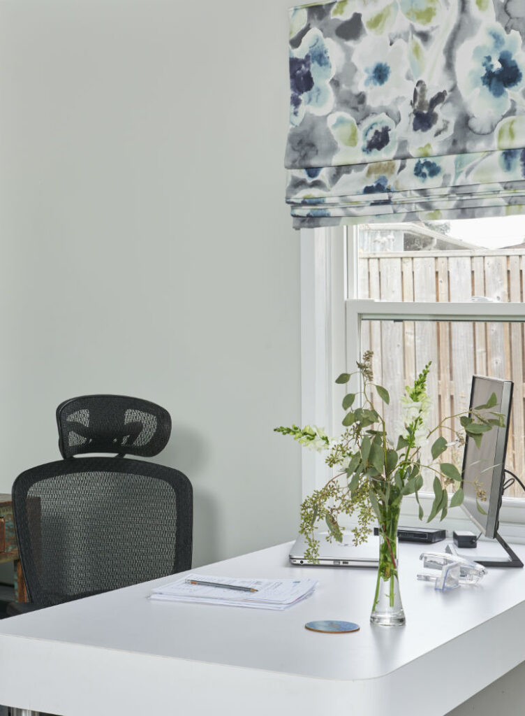
Like the one in my outdoor studio shown below, the blind doesn’t need to be functional if privacy is not an issue – but it looks functional with the pleats at the bottom. You can see more of my interior design studio here in my portfolio.
As my quick mock-up reference was meant to provide a general idea of how to tie everything together, I encouraged my client to start with a fabric or a runner, and look for something with a pattern she likes to inspire a colour palette.
This is something I encourage as part of the decorating advice I share inside my Perfect Colour Palette collections. These PDF Guides, available for immediate download are a great starting point to help you confidently coordinate paint colours with fabrics, furnishings, and accessories.
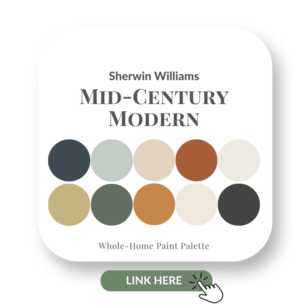
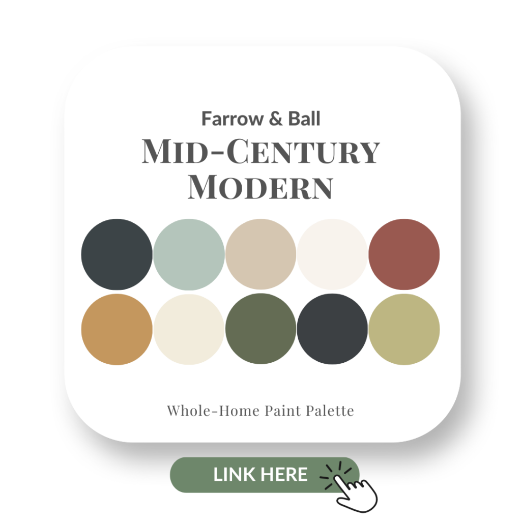
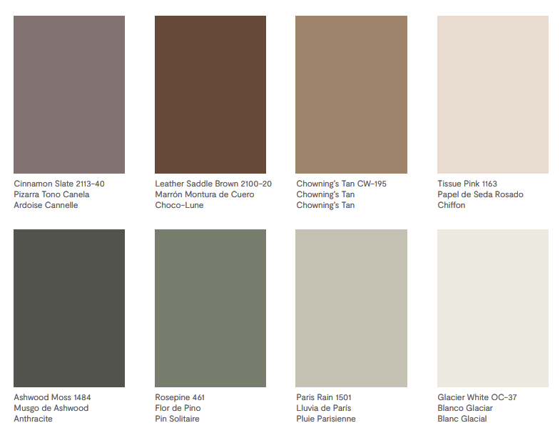
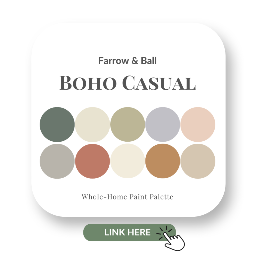
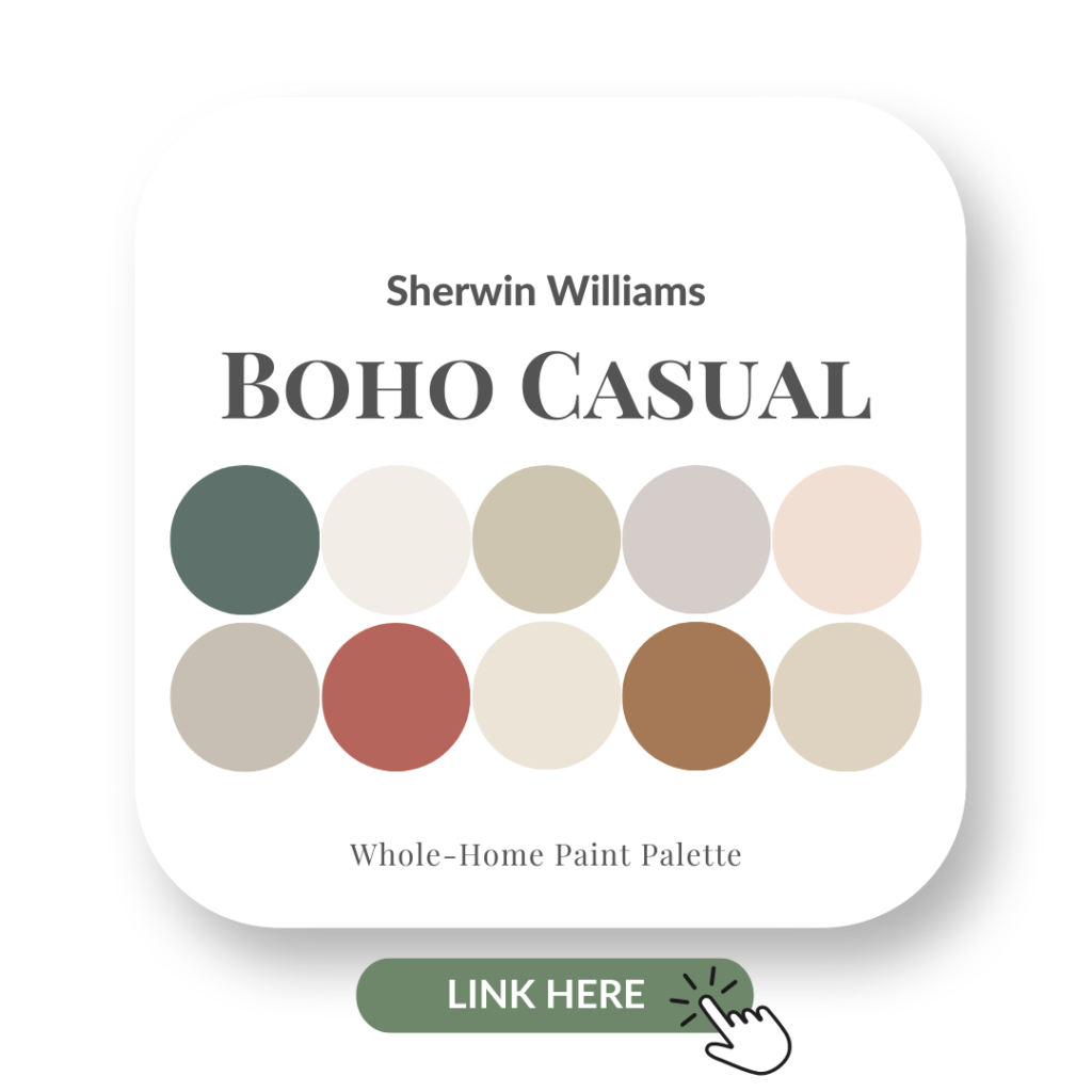
See here for all the colours and choose from Benjamin Moore, Sherwin Williams or Farrow & Ball.
Thousands of Dollars Saved!
This client was also ready to repaint her entire main floor, which I’m sure would have easily cost more than $5000, but I stopped her.
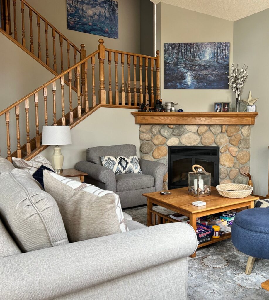
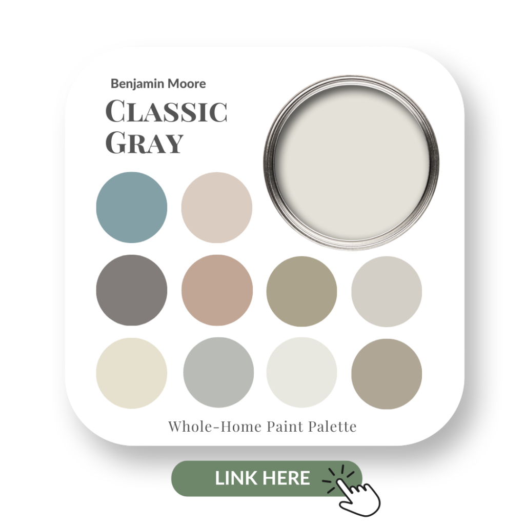
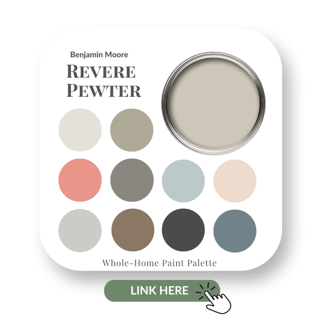
She thought she needed to repaint the walls, but once I saw her stone fireplace with the existing wall colour —Benjamin Moore’s Revere Pewter— I knew that wasn’t necessary.
Revere Pewter has been a popular paint colour for a very long time. With it’s warm green undertone, this colour complemented the natural tones in her fireplace stone beautifully.
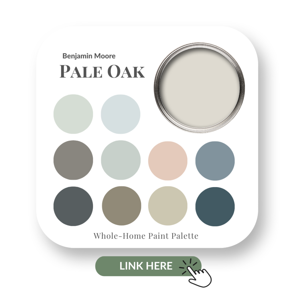
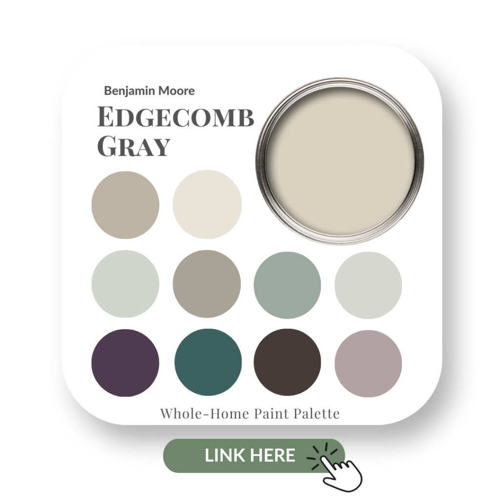
On a side note, Pale Oak or Edgecomb Gray would also work well with that particular fireplace stone.
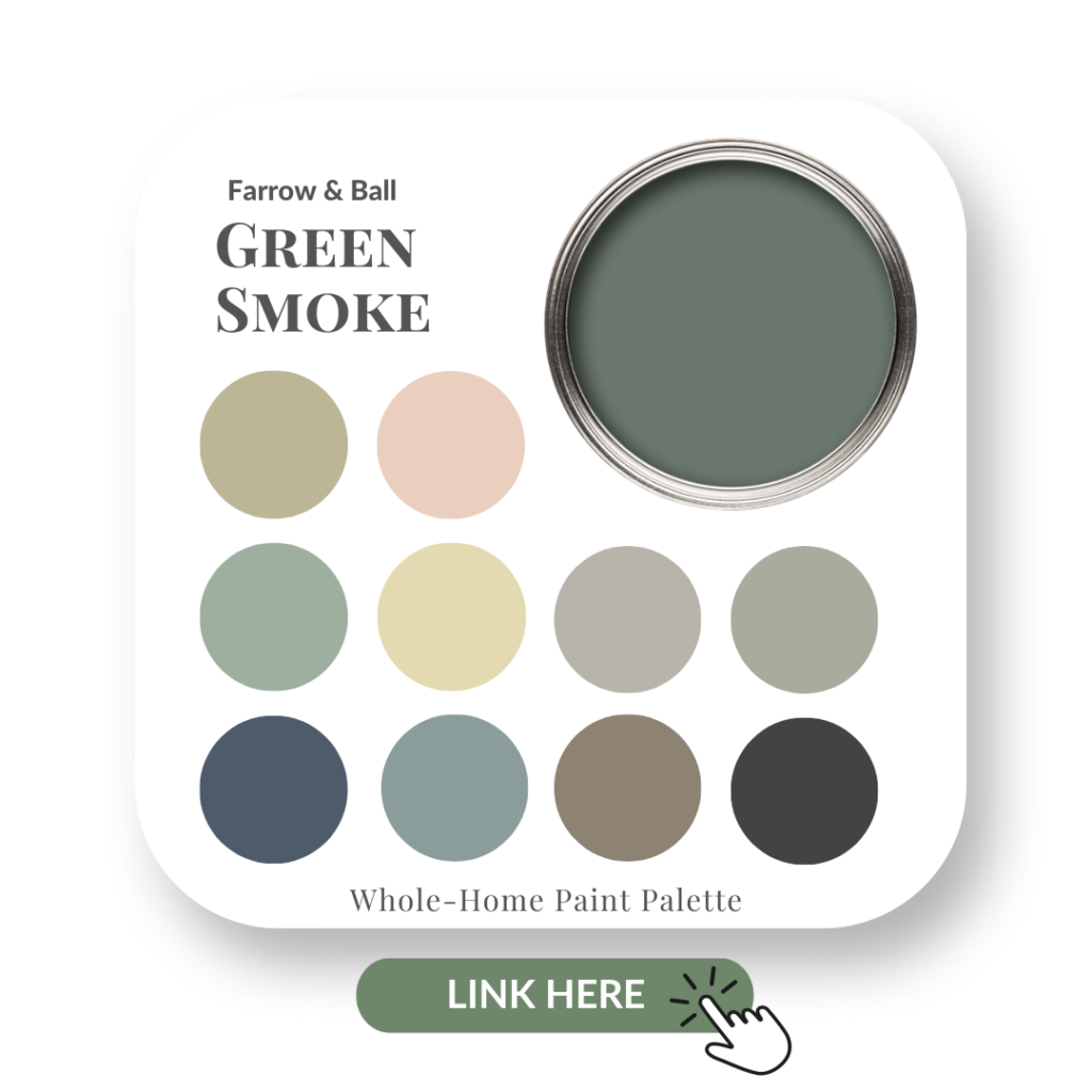
To learn more about Revere Pewter, and how to pair it with other colours, including the best whites for ceilings and trim, check out my Revere Pewter Perfect Colour Palette.
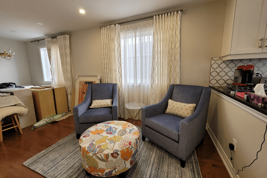
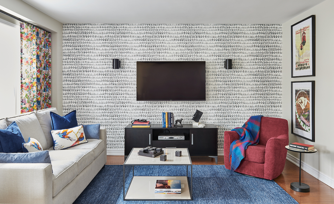
The biggest challenge with this living room was the furniture layout. Why do architects build homes with angled fireplaces?!! There’s nothing that bothers me more…well, okay, maybe a few things irritate me more, but this is a pet peeve of mine when it comes to design.
Improving the Living Room Layout
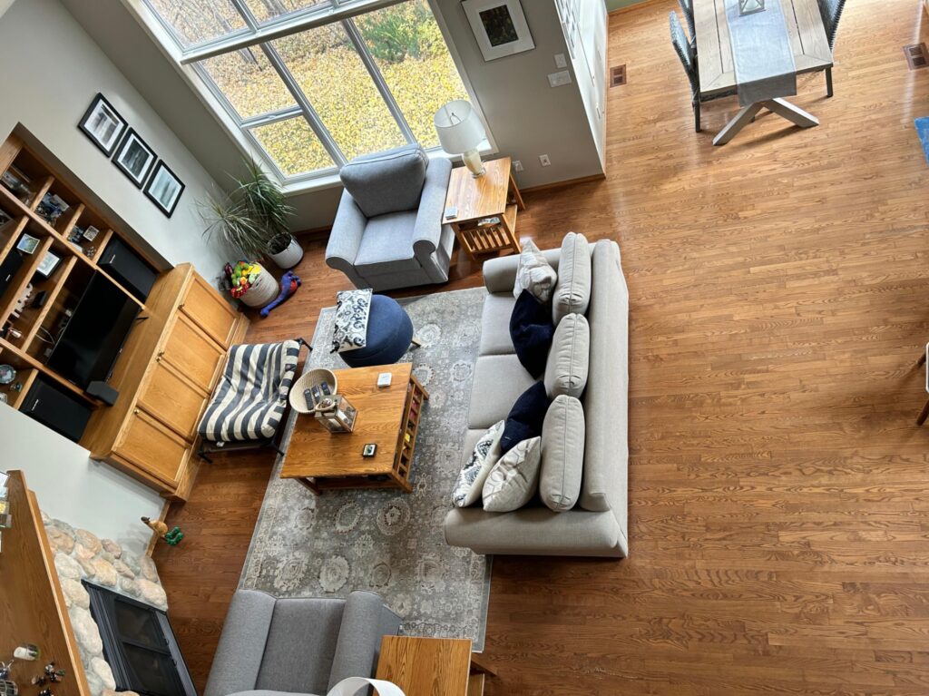
We discussed different furniture arrangements but ultimately, this layout does make the most sense for the way they use this room and considering what we have to work with.
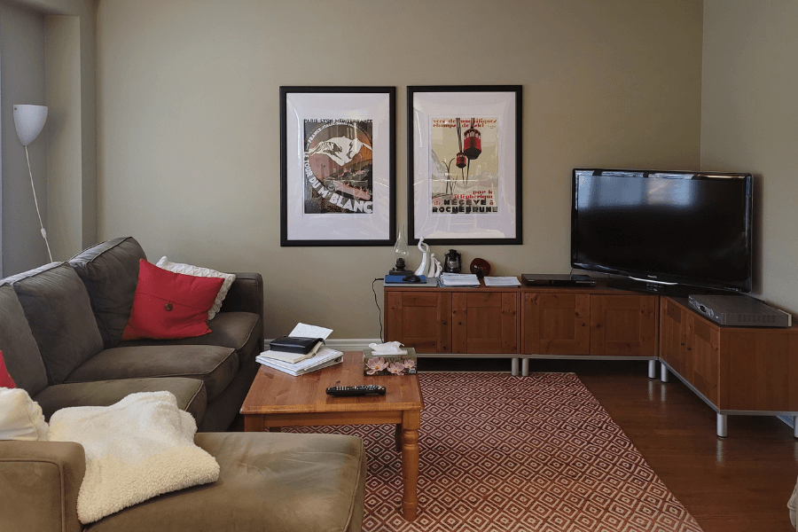
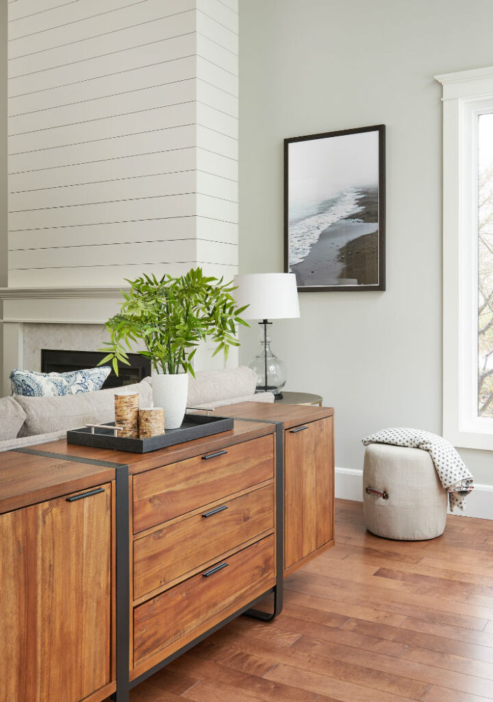
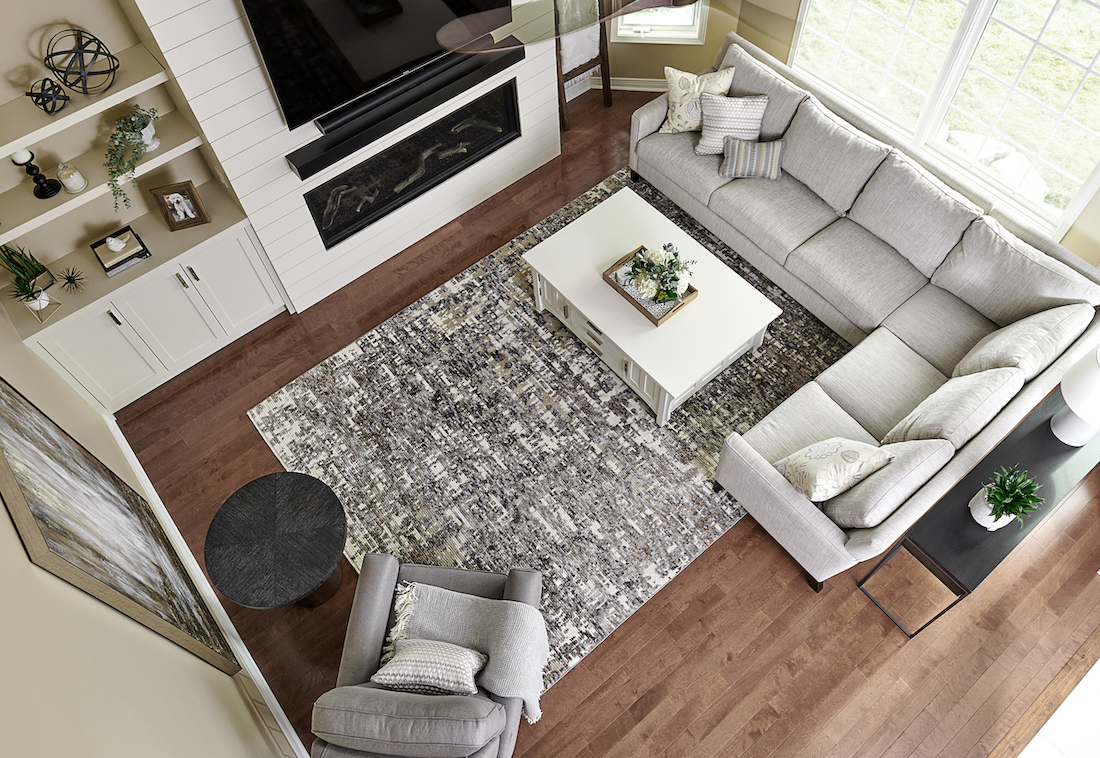
Adding a console behind the sofa like we did here in this client’s coastal living room and again here in another client’s great room, is a good way to soften the look of the back of a sofa, especially when it’s in the middle of a room. A sofa table also offers an opportunity to bring in some accessories for styling.
Placing a vertical mirror above the fireplace would emphasize the lovely feature of the high ceilings and reflect light from the large window opposite. Since the wall space is limited, the horizontal artwork currently placed there looks too squished.
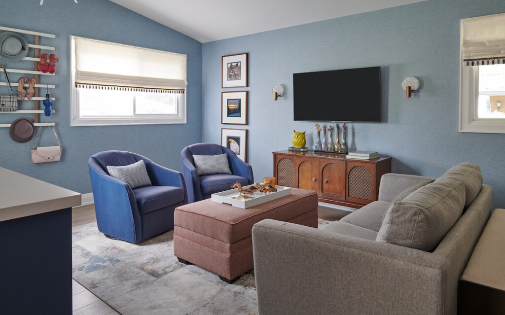
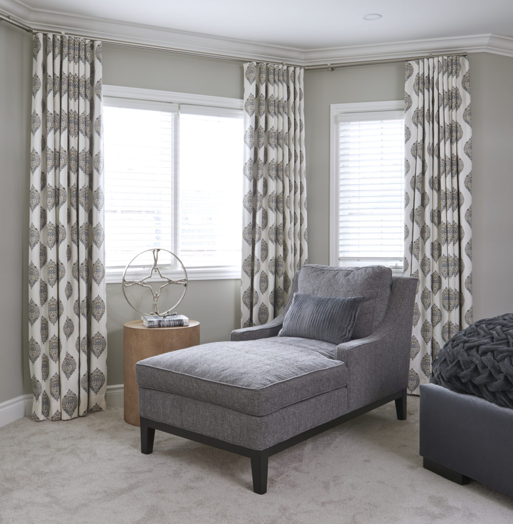
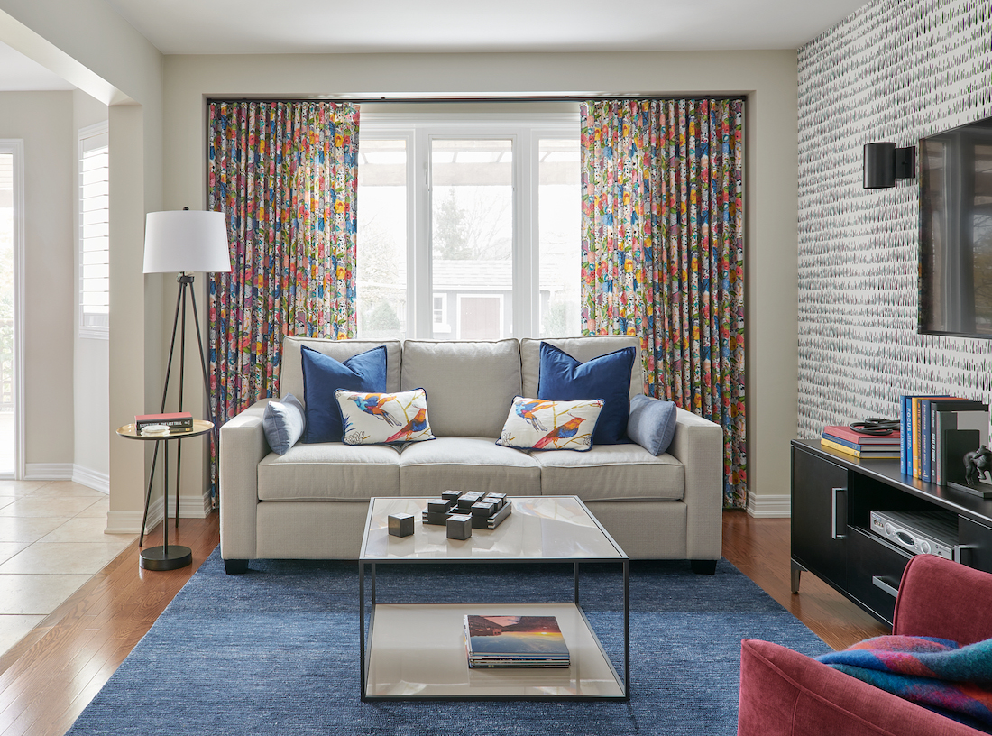
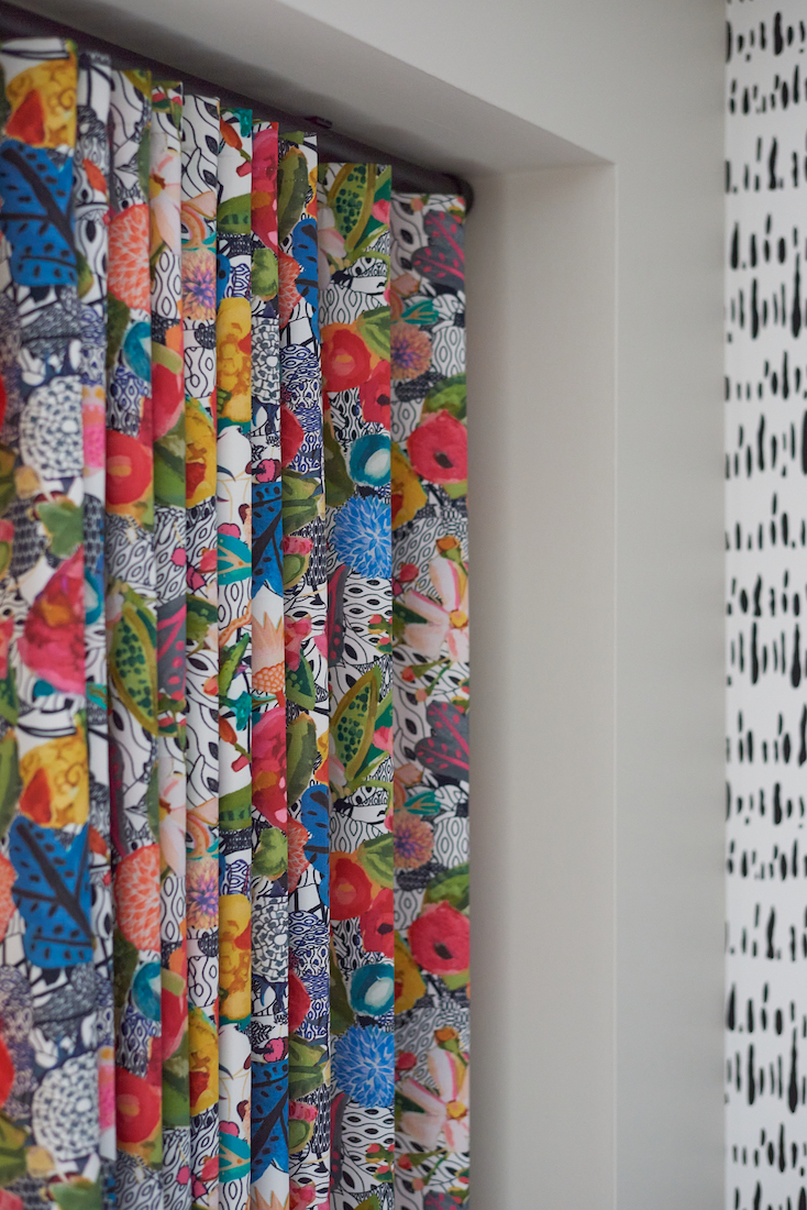
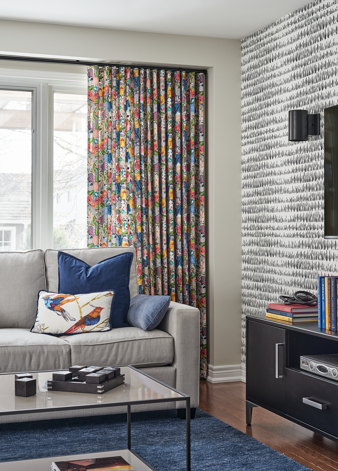
For the large window, I would install side panel draperies similar to the ones we did for a Burlington client’s living room shown below in subtle blue and green hues.
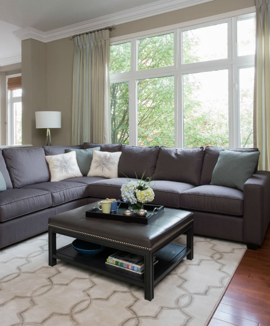
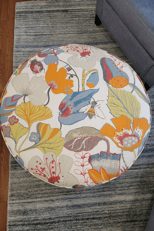
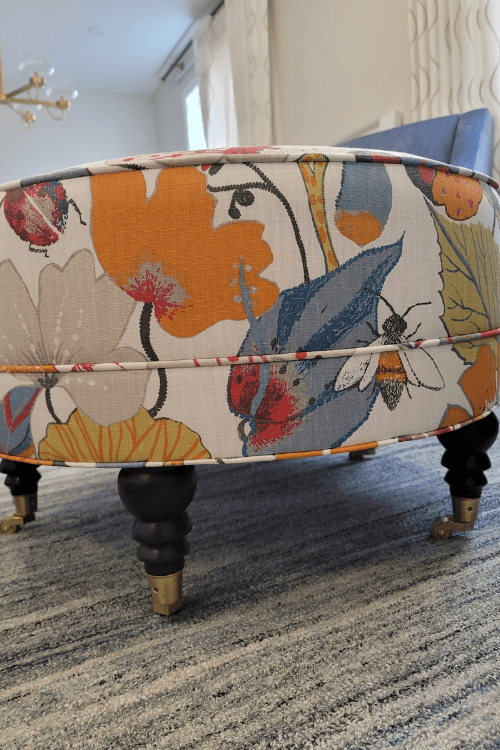
I used an app to add a larger area rug. A common decorating mistake many people make is to buy area rugs that are too small. This size is better in terms of scale, as you want a big enough rug so that it extends under the front legs of all the main furniture pieces to define the seating area.
With this specific rug I found online, the pattern is pretty and the muted colour tones work very well with the fireplace stone, the wood floor, and Revere Pewter on the walls.
Paint It Like New
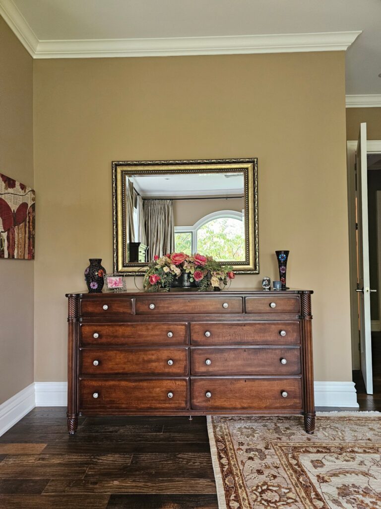
Like many traditional or transitional houses, this client’s home had a lot of orange-toned wood. And not only the flooring, stair railings, and built-ins, but also the case good furniture pieces. Painting the spindles or built-ins could’ve been an option, but not every homeowner is open to doing that.
We discussed alternative ideas such as either getting a new coffee table and end tables or keeping the ones she has and spraying them white.
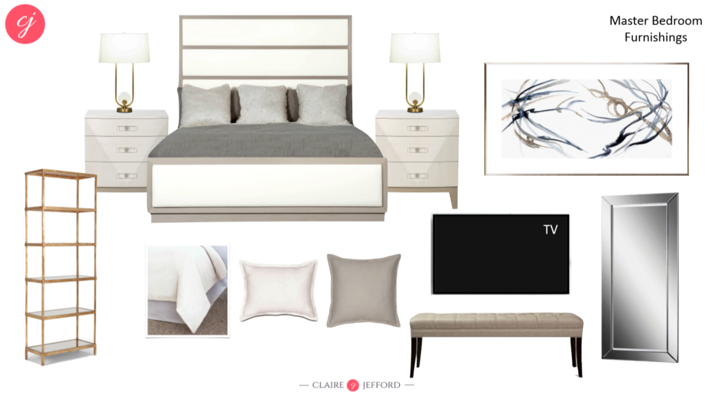
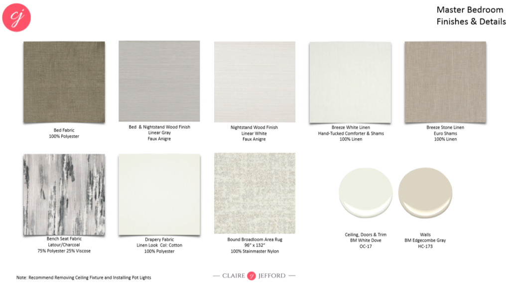
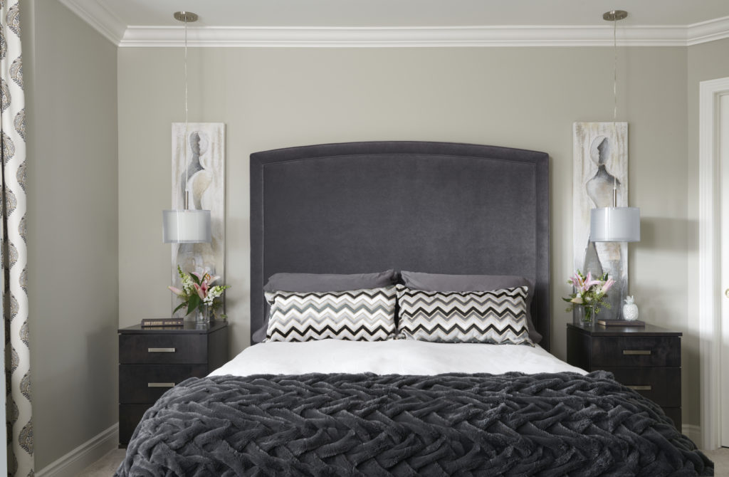
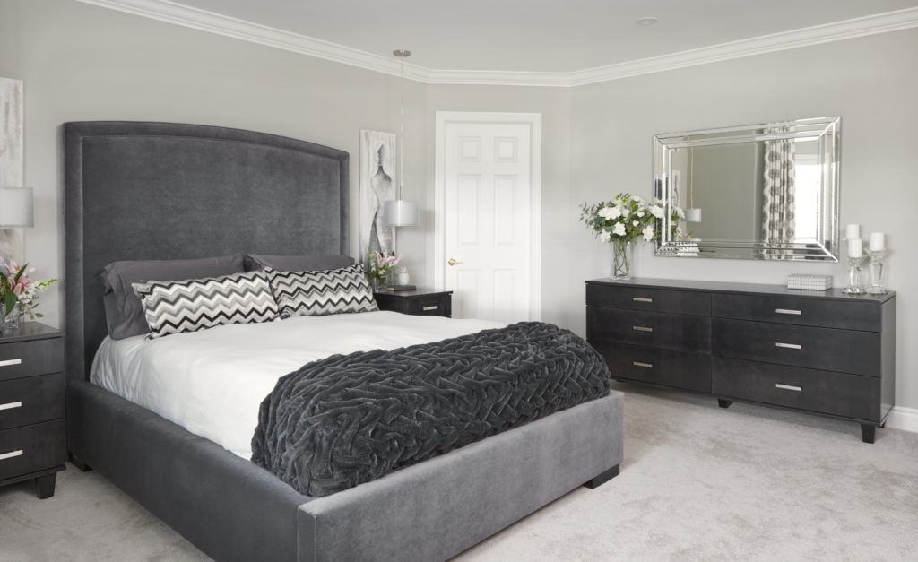
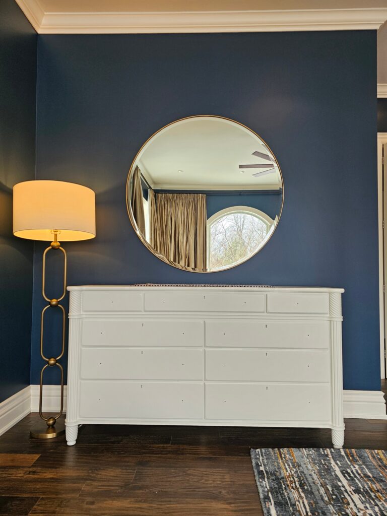
On a recent bedroom decorating project, we did just that for a client. We sprayed her traditional styled, dark wood dresser and nightstands to completely transform and update the look. This is great for reducing waste and saving money on a project.
Below are the before and after photos from that particular project with the updated piece shown without the hardware. We later added gold knobs which complemented other finishes in this large bedroom.
At the end of our Zoom call, my client had a clear plan, renewed confidence, and a big sigh of relief knowing she didn’t need to repaint her entire main floor. The money she was going to spend on paint, could now be invested in window treatments and other furnishings. Yay!
What’s your biggest takeaway from the design lessons I shared with you here today? Comment below to let me know.
Here & Now Design Consultations
Is there an area in your home that you’ve been struggling with? Whatever the design dilemmas or colour challenges you are facing, know that you don’t have to figure it out all on your own.
Let’s hop on a Zoom call, I’ll give you immediate answers, so you can move forward with confidence and clarity.
I offer my 1-hour ‘Here & Now’ online design consultations for anyone outside of my local area.
With over 14 years of design experience and having worked on hundreds of projects, I can provide professional guidance in any area of your home. Stop second-guessing, I am here to give you instant Claire-ity 🙂
Learn more about this exciting new service and book your online appointment with me here.
I can’t wait to e-meet you and help you with your project!

Local In-Person Design & Colour Consultations
If you are local to me either in Burlington, Ontario or around the GTA (Greater Toronto Area), I would love to come to your home for a 2-hour in-home consultation.
Click here to connect with me via my contact page.
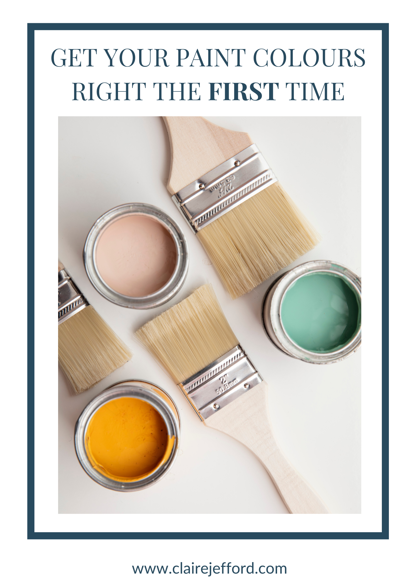
Perfect Colour Palettes
Are you losing sleep and overthinking when it comes to choosing the perfect paint colours for your home? Don’t sweat it!
As a Certified True Colour Expert, I have instant advice to make it easier for you.
We have more than 50 Whole-Home Colour Palettes readily available for you to instantly download. All of the paint colours in each palette have been carefully selected by me personally.
Plus, there’s you get tip sheets on lighting, paint sheens, how to create a gallery wall, a paint planning template, and more.

You can view the entire gallery of paint colours here.
Or, click below on your preferred brand to see the most popular paints to choose from.
Benjamin Moore Colours Referenced in This Blog Post: