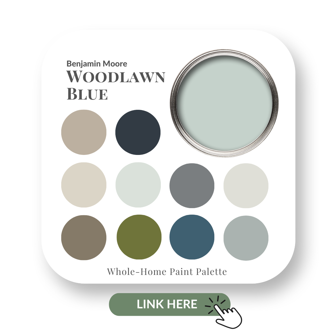
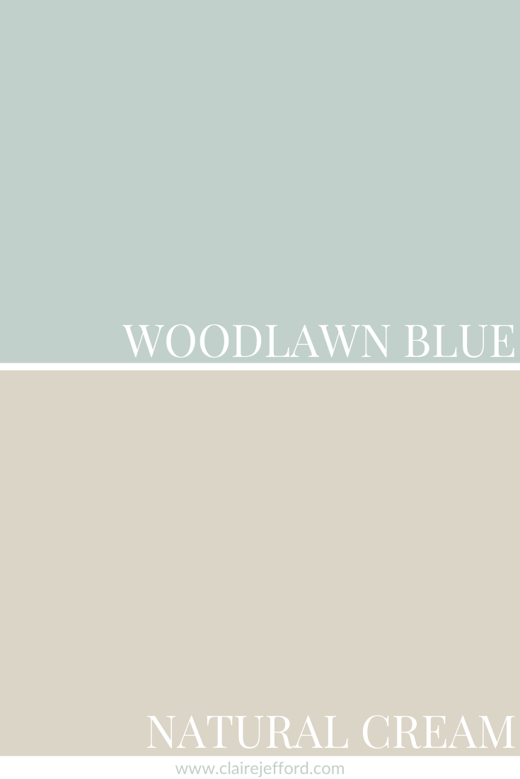
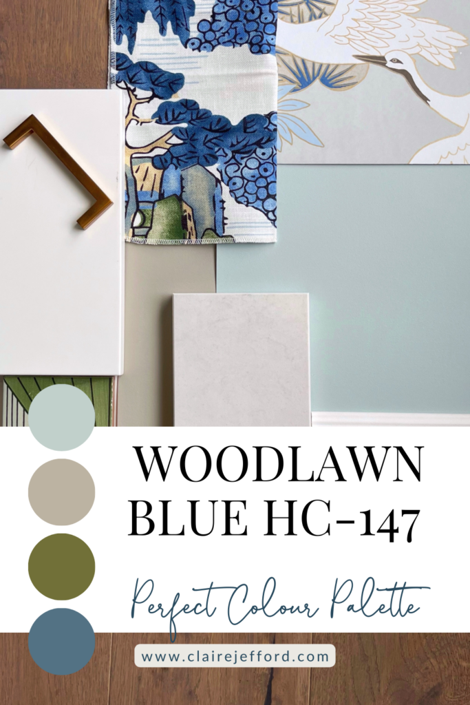
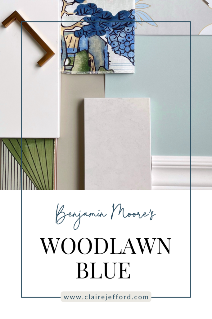
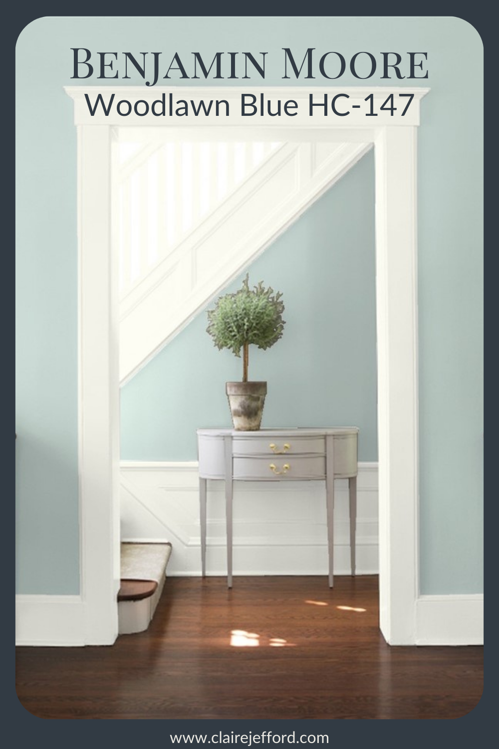
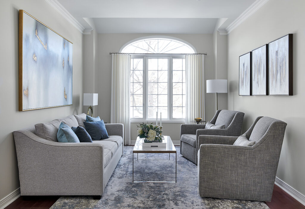
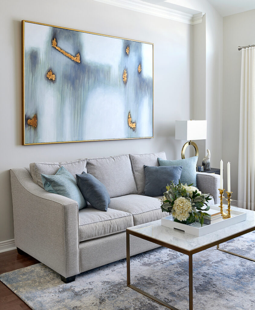
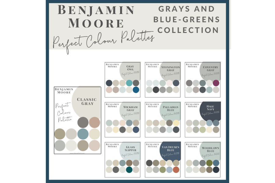
Today’s review is of Benjamin Moore’s Woodlawn Blue. It is a lovely subtle shade of blue-green from their Historical Collection.
This beautiful tone would add a wonderful bit of colour to a mostly neutral home or look super in a luxurious spa-like bathroom.
In this colour review video of Woodlawn Blue by Benjamin Moore, I share:
The undertone
Colour comparisons to easily see the different undertones
Best white paint colours for the trim and ceilings
Beautiful colour combinations to inspire you for your decorating project
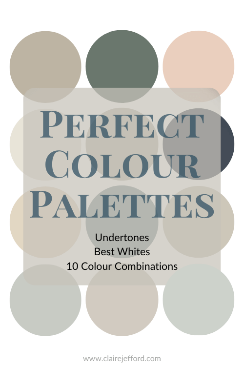
After you watch the video if you would like all this information conveniently laid out for you in one place with even more paint colour combinations to use, take a look at my Woodlawn Blue Perfect Colour Palette.
A must-have digital download for any colour enthusiast or design professional.
As a Certified True Colour Expert and an award-winning interior design professional, I’ve worked with many homeowners on various residential design projects.
I want to give you the confidence to make educated decisions about your own paint choices.
Let’s do this!
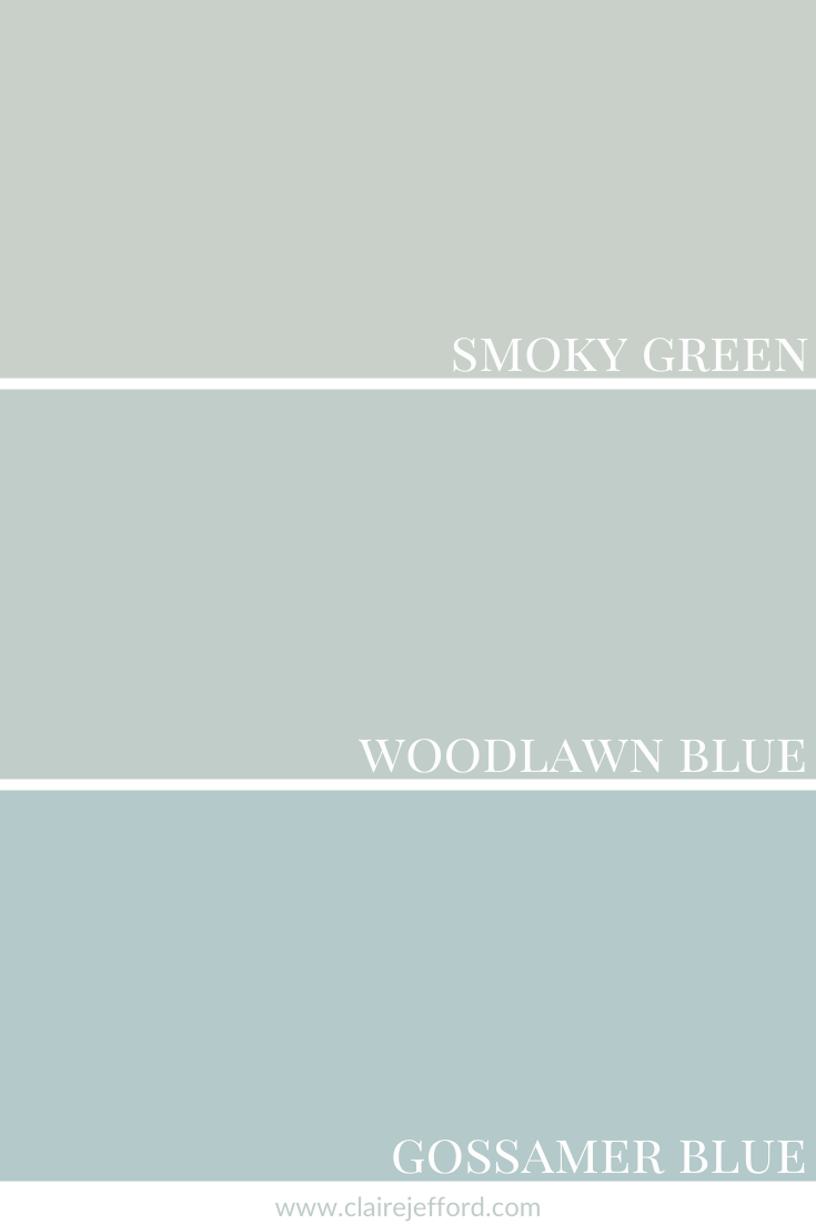
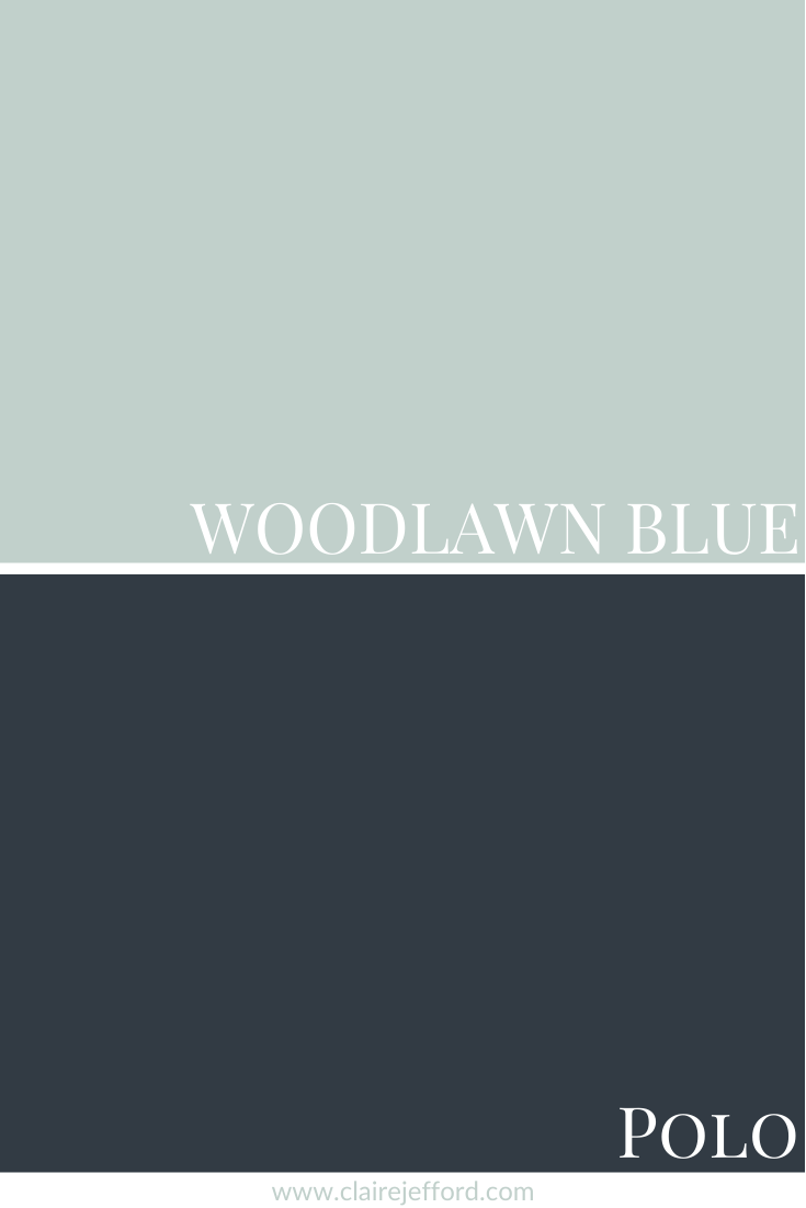
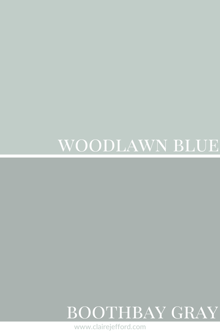
Undertone: blue/green
Woodlawn Blue may lean more towards blue or green in colour depending on the lighting and what other decorative elements you pair with it in your interior decorating project.
Looking at the colour comparisons below will help give you a better idea of where Woodlawn Blue fits between two similar shades, one that is more green and the other that is bluer.
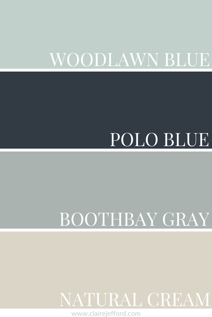
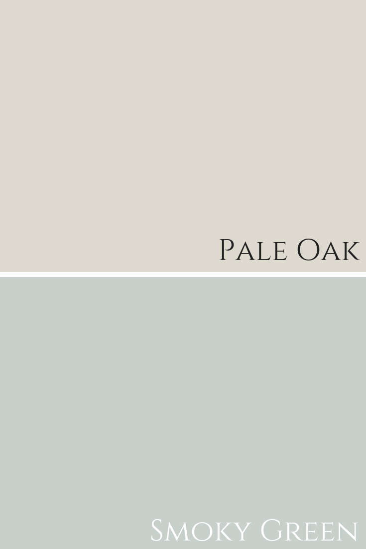
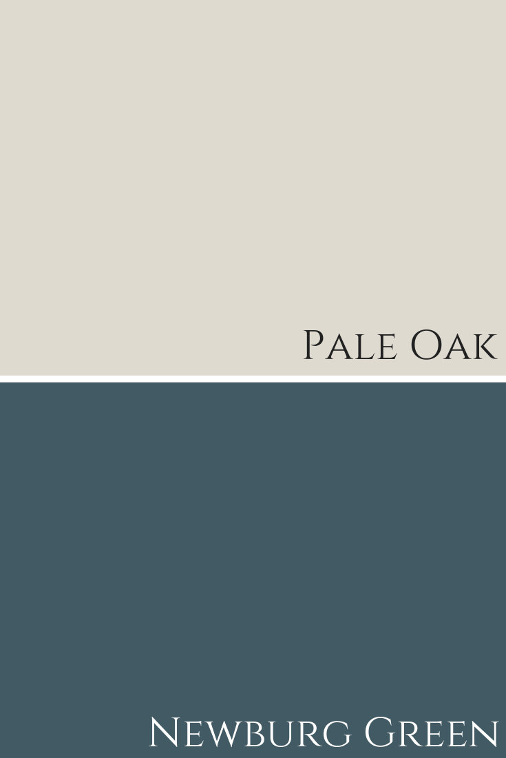
Colour Comparisons
Smoky Green CC-700 & Gossamer Blue 2123-40
I always love to compare a paint colour so you can clearly see the true tones. It’s often not until you have a colour side by side with similar shades that the tones become obvious. Don’t miss this step when selecting your paint colours.
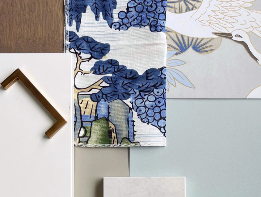
During a colour consultation, I always make sure to show my large paint boards against different elements such as flooring, tile, and fabrics.
I swap them out to show my client just how different similar colours can look next to their existing finishes.
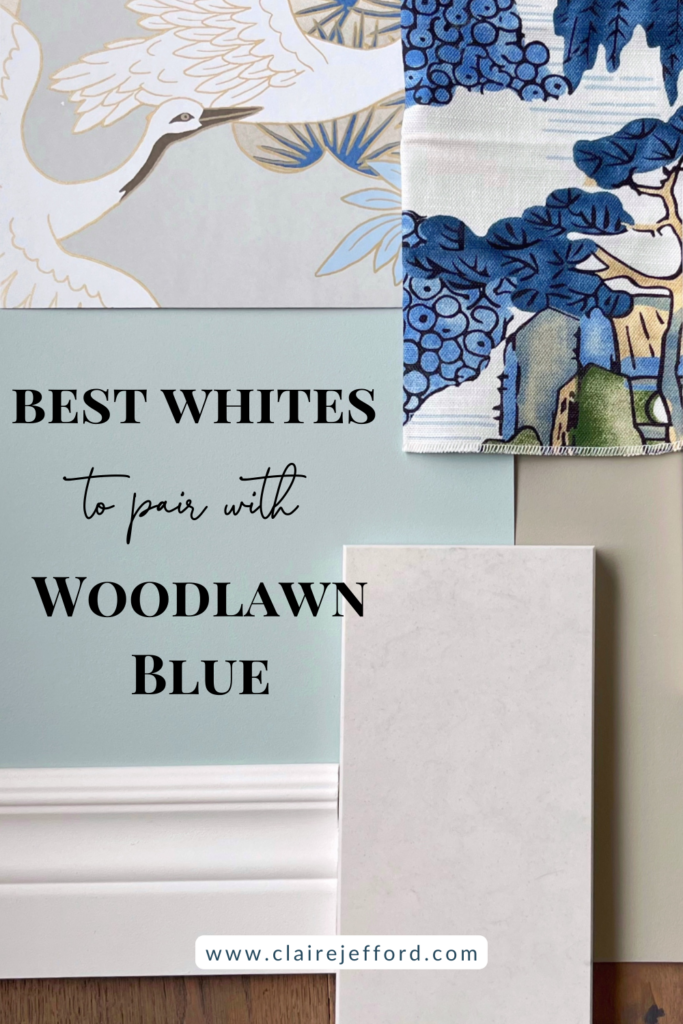
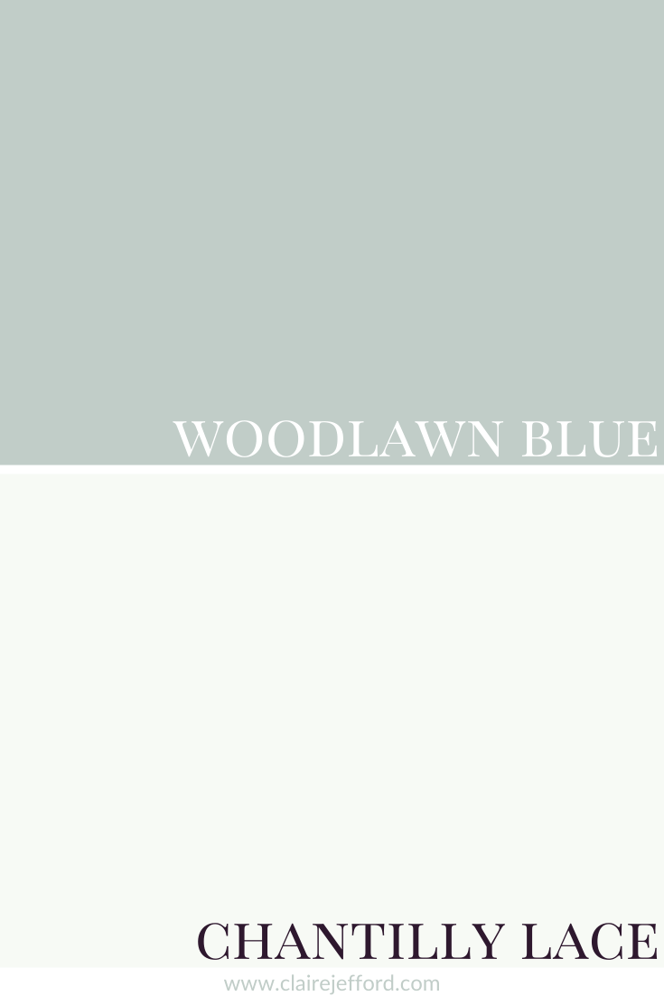
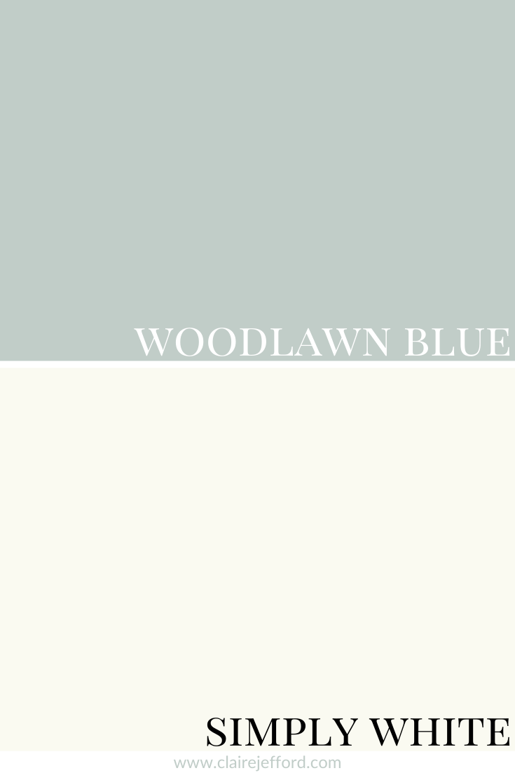
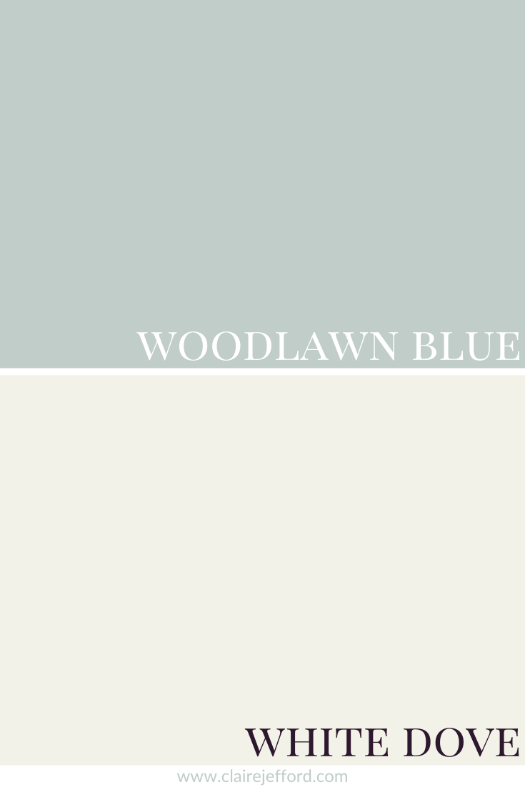
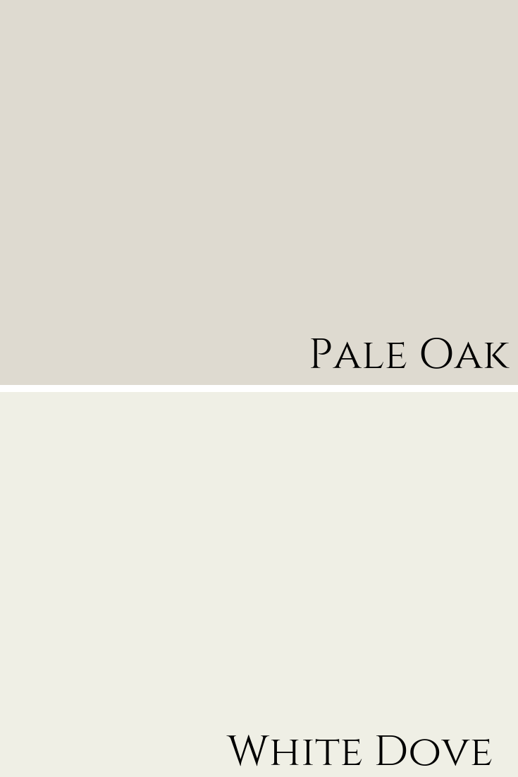
Best Whites To Pair With Woodlawn Blue
Chantilly Lace OC-65 By Benjamin Moore
Simply White OC-117 By Benjamin Moore
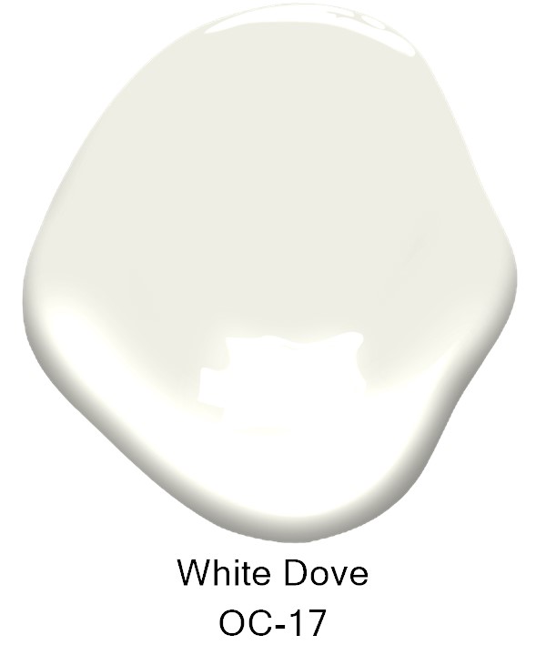
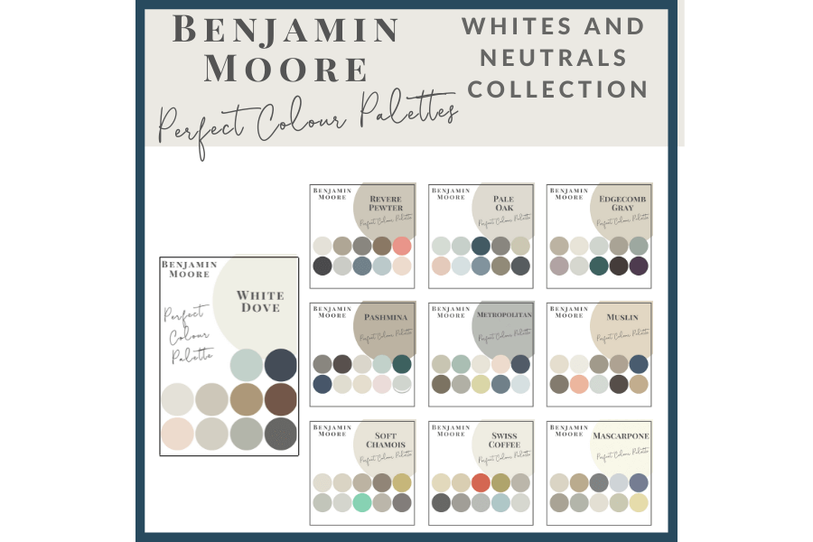
White Dove OC-17 By Benjamin Moore
If you want to learn more about one of the most popular whites, check out my review of White Dove by Benjamin Moore.
I tend to have around 10 white paint colours that are my best whites for trim and ceilings. You don’t need to look at the thousands of whites available to find the right one and you definitely don’t need to mix two different whites or use only a certain percentage of paint colour to get the right one for you.
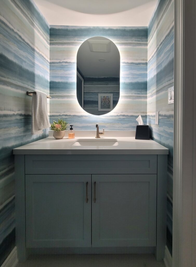
We used Woodlawn Blue for a custom vanity in a client’s powder room we redesigned. It was the perfect colour to pair with the calming blue-green tones in the bold and beautiful wallpaper we selected.
We took the photo ourselves, so while it’s not a professional photograph, hopefully, you can still see how lovely it all came together for this interior design project. (And how fabulous is that back-lit mirror?!)
I am always curious to hear what you think of the colours I review. I have not yet had the opportunity to use Woodlawn Blue in a project, have you? Please comment below.
I’ve printed all of mine and they have proved to be a very helpful resource for consultations and client projects.
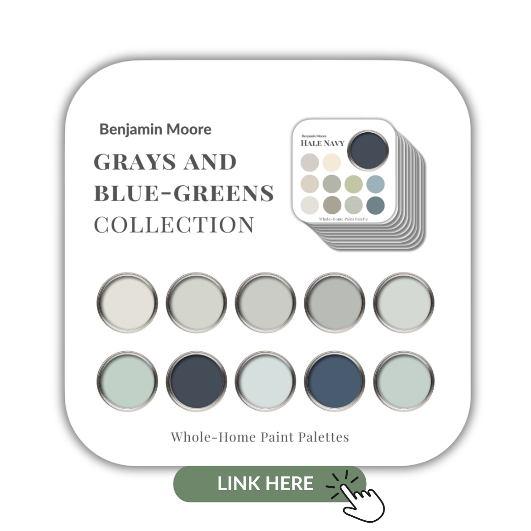
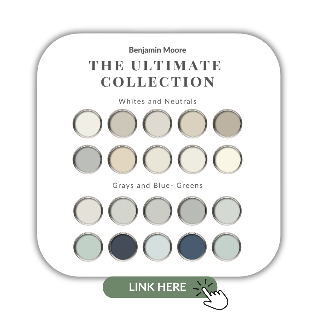
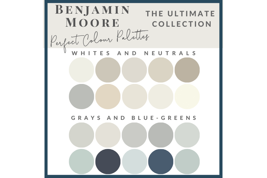
If you want to get all my Benjamin Moore colour guides in one place, look no further than my Benjamin Moore Ultimate Collection. All 20 of my Benjamin Moore palettes in one handy collection.
Remember, it only takes one mistake to take your home decorating project from divine to disaster. Don’t let the paint be what stresses you out!
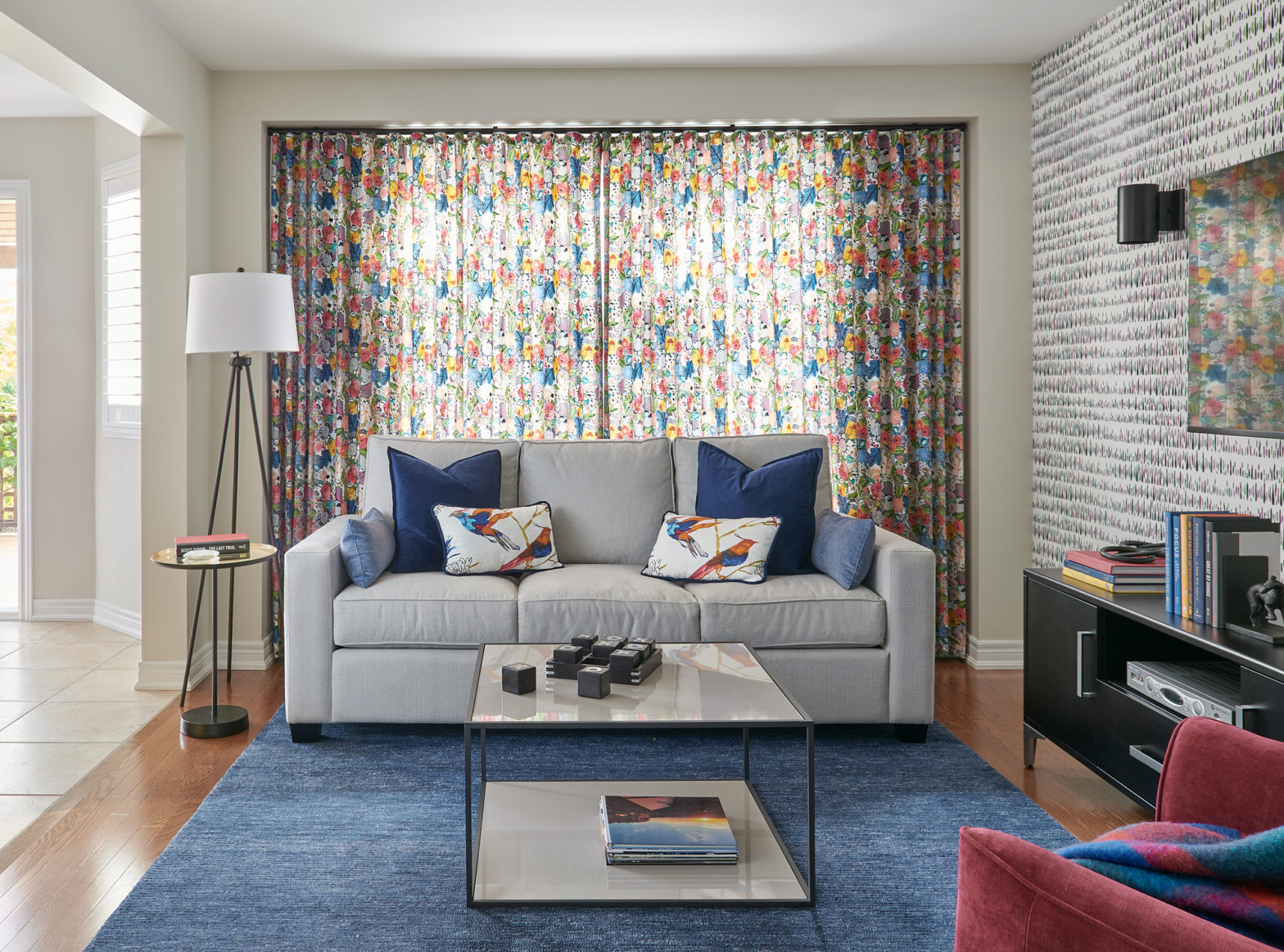
There are some exciting trends in sofa designs that I want to share with you. Interestingly, all of the living room sofas I’m showing you here on the blog today have one thing in common: large chaises.
Yes, sofas and sectionals with large chaises are currently trending in upholstered living room furniture. I’ve got six different looks and styles to share with you that are in the showroom of my local decorating centre.
Plus, we’ve compiled a few sofas’ with chaises to share with you that we’ve used in recent interior design projects.
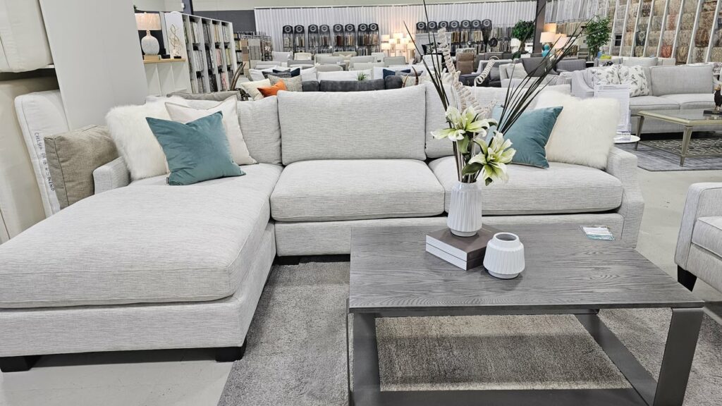
1. Super Casual and Comfy
This first style is incredibly casual and comfy, perfect for lounging. It’s not the best choice for someone who prefers a more tailored look or likes to sit up straight.
I see this fitting beautifully in a cottage or as the main seating in a basement living area.
2. Modern Elegance
Next up is a sofa with a modern feel, featuring a slightly curved arm detail that adds an elevated touch.
This style merges contemporary design with subtle sophistication, making it a versatile sofa with chaise for various living room aesthetics.
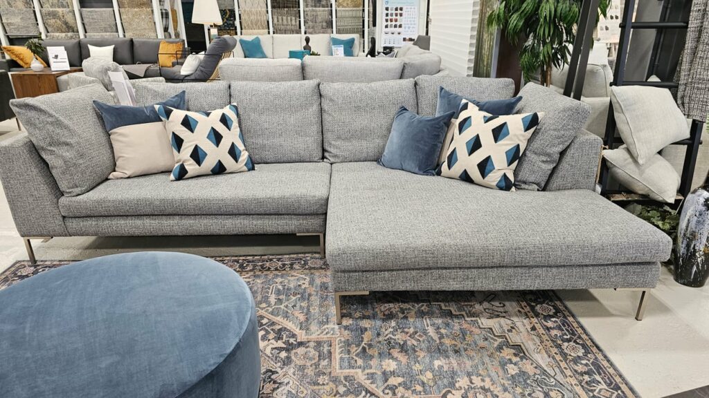
3. Perfect for Cuddling
This sofa features a chaise that matches the width of the adjacent sofa cushion, making it ideal for two people to cuddle up on.
Notice how the back cushions are smaller than the large seat cushions, offering different configurations for seating and back support.
While I’m not a fan of the skinny chrome legs, they do provide a streamlined look that some people prefer.
Overall though, the narrow chrome legs are too small for the scale of this sofa. And while in this photo the rug is not under the leg shown on the right side, you always want both front legs of your sofa to be on the area rug. This helps to create a ‘vignette’ and bring the entire sitting area together.
While this video is older, it’s still a great example of what you want to consider for choosing the best size area rug for your living room design.
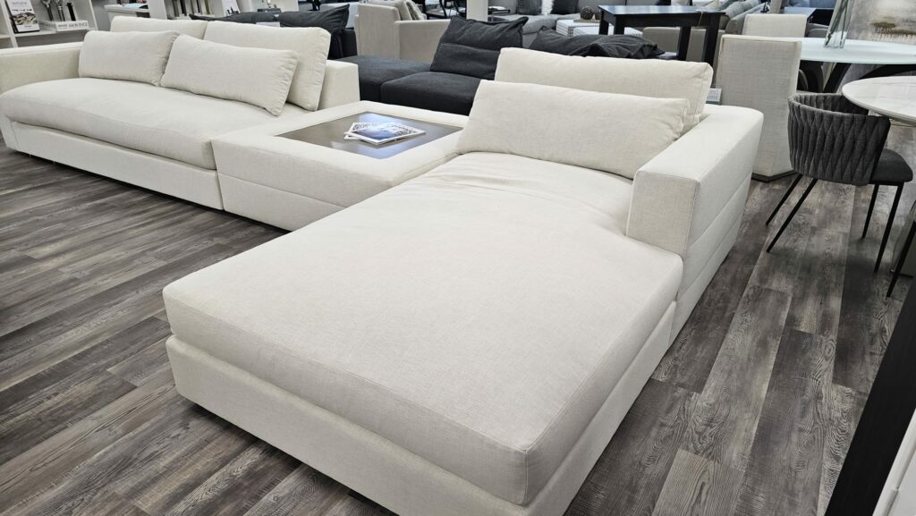
4. Bulkier Comfort
The fourth sofa is similar to the previous one but with much bulkier seat cushions and a more substantial frame. Surprisingly, it also features small, dainty chrome legs.
Given the larger scale of the cushions, I feel that chunkier legs would be more appropriate.
5. Spacious Sectionals
Sectionals with chaises are hugely popular for those large living spaces.
Notice how the feet of this sofa are almost invisible due to its proximity to the ground. This might pose a challenge for vacuuming underneath, which is important to keep in mind if you’re obsessed with vacuuming as much as I am!
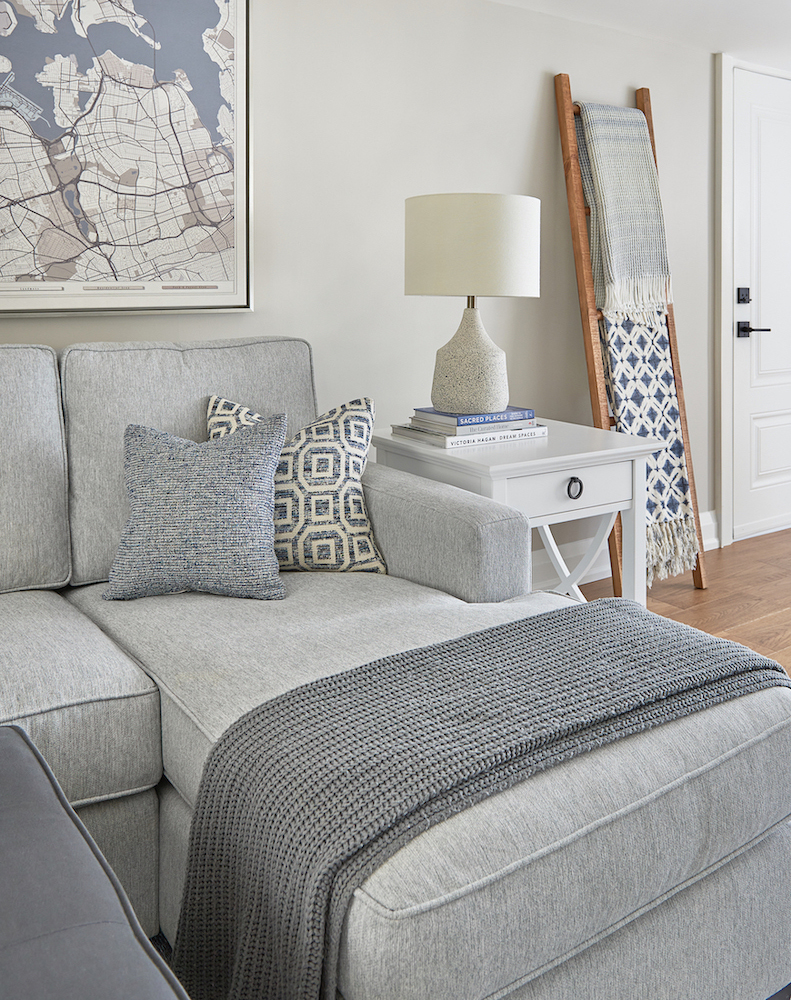
6. Long Chaise with Ottoman
Lastly, we have a sofa with a long chaise and an ottoman-type table in the middle.
This configuration is fantastic for a custom living room design setup. The ‘bump-out ottoman’ offers a convenient spot to perch or place snacks, and it also maintains a clear view of focal points like a fireplace.
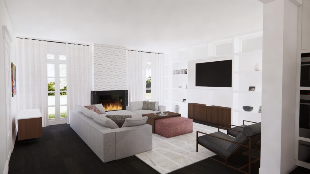
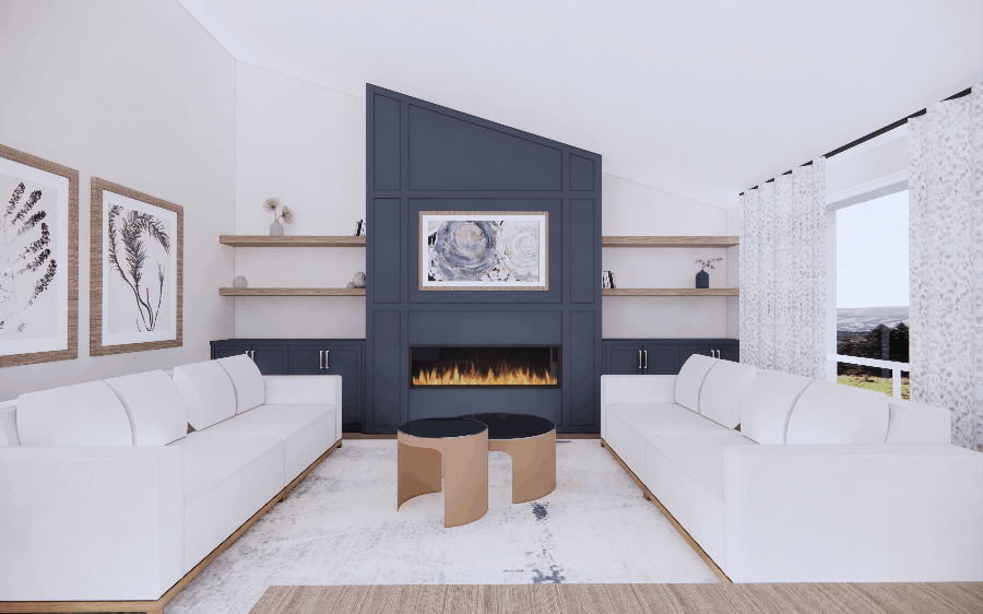
In one of our most recent living room designs, we created a custom sofa that had a ‘cut out’. This means, it had no back cushion by the section in front of the fireplace, so not to obstruct the view of that feature wall. Below is the 3D rendering.
3D Rendering of our Burlington Client’s living room design
Our Interior Design Projects
Now let’s take a look at interior design projects that we here at Claire Jefford Inc., have created for our fabulous clients.
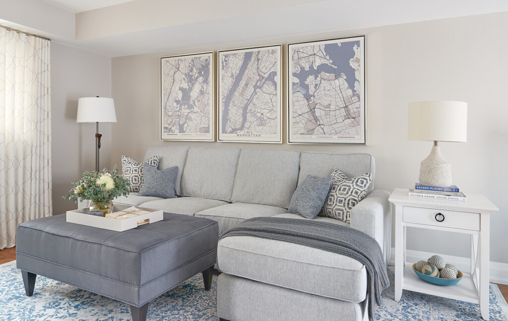
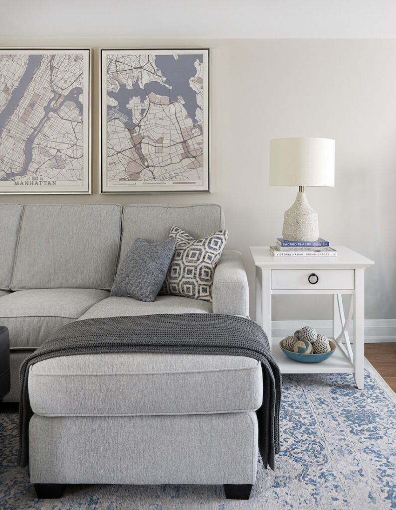
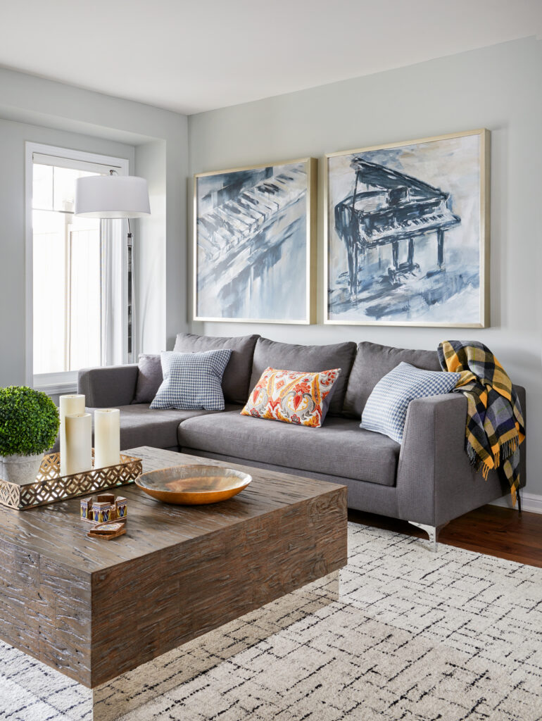
First, we have this contemporary, tailored sofa with chaise in a light gray fabric.
Designed by Claire Jefford Inc. All professional photos by Stephanie Buchman Interiors.
What you need to know:
The sofa is opposite to the media wall with a TV
The chaise is oriented on the right side because opposite on the left side, there is a swing door that opens into the room
The gray fabric has blue undertones which work beautifully with the other soft, blue accents in the room. We love blue colour combinations!
The family fights over who gets the comfy chaise section 😉
The wall colour is Collingwood by Benjamin Moore, which is the same colour as my updated main floor – well, at least the ones that aren’t covered in wallpaper
We called this project Collingwood Casual & Manhattan Blues because the artwork behind the sofa is a map of New York City, where our clients loved to vacation. It is separated into 3 pieces which we had custom framed.
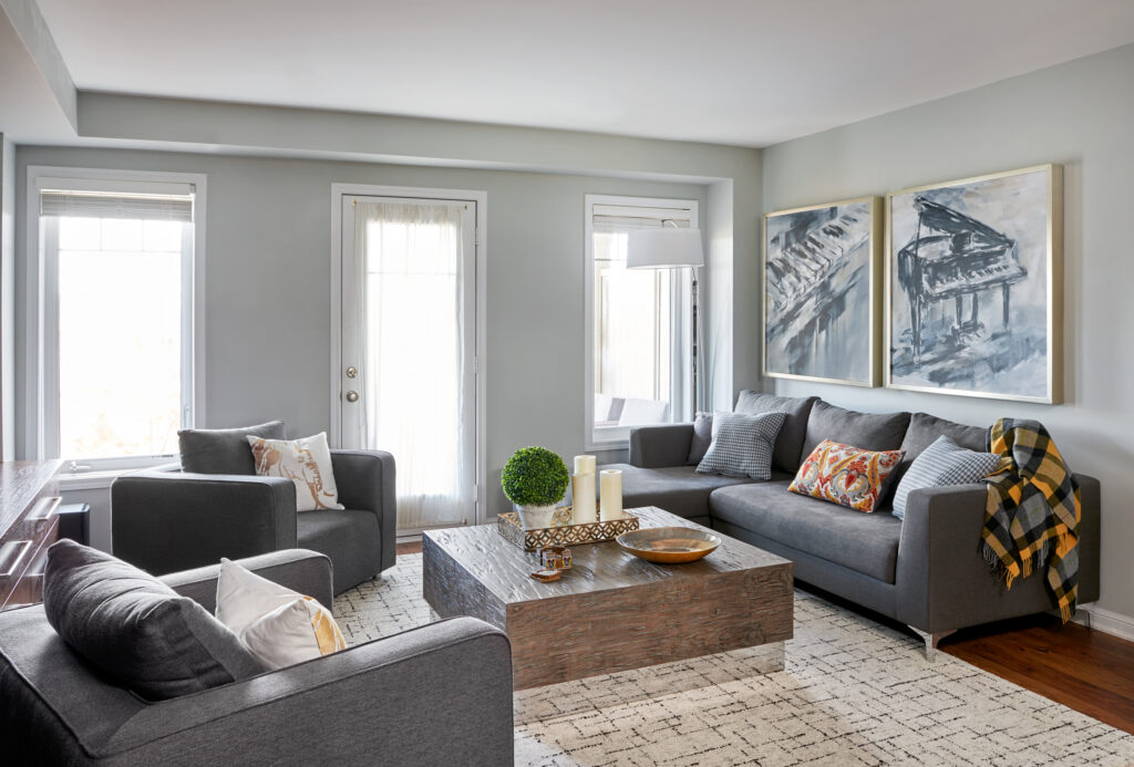
Next up is a project we called Marina Gray & Rich Woods and the sofa with chaise has similar chrome legs that we saw in some of the trending sofas from my decorating centre.
Light gray living room with statement coffee table
What you need to know:
There are 2 back pillows and one longer bench cushion, instead of a ‘2 and 2’ configuration
The chaise is on the side with the door to the patio, which we measured carefully to ensure there was enough clearance with no obstruction
I would have loved to include drapery panels to add another element of softness and a pattern. However, there was not enough room for a ‘stack back’ since the windows were so close to the walls, therefore, we felt having good light was more important
Fun Fact:
This was the first (and last) project where I never actually met the clients until the day of the photoshoot. My design assistant at the time led the entire project while I oversaw and approved all plans before she presented them to our clients. (they were lovely BTW!)
Conversational living room in neutral tones
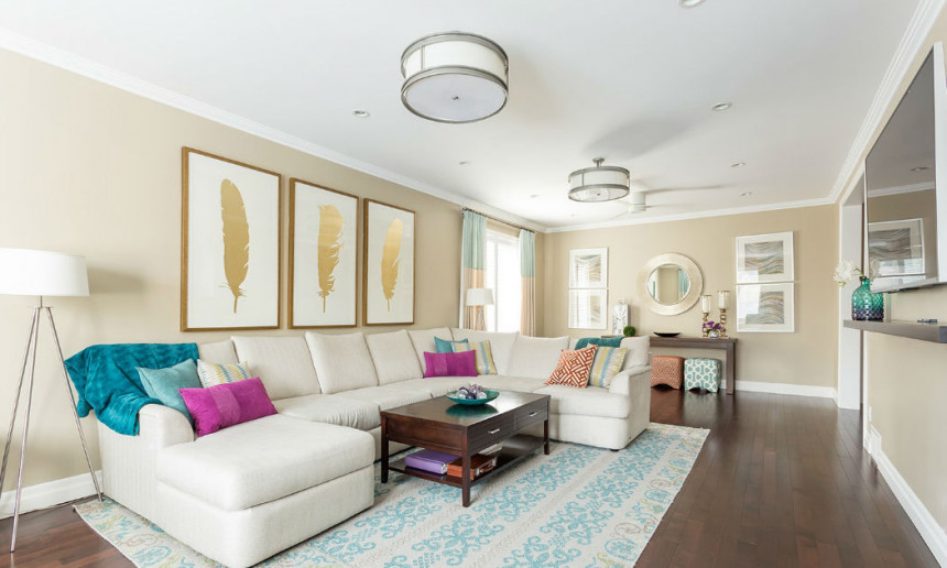
The third project I’m sharing a sofa with chaise may very well be an example of the biggest sofa we’ve ever worked with in a living room. It is a light cream sofa which our clients purchased themselves for this large living room.
Large living room, creamy sectional with chaise
What you need to know:
These clients have five children, which meant they needed an overscale couch to ensure all seven of them could gather here comfortably to watch TV together
The room was so long that we divided it into 3 different spaces – the far end with a console and extra cube seating to be used as needed, the TV viewing area, and the opposite end with 2 accent chairs
The wall colour is Edgecomb Gray by Benjamin Moore, but the kitchen was painted Stonington Gray which is why we named the project as we did (see below)
Living room design with Edgecomb Gray walls by Benjamin Moore
Fun Fact:
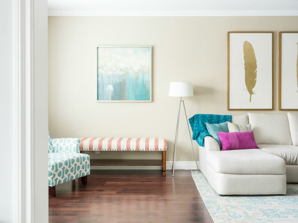
For this Stonington Gray & Gold Treasures project, clients worked with us using our Designer By Your Side Services. Since that meant that we weren’t designing the entire room in one go, the large 3-piece artwork set with the gold leaves was one of the final pieces of the puzzle to this room design.
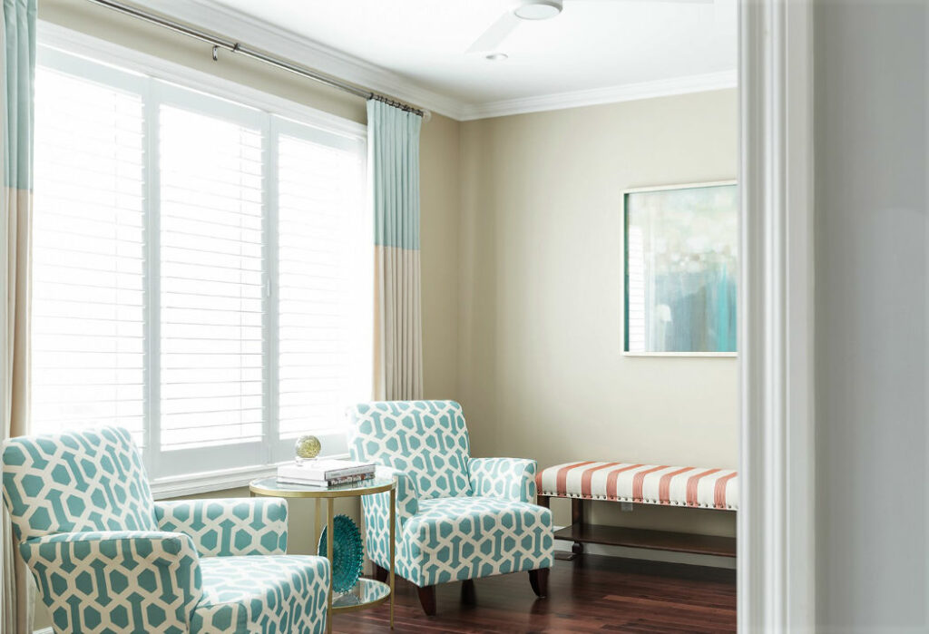
The name of our project reflects these ‘Gold Treasures’ and you can see the finish repeated in the round mirror at the opposite end of the room, in the accent pieces by the two patterned chairs, and the framed colourful artwork above the striped bench seat.
Patterned accent chairs with a backdrop of custom, color blocked drapery
Do you have a sofa with a chaise? Or if you were going to invest in one for a living space in your home, which style do you like best?
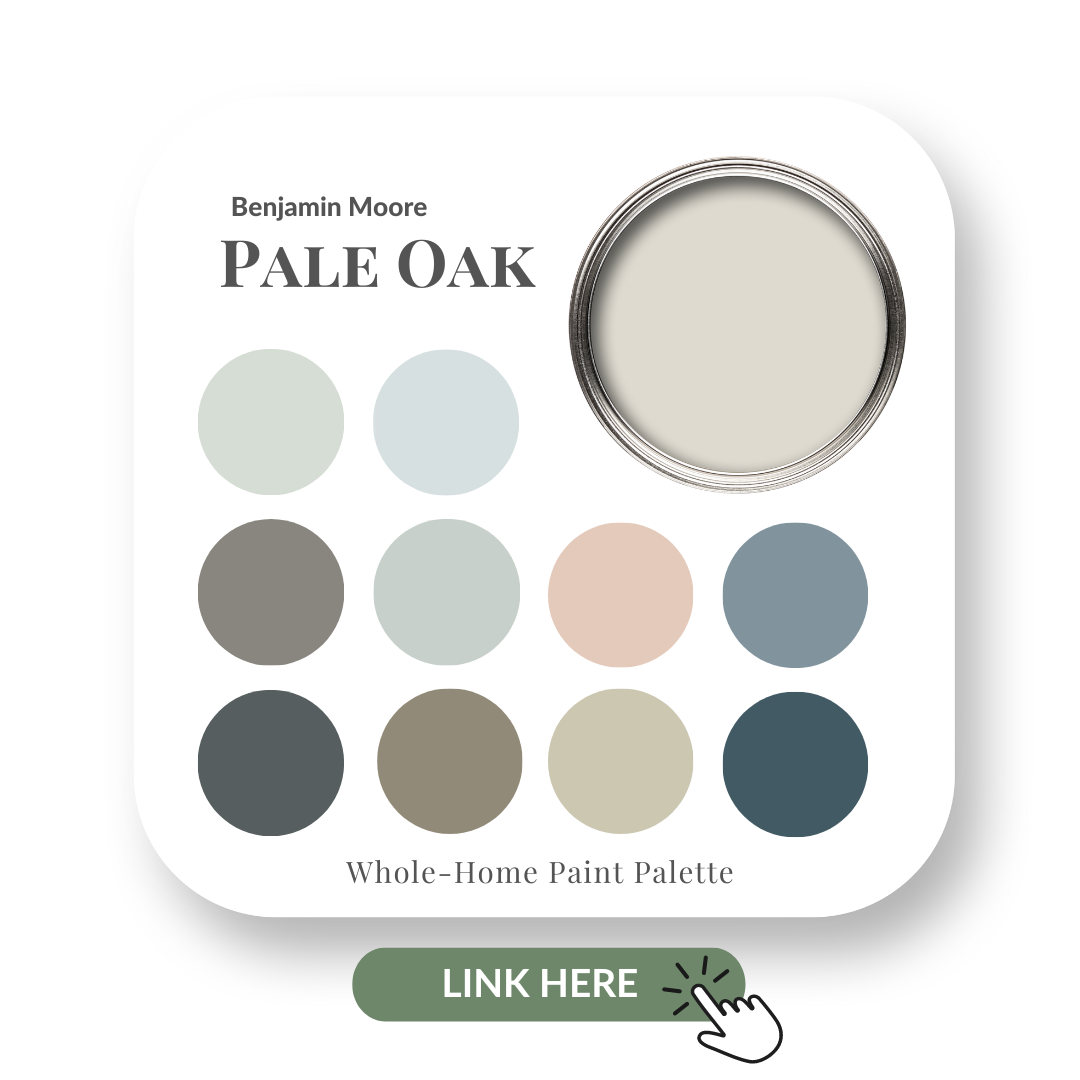
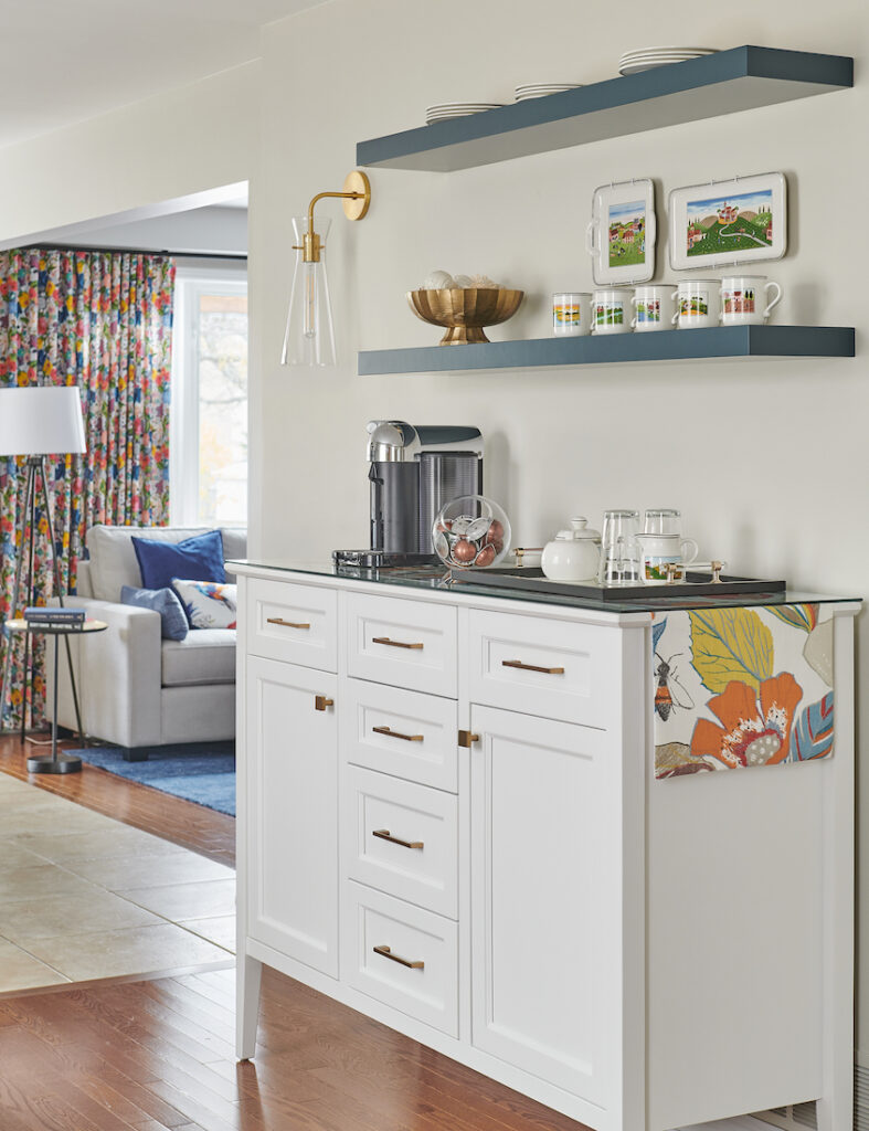
I recently used this neutral Benjamin Moore paint colour on a client’s main floor project and to say we are thrilled with the results is an understatement.
I’ve heard great feedback from those who have painted with Pale Oak by Benjamin Moore. If you’ve used it, please comment below to share your experience. Do you love it as much as I do?
As with each of my colour review posts, you can expect me to share with you:
The undertone of my featured colour
Colour comparisons to easily see the different colour tones
Client design projects where I used Pale Oak
Best white paint colours for the trim and ceilings
Beautiful colour combinations to inspire you for your decorating project
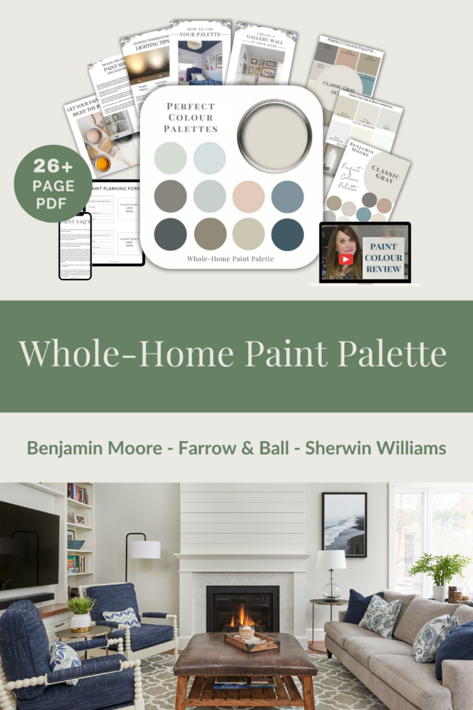
After you watch the video, if you would like all this information conveniently laid out for you in one place and have even more paint colour combinations to use with this popular neutral paint colour by Benjamin Moore, be sure to check out my Pale Oak Perfect Colour Palette.
These PDF download colour guides provide details you need to know before you choose a paint colour, as well as inspiration for your next decorating project with my carefully curated whole-home paint palette collection included.
Pale Oak Benjamin Moore Paint Guide
Below is the video of my Pale Oak Colour Review.
Undertones: Taupe Greige
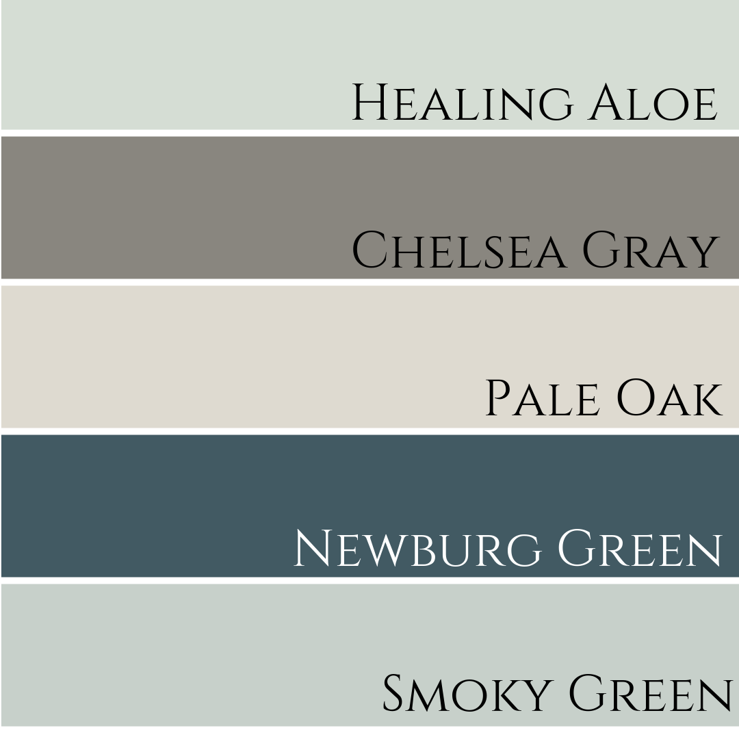
Colour Comparisons
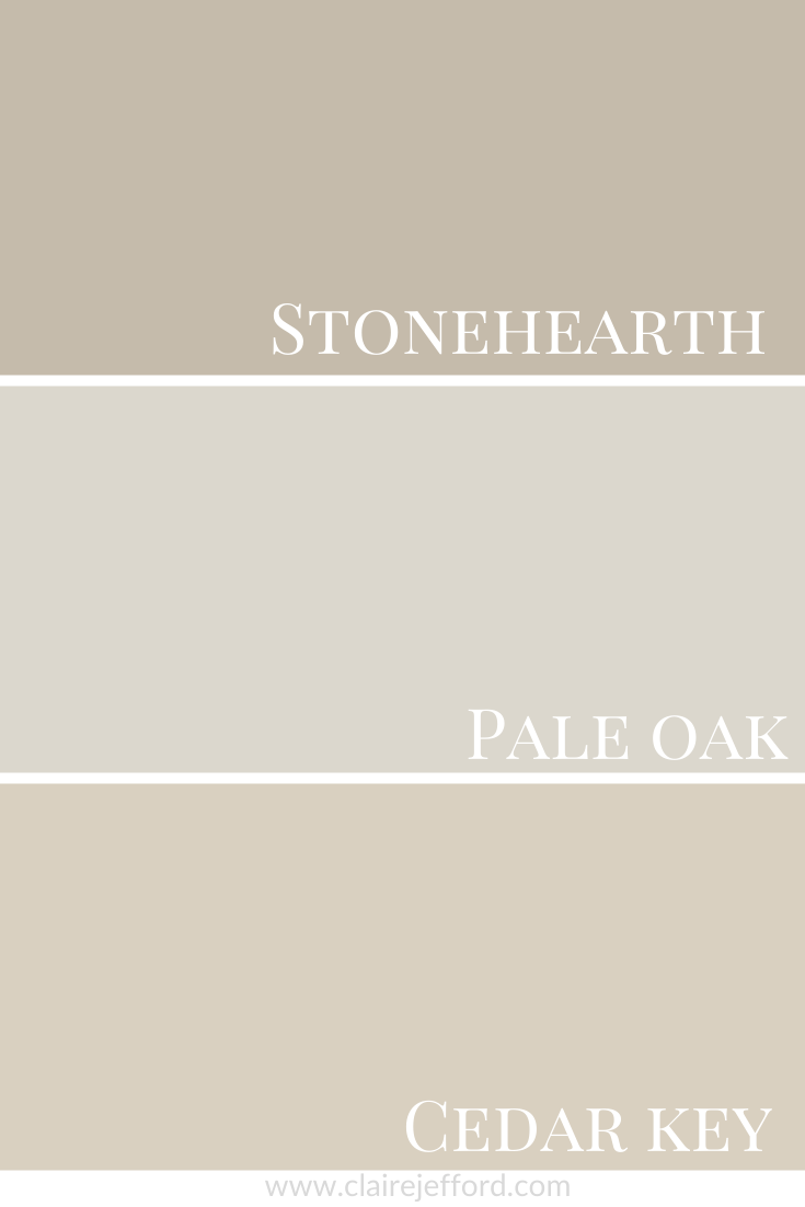
Stonehearth CC-490 and Cedar Key OC-16
With Pale Oak in the middle, you can see how it’s more of a greige and less beige when compared to the other two colours. That’s how it also appears in our client project shown below.
A client project with Pale Oak
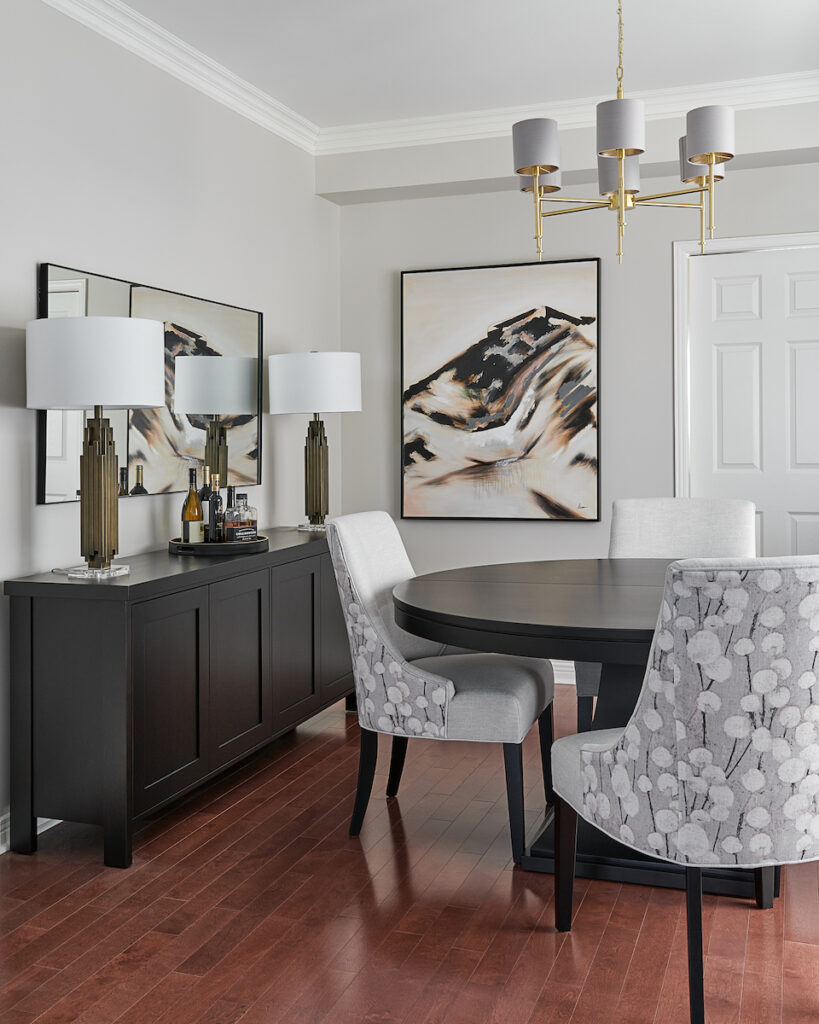
A project where we used Pale Oak by Benjamin Moore for the wall colour was in our Burlington clients’ custom living and dining room design.
Dining room in Pale Oak by Benjamin Moore
RefinedLiving Room with Pale Oak Walls
Paired perfectly with moody blues and light green
Designed by Claire Jefford Inc., Photo by Stephani Buchman Interiors
Their main floor was already painted Shaker Beige by Benjamin Moore and our clients wished for that to remain unchanged if possible.
Shaker Beige has a pink undertone and pairs very nicely with Pale Oak. As you can see in the image below of the custom bench seat with the artwork above, we added artwork and pillows to this front foyer vignette which worked fabulously with the overall colour palette.
Foyer Bench Seat With Pillows and Shaker Beige Walls
You can see the full project here, as we also redesigned this client’s Great Room where we used White Down on the fireplace shiplap and custom cabinetry.
If you want to get all my Benjamin Moore colour guides in one place, look no further than my Benjamin Moore Ultimate Collection. All 20 of my Benjamin Moore guides in one handy collection.
Remember, it only takes one mistake to take your home decorating project from divine to disaster. Don’t let the paint be what stresses you out!
Perfect For Pinning
Take my Colour Quiz and discover your Perfect Colour Palette.
This question was asked in my private free Facebook group for interior designers, Interior Design Business Strategies.
If you’ve ever wondered what the best way to respond confidently to this type of question is, you’ll want to read this post.
From what I understand and based on what I’ve been told by designers who work at Kitchen & Bath showrooms, they are hired to ‘sell boxes’. Their goal is to sell as many boxes as they can, because that is where these showrooms make the most profit.
Design by Claire Jefford Inc.
I always thought it was so bizarre when I would have clients hire me to help them select their kitchen finishes, even though they were working with a Kitchen company.
However, that’s because many of those designers don’t get paid for the designs, nor do they get paid to select finishes. They are paid based on cabinetry sales and only get their money after a kitchen has been installed.
So how can you confidently answer the question of ‘Why hire an interior designer as opposed to a kitchen design company?’ the next time a new lead or client asks this of you?
Read on, because in this post I’m sharing 4 ways that you can market this service and important details you should be discussing with potential clients to promote your kitchen design services.
1. The bigger picture
When we create main floor concept designs for clients, our professional advice is based on what we think would function best for the way they live.
We also take into consideration many other design elements when it comes to the overall aesthetic and character of the home to ensure there is not a disconnect and that there is a meaningful flow throughout.
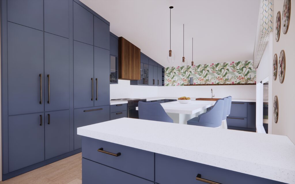
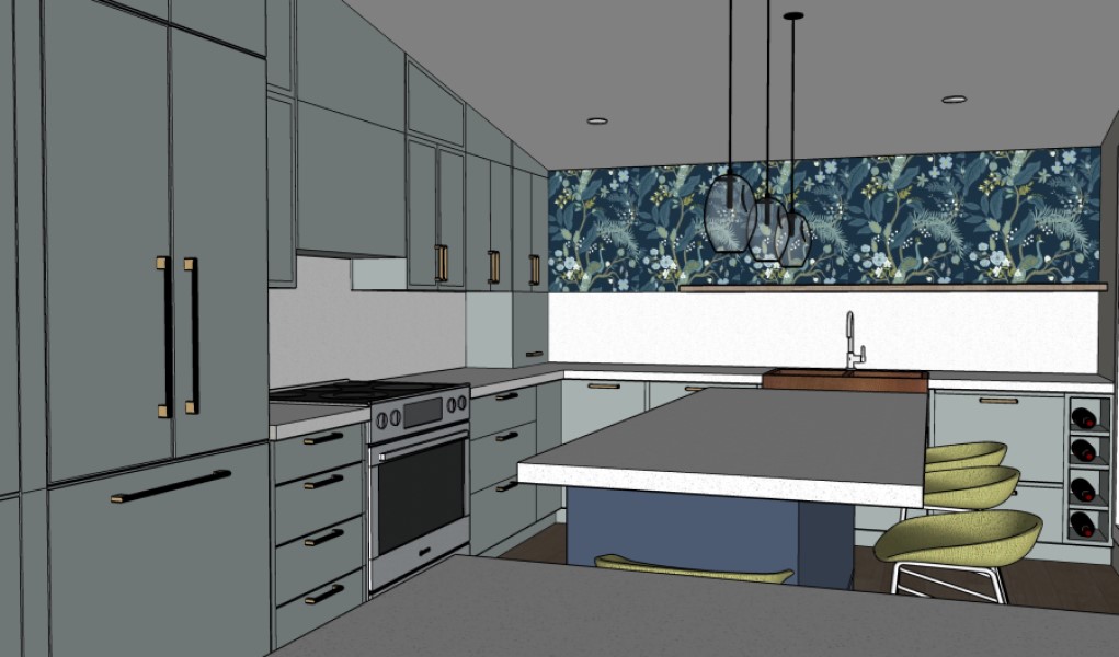
Below is a kitchen rendering option that we designed for a client. And below that image is another 3D render of the great room that is open to the kitchen.
Not only does the blue and white colour scheme continue into the living space, but so do the soft wood tones we incorporated as well.
In my own home design, you’ll see how I repeated the blue tone of the Benjamin Moore Kensington Blue kitchen cabinetry in the living room with the slightly textured blue wallpaper and custom swivel chairs.
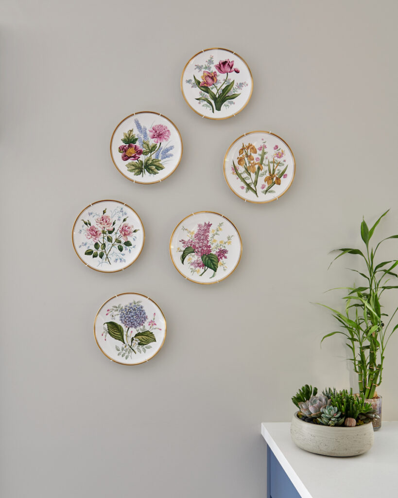
You’ll notice that the upholstered pink-coloured ottoman is also intentional, as this relates to the decorative details in the kitchen such as the wall plates, accent wallpaper by the floating shelf, and the window treatment. This repetition creates flow within the design.
Design by Claire Jefford Inc.
Wall plates with pretty botanicals
Wallpaper pattern with the same fun colours repeated throughout the home
By the way, if you are still not feeling confident about how to market your design services to your clients and effectively communicate to them the value of your work, my comprehensive Rock the Initial Consultation process package will make you feel supported and in control of every step of the process.
2. Our cabinetry is custom
Although most of the general public thinks that they are, most cabinet lines sold by kitchen companies are typically standard sizes and often built off-site.
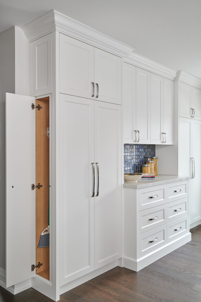
Our cabinets are 100% custom and my cabinet maker builds everything within his local shop just outside my hometown of Burlington, Ontario. We can easily integrate smart storage solutions and use every inch to maximize space as well as function.
Custom broom closet designed by Claire Jefford Inc.
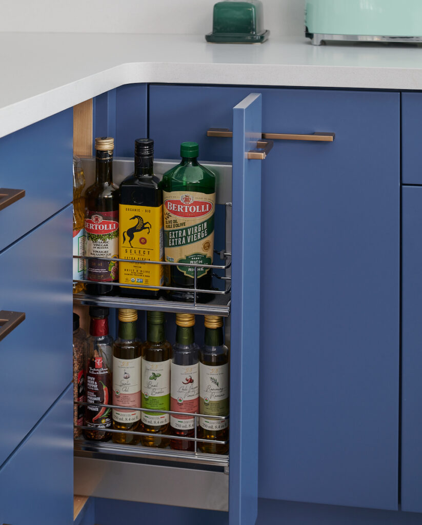
Custom pull-out cabinet with Haefele oil racks
For smart kitchen storage solutions, take a look at my kitchen here.
3. I am not invested in ‘selling boxes’
We create a vision with the best solutions for the client being top of mind.
We are not swayed by commissions on sales of cabinetry or countertops. Our GC manages the renovations and collects payment for everything except soft furnishings, while we bill for our professional interior design services.
So, the idea of ‘a free’ kitchen design from these showrooms, can come at a cost of compromising what is best for the client.
Design by Claire Jefford Inc.
In addition, the drawings a homeowner receives from a Kitchen company will often only be basic and in black and white.
We, on the other hand, are selling a ‘vision’ and want to get our clients excited about their projects!
Often we will provide 2 options for layout where it makes sense to do so and can easily upload different finishes and cabinetry colours to convey the possibilities for their new space.
This was an alternate option for my kitchen colour scheme – fun, eh?!
4. We can help select all the finishes
As an independent interior designer, you can get more involved in the project to ensure other finishes are specified for a cohesive design.
This means, we are a ‘one-stop-shop’ and can assist with other design elements such as counters, backsplash, cabinetry colours, and hardware, in addition to decorative elements like kitchen island stools, window treatments, lighting, and artwork.
We don’t just create the layout design for the kitchen, we bring all of the design elements together beautifully.
Design by Claire Jefford Inc. Most photos were by Stephani Buchman.
If you love hearing about the latest trends in kitchen and bath design, read this post from one of my trips to the Kitchen & Bath show in Las Vegas.
What about you? How do you sell clients on hiring your interior design firm over a showroom for kitchen design services?
For more helpful resources to push your business to the next level, see my shop page here.
My helpful resources will help you to get organized and gain more confidence in the way you run your interior design business!
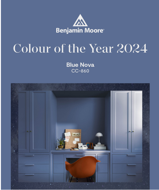
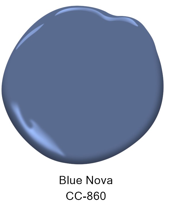
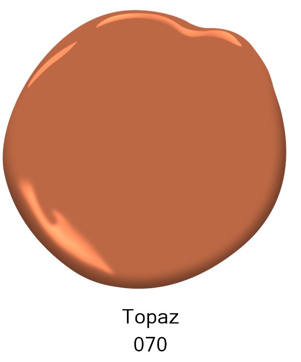
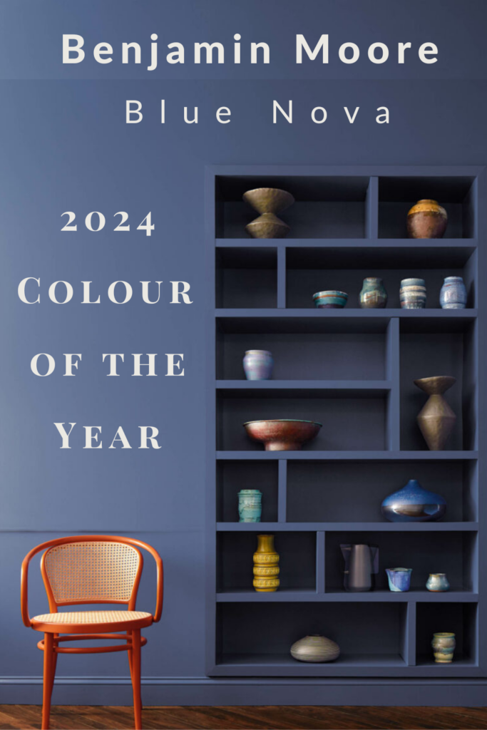
Incredibly it’s that time of year again. Benjamin Moore’s Colour of the Year 2024 has been revealed!
Blue Nova 825/CC-860
A moody blue with a strong lean towards purple, like a deep, periwinkle tone.
Benjamin Moore Colour of the Year 2024 Blue Nova
And guess what? Blue Nova is a similar tone to colours that I’ve used recently for custom cabinetry on two different interior design projects.
Yes, I am the interior design colour trendsetter. 🙂
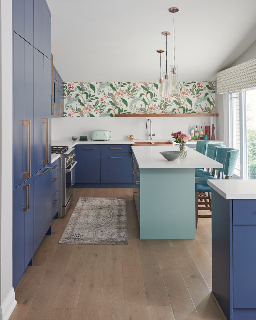
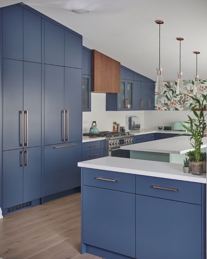
First up is my own kitchen design where I selected the cabinet colour Kensington Blue.
Kitchen cabinets Kensington Blue by Benjamin Moore. Design by Claire Jefford Inc.
Kitchen Island colour is Stratton Blue by Benjamin Moore
While Blue Nova is slightly less intense than Benjamin Moore’s Kensington Blue, take a look below at just how similar these two Benjamin Moore colours really are.
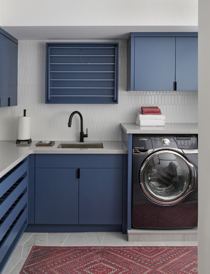
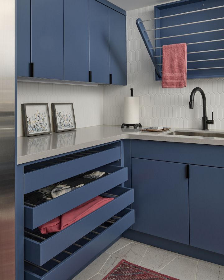
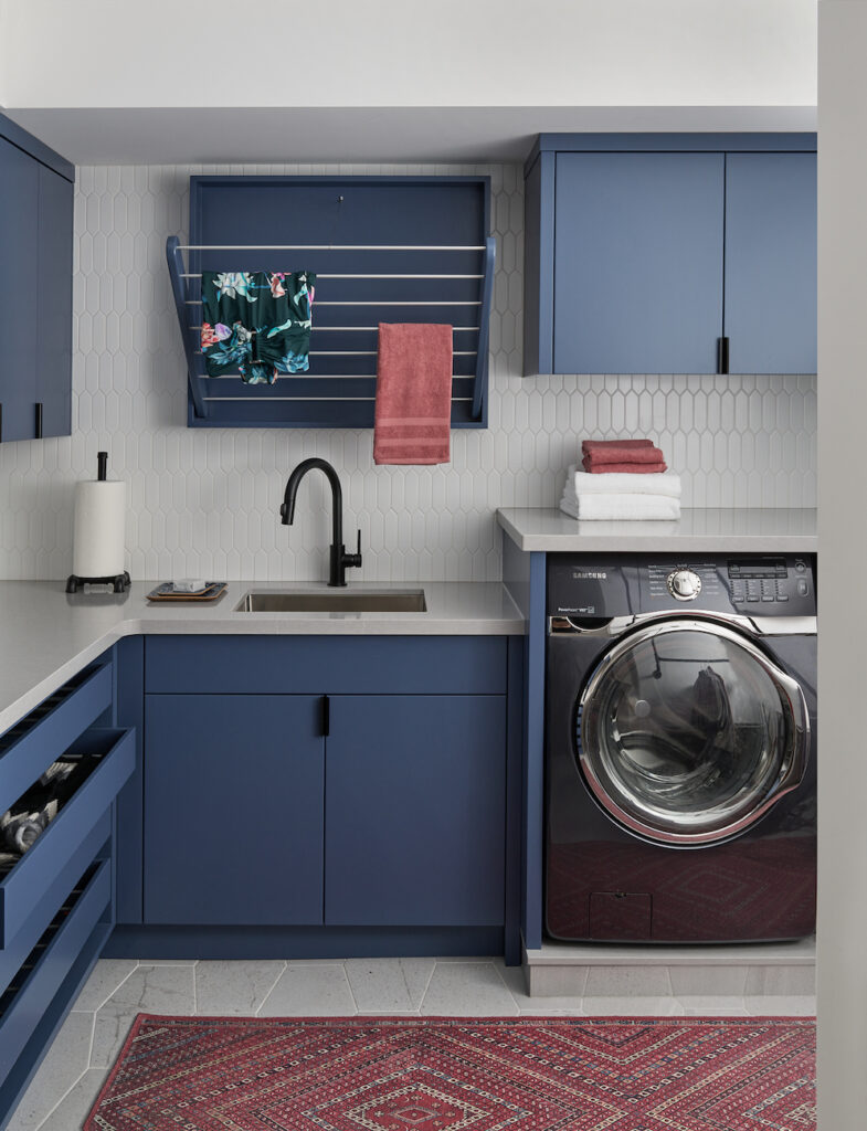
Now check out a basement laundry room we designed in 2022. We used the colour Indigogo by Benjamin Moore for the custom cabinetry.
Although not every colour of the year becomes the next big thing, it will be interesting to see if people will embrace (and really commit to!) Blue Nova in a similar way that I did in these Burlington interior design projects.
Flat-panelled cabinets are Indigogo by Benjamin Moore.
But it’s not easy to pull off this colour successfully in design as it is to do with the neutral look of a style such as ‘farmhouse’.
That is why many tend to play it safe when decorating, by using popular white paint colours. But I find safe and neutral to often equal boring or uninspiring.
I say – Give me colour!
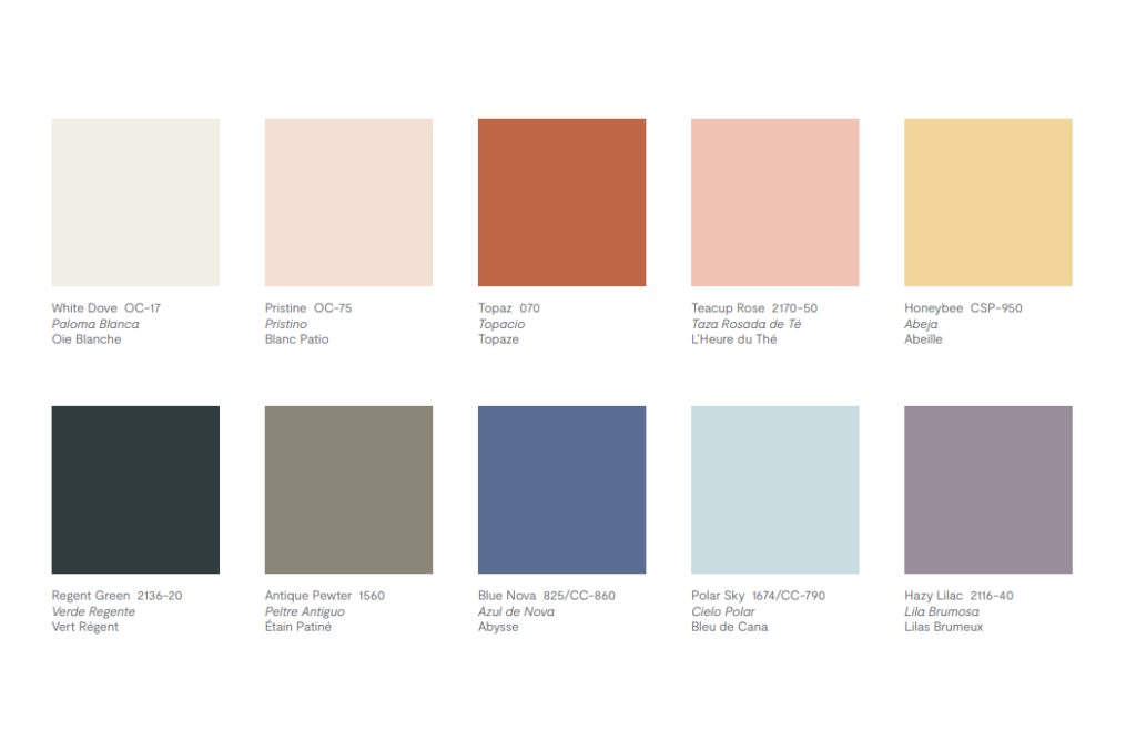
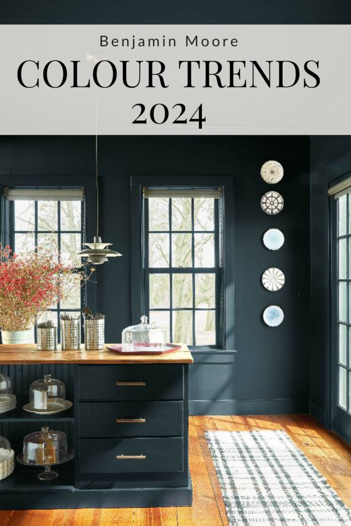
In addition to the Colour of the Year announcement, Benjamin Moore has also released their entire Colour Trends palette for 2024.
Benjamin Moore Colour Trends Palette 2024
Look at the Colour Trends 2024 palette and then this image showing the different finishes used in my kitchen.
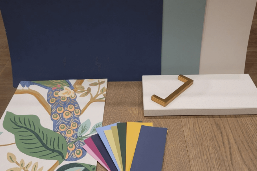
The paint chips I matched from my Spode wall plates with brass rims create a very similar colour palette. These plates from my mother-in-law were the jumping-off point for our entire kitchen design.
Finding inspiration in meaningful decorative items such as these is a great way to determine how to choose the best paint colour for a project.
Botanical Spode Wall plates on a backdrop of Collingwood Paint by Benjamin Moore
This is proof that you can create an entire room or even a full home colour palette from the helpful downloads I’ve personally created, my Perfect Colour Palettes.
Beautiful rooms showcasing the 2024 Colour Trends:
More images from the Colour Trends palette for 2024 can be seen below. Photos are courtesy of Benjamin Moore.
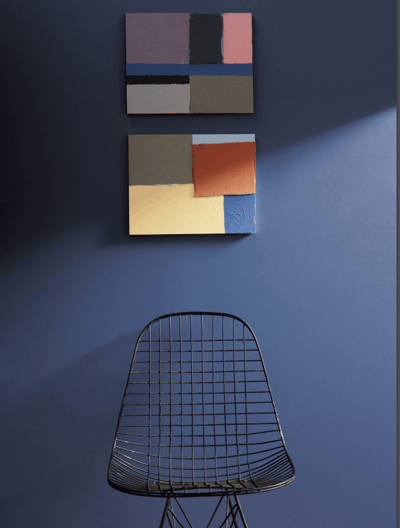
Blue Nova 825/CC-860
Benjamin Moore Blue Nova backdrop
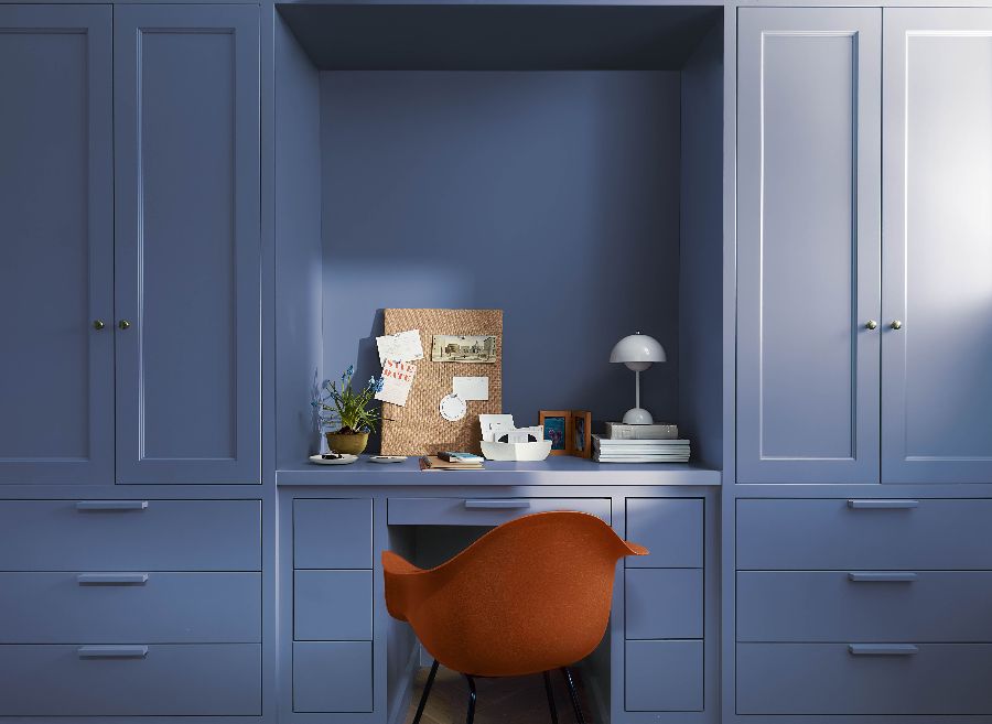
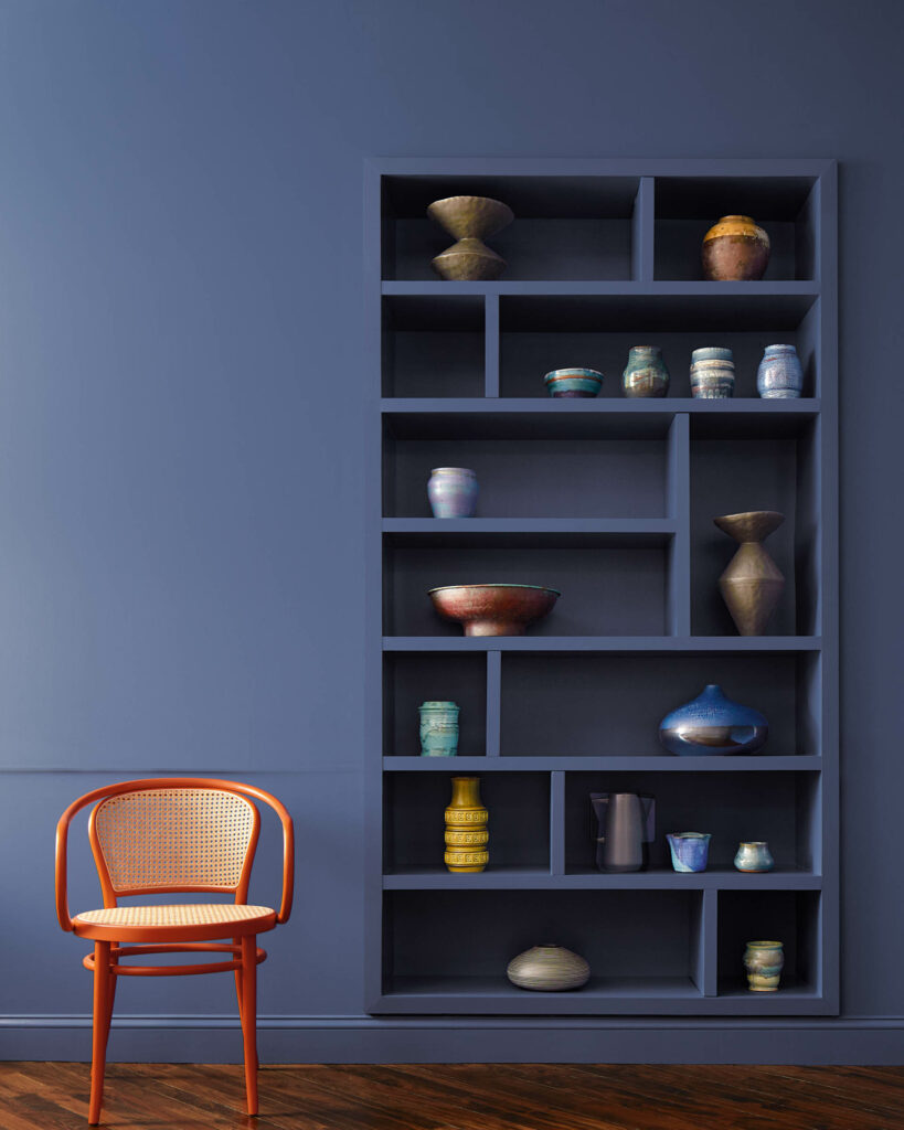
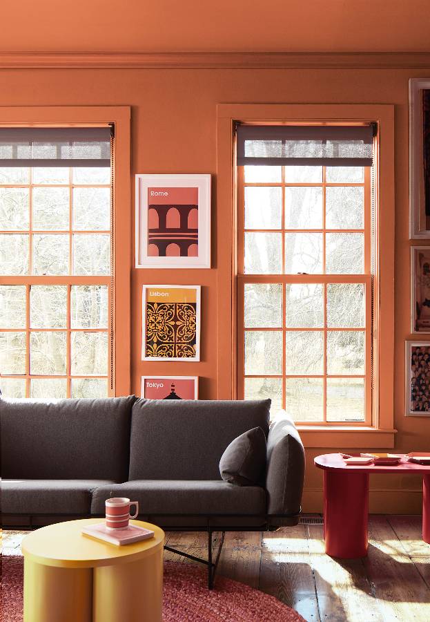
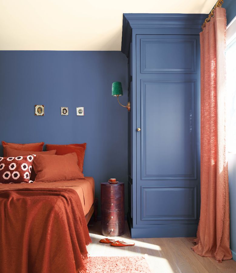
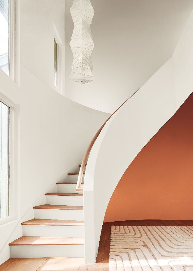
Blue and orange are opposite on the colour wheel. You can see how these similar colour tones when combined together in a space can create a striking pairing.
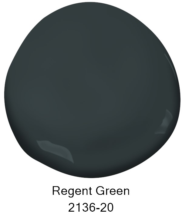
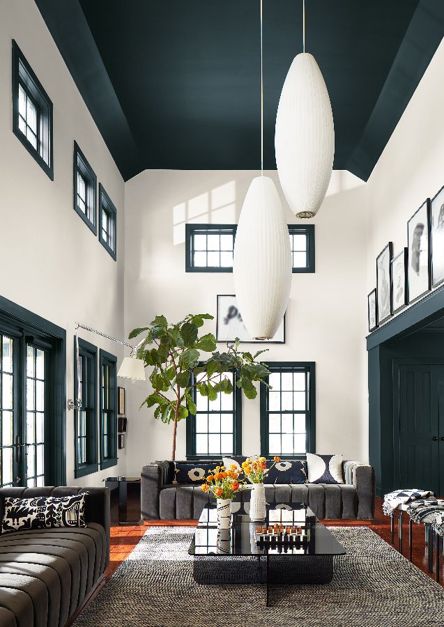
Painted ceilings can add incredible drama to a room. Here you can see the dark Regent Green ceilings and trim contrasting with White Dove on the walls.
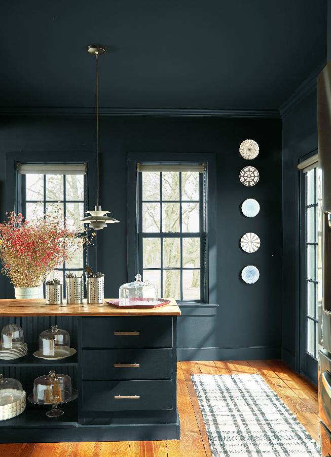
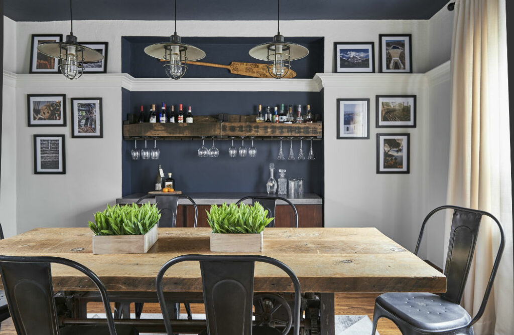
Below is one of our dining room designs where we used the contrasting colour combination of Hale Navy on the ceiling and in the niche while painting the wall the soft, beautiful neutral that is White Dove.
Dining Room Design by Claire Jefford Inc.
When Benjamin Moore announced Aegean Teal as the Colour of the Year for 2021, I already had that colour painted on the ceiling of my outdoor interior design studio.
My studio office design, Agean Teal painted ceiling
See, I am the interior design colour trend-setter 🙂
What do you think of these Colour Trend colours for 2024?
Have you used any of these paint colours by Benjamin Moore?
Comment below, I want to hear from you!
Choosing Paint Colours
If you struggle with choosing paint colours, be sure to check out my Perfect Colour Palettes.
I have over 50 colour palettes to help inspire you.
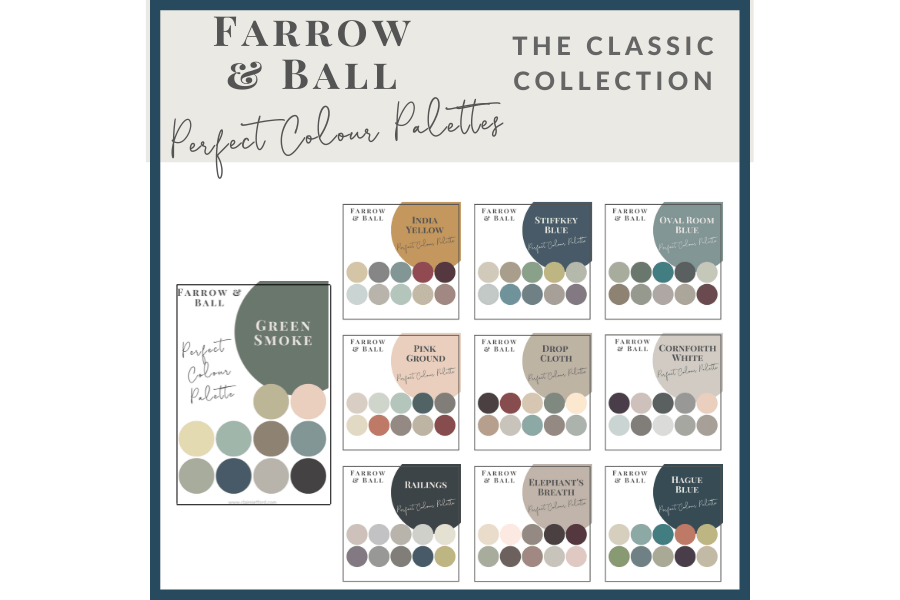
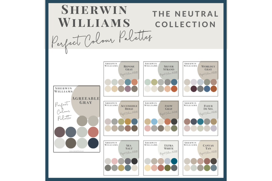
I also offer collections that showcase a group of 10 similar colours from Benjamin Moore, Farrow & Ball and my newest addition, Sherwin Williams.
In addition, there’s my ultimate collection which includes all 20 of my Benjamin Moore Guides.
Although it’s often the final room to be decorated, the bedroom is an essential space in a home as it provides a private and comfortable area for rest and relaxation.
It is where we spend a significant amount of our time sleeping, which is crucial for our physical and mental well-being.
Additionally, a well-designed bedroom can enhance the overall ambiance and aesthetic appeal of a home.
You CANNOT afford to mess up this type of decorating project!
For this reason, I want to share with you my ‘6 Bedroom Design Mistakes You Don’t Want to Make’.
1. Placement of your bed.
Your bed should be the focal point, a real feature since it’s the largest piece of furniture in the room. Design the space so that the bed fits nicely on a main wall with side tables.
The placement of your bed can have an impact on your overall well-being.
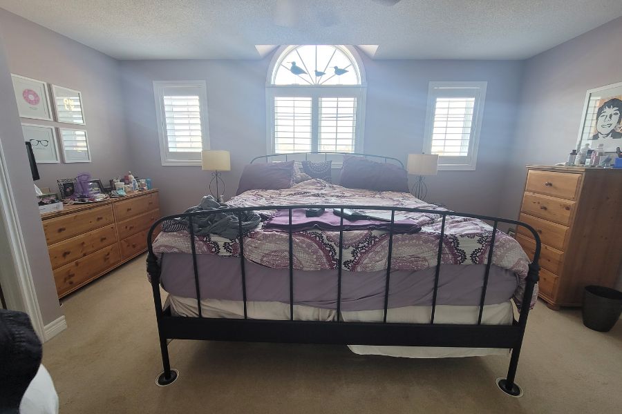
It’s generally recommended to place your bed in a position where you can see the door, but not be directly in line with it, which was the case in our Burlington client’s bedroom when we first met with them to discuss this specific project.
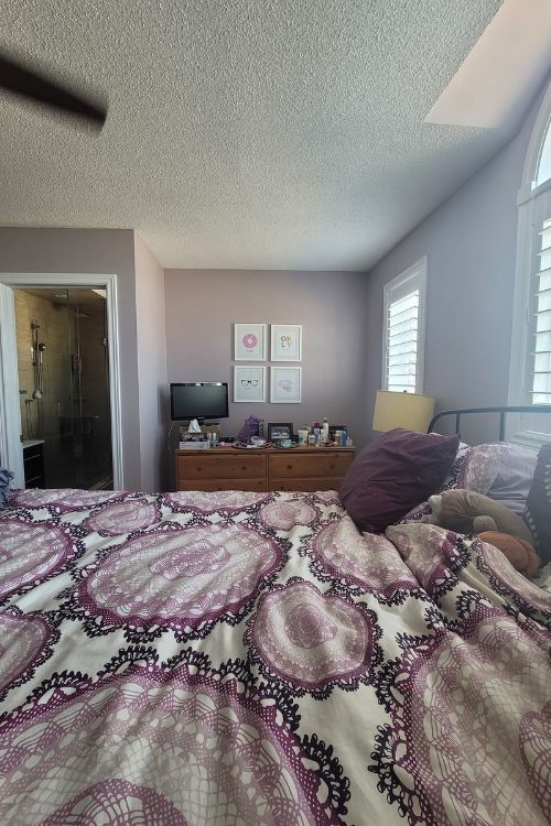
Before: Placement of bed under the windows
Additionally, it’s important to avoid placing your bed under a window or in a location with a lot of clutter or chaos. Overall, the goal is to create a peaceful and comfortable sleeping environment.
Here is my own bedroom where the bed is placed opposite the closet
If you place your bed on a wall with windows, be sure the window treatments aren’t covered up by the bed or covering a heat vent.
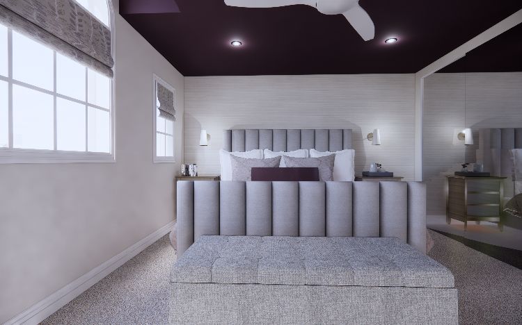
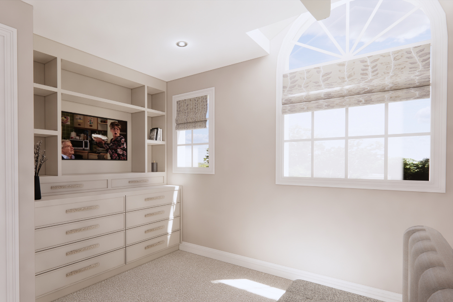
Sometimes you’ll want to consider roman blinds as opposed to drapery, which is exactly what we did here in our Burlington client’s principal bedroom.
3D rendering showing roman blinds and possible purple ceiling
2. Inappropriate scale
Scale and proportion are crucial elements in furnishing a space.
Scale refers to the size of individual pieces of furniture, while proportion refers to how those pieces relate to each other and the overall space.
Properly scaled furnishings create a balanced and harmonious environment, while mismatched proportions can make a room feel awkward and uncomfortable.
It’s important to consider the scale and proportion of each piece when selecting and arranging furniture to ensure a cohesive and pleasing aesthetic. This is a common oversight that many people make when decorating.
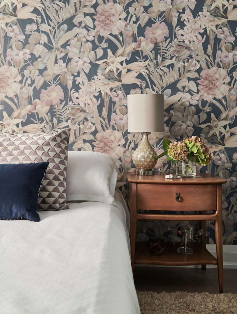
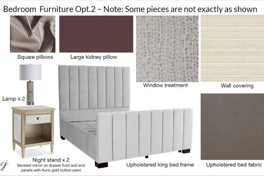
The image below is a perfect example. The upholstered bed frame is quite grand, but the lamp on the side table next to it is too small in proportion.
This acrylic lamp is too small in scale for the upholstered bed
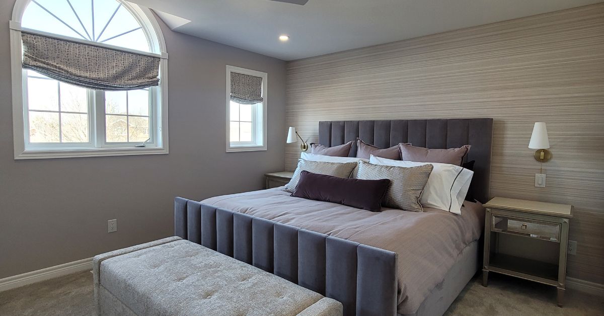
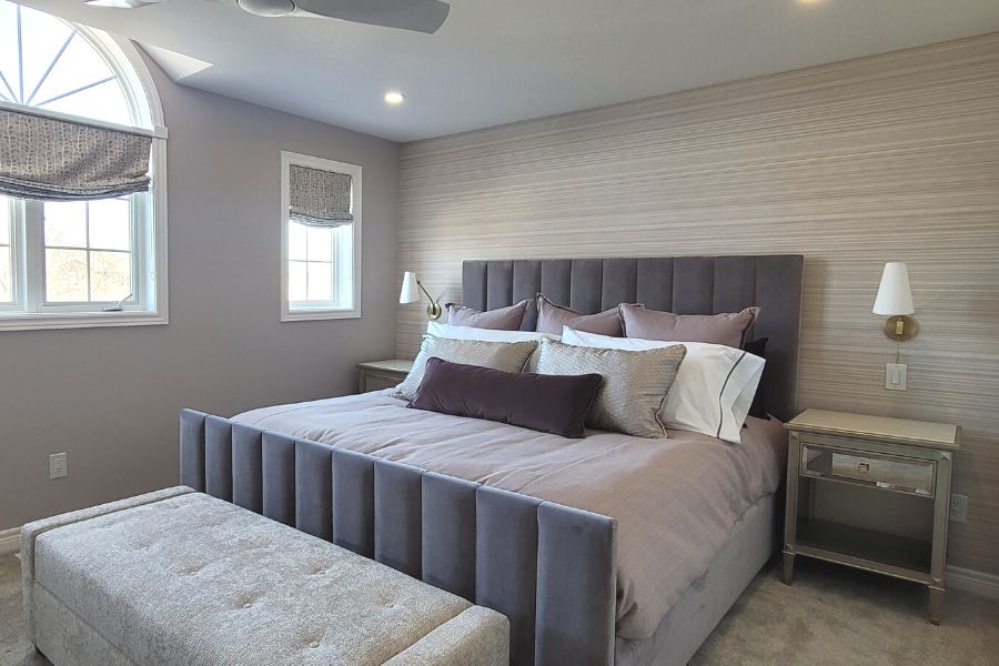
When planning the decor of our clients’ principal bedroom, we specified a beautiful, king-sized upholstered headboard. We took careful consideration in selecting other furnishings that were similar not only in style but also in scale.
From the installation day of our client’s bedroom, not professionally photographed yet!
The antique mirrored nightstands are a good size at 24″ x 24″.
The sconces are hung at nearly the same height as the top of the headboard and fit nicely between the wall and the bed. Look at all those BIG pillows, plus the large custom storage ottoman!
To achieve good design, always consider how furnishings will relate to one another in both style, as well as scale.
3. Overlooking Storage
Smart storage solutions are important because they can help maximize space utilization and increase efficiency.
By utilizing innovative storage options, we can better organize our resources, reduce clutter, and increase access to important items.
Yes, we love ‘pretty’ but practicality is important too. In this client’s bedroom, we designed the niche area to include a new, beautiful custom dresser built-in.
Before image showing a stand-alone pine dresser
Not only does it look AMAZING, but it also provides a ton of practical storage, including organized jewelry drawers with felt inserts. And functionally, the location of the TV is now opposite the new placement of the king bed.
Our clients absolutely love their new built-in cabinet with the stunning hardware
The design of the unit also has open shelving, which allows for items like perfume to be on display and easy to hand as needed.
Now that the room is complete, it’s like it was always meant to be there!
We designed this stunning custom piece to be finished in Collingwood by Benjamin Moore and the walls are painted Portland Gray. These gray paint colours both have a Violet undertone.
Lighting is important for a variety of reasons. It can affect our mood, productivity, and overall well-being.
Proper lighting can make a space feel more inviting and comfortable, while poor lighting can cause eye strain and headaches.
In this client’s bedroom, we added four pot lights, two sconces, and a ceiling fan light.
Another key to good lighting design is not to overlook how fabulous dimmers can be. We ALWAYS specify dimmer switches!
Consider layering your lighting to create the perfect, versatile ambiance in your space.
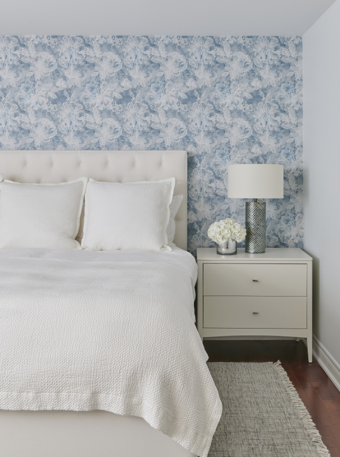
This same lighting strategy can also be implemented using table lamps or pendants over your bedside tables as we did in these other bedroom decorating projects for clients.
Bedroom with a lamp on the side table, designed by Claire Jefford Inc.
This is a huge mistake homeowners often make, and it’s such a costly one too! Buying one item at a time and not looking at the big picture.
How many times have you seen something in a store, purchased it thinking ‘it will go perfectly in my home’ and then it actually doesn’t look so hot?
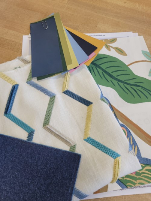
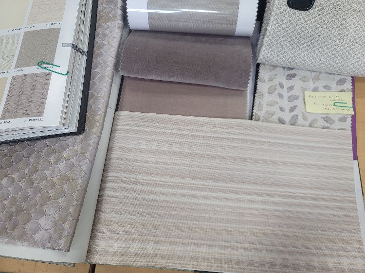
To achieve great design, we pull all samples of potential fabrics, finishes, wallpaper, and paint colours so that we can view them all together.
Here you can easily see how well all of our fabrics go together
We do the same with furnishings, placing images of items on a mood board, and laying them out to ensure everything looks fabulous and works perfectly.
Finishes shown here from our original client presentation
Mixing different textures and patterns is a goal of ours when designing for clients and ensuring undertones don’t fight with one another but rather complement each other.
6. Overthinking
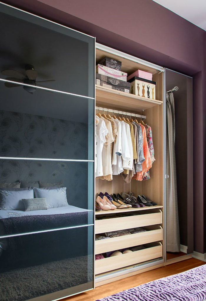
Do not overthink simple solutions. Instead of fussing around too much with our clients’ bedroom closet, we simply updated the doors.
They had an IKEA Pax closet insert with doors that opened outwards.
With the new room design, we needed sliders and the white shaker-style IKEA Pax doors were perfect!
We also used the IKEA Pax wardrobe system when we redesigned our own bedroom for the first time about 10 years ago. They still work wonderfully to this day.
PAX IKEA Wardrobe
When looking at your overall budget, consider where you may be able to mix high and low, without compromising look or function.
Tell me, are you making of these design mistakes in your bedroom? Comment below to share with us. It’s okay, we won’t judge. 🙂
Follow me for more helpful design and colour tips, I’m just getting warmed up.
If you are planning a bedroom renovation and happen to be near our local area of Burlington, Ontario, reach out to us here, and let’s discuss your project.
You deserve to Live Beautifully in your home. Until next time, Cheers!
Today I’m sharing 7 ways to increase client conversion to set you up for success with more projects.
Getting your foot in the door for a consultation meeting is one thing, but what strategies can you implement to convert more of those consultations into interior design projects?
Let’s get right to it!
1. Staying ‘Top Of Mind’
Email is not dead.
Stay in touch with regular updates to leads and past clients, so that you are the one who comes to mind as the expert to turn to when it’s time for their next home project.
We like to stay in touch with past clients and leads who have previously inquired with us (but may have never hired us) at least once a month.
These emails are not ‘salesy’, nor should they be.
For example, share helpful tips and advice about recent projects you’ve worked on or industry events you have attended – like KBIS, the Kitchen and Bath Industry Show or Highpoint Furniture Market in North Carolina.
This content needs to provide value, something of interest to a homeowner.
Laundry room design by Claire Jefford Inc. All professional photos by Stephani Buchman.
When you share project images, whether it’s behind-the-scenes or a final reveal of a new project in your portfolio, explain a bit of the backstory. Touch on why the client hired you and how your interior design services benefited their renovation or decorating project.
In my Booked Solid with a Waitlist digital business marketing resource for interior designers, I share 3 examples of actual emails we have sent to clients, advise on how often to send these emails, and so many more of my proven strategies for keeping your pipeline full.
2. Discovery Call Follow-Up
After a discovery call with a potential interior design client, make sure you have a streamlined process for how you follow up with these leads. Don’t just hang up the phone and leave it at that.
We have a standard email template that we tweak slightly to personalize for each potential new client.
In addition, we often send a comprehensive, pretty, and easy-to-read Welcome Pack that lists further details of our services, and the benefits of working with our award-winning Interior Design firm.
As part of our process and lead up to our paid Interior Design Consultation, we ask clients for photos of their home, and if applicable, sometimes we will set up a shared board on Pinterest.
This not only shows we like to be prepared and that we care, but it also helps us better understand what we are walking into.
With more than 15 years of experience in running my own successful interior design business, now I’m confident and quick off the cuff with design ideas so I’m fine if I walk into a new client’s home without having seen it ahead of time.
But this wasn’t always the case, especially when I was first starting out. Asking for this information has always been part of my process, and it still works for us, even today.
Being prepared for a new client consultation takes more than dressing up and putting on some perfume. 😉
For a recent consultation, clients sent me rough drawings with a layout of their proposed new design plans.
It was very insightful to see what they had come up with on their own. Although, as I’m sure you can appreciate as a fellow professional in this field, I could see the potential for a much more functional and well-thought-out design.
My own kitchen design with plenty of personality and a ton of function
Being armed with this information ahead of time provides me with the opportunity to show up prepared and express my expertise.
At the consultation meeting, I tactfully educated the lovely couple on some crucial flaws in the design and professional recommendations on how I would redesign the space to make it way more aesthetically pleasing and far more functional.
4. Don’t Hold Back
Although this can depend on your interior design business model, I personally like to give as much value as I can at the consultation meeting.
Some designers don’t do consultation-only appointments, and that’s totally fine. For me, I love them!
At a recent colour consultation for another lovely couple, I shared a lot of helpful advice for updating their main bedroom and ensuite.
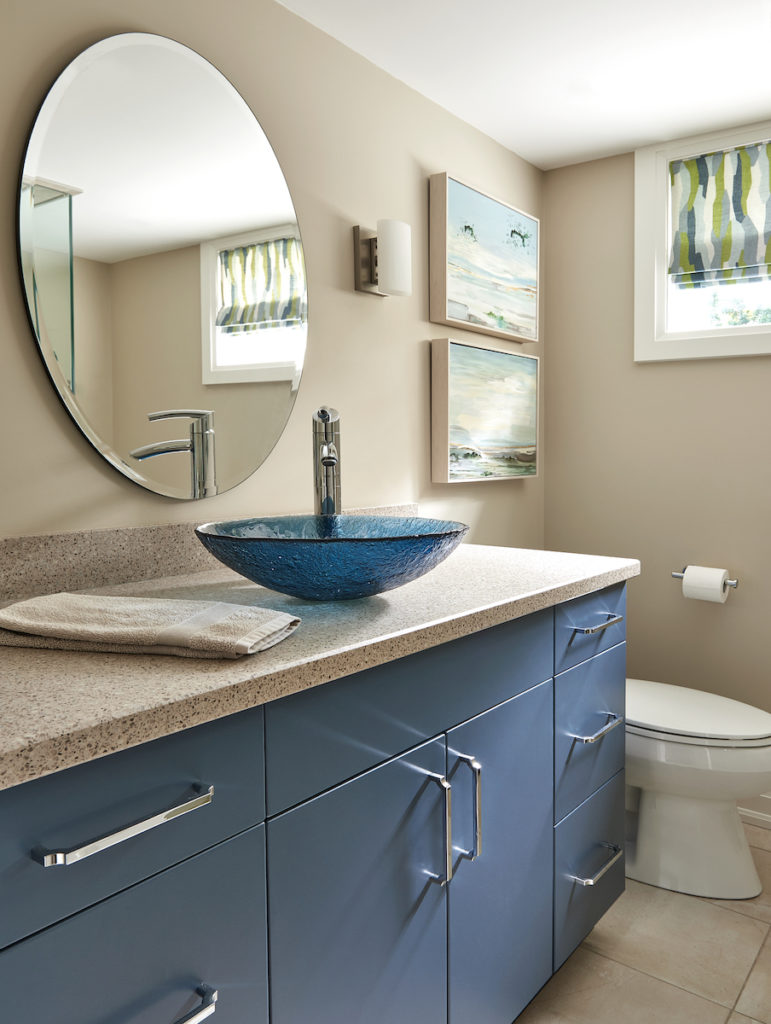
I also provided ideas of how they could easily update their other full bathroom without doing a full reno, just like we did in a client’s basement bathroom shown here.
Updated vanity, new hardware, artwork & custom roman blind for this bathroom refresh by CJI
They asked about window treatment ideas and appropriate sizing for a chandelier in their dining room. I showed up as the expert, easily proving that I knew my stuff and wasn’t holding back.
A recent story was shared by one of my long-time coaching clients who has invested in all of my Interior Design BOSS Academy On-Demand resources. She told me that she invested in me as her Interior Design Business Coach because she sees how much I share online for free and thought, ‘Wow, if she gives all of this advice for free, how incredible will her paid courses and coaching be?’
Some designers worry that if they give too much away, the clients won’t hire them for further services, but I believe the opposite is true.
There will always be people who see the value in what we do and are willing to invest in our services.
Conversely, there will always be those who feel it’s too expensive to hire an interior design professional, especially for full custom design and project management services, but they may be happy to invest in a paid consultation-only appointment for ideas and guidance to lead them on the right path.
Either way, my goal is to help homeowners in any way that I can. Holding back is not in my nature.
5. Bring Visuals
Never underestimate how exciting it is for a homeowner looking to renovate or decorate to see examples of what’s involved in the design process.
A tablet is great for showing past projects you’ve worked on – before images, 3D renderings, and the final results. Discuss any challenges you faced and how you came up with fantastic solutions for the project.
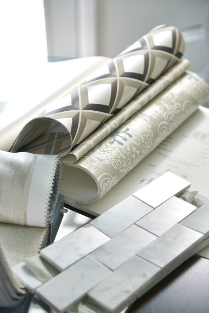
We may also bring an example of our Project Site Binder. This includes our Materials and Selections sheet, showing details of all paint colours used in a project, as well as any tiles or hardwood selections, and more.
We also have an end-of-client-project folder that includes actual fabrics, wallpaper, and paint colours of physical samples that we give to clients so that they have everything together in one place.
There is so much that happens in the backend of what we do that clients don’t see, so sharing this sort of detailed information helps them to better understand what you bring to a project and how you help to keep everything organized for them.
Samples shown here of items used in my own kitchen renovation
6. Create a Design Proposal
If you feel it’s worthwhile, and depending on your business model, take time to draw up an interior design proposal for their consideration.
Whenever I share an example of my design proposal template with other designers, they always tell me that they love how professional it looks and how comprehensive it is.
7. Frequently Share on Social
If you ever get stuck wondering what to share on social media, be sure to frequently post to different platforms to show people what you do.
In a story or an Instagram Reel, talk about the process of how you work. Tell a story about how you helped a client and the different ways you benefitted an interior design project.
A client who we initially thought was hiring us for an interior design consultation-only appointment, ended up telling me at this first meeting that she changed her mind after seeing my Instagram feed and stories.
She decided she wanted to hire us for full services and wanted to be ‘hands-off’ to leave everything to the professionals.
You never know when you are going to strike a nerve or hit on that ‘sweet’ spot with someone watching you on social media.
For more helpful resources to push your business to the next level, see my shop page here. Get organized and gain more confidence!
What a week it was at the Kitchen and Bath Industry Show in Las Vegas!
With the highest number of attendees in many years, the show was definitely buzzing.
Seeing the vast, stunning displays in two different buildings at the Las Vegas convention centre and receiving an invitation to tour the $13 million dollar ‘All New American Home’ in the hills overlooking the Strip in the far distance, was just what I needed to refuel my inspiration for upcoming interior design projects.
In case you missed my live webinar event where I shared some of the latest trends in Kitchen & Bath design from the show, in this post I’m sharing the replay for you.
Here you’ll see me sharing my insights on some of the new products in kitchen and bath design, as well as colourful displays from the show. Plus, stick around to the end of the video where I show you some of THE MOST RIDICULOUS DESIGN IDEAS that I saw.
Remember, new and different doesn’t always mean better!
Highlights from the show
Bathroom vanities with off-centred, uniquely shaped sinks
Ann Saks bathroom featured in the Kohler booth
Kohler colourful toilets – a blast from the past!
Laundry room solutions including a doggy shower
A new way to freshen up stinky shoes, by LG
Bold appliance and cabinetry colours from Cafe
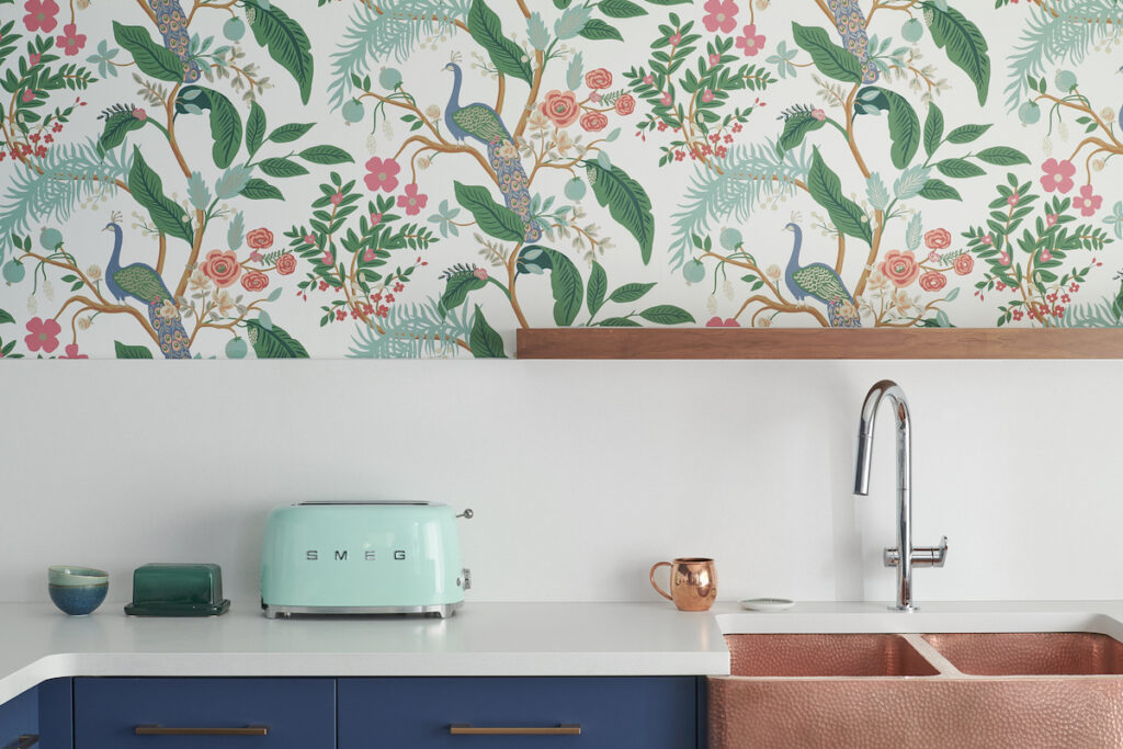
Wallpaper in kitchens is on trend, just like in my kitchen 🙂
Monogram-marvel showcasing stunning designs by Richard Anuszkiewicz
Smeg makes you smile with Snoopy and fun hues for refrigeration
The exquisite ensuite in the All New American Home
Disappointing Designs
The faucet hanging from the ceiling -WTH?
White Brizo faucets that look plastic and cheap
Cambria’s display, striking but not at all functional
What specifically stood out for you from what I shared in my videos?
Do you have a most / least favourite design idea? Share your thoughts below.
Speaking of hot topics…have you taken my colour quiz yet?
Take my Quiz and find your perfect colour palette with décor inspiration for your next interior design or decorating project.
Perfect Colour Palettes
Remember, it only takes one mistake to take your home decorating project from divine to disaster. Don’t let the paint be what stresses you out!
Convenience at your fingertips
I have created Paint Colour Palettes for some of the most popular colours from three of the leading paint companies, Benjamin Moore, Sherwin Williams and Farrow & Ball.
Our Perfect Colour Palettes help you confidently select the best colour for your home, and see which trim, ceiling, and accent colours pair well with your selected colour.
Kitchens are the place where everyone often gathers in your home and where you make the most memories.
While kitchens may be the most expensive area in your home to renovate, they are also where you will generally see the biggest return on your investment.
You CANNOT afford to mess up these costly renovations.
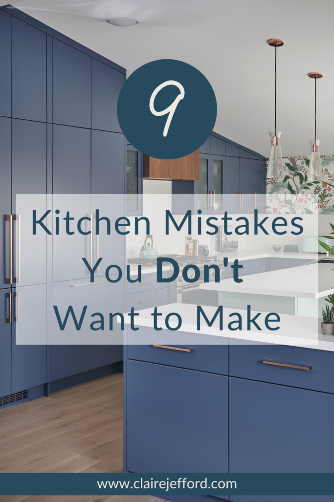
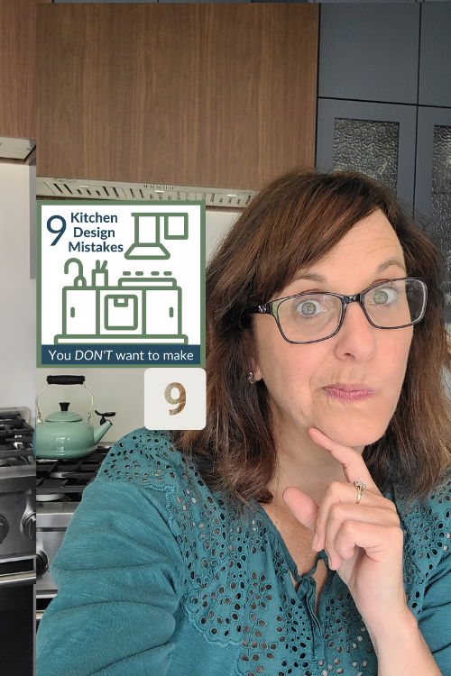
For this reason, I want to share with you my ‘9 Kitchen Design Mistakes You Don’t Want to Make’.
This was a series of short videos that I shared on Instagram as Reels with lots of engagement. This series was also hugely popular on my TikTok account.
1. Looking to Big Box Stores for Inspo
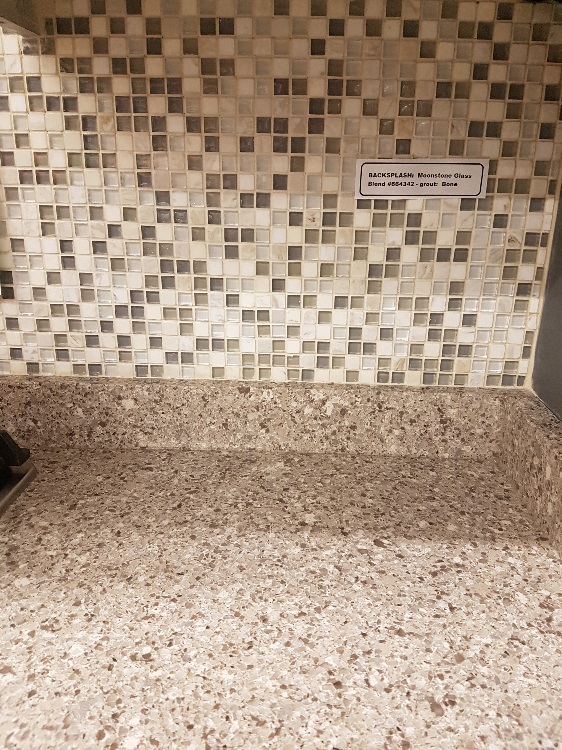
Yup, I’m talking about those hideous kitchen displays at the Big Box Stores and what a huge mistake it is to make them your ‘go-to’ for design inspiration.
I don’t know who designs them or how these design train-wrecks get approved, as the majority I have seen over the years are beyond terrible.
They are usually a mix of various patterns and cabinetry styles, perhaps with the intention of showing you what is available for finishes. But when you know good design, it really leaves one scratching their head.
Look at this first one below, for example.
The busy quartz counter with the tiny square mosaic backsplash in various green tones is way too busy. Not to mention, those mosaics are so dated. We actually ripped out a similar backsplash from when we first renovated our kitchen in 2006.
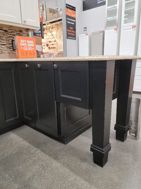
In the big box kitchen display below there is a similar busy backsplash pattern paired with a quartz countertop that has quite a bit of movement to it as well.
But my biggest question was – what the heck is the point of the half cabinet on this peninsula with massive legs? It looks incredibly awkward, is in no way functional, and is just an eyesore in general.
So, please do not look at these big box store kitchen displays for design inspiration.
2. Doors vs Drawers
When redesigning your kitchen, skip doing mainly doors on the base cabinets and design your new kitchen with plenty of drawers instead.
It’s way easier to access everything as opposed to crouching down in a cupboard with fixed shelving and it’s much better for your back too. Hey, I don’t know about you, but I ain’t getting any younger over here!
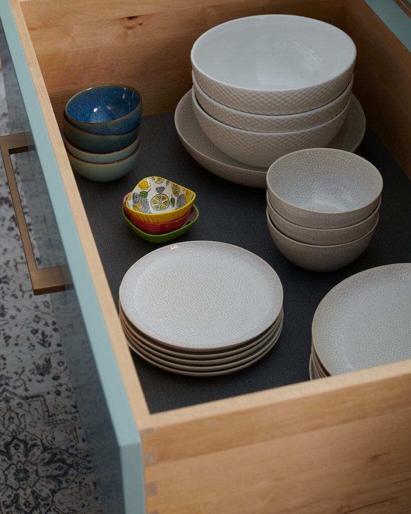
We house our main dishes, cooking utensils, and pots & pans in 36″ wide x 12″ deep drawers.
Deep and wide kitchen drawers, photo by Stephani Buchman Photography
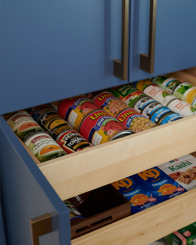
And for a deep pantry, opt for pullout drawers like these if you are designing a custom kitchen. It’s so much easier to see and access everything.
These are key design principles that start with optimizing function, plus, they look super sleek too.
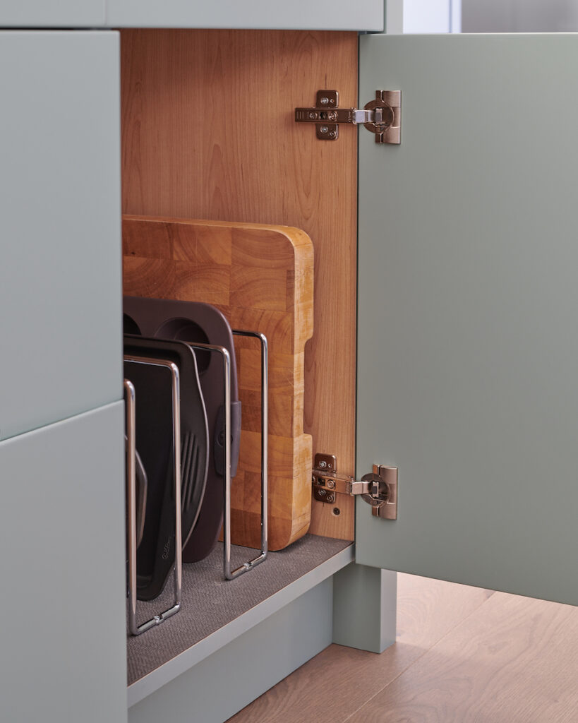
3. Overlooking Smart Storage Solutions
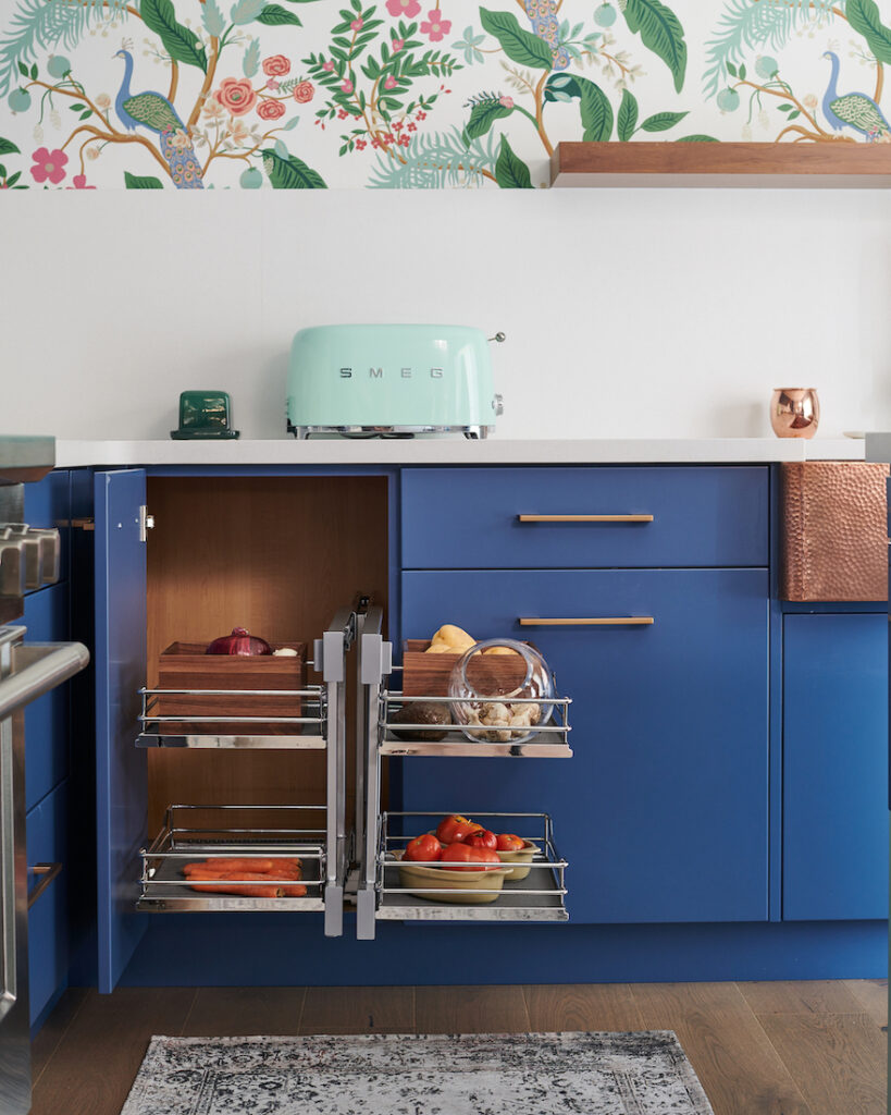
I had the pleasure of working with Häfele Canada which has the most AMAZING kitchen storage solutions to make the most of every inch of precious space.
In the awkward corner area on the base cabinets, we installed the Flex Corner Unit. It has 2 pull-outs each with 2 levels of shelving.
Corner kitchen cabinets can be awkward, get as much storage there as you can
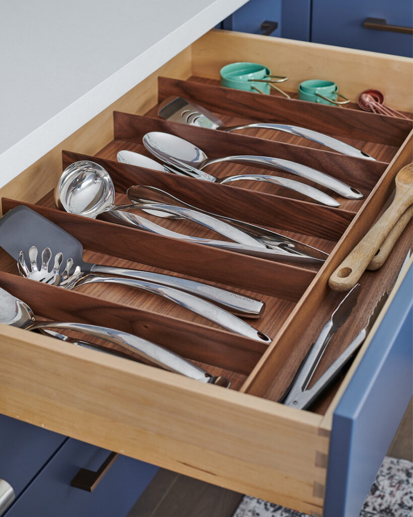
In our kitchen we have two sets of 36″ drawers. In the top drawer of our island we store our main cutlery. And the other bank of drawers, the top one next to the oven, holds our larger cooking utensils.
For both of these, we used Häfeles Fineline Cutlery Trays in Walnut. How they keep everything organized is exquisite!
Utensil organizers in walnut by Häfele
In our 27″ wide spice drawer next to the oven, we installed 3 Häfele Stepped Spice Inserts that make it easy to see and organize all our spices. (Sorry, no professional photo to share with you of the inside of that drawer).
Don’t forget about storing your oils. We had 7″ remaining on our main kitchen wall which we utilized for a pull-out cupboard with double oil baskets from Häfele.
Out of all of these mentioned, which of these solutions would be a ‘must’ for you? Comment below and tell us why.
There are so many fabulous options for lighting. In kitchens especially, it’s imperative to have various light sources, depending on what tasks you are doing.
You’ll need to watch my video to see the 4 different types of lighting we used in my kitchen, as we didn’t get photos of each of them. The last one is really unexpected and I think you’ll love it!
Potlights
Pendants over the island
Under cabinetry lighting
Strip lighting on top of my floating walnut shelf
Pot lights in the ceiling, as well as pendants over the kitchen island
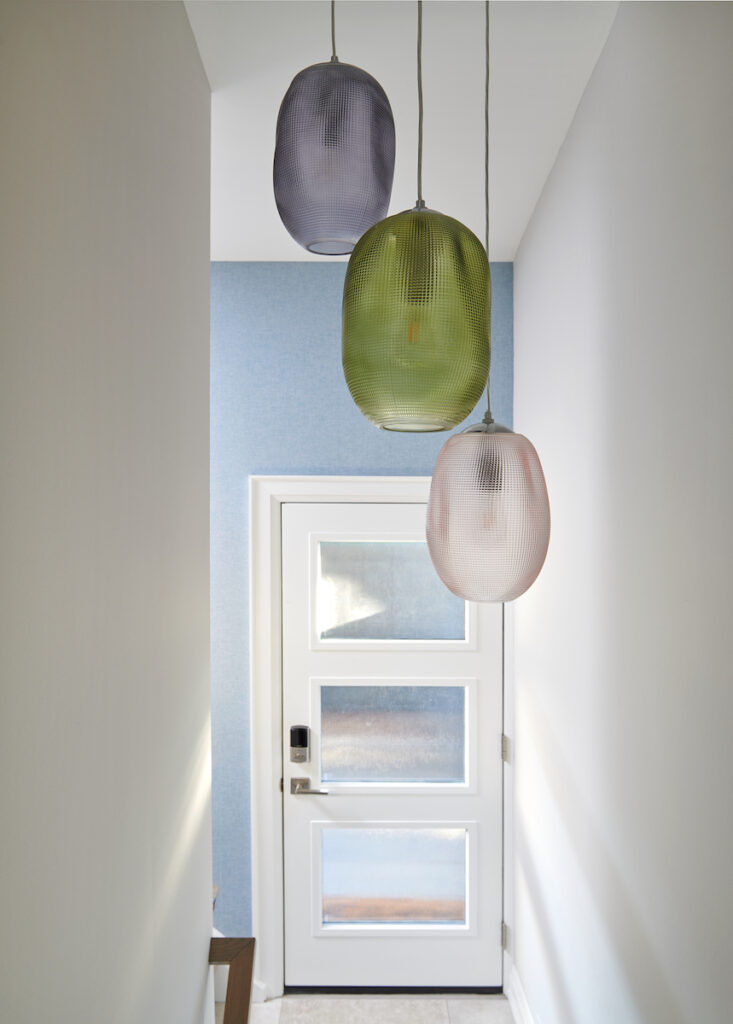
And for more colourful fun, I added in these pretty pendants that hang in our stairwell leading down to the basement which is open to our main floor hallway as well.
When doing a kitchen design, electrical needs to be discussed at the very early stages. Think about where you will need light sources and where best to place electrical switches and outlets.
5. Ignoring Architectural Features
I was only really excited about my kitchen design when I decided to swap the location of my kitchen for my living room. The possibilities were so much more thrilling and less limiting due to the bigger space.
Fisher & Paykel 36″ Gas Oven
Plus, the angled ceiling where the main cabinetry was to reside on the back wall of my new kitchen design, meant that we would be highlighting this very cool architectural detail which was going to be quite the focal point. It did not disappoint! My cabinet maker is very talented and his attention to detail is impeccable.
6. Don’t Follow the Trends!
What I love about my kitchen is that you can’t pinpoint a date as to when it was renovated. It could have been designed last month or anytime in the past few decades.
Am I right?! Kitchens are an investment that is meant to last 15 years or more. When you follow the trends, you run the risk of not loving your renovation for years to come.
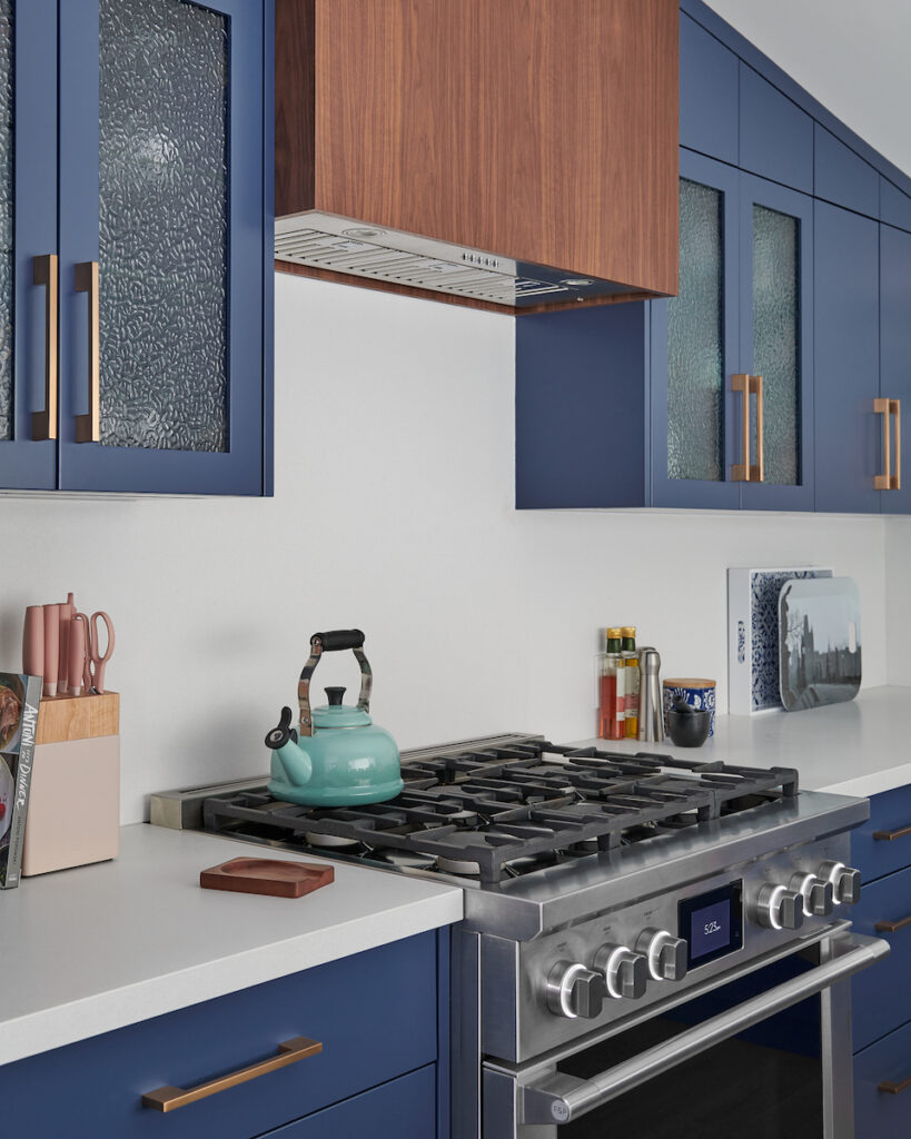
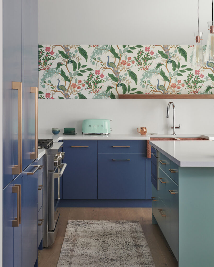
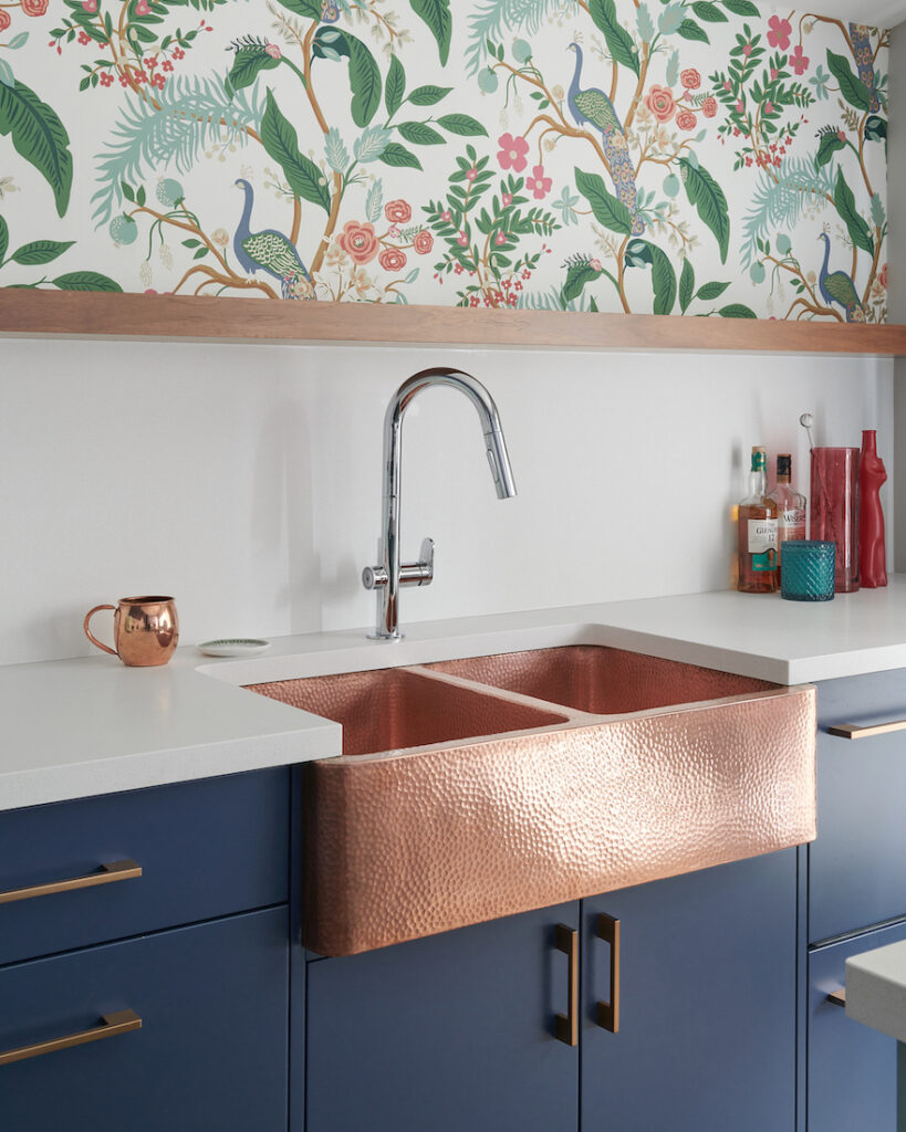
I selected a purple hue for my custom cabinets. Kensington Blue by Benjamin Moore is a Purpley-blue that we used for the perimeter cabinetry in my kitchen.
Below you can see Kensington Blue in my large painted board on the far left and again on the far right in the paint chips next to my fun wallpaper.
But for my initial design ideas I was considering the now very popular black for the cabinetry colour, just like my bathroom cabinet design. I’m so glad I decided not to do black as Kensington Blue makes me smile every time I enter the room, plus it’s timeless!
Feel free to argue with me on this, but I just saw this same colour tone in Mad Men which is a TV show set in the 60’s. They had the exact same kitchen cabinet colour, but accented with red tones, which was cool, but not my vibe.
7. Going With Basic Appliances
Kitchen appliances have come a very long way over the years, so if it’s been a while since you last renovated, make sure you do your research to find the best ones for the way you live – or for how you want to live in your new kitchen.
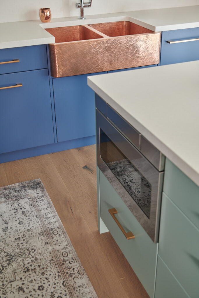
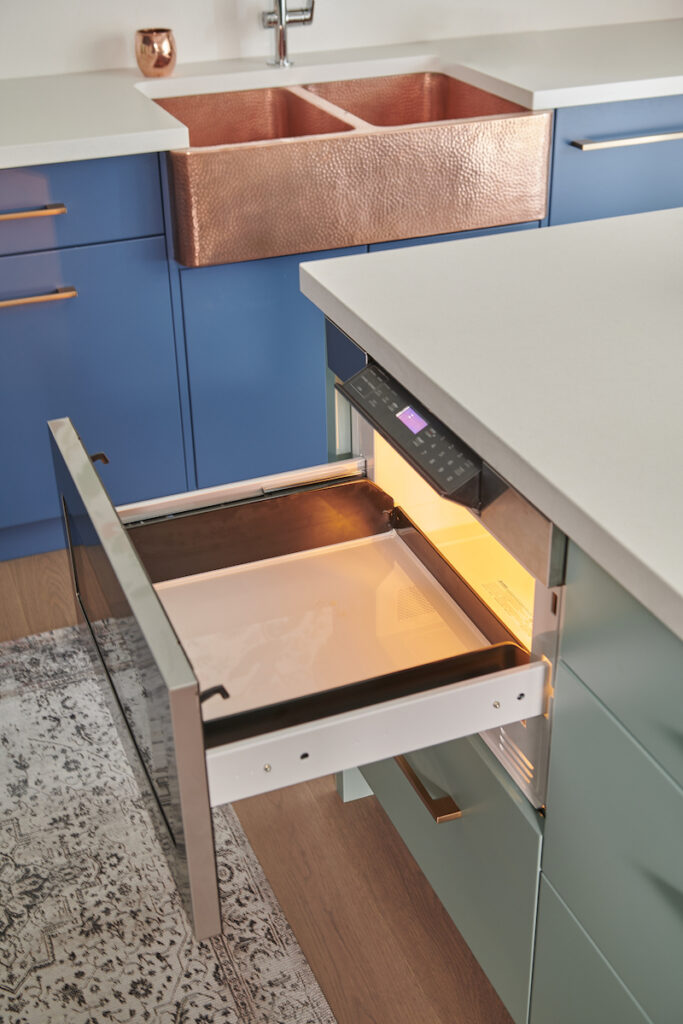
We worked with Best Brand Appliance in Oakville and chose Fisher & Paykel for our range and double drawer dishwasher. The 84″ tall x 36″ wide paneled fridge is from Dacor, it’s next to the pantry which is on the end in the far left of this photo.
Our microwave is a Sharp microwave drawer that I designed to be housed within our kitchen island. This is a great option if you are either short like me and have a hard time reaching a microwave above an oven. Or if you have a bad back or problems bending, this is also a great solution.
Although it is about 4-5 times the cost of a normal microwave, for me the convenience and ease on my body of using it makes it worthwhile, especially since we use the microwave daily.
Yes, these appliances were a splurge and I don’t regret one penny of the investment. We love them all! And remember, you don’t need to splurge on every appliance if it’s not in the budget. Pick one or two that are most important to you.
The Microwave Sharp drawer is 24″ wide
Shown open and with the control panel popped down
8. Not Creating Flow
Creating flow is all part of good design. You achieve this through color, finishes, texture, and patterns, for example.
In the short video, I explain how we did this in my new kitchen design with my Thompson Traders sink and walnut accents, as well as with colorful decor and accessories such as my wallpaper and decorative wall plates.
Even my Smeg toaster matches the leaves in my wallpaper and the island colour
The copper tone is repeated in the hardware and our custom walnut floating shelf
The colourful hues in my wall plates can be found all throughout the main floor of my home
To achieve this in your own home, if you used a colour for your island or on your stools for example, repeat that color in a window treatment, placemats, or a small rug. These are just some ideas for you to incorporate similar colours into the design of your kitchen to create flow.
9. Not Protecting Your Investment
Last, but certainly not least, please protect your investment.
For instance, to protect the bottom of our custom drawers we used non-slip mats from Häfele Canada. We cut them to size to fit perfectly in each drawer.
These mats stop items from moving around when you open and close your drawers too – plus they look super sharp!
The bottom of this cupboard doesn’t mark when sliding cutting boards in and out
In our previous kitchen, we had some leaks under the sink which made the inside of our cabinet finish peel away and in some areas even turned green. Ew!
In our new kitchen, we protect the sink cabinet by using the Under-Sink Mat from Häfele. This mat has unique dimples that can collect up to 1 gallon of water per 6 square feet, should you have a minor leak.
Be sure to consider smart products like these from Häfele to protect your investment, your kitchen is worth it!!
Remodeling your kitchen can be a very daunting task, and there are so many moving parts to think about.
If you are planning a kitchen renovation and happen to be near our local area of Burlington, Ontario, reach out to us here, and let’s discuss your project.
You deserve to Live Beautifully. Until next time, Cheers!
Perfect for Pinning
Claire's Guide to Services & Pricing
FREE DOWNLOAD:
Interior Design Services and Rates Guide
This website uses cookies to improve your experience while you navigate through the website. Out of these cookies, the cookies that are categorized as necessary are stored on your browser as they are essential for the working of basic functionalities of the website. We also use third-party cookies that help us analyze and understand how you use this website. These cookies will be stored in your browser only with your consent. You also have the option to opt-out of these cookies. But opting out of some of these cookies may have an effect on your browsing experience.
Necessary cookies are absolutely essential for the website to function properly. This category only includes cookies that ensures basic functionalities and security features of the website. These cookies do not store any personal information.
Any cookies that may not be particularly necessary for the website to function and is used specifically to collect user personal data via analytics, ads, other embedded contents are termed as non-necessary cookies. It is mandatory to procure user consent prior to running these cookies on your website.