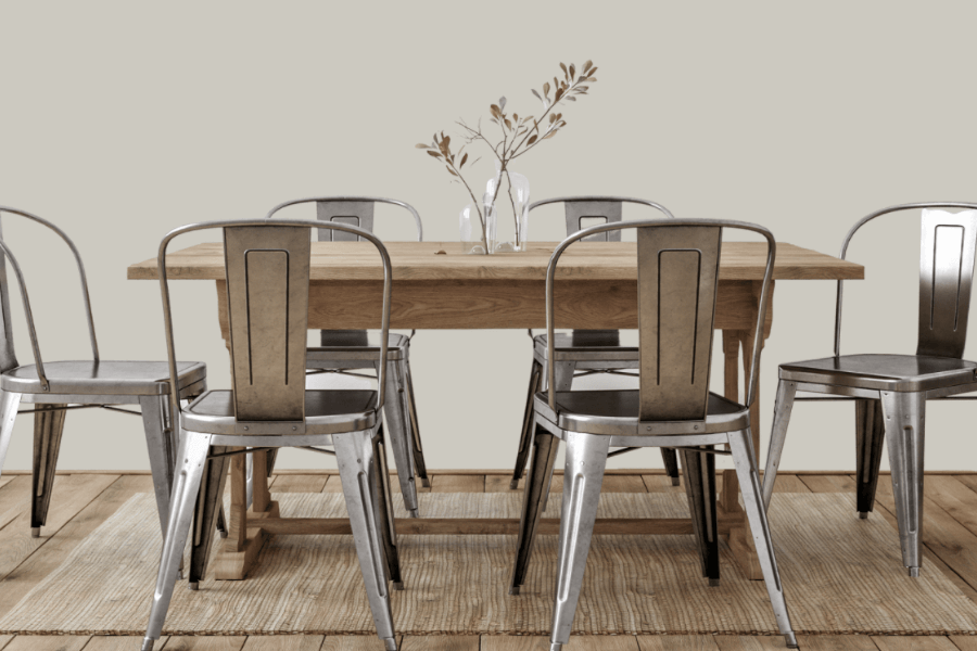
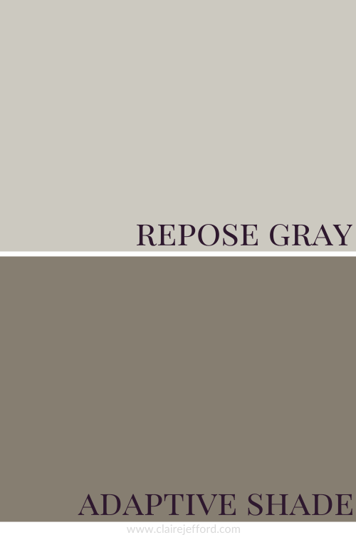
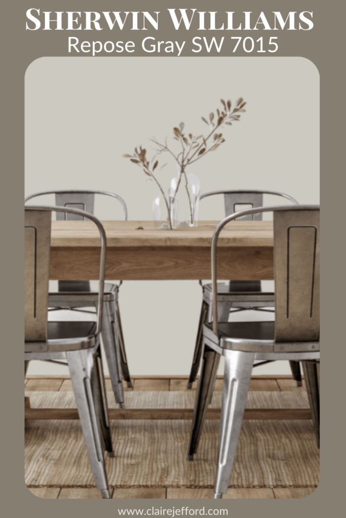
Hugely popular amongst professional designers, decorators and home owners alike, Repose Gray by Sherwin Williams is a fantastic neutral.
Repose Gray is a gray, although not a true gray.
An incredibly versatile colour, Repose Gray is not restricted to a particular design style or room.
If you’re new here, welcome! Below you will see what I cover in every colour review post.
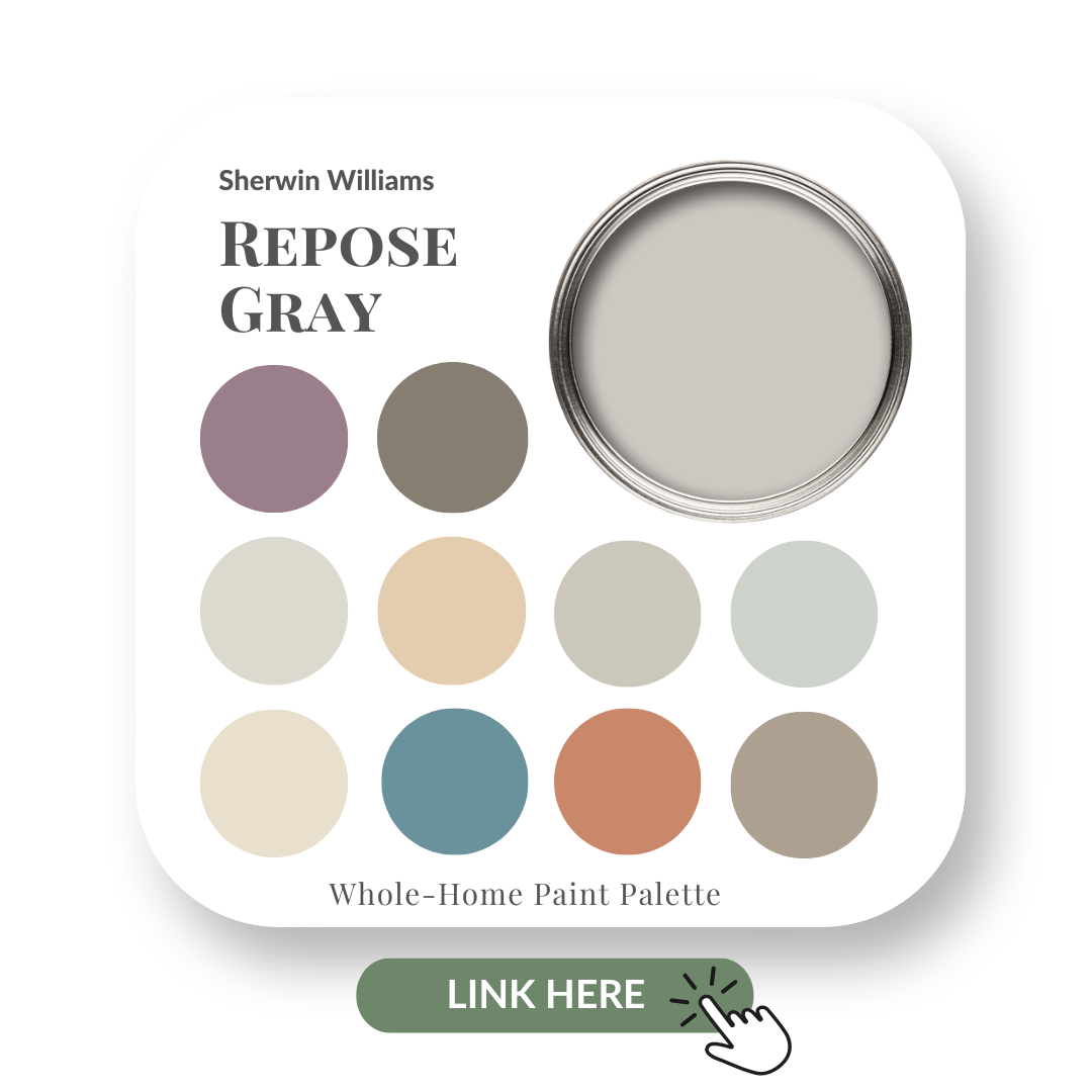
In this colour review of Repose Gray by Sherwin Williams, I share:
The undertone of my featured colour
Colour comparisons in order to easily see the different colour tones
Best white paint colours for the trim and ceilings
Beautiful colour combinations to inspire you for your decorating project
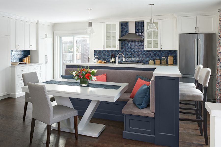
Sherwin Williams – Repose Gray
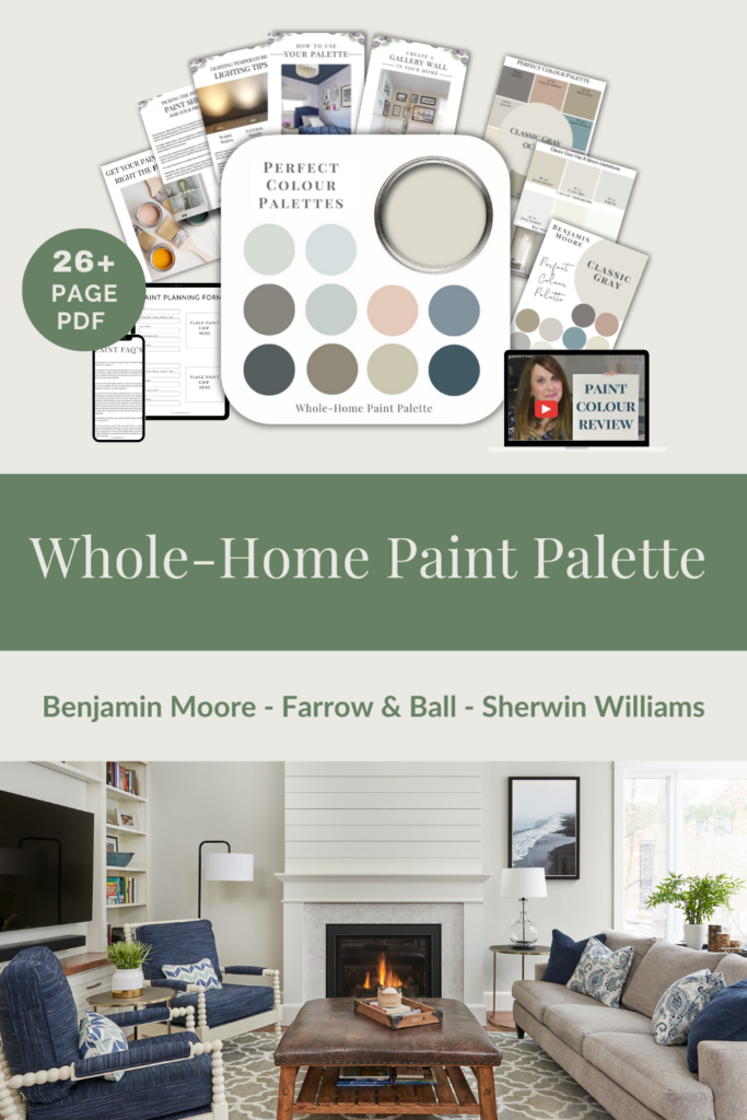
After you read the blog if you would like all the information I discuss in one convenient place look no further than my new Perfect Colour Palette for Repose Gray.
My 26+ page Perfect Colour Palette also includes more colours that go beautifully with Repose Gray, plus helpful tips for choosing a cohesive colour palette in your own home.
A must-have for any colour enthusiast or interior design professional!
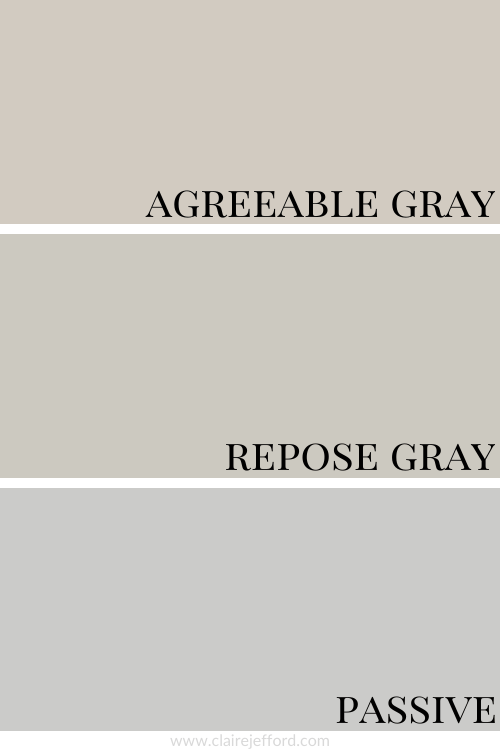
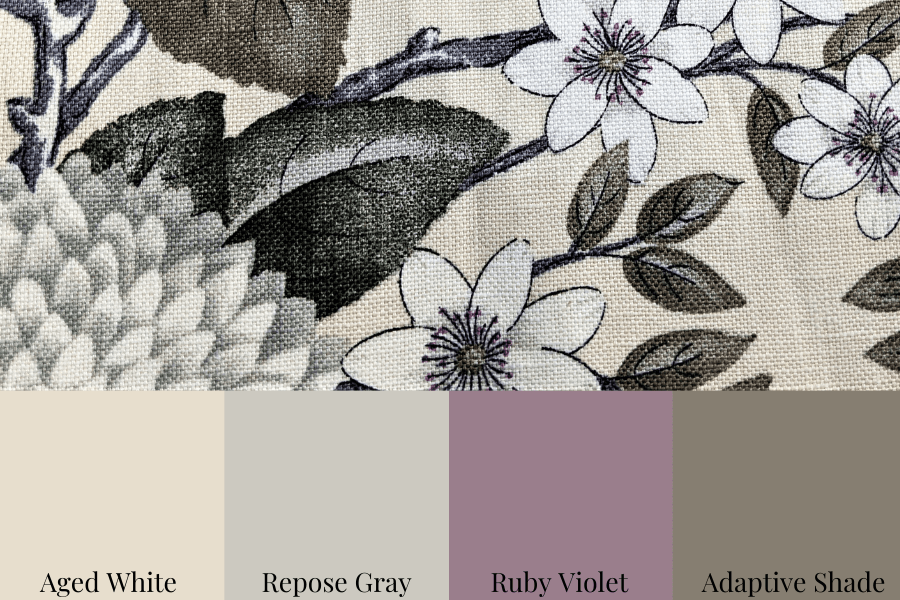
As you can see below, it’s when we start comparing colours that you get a much better sense of a paint’s true colour.
Agreeable Gray SW 7029 and Passive SW 7064
Colour Comparison with similar colours by Sherwin Williams
This comparison above gives you a much better idea of where Repose Gray fits in.
Passive looks cooler and has a more noticeable violet undertone when compared to Repose Gray.
You can definitely see a bit more of the green undertone in Repose Gray compared to Agreeable Gray which also has a green undertone but is not nearly as gray.
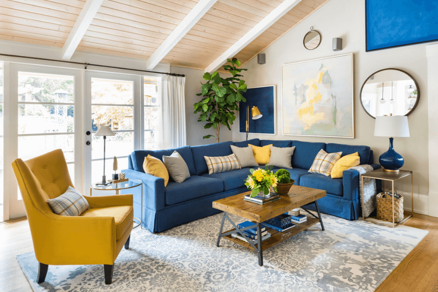
Gorgeous living room designed by my dear friend Maria Killam.
A much lighter gray, Agreeable Gray looks gorgeous in this living room.
When I do Colour Consultations in a client’s home, I always compare colours so they can easily see the differences between the paint colours.
I hold my large paint boards up to a decorative element such as fabrics, wallpaper or subway tile and then swap out one board with another board. This helps to clearly show which colour will work best.
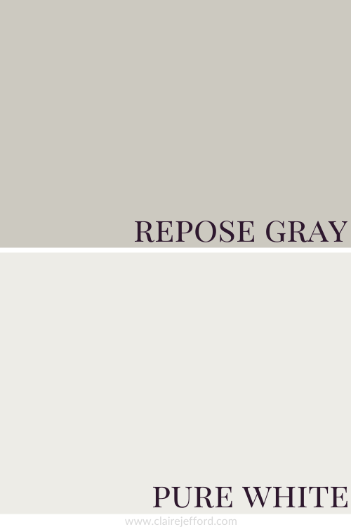
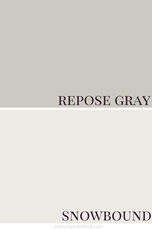
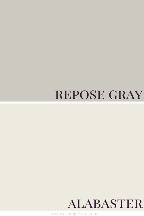
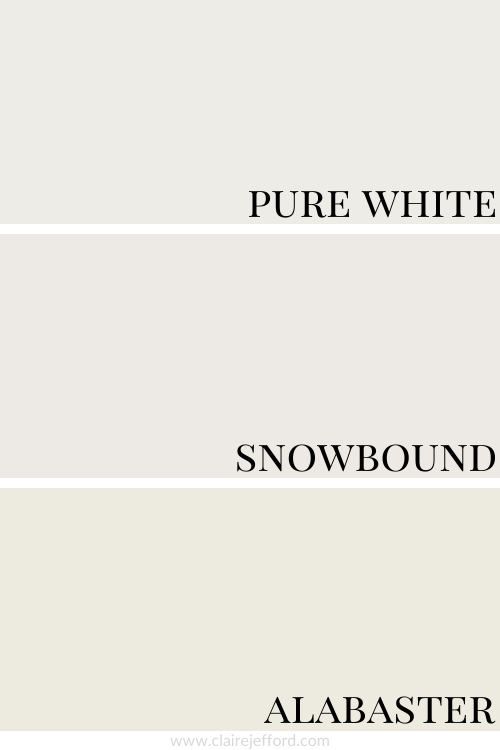
Best Whites To Pair With Repose Gray
Pure White SW 7005 by Sherwin Williams
Snowbound SW 7004 by Sherwin Williams
Alabaster SW 7008 by Sherwin Williams
Pure White, Snowbound and Alabaster
Three whites that would all look so great with Repose Gray, each offering quite a different look.
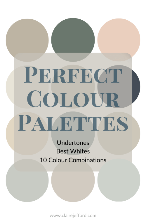
There are a total of 10 colours in my Perfect Colour Palette that I’ve carefully curated and they all look amazing with Repose Gray.
You can use the palettes as inspiration for creating a beautiful space anywhere in your home. Remember, the colours aren’t meant to all be used for paint colours.
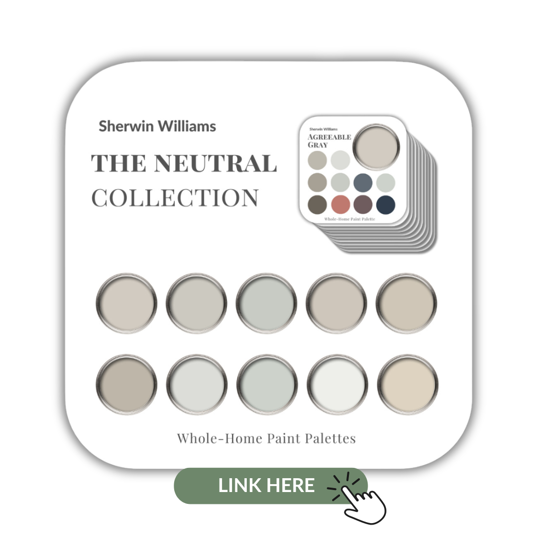
10 of the most popular Sherwin Williams’ Neutrals in one collection
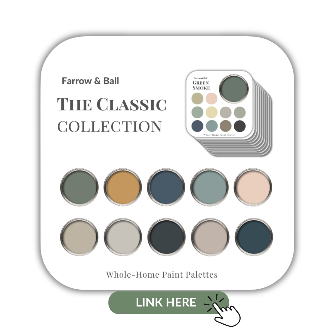
If you are a fan of the beautiful rich paints by Farrow & Ball I’ve also created a collection of 10 classic colours from this popular British paint company. Check them out here.
Farrow & Ball’s Collection of 10 Classic paint colours
Remember, it only takes one mistake to take your home decorating project from divine to disaster. Don’t let the paint be what stresses you out!
Take my Colour Quiz to find out what your Perfect Colour Palette is.
Or are you thinking about it, but not sure how exactly to go about it?
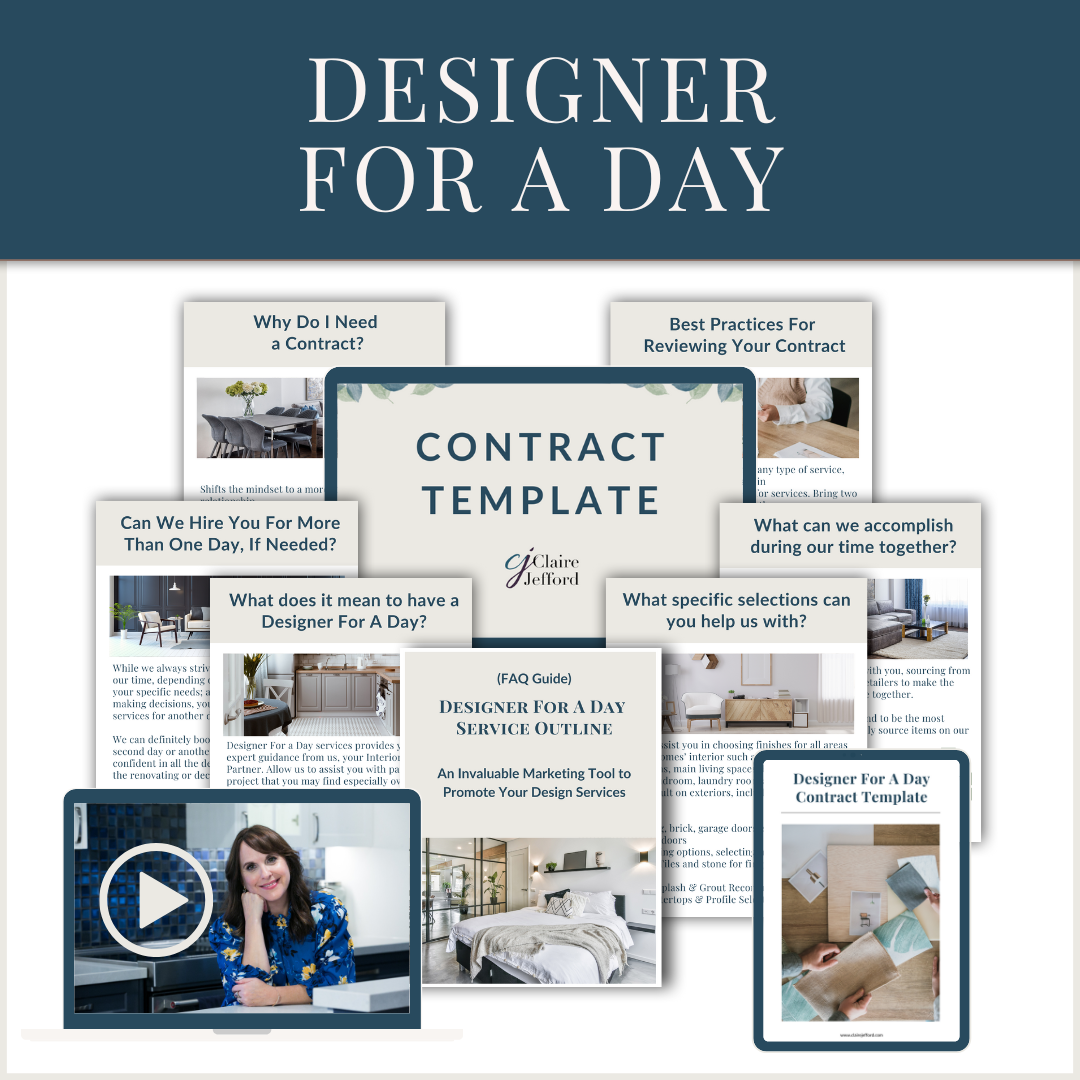
In this post, I will take you through my step-by-step process to help you decide if Designer For a Day is a service you’d like to offer in your Interior Design Business.
This is NOT Luxury Design, BUT…
Please note that if you only want to attract luxury, full-service clients, offering Designer For a Day is not going to suit your firm’s goals or brand messaging.
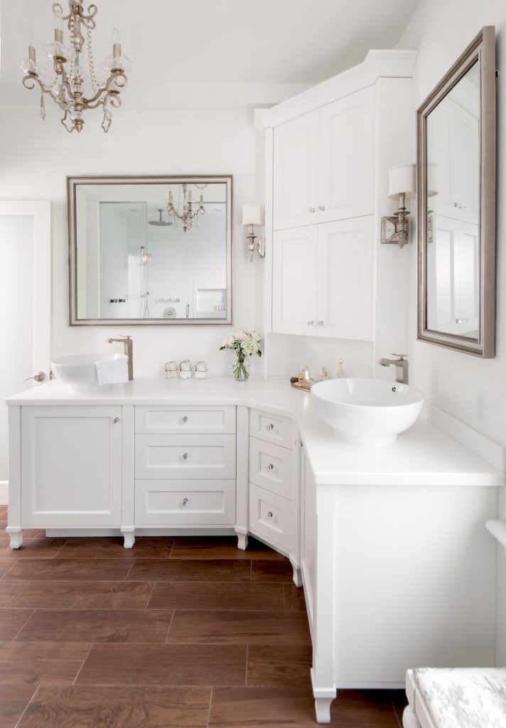
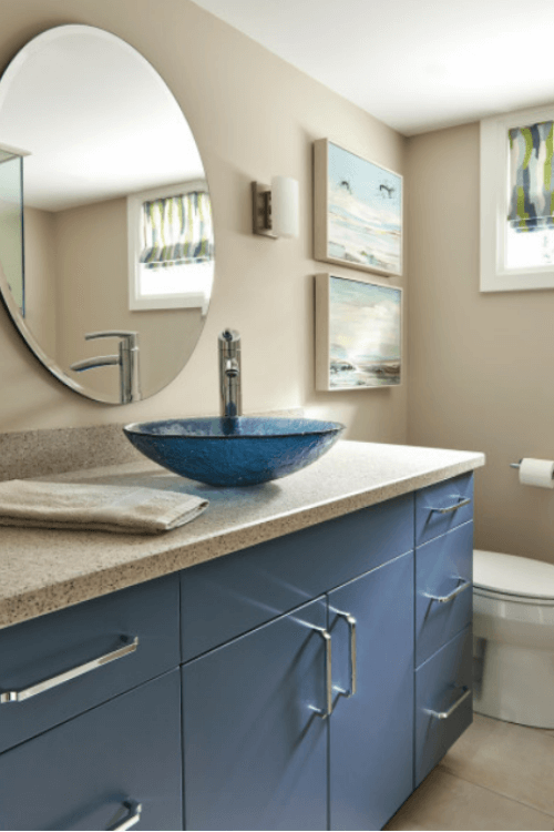
High-end bathroom design by Claire Jefford Inc.
BUT at the same time, don’t limit your thinking to believing this is a ‘cheap’ service. This is still a very valuable service that you can market to high-end clients if that is your target market.
With the uncertainty regarding the future of our economy, offering various levels of service may be what gets you through this tough time ahead.
This really is rule #1 when it comes to ways you can still have a thriving business if the economy collapses.
Designer For a Day services provides you with expert guidance from us, your Interior Design Partner. Allow us to assist you with parts of the project that you may find especially overwhelming and to help you avoid making costly mistakes.
Services in our 6-hour time blocks may include, but are not limited to:
Space planning ideas
Guidance for kitchen and bath design
Sourcing of various finishes & furnishings
Specifications for paint colours
In-person meetings & communication with clients or trades
How you offer this service may look different and that’s the beauty of running your own business! Here’s a graphic I created to show you the potential earnings for this service.
More details on money matters closer to the end of the post.
What type of Design services can you provide?
Also included with all of our contracts in the Service Outlines are details of what type of specific design services we can provide.
For example, if we are assisting homeowners with fixed element selections for new builds we would include hardwood flooring, floor/wall tiles, countertops, bathroom or kitchen plumbing fixtures, and sometimes lighting.
In addition, we can choose complementary paint colours for cabinets and walls, as well as hardware, grout, and sometimes even lighting.
The Designer For a Day service could also be used for styling, an often very difficult part of the interior design process for homeowners to do successfully on their own.
Although we don’t do it, shopping retail for furniture could also be included as part of this service. The downside is that you need to take the time to create a floor plan with measurements of furnishings.
This can start to get quite time-consuming and is really more of an in-depth design service.
Also, when shopping retail and in person, there are no guarantees you will find exactly what you are looking for in that one-time shopping trip. It can be hit or miss depending on the availability of products on a showroom floor if you are looking to get everything done in one day. It’s a pretty tall order that is almost impossible to fulfill.
Another idea is to offer this virtually and use online resources that you can refer people to for purchasing products.
For us, we only shop retail for accessories on an install or photoshoot day. Otherwise, we reserve furniture specifying for our Full-Service clients and shop through our trade-only vendors.
1. After a lead reaches out to us, we log the inquiry details and look to schedule a 15-minute Discovery Call to assess their needs, timelines, investment amount, etc.,
2. If it turns out that the lead is a good fit, we book and collect payment for an initial consultation appointment.
3. As you meet with them at this all-important first in-person meeting, if you ROCK your consultation then you should be able to carefully assess the details of their project to accurately determine which interior design service you offer that will be best for them.
Use my Service Outlines to review in more detail why you are recommending a specific service – in this case, Designer for a Day – and so they fully understand your process for moving forward. This is an excellent way to manage a client’s expectations from the offset.
*HIGHLY RECOMMENDED: When we help clients with selections for a renovation or new build, we always advise them that we prefer to use our own local suppliers. This will make you more efficient with your time because knowing the ‘lay of the land’ in a showroom and being familiar with their products, as well as having good relationships with the staff, makes this process go much more smoothly.
If they insist you use a supplier unknown to you, consider charging an additional fee as it will take you longer to navigate a store that you are unfamiliar with.
4. Once you’ve clearly established the scope of work, it’s time to review and sign your contract.
Collect full payment with the signed agreement and book a date in your calendar for the Designer For a Day. Here’s a post about what you should include in your contract.
5. Take photos of the necessary areas of the home. Grab any samples they may already have on-site that they want you to work with or to consider as options for the project. If they have any floor plans or documentation that may be helpful, add that to your folder. If need be, take any quick measurements you may need to reference.
*NOTE – This step may need to happen as part of their Designer For a Day time allowance and be done first thing at a follow-up visit. It depends on how the consultation goes and if they are quick to decide early on at the meeting that they want this service.
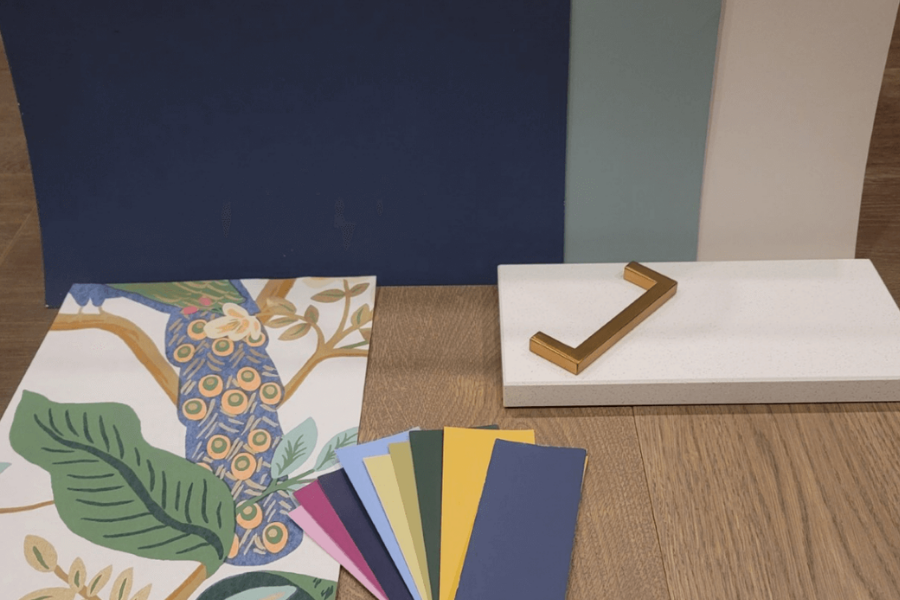
6. When assisting clients with choosing finishes for a kitchen or a bathroom renovation, head to the showroom on your own first, and be prepared with any samples or documentation you may have already collected from them.
Samples showed here for my own kitchen renovation
We always take our large painted boards, samples of painted cabinet doors, and our grout palette. Then we do our thing, selecting finishes (usually 1 or 2 options) based on what we said we would do in the detailed contract.
We are lucky to have a designated area of the showroom – a quiet corner or the board room – to set up and leave our ‘presentation’ there for a day or so.
*NOTE: The selection process typically takes 2-3 hours depending on the scope of work and including travel time and setup. This means that around 3 hours are remaining from the initial 6 hours.
7. The way we work with Designer For a Day service is that we generally split the 6 hours into two parts.
For the second part, we arrange for the client to meet us at the showroom where we present the design finishes. Anything that needs to be swapped out or slightly modified can easily be done right there on-site.
A member of the staff makes a note of the final selections and tags the paperwork with the client’s name, my name, and their GC (if applicable).
Bathroom Refresh by Claire Jefford Inc.
8. If there is still time remaining in their allotted 6 hours, it’s not uncommon for us to either leave with the samples and take them to the client’s home to view on site.
Alternatively, we sometimes will go to a bathroom boutique or lighting showroom, depending on the client’s top priorities of what they want help with.
9. When we are done, we part ways and that’s it! Unless they need further services, you are done. No follow up meeting, no write-up required and no ordering of products.
Be sure to take photos to share on social media and/or for future blog posts. Then follow up afterward to ask for a review.
10. Go home, put your feet up and have a glass of wine, you’ve earned it 🙂
Of course, there are different ways you can offer this service. Tailor it in a way that works for how you want to run a successful interior design business. If you are still unclear and want more detailed information to better understand how Designer For a Day could work for your model, reach out to book a one-on-one coaching session with me and we can tighten up this fabulous service offering to work for you in your business!
Did you ever wish there was something you knew about the design industry way back when you started your business?
Maybe you are an interior design student or a decorating enthusiast considering starting your own business in the near future and are curious to hear a seasoned professional’s thoughts on this industry and what they might like to see change.
This post is for you, keep reading!
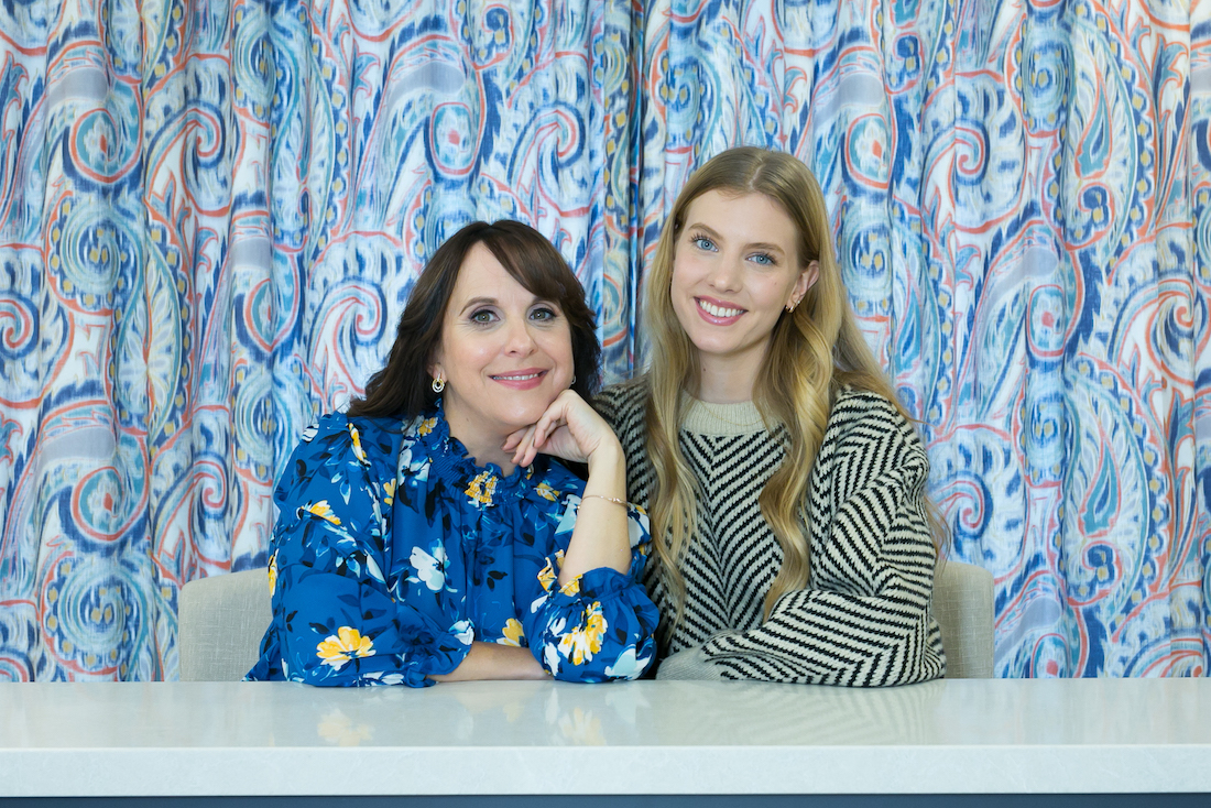
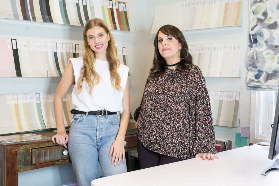
For a school project, Kathryn Venema, an Interior Design student and my part-time designer here at Claire Jefford Inc., sat down with me to ask these questions and much more.
See all the Q&A’s here as I share my views on what it takes to make it in the interior design business.
Full-time student, and part-time interior designer Kathryn Venema, and business owner Claire Jefford.
Kathryn:What is something about the design industry that you wish you knew when starting your business?
Claire: I wish I was more prepared for the business side of the industry.
In school, I learned a lot about design, layout, etc. They taught me the foundation of how to design and decorate, but definitely not how to run a business.
I learned what I know about running a business from experience, trial and error, and learning from others around me.
Now, I’ve been able to use what I’ve learned about the industry to coach young designers like yourself to give you the foundation of business knowledge that I wish I had when starting out.
Kathryn: What is the most rewarding aspect of the design process for you?
Claire: I have two. First would be the client presentation, seeing clients get excited about the possibilities of what their home could be because our designs are usually something they would not imagine for themselves.
My second favourite part about the design process for custom projects is the big reveal.
When clients trust the whole process and trust your designs without back and forth, being able to see your design come to life on a big reveal day is soooo thrilling!
Knowing the work and all the magic you put in behind the scenes in making it all work smoothly, and seeing clients so excited to view their new space, is one of the most rewarding parts of the process.
Kathryn: Is there anything you don’t love about the business side of the design industry?
Claire: Managing renovation projects. As a certified interior decorator, project managing for full floor or kitchen and bath renovations is definitely not my thing.
I love to do what I do best in terms of the overall design, layout, making selections, choosing paint colours and guiding a client that way for a renovation as opposed to managing trades, ordering all items, tracking, and troubleshooting.
We do, however, project manage many decorating projects for our wonderful clients.
In terms of admin work, order tracking, sourcing, etc. it’s about how you want to run your business. Some people describe this as the 80/20 rule: 20% design and 80% everything else -basically running the business.
If you become your own boss, you need to recognize which aspects of the interior design process you don’t like and you aren’t the best at. Those are the tasks that you’re going to want to outsource first in your business or hire someone else to do.
Claire thinking carefully about which tasks to outsource in her Interior Design business. LOL
This past spring I hired my sister (who also happens to be a client) as my full-time Office Manager. As the goals that I have for my business continue to evolve, I needed help managing more of the administrative work if I want to continue to grow and successfully manage my business.
As a bookkeeper, and an extremely organized person (at work and at home) she has been a great addition, helping me in areas that aren’t my strength. This means I can focus more on the design and coaching side, while she looks after all the admin work.
Claire at the thought of doing less admin work.
Kathryn: What skills would you expect from an Interior Design student or Interior Design graduate to stand out when searching for a job in the industry?
Claire: One thing I preach all the time is the use of video. Video is something that is often overlooked but it really helps you to stand out from the crowd when initially reaching out to an accomplished firm with the hopes of getting a job or even pro-bono experience.
I’ve spoken at many industry events and sometimes send a video along with my submission to introduce myself and describe how I can help them. That personal connection can’t be beat.
From a business’s perspective and in terms of the specific needs of my own firm, when hiring design students 3D rendering skills are a must in order to illustrate design concepts to our clients.
I used to do these myself, but now prefer to focus on other aspects of my business while someone else takes care of this important part of the project. Of course, I oversee the designs and share my vision as well as ideas I have for any project we take on.
The student should also have a good eye for material selections and being aware of ideal measurements and dimensions within any given space, is also an asset.
Being punctual, respectful in their communication and showing initiative is also high on my list of expectations.
I wouldn’t expect them to know anything about business at that point, even as a new graduate.
My recommendation for anyone starting their own business is to go through your first design projects, whether it was for yourself or something you did for school. Build a portfolio of your drawings, before and after images and look at the design process to help you understand what issues may have arisen, what did you do to address them, how could you have addressed them better, and what was the purpose and obstacles of this project?
This will help you develop and refine your business processes and make you able to stand out in interviews when discussing problem solving scenarios, and with your clients in the future too!
Kathryn: What piece of business advice would you give to a design student or new graduate when entering the industry?
Claire: Although you need to learn through your own experiences and with every project you will gain more confidence in your abilities, try not to underestimate the value you bring as an interior design professional to a project and how beneficial your services are for homeowners. These designs you create and the choices you make, impact the way they live.
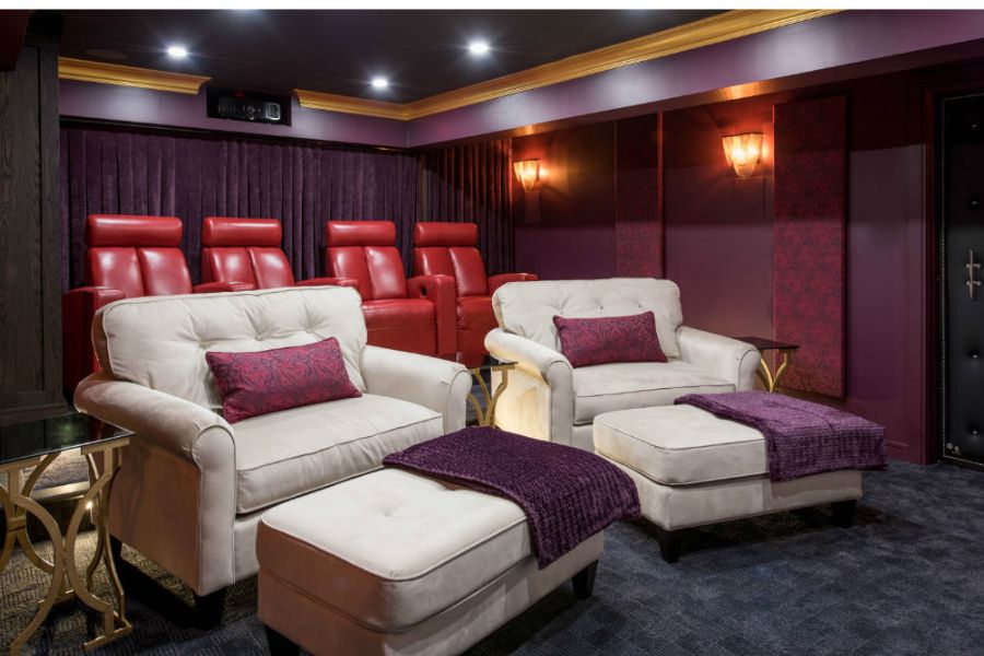
The ultimate home theatre.
Invest in your business! Remember that this is a business and you are a professional running a business.
When you invest actual money and develop a strategy up front, you’ll be more likely to take yourself seriously which will reflect the way you present yourself and how you work.
This includes investing in your website, creating a brand image, hiring a professional photographer to build your portfolio., etc.
I’ve seen too many new people start up an interior design business without thinking like an ‘Interior Design Boss‘ and it feels more like a hobby. This type of mindset is hard to shake and can lead to ‘imposter syndrome’. Invest in your business from the start with the necessary business setup requirements.
Be open to learning from others in the industry who have relevant experience because you can never know it all.
This includes working with trades and appreciating what level of expertise they can also bring to a project.
If you want to grow your business and enter with a mindset of bigger and better – hire sooner than later.
When you’re presenting your services to potential clients, don’t just disclose what services you offer, but instead make sure you are sharing the benefits of working with you.
For example, if you were to approach a realtor to work with them on styling, how will hiring you as a designer help them, and what skills do you bring to the table?
Kathryn teaches Claire some new tricks.
Reflections from Kathryn
“This was a really great opportunity to get some insight on more of the business aspects of the design industry from an industry professional and accomplished business owner such as Claire.
I gained a lot of insight on what goes into running your own interior design business, as well as valuable strategies and pieces of advice to get there.
Kathryn hard at work.
The biggest takeaways from this interview were to remember that when starting a design business, even if you start out from your home, you need to treat it like a professional business and invest both money and time into a business plan in order to find success.
In addition, considering which aspects of the design process you love and what you may not like, and understanding all the additional elements that go into running your own business, was a valuable takeaway for me as well.“
Kathryn is a lovely person, and I feel very fortunate to have her on my team. We have quite a bit of fun as well, if you can tell by our cheeky smirks in this photo above. 😉
I know she is learning a lot on the job while teaching this ‘not so old’ dog a few new tricks at the same time!
Cheers Kathryn, for all that you do here at Claire Jefford Inc.!
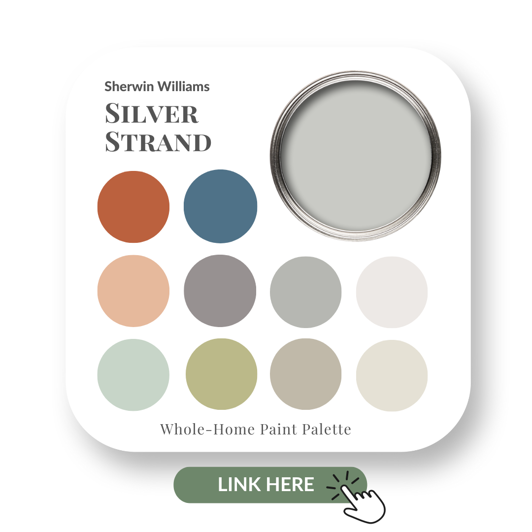
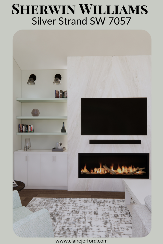
Silver Strand is just one of many beautiful and popular neutral gray paint colours from Sherwin Williams.
And like many grays it can look different at various times of the day depending on the room, the lighting and of course all the other accents and elements in the space.
Let’s take a closer look at this light and airy gray from Sherwin Williams.
If you’re new here, welcome! Below you will see what I cover in every colour review post.
In this colour review of Silver Strand by Sherwin Williams, I share:
The undertone of my featured colour
Colour comparisons in order to easily see the different colour tones
Best white paint colours for the trim and ceilings
Beautiful colour combinations to inspire you for your decorating project
Sherwin Williams – Silver Strand
After you read the blog, if you would like all the colour details in one convenient place, look no further than my new Perfect Colour Palette for Silver Strand.
My Perfect Colour Palette also includes 10 colours that go beautifully with Silver Strand, plus a 2-page step by step How-To for choosing a cohesive colour palette in your own home.
A must-have for any colour enthusiast or interior design professional!
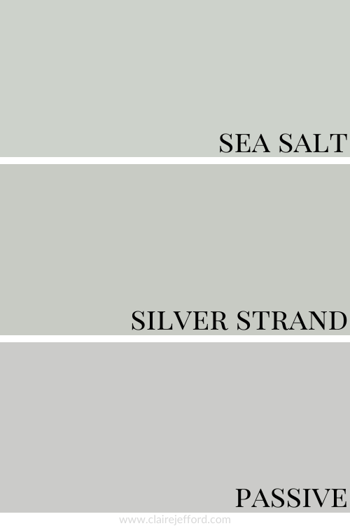
As you can see below, it’s when we start comparing colours that you get a much better sense of a paint’s true colour.
Sea Salt SW 6204 and Passive SW 7064
If you couldn’t quite see the green/blue undertone it certainly is more apparent when comparing it to Sea Salt and Passive, two other lovely neutrals from Sherwin Williams.
Colour Comparison with similar colours by Sherwin Williams
As you can see in the comparison above though, it’s not quite as strong or noticeable as it is in Silver Strand.
The paint colour Passive is also a gray but has a violet undertone.
When I do Colour Consultations in a client’s home, I always compare colours with my large colour boards so they can easily see the differences between the paint colours.
When I hold my large paint boards up to a decorative element such as fabrics, wallpaper or subway tile and then swap out one board with another board, it becomes clear as to which colour will work best.
If you think this slightly more subtle gray is more your style consider my Perfect Colour Palette for Sea Salt to give you some added inspiration.
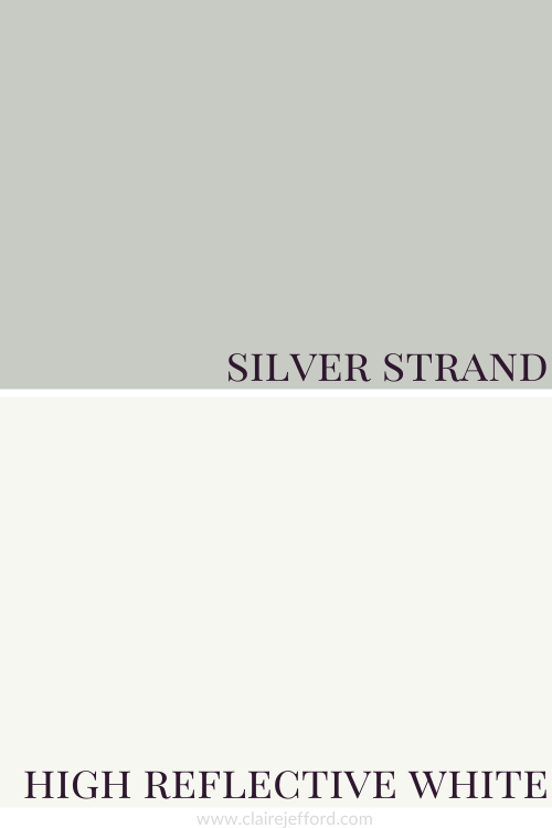
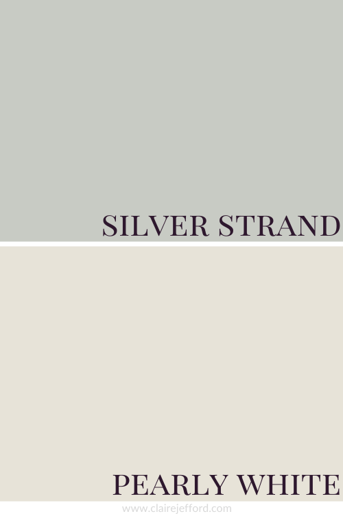
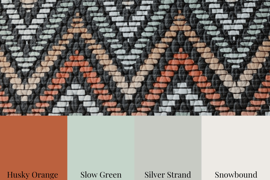
Best Whites To Pair With Silver Strand
High Reflective White SW 7036 by Sherwin Williams
Snowbound SW 7004 by Sherwin Williams
Pearly White SW 7009 by Sherwin Williams
High Reflective White, Snowbound and Pearly White
All three whiles look super with Silver Strand but the comparison below gives you a good idea of the different looks you would get with each.
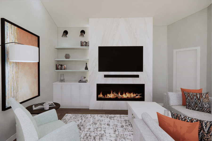
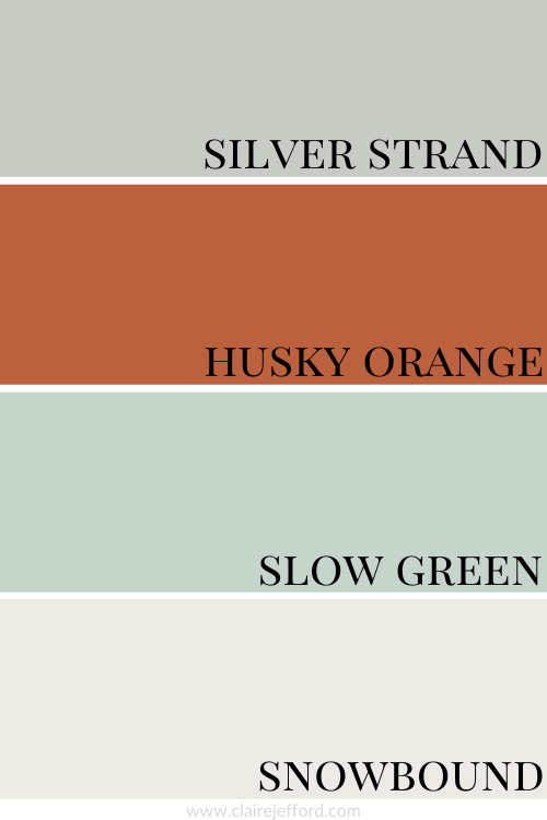
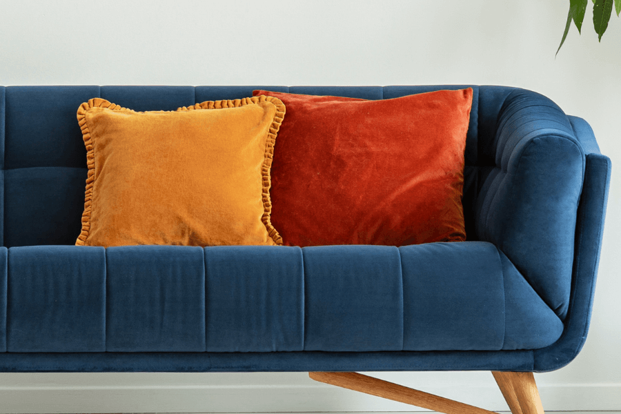
From the room rendering below you can visualize the different ways to use these colours all together in one space.
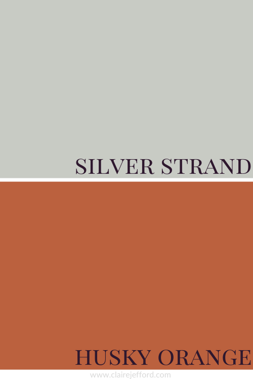
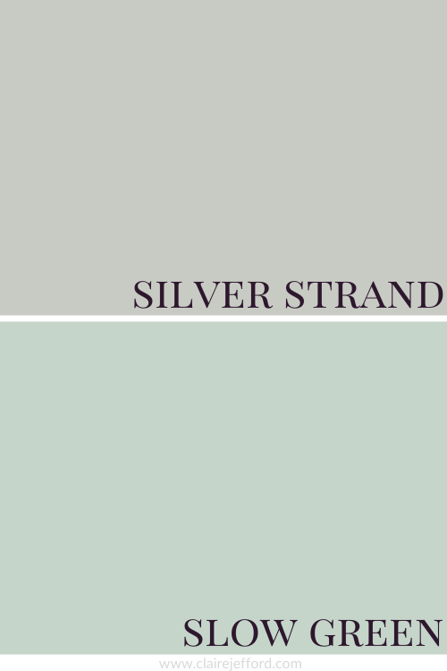
The walls are painted Silver Strand.
The artwork on the left wall along with the cushions incorporates the Husky Orange.
And the accent chair is upholstered in a similar coloured fabric to that of Slow Green.
So remember, you can use my Perfect Colour Palettes to pull together a pretty colour scheme, being inspired by the colours for more than just paint colour for your walls.
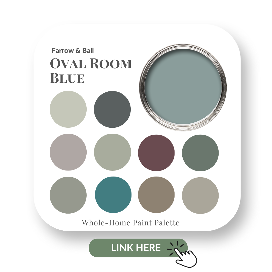
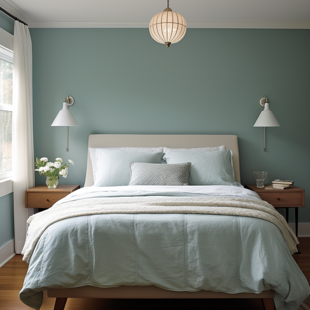
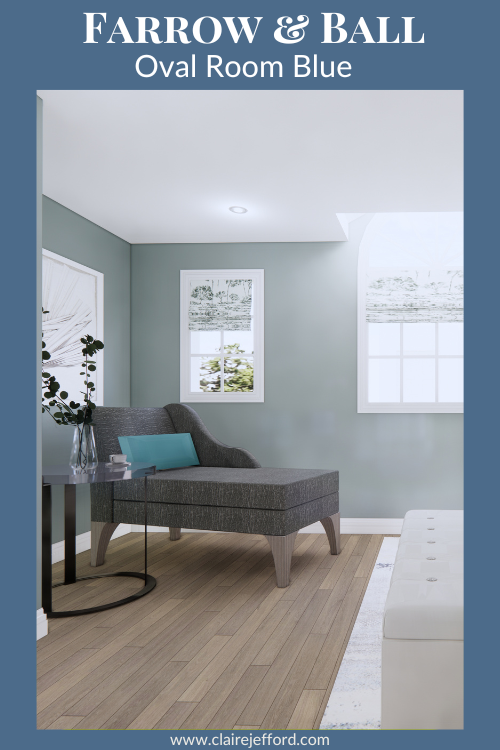
A must-have resource for any colour enthusiast or design professional! Below is the cover for Oval Room Blue. Learn more here.
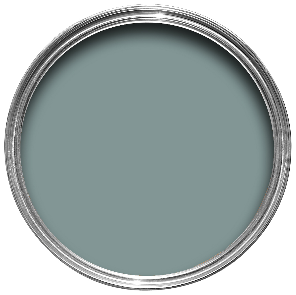
Oval Room Blue Colour Review
Colour: light teal blue
Farrow & Ball describe Oval Room Blue as…
the most ‘blackened’ of their blues, giving it a subtly aged feel. Named after the attractively shaped rooms of the late 18th century, it sits perfectly with our popular greys to create depth and balance in either a hall or a darker, cosier family room.
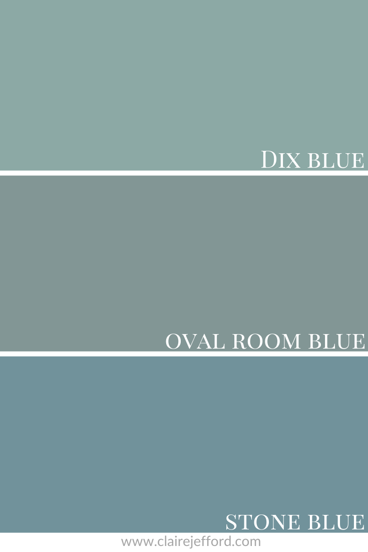
Let’s take a look at some comparisons of similar colours to get a better read of this blue.
Colour Comparisons
Dix Blue No.82 & Stone Blue No.86
Here it seems to look more like a gray blue when sandwiched between Stone Blue and Dix Blue. Oval Room Blue is much less vibrant than those other two colours.
But when you view it in isolation and pair it with specific hues, it seems more bright than you might expect.
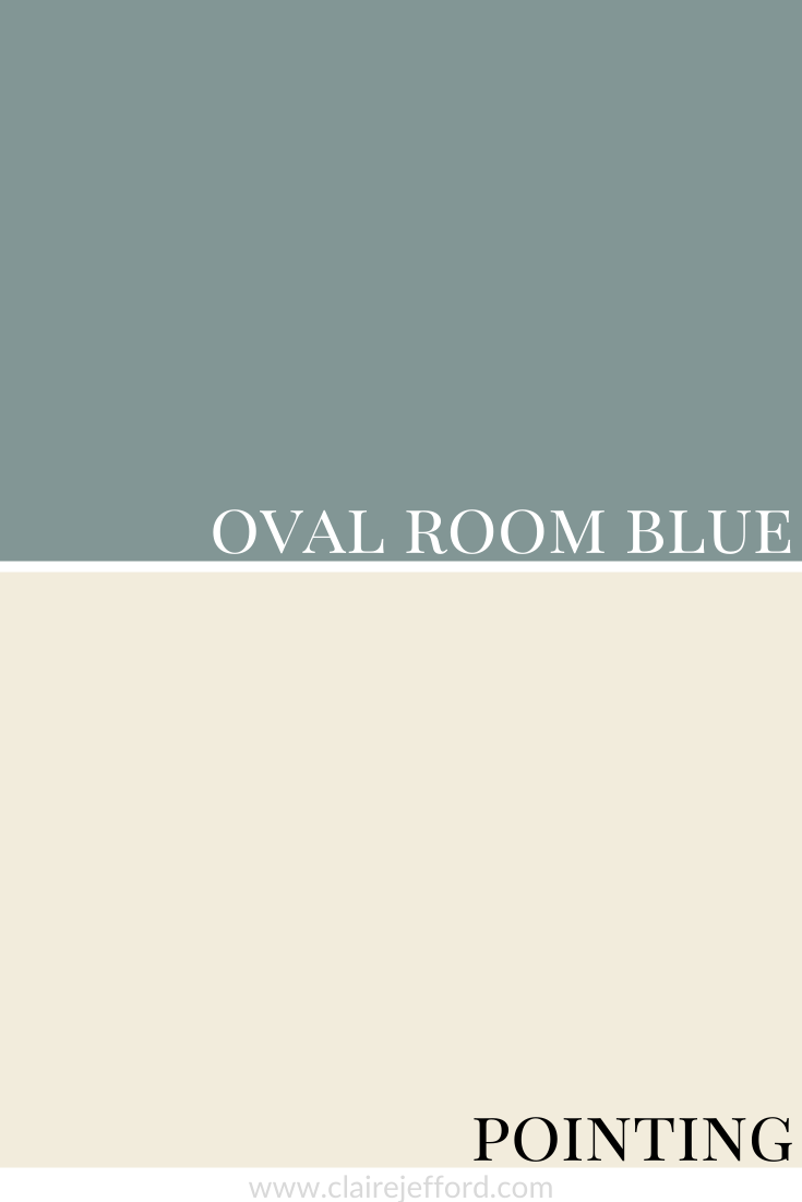
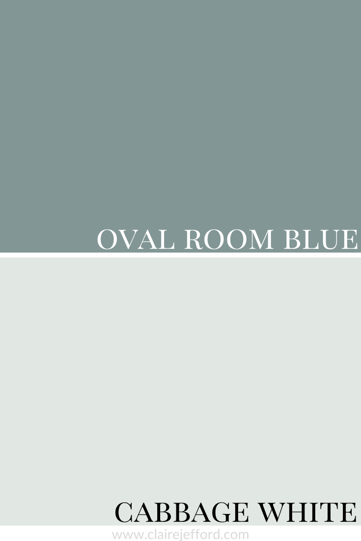
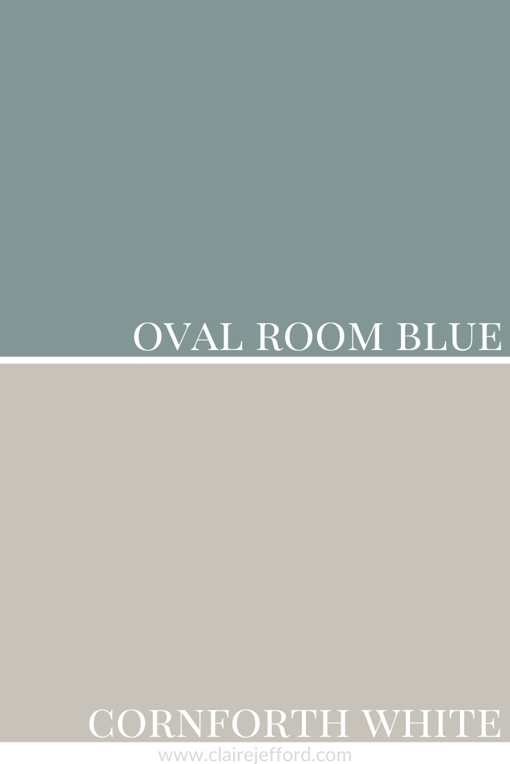
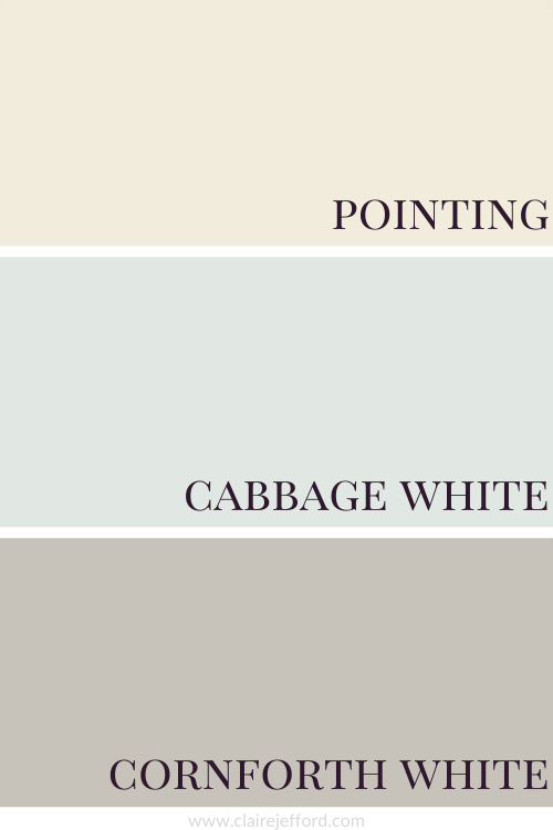
Best Whites To Pair With Oval Room Blue
Pointing No.2003 By Farrow & Ball
Cabbage White No.269 By Farrow & Ball
Cornforth White No.228 By Farrow & Ball
Now that we’ve seen each white on its own with Oval Room Blue, let’s take a look at the 3 whites together.
These don’t even look white at all, but believe it or not, they are some of the lightest ‘whites’ from Farrow & Ball.
And while we are on the topic of whites, if they confuse you, you are not alone. But I can help. 🙂
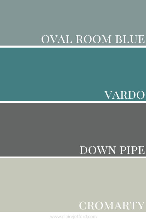
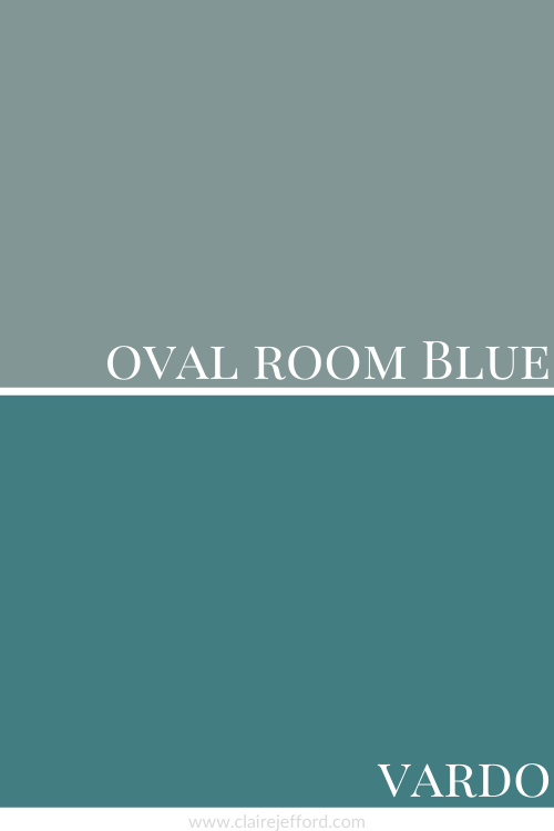
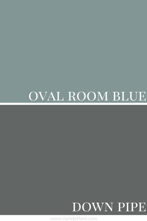
I absolutely love how Vardo stands out and the contrasting Down Pipe in this Farrow & Ball colour combination! Do you love it too?
Vardo No. 288 By Farrow & Ball
Down Pipe No.26 By Farrow & Ball
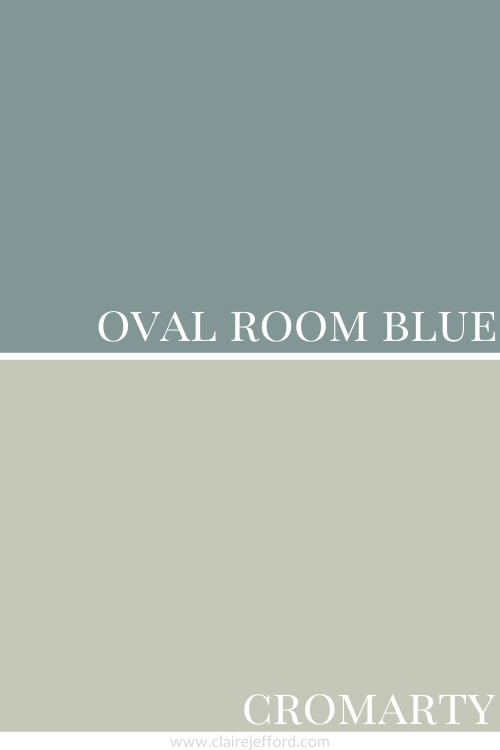
Cromarty No.285 By Farrow & Ball
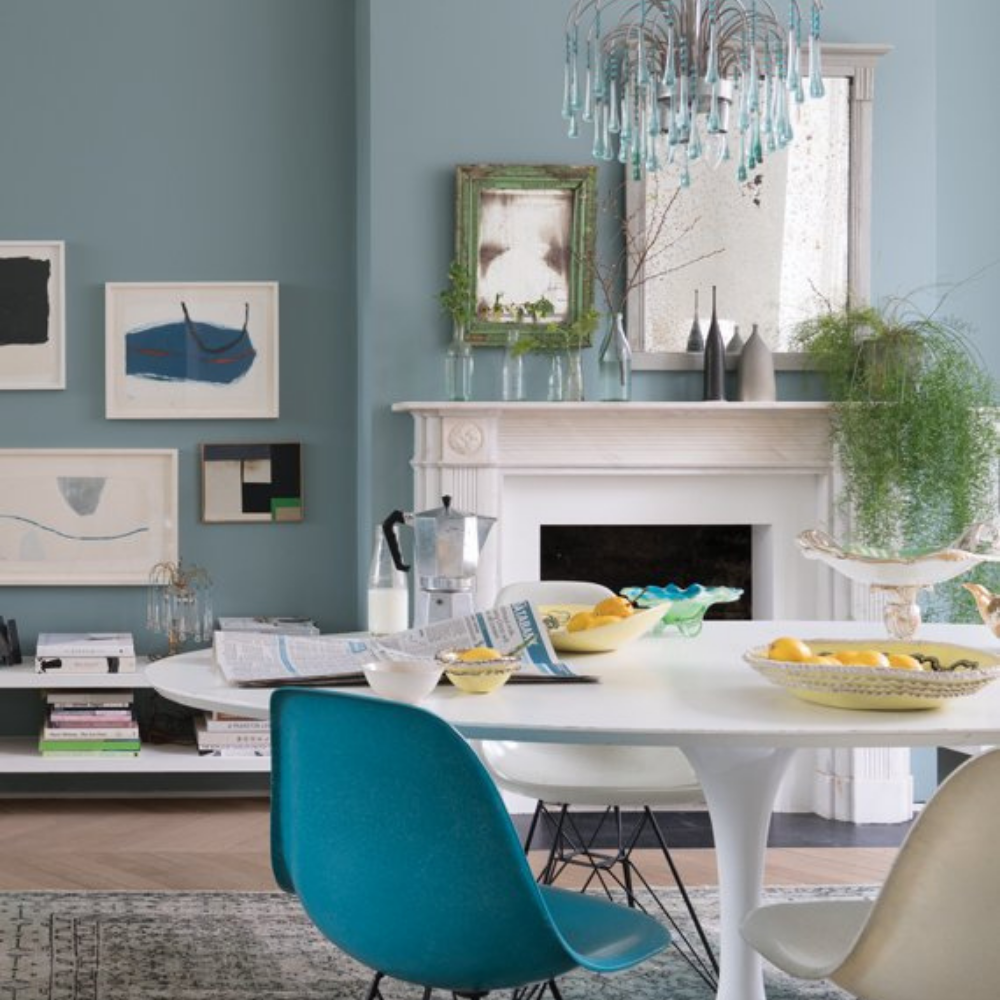
The chairs in this room image from Farrow & Ball resemble Vardo and Cromarty.
Convenience At Your Fingertips
All of the colour combinations I share here, plus more options to inspire your next decorating project, are included in my Perfect Colour Palette Oval Room Blue.
Who doesn’t love a fresh white and blue colour palette for a living space?
This popular colour combination never goes out of style.
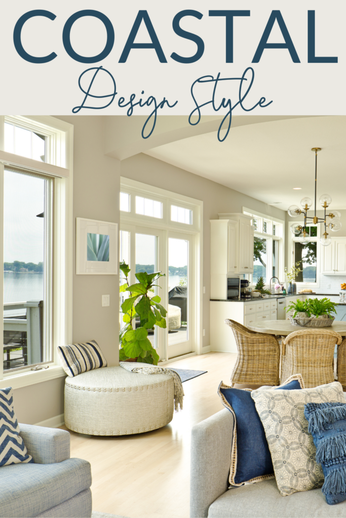
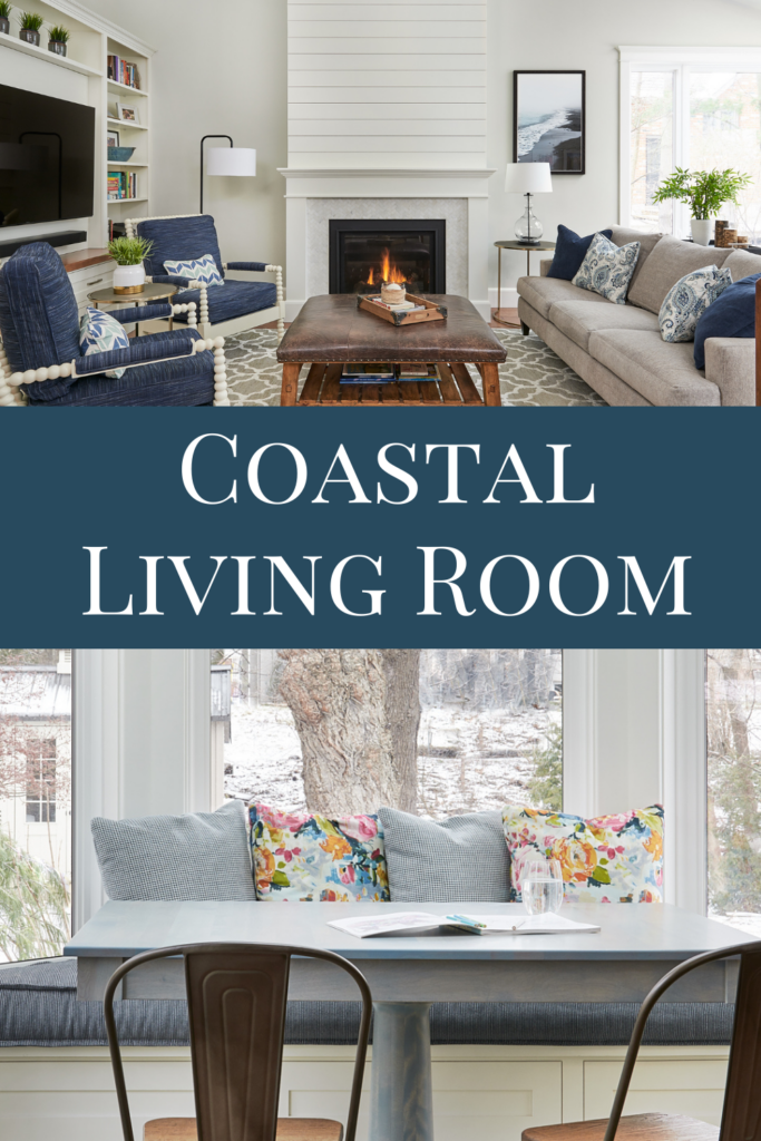
Check out the BIG reveal for this Coastal Living Room!
If you want to better understand the process of interior design and how we overcome various challenges when working on client projects, that’s exactly what I’m sharing with you today.
Let’s look at the details of this beautiful Great Room transformation, including before images, 3D drawings and our professional ‘after’ photos.
Project Location:
This was an older home in a beautiful mature neighbourhood known as Aldershot in my home town of Burlington, Ontario.
Client Wishlist
While they had an idea of what they desired to update and drastically improve this previously unused space, my clients sought professional guidance from us to make their dreams a reality.
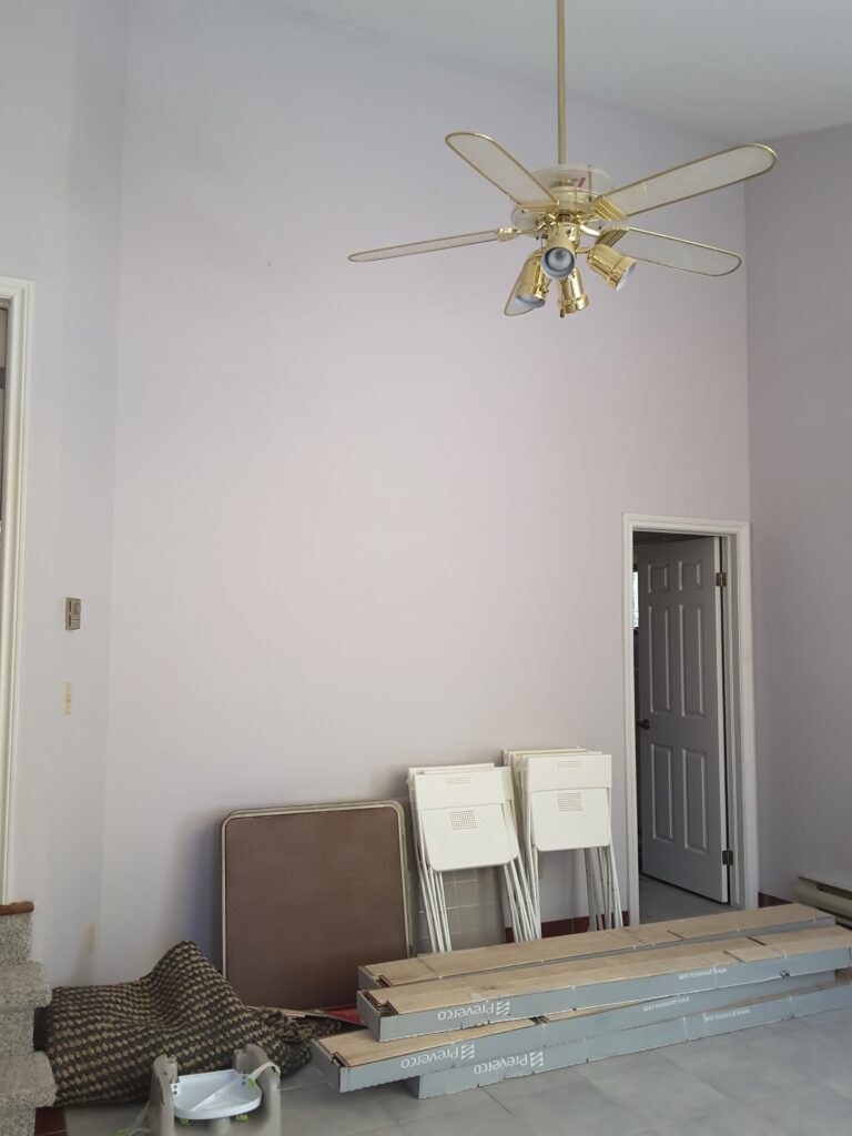
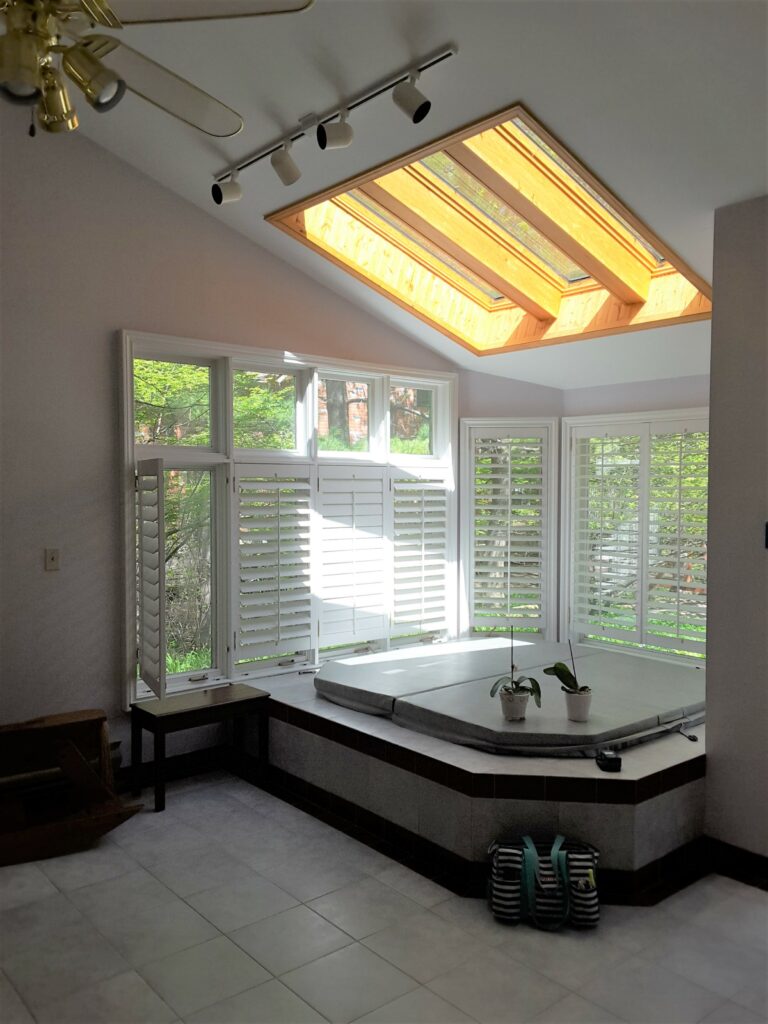
Behind this wall was a very dated bathroom which was never used
To do this successfully, it was necessary to tear down a wall and remove an unused bathroom that would then allow enough room for everything on my client’s wish list, including an open floor plan between the kitchen and the new Great Room.
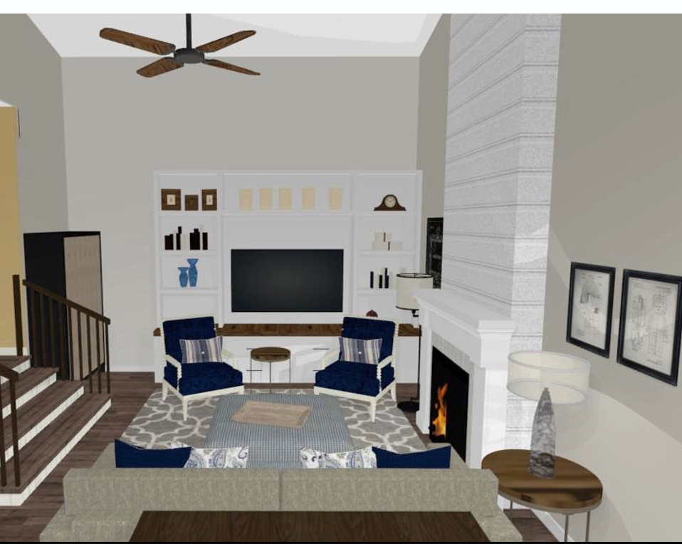
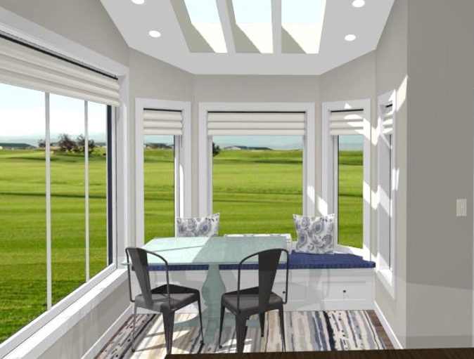
This rendering really helped the client see the potential of their space
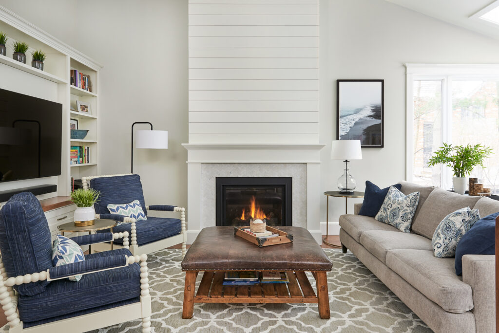
In discussing the needs (and wants!) of our clients, we thoughtfully designed an entertaining area that the entire family could enjoy, a beautiful, coastal living room.
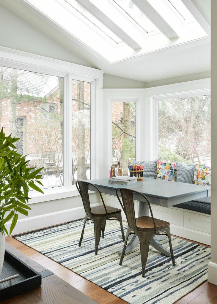
It was important for us to accentuate the great architectural features in this room, such as the tall slanted ceilings and abundant windows that provided a glorious view to the lush gardens in their backyard.
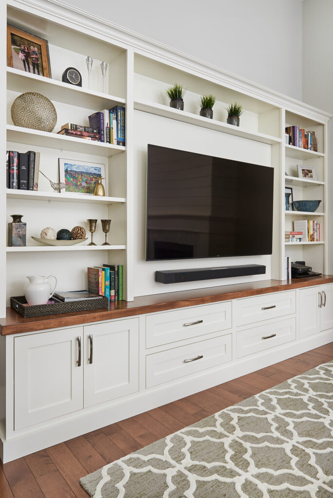
Custom entertainment centre built in – Cloud White by Benjamin Moore
Key Focal Points-Coastal Living Room
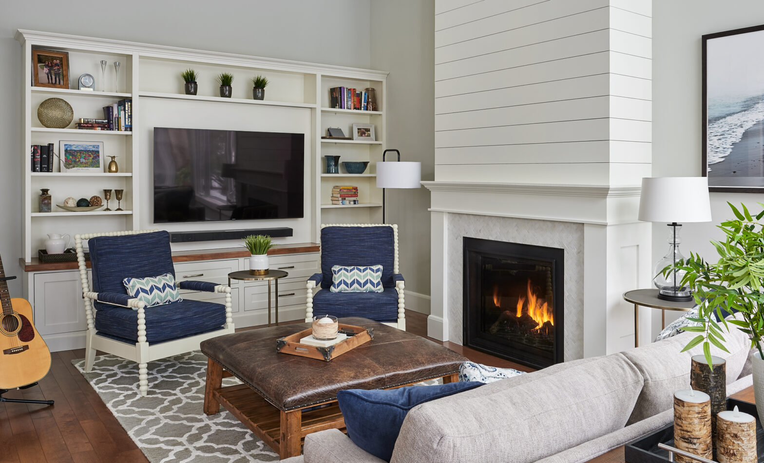
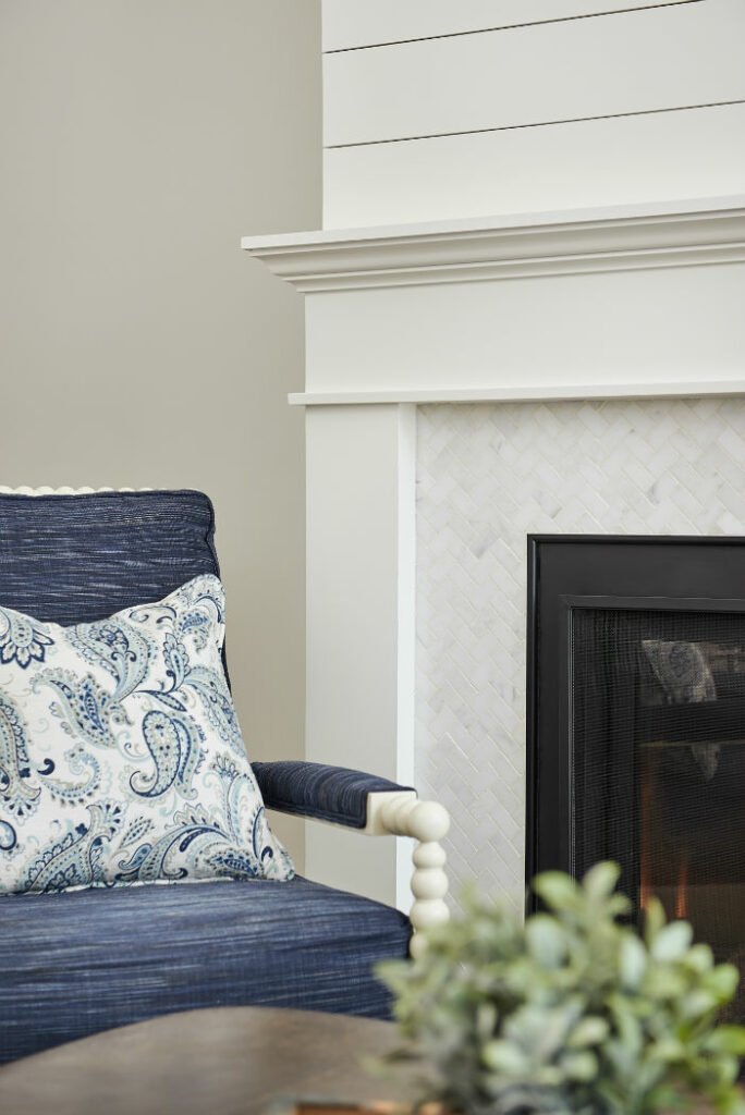
The main focus was the addition of a custom media wall unit and new fireplace that we designed using soft white shiplap and a small marble herringbone tile.
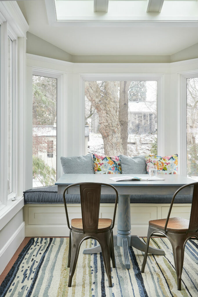
This rendering shows a sneak peak of the big reveal for this coastal living room.
We were also really excited about the addition of a crafting area for the kids in the back corner by the windows!
Clients can easily see their homes transform with 3D renderings
The area rug and bench seat with pillows help to tie in the coastal blue colour scheme
This space used to house an old hot tub that the clients never used.
Check out the before image below.
Why keep what you aren’t using?
Wowzas! It’s incredible when you consider the possibilities of what you can do.
In my opinion, that’s one of the best parts of being an interior design professional. And making dreams come true too, of course. 🙂
With the additional sunlight that pours into this room from the skylights above, it was the perfect spot to create a cosy little nook.
The kids benefit from this renovation as well, with this gorgeous craft area.
The custom bench seat that sits perfectly within this bay window area not only looks great, but the drawers underneath for storage of colouring books, pencils, games and puzzles means that it’s super functional as well.
Colour Inspiration-Coastal Living Room
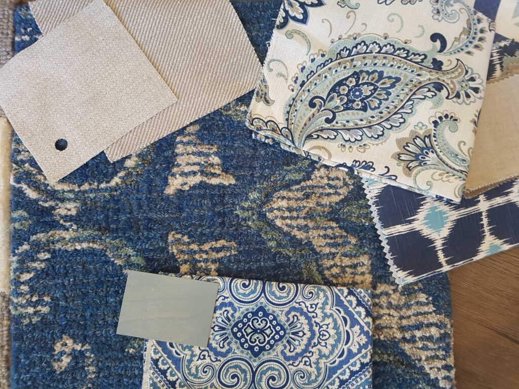
The client wanted a coastal design style, so we sourced fabrics in these great shades of blue.
For the colour palette I am often inspired by fabrics first.
Typically we use one or two swatches that become the ‘jumping-off point‘ for the entire design.
Blue and white is a great, ‘no fail’ colour combination.
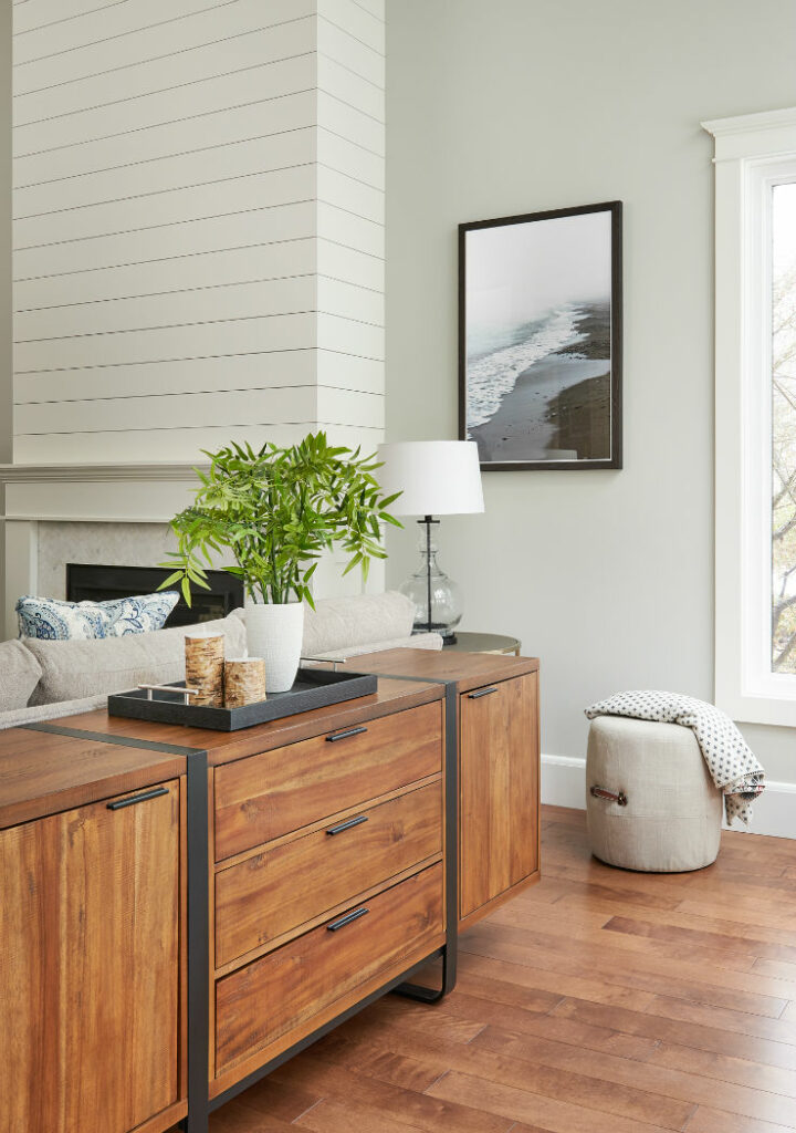
From there we look at other decorative elements to support the design palette, mixing in some warm tones as well. You can see that reflected in the coffee table, walnut shelf on the media unit and console behind the sofa.
Wood console placed perfectly behind the sofa
Then we add in more layers such as the area rugs and accent cushions.
There was an emphasis on creating a Coastal colour palette with nautical hints to complement the new shiplap fireplace.
You can see how we did that by using beautiful dark blue fabrics in the conversational seating area, as well as in the other blue tones incorporated into the children’s new crafting area by the windows.
The fireplace is a stunning addition to the big reveal of this coastal living room
More beautiful blue colour combinations can be found here.
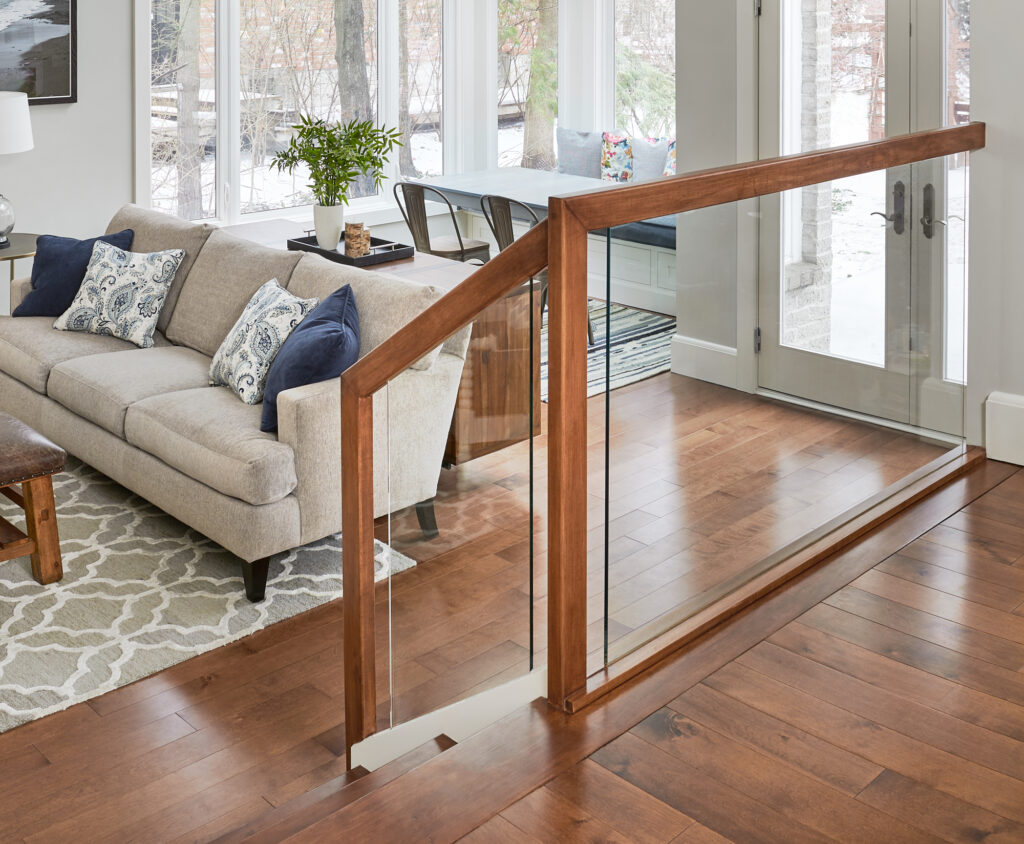
Since it was important for the clients to open up this new space from the kitchen, in order to keep the eye moving you’ll see we used see-through acrylic panels by the stairs. Traditional railings can often distract the eye and look busy.
This is a clever design tip that makes for a seamless design that the client’s especially loved.
See-through acrylic panels give a more open look to the space
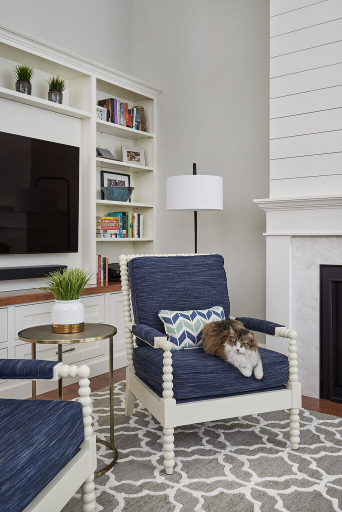
Fluffy seems to approve of the renovation updates too. LOL
We enjoyed working with these Burlington clients to redesign an area of their home that had previously not been used since they moved in.
Our job is most meaningful when clients trust us to create stunning and functioning spaces for gathering and making memories.
Plus, the return on investment for selling a property that has been thoughtfully designed and beautifully decorated is huge!
Have you ever been to Napa in California? It truly is one of the most beautiful places on earth with continuous rolling hills, endless exquisite vineyards and greenery as far as the eye can see.
I arrived a couple of days early to meet some of my closest design friends. We decided to treat ourselves and booked a trip on the Napa Valley Wine Train for Mother’s Day.
If you ever find yourself in Napa, I highly recommend you sign up for this one of a kind experience. It was fun, relaxing, and a magical memory I will never forget.
Me and my girl, fellow interior designer Jana Donohoe.
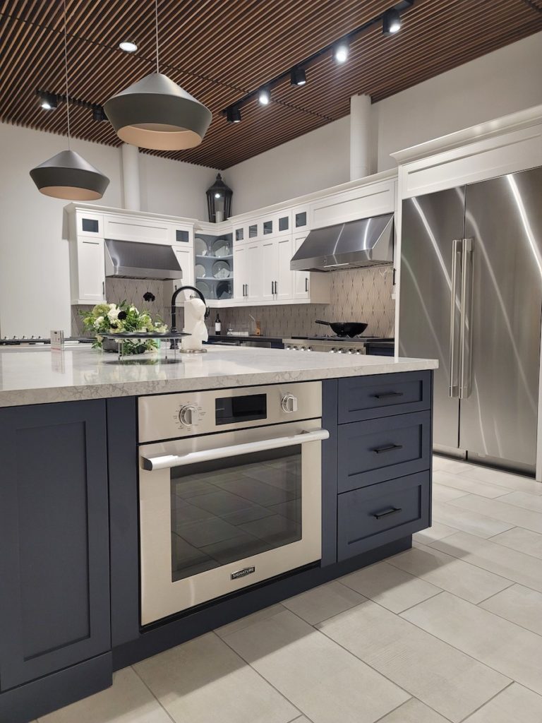
SKS Kitchen Appliances
Fun train trips and beautiful landscapes aside, the actual purpose of my business trip was to learn more about Signature Kitchen Suite appliances and take part in their one of a kind ‘True to Food’ experience.
The kitchen is referred to as the ‘Heart of the Home’ for a reason.
It’s where you spend the most time, preparing food, gathering with family and friends and making memories along the way.
Deciding on selections for your kitchen appliances is a major decision and one not to be taken lightly.
If making the most of your kitchen is important to you, (which it absolutely should be!) then how the appliances you choose will look and function is a major consideration.
Your kitchen appliances are also a big investment, so you want to be sure to choose wisely.
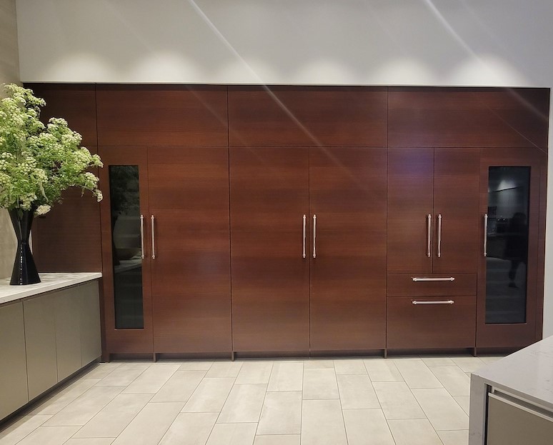
Extra Large Capacity Columns
Let’s start with refrigeration. In this image above, taken at the SKS 24,000 square foot Experience Design Centre, you can see a full wall of panelled wall fridges/ freezers with glass wine columns on each end.
The extra-large capacity fridge columns preserve the integrity of your fresh food. There has been so much innovation and engineering put into the integrated 30-inch refrigerator and 18-inch freezer columns-both with one of the largest capacities in their class.
While it’s imperative to have ample storage, just as important is the ability to ensure the freshness of the food you purchase – especially with the increased prices for produce and all of our groceries these days.
Wine Cave Technology
It’s hard to imagine a more perfect partner for good food than wine. Am I right?! 🙂
That’s why the wine column refrigerators – shown on each end of the panelled fridge wall below – were developed with exclusive Wine Cave Technology. It actually mimics the ideal environment of historic Old World wine caves.
This protects wine against its four biggest enemies: vibration, light, and variations in temperature and humidity. And when you open the glass door, the light inside automatically comes on so you can easily select the best pairing of wine to go with your meal.
Panelled fridge/freezer wall with wine columns at each end from Signature Kitchen Suite.
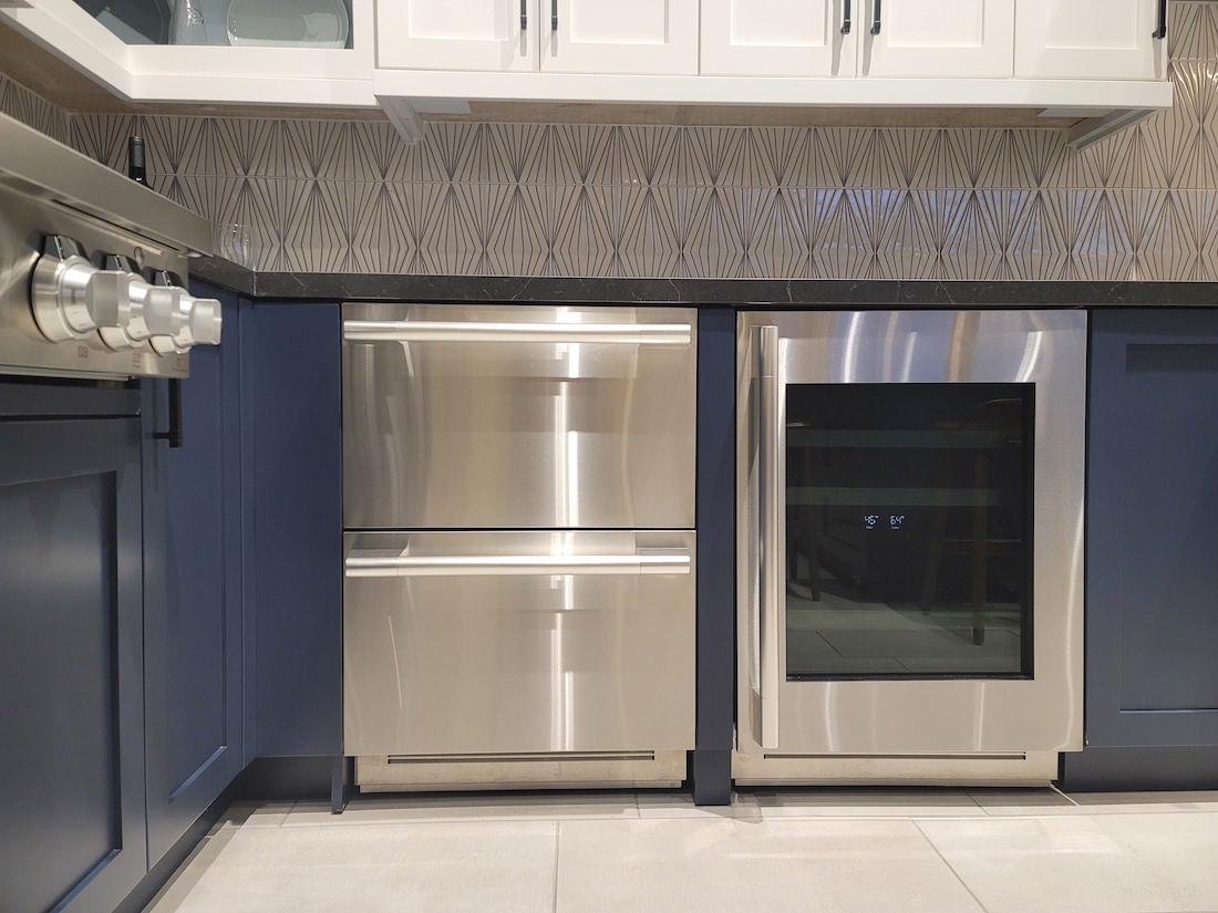
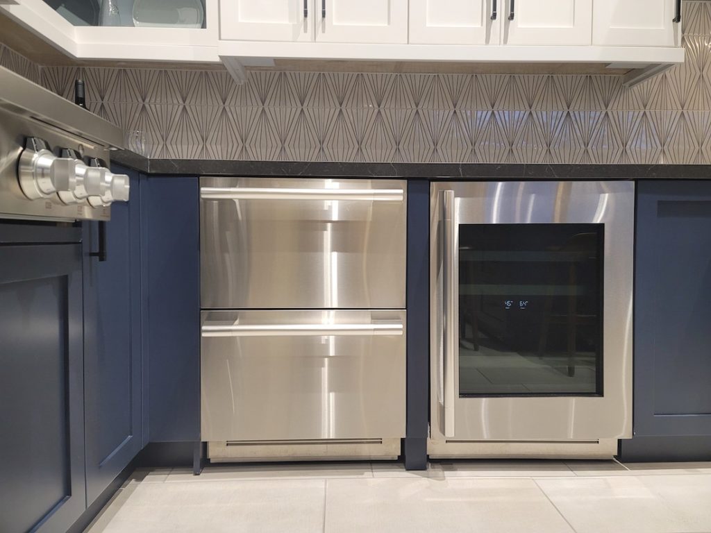
Undercounter Convertible Fridge/Freezer Drawers
These are becoming increasingly popular because of their versatility and they look fabulous as well!
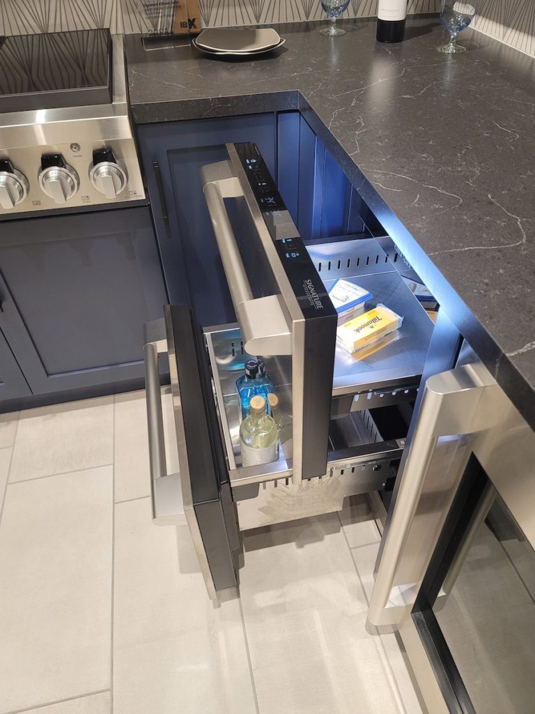
This is the only built-in under-counter refrigeration unit in its class with dual drawers and Multi-Temp Settings.
Both kitchen drawers offer a selection of six temperature zones:
Pantry
Fridge
Bar
Seafood
Meat
Freezer
Yes, you read that right! If you require extra freezer space, you can drop the temperature all the way down to make either (or both drawers) a freezer.
How cool is that? And yes, that pun was intended.
A look at both drawers open
And a birds-eye view from above
On a side note, the base shaker cabinets in this kitchen look like the colour Van Deusen Blue by Benjamin Moore. Blue is always in style in interior design.
Craft Ice Balls
Am I the only person who has never heard of these before?
Apparently, they are super sophisticated, maybe that’s why I never knew about them before…HAHA!
LG is connected to Signature Kitchen Suite and they have ‘Craft Ice’ refrigerators. These refrigerators deliver slow-melting ice for the best-tasting beverages.
While I’m not an avid cook, I can still appreciate the need for speed when preparing meals.
My interior design friend Jana and I had the opportunity to try out the Signature Kitchen Suite Steam-Combi convection oven.
This combines steam and convection cooking for gourmet results. The convection system cooks food quickly and evenly while steam helps to preserve texture, appearance and taste.
We made the cute mini ‘jacket potatoes’ that you see below on the plate of deliciousness.
All food prepared with Signature Kitchen Suite luxury appliances!
You can see more of that fun cooking experience here in one of my first Instagram Reels published from this event.
As well, I created a highlight here on my Instagram profile that captures all of the beautiful views, hands-on learning experiences and shenanigans that I got up to with my fellow Designhounds on this unforgettable adventure.
Which appliance from SKS excites you the most?
Comment below to share.
I am definitely partial to the convertible drawer fridge/freezer combination!
Find your perfect colour palette!
Have you done my colour quiz yet? You can take it here to find your perfect colour palette with décor inspiration for your next kitchen design, interior design or decorating project.
Perfect Colour Palettes
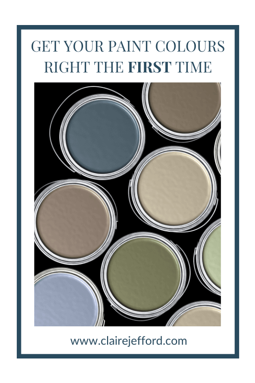
Remember, it only takes one mistake to take your home decorating project from divine to disaster. Don’t let the paint be what stresses you out!
Convenience at your fingertips
I have created Paint Colour Palettes for some of the most popular colours from three of the leading paint companies, Benjamin Moore, Sherwin Williams and Farrow & Ball.
Our Perfect Colour Palettes help you confidently select the best colour for your home, and see which trim, ceiling, and accent colours pair well with your selected colour.
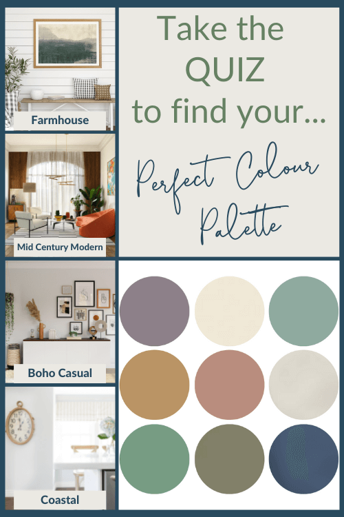
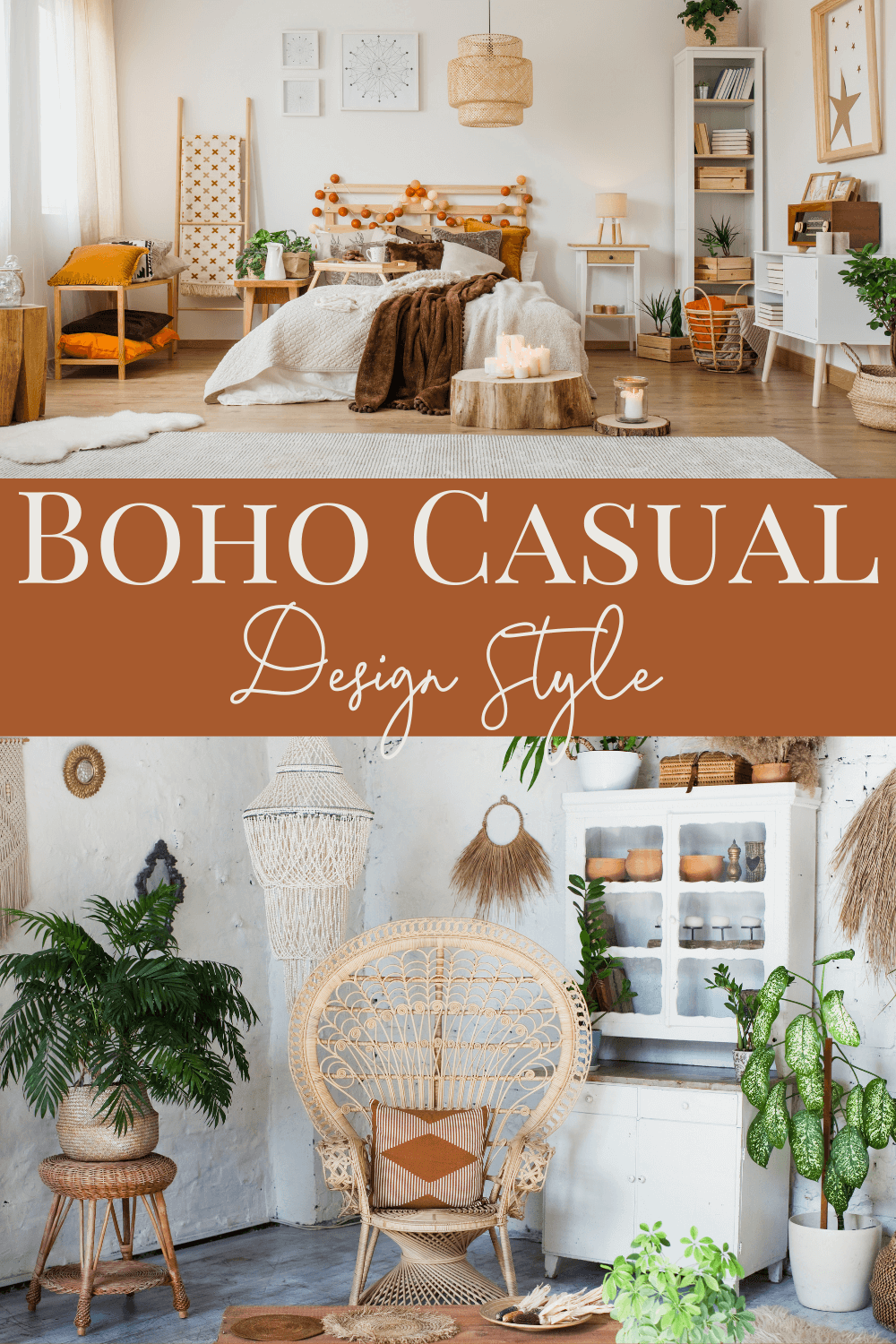
Boho Casual is featured as the fourth and final interior look in this initial Design Style series.
Bohemian, as it’s also known, is the least structured of all the Interior Design Styles we’ve covered – Farmhouse, Coastal and Mid Century Modern, being the other three.
There are no hard and fast rules for this freer style that uses layers of colour, texture and pattern to create an eclectic and highly individualized look.
Boho Casual Colours
Boho Casual design style has a range of distinct colours that assist in curating this look.
Let me share three inspiring Bohemian colours that will give you a great starting point if you are considering this interior design style for your own home.
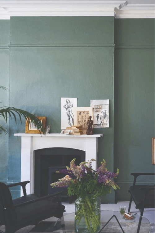
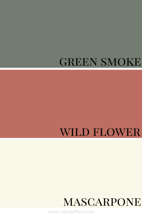
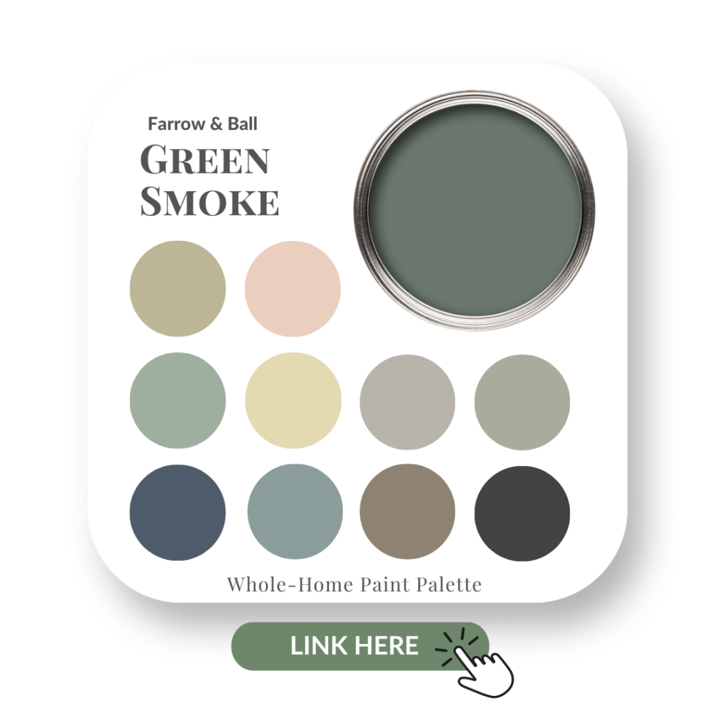
Farrow & Ball – Green Smoke No.47
Green Smoke by Sherwin Williams
A gorgeous green, Green Smoke lends itself so well to the Boho look.
As you’ll see and read later, botanicals are a big feature of Bohemian design style. Green Smoke is the perfect colour to convey this look in a paint colour.
Green Smoke living area and fireplace wall – image by Farrow & Ball
This is a favourite green of mine, one that I even used in my own recent basement renovation.
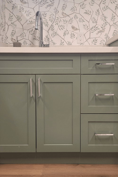
Below are my custom shaker style laundry cabinets painted in Green Smoke by Farrow & Ball.
This green works so beautifully with the nature-inspired bird and branch wallpaper, which has subtle dark blues, similar toned green and warm beiges in it.
You know that my family and I are bird-nerds, right? 😉
Green Smoke cabinetry in my basement laundry room
If you love green too, I have created a Green Smoke Perfect Colour Palette that offers 10 colours to pair with Green Smoke, a fabulous decorating resource to inspire your next interior design project.
Benjamin Moore – Wild Flower 2290-40
Benjamin Moore’s Wild Flower
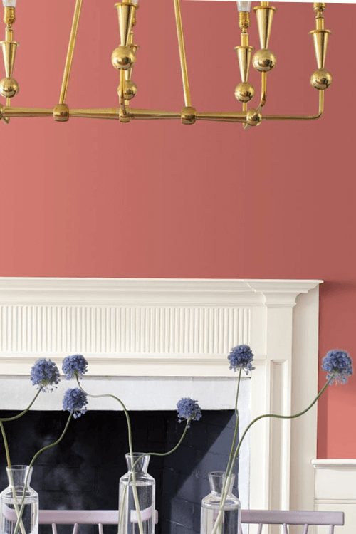
Not quite a terracotta, Wild Flower is a slightly brighter tone, a beautiful combination of pink, orange and red. It’s the perfect colour to pull off a casual Bohemian look.
Wild Flower dining room wall – image by Benjamin Moore
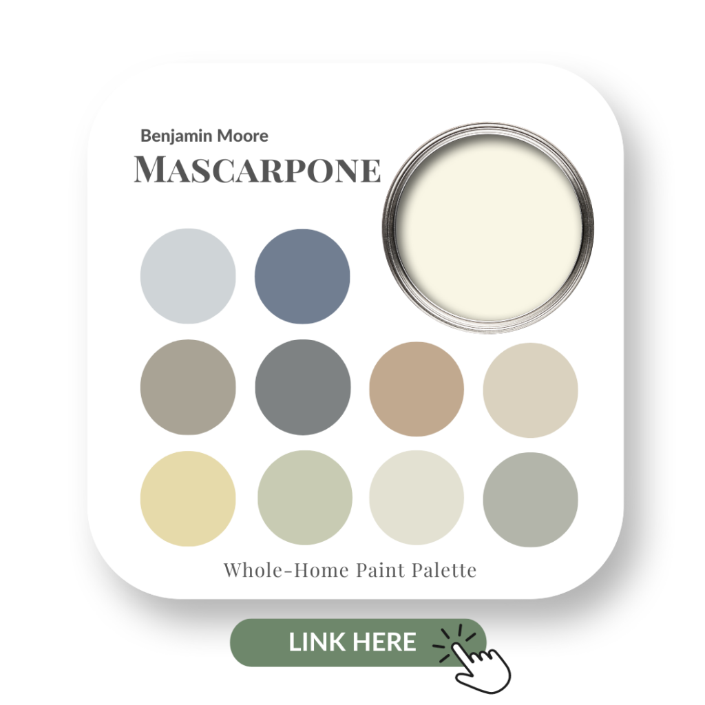
Benjamin Moore – Mascarpone AF-20
Mascarpone by Benjamin Moore
Most styles do well with a neutral colour to anchor the look and Mascarpone is a great choice for this Boho palette. It’s soft and creamy and let’s the richer colours really shine.
If you’re hesitant about the colours in this combination for the Boho Design Style, check out my Mascarpone Perfect Colour Palette which gives you 10 colours to mix and match with this pretty, light neutral.
Green Smoke, Wild Flower and Mascarpone
Boho Casual Design Style Colour Palette
A bold colour palette speaks to the Boho look completely.
Design Details
What are some of the signature details of the Boho Casual design style?
There are so many, let me touch on some of them here.
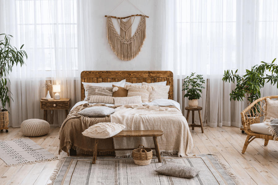
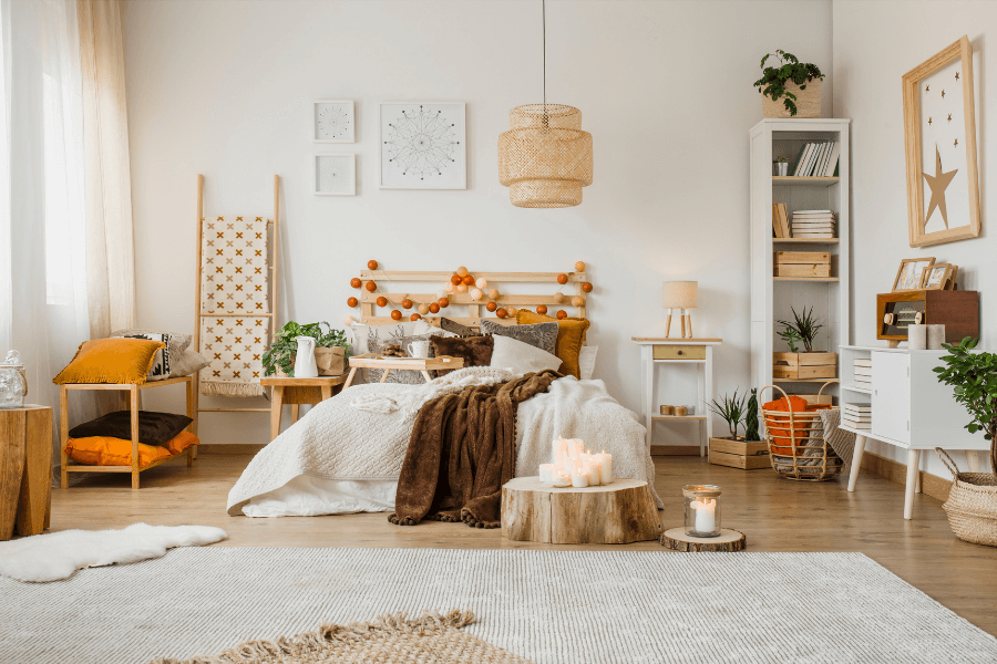
Natural / Light Wood Tones
Light wood tones and woods that are closer to their natural state in appearance work amazingly with the Boho Design Style.
The light pine flooring below has a very natural look, as does the bed frame and side table, even though they are a bit darker in tone.
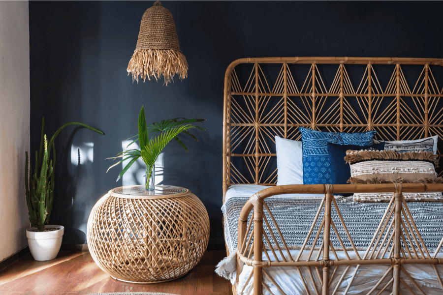
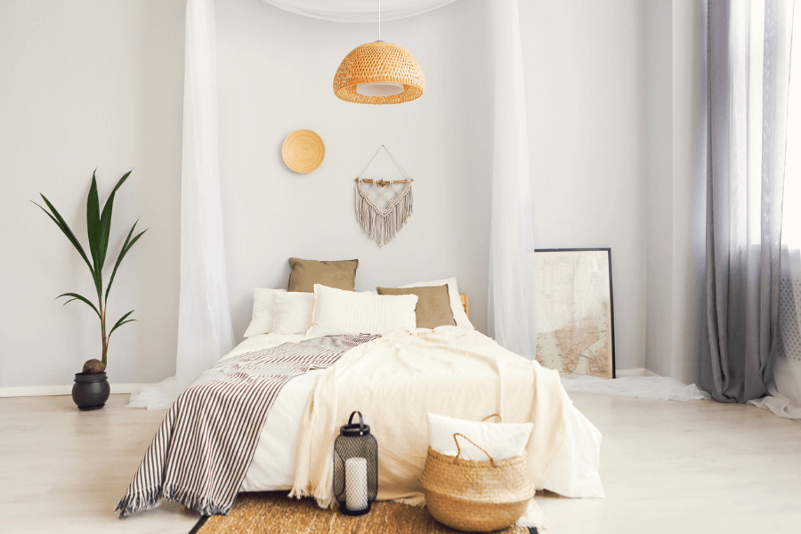
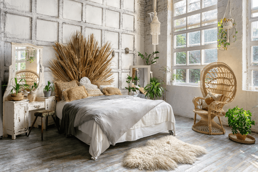
Light toned, natural wood flooring in this Boho inspired bedroom
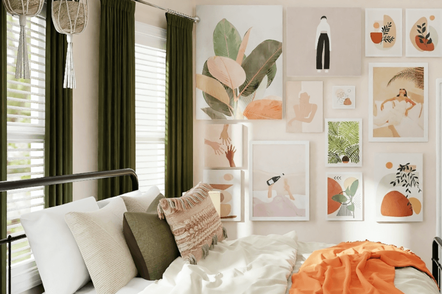
An even lighter flooring as seen in the image below allows the other elements in this Boho styled bedroom to stand out more. But still in a very calm and casual way.
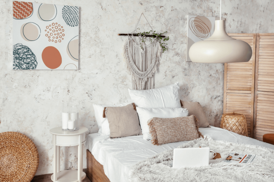
Boho Casual bedroom with light flooring and other natural and light-toned elements.
Organic Forms / Shapes
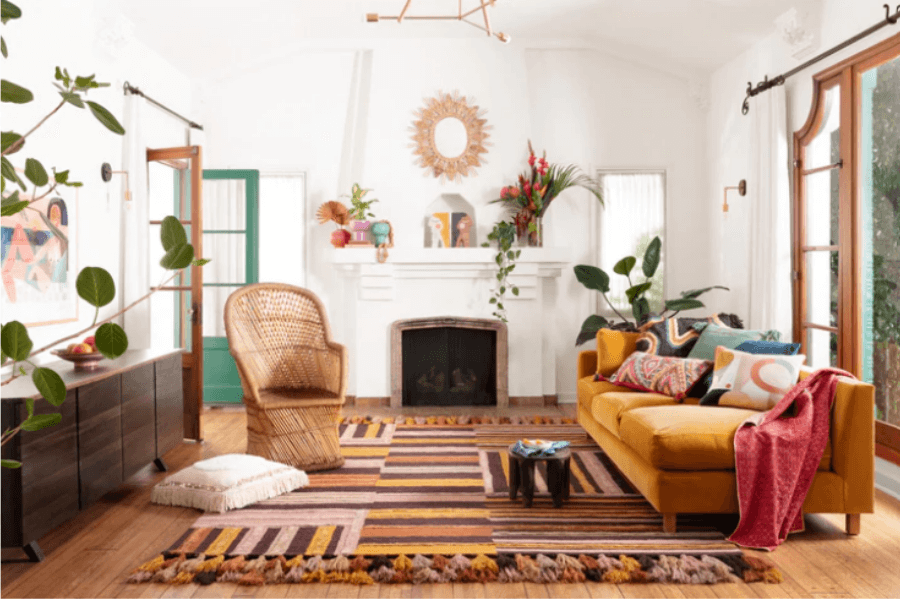
Softer shaped and less rigid forms are indicative of a Boho Casual design style. This style tends to incorporate more smooth, curved and rounded shapes into its look.
And look how gorgeous this room image is below with the contrasting, dark navy wall as a backdrop that really makes the natural woods stand out.
Orangic feel to this Boho inspired bedroom with furniture with no hard lines or corners
The image below exhibits brilliantly the less structured shapes and lines that you will often see in Boho Casual design style.
Curved and flowing elements contribute to the overall unstructured and freer Boho feel.
Plus, do you notice the colour palette? Yup, it’s displaying similar tones to my recommended 3 Boho colours!
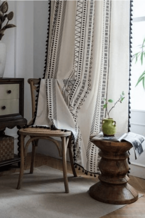
Soft / Flowing Drapery
Beautiful layered drapery fabrics on windows and bed canopy
Fabrics & Textures
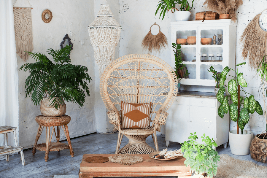
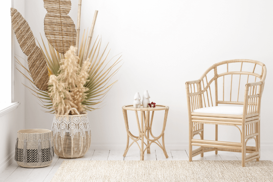
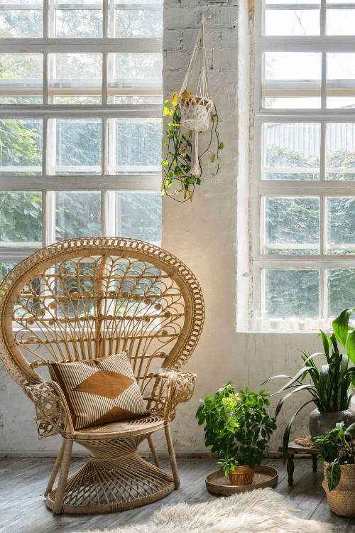
Rattan/Cane/Wicker
These natural and manmade materials are so versatile they are a common feature in many design styles.
In the Boho Casual look, they are often curved and have a very gentle appeal about them.
Rattan chair and table, wicker baskets
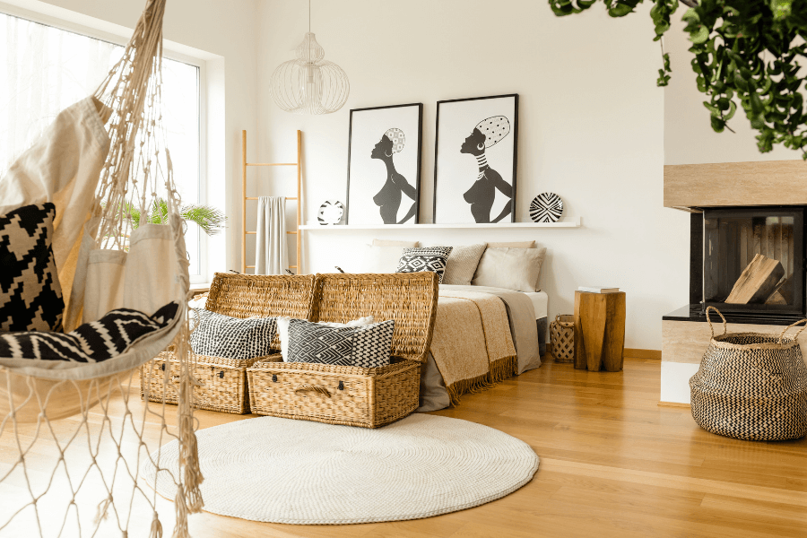
Large cane/wicker storage trunks, black and natural wicker basket
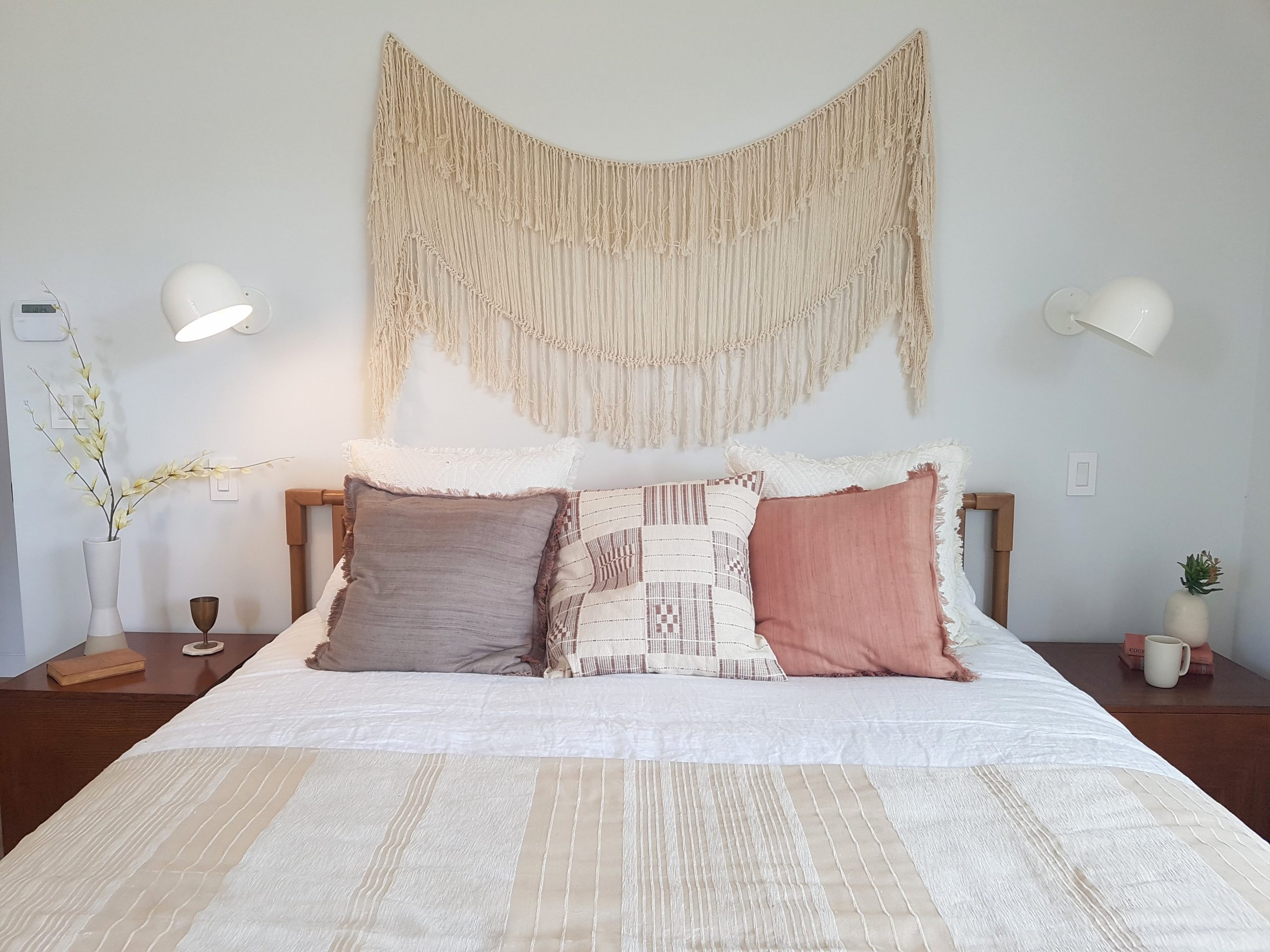
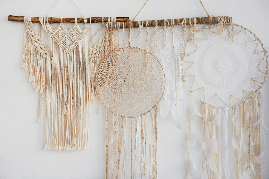
Macramé
Macrame is huge when creating an interior design with that relaxed Bohemian look and feel.
It’s everywhere, from wall art, and plant holders and is even being incorporated into some alternative furniture designs.
Macramé wall art
Bedroom with macramé over the bed, from a Design trip in LA I attended in 2018
Macramé wind catchers and wall art
Macramé hanging light fixture and plant holder
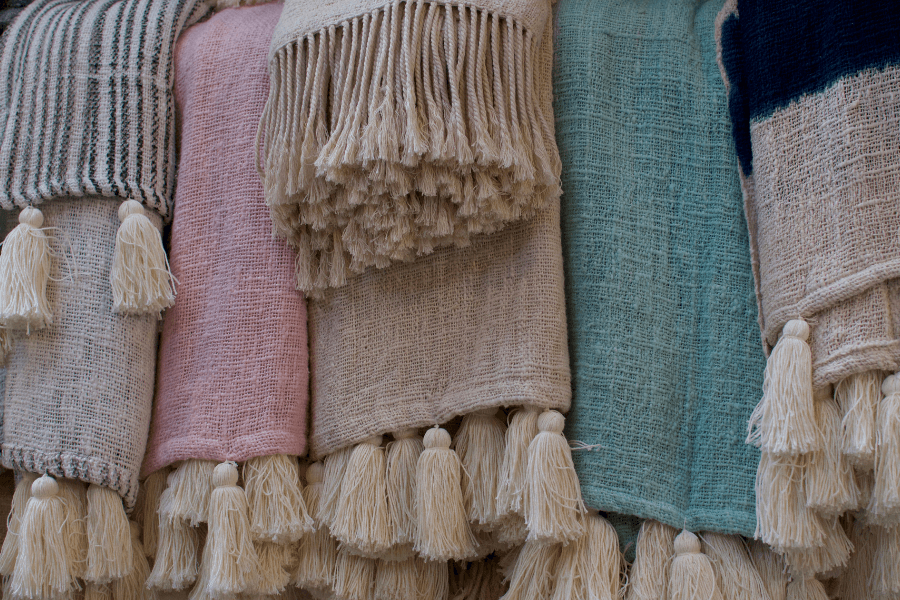
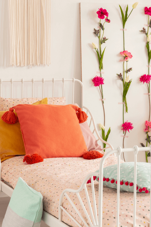
Tassels & Fringes
Tassel and fringed natural fabrics are perfect to get the Boho Casual look
Area rug with large tassels, along with floor cushion and pillows on sofa
Large and small tassels on decorative pillows in this boho-casual bedroom
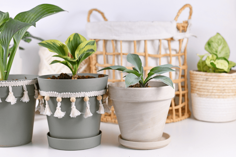
No place tassels can’t go in Boho Design Style – plant pots embellished with tassels
Boho Casual Decor
Hats
Hanging hats on the wall, a simple way to get a bit of that Boho feel
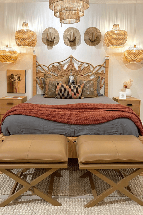
A vignette from Fall Highpoint Furniture Market with hats over the bed
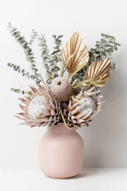
Grasses and Dried Flowers
Woven grasses wall art
Dried flower arrangement including palm fronds
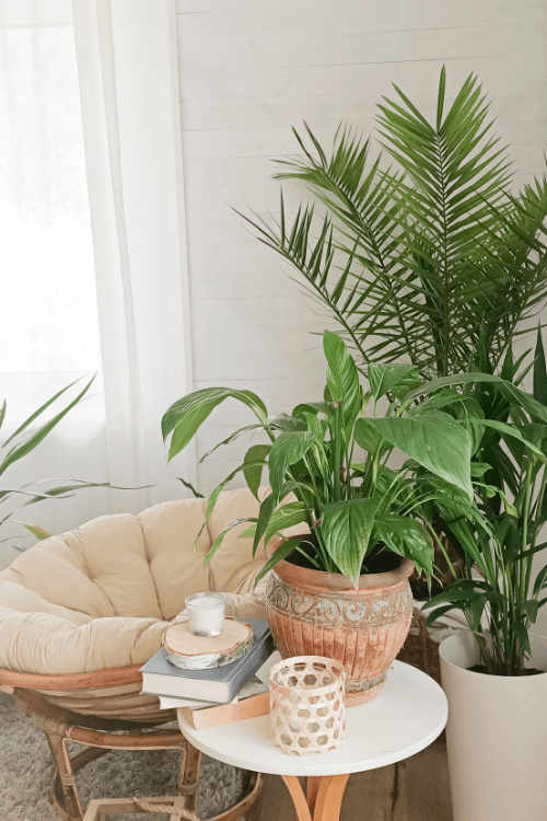
Botanicals
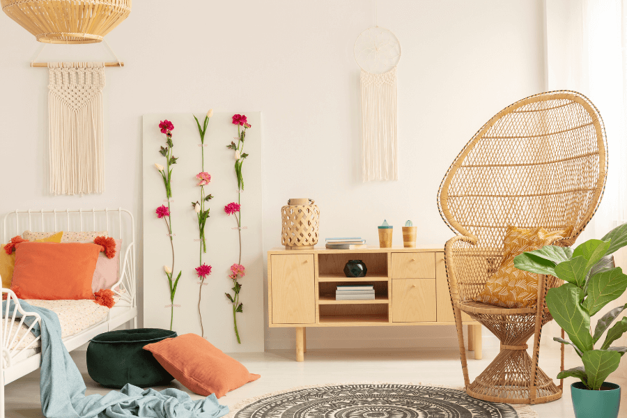
Adding living plants, and plenty of them is probably one of the easiest ways to achieve a more boho-inspired aesthetic.
Include different sized, shaped and textured plants in a variety of containers made of wicker, macrame and wood and you’ll be on your way to getting that Boho style.
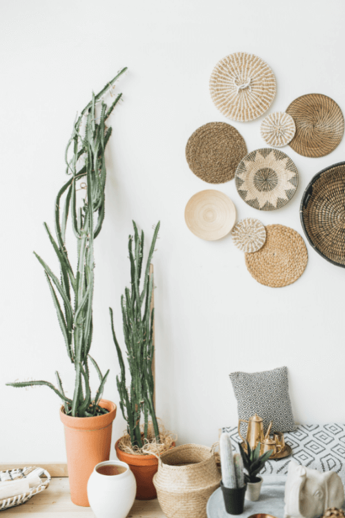
Beautiful Peacock chair and vibrant greenery
Robust array of plants of different sizes and textures and containers and Papasan chair
Boho Casual Design Style
If you prefer a design style that does not require you to adhere to specific rules, Boho Casual might be a great one for you to try out.
It can still be purposeful but it is not so obvious in its execution.
Layering is key but how you mix and match colour, patterns, and textures is what gives the Boho Casual look its unique and personalized aesthetic.
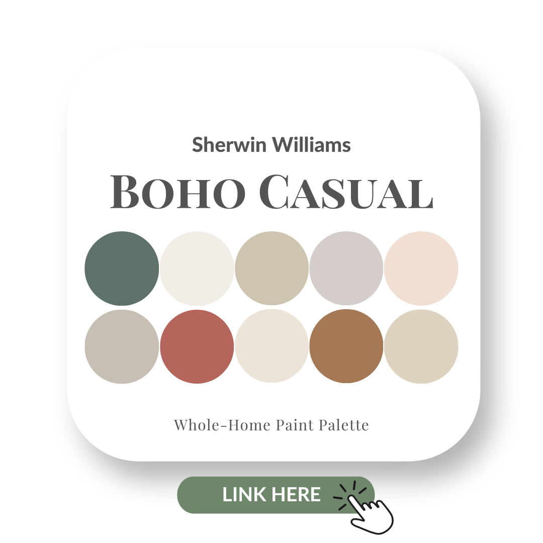
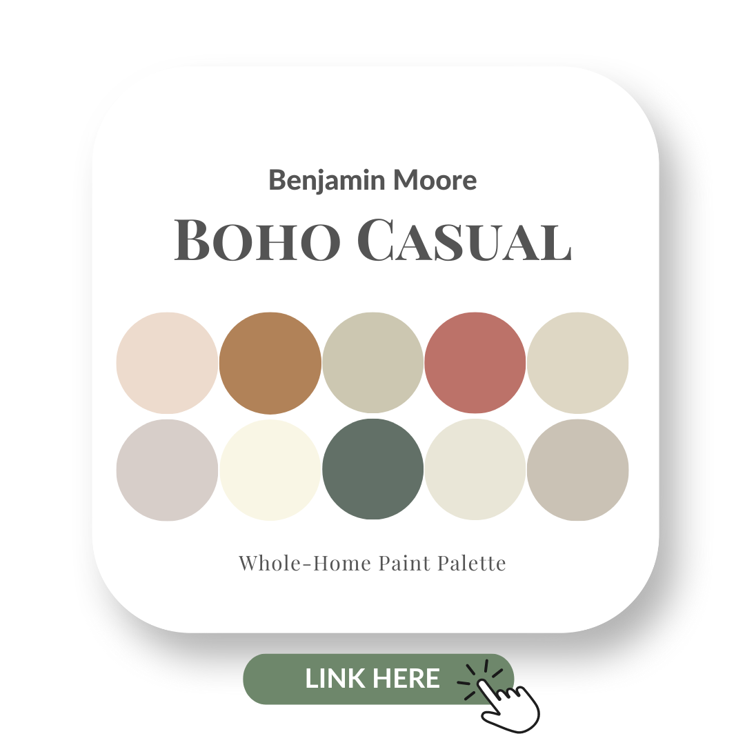
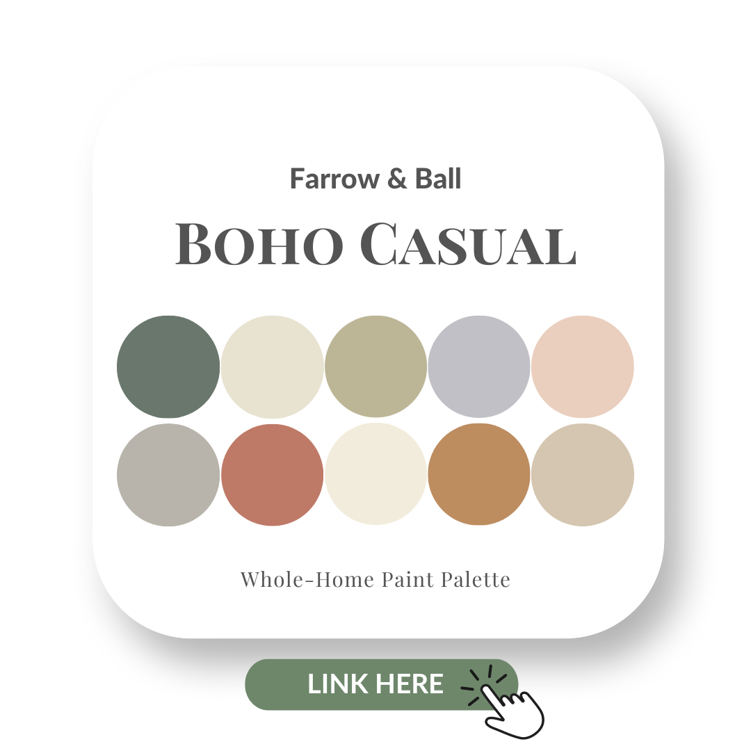
Boho Casual Perfect Colour Palettes
Loving the look of the Boho Casual design style?
Let me help you achieve this sophisticated yet relaxed feel with my Perfect Colour Palettes which provide 10 fabulous colour combinations in order to pull off a gorgeous Bohemian inspired interior.
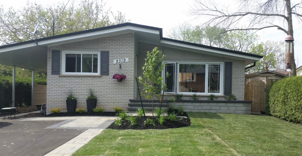
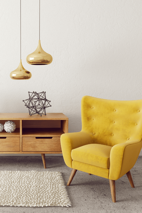
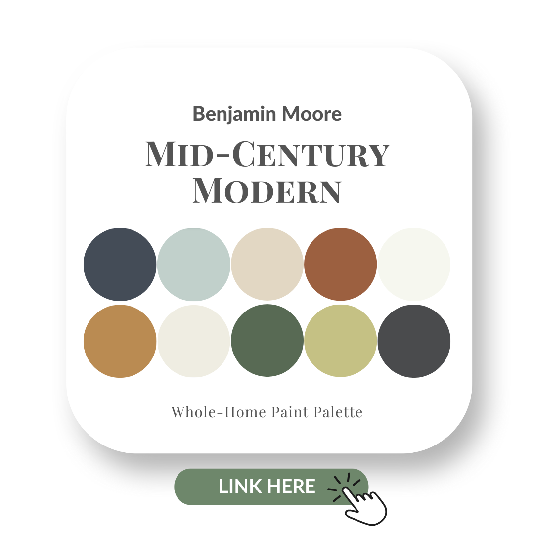
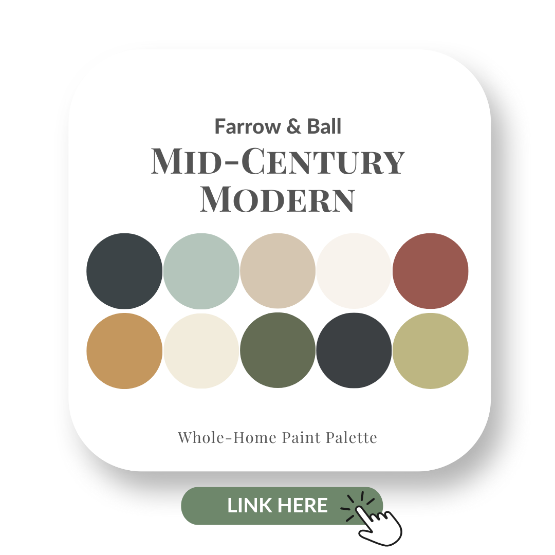
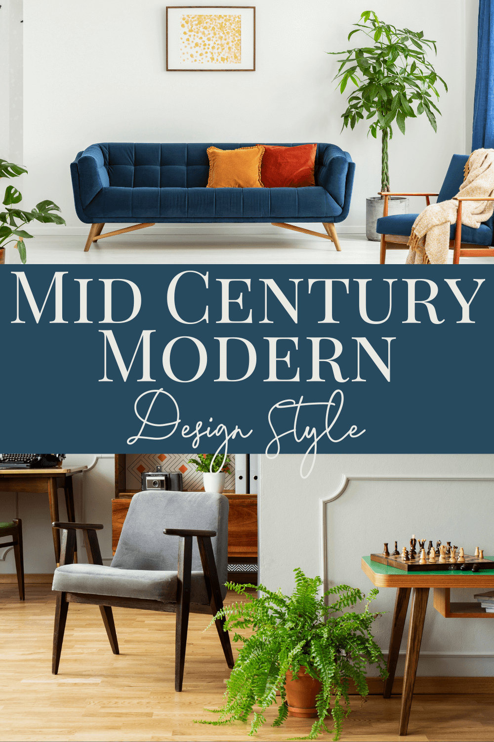
Mid-Century Modern style has been revived over the last 5 years in a BIG WAY!
Personally, I love this style. Our 3 bedroom bungalow was built in 1967 and the architecture of the home with the angled roofline definitely has a look reminiscent of designs by Frank Lloyd Wright.
The Mid-Century Modern, aka MCM, design style had its beginnings in the middle of the 20th century. Post-WWII, people were looking for a more uncomplicated design style.
Focus had changed from the ornate to a less frilly, less embellished look in architecture and furniture.
Mid-Century Modern Colours
Mid-Century Modern design style has a range of distinct colours that assist in curating this look.
Let me share three inspiring MCM colours that will give you a great starting point if you are considering this design style for your own home.
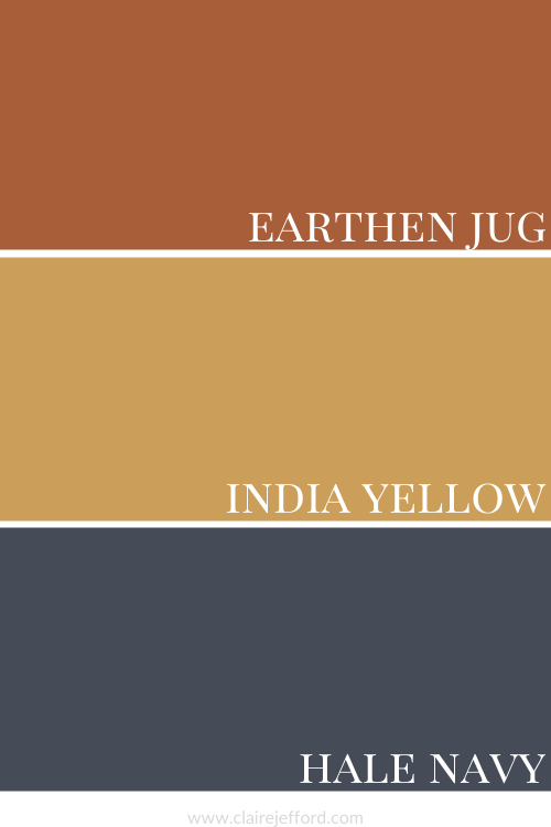
Sherwin Williams – Earthen Jug 7703
Earthen Jug by Sherwin Williams
After seeing the latest images on social media from showrooms at High Point Spring Market in North Carolina, the warm Terracotta tones are still trending in a big way.
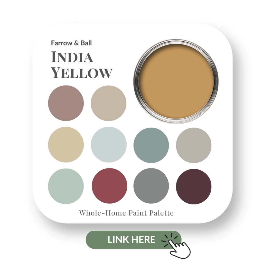
A rich mustard yellow, India Yellow is a colour indicative of this period of design. Paired with the right colour combinations it can deliver the MCM look down to a tee.
Learn more about this gorgeous deep yellow by Farrow and Ball here in my colour review.
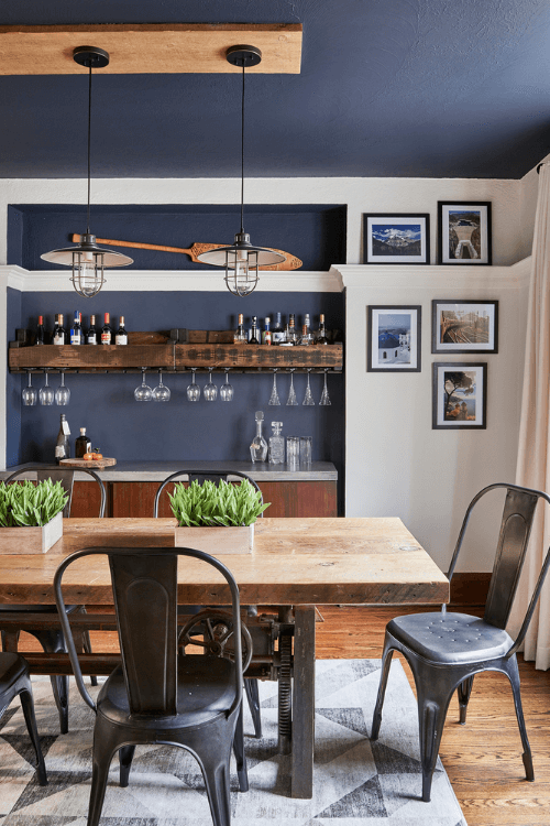
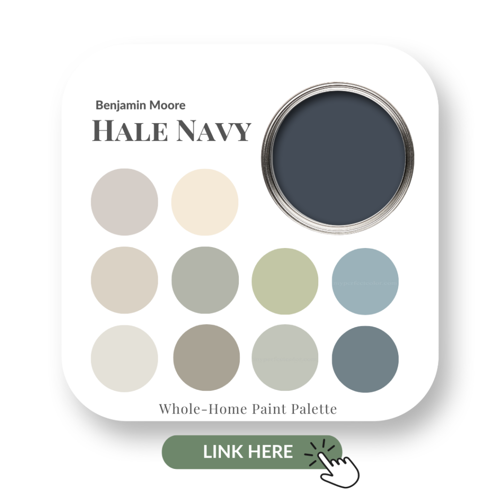
One of Benjamin Moore’s most popular blues, Hale Navy works so well in a Mid Century Modern colour palette.
It also looks amazing in other styles of interiors, like this gorgeous dining room we designed for clients in Toronto.
Hale Navy dining room nook and ceiling, White Dove walls.
Get more colour inspiration and what you need to know about using this popular Navy in my Perfect Colour Palette.
Earthen Jug, India Yellow and Hale Navy
Mid-Century Modern Design Style Colour Palette
What a vibrant and contrasting palette that highlights the look and feel of the Mid-Century Modern design style.
Design Details
What are some of the signature details of the Mid-Century Modern design style? Let’s take a look!
Dark Wood Tones
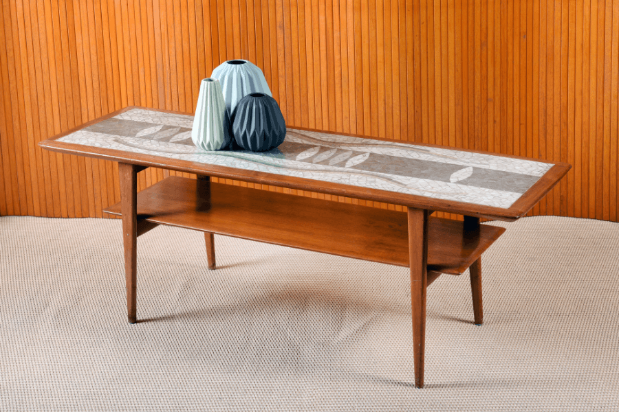
Teak is probably the best known of the dark woods prominent in Mid-Century Modern furniture.
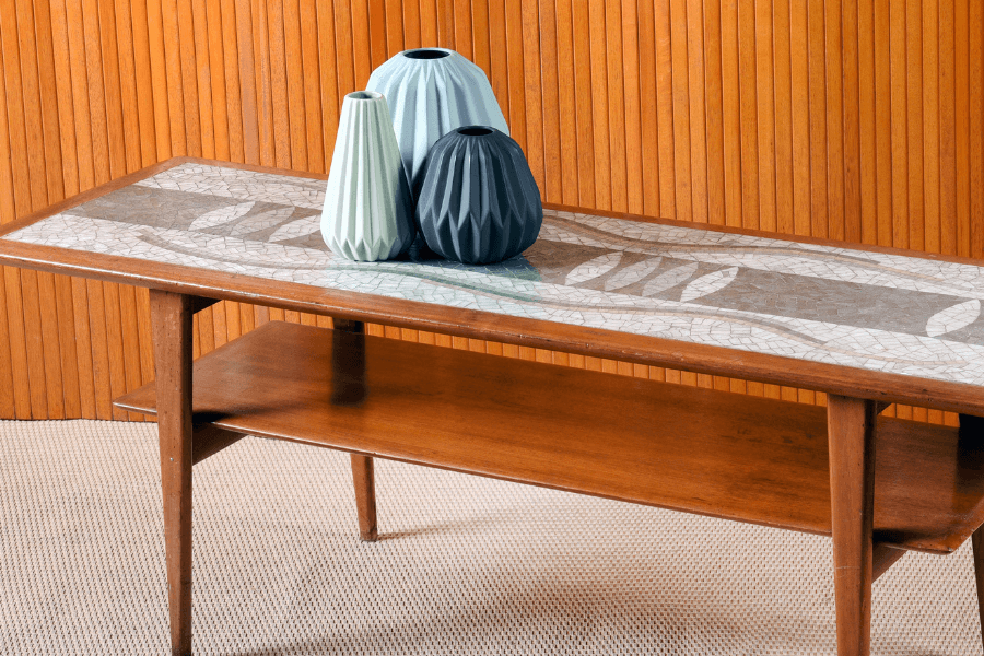
Teak double shelved coffee table
There are many others that were used in furniture making during this dynamic period including Rosewood and Walnut.
Walnut is one of my personal favourites and I believe it is a warm wood that never goes out of style.
Dark toned wood shelving units, desk and chair
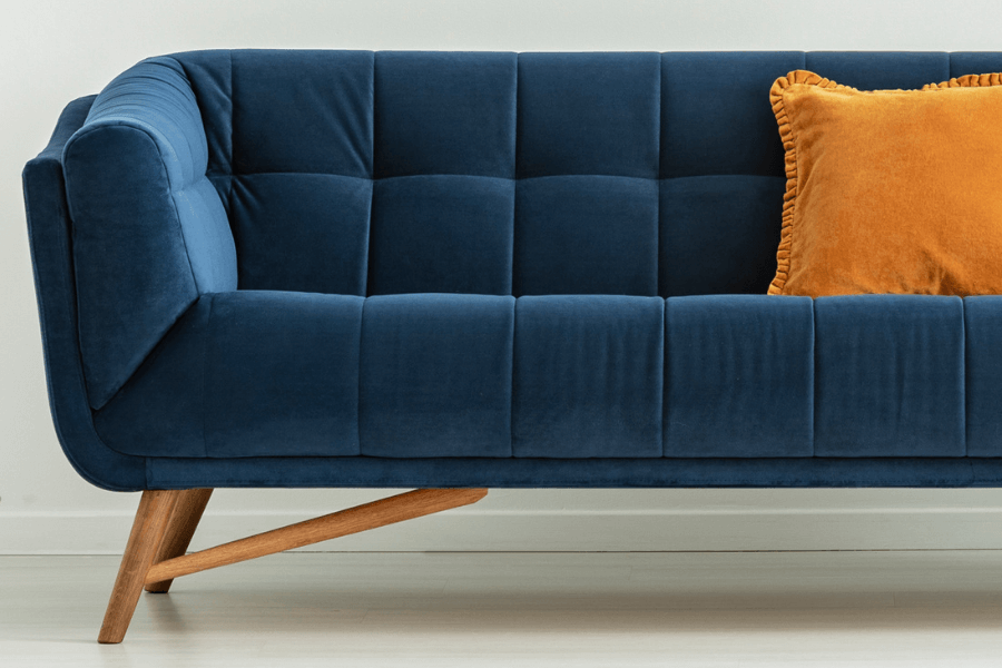
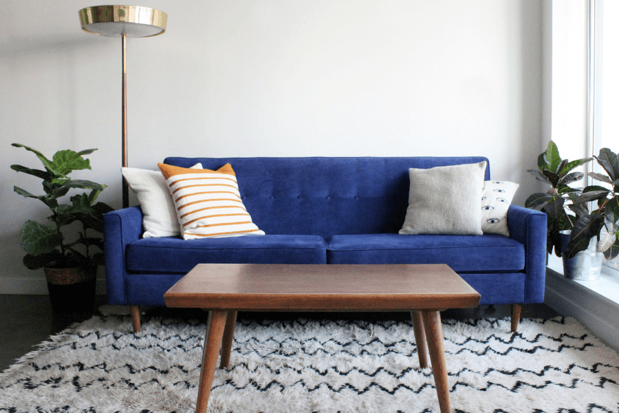
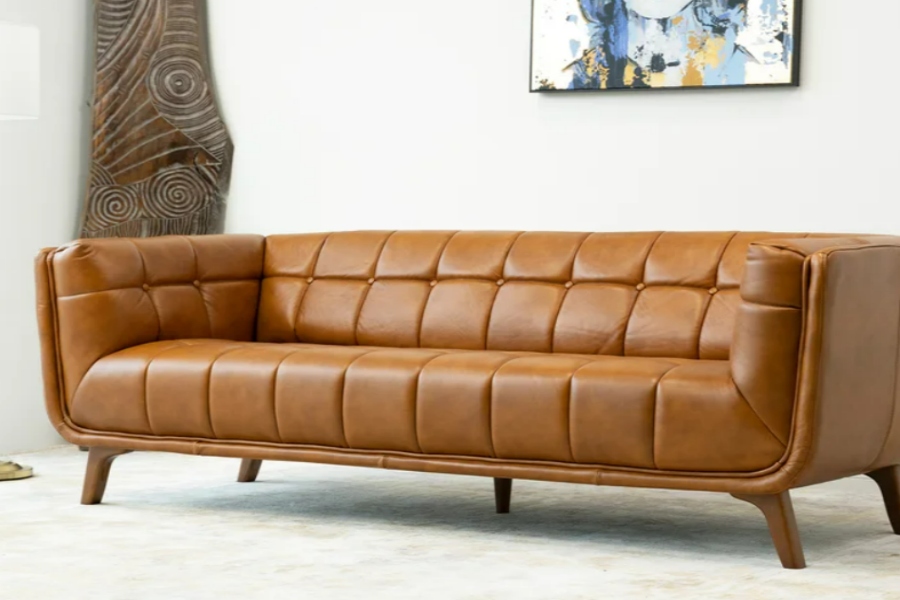
Tufting
Tufted blue velvet sofa with tapered wood legs
Tapered Legs
Coffee table, chair and floor lamp all with tapered legs. And notice the tufting on this gorgeous sofa!
Tapered legs are everywhere in Mid-Century Modern furniture design!!
Fabrics & Textures
Velvet
Colourful velvet accent pillows on a blue (tufted!) velvet sofa
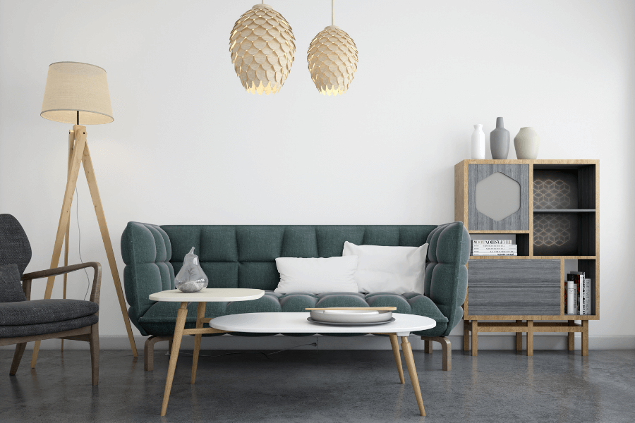
Rich green velvet love seat and yellow armchair
Rattan/Cane/Wicker
Cane panelled sideboard
These design elements can be used in a variety of design styles, including Farmhouse and Coastal.
Leather
Simple MCM leather chair with tapered legs
Dark brown leather traditionally styled mcm walnut armchair
This sofa has it all: Leather in an earthy tone, tufting details and tapered legs.
Mid-Century Decor
Geometrics
Geometric area rug
Simple and bright, mid-century modern artwork brings a space to life
Hexagon shaped tiles and shelf boxes
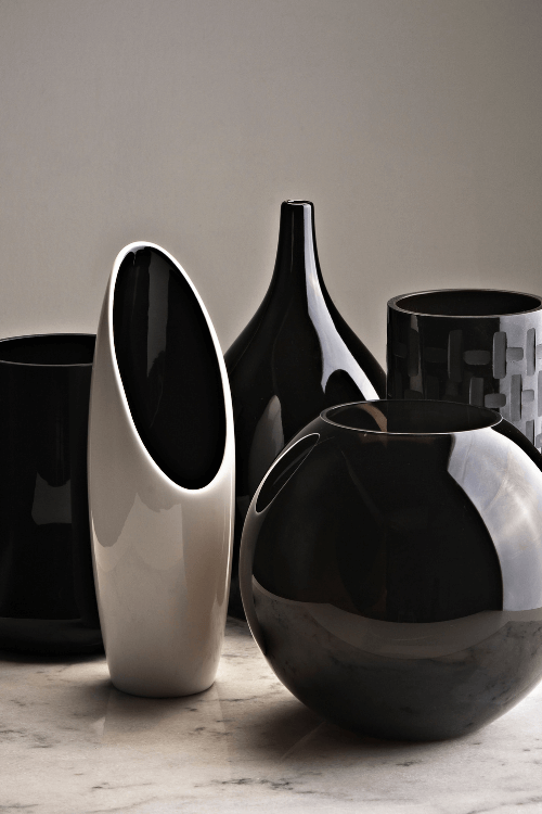
Ceramics & Glass
Glass and ceramic smooth curved vases and vessels
Ceramic vases – popular decor elements in any MCM interior space
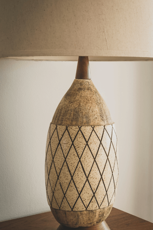
MCM Ceramic lamp with diamond pattern
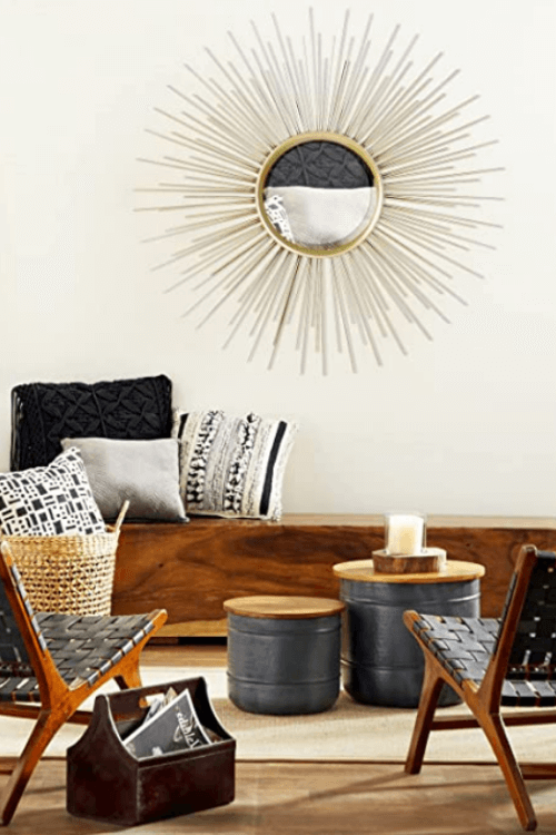
Star Burst
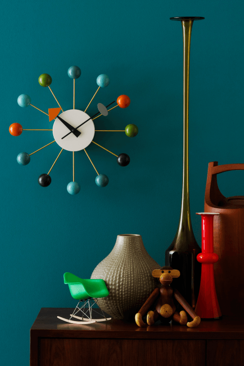
Coloured ball clock
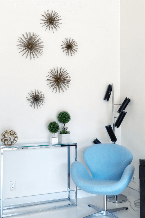
Starburst wall decor
Starburst mirror
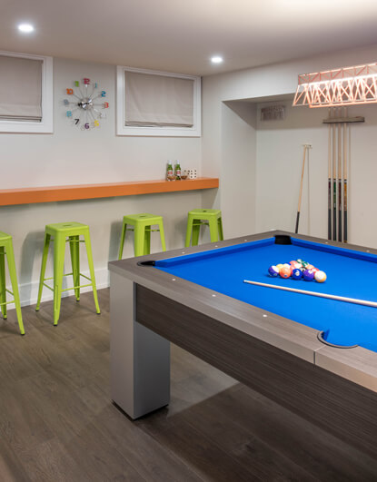
And although the basement with pool table shown below is not Mid-Century Style, you can see that we used a colourful clock similar to the starburst style in this games room area.
The colourful clock is reminiscent of the ‘starburst’ seen in MCM design style
Remember, just because you may not be decorating an entire room in one specific design style, doesn’t mean you can’t mix in various elements of style.
In fact, I encourage it to achieve a layered and interesting room design!
Mid-Century Modern Perfect Colour Palettes
Loving the look of the Mid-Century Modern design style?
Let me help you achieve this sophisticated yet relaxed feel with my Perfect Colour Palettes which provide 10 fabulous colour combinations in order to pull off a gorgeous MCM interior.
This website uses cookies to improve your experience while you navigate through the website. Out of these cookies, the cookies that are categorized as necessary are stored on your browser as they are essential for the working of basic functionalities of the website. We also use third-party cookies that help us analyze and understand how you use this website. These cookies will be stored in your browser only with your consent. You also have the option to opt-out of these cookies. But opting out of some of these cookies may have an effect on your browsing experience.
Necessary cookies are absolutely essential for the website to function properly. This category only includes cookies that ensures basic functionalities and security features of the website. These cookies do not store any personal information.
Any cookies that may not be particularly necessary for the website to function and is used specifically to collect user personal data via analytics, ads, other embedded contents are termed as non-necessary cookies. It is mandatory to procure user consent prior to running these cookies on your website.