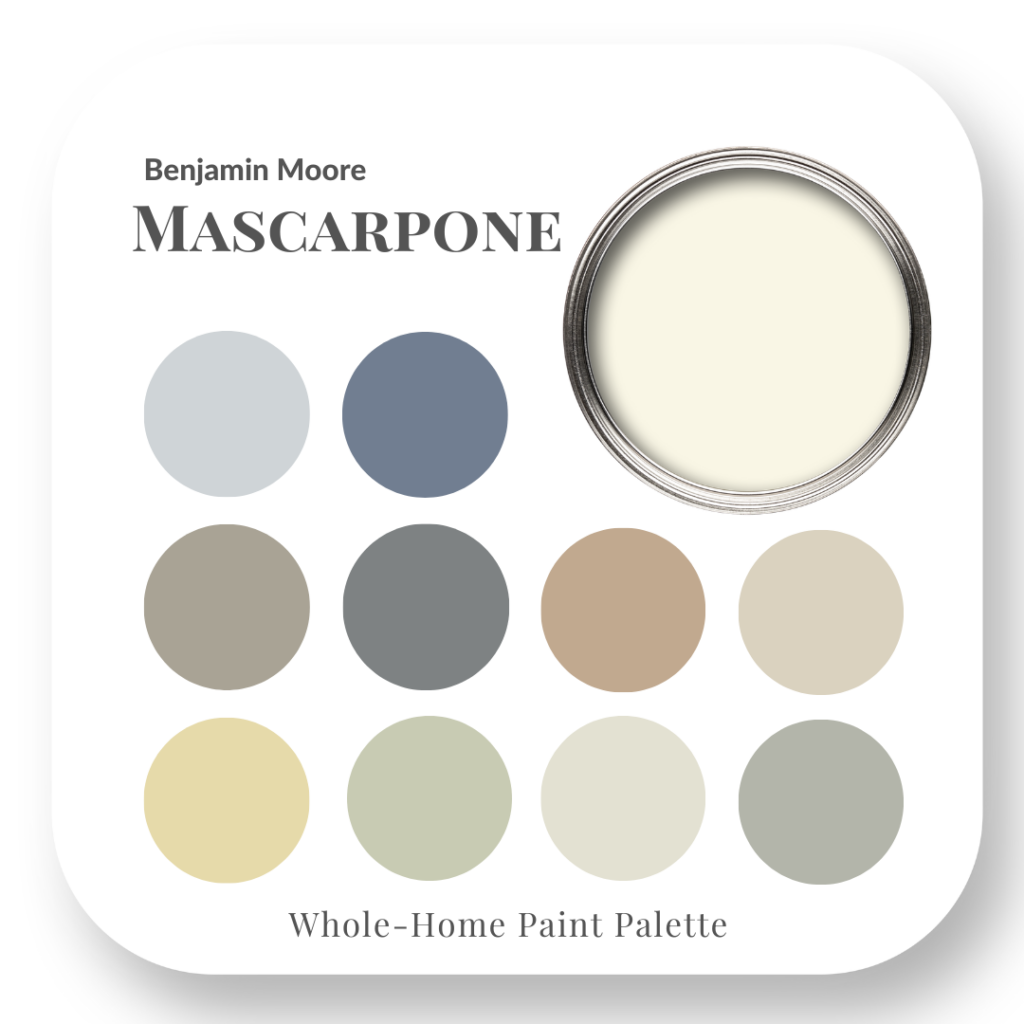
Mascarpone


If you have a decorating or renovation project coming up, don’t pick your paint colours out of thin air!
Select colour combinations in our whole-home colour palettes that you know will work beautifully together. As a Certified True Colour Expert, and having done hundreds of room designs for my clients, let me help to make it super simple for you.
I provide you with a starting point for selecting a cohesive colour scheme for your next interior design renovation or decorating project, with many helpful resources to guide you in the right direction.
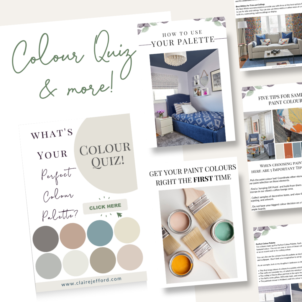
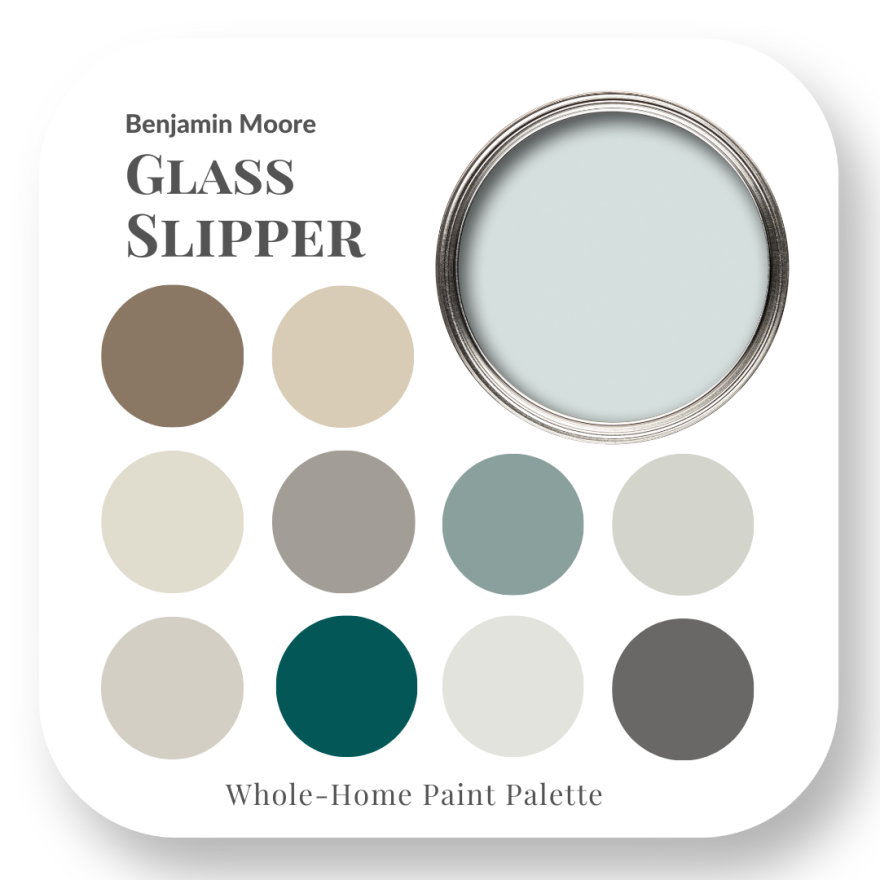
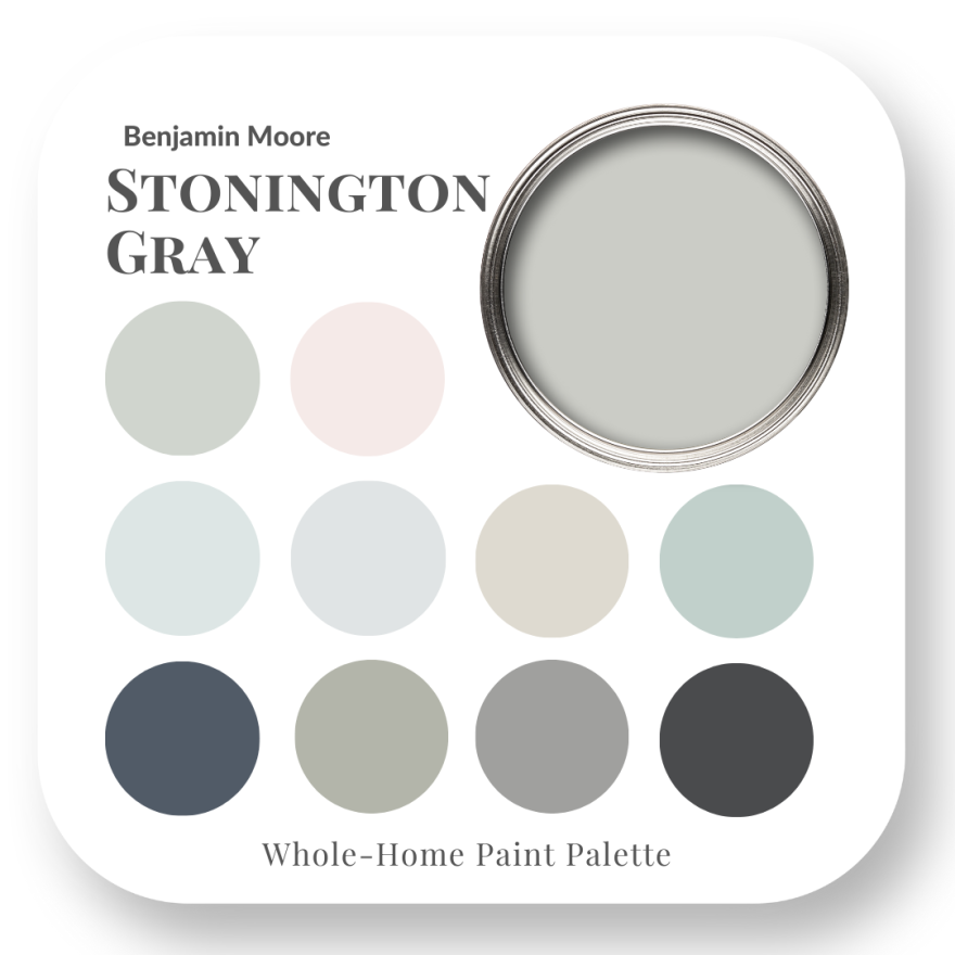
Our Perfect Colour Palettes help you confidently select the best colour for your home, and then see which trim, ceiling, and accent colours pair well with your selected colour.
Choose the perfect interior paint colours the first time, every time. Each 26+ page guide is in a PDF format and ready for immediate download. You will receive cost-saving information with details that include:
- Three best white paint recommendations for trim and ceilings
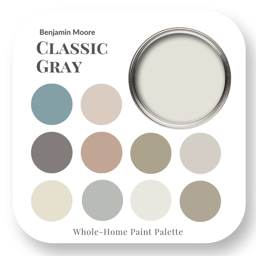
- Ten curated paint colour options to use with the featured colour—no-fail colour combinations!
- The undertone of the feature colour
- Two paint comparisons to better understand how to see colour
- Helpful tips for knowing how to choose the right paint colour
- Recommendations for selecting the perfect paint sheen
- Tips on selecting the best lighting for your home
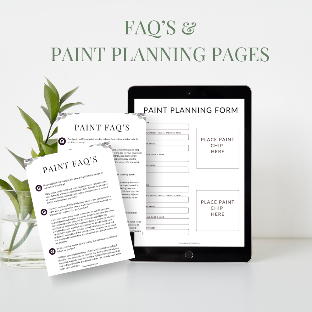
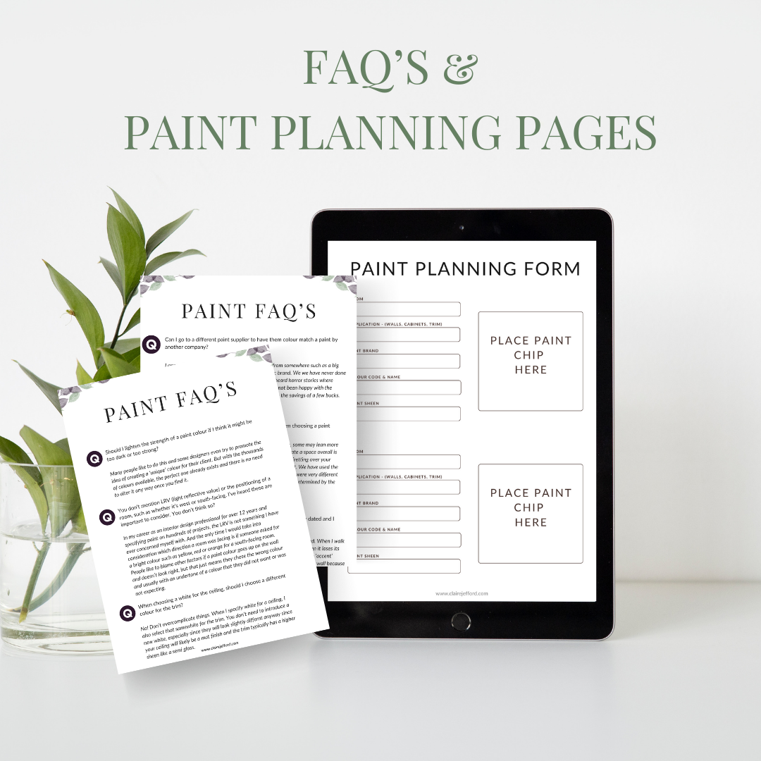
- Answers to our most common FAQ’s about paint
- Paint planning / specifying template
- A link to the corresponding paint colour blog
- Valuable resource to get your own painted samples
- *Bonus – 7 pages with tips for creating a Gallery Wall in your home
Browse our Benjamin Moore Whites & Neutrals Collection here for a curated package of 10 Perfect Colour Palettes for the best deal!