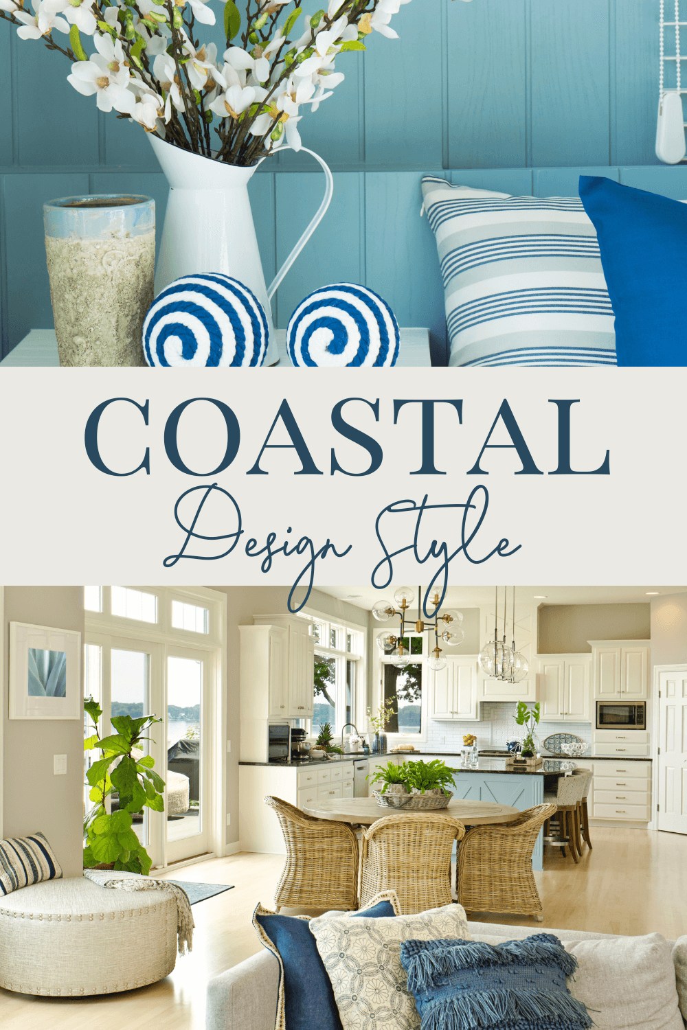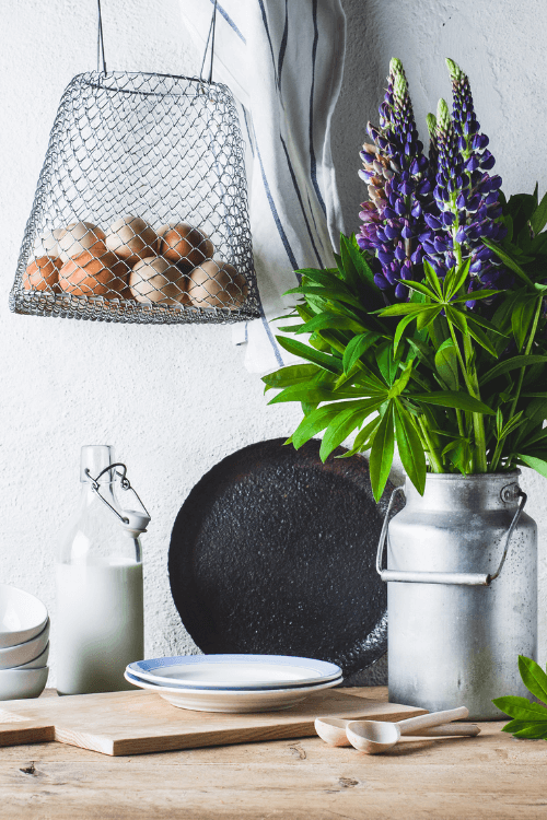
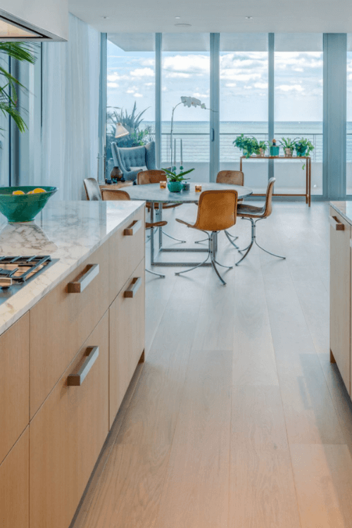
Coastal Design Style
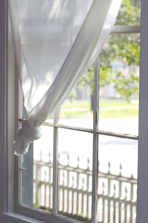
When I think of Coastal design style, an abundance of natural light and an airy relaxed look is what comes to mind.
You do not have to live by the coast or even near it to enjoy a beautiful Coastal design style.
The coastal aesthetic is common for properties in close proximity to the water, whether it be the ocean, lakeside house or cottage on a river.
But it can also be in an urban environment with a backyard oasis that exudes a similar feeling. That’s kind of the best of both worlds!
Coastal Colours
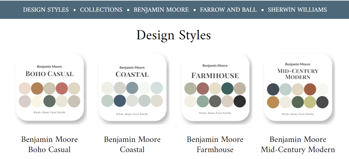
As with any design style, Coastal has a range of distinct colours that help create this look.
Let me share three inspiring Coastal colours that will give you a great starting point if you are considering this design style for your own home.
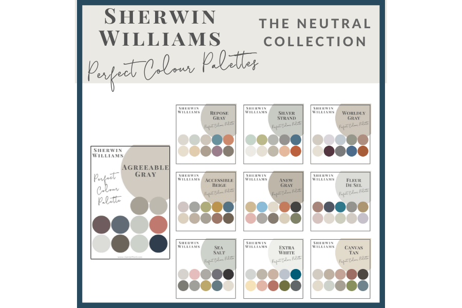
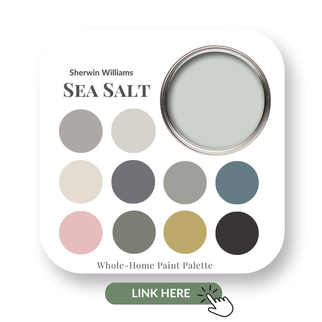
Sherwin Williams – Sea Salt 6204
This is a lovely and subtle green with a slight blue undertone. The colour it appears can change depending on lighting and other elements, just like the sea itself.
This is one of the most popular colours from Sherwin Williams and I did a colour review of Sea Salt that you can read here.
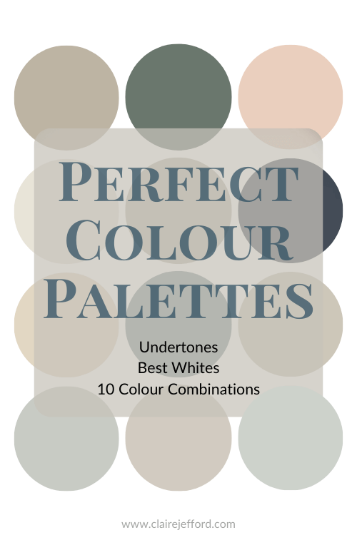
If this colour speaks to you, I have created an entire colour palette for it that you can check out.
My Sea Salt Perfect Colour Palette provides decorating inspiration and colour combinations if you are considering this calming colour for an upcoming home project.
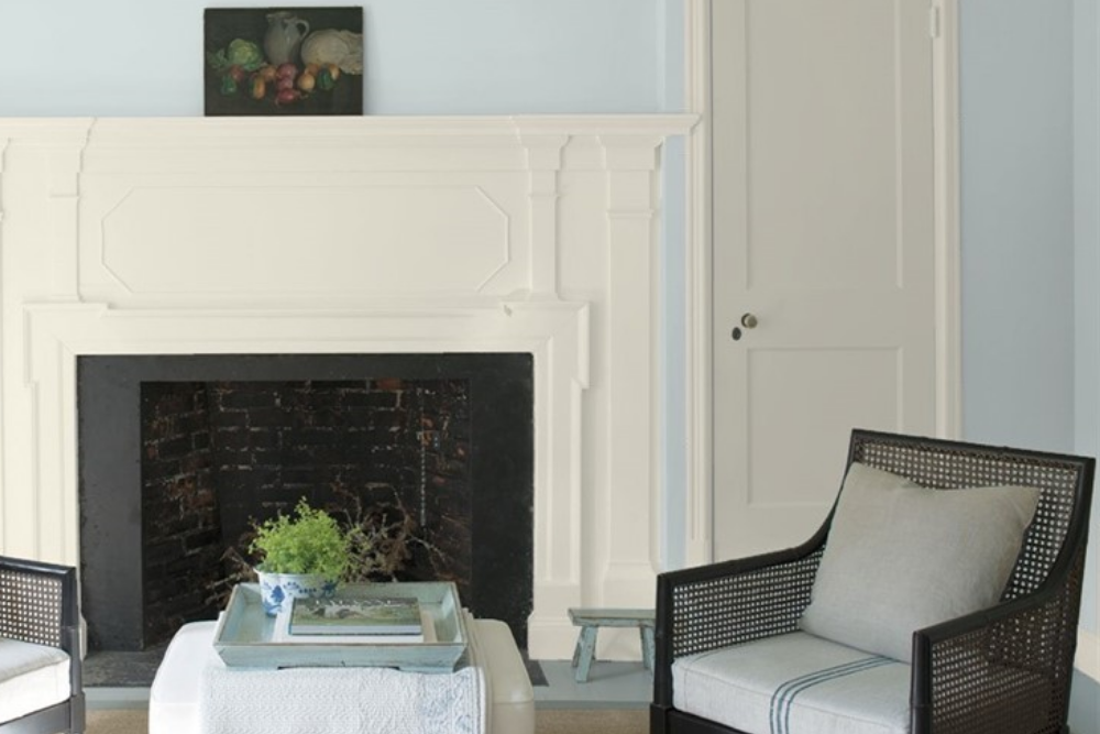
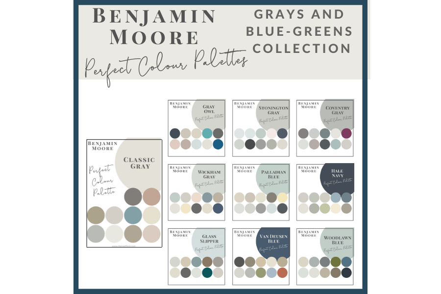
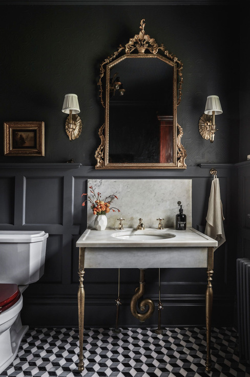
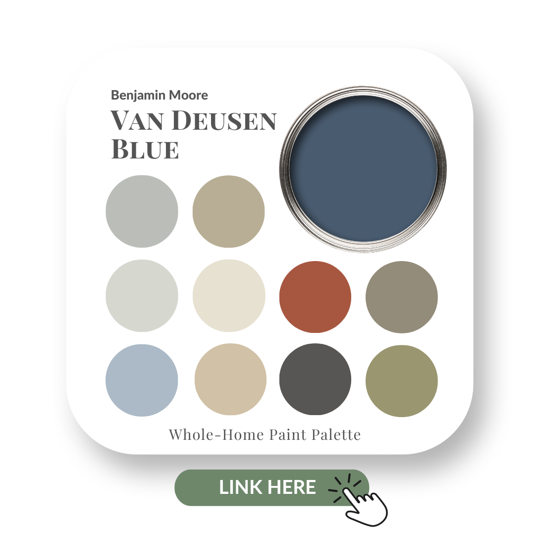
Benjamin Moore – Van Deusen Blue HC-156
No colour says coastal more than blue and Van Deusen Blue is a great choice. This deep blue is clean, crisp and rich! It looks amazing as part of a coastal palette.
Get more helpful and inspiring information from my Van Deusen Blue colour review here.
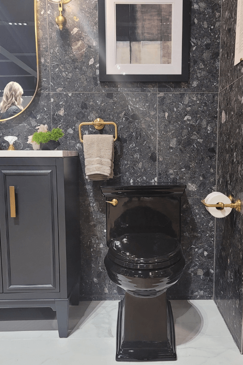
Look how great Van Deusen Blue looks on the vanity in this bathroom makeover!
We kept the original quartz counter, the flooring, mirror and sconces for this ‘refresh’ design.
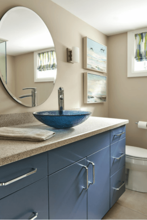
The vessel sink also stayed and that was where the inspiration came for the vanity colour and overall palette.
We then repeated the blues in the artwork and Roman blind which add a bit of that coastal feel to this urban home.
The paint colour, Natural Linen CC -90 by Benjamin Moore was thoughtfully selected after looking at the tones in the countertop.
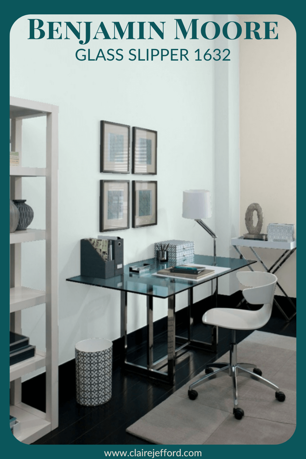
See this entire Burlington client project here which also includes a stunning new home office as well as a casual, yet classy, living room.
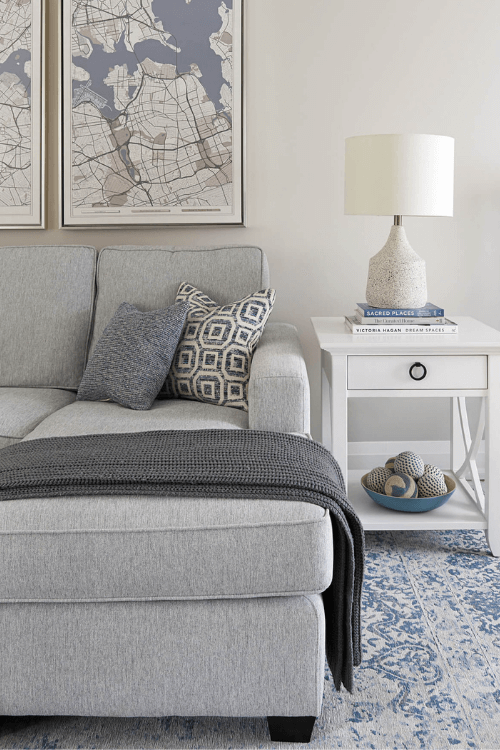
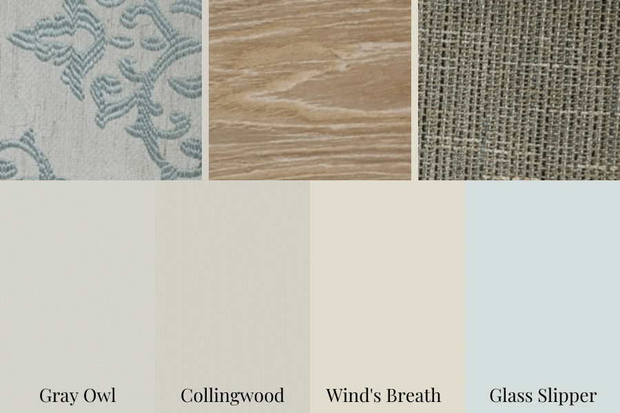
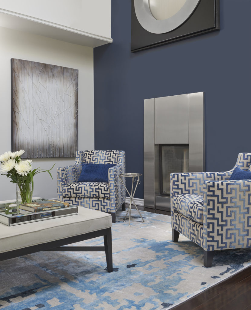
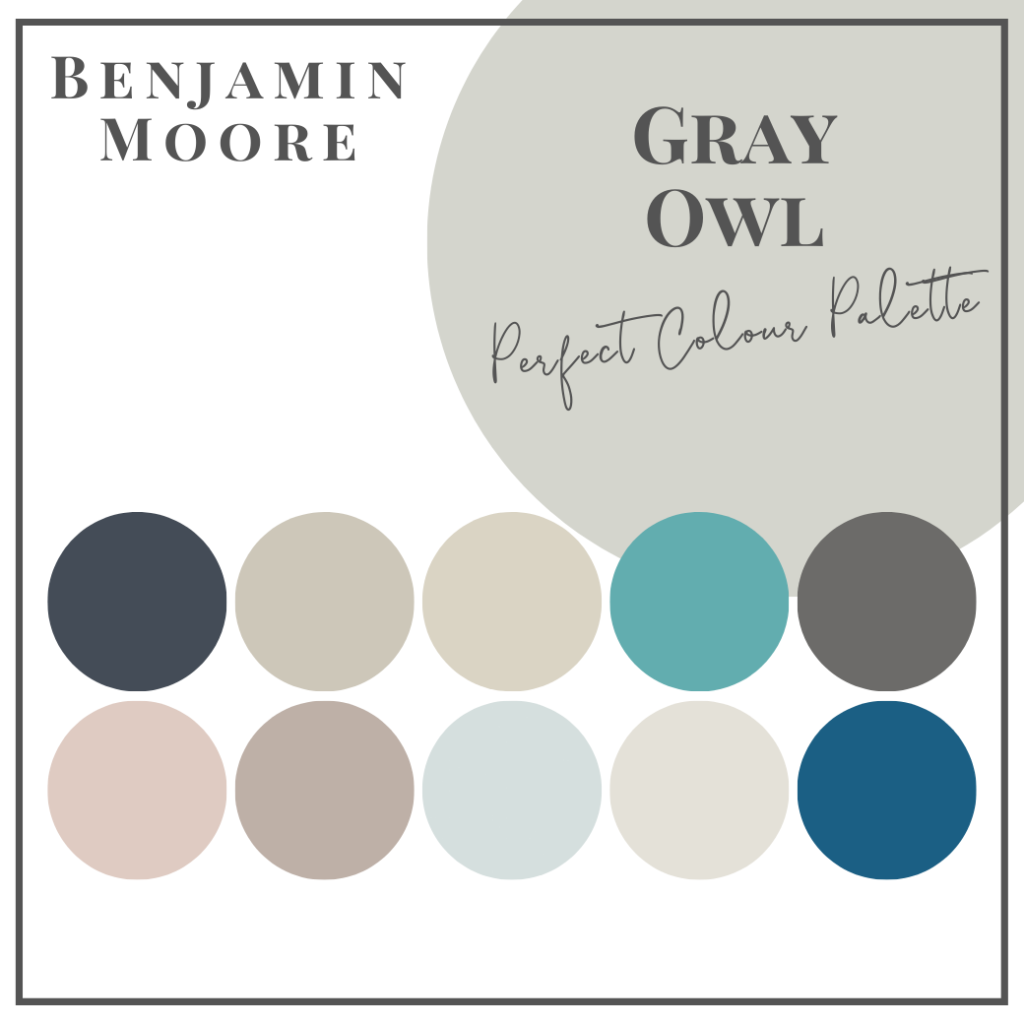
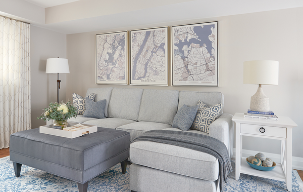
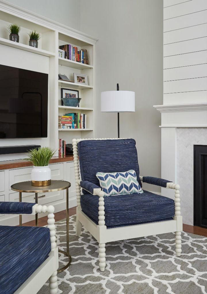
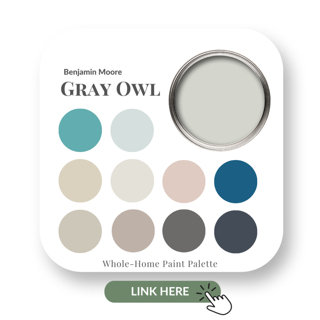
In another project that we refer to as ‘Gray Owl and Coastal Cozy’ in our portfolio, you can see this deep blue colour on the fabric of the accent chairs.
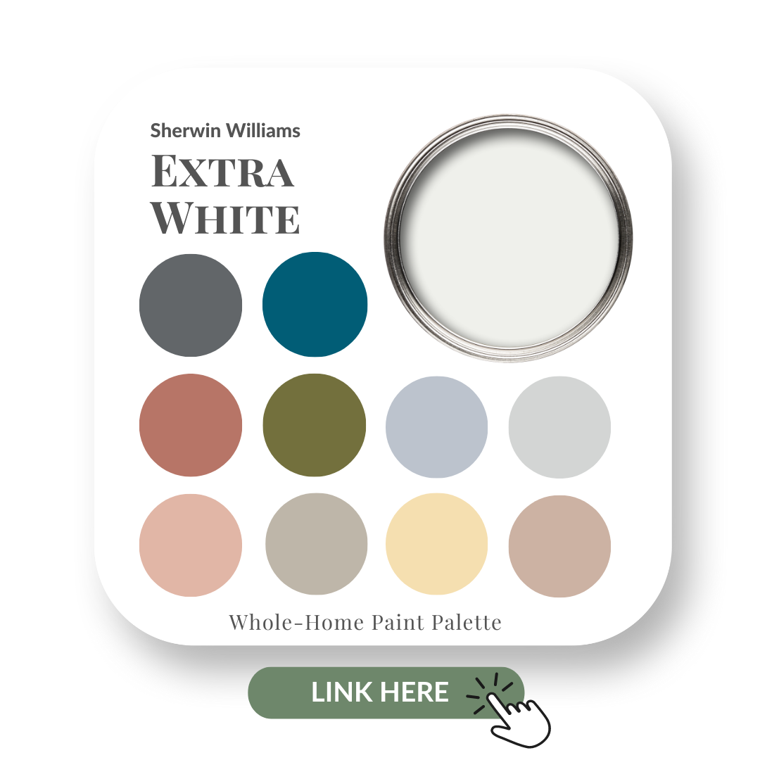
Sherwin Williams – Extra White 7006
No coastal palette is complete without a great white – not shark, but paint colour that is! Sherwin Williams has a perfect one, Extra White.

Being a true white it pairs wonderfully with Sea Salt and Van Deusen Blue to bring a cohesive coastal colour palette into your home.
Get more information on this trending white by Sherwin Williams from my colour review here.
See below for how fresh this colour combination looks when they are all put together.
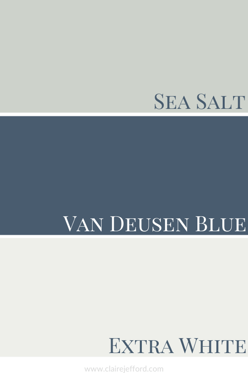
Such a stunning combination, you can almost smell the sun and hear the waves gently lapping against the shoreline.
Aaahh, can you tell it’s been way too long since I’ve been on a beach holiday?!
Design Details
What are some of the signature details of the Coastal aesthetic? Let’s take a look.
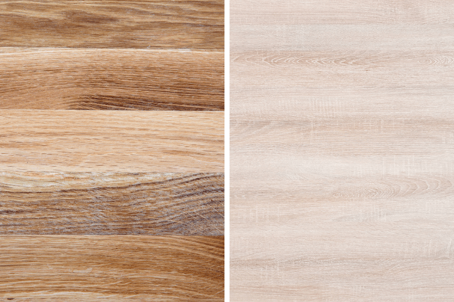
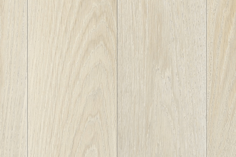
White Oak Flooring
Such a durable wood, white oak is also more resistant to water and rot than most other species.
It must be as it was used for shipbuilding and whiskey barrel making. And now it’s being used to create beautiful spaces in homes looking for an airy and natural coastal look.
White Oak can come in so many colours. A more natural, organic colour as seen above or the popular whitewashed which will help reflect light and keep your interior nice and bright.
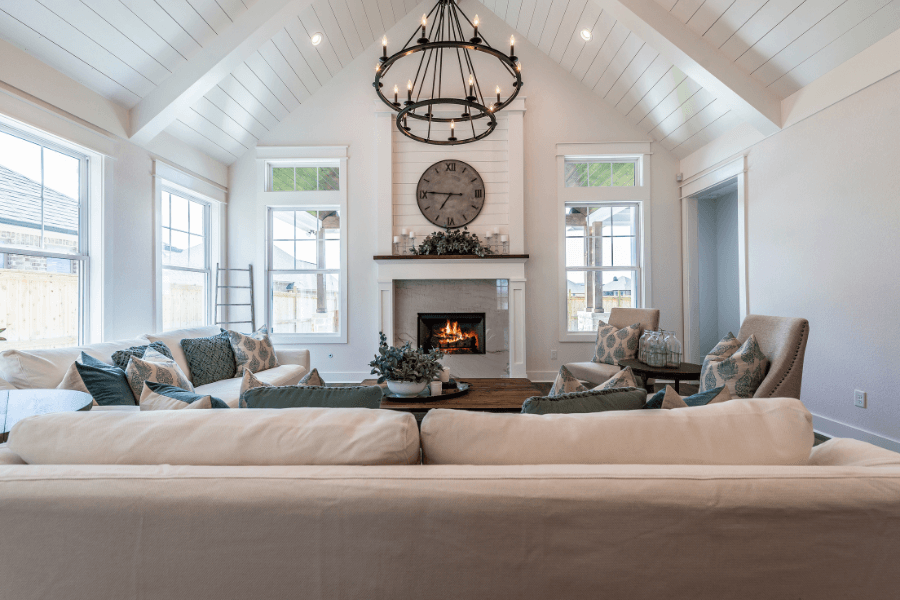
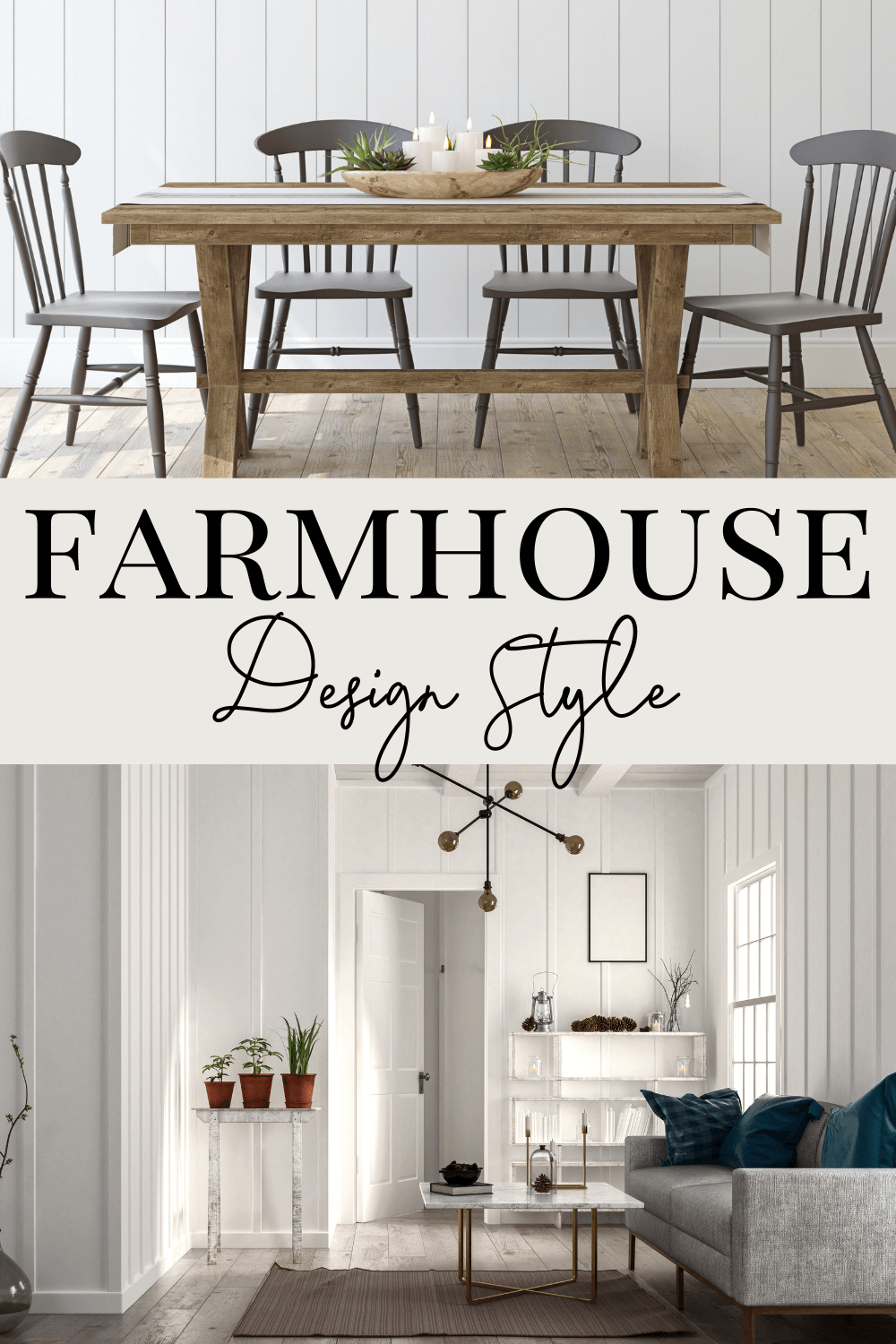
Shiplap
Shiplap can be used in both Coastal décor as well as Farmhouse design.
Both interior design styles can be achieved, depending on the other decorative elements you combine with the shiplap within a space.
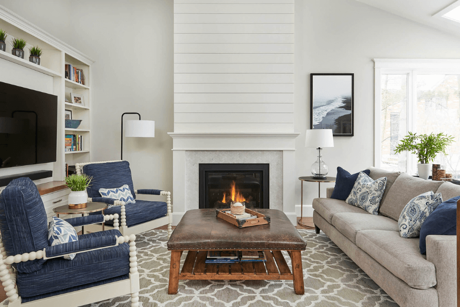
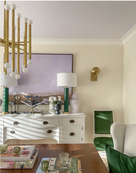
Another image from our Gray Owl and Coastal Cozy project is seen below with the shiplap fireplace to accentuate the high ceilings of this Great Room.

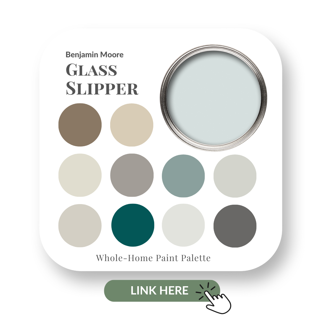
If you love the soft blue-green wall colour Gray Owl, then be sure to read my review of this popular Benjamin Moore colour.
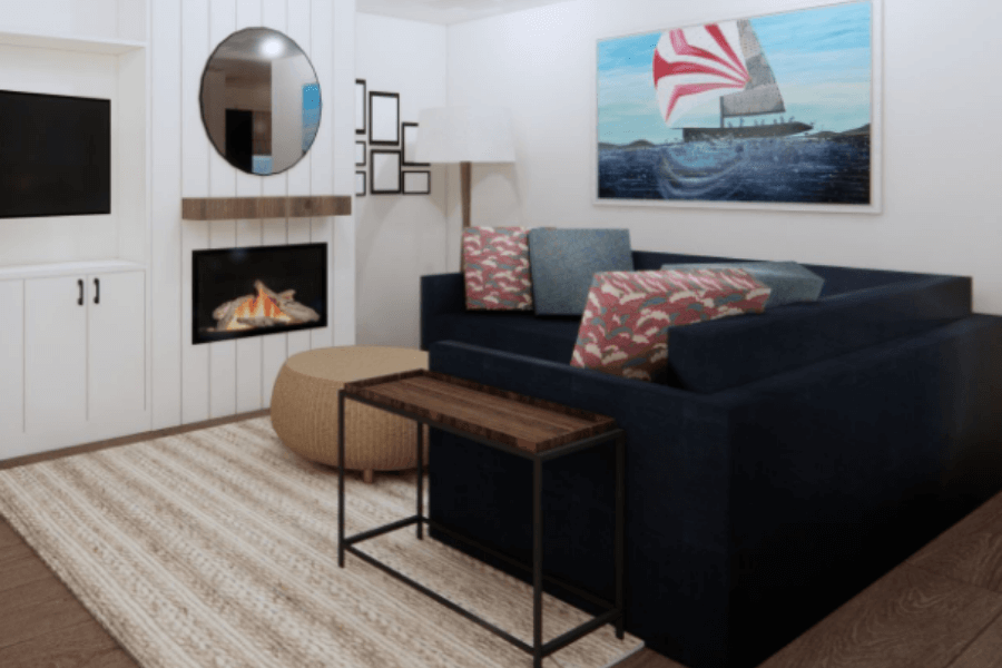
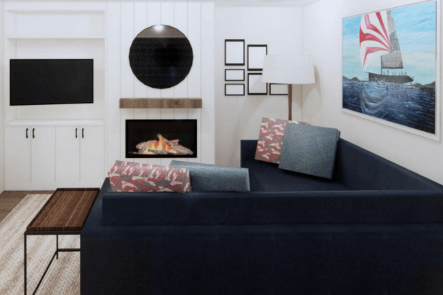
Another Coastal inspired project featuring shiplap
Another Burlington client project of an entire home we have redesigned is currently underway.
My client is a sailing enthusiast so it wasn’t a surprise she was drawn to a coastal vibe.
She owns a beautiful piece of custom artwork that we used as the jumping-off point for the living room design!
You can see below in the design of the asymmetrical custom built-in media unit, we are using a vertical shiplap on the fireplace. The entire unit is Cloud White by Benjamin Moore.
White or cream are the ‘traditional’ tones we are used to seeing shiplap done in, but it doesn’t have to be this way all the time.
Don’t be afraid to add colour!
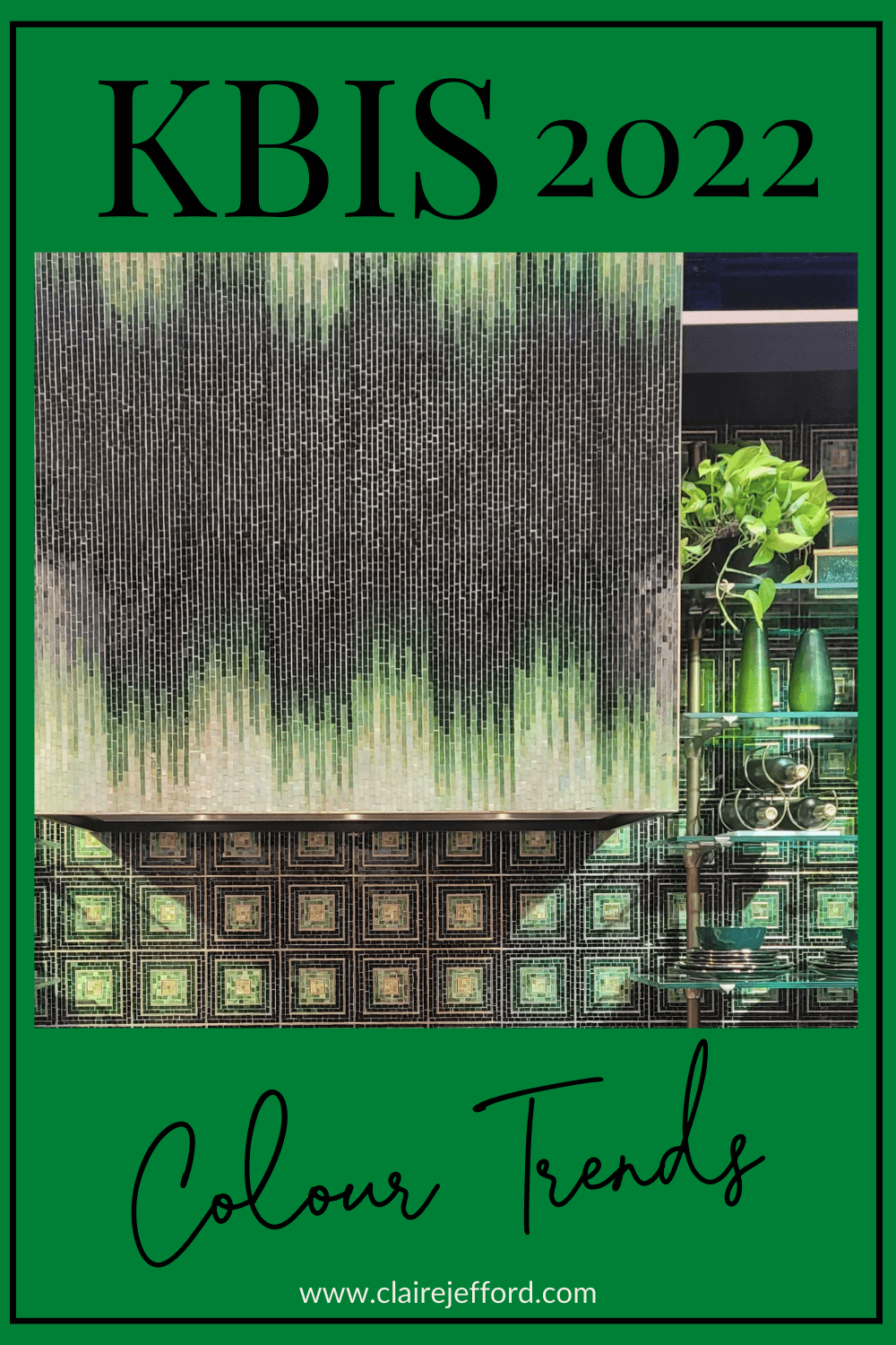
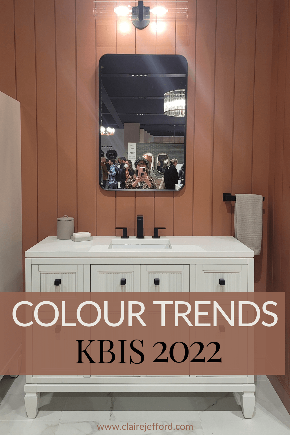
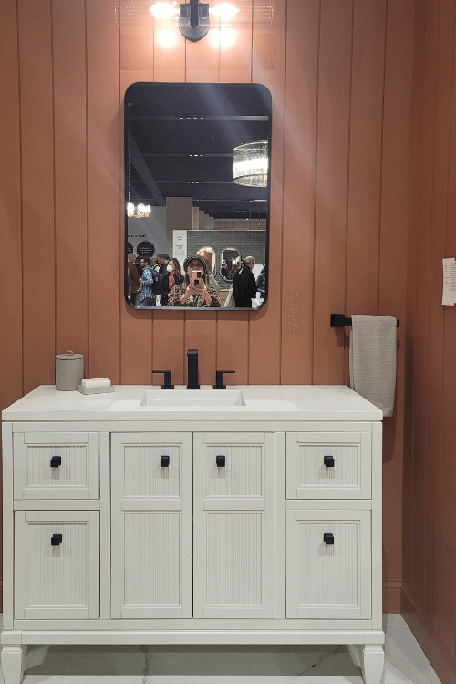
If you read my blog post with the latest 2022 interior design trends from the Kitchen and Bath Show, you may recall this image below with the warm, clay coloured vertical shiplap as a backdrop to a bathroom vanity vignette.
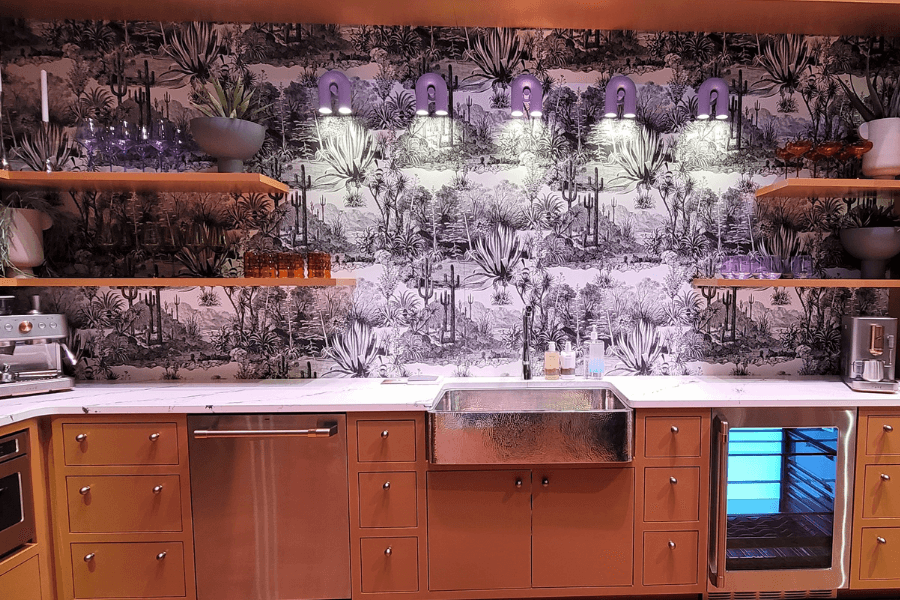
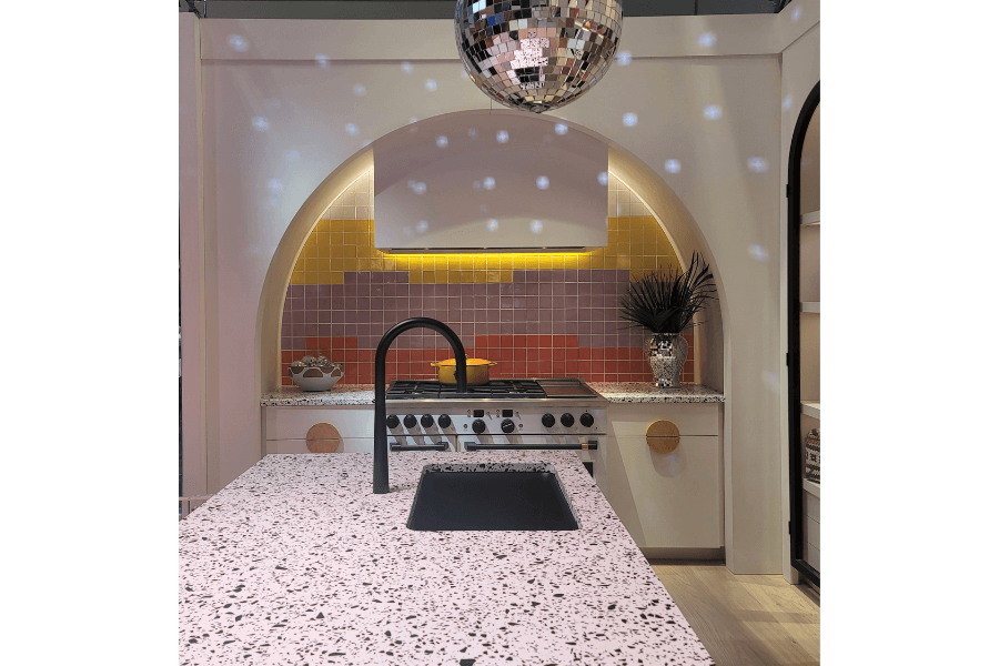
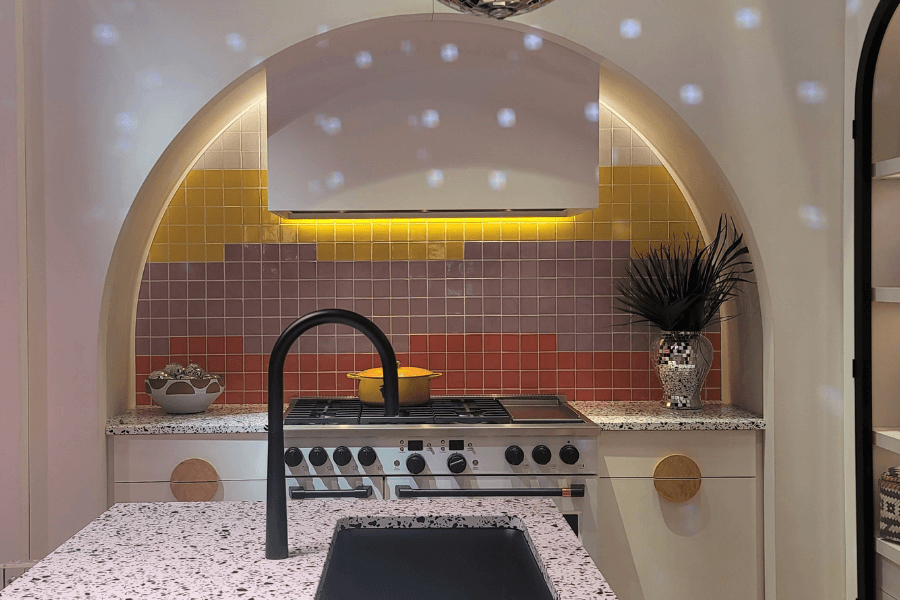
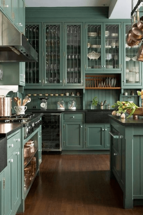
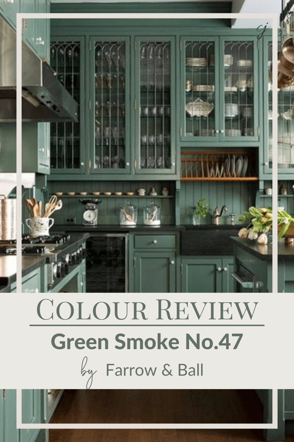
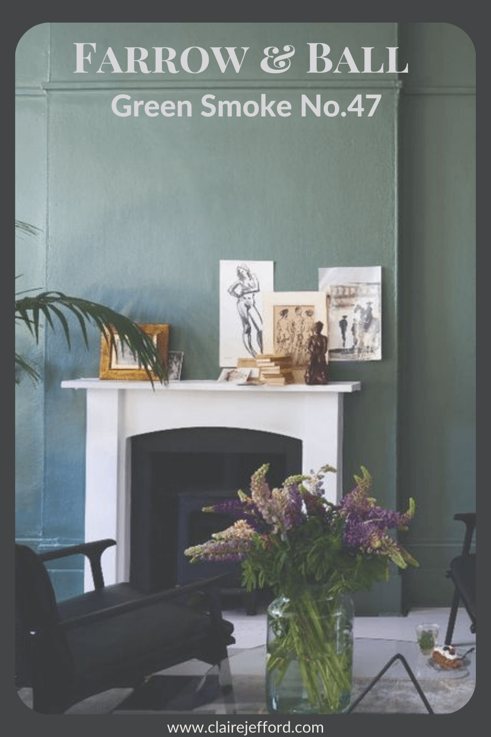
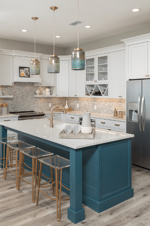
Another outstanding example of using colour on your shiplap can be seen here in a coastal-inspired kitchen island in River Blue 2057-10 by Benjamin Moore.
I also love how In Detail Interiors repeated this rich teal tone in the light pendants above. Exquisite design!
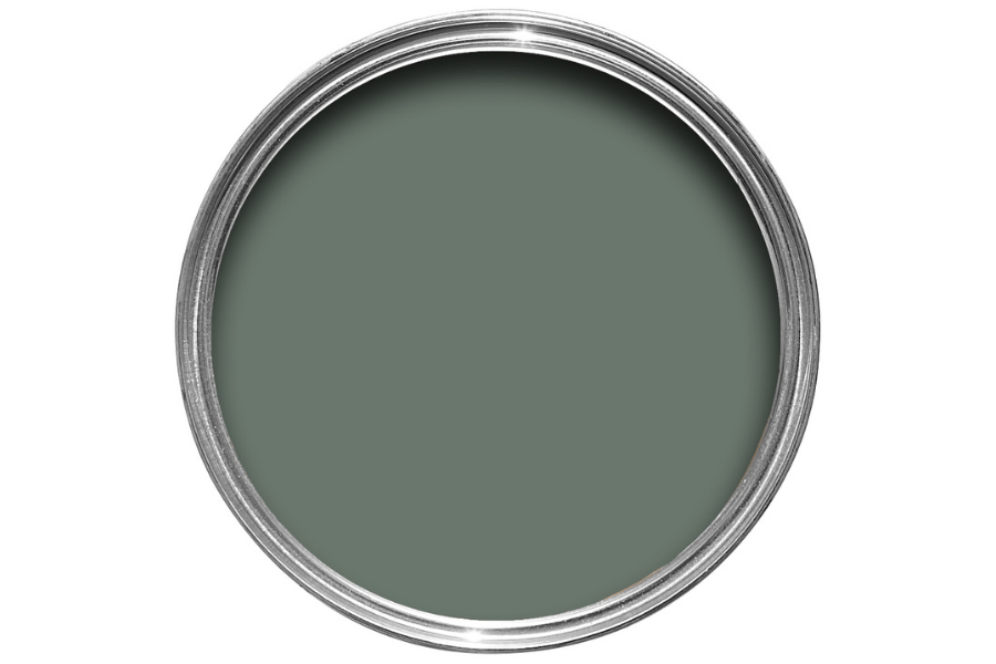
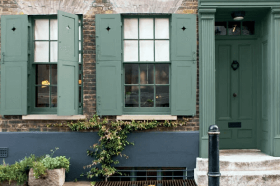
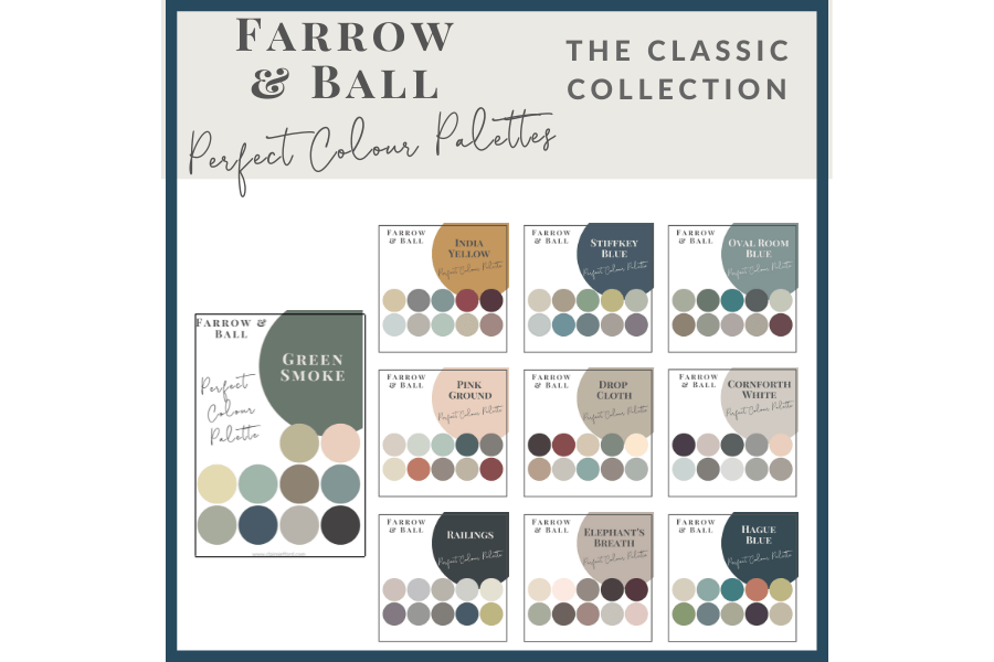
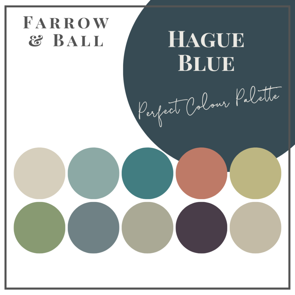
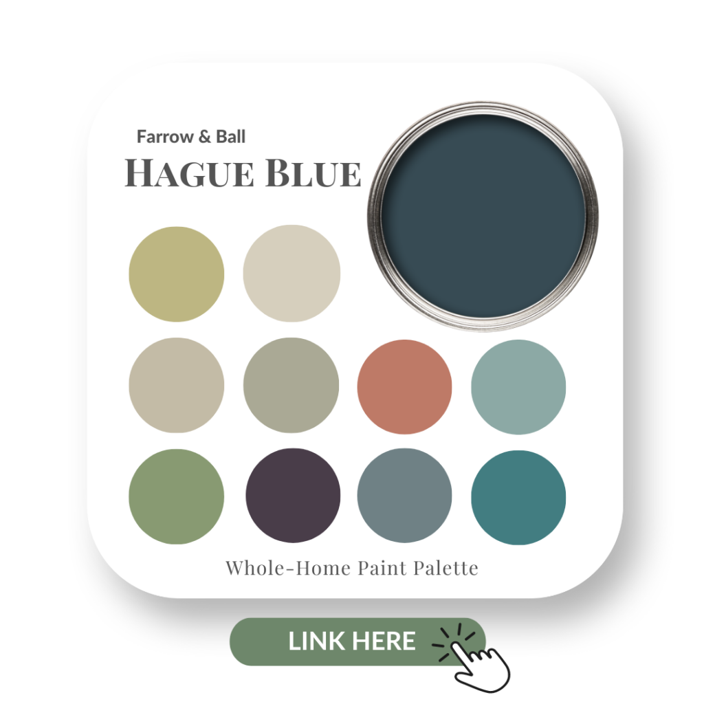
If you are looking for a slightly deeper shade of blue, try looking at Hague Blue by Farrow & Ball.
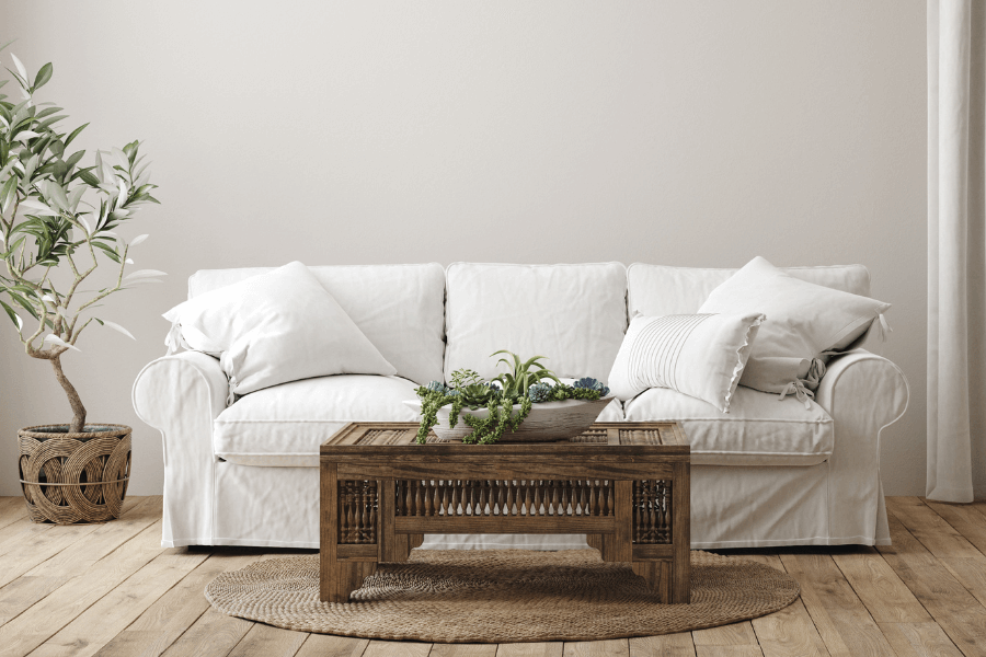
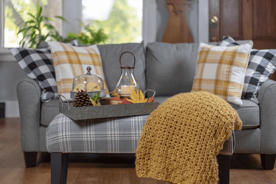
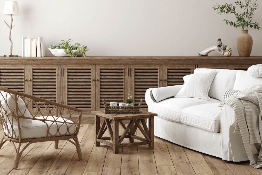
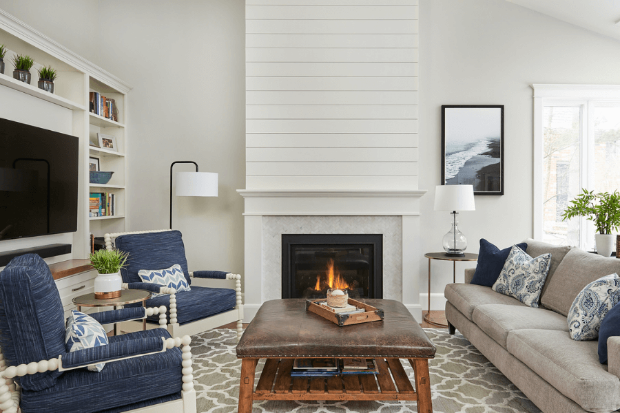
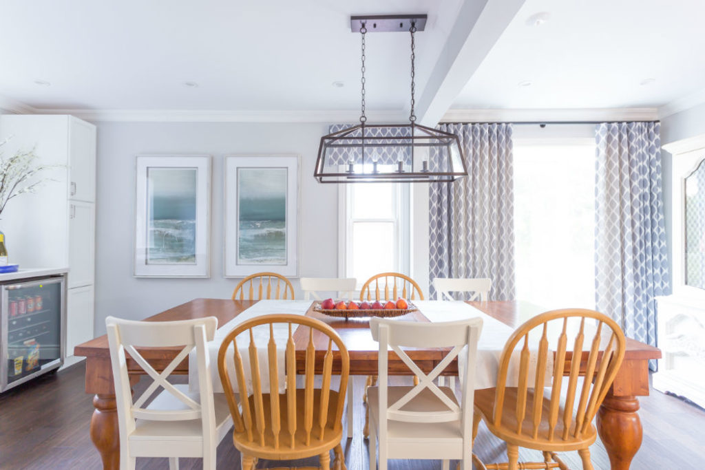
Casual Furniture
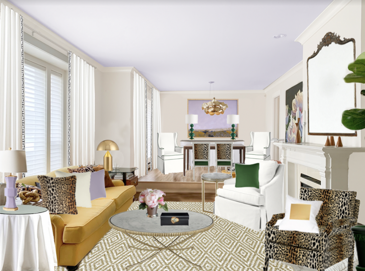
There shouldn’t be anything pretentious in coastal design. The goal is to be super relaxed and comfortable. The furniture you select should only add to the chill, clean vibe of the Coastal design.
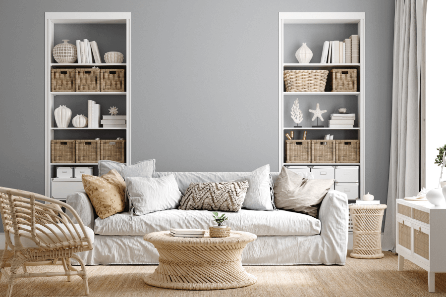
While I’m not loving the backdrop of the gray paint colour on the walls in this image below, if you swapped it out with a fresh paint colour like Sea Salt and added some blue pillows, it would definitely come to life and be more indicative of Coastal design.
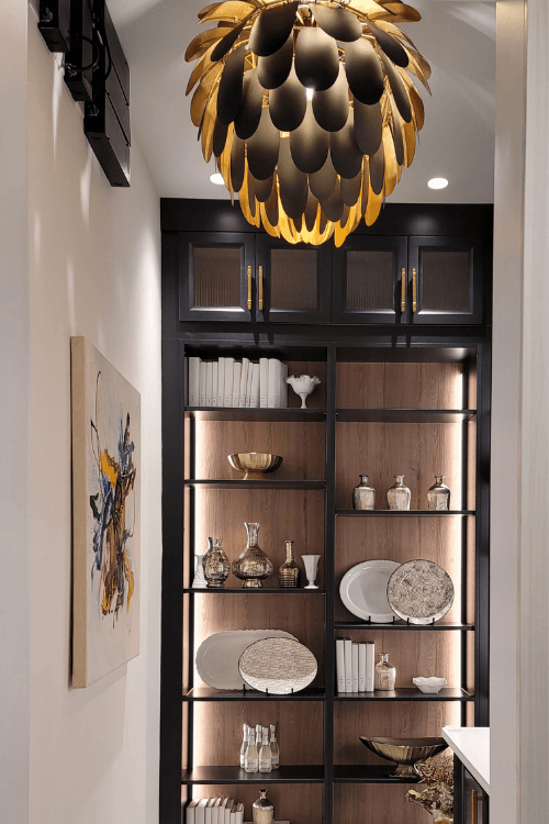
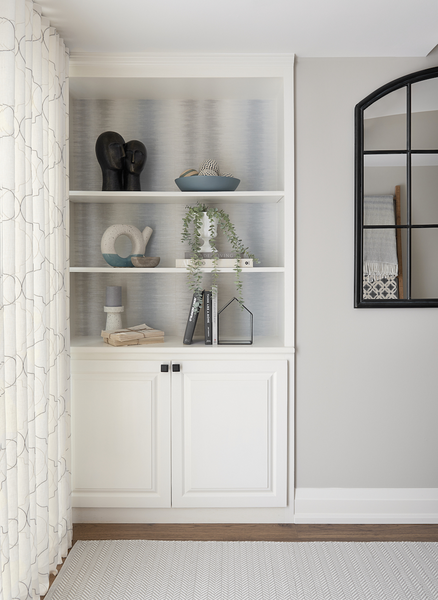
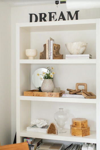
The accessories on the bookshelves, the rattan furniture and sisal rug are all fitting for a coastal feel.
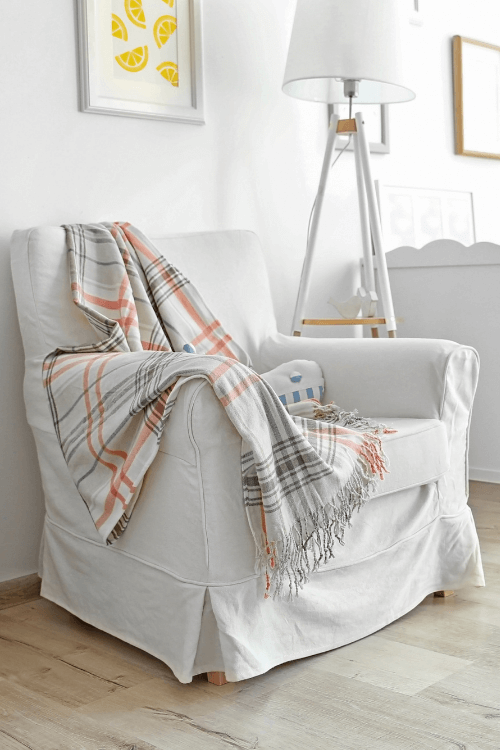
Fabrics & Textures
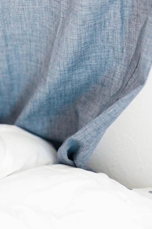
Linen
Always a classic material and often seen used in coastal design, linen is the perfect fabric for drapery and accents like tea towels in the kitchen.
Its natural look and lightweight makes linen the ideal fabric to use, making a home inviting as well as relaxed.
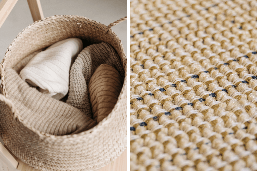
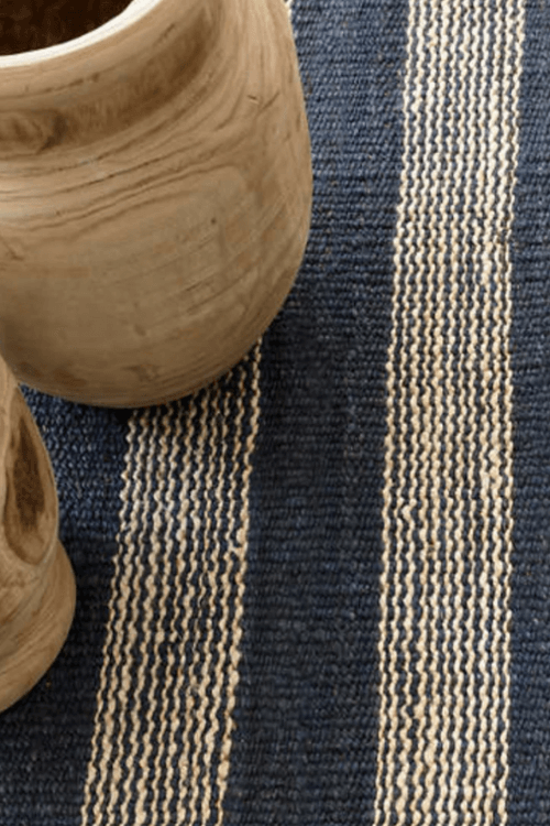
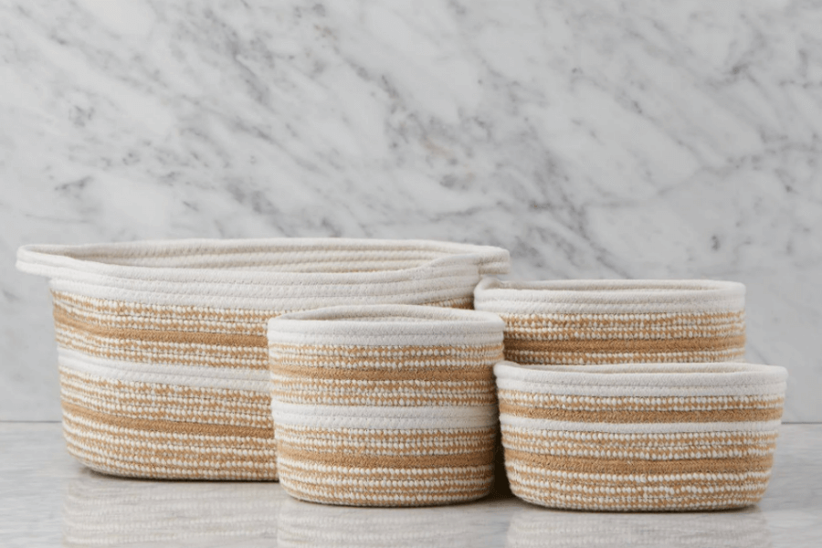
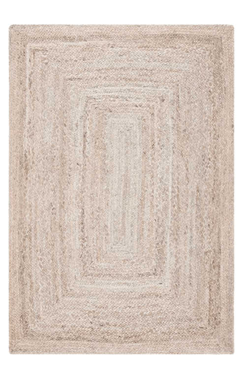
Jute
Organic in feel and colour, Jute is frequently used in coastal designs for accessories and rugs.
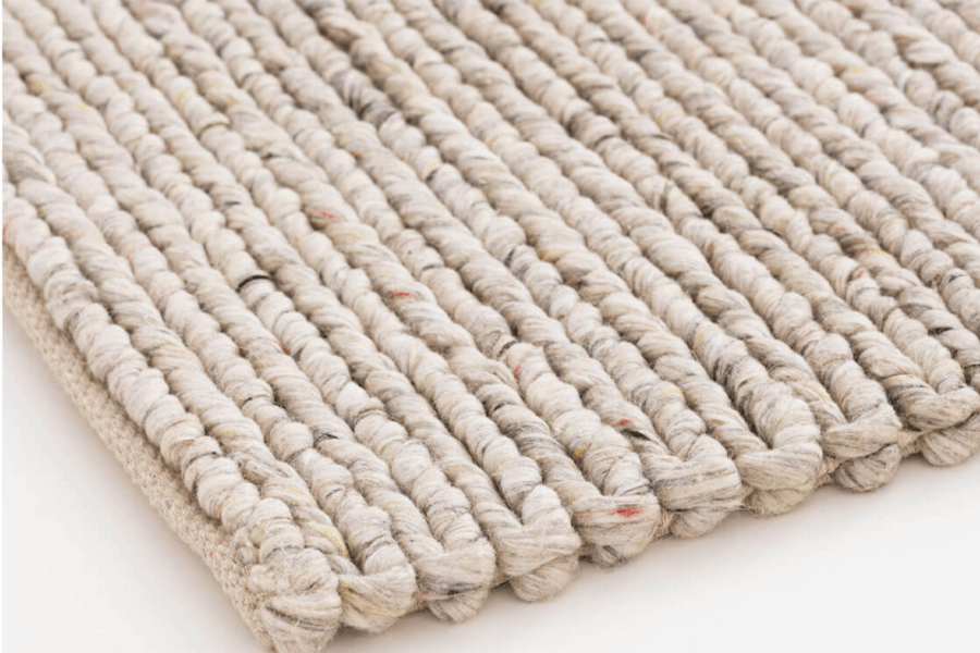
Loose Looped Pile Rugs
Berber style rugs are soft to the touch and often seen with a subtle variation of other colours mixed in.
But I will say, after having had wall to wall looped rugs such as this in my basement for over 10 years, they do go flat after a while. Something to consider if you are thinking of purchasing this style of rug.
Coastal Decor
There are many fantastic décor items that really lend themselves to the Coastal design style, too many to mention all of them here.
But let’s discuss a couple.
Artwork depicting water scenery
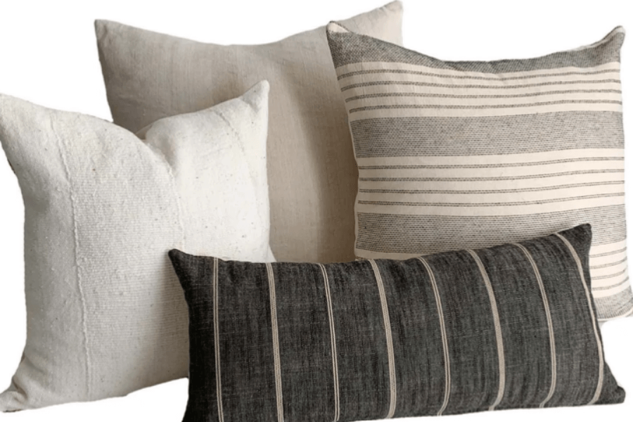
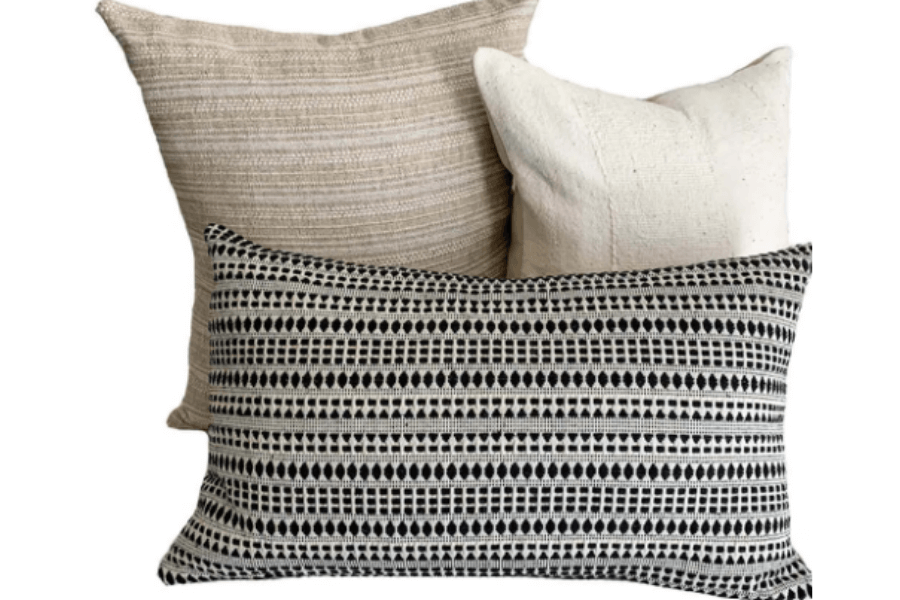
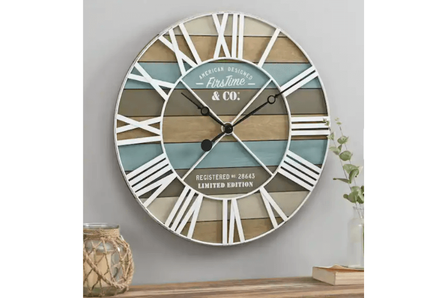
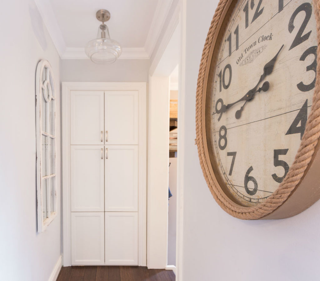
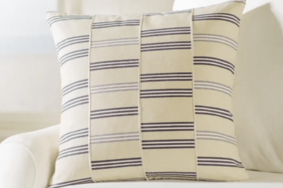
Clocks and Stripes
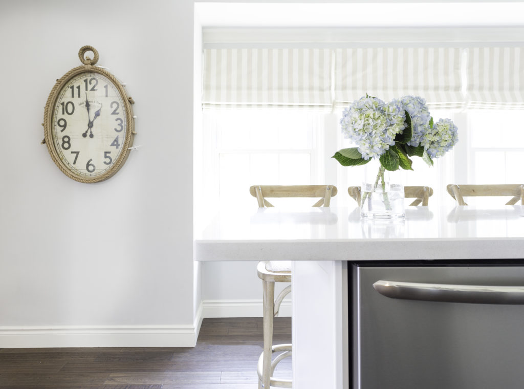
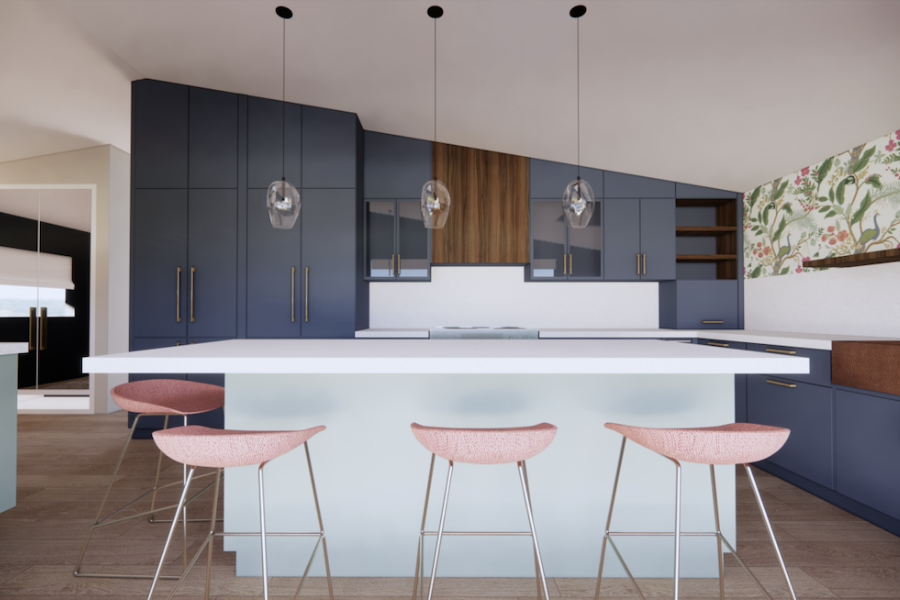
See more of this Burlington interior design project we called Ocean Blue and Sterling Stripes in our portfolio.
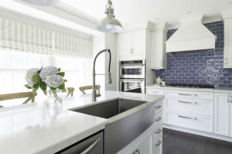
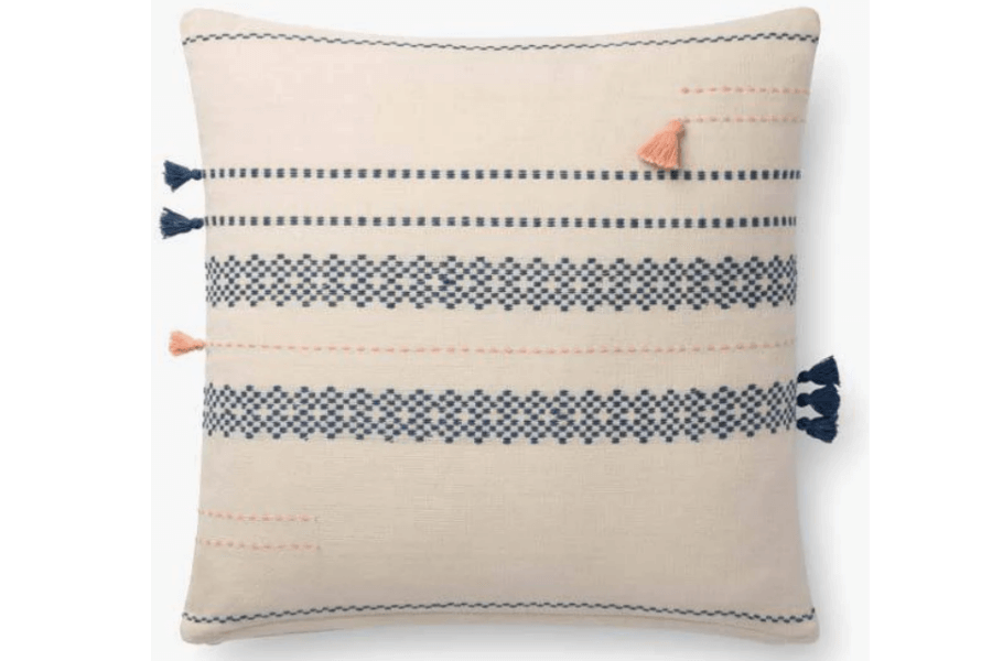
In addition to the striped roman blinds shown in the kitchen design mentioned above, striped pillows are also a sure hit for coastal-inspired homes.
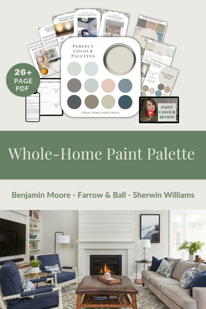
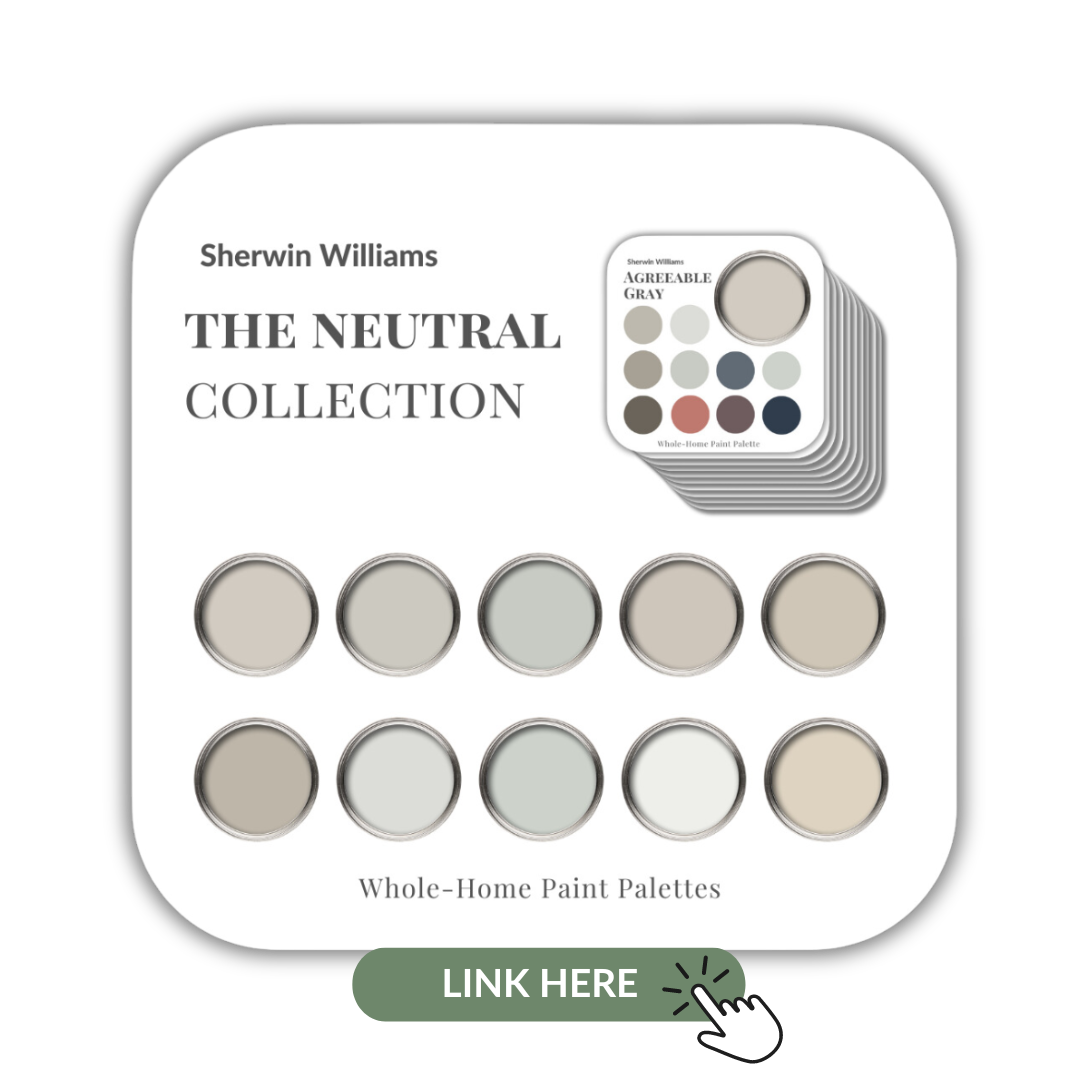
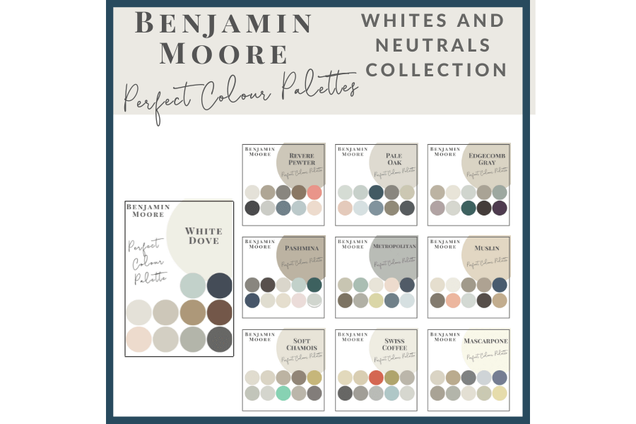
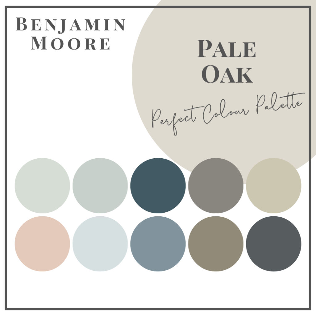
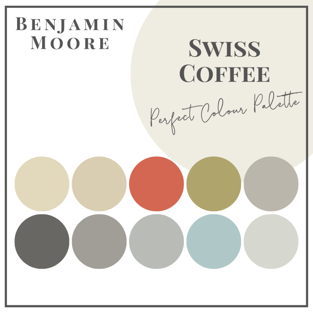
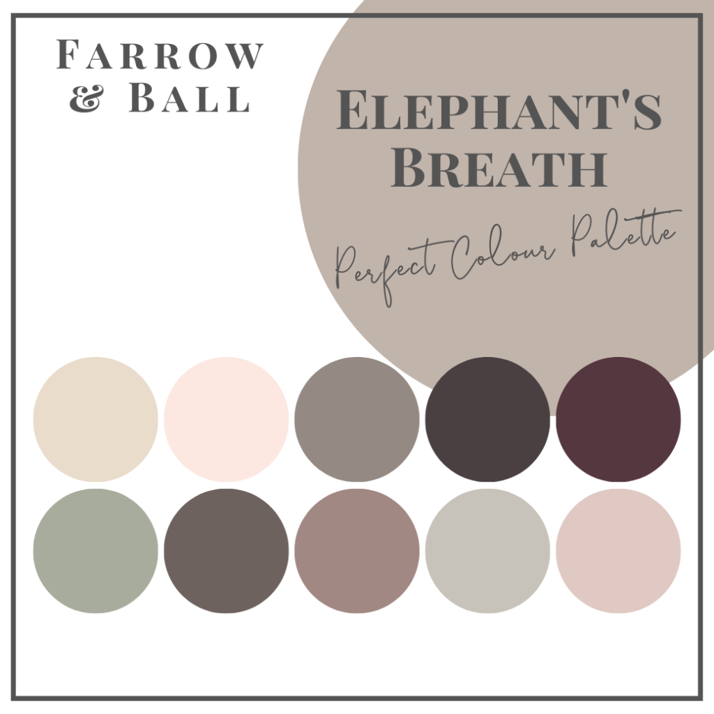
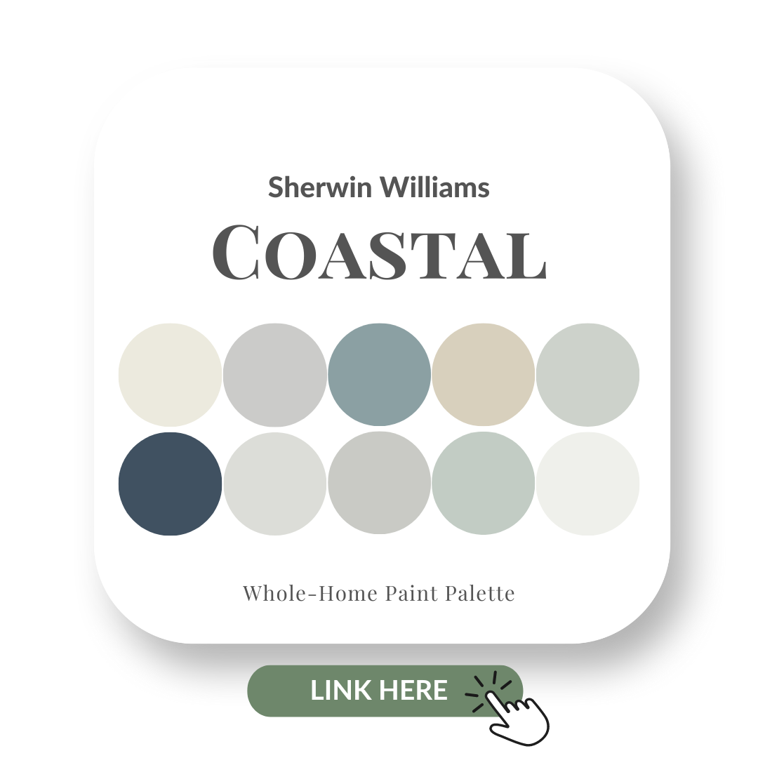
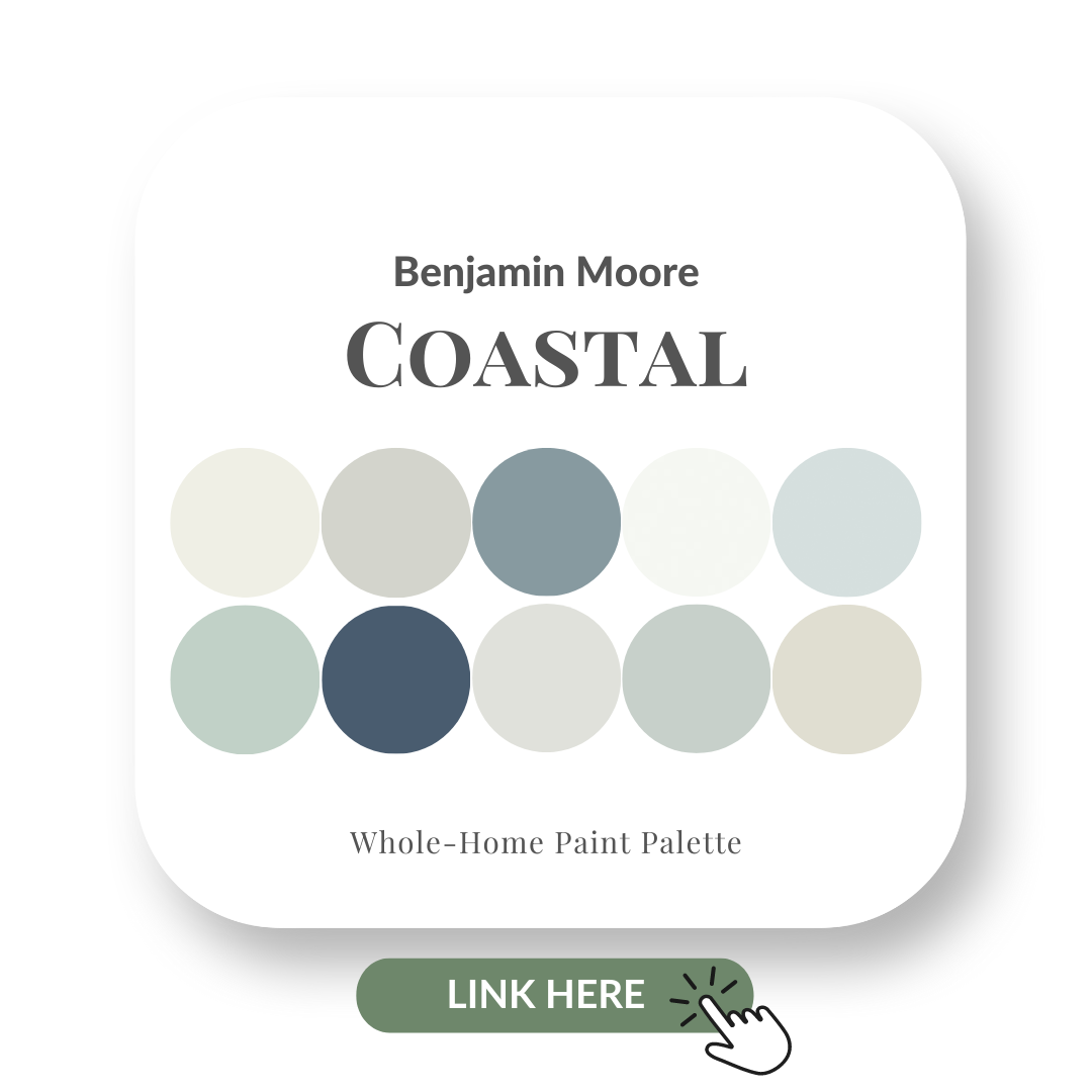
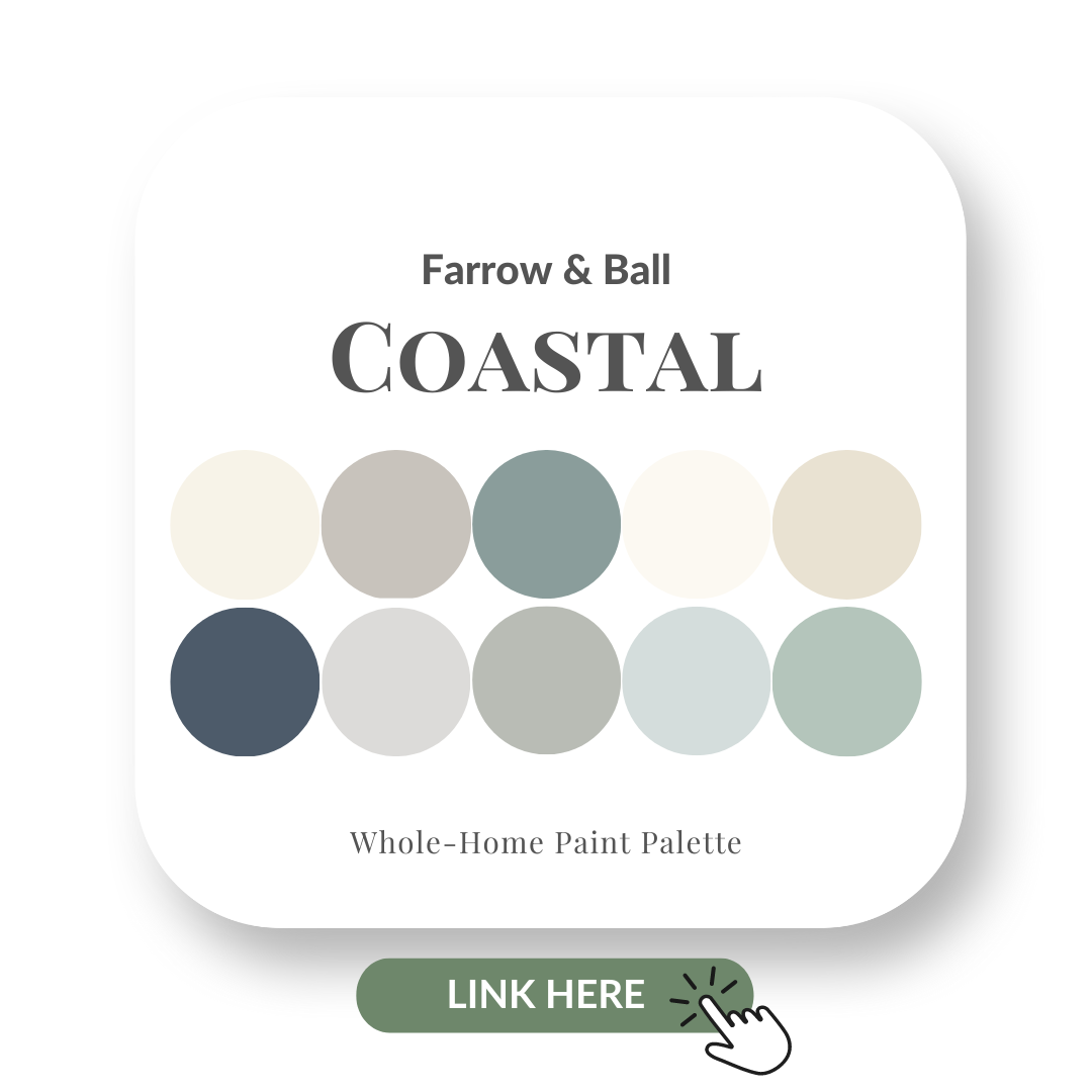
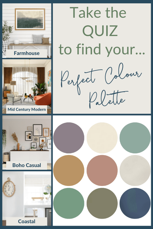
Coastal Perfect Colour Palettes
Loving the look of the Coastal design style?
Let me help you achieve this relaxing feel with my Perfect Colour Palettes to give you all the colours you need to pull off a gorgeous Coastal interior.
Sherwin Williams Coastal palette
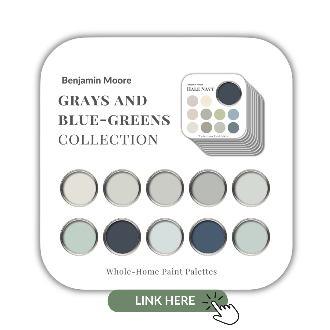
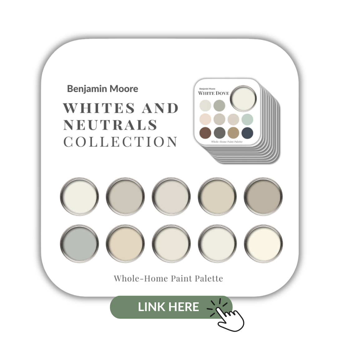
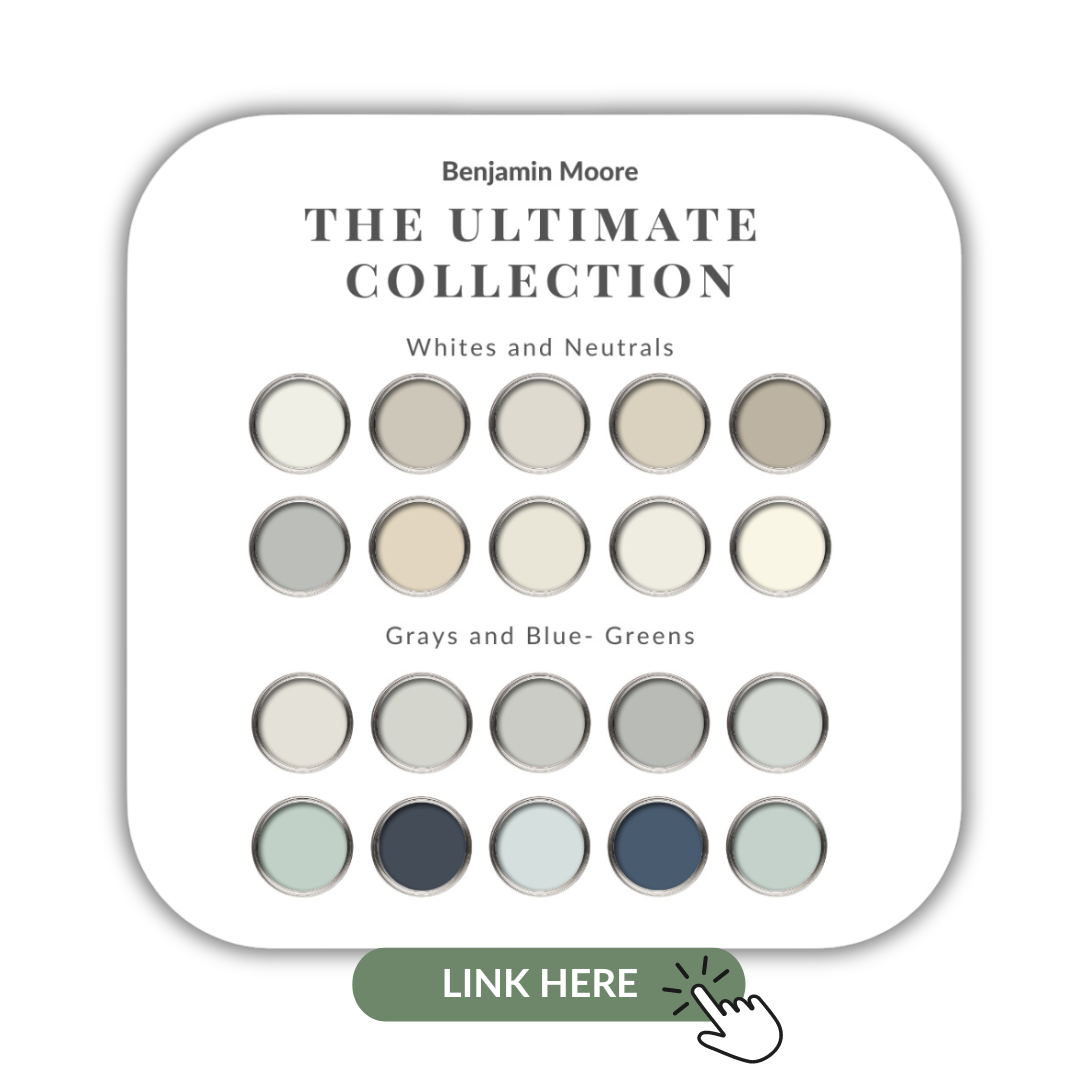
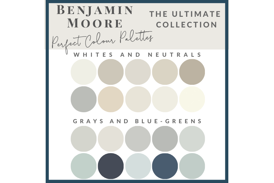
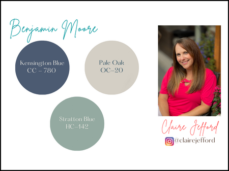
Benjamin Moore Coastal palette
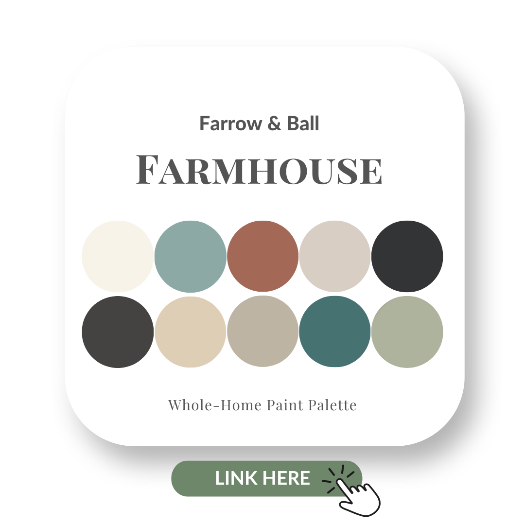
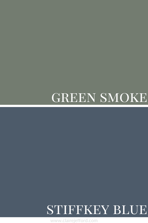
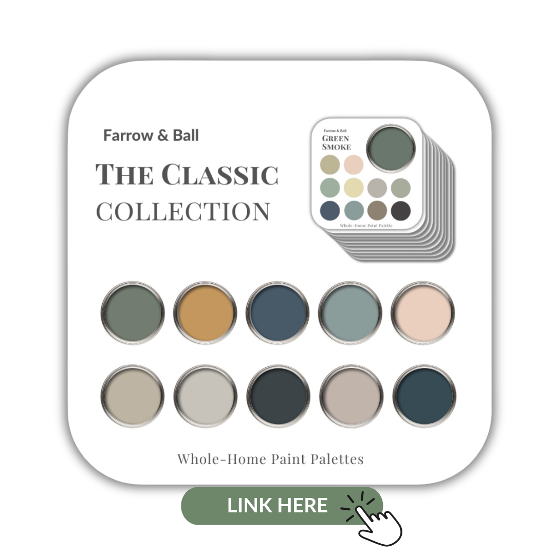
Farrow & Ball Coastal palette
Sea Salt Perfect Colour Palette
Van Deusen Blue Perfect Colour Palette
Extra White Perfect Colour Palette
Gray Owl Perfect Colour Palette
Hague Blue Perfect Colour Palette
Colour Quiz
Take my revamped colour quiz to find your Perfect Colour Palette.
Perfect For Pinning