Swiss Coffee Colour Palette Designs
Choose the right paint colour
the first time Let me show you how in just 5 easy steps!
BONUS: The Top 15 Shades of Gray by Benjamin Moore

Three Beautiful Palettes for Swiss Coffee
In my previous post, I did a colour review for Swiss Coffee by Benjamin Moore. Now I want to inspire you with ideas on how to pull a complete palette together using this sophisticated, soft white.
In this video, I demonstrate how to use the colours from my Swiss Coffee Perfect Colour Palette as inspiration for creating beautiful interior design palettes with fabrics, wallpaper, hardwood, and countertops for your home.
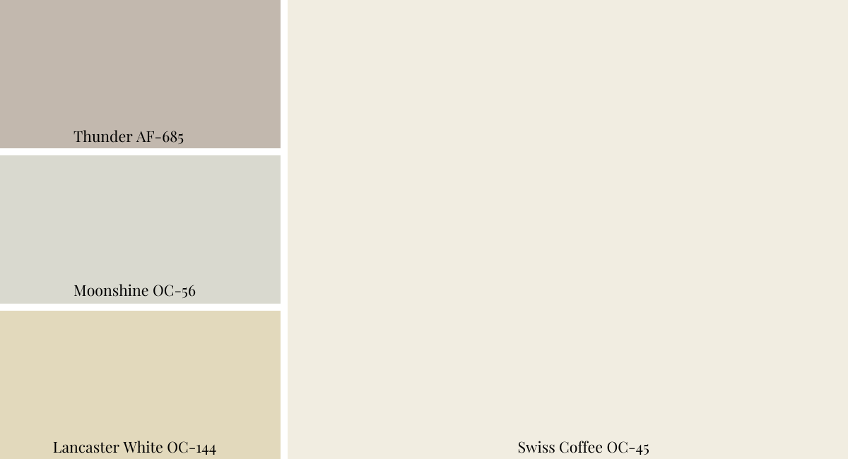
All the colours I use are included in my Swiss Coffee paint guide. I have come up with three gorgeous combinations, but there are many more ways that you could mix and match to create a design palette that is perfect for you!
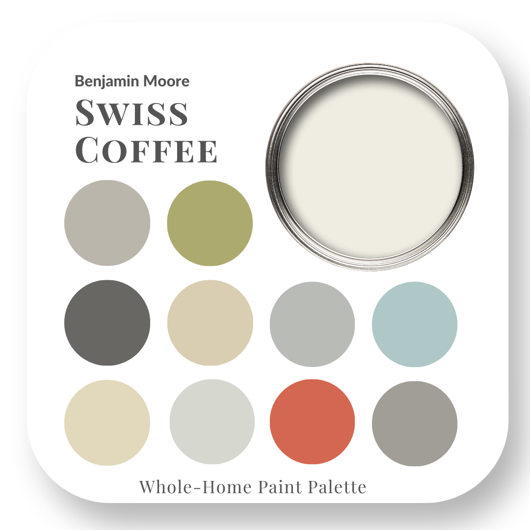
Swiss Coffee – Palette Inspiration
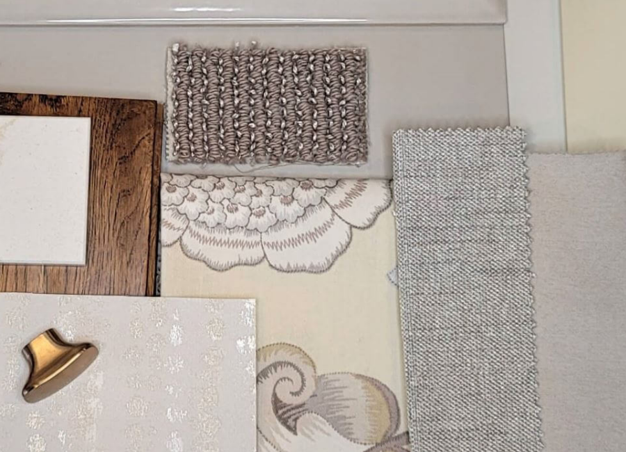
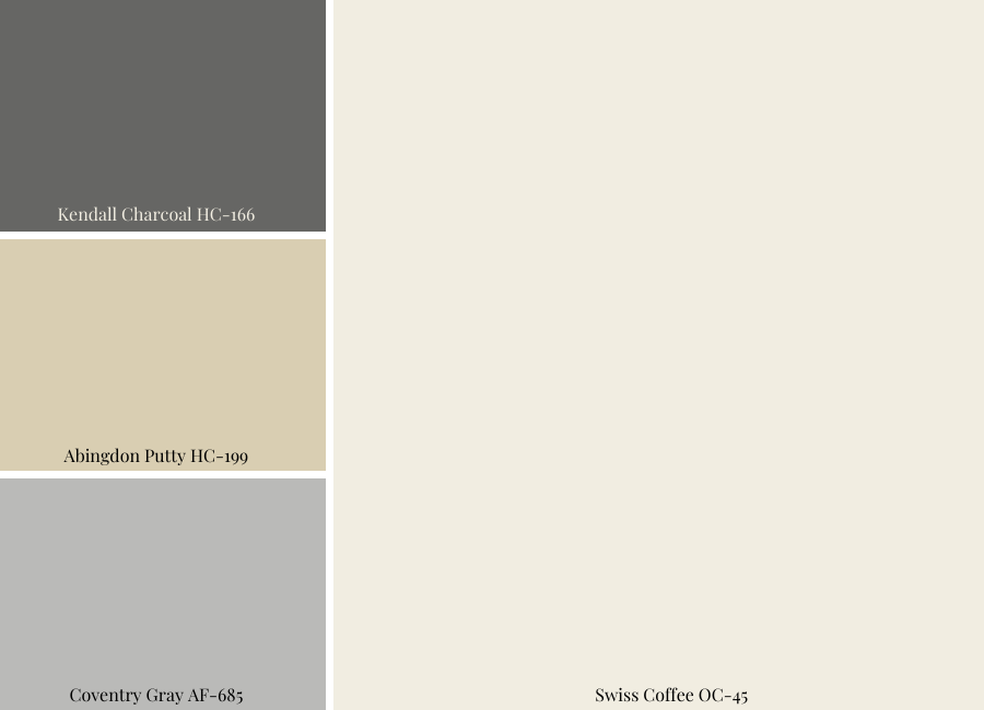
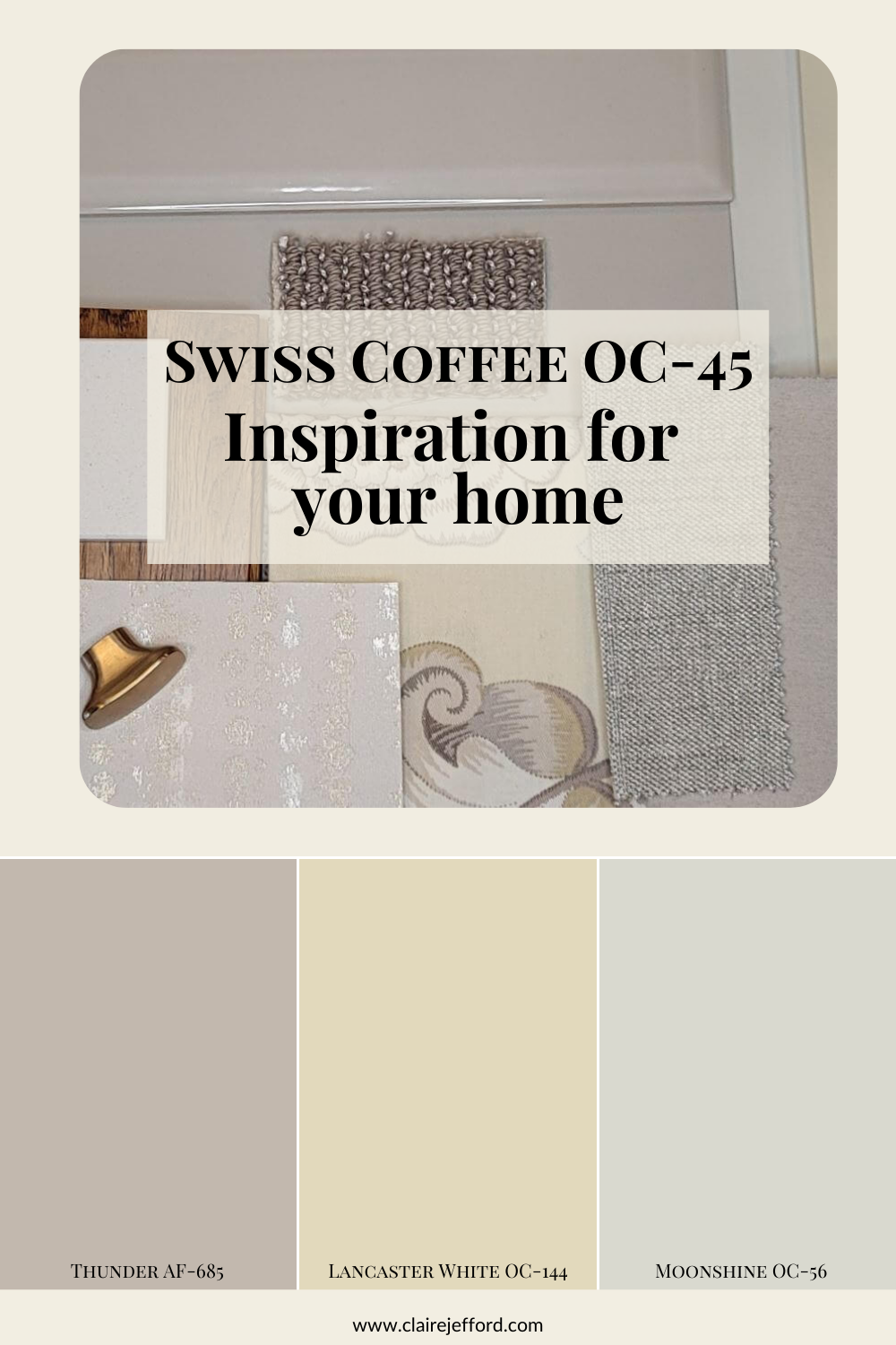
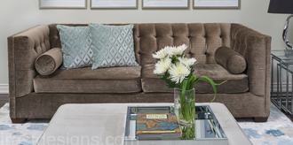
Palette 1: Soothing monochromatic
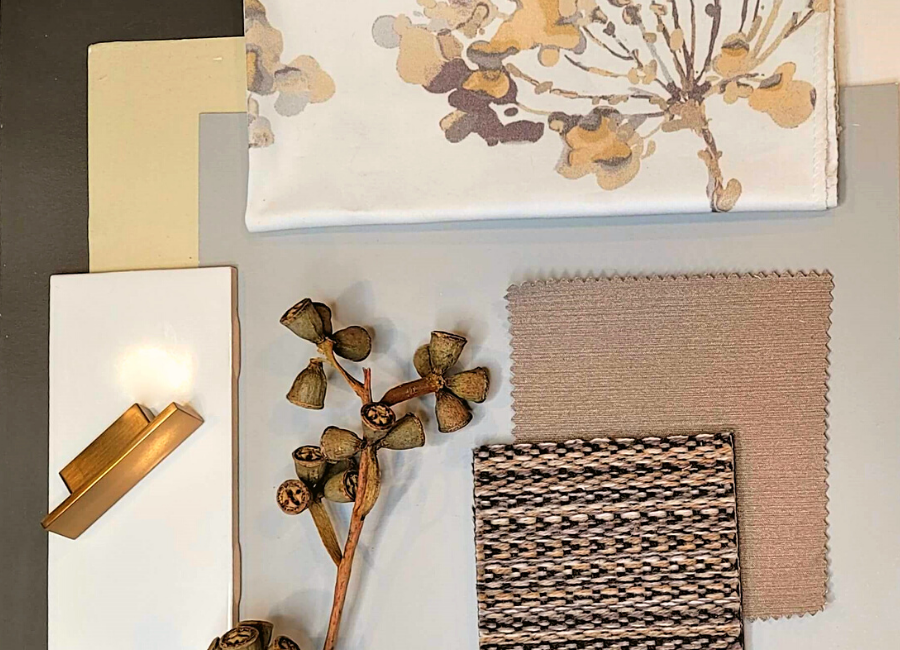
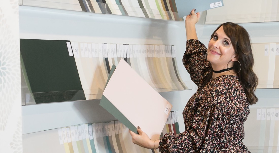
This first colour combination is the most calming pallet of the three. I printed off my Perfect Colour Palette for Swiss Coffee and walked through the endless fabric aisles at my Design Centre to find patterns that paired well with the combinations that I put together.
Look at how beautifully these 3 colour tones work together!
I am using this colour combination to find inspiration for fabrics and other home décor finishes. I am not saying you must paint with all these 3 colours, but instead, use them as inspiration for pulling together a design palette.
Here’s what I found:
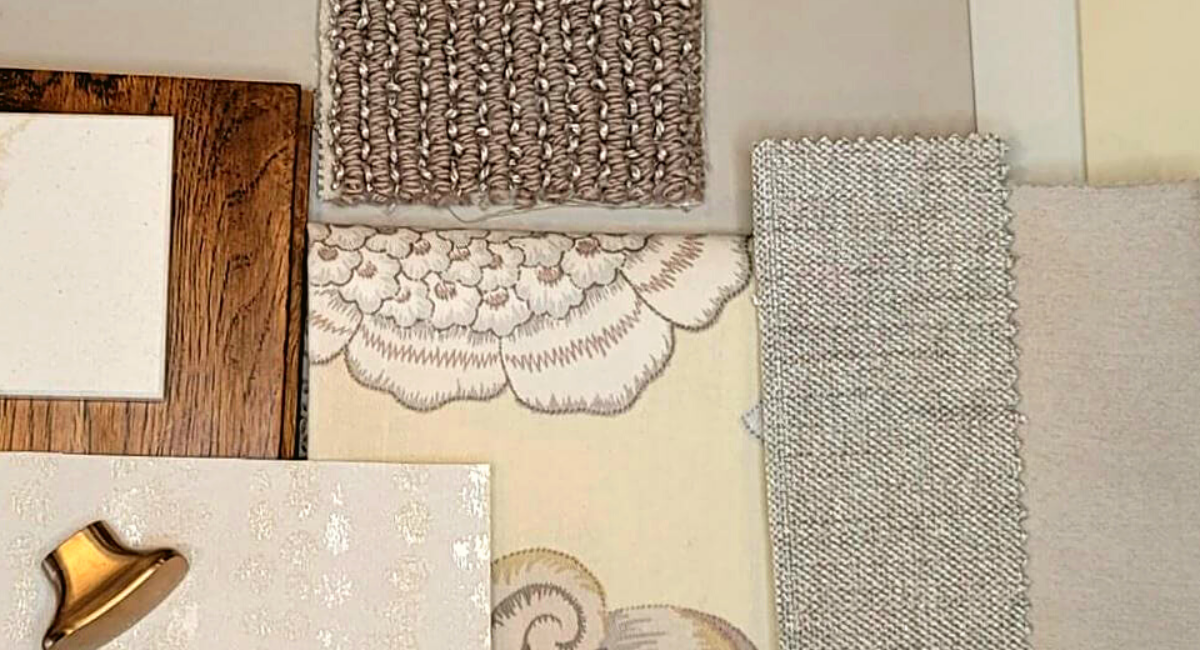
The first fabric is a fantastic, soft, and pretty floral fabric from JF Fabrics. You could use this fabric for a pillow on your sofa or apply it to some gorgeous drapery. You can see the other neutral-toned materials shown above that could be used for a sofa, a custom ottoman, and/or accent chairs.
Notice how the taupe looped rug sample compliments the fabrics and overall palette? The addition of the wallpaper sample with similar tones can be used to add another layer to your design palette.
Be sure to watch the video above to understand in more detail, why I chose each specific element of the designs.
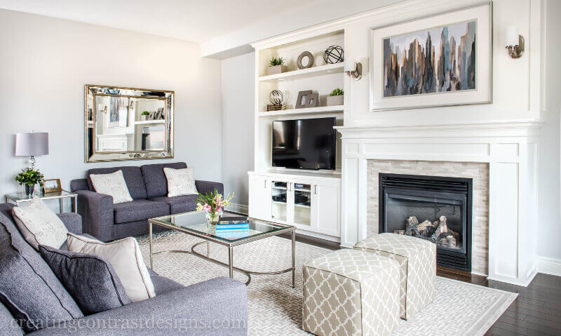
Your home should always flow from room to room so that it’s clear that your design choices are purposeful. To do this successfully, repeat the same tones into other areas on your main floor.
Hopefully, you can see how I’ve done that with each of these materials by including selections for a kitchen design with the counter selection, backsplash, and a pretty piece of hardware.
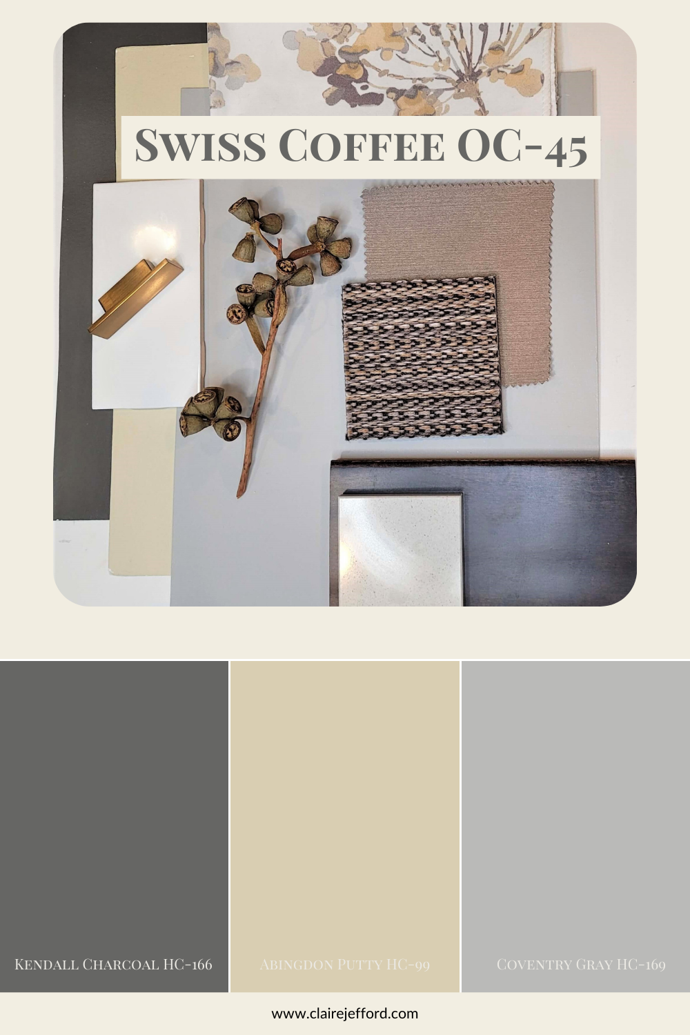
Palette 2: Contrasting & Moody
The second palette is slightly more moody with contrasting colours between quite dark and much lighter colours. I love creating contrast in my interior design projects!
Often just one fabric can be my jumping-off point (inspiration) for decorating an entire room, maybe even an entire home!
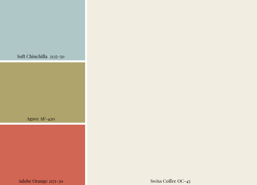
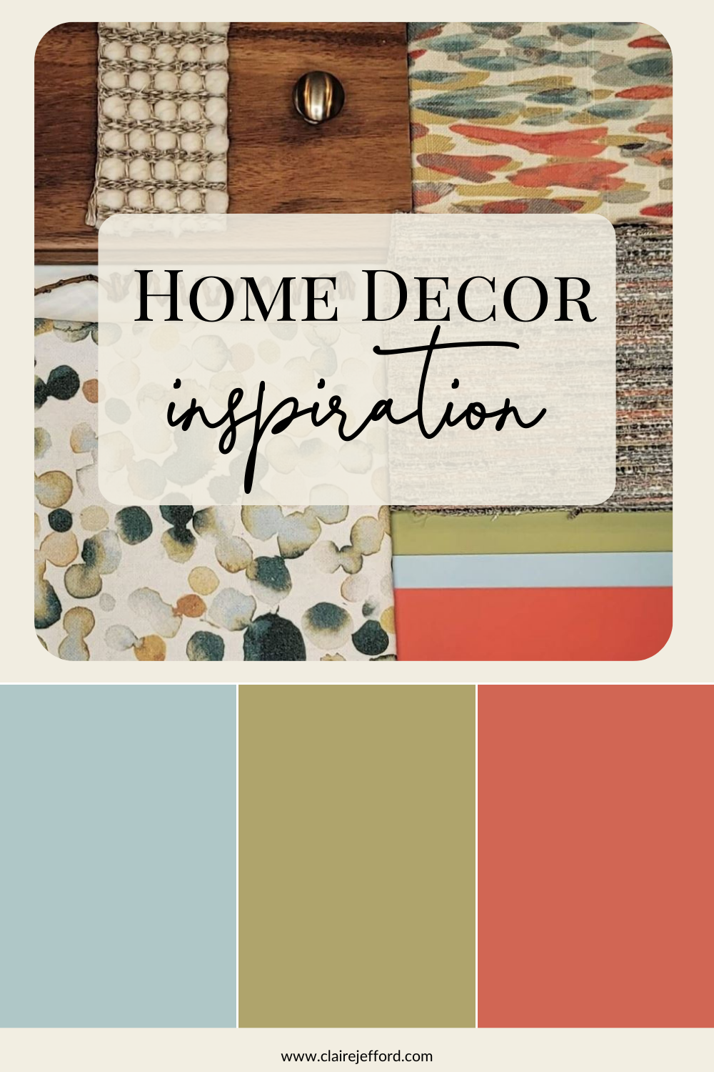
Palette 3: Bright & Fun
Now I’m not typically a neutral kind of gal when it comes to my interior design projects. You have seen my own bathroom, right?
In this final colour and design palette combination, I have saved the bright, bold, and most fun for last!
An exciting combination of 3 colours, again taken straight from the Swiss Coffee Perfect Colour Palette.
Once again I picked a fabric first – the one with the dark green circles – and added on to the palette from there.
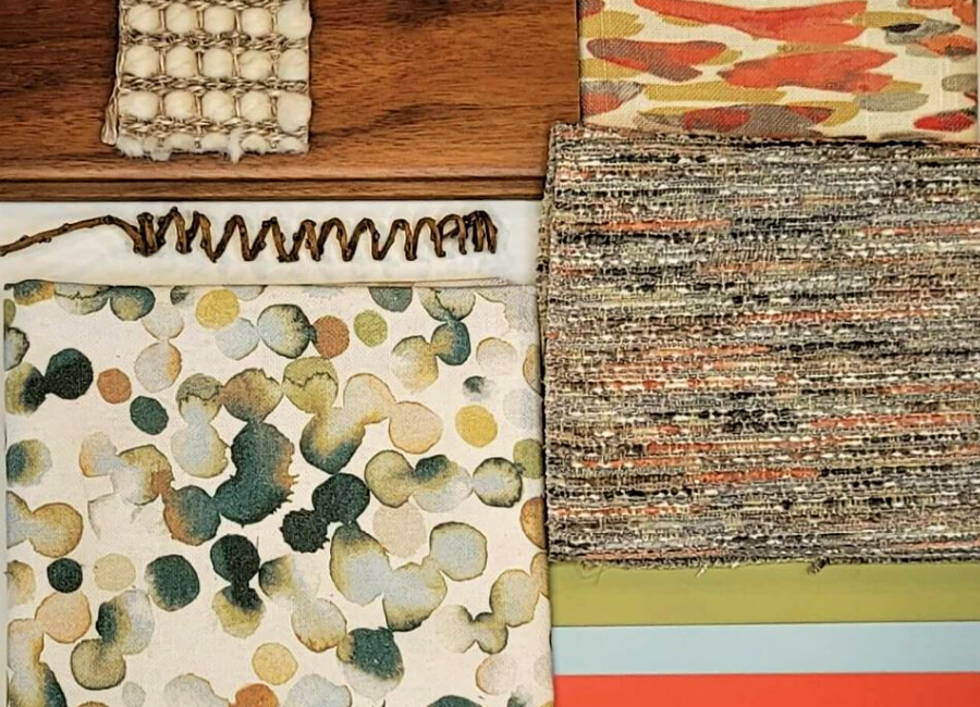
You can see the orange in this fabric is not as bright as the Adobe Orange and that’s ok. I am trying to show that tones don’t need to be exactly the same when pairing and mixing colours. But you can see how well it all ties together.
I would use all three of these fabrics in the same room just mix and match them. I love adding texture, you can see that here with the sample for the neutral area rug in the top left corner, sitting on top of the hardwood sample.
Putting together palettes combining colour, textures, patterns and materials was certainly made easier using the colour combinations in my Perfect Colour Palettes. If you get stuck on how to come up with a colour palette for your own projects, my guides can definitely help. Their purpose is to make it less daunting to choose paint colours for your home.
So, which palette was your favourite? Comment below to share your thoughts on which one you found resonates the most with your interior design style.
Get Inspired – Perfect for Pinning!
Convenience At Your Fingertips
Swiss Coffee is now part of my Benjamin Moore Whites & Neutrals Collection showcasing all 10 of my Benjamin Moore white and neutral Perfect Colour Palettes.
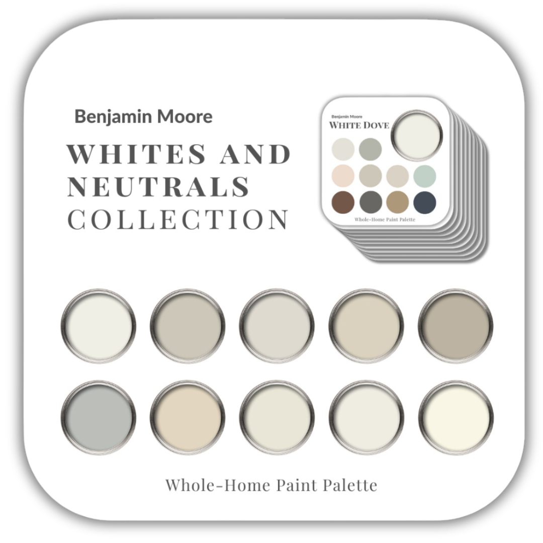
My Perfect Colour Palette library has been expanded and now has 50 paint colours to select from. Click here to see them all.

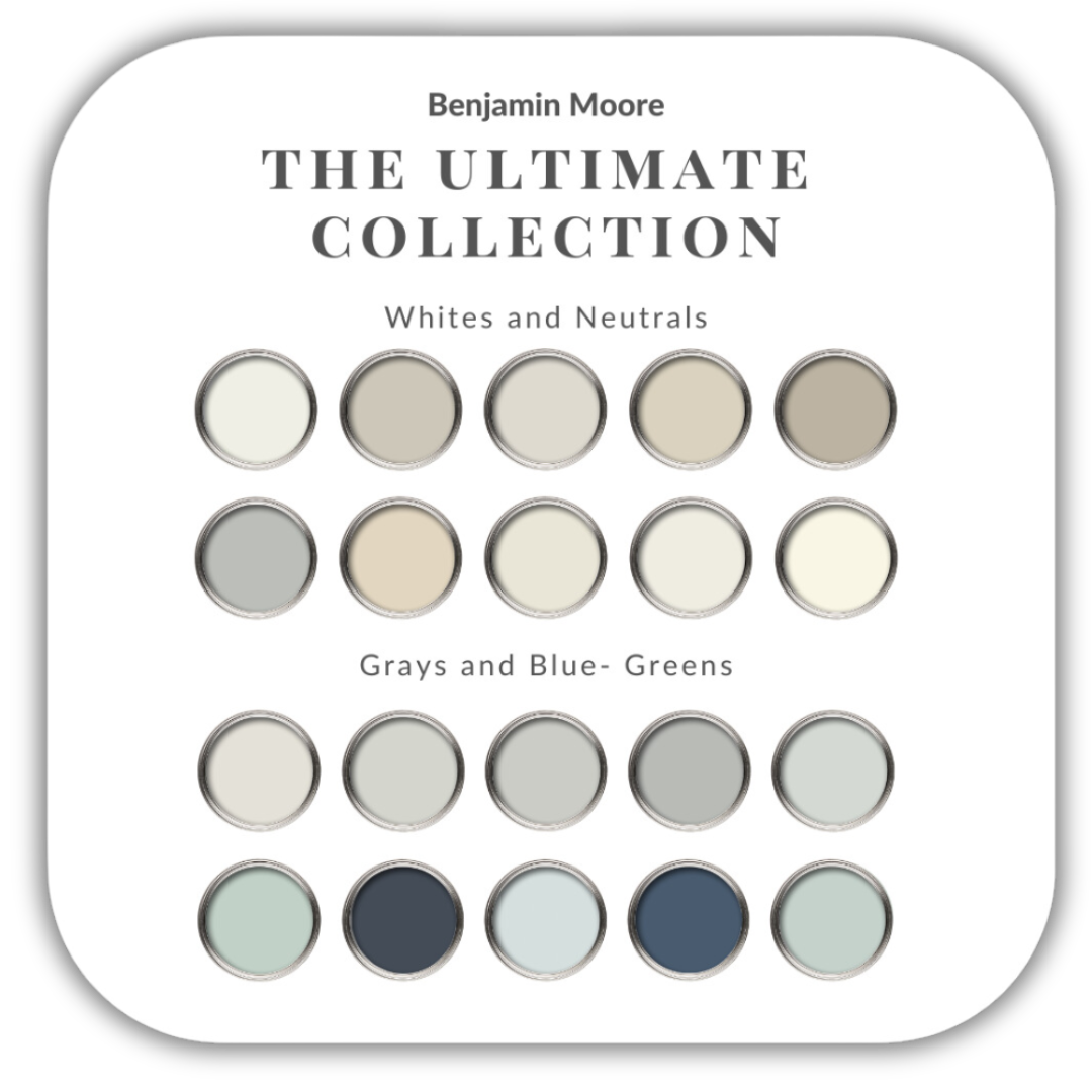
If you want to get all my Benjamin Moore colour guides in one place, look no further than my Benjamin Moore Ultimate Collection. All 20 of my Benjamin Moore guides are in one handy collection.
Remember, it only takes one mistake to take your home decorating project from divine to disaster. Don’t let the paint be what stresses you out!
Take my Colour Quiz to see which Colour Palette best suits your style.


Donna
| 18 June 2021Hi Claire! I love all of your Swiss Coffee colour palettes! The colorful bubble fabric in Example #3 is EXACTLY what I need. Can you please tell me where you found that?
Claire Jefford
| 20 June 2021Sorry Donna, I don’t actually have this sample anymore! It was a consideration for my own basement, but then I went with another palette and returned the fabric sample. I wish I could be more helpful.
Robin
| 4 January 2022Claire, love the post on Swiss coffee. I have my kitchen and family room painted this color. Get compliments all the time. Great neutral with medium brown hardwood floors.
Claire Jefford
| 27 January 2022Sounds lovely! I haven’t heard of anyone who didn’t love Swiss Coffee.
Sherrill
| 6 December 2025Are most people using Swiss Coffee full strength? I was thinking of using it at 50 % or 75%. A husband’s office is dim in afternoon but sun
comes in a lot earlier.
The other bedroom large with two dormers. It is
nW I think. Which do you think to use. Thank you.
Claire Jefford
| 13 December 2025We never recommend changing the strength of the colour. With thousands of choices, I can assure you, the right colour tone for your home is out there 🙂 Test Swiss Coffee on a large board and move it around the room at different times of the day to see how it looks in different light. Be sure to look at it with any fixed elements as well – like counters, and tiles. If it looks like a good match, then great. Otherwise, consider something either warmer or cooler based on what would work the best with what you already have in the space and need to work off of.