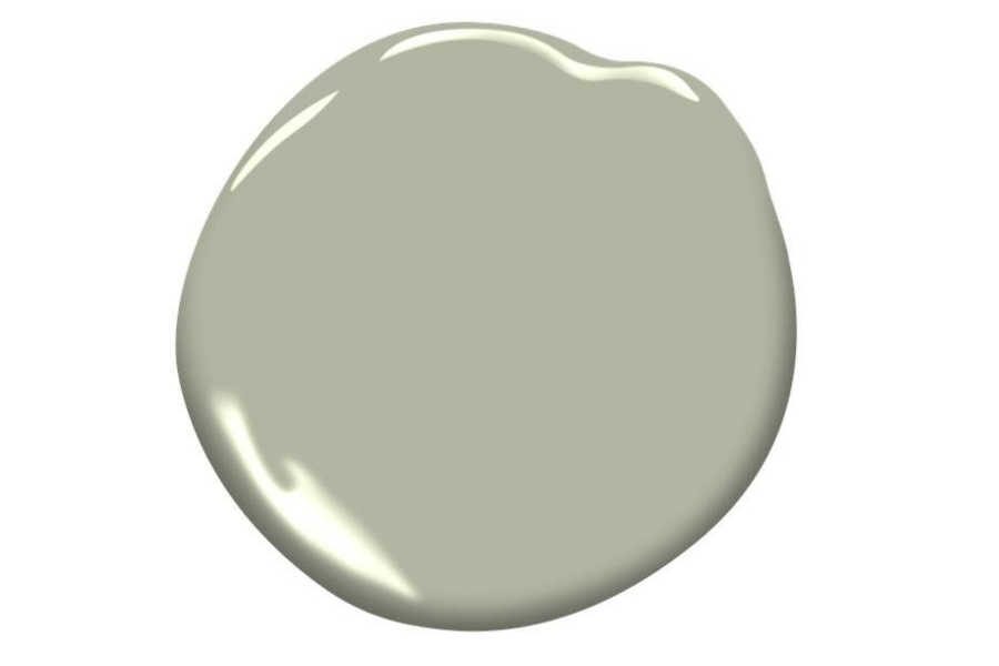
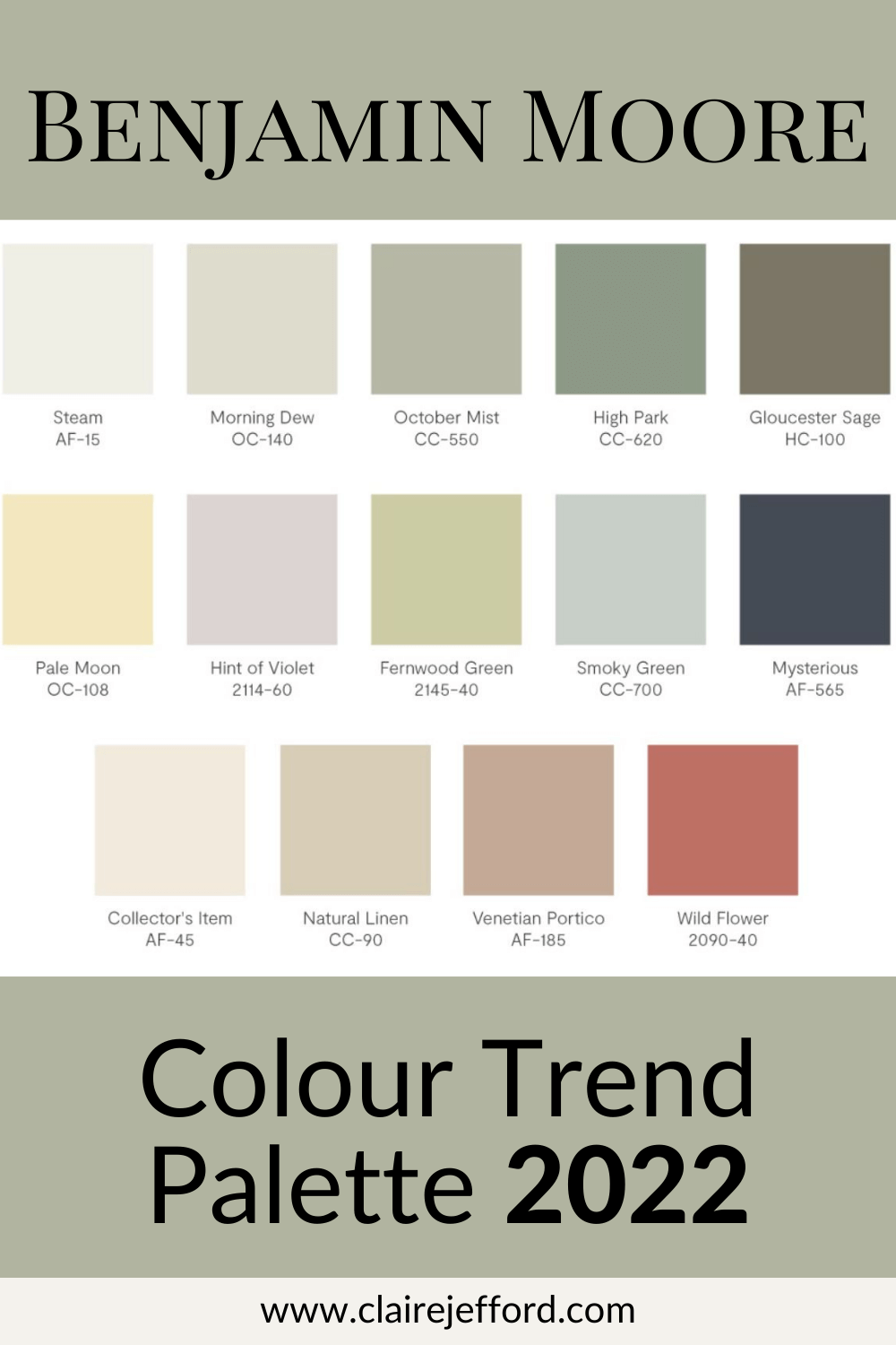
What colours are trending in furniture design? Do they fall in line with the 2022 Colour Trends recently announced by Benjamin Moore?
Spoiler alert!
The answer is YES, and I’ve put together some inspiring colour palettes for you in this blog post.
Sadly, I was unable to attend October’s fall Highpoint Market. But, I had a very good friend and fellow interior designer on the inside!
I want to thank Linda Holt for sharing these photos with me from her recent trip to Highpoint in North Carolina.
Connect with Linda here on her Instagram. This wonderful woman used to be a photographer, and she loves colour just as much as I do, so you’ll definitely be inspired by her posts.
I’ve also created colour palettes to complement some of these vignettes to further inspire you for your next interior decorating project.
Let’s dive in!
The MOST POPULAR Colour at Market
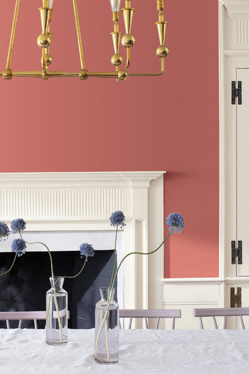
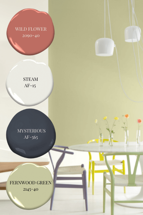
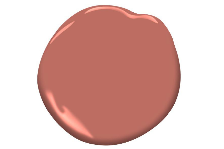
Does the colour of this curved console look familiar to you?
Linda tells me that this colour was in almost every showroom at High Point, whether it was furniture, fabric, artwork or accessories.
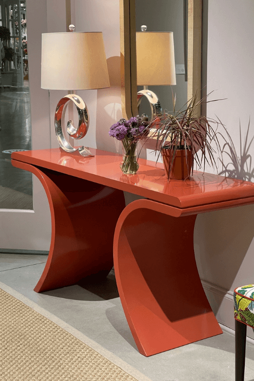
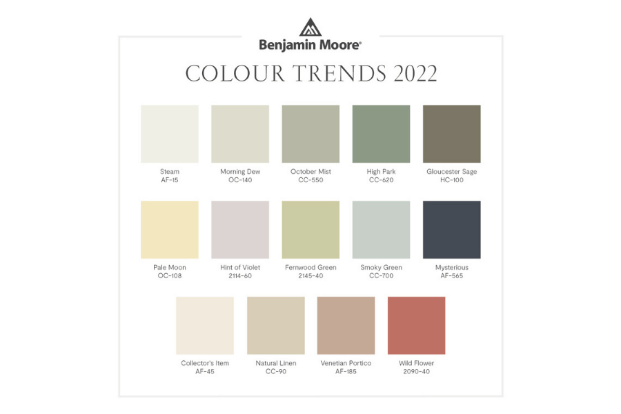
This colour tone is very similar to that of Benjamin Moore’s Wild Flower which was included in their 2022 Colour Trends Palette lineup announced last month.
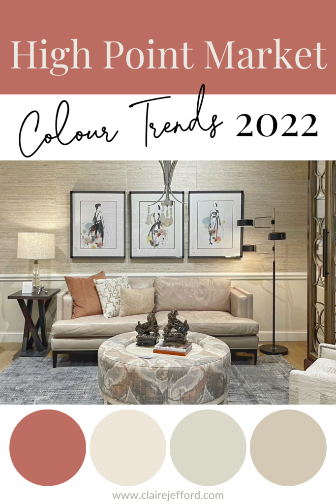
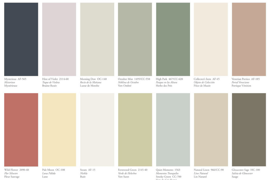
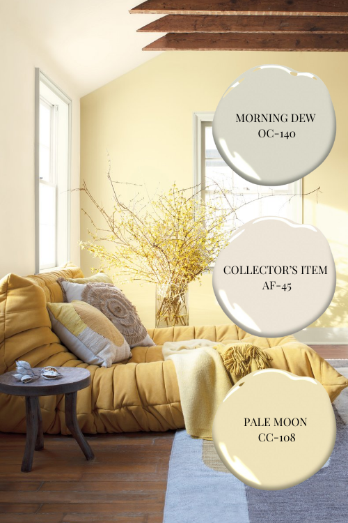
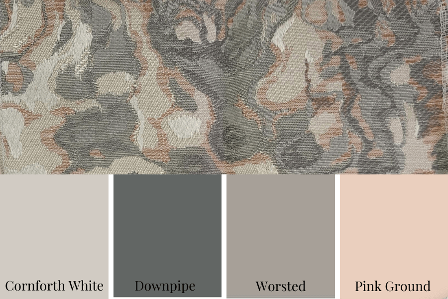
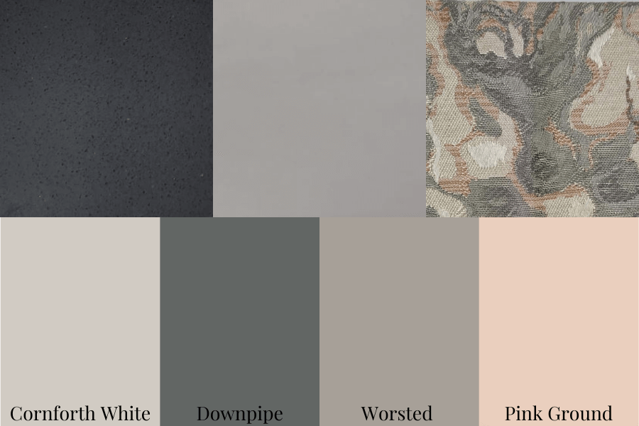
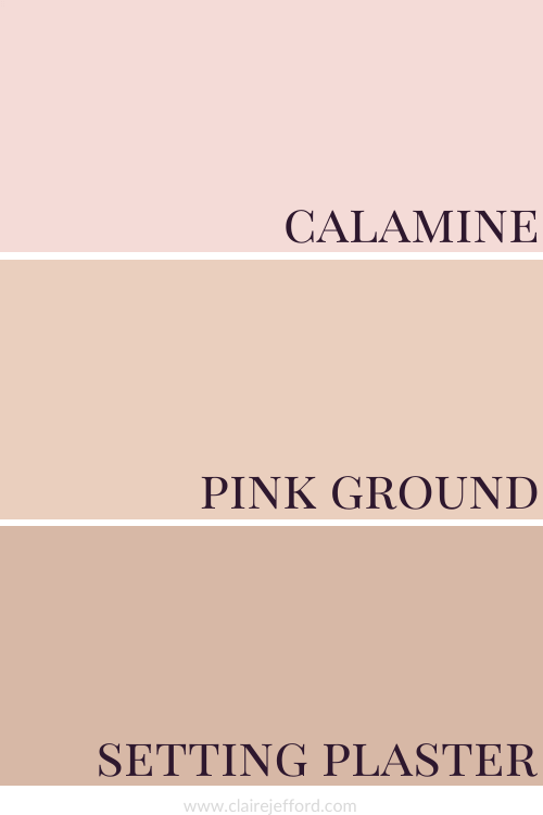
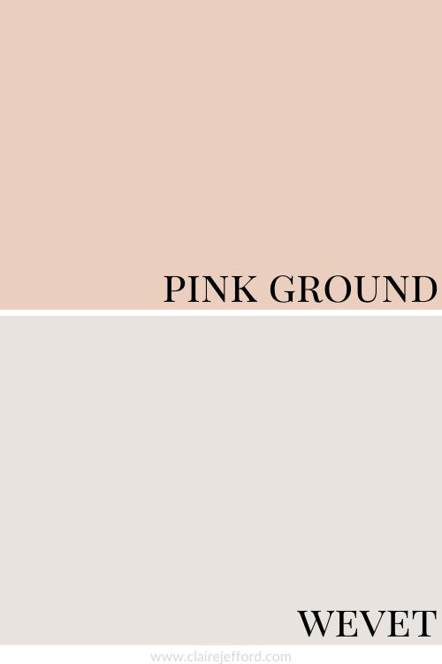
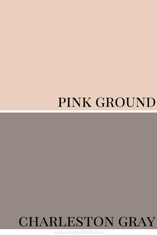
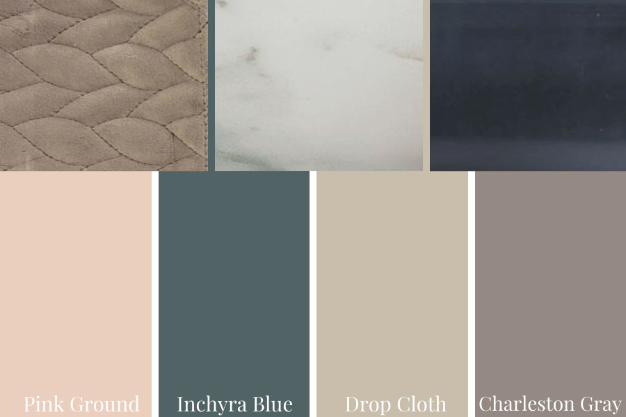
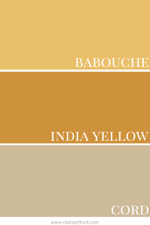
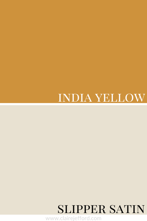
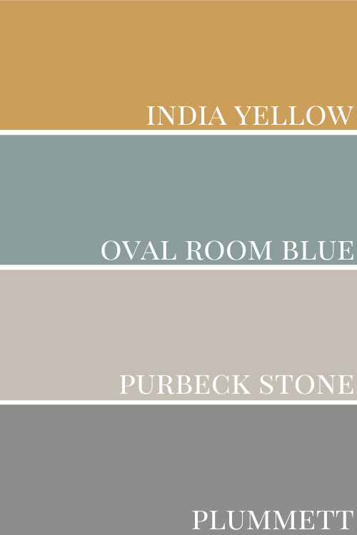
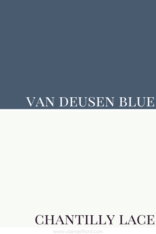
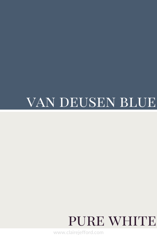
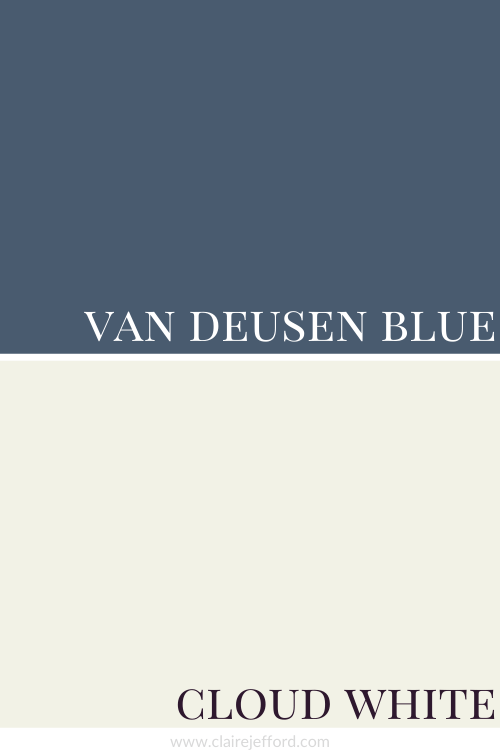
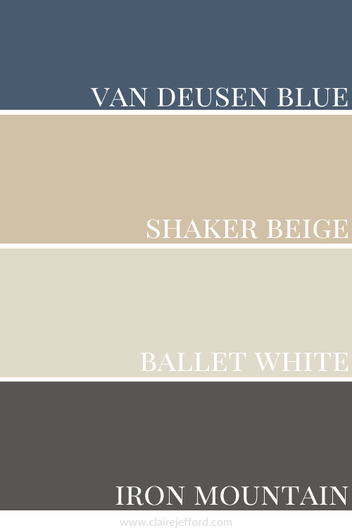
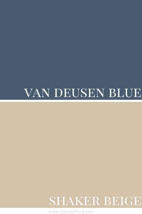
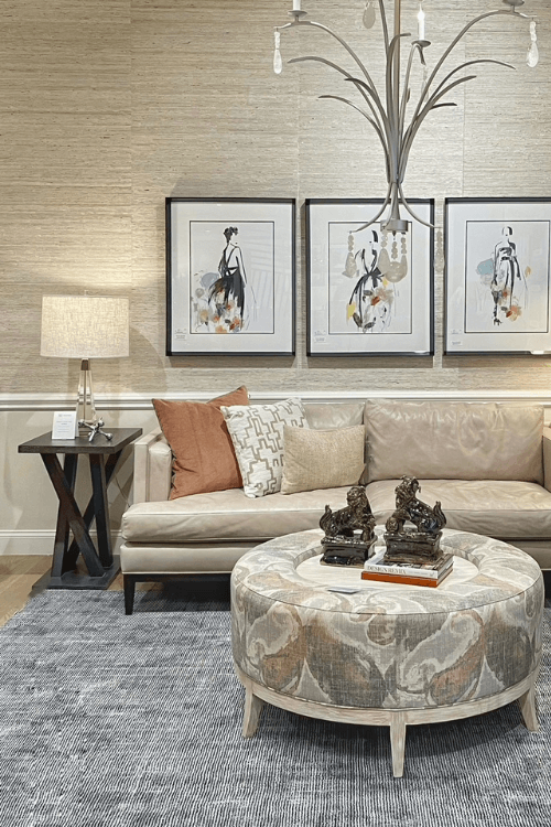
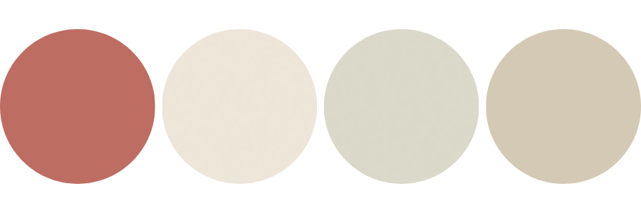
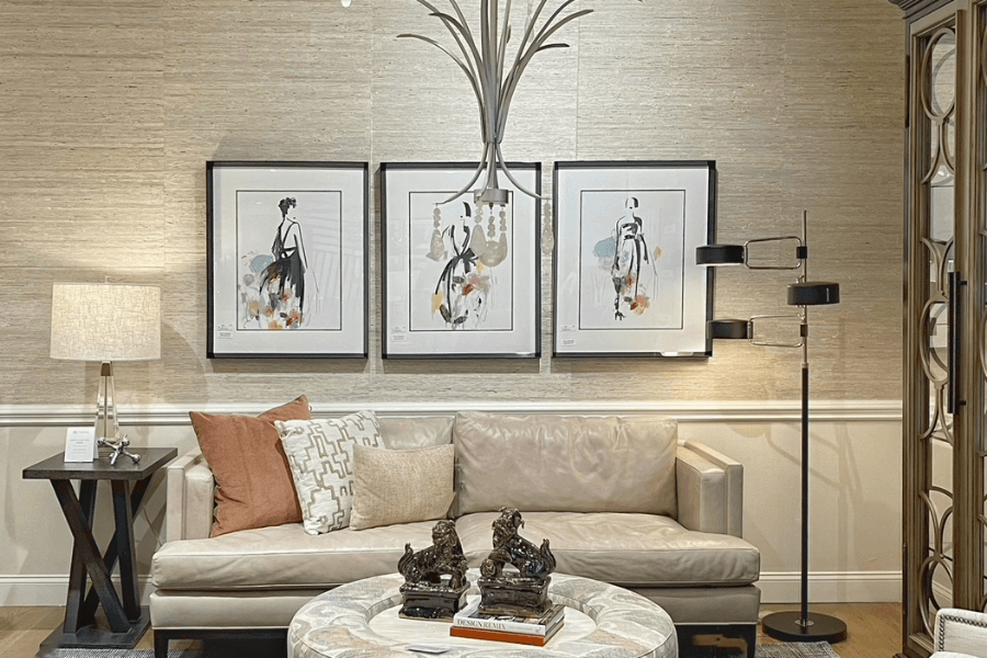
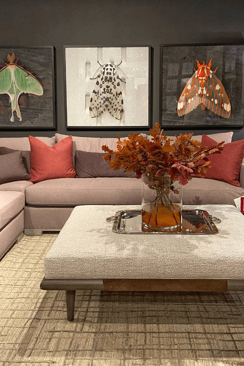
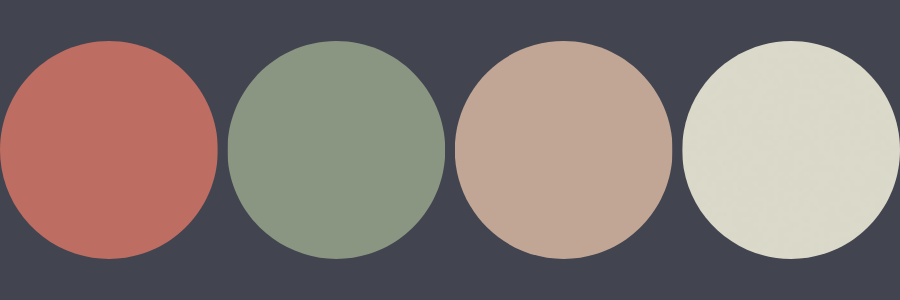
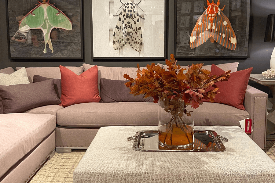
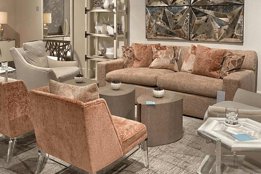
Living Room Colour Palette
In the living room below we see the same colour again, but in this space, it is more muted in the accent pillow on the leather sofa.
Small hints can also be seen in the book on the upholstered ottoman that doubles as a coffee table, as well as in the artwork above the sofa which is layered on top of the backdrop of the neutral grasscloth wallpaper.
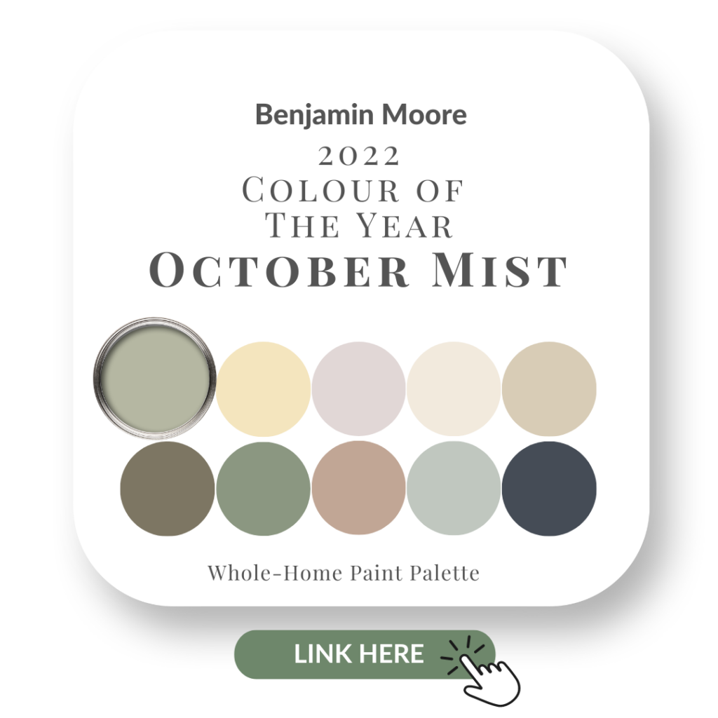
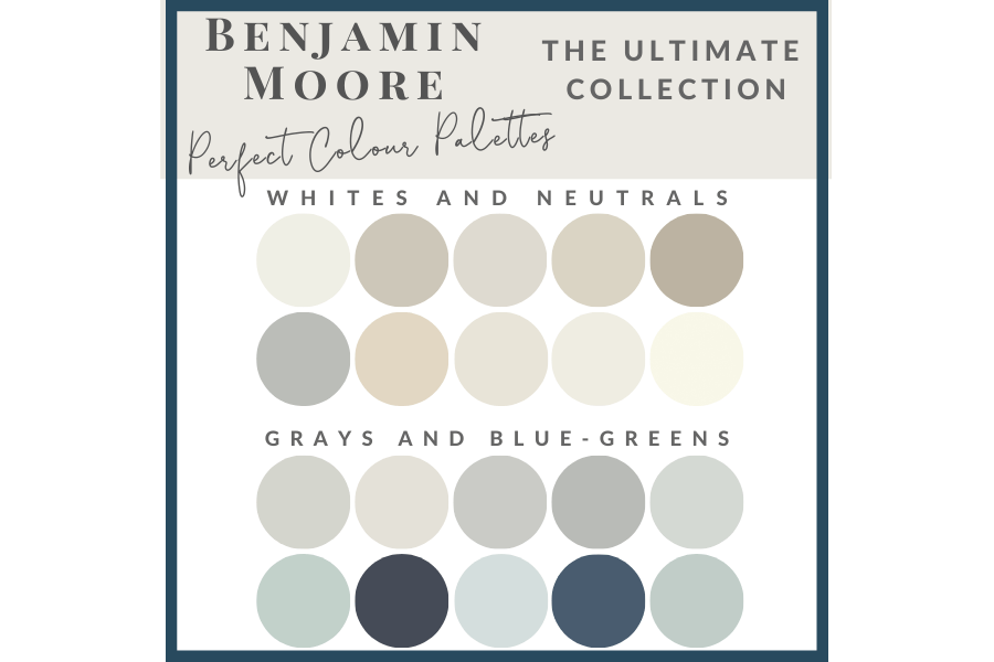
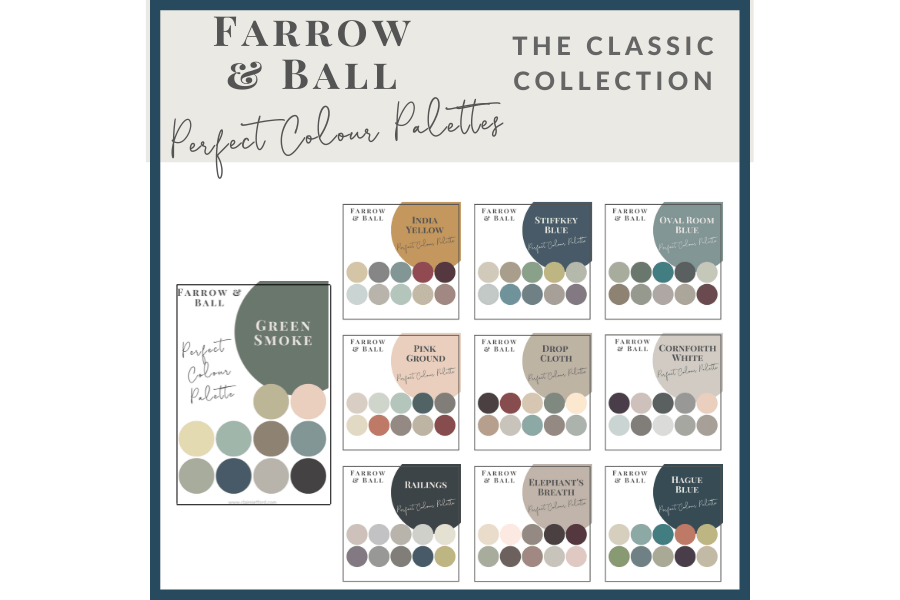
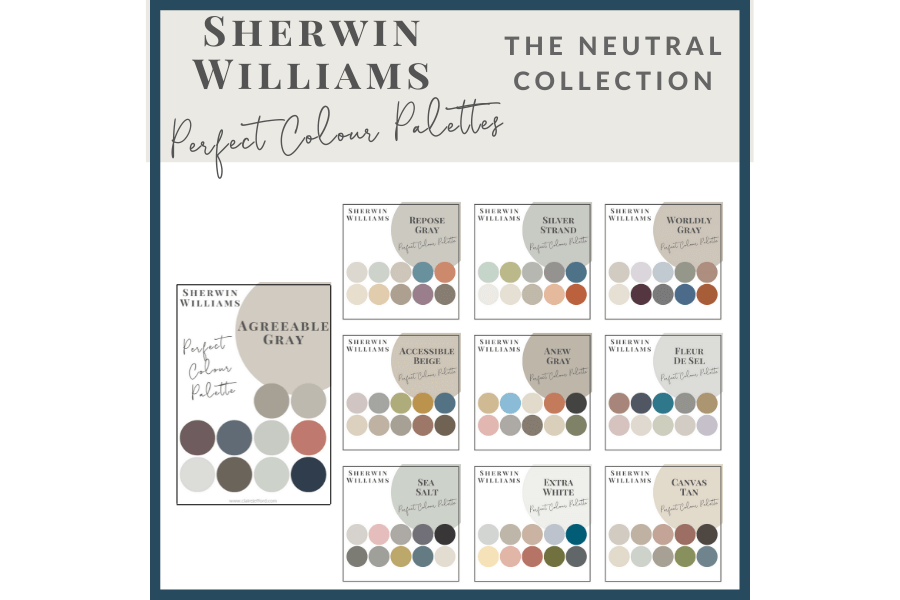
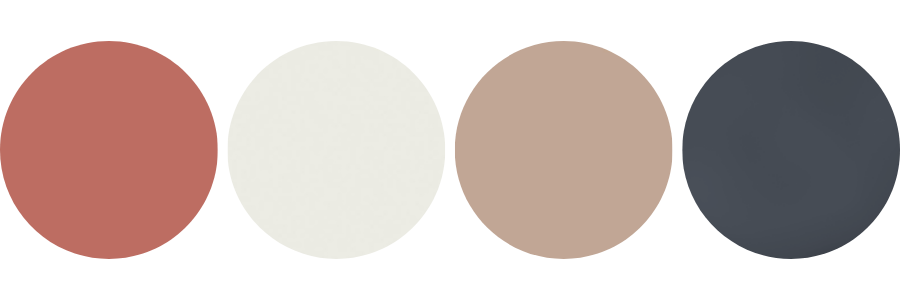
The palette combination I created from this image further below, shows off different Benjamin Moore paint colours.
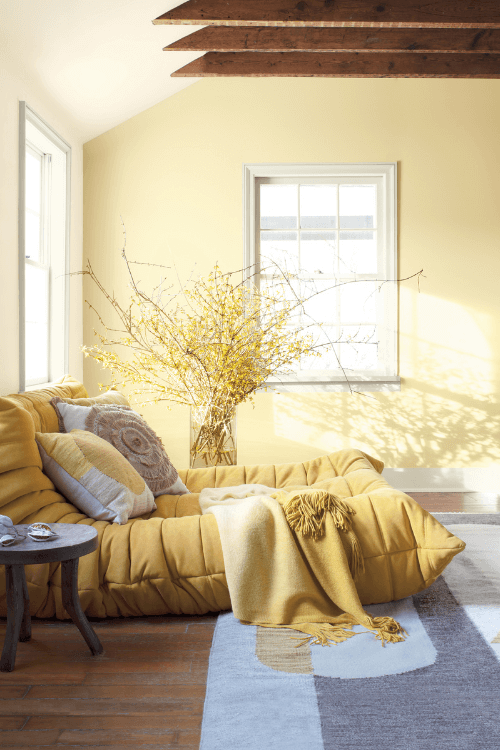
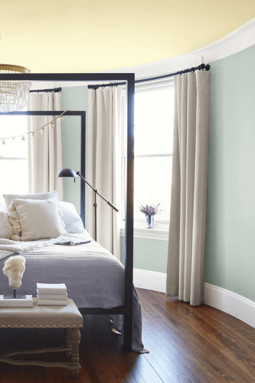
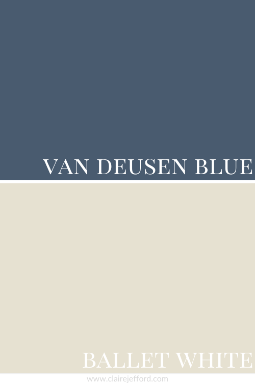
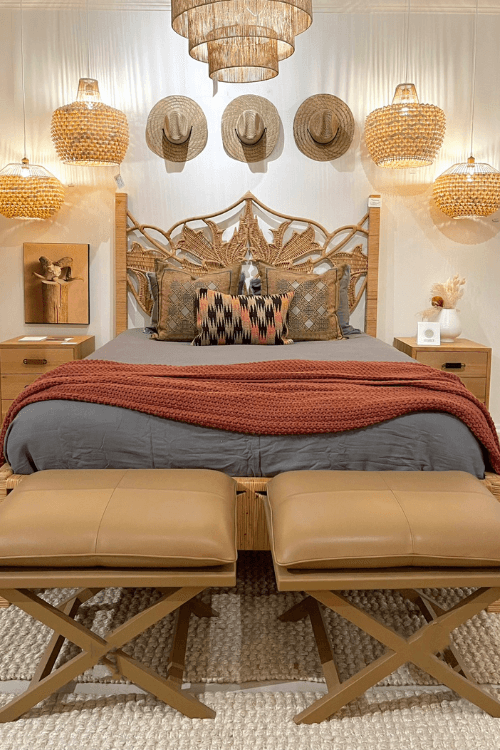
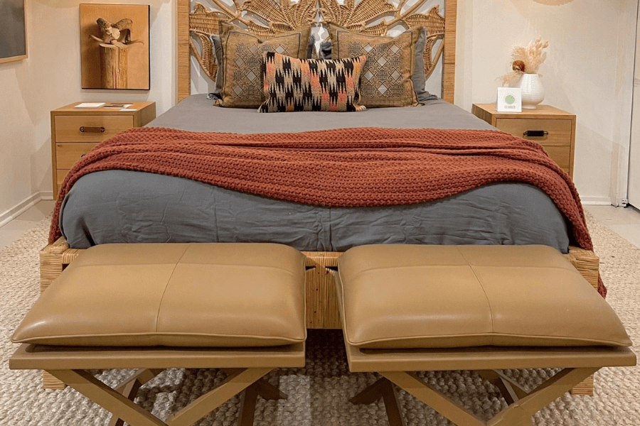
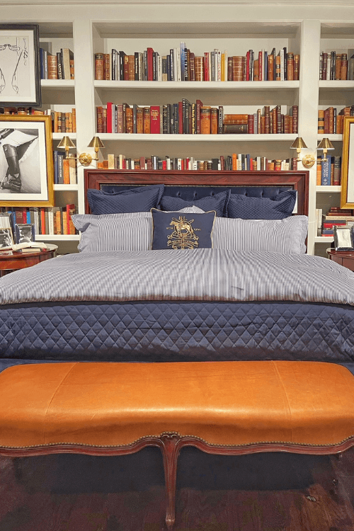
Bedroom Colour Palette
Texture was a big interior design trend at High Point, but really, it always has been in my opinion.
Rattan specifically has made a huge comeback, shown here in this headboard frame.
Similar textures are repeated in the basket light pendants, main ceiling fixture and decorative hats.
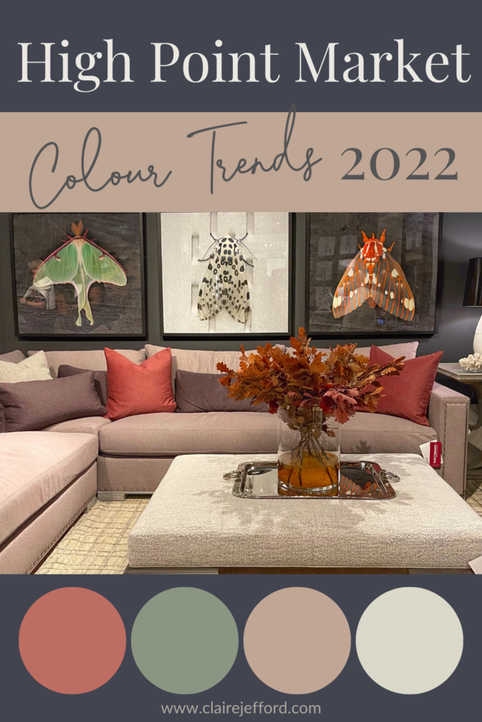
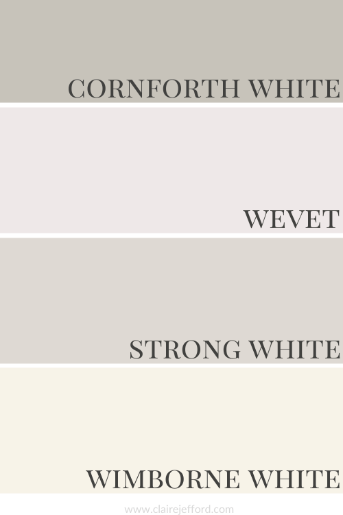
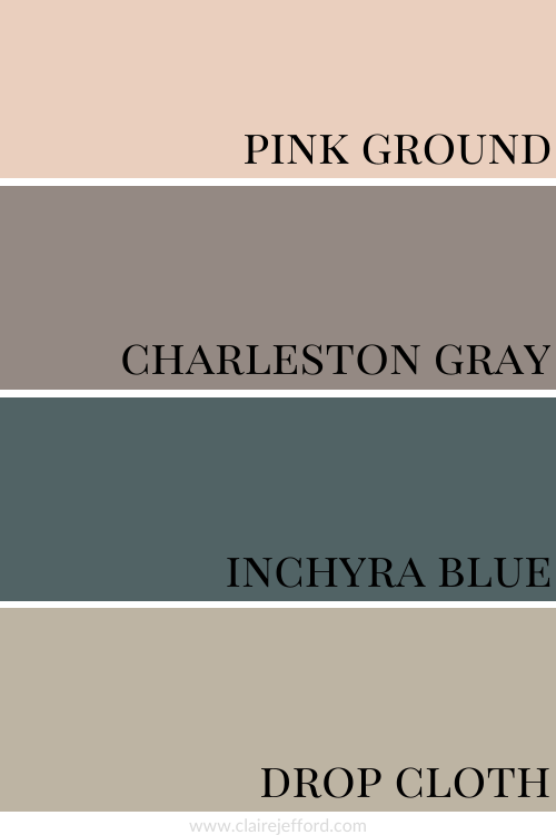
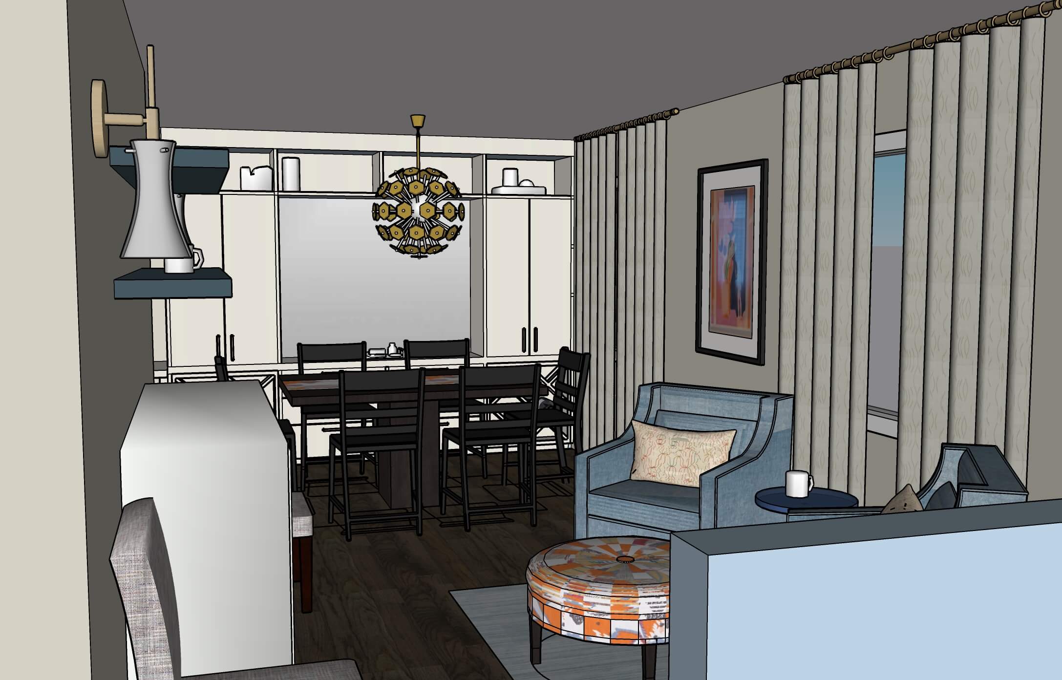
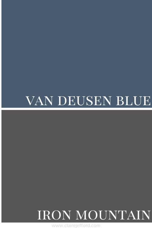
Moody Living Room Colour Palette
I love me some contrast, so this dark gray wall behind the Venetian Portico coloured sofa with accent pillows and florals in the same deep coral tone as Wild Flower, really excites me!
Muted But Still Marvelous!
Blue colour combinations are always on-trend. This blue sofa with the single sofa cushion looks lovely with the coral pillow.
Blue and orange are opposite on the colour wheel, which means that they are complementary colours.
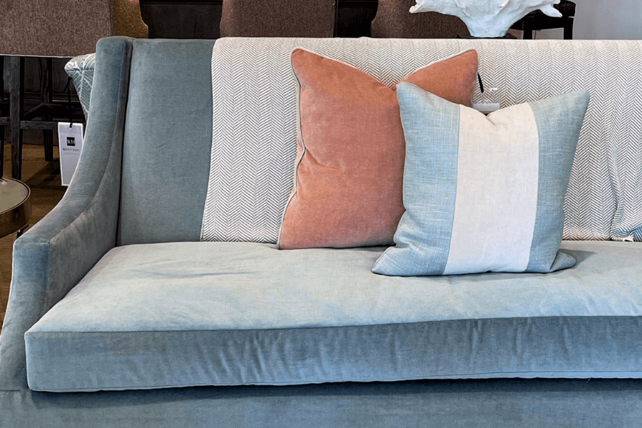
You will see more orange and blue tones worked into interior design vignettes below but in a much different way. Keep reading my friend!
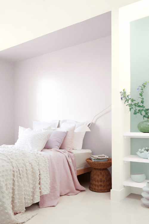
How cute is this ‘moment’ shown here in the bedroom display below?
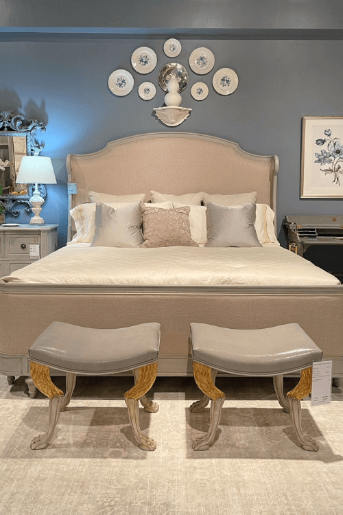
I love seeing the plates used as wall décor, as well as the upholstered curved headboard in a muted blush tone on the backdrop of the blue walls.
Did you notice the animal legs on the 2 small bench seats at the foot of the bed? Very whimsical!
Love It Or Leave It?
This room reminds me of my Grandma’s apartment when I was younger.
The peachy tones and furniture style seem dated to me. I’m not a fan of this particular setting nor the monochromatic look, it feels uninspiring.
What do you think?
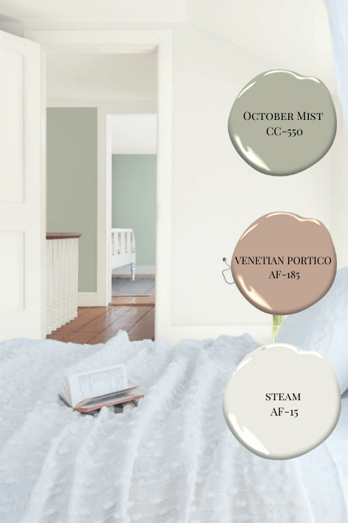
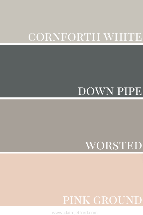
Navy Blue and Cognac
A more traditional interior design style can be seen below in this bedroom vignette.
The book covers repeat the cognac and blue tones of the furnishings shown in the foreground which is essential for creating continuity and flow in a space.
This is also a very classic colour combination that never goes out of style when done correctly.
Take a look at the next image where this same palette can be seen in a more modern style of design.
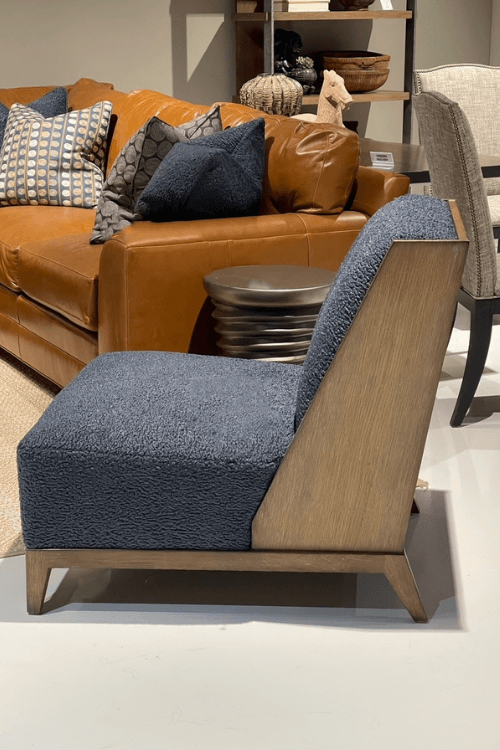
Psst! Insiders Tip: The woolly-looking fabric on this chair with the wooden frame is called boucle.
It was such a HUGE trend at High Point Market this fall that the hashtag #boucleallday was apparently derived from this year’s event.
You’ll see more of this boucle on white sofas in more neutral living room settings a little later in the post.
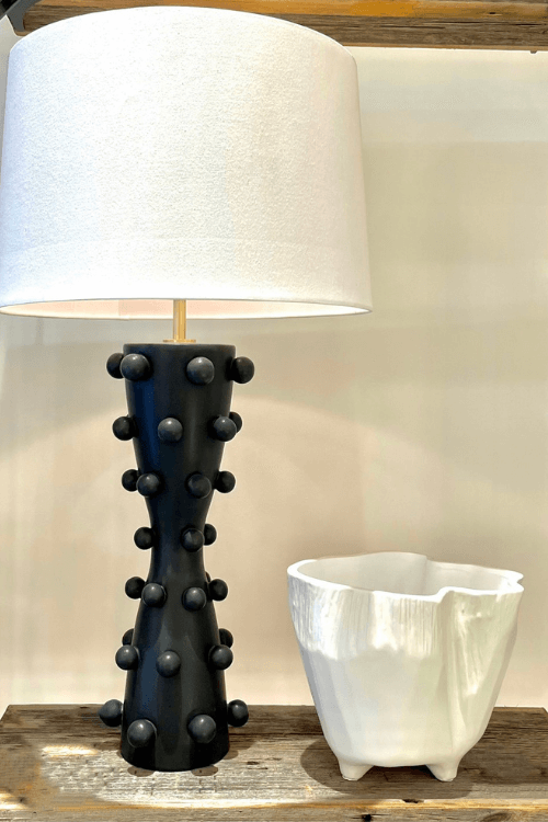
How cute is that lamp base? There’s that texture again.
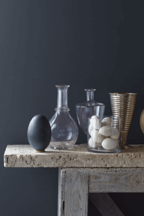
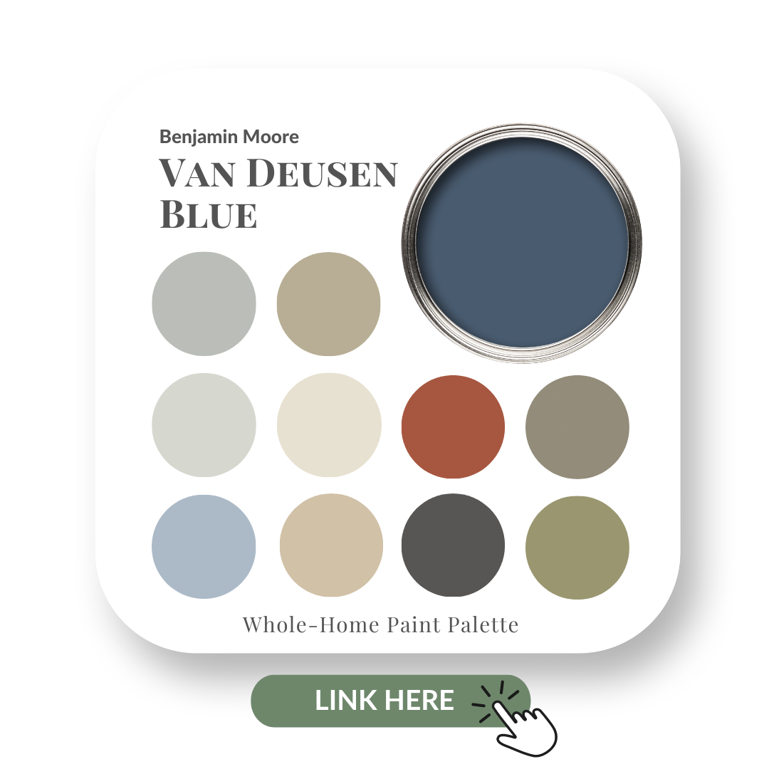
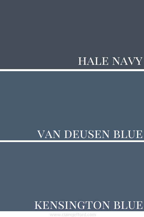
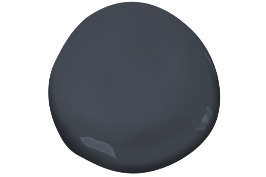
These darker blues are all reminiscent of the only blue included in Benjamin Moore’s 2022 Colour Trends, Mysterious.
Mysterious is quite a bit darker and moodier than my favourite navy paint colour, Hale Navy.
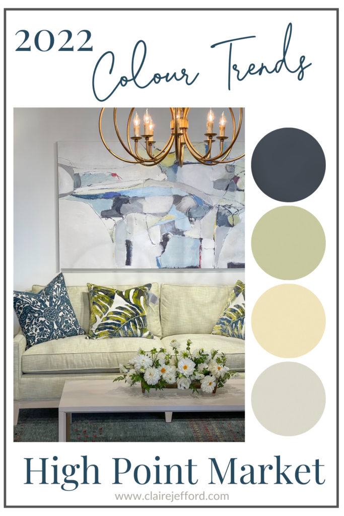
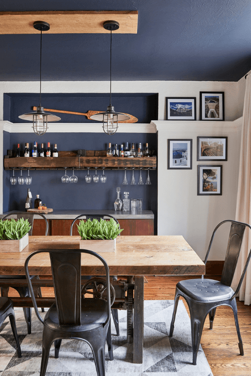
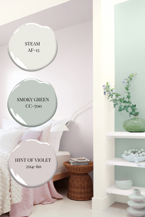
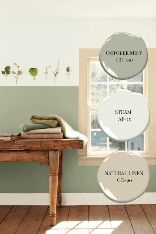
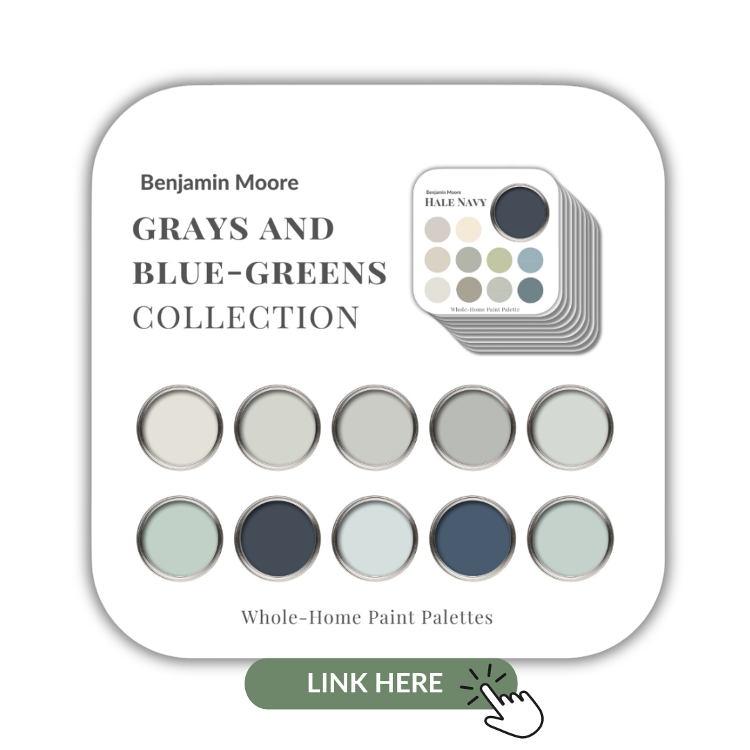
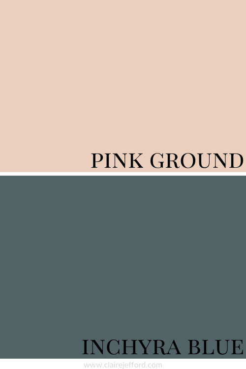
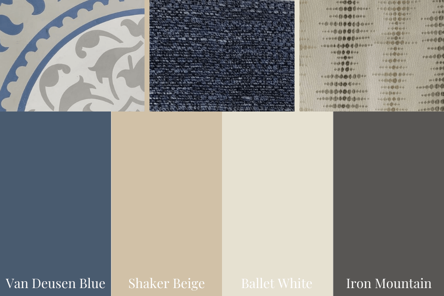
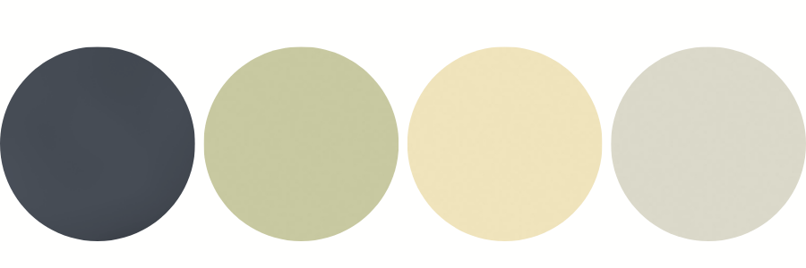
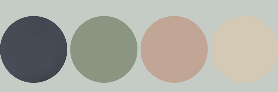
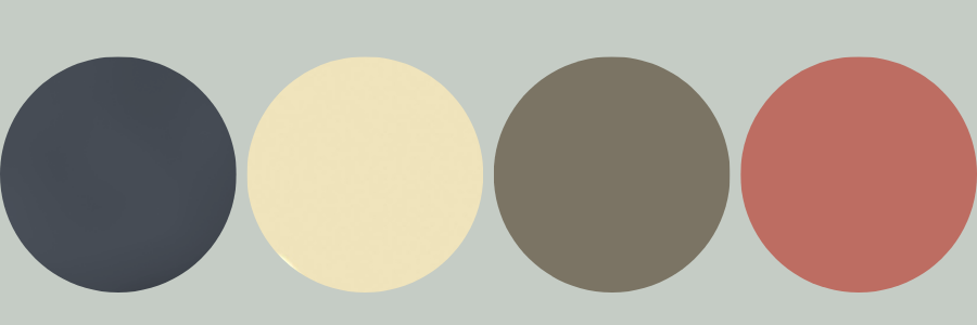
Blue and Green Colour Palettes
The combination of blues and greens never goes out of style.
But boy, these tones sure can vary which makes them super fun for creating different colour palettes as inspiration for any room in your home.
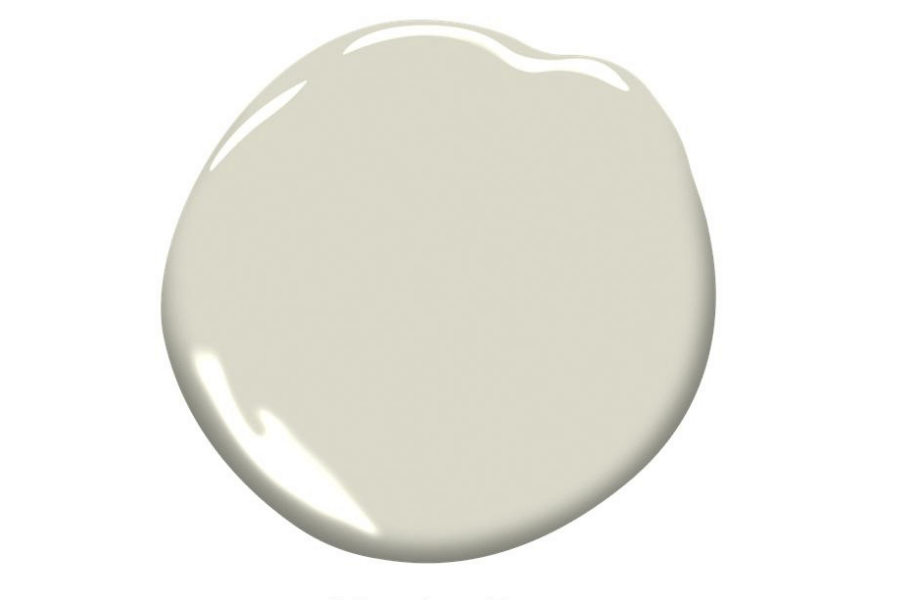
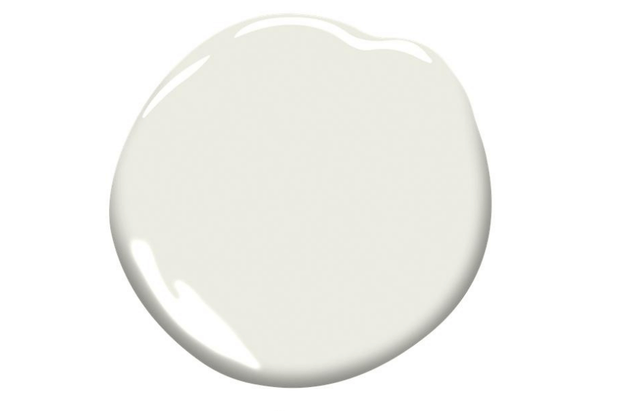
Below you can see the perfect colour palette I created from this vignette which takes on a slightly ‘cooler’ vibe with the backdrop that I would say is similar to Oxford White by Benjamin Moore.
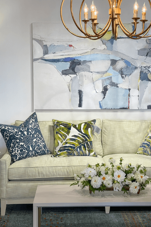
Oxford White has a blue undertone and we specified that colour for cabinetry in this client’s kitchen.
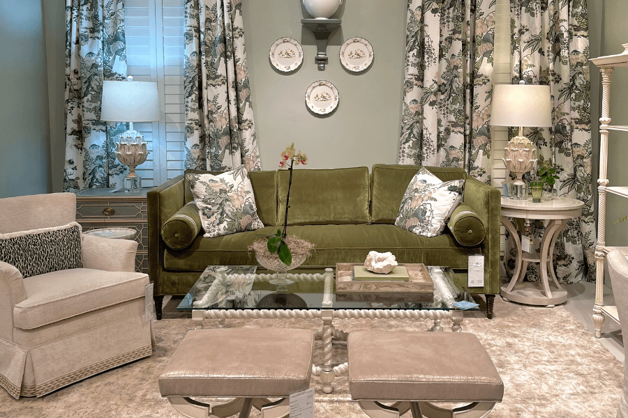
A dark green sage sofa is shown here below with a single bench seat and sweet little round bolster cushions to match at each end.
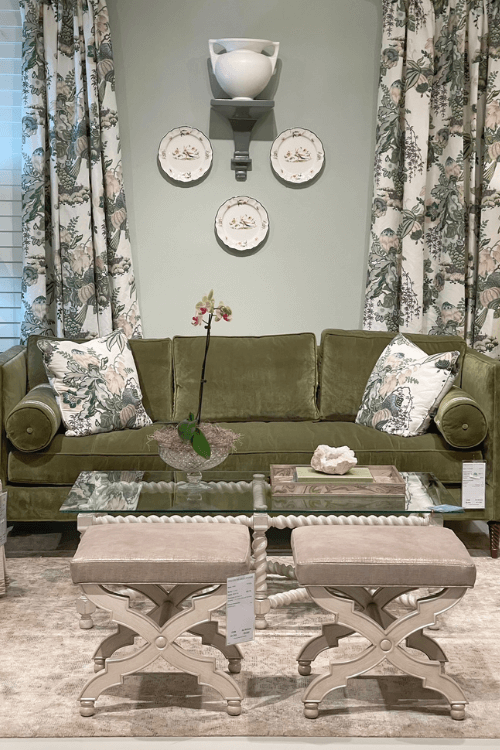
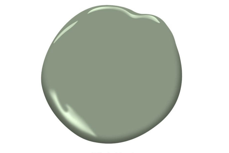
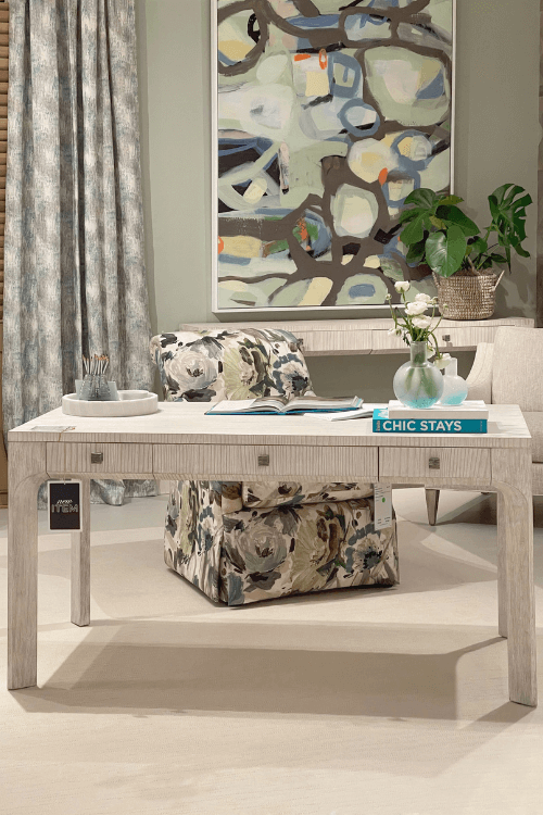
Again with a backdrop similar to Quiet Moments / Smoky Green, this office set up shown below brings colour in via the playful artwork and exquisite fabrics.
If you love blue and green colour combinations, check out this Toronto project and one of our Oakville projects here where you’ll see two very different décor styles for living and dining rooms we designed.
Both are bold and beautiful – at least, we think so!
Neutral Curves
If all of those vignettes and colour palettes are too colourful for you, maybe these showroom images will be more your taste. These show a lot of neutral tones that include grays and white colours.
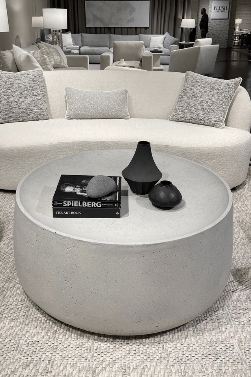
Here is an off-white sofa (there’s the boucle again) and a round gray, cement-looking coffee table with black accents on top.
Similar to the setup above, this showroom features a more elegant look that includes round marble top coffee tables with brass accents.
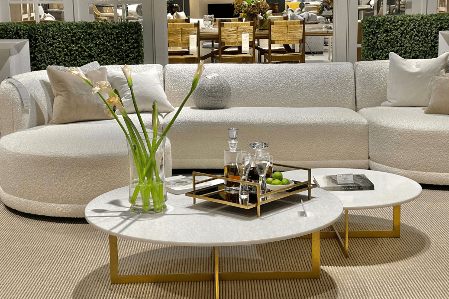
Did you notice the boucle AGAIN?!
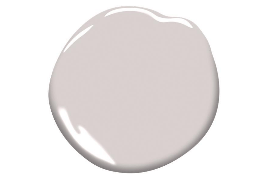
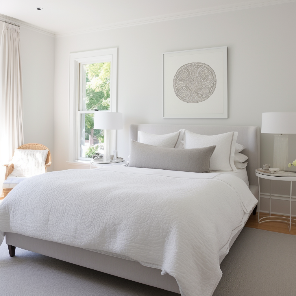
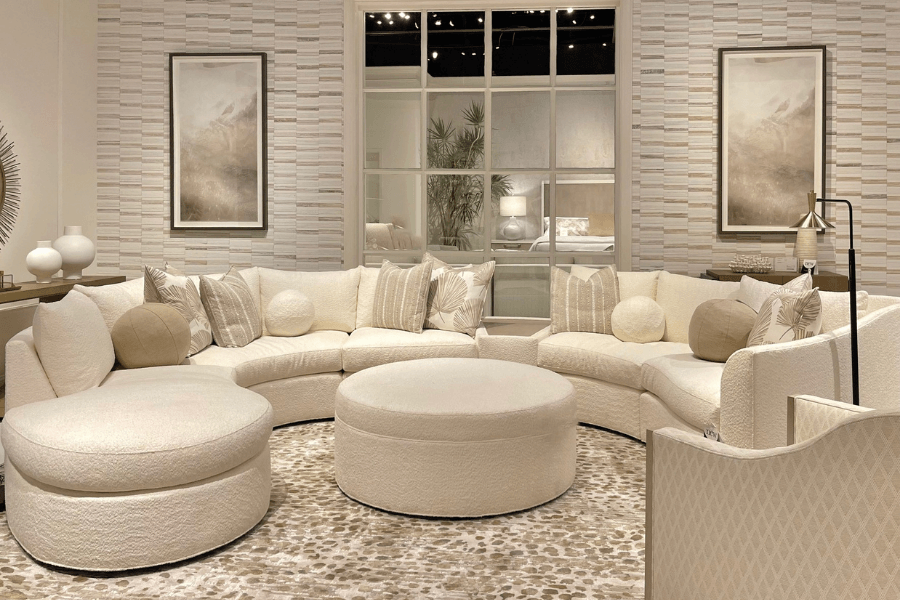
In the photo below we see another monochromatic display that reminds me of the popular light taupe paint colour Pale Oak.
Oh AND DID YOU NOTICE THE BOUCLE AGAIN??!!
Just For Fun
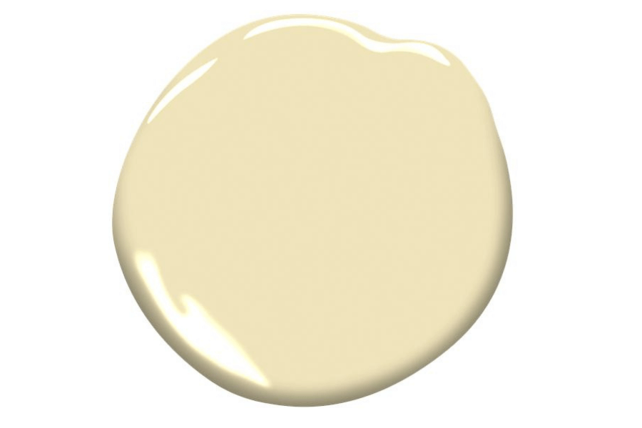
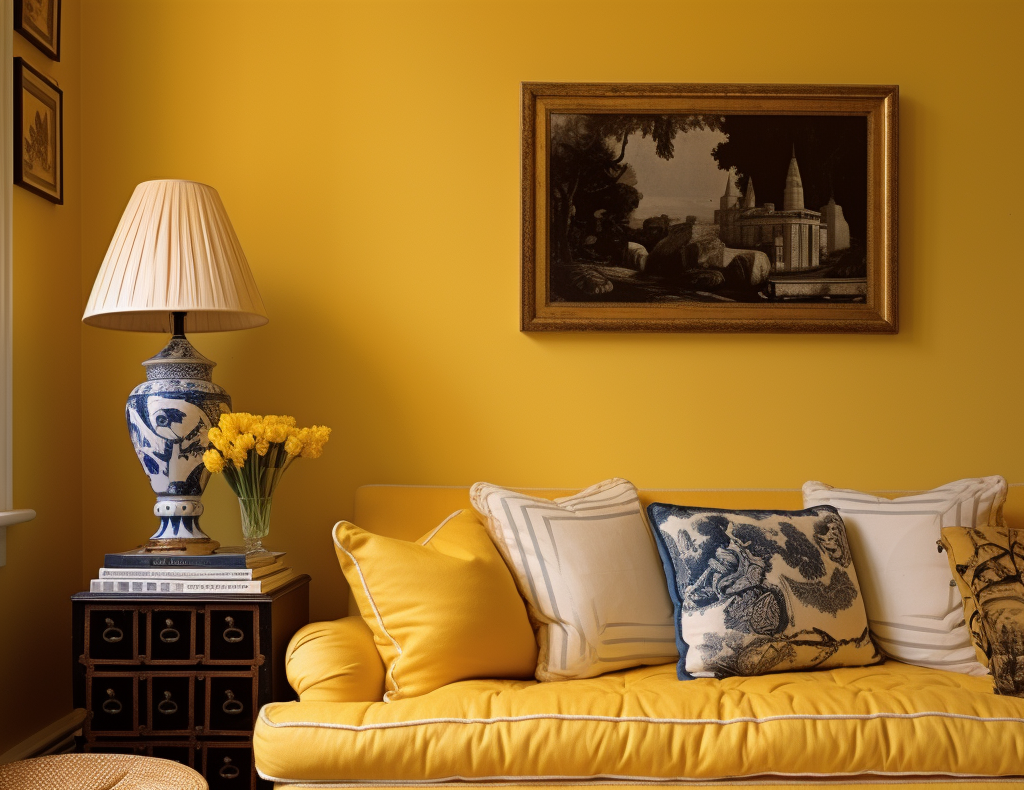
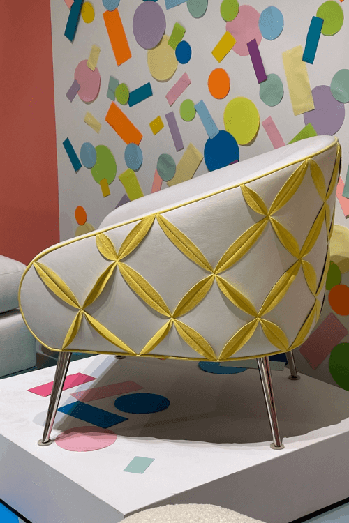
Let’s end on a colourful note that I hope makes you happy.
Even if you don’t like this chair or the bright yellow, hopefully, it will make you smile!
Which colour combinations do you like best?
Blues and greens?
The ones with the hit of the trending orange tone of Wild Flower?
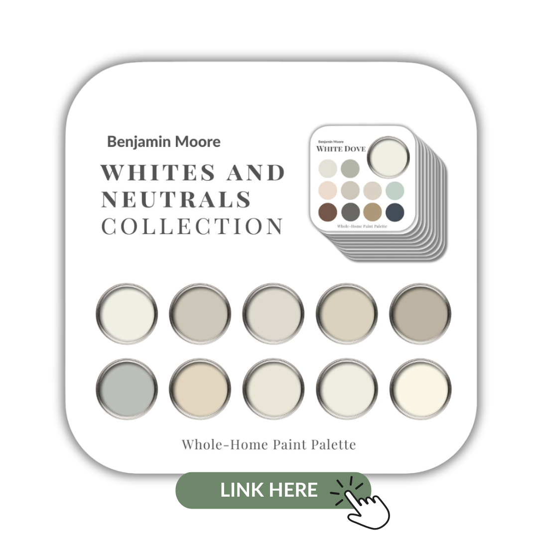
Or, maybe you like your home less ‘wild’ and more neutral with the whites, creams and beiges?
Take my Quiz and find your perfect colour palette with décor inspiration for your next interior design or decorating project.

Cheers again to my friend and fellow designer Linda Holt of Linda Holt Creative who was kind enough to share her best pictures from High Point Market.
I truly appreciate you, my friend!
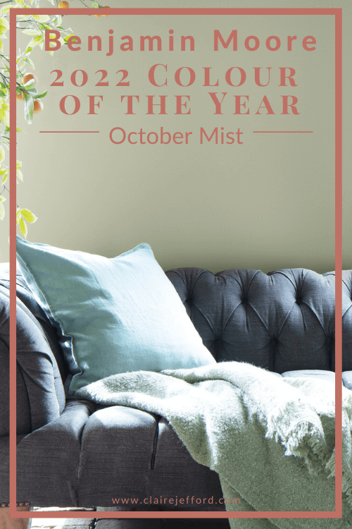
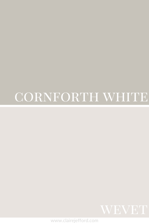
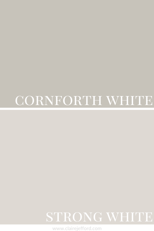
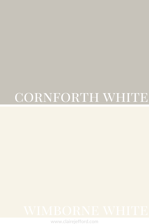
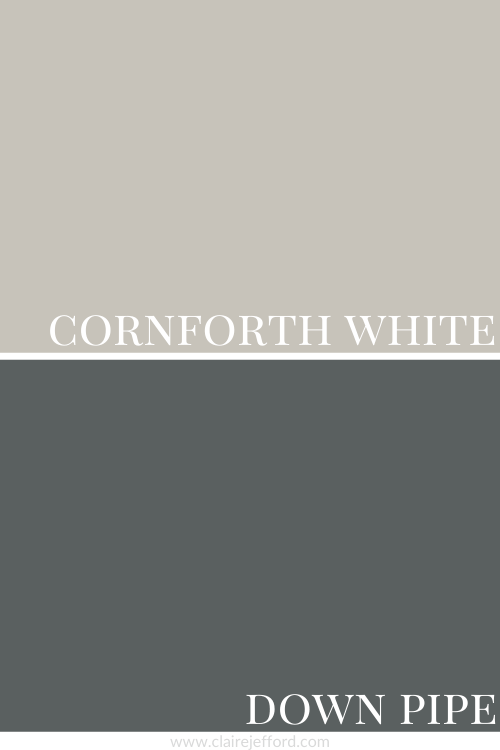
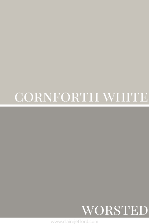
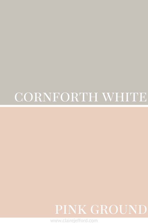
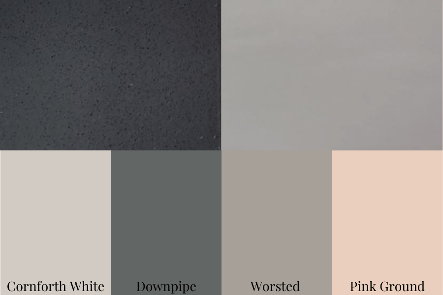
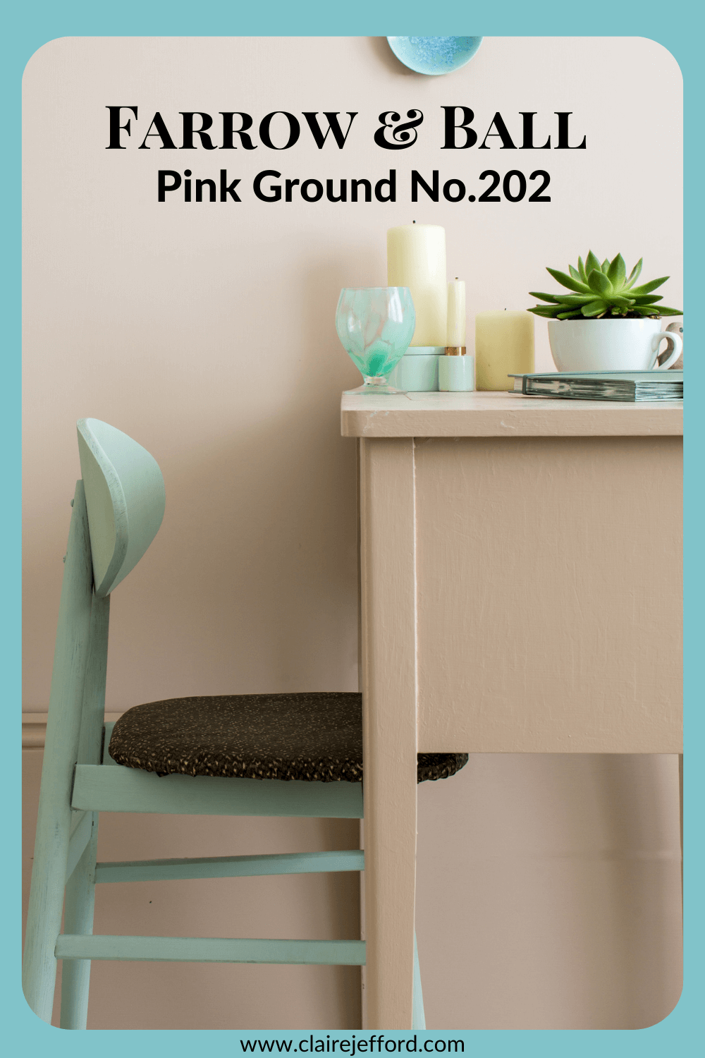
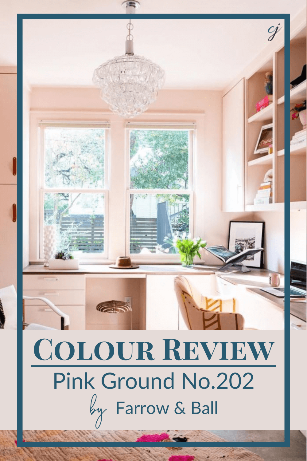
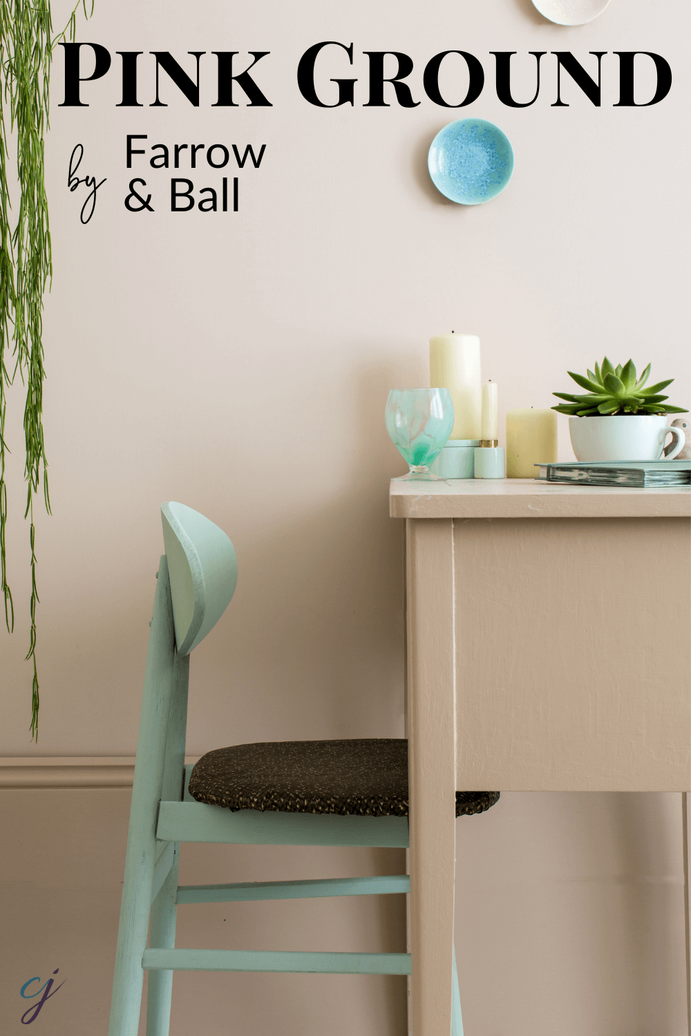
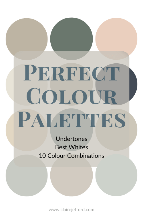
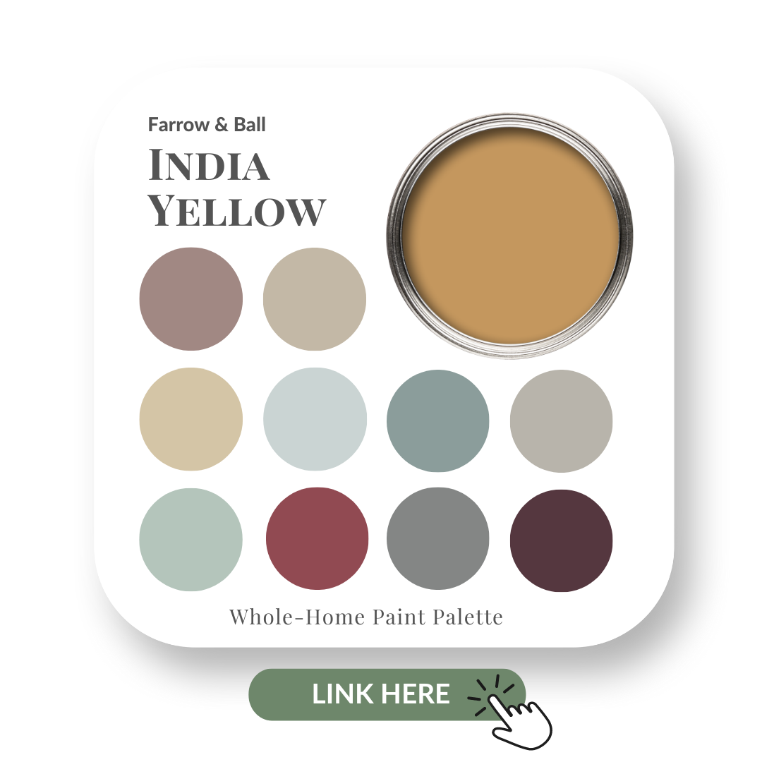
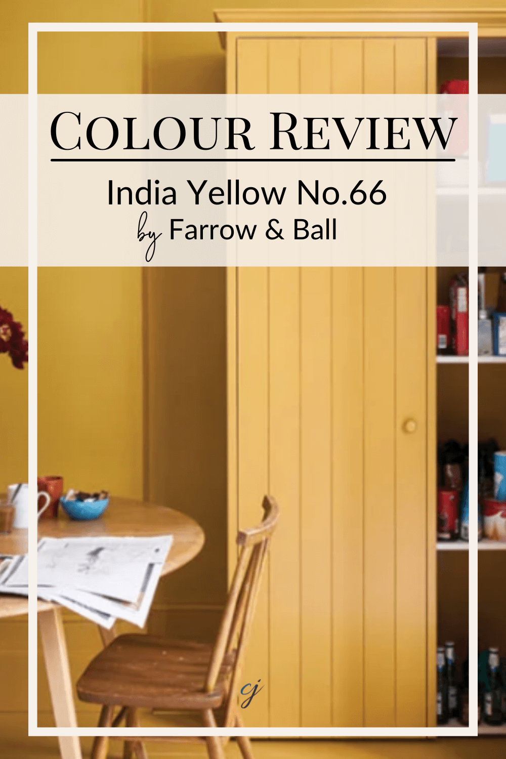
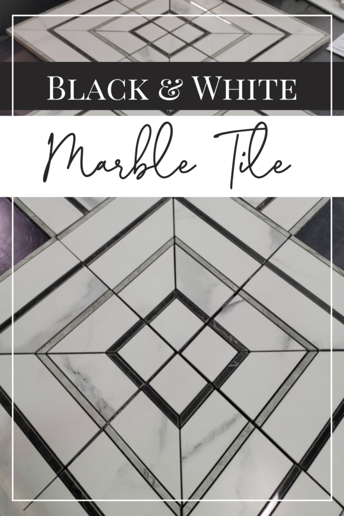
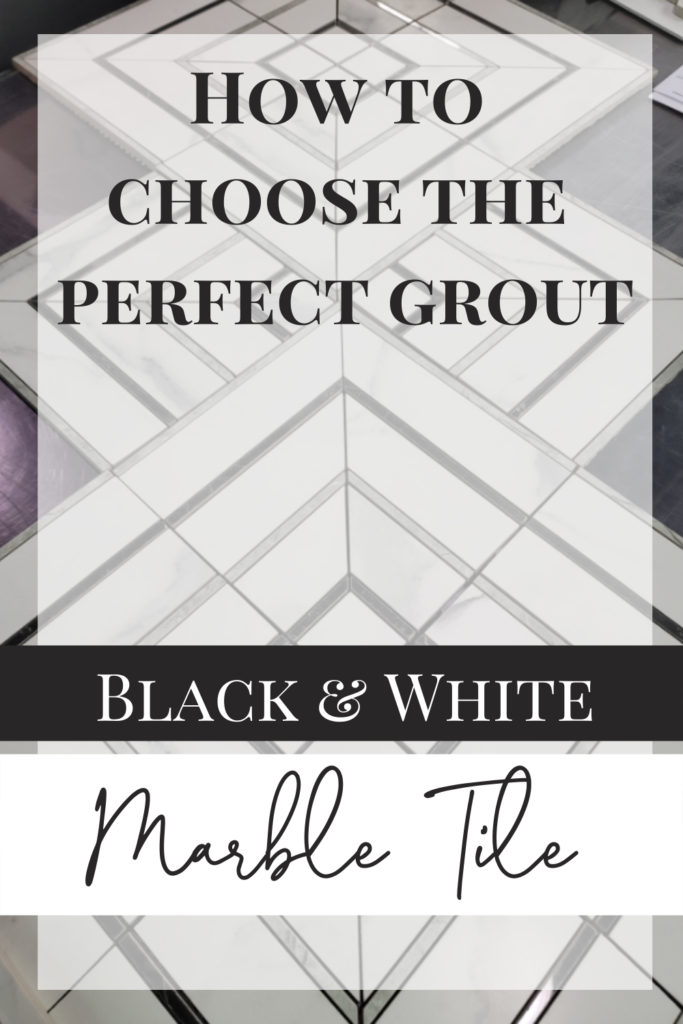
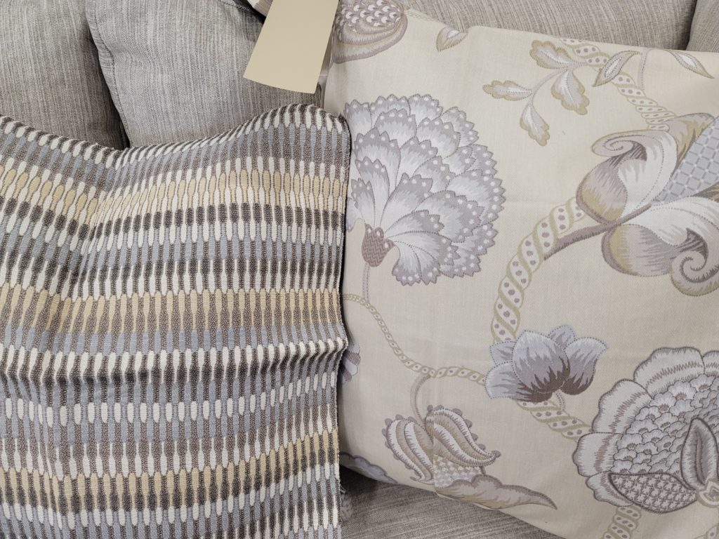
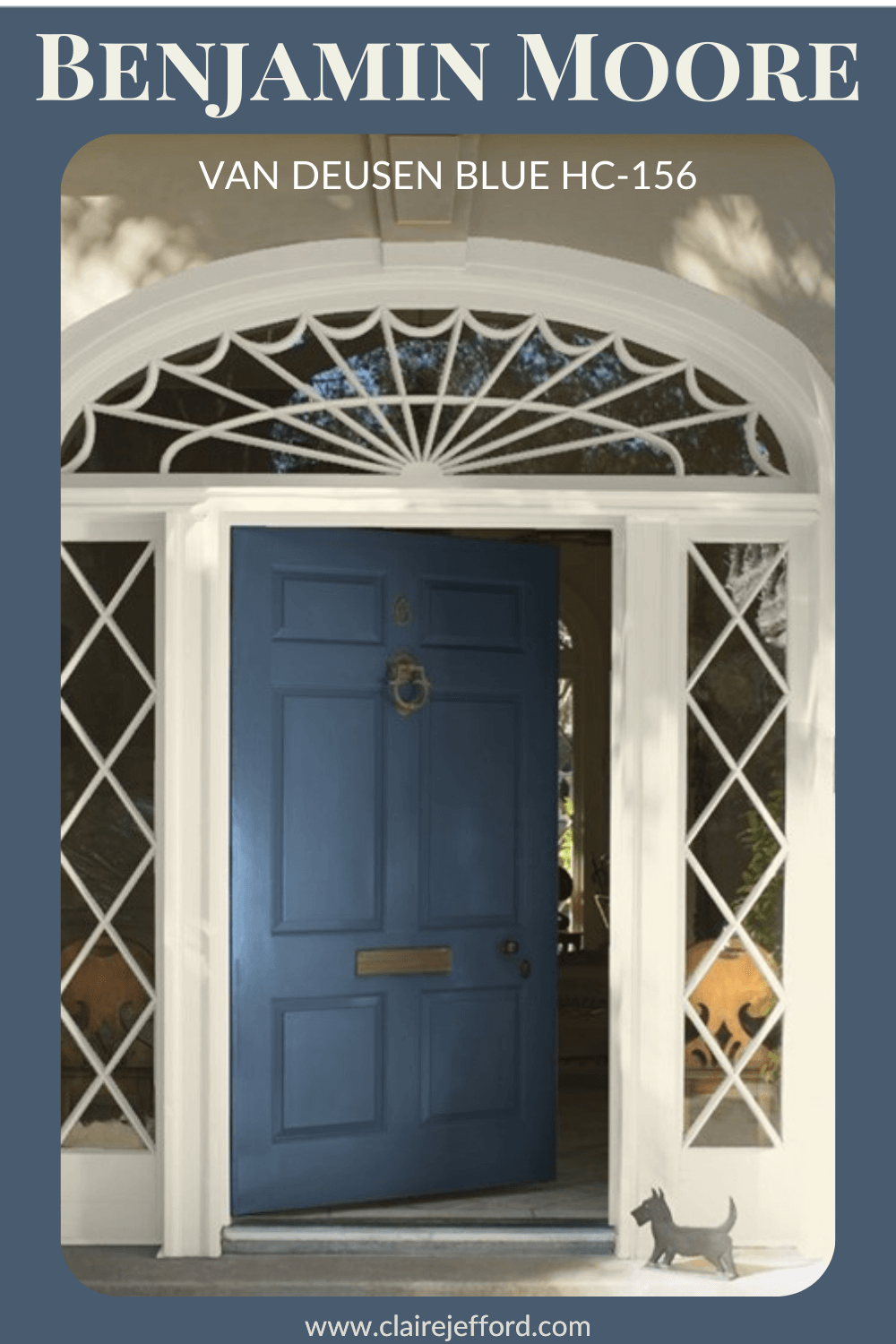
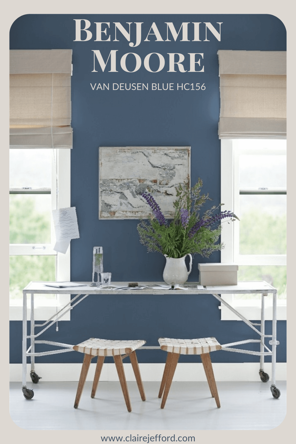
Perfect for Pinning!
Pin these graphics to your Pinterest Boards for easy reference when you want to see this post for future interior decorating inspiration!