How To Create a Gallery Wall In Your Home
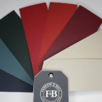
Choose the right paint colour
the first time Let me show you how in just 5 easy steps!
BONUS: The Top 15 Shades of Gray by Benjamin Moore

Wall gallery displays in Interior Decor have become a popular way to dress up the walls in your home. To ensure you get this focal wall just right, I’m sharing a few guidelines with you that I like to follow.
You want to make sure that your hard efforts of creating a gallery wall in your own home will pay off to give you your desired look, especially before putting holes in that wall!
You’ll also see:
- My rules to follow for creating a gallery wall in your home
- What to consider when choosing your wall art and your frames
- How I created a simple (& inexpensive!) gallery wall as a focal point in my own home
- A foyer & dining room of two different client projects using their photos to personalize the space
- 3D renderings to allow clients to visualize my ideas for these accent walls within their home
Are you ready? LET’S DO THIS!
PLANNING:
If you know me, you know I like to plan, so this is very important.
My rule is that there should be at least one commonality throughout the entire gallery wall, one element tying it all together. The first thing you need to do is:
PICK A THEME
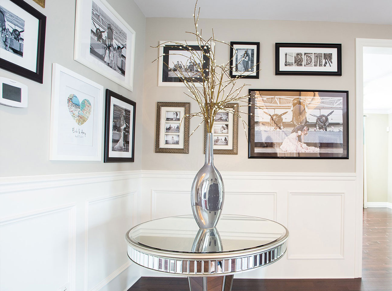
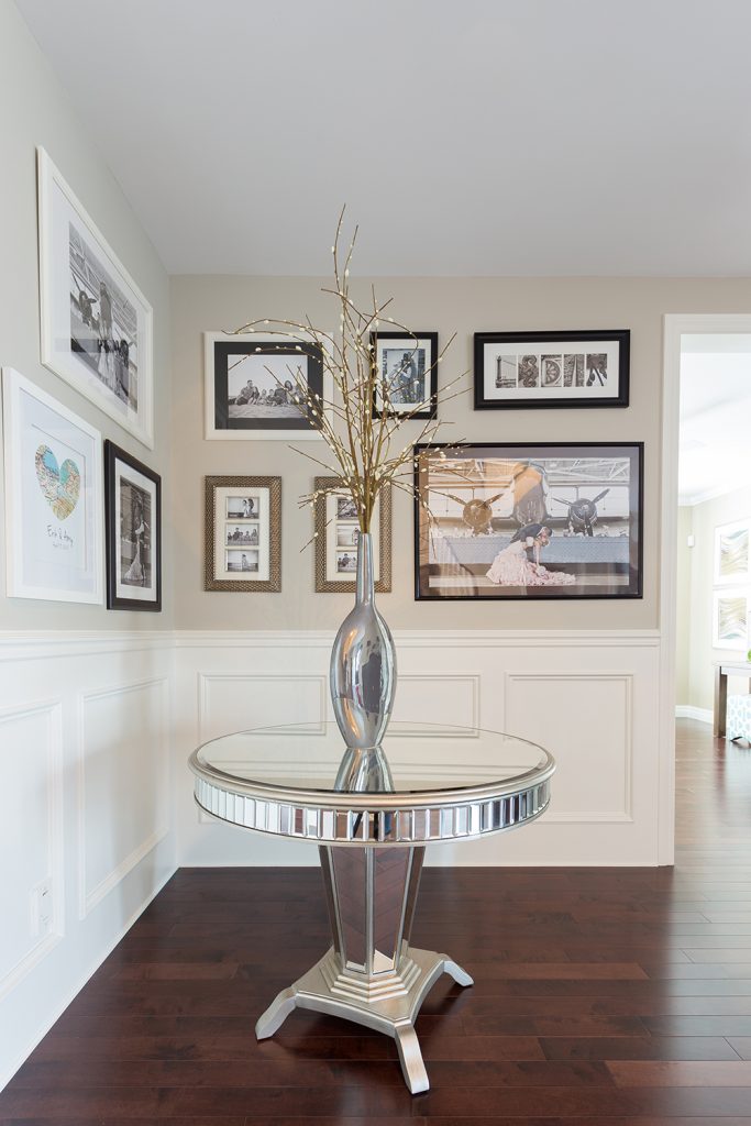
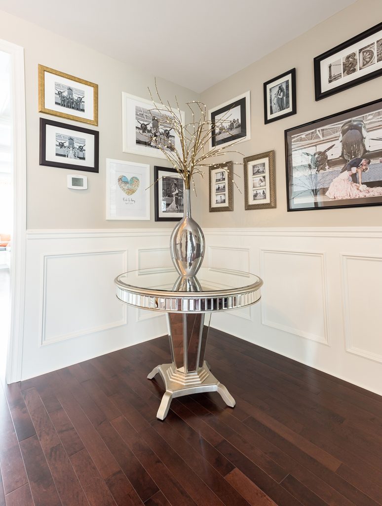
For my client’s front entryway (below) in their home in Hamilton, Ontario, we decided to go with the theme of family photos. We wanted to convey through the images in the gallery, that was is tight knit family with a home full of love and fun! The framed images were from their wedding and trips that they had taken together over the years.
Similar Frames or Mat Colours
In my own living room in Burlington Ontario, I have a feature wall with IKEA frames that are all the same medium toned wood colour. I also made my own border within the mats to frame each photograph. To keep continuity and flow, I chose to paint them the same as the wall colour, Flint by Benjamin Moore.
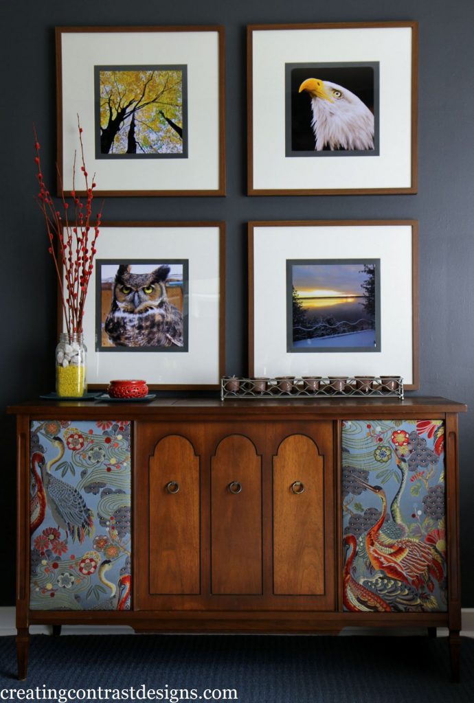
Shown below is a wall design that I did in my own basement many years ago. All the mat colours are the same, but you can see that I decided to go with different frames, different in both style and in size.
Take Your Measurements
Now wait. Don’t put your hammer to the nails just yet!
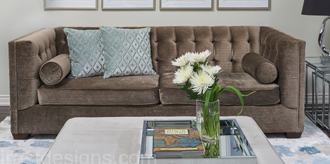
Before you put a hole in the wall, you’ll need to measure the wall space where your wall art will live. Let’s say it’s going above your sofa. You typically don’t want to exceed the width of the sofa. Also, be sure to place the bottom of the frames within 6″ – 12″ above the top of the sofa.
As with anything, there are some exceptions to this rule. However, for the purpose of this post, let’s stick to that way of thinking.
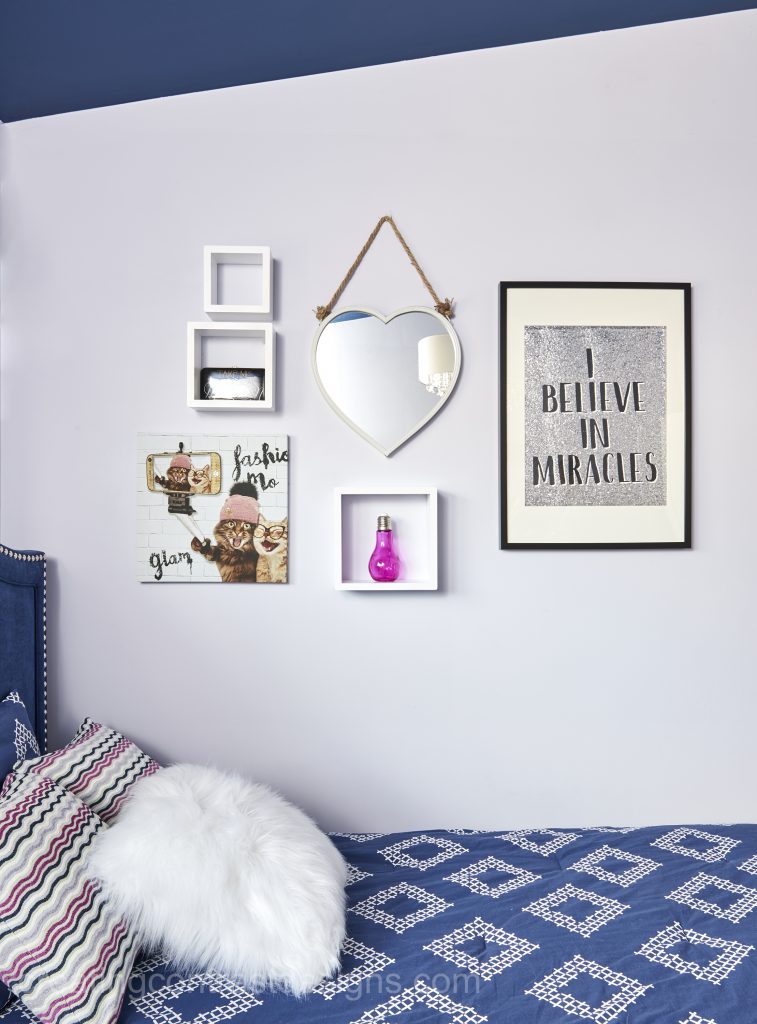
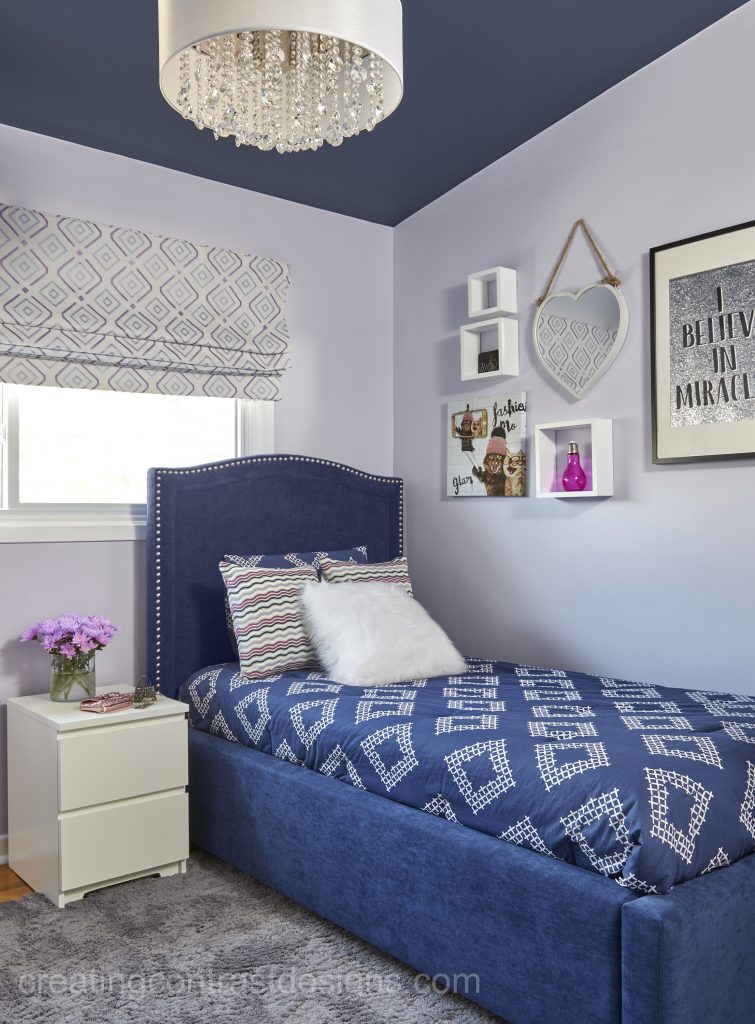
Below in my daughter Elise’s room. Notice how the items on the wall do not extend past her bed?
To measure it all out, I do one of two things:
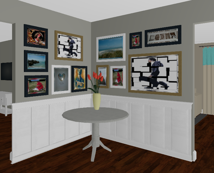
I either use my 3D program and map it all out like you can see in the rendering below. This way I can show clients exactly how I intend to set up their gallery wall display and get my client’s approval for the layout.
The other option is to map it all out on the floor. Use a measuring tape and play around with the arrangement by moving your decorative pieces around until you get the look you want.
Tip: Take photos of proposed layouts before adjusting items to try another look. This way you don’t need to worry about remembering each possibility! (Hey, we aren’t getting any younger, right?!)
I like to start by placing the biggest piece first, unless all the photos are the same size.
You’ll also want to consider if you (or your client) is someone who likes things to be symmetrical or if you are a bit more ‘loosey goosey’ and like the quirkiness of an asymmetrical design.
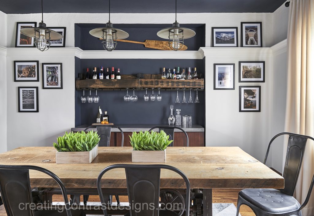
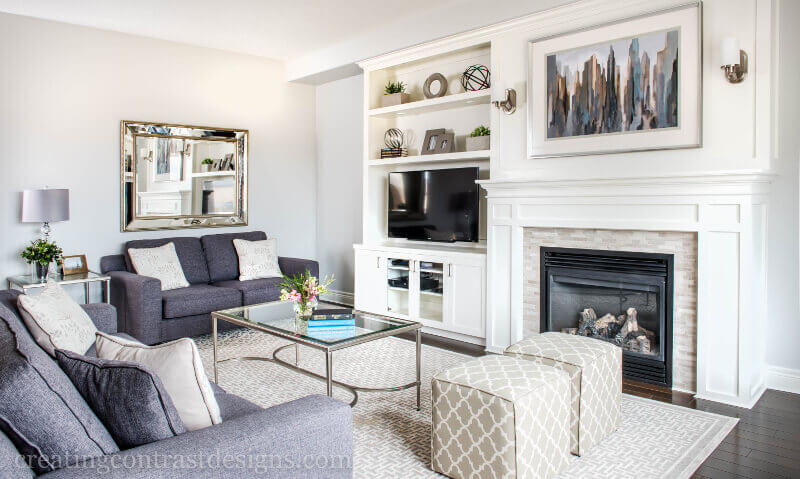
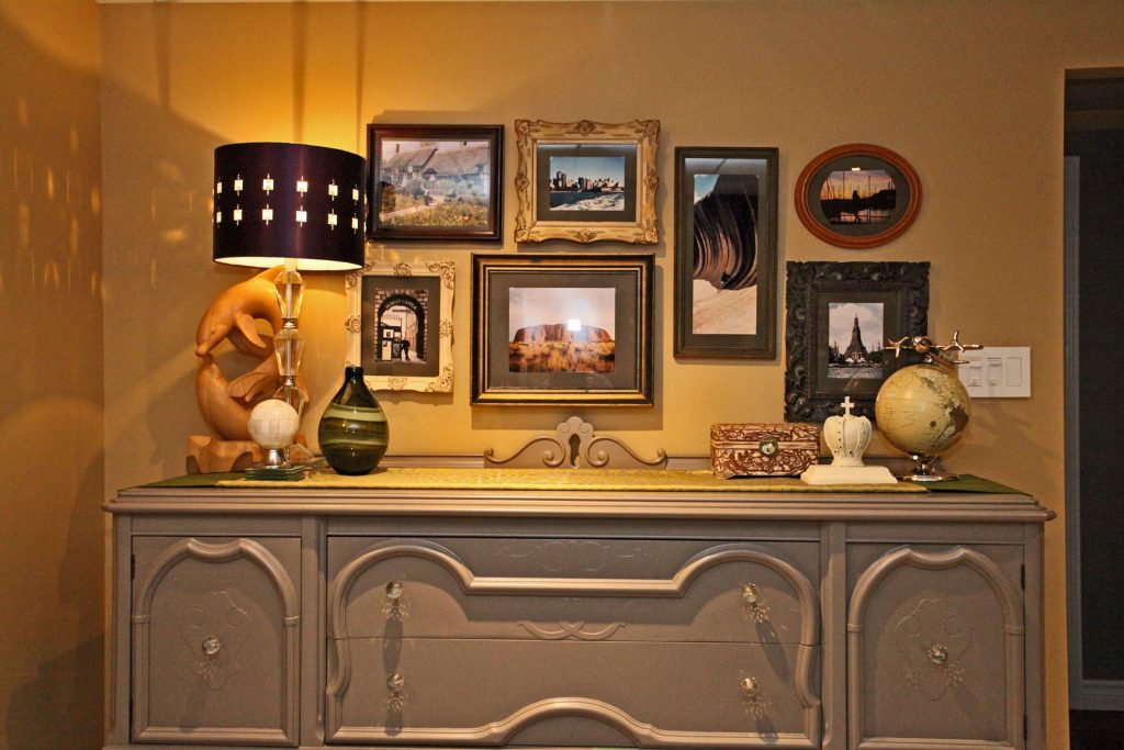
Keep each piece of wall art close enough together so they’re relating to one another. At the same time, allow for some breathing space so each item can be appreciated when looking at the final design, just as we did above in our clients very cool dining room.
What I love about so many gallery walls, is not only are they a great way to display artwork, but these feature walls are a great opportunity to make your space more personal. That’s really what great interior design for a home is all about.
Just like my tagline states, “Love where you live, live a better life.”
When you surround yourself with personal and sentimental items, that’s when you really make your house, a home.
Plus, you’re going to be excited to show off your beautifully decorated home with those who mean the most to you. A win-win for sure!
If you want help designing a gallery wall, I’d be happy to help. Contact me here.
Now it’s your turn to share your tips with us. Comment below to let us know if you have a Gallery Wall of Art in your home.