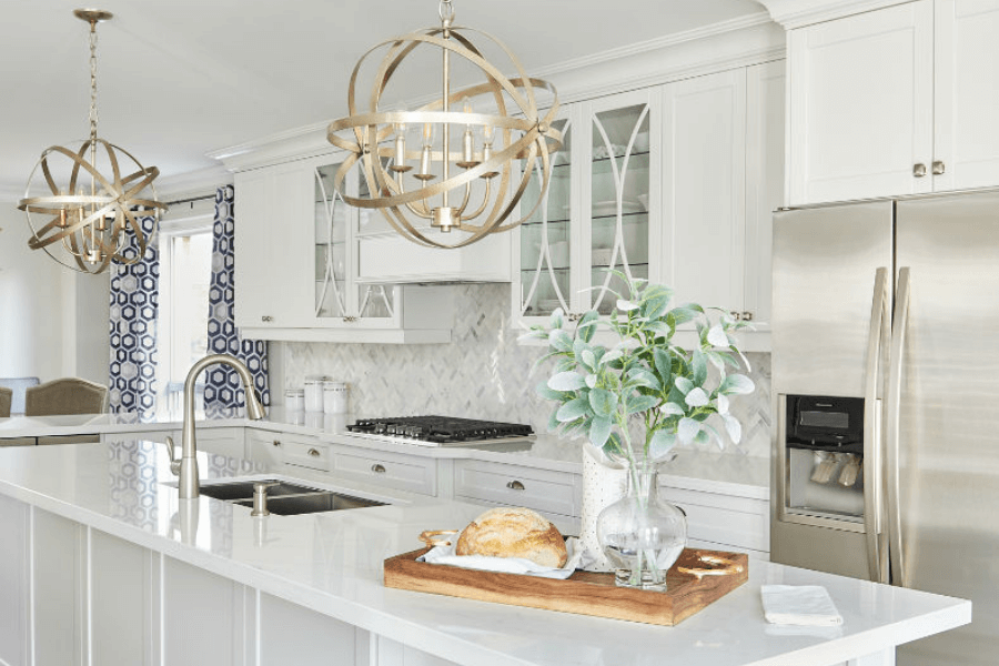
The designer-contractor working relationship can be a tricky one, but it doesn’t have to be.
Today’s vlog topic, the working relationship between designers and contractors, came from a question in my FREE Facebook group, Interior Design Business Strategies.
A question was asked by a designer in the group who is working with a client who has their own contractor.
The issue that has been raised is one about the ordering of materials and goods.
The contractor feels his toes are being stepped on. He has threatened to walk away if he cannot do the ordering.
It all comes down to communication and managing expectations!
Here’s my professional advice on how to deal with this type of situation.
The Designer-Contractor relationship
This relationship can be a delicate one. One that needs to be mutually respectful.
Communication is key for getting off on the right foot.
My contractors and I sat down and recorded a podcast discussing this exact thing. How should designers and contractors work together on a project?
Working Relationships – How to build a good relationship with a General Contractor
I have a great GC and cabinet maker I work with regularly. We are a team and that’s how it should be – a collaboration with similar goals.
However, I also work on projects where clients have brought in their own contractors.
If a contractor is already on the scene, I suggest setting up a time to meet with them on your own. Use this opportunity to discuss the client’s project and how you will work together.
Go through who is responsible for what, and be as specific as you can.
As a designer who is picking out say, plumbing fixtures and kitchen hardware, will you be responsible for ordering them, scheduling delivery and handling any issues that may arise?
Will the builder be ordering all building-related materials, lumber, drywall, paint, and items like flooring, countertops, and cabinetry?
If you are working with the client for Designer by Your Side services, the client may even be making some purchases on their own.
Have the conversations upfront and ensure everyone is on the same page.
This way expectations are managed for all three parties and you are less likely to experience awkward situations going forward.
Working Relationships – Designers & Contractors: From the contractor’s point of view
Because this can often be a contentious relationship my contractor, cabinet maker and I kept the conversation going.
We recorded part two of our roundtable discussion on what it’s like working with each other.
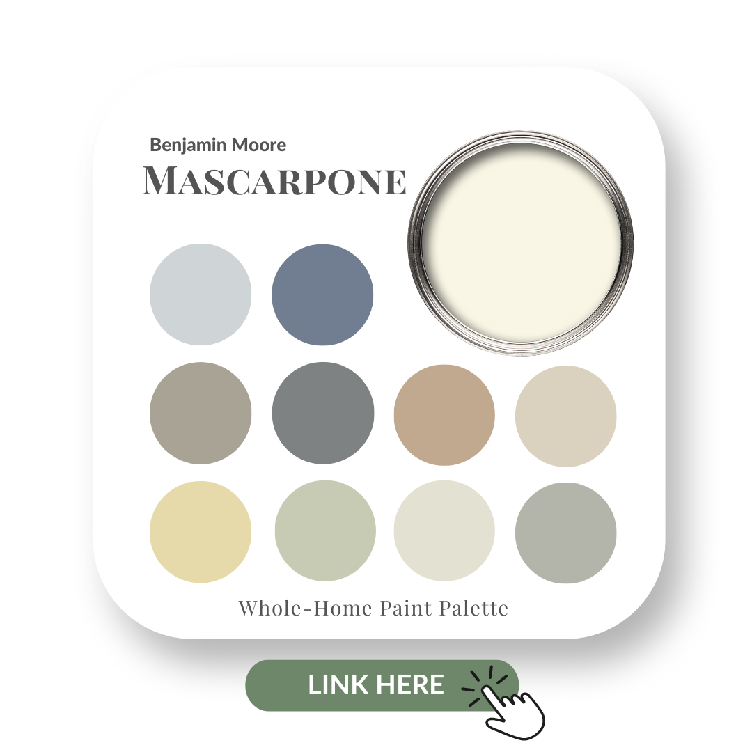
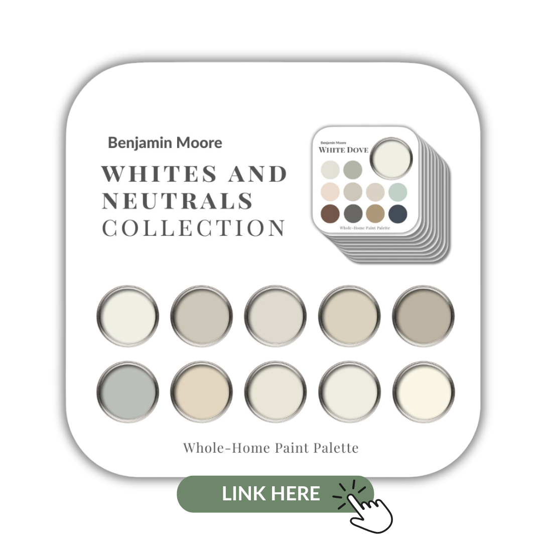
If you would like all this information in one convenient place and even more paint colour combinations to use with Mascarpone, take a look at my Mascarpone Perfect Colour Palette. A must-have for any colour enthusiast or design professional.
Mascarpone Colour Review Video
As a Certified True Colour Expert and an award-winning interior design professional, I’ve worked with many homeowners on a huge variety of residential design projects.
My goal is to give you the confidence to make educated decisions about your own paint choices.
Let’s do this!
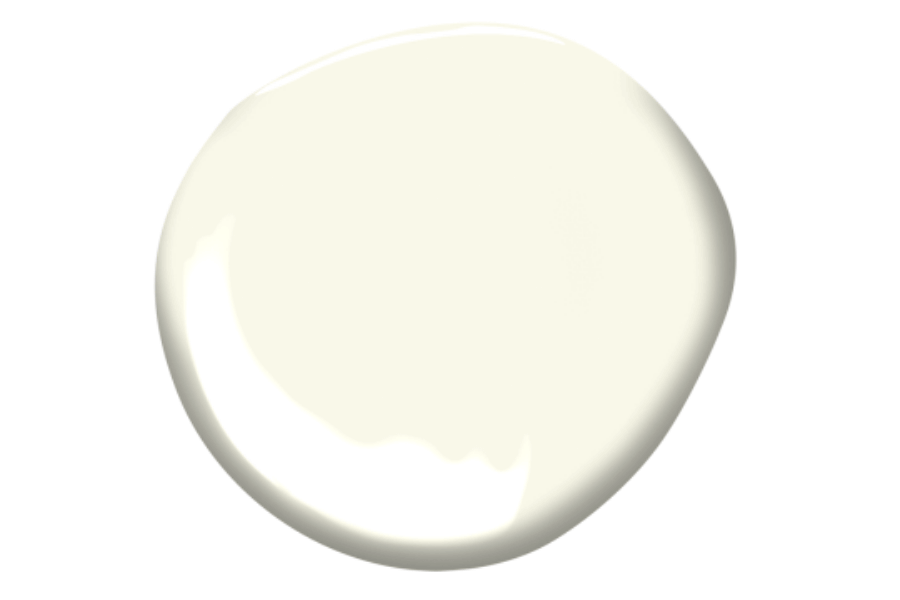
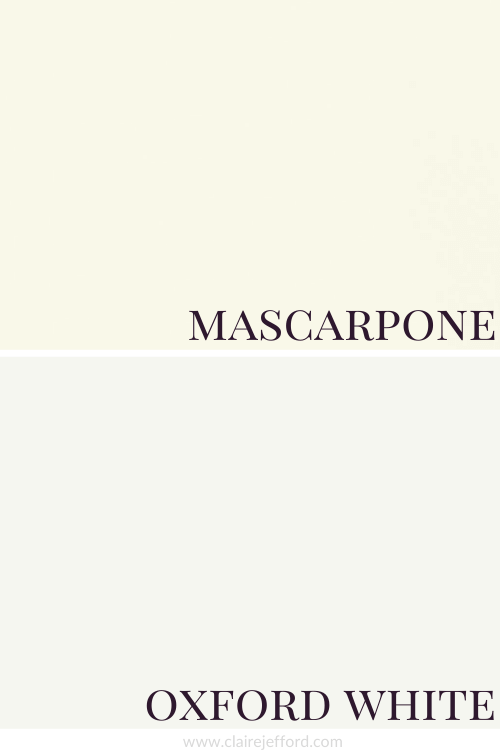
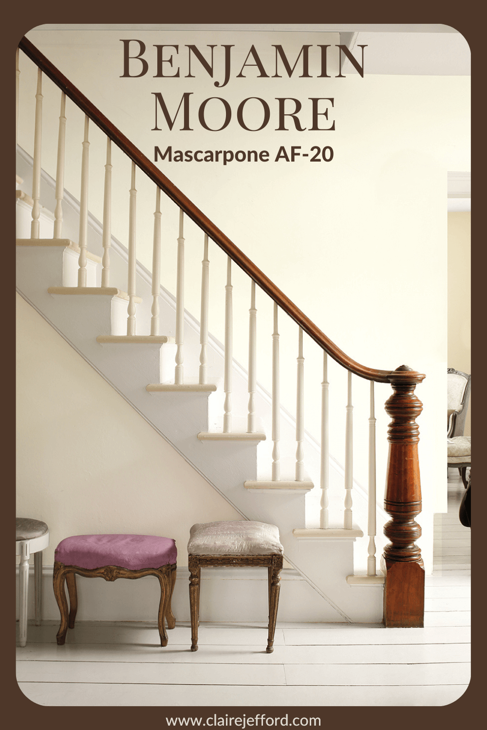
Undertone: creamy white (soft yellow)
A slightly creamy white, Mascarpone is a great choice if you are looking for a white that’s not too crisp and bright.
Keep in mind it may look different in your space depending on the lighting and what other decorative elements you pair with it in your interior decorating project.
Where you use it and the finish of the paint will also affect how this colour looks in your home.
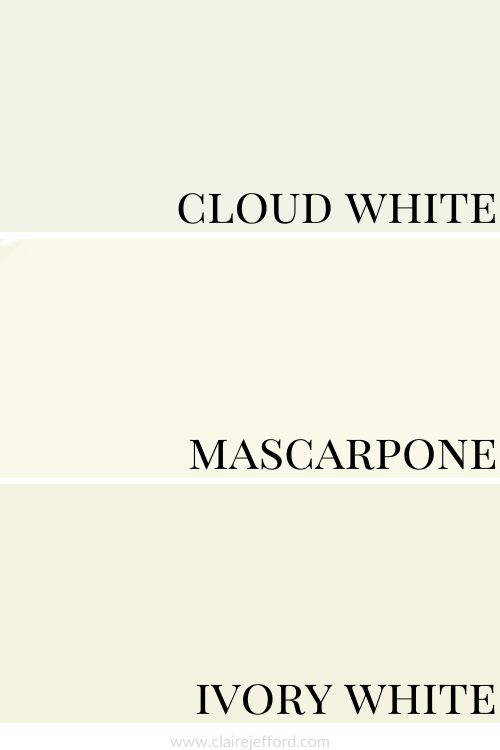
Colour Comparisons with Mascarpone
I cannot stress enough that you never look at a paint colour in isolation!
Comparing colours to similar shades is key to truly seeing the undertones.
Cloud White CC-40 & Ivory White CC-130
Here I compare Mascarpone to Cloud White which is often thought to be a creamy white.
But we can see when side by side with Mascarpone it’s not quite as creamy as Mascarpone.
And Ivory White which is also a creamy white looks richer and a bit deeper than Mascarpone.
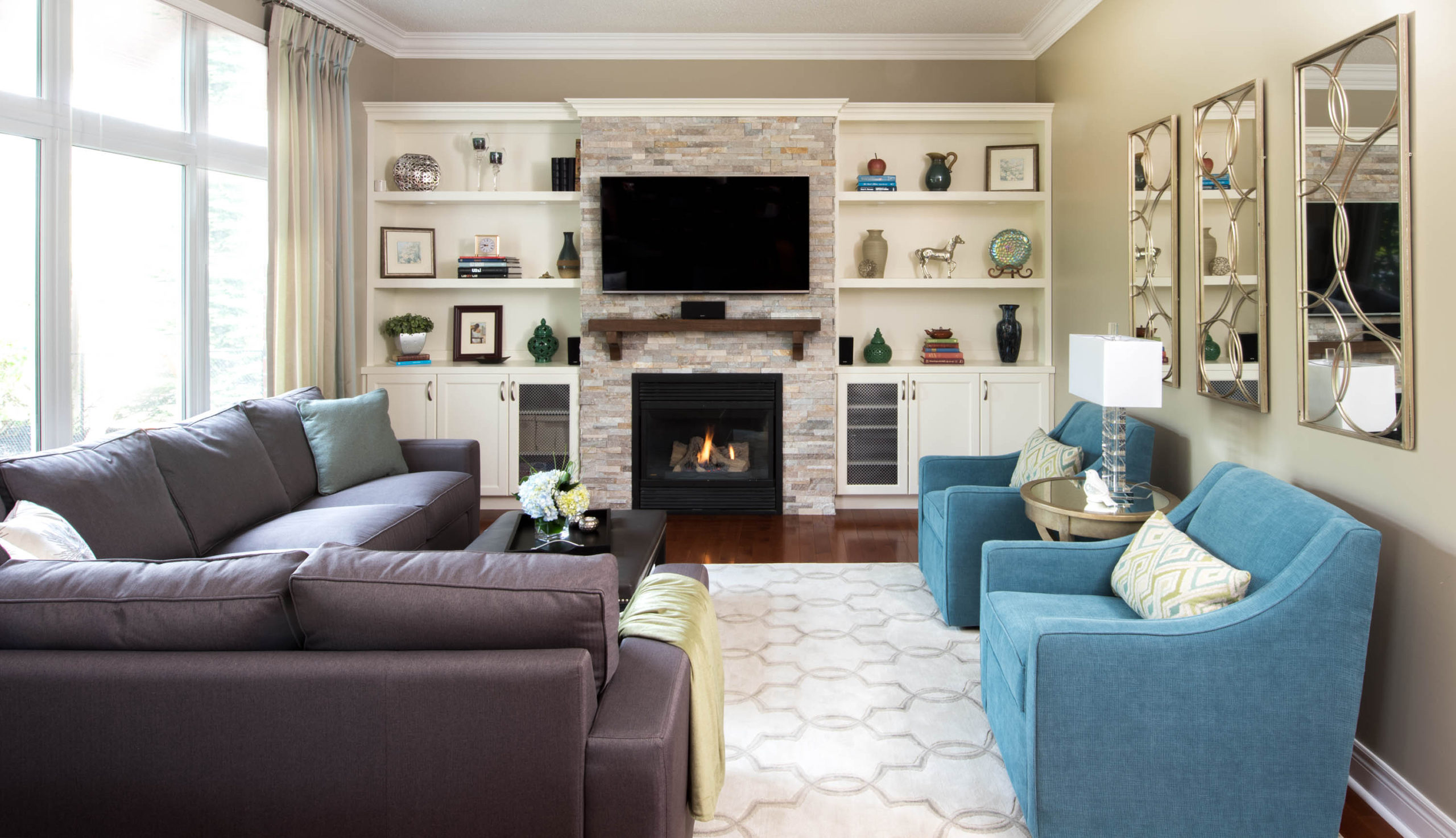
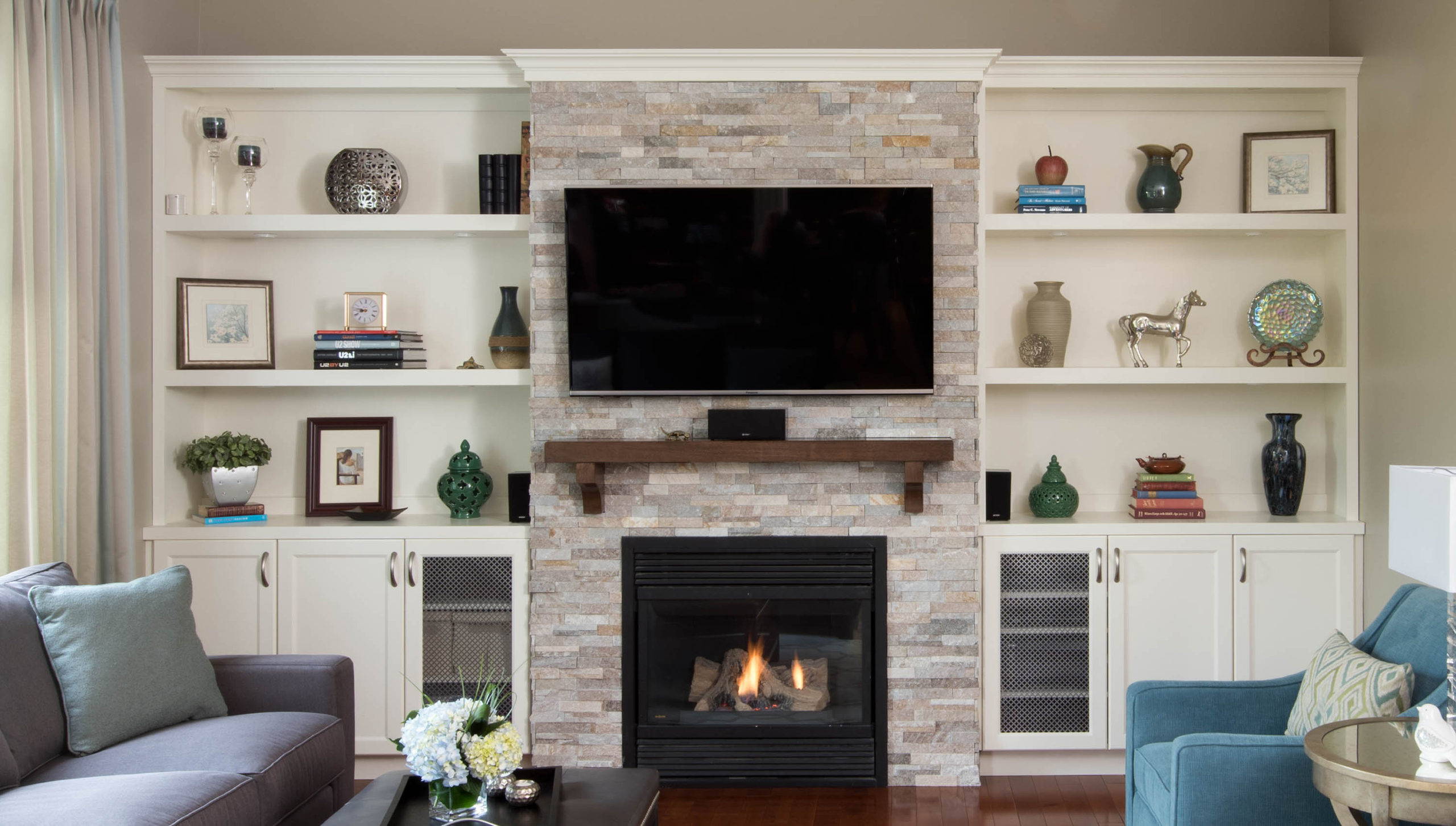
Ivory White is the colour of these custom built-ins shown below that we designed for our client’s living room.
Built-Ins are Ivory White and the wall colour is Pashmina by Benjamin Moore
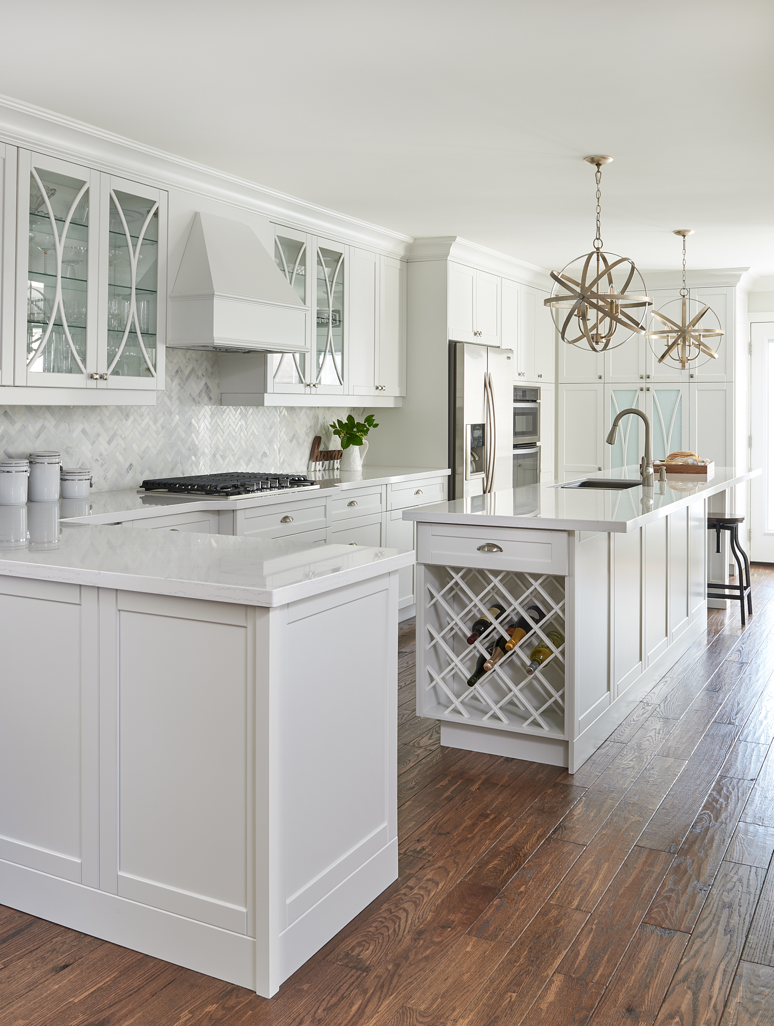
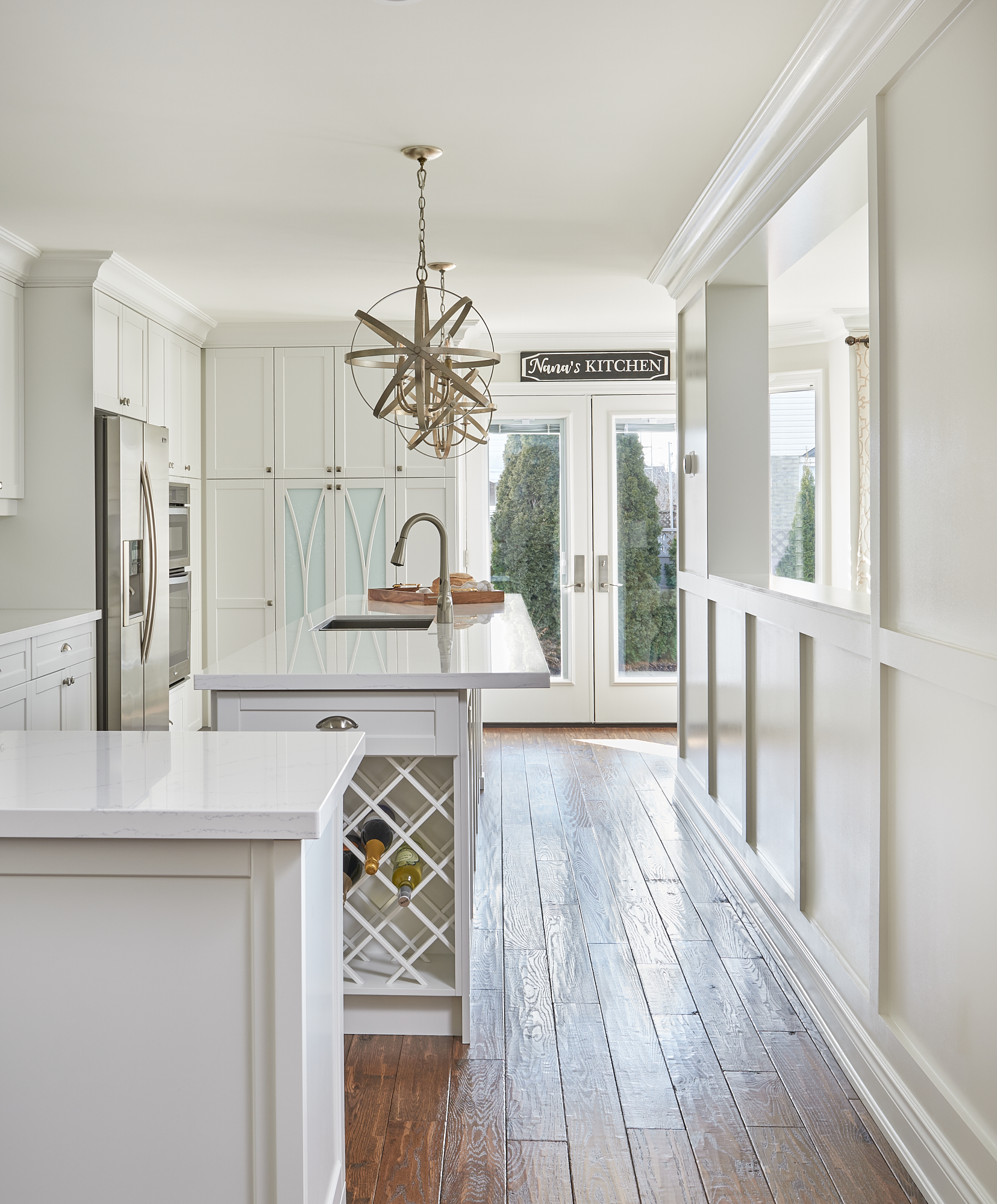
Oxford White is another true white and has a bluish undertone to it.
This is a wonderful white we used in a kitchen renovation.
We used it on the kitchen cabinetry in our Burlington client’s home below and paired it with Classic Gray on the walls. A great paint colour combination!
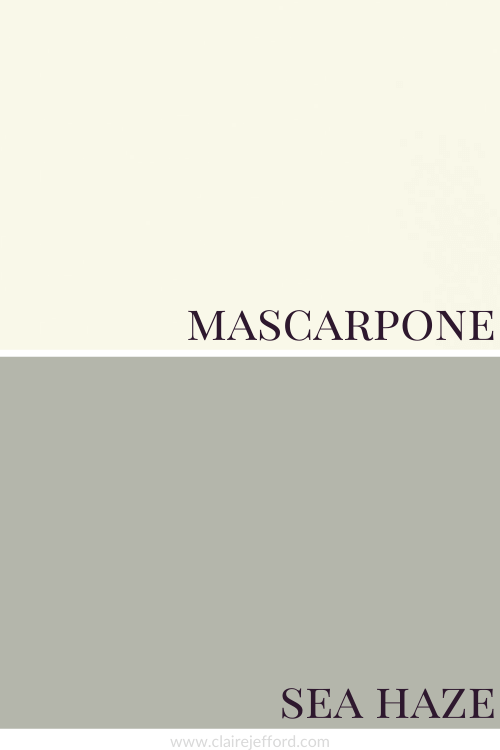
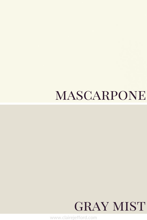
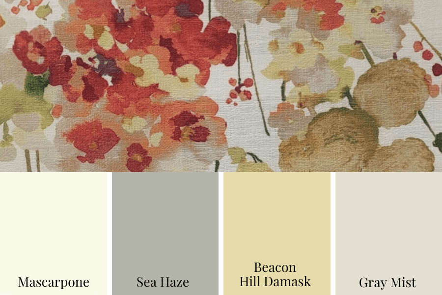
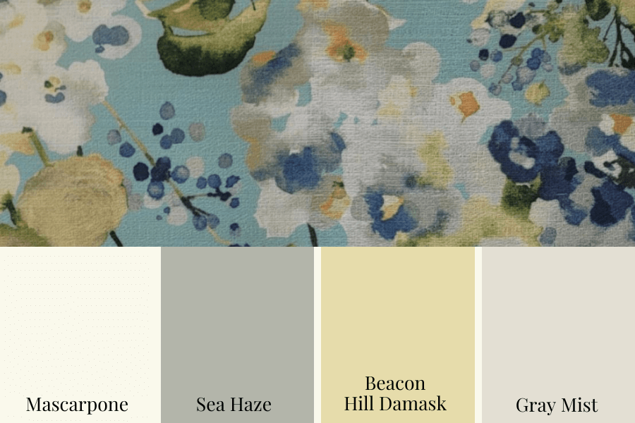
Mascarpone with Sea Haze, Beacon Hill Damask & Gray Mist
This is just one of the stunning palettes you could create using the colours in my Mascarpone Perfect Colour Palette. There are a total of 10 colours to mix and match.
I love the calming nature of this palette. Keep reading to see two different looks using this same palette.
Remember, it only takes one mistake to take your home decorating project from divine to disaster. Don’t let the paint be what stresses you out!
Work with me 1-on-1
If you are planning a kitchen update, room refresh or interior design project of any kind and want expert guidance, I can help.
‘Here & Now’ Design & Colour Consultations
I now offer 1-hour online design and colour consultations for anyone outside of my local area. With over 13 years experience of running my award-winning interior design firm and working on hundreds of projects, I can provide professional guidance for any area of your home.
Learn more about this exciting new service and book your online appointment here. I can’t wait to e-meet you and help you with your project!
When Should You Hire Staff for your Interior Design Business?
Hiring staff – a very timely vlog topic as we are presently going through this exact process here at Claire Jefford Inc.
We are on the lookout to fill an Office Manager position. We’re in the final stages and I followed the criteria I lay out here for you.
I’m breaking down this topic into two areas:
When is it time to hire?
What jobs or tasks should I be outsourcing/delegating?
Watch my video to learn if hiring staff is something you should be considering for your Interior Design or Decorating business.
Hiring Staff
How do you know when it’s time to bring someone onboard?
At what stage should your business be at before you consider hiring a staff member?
I broached the subject of staff in my last vlog on Monthly Expenses.
Paying staff is a huge monthly expense. Therefore, you need to make sure your business is at a place where you can afford it.
Tips on When It’s Time to Hire Someone
1. Consistently busy for 6-12 month period
There’s no let-up in the number of design projects you have on your calendar.
You may prefer to work on one project at a time. Other design and decorating professionals like it better when they have a few on the go.
Regardless of which way you work, if your projects are back to back to back with little or no breaks, this is a huge sign that it may be time to hire some help.
2. Working 8-12+ hours 5-7 days/week
If you are anything like me, I bet you work over 40 hours a week.
I love to work, but when I do extra hours, I prefer to be creating videos or engaging with my audience on social media!
You’re filling your days meeting with clients.
You are designing, creating floor plans, sourcing and procuring.
Your priority should be the areas that you love and are good at. If possible leave the rest to someone who works for you.
Tasks to Outsource
Speaking of the areas of your business that you absolutely love doing, let’s look at all the different jobs you do and how you feel about them.
This is a fantastic way to clearly see which duties you should continue to do and which you should outsource.
Here is my suggestion on how to figure this out.
I went through this exercise myself and it helped me identify those tasks I should spend the majority of my time on and the tasks that I should be delegating to someone else.
Categorize your tasks into 4 categories -or ‘buckets’ as I like to call them.
1. Jobs you’re great at and love doing
2. Things you’re good at and don’t mind doing
3. Things you’re pretty good at and don’t like doing
4. Tasks you are not good at and don’t like doing at all
Make a list of all the tasks you do for your business
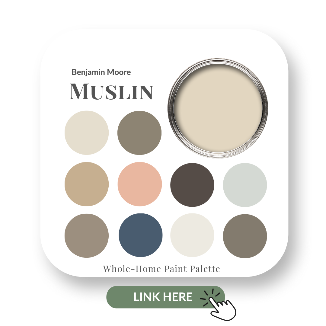
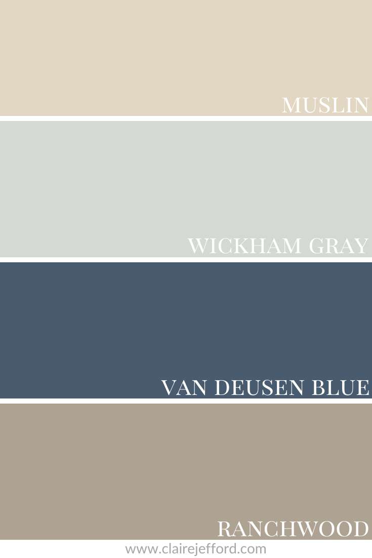
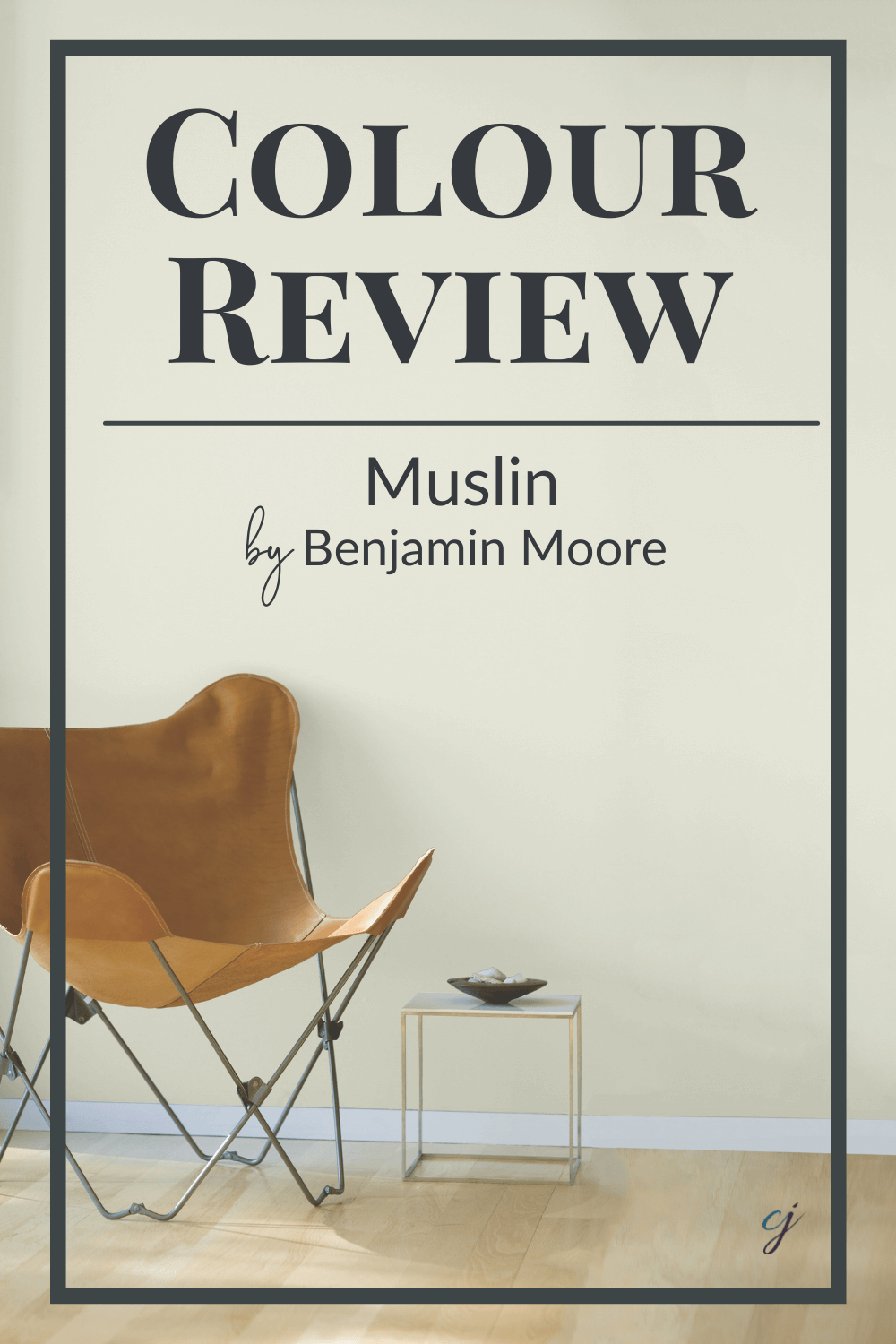
A calming light beige, Benjamin Moore’s Muslin is not quite off-white.
It’s a lovely soft neutral and will look amazing in a huge variety of spaces.
In this colour review video of Muslin by Benjamin Moore, I share:
The undertone of my featured colour
Colour comparisons in order to easily see the different colour tones
Best white paint colours for the trim and ceilings
Beautiful colour combinations to inspire you for your decorating project
When you’re finished watching the video and you’d like all of this information at your fingertips look no further than my Muslin Perfect Colour Palette.
In this digital download, you’ll find even more paint colour combinations to use with Muslin.
Great inspiration for putting together a gorgeous colour scheme for a decorating or design project.
Benjamin Moore – Muslin Colour Review
As a Certified True Colour Expert and an award-winning interior design professional, I’ve worked with many homeowners on various residential design projects.
I want to give you the confidence to make educated decisions about your own paint choices. Let’s do this!
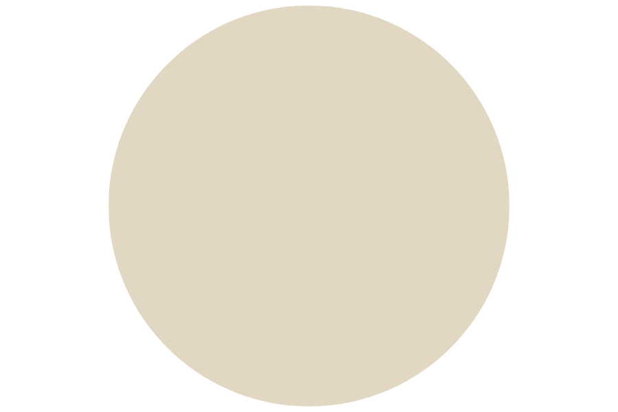
Undertone: pink
Beiges may come and go but they never seem to go far.
Muslin is a classic neutral and the slight pink undertone gives it a little more depth than a true off-white.
Muslin may look different in your space depending on the lighting and what other decorative elements you pair with it in your interior decorating project.
To see the undertone more clearly let’s see the comparisons.
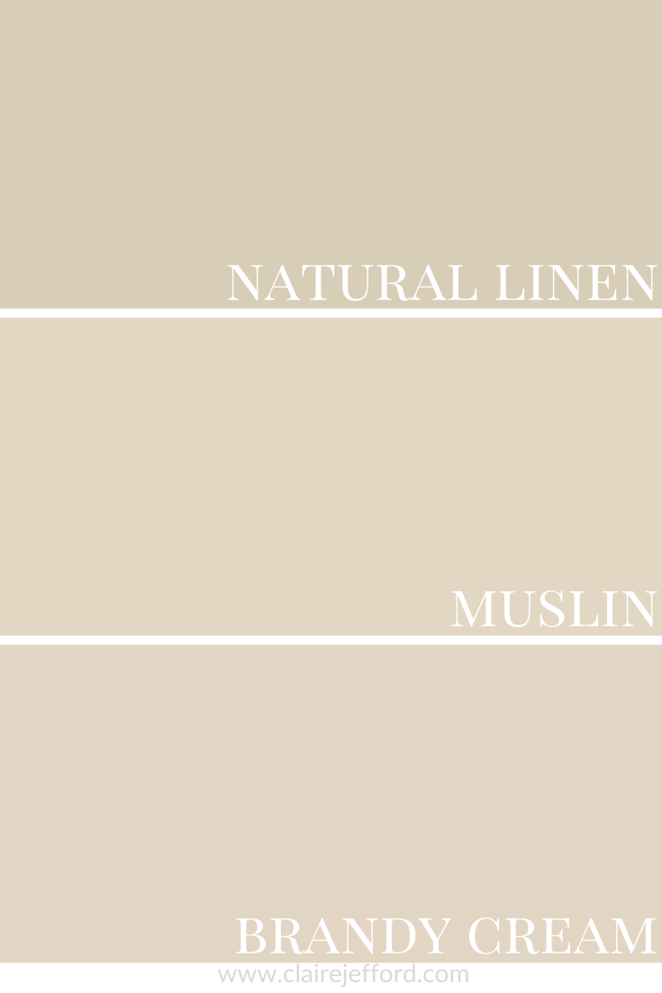
Colour Comparisons
Natual Linen CC-90 & Brandy Cream CC-60
Muslin’s pink undertone is more evident when you compare it with similar shades.
Natural linen leans slightly more green and Brandy Cream pink when you see all three of these colours together.
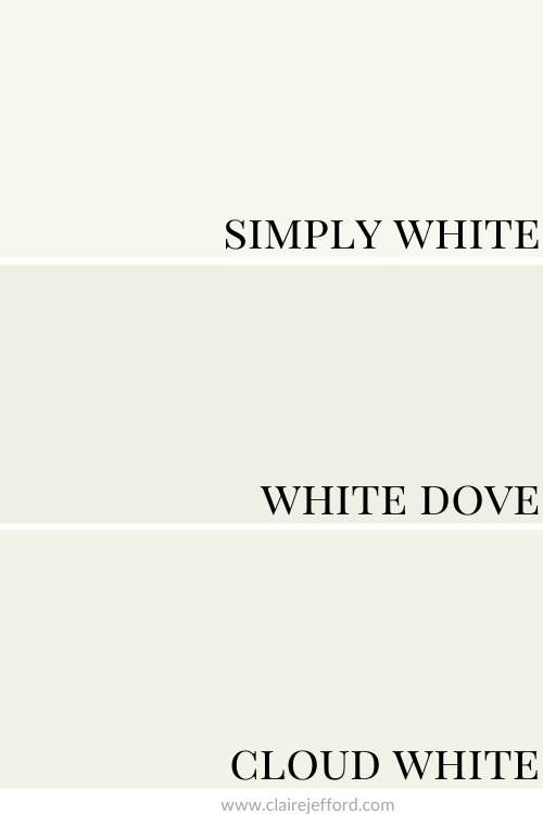
Best Whites To Pair With Muslin
Cloud White CC-40 By Benjamin Moore
Cloud White is a nice creamy white to use on trim and ceilings.
White Dove OC-17 By Benjamin Moore
I love White Dove and definitely would recommend it as one of the top whites to pair with Muslin.
It’s slightly softer than Cloud White but still not overly bright.
White Dove is hugely popular and was one of my first colour reviews.
This one is the brightest of the three whites here. It would look fantastic if you have decor elements that are crisper in colour as opposed to creamy or muted.
The differences in the three whites are made more clear from the comparison below.
If you are a regular to my colour reviews you will know I tend to recommend from a group of about 10 white paint colours.
You can also check out my Wickham Gray Perfect Colour Palette to see 10 more beautiful colours from Benjamin Moore that pair wonderfully with this gentle gray.
Van Deusen Blue HC-156 By Benjamin Moore
Van Deusen Blue is one of my favourites from Benjamin Moore. That and Hale Navy are standouts for sure.
Hale Navy has been a popular blue for some time and one I have used with great results.
See how beautiful looks in this clients’ home, paired with White Dove on the ceiling and trim.
Ranchwood CC-500 By Benjamin Moore
And finally, we finish with Ranchwood. A rich taupe colour that brings the right amount of contrast with Muslin.
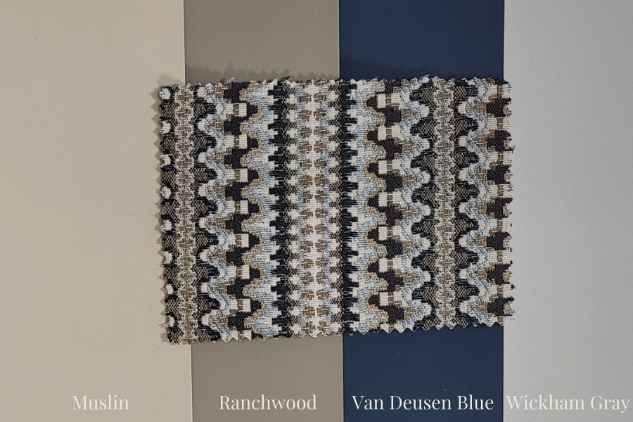
Benjamin Moore – Muslin: Colour Palette Inspiration
Often I find my inspiration for a decorating project from fabrics, area rugs or even pieces of art sometimes.
Look how great this palette looks with the fabric below.
The idea here is to build your decor, furnishing and paint around this complete look.
It does not mean you need to use all four of these paint colours throughout your room.
Imagine a beautiful deep blue sofa paired with some gorgeous pillows in the fabric shown!
Walls painted Muslin, ceilings and trim White Dove and some accents in Wickham Gray and Ranchwood.
How stunning would that room look?!!
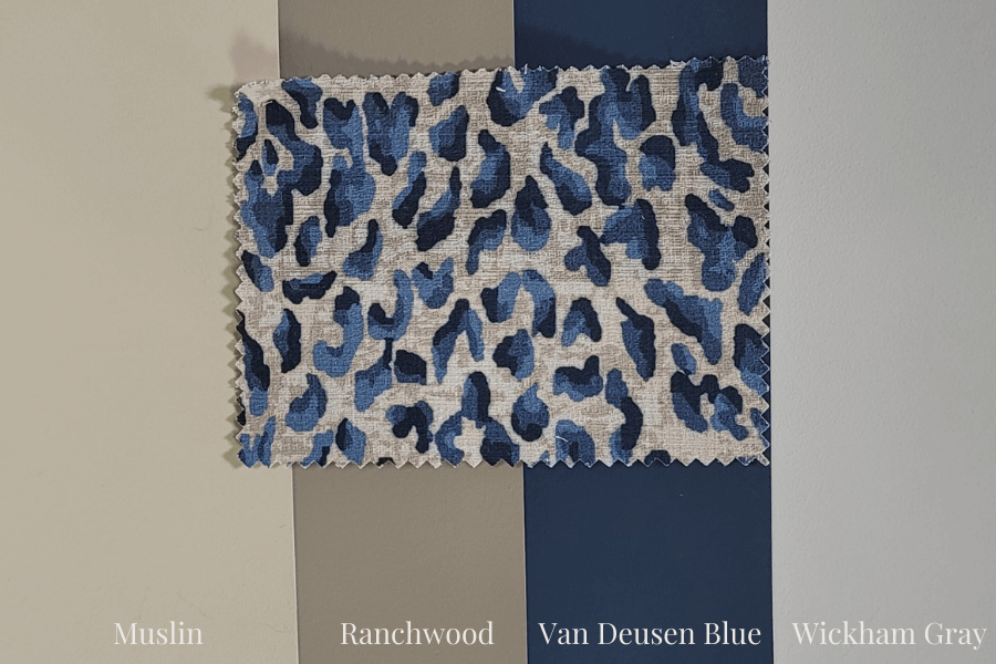
Here’s another look that’s a little more playful and fun.
The deep blues in the leopard-style fabric offer another incredible look with these four colours.
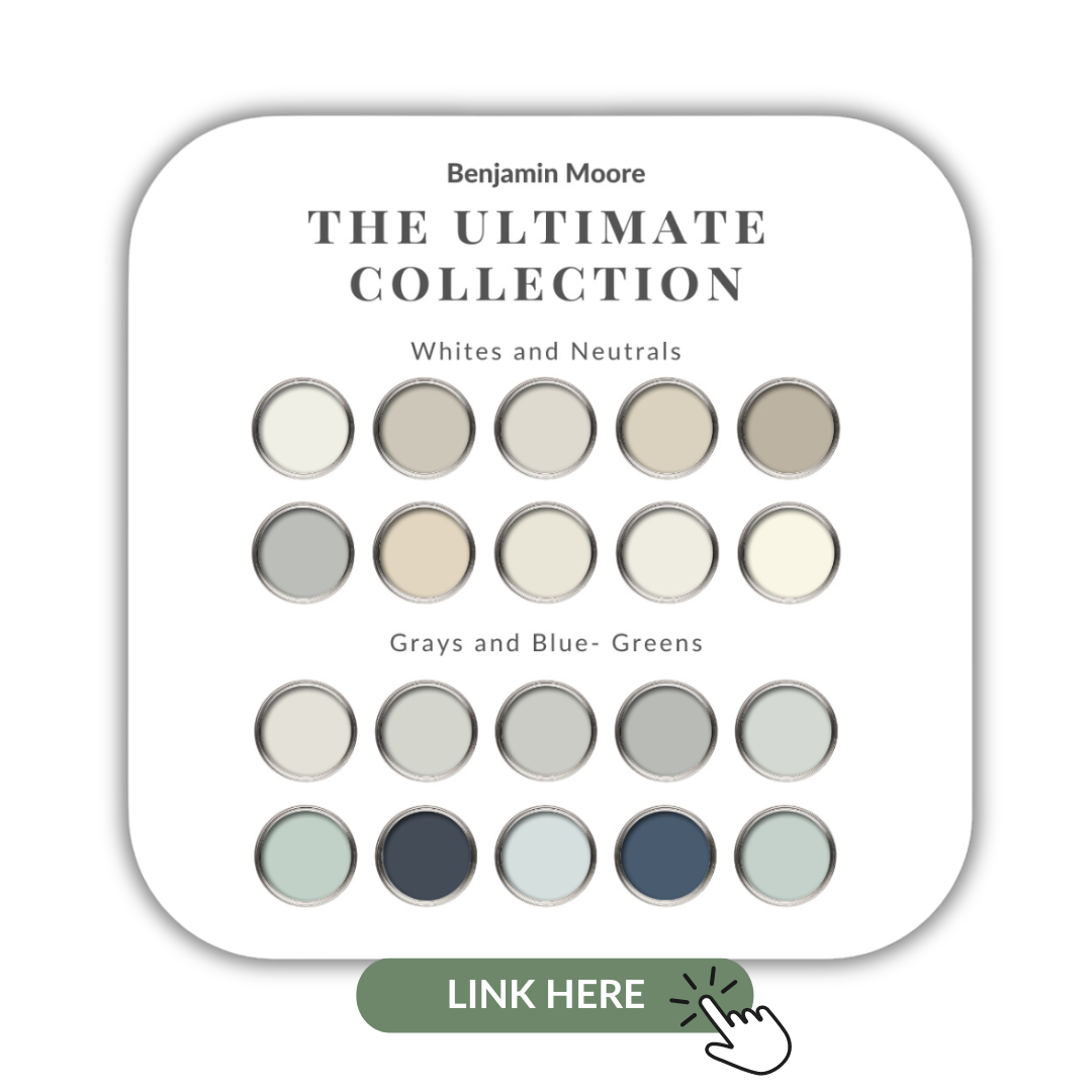
If you want to get all my Benjamin Moore colour guides in one place, look no further than my Benjamin Moore Ultimate Collection. All 20 of my guides in one handy collection.
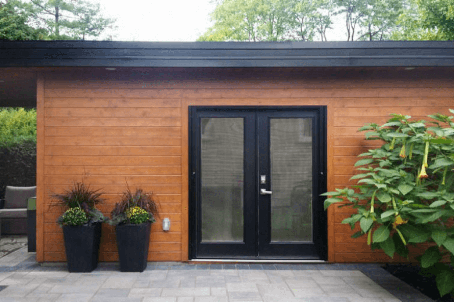
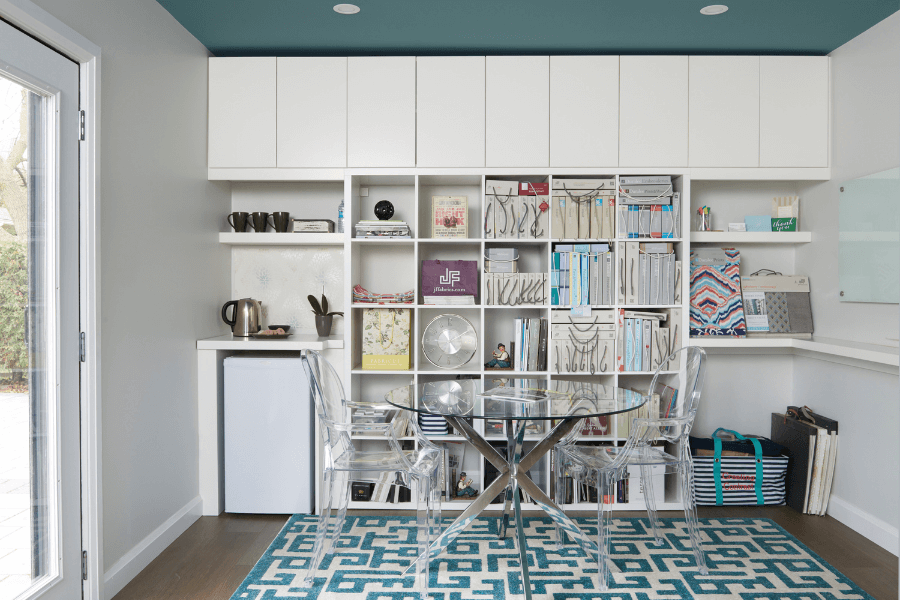
We may not love them but they are certainly a part of our everyday Interior Design business.
Yes, I am talking about Monthly Expenses.
For those who may be fairly new to this profession, I am going to help you get a handle on what your costs will be per month.
If you are a seasoned design professional, think of this as a recap and find out what and where I am spending running Claire Jefford Inc.
In today’s video, I break down monthly expenditures into three simple categories – LOW, MEDIUM and HIGH.
However, I won’t be speaking to start-up costs.
These are different and include things like a business license, business cards, your laptop and printer, software you purchase outright, and the initial building of your website if you pay a web design company to do it.
For many Designers and Decorators who start their own business, they will rack up a combination of expenses in the three categories I mention.
Please note, this is a comprehensive list of items you will need to consider as your business grows. But there may be other costs that I don’t discuss here.
If there are other expenses that you wish to add that I don’t include, please comment on this post to share with us!
Let’s get to the video and see where all that money is going!
(Please note, my expenses are in Canadian dollars.)
Your Interior Design Business Monthly Expenses
At the low end of monthly costs are where we find our everyday expenses.
The majority of us will have these, if not all of us. We couldn’t run our business without spending money on these necessities.
Remember every expense I talk about is dependent on various factors, so there will be a monetary range in which each one falls.
For example, the laptop in your start-up costs. You may not need one and be able to manage initially with only a phone or tablet. While others may want to run robust architectural software.
This will require a much more substantial device, bringing the price way up. See what I mean by dependent factors affecting cost?
Basic Expenses
1. Insurance Fees
As business owners, we must have insurance to cover our business in the case of loss or damage. I recommend you speak with a broker to make sure you have the appropriate insurance for how you want to run your business.
Currently, I pay approximately $200/month for insurance in my business.
Estimated costs: $200/month
2. Phone
Where would any of us be without our cell phones? They are important in normal day-to-day life. And certainly, they are essential if not compulsory for running a business.
There is a range to which a phone will cost you monthly.
Do you get the newest top-of-the-line phone each time one appears on the market?
Do you use a lot of data?
These will affect the price you pay each month.
My monthly phone plan is costing me around $130/month.
Estimated costs: $75-200/month
3. Bank and credit card fees
These can’t be avoided, as much as we don’t like to pay them!
I budget for $20 a month based on my current yearly credit card fee and monthly bank fees.
Again, this fee could be less or more depending on the type of credit card you have and where you bank.
Estimated costs: $20/month
4. Email Marketing Software
These days most software is paid for on a monthly basis. If not, it can be broken down to calculate approximately what it is costing you each month.
Here’s a tip: paying yearly for software and other items that offer you different payment plans, is usually the cheaper way to go.
I believe an automated email marketing tool falls under the Basic Expense category.
This is huge for your business and something you should consider getting if you don’t already use one. There are so many to choose from these days, it can definitely be overwhelming to decide which one is best for you.
Here’s a great article on what an email automation tool is and how it can help your business.
My monthly subscription to Active Campaign costs me around $275/month but they have plans starting from $15.
Estimated costs: free to $300 and up
5. Website Maintenance
Similar to the automated email software, I strongly believe every design and decorating business needs to have a website. No exceptions on this one!
The creation of the website, if outsourced, is part of the start-up costs. The ongoing monthly fees are expenses.
Some website builders offer a free option. Beware though, most often these do not link to a unique domain name.
Website builders, like Wix and Weebly, where you do it yourself, range from $5 to around $20 for their personal or basic plans.
My website was built on WordPress and contains shop pages where I sell helpful coaching and colour products. This often involves videos and courses in the backend. And all of that means I need support.
I pay roughly $250 a month for the ongoing work my web team provides me. This does not include additional requests which often arise, nor my monthly meeting with my web designer to review my analytics.
Estimated costs: $5 – $500+
6. Office Supplies
These can add up and include everything from post-it notes and printer ink to paper clips and pens. I estimate $100-200 / month for these types of items if you are a solopreneur who works from a small home office studio.
Adding up all the basic monthly expenses you are looking at a minimum of just over $400, but I suggest you budget for around $700 to be on the safe side.
Advanced expenses
If we start adding a few of the more advanced expenses the total monthly spend increases significantly.
7. Accounting software
Quickbooks is fantastic accounting software for small businesses and it’s what I use.
It keeps my financials super organized and makes it way easier for my accountant (who’s listed as a Premium expense – will get to that in a bit).
Quickbooks sets me back $45/month.
Estimated costs: $10 – $60/month
8. Video Communications Software
Now more than ever we are conducting business through video meetings.
I have been using zoom for my 1-on-1 coaching calls for years and my usage of this app has only increased through the pandemic.
I pay $20/month for their basic plan.
Estimated costs: Free – $60/month
9. Digital graphics program
It seems the software we can use these days is never-ending.
We create a lot of graphics for our website and various social media apps and platforms.
We have found Canva to be incredibly user-friendly and produces superb graphics. The monthly price is unbeatable and totally worth the value at just $10.
Estimated costs: Free – $70/month
10. Online schedulers
It costs money to stay organized! An online appointment scheduler is a great addition to your software family to help you do this.
Calendly is our product of choice. We can get design or coaching clients to schedule appointments, consultations or coaching sessions directly through this app.
We pay $8/month for Calendly. Do your homework to decide which scheduling app is best for you and your business.
Estimated costs: Free – $12/month
11. Project management programs
This is one area where there is software specific to our industry.
Mydoma is what we use to keep our design projects organized.
It allows us to upload all images and documents related to a client project.
Team members, clients and trades can all be given access to view and add more items if required.
There are several price points of the different packages depending on the needs of your business.
If you want to try out Mydoma, as a brand ambassador, I invite you to get a promotional offer when you use my affiliate link here.
Other similar interior design project management programs exist, so do your due diligence to learn more about each one before you make a commitment and the monthly/yearly investment.
Estimated costs: $40 – $1000/month
12. Team collaboration and productivity suite
I have used G-Suite (now called Google Workspace) from the beginning.
It has grown with me and I don’t know where I’d be without it.
I pay approx. $23/user a month and it’s one of my most used pieces of technology.
These office suites typically charge per user so keep that in mind.
Estimated costs: $2-$35/user/month
13. Social media management
These types of apps ideally help you keep on top of posting to your different social media platforms. There are so many, I know, I know!
Tailwind is one we use that’s linked to Pinterest and costs $10/month.
Facebook Creator Studio helps us schedule our posts on both Instagram and Facebook and it’s absolutely free.
There are others of course like Hootsuite, Sprout Social and many more that you can research.
It took us a while to get into a groove of figuring out what works best for our needs. So, take your time and choose the one most suited to your business.
Do you belong to any local or national associations?
Or are you a member of any organizations such as NKBA that charge membership fees or yearly subscriptions?
These will need to be incorporated into your monthly expense calculations as well.
15. Bookkeeper
For me, this is a must!
The size of your business and the level of service / support you need will be factors in determining what you will pay.
My monthly bookkeeping fees are $200/month.
Estimasted costs: $150 – $500/month
You add in all or even some of these advanced expenses and you are increasing your monthly expenditure by a minimum of $200/month, but I would suggest budgeting at the mid range point of around $500.
It’s important to remember that it’s not likely you will opt for the free version of all of these items. Maybe none of them. This will potentially increase your monthly costs by a decent amount.
Premium Expenses
These premium expenses may not come until your business is well developed, depending on how much you want to scale your business over time.
They all need to be considered though when tallying up what you could potentially pay each month.
If you are thinking about adding one of these premium expenses to your business operations you need to make sure it’s doable.
Have you heard the term, the ‘Fifth Wall’? Yup, that’s the ceiling. And guess what? It doesn’t HAVE TO BE WHITE!
I have loads of painted ceiling ideas. How about a bold chartreuse or a moody black tone? Don’t be scared. This is a stunning way to bring colour into a room.
Painting ceilings a colour other than white is still hugely popular amongst interior design and decorating professionals.
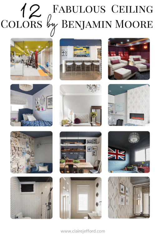
Join me as I discuss painted ceiling ideas. As well as share my best advice as to why you might want to rethink white for your ceilings. Get inspired as we look at some exciting projects where we wanted the often forgotten 5th wall to stand out.
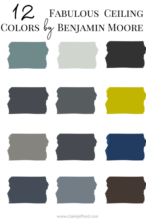
I’m going to show you 12 Benjamin Moore colours that I have used on various projects. From a bold basement gym to lovely powder rooms and many spaces in between.
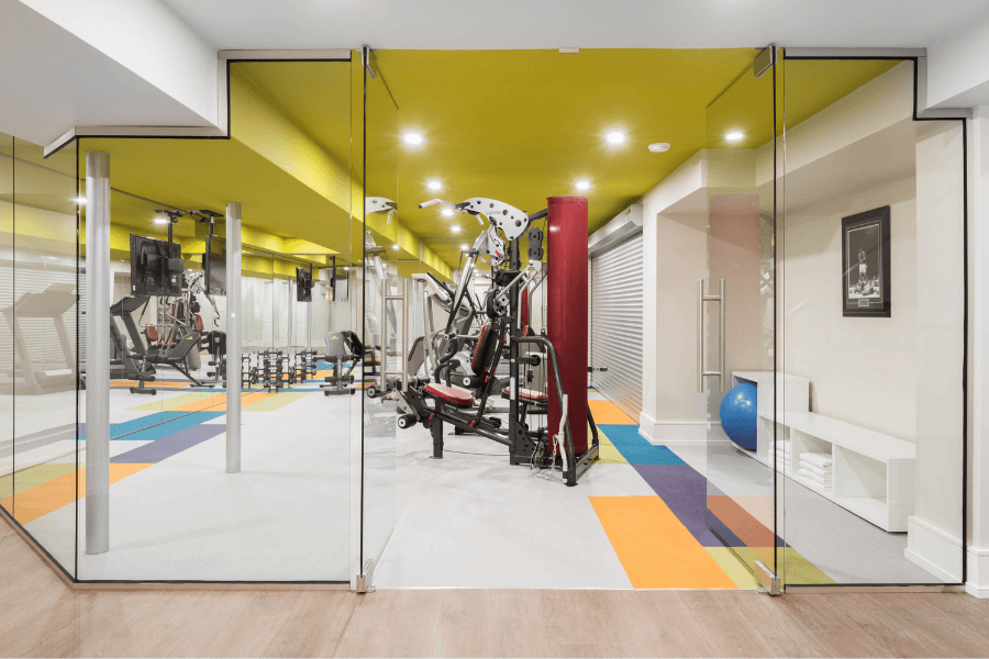
This is the first room you see as you make your way down the stairs into this massive basement of our client’s home located in Milton, Ontario. It’s always been one of my favourite photographs in my portfolio.
It’s pretty darn impressive, eh? How could this not pique a guest’s curiosity into wanting to see what’s around each new corner in this bold custom basement design?
2. An Unexpected Suprise
An unexpected surprise with a major impact is a great reason to paint a ceiling a colour.
Smaller rooms, like powder rooms or a quaint guest bedroom, are the perfect areas of the home to have some fun. A bright or dark painted ceiling can be unexpected and makes a small room much more striking.
Leave your comfort zone and be a bit unpredictable.
Powder Room with ceiling painted Dolphin AF-715 by Benjamin Moore
2. Tie in the Overall Colour Scheme.
A colourful painted ceiling is the perfect way to reinforce the colour theme of other decorative elements in a room.
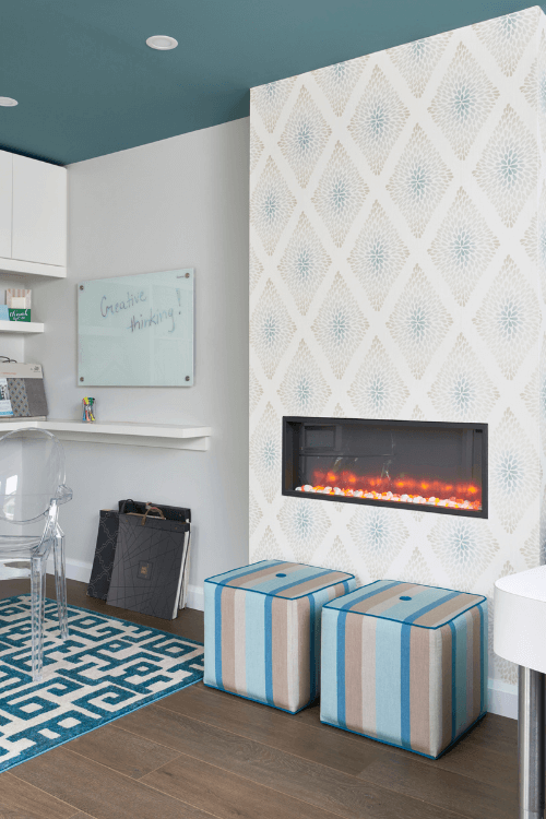
In my office studio below, I painted the ceiling Benjamin Moore’s 2021 Colour of the Year, Agean Teal. You can see how it coordinates beautifully with the wallpaper, area rug, and window treatment, therefore, tieing the whole look together.
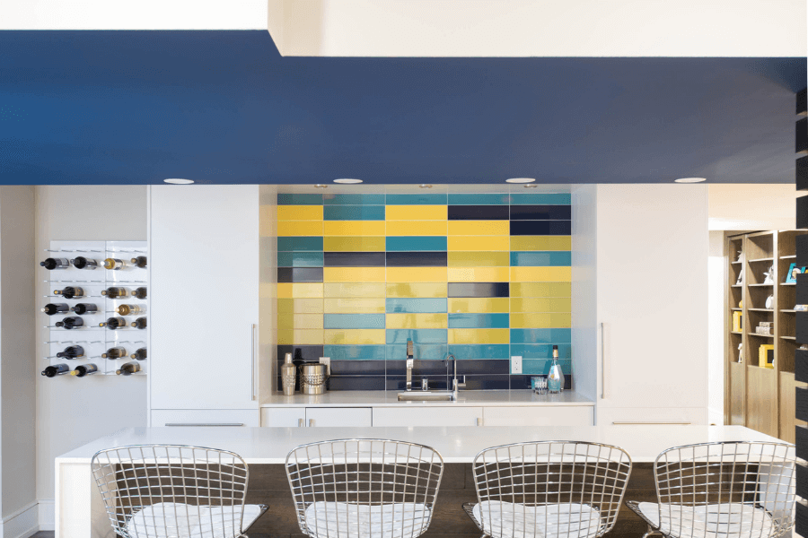
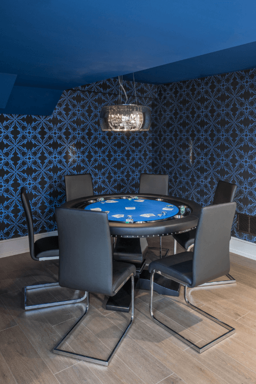
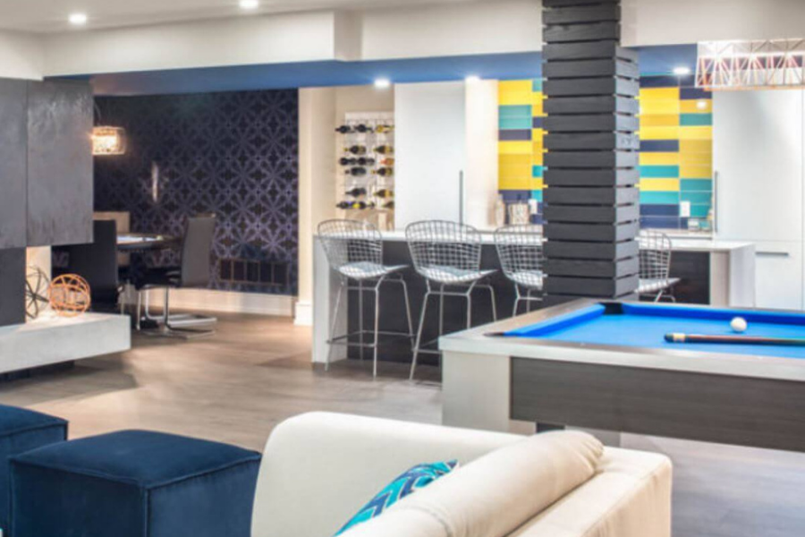
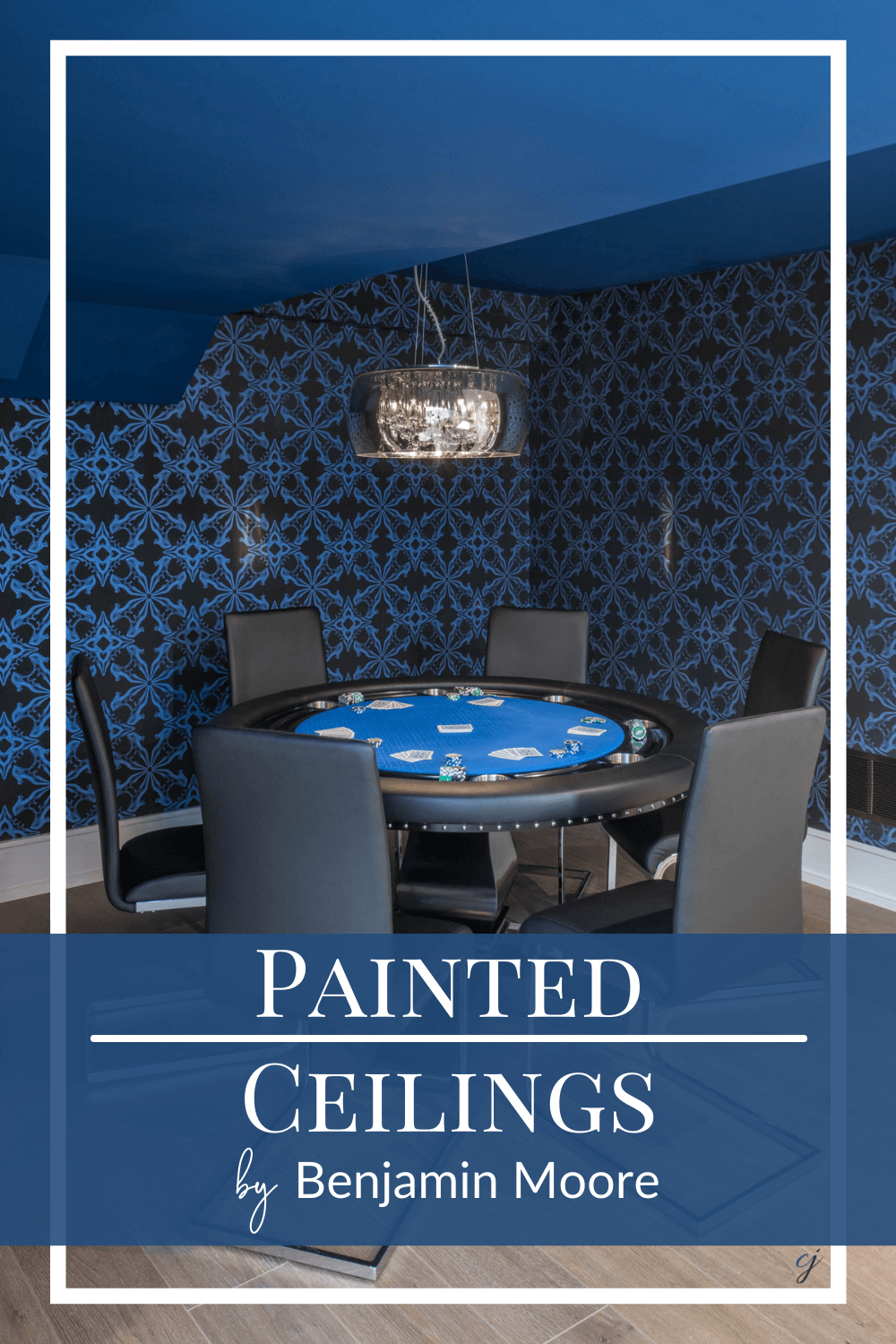
Go one step further and tie in the colour theme of an entire floor. We painted the ceiling in three adjoining basement spaces an eye-catching blue. This allowed the rooms to flow into each other seamlessly.
Ceiling colour is Symphony Blue by Benjamin Moore.
We continued the bold blue colour scheme by repeating this tone in the fun wallpaper of the poker room and on the tile in the backsplash of the bar area.
3. Highlight architectural or other outstanding features
You know what they say: “If you’ve got it, you might as well flaunt it!” Painting a ceiling a colour other than white is a great technique to highlight architectural features of a home that impact the ceiling.
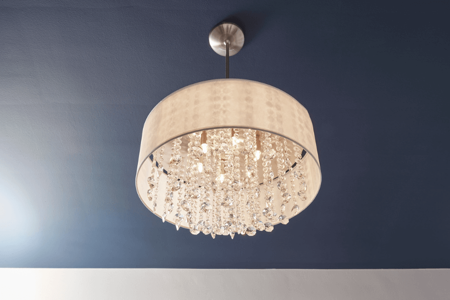
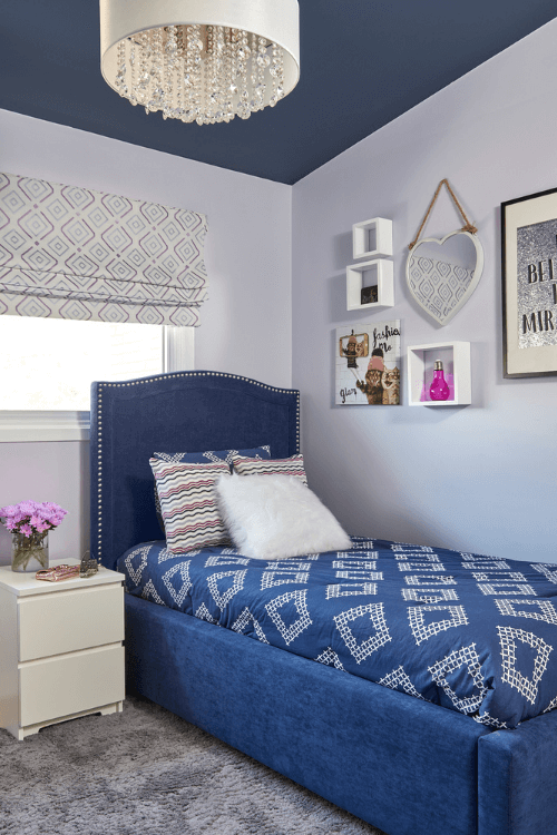
In my own home, we used a dark colour on the ceiling to showcase a gorgeous chandelier in our teen daughter’s room. There is no way this light fixture would have the same dramatic feel against a white ceiling.
Ways to use colour in your ceiling
Following on from why you should consider using colour the next time you paint a ceiling let’s look at ways in which to do this.
The first way to incorporate a painted ceiling is by using it to repeat the colour in a space.
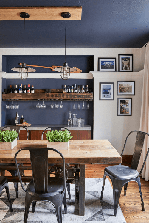
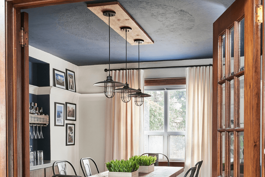
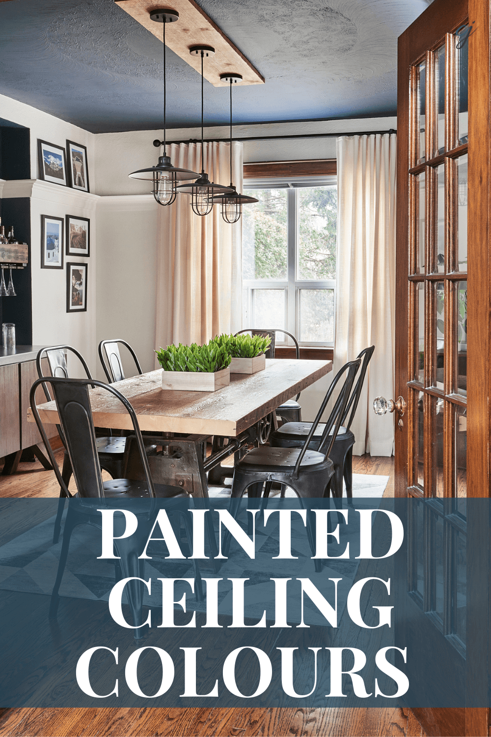
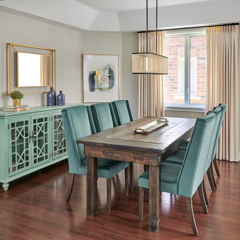
In my client’s dining room below you can clearly see how we did this. Both the niche and the ceiling are painted Hale Navy by Benjamin Moore.
And it didn’t stop there. The painted dining room ceiling continued the colour scheme from the front living room. Your eye is naturally drawn to the flow of the deep blue throughout these rooms.
Hale Navy is a hugely popular colour and consequently one of my all time favourites! You can see from this project the lovely paint palette that goes so well with this classic shade of blue.
A second way to use colour in a ceiling is a little design trick that I sometimes like to employ in my interior design projects. That is to paint the ceiling the same colour as the tone that you have on the floor.
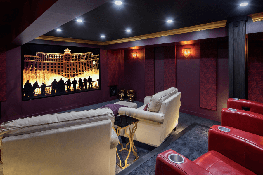
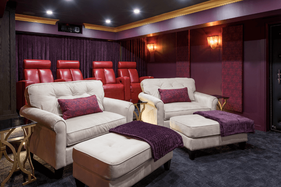
There’s no better example of this than in this incredible home movie theatre in our client’s basement. The carpeting throughout the room is a dark, dark blue. We matched it on the ceiling with Witching Hour by Benjamin Moore.
And then I suggested a metallic gold for the crown moulding which you can see repeated in the base of the side tables next to the large white chairs.
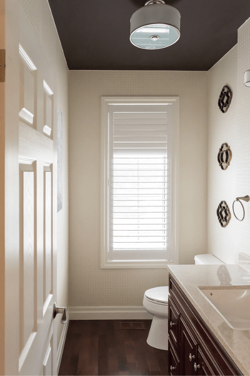
You can also see how this approach worked beautifully in the powder room below. We used Benjamin Moore’s Bittersweet Chocolate to match the dark hardwood flooring.
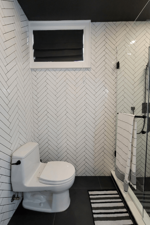
And lastly, a recent project shows a deep black ceiling that mimics the large black tiles on the floor. This Burlington client’s basement has yet to be photographed, the photo shown is my own.
Benjamin Moore’s Black 2132-30 in this basement bathroom.
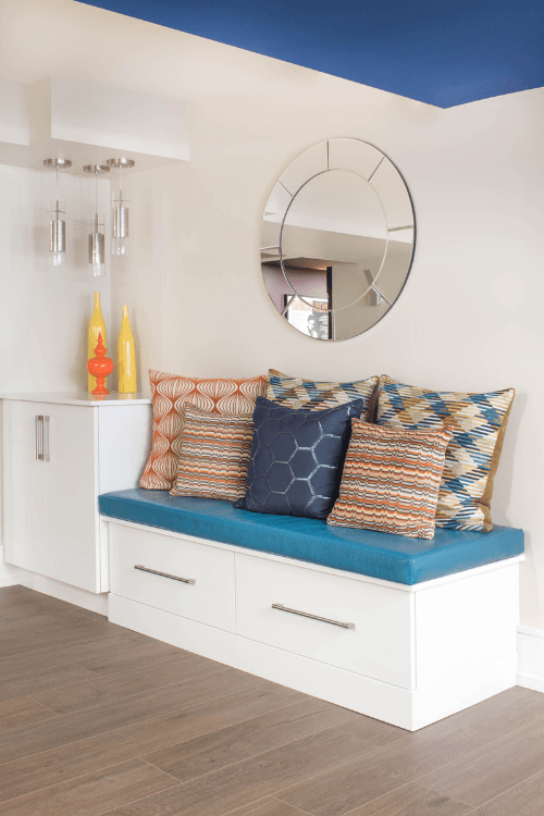
A third way to work colour into your ceiling is to use it in areas to accentuate the structure of the ceiling itself.
Earlier I showed a basement to demonstrate colour flow. It is also a great example where we used it to highlight the bulkhead.
Normally this is not a feature that you want to stand out. However, because there was no getting around having them there, we decided to embrace this 5-foot wide bulkhead instead of ignoring it.
The contemporary design style also helped to pull this off successfully. As a result, painting it Symphony Blue worked to our advantage as we moved through the different spaces in this huge basement. And of course, it helped us to carry the colour scheme all the way through as well.
Going back to my daughter’s room, not only does the Marine Blue painted ceiling make the chandelier pop, but it really does emphasize the angled ceiling in her room.
The contrast between the rich blue of the ceiling and the Lavender Ice colour of the walls, keeps your eyes moving upwards.
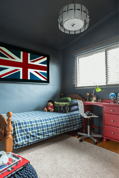
Similarly, in my son’s room below, the ceiling is painted Flint to match the walls and to draw the eye upwards with the slanted ceiling.
Part of the reason why all of these colours look so great is that we chose the right colour. It’s absolutely crucial to pick the right paint colour for any wall, including the 5th.
Here are a couple more painted ceilings from my own portfolio to inspire you.
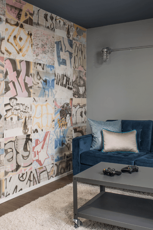
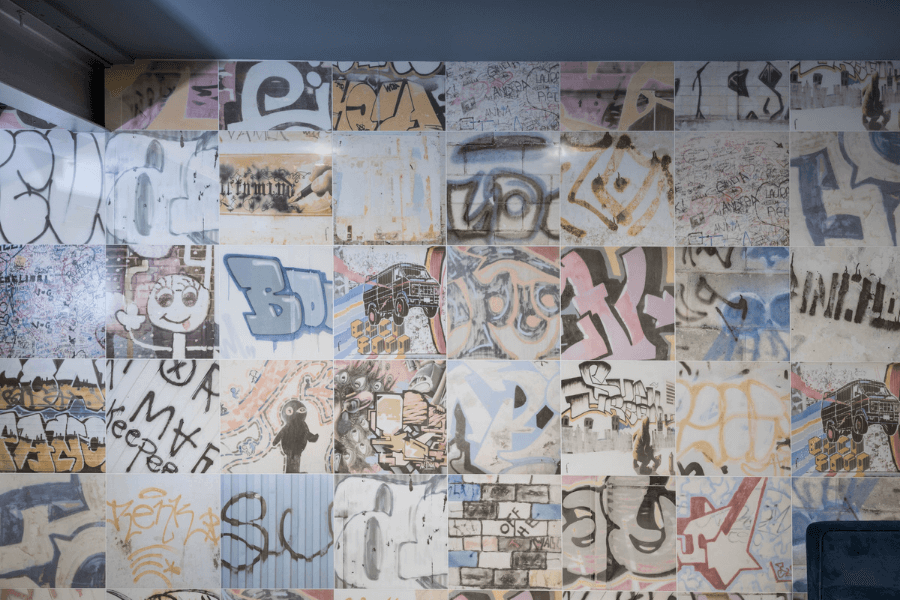
I can’t emphasize enough how a painted ceiling can bring a whole room together. Below is a Secret Xbox game room with an amazing graffiti tile on the feature wall with Black Pepper by Benjamin Moore on the ceiling.
And, the ceiling picks up on similar tones in the funky wall tile as well as the velvet sofa – perfect!
And lastly, I wanted to show you this sitting area in a Toronto client’s home. We decided to continue the Gray Cashmere colour that you see on the walls, up onto the ceiling.
It’s a beautiful backdrop for the chandelier. As well, it gives the room a wonderfully cohesive and elegant look. The sheen of the paint on the walls is eggshell while the ceiling paint was done in a matte finish.
Which of these 12 projects showing painted ceilings was your favourite? Have you ever used colour on your ceilings? Let me know, comment below. I’m always curious to hear your thoughts!
Pin the graphic below to your Pinterest board for easy reference for when you want to come back to this post.
Painted Ceiling Ideas – Choose the Right Paint Colour
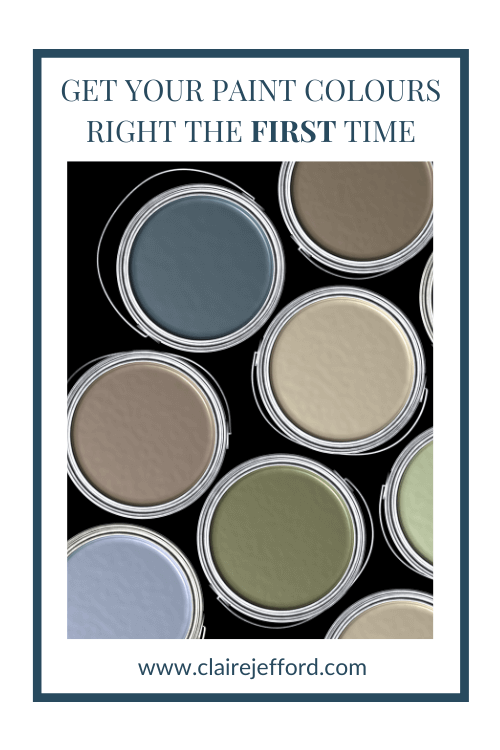
Painting your ceiling is a brilliant way to introduce colour into a room. But only if you use the right paint colour. Get my free resource that will help guide you in making the right paint selection for your future paint projects.
Ceiling or wall, you want to pick the perfect colour the first time.
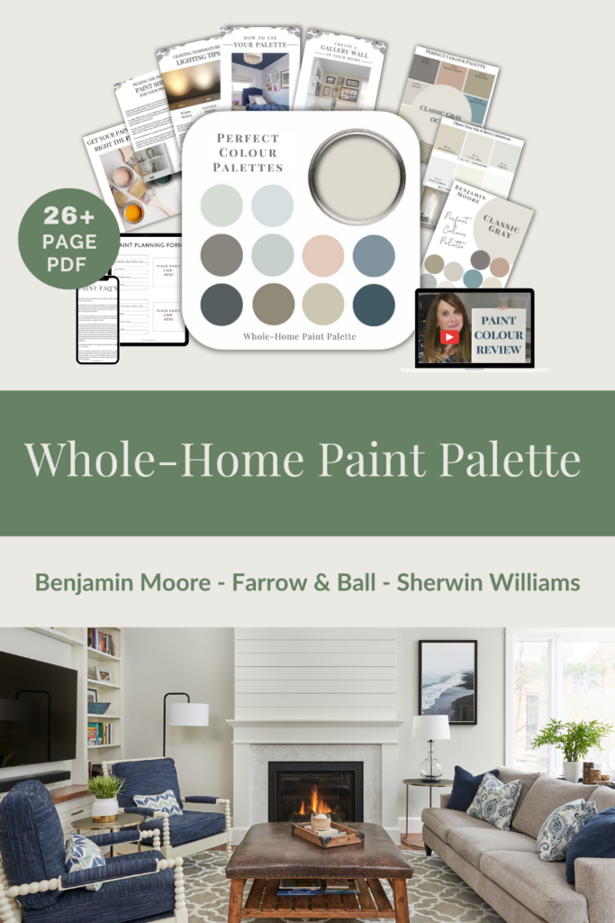
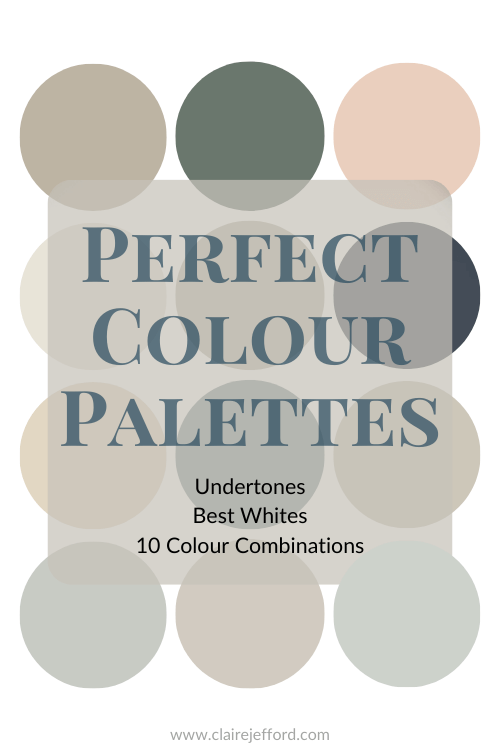
Perfect Colour Palettes
There’s nothing like a perfectly curated colour palette to bring a home’s décor together flawlessly. But knowing how to coordinate colours can be confusing and overwhelming.
Our Perfect Colour Palette library now has 40 paint colours from 3 top paint companies; Benjamin Moore, Sherwin Williams and Farrow & Ball.
These colour palettes were created to help you confidently select the best colour for your home, and then see which trim, ceiling, and accent colours pair well with your selected colour.
An amazing resource for your next design or decorating project.
It’s no secret that I’ve been a huge promoter of leveraging video as one of the most effective strategies to market your business. I truly feel a Design Services video is the best marketing tool.
Video has easily been one of the biggest game-changers for me and other designers whom I know to be using this medium regularly as a marketing tool on their website and for their social media.
Just recently I updated my Interior Design Services video that lives on the services page of my website. If you are rolling your eyes at me because the thought of video makes you cringe, don’t leave – hear me out!
If you only do one video for your business, THIS is the one you NEED to do.
It doesn’t have to be very long or even professionally filmed. Although I would say it’s worth the investment to hire a professional to help if you aren’t comfortable with video creation and editing.
The most important thing is to just get it out there so people can see you.
Take a look at my newest video below, just over 90 seconds long, to see what I mean.
Why a Design Services video is the BEST marketing tool
1. Connection
The connection you can make with potential clients is much stronger with video than with text and still images alone. As soon as they see you a relationship is starting to be built.
2. Builds trust
And through this powerful connection, you have an incredible opportunity to build trust! When people can see you and hear your message, they are able to develop a clearer picture of you are.
Potential clients can quickly relate to you. And they can make a more informed decision about whether they feel you will be a good fit to work with on their renovation or interior decorating project.
3. Stand out from the crowd
In the case of trying to attract new clients, you definitely want to stand out amongst the hundreds of other interior design and decorating professionals. Creating a design services video is a fantastic way to do this!
People are much more likely to remember you and your services if they see you in a video. Information in an email OR a video outlining your services – which is going to be more captivating? Video. Of course!
4. Impact
A Design Services video is an incredibly impactful way to get your message across. You can define your services in a way that prospective clients will recall easily when making their final decision on who to hire.
If the thought of you in front of the camera sounds a bit daunting then perhaps I can help. Set up a 1-on-1 coaching call with me and we can form a plan with steps on how to proceed.
The first video you make is often the most difficult. But you’ve got to start somewhere and I’d be thrilled to get you up and filming.
1. Start your video with something captivating. Speaking to a homeowner’s pain points is a great way to immediately draw them in.
What are they struggling with? Furniture placement, size and style of furnishings, room layout, fabric choices, paint colours? You want to engage your viewer from the first moment. They will be compelled to watch the video in its entirety.
2. Get to the point. You are trying to grab the attention of future clients. You don’t want to bore them with the minutia of everything that is involved with working with an interior designer.
It’s important to find the perfect balance between being informative and not overwhelming your viewer. I suggest no longer than 2 minutes for this type of video.
3. Introduce yourself and tell people a little about who you are. Share any triumphs or accolades that will impress but not sound too braggy.
4. Outline your services. Give brief descriptions of each service you offer. If coming up with your menu of services is something you are still struggling with then firstly you may want to take a look at my FREE SERVICES & RATES GUIDE. You don’t want to bombard a homeowner with too many choices. So, be sure to have a clearly defined list of design services to speak about.
I can’t emphasize this enough.
A Design Services video is the perfect place to explain the different services that you offer. I truly believe people grasp better what their options are when they hear it spoken to them vs. reading about it on a website.
5. Talk about the value of your expertise. Finish your video by pointing out the tremendous value you will bring to their project – big or small. Explain how your skill set will greatly benefit them. And finally, how hiring a professional will, in the end, save them time and money.
Final tip
Be yourself. Show your personality and passion for what you do.
Most of us will agree we learn better by watching or doing than just reading about something. So, be understanding of the struggles that potential clients might have and make a thoughtful and informative video to educate them on the benefits of hiring your services.
Good Luck. Don’t overthink it. Carve out some time to make a plan with a brief script, know where and how you will be filming (good lighting is important!), and remember to breathe.
You might surprise yourself with you how much you like using video or how easy it is. Or perhaps you appreciate it’s something you need to start doing to further your business. Either way, if you want to learn more about how to incorporate video into your business then check out my Video for Profits Course.
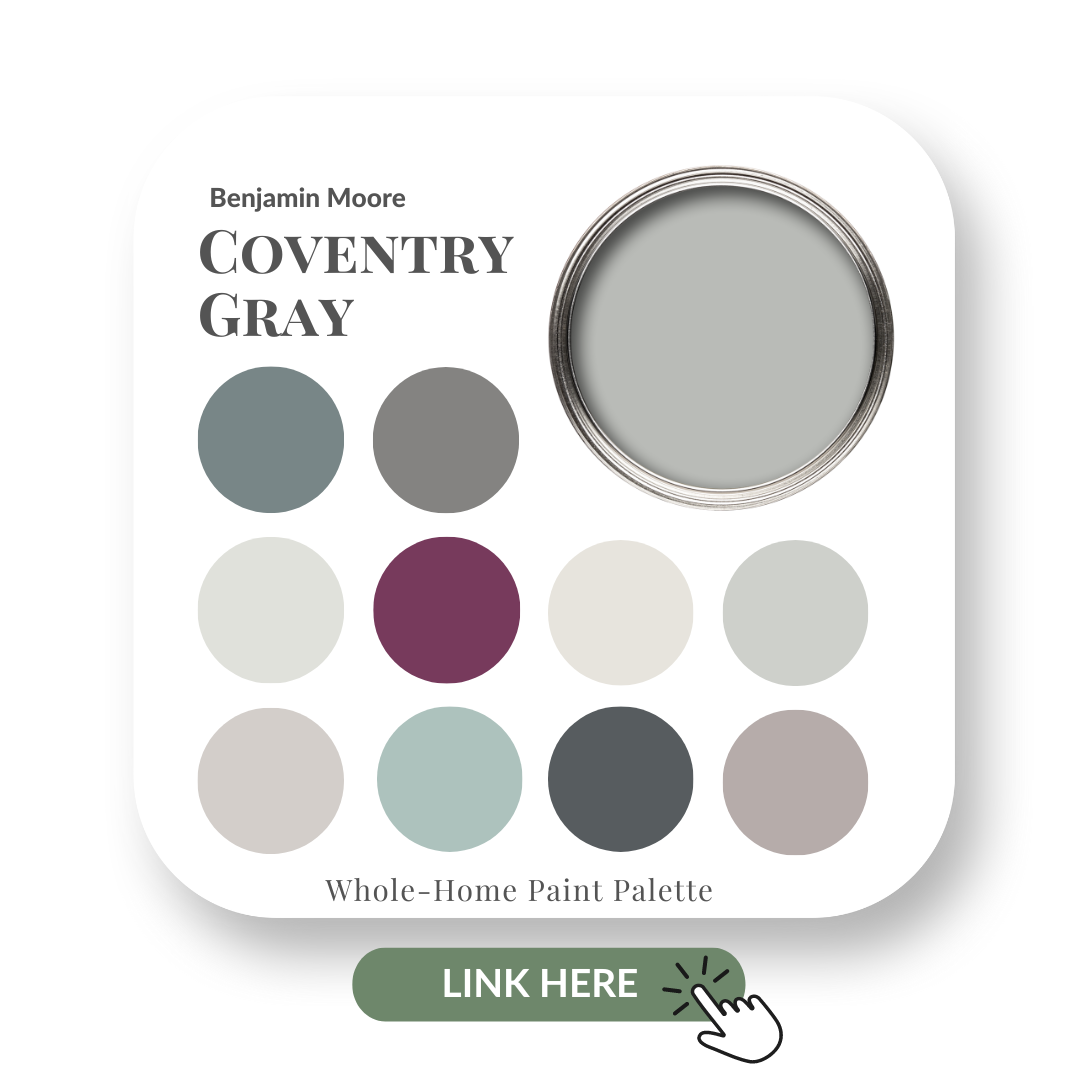
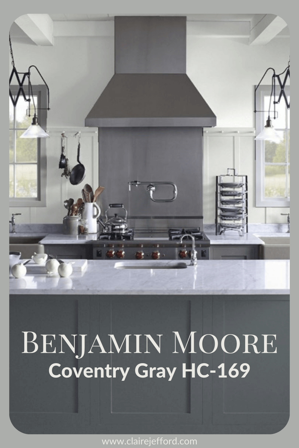
You’ve heard about classics before but this truly is one of the classic grays by Benjamin Moore.
Although Coventry Gray is part of Benjamin Moore’s Historic Colour collection, you’d be amiss to think that it’s old or outdated. It’s anything but.
A versatile mid-tone gray it can be used in modern and traditional spaces. You can use it as a neutral or an accent colour – it looks amazing on kitchen islands!
In today’s colour review video of Coventry Gray by Benjamin Moore, I share:
The undertone
Colour comparisons in order to easily see the different undertones
Best white paint colours for the trim and ceilings
Beautiful colour combinations to inspire you for your decorating project
After you watch the video if you’d like all this information conveniently laid out for you in one place, look no further than my Coventry Gray Perfect Colour Palette.
A fantastic paint resource showing a total of 10 complementary colours to go with Coventry Gray. It’s a must-have digital download for any colour enthusiast or design professional.
As a Certified True Colour Expert and an award-winning interior design professional, I’ve worked with many homeowners on many residential design projects. I want to give you the confidence to make educated decisions about your own paint choices.
Let’s do this!
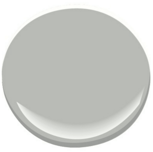
Undertone: blue
Coventry Gray is not super light nor is it a deep gray. I call it a true gray. Coventry Gray along with Stonington Gray are the two grays I show most to clients who are looking for a true gray.
I worked with a family on a home renovation where we used Stonington Gray in their eat-in kitchen. It looks amazing in this space.
It’s always important to remember that in a different light this gray could lean bluer or slightly warmer. How a colour appears on your walls is also dependent on the fixed elements and furnishings in the room it shares.
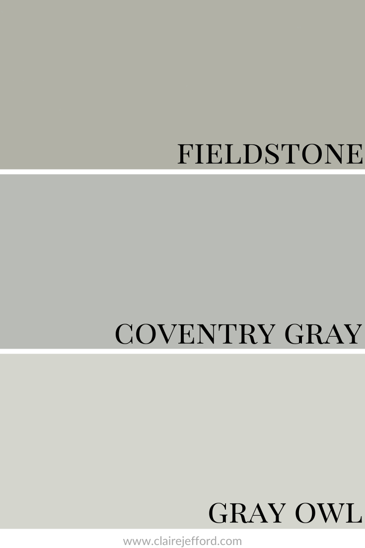
Colour Comparisons
Looking at the colour comparisons below will help give you a better idea of where Coventry Gray fits between two similar shades, one that is more green and the other that is more blue.
I always love to compare a paint colour with clients so that they can see the true tones. It’s often not until you have a colour side by side with similar shades that the tones become obvious.
During a colour consultation, I make sure to show my large paint boards against different elements such as flooring, tile, and fabrics. I swap them out to show clients just how different similar colours can look next to the existing finishes they have in their home.
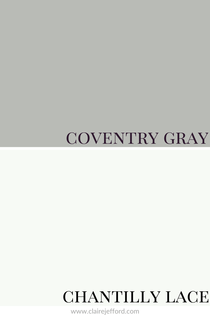
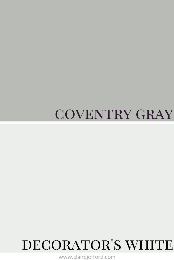
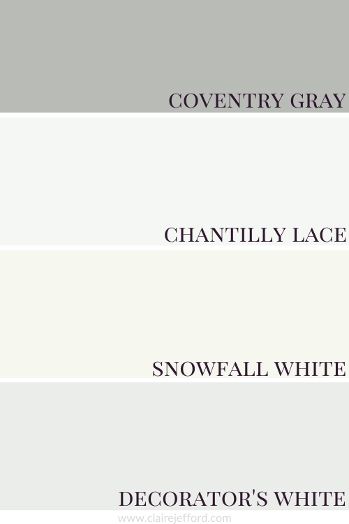
Best Whites To Pair With Coventry Gray
Chantilly Lace OC-65
Snowfall White OC-118
Decorator’s White OC-65
Again, all three of these whites would give a slightly different look when paired with Coventry Gray.
I tend to have around 10 white paint colours that are my best whites for trim and ceilings. You don’t need to look at the thousands of whites available to find the right one. And you definitely don’t need to mix two different whites or use only a certain percentage of paint colour to get the right one for you. The right colour is already out there for you, I promise!
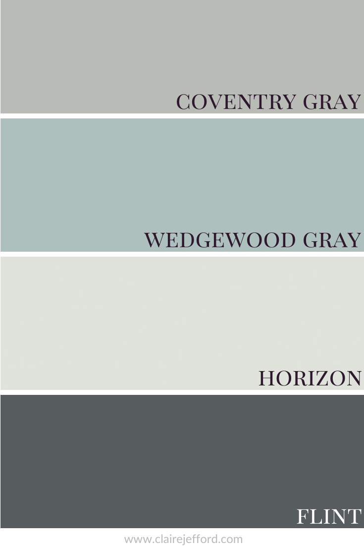
In the video, I selected three colours to pair with Coventry Gray. All three colours are from Benjamin Moore and can be found in my Perfect Colour Palette for Coventry Gray.
There are a total of 10 complementary colours to give you loads of options for creating gorgeous paint palettes that work amazingly with this light gray.
Coventry Gray is extremely versatile. It pairs well with neutrals, colours with similar tones, and those that offer amazing contrast.
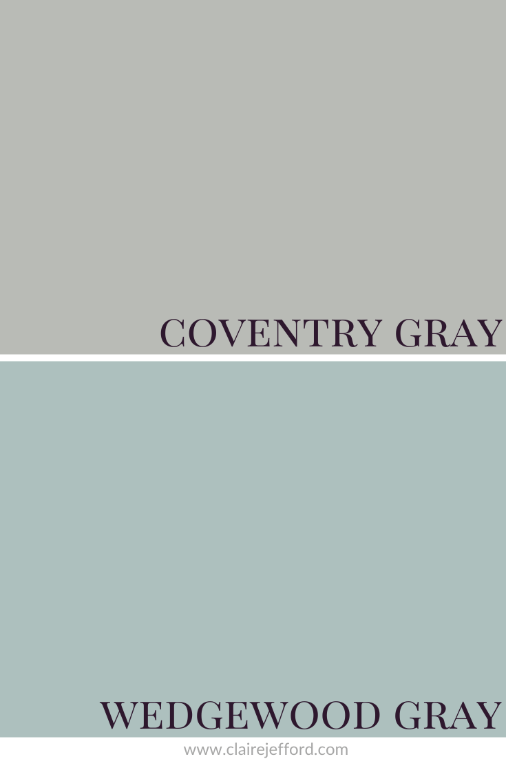
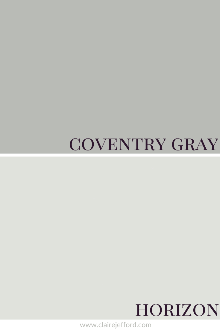
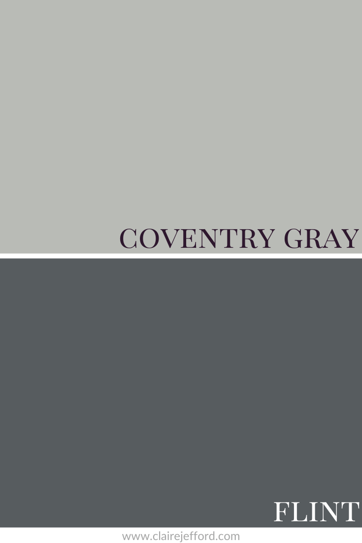
Coventry Gray with Wedgewood Gray, Horizon & Flint
Wedgewood Gray HC-146
Horizon OC-53
Flint AF-560
Coventry Gray does look stunning against the dark blue-black of Flint.
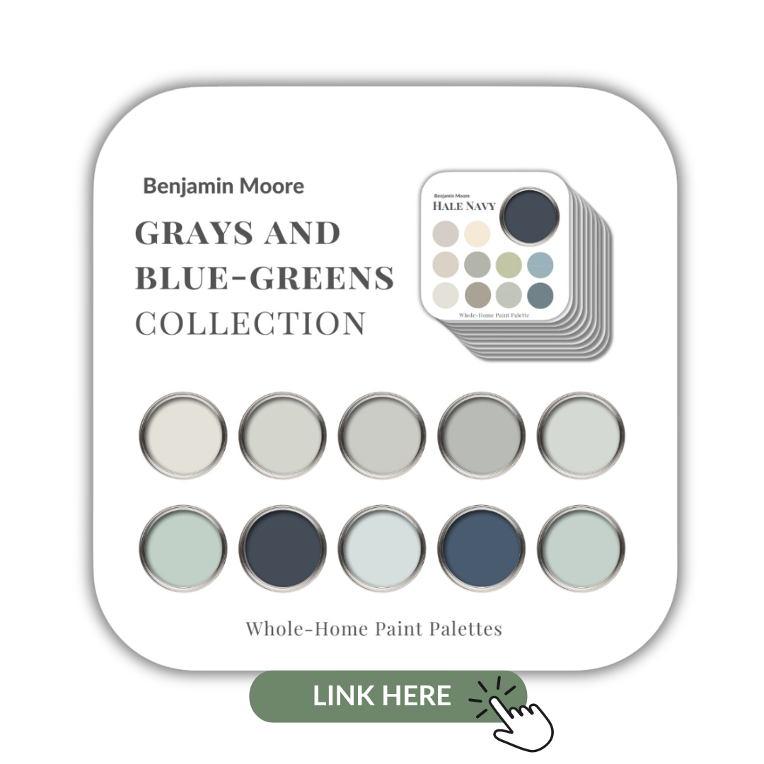
If you like what you see in Coventry Gray but aren’t sure it’s the right gray for you, take a look at the beautiful paints I have put together in my Benjamin Moore’s Grays & Blue-Greens collection.
Coventry Gray is in there as well as 9 others. Definitely worth checking out.
What are your thoughts on Coventry Gray? I haven’t had the chance to use this colour yet, have you? Please comment below.
These are digital downloads for your convenience. I’ve printed all of mine and they have proven to be a very helpful resource for interior design consultations and to refer to for client projects.
If you want to get all my Benjamin Moore colour guides in one place, look no further than my Benjamin Moore Ultimate Collection. All 20 of my Benjamin Moore guides are in one handy collection.
Remember, it only takes one mistake to take your home decorating project from divine to disaster. Don’t let the paint be what stresses you out!
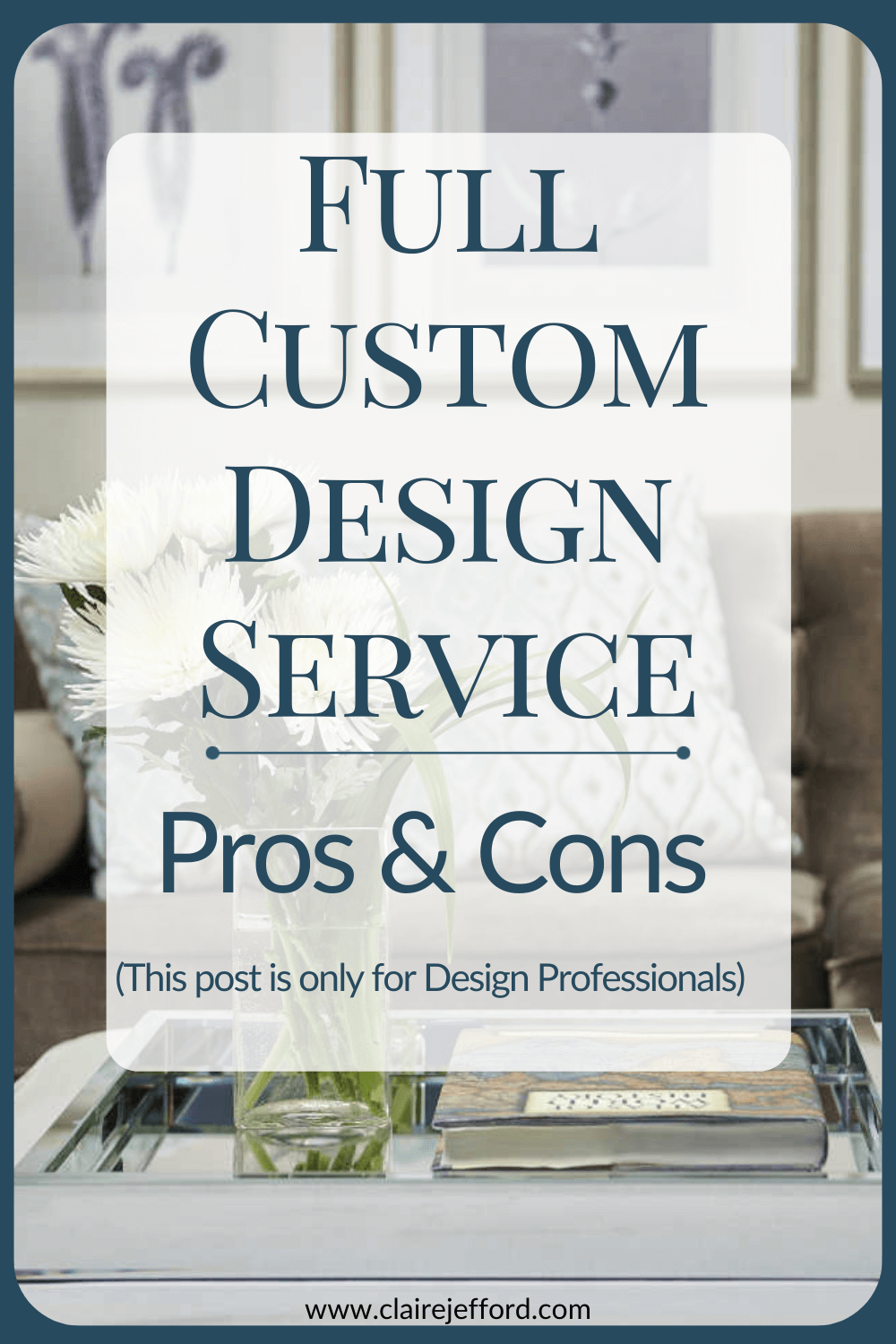
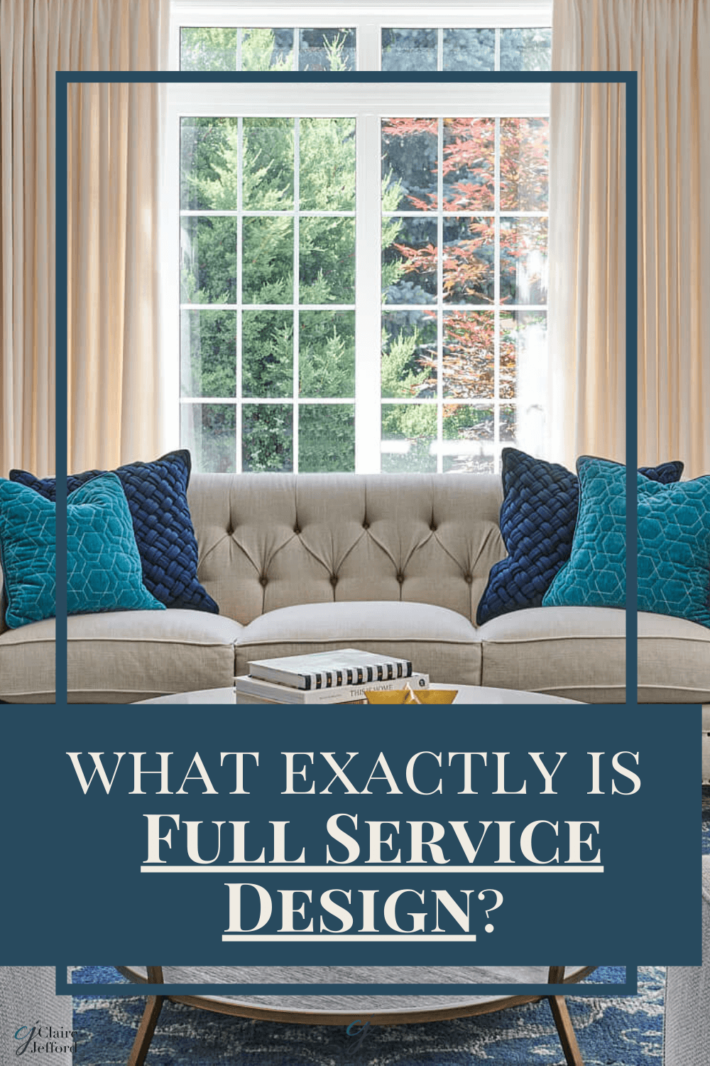
We offer Full Custom Design & Project Management as our top luxury interior design service.
Many interior design and decorating professionals aspire to work on these types of projects where they are in charge and can see a project right through to completion.
What does the Full Custom Design service look like and what are some of the Pros & Cons?
Read on to find out how we operate this type of service and what I believe are some of the important positives and negatives of working on projects of this nature.
Firstly though, it’s important to know what services you’ll offer when starting or running your own design firm. When I coach fellow design professionals I discuss with them these 3 key factors that I feel are crucial when determining which services to provide.
1. What are your business goals? It is not necessary to offer the same list of services that every designer you know does if they will not help you meet your business goals. Be faithful to your goals and build your services around achieving them.
2. Where are you in your personal life? Certain services may be more or less appealing depending on your personal situation.
Perhaps you are semi-retired or doing design on a part-time basis, or you have young or elderly family members to care for. Maybe you have just moved to a new city. There are so many different circumstances that will have a role in deciding which services will fit best for where you are in life.
3. You Do You! This is YOUR business. It is of no benefit to you to worry about what other people are doing or what they might think about how you run your business.
You do not need to convince others why the path you want to take is a good idea. Provide design and decorating services that excite YOU and make no excuses!
If you haven’t already got your hands on my FREE Services and Pricing guide, with 12 pages, get it now to determine the best list of services to offer that will help you achieve your business goals.
Full Service, Custom Design and Project Management are two of the terms used to describe this type of service. Regardless of what you name it, for most, this is the top interior design service. I describe it as our elite service and tell clients that when they hire us for this service, they are MARRIED to me.
Full service means exactly that – Full service. There is no piecemeal to this type of service and the client needs to fully understand that they are handing over the reins to you, the interior design professional. You are the lead for this project and will see it through from beginning to end.
The client gets to sit back on this one (for the most part) while you organize everything and handle all the details. You will manage the trades, make selections and do all the purchasing. It will involve installations and typically white glove delivery service.
BTW, if you still don’t feel confident about managing your relationship with trades, you can get my How To Find Great Trades & Suppliers where I guide you in finding the right people and products for your business.
Lastly, there will be the Big Reveal upon completion!
Who’s likely to hire you for this type of Full Service Interior Design?
It is important to remember that this type of service is not for everyone. This is a tailor-made service for someone who has no time or frankly the inclination, to take on this type of project themselves.
In my experience, these clients are often busy working professionals who do not want to be involved in the day-to-day running of the project and they typically have a decent amount of money to invest for these services.
Homeowners seeking this service understand that this is your field of expertise, not theirs. Therefore, they want a beautiful space where the smallest detail will not go unchecked. Most clients who hire you for Custom Design and Project Management appreciate the incredible value you bring to the table and put their trust in your abilities.
Like all my services a signed contract is a must. I always review my contracts in person with my clients and request a retainer at the same time.
During the initial 2-hour consultation we have evaluated the needs of the client. We have also assessed the scope of their project. In doing so we’ve determined that Custom Design & Project Management is the most suitable service.
I have a comprehensive and easily editable contract template specifically for my Custom Design & Project Management service. Included with it is a wonderful marketing tool. Use this outline to explain to your client how this service works. It will also assist in answering many of the most common FAQs.
If you have trouble articulating the value you bring to a project and the benefits of your services, this will help you immensely.
Because clients of this type of full design service have invested in you and your abilities, they stick with you for the duration of the project. You have a dedicated client who will not shop you or be constantly looking over your shoulder. They have signed a contract stating all this and more.
In the beginning, it might be difficult to land the bigger custom design jobs with decent-sized budgets. In that case, Designer by Your Side services may be what you sell more of when you first start your business.
You Have More Control
If you like being in charge of a project then this may be the only service you offer past the initial consultation meeting. This client is putting their trust in you. In addition, they are giving you the creative freedom to see your vision through to completion.
There’s no confusion as to who’s dealing with what because you are dealing with everything. From scheduling and meeting with the trades to ordering furnishings and selecting finishes. There isn’t anything you are not on top of and people know who to come to should any issues arise.
That BEST Feeling of Satisfaction!
I believe the biggest pro is how rewarding it is to see the absolute joy on a client’s face at the big reveal! It’s fantastic when you see all your efforts and hard work come together in a stunning finished room.
Amazing Professional Photos
Following on from the previous pro is that you’ll likely get fabulous professional photos of the space to add to your interior design portfolio.
These images are great for showing future prospective clients your work. Also, for sharing on social media to broaden your reach. A range of professional photos is a fabulous asset for your business.
With the positives come the negatives, here are some cons of this service.
You Must Be Super Organized
Because you are the lead on a Full Custom Design Project it’s imperative that you are super organized. You will have a lot of balls in the air at any given time and need to be able to manage them all. It starts with your processes from the time you sign the contract with the client. It continues through the design and planning stages all the way through to building, installation, and delivery.
If details aren’t your forte then you might not be suited to offer this type of service.
Oh the paperwork
Documentation is enormous and you will need to keep accurate records of all the incomings and outgoings. Quotes, invoices, emails. They can pile up quickly and you will need to file everything so that you have a complete paper trail if (when) you need it.
Headaches
Keep a bottle of aspirin handy as I can guarantee you, issues will arise!
When things go awry it all falls on you to sort out. If you don’t deal well with confrontations or the pressure of being the ‘fixer’ then you may need to rethink offering this service.
Ultimately, you are the person that must resolve problems that arise. From trades not showing up and dye-lot issues with the fabric to damaged furniture, it’s all up to you to resolve these problems that inevitably will arise.
The client is paying the big bucks for you to take on the headaches on their behalf. If this sounds all too overwhelming for you then you will either need to hire someone who will do this for your or stay clear of this type of design service altogether.
Do you currently offer this service or one similar? If you don’t, would you consider it?
I love hearing from all my fellow design and decorating professionals so please, comment below.
Pin for Easy Reference!
More design contracts for your business:
Claire's Guide to Services & Pricing
FREE DOWNLOAD:
Interior Design Services and Rates Guide
This website uses cookies to improve your experience while you navigate through the website. Out of these cookies, the cookies that are categorized as necessary are stored on your browser as they are essential for the working of basic functionalities of the website. We also use third-party cookies that help us analyze and understand how you use this website. These cookies will be stored in your browser only with your consent. You also have the option to opt-out of these cookies. But opting out of some of these cookies may have an effect on your browsing experience.
Necessary cookies are absolutely essential for the website to function properly. This category only includes cookies that ensures basic functionalities and security features of the website. These cookies do not store any personal information.
Any cookies that may not be particularly necessary for the website to function and is used specifically to collect user personal data via analytics, ads, other embedded contents are termed as non-necessary cookies. It is mandatory to procure user consent prior to running these cookies on your website.