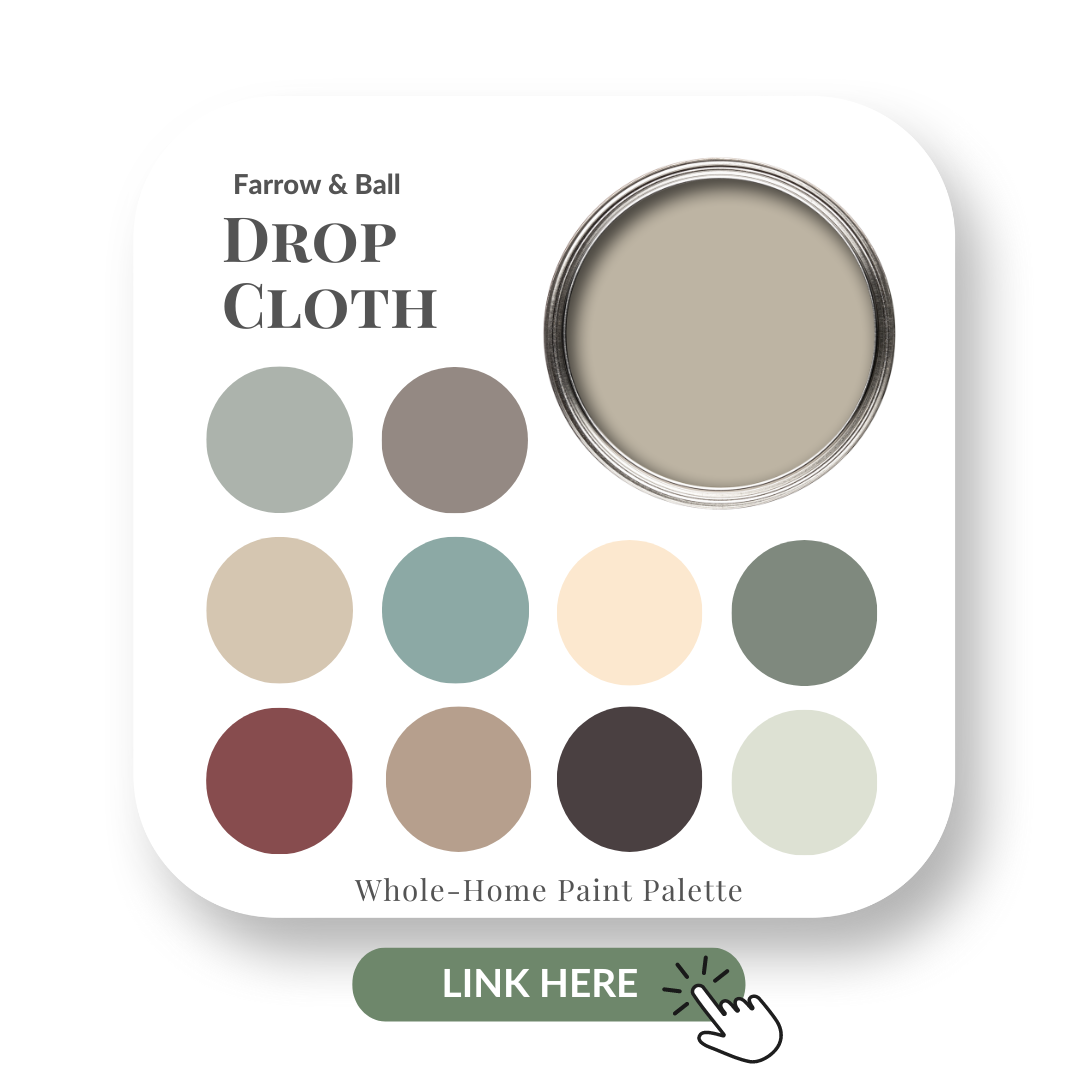
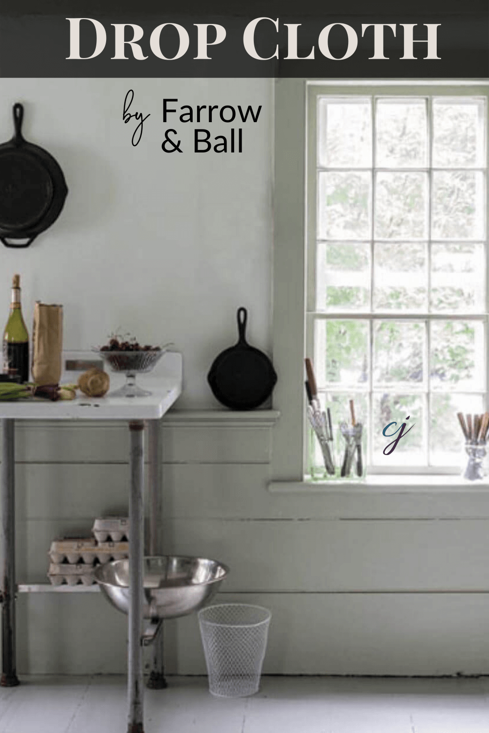
Farrow & Ball Drop Cloth
Choose the right paint colour
the first time Let me show you how in just 5 easy steps!
BONUS: The Top 15 Shades of Gray by Benjamin Moore

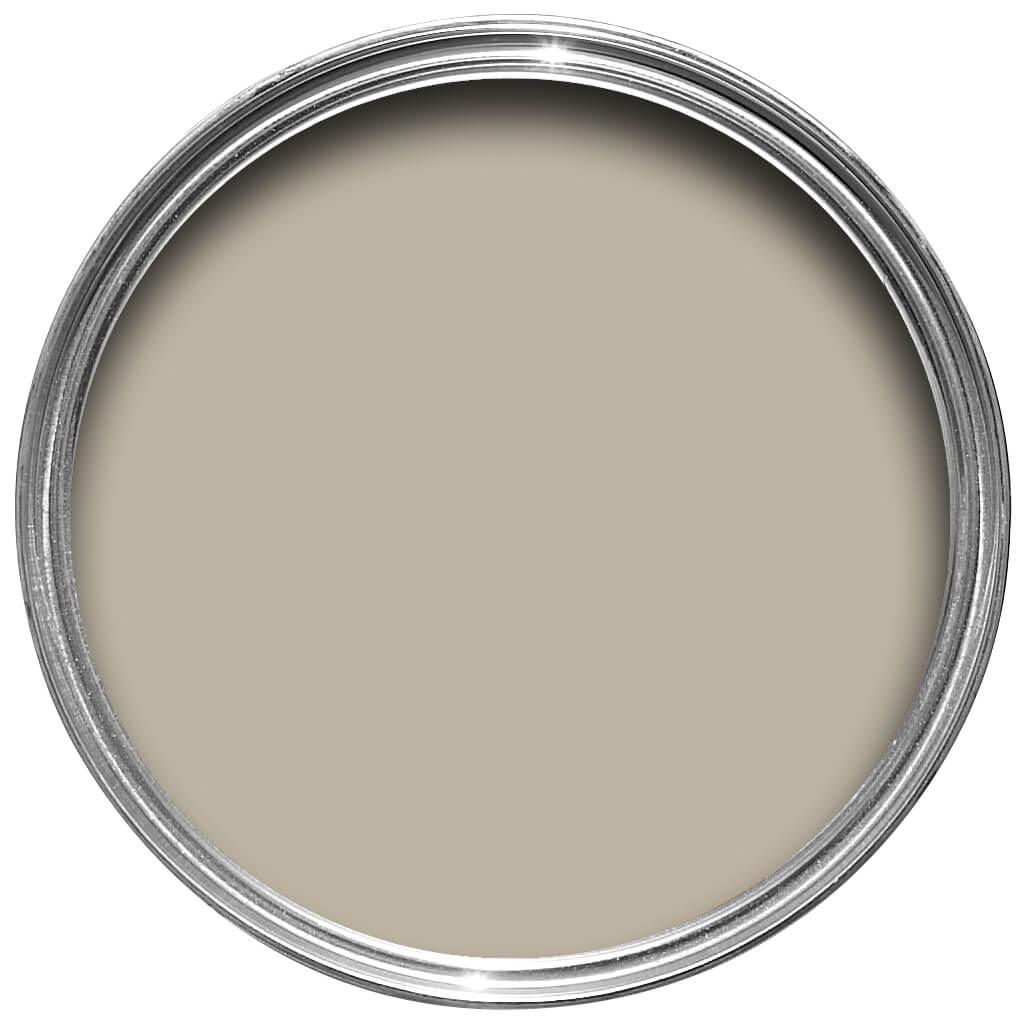
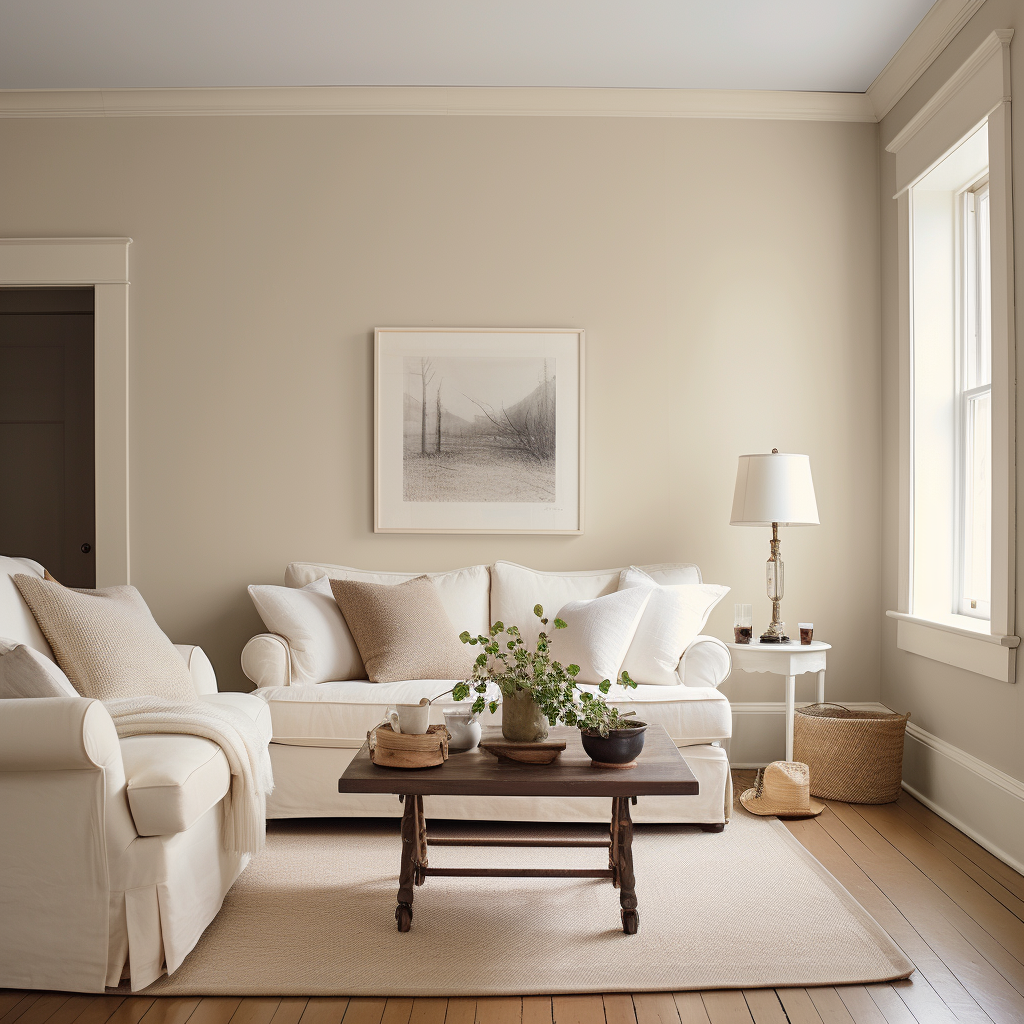
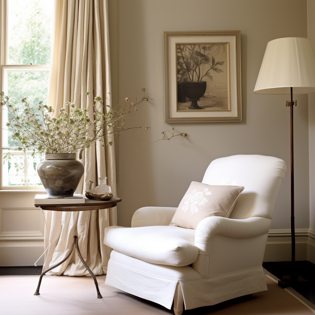
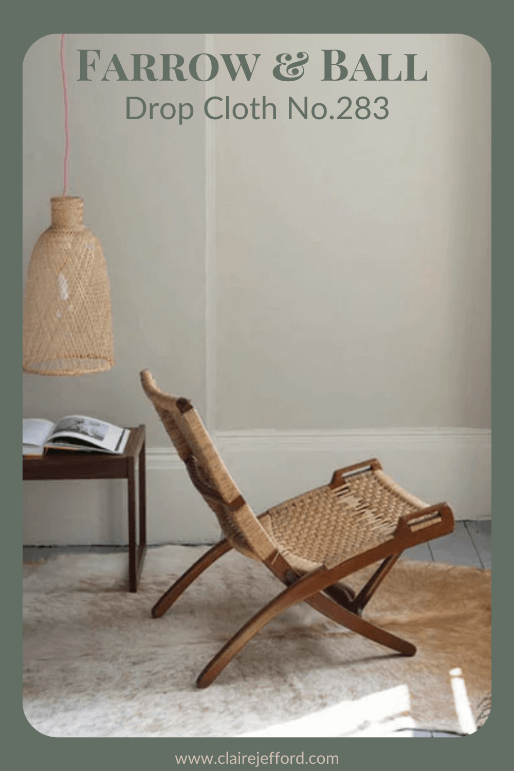
Drop Cloth No. 283 By Farrow & Ball
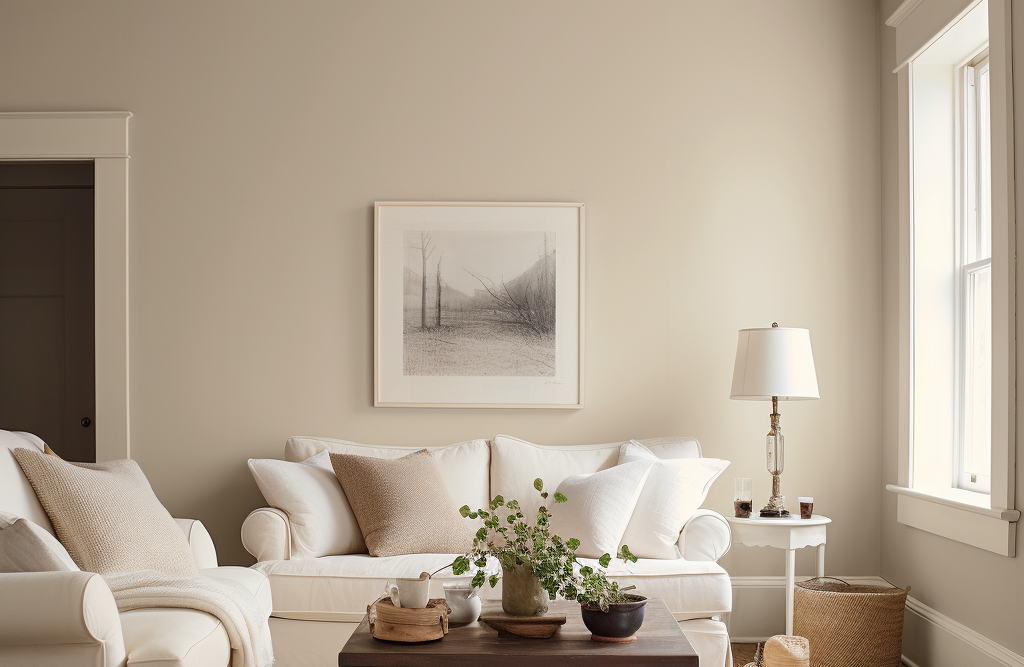
A gorgeous muted neutral from Farrow & Ball, Drop Cloth is neither too yellow nor too gray.
If you’re new here, welcome! Below you will see what I cover in every colour review post.
In this colour review video of Drop Cloth by Farrow & Ball, I share:
- The undertone of my featured colour
- Colour comparisons in order to easily see the different colour tones
- Best white paint colours for the trim and ceilings
- Beautiful colour combinations to inspire you for your decorating project
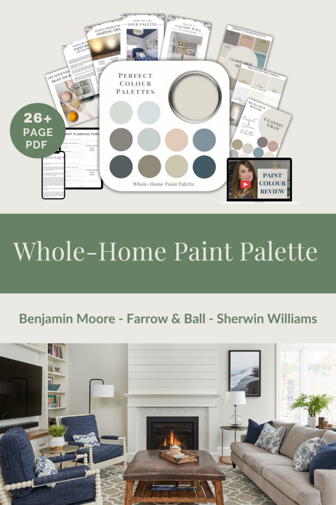
After you watch the video, if you would like all this information conveniently laid out for you in one place and have even more paint colour combinations to use with Drop Cloth, take a look at my new Perfect Colour Palette.
A must-have for any colour enthusiast or design professional.
Drop Cloth Colour Review Video
Undertones: Yellow/Gray
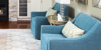
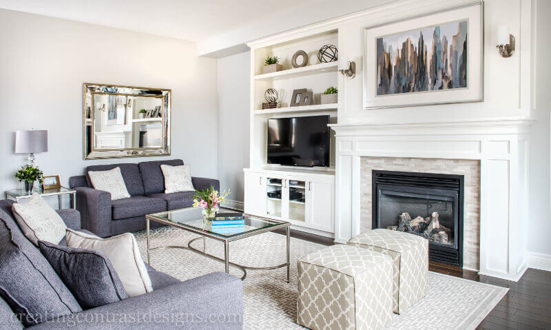
This subdued gray/beige paint may lean towards one colour more than the other depending on the lighting and what other decorative elements you pair with it in your interior decorating project.
The colour of your trim and ceilings will also affect how Drop Cloth appears in your space, more beige or more gray.
As you can see below, it’s when we start to look at comparisons to other colours, that it becomes very eye-opening.
Colour Comparisons
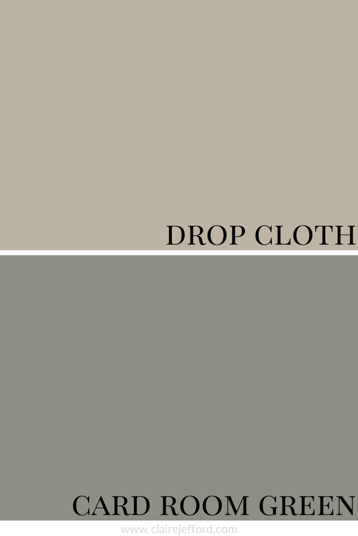
Elephant’s Breath No.229 & Pavilion Gray No.242
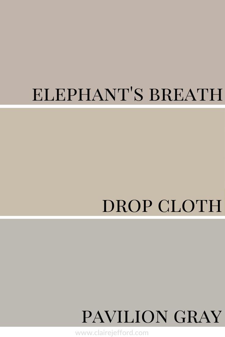
When you look at a colour side by side with similar shades the differences become much more apparent. Elephant’s Breath, another gorgeous neutral by Farrow & Ball, has a pink undertone and Pavilion Gray definitely has a more gray undertone when compared to Drop Cloth.
It’s only when we compare colours that we can truly understand the tones and whether they lean more one way or another on the colour spectrum.
When I do Colour Consultations in a client’s home, I am always comparing colours so they too can easily see the differences.
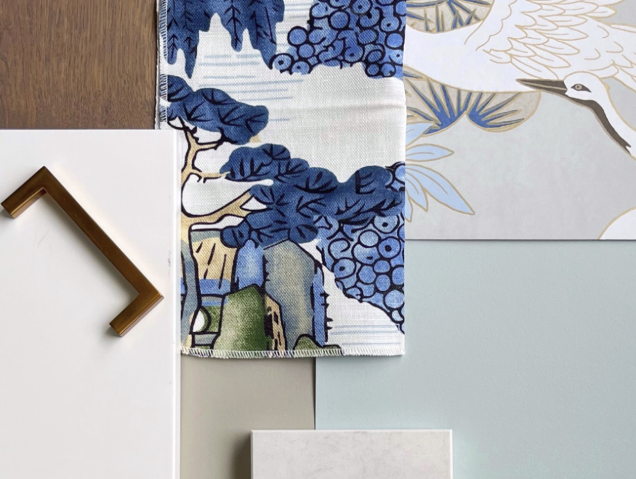
When I hold my large paint boards up to a decorative element such as fabrics, wallpaper, or subway tile and then swap out one board with another board, it becomes much clearer as to which colour will work best.
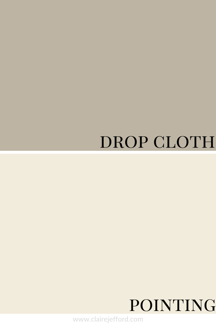
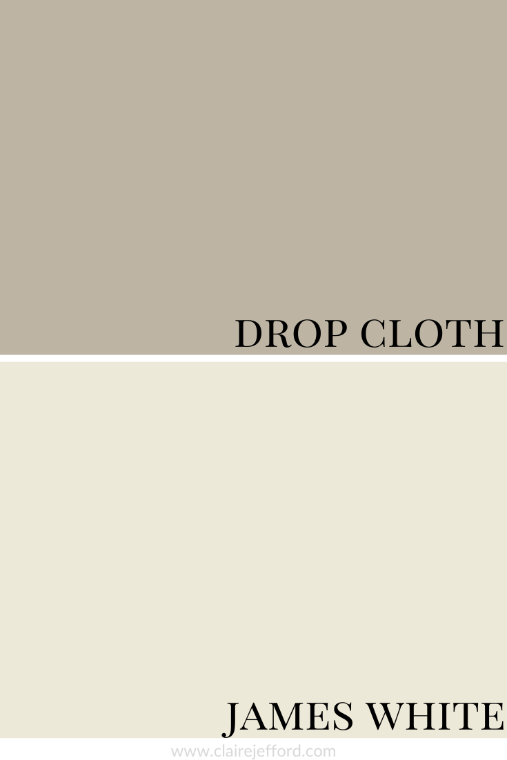
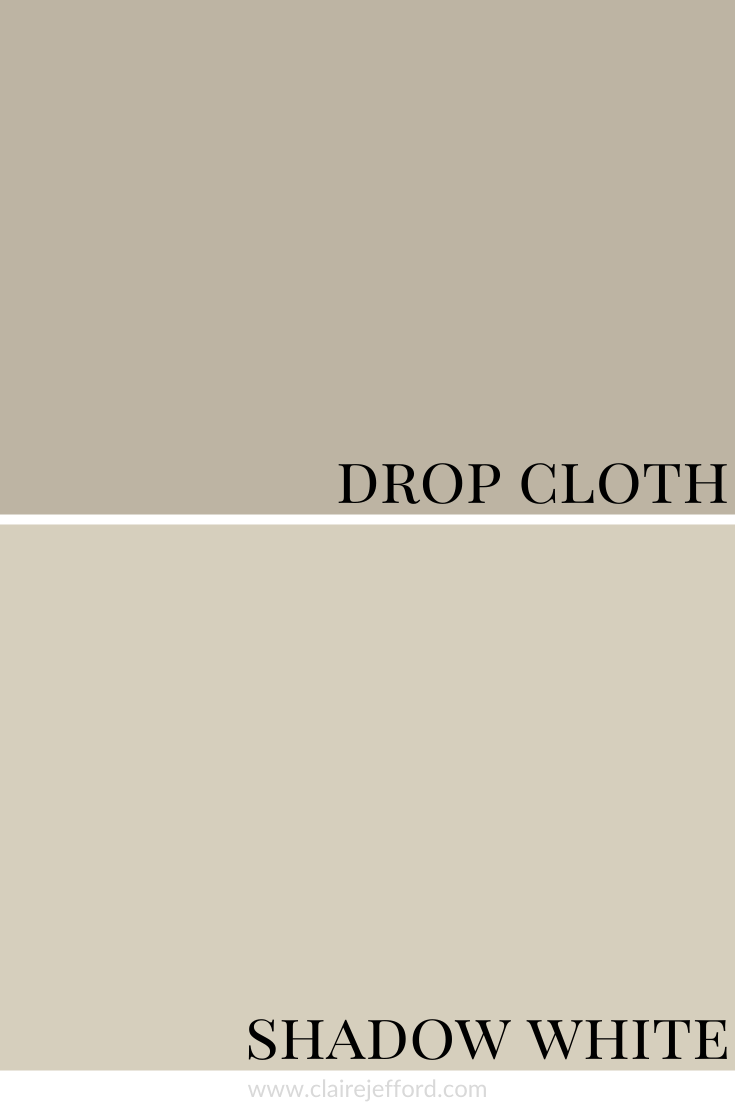
Best Whites To Pair With Drop Cloth
Pointing No.2003 By Farrow & Ball
James White No.2010 By Farrow & Ball
Shadow White No.282 By Farrow & Ball
I can assure you that the best colour for your project already exists, you just need to know the 5 Steps on how to choose the right paint colour the first time.
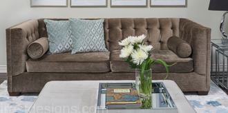
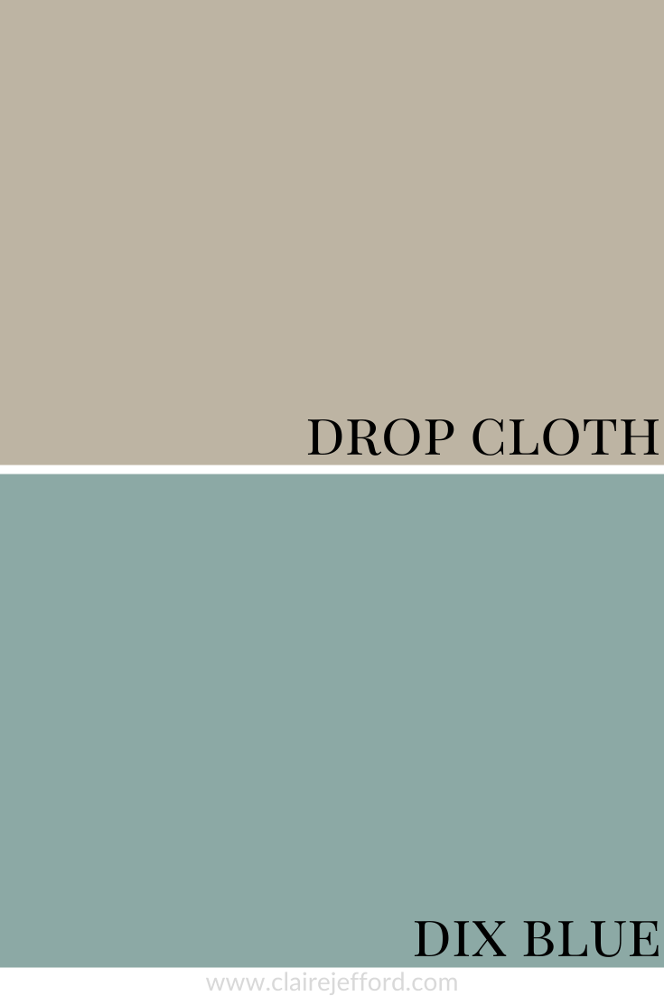
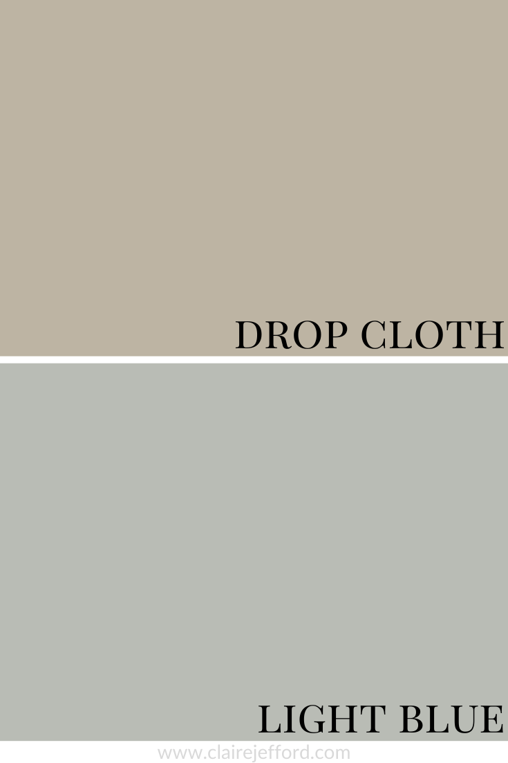
Fabulous Colour Combinations
Drop Cloth with Card Room Green, Dix Blue & Light Blue
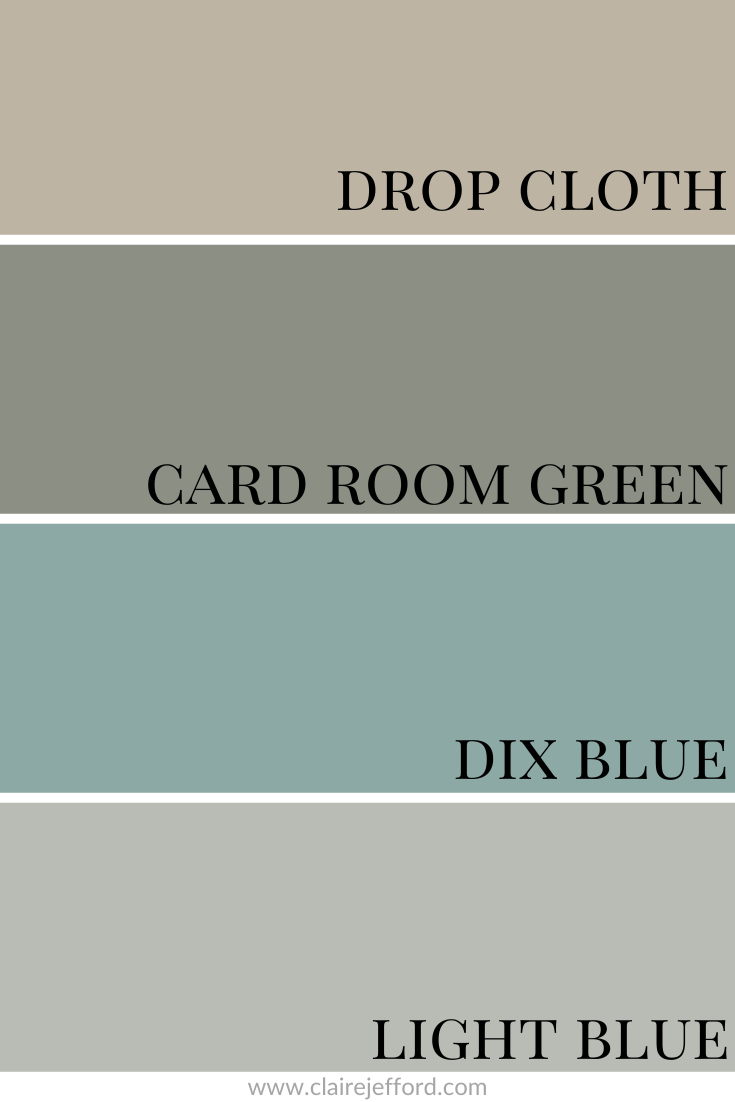
Card Room Green No.79 By Farrow & Ball
Dix Blue No.82 By Farrow & Ball
Light Blue No.22 By Farrow & Ball
Convenience At Your Fingertips
All of the colour combinations shown above plus more options for you to choose from are included in my Perfect Colour Palette for Drop Cloth.
Drop Cloth is one of 10 Farrow & Ball colours you’ll find in our Farrow & Ball Classics Collection.
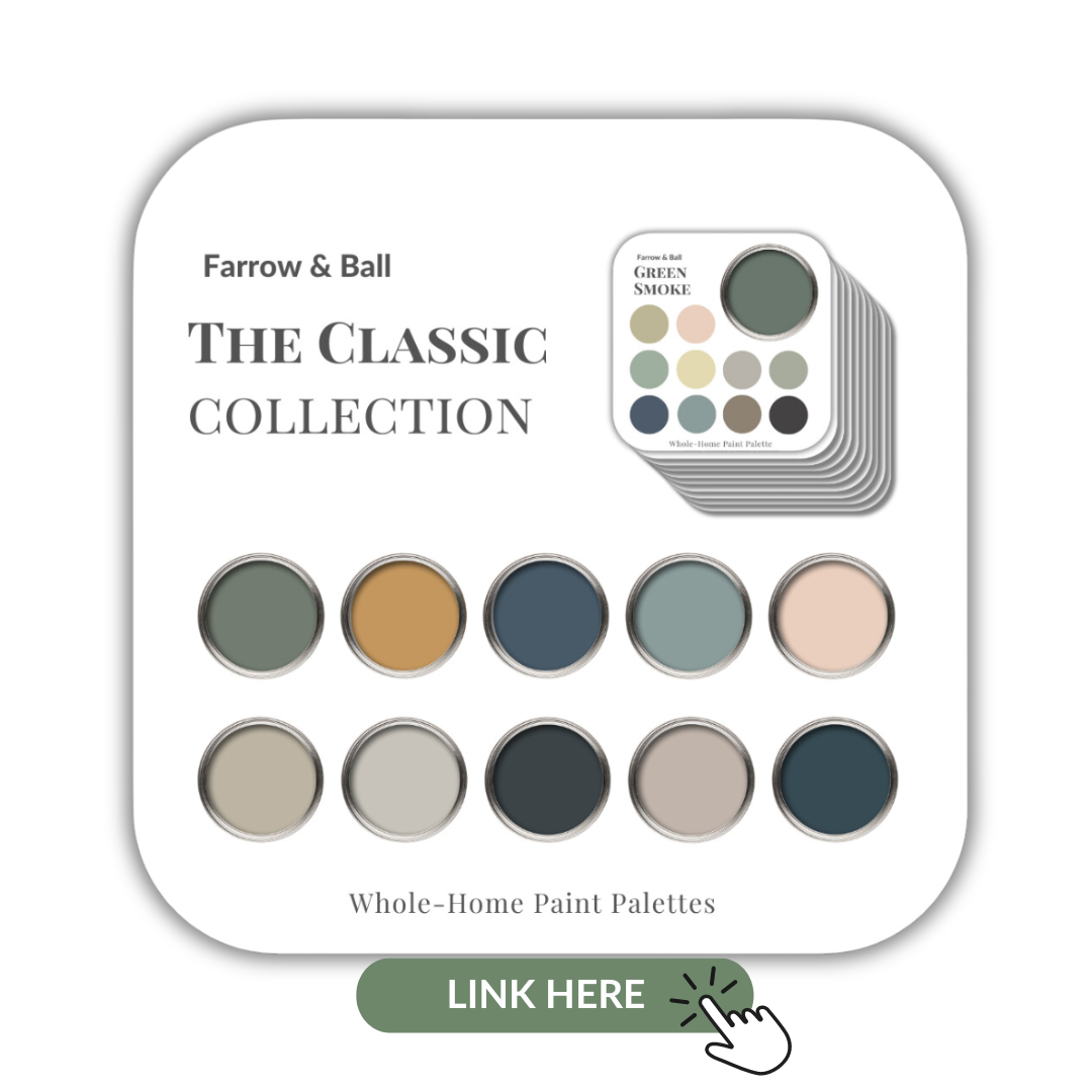
My Perfect Colour Palette library is expanding and I now have over 50 palettes to select from! Click here to see all of them.

Remember, it only takes one mistake to take your home decorating project from divine to disaster. Don’t let the paint be what stresses you out!

Perfect for Pinning
All room images from Farrow & Ball