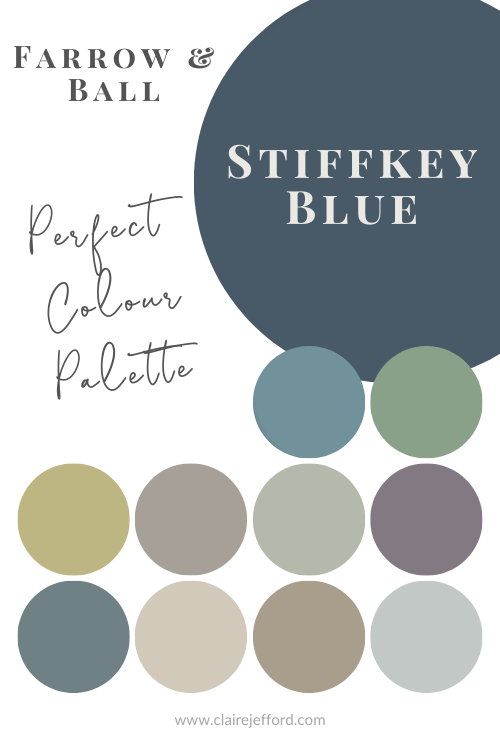
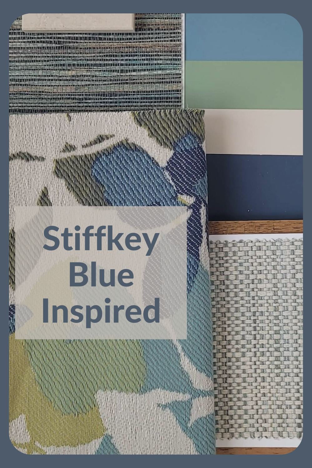
Stiffkey Blue Colour Palette Designs
Choose the right paint colour
the first time Let me show you how in just 5 easy steps!
BONUS: The Top 15 Shades of Gray by Benjamin Moore

Three Beautiful Palettes for Stiffkey Blue
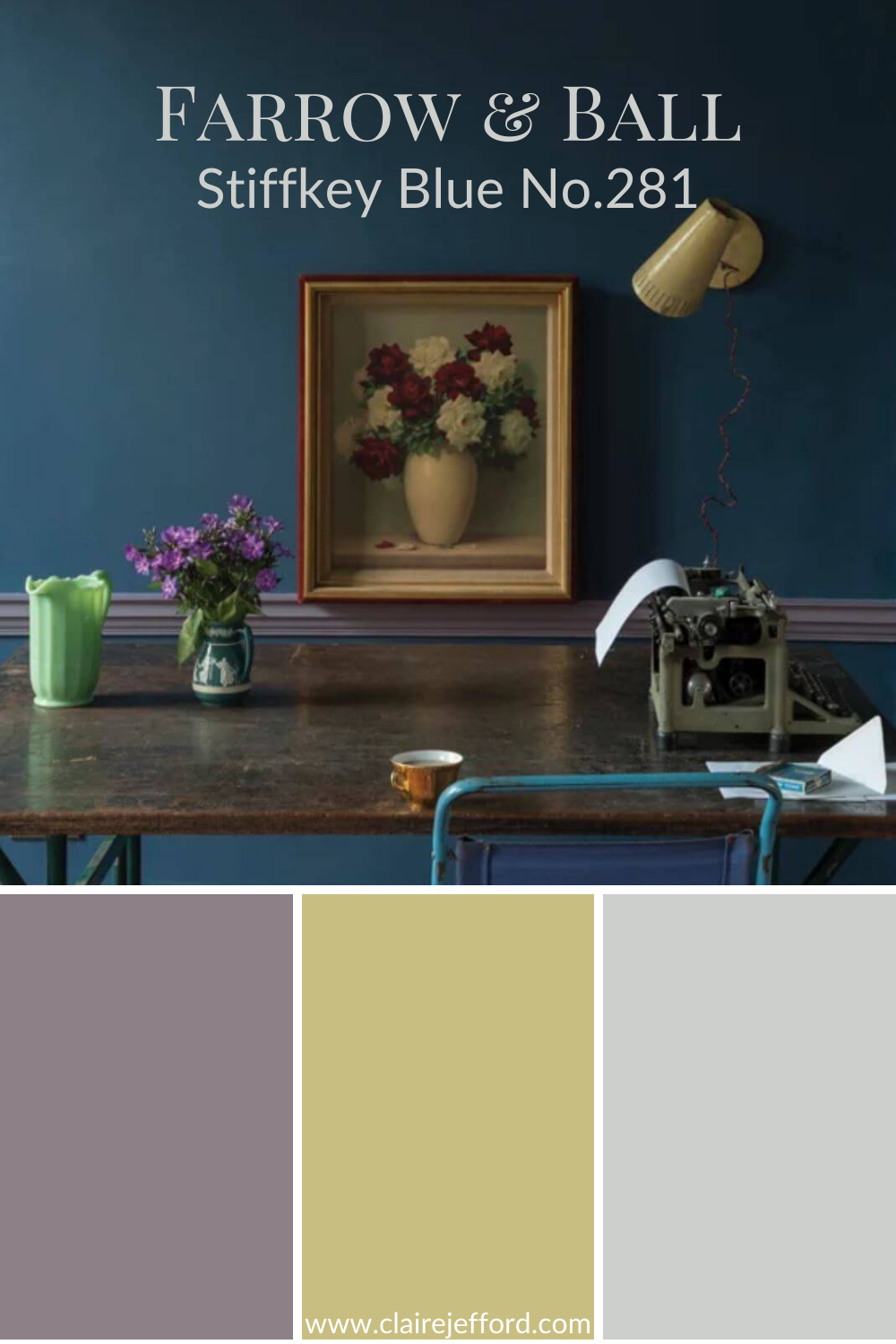
My most recent colour review was for Stiffkey Blue by Farrow & Ball. Today I have pulled together three gorgeous Stiffkey Blue colour palette designs to inspire you with some ideas on how to use this gorgeous rich blue to put together a complete look for your home.
In this video, I demonstrate how to use the colours from my Stiffkey Blue Perfect Colour Palette as inspiration for creating beautiful interior design palettes with fabrics, wallpaper, hardwood, countertops and more, for your home.
All the colours I use are included in my Stiffkey Blue palette. I have come up with three exquisite combinations for you, but there are many more ways that you could mix and match to create a design palette that is perfect for your home.
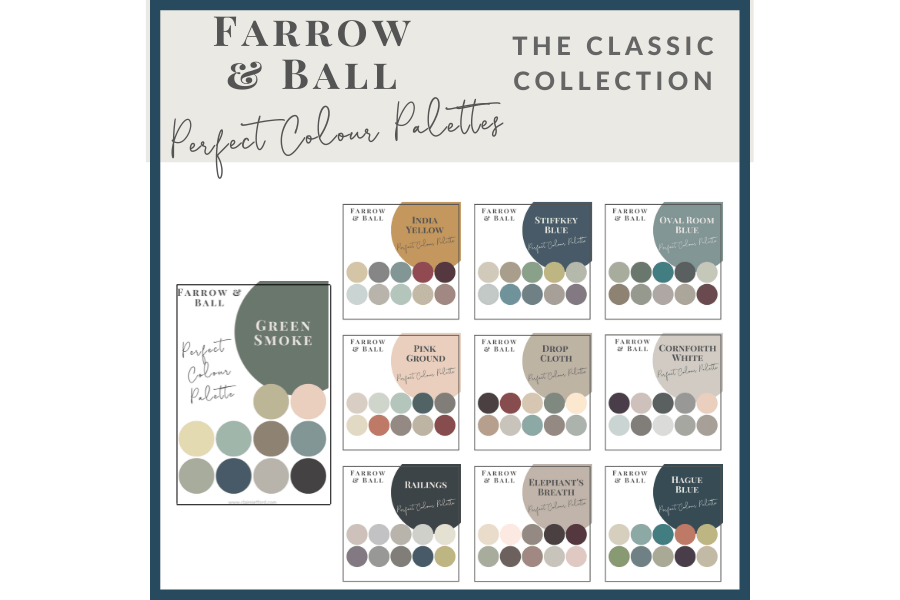
Stiffkey Blue is just one of the colours in my Farrow & Ball Classic Collection which showcases 10 popular Farrow & Ball paints. Just think of the inspiration waiting to be tapped.
Stiffkey Blue Colour Palette Designs
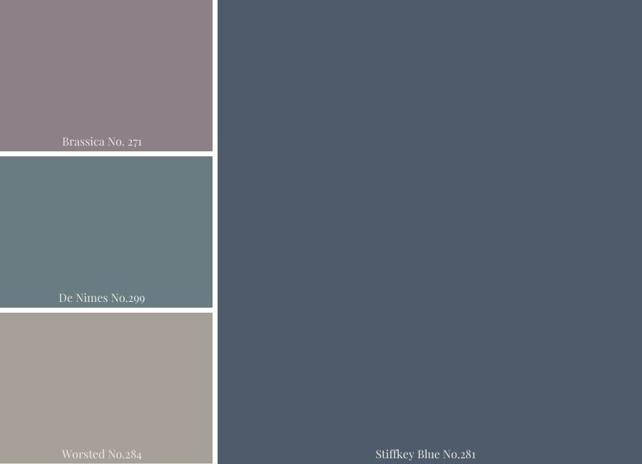
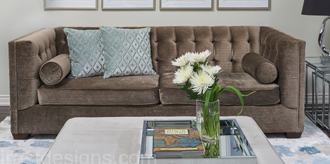
1st Fabulous Colour Combination
Talk about a fabulous paint palette! This combination of colours with the featured Stiffkey Blue by Farrow & Ball would make for quite a dramatic look. Bold, and beautiful.
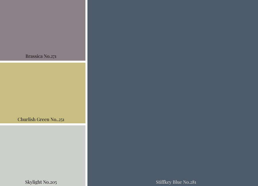
These three colour tones look stunning together, a real rich, luxe feel.
You can easily use the colour combinations I put together in my Perfect Colour Palette digital downloads to find inspiration for fabrics and other home décor finishes.
Am I suggesting you need to use all three of these paint colours in one space? Not necessarily. The idea is to use them to guide and inspire you for pulling together an entire interior design palette.
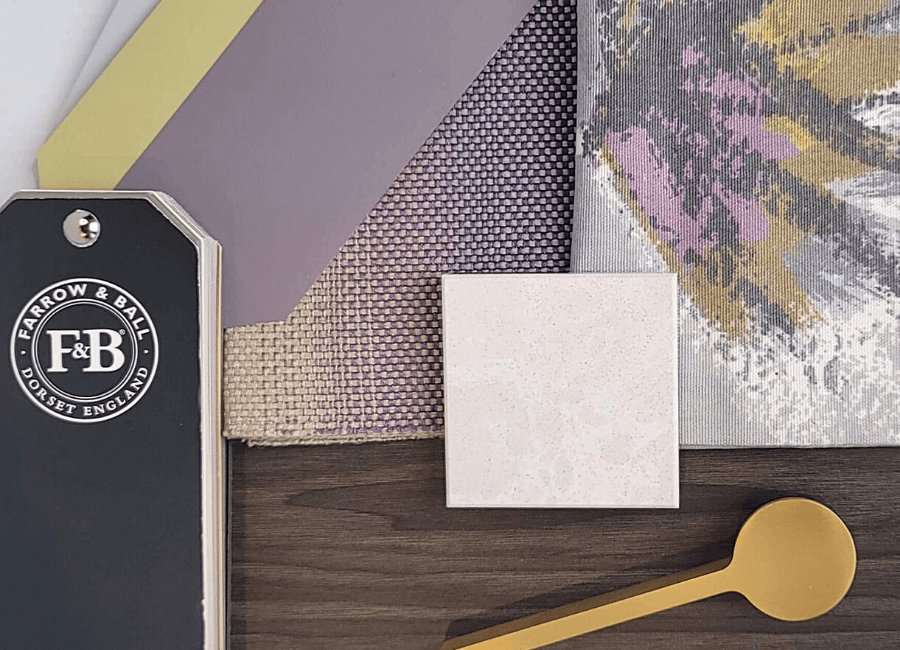
Here are two lovely fabrics that tie into our colour combination wonderfully. The one on the left is from JF Fabrics – pattern Parlor – and would look so great as drapery.
The second fabric on the right is also a JF Fabric, pattern code AW-ZINIO, from the Ashley Wilde designs collection. It has a beautiful purple tone and a lovely greeny-yellow that is very similar to the Churlish Green. An accent pillow in this fabric would look so great on a dark gray sofa or chair.
If we bring the colour combination into a kitchen design for the same home, I found a Cambria counter called Newport that would tie in nicely and keep the flow going from the living room. You aren’t limited to using the fabrics only in the living room, but you could incorporate them into your kitchen space as well on a bench seat or a window valence.
To top off the look I found this striking pull from Richelieu that looks amazing with the colours and materials in this palette. Imagine kitchen cabinetry painted in Stiffkey Blue with these pulls…absolutely gorgeous!
Make sure to watch the video to see a few more elements I selected for this palette, including a white picket tile that I used in my own bathroom remodel.
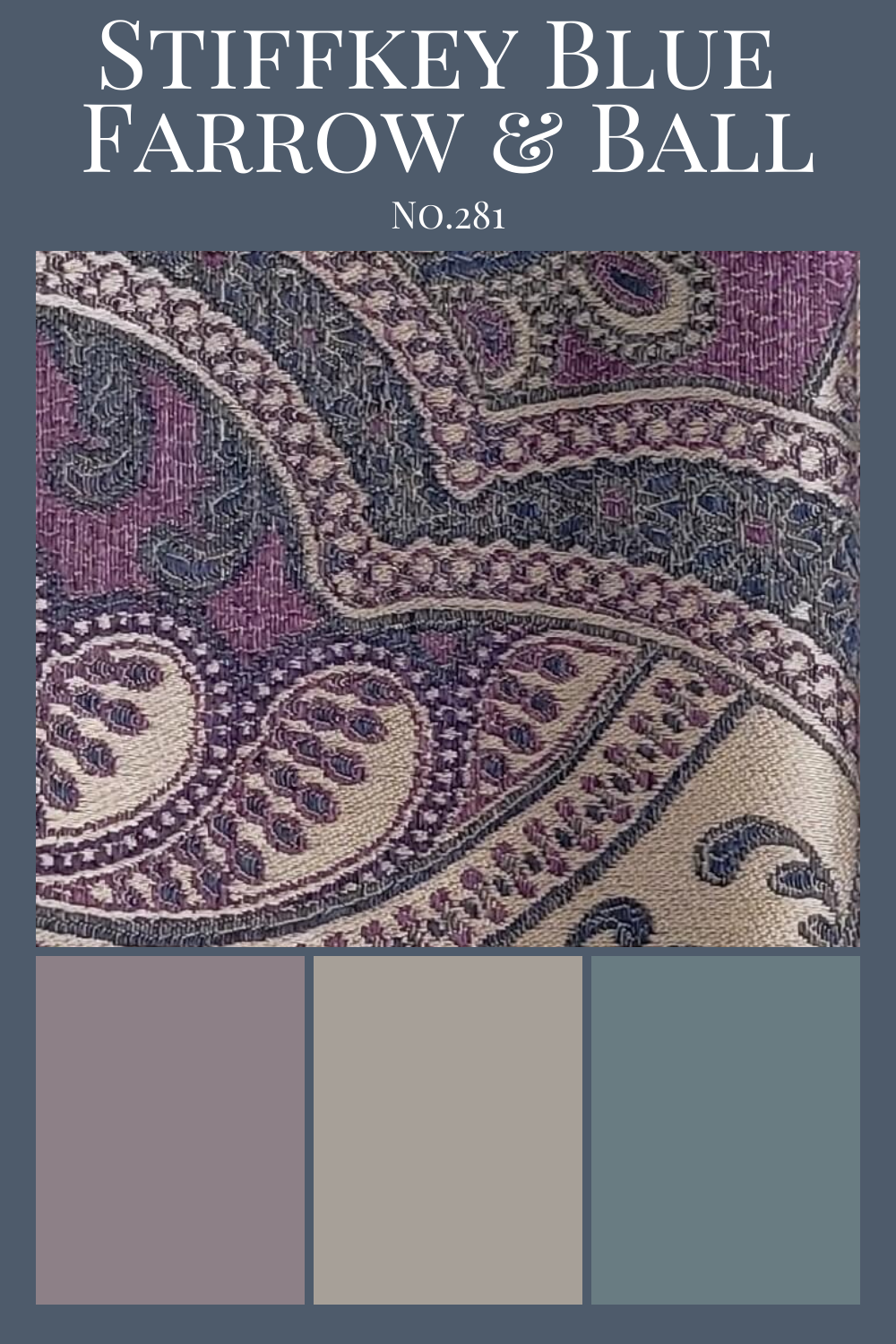
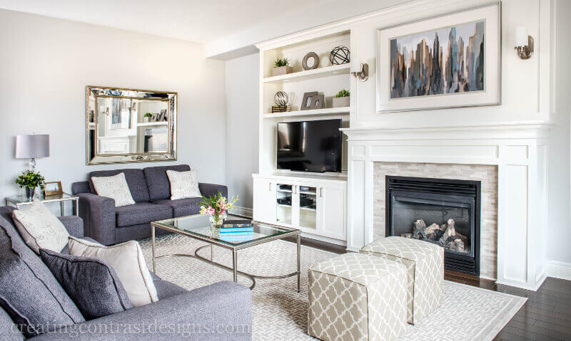
2nd Palette, Upping the Elegance
The second palette has slightly more muted tones and I found a fabric I adored that looks striking against this combination.
This paisley fabric is called Turnout and is part of the Color Concepts Coral Sky Collection from JF Fabrics. Are the two purples an exact match? No. And they don’t have to be, yet they complement each other beautifully.
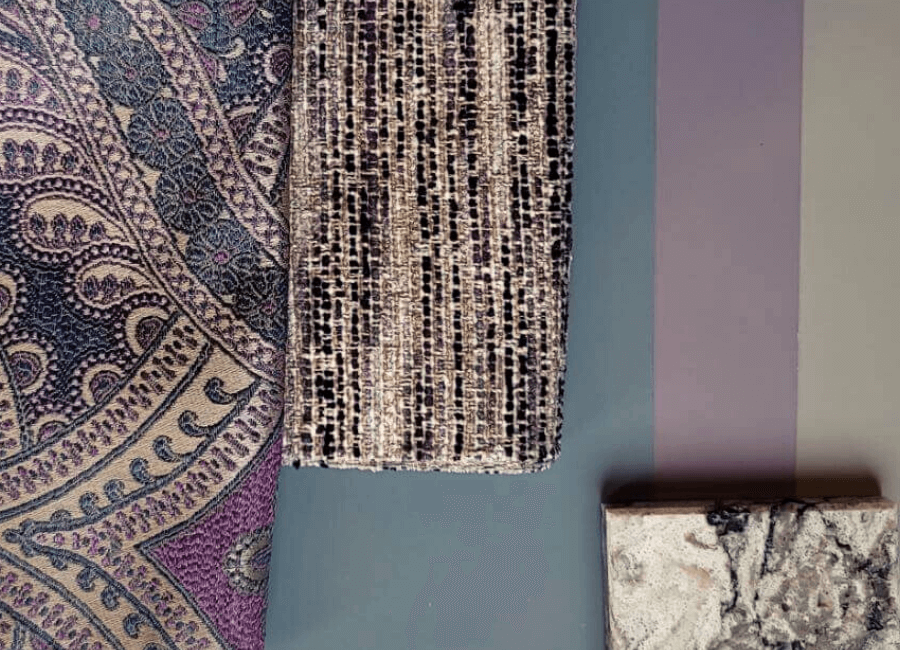
The second fabric shown would look fantastic on a couple of occasional chairs. The Cambria quartz shown above in the bottom right corner is Bellingham. Notice how it picks up a couple of colours from our palette, which would allow you to repeat the colours as you move through to the kitchen.
Your home should always flow from room to room. It should be obvious that your design choices are purposeful. To do this successfully, repeat the same tones into other areas of your home.
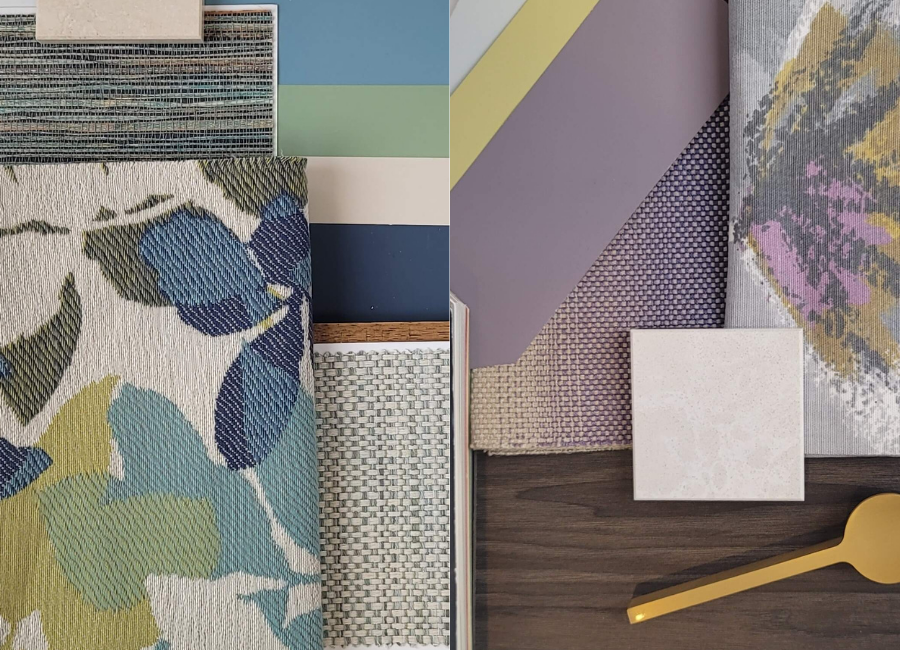
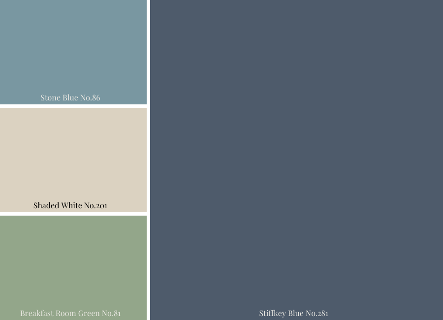
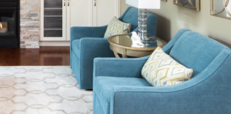
Fresh with Blues and Greens for the 3rd Colour Combination
For the final Stiffkey Blue colour palette design, I went with slightly fresher shades of blue and green.
It is such a great feeling when that perfect fabric jumps right out at you. That’s how I found the jumping-off fabric for this 3rd colour combination. Seriously, it looks like it was made with these colours in mind. Jackpot!!!
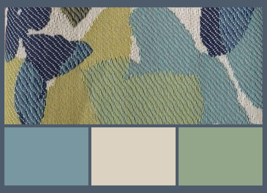
This JF patterned fabric is called Leaflet and it’s from the Morning Glory Inside Out collection.
I worked off this one fabric to build my palette and when I was done I had fabrics that could potentially be used for pillows, drapery, and furniture. They all tied in so well and were all inspired by my Stiffkey Blue Perfect Colour Palette.
Not only did I find amazing fabrics to colour match with my palette, but I came across a fabulous grasscloth wallpaper that you see in the video.
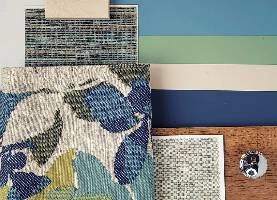
As an example, a main floor powder room could be papered in this paper which would flow nicely from the front room where two occasional chairs might be covered in one of the coordinated fabrics. Cohesiveness throughout the living space demonstrates that all your design choices have been deliberate.
Putting together palettes combining colour, textures, patterns and materials was made easier using the colour combinations from my Perfect Colour Palette.
If you get stuck on how to come up with a colour palette for your own projects, learn more about my carefully curated paint palettes and how they can help. Their purpose is to make it less daunting to choose paint colours for your home.
Which palette was your favourite? Comment below to share your thoughts on which one you found resonates the most with your interior design style.
Get Inspired – Perfect for Pinning!
Convenience At Your Fingertips
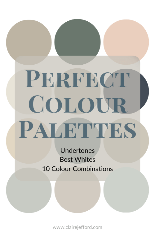
My Perfect Colour Palette library now has 40 paint colours to select from. Click here to see them all.
Remember, it only takes one mistake to take your home decorating project from divine to disaster. Don’t let the paint be what stresses you out!


Lucy
| 2 March 2021Very nice pallets Claire!
Claire Jefford
| 7 March 2021Thanks Lucy!