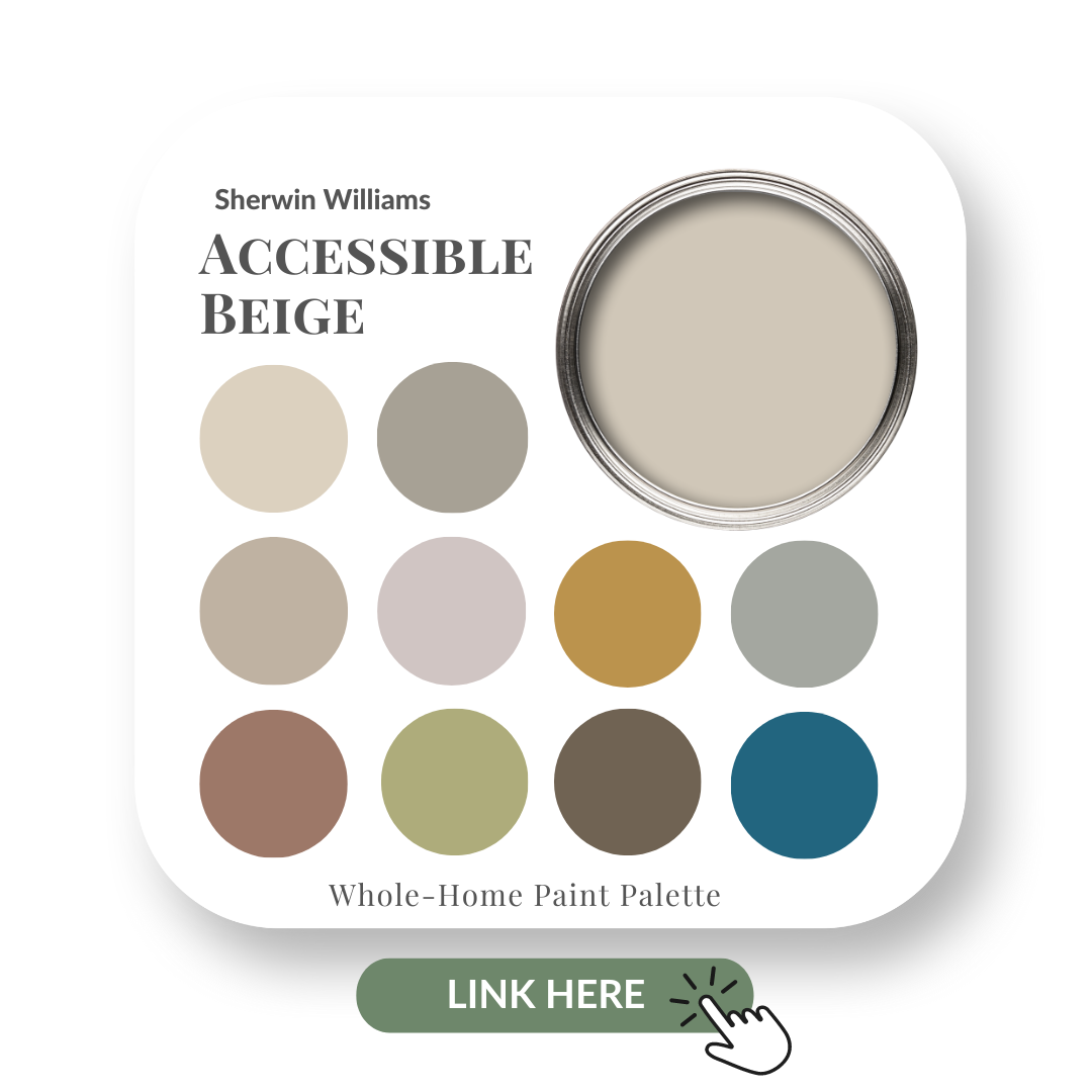
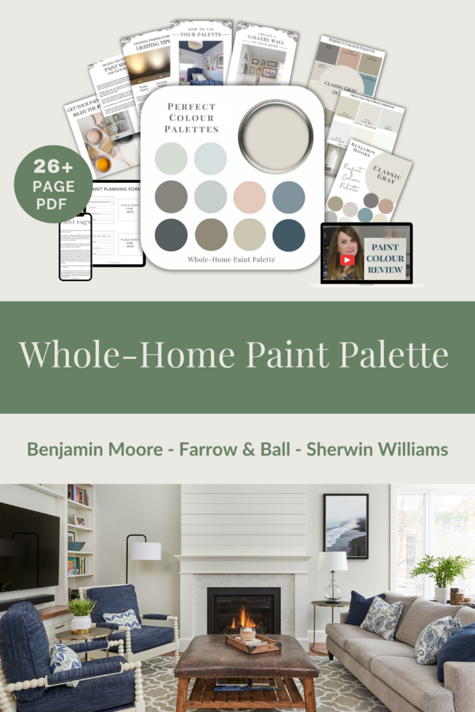
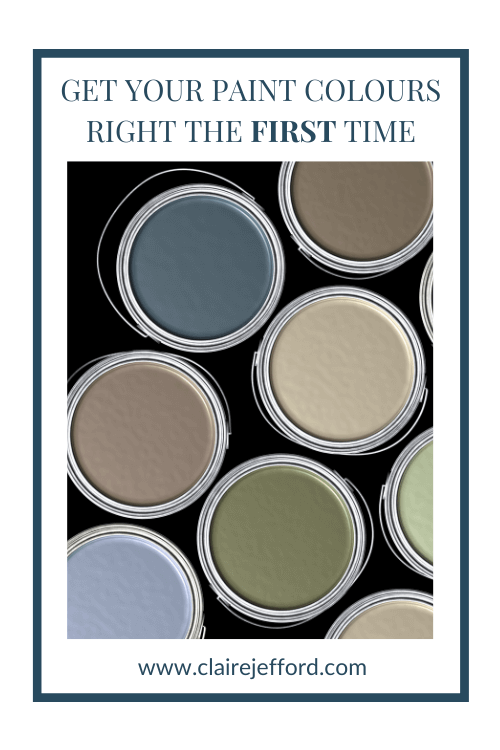
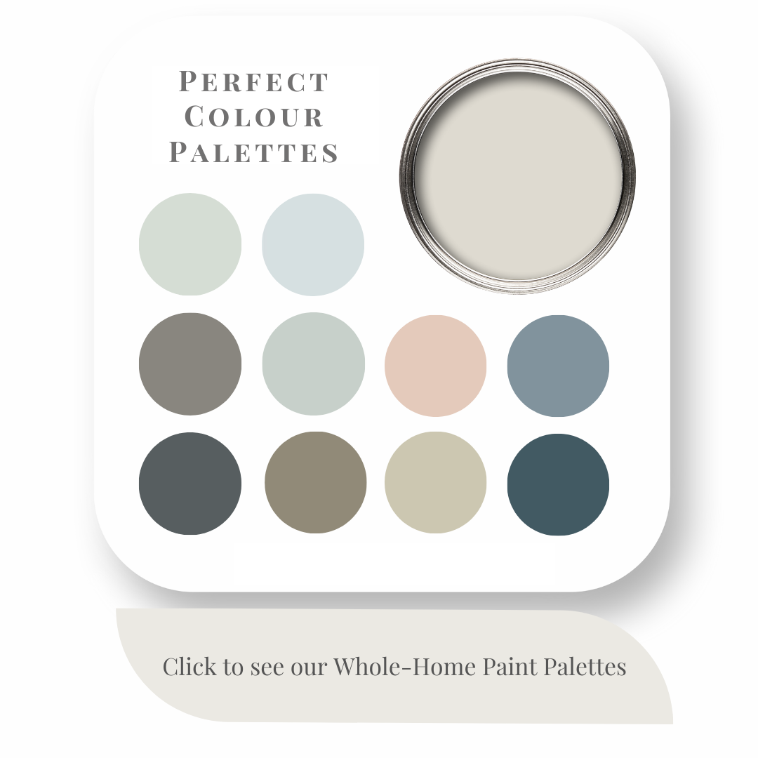
My Perfect Colour Palette also includes 10 colours that go beautifully with Accessible Beige, plus a 2-page step by step How-To for choosing a cohesive colour palette in your own home.
A must-have for any colour enthusiast or interior design professional!
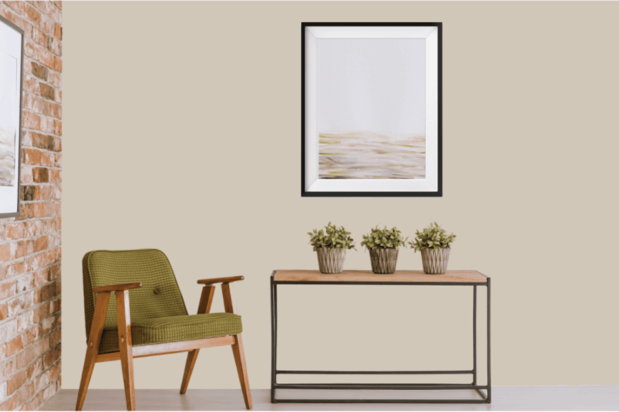
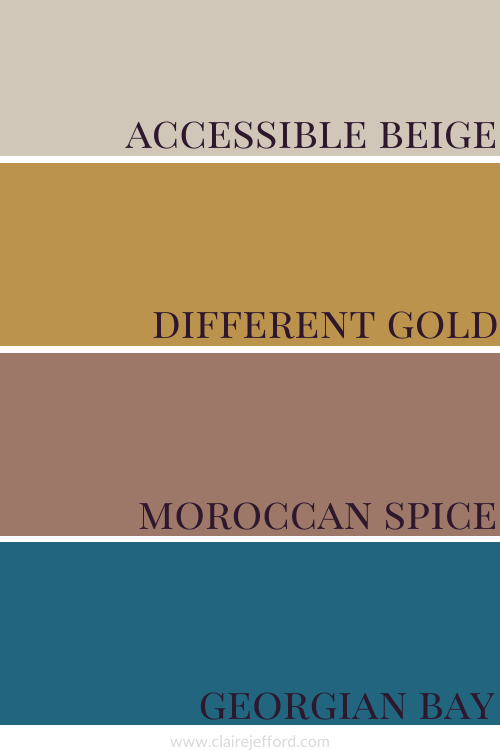
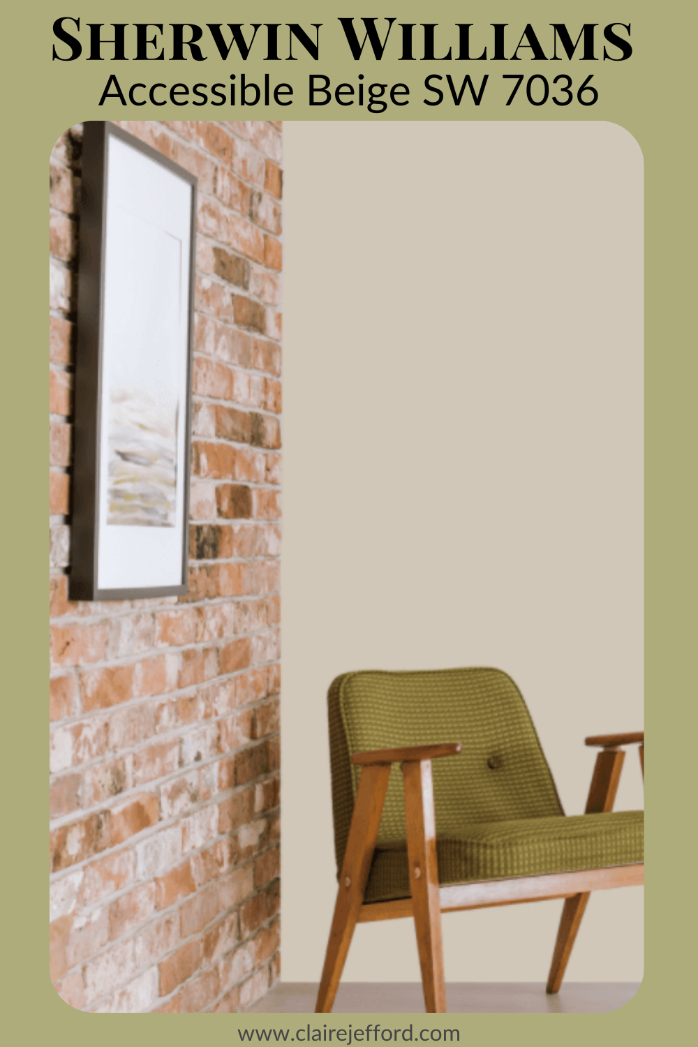
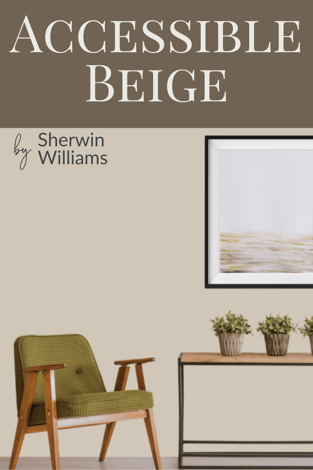
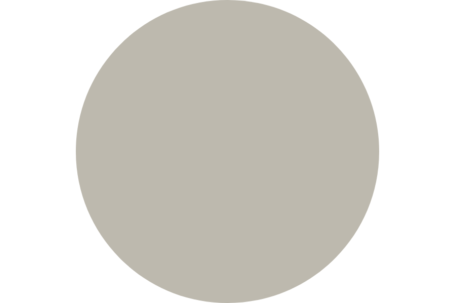
No way is Accessible Beige a boring beige. With its slightly green/gray undertone, we’d call it more of a greige. It’s a fantastic neutral to combine with so many different colours.
Colour Comparisons
As you can see below, it’s when we start to look at comparisons to other colours, that things become very interesting.
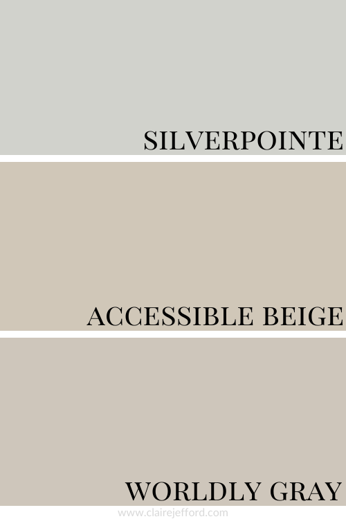
Silverpointe SW 7653 and Worldly Gray SW 7043
Colour Comparisons with similar colours from Sherwin Williams
Looking at the colour comparison above, it’s easier to see the true colour of Accessible Beige. Silverpointe, another great neutral is more of a gray with blue and green undertones and Worldly Gray although similar has a violet undertone.
When I do Colour Consultations in a client’s home, I am always comparing colours so they too can easily see the differences between the paint colours.
When I hold my large paint boards up to a decorative element such as fabrics, wallpaper or subway tile and then swap out one board with another board, it becomes clear as to which colour will work best.
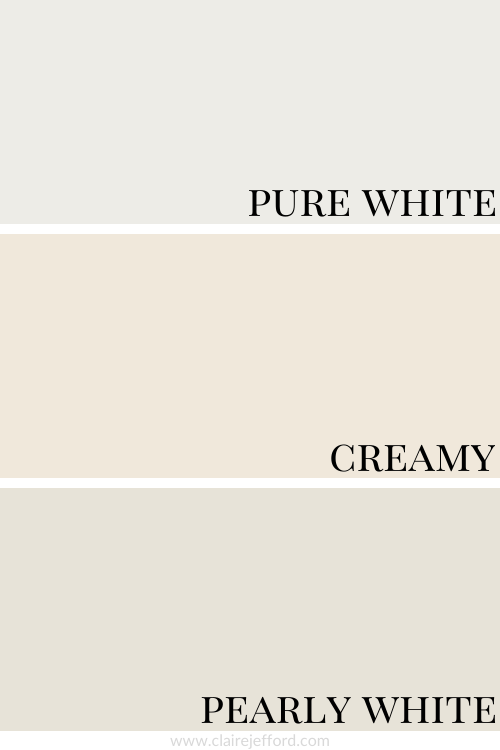
Best Whites To Pair With Accessible Beige
Pure White SW 7005 by Sherwin Williams
Creamy SW 7012 by Sherwin Williams
Pearly White SW 7009 by Sherwin Williams
Now look at all three whites together and you get a better idea of the different looks each would give when used for trim or ceilings with Accessible Beige.
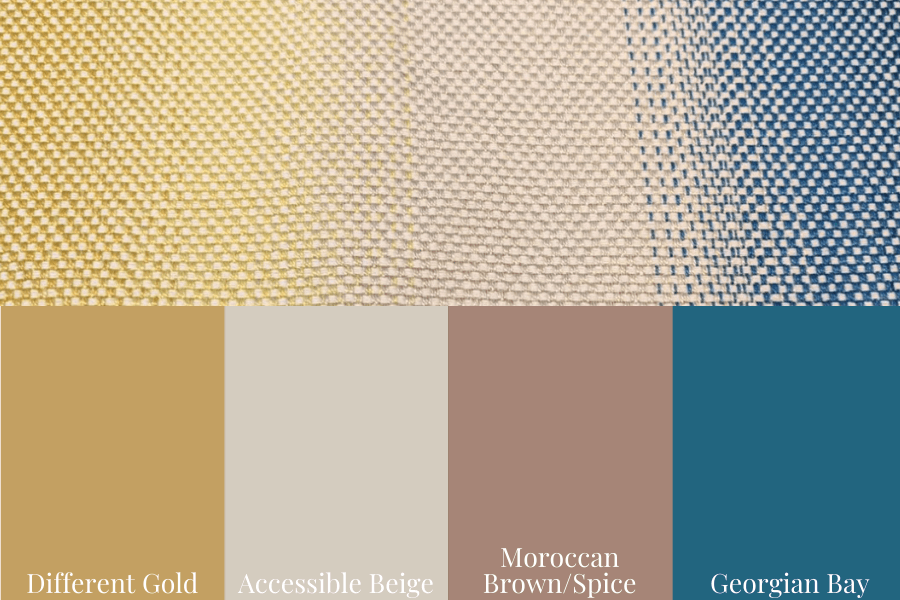
Creating a Beautiful Colour Palette for Accessible Beige
A fabulous fabric used to create this beautiful palette for Accessible Beige.
Remember when using my Perfect Colour Palette that we have put together 10 colours that look amazing with Accessible Beige although it’s not suggesting you use all 10 as paints when designing your interior space.
The palette is a guide on how to create a space using a combination of the 10 colours in paint, flooring, fabrics, artwork, and other decorative elements.
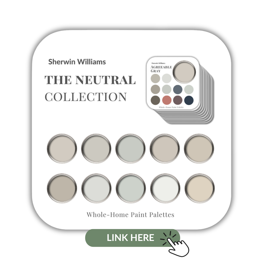
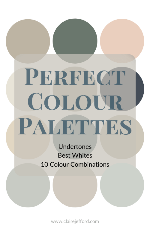
10 of the most popular Sherwin Williams’ Neutrals in one collection
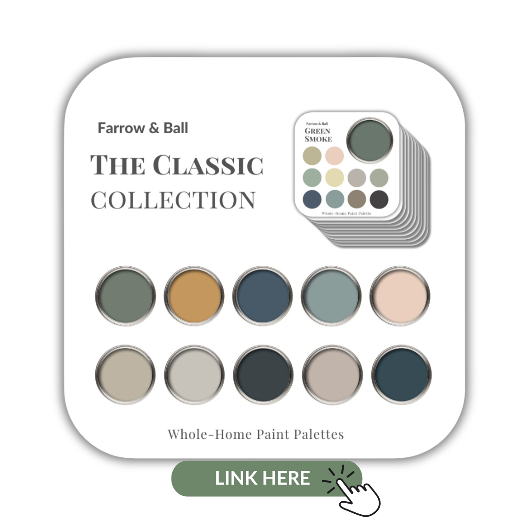
If you are a fan of the beautiful rich paints by Farrow & Ball I’ve also created a collection of 10 classic colours from this popular British paint company. Check them out here.
Farrow & Ball’s Collection of 10 Classic paint colours
Who doesn’t want to make their current home their forever home and never have to think about moving again?
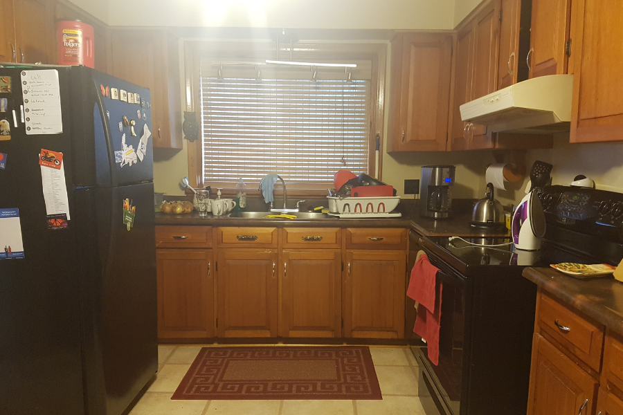
Years ago my sister and brother-in-law were thinking about moving. With the design layout as it was, the functionality of their 1950’s Burlington bungalow did not meet their needs.
As an Interior Design Professional with over 11 years of experience helping homeowners live beautifully, I could definitely see the potential.
They loved the Burlington area where we all live and I knew that they could have what they desired if only they were aware of the fabulous possibilities.
Karen and Jason hired us for our interior design services and together with our team here at Claire Jefford Inc., we created an inspiring design with a completely new layout.
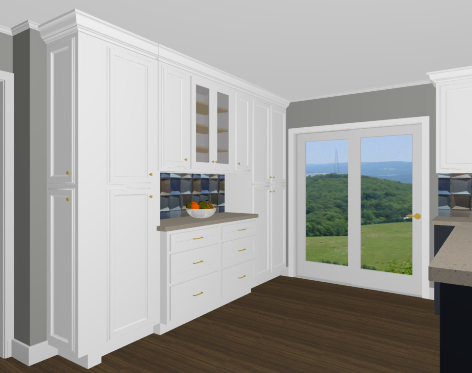
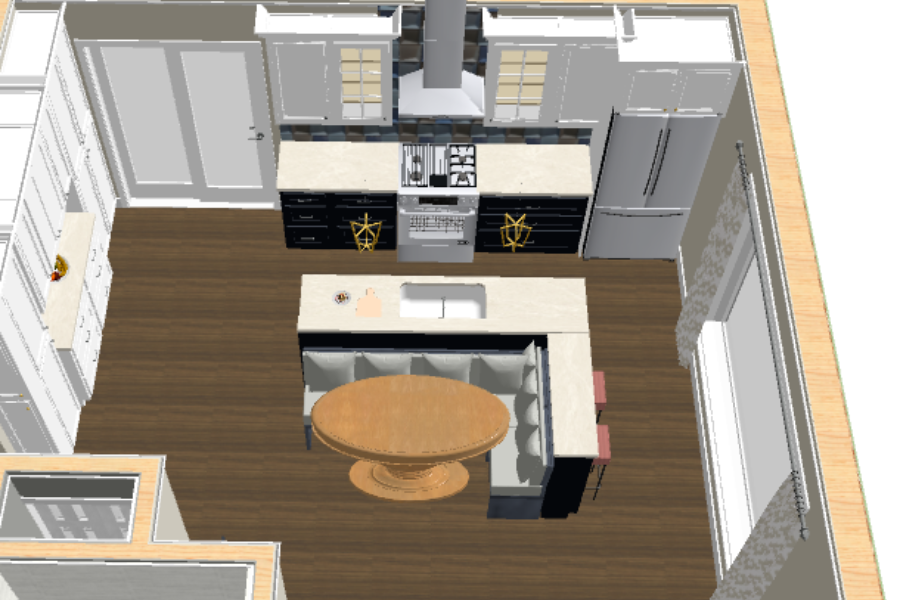
3D design of their new kitchen pantry wall with a built-in tea station
Follow along with this post to see the BIG reveal for this 1950s bungalow that we took from outdated to upscale!
Let’s look at the details of this incredible main floor transformation. This includes the before images, 3D drawings and our professionally photographed ‘after’ shots.
Project Location:
This was an older home in a beautiful mature neighbourhood known as Mountainside in my home town of Burlington, Ontario.
Client Wishlist
My sister Karen and her husband Jason were looking to update their bungalow so that the design would work for them to indeed become their forever home.
As they both love to cook, on their wishlist was a more functional and open kitchen layout, as well as a more spacious bathroom.
Below was their kitchen before and this space actually turned into their new bathroom. Keep up with me now!
Here is their old kitchen where the large bathroom is now
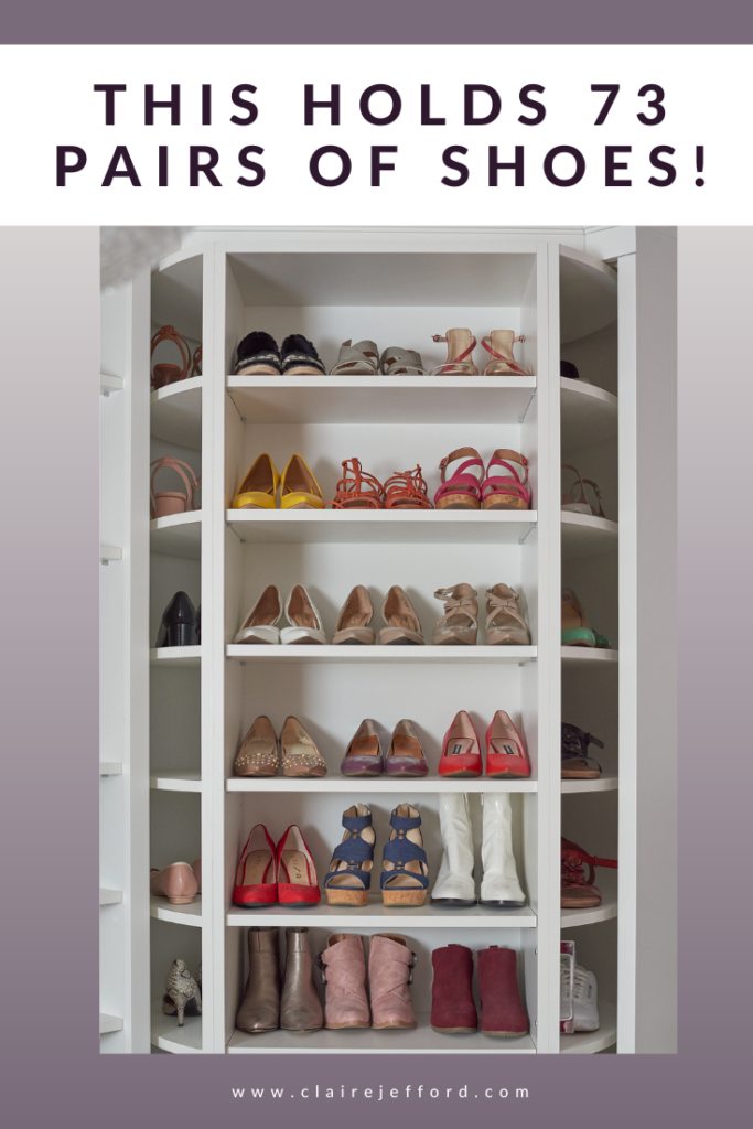
My sister is obsessed with fashion and on her wishlist was a stunning dressing room with ample storage for all of her clothes and smart organization solutions for shoes, jewellery and make up.
We gutted the entire main floor, turning this 3 bedroom bungalow into a 2 bedroom home. By eliminating one of the bedrooms and the living room, we were able to design the home in a way that made it way more spacious and with plenty of storage.
The living room below was mainly an unused space and the first room you see as you entered the home in the previous layout. We decided to remove the wall from the entry that you see below which enabled us to create a much larger and more functional kitchen.
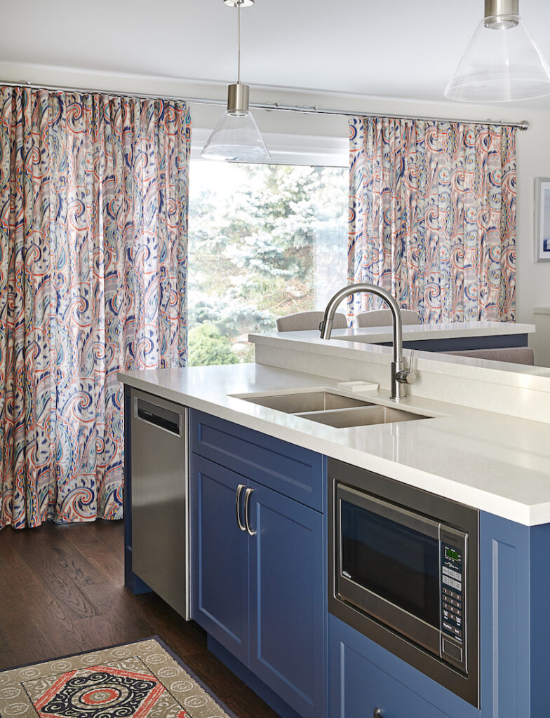
Now this beautiful big window is a bright part of the new kitchen
Taking out a living room from the main floor bungalow may sound crazy, but because I knew my clients so well and completely understood their lifestyle, this design made perfect sense.
They have no children and don’t really have guests stay over, so having a third bedroom was not needed.
This rendering really helped them to see the potential of their space
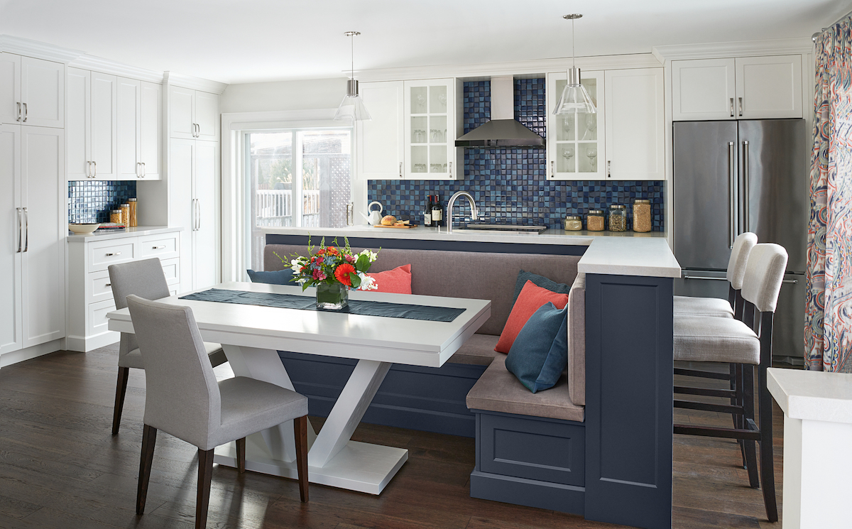
The main focus was to design a large, open kitchen that incorporated all of our client’s needs, especially taking into consideration that they are both avid cooks.
Now in their new kitchen, the natural light really lights up this beautiful open space. And the custom drapery is lovely too, eh?!
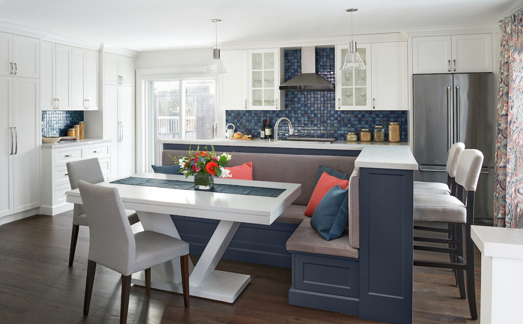
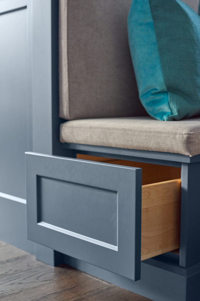
Hale Navy island and banquette which also houses some secret storage in the bench seating!
You can never have enough storage
The new kitchen includes a large island with a corner banquette at their eat-in kitchen table, as well as two additional counter-height stools at the far end near the window.
We had many discussions with both the clients and our custom cabinet maker regarding the various custom cabinetry designs throughout the home.
From the kitchen to the bathroom, including the large walk-in closet known as the ‘Girly Room’, no detail was overlooked.
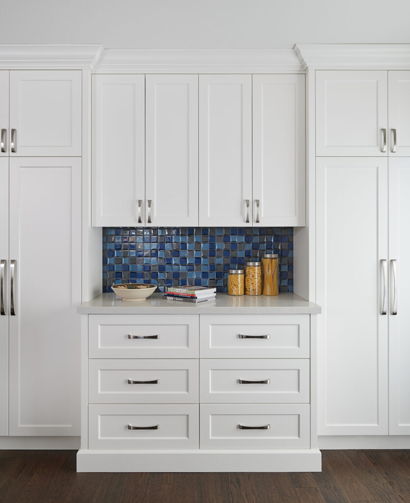
The main double doors here house small appliances like a crock pot, blender, etc.
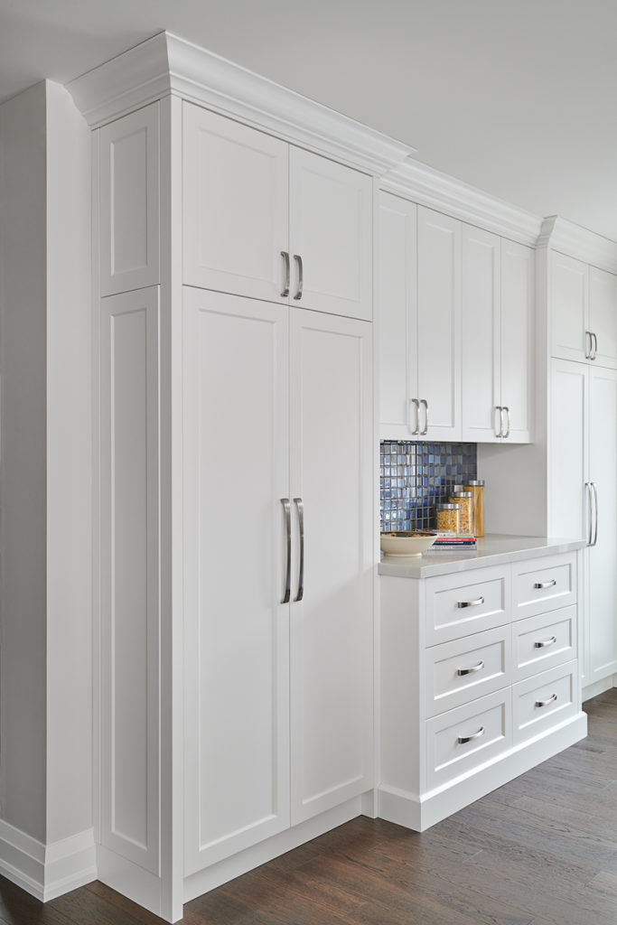
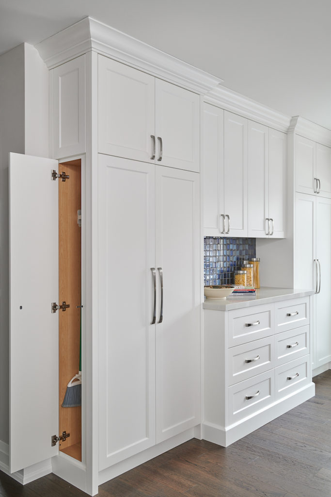
We customized a narrow side cabinet to make room for taller items such as brooms and mops
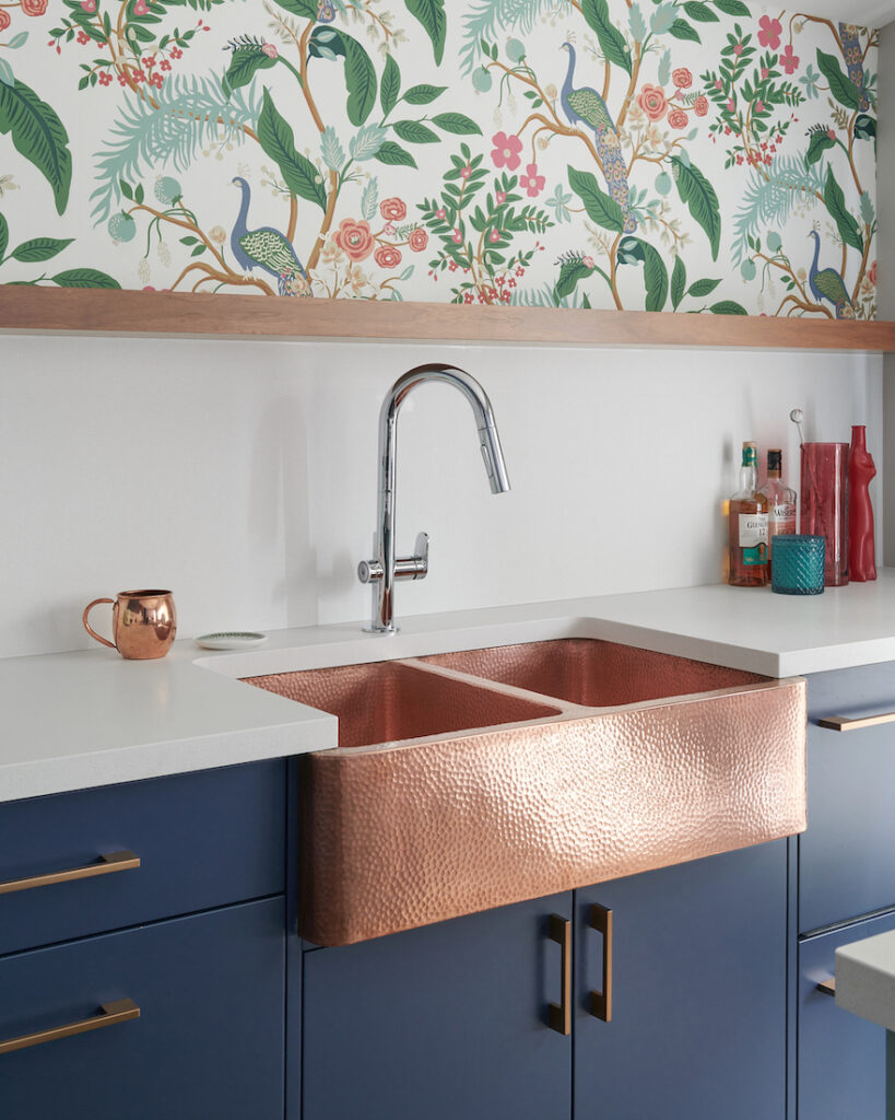
Custom kitchen cabinets and pantry – Simply White Benjamin Moore
The nice thing about investing in custom millwork is that you can get exactly what you want.
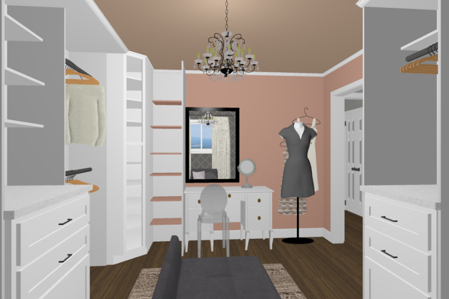
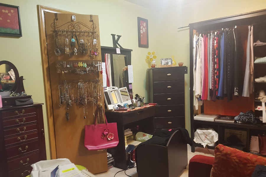
‘The Girly Room’
The fully customized dressing room for my sister was a lot of fun to design, although not without it’s challenges, to make sure we got everything perfectly perfect.
We wanted the look to be soft and feminine which is why we selected pink wallpaper, white and blush drapery fabric, and a bright white for the custom cabinetry.
This rendering shows a sneak peek of the big reveal for this beautiful dressing room
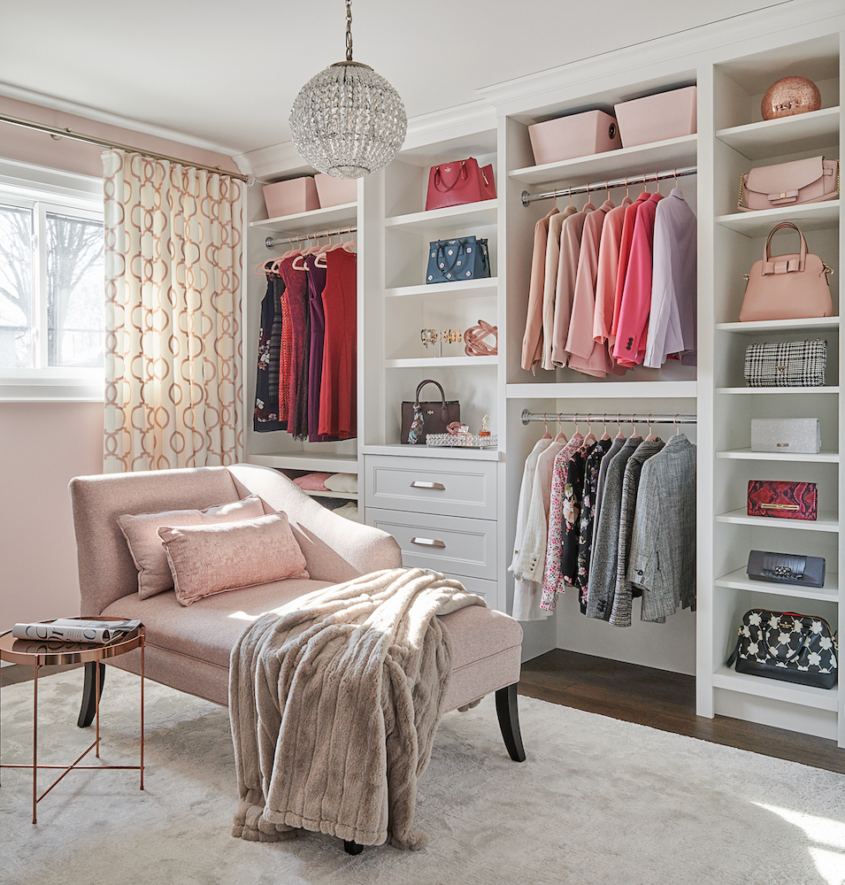
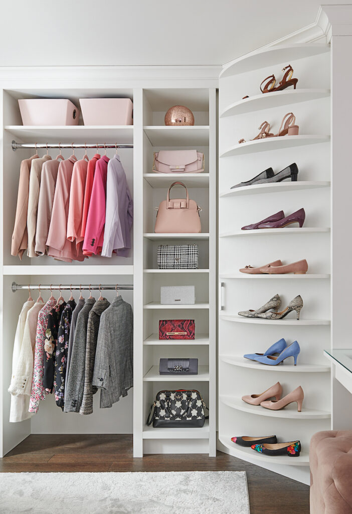
We designed this ‘Girly Room’ to include plenty of open hanging storage for dresses, dress shirts and formal suit jackets. Good size drawers house undergarments and open shelving allowed us to display stylish accessories such as handbags, some jewellery and perfumes.
The custom-designed spinning shoe rack in the corner is definitely a show-stopper and conversation piece. This beauty houses over 70 pairs of my sisters’ shoes!
The crystal chandelier and soft, pink glass swirly hardware on the drawers add additional hits of ‘bling’ to the room.
What girl doesn’t want or need a shoe rack like this?!
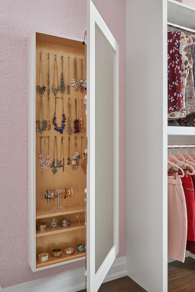
This custom full-length wall mirror doubles as a home for all my sisters’ jewellery and was designed in a way where she can easily see every necklace and each set of earrings to allow her to easily and carefully select the best pieces to coordinate with her outfits.
A jewellery case that doubles as a full-length mirror-yes please!
This new and improved ‘Girly Room’ was more than just a step up from what the room my sister was using previously for all her fashion needs. Check out the before image below.
It definitely needed to be upgraded and is now more aesthetically pleasing and super organized!
Wowzas! It’s incredible when you consider the possibilities of thoughtful, interior design.
In my opinion, the creative process is one of the best parts of being an interior design professional, and making dreams come true too, of course. 🙂
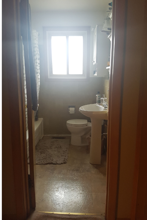
A Bigger Bathroom
This tiny bathroom was previously shared by my sister and brother-in-law
In the new design, we moved the new bathroom to where the old kitchen was. If you scroll back up to the first ‘before’ photo in this blog, the one of their kitchen, you will see the same window that is now shown here on the right and in the reflection of the mirror.
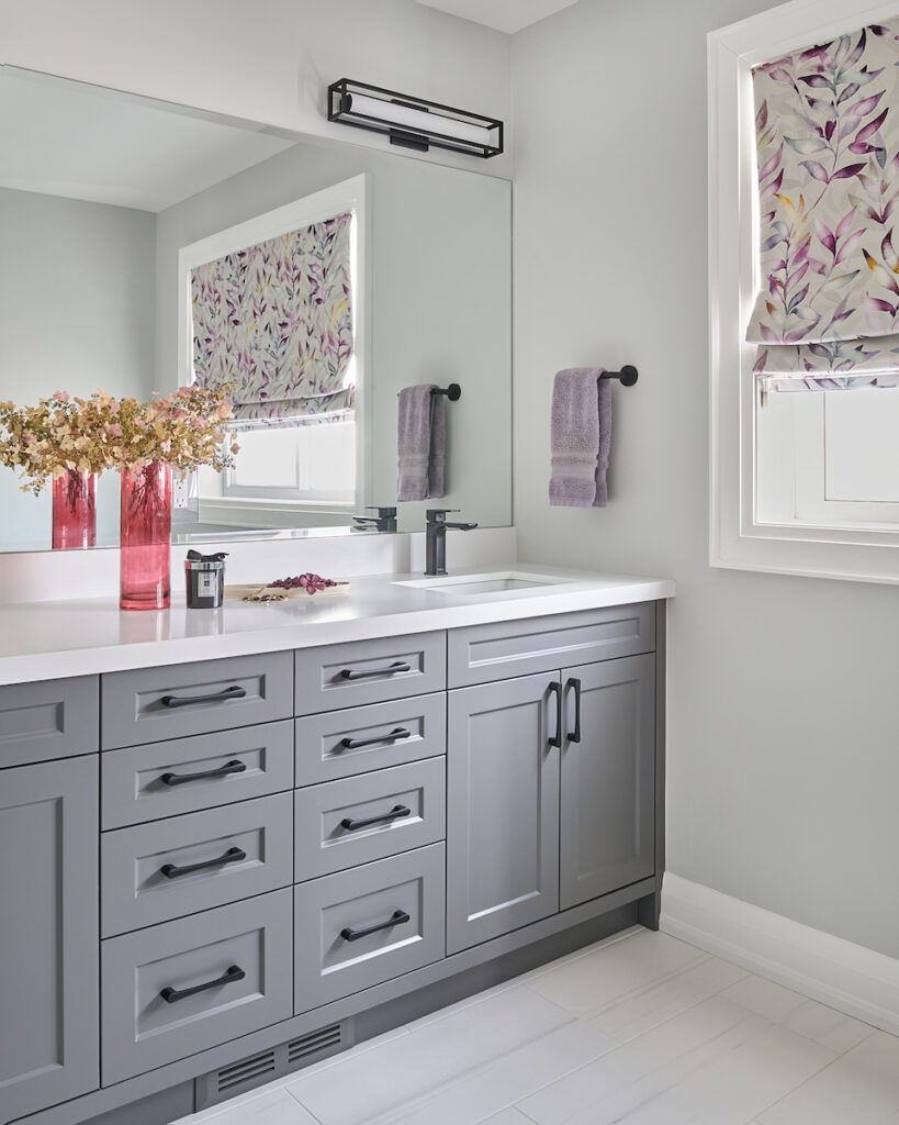
Brand new spacious bathroom with double sinks and custom vanity
This renovated bathroom is quite a change from what my sister and brother-in-law were used to. Double sinks, a larger window, loads of counter space and great storage with all those drawers!
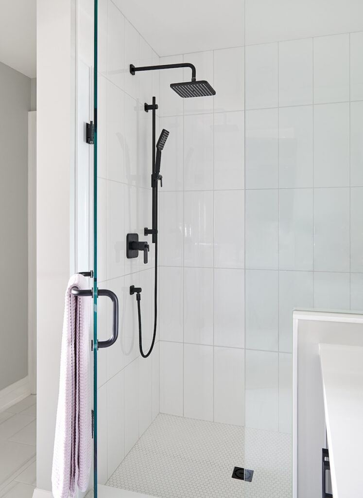
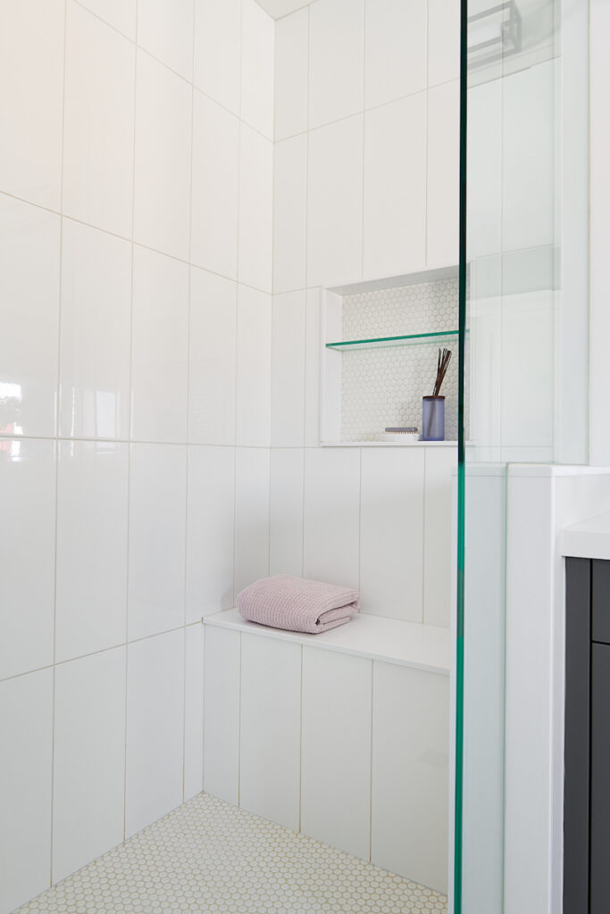
White-tiled shower with black plumbing fixtures
My sister and her husband love the clean look of this new bathroom design. A tub wasn’t required, so a nice big shower with a built-in bench worked very well.
Glass shower design with bench seat and wall niche
The large wall tiles make for easy cleaning and the small penny tile is so charming on the shower floor which we repeated in the niche on the wall.
Adding a glass shelf to the shower niche allows for extra storage to house shampoo, conditioner, shower gel and razors…except for in the professional photo where we styled it with scented sticks. 🙂
Designer Secret
Want to know one way that you can make a room more stunning? Paint the ceiling a dramatic colour!
My sister and brother-in-law were very open to this idea, and they loved the result. Painted ceilings are a nice, unexpected touch to an area that is often overlooked for its possibilities and usually done in white.
We wanted to create a bedroom space with a feeling that was moody yet serene, with some playful accents. The hits of teal and raspberry tones work beautifully to achieve the desired look.
We used Benjamin Moore’s Revere Pewter on the walls with Wrought Iron on the ceiling
I really enjoyed working with my sister and brother-in-law, they were very open to all of my ideas and were great to work with.
Now we all look forward to their next renovation coming this fall which will see a complete gut and new design in their basement! Stay tuned for that project.
Our job is most meaningful when clients trust us to create stunning and functioning spaces for gathering and making memories.
Moving is a daunting task, not to mention expensive. Plus, it’s rare that you will find a house that you don’t need to decorate or renovate in any way. Don’t limit the possibilities of what you might be able to do in your current home versus moving houses.
My sister exceeded our expectations. We never thought our home could be this spacious or beautiful. It finally fits all of our needs and is now our forever home!
What design element did you like best?
Have a favourite part of this Bungalow Makeover? Comment below to tell me what it is!
There’s nothing quite like the feeling of being organized.
I mean, super organized.
Like, everything has a place.
Being a professional in the industry and having offered interior design services since 2011, I know what a fabulous feeling it is when a home looks great, but the function is just as important.
Since renovating, I’ve never felt so comfortable and happy in my own home. It’s not just because of the beautiful colour palette that perfectly suits our style and not only down to the sensible floor plan layout that works flawlessly for the way we live.
It’s because everything now has a place.
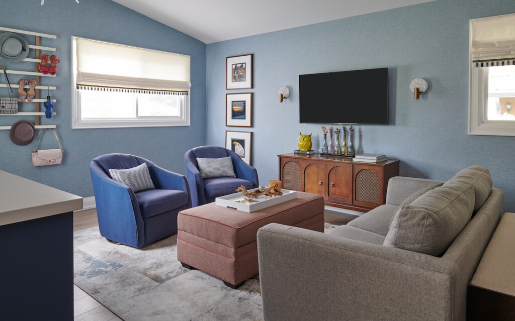
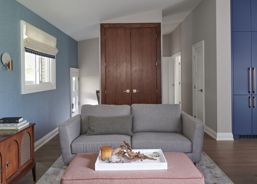
Our new living room, which used to be our kitchen. All professional photos of my home by Stephani Buchman.
In my previous blog post you saw the unbeatable storage solutions from Häfele that we integrated into our new kitchen design.
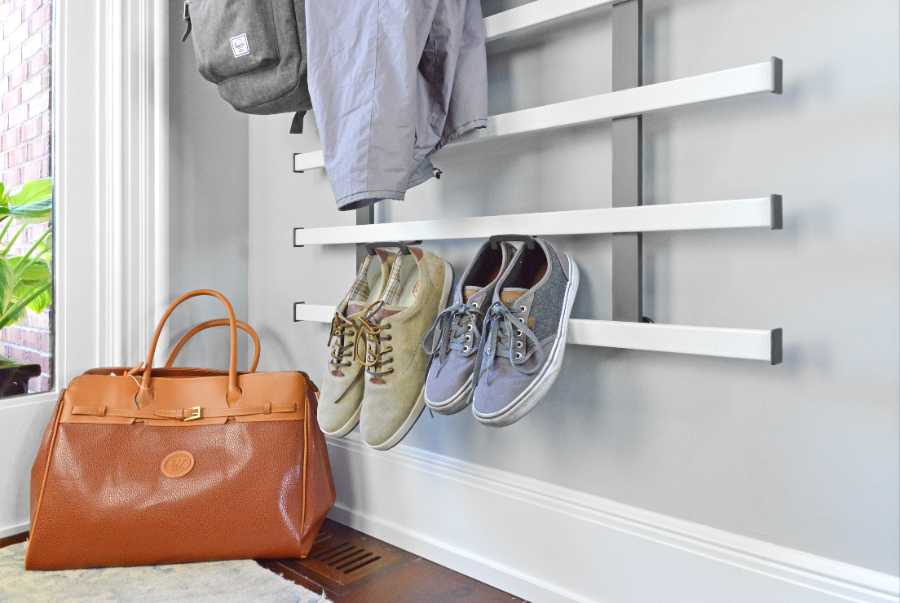
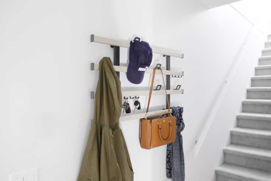
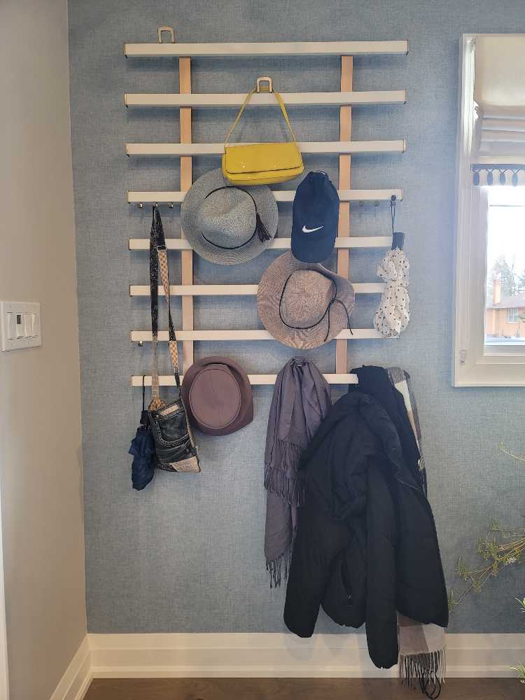
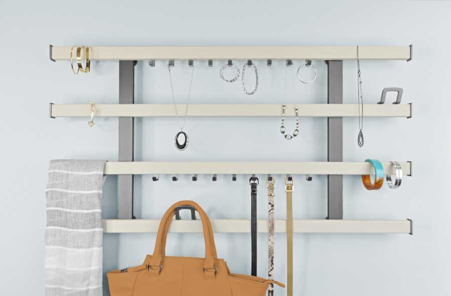
In addition to the smart organization for kitchens, Häfele also has a fabulous and stylish solution for organizing other areas of your home. Let me introduce you to their Symphony Wall Organizer and give thanks to Häfele for sponsoring this post.
Just one configuration for the Häfele Symphony Wall Organizer
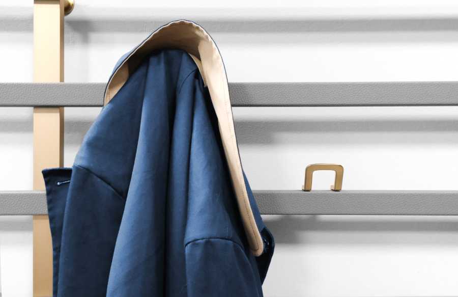
Designed to add greater flexibility and elegance to open storage, the Symphony Organizer features a sleek, low-profile frame which makes it an ideal solution for blank walls, tight spaces or other areas where shelving and drawers just can’t go.
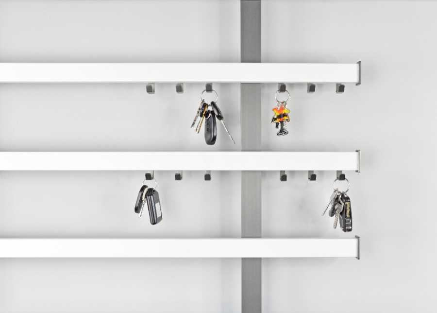
For even more versatility, there are a few different types of hooks styles to choose from, depending on what you wish to hang. And they can easily slide along the horizontal rail if you want to move them, then be clipped firmly back into place once you’ve selected the ideal positioning for your needs.
These are the triple hooks for keys.
Here is the style you can use for coats, hats and purses.
Shoes can also be hung here and kept off the floor. Perfect for small entries like mine!
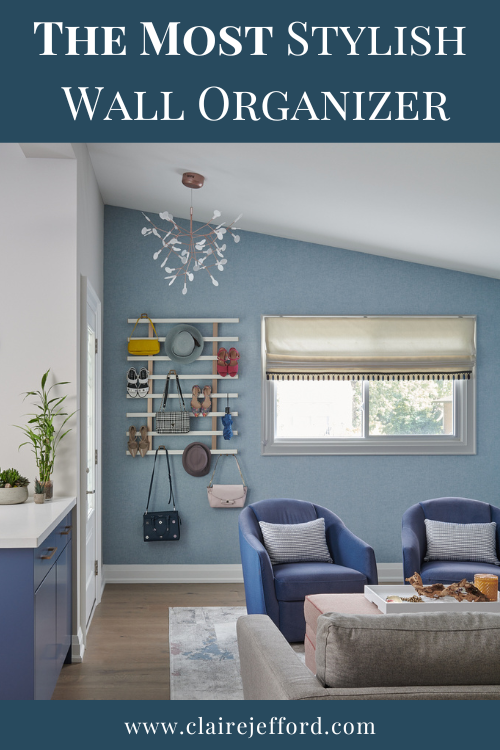
This sure beats our old pine wall shelf with 5 pegs that used to hang on the wall in our previous front foyer! Take a look at where we have this ingenious organizational art-like piece housed in our new living room by the front door of our home.
For the photo, we staged this area. It’s not always this pretty, but it’s always functional!
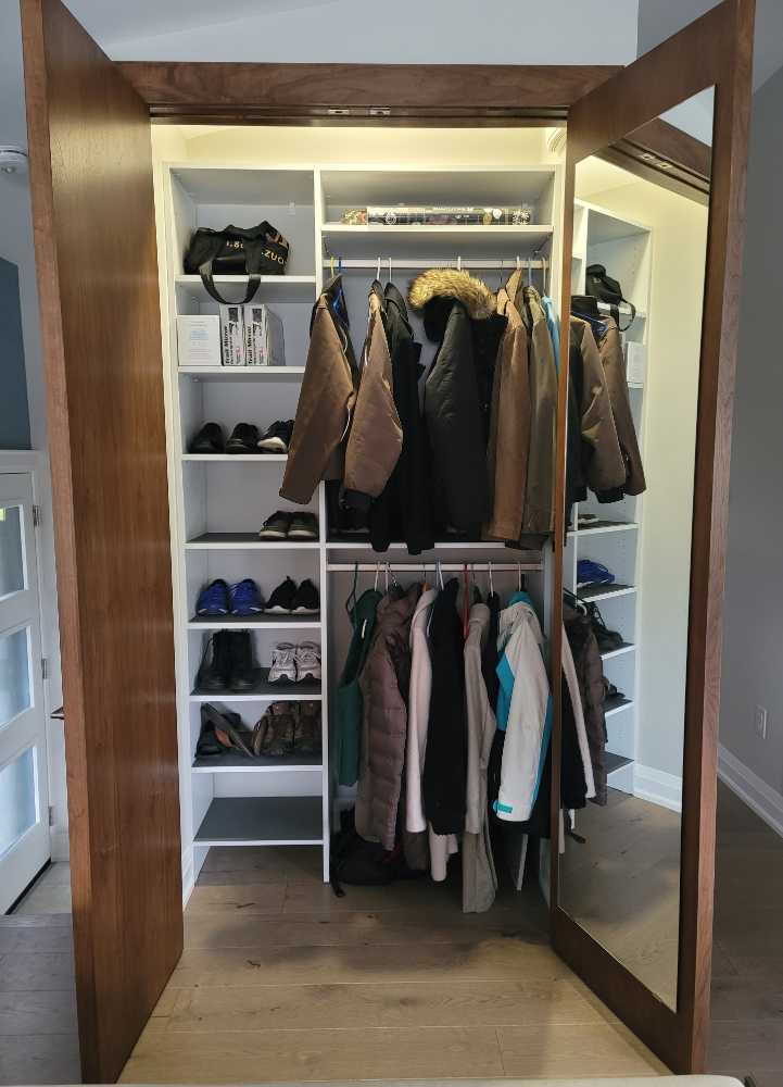
We have a full closet at the opposite end of this room which is where we keep the majority of our coats, boots and shoes.
This main closet is 4’5″ by 8’5″ with a full-length mirror one side
Custom walnut closet doors in the living room of our newly renovated Burlington bungalow.
Now you have a better idea of how the room is set up and the situation with our closet space. The items we hang on the Symphony Organizer are what we use most regularly, like a couple of hats, a few scarves, a purse or two and coats we wear daily.
Looking at the quick photo below that I snapped just a few days ago, I can confess that it’s mostly all of my stuff. 🙂
This is real life. LOL
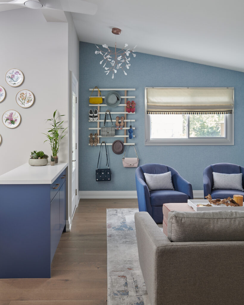
Available in a variety of sizes, configurations and colour combinations, Symphony is one of the most stylish and customizable open storage options available for the closet, entryway, home office, craft room, vanity and more.
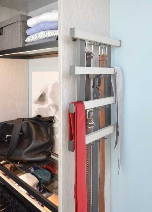
And don’t limit your thinking to believing that this gem can only be used by the front door. Due to its flexibility with many design options, the possibilities are plentiful!
Here it can be seen for hanging belts and ties on the end of a closet.
Here’s how it first started to come together.
Organize Your Precious Jewels
“Best believe I’m still bejeweled, when I walk in the room I can still make the whole place shimmer”
Taylor Swift, Bejeweled from her new album Midnights
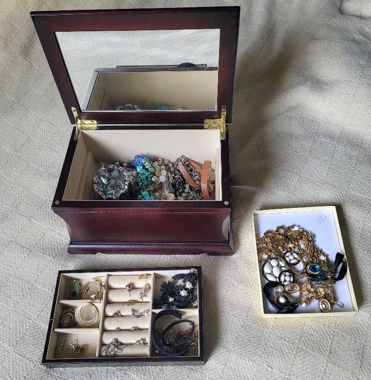
If your necklaces and bracelets get tangled like mine do because of a small cluttered (useless) box like this one, you may want to consider the Symphony for all your sparkling jewels.
Confession time: Currently, my jewellery storage is a mess! No judging.
I’ve got my jewellery scattered between this traditional, cherry stained jewellery box, while some other necklaces of mine are in our guest room on the side table. Then I have some other pieces that rarely make it out of my travelling case because I have no decent place for them to live.
But, that’s about to change because the smaller version of the Symphony Organizer is on my wishlist for my bedroom.
It’s not uncommon for me to give up on wearing a specific necklace or pair of earrings that I actually want to wear with an outfit because it takes me too long to find it. And if I do find the one I want, I may need to spend another 15 minutes untangling it from other chains.
Does this happen to you too, where you find yourself wearing the same jewellery because it’s easier?
It all comes down to being well organized. When everything has its place, you know exactly where to find what you need.
I hope you’ve found this refreshing, functioning wall art from Häfele inspiring ideas for your next home organization project. Think outside the box and remember that function doesn’t have to mean fugly. We’ve come a long way baby!
Häfele is the leading international manufacturer and supplier of furniture fittings and architectural hardware. To see all of their products and learn more, check out the Häfele Canada website here.
The renovation of my main floor, especially my kitchen, has been a long time coming and I can tell you, it was well worth the wait.
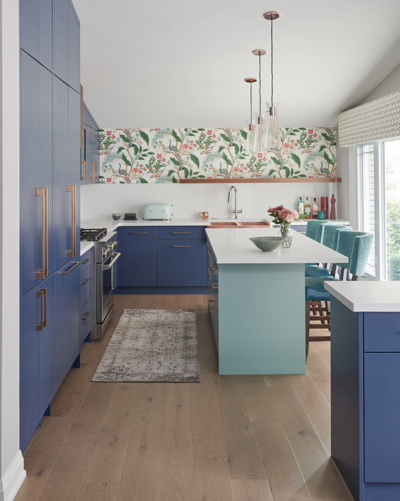
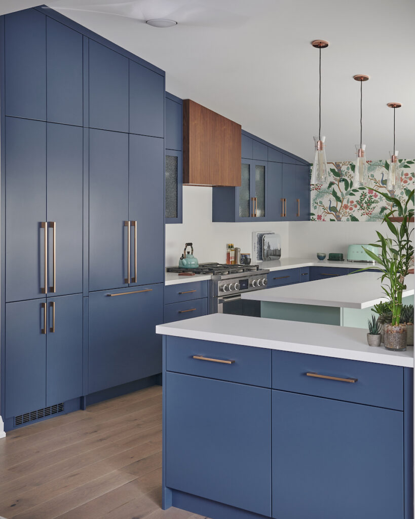
Finally, I can reveal to you my newly renovated and completely redesigned kitchen!
I’m just gonna put it out there and say, it’s unlikely that you have seen such a bold, colourful kitchen that has been designed with so much smart organization and thoughtful storage ideas.
There, I said it. I’m tooting my own horn. 🙂
I am so proud of what we have accomplished here with my exceptional team of trades and by partnering with wonderful sponsors like the fabulous people at Häfele Canada. At the end of this post, I will be sharing codes and links to all these fabulous products, so you too can enjoy them in your kitchen too.
My new kitchen revealed! All professional photos by Stephani Buchman
Because I’m a sucker for acronyms and I adore structure, let me give you CLAIRE-ITY as I walk you through the details of my kitchen design project.
CLAIRE-ITY
Clients – Who hired us for the project?
Location – The city and areas of the home we redesigned.
Assignment – The motivation behind updating the space.
Inspiration – How we derived inspiration for the design.
Exposed – Challenges we faced and how we overcame them.
Investment – Estimated costs & design service fees.
Top Takeaways – Lessons learned and designer tips.
Your say – Tell us what you think!
Clients
My husband and I are nearly empty-nesters. I can’t believe it myself, where has the time gone?
Our son Adley is in his first year of university and will be spending holidays and summers here at home.
Elise is our 16-year-old daughter who is very active in musical theatre and has a busy social life.
My Beautiful family.
Chris and I work full time, often entertaining friends here at the house and this year I’ve been playing more golf, which I quite enjoy!
Location
We live in Burlington, Ontario which is between Toronto and Niagara Falls. Our 1967 three-bedroom bungalow has been our home for over 18 years since we moved from the UK where I met Chris, who is originally from England – as is my Mom and her entire side of the family.
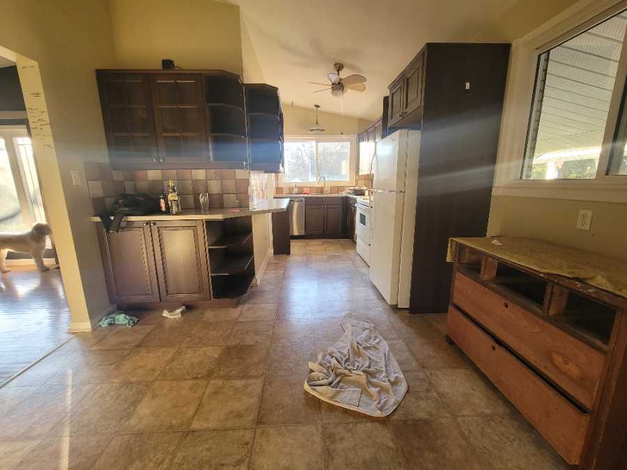
My old tired kitchen which we first renovated in 2005
When we first moved to this home, it was nearly 7 years before I started my interior design business in Burlington. I was pregnant with Elise and was a stay-at-home mom, so our budget was very limited.
Dark espresso cabinets were trending – this was in 2005. We installed IKEA cabinets and linoleum flooring which was pretty much the extent of our renovation upgrade at that time. It was time for a much-needed update. My interior design team and I were up for the challenge!
Assignment
We have no intentions of moving any time soon. This is our forever home, at least that is the plan at this point in time.
Previous to the renovation, with the original design being a galley-styled kitchen, it was super tight in terms of space. The lack of storage and inadequate counter space were issues we had to deal with on a daily basis.
In addition, the layout was lousy for entertaining and the kitchen was dark.
The space needed to be opened up, as the divide between the kitchen and the living room was really affecting any possibility of creating a functioning design plan.
It wasn’t until I came up with the idea to swap my kitchen and my living room around that I really started to get excited about my main floor renovation project! This is something we’ve done for other clients before, like in this project here. It opens up so many more possibilities for layout and interesting design concepts.
This is now where my kitchen is.
Inspiration
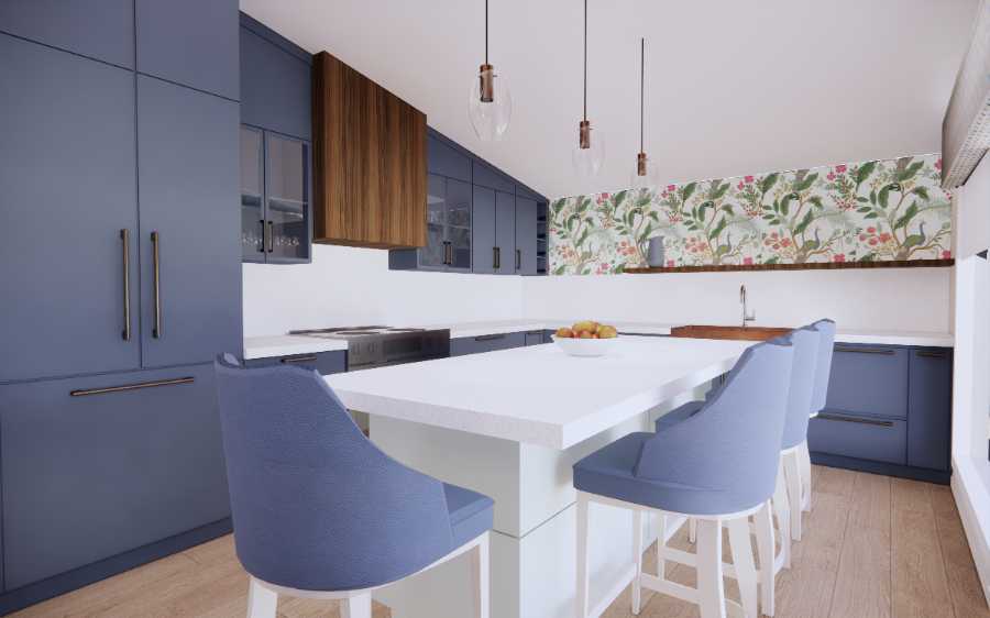
As soon as I decided to make this change, my kitchen design started to come to life beautifully. I could have all the storage space I dreamed of, a large kitchen island and play with the architectural feature of an angled ceiling!
Having done so many grey and white kitchen designs over the past 10 years, I knew that I yearned for something different.
Oh yes, there was going to be lots of COLOUR!
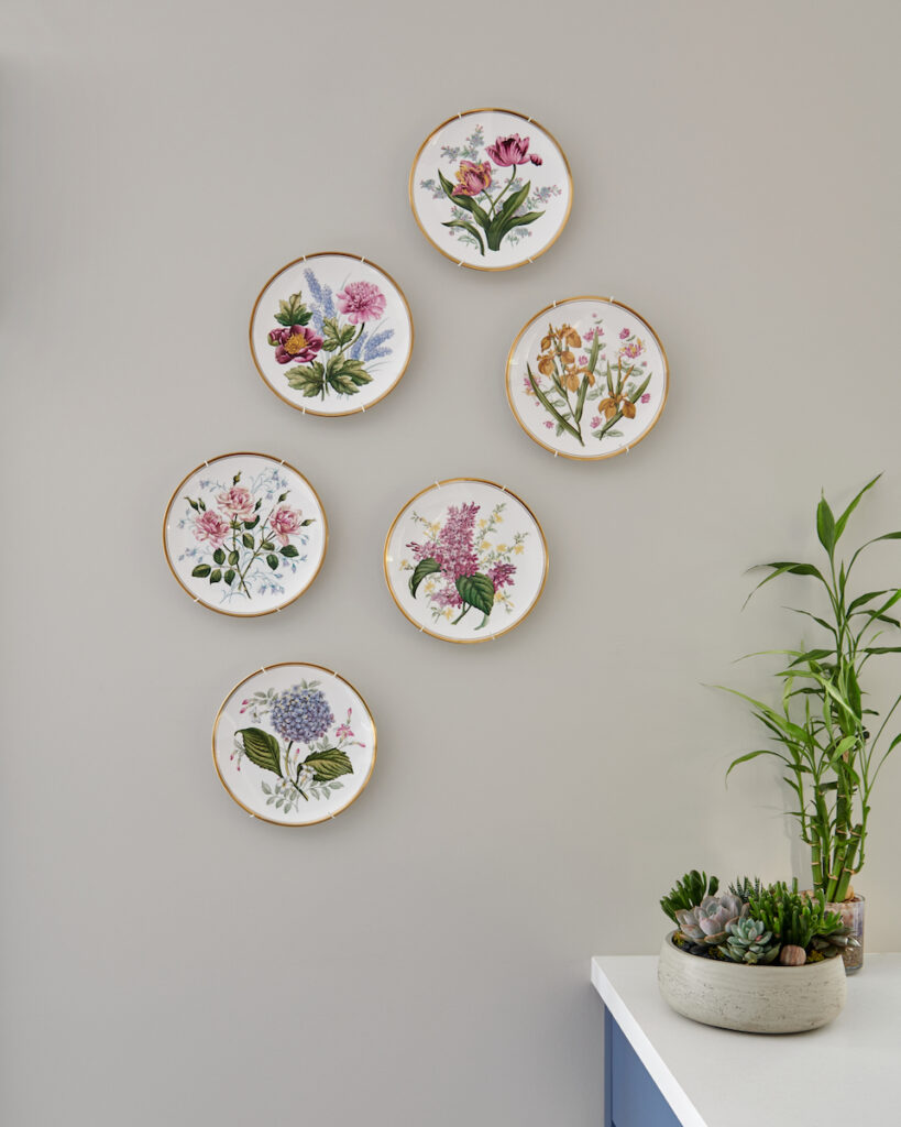
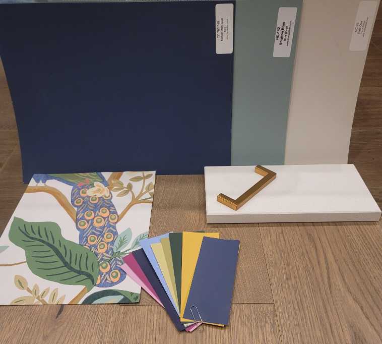
Bold colour choices were initially inspired by a set of six antique Spode Wall Plates that my mother-in-law from England gave to us nearly 20 years ago. I adored all the bright, fun colours and embraced them all.
From there I found this fabulous wallpaper (see below) and used my large colour boards to select the colours for my kitchen cabinets, kitchen island and wall colour.
Here’s how it first started to come together.
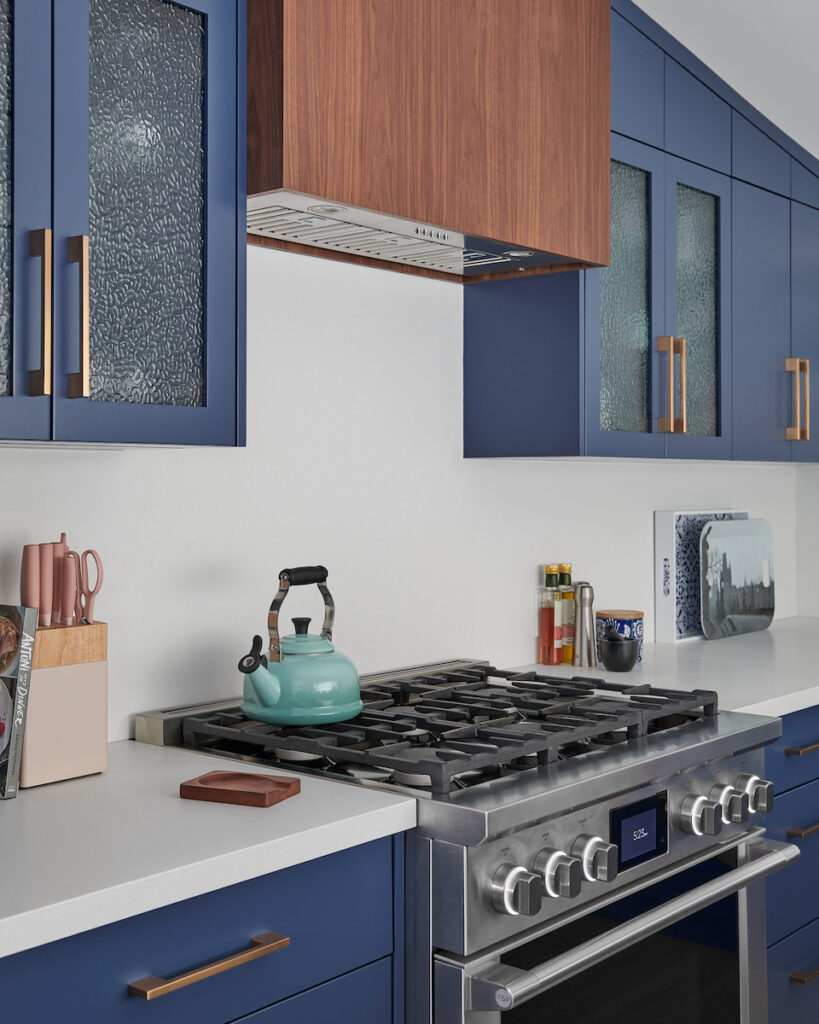
The perimeter cabinetry is Kensington Blue which leans towards purple (my favourite colour) and the kitchen island is Stratton Blue, a green blue. Both colours are from Benjamin Moore.
Despite the image above that shows Pale Oak for my walls, I actually went with Collingwood by Benjamin Moore which we used for this client project a couple of years ago.
The renderings are so powerful for visualizing a space before starting a renovation.
Recommendations
The kitchen design layout was further inspired by my partnership with Häfele Canada.
Häfele is the leading international manufacturer and supplier of furniture fittings and architectural hardware. Their kitchen organization solutions are second to none.
Häfele gray mat liners keep items from shifting within the drawer.
Smart storage is always on trend and is especially needed for accomplishing a functional kitchen design.
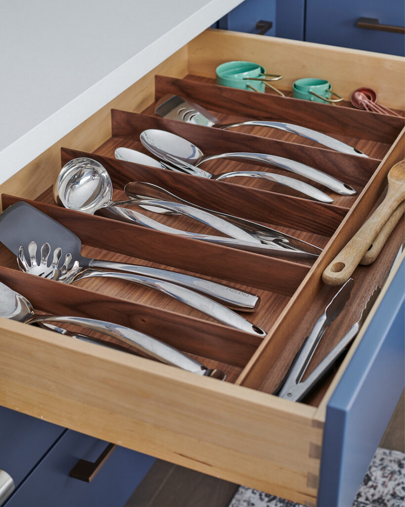
When the opportunity came to work with Häfele, I was super excited. It’s not easy to keep a kitchen tidy and to always find everything in its place, but with their Fineline large cutlery trays, that’s exactly what happens now!
Häfele Fineline walnut cutlery drawer insert.
These fabulously functioning inserts come in different configurations for main cutlery, as well as for larger utensils used regularly when cooking. We house our Fineline trays in 36” wide drawers and even the kids know exactly where things go now. Yay!
I especially loved having the option of using a walnut finish because I designed the kitchen with other walnut accents, such as our custom floating shelf by the sink and our custom hood over the oven.
The Häfele walnut inserts were a wonderful way to complement those elements and assist with the overall flow of the design.
Häfele products are perfect for custom kitchens and for people who value investing in smart organization. It really does make all the difference in making your day-to-day experiences more pleasurable.
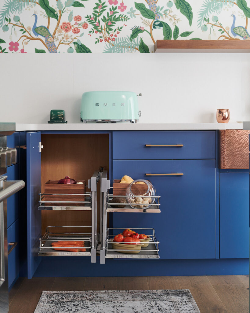
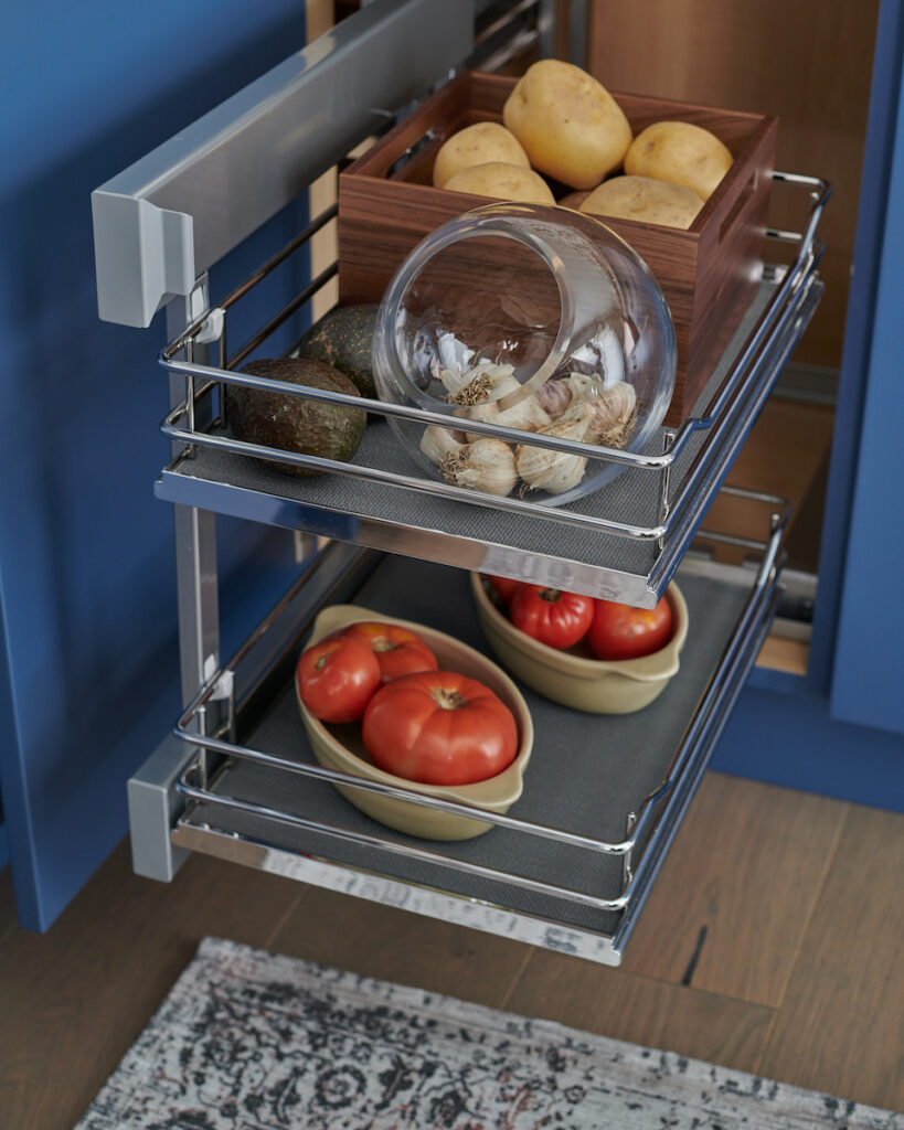
My cabinet maker also commented on how easy it was to install items such as the Häfele Flex Corner Unit, which we absolutely love.
Häfele flex corner kitchen unit organizer makes the most out of your corner storage.
Häfele flex corner kitchen unit organizer.
Start with a thoughtful design for your room layout. I carefully considered every inch of my new kitchen space, just as I do for clients. Think about where it will make the most sense to place everyday items based on how you and your family use your kitchen.
The more organized your home is, with items easy to see and easy to reach, the happier you will feel. I also keep my kitchen much tidier than I ever did before because it makes me so much happier now knowing everything has a place.
Exposed!
The nice thing about investing in custom millwork is that you can get exactly what you want. This can challenge a custom cabinet maker, but the professionals (like mine!) who care deeply about their craft and have incredible attention to detail, push through to make the magic happen and get results.
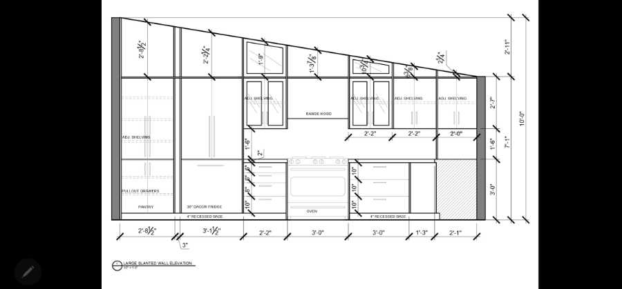
Our slanted ceiling was a challenge for sure, mainly because floors are rarely truly level.
Also, having such a contrast in terms of colour selection between the white-painted ceiling and dark, bold cabinetry, meant that there was no room for error. It had to be perfectly precise!
These drawings had to be very precise to fit on the angle.
The other design element that is often a challenge is that when using standard kitchen cabinets, you are limited to the sizes of doors/drawers, as well as utilizing every inch of available space.
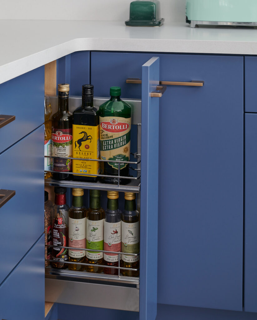
We were able to include the design of the Häfele oil pull-out with the 7″ we had remaining next to my 36″ large pot drawers.
Häfele oil pull out conveniently located near the oven makes for easy access when cooking.
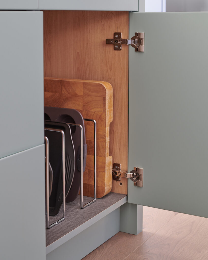
At one end of my island, we added a cupboard underneath the drawer which cleverly houses baking trays and cutting boards.
We used two of Häfeles baking rack dividers to add some separation and help organize these items thoughtfully.
Häfele kitchen storage organization baking racks in chrome.
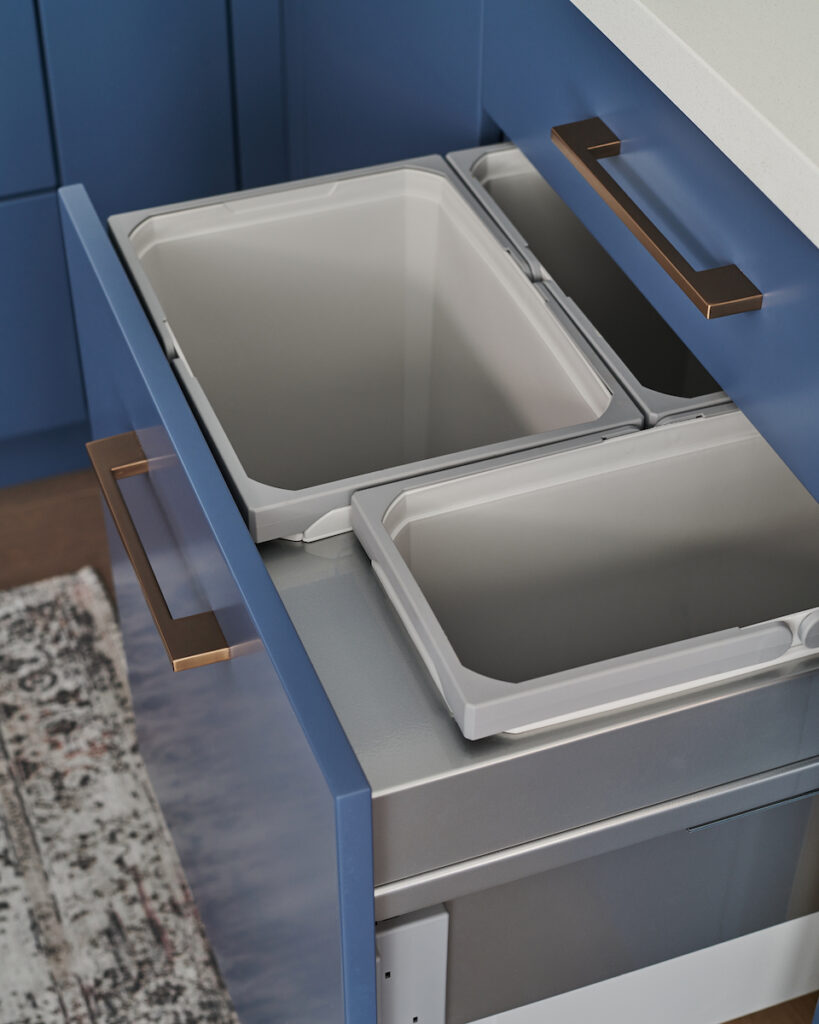
Between the sink and the corner cabinet, we had the perfect amount of space for the 24″ Häfele waste / recycling pull-out unit. Placing your garbage and compost receptacle near the sink is perfect when clearing up after meals.
Häfele kitchen garbage recycling pull-out unit
Investment
Kitchens are definitely an investment. For our new kitchen design, and unlike the first kitchen renovation we did in 2005, we held nothing back this time.
The cost for the cabinetry, countertops, appliances, sink, faucet and smart organization inserts came to around $120,000, plus taxes.
This does not include items such as hardwood, lighting, window treatments, wallpaper, nor the cost to take down the wall that previously divided the 2 rooms.
My first kitchen makeover was less than $10k, so even though that was over 15 years ago, you can see the difference it makes when your wish list includes all the bells and whistles.
Every morning I wake up and smile as I walk into my new kitchen. The design, the multitude of colours, the smart organization solutions – I am thrilled with how it all came together.
Don’t get caught up in the trends and what you see everyone else doing. I happen to think my kitchen design is timeless, especially after watching Mad Men which is set in the 1960’s where they used so many fun and bold colour combinations.
Secondly, everyone knows that kitchens are easily the most frequently used space in a home. It’s where everyone inevitably ends up spending the most time together when gathering with friends and family. The memories made in this busy hub of our homes, are precious.
The kitchen is also the most costly of all renovations and when done right, you will see the biggest return on investment, should you ever go to sell your home.
For these reasons, it’s worth working with a designer.
I know what you’re thinking – of course I’m going to say that being an interior design professional myself. But it’s the truth!
There are so many decisions to be made and so many moving parts to this type of renovation project. One mistake can easily compromise the entire design, whether it comes to the layout or making selections.
If you can’t afford a designer to work with you throughout the entirety of the project, at least consider investing in an initial consultation.
At Claire Jefford Inc. we often have homeowners reaching out to us in order to gain thoughtful advice based on years of experience, regarding what they need to think about before starting on this design journey.
We even offer a Designer For a Day service to assist in choosing selections such as hardwood, countertops, backsplash, cabinetry colours, best paint options for walls, hardware and more.
It can become very overwhelming once your contractor needs you to start making design decisions. There are so many details involved that you likely haven’t even considered at all, but you don’t have to do it alone.
Over to you! What do you think about my new kitchen?
Are you loving all the smart organization solutions we incorporated into the design?
Are my colour choices too bold for your taste?
Comment below with your feedback, I love hearing from you.
More to come on my main floor renovation. I’ve only just touched the surface here and have so many other insider design secrets and tips to share with you.
A big shout out and THANK YOU to Häfele Canada who was a wonderful brand and sponsor to work with for our kitchen design project.
If you would like to learn more about these wonderful products and partner with Häfele for your own kitchen renovation, click here if you are in Canada.
Häfele Product Codes with links
As promised, below is a list of product codes and links to the Häfele items we used in my kitchen.
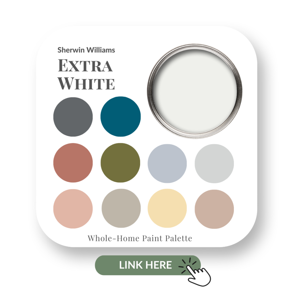
Extra White is one of Sherwin Williams’s brightest whites.
It gives a very clean look to a room but can certainly be enhanced by adding in other beautiful complementary colours, as you will see later in this post in the design rendering we created.
In this paint colour review of Extra White by Sherwin Williams, I share:
The undertone of my featured colour
Colour comparisons in order to easily see the different colour tones
Best white paint colours for the trim and ceilings
Beautiful colour combinations to inspire you for your decorating project
Sherwin Williams – Extra White
After you read this post, if you would like all the information I share in one convenient place, then you’ll want to check out my new Perfect Colour Palette for Extra White.
My Perfect Colour Palette also includes 10 colours that go beautifully with Extra White and step-by-step guidance for choosing a cohesive colour palette in your own home.
This helpful download is a must-have for any colour enthusiast or interior design professional!
Extra White Colour Review
Undertone: true white
Colour Comparisons
Whites can all look the same to many people until you look at various white paint colours side by side with others. Then you are blown away by just how different they all can be!
And that is why it’s not uncommon for homeowners to overthink choosing a white paint colour for any part of their design project.
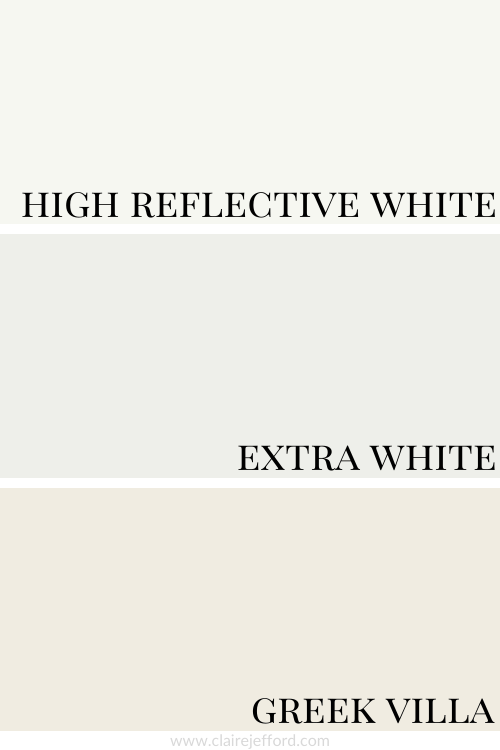
High Reflective White SW 7036 and Greek Villa SW 7551
Colour Comparison with similar colours by Sherwin Williams
When I do Colour Consultations in a client’s home, I am always comparing colours so they too can easily see the differences between the paint colours.
Best Whites To Pair With Extra White
High Reflective White SW 7036 by Sherwin Williams
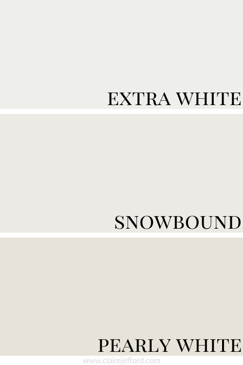
Snowbound SW 7004 by Sherwin Williams
A third white that would work brilliantly as a trim or ceiling colour with Extra White is… Extra White itself.
Yes, if you are painting your walls white, you don’t have to add in another white paint option for trim, ceilings, or cabinetry.
For a beautiful seamless look, they can all be painted in the same white. No need to overthink it!
High Reflective White, Extra White, and Snowbound
For reference, you can see all the whites together in the graphic above.
NEW!!
If whites confuse you, you are not alone. But I can help. 🙂
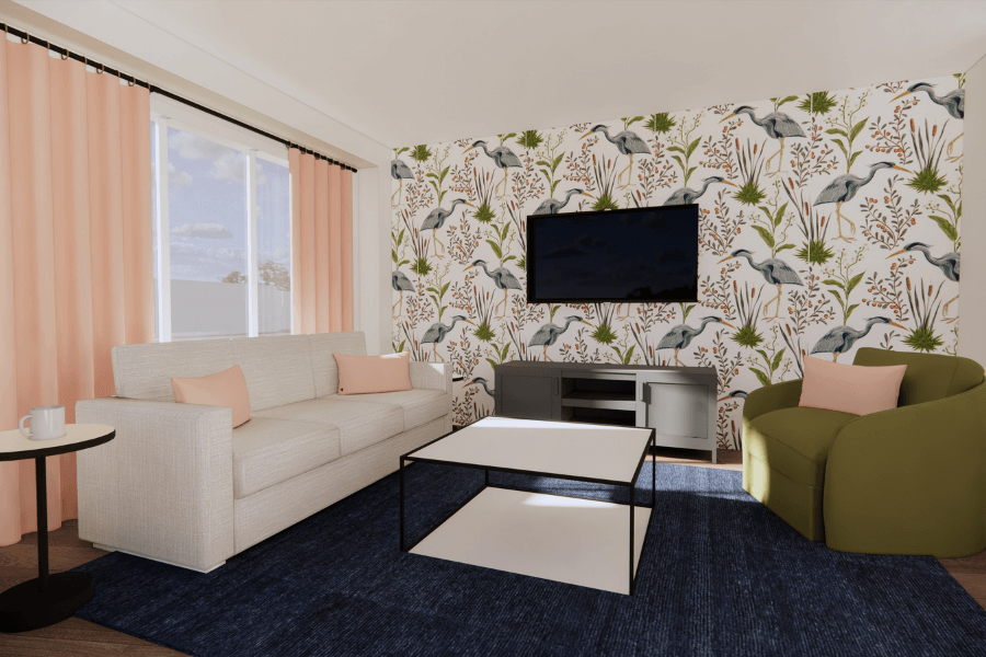
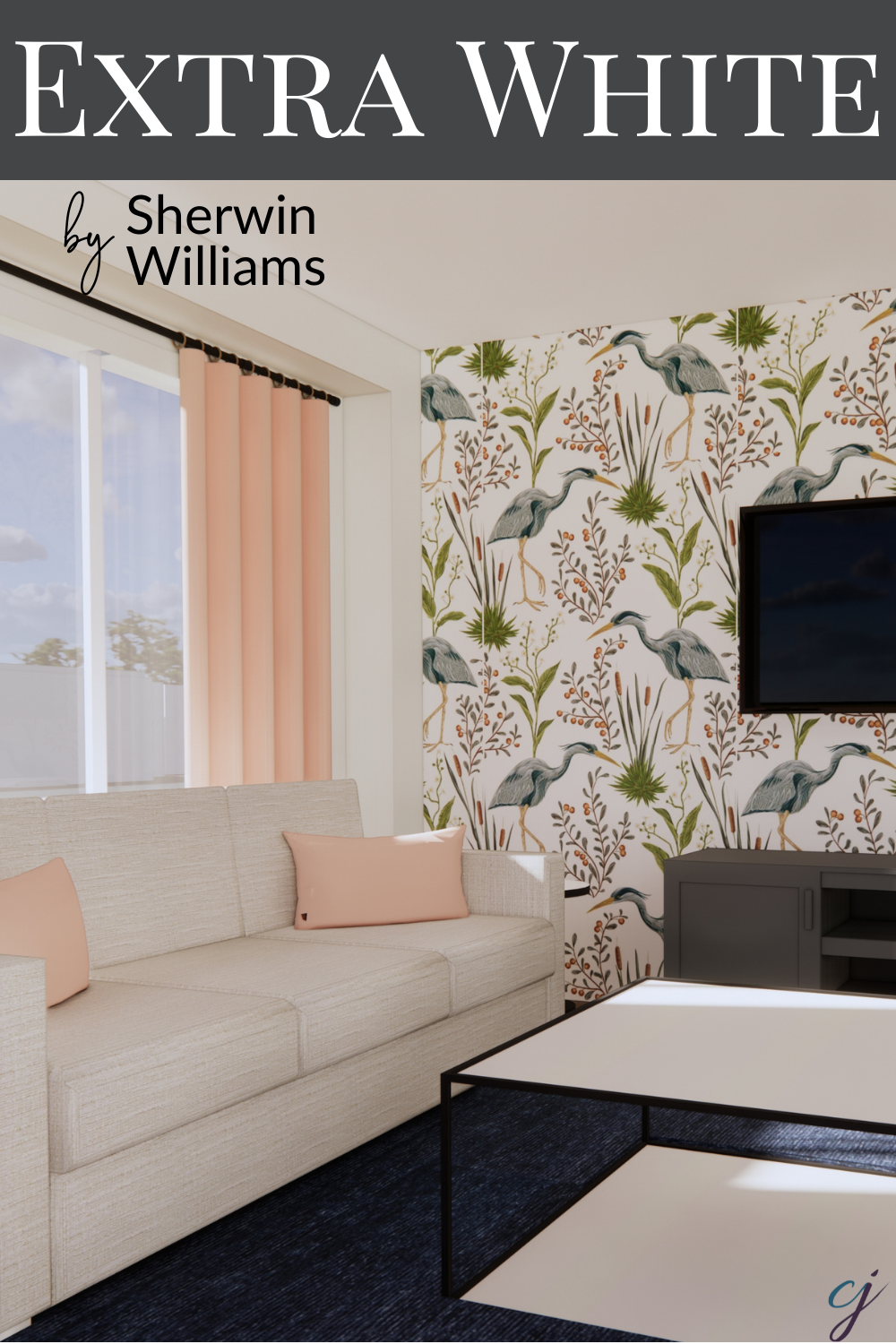
The below image is a room rendering demonstrating the different ways to combine this colour combination.
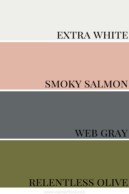
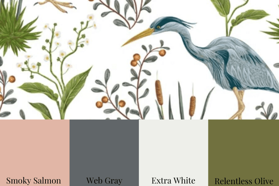
The walls and ceiling are shown in Extra White.
The drapery and pillows are Smoky Salmon.
The console is painted Web Gray, while the accent chair is seen with Relentless Olive. I love that name!
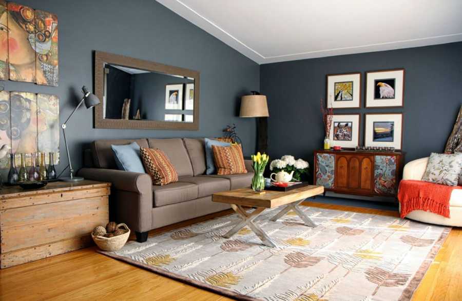
On a side note and to show you a completely different colour palette, the living room layout in a 3D rendering shown above was initially created for this Burlington client project.
See if you can spot the same living room, but now done in real life, as you scroll through that blog post.
Talking with designer and decorator friends it seems everyone has their favourites.
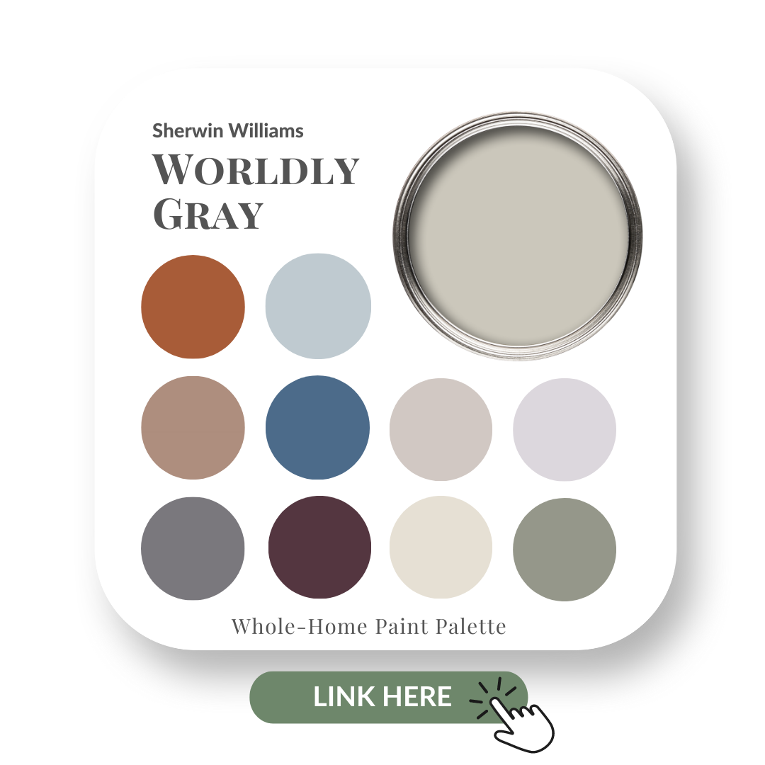
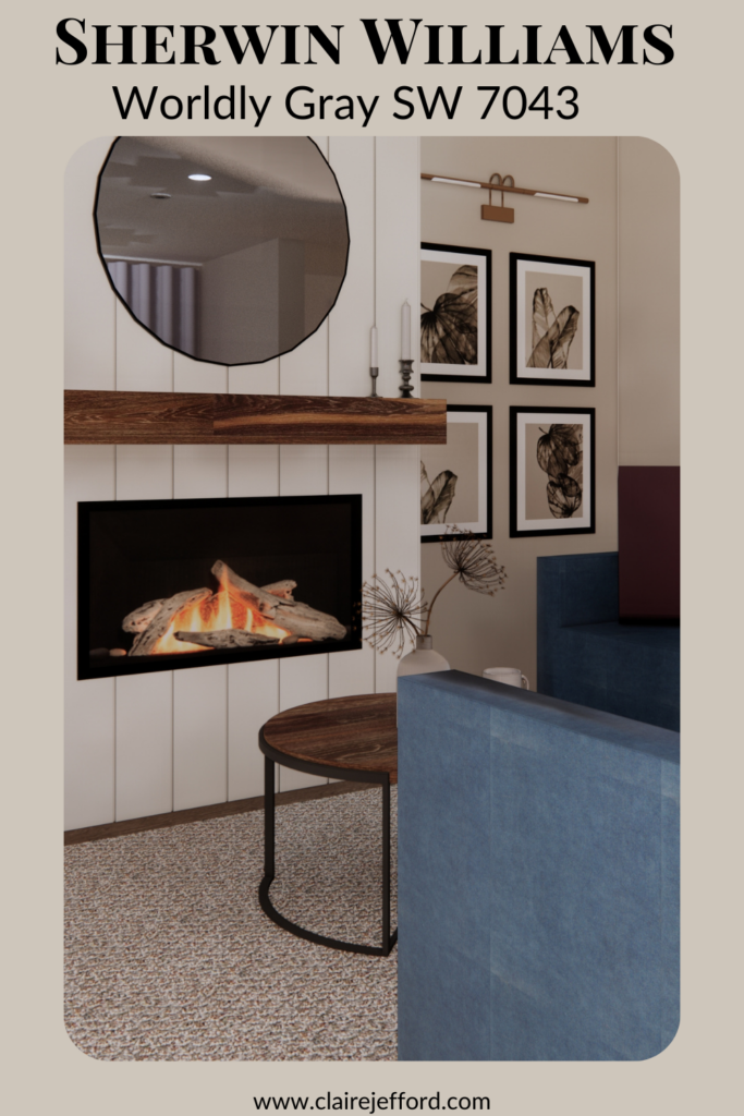
Worldly Gray by Sherwin Williams is certainly an incredibly popular one.
This subtle gray that some people may refer to as a greige, is a beautiful colour. As with many neutrals, it tends to take on slightly varying appearances in rooms depending on the light and other decor elements.
Let’s explore this colour a bit more closely here in this week’s colour review.
If you’re new here, welcome! Below you will see what I cover in every colour review post.
In this colour review of Worldly Gray by Sherwin Williams, I share:
The undertone of my featured colour
Colour comparisons in order to easily see the different colour tones
Best white paint colours for the trim and ceilings
Beautiful colour combinations to inspire you for your decorating project
Sherwin Williams – Worldly Gray
After you read my review if you would like all the information I discuss in one convenient place look no further than my new Perfect Colour Palette for Worldly Gray.
My Perfect Colour Palette also includes 10 colours that go beautifully with Worldly Gray, plus a 2-page step by step How-To for choosing a cohesive colour palette in your own home.
A must-have for any colour enthusiast or interior design professional!
As you can see below, it’s when we start comparing colours that you get a much better sense of a paint’s true colour.
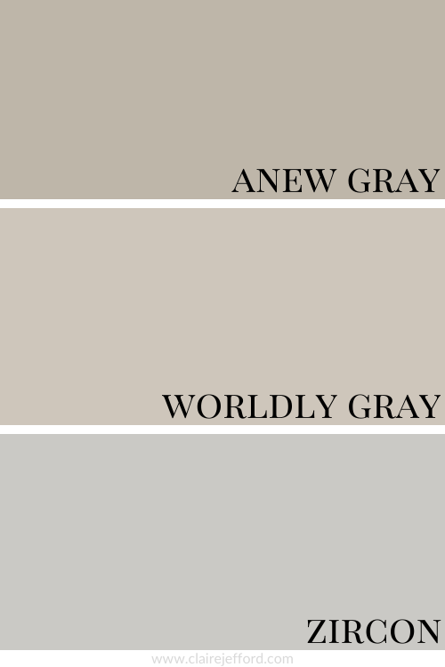
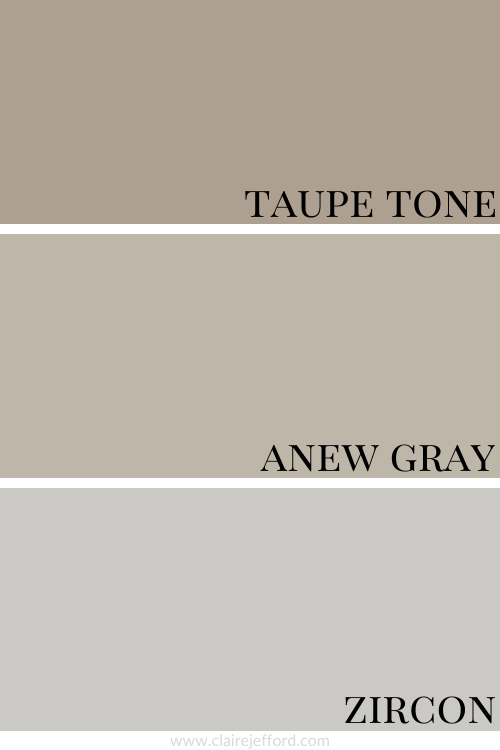
Anew Gray SW 7030 and Zircon 7667
Colour Comparison with similar colours by Sherwin Williams
When comparing these three colours so closely as I have in the graphic above, you can easily see the differences in the undertones.
Anew Gray is a green-gray, Worldly Gray is a violet-gray and Zircon is a Blue Gray.
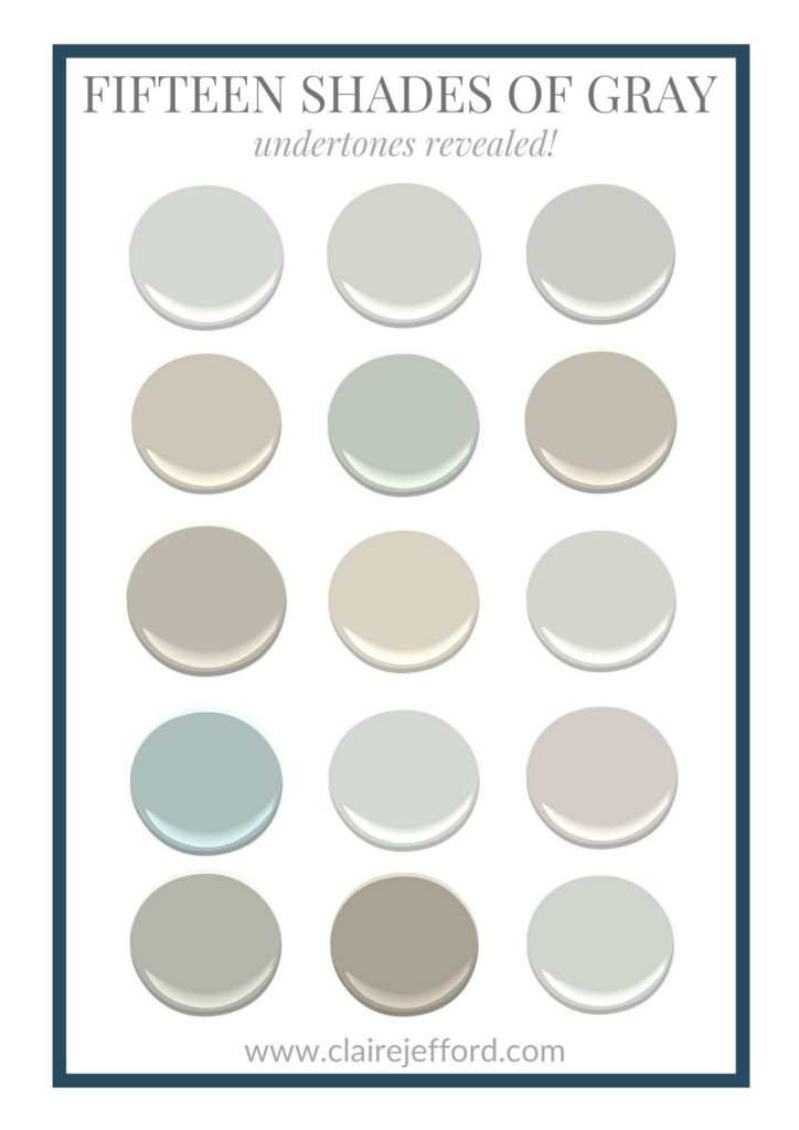
So many Shades of Gray! Who knew?!
Well, I did actually. 😉 But because I appreciate how confusing this can be if you are not a True Colour Expert obsessed with colour and design, I have a Free download for you.
Extra White being a true white will highlight Worldly Gray as a slightly cooler colour compared to both Snowbound and Pearly White. These two whites are definitely warmer in tone.
Fabulous Colour Combinations
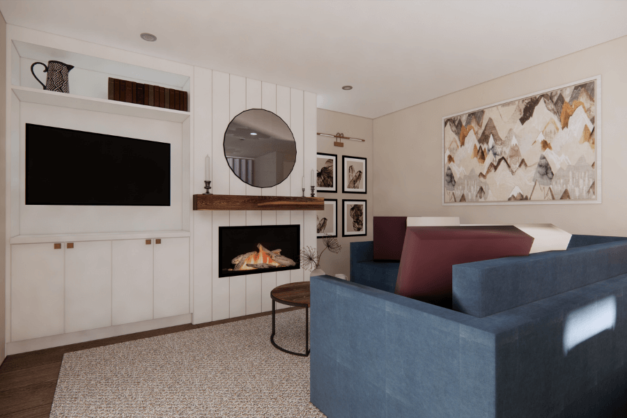
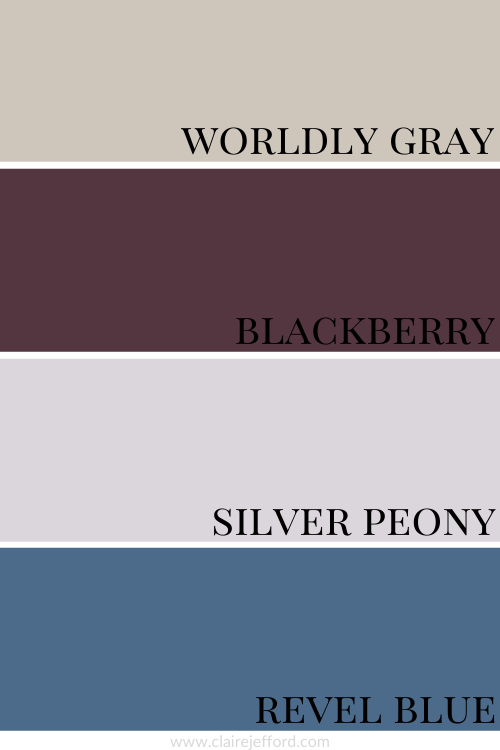
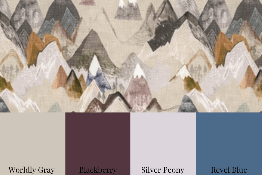
Worldly Gray with Blackberry, Silver Peony and Revel Blue
The room rendering shown here is an example of how you can find inspiration for an interior design project and incorporate the colours from my Perfect Colour Palette into a space.
Remember, you don’t need to use all of the colours for paint.
Yes, the walls are Worldly Gray and the built-ins and fireplace shiplap are Snowbound, but those are the only two paint colours.
The remaining colours we integrated into the room’s decor in other ways. The blue sofa mimics Revel Blue and the accent cushions are similar to Blackberry and Silver Peony.
Convenience At Your Fingertips
Love the idea of being inspired by beautiful colour combinations already done for you by a professional who eats, sleeps and breathes interior design every day?
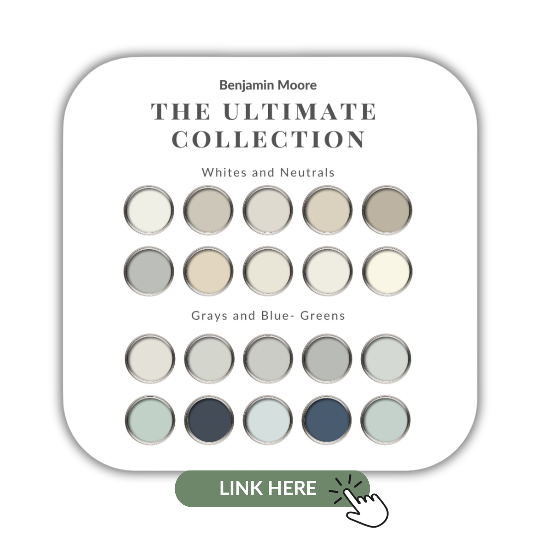
We have single feature colour download available immediately after purchase and full collections from the most popular paint companies – Sherwin Williams, Benjamin Moore as well as Farrow & Ball.
10 of the most popular Sherwin Williams’ Neutrals in one collection
Remember, it only takes one mistake to take your home decorating project from divine to disaster. Don’t let the paint be what stresses you out!
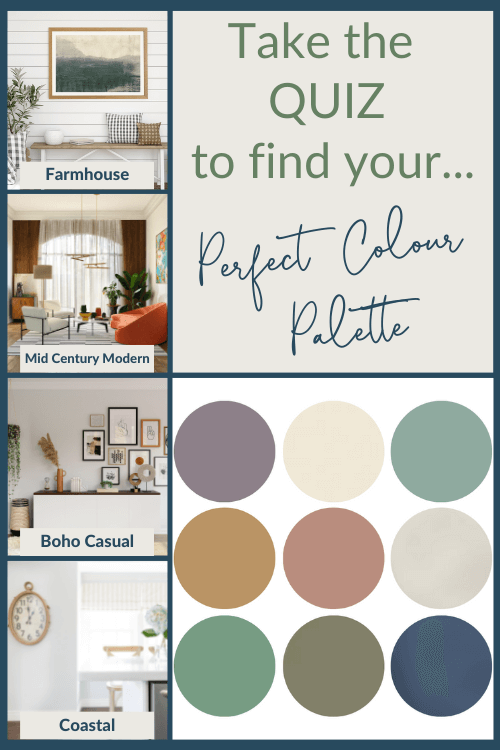
Take my Colour Quiz to find out what your Perfect Colour Palette is.
Don’t turn your nose up because you think this colour tone is ‘so 10 years ago’, because Beiges are back!
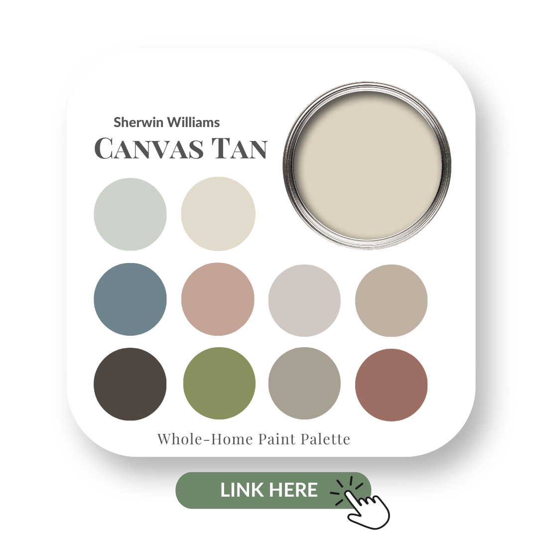
And today I am reviewing a longstanding popular paint colour that is the lovely neutral Canvas Tan by Sherwin Williams.
This is a warm, light tan that does well in both sun-filled and darker rooms.
If you’re new here, welcome! Below you will see what I cover in every colour review post.
In this colour review of Canvas Tan by Sherwin Williams, I share:
The undertone
Colour comparisons in order to easily see the different colour tones
Best white paint colours for the trim and ceilings
Beautiful colour combinations to inspire you for your decorating project
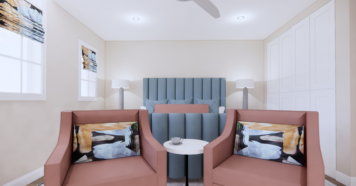
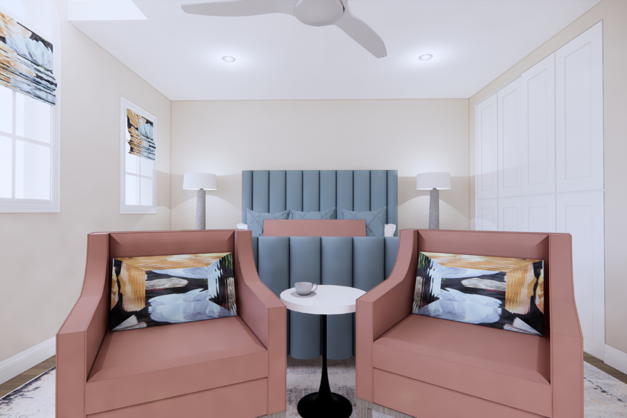
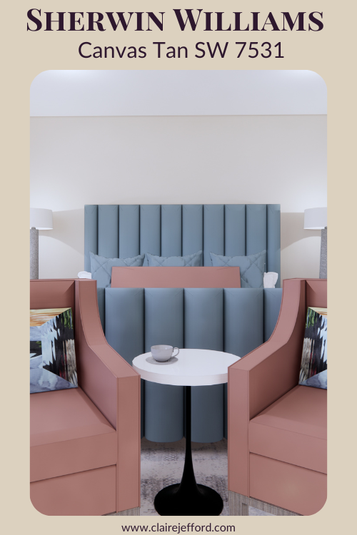
Walls shown in rendering as Canvas Tan
Sherwin Williams – Canvas Tan
After you read the blog post, if you would like all the information that I share in one convenient place, be sure to check out this Perfect Colour Palette.
In addition to the details I provide in my blog, the PDF includes a total of 10 colours that go beautifully with Canvas Tan.
Plus, there is a comprehensive step-by-step How-To Guide included for choosing a cohesive colour palette in your own home.
A must-have resource for any colour enthusiast or interior design professional!
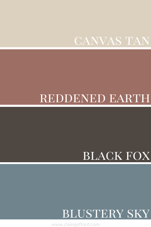
We can better identify the undertone of a colour such as this when we compare it to other neutral paints in the beige family.
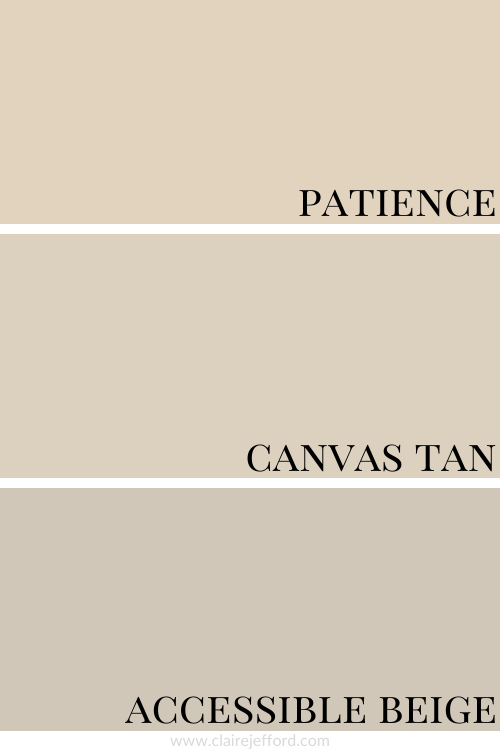
Patience SW 7555 and Accessible Beige SW 7036
Colour Comparisons with similar colours by Sherwin Williams
From the comparison graphic above the true colour of Canvas Tan becomes much clearer.
Patience, shown on the top, is a pink beige.
Accessible Beige has a green undertone, but is more intense than Canvas Tan.
When looking at my large colour boards, a close comparison to Sherwin Williams’ Canvas Tan is Muslin by Benjamin Moore, even though it is a pink beige.
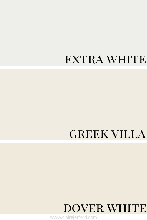
Best Whites To Pair With Canvas Tan
Extra White SW 7006 by Sherwin Williams
Greek Villa SW 7551 by Sherwin Williams
Dover White SW 6385 by Sherwin Williams
Extra White, Greek Villa and Dover White
See all three together to get a better sense of these recommended whites to use with this Sherwin Williams neutral paint colour.
They don’t even look white when you see them on the super white backdrop of my website!
That’s why choosing white paint colours can be a daunting task when decorating your home.
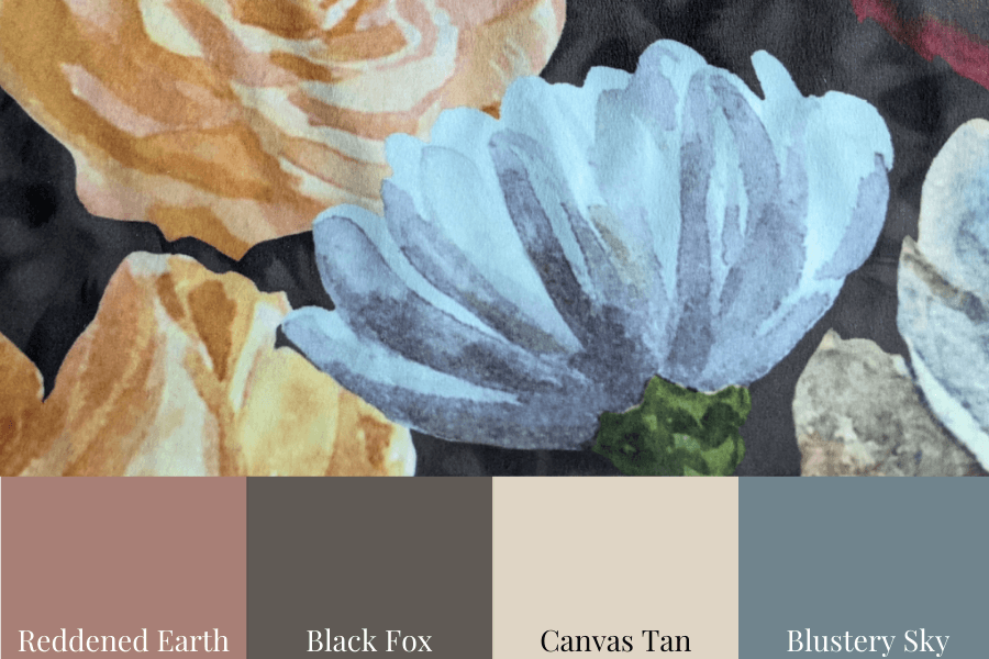
The beautiful fabric here demonstrates exactly how a complementary colour palette can be used to bring a room together.
Walls painted Canvas Tan, some stunning drapery in the above fabric, an area rug with a strong Blustery Sky shade to it and accent pieces with hints of Reddened Earth and Black Fox. Gorgeous.
Convenience At Your Fingertips
For your convenience, all the colour combinations shown above coordinate with this popular beige (plus 7 more!) are included in my Perfect Colour Palette for Canvas Tan.
But don’t be fooled and think of the bright white processed table salt that you might find in most kitchens.
Instead, this beautiful, pale, soothing light gray resembles its namesake, the thin crust of salt that forms on the surface of seawater.
A very natural colour that is perfect if you are going for a Coastal Design Style.
If you’re new here, welcome! I’m Claire Jefford, a True Colour Expert and Certified Interior Decorator.
Below you will see what I cover in every colour review post.
In this colour review of Fleur de Sel by Sherwin Williams, I share:
The undertone of my featured colour
Colour comparisons in order to easily see the different colour tones
Best white paint colours for the trim and ceilings
Beautiful colour combinations to inspire you for your decorating project
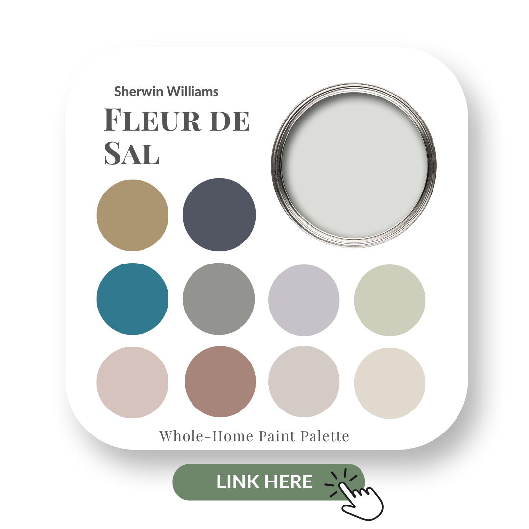
Sherwin Williams – Fleur de Sel
After you read this post, if you would like all the information I discuss in one convenient place look no further than my new Perfect Colour Palette for Fleur de Sel, which includes 10 colours that go beautifully with this colour.
A must-have for any colour enthusiast or interior design professional!
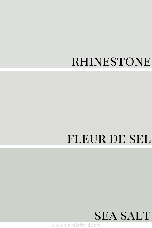
Colour Comparison with similar colours by Sherwin Williams
In the above comparison, it becomes a bit easier to see the true tone of Fleur de Sel. It’s not looking quite as cool as Rhinestone which has a blue undertone.
And you can see that Sea Salt, which is another popular Sherwin Williams paint colour that I have previously reviewed, has a stronger green undertone.
When I do Colour Consultations in a client’s home, I always compare colours so they can easily see the differences between the paint colours.
When I hold my large paint boards up to a decorative element such as fabrics, wallpaper or subway tile and then swap out one board with another board, it becomes clear as to which colour will work best.
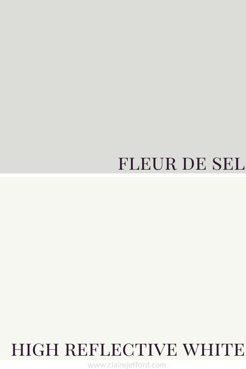
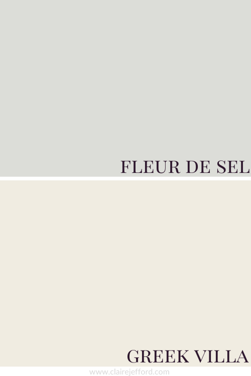
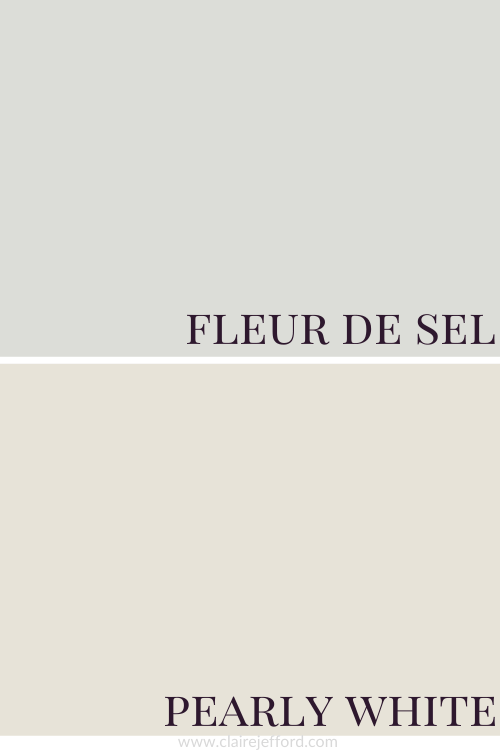
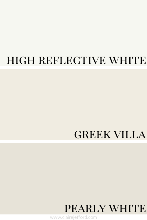
Best Whites To Pair With Fleur de Sel
High Reflective White SW 7036 by Sherwin Williams
Greek Villa SW 7551 by Sherwin Williams
Pearly White SW 7009 by Sherwin Williams
High Reflective White, Greek Villa and Pearly White
You will get quite a different look depending on which of the three whites you pair with Fleur de Sel. See the comparison graphic below with all these suggested white paint colours by Sherwin Williams to get a better idea of how each might look.
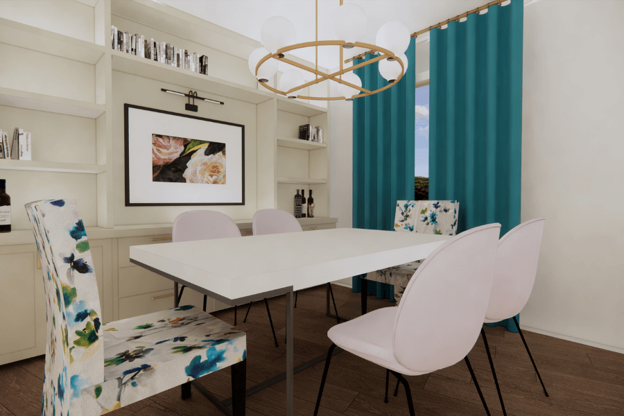
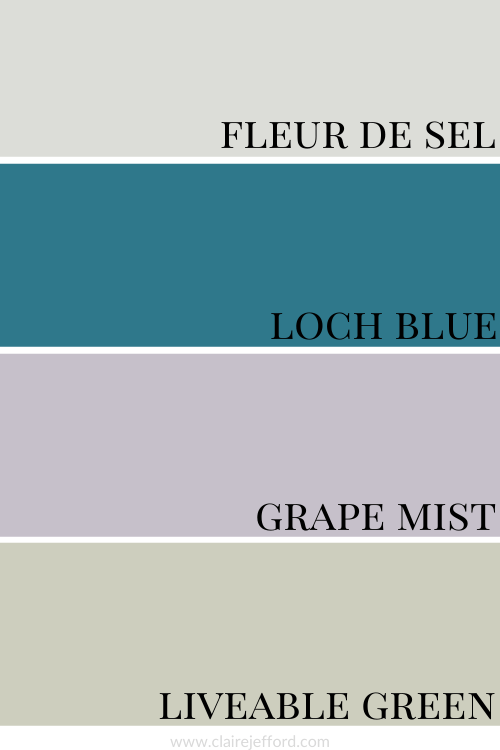
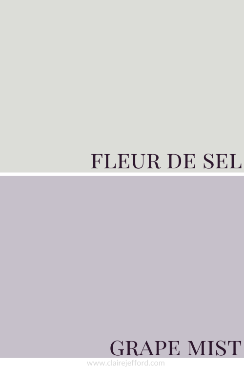
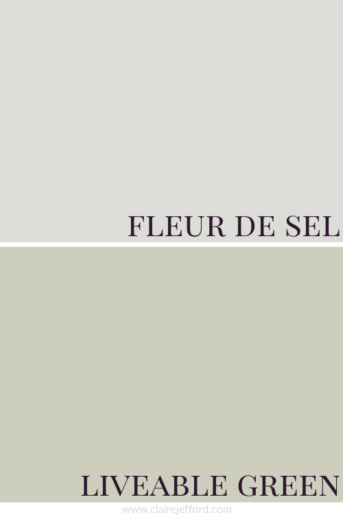
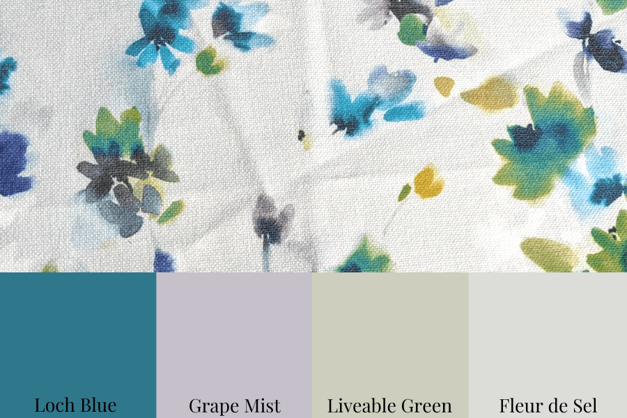
Fleur de Sel, Loch Blue, Grape Mist and Liveable Green
Oooh, I just love this pretty colour palette, don’t you?!
Loch Blue SW 6502 by Sherwin Williams
If Loch Blue is a little too bright for you, but you still love the richness of it, take a look at Hague Blue by Farrow & Ball to see if you prefer that colour.
Grape Mist SW 6502 by Sherwin Williams
While I’m a sucker for purples, this Grape Mist is more of a lavender and reminds me of the wall tile we removed from our main floor bathroom when we renovated it in 2020.
Liveable Green SW 6176 by Sherwin Williams
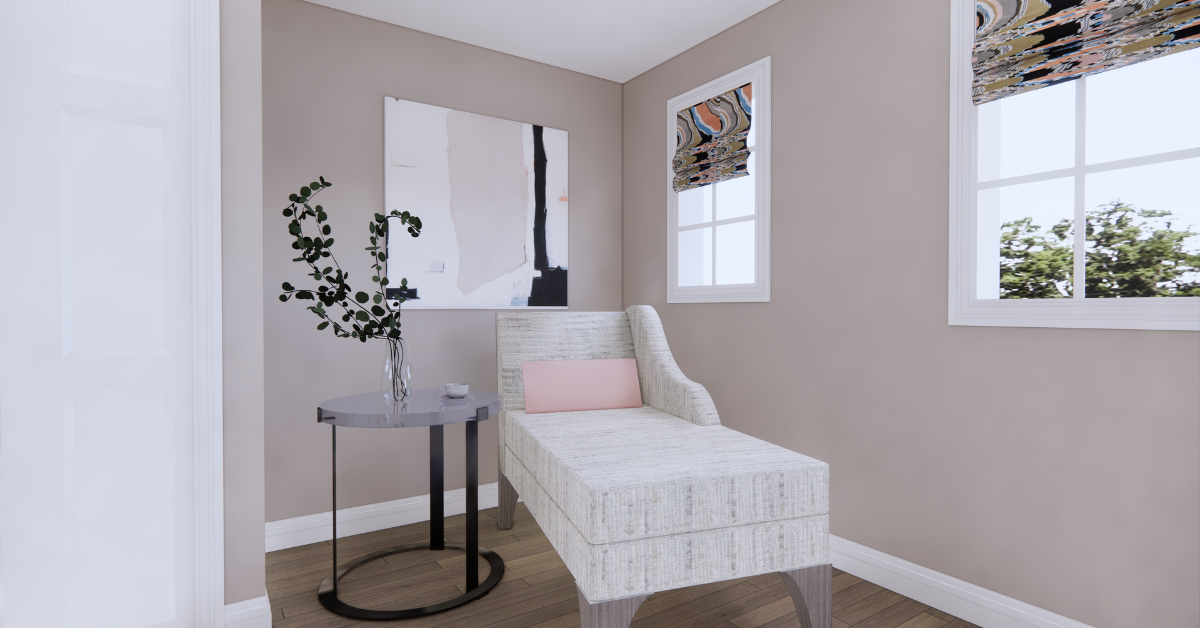
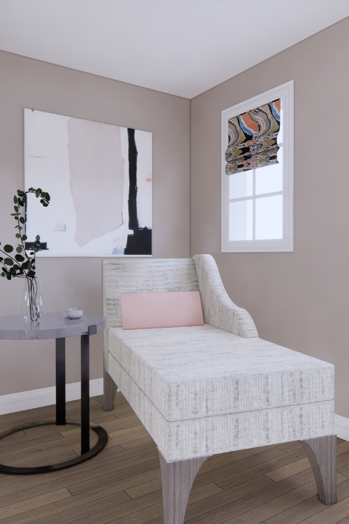
We choose 3 of the complementary colours from my Perfect Colour Palette for Fleur De Sel to create this beautiful palette and pair them with the fabric below.
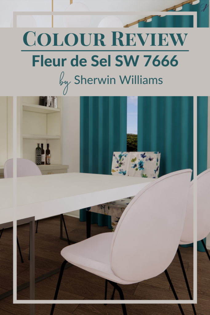
In the room rendering below you can see how we incorporate the colours from the above palette into our design.
The walls are painted the featured colour Fleur de Sel by Sherwin Williams.
We’ve shown the accent chairs at either end of the table in the beautiful fabric shown in the graphic above.
We placed Grape Mist on the other dining chairs and the bright hue of Loch Blue on the drapery.
Livable Green can be seen on the built-in cabinet that acts as our backdrop for this rendered dining room.
Convenience At Your Fingertips
All of the colour combinations shown above, plus more inspiring options for your next home decorating project can be found in my Fleur de Sel Perfect Colour Palette.
10 of the most popular Sherwin Williams’ Neutrals in one collection
If you prefer Benjamin Moore or can’t do anything but Farrow & Ball, I’ve created collections of the most popularly used paint colours from both of the paint companies as well and you can see them here.
Farrow & Ball’s Collection of 10 Classic paint colours
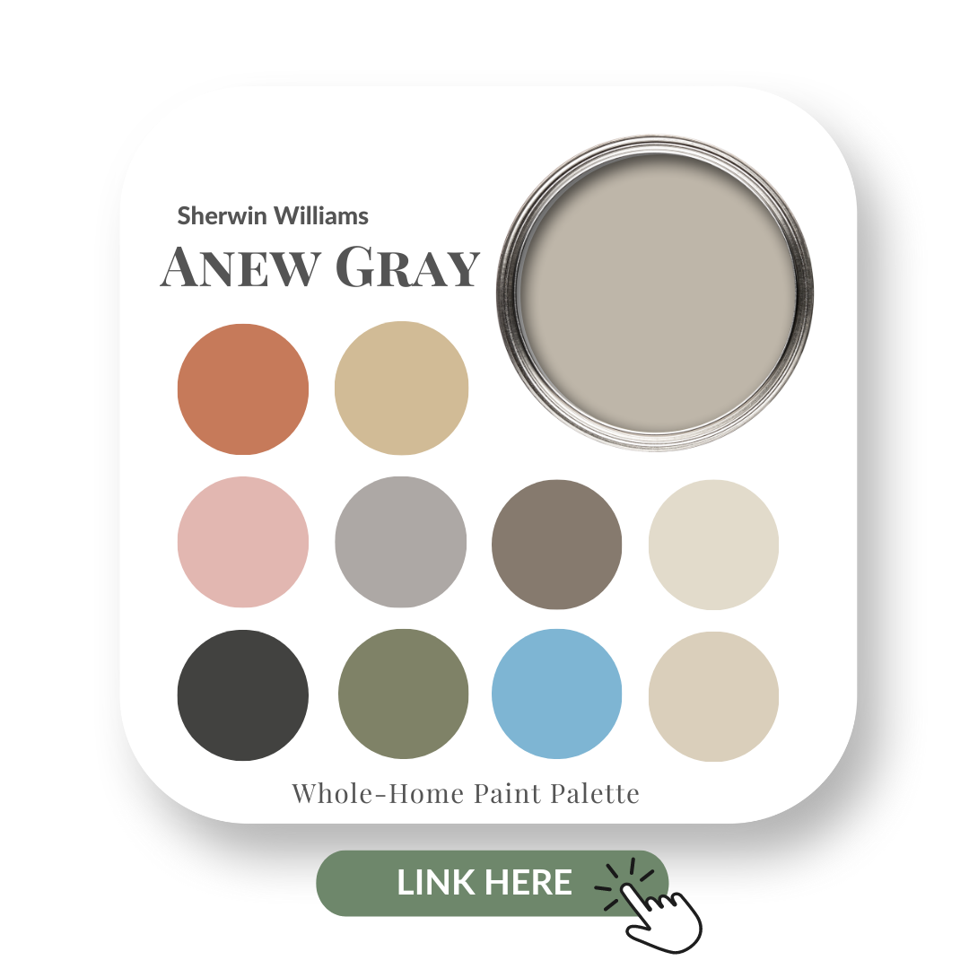
Undoubtedly, one of THE MOST popular Sherwin Williams’ neutrals for the past 5 years or more.
Anew Gray is warmer and a bit richer than many of the other trending grays out there.
If you’re new here, welcome! Below you will see what I cover in every colour review post.
In this colour review of Anew Gray by Sherwin Williams, I share:
The undertone of my featured colour
Colour comparisons in order to easily see the different colour tones
Best white paint colours for the trim and ceilings
Beautiful colour combinations to inspire you for your decorating project
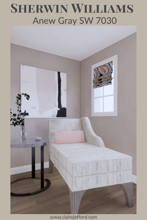
Walls shown in rendering as Anew Gray.
Sherwin Williams – Anew Gray
After you read my paint colour review, be sure to take a look at my Colour Shop for all the carefully curated Perfect Colour Palettes I’ve designed to inspire your next home decorating project.
Must-have resources for any colour enthusiast or interior design professional!
As you can see below, it’s when we start comparing colours that you get a much better sense of a paint’s true colour.
Taupe Tone SW 7633 and Zircon SW 7667
Colour Comparisons with similar colours by Sherwin Williams
Taupe Tone is quite a bit darker than Anew Gray and it’s a Taupe, just as the name suggests.
Although don’t be fooled, because this isn’t always the case with paint colour names!
You see when Anew is Gray beside Zircon, a blue gray, now it does not appear to be as gray as you may have initially thought.
When I do Colour Consultations in a client’s home, I am always comparing colours so they too can easily see the differences between the paint colours.
When I hold my large paint boards up to a decorative element such as fabrics, wallpaper or subway tile and then swap out one board with another board, it becomes clear as to which colour will work best.
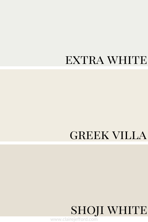
Best Whites To Pair With Anew Gray
Extra White SW 7006 by Sherwin Williams
The truest white out of the three, Extra White is a great white to use on ceilings and trim when considering painting a room with Anew Gray.
Greek Villa SW 7551 by Sherwin Williams
A slightly creamier white, Greek Villa is a wonderful trim colour to go with Anew Gray.
Shoji White SW 7042 by Sherwin Williams
A much richer white (and some might say not really a white at all) is Shoji White by Sherwin Williams and it makes a gorgeous paint combination with Anew Gray.
Extra White, Greek Villa and Shoji White
Looking at all three whites together you can more easily see how a different look and feel would be created for each one in a design when paired with Anew Gray.
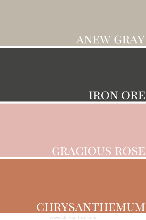
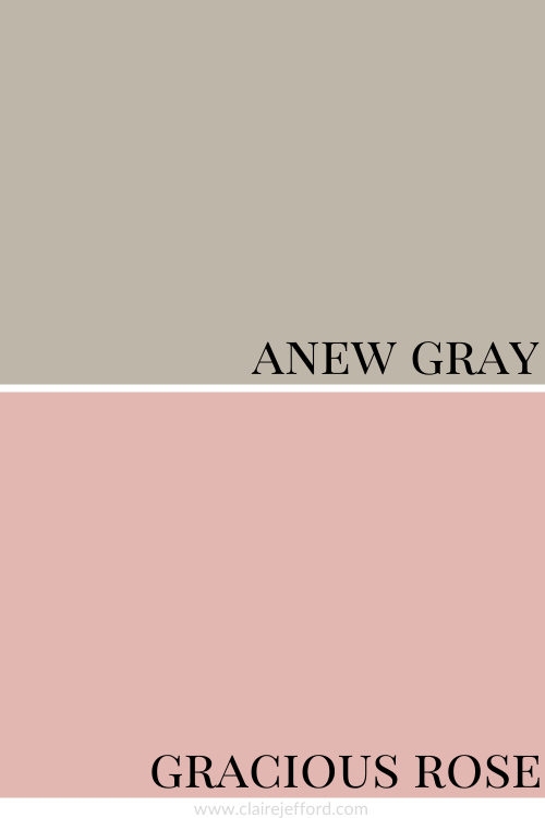
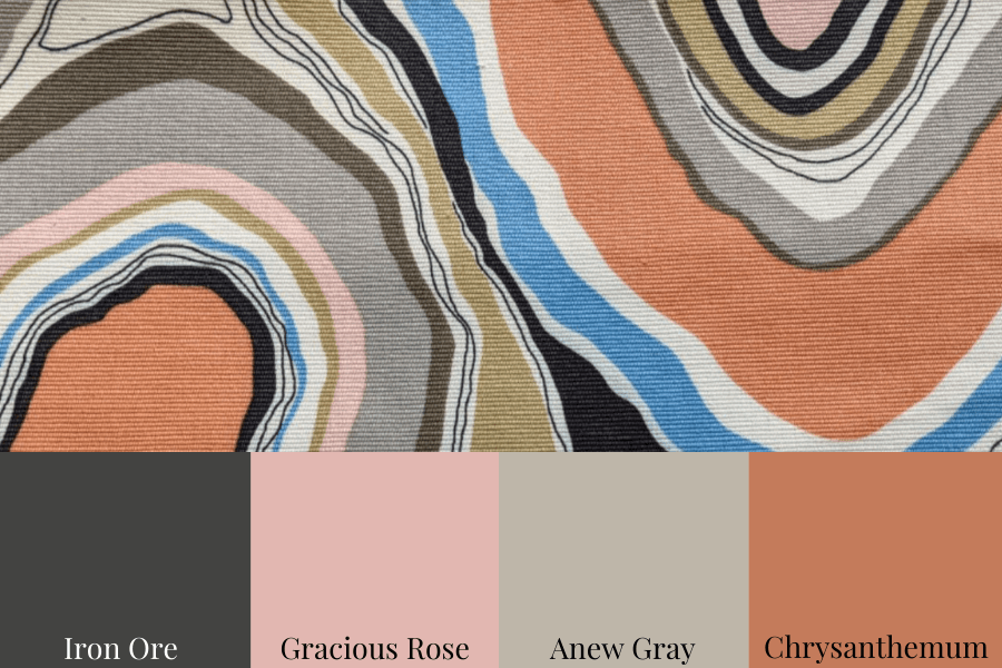
Anew Gray with Iron Ore, Gracious Rose and Chrysanthemum
Iron Ore SW 7069 by Sherwin Williams
Gracious Rose SW 6317 by Sherwin Williams
Chrysanthemum SW 6347 by Sherwin Williams
We used the fabric below as a jumping-off point to create these beautiful colour combinations.
When creating a cohesive look for a room or entire home think of all the ways to incorporate the colours in your chosen colour scheme.
Just looking at this fabric and keeping Anew Gray as your main colour you can see the amazing selection of colours you could use for other areas of the project.
Artwork, drapery, cushions, decorative elements – these all can incorporate the colours of the palette.
The colours do not all have to be used solely for paint.
10 of the most popular Sherwin Williams’ Neutrals in one collection
If you are a fan of the beautiful rich paints by Farrow & Ball I’ve also created a collection of 10 classic colours from this popular British paint company. Check them out here.
Farrow & Ball’s Collection of 10 Classic paint colours
This website uses cookies to improve your experience while you navigate through the website. Out of these cookies, the cookies that are categorized as necessary are stored on your browser as they are essential for the working of basic functionalities of the website. We also use third-party cookies that help us analyze and understand how you use this website. These cookies will be stored in your browser only with your consent. You also have the option to opt-out of these cookies. But opting out of some of these cookies may have an effect on your browsing experience.
Necessary cookies are absolutely essential for the website to function properly. This category only includes cookies that ensures basic functionalities and security features of the website. These cookies do not store any personal information.
Any cookies that may not be particularly necessary for the website to function and is used specifically to collect user personal data via analytics, ads, other embedded contents are termed as non-necessary cookies. It is mandatory to procure user consent prior to running these cookies on your website.