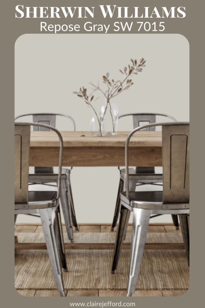
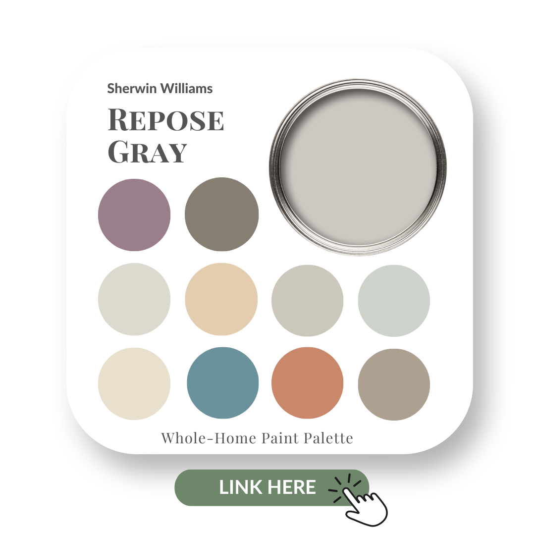
Sherwin Williams – Repose Gray
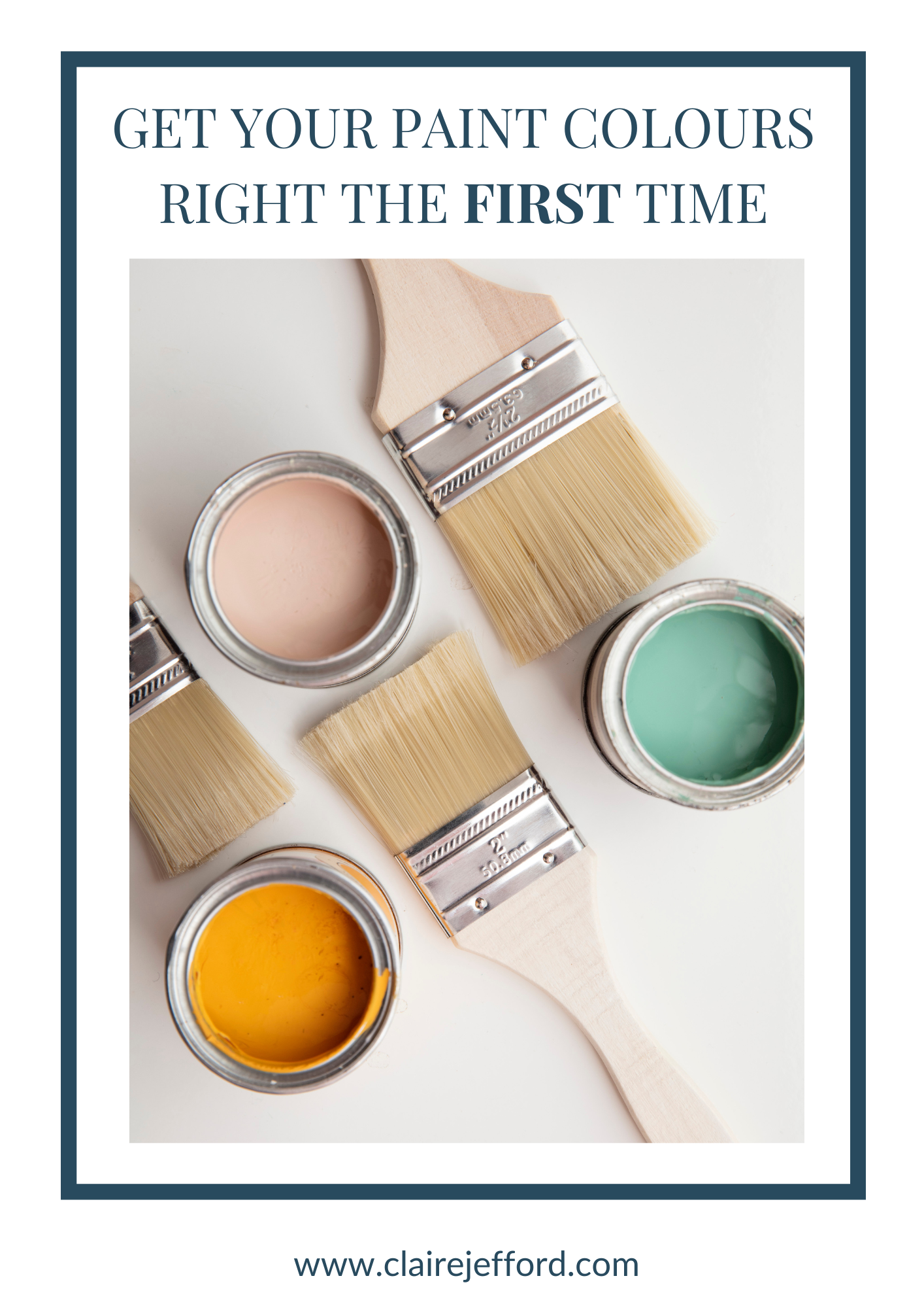
Choose the right paint colour
the first time Let me show you how in just 5 easy steps!
BONUS: The Top 15 Shades of Gray by Benjamin Moore

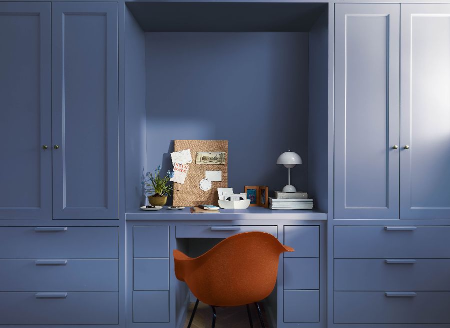
Repose Gray SW 7015 by Sherwin Williams
Hugely popular amongst professional designers, decorators and home owners alike, Repose Gray by Sherwin Williams is a fantastic neutral.
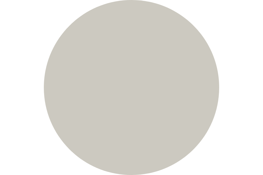
Repose Gray is a gray, although not a true gray.
An incredibly versatile colour, Repose Gray is not restricted to a particular design style or room.
If you’re new here, welcome! Below you will see what I cover in every colour review post.
In this colour review of Repose Gray by Sherwin Williams, I share:
- The undertone of my featured colour
- Colour comparisons in order to easily see the different colour tones
- Best white paint colours for the trim and ceilings
- Beautiful colour combinations to inspire you for your decorating project
Sherwin Williams – Repose Gray
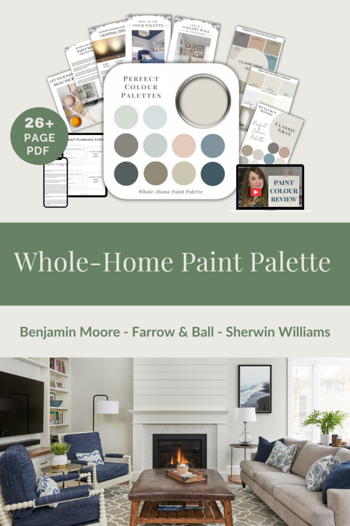
After you read the blog if you would like all the information I discuss in one convenient place look no further than my new Perfect Colour Palette for Repose Gray.
My 26+ page Perfect Colour Palette also includes more colours that go beautifully with Repose Gray, plus helpful tips for choosing a cohesive colour palette in your own home.
A must-have for any colour enthusiast or interior design professional!
Repose Gray Colour Review
Undertone: green/slight violet undertone
Colour Comparisons
As you can see below, it’s when we start comparing colours that you get a much better sense of a paint’s true colour.
Agreeable Gray SW 7029 and Passive SW 7064
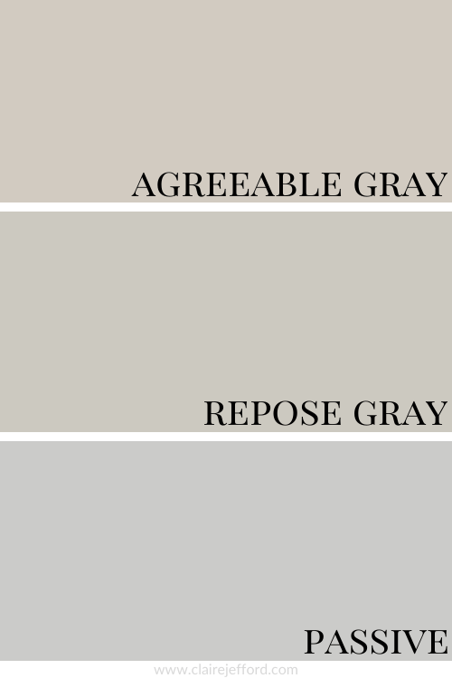
This comparison above gives you a much better idea of where Repose Gray fits in.
Passive looks cooler and has a more noticeable violet undertone when compared to Repose Gray.
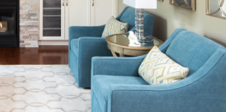
You can definitely see a bit more of the green undertone in Repose Gray compared to Agreeable Gray which also has a green undertone but is not nearly as gray.
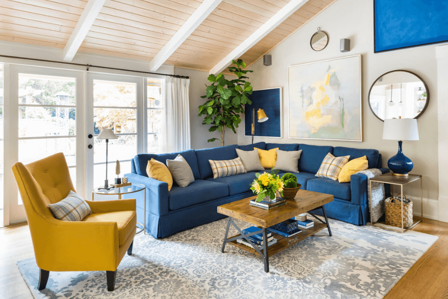
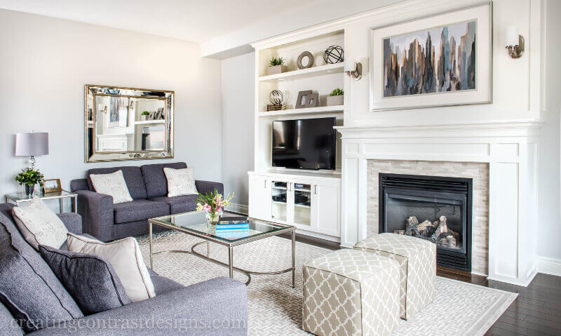
A much lighter gray, Agreeable Gray looks gorgeous in this living room.
When I do Colour Consultations in a client’s home, I always compare colours so they can easily see the differences between the paint colours.
I hold my large paint boards up to a decorative element such as fabrics, wallpaper or subway tile and then swap out one board with another board. This helps to clearly show which colour will work best.
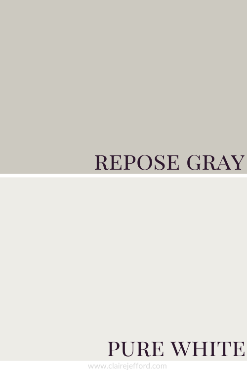
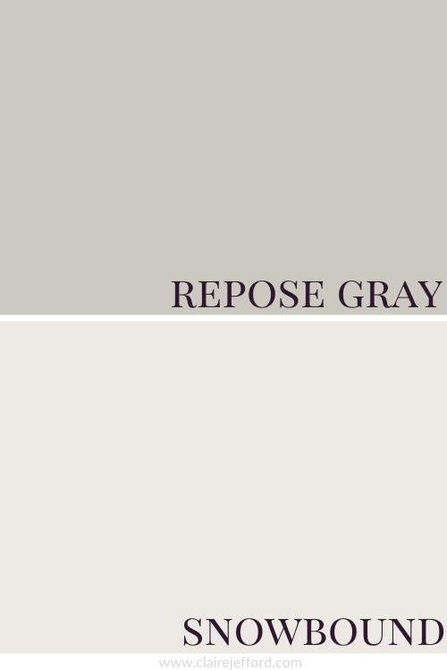
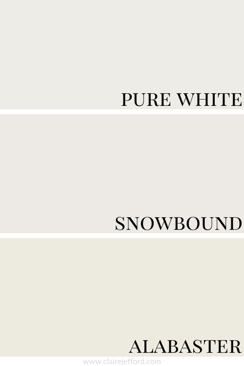
Best Whites To Pair With Repose Gray
Pure White SW 7005 by Sherwin Williams
Snowbound SW 7004 by Sherwin Williams
Alabaster SW 7008 by Sherwin Williams
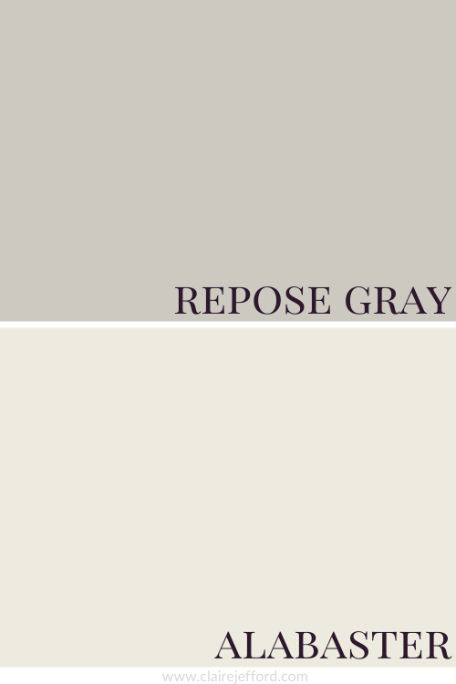
Pure White, Snowbound and Alabaster
Three whites that would all look so great with Repose Gray, each offering quite a different look.
I can assure you that the best colour for your project already exists, you just need to know the 5 Steps on how to choose the right paint colour the first time.
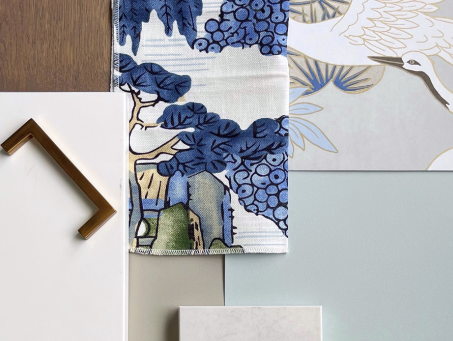
Fabulous Colour Combinations
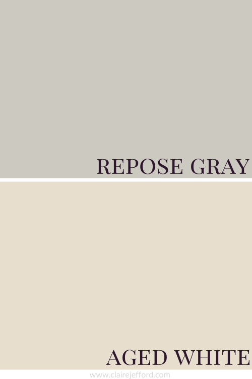
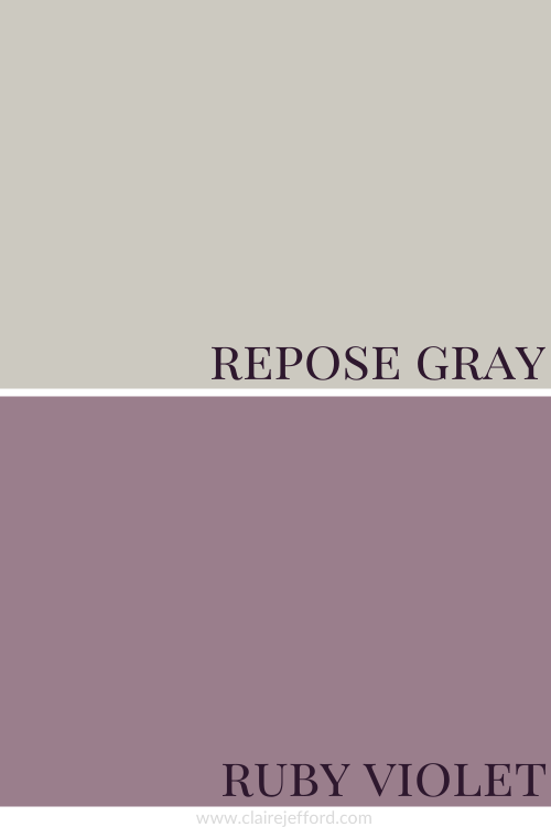
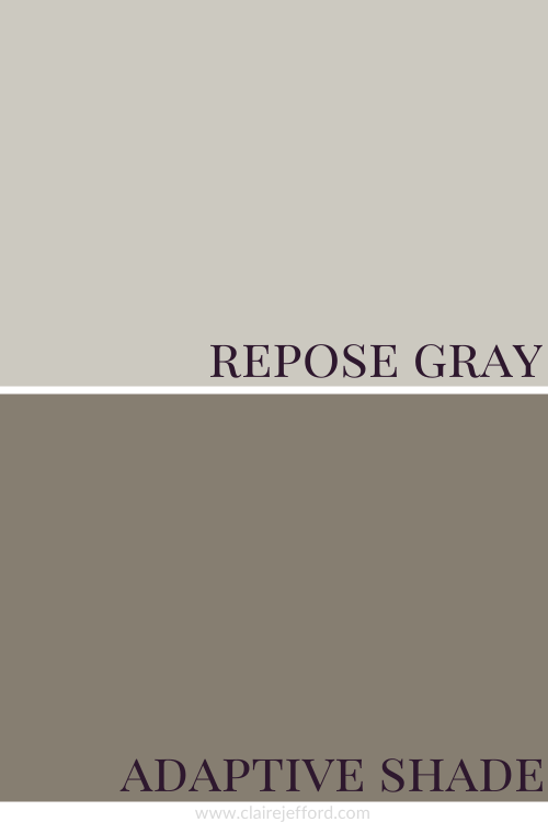
Repose Gray, Aged White, Ruby Violet and Adaptive Shade
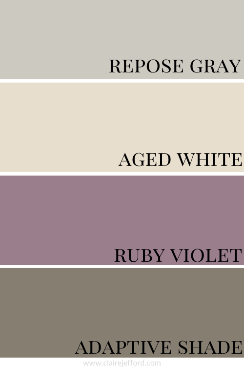
Aged White SW 9180 by Sherwin Williams
Ruby Violet SW 9076 by Sherwin Williams
Adaptive Shade SW 7053 by Sherwin Williams
We used my Perfect Colour Palette for Repose Gray and the fabric below to come up with this gorgeous palette.
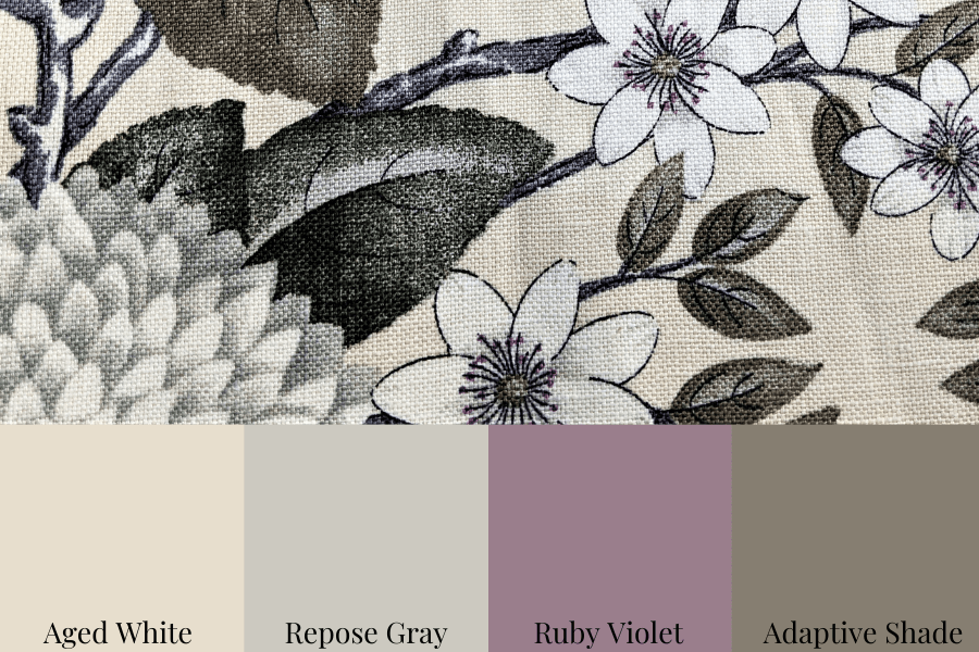
There are a total of 10 colours in my Perfect Colour Palette that I’ve carefully curated and they all look amazing with Repose Gray.
You can use the palettes as inspiration for creating a beautiful space anywhere in your home. Remember, the colours aren’t meant to all be used for paint colours.
Think of flooring, drapery, upholstery and other design elements when being guided by any of my Perfect Colour Palette Collections.

Convenience At Your Fingertips
All of the colour combinations shown above plus more options for you to choose from are included in my Perfect Colour Palette for Repose Gray.
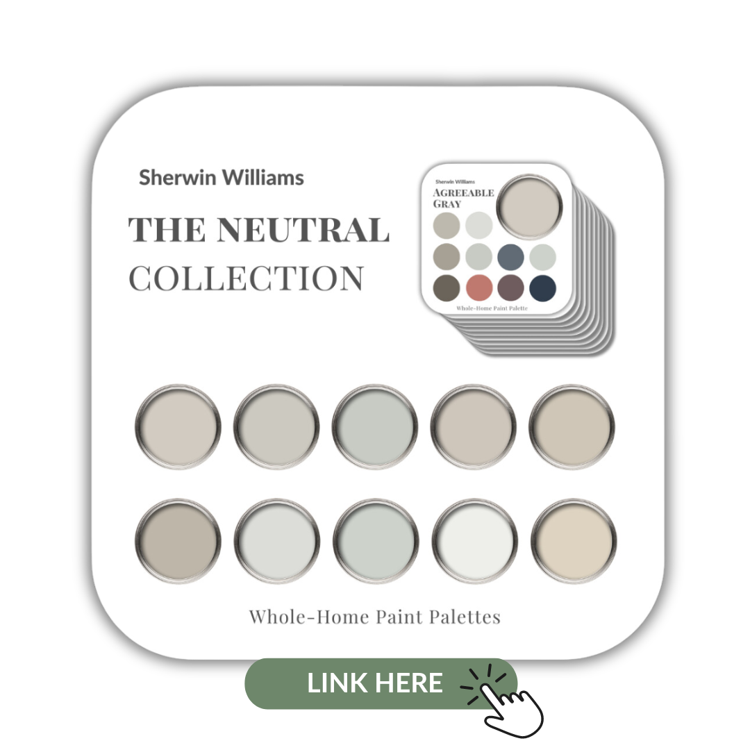
Repose Gray is also included in my newest Collection that showcases 10 beautiful neutrals from Sherwin Wiliams.
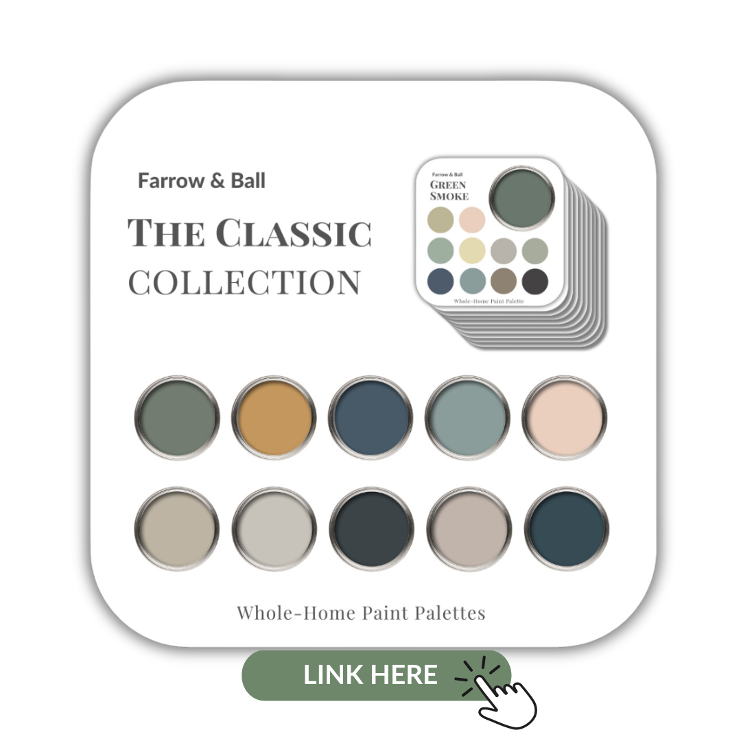
If you are a fan of the beautiful rich paints by Farrow & Ball I’ve also created a collection of 10 classic colours from this popular British paint company. Check them out here.
Remember, it only takes one mistake to take your home decorating project from divine to disaster. Don’t let the paint be what stresses you out!
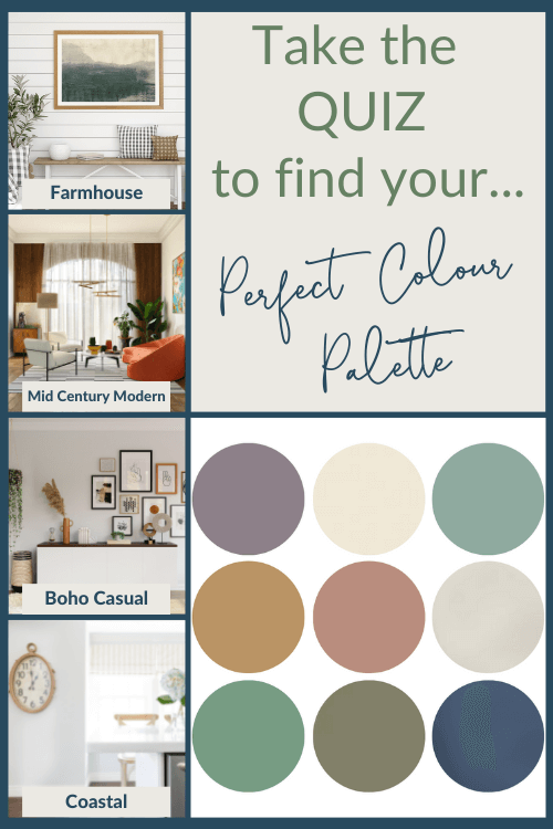
Take my Colour Quiz to find out what your Perfect Colour Palette is.
Perfect For Pinning