Kitchen Refresh Blue & White
Choose the right paint colour
the first time Let me show you how in just 5 easy steps!
BONUS: The Top 15 Shades of Gray by Benjamin Moore
Today I’m thrilled to share a before and after transformation of a kitchen refresh I helped a homeowner in North Carolina with when she hired me for my online design consultation services.
Not every kitchen renovation has to be fully gutted and completely custom to make a powerful impact.
A smaller scale kitchen remodel is exactly what homeowner Stacey was planning, and she already had some rough design plans and estimates for work when she reached out for my professional help.
She and her husband wished for an updated look, and more functionality from the kitchen design. As this isn’t their forever home, she wanted to keep costs relatively conservative, while still creating something beautiful.
Behind The Design: Kitchen Refresh Video
Watch the recording of this live webinar that Stacey and I hosted, where we dished all of the design details that went into this kitchen refresh.
The Design Layout
When Stacey booked her online design consultation with me, she was sent a questionnaire along with a request for photos.
I also like to ask for any design plans or finishes one might be considering so that we can add these to a clients folder and be best prepared for our meeting.
First, we needed to address the layout of the kitchen.

As you can see from the before image, the layout had a ton of wasted space in the middle of the kitchen. A kitchen island was definitely at the top of the wishlist.
In addition, the pass-through into the dining room and the cabinetry you see in the image below were slated to go as well.

The plan was to open up this area completely and eliminate the doorway to the left on that same wall, as that would become redundant once the pass through became a complete opening.

This would make for a better kitchen design layout overall, and allow for the necessary space to incorporate an island with ample room required for traffic flow.

Cabinetry & Flooring
To save money, they decided to keep and respray the perimeter cabinets, yet update all the doors and drawers. The new fronts were all to be a ‘shaker’ style.
This refacing update was key for modernizing the look of the kitchen. Arched details on cabinetry (like what they had) are typically indicative of an older, more traditional style of millwork.

Changing out the old vinyl flooring was also going to be a significant update. I assisted Stacey in finalizing a neutral floor tile that tied in with the other finishes, which you will see shortly in the ‘after’ photos.
Be patient, the exciting final reveal is coming 🙂
A neutral, non-patterned flooring would not only to update the look, but also takes the focus away from the busy, ‘dirty’ looking patterned flooring that was there before.
Design Tip:
We mainly specify hardwood flooring throughout a home when clients are undergoing an entire renovation. However, in a kitchen refresh like this, installing a tile is the better option because trying to match a new hardwood to a previously installed hardwood in other areas of the home is almost impossible.
Even if you manage to find the same species of hardwood from the original supplier, the hardwood that’s been in the home for a while will likely have changed colour over time and the differences will be evident.
Although we did manage to accomplish just that with the rich hardwood for this Burlington client’s project, it’s not typically the case.
Countertops & Paint Colours
Stacey wanted a white kitchen with navy blue accents, similar to the idea of the kitchen we designed in my sister’s bungalow shown below.
In case you were wondering, even though we’ve seen this look for quite a few years now, blue and white is a classic colour combination that always looks fresh and inviting.
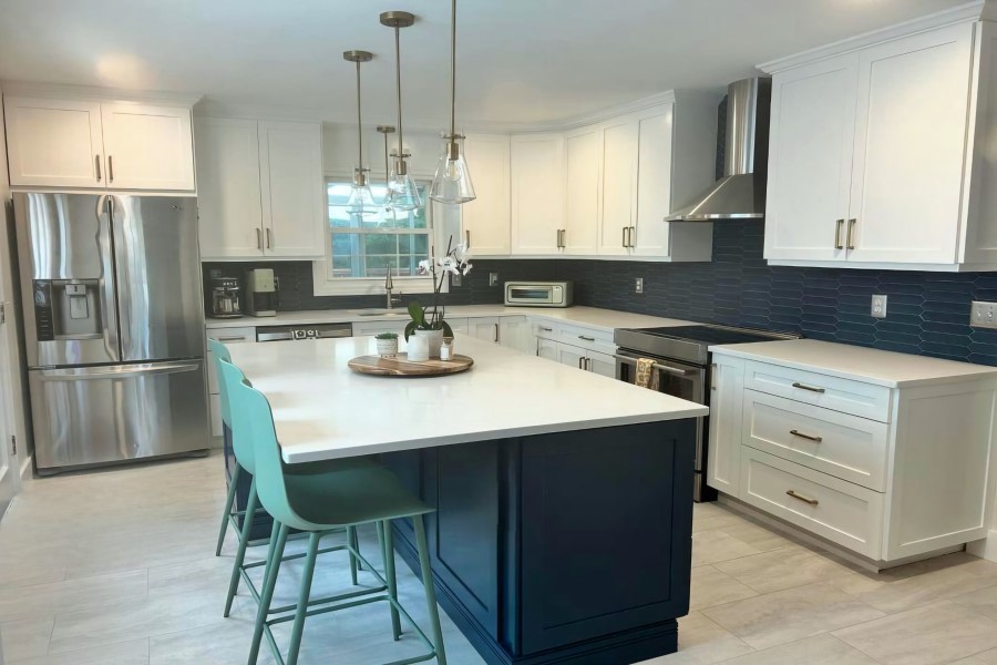
We selected Benjamin Moore’s Hale Navy for the island colour, but only after the subway tile had been confirmed. More on that soon.

The quartz countertops are white with subtle gray veins. By carefully looking at the countertop selection, I specified Chantilly Lace for the perimeter cabinets and Classic Gray for the wall colour.
Choosing The Backsplash
Ah, the baffling backsplash debacle!
One of the biggest kitchen mistakes people make when it comes to selecting finishes, is to look at everything in isolation as opposed to how they should – by viewing all samples together.
The backsplash tends to be where the majority of homeowners get stuck.
Unless someone is working with a designer, this integral part of the overall design is the most common piece of the puzzle to get left until the very end.
- Should you go bold?
- Should you make it the same material as the countertop?
- What about doing a contrasting grout?
- Would creating a focal point over the oven be a good idea?
So many questions, right? I get it!!
That is just one reason why hiring an interior design professional is well worth the investment.
Whether you are local to me in Burlington or in the Toronto area, or further afar wishing for an online design consultation I can help guide you with these type of kitchen selections, just as I have done with Stacey.
Often it’s not until the renovation is underway that you realize just how many decisions you have to make and how stressful it can be.
All you have to do is make one mistake for the entire kitchen design is compromised.
There is no turning back once everything is installed. You will have to live with that mistake for many years because it’s too expensive to redo.
While this post about kitchen cabinetry companies was meant for Interior Designers only, what I share is eye-opening and mostly unknown to most homeowners. If you have a minute, it’s worth the read and may suprise you.
For this kitchen design, when it came to the backsplash, here’s the advice I gave Stacey when she sent me the 4 options shown in the image below:

- Glossy, bumpy subway tile: Too shiny, and highly reflective
- Matte, picket fence tile: Bold and sophisticated
- Glossy standard subway tile: A nice option
- Glossy beveled longer subway tile: Too shiny, and will be very busy once installed
I found this photo below of a similar tile to the fourth option to show Stacey exactly what I meant by it being too shiny and very busy looking when it’s installed, especially with a white grout.

Once I shared my feedback on all the options that she provided, she didn’t hesitate to go with my top choice: #2.
This rich looking, matte picket fence tile was to be installed horizontally in a stacked pattern. YAY!

Once we landed on the blue picket fence backsplash tile, we colour matched it to confirm the best blue for the island cabinetry. The best choice was Hale Navy by Benjamin Moore.

Near Fatal Mistake, Avoided With My Expert Advice
While this may not be one of the nine kitchen design mistakes I included in this series, it is one you are definitely going to want to avoid.
During one of our Zoom Consultation Calls, Stacey said, “My husband wants to go with black handles for the cabinetry, even though we both really like the gold look that’s trending right now.”
Let me tell you what you need to know about the warm gold finishes we are seeing today in interior design. The gold tone made a comeback the year I began my business in 2011, and while I thought it was going to be a ‘flash in the pan’, all these years later, it’s still going strong.
Golden finishes are NOT trendy, it’s black finishes that are trending currently.
I immediately said NO to the black hardware and sent her a photo similar to the one below to illustrate why.

Despite the serene wall colour, the white subway tile, and the neutral countertop in the photo, notice how your eye is instantly drawn to the black hardware?
All of these harsh black ‘bits’ dotted throughout a kitchen with a backdrop of white cabinetry takes away from the fresh, serene look one is hoping to achieve in this type of kitchen palette design style.
This is just one of the massive mistakes many homeowners are making right now, which is understandable when you consider that everyone loves to hear about what’s trending in kitchen design.
But, once you see it, you cannot unsee it!
When I brought it to her attention, Stacey and her husband agreed it was best to move in a different direction.
There have only been a handful of times I’ve specified black hardware for cabinetry which is either:
- When the cabinetry is black like in my bathroom here (please don’t judge me when you see the gross before images on that post)
- With dark colourful cabinetry and black plumbing like in our laundry room design on this project
- To repeat a black finish in a minimal way like we did in this client’s window seat
The hardware decision alone is another perfect example of how one mistake, one single decision that may seem minor, can compromise the entire design.
That type of disaster is what I want to help you to avoid and why I offer my ‘Here & Now’ Online Consultations for instant, expert advice.
After our discussion and my recommendation, they went with the classy, warm champagne hardware finish and repeated that finish in the 3 glass pendants above the island.
The Reveal
Here’s the after photo Stacey sent to me. What an incredible transformation, now so fresh and fabulous!

Final Design Inspiration
I always like to show clients how all the finishes for their project look when put together, and add additional inspiration pieces like I did in the image below.

I pulled the beautiful wallpaper sample you see and some fabrics from my interior design studio library.
We love to create dynamite designs and well put-together spaces by layering in beautiful decorative elements. Strategically repeating colours are key to a successful design and for creating flow.
Stacey ended up purchasing that exact wallpaper for her dining room and is currently waiting for it to be installed. I can’t wait to see the final result!
When pulling together a colour palette and overall design style for your next project, be sure to look at the bigger picture and consider all the details.
Here are the before and after images together.

For this specific project, Stacey hired me for a total of 3 ‘Here & Now’ Consultation Zoom calls.
My professional guidance and keen eye for colour were exactly what she was looking for to feel confident in her decisions and to ensure she avoided making costly mistakes.
I was able to help her create a brilliant kitchen design refresh without a full-on renovation.

Stacey was great to work with and quick to follow my advice.
Thank you Stacey for trusting me to help you make your dreams for your home a reality. I’m thrilled you and your entire family love your new kitchen design!
What’s your favourite part of this kitchen refresh project?
For me, while I love it all, if you forced me to choose just one design element, it would be the backsplash.
Comment below to share your thoughts on this kitchen transformation.
Helpful Design Resources For Your Next Project
If you are planning a kitchen update or home renovation of any kind and want expert guidance at any stage of your project, I can help.
Here & Now Design & Colour Consultations
I now offer 1-hour online design and colour consultations for anyone outside of my local area.
With over 13 years experience of running my own interior design firm and working on hundreds of projects, I can provide professional guidance in any area of your home.
Learn more about this exciting new service and book your online appointment here.
I can’t wait to e-meet you and help you with your project!
Local In-Person Design & Colour Consultations
If you are local to me either in Burlington, Ontario or around the GTA (Greater Toronto Area), I would love to come to your home for a 2-hour in-home consultation.
Click here to connect with me via my contact page.
Perfect Colour Palettes
Are you losing sleep and overthinking when it comes to choosing the perfect paint colours for your home? Don’t sweat it!
As a Certified True Colour Expert I have instant advice to make it easier for you.
We have more than 50 Whole-Home Colour Palettes readily available for you to instantly download. All of the paint colours in each palette have been carefully selected by me personally.
Plus, there’s you get tip sheets on lighting, paint sheens, how to create a gallery wall, a paint planning template, and more.
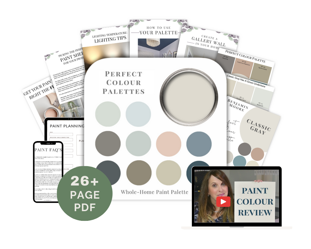
You can view the entire gallery of paint colours here.
Or, click below on your preferred brand to see the most popular paints to choose from.
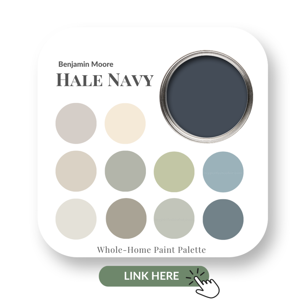
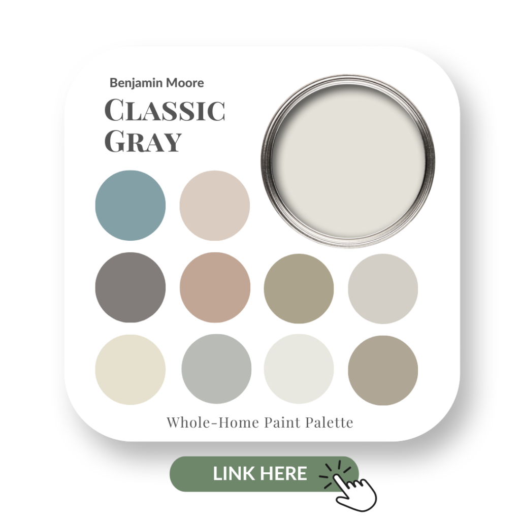
If you love the paint colours we used for Stacey’s project, see below for two of the most popular Benjamin Moore paints.
Hale Navy
Classic Gray
Big Reveals
For another interior design project transformation, check out custom this Burlington living room we designed for clients. There’s no shortage of colour in that project!
Perfect for Pinning





Rachel
| 17 November 2024Claire,
Thanks so much for posting the original zoom meeting. This was great to be able to hear and visually see the process between the two of you. I would love to see more content like this in the future!
Claire Jefford
| 17 November 2024I’m so glad you enjoyed it Rachel! Stacey and I had fun sharing all the details of the design with you all 🙂 Cheers for your comment to let us know.
Universal Stone
| 11 June 2025Gorgeous blue-and-white refresh—elegant and timeless!
Claire Jefford
| 13 June 2025Thank you!