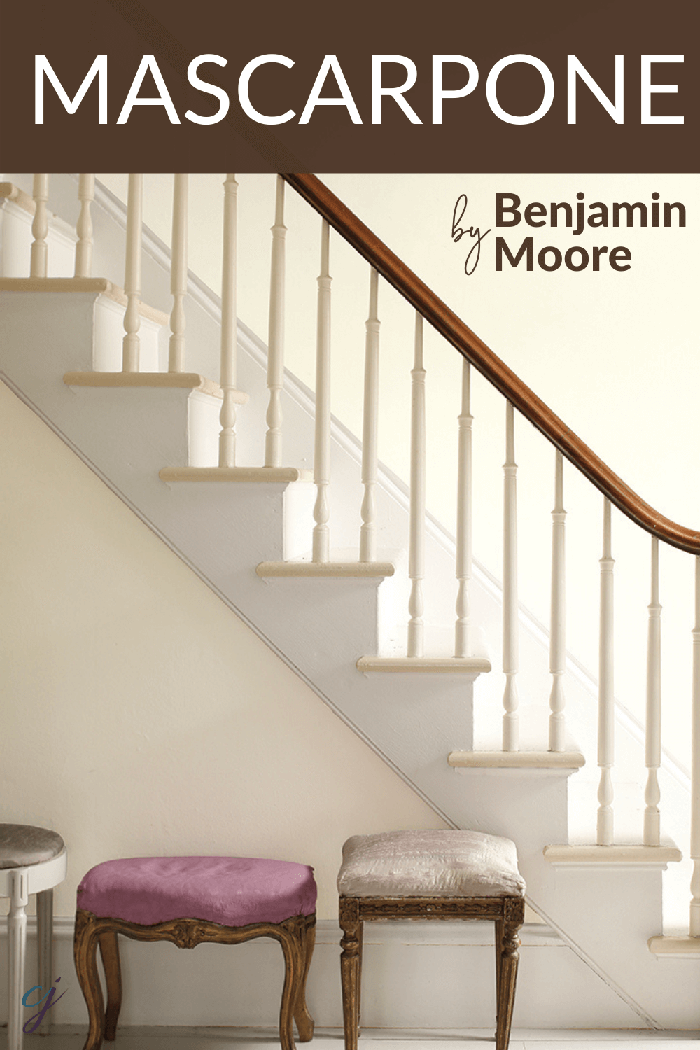
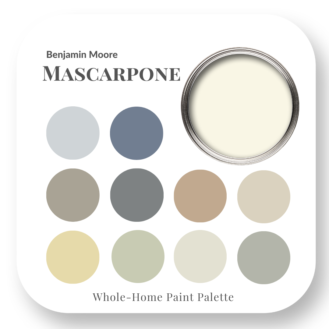
Benjamin Moore – Mascarpone
Choose the right paint colour
the first time Let me show you how in just 5 easy steps!
BONUS: The Top 15 Shades of Gray by Benjamin Moore

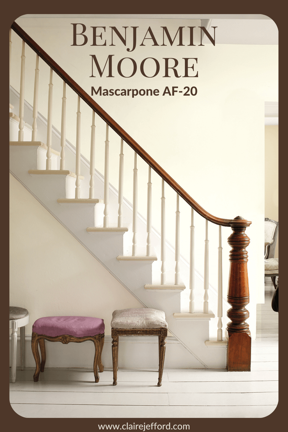
Mascarpone AF-20 by Benjamin Moore
Whites are still so super popular. Benjamin Moore’s Mascarpone is a gorgeous white that’s very soft on the eyes.
Don’t be surprised if your mind wanders to the beautifully rich and creamy cheese that this colour is named after.
Mascarpone is a soft white. It is neither too bright nor too creamy – a perfect, subtle white.
Benjamin Moore’s Mascarpone
In today’s colour review video of Mascarpone by Benjamin Moore, I’m sharing:
- The undertone
- Colour comparisons in order to easily see the different colour tones
- Best white paint colours for the trim and ceilings
- Beautiful colour combinations to inspire you for your decorating project
If you would like all this information in one convenient place and even more paint colour combinations to use with Mascarpone, take a look at my Mascarpone Perfect Colour Palette. A must-have for any colour enthusiast or design professional.
Mascarpone Colour Review Video
As a Certified True Colour Expert and an award-winning interior design professional, I’ve worked with many homeowners on a huge variety of residential design projects.
My goal is to give you the confidence to make educated decisions about your own paint choices.
Let’s do this!
Undertone: creamy white (soft yellow)
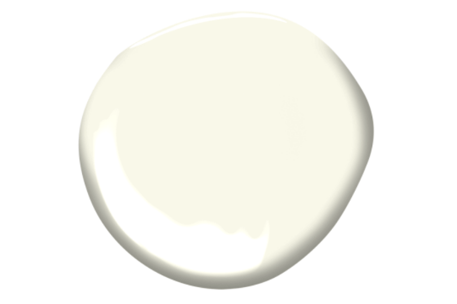
A slightly creamy white, Mascarpone is a great choice if you are looking for a white that’s not too crisp and bright.
Keep in mind it may look different in your space depending on the lighting and what other decorative elements you pair with it in your interior decorating project.
Where you use it and the finish of the paint will also affect how this colour looks in your home.
Colour Comparisons with Mascarpone
I cannot stress enough that you never look at a paint colour in isolation!
Comparing colours to similar shades is key to truly seeing the undertones.
Cloud White CC-40 & Ivory White CC-130
Here I compare Mascarpone to Cloud White which is often thought to be a creamy white.
But we can see when side by side with Mascarpone it’s not quite as creamy as Mascarpone.
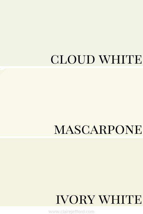
And Ivory White which is also a creamy white looks richer and a bit deeper than Mascarpone.
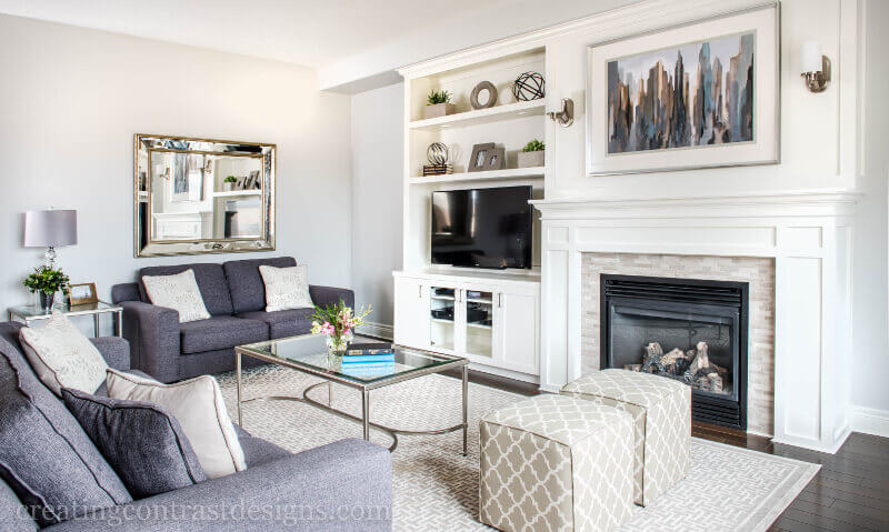
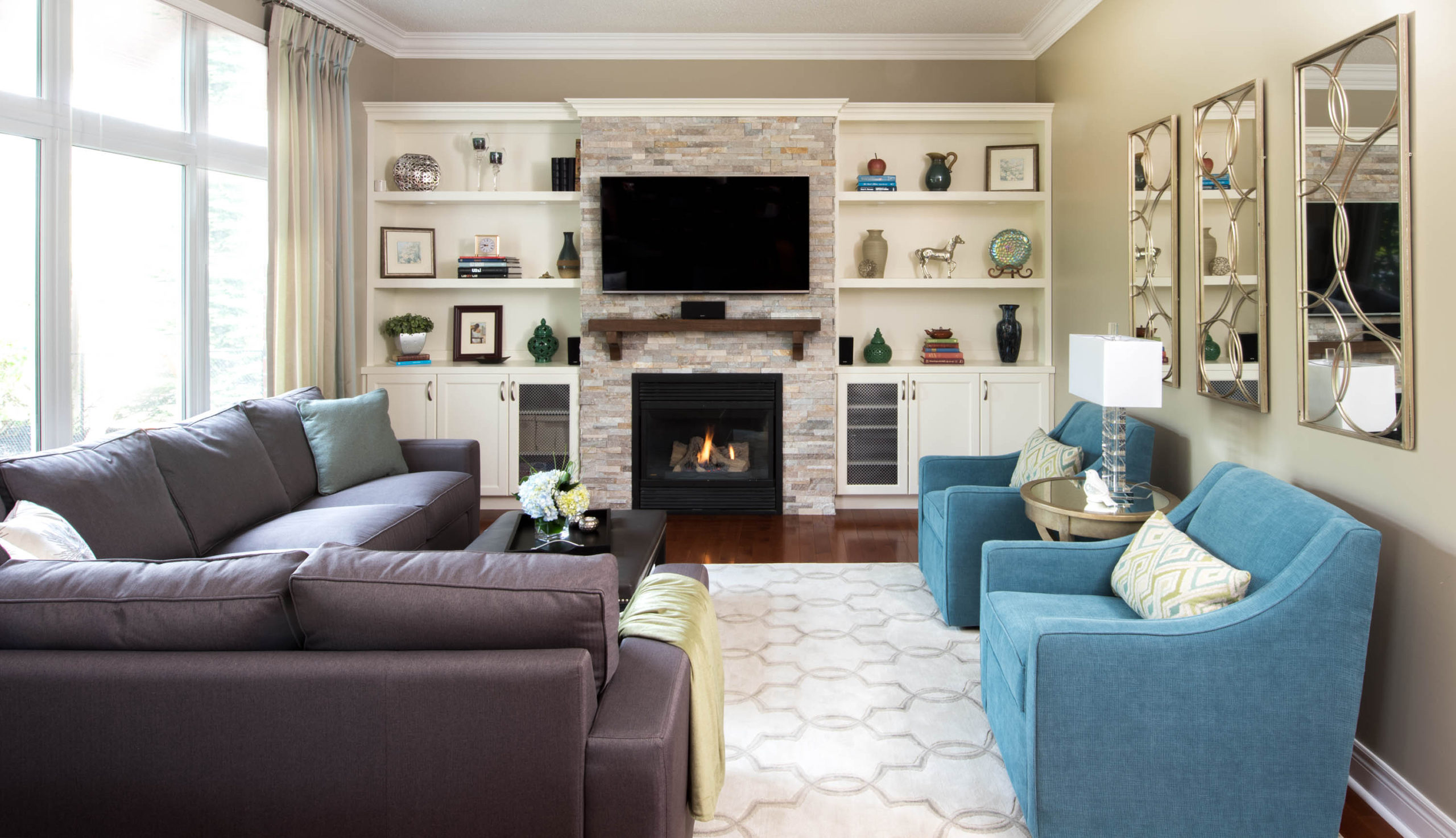
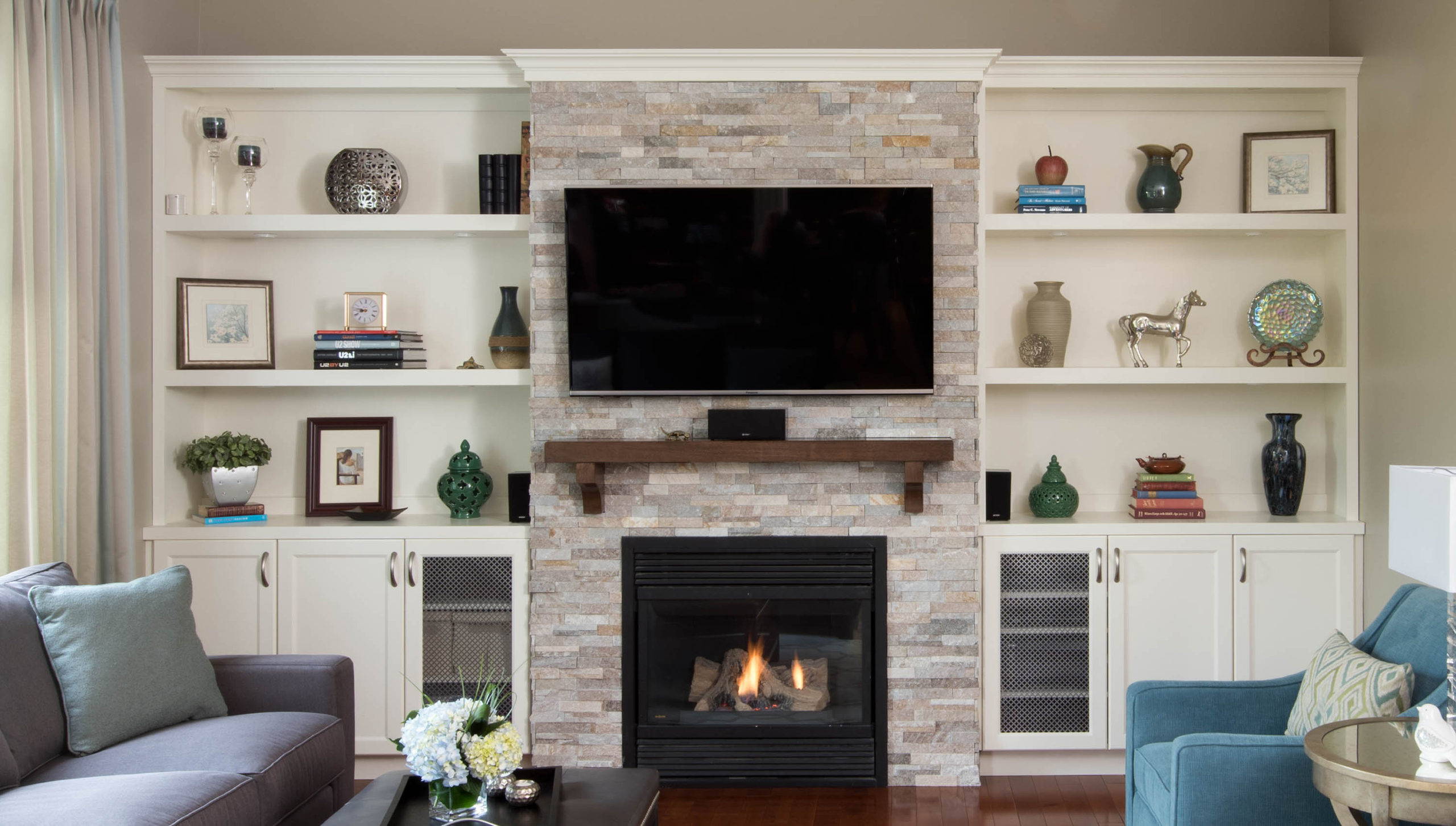
Ivory White is the colour of these custom built-ins shown below that we designed for our client’s living room.

Best Whites To Pair With Mascarpone
When painting walls white you still need to consider what white you will use on trim and ceilings.
Using the same colour on the walls and trim is a possibility. You could certainly paint your walls and trim Mascarpone.
You could also paint both your ceiling or say your kitchen cabinets Mascarpone.
They will all look a little different because of the application and the finish.
And of course, you can paint trim a different white altogether. Here are three that I recommend with Mascarpone.
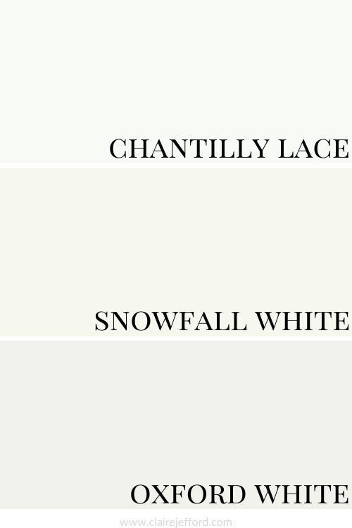
Chantilly Lace OC-65 By Benjamin Moore
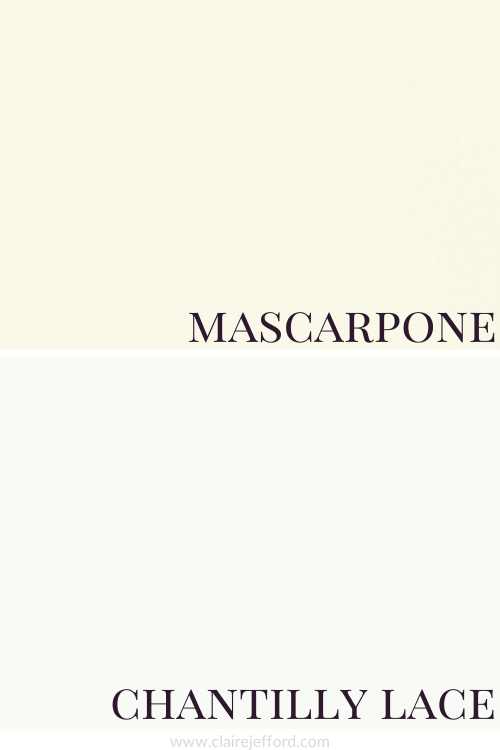
A bright white, Chantilly Lace looks great with Mascarpone.
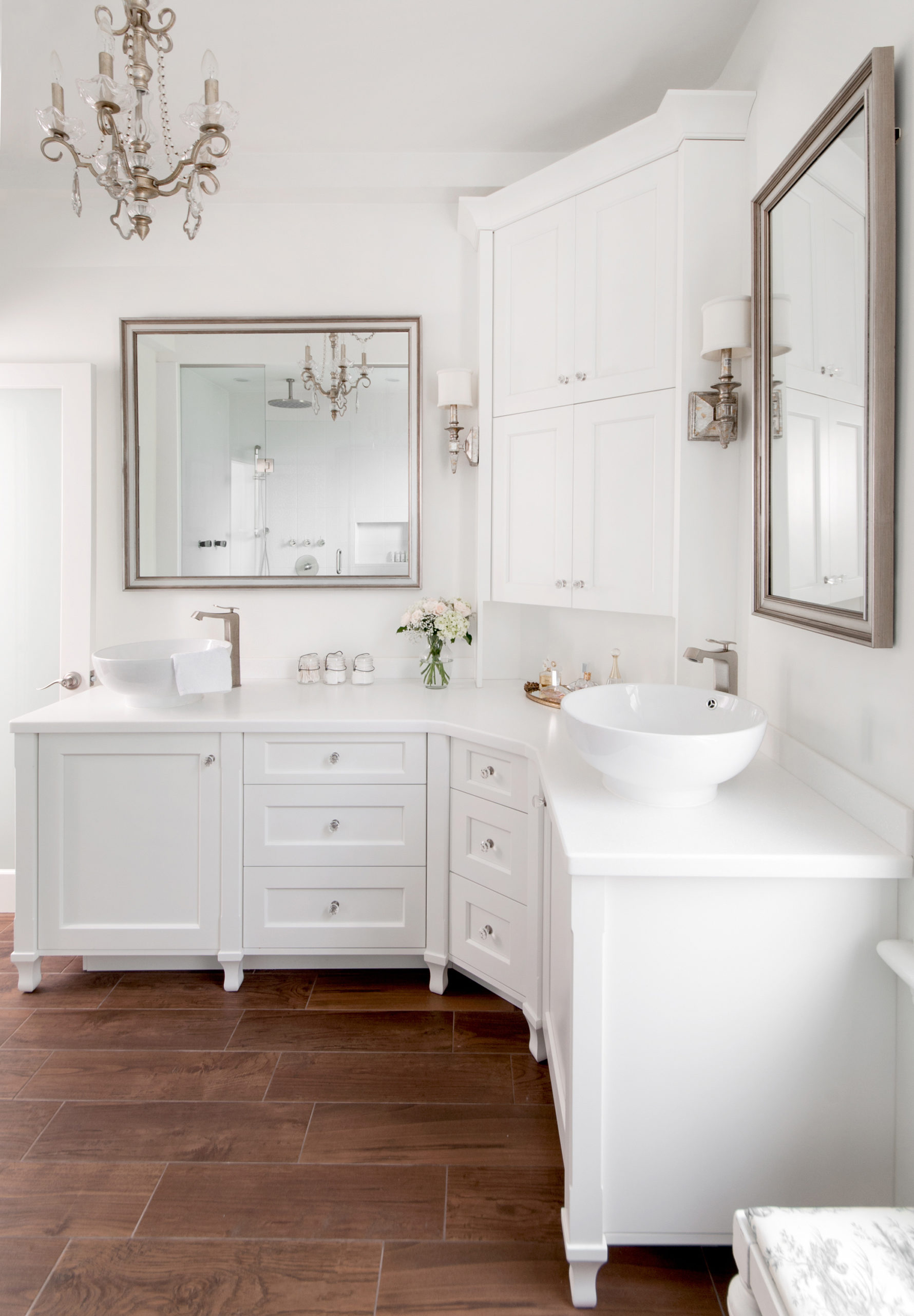
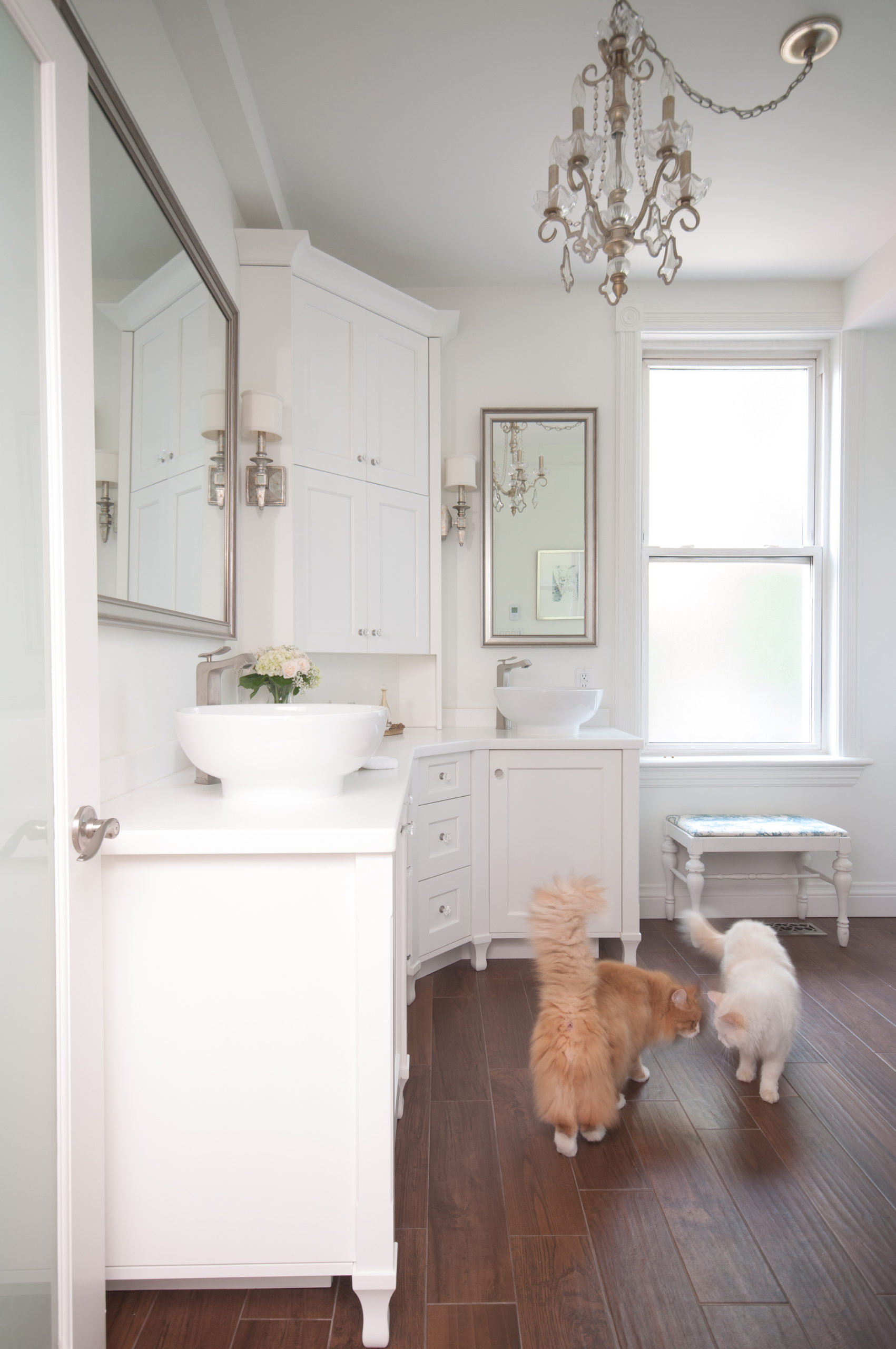
Snowfall White OC-118 By Benjamin Moore
Snowfall is also a crisp, bright white but not to the extent of Chantilly Lace.
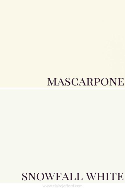
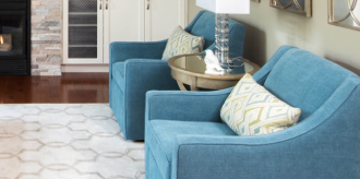
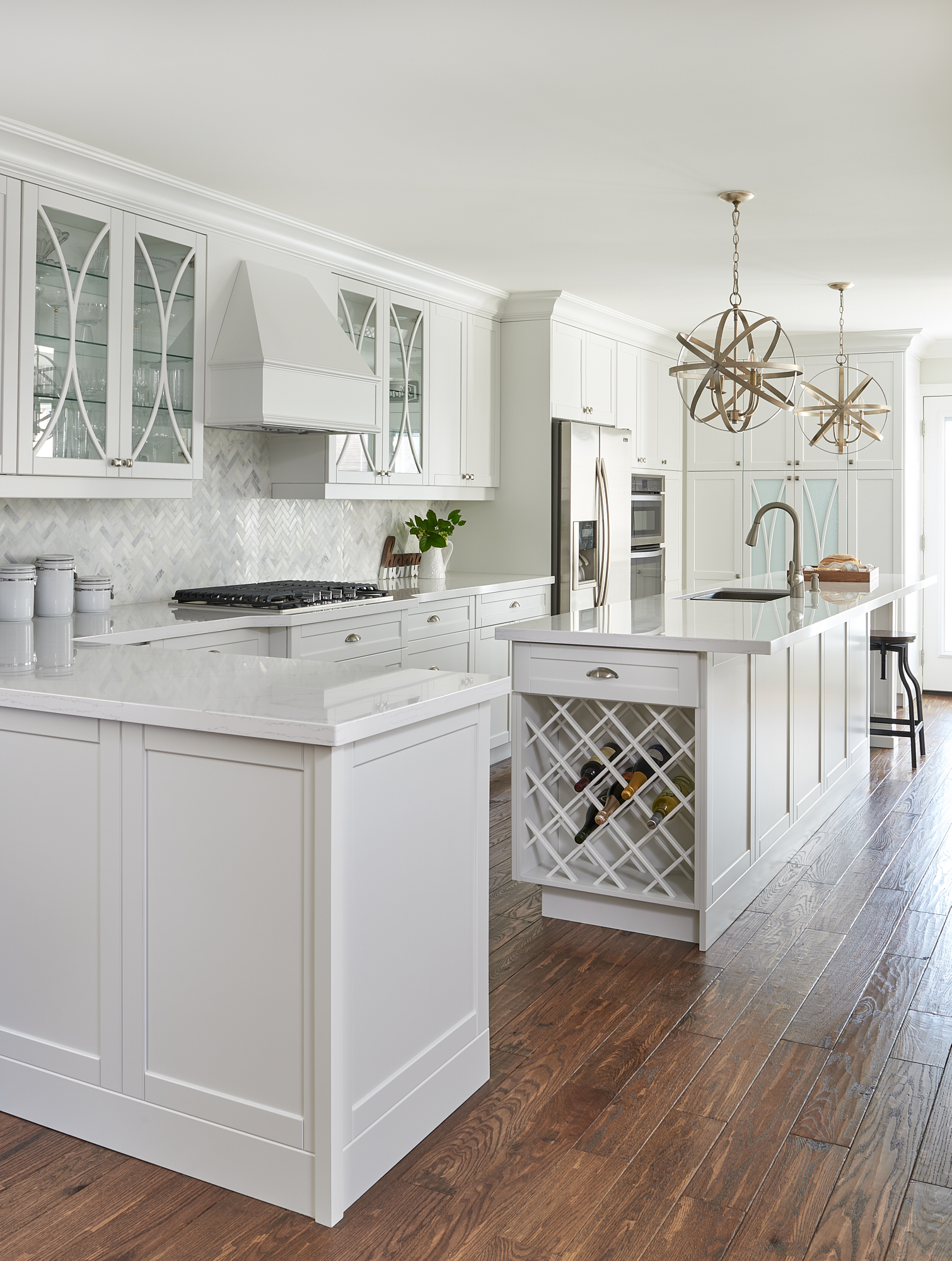
Below you can see Snowfall White in a Toronto client’s bathroom on the walls and cabinetry.
Oxford White CC-30 By Benjamin Moore
Oxford White is another true white and has a bluish undertone to it.
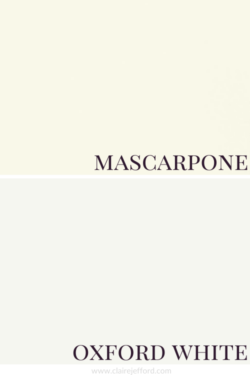
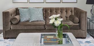
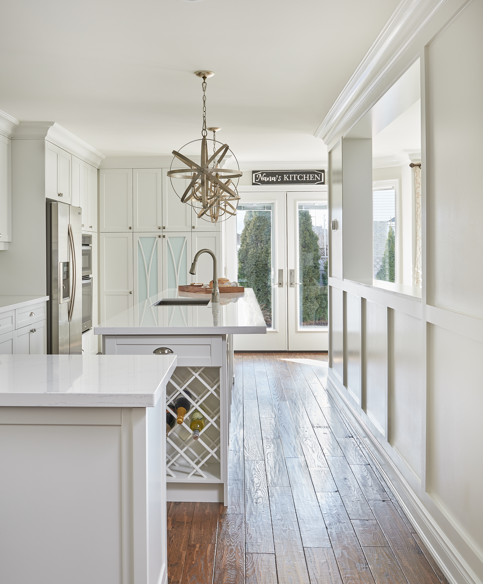
This is a wonderful white we used in a kitchen renovation.
We used it on the kitchen cabinetry in our Burlington client’s home below and paired it with Classic Gray on the walls. A great paint colour combination!
Here’s a comparison to really see the differences you would get in these three whites to pair with Mascarpone.
I tend to use the same 10 white paint colours that are my best whites for trim and ceilings.
You do not need to bring home hundreds of white paint chips or samples to find the best one.
And you definitely don’t need to mix two different whites or use a certain percentage of paint colour to get the right one.
I can assure you that the best colour for your project already exists, you just need to know 5 Steps on how to choose the right paint colour the first time.
Benjamin Moore – Mascarpone
Fabulous Colour Combinations
Mascarpone with Sea Haze, Beacon Hill Damask & Gray Mist
This is just one of the stunning palettes you could create using the colours in my Mascarpone Perfect Colour Palette. There are a total of 10 colours to mix and match.
I love the calming nature of this palette. Keep reading to see two different looks using this same palette.
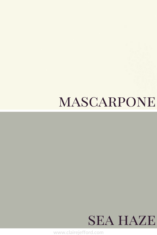
Sea Haze 2137-50 By Benjamin Moore
Sea Haze adds just enough contrast to this palette. It’s a gorgeous green I used in a client’s living room in Toronto.
In that project it was paired with Hale Navy and White Dove, the paint colours we used in the dining room.
Beacon Hill Damask HC-2 By Benjamin Moore
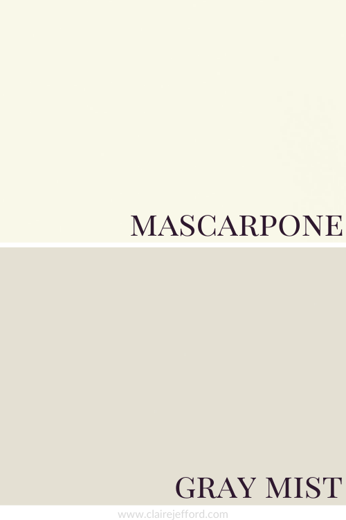
Gray Mist OC-30 By Benjamin Moore
Benjamin Moore – Mascarpone Palettes
Using the palette I put together from my Mascarpone Perfect Colour Palette I came up with two looks.
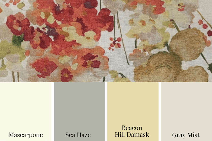
This first option shows how I paired a fresh and bright fabric with the palette.
Are the colours in the fabric an exact match – perhaps not? But they don’t need to be.
You can see how the tones for the yellow pull out the Beacon Hill Damask. As well as the backdrop to the fabric is well-balanced with Mascarpone.
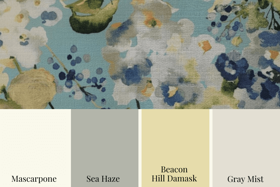
The second fabric is the same pattern but completely different colours, giving a very different look – cooler and blue.
There’s no right or wrong. You could use either. They both would look beautiful in a home.
Do you have a preference? Please comment below, always love to hear from you.
Please note: These two fabric samples have been discontinued.
Convenience At Your Fingertips
All of the colour combinations shown above are included in my Perfect Colour Palette of Mascarpone.
Mascarpone is also included in my Benjamin Moore Whites & Neutrals Collection.
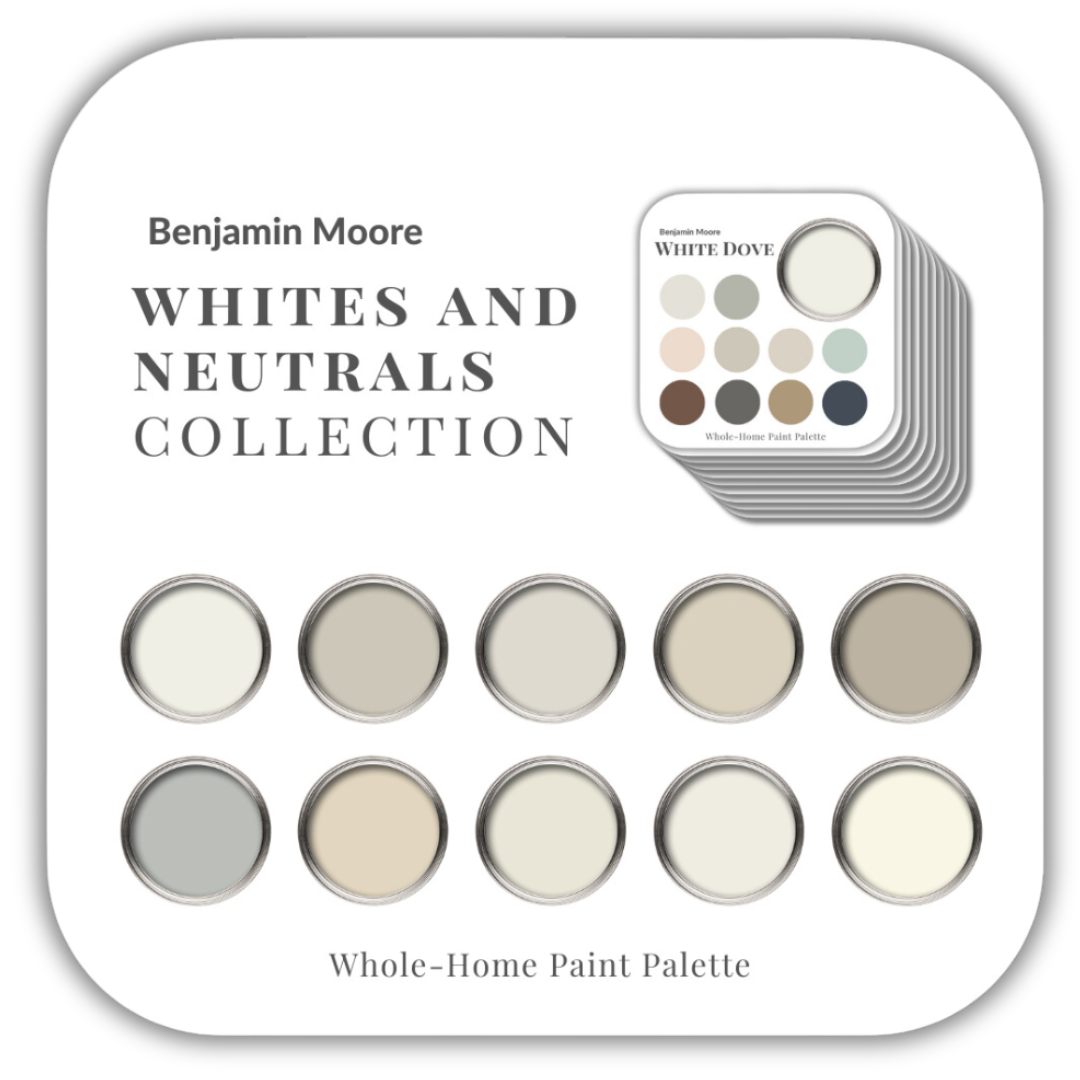
Or get my entire collection of all 20 Benjamin Moore colour guides here.
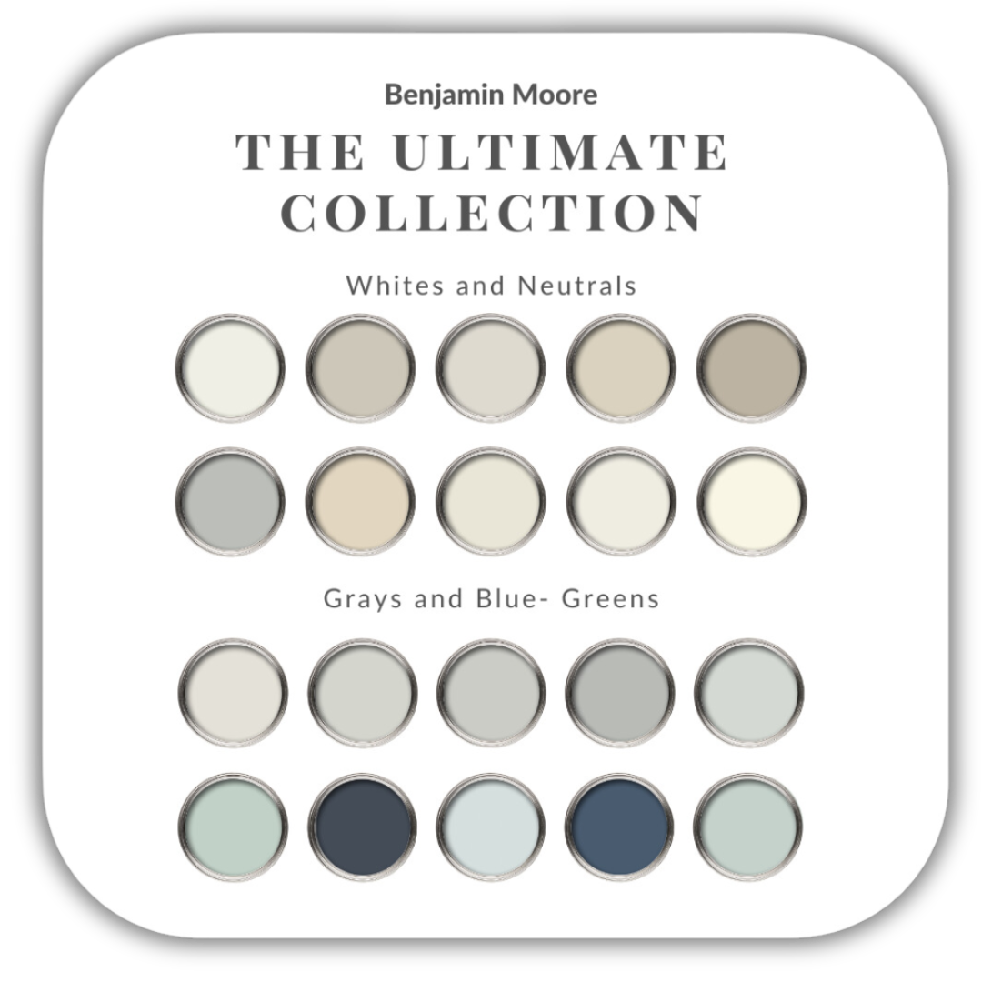
My Perfect Colour Palette library is expanding and I now have over 50 palettes to select from. Click here to see all of my Perfect Colour Palettes.

Remember, it only takes one mistake to take your home decorating project from divine to disaster. Don’t let the paint be what stresses you out!

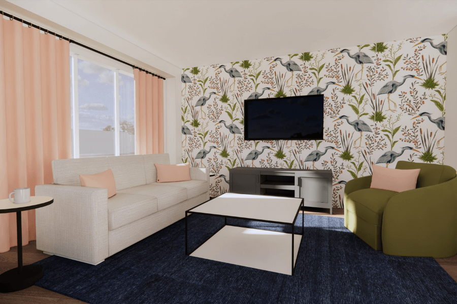
Room image by Benjamin Moore Colour Viewer
Perfect For Pinning