In my new video series, I’m spilling the beans on my most effective strategies for getting yourself known in your local area and solidly booking your calendar with clients.
If you know me, then you know that I can’t help but be totally transparent. After all, it’s who I am. It’s also the only way we truly learn from each other. Otherwise, what’s the point right?
Not only do I share with you my secrets on this forever trending element of any interior design business, but I also disclose actual results and some strategies that continue to get me clients every single month.
With so many gray paint colours out there, it can be difficult to determine which is the best gray paint colour for your home renovation or interior decorating project.
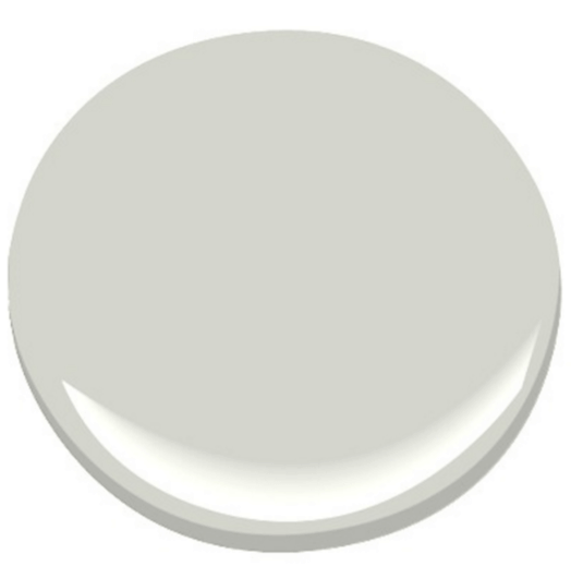
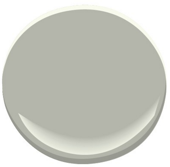
Gray Owl, OC-52, by Benjamin Moore is a go-to for many interior designers. But is it the best colour with the right undertone for your space?
This week, in Episode #4 of my paint colour reviews, I walk you through Gray Owl and show you a commercial project where we used it. You’ll see why it was a perfect choice for this space.
In this colour review video of Gray Owl by Benjamin Moore, I share:
Undertones of Gray Owl
Colour Comparisons to this popular Benjamin Moore paint colour
Best Whites for Ceilings, Doors and Trim to pair with it
Fabulous Colour Combinations
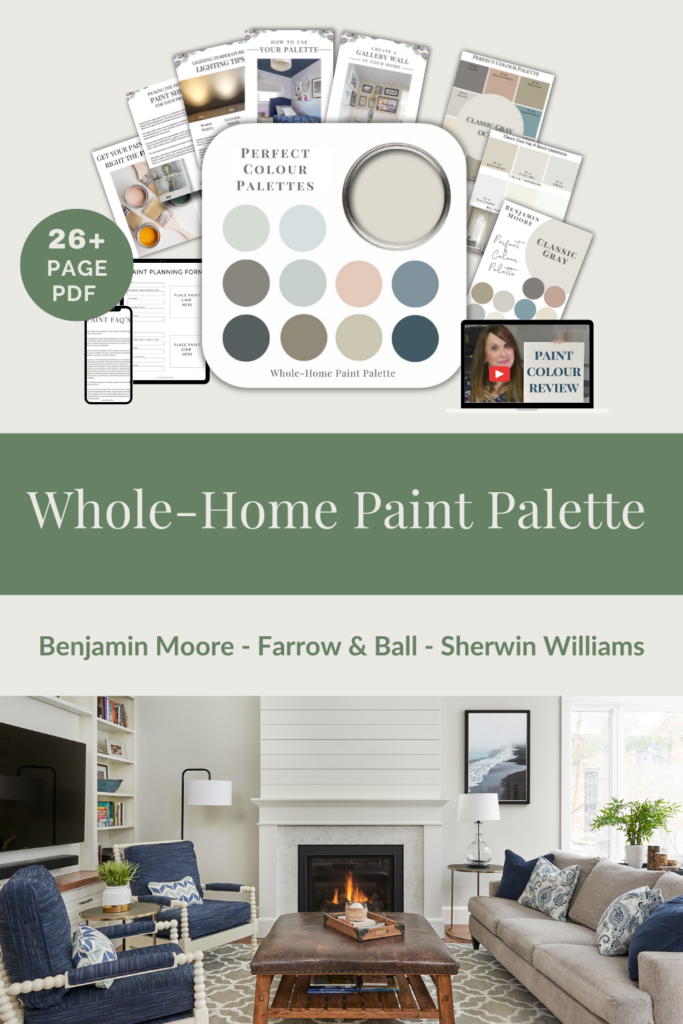
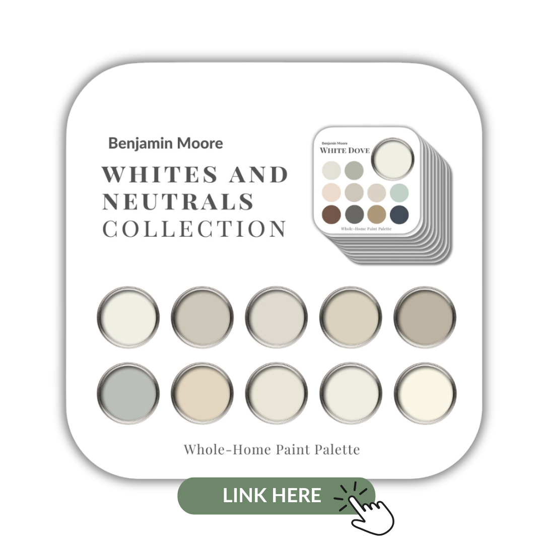
After you watch the video, if you would like all this information conveniently laid out for you in one place and have even more paint colour combinations to use with Gray Owl, take a look at my Perfect Colour Palette.
A must-have for any colour enthusiast or design professional.
Are you ready? Let’s do this!
Colour Review of Gray Owl
Undertones:
This calming gray has undertones that are blue-green. Whether it looks bluer or more green, will depend on what you pair it with and what your source of lighting is.
Gray Owl OC-52
Colour Comparisons:
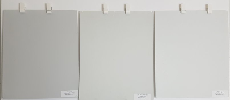
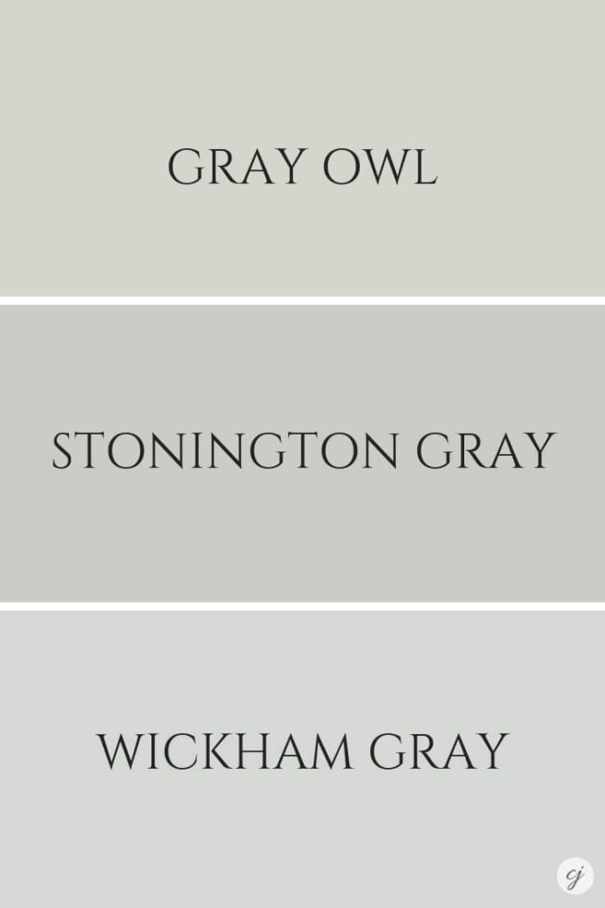
Take a look at the image below. Gray Owl is the painted colour board in the middle.
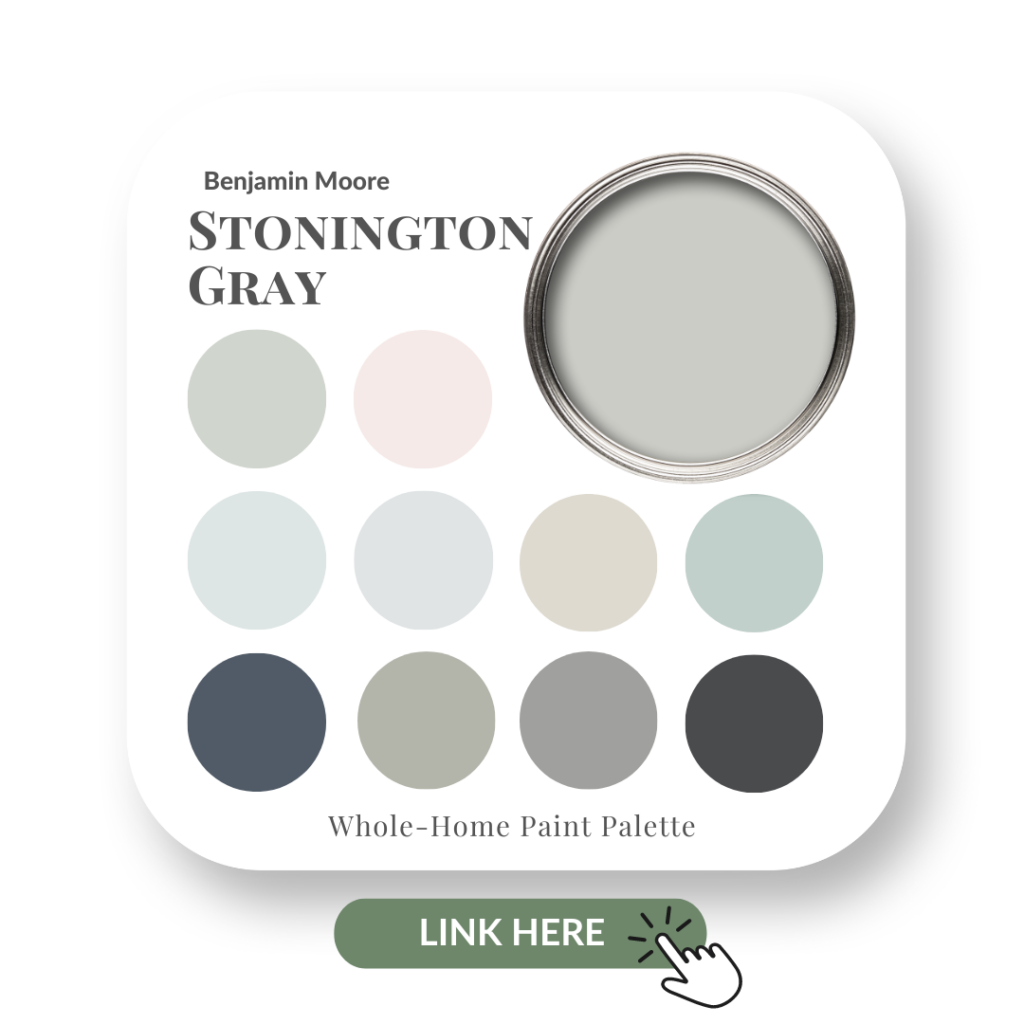
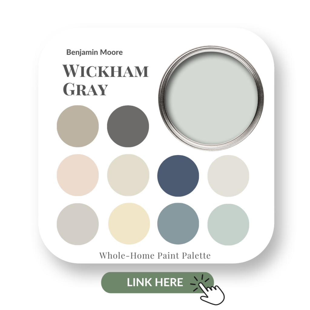
Stonington Gray HC-170 is on the left and Wickham Gray HC-171 is on the far right.
Colour comparisons to Gray Owl
Stonington Gray HC-170 & Wickham Gray HC-171
If there was a ‘true gray’, for me it would be Stonington Gray. In fact, that’s often how I refer to it when I’m showing colour comparisons with my interior design clients. You can check out my review of Stonington Gray here, and click here for my review of Wickham Gray to see more comparisons.
While it has a slight blue undertone, it’s not nearly as obvious as the other two grays.
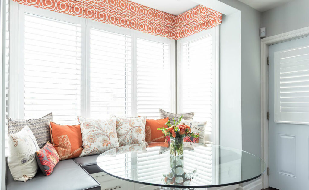
Check out these popular gray paint colours that we used in three different home design projects below.
Stonington Gray
Stonington Gray on walls in our clients custom kitchen banquette
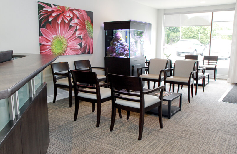
Gray Owl
I used Gray Owl here in a Dental office in my home town of Burlington, Ontario.
There is a hint of blue within the stripe of the carpet floor tiles we selected for this space, and Gray Owl complimented it beautifully.
Dentist Office waiting room with Gray Owl walls and light gray chair fabric with the slightest hint of blue.
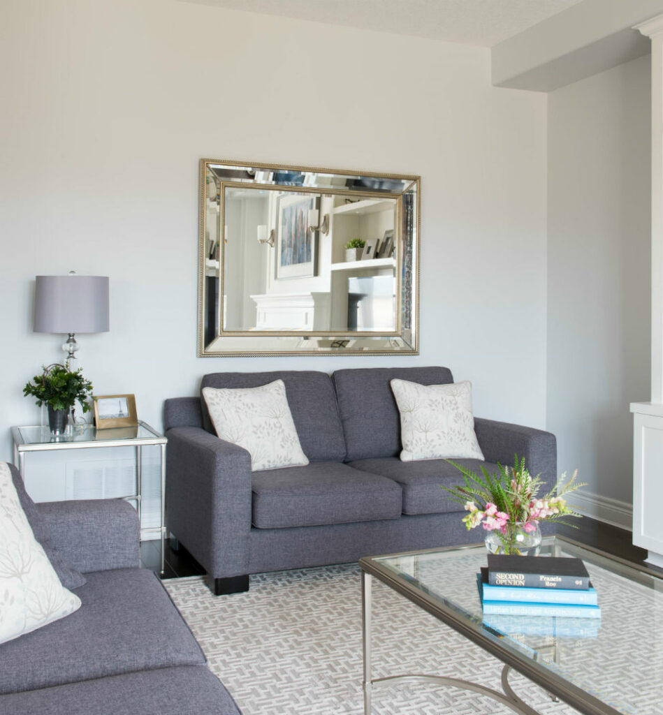
Wickham Gray
On the walls in my Grimsby clients living room, Wickham Gray took on a more of a blue-green tone.
It’s very subtle, but you can see that right? As an FYI – the custom cabinetry I designed is painted Cloud White by Benjamin Moore.
See more of this project, including our clients’ elegant dining room painted Pashmina by BM, here in our portfolio.
Wickham Gray by Benjamin Moore on the walls. Custom cabinetry painted Cloud White.
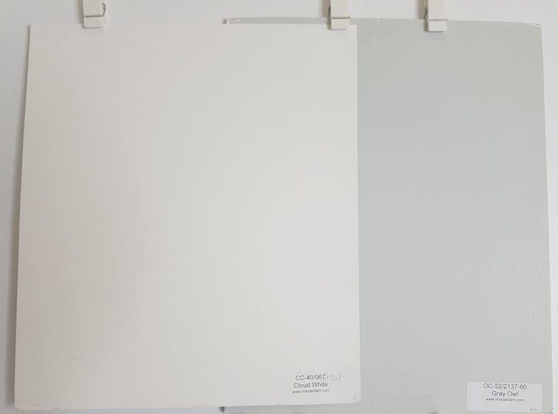
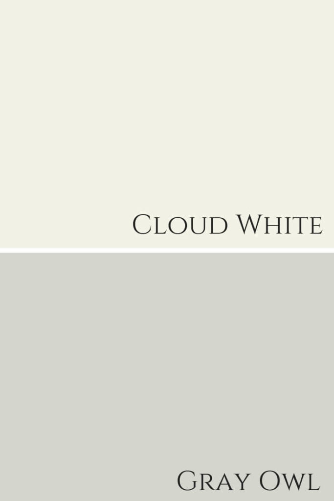
Best White Paint For Ceiling and Trim
Cloud White by Benjamin Moore looks wonderful with Gray Owl too. You can see them side by side here on my large painted boards.
Cloud White CC-40
Cloud White with Gray Owl. Creamy and dreamy.
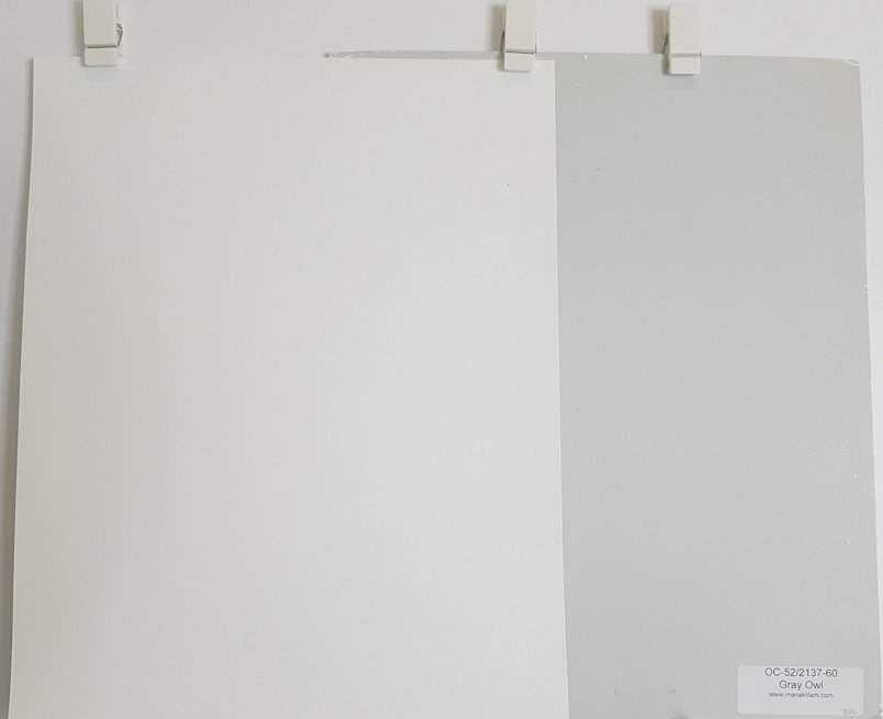
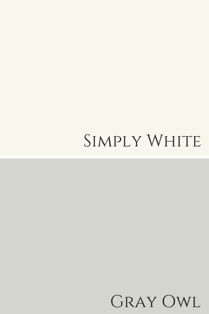
Simply White OC-117
Simply White by Benjamin Moore with Gray Owl
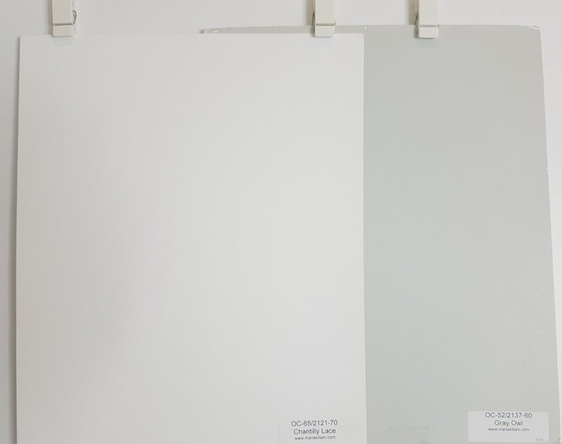
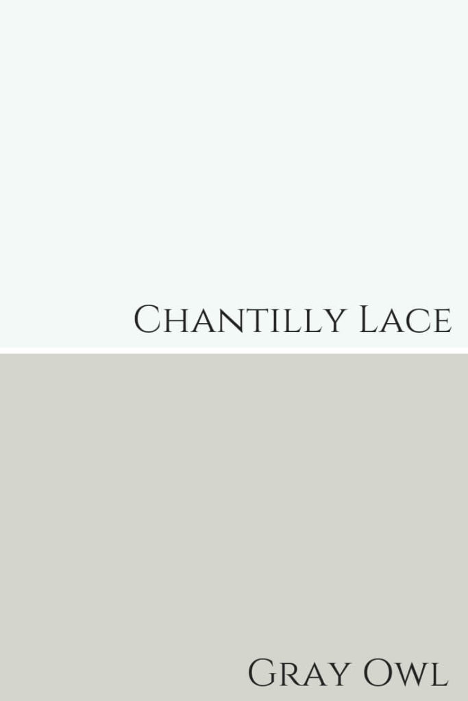
Chantilly Lace OC-65
Chantilly Lace is a bit brighter but still looks lovely with this blue-green gray. It looks quite blue in the graphic we created below my paint board comparisons.
Chantilly Lace – more than just a pretty face. haha!
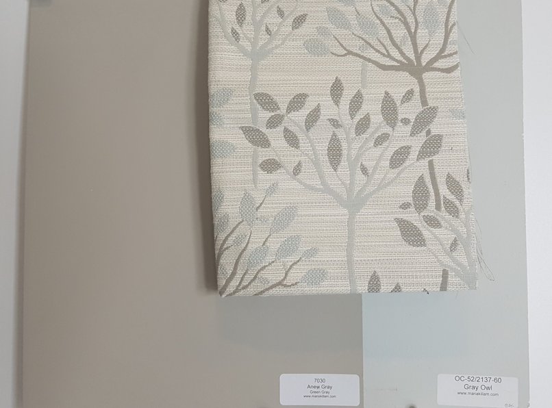
Fabulous Colour Combinations
Creating timeless colour palettes with Gray Owl is easy.
Below I’ve paired it with a fabric that we used in the clients living room shown earlier in this post where we painted the room Wickham Gray.
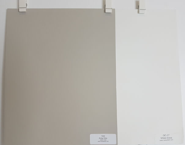
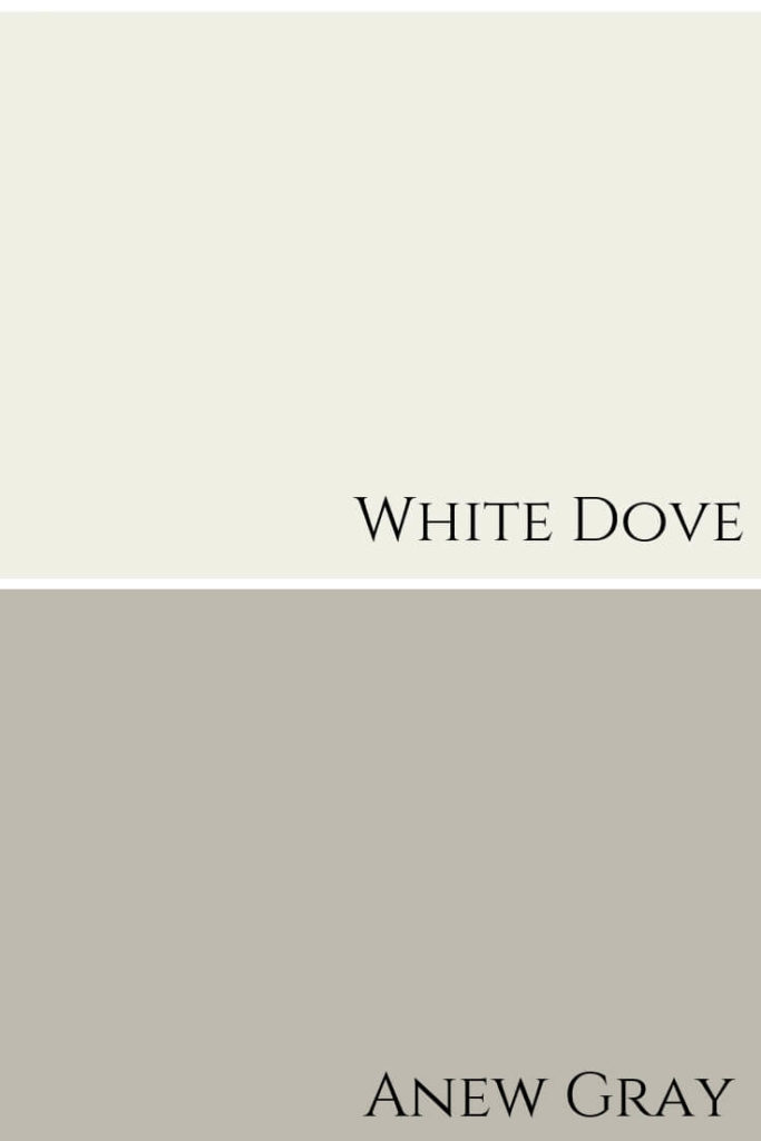
But as you can see here, the Gray Owl pairs nicely with it too and I pulled out the darker neutral in the fabric to show you what it looks like with Anew Gray by Sherwin Williams.
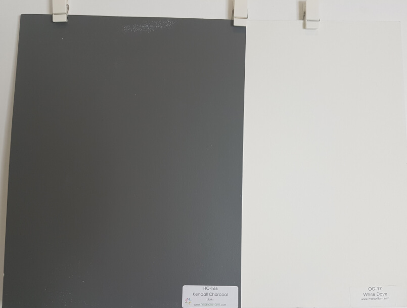
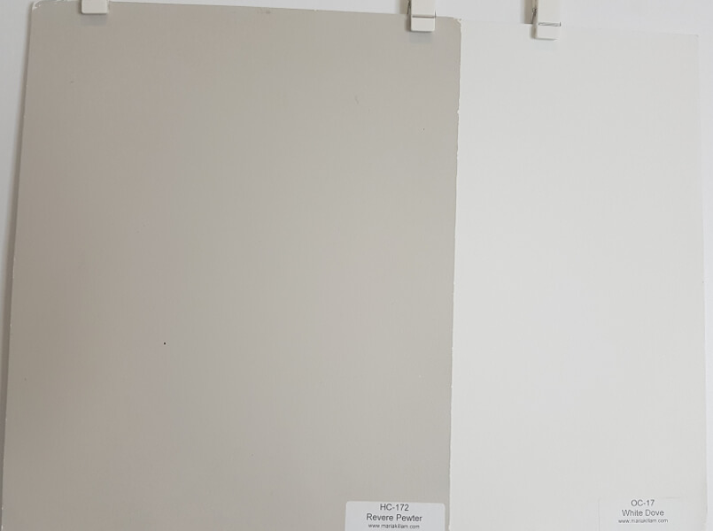
If you are looking for a Benjamin Moore colour that is similar to Anew Gray, you can try Revere Pewter or Pashmina.
Anew Gray by Sherwin Williams shown above here with Gray Owl
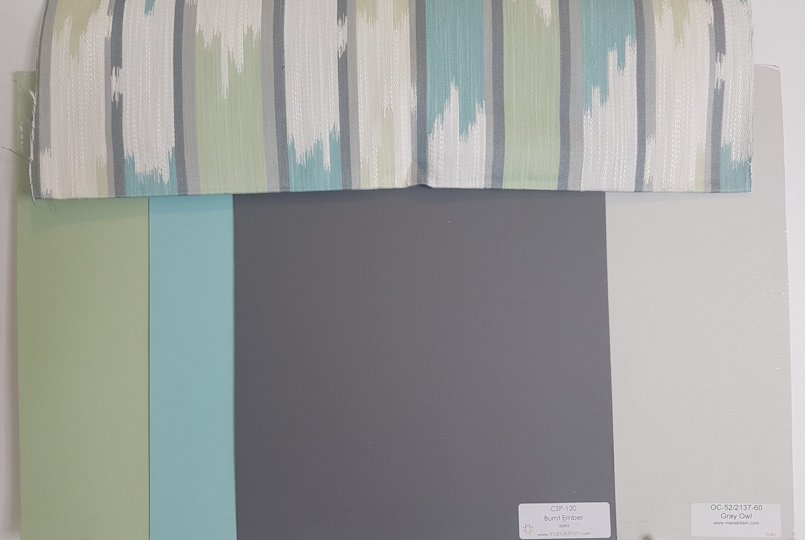
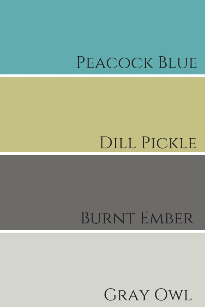
Dill Pickle 2147-40, Peacock Blue 2049-40 & Burnt Ember
CSP-120
A more bold and fun colour palette is shown here
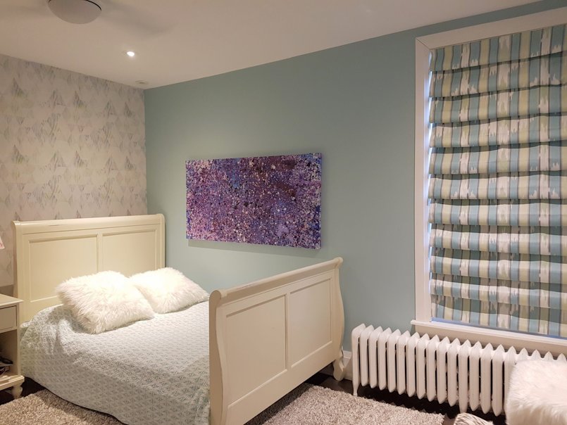
As a side note, we actually used that fabric for a teen girls bedroom on her cascading roman blind window treatment -see below.
Peacock Blue Walls shown here in a teen girls bedroom
Okay, back to Gray Owl!
You can see below how you can warm it up and cool it down at the same time.
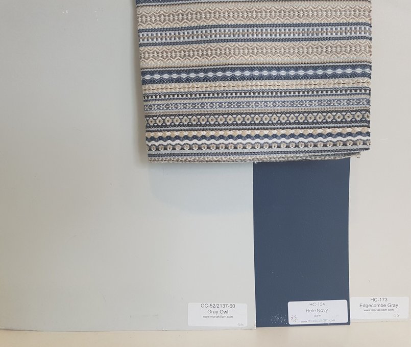
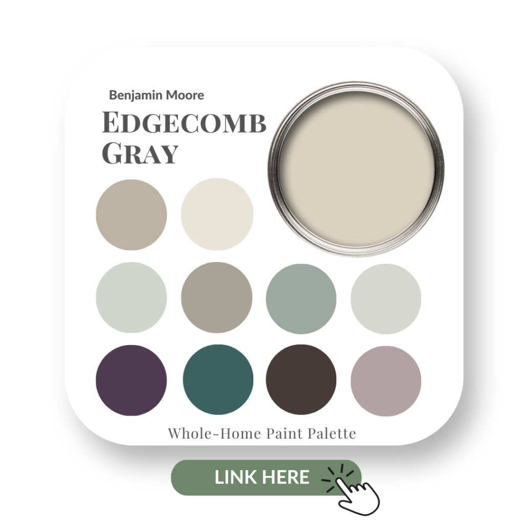
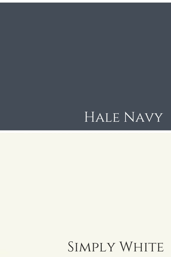
Hale Navy HC-154 & Edgecomb Gray HC-173
Edgecomb Gray, Gray Owl and Hale Navy
Inspiration Photo
My clients already had their bathroom done and painted in Gray Owl when I arrived on the scene to create the master bedroom of their dreams.
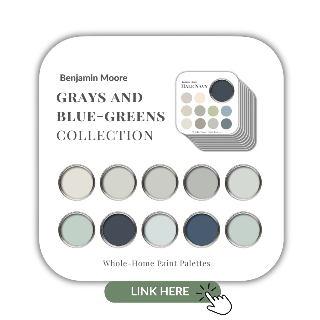
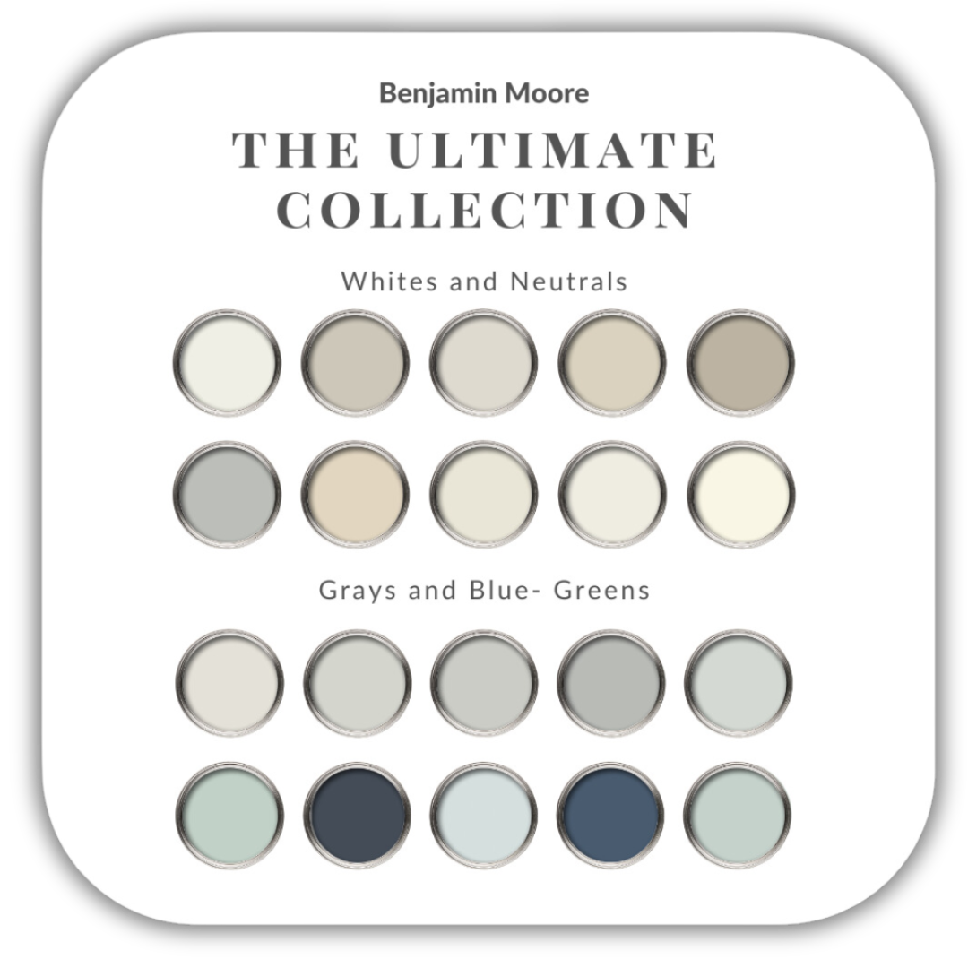
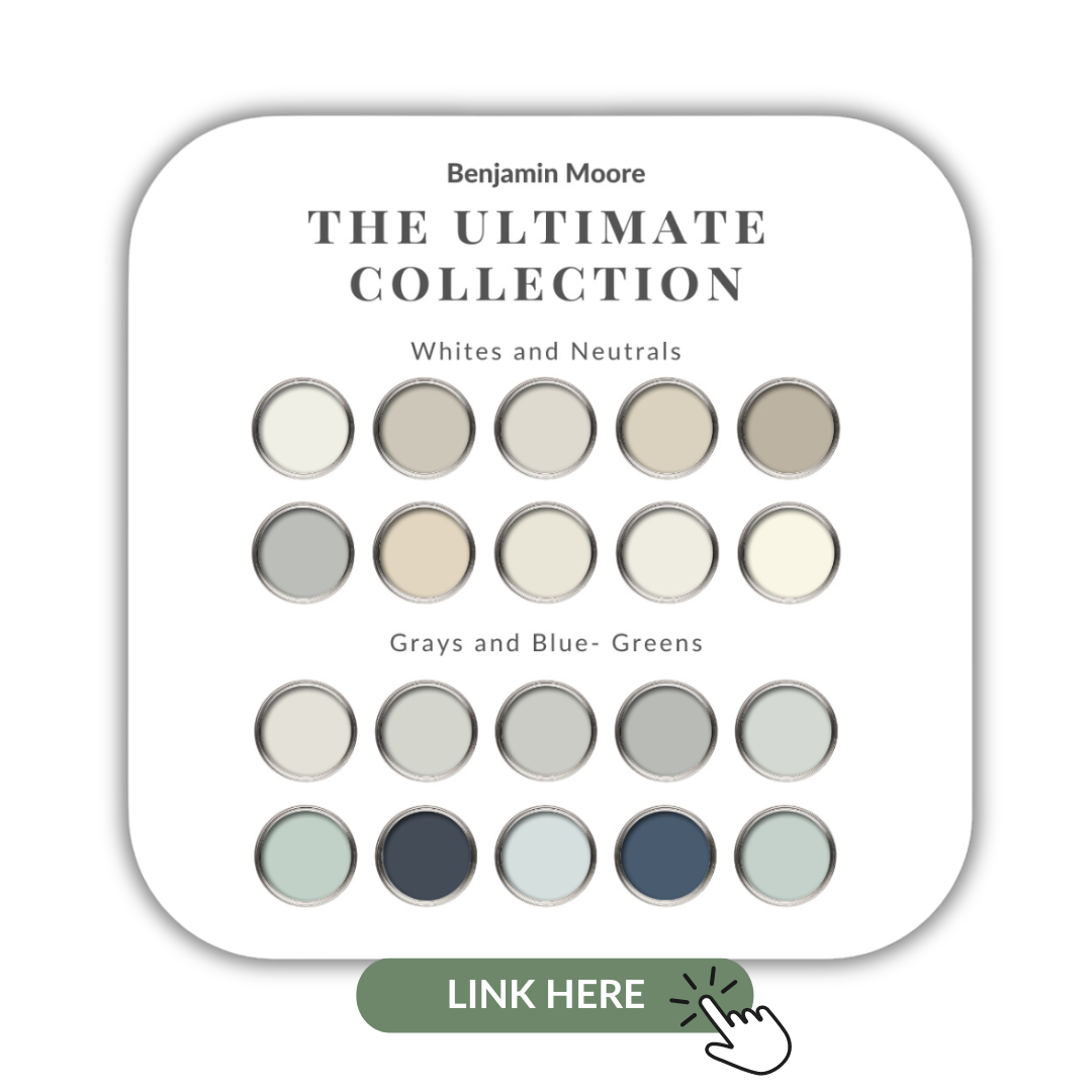
If you want to get all my Benjamin Moore colour guides in one place, look no further than my Benjamin Moore Ultimate Collection. All 20 of my Benjamin Moore guides in one handy collection.
Remember, it only takes one mistake to take your home decorating project from divine to disaster. Don’t let the paint be what stresses you out!
Perfect For Pinning
Take my Colour Quiz to see which Colour Palette best suits your style.
Want my Large Painted Boards?
Love my large painted colour boards and want your own set?
// DISCLOSURE: Thank you for trusting me with my truthful and reliable opinion on any future purchase you may make. I always disclose affiliate or sponsored information when it is the case. If you purchase Maria’s boards, I will earn a small commission from the sale. This doesn’t affect you in any way, the price remains the same regardless. Thank you for supporting me and entrusting me to be your go-to for all things Colour and Interior Design!
I LOVE HEARING FROM YOU!
If you’ve used a paint colour that I’ve reviewed or you; want to ask a question: or even if you have a different point of view to mine, please comment below to let me know.
For colour advice, please note that I can’t always give advice based on simply reading about a scenario. If it were that easy for me to recommend the perfect paint hue, without knowing more about the specific space; the lighting situation; what other fixed elements to consider etc, then I really would be even more magical than I already am. HAHA!
Nine times out of ten, I will always recommend that you either seek advice from a local Colour Professional or I might be able to hook you up with an online colour consultation.
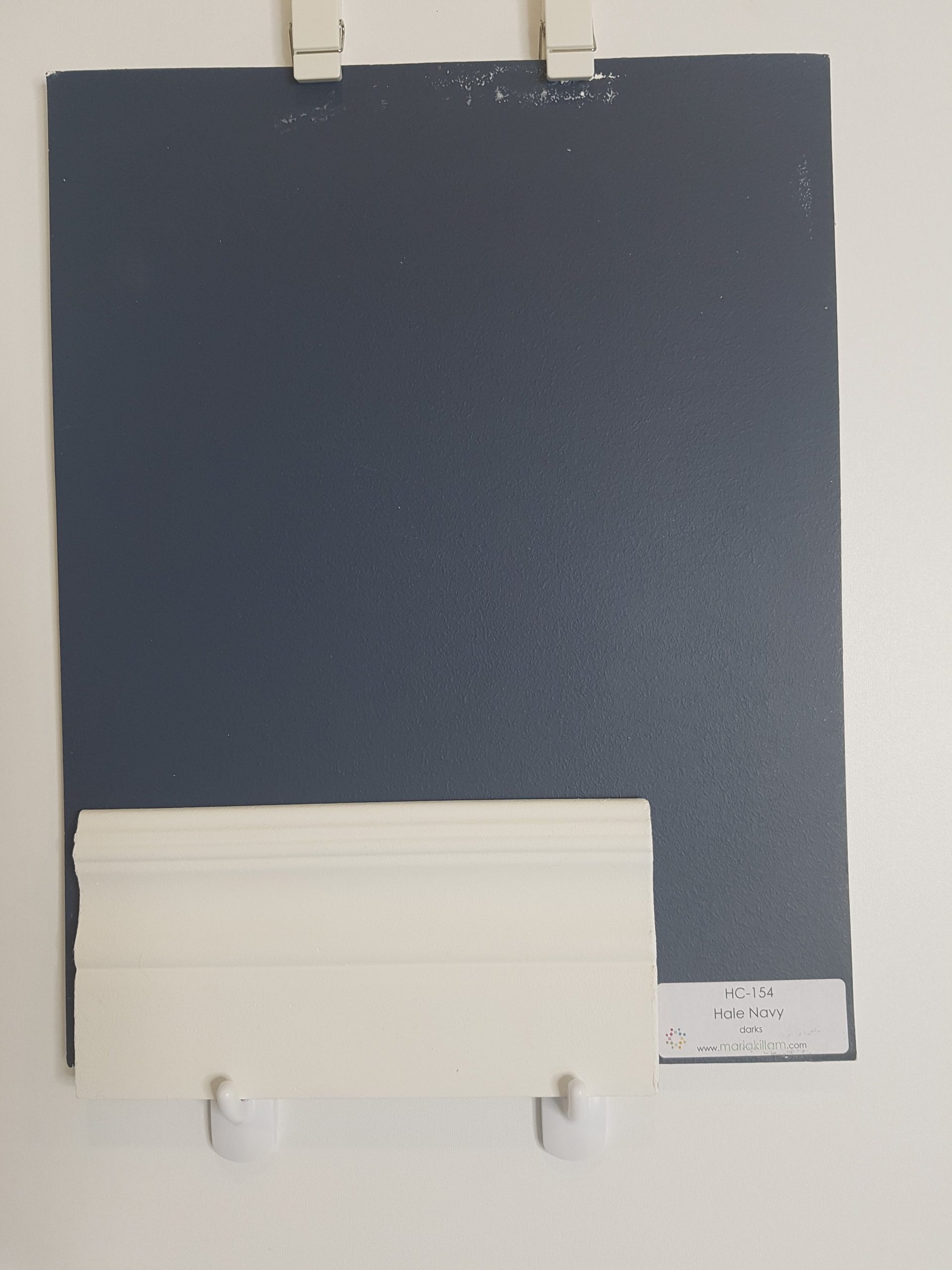
Hale Navy, HC-154, by Benjamin Moore is one of my absolute FAVOURITE colours for interior design and decor!
I am super excited to share more details about this colour and a couple of client projects where I’ve used this sumptuous colour.
LET ME SHOW YOU:
Colour Comparisons to Hale Navy
Best Whites for Ceilings, Doors and Trim to pair with this dramatic and moody colour
Fabulous Colour Combinations
My Favourite Applications of Where To Use Hale Navy In Interior Design
Are you ready? Let’s do this!
Hale Navy by Benjamin Moore
The choices one has for paint colours are infinite. Selecting the best colour for your home and then choosing additional colours to compliment it is a daunting task, but it doesn’t need to be anymore.
My Perfect Colour Palettes are an incredibly helpful tool for homeowners and designers alike.
Click here to learn more about what every PDF download includes.
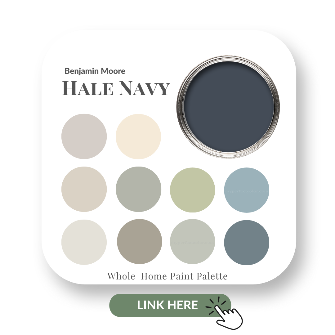
We are adding new colours all the time so be sure to check back often! My Hale Navy Perfect Colour Palette was one of the first ones we created as it’s such a hugely popular colour.
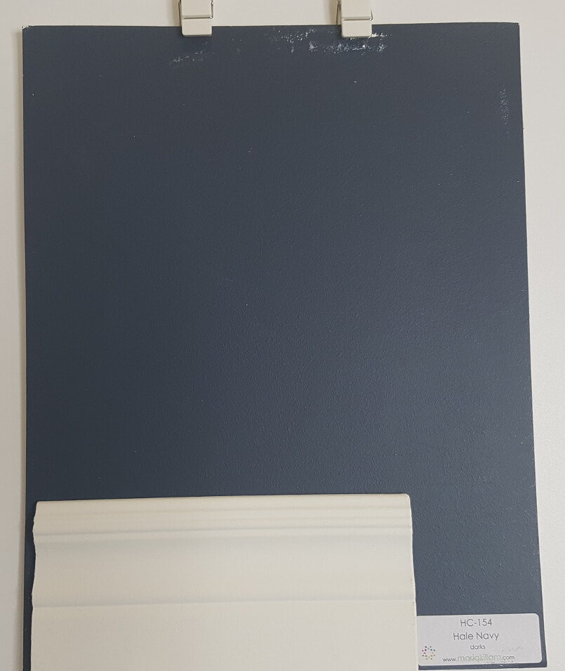
Hale Navy HC-154 by Benjamin Moore
Hale Navy HC154 Benjamin Moore
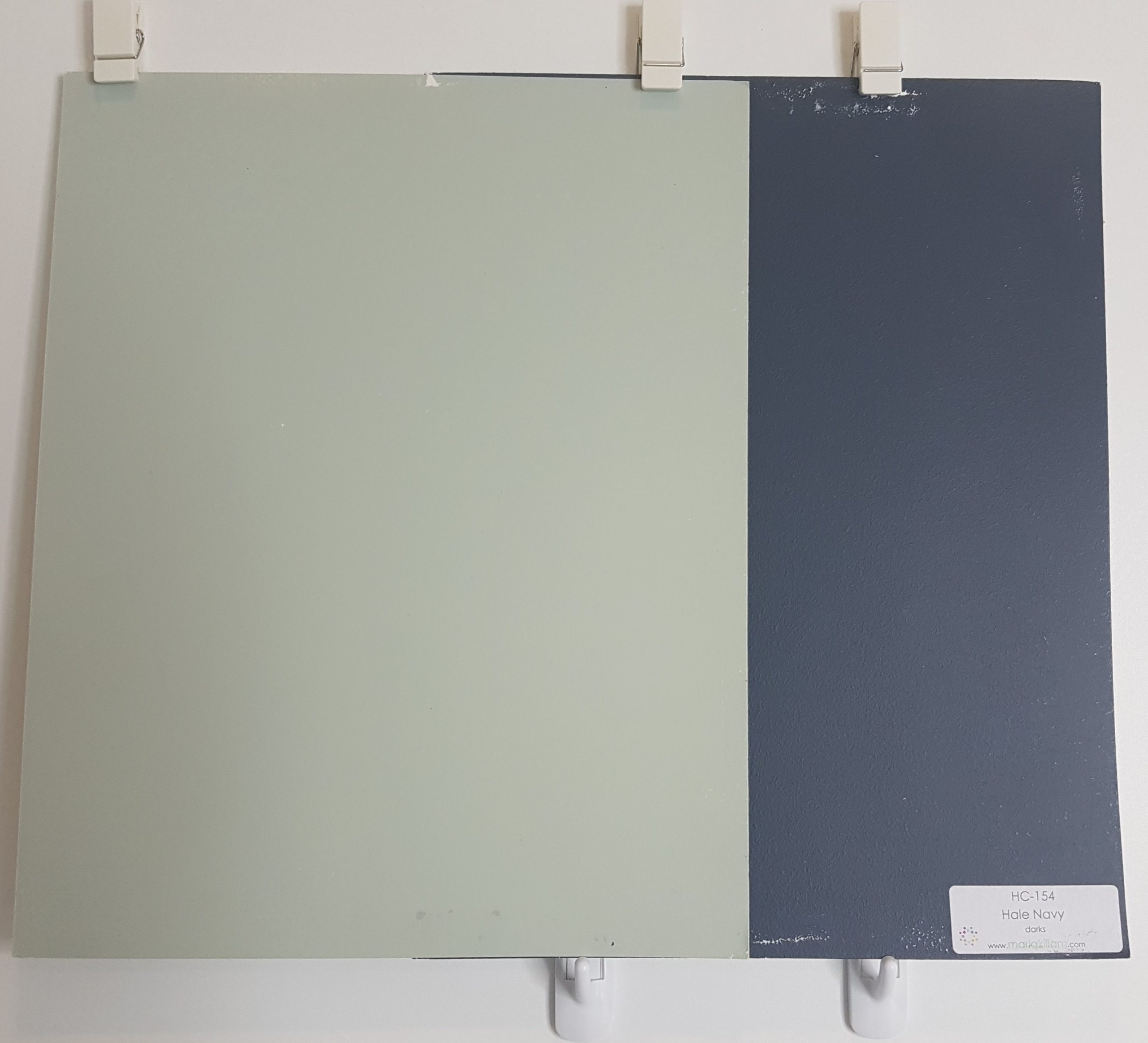
Colour Comparisons:
Forgive my tattered large colour boards, they have been very well used!
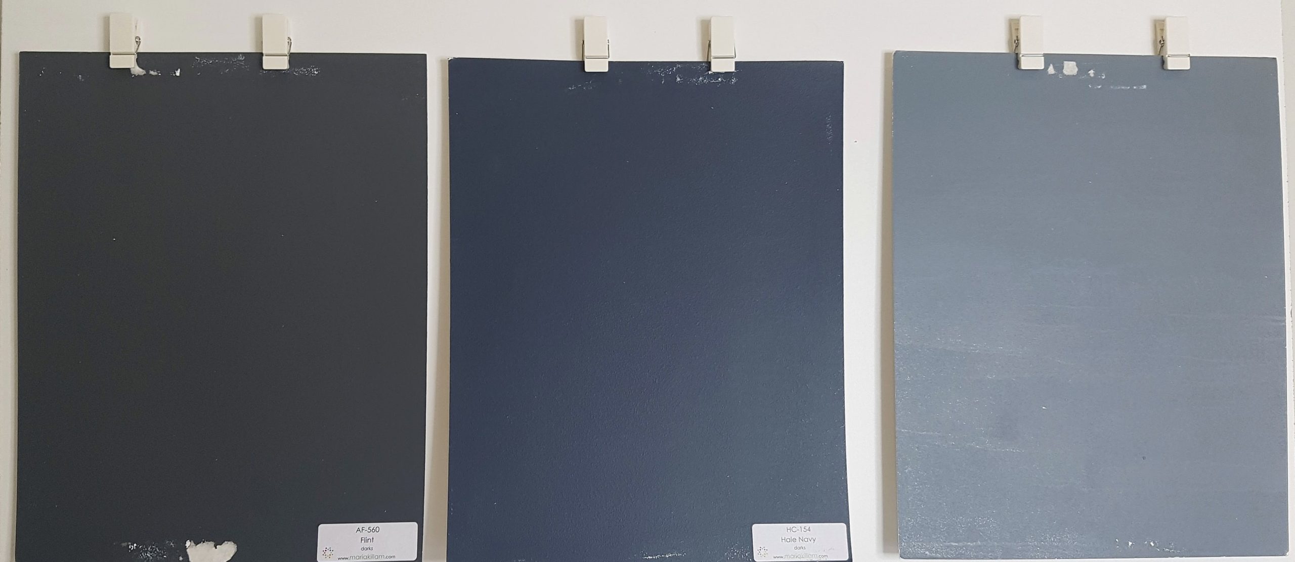
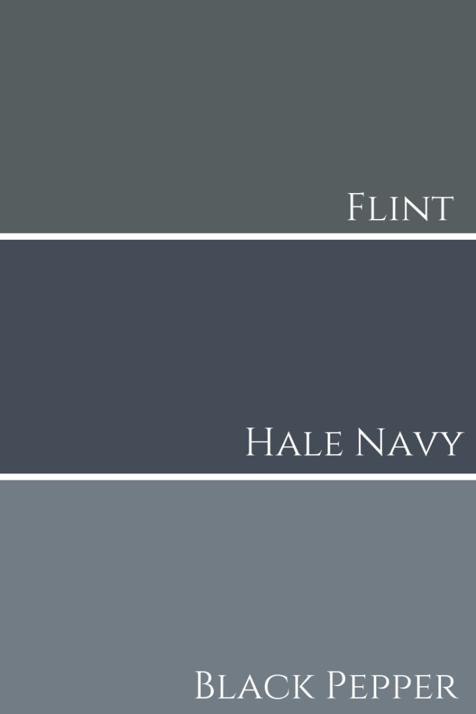
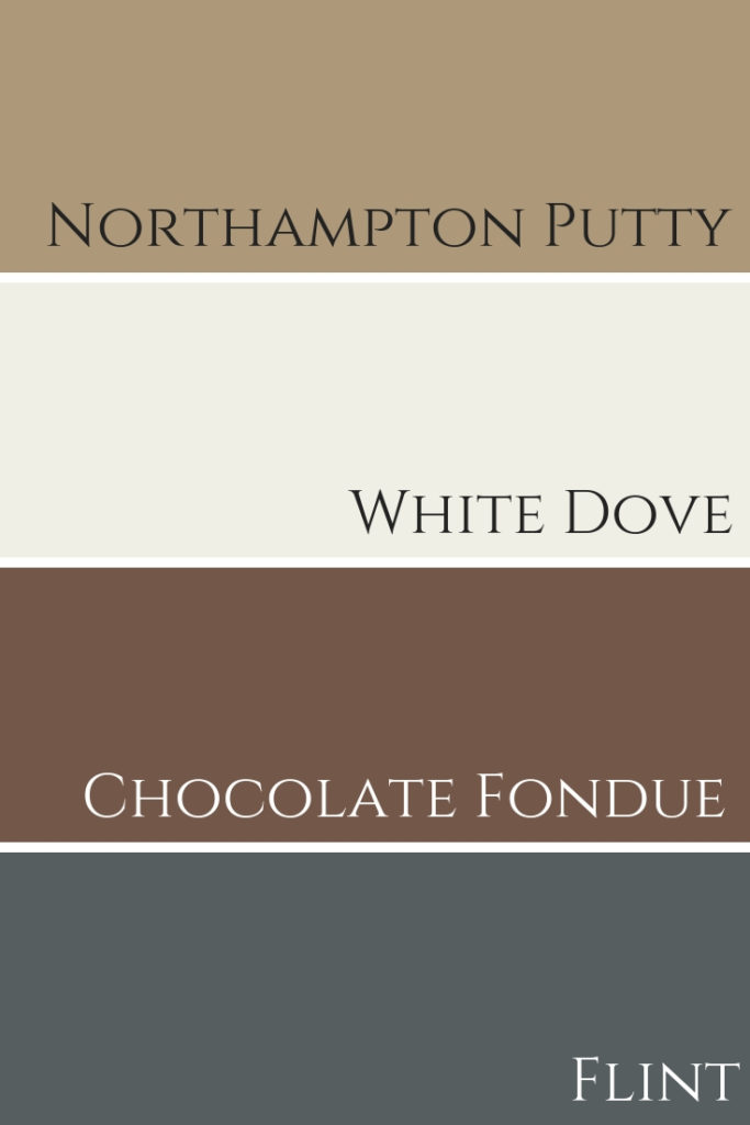
Below you can see comparisons between Black Pepper 2130-40 on the far right and Flint AF-560 to the left. Both colours are a blue-gray with Black Pepper being lighter and bluer than Flint.
From left to right: Flint AF 560, Hale Navy & Black Pepper 2130-40 All colours are from Benjamin Moore.
Flint & Hale Navy & Black Pepper Comparison
See these three paint colours used in different projects we designed below.
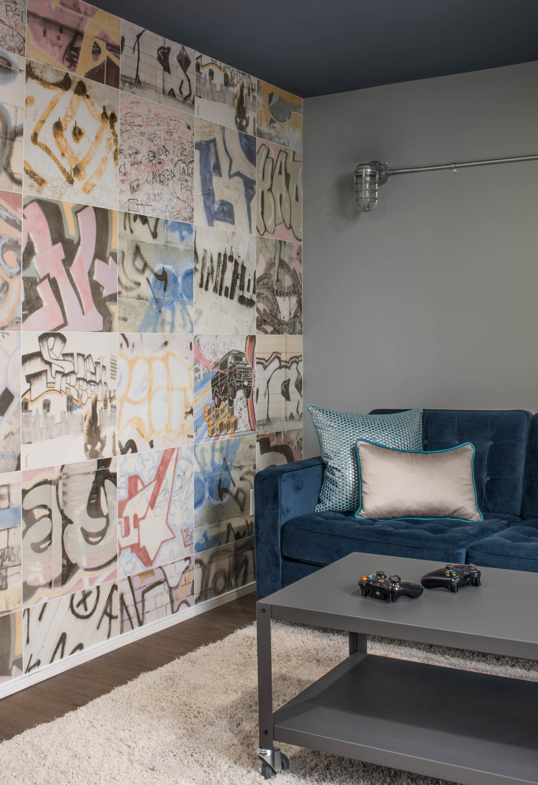
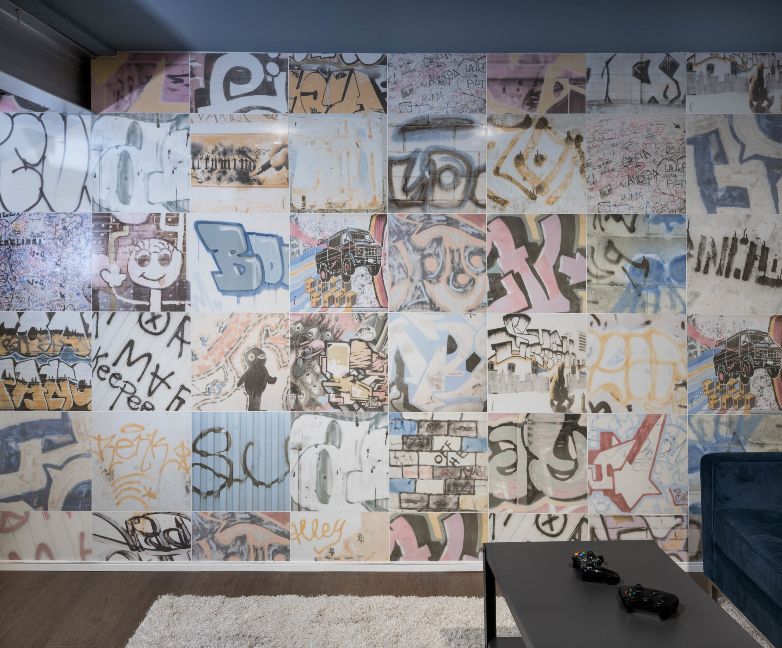
The image below shows our clients secret Xbox room with this blue-gray colour on the ceiling.
The walls are painted an even lighter blue-gray tone, Boothbay Gray by BM.
Secret Xbox room, walls Black Pepper by BM. Photo by Stephani Buchman
Graffiti wall and shag rug with blue velvet couch
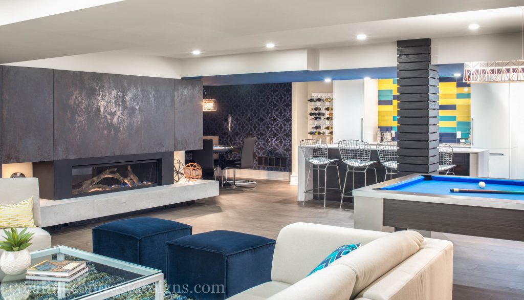
To check out that incredible 3000-square-foot contemporary basement design, click here.
As I mentioned in my video, here’s my own living room (shown below) painted Flint by BM. You can see how much darker it is and also, how much more gray it is when compared to Hale Navy.
Living Room Painted Flint by Benjamin Moore.
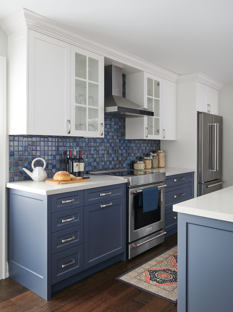
More recently we used Hale Navy in my sister’s beautiful kitchen renovation, click here to see more photos from this stunning project.
Best White Paint Colours
So many whites work well with this sensuous dark blue tone. You’ll see below how you can use it with either a creamy white or a crisper white depending on the direction you wish to go and, of course, being guided by the fixed elements within the space.
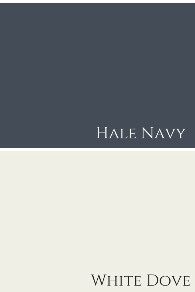
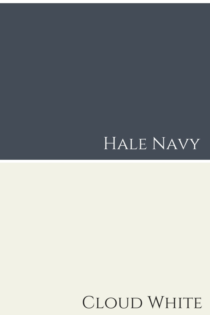
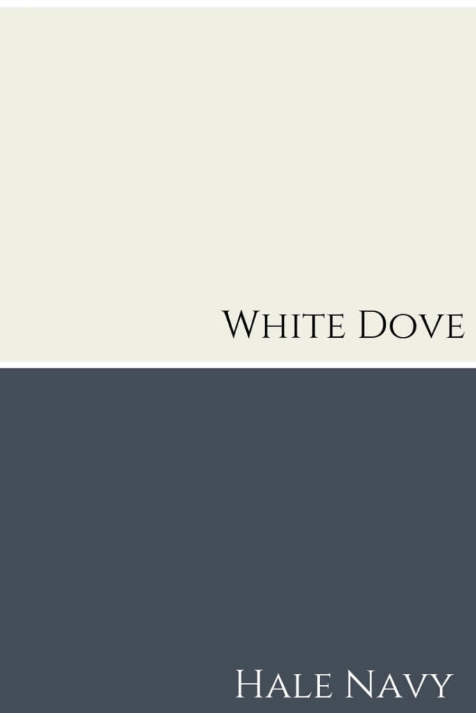
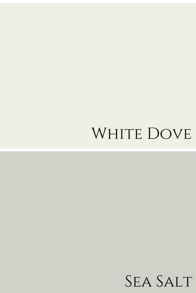
Hale Navy with White Dove. Both Benjamin Moore Colours.
Hale Navy & White Dove
White Dove, OC-17, is a creamy white. This white works wonderfully with Hale Navy, offering a soft, yet rich feel. Check out my colour review of White Dove in this post.
Colour combination of White Dove with Hale Navy by Benjamin Moore.
Here are some other great whites you can use for ceiling and trim in your next interior design project with Hale Navy:
For a more crisp pairing, you can use Chantilly Lace OC-65 or White Diamond OC-61, of which the latter has a slight blue undertone.
FABULOUS COLOUR COMBINATIONS
Creating striking paint palettes with Hale Navy is limitless really.
Think about it, what doesn’t go with dark blue jeans??? That’s what’s so great about dark blues like this, they can essentially work with pretty much any colour.
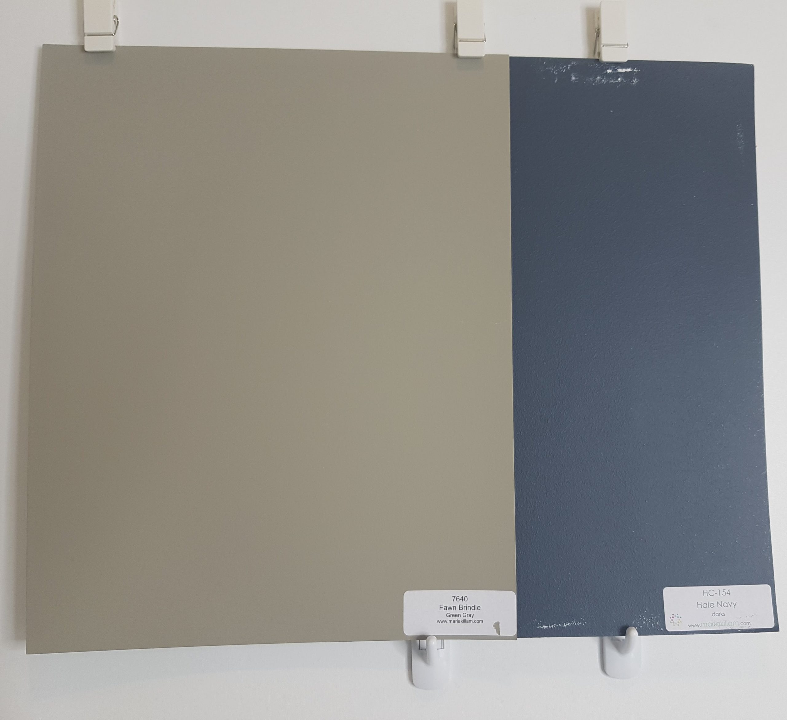
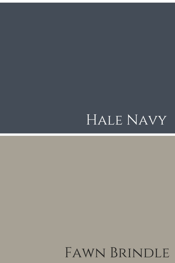
Hale Navy and Fawn Brindle SW 7640 by Sherwin Williams
Hale Navy & Fawn Brindle
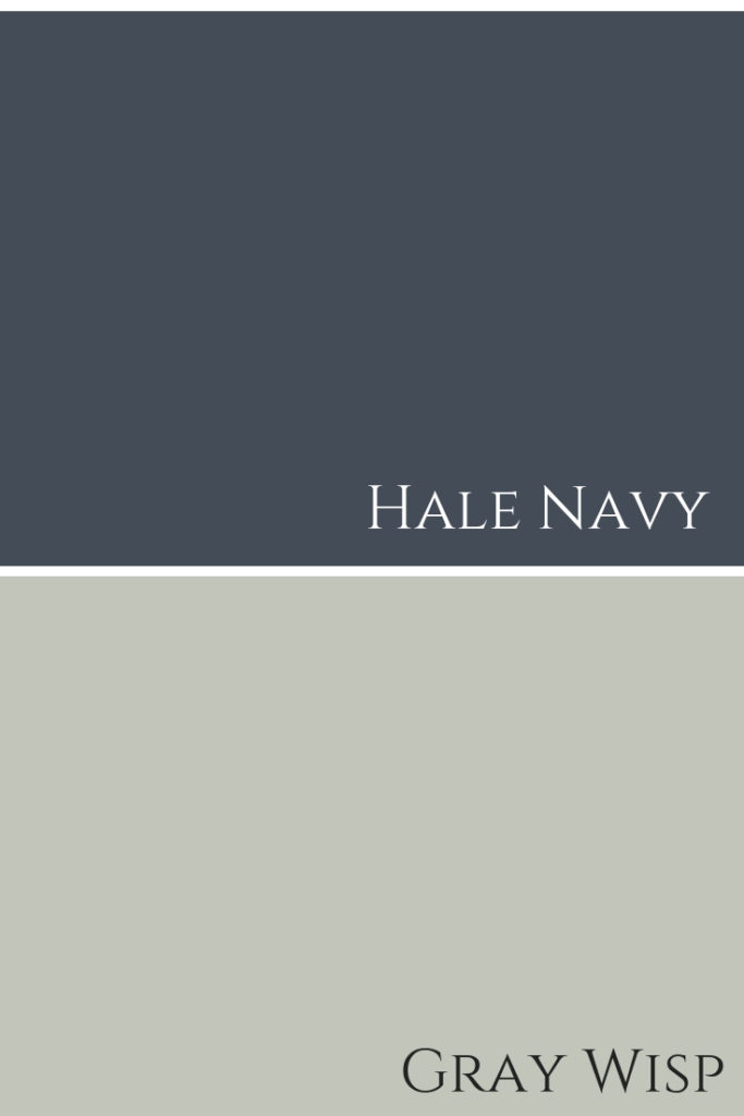
Gray Wisp CC-670 by BM with Hale Navy
Hale Navy & Gray Wisp
Here’s a couple of gorgeous paint colour palettes…
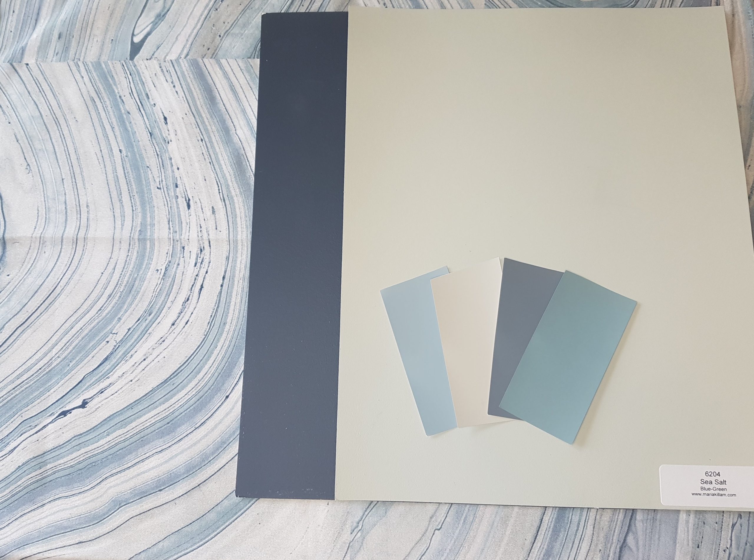
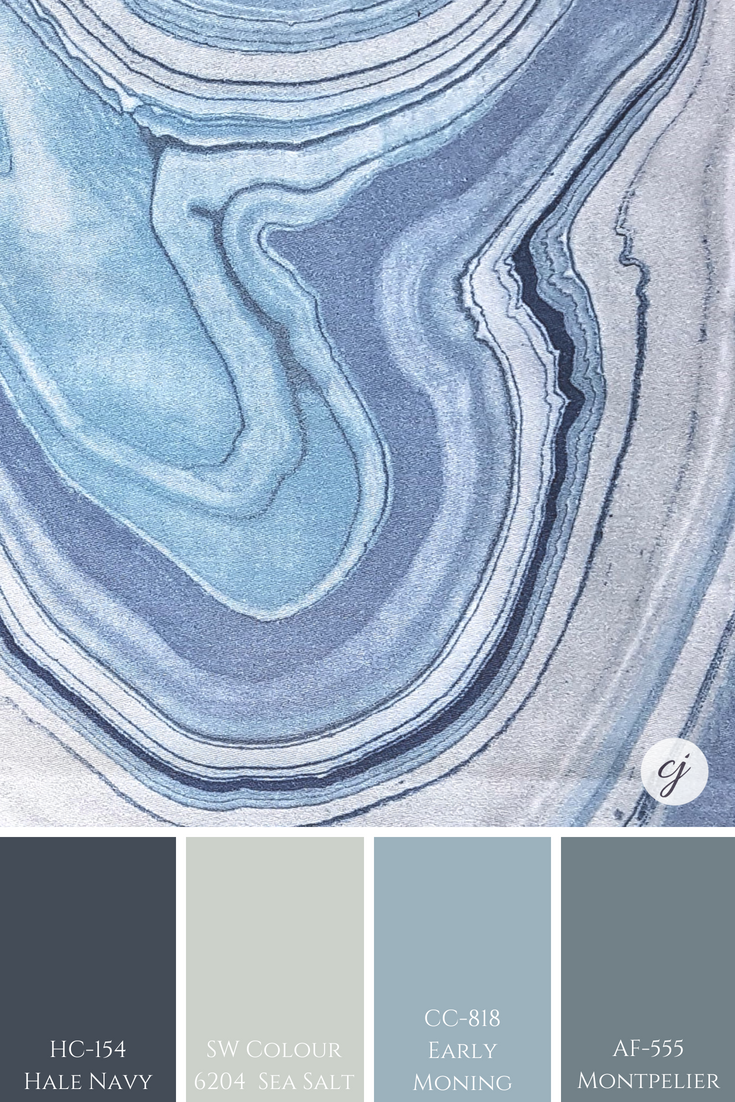
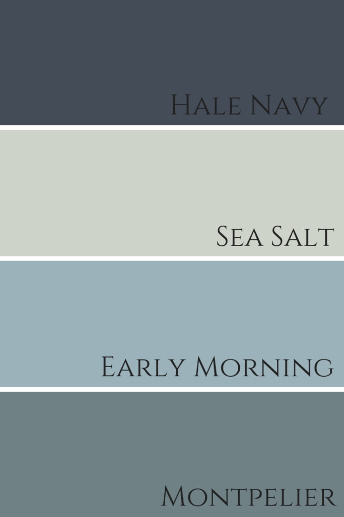
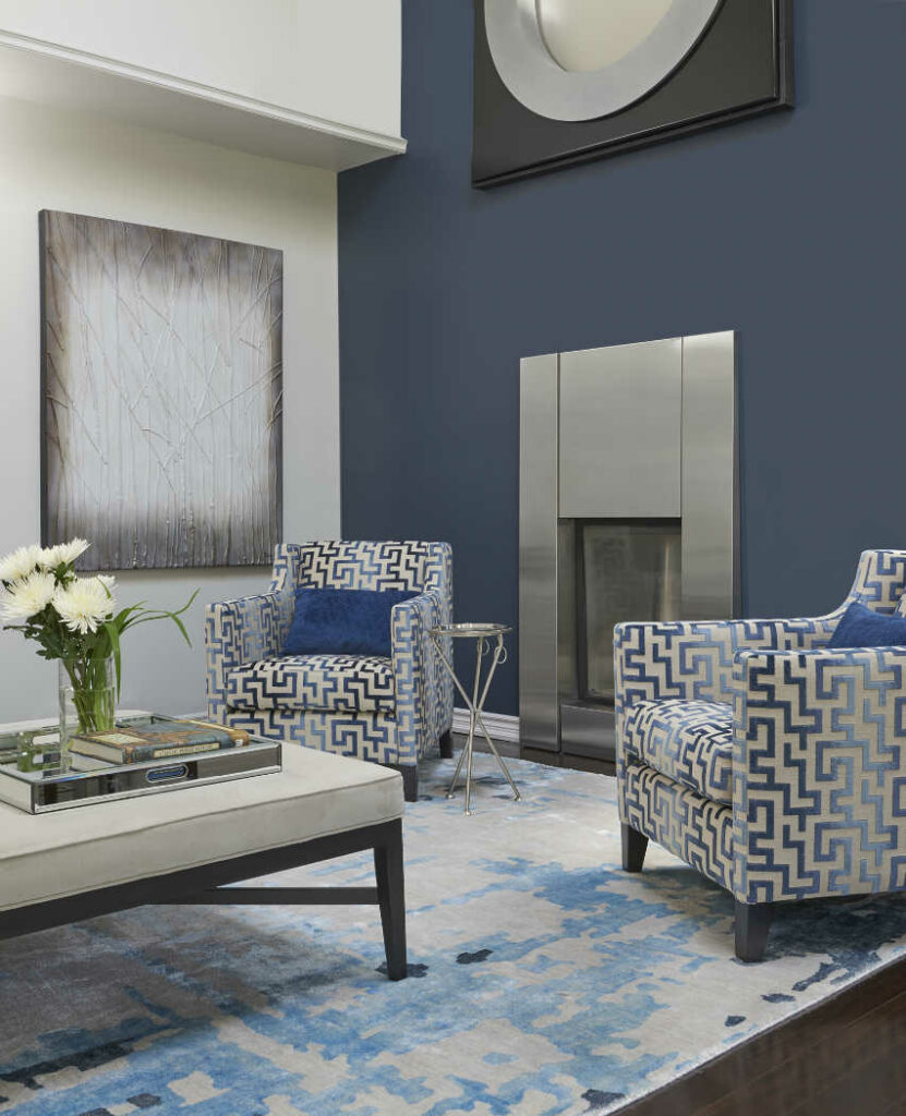
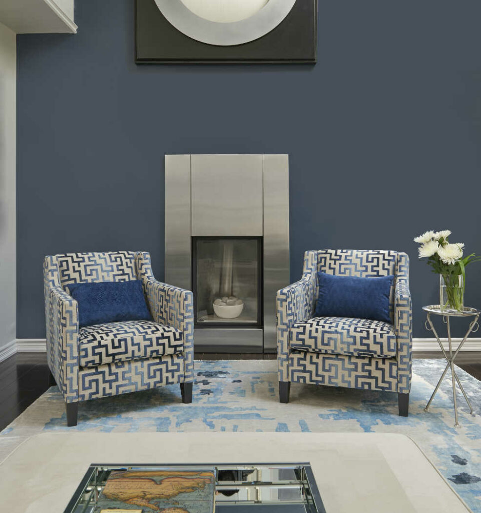
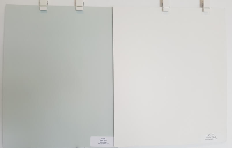
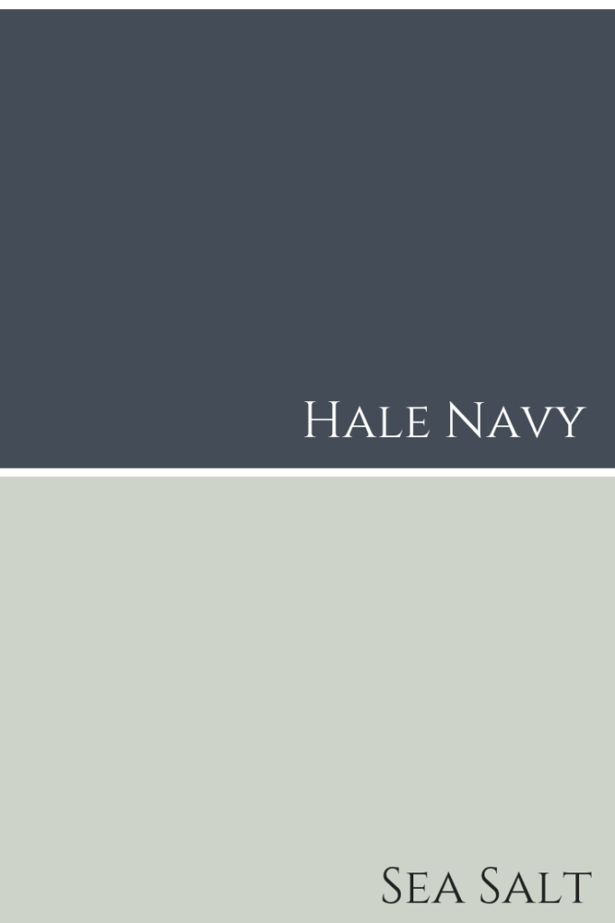
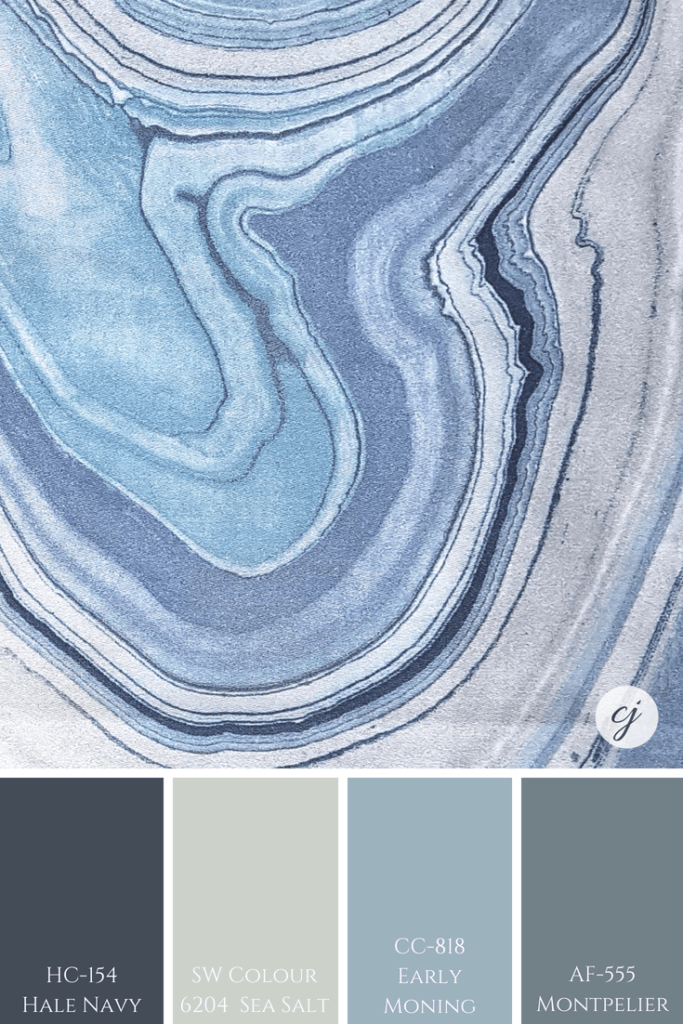
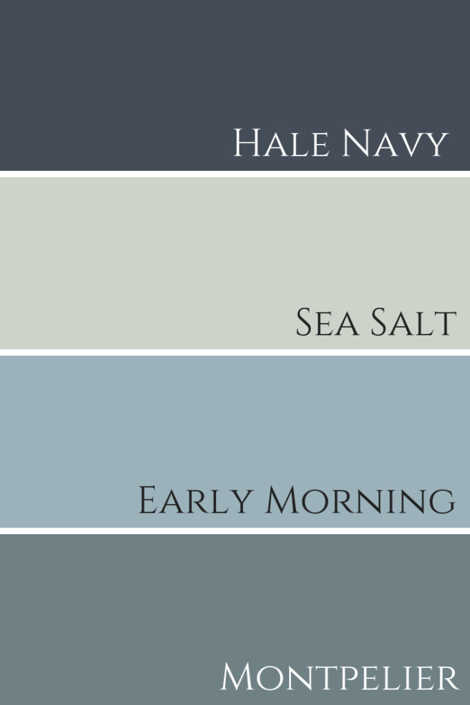
Hale Navy with Sea Salt SW 6204 by Sherwin Williams
Listed paint colours shown here with this beautiful geode patterned fabric
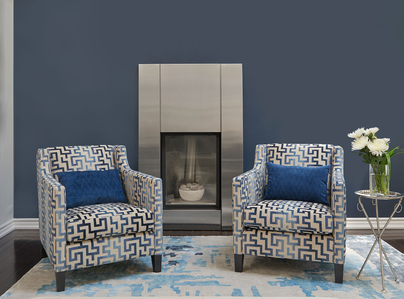
Hale Nav HC-154, Sea Salt SW 6204, Early Morning CC-818 & Montpelier AF-555
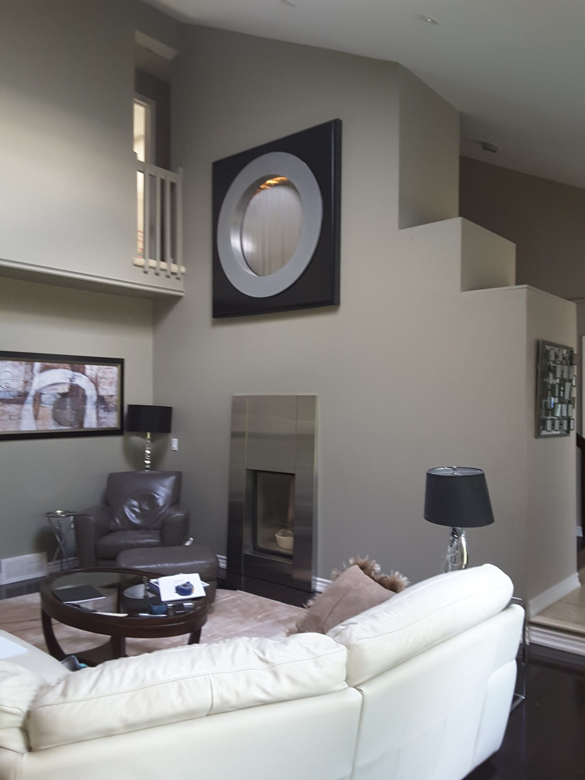
On a side note, can you guess what that large black square is above those fabulous patterned chairs & stainless steel fireplace?
It’s a water fountain feature!!
Before my clients hired me, this stuck out so much that this ‘black square’ was the focal point of the room.
By painting the wall Hale Navy & adding some beautifully patterned chairs in front of the stainless steel fireplace, the frame of the fountain was less ‘in your face’ and not so much the focus of the room.
Here’s a before…
Here’s the before photo
Okay, I digress. Back to paint colour combinations with Hale Navy.
When decorating a space, in order to have flow, you need to repeat some key colours from room to room.
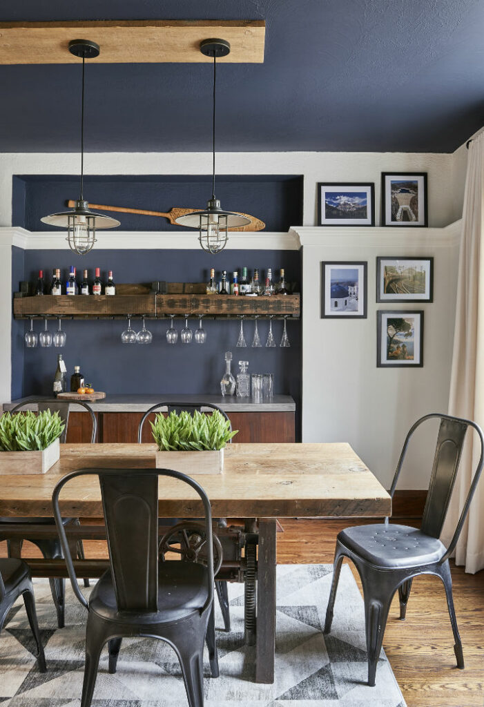
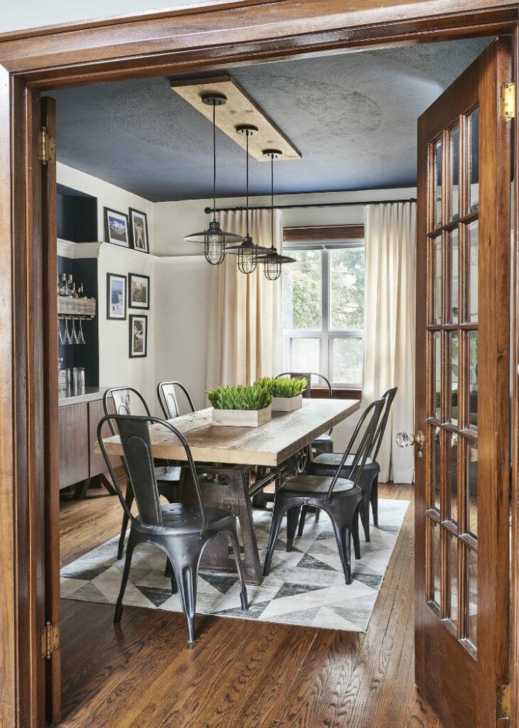
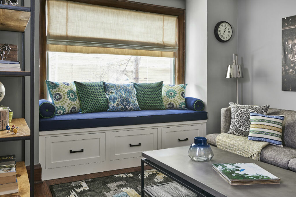
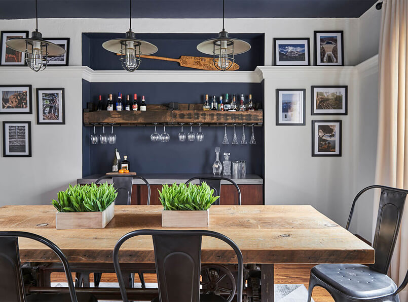
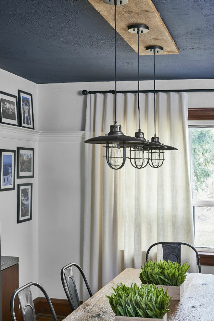
For example, in our clients’ dining room where we painted the niche wall & ceiling Hale Navy, we repeated the dark blue in the accent pillows and the custom window seat. See the full portfolio of this stunning project here.
Custom bench seat with soft accents in dark blue tones.
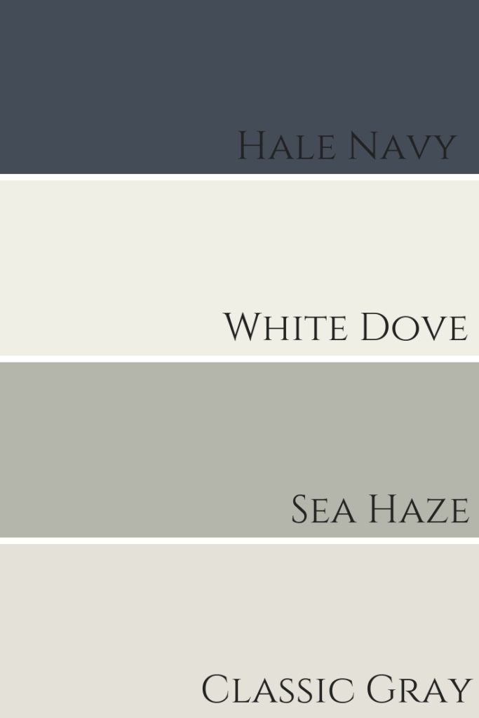
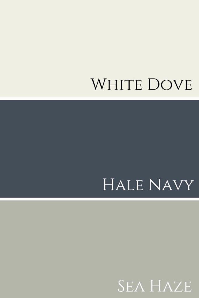
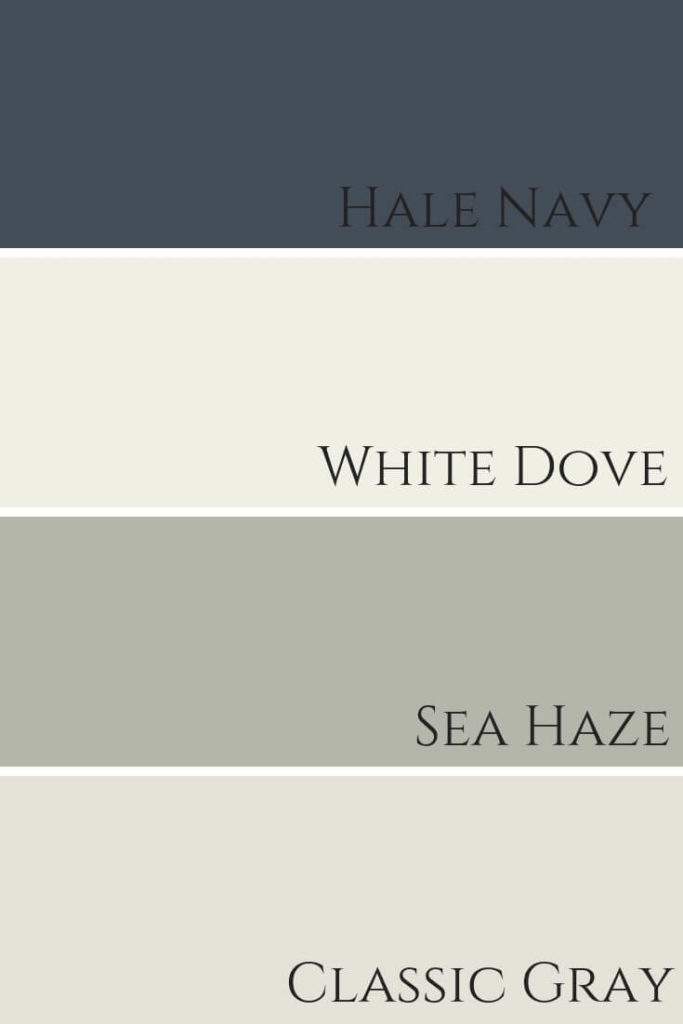
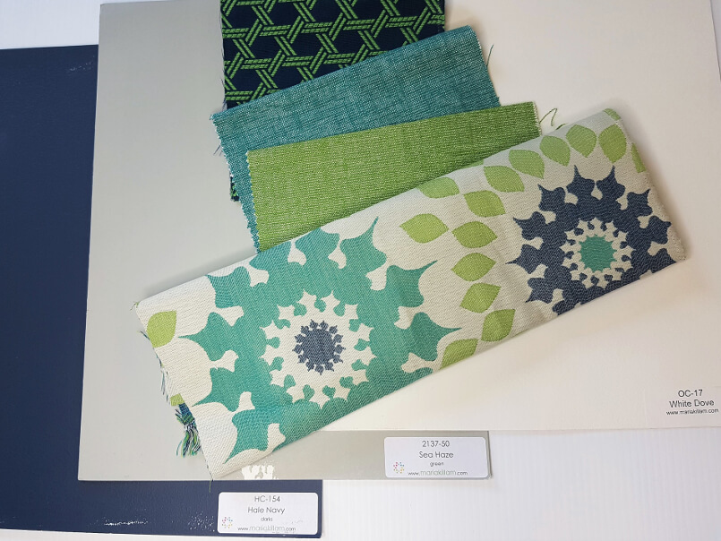
This colour palette graphic shows you how flawlessly all these hues look together.
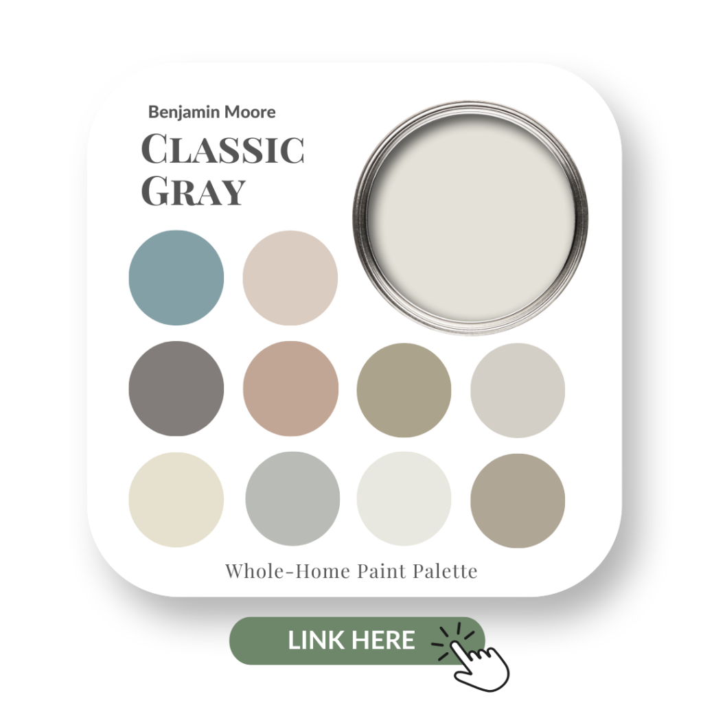
White Dove and Hale Navy pairs nicely with Classic Gray and Sea Haze.
Hale Navy & White Dove & Sea Haze & Classic Gray
HAVE YOU USED HALE NAVY OR WOULD YOU USE THIS COLOUR IN YOUR HOME? COMMENT BELOW TO LET ME KNOW.
My Favourite Places to Use Hale Navy
As you can see from the professional photography of my work, I love using Hale Navy as an accent wall or to make a bold statement on a ceiling. We are also finishing up another clients dining room where we used this dark blue on all the walls and it really is striking and dramatic.
I also ADORE Hale Navy for cabinetry in kitchens, bathrooms or on an antique piece of furniture. And did I mention that I love to see it on other millwork such as wainscoting and stairs?
My Hale Navy Perfect Colour Palette is a great resource. You’ll have all the info right at your fingertips plus more gorgeous colour combinations.
If you want to get all my Benjamin Moore colour guides in one place, look no further than my Benjamin Moore Ultimate Collection. All 20 of my Benjamin Moore guides in one handy collection.
Here are the Perfect Colour Palettes for some of the colours I mentioned above:
For colour advice, please note that I can’t always give advice based on simply reading about a scenario. If it were that easy for me to recommend the perfect paint hue, without knowing more about the specific space; the lighting situation; what other fixed elements to consider etc, then I really would be even more magical than I already am. HAHA!
Nine times out of ten, I will always recommend that you either seek advice from a local Colour Professional or I might be able to hook you up with an online colour consultation.
Contact me here to see how I can help you transform your home.
If you’ve been hesitating to raise your fees because you are unsure of how to tell your clients, I’m here to share ideas on how you can effectively communicate this to your past and current clients in a way that could actually result in landing more projects.
These lovely clients recetnly hired us back to do their front foyer. Design by Claire Jefford. Photo by Stephani Buchman
Sound too good to be true? Watch my video to see how this can be a win-win situation for everyone AND how it doesn’t have to be an awkward conversation.
Click on the play button above to watch the video.
The one thing that I will caution you on though, is not to raise your rates shortly after taking on a new client. That would not be fair to increase rates within a few months of a relatively new project.
So, there are times when it’s not advisable. Sometimes I like to throw things back at myself, asking the question, ‘How would I feel if roles were reversed?’.
Consider This
If you’ve been working with clients for a couple of years and the project has dragged on due to delays in the decision making process at their end, this can be detrimental to your business for a couple of reasons:
#1) You have likely reserved time in your busy schedule to work on their project until it’s finished, thus turning down or putting off other potential work until a later date.
#2) We all know that products can become back ordered or discontinued, not to mention the changes in dye-lot for various items such as tiles and fabrics. The longer it takes to make final decisions on moving forward with sourced items, the higher the possibility of needing to re-source items for a project.
This can inevitably affect the overall project, compromising other ‘pieces of the puzzle’ that you already had nailed down. Thus, in some circumstances, resulting in having to go back to the drawing board to ultimately start over again.
With a 3000 square foot project, there’s not time for delays. See more of this modern basement here. Photo by Stephani Buchman.
This is why I always stress how important it is to have these conversations with clients at the very beginning of the project. We cannot assume that our lovely clients know what we do everyday. It’s our job to educate them on the process, in order to manage their expectations.
See This As An Opportunity
It’s perfectly normal for pricing to increase over time, there’s nothing weird or strange about that at all. It’s called inflation and it’s part of any business.
Instead of feeling nervous and hesitant to notify clients of a fee increase, see it as an opportunity to reach out to them and discuss possible future projects and further collaborations.
If you decide that you are overdue in increasing your rates and chose to give yourself a pay rise on come January 1st, 2019, here’s what you can do.
Inform current clients you’ve been working with for some time, that your rates are set to increase on January 1st, 2019. Let them know that as a preferred client, you will be keeping your current rates as they are, until March 1st, 2019. This way, the increase doesn’t come as a surprise and you’ve provided them with ample time so that it doesn’t feel like something that just happened over night, with no advance notice.
Past Clients
This is the perfect chance to connect with your past clients. You can include this type of business update in your Interior Design monthly newsletter to clients, as well as sending them a separate email or letter to make it more personalized.
Draft an email template that reads something similar to this:
“Dear Past Client
I hope that everything is going well with you and your family. Are you all still loving the beautiful (insert here the space you designed / decorated for them) that we worked on with you (insert approx date you worked on the project with them)?
This January, I wanted to let you know about my new rates for services. As of January 1st, an initial consultation will be $XXX and hourly services for design will be $XXX. Project pricing (if this applied to your service offerings) will be…” then add in the appropriate new pricing per package.
“As a preferred client, whom we would love to work with again, I would like to provide you with the opportunity to book a consultation meeting and possibly pre-schedule time in for an upcoming project on my current rates. To take advantage of this VIP pricing, please contact us by ‘INSERT DATE HERE’ and we would be happy to arrange an appointment to discuss your next project. “
It’s always a good idea to set timelines, as this makes you accountable for sticking to a date and it also instills a sense of urgency for booking an appointment. I mean, if a store is having a sale that never ends, what’s the rush to go there?
Lastly, I was thrilled to be a guest on this terrific podcast, hosted by the lovely Darla Powell. Click the image below to hear my interview with Darla and Natalie and for my tips on how to kill it on IGTV – that’s Instagram TV.
Cheers ladies for having me, I had a great time!
WINGNUT SOCIAL PODCAST INTERVIEW RE – IGTV
If you are not heading to Highpoint next week (boo hoo) then be sure to follow me on Instagram for the latest in Interior Design and Decorating trends.
I am a big stickler for investing in one’s business. When you find helpful tools or attend seminars and events that can propel you forward, it allows you to enhance the skills you already have. This makes you better at what you do, thus providing clients with a better quality of service and overall experience.
In the business of Interior Design and Decorating, understanding colour is essential. When I attended my college course to obtain my Interior Decorating certificate, there was a colour theory class that was mandatory to take as part of the program curriculum.
While it was helpful in explaining how to use a colour wheel and recognise various colour schemes, it wasn’t enough to give me the confidence I needed to specify paint colours for clients.
In 2011, the year I started my Interior Decorating business, it was my very first client who introduced me to a blog that changed my life.
The blog was called Colour Me Happy. The content provided on this blog was truly addictive, full of so much useful information pertaining to choosing colours and identifying undertones. I would binge read from post to post for hours and felt like I had struck gold!
By now, it’s highly likely that you know the True Colour Guru behind this extremely popular blog. She is (my now good friend) the one and only, Maria Killam.
Maria Killam Specify Colour with Confidence course 2018. How cute is she?!
Attending Maria’s course in 2012 was one of the best investments that I ever made in my business. Almost overnight -and I’m not even kidding – I went from having the colour consultation being one of the scariest parts of my job, to being one of my most favourite things to do for clients!
Of course, having Maria’s large painted boards also helps in a big way. If you are either a homeowner or design professional who has her boards, you know how valuable they are when looking at and specifying paint colour, to make sure you get it right the FIRST time, EVERY time.
My colour confidence is to the point now where creating video content for my YouTube channel and on my IGTV videos on Instagram, about paint colour reviews and how to choose colour, excites me almost more than interior decorating does. To teach and share what I’ve learned is exhilarating and fun for me. I have Maria to thank for that.
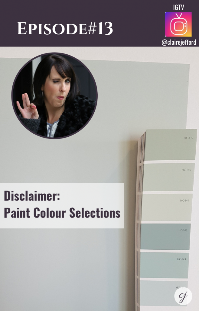
IGTV Video Episode #13, Disclaimer: Paint Colour Selections. You can watch it here.
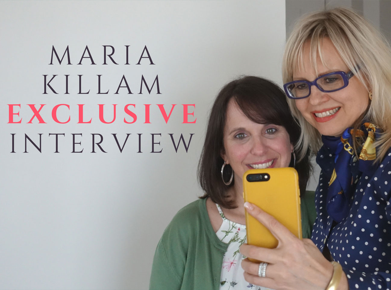
Earlier this year, I decided to attend Maria’s course for the second time while on a trip to New York. I wanted to see how the course had changed – and to be totally transparent, I was also excited to see Maria again and many of my designer friends who were also attending the Specify Colour with Confidence Course in Long Island. 🙂
I contacted Maria ahead of time and asked her if she would be willing to sit down with me for a first ever interview of this kind with the True Colour Expert herself.
I wanted to get a ‘behind the scenes’ glimpse into her course and find out more about why she feels so strongly about this being ‘the course’ that people need to take in order to better understand & confidently specify colour.
Maria said yes, YAY! I couldn’t be more excited to share this exclusive interview with you here today. Click below to see the full interview.
When people ask me if the course is worth taking, my answer without a doubt, is yes.
Maria’s 3 day course is about more than just colour. She does helpful hands on exercises on how to read undertones; shares her process for E-design; provides insight on how to style a space and much more.
Maria is a big believer that loving your home is all about ‘the look and the feel’ when you put it together. Paint alone cannot transform a space.
For the record, this is not a sponsored post.
Even if it was, there isn’t anything I’m saying here that I don’t 100% believe. This is THE NAKED TRUTH!
Specify Colour with Confidence Course 2018 Long Island, NY.
Have you taken Maria’s colour class yet or have you been following her blog and are still considering it? Comment below, ask a question and Maria or I will be happy to respond.
Never miss a video where I share colour and decorating tips every other week. Click here to subscribe to my Claire Jefford YouTube channel and hit the bell to the right of the red button to make sure you always get notified when I publish a new video.
Want Maria’s Large Painted Colour Boards?
Love my large painted colour boards and want your own set?
// DISCLOSURE: Thank you for trusting me with my truthful and reliable opinion on any future purchase you may make. I always disclose affiliate or sponsored information when it is the case. If you purchase Maria’s boards, I will earn a small commission from the sale. This doesn’t affect you in any way, the price remains the same regardless. Thank you for supporting me and entrusting me to be your go-to for all things Colour and Interior Design!
My next video is all about Benjamin Moore’s Hale Navy and is released Wednesday October 10th. Don’t miss it!
Hale Navy colour review release date: October 10th.
Perfect for Pinning!
As I love creating graphics and because they are necessary to drive people back to my site from platforms such as Pinterest and Instagram, here are three that I designed specifically for this blog post. Which one is your favourite?
Knowing how much to charge for your Interior Design services is something that takes careful consideration & thought. Numerous factors must be taken into account before you set your rates for all the valuable & money-saving advice you have to offer.
Often in Facebook groups, including my own fabulous tribe of nearly 3000 members from across the world- Interior Design Business Strategies – someone will post to ask what everyone else is charging for an initial consultation fee.
While this provides an opportunity for great conversations, it can also open up the flood gates to a lot of confusion, especially for newer designers and decorators.
In my latest video, I address this head on and share with you my strong point of view of what you need to think about when setting your fees for the initial consultation meeting.
Watch that video by clicking on the image below.
Comment to let me factors that you decided upon for your initial consultation fee.
Did you know that my extremely helpful ‘FREEBIE’ (aka my fabulous giveaway to get you on my email list!) are tips for creating your own design packages with suggestions on how to work out your rates? It includes a helpful video & coaching sheet, so if you haven’t got it already, go grab it here now.
FREE SERVICES AND RATES SHEET – get it here NOW!
How To Rock the Initial Consultation Meeting
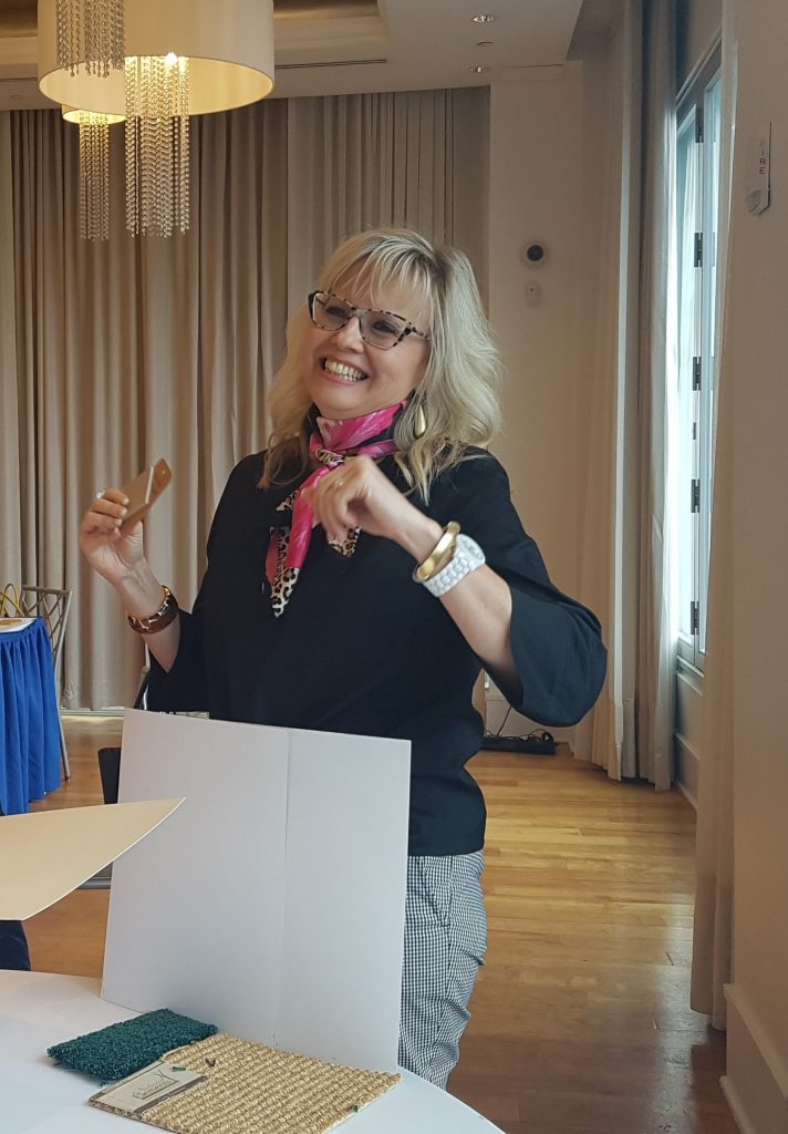
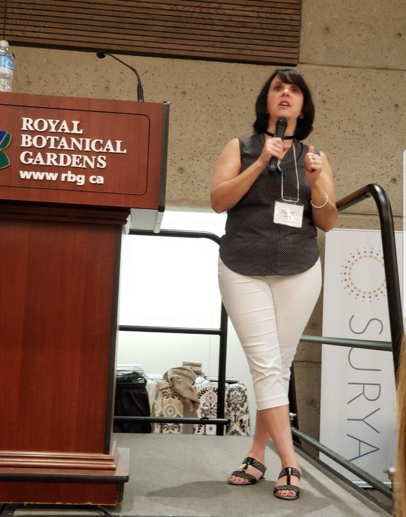
Last week I was so excited to present at my local decorating centers’ annual trade show. This has been on my bucket list for quite some time and I nearly cried when owners Lin and Doug Munro invited me as a speaker.
My presentation was all about ‘HOW TO ROCK THE INITIAL CONSULTATION‘. After having conducted more than 150 consultations in just 7 years, I really enjoyed getting up in front of over 200 local designers to share my proven processes & strategies for one of the most important phases in the entire process of working with clients.
Here I am speaking at the TDC local Trade Show, Burlington, Ontario
In addition to seeing friendly faces from those I’ve had the pleasure of knowing within my local design community for years, I also loved meeting new designer friends. Especially those who I known online for a while, but may not have had the chance to meet in real life.
The Decorating Centre‘s Annual Trade Show is always one of my favourite events to attend and so this year was extra special for me!
If you are struggling with your process leading up to the consult or are unsure of how to take control and offer incredible value to your clients, you need to invest in my ROCK THE CONSULTATION PROCESSES PACKAGE.
For the second time, I appeared on our local news station, CHCH TV. This time for the Morning Live Show.
It was so much fun! Watch the entire segment here where I share tips on decorating a living room & bedroom, as well as touching on some of the latest trends in Interior Design today.
Upcoming Events – WILL I SEE YOU AT HIGHPOINT? Comment below & let me know!
Highpoint Market in North Carolina is fast approaching and I couldn’t be more thrilled! We are currently working on putting together an events page for my website, but until then, please see below for what’s happening and click the links to sign up. I really hope to meet you (or see you again) while I’m there!
Monday October 15th: 5pm Modenus – DETAILS COMING SOON!
I’ll also be hanging out with the NKBA on Tuesday afternoon and speaking at their private event the following day. If you have been invited, I look forward to seeing you there!
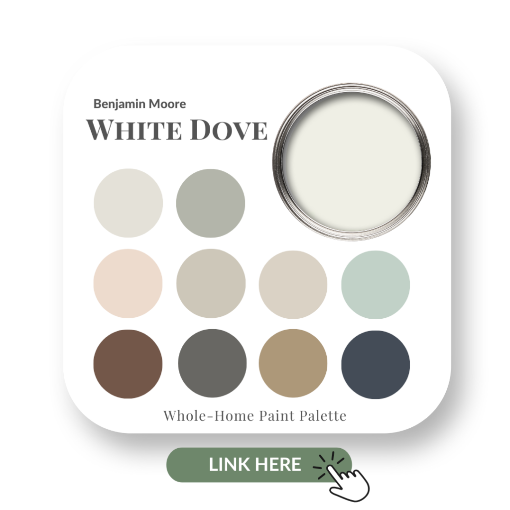
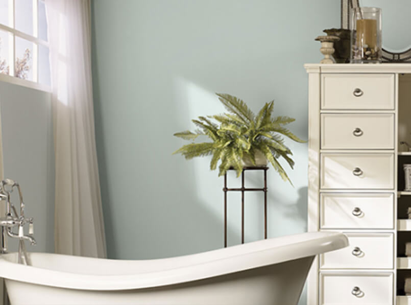
PAINT COLOUR REVIEW VIDEO -WHITE DOVE
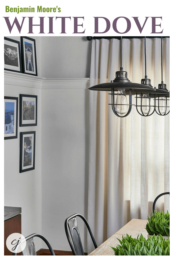
On my other YouTube channel – Claire Jefford – where I share advice on Deocr and Design with a big emphasis now on Colour, my latest TNT Colour Review video is all about Benjamin Moore’s White Dove.
This week in my colour review, I share with you one of my favourite white paint colours: White Dove by Benjamin Moore.
TOP TIP:
Don’t be fooled into thinking that when you hear the name of a paint colour, then that paint will indeed be that colour. Confused? LOL
What I mean is, just because White Dove is called ‘WHITE‘ Dove, doesn’t mean to say that it’s a true white.
As an example, I’ve noticed that some clients can get put off when I show them a colour that has the word ‘Gray’ in it if they are not a fan of Gray.
However, because all grays have undertones, what one perceives as ‘Gray’ in their own mind, can be completely different than the actual ‘Gray’ colour I’m specifying.
As for the whites, stick with me and you’ll understand what I’m talking about when you look at my white paint colour comparisons.
Here’s what I’ll be sharing with you about White Dove:
The Undertone of White Dove
Colour Comparisons to other whites
Best Whites for Ceilings, Doors and Trim
Fabulous Colour Combinations
Favourite Applications In Interior Design
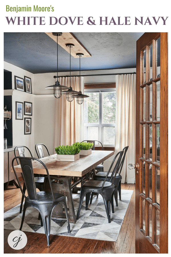
Another view of my Toronto client’s dining room. Notice how the White Dove paint colour on the walls matches perfectly with the custom ripple fold drapery? That’s not a coincidence. 😉
White Dove is not a true white. They rarely are! It has a creamy undertone that makes it a soft, rich white paint colour to work with for your interior decorating projects.
Colour Comparisons:
Despite what my husband thinks (that all whites are created equal and look the same) this is so not the case! When you begin to compare whites, you will start to notice how very different they all are from one another.
This is why it really bothers me when contractors or kitchen companies recommend a cabinetry colour, without even factoring in the countertops, the backsplash or any other fixed elements in a space. That’s a totally backward way of thinking!!
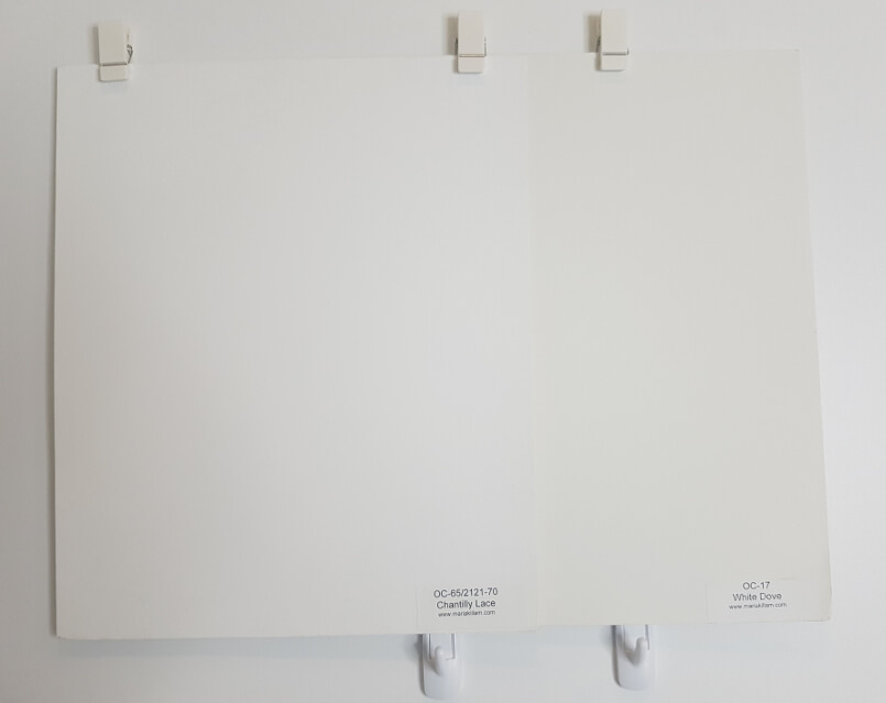
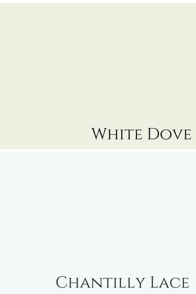
White Dove shown here with Chantilly Lace. Both are Benjamin Moore paint colours.
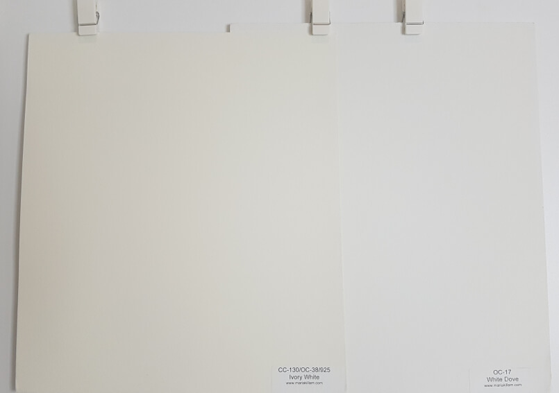
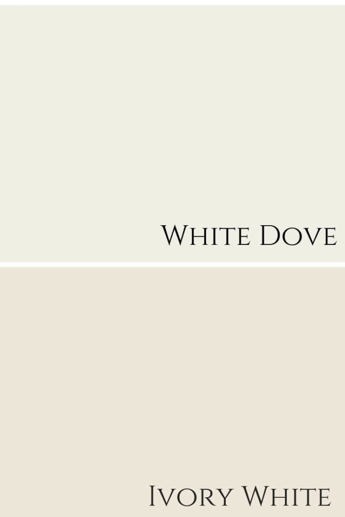
If you prefer a white that is less stark than Chantilly Lace, but more creamy than White Dove, Benjamin Moore’s Ivory White is a good alternative to consider.
Shown here is Ivory White, CC 130 by BM next to White Dove OC 17.
Best White Paint Colours
You could use either of the whites mentioned above as trim colours to pair with White Dove on the walls, or you could just continue using White Dove!
In my Toronto client’s dining room, we chose to keep the natural stain of the wood trim, as it was also the finish on their gorgeous, warm-toned interior doors, as well as part of the charm and character of their home.
Colour combination of White Dove with Hale Navy by Benjamin Moore.
Fabulous Colour Combinations
Here you can see my large painted board Hale Navy, tucked behind a baseboard painted in White Dove.
White Dove baseboard shown with painted colour board, Hale Navy HC-154.
Below you can see the paint colour combination together that I used in my client’s main floor decorating project.
As shown above, in the colour palette of the three colours used in my clients home, Sea Haze 2137-50 by BM also works wonderfully with White Dove.
Sea Haze 2137-50, is a light sage green colour
Here, I’ve added Classic Gray into the colour combination, if you wanted to bring in a fourth colour.
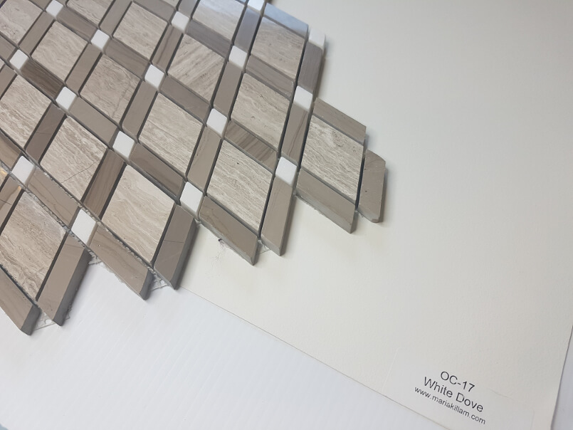
The walls in the image below are painted Sea Haze and this is the same client’s living room, as the industrial-styled dining room shown earlier in this post.
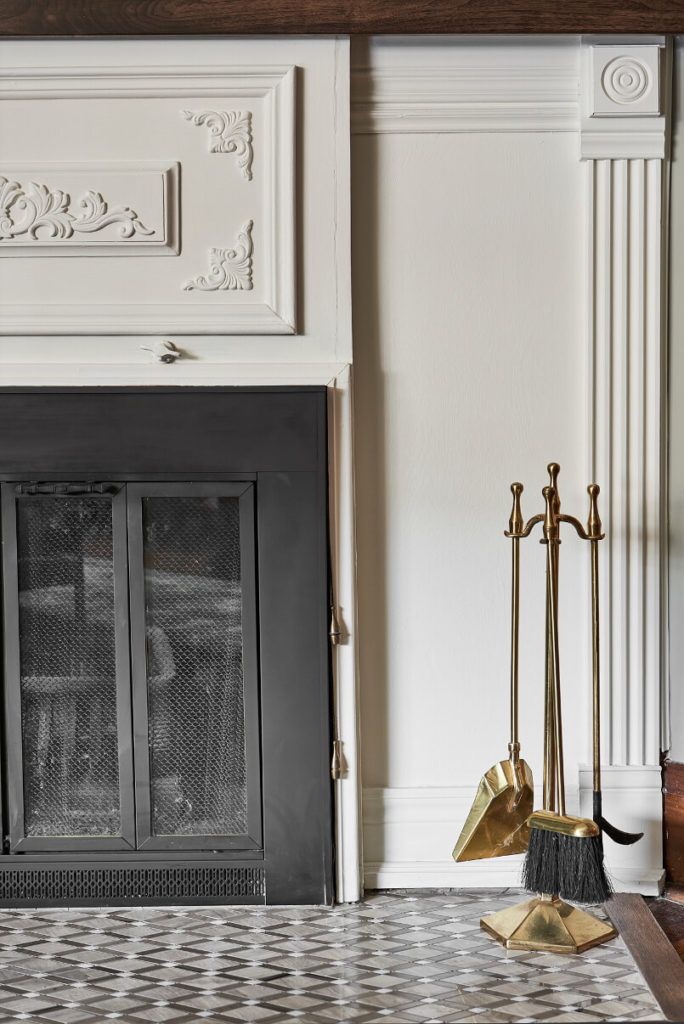
This fun fireplace floor tile that we used has warm tones that pair beautifully with White Dove.
Fabulous Colour Palette
You can see in this colour palette just how flawlessly all of these hues look together.
White Dove and Hale Navy pair nicely with Classic Gray and Sea Haze.
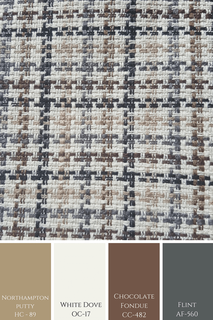
The pattern below shows a more masculine colour combination in various tones by Benjamin Moore.
A QUICK STORY
For this particular interior decorating project, it was quite tricky to choose a colour for the walls in the living room. Normally, specifying colour comes very easy to me.
In this case, however, I was initially a little unsure about using Sea Haze. Mainly because the colours that we used for many of the accents in the room such as pillow fabrics and in the area rug are what I like to refer to as ‘clean’ colours.
All three colours shown here with fabric swatches from my clients custom bench seat.
Sea Haze is a colour that I consider to be more ‘muddy’ or ‘dirty’. I almost never mix ‘clean and dirty’, but here it worked.
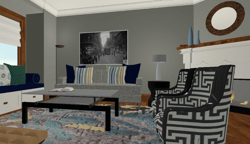
To double-check though, I was able to see this paint colour in our 3D rendering software designs that we did for our clients.
It’s not a perfect match because we are looking at it on a computer program, but it was enough to give me the confidence to give it the thumbs up and move forward with this colour.
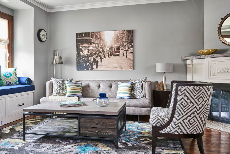
Ok, not perfectly matched with the after image shown below, but it gave me the confidence to go for it!
Walls are Sea Haze 2137-50 by BM, fireplace, trim and ceiling are White Dove.
Fireplace painted White Dove by Benjamin Moore.
Favourite Places to Use White Dove
As shown above, I love White Dove in either an entire room or as trim colour and also for custom millwork.
Below are graphics I designed, I just love creating these! I think they are pretty, do you?
Magazine Cover Graphic White Dove and Hale Navy Benjamin Moore
White Dove Magazine Cover Graphic
COLOUR CONVENIENCE
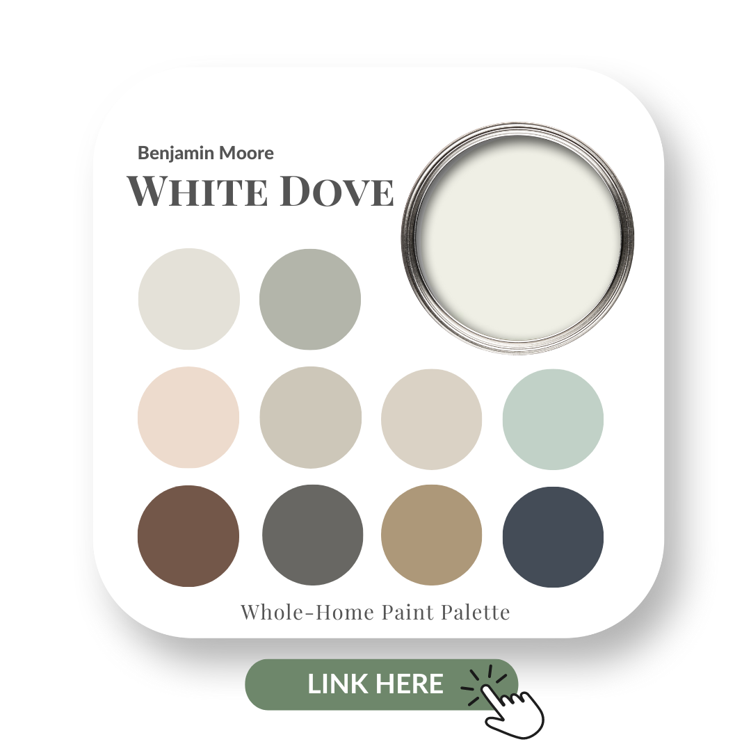
For more colour Claire-ity, I have created Perfect Colour Palettes to help you avoid making costly mistakes when it comes to choosing paint colours?
These paint colour guides are a super helpful resource to have on hand when trying to find a perfect palette for your next design or decorating project.
I LOVE HEARING FROM YOU!
If you’ve used a paint colour that I’ve reviewed or you want to ask a question, or even if you have a different point of view to mine, please do share!
Do you live locally in the Toronto or Burlington area? Contact me here to inquire about an in-person Colour Consultation.
For colour advice, please note that I can’t always give advice based on simply reading about a scenario.
If it were that easy for me to recommend the perfect paint hue without knowing more about the specific space; the lighting situation; what other fixed elements to consider etc, then I really would be even more magical than I already am. HAHA!
If you do not know who LuAnn Nigara is, where have you been?!!
LuAnn is a powerhouse & the incredible woman behind the highly successful (and addictive!) podcast, A Well -Designed Business. This #1 rated Interior Design Business podcast in Itunes, sees LuAnn interviewing fantastic guests from our industry, all of whom offer invaluable advice that will help any design professional looking to improve and advance their business.
LuAnn in her Podcast studio with her first book ‘The Making of A Well-Designed Business. Get her book here.
LuAnn and I met for the first time at the Wynn Hotel in Las Vegas Market in 2017. We fondly look back on this initially meeting with much laughter and animation during the uncut version of our video interview which you will see a little later in this post. Don’t scroll down just yet though, you need to hear the back story!
Since then, I’m thrilled to say that LuAnn and I have become very good friends. I have nothing but respect and admiration for her hard work ethic, her passion and for all that she does for Interior Designers.
I’ve also had the pleasure of being invited to be on LuAnn’s incredible podcast for two separate interviews.
In April of this year, I had plans to head to New York to do Maria Killams Colour Course for the second time. I knew LuAnn was located in New Jersey and I contacted her to ask if I could do an interview video with her for my YouTube channel.
Hey, she has interviewed so many people and brought so much insight to all of us, I figured it was time to learn more about the woman on the other side of the mic. I know you are curious too!
LuAnn happily accepted -YAY! She then in turn, asked me if while I was in town, did I want to speak at her Window Works Showroom for their monthly Lunch and Learn. Well, of course! And so, it was on.
At Window Works Lunch & Learn. From left to right: Kimberley, Sarah Danielle, LuAnn, Claire & Wendy Woloshchuk.
I ALSO GOT AN EXCLUSIVE TOUR OF LUANN’S PODCAST STUDIO IN HER HOME & A PEEK INTO HER CLOSET!!
You can see that, including how LuAnn prepares for her podcast interviews, where she finds inspiration and all of her Podcast Green outfits in the edited version of our video interview below.
Comment & tell me your favourite A-HA moment from my interview with LuAnn.
Okay, now for the un-cut, no holds barred version of our in depth discussion!
Get comfy and click on the video below to watch.
Behind the Scenes
We initially met up at LuAnn’s well established firm that she runs with her husband Vincent Nigara and Bill Campesi. When we greeted each other in the parking lot (like a couple of giddy teenage school girls!), we stayed there chatting for nearly an hour before finally moving inside.
And even then, that was only because my husband Chris was ushering us along. He has the patience of a saint, but realized that we could’ve easily been stood for another couple of hours in the hot sun. HAHA, #jokingnotjoking.
Out for dinner with our fabulous husbands, Vincent and Chris.
LuAnn is very easy to talk to, as you will already know if you listen to her podcast or have met with her in real life. Psst! If you’re not signed up to her podcast, you need to be. There is so much incredibly helpful information that you won’t want to miss an episode…here’s the link.
During the interview we have lots of laughs, but also hit on some real truths about the industry. Watch the video to hear our thoughts about designers not charging their worth and how the struggle to run a business is very real…but not impossible.
So this is what happened… it was hilarious!
The moment we realized that the camera over-heated!
Part way through the interview, we had to pause because the camera had actually over-heated! Yes, we talked A LOT! Stay tuned to the end of the video to see the exact moment when LuAnn and I were advised of this hilarious news!
My video interview with Luann is one you that will not see anywhere else – especially the edited version where we tour her home and podcast studio. It’s so inspiring to see how thorough she is in preparing for a guest interview, she is so orgainzed. It’s no wonder her and I are get along so well!
Stay tuned for my other video with LuAnn coming out in October.
WHAT I LEARNED FROM A WELL DESIGNED BUSINESS – THE BOOK
Coming in February is LuAnn’s second book, the much anticipated ‘What I learned from A Well Designed Business.’ This book is going to be like the bible for starting and running a successful interior design business. I’m super excited and thrilled to share that LuAnn has asked me to be included in her book!
It’s no suprise that my chapter is on ‘Managing Clients’ Expectations’. Look out for that to be released in February 2019. Don’t worry, I’ll keep you posted! 🙂
Got a question for me or LuAnn about our video interview or the book? Comment below and I’ll be sure to reply.
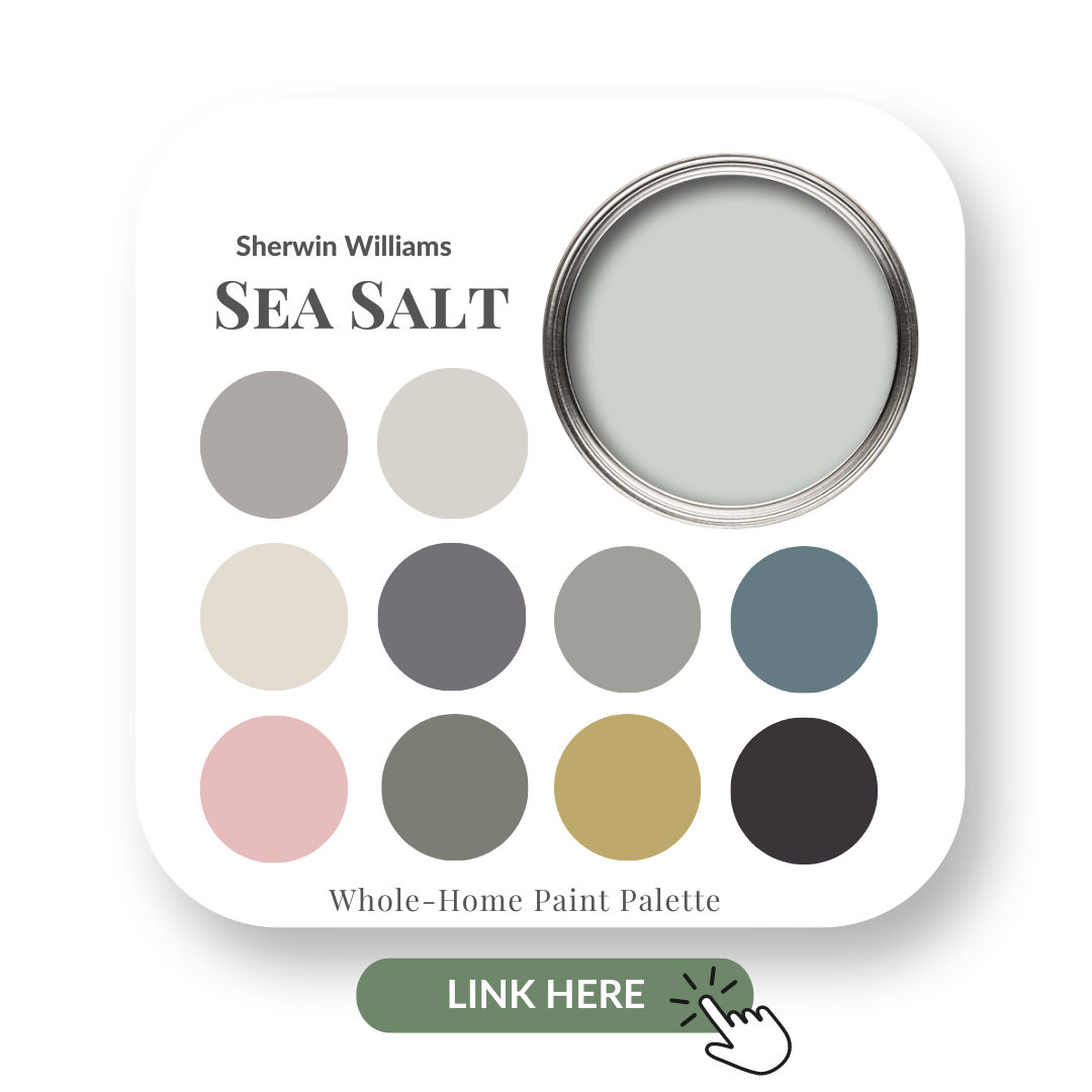
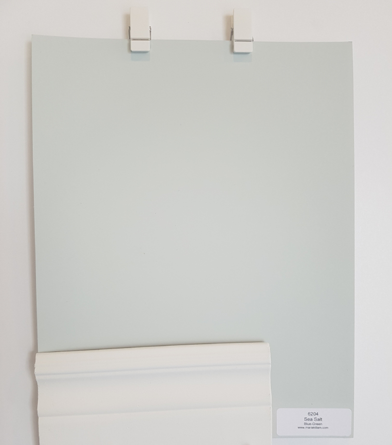
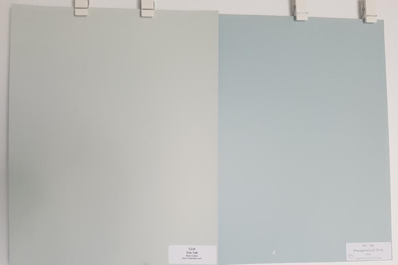
Be sure not to confuse this Sea Salt by Sherwin Williams with the Sea Salt by Benjamin Moore. They are entirely different. I’ll show you in my comparisons of both colours a little later in the post.
SEA SALT SHERWIN WILLIAMS
In this colour review video of Sea Salt by Sherwin Williams, I share:
The undertone of my featured colour
Colour comparisons in order to easily see the different colour tones
Best white paint colours for the trim and ceilings
Beautiful colour combinations to inspire you for your decorating project
After you watch the video, if you would like all this information conveniently laid out for you in one place and have even more paint colour combinations to use with Sea Salt, take a look at my Sea Salt Perfect Colour Palette.
A must-have for any colour enthusiast or design professional!
If you are new to me and my blog, here’s something you should know.
I like to strip down to the root of your Interior Design dilemmas and give you the information you NEED to know.
My goal is to make it as simple as possible and to have FUN in the process!
Yup, that’s me having fun. Life’s too short to be stressing over decorating your home. It’s all good, I’ve got you covered.
But know this: I am not scientific about colour.
I do not concern myself with the LRV of a paint colour. Since starting my Interior Decorating business in 2011 and doing many colour consultations, it’s never come back to bite me in the you know what.
I never make suggestions on lightening or darkening a paint colour by a certain percentage to make it more suitable for an application.
I can always find the best paint colours for my clients.
All of my large boards have been painted in a matte finish and if you are interested in knowing where to get these boards, I’ll share a link to them at the end of the post.
Sea Salt by Sherwin Williams Colour Review Video
Undertones: Blue/Green
In my office, Sea Salt appeared to look more green, but there is also a blue undertone.
This is where your lighting and other elements within your own space can alter the look of a hue like this.
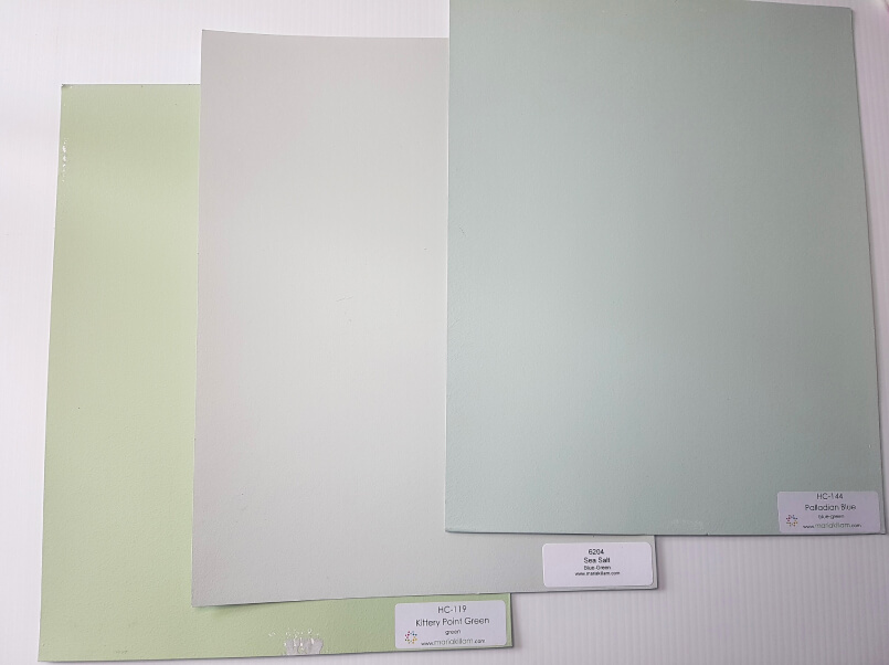
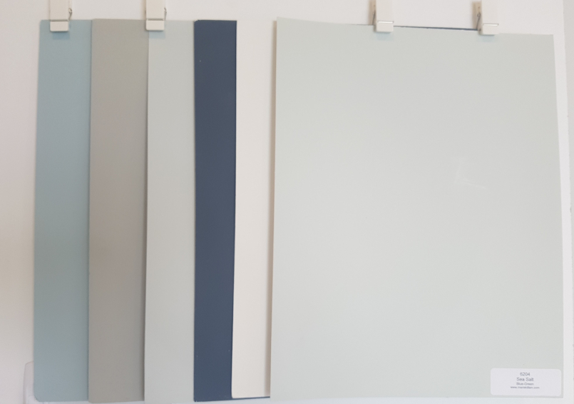
Colour Comparisons:
Kittery Point Green HC-119 & Palladian Blue HC-144
Comparing colour is so important. When you do colour comparisons, it helps you to get a better read of your focus colour. I also like to put my large colour boards up against a white background. This way, I can see the colour more clearly.
See below where I show you Kittery Point Green by Benjamin Moore (BM) on the left and Palladian Blue by BM on the right.
It’s interesting how much of a light gray tone Sea Salt takes on when you compare it with colours that are more saturated in tone.
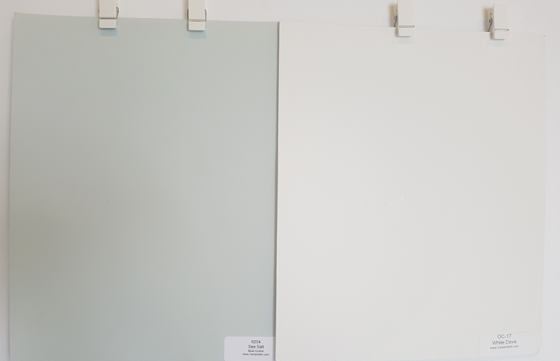
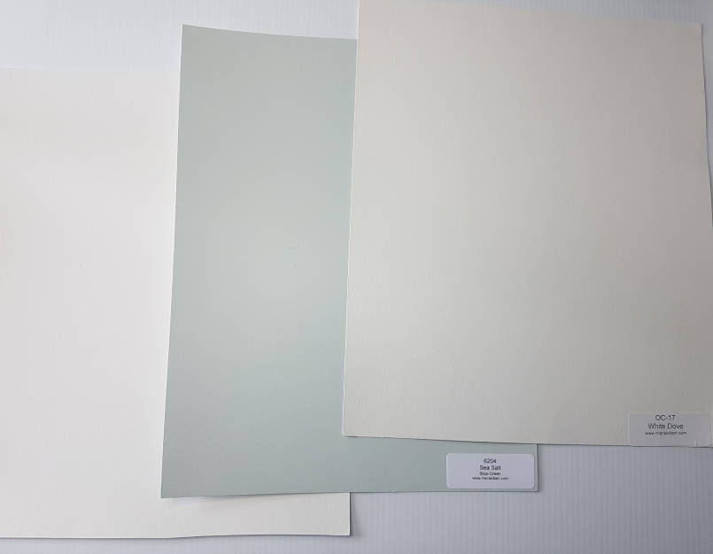
Best Whites To Pair with Sea Salt
White Dove OC-17 by Benjamin Moore
There is always going to be more than one option for the best white to use for ceilings, doors and trims.
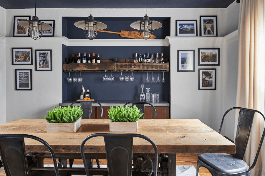
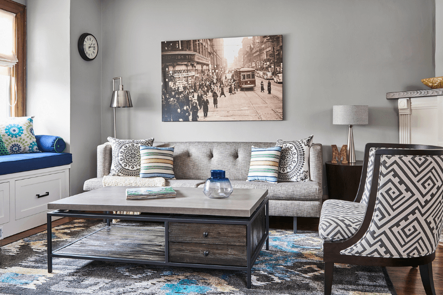
Hale Navy was used in the dining room in the alcove and the ceiling and White Dove on the walls.
We continued the flow into the living room repeating the Hale Navy shade in the bench seat and painted the walls, Sea Haze.
Before we get to even more pretty palettes, have you taken my Colour Quiz? See which Palette best suits your design style.
Fabulous Palettes – Perfect for Pinning!
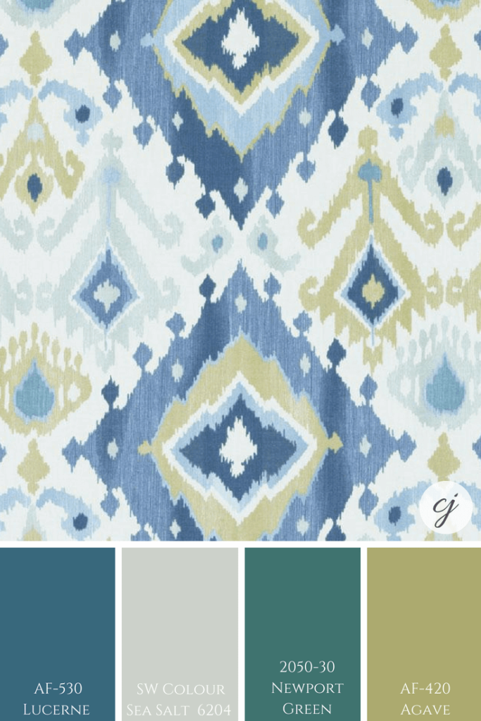
Sea Salt paired with BM’s: Lucerne; Newport Green & Agave
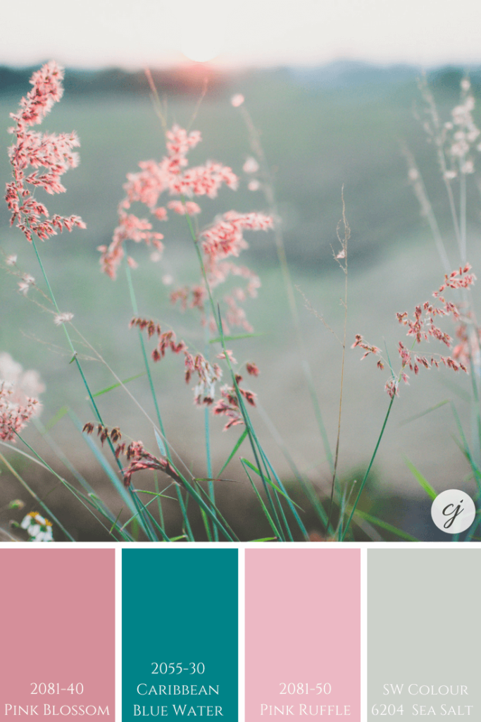
Sea Salt with BM’s Pink Blossom; Caribbean Blue Water & Pink Ruffle
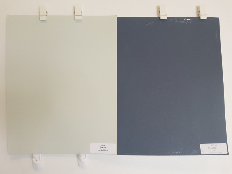
Sea Salt paired with BM’s Hale Navy; Early Morning & Montpelier
Fun Fact
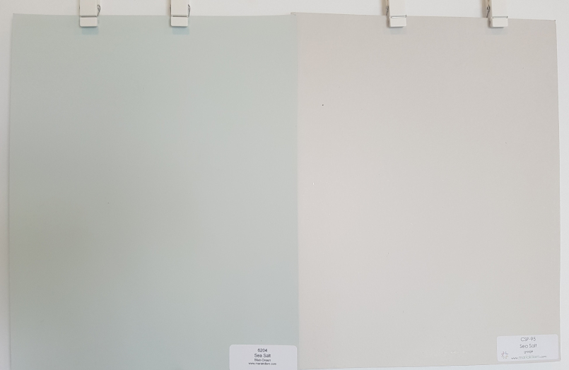
As already mentioned at the beginning of the post, there are two colours called Sea Salt. One is the Sherwin Williams colour I’m reviewing here and the other is from Benjamin Moore.
To ensure you avoid any mistakes of either picking up the wrong colour for yourself or for your client, (if you are an interior design professional or colour consultant) always write down the name AND the code once you select a paint colour.
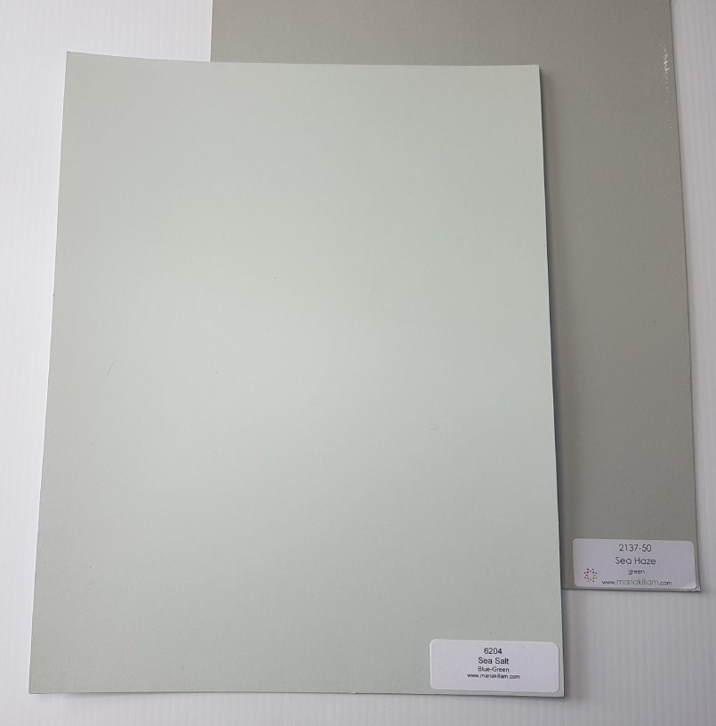
As you can see in the photo below, these two colours are very different. The Sea Salt by Benjamin Moore is a ‘Greige’ colour and the other Sea Salt…well, you know all about it now because we’ve just reviewed it!
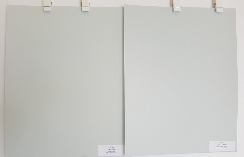
Similar to Sea Salt
Wickham Gray by Benjamin Moore is also a pretty blue-green and is similar to Sea Salt by Sherwin Williams. Here you can see where we used it in a clients custom living room design.
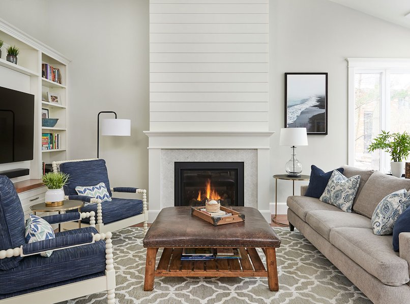
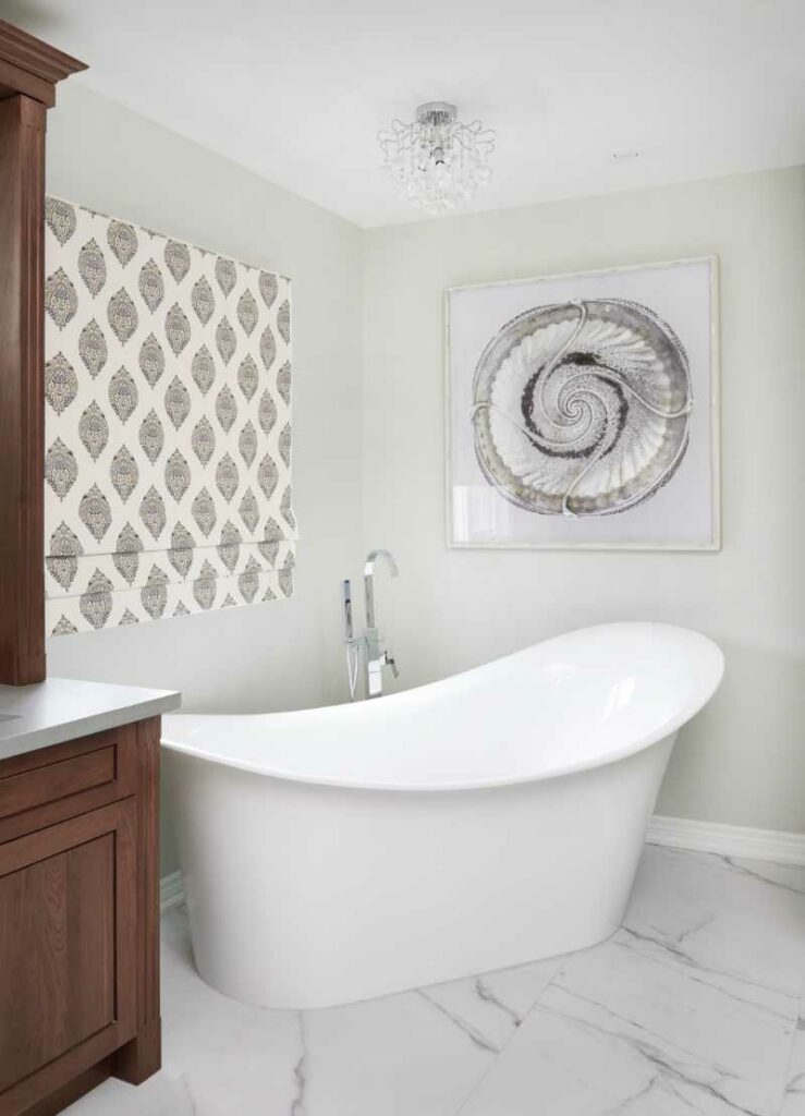
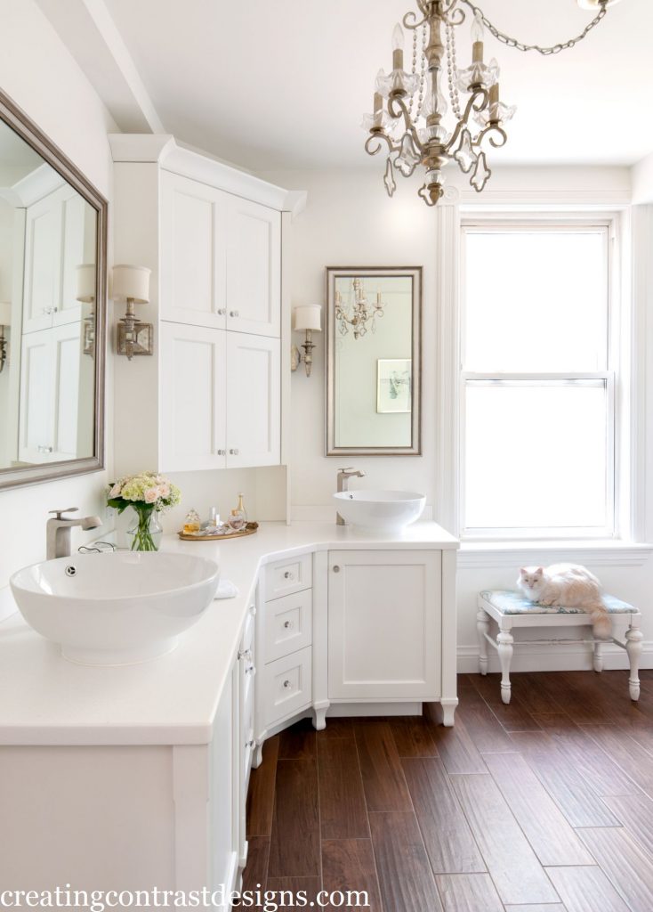
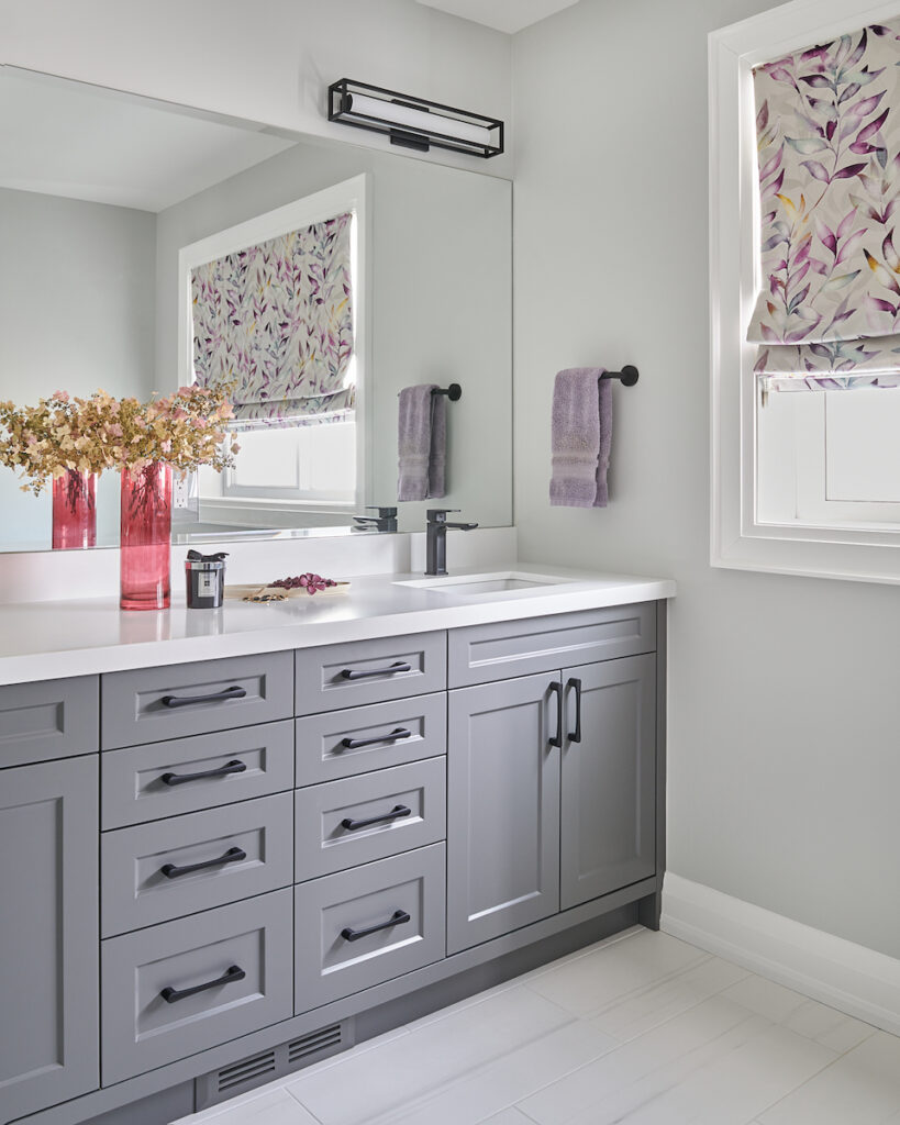
Gray Owl by Benjamin Moore is also a colour with a blue-green undertone. We used it here in a client’s bathroom.
Wall colour is Gray Owl by Benjamin Moore
We also used Gray Owl in this dental office.
Convenience At Your Fingertips
For more colour combinations that look fab with Sea Salt plus colour comparisons and best whites be sure to check out the Sea Salt Perfect Colour Palette.
See all colours in our Perfect Colour Palette library here.
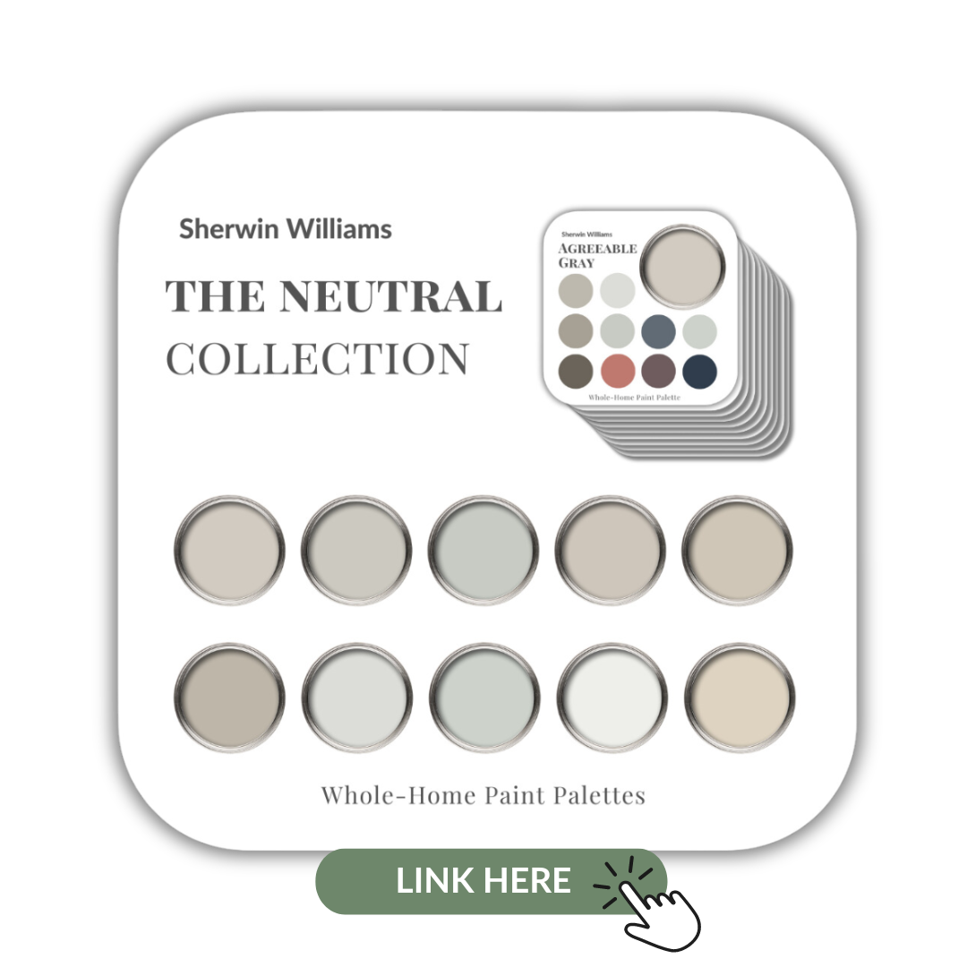
I’ve also included Sea Salt in my Sherwin Williams Neutrals Collection. This collection of 10 popular Sherwin Williams neutrals is a great resource and deal.
Remember, it only takes one mistake to take your home decorating project from divine to disaster. Don’t let the paint be what stresses you out!
Take my Colour Quiz and discover your Perfect Colour Palette.
Claire's Guide to Services & Pricing
FREE DOWNLOAD:
Interior Design Services and Rates Guide
This website uses cookies to improve your experience while you navigate through the website. Out of these cookies, the cookies that are categorized as necessary are stored on your browser as they are essential for the working of basic functionalities of the website. We also use third-party cookies that help us analyze and understand how you use this website. These cookies will be stored in your browser only with your consent. You also have the option to opt-out of these cookies. But opting out of some of these cookies may have an effect on your browsing experience.
Necessary cookies are absolutely essential for the website to function properly. This category only includes cookies that ensures basic functionalities and security features of the website. These cookies do not store any personal information.
Any cookies that may not be particularly necessary for the website to function and is used specifically to collect user personal data via analytics, ads, other embedded contents are termed as non-necessary cookies. It is mandatory to procure user consent prior to running these cookies on your website.