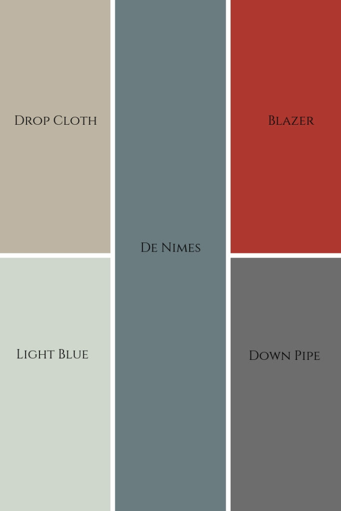
Neutrals are great and they definitely have a place in interior design and decor, but bold colours are so much more exciting, aren’t they?
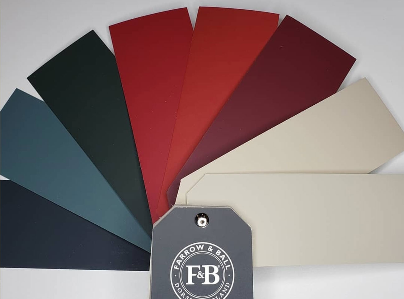
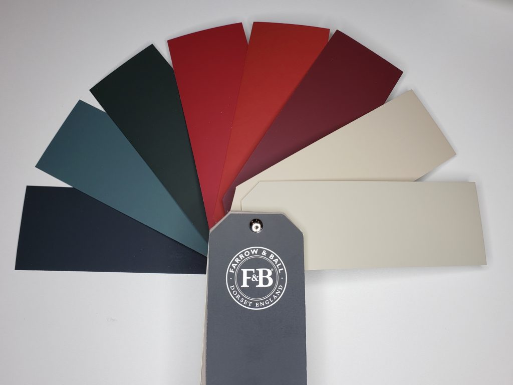
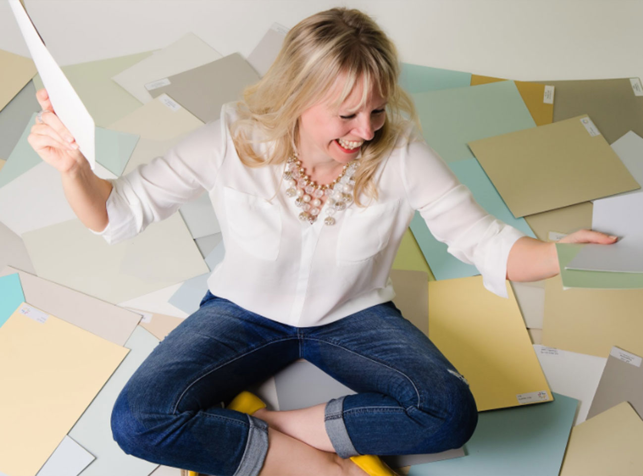
I’m doing another unboxing video, it’s becoming one of my favourite things to do! This time I’m opening up a brand spanking new set of Maria Killam’s painted boards of her VIP Collection.
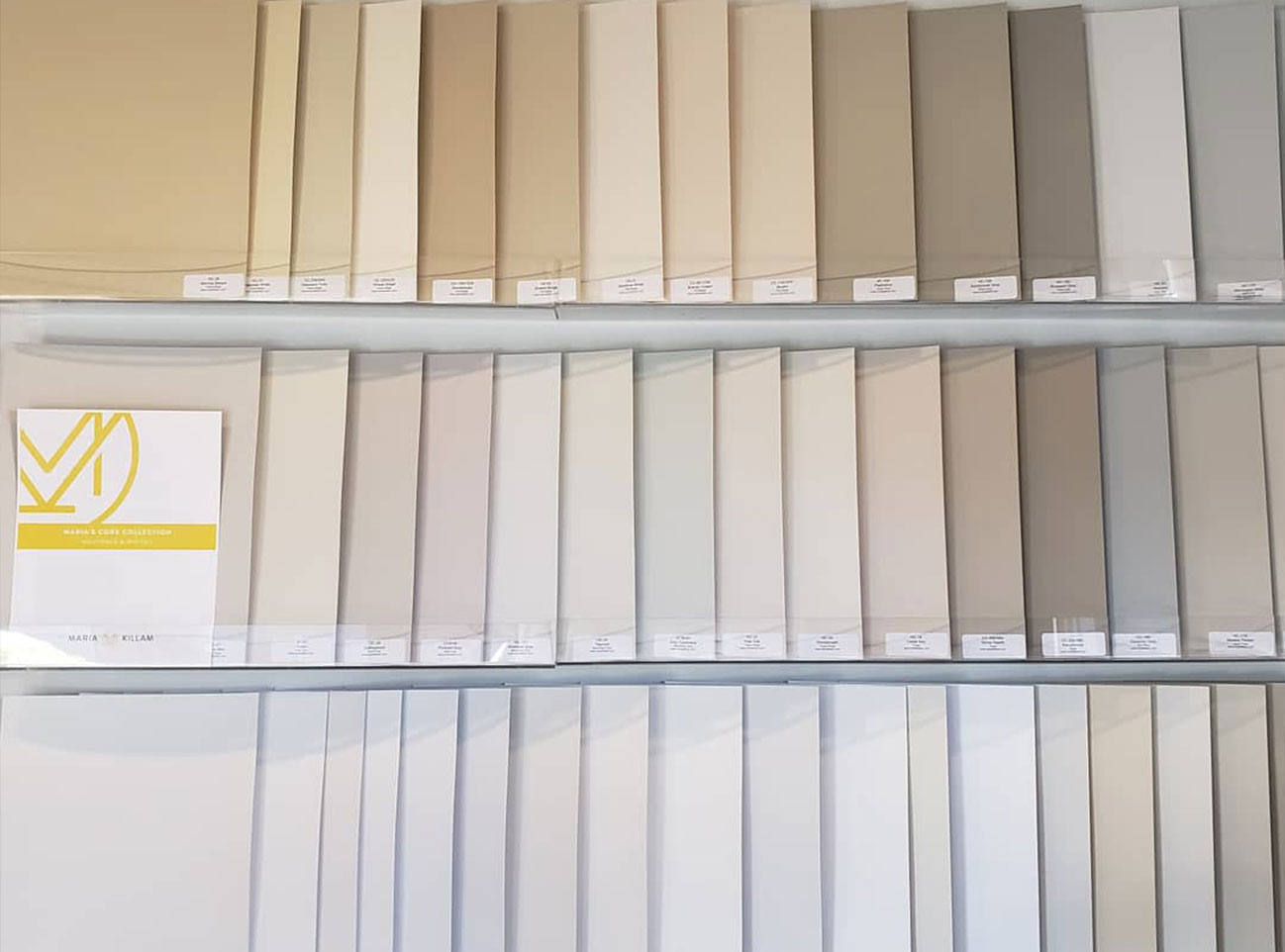
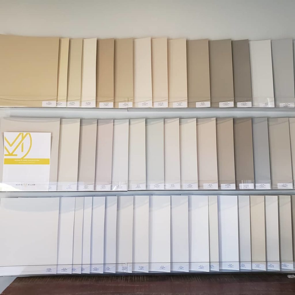
This is another fabulous set of 50 large colour boards, but this collection is a selection of Maria’s favourite neutrals, colours and darks from Benjamin Moore.
Love my large painted colour boards and want your own set?
See below for links to each specific set.
➜ Click here to shop the large colour boards now!
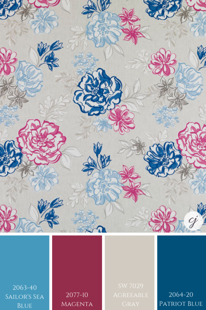
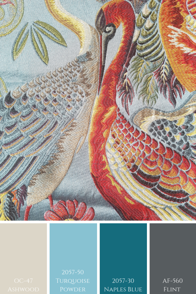
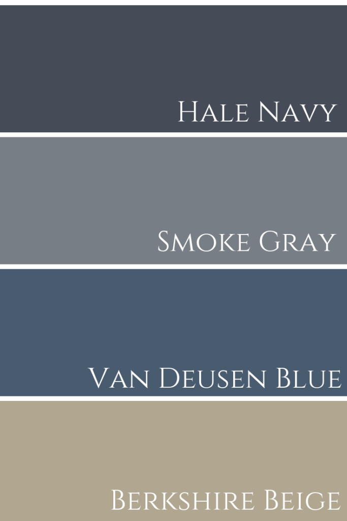
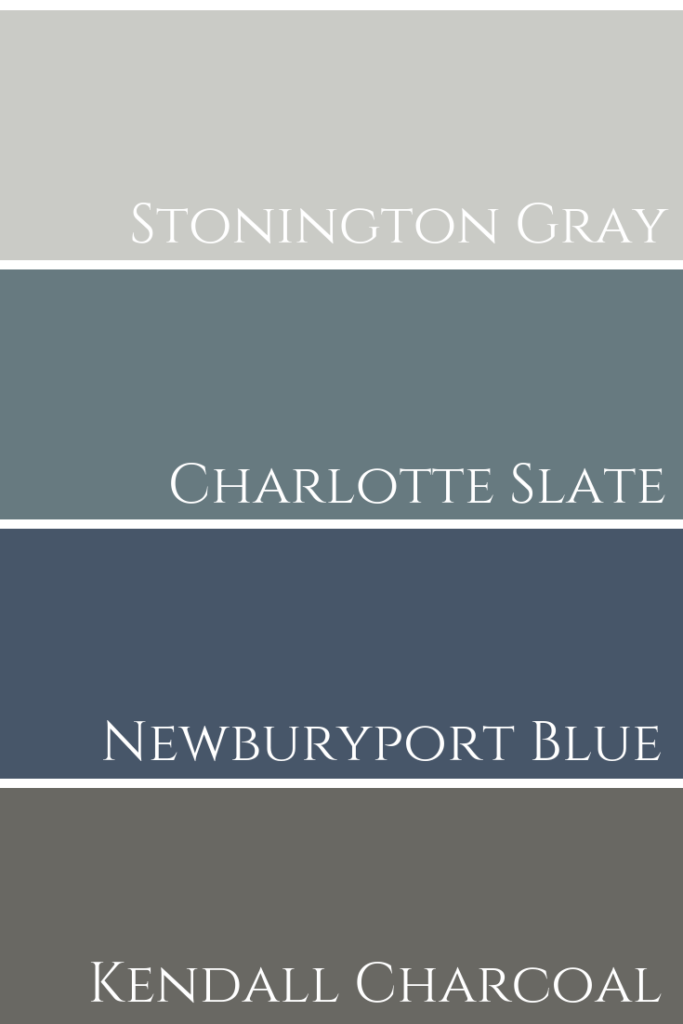
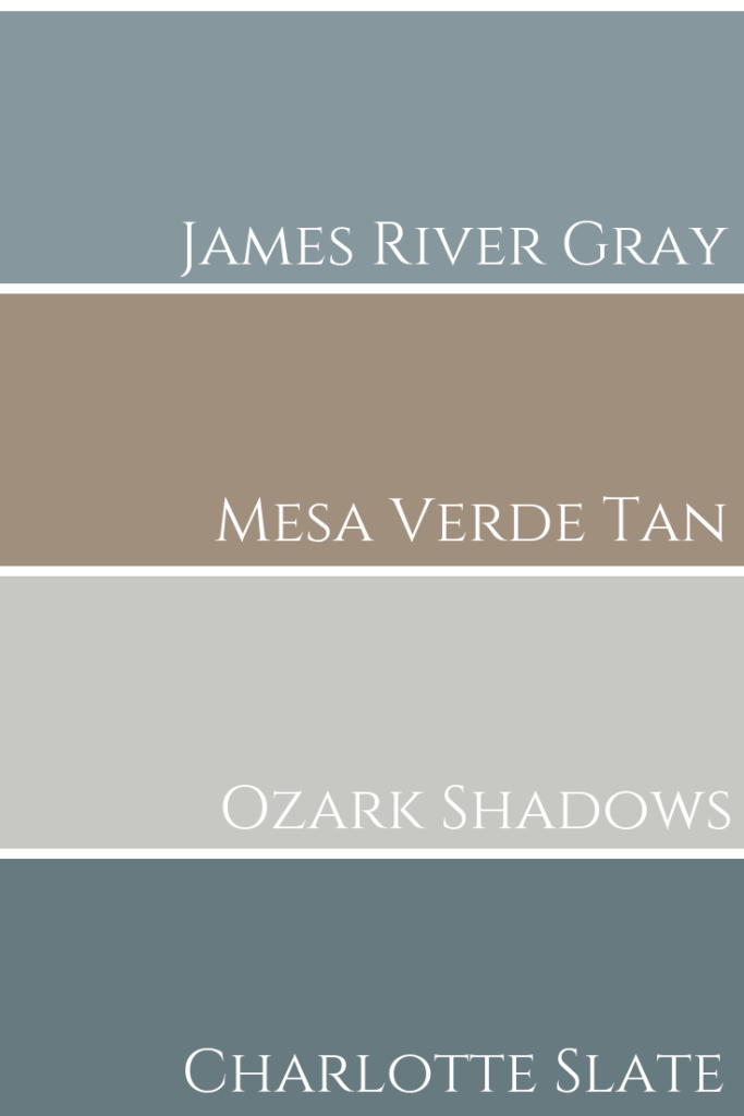
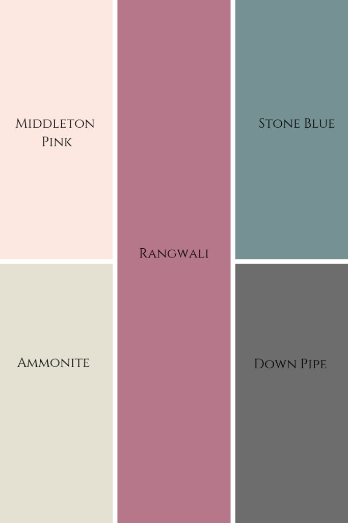
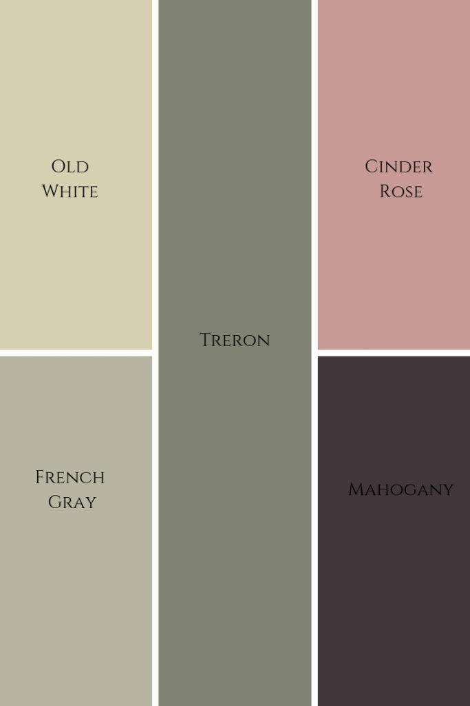
VIP Collection
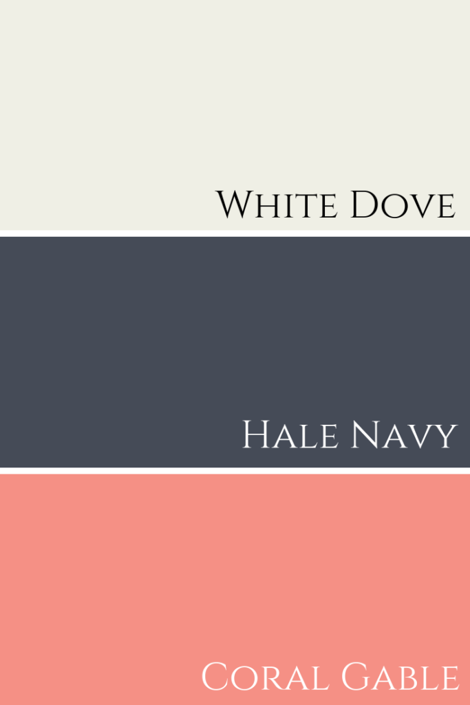
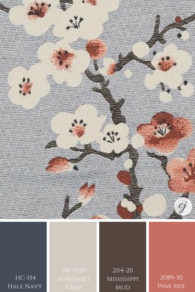
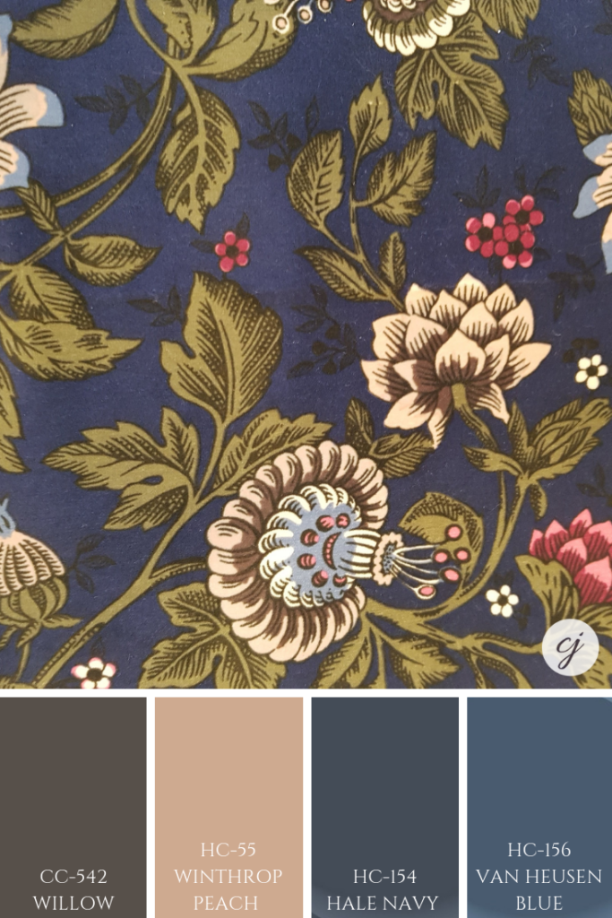
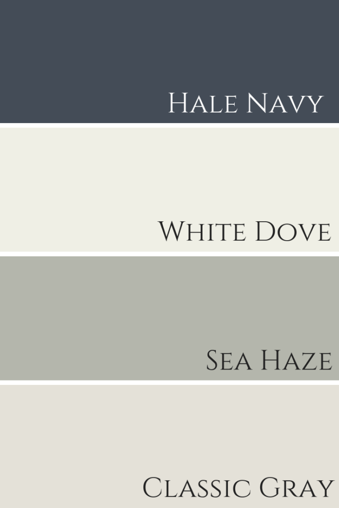
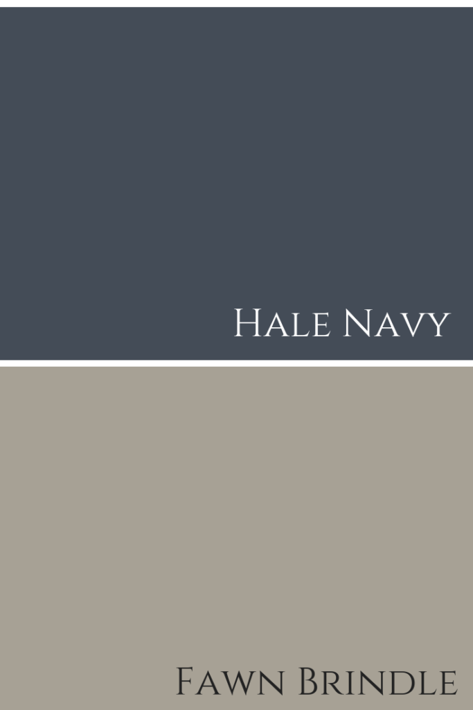
In this collection, there are colours such as Hale Navy (a personal fav of mine!), Classic Gray and Flint. Below are interior decorating projects where I’ve used all of these colours.
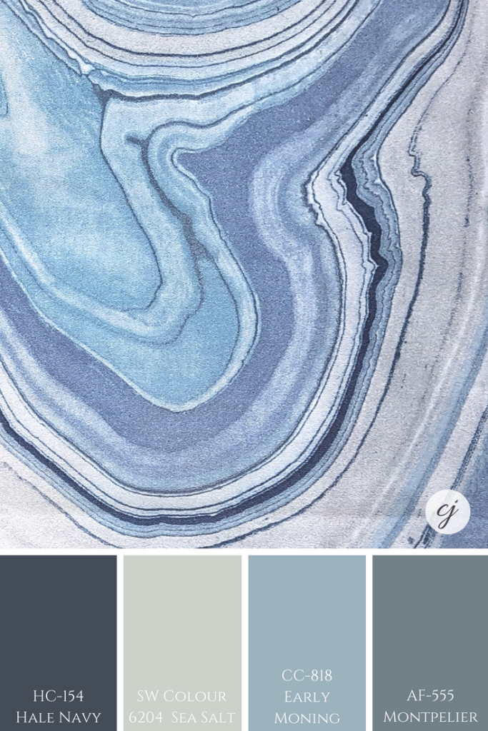
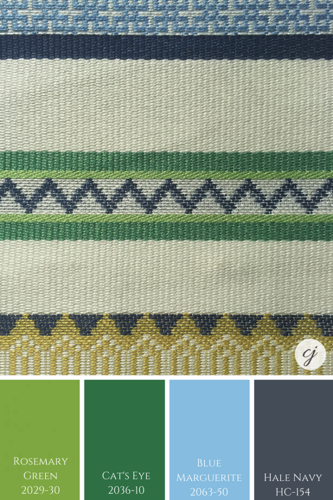
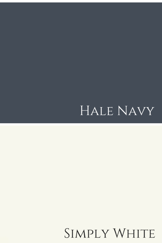
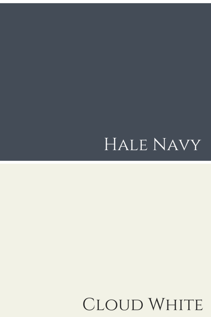
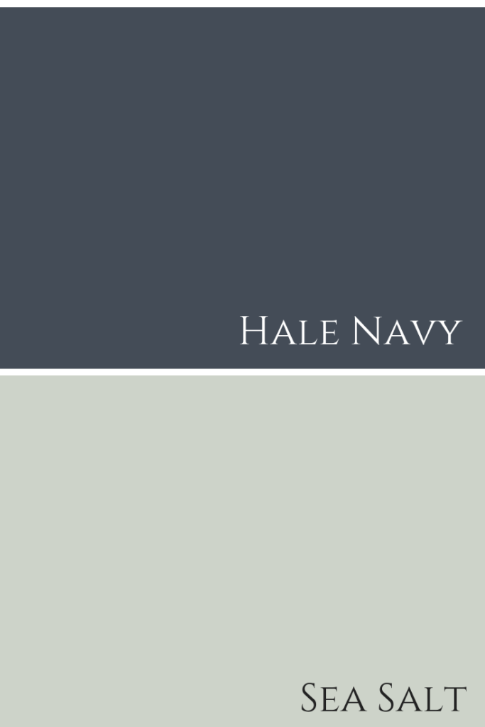
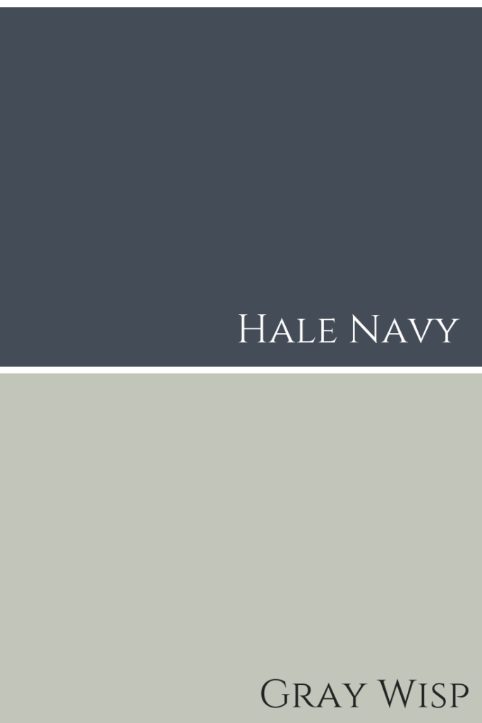
HALE NAVY
I did a colour review of Hale Navy that you can check out here.
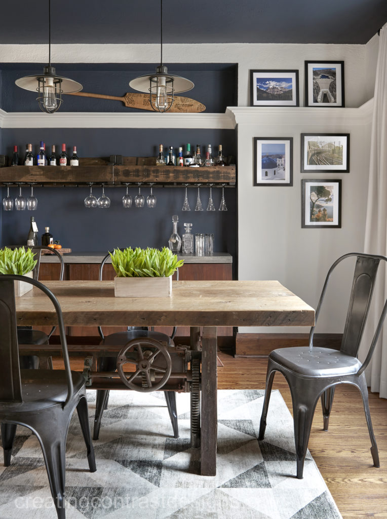
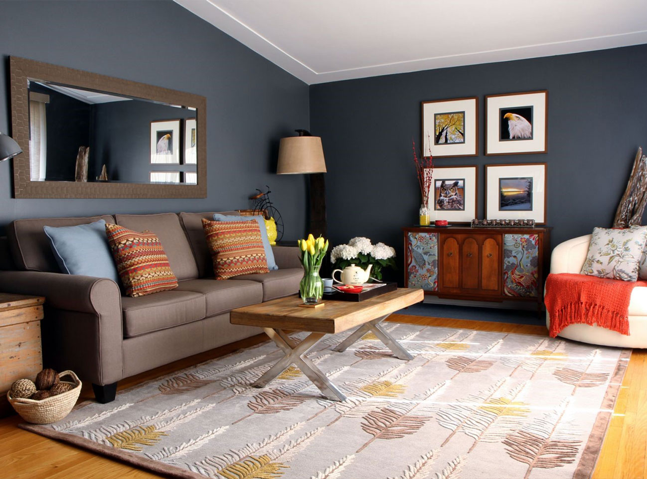
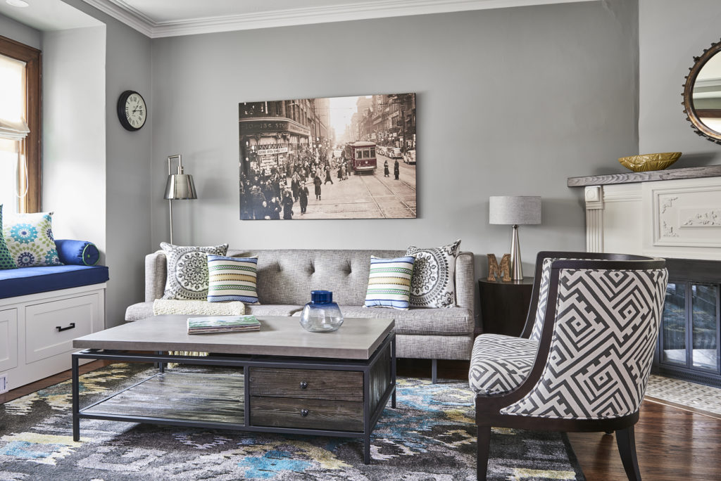
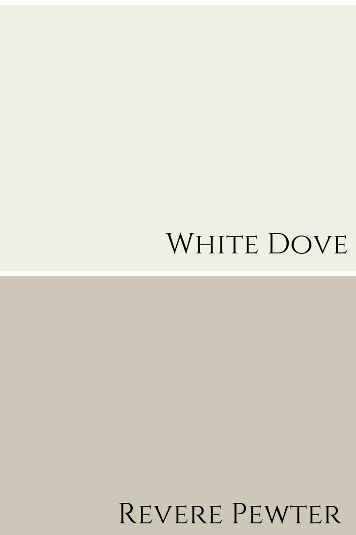
The dining room above was painted White Dove with the niche wall and ceiling painted Hale Navy.
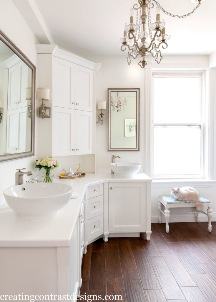
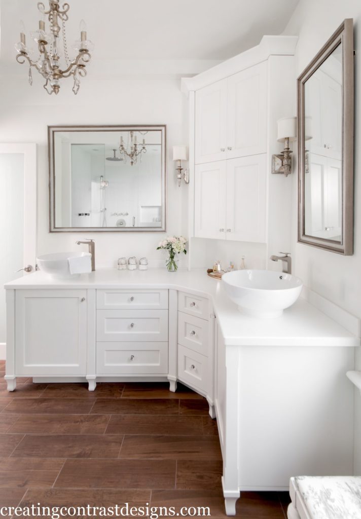
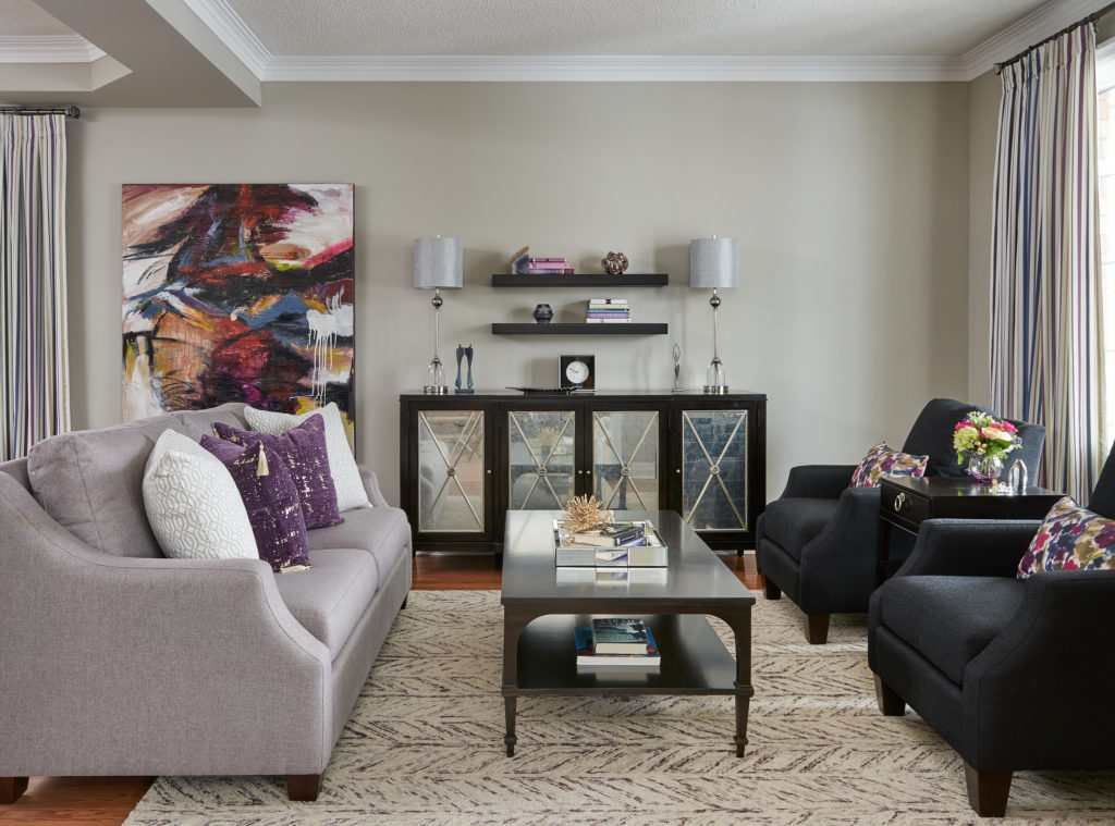
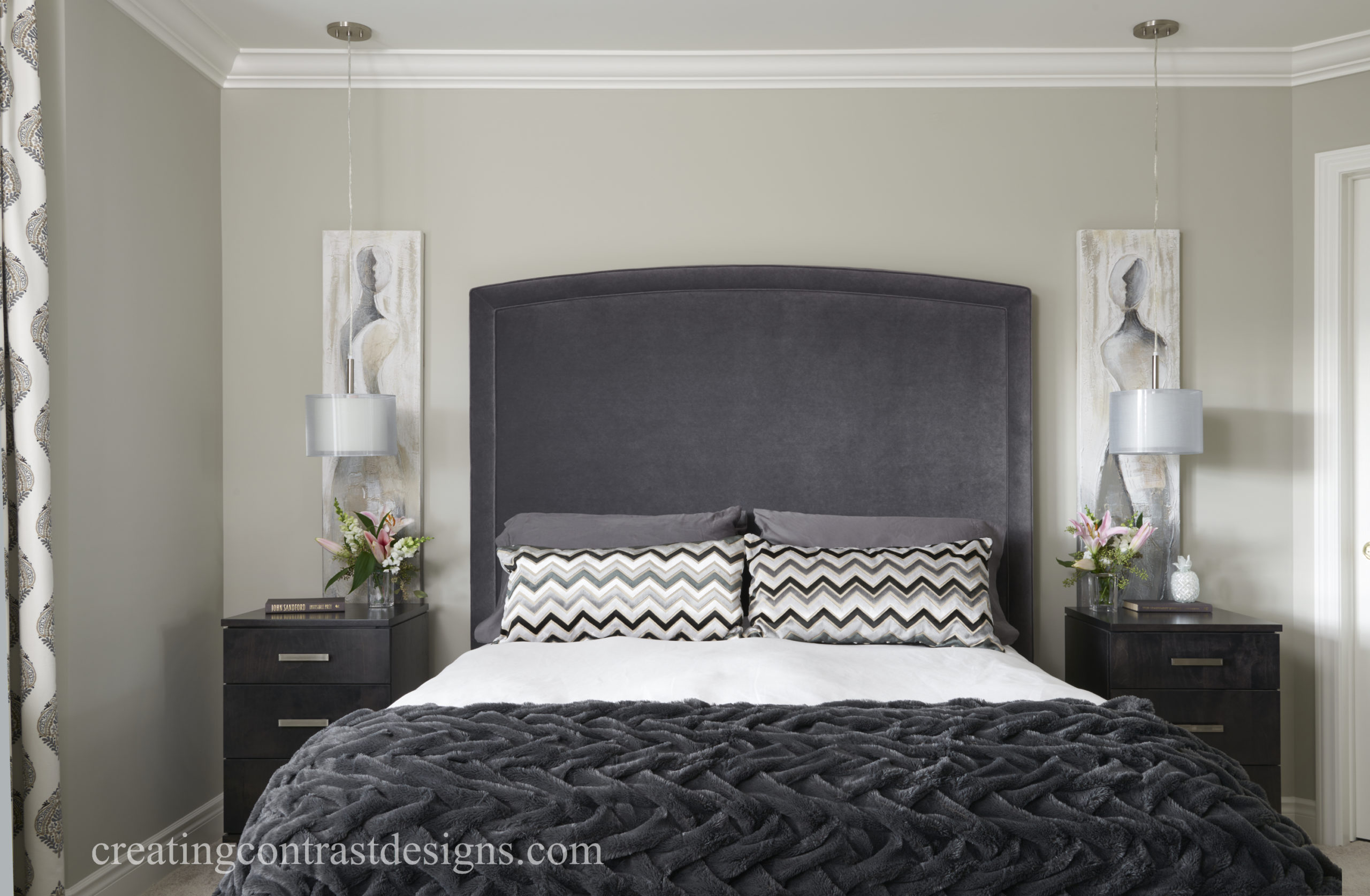
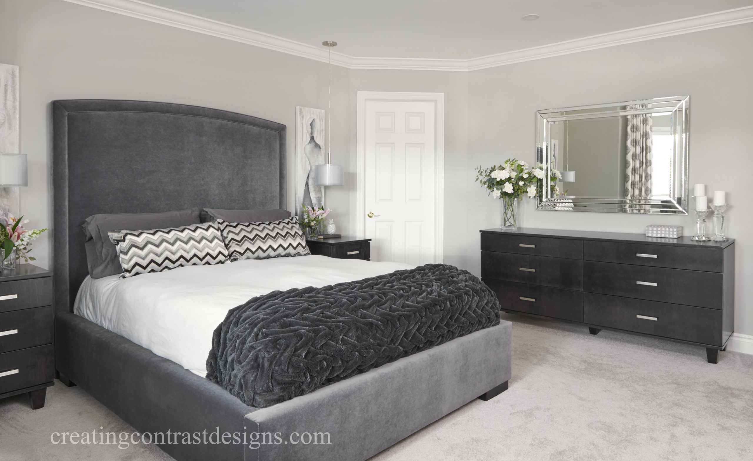
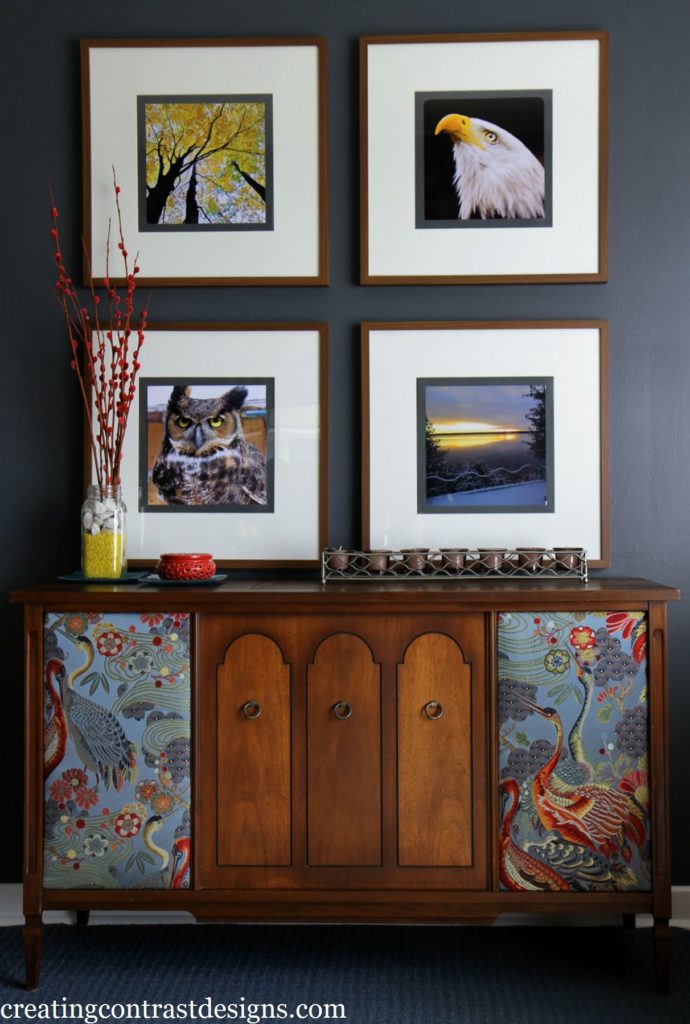
HALE NAVY & CLASSIC GRAY
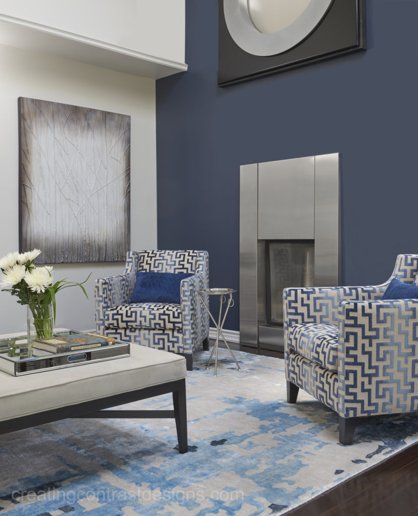
The above photos were taken by Stephani Buchman Photography.
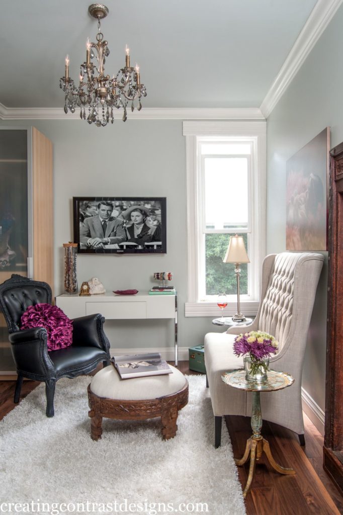
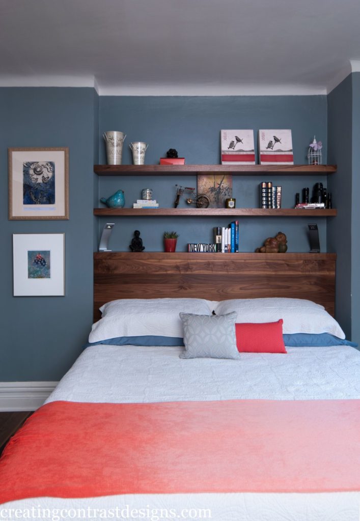
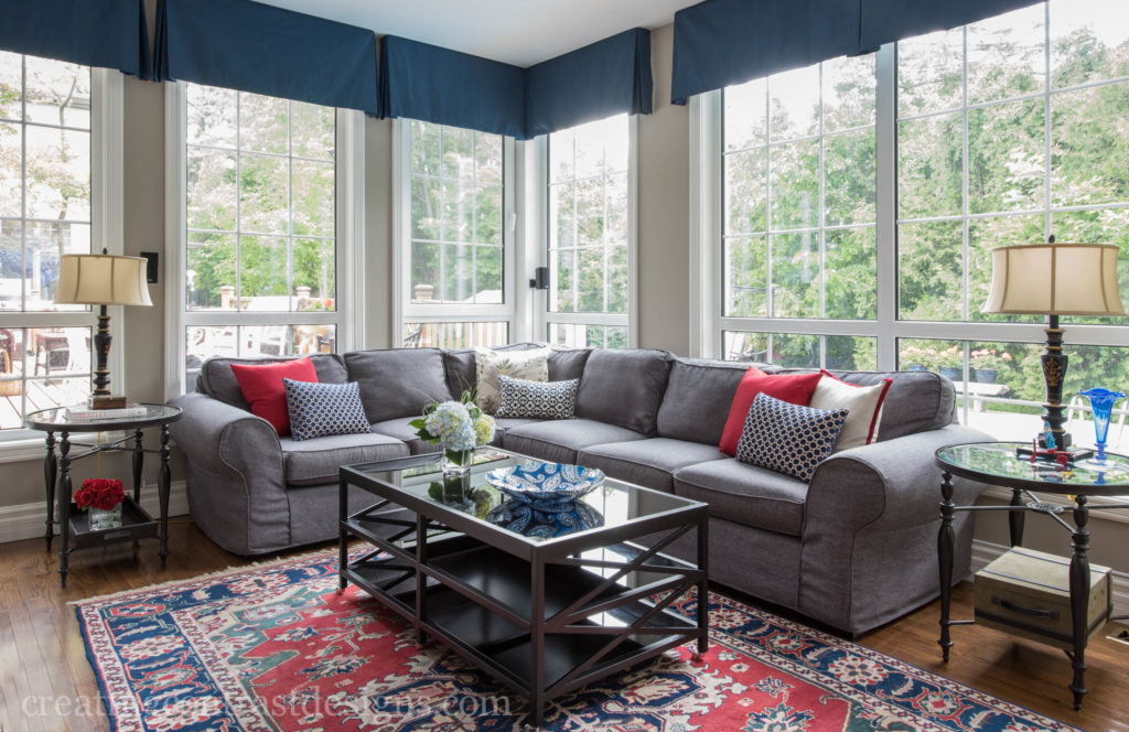
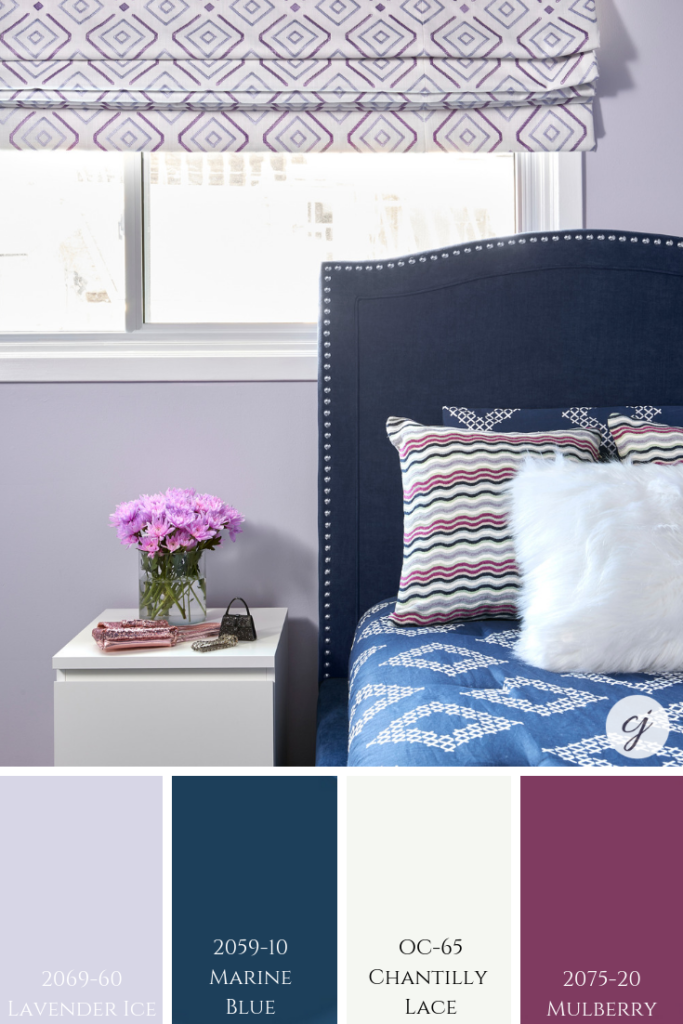
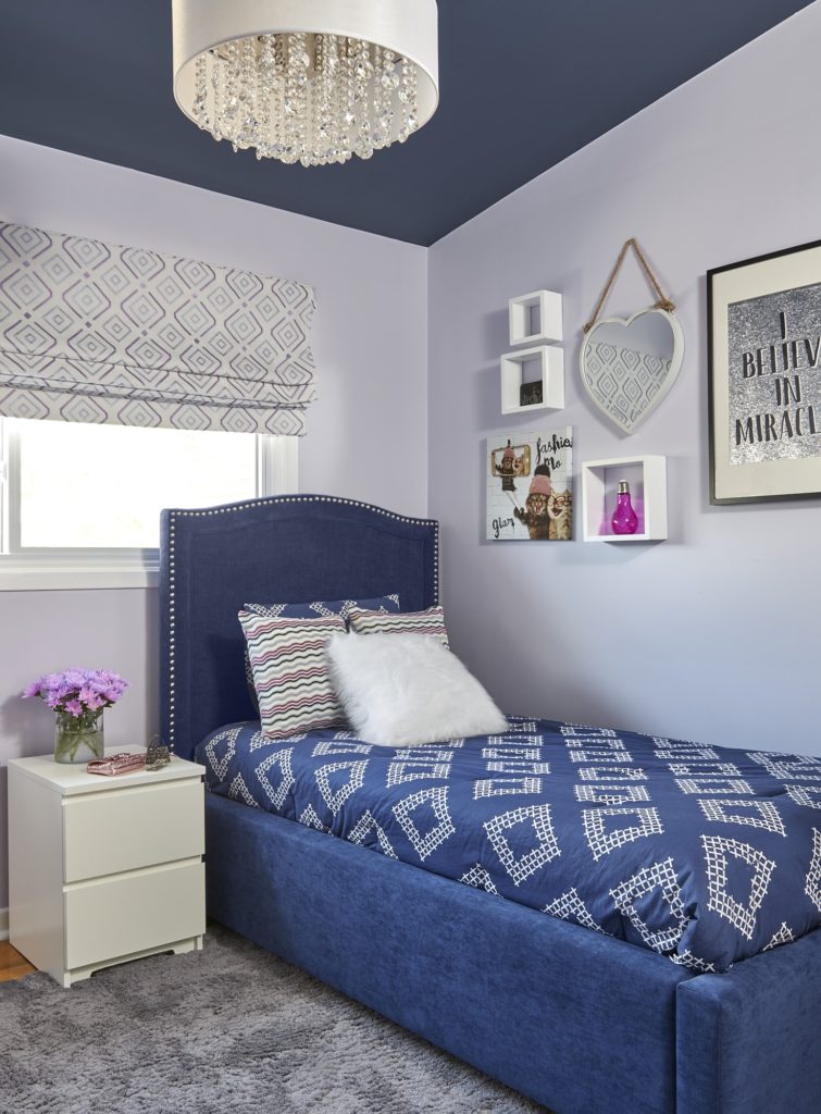
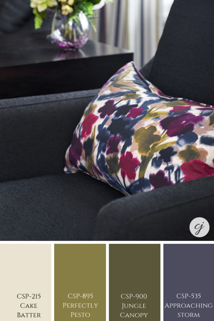
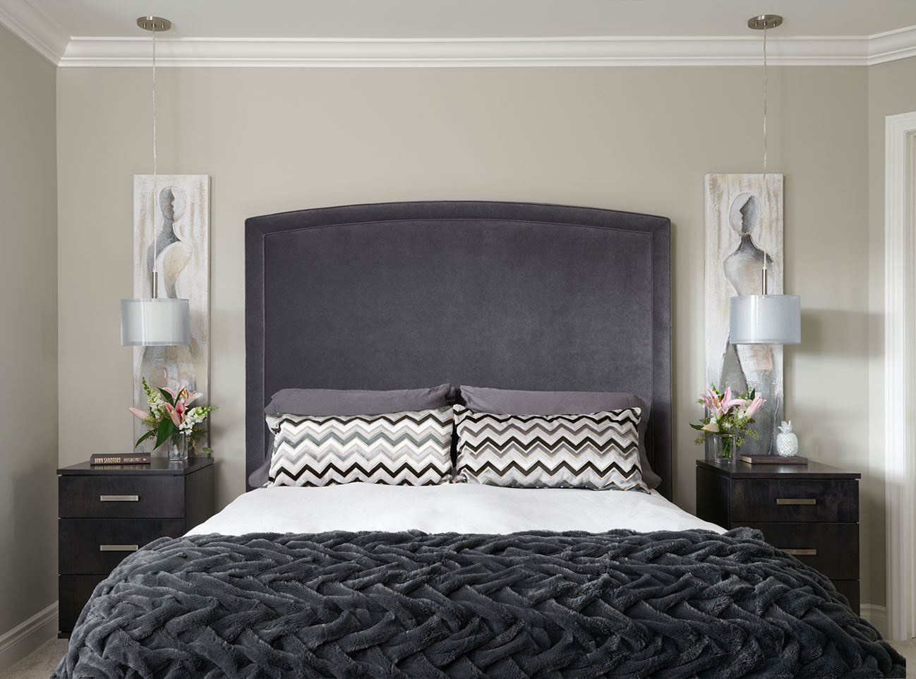
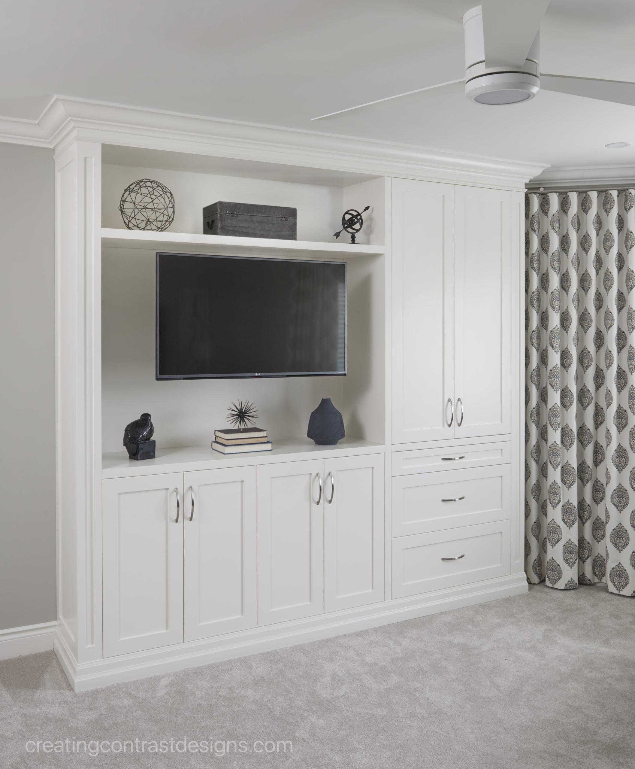
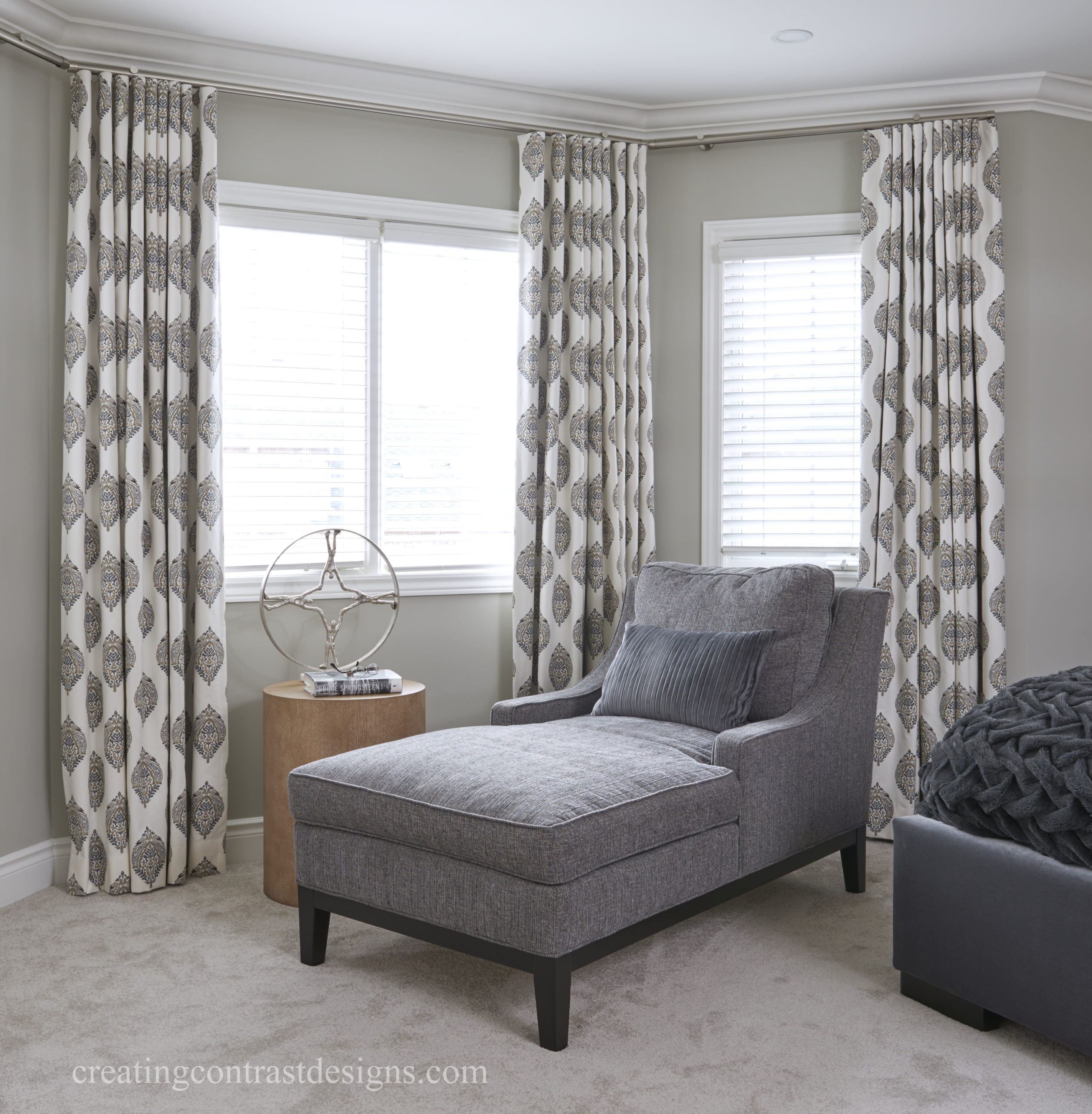
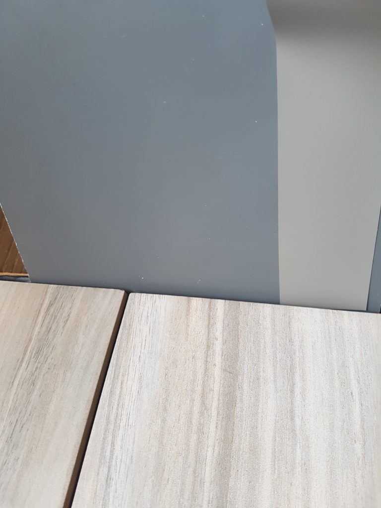
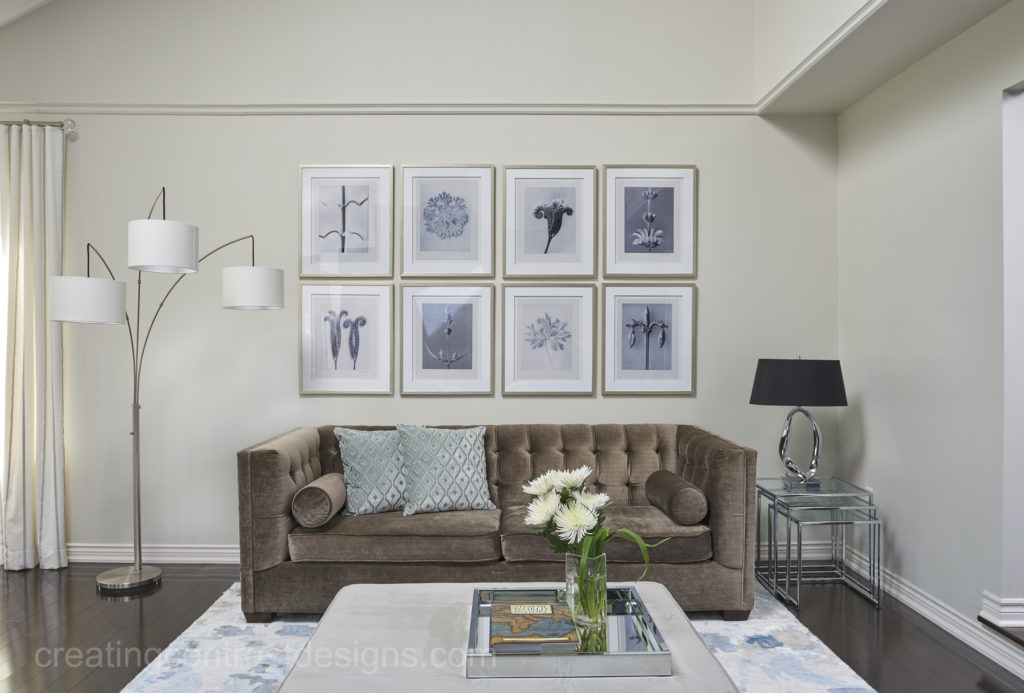
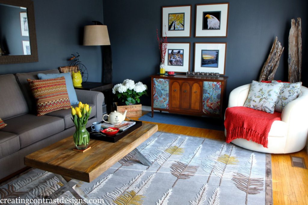
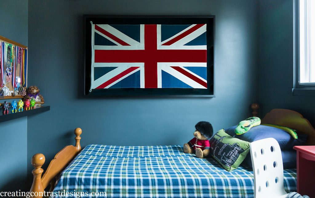
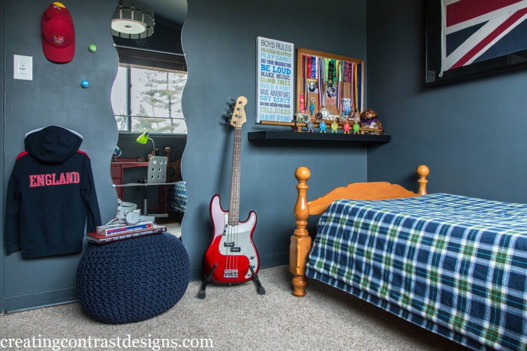
FLINT
These two rooms are both in my own home. The first is our living room and the second is my son’s bedroom.
To gain even more colour confidence, Maria also teaches her systems on understanding undertones all across North America. I attended her Colour workshop in 2012 for the first time and then again in 2018.
Not only is investing in this hands-on workshop fabulous for gaining confidence in specifying colours, but the course is also a wonderful opportunity for networking and meeting other colour enthusiasts from all around the world.
I recently interviewed Maria about her colour course. If you are thinking about attending her class, watch the video here to learn more about what’s involved.
Follow Maria’s outstanding and always helpful colour blog here.
Do you already have these colour boards? Comment below or ask me anything by sending me a DM on my Instagram account here.
Claire Jefford xox
Convenience at your fingertips
Remember, it only takes one mistake to take your home decorating project from divine to disaster. Don’t let the paint be what stresses you out!
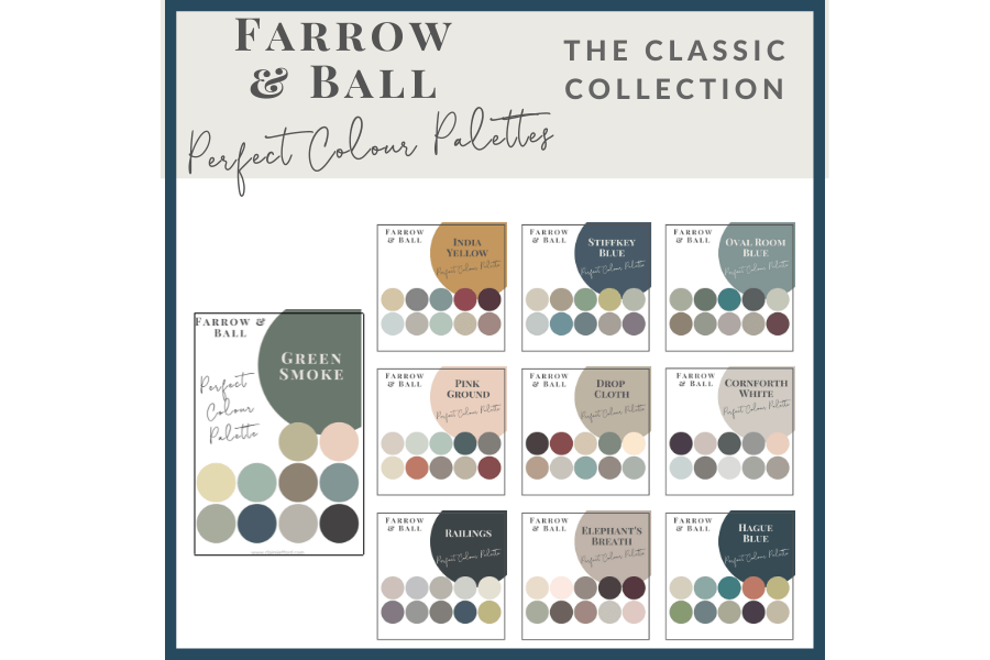
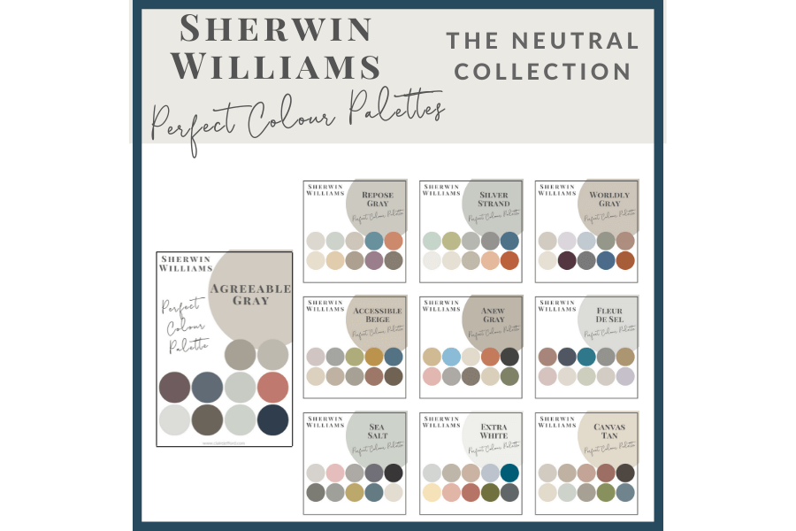
Choosing Paint Colours
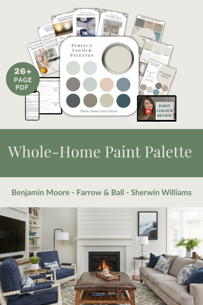
If you struggle with choosing paint colours, be sure to check out my Perfect Colour Palettes.
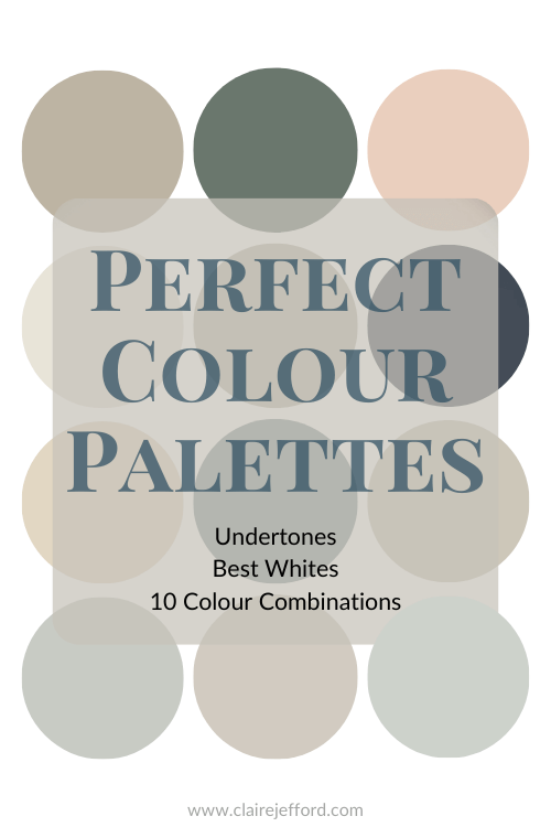
I now have 40 individual guides to help inspire you.
Collections
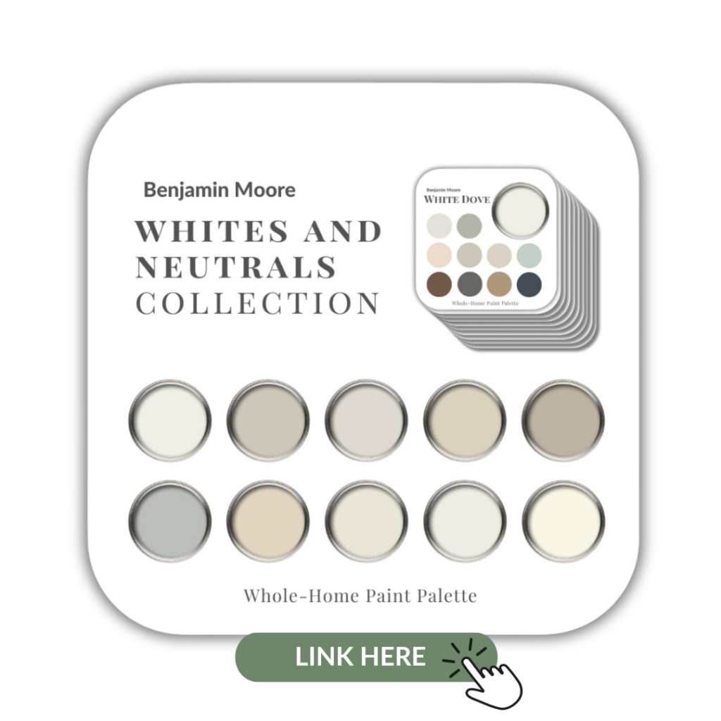
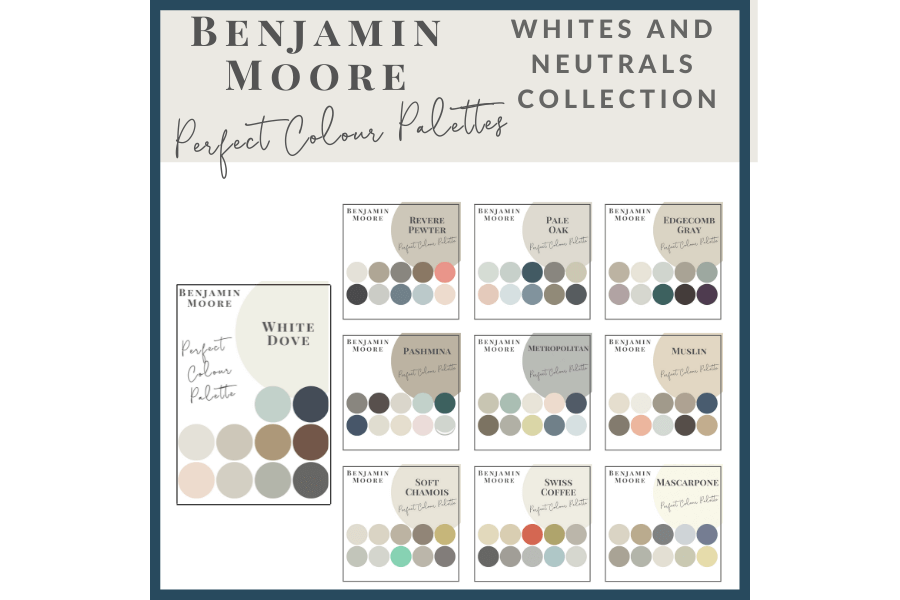
I also offer some fabulous Benjamin Moore Collections.
The first with 10 of the most popular whites and neutrals.
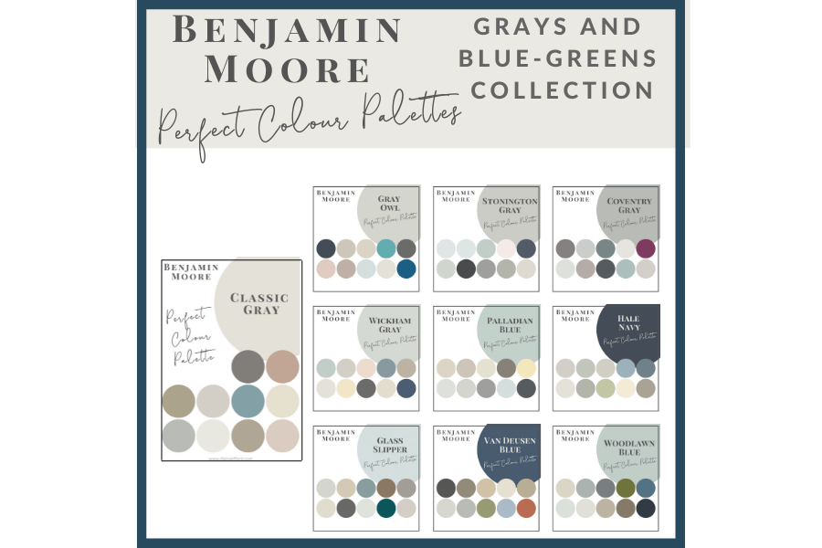
I also have a collection of 10 grays and blue-greens from Benjamin Moore
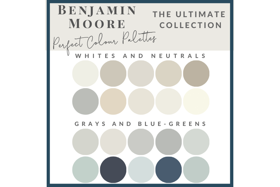
And the Ultimate Collection includes all 20 of these Perfect Colour Palettes in one handy spot.
Psst! Love Colour? Take my new colour quiz to determine which colour palette suits you best!

// DISCLOSURE: Thank you for trusting me with my truthful and reliable opinion on any future purchase you may make. I always disclose affiliate or sponsored information when it is the case. If you purchase Maria’s boards, I will earn a small commission from the sale. This doesn’t affect you in any way, the price remains the same regardless. Thank you for supporting me and entrusting me to be your go-to for all things Colour and Interior Design!