Click on the video below to watch the podcast interview.
Prefer to listen on the go? Click here to download this episode.
One of the most difficult aspects of being an interior design professional is knowing how to work with family and friends who will inevitably ask for your advice or need your help.
Do you charge them for your interior design services?
What about when you’re at an event and a friend or family member wants to ‘pick your brain’ about their latest home decor project? Do you stick to your processes? How do you communicate your terms?
Understanding how other interior design professionals have handled working with family and friends can help you to navigate similar situations.
From left to right: Karin Bennett, Claire Jefford and Joanne Jakab
Hear Karin, Joanne and I discuss our real-life experiences. Joanne will share the single most important question that she asks clients who pass her a referral, and Karin tells us how a friendship was forever ruined after doing design work for them without proper processes in place.
Joanne Jakab is a well-known award-winning local designer specializing in residential interiors. She helps busy professionals and their families to design and renovate their home so they can live the life they truly desire.
Clients who had initially felt overwhelmed truly appreciated her proven track record for sorting through the myriad of options and creating a cohesive design plan. Identifying the key elements that will take them from standard design to extraordinary concept on time and on budget since 1999. Joanne resides with her family in Burlington, Ontario and has just announced her retirement.
Karin Bennett Designs is a full-service design firm specializing in large scale remodels and new builds. She believes in designing a home that is both functional and stylish. Karin has been married for 18 years and is a busy mom of three teenagers and two sweet dogs. Karin grew up with parents that are modern-day House Flippers. Her mom was a designer and realtor who loved to fix up homes and move on to the next challenge, so renovating and designing homes is in Karin’s blood. I invite you to visit Karin’s website, it’s gorgeous and so is her Instagram account.
See all my podcast episodes here. New episodes are published every other Friday!
Free Resources
A fabulous FREE resource to help excel your interior design business.
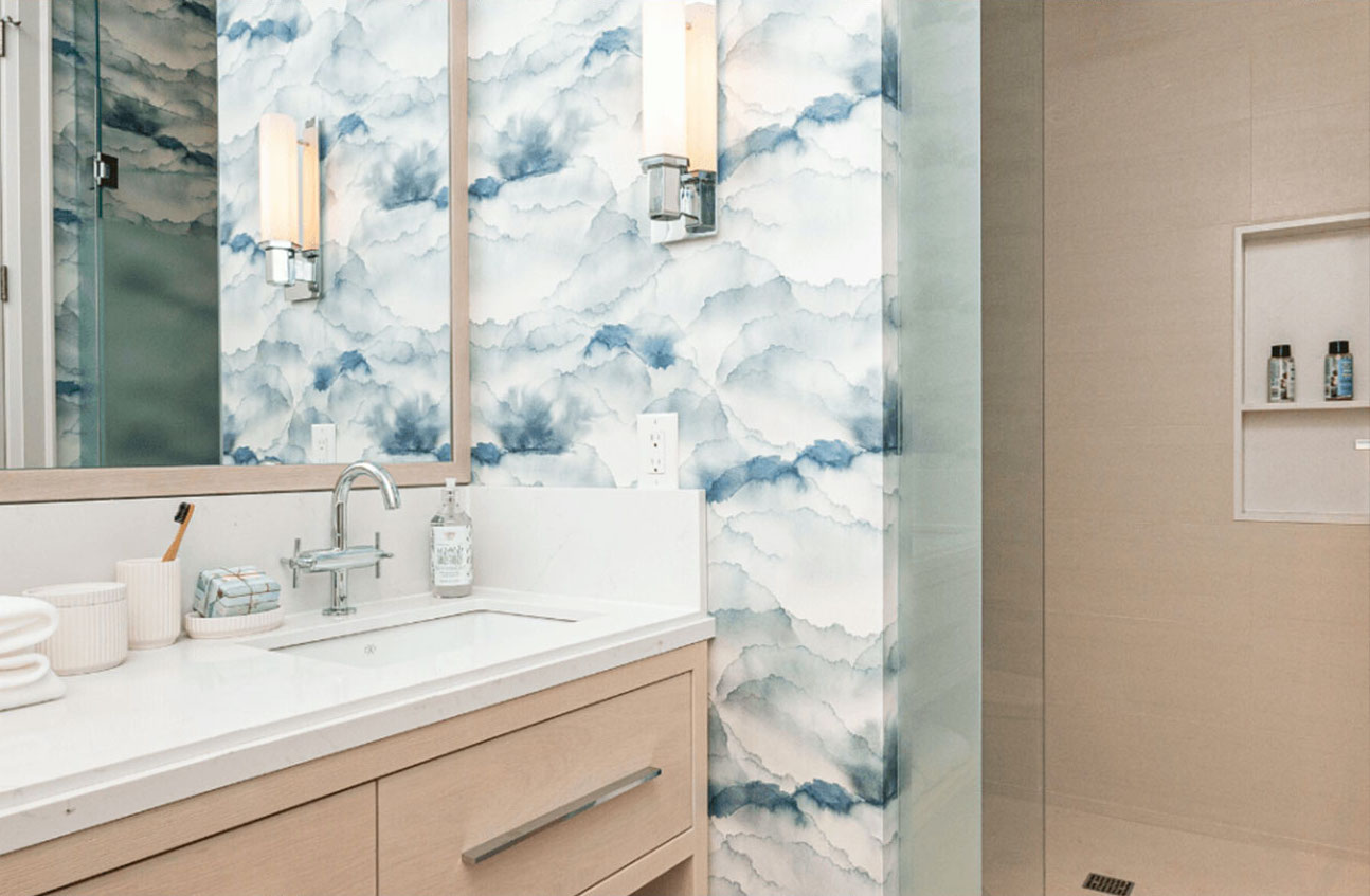
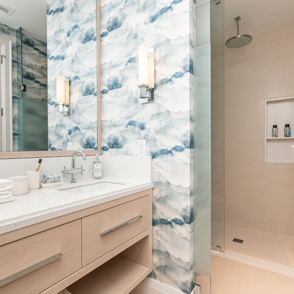
Do you know how long I’ve been dreaming of a sanctuary to call my own when it comes to a nice bathroom?
No, this is not my bathroom shown below. Because mine is still under construction, but at least it’s underway!
Princess Margaret Lottery Home Bathroom with fixtures from Grohe, American Standard and DXV
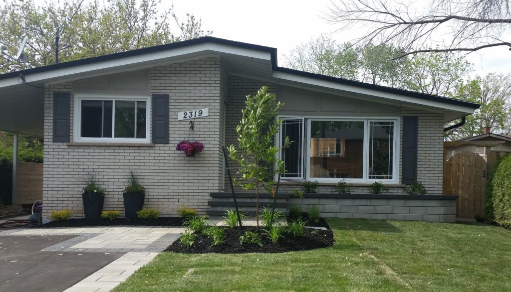
My bathroom is mostly all original to our home, which is a small 3 bedroom bungalow built in 1967.
We moved into our Burlington home (pictured below) in 2004 after having lived in England for 6 years. (Well, I had been living in London for 6 years, my husband Chris is actually from the UK.)
We had our first child there, our handsome son Adley, just before moving back to Canada in the spring of 2004.
In 2006, we had our beautiful daughter Elise. I was thrilled to be a stay at home mom, but it meant that we did not have much money for renovations.
Our Bungalow after being updated with landscaping in 2015
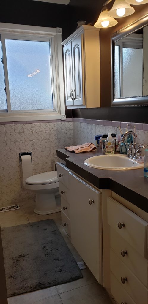
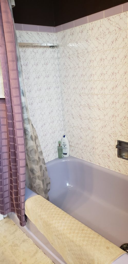
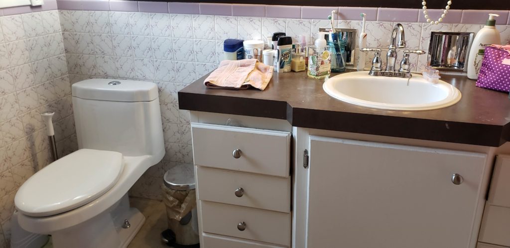
Bathroom Before
Our bathroom redesign has been a long time coming!
Below is what our small, main bathroom looked like for the last 14 years. We did make some minor updates shortly after we moved in, such as replacing the lilac toilet and sink, along with the old faucet. We also updated the countertop, flooring, mirror, lighting and medicine cabinet.
For the updated wall colour I chose Wenge by Benjamin Moore, as it has a purple undertone so it seemed to work with the 1960’s lilac wall tile. That was the extent of the updates that we could afford at the time.
Flashback to the ’70s with that lavender tub!
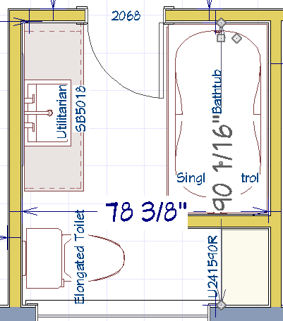
The footprint of the bathroom is small, which is why the vanity is more narrow in depth at either end. With the previous vanity, you can see how it protruded out to allow enough space for the sink.
Despite looking at options of redesigning the layout, the space was so tight and very limiting that we stuck with the original floor plan. Hey, it’s worked fairly well for us all these years that at least we were familiar with what we had.
Below is my CAD drawing. The only difference that you would notice from this drawing is that the sink faucet is now wall-mounted, which will give us a more updated look because now the vanity will be more streamlined as it will be the same depth from end to end.
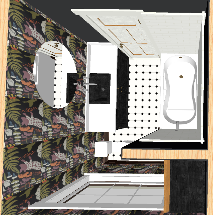
The 3D rendering below shows you one of my first drafts of the updated design. Since this drawing, there have been some changes made to the plans, like the floor and mirror. And of course, there is a glass shower door and more plumbing fixtures, but this was to initially give my contractor an idea of the direction in which I was going with the look and feel.
The Inspiration
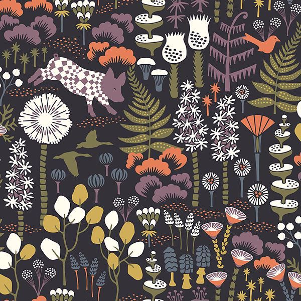
I was dying for wallpaper. I mean I was seriously yearning for it. There was no fighting my urge to have some fun with colours and patterns in my own bathroom design. This is the wallpaper I landed on.
I love the colours, the black backdrop, the organic feel that it has and my favourite element is the jumping purple pig! I appreciate this is not everyone’s cup of tea, but what about you? Do you like it? Comment below to give me your feedback.
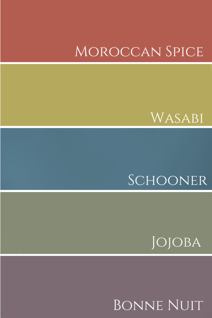
I colour matched all the colours in the wallpaper to Benjamin Moore paint samples. This way I know exactly which accent colours I can use for accessories such as bath mats, towels, candles, soap, etc.
This is one of my top decorating tips and you can learn more about how to do that yourself in this video here.
Benjamin Moore Colour Palette
Collaborating with Brands
I’m pleased to have formed such a wonderful working relationship with Jamie Martin, the National Sales Manager for Farrow and Ball. When I asked Jamie if they would be willing to provide me with a gallon of paint for my bathroom ceiling, he delivered immediately. I appreciate Farrow and Ball’s willingness to team up with me and can’t wait to use more of their paint colours for upcoming projects!
My paint colour selection for our ceiling is Farrow and Ball’s All White No. 2005 Modern Emulsion.
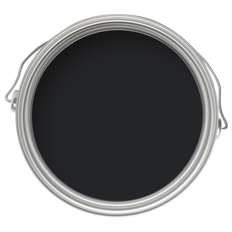
For the custom vanity and linen closet, I am colour matching to Farrow and Ball’s Pitch Black No. 256. I am soooo excited for these custom pieces to have a rich, black finish!
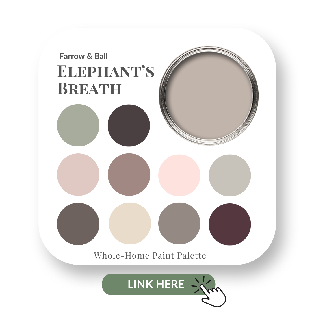
If you love Farrow and Ball, be sure to read my blog post here where I did a colour review of Elephant’s Breath and also check out this post where I reviewed the exquisite Hague Blue.
I’ve also teamed up with Grohe Canada for most of my plumbing fixtures and went with a classic chrome finish. Here are just some of the beauties that I selected for my new bathroom design.
This wall-mounted faucet is not only sleek in style, but it was also an integral part of the function for this design. As you saw in some of the before photos, we are really tight for space in my bathroom. The vanity depth is just 18″ and having this Grohe wall-mounted faucet will help to save on some much-needed counter space.
Chrome Wall mounted faucet
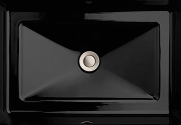
This beauty above will pour into my new black undermount DXV sink. Pretty sexy, eh?!
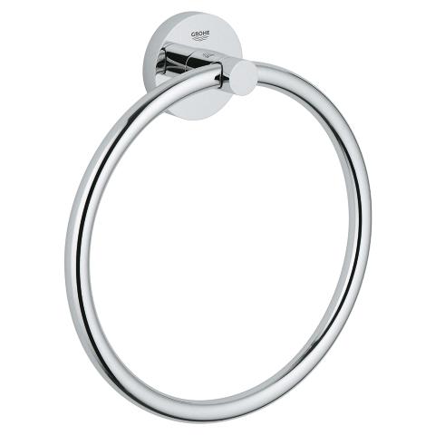
We had a towel ring in the old bathroom and it did come in handy with it located to the right of the sink for a hand towel. Sticking with what you know already works is a smart move!
Chrome towel ring from Grohe
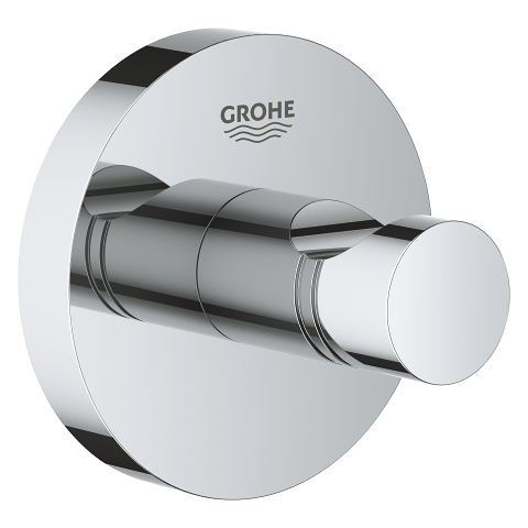
When I polled my Facebook followers to ask which they preferred, a hook vs a towel rod, the response was amazing.
Although, there were strong opinions for both, in the end, I kind of cheated and opted for both. I ordered 2 of these stunning Grohe chrome towel hooks for the back of the door and another towel holder for above the toilet.
Grohe Towel Hook in Chrome
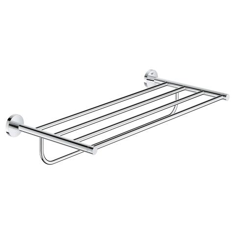
Below is the Essentials Multi bath towel rack that I snagged as well.
Essential Multi Towel Rack
Unboxing Video Live on Facebook
If you follow me here on Facebook, you may have seen me unbox many of these Grohe fixtures live. It was very exciting, just like Christmas really! You can watch the replay below.
More bathroom loves coming soon. Tiling starts next week and you’ll have to wait to see what I chose for the shower walls! If you follow me on Instagram here, you will see daily updates in my Stories.
Thank you to all my sponsors, I truly appreciate you!
Psst! Love Colour? Take my new colour quiz to determine which colour palette suits you best!
Convenience at your fingertips
Remember, it only takes one mistake to take your home decorating project from divine to disaster. Don’t let the paint be what stresses you out!
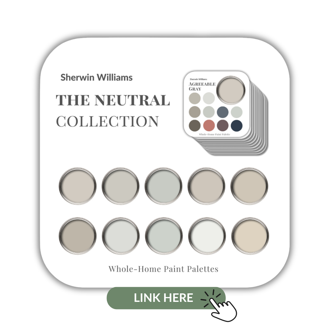
Choosing Paint Colours
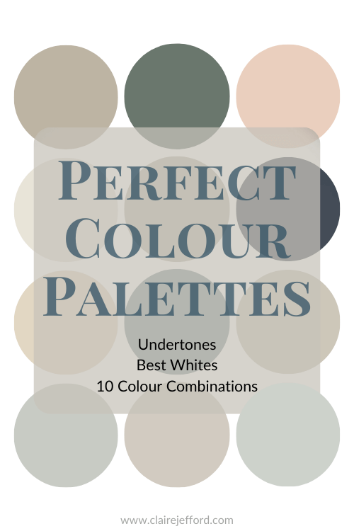
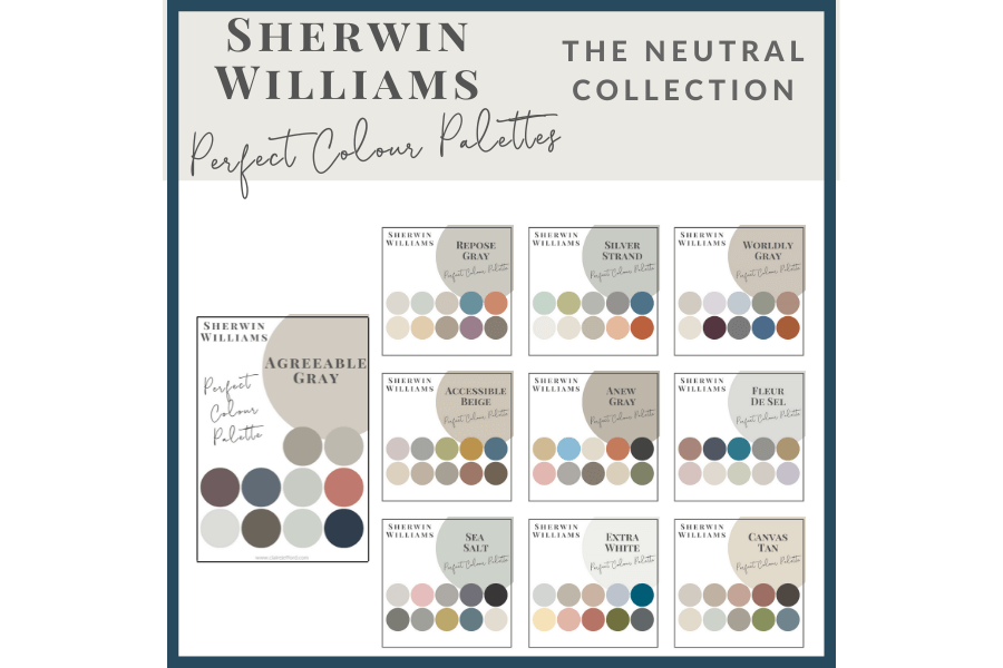
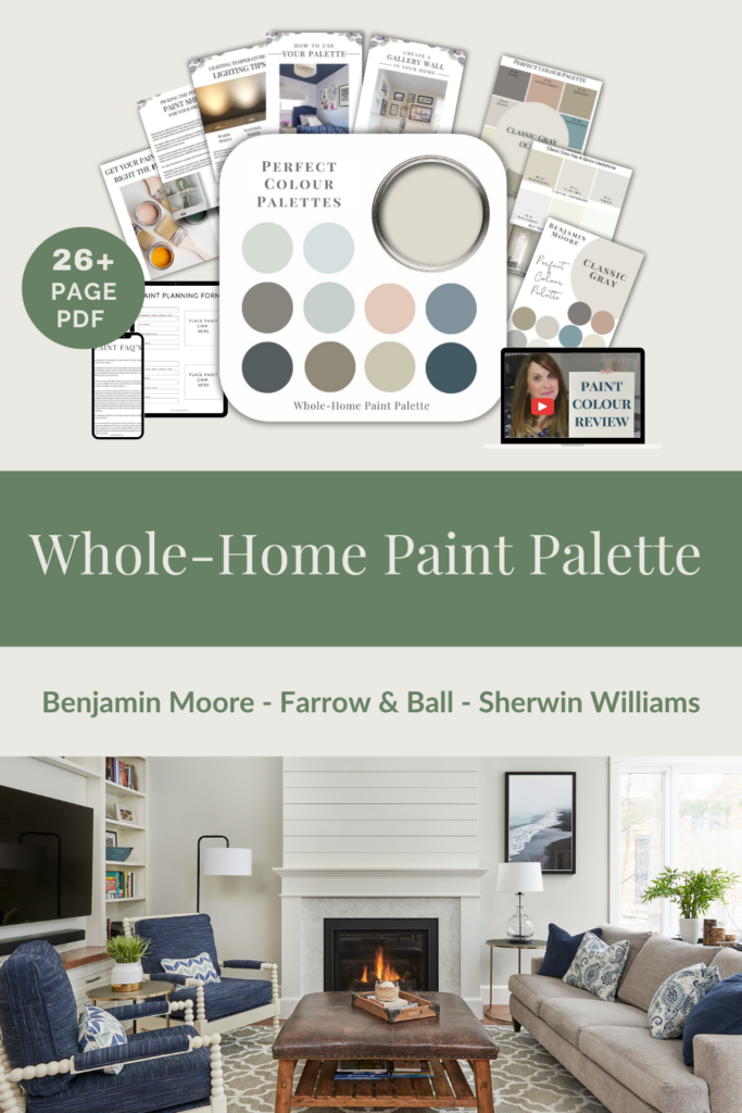
If you struggle with choosing paint colours, be sure to check out my Perfect Colour Palettes.
I now have 40 individual guides to help inspire you.
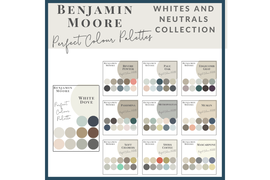
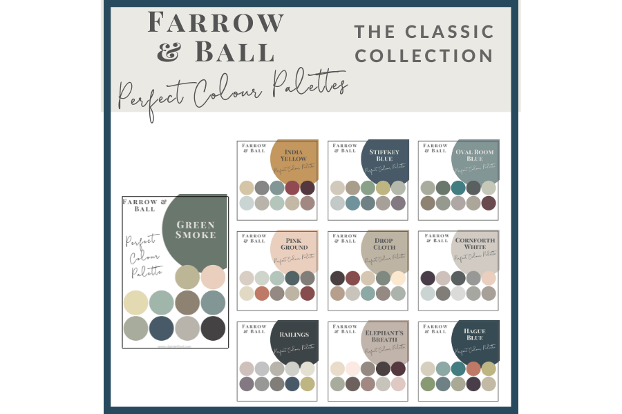
Collections
I also offer collections that showcase a group of 10 similar colours from Benjamin Moore,
It’s easy to find pretty photos online of finished interior decorating projects. Inspiration can be found everywhere from Pinterest, to Instagram and of course, in my portfolio too!
But wouldn’t you like to learn more about the details that go into the thought process for designing a beautiful space? After all, it didn’t just happen easily and by coincidence with all the pieces falling perfectly into place.
If that was the case, then my job would be super easy or even redundant altogether.
Welcome to ‘Behind the Design’!
Here I’ll share a quick round-up of a few different design elements to bring you a better understanding of why I make the choices that I do when working on clients’ projects.
Today’s post includes interior design tips from the main floor redesign that we did in a Burlington client’s home.
1,2,3, take a look Behind the Design with me
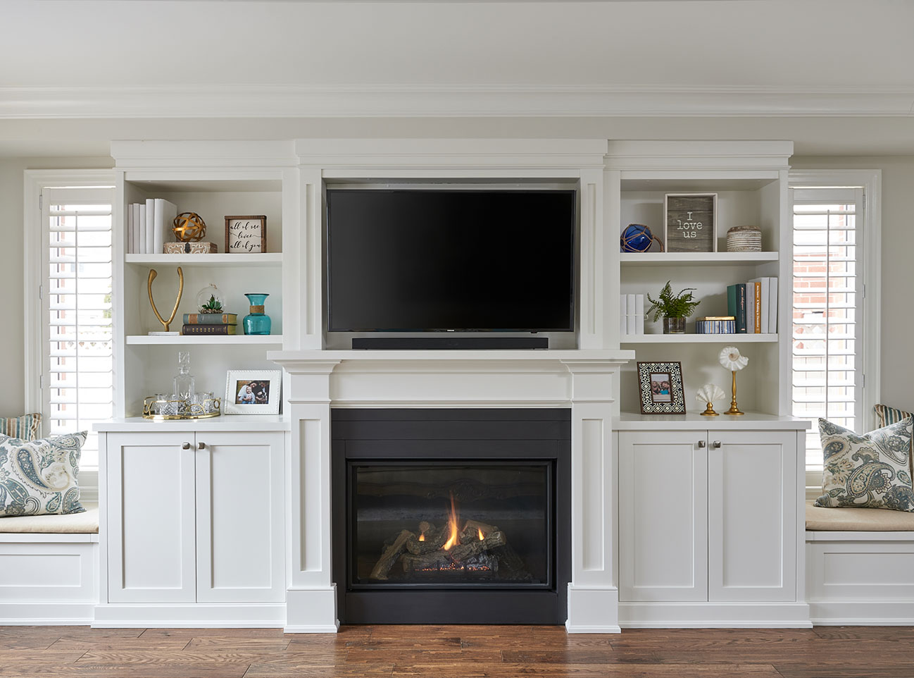
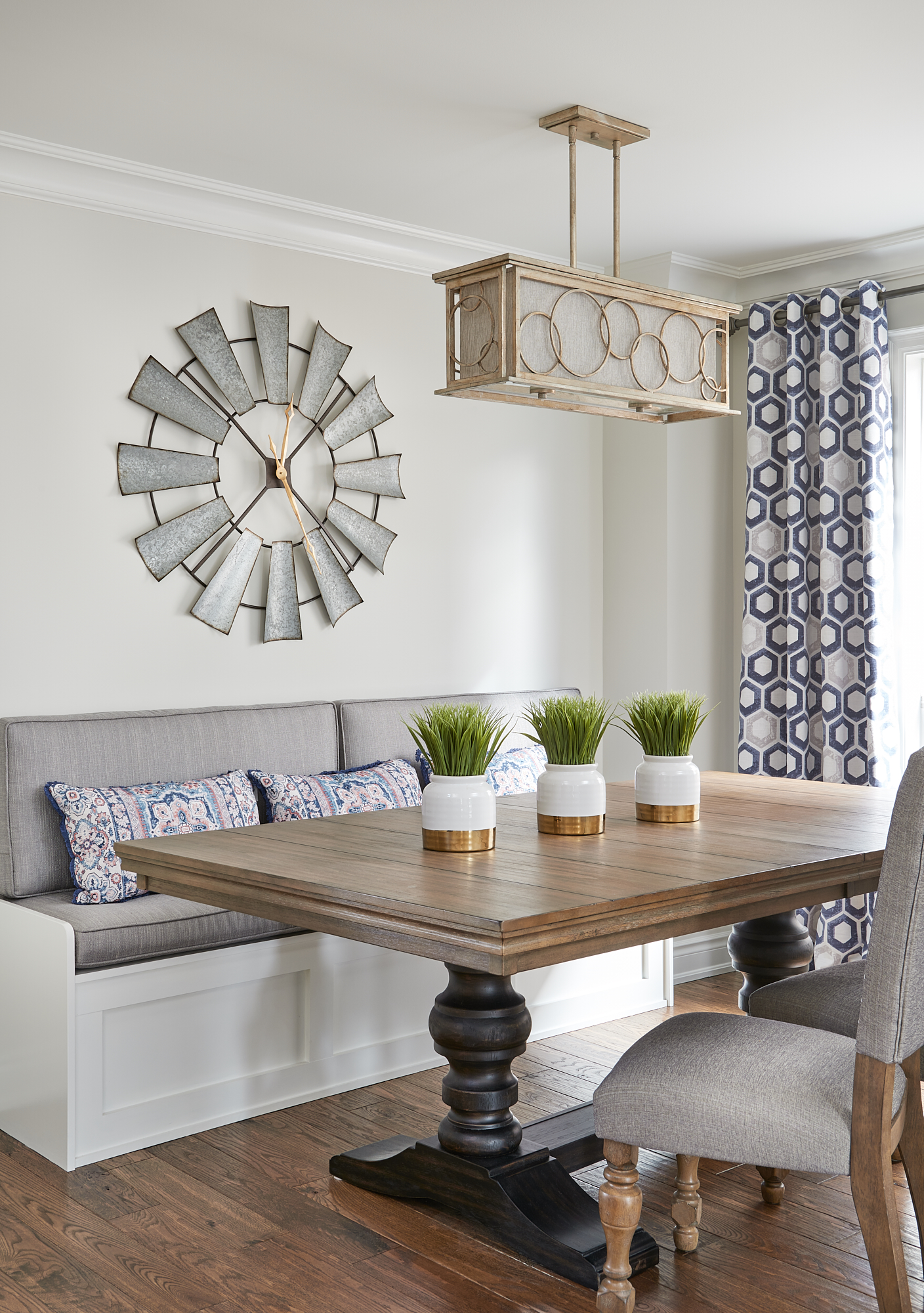
#1. Make Sense of Your Space
In our Burlington client’s home, we removed a wall between the formal dining room and the traditional living room in order to create a larger kitchen. The living room was not needed as my clients had a family room on the main floor as well as a fully finished basement. (FYI – the wall is behind the angle from where the photo is being taken.)
Space Saving Tip:
Our suggestion was to turn the living room into the dining room and custom build a large banquette on the far wall for seating. A wall banquette saves on space usually required for pulling out the dining chairs.
In addition, a dining table with a pedestal (opposed to legs) allows for extra seating space around each end of the table when needed to accommodate more guests.
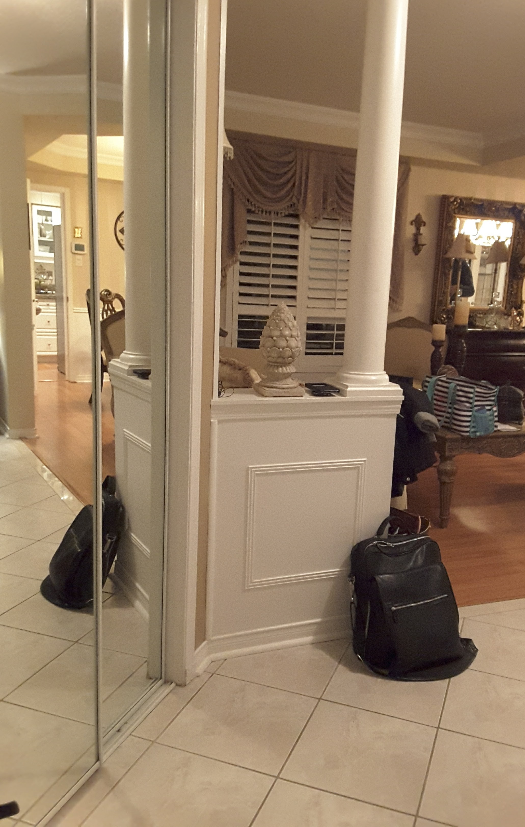
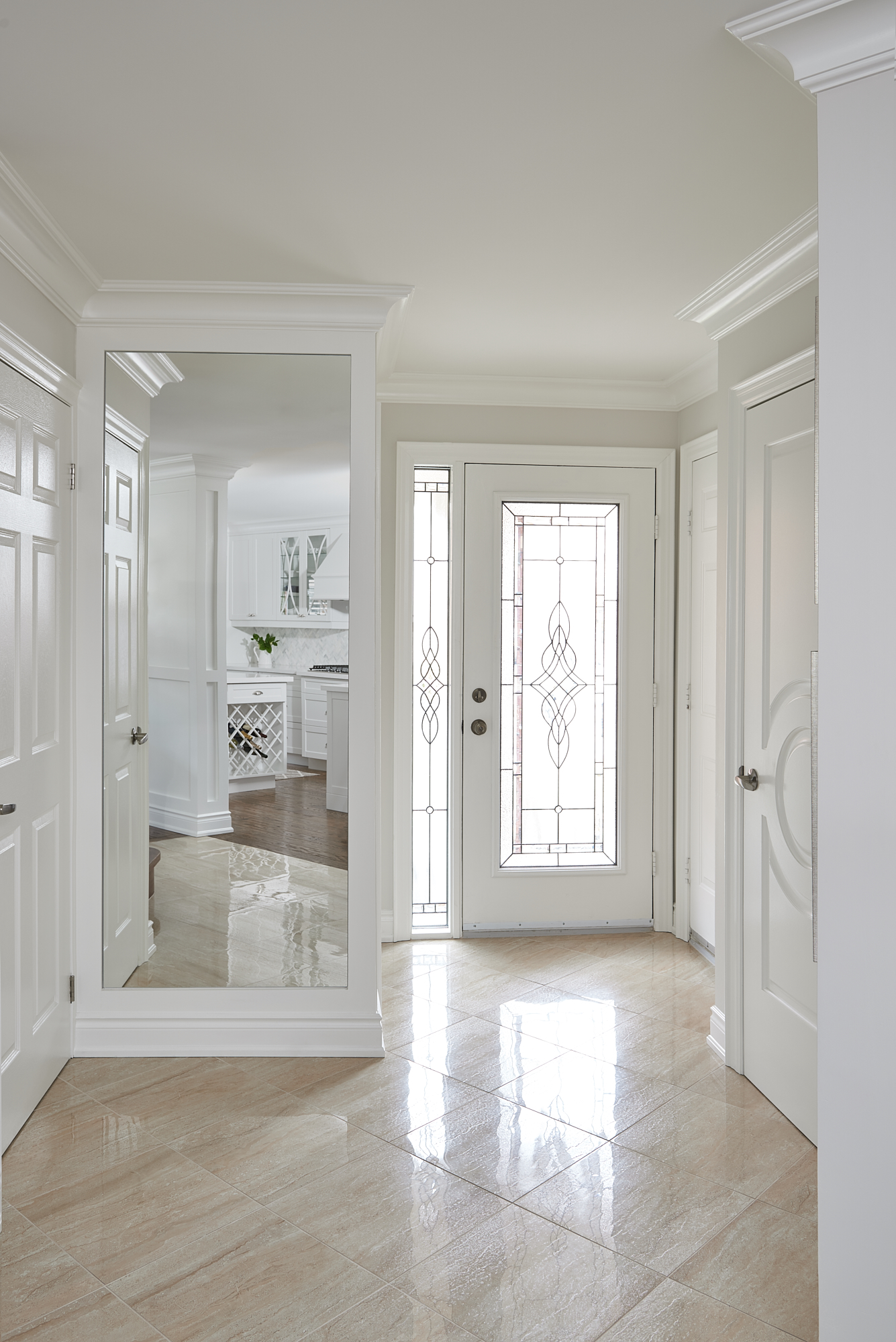
#2. Out With the Old
Within the same area, there was a half wall that bordered the front foyer with a pillar on the end closest to the room opening (see below). In addition to the new flooring and overall renovation work done to update their home, removing this traditional column helped us to eliminate a structural element that is indicative of a more traditional style.
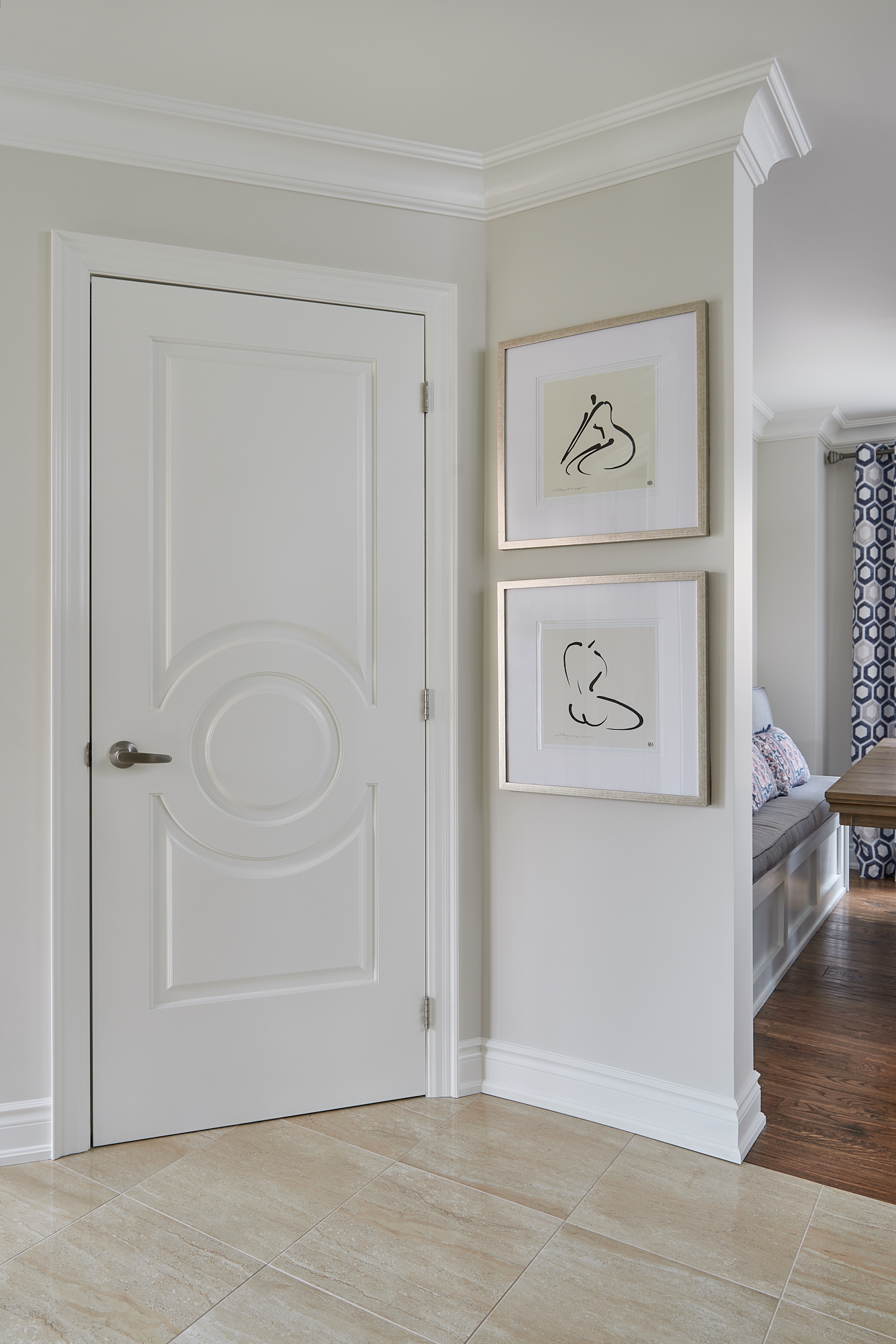
A Plan With Purpose
We took that narrow wall all the wall to the ceiling and beautifully finished it with a detailed crown moulding. This wall divides the space and enabled the addition of our clients’ simple, yet sophisticated artwork that greets you when you enter the front foyer area. So pretty, right?!
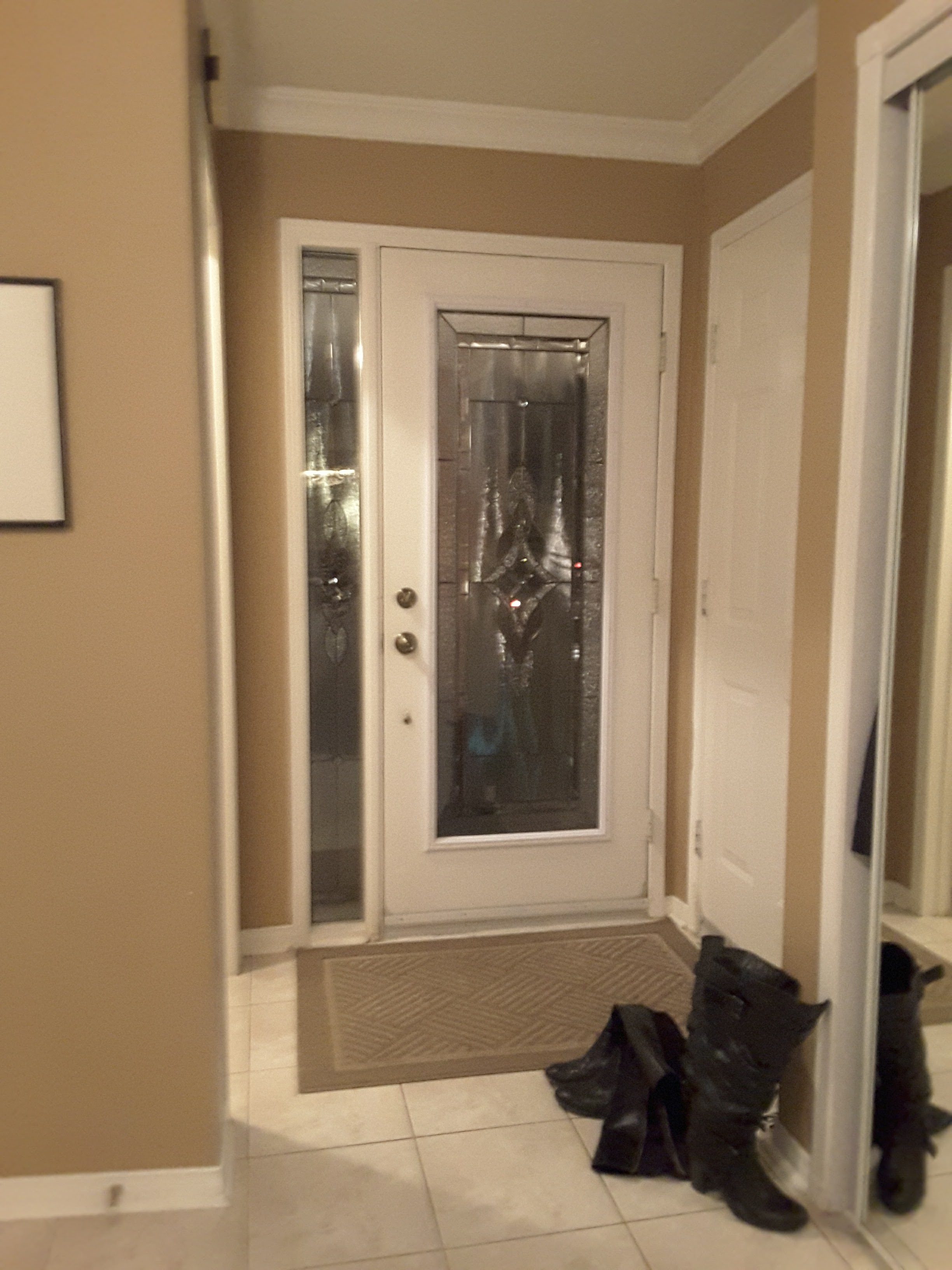
#3. Tricks of the Trade
There are so many doors in this small entryway that the contrasting wall colour, made the space feel very busy and closed in.
Bright & Welcoming
By lightening up the paint colour (Classic Gray by Benjamin Moore) and adding a custom mirror within the millwork on the wall, the front entry now feels bigger and is much more welcoming. Don’t you agree?
To see more of this kitchen in my portfolio, click here.
Which of these 3 updates was your favourite? Comment below to let me know which one you liked best.
It’s amazing how different a home can look and feel when you have a good design plan and a professional to help you along the way.
We would love to work with you on your next project. Reach out and contact us here.
Psst! Love Colour? Take my new colour quiz to determine which colour palette suits you best!
Convenience at your fingertips
Remember, it only takes one mistake to take your home decorating project from divine to disaster. Don’t let the paint be what stresses you out!
Choosing Paint Colours
If you struggle with choosing paint colours, be sure to check out my Perfect Colour Palettes.
I now have 40 individual guides to help inspire you.
Collections
I also offer collections that showcase a group of 10 similar colours from Benjamin Moore,
Last week I had the pleasure of being a guest on LuAnn Nigara’s podcast, A Well Designed Business, for the third time.
LuAnn and I are good friends and both a bit nerdy when it comes to processes for our businesses. This is just one reason why I love her so much!
Step by Step Process for the Initial Consultation
In my latest interview, episode #485, LuAnn dedicates the entire show for me to walk her through every single step of my client intake & consultation process.
This process begins with the client Discovery Call and takes you all the way to the to the end of the initial consultation meeting.
I have set it up in a way that enables me to quickly build trust with my clients and to manage their expectations from the onset.
After you listen, if you want to set yourself up with the exact same process without starting from scratch and figuring it all out on your own, you can get my ROCK the CONSULTATION PROCESSES PACKAGE HERE for 30% off the regular price starting Friday!
To catch more of LuAnn’s podcast and hear more great episodes, go to her website here. She sure is one #smartlady.
Oh and did I mention that she’s also a ton of fun? Below is a part of a video clip (I faded the for the video) from when I interviewed LuAnn at her Window Works store in New Jersey in 2018.
LuAnn is also the mastermind behind the book ‘The Things I Learned From A Well Designed Business’, of which I am a co-author of, along with all of these other wonderful people!
My chapter is all called ‘Managing Client’s Expectations’ (surprise, surprise!) and if you’d like to get your own copy, click here to purchase your this interior design business bible now!
How are you setting up your business for success in 2020?
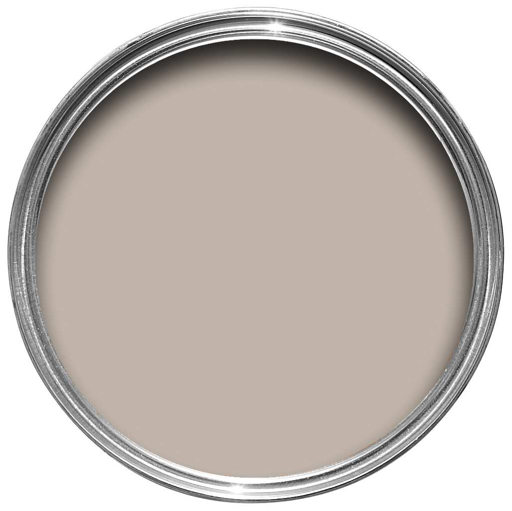
Isn’t this Farrow and Ball paint colour gorgeous?! Let’s dive in to find out more about it and if it’s the right hue for you.
In this colour review video of Elephant’s Breath by Farrow And Ball, I share:
The undertone of my featured colour
Colour comparisons in order to easily see the different colour tones
Best white paint colours for the trim and ceilings
Beautiful colour combinations to inspire you for your decorating project
After you watch the video, if you would like all this information conveniently laid out for you in one place and have even more paint colour combinations to use with Elephants Breath, take a look at my new Perfect Colour Palette.
A must-have for any colour enthusiast or design professional.
I’m a Certified True Colour Expert and an award-winning interior design professional having worked with many homeowners on various design projects. I want to give you the confidence to make educated decisions about your own paint choices. Let’s do this!
Video Colour Review of Elephant’s Breath
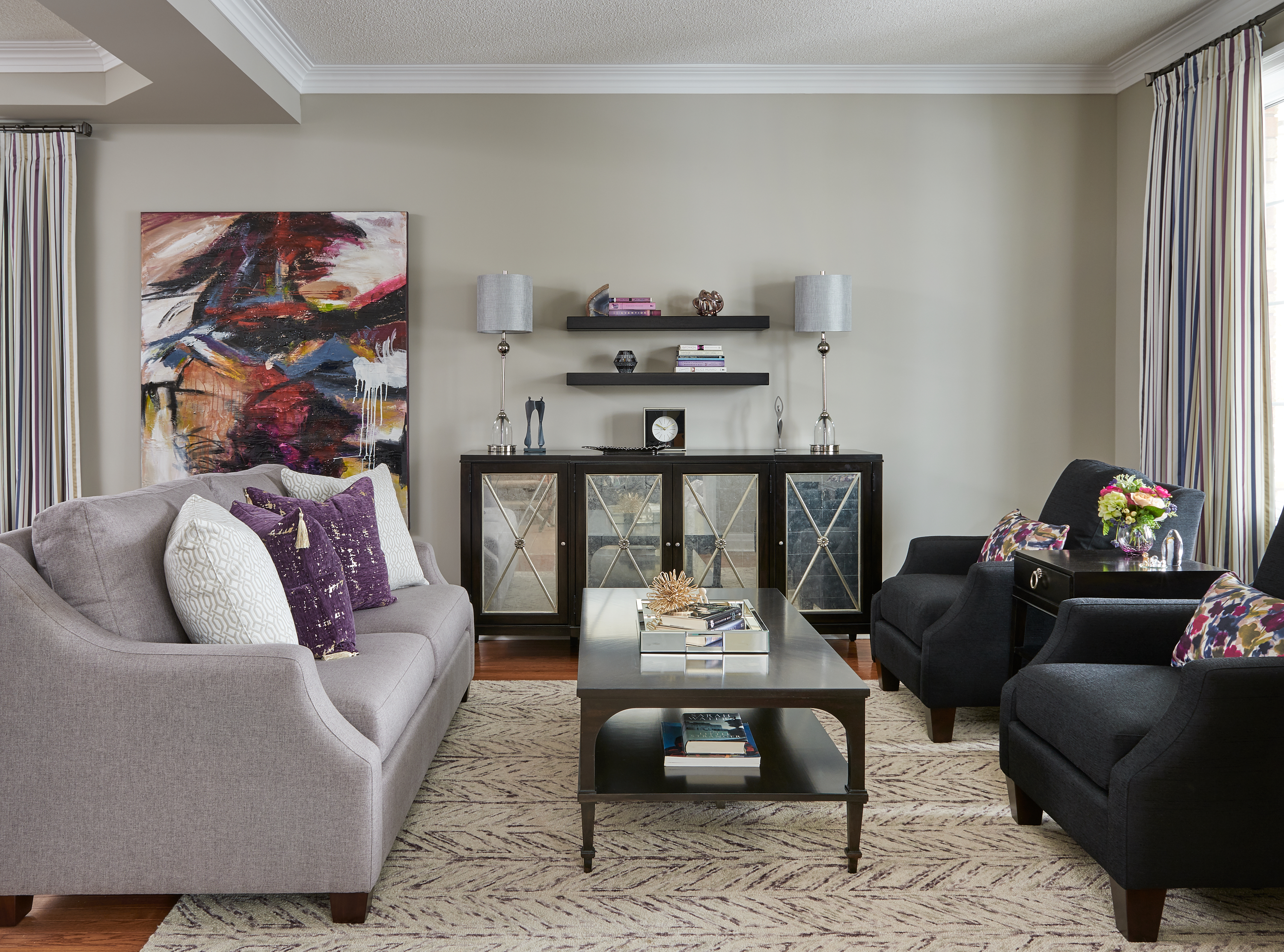
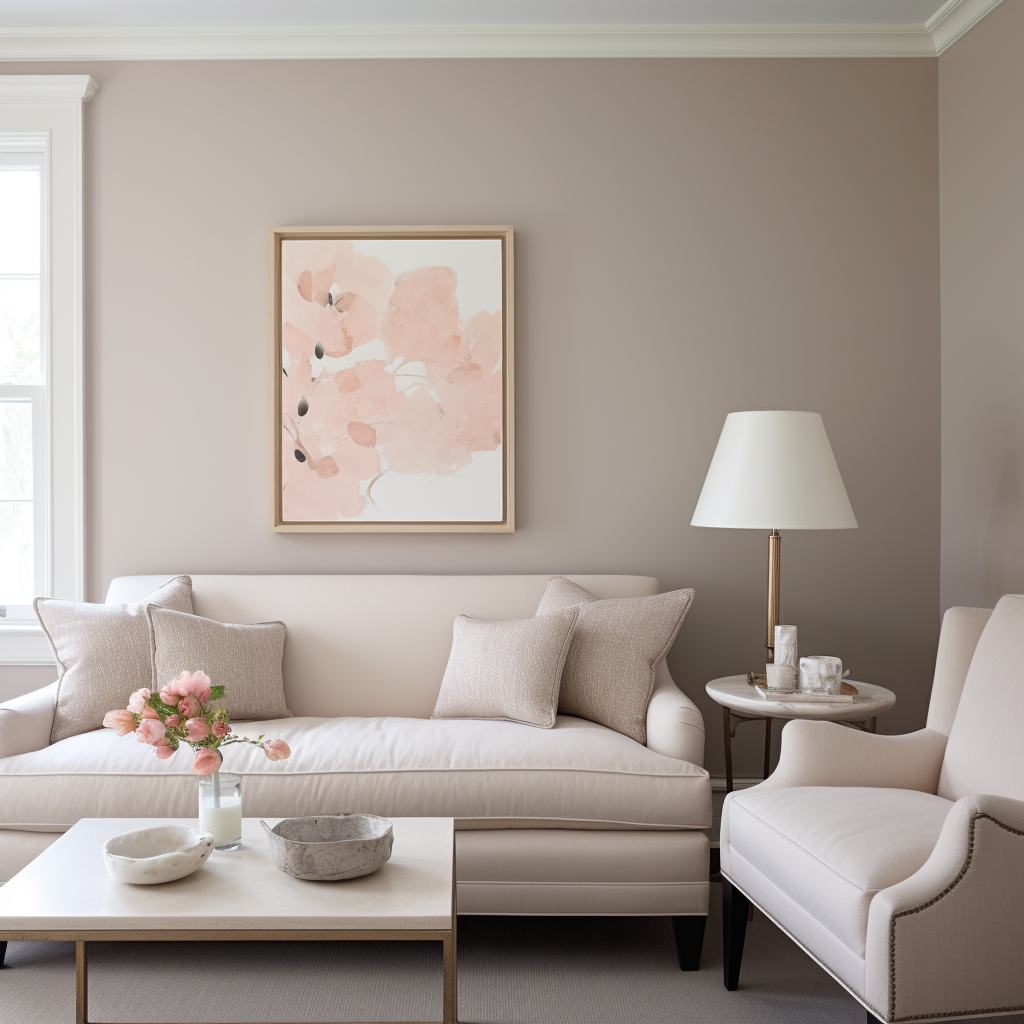
As a reference point, let’s start off by taking a look below at this clients living room we designed. It’s painted Shale by Benjamin Moore.
Although Shale has slightly less intensity than Elephant’s Breath, it is quite comparable.
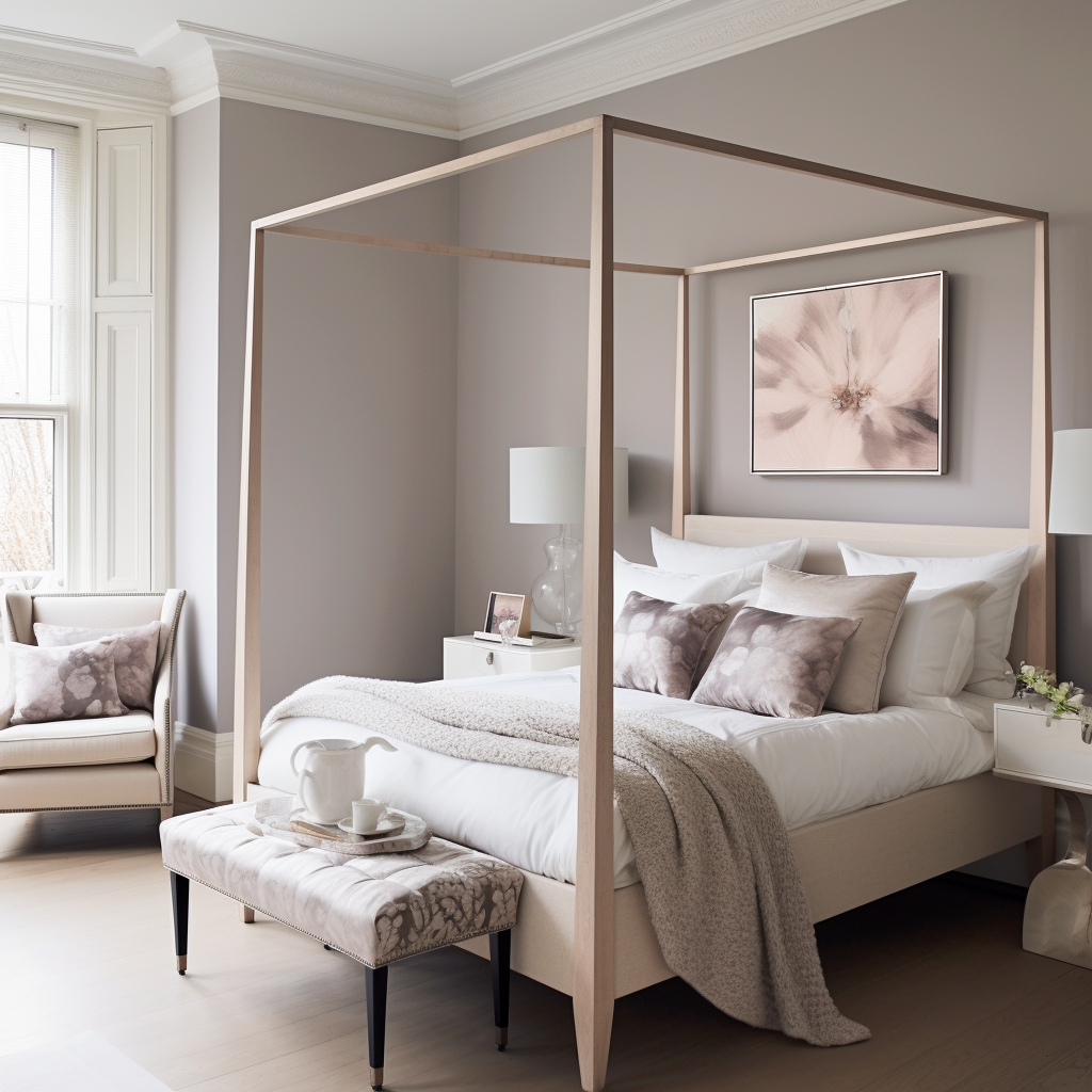
Below is an AI render with Elephant’s Breath by Farrow & Ball on the bedroom walls.
Undertones: Pink/Violet
Elephant’s Breath is described by Farrow & Ball as a warm mid-gray with a hint of magenta, but can also look lilac depending on the light.
Living Room walls in Elephant’s Breath by Farrow & Ball
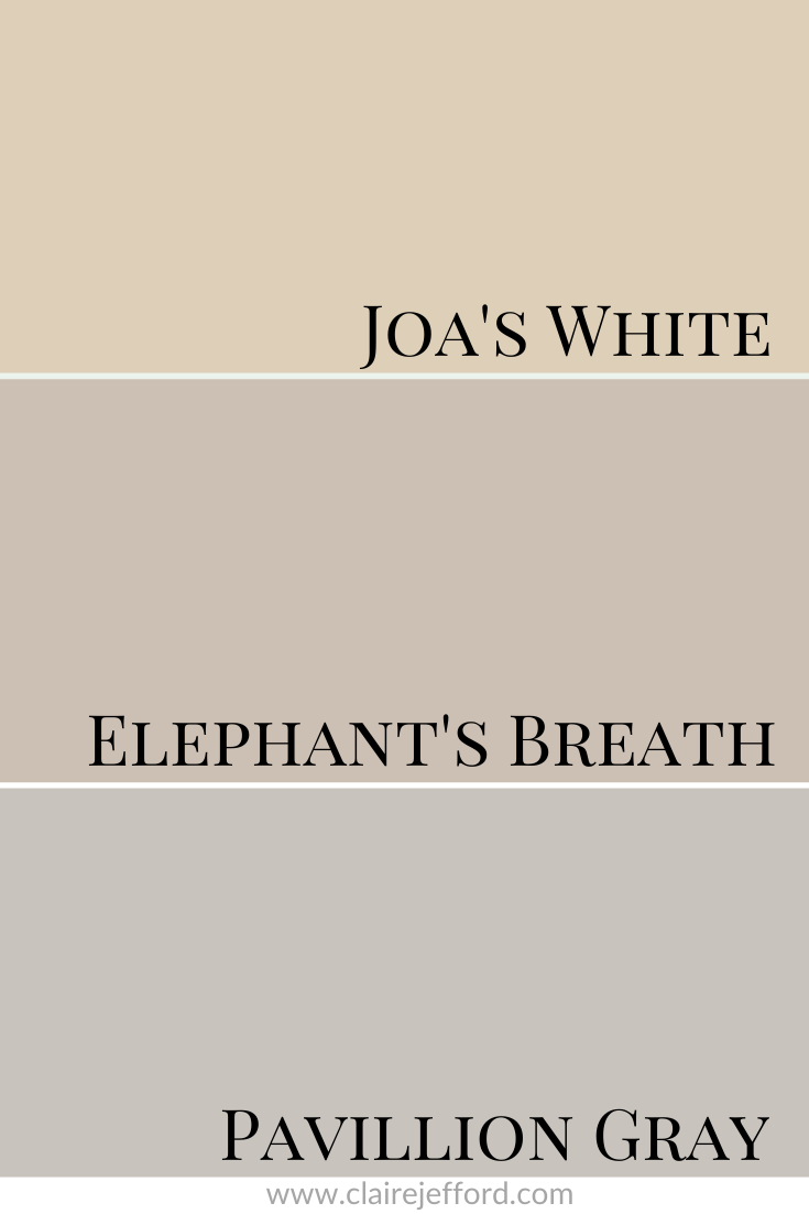
Colour Comparisons:
Joa’s White No.226 & Pavillion Gray No.242
Best Whites To Pair With Elephant’s Breath
Pointing White No.2003 By Farrow & Ball
School House White No. 291 By Farrow & Ball
All White No.2005 By Farrow & Ball
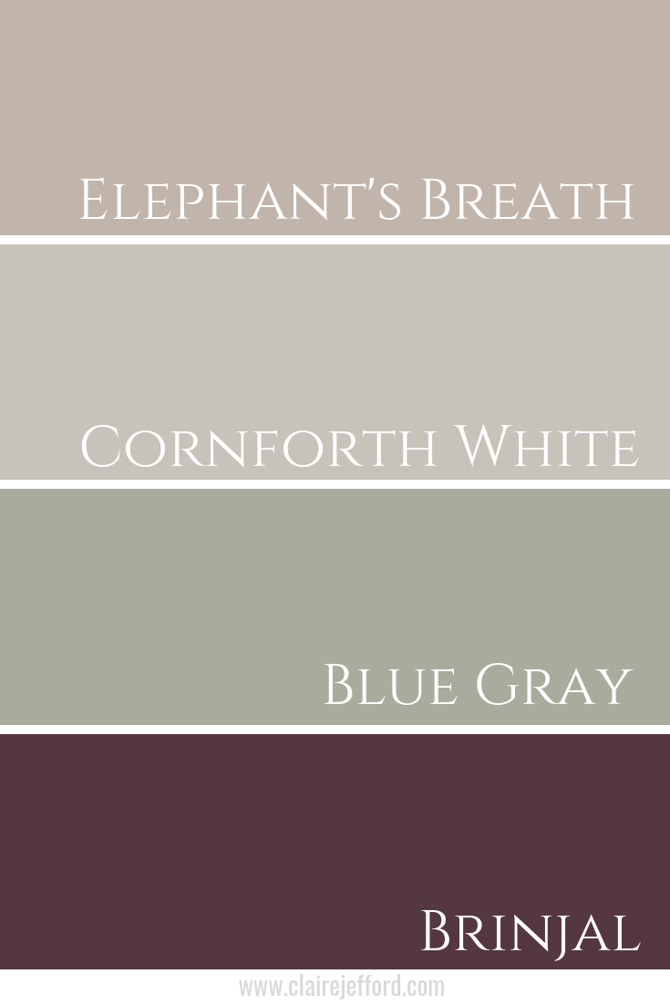
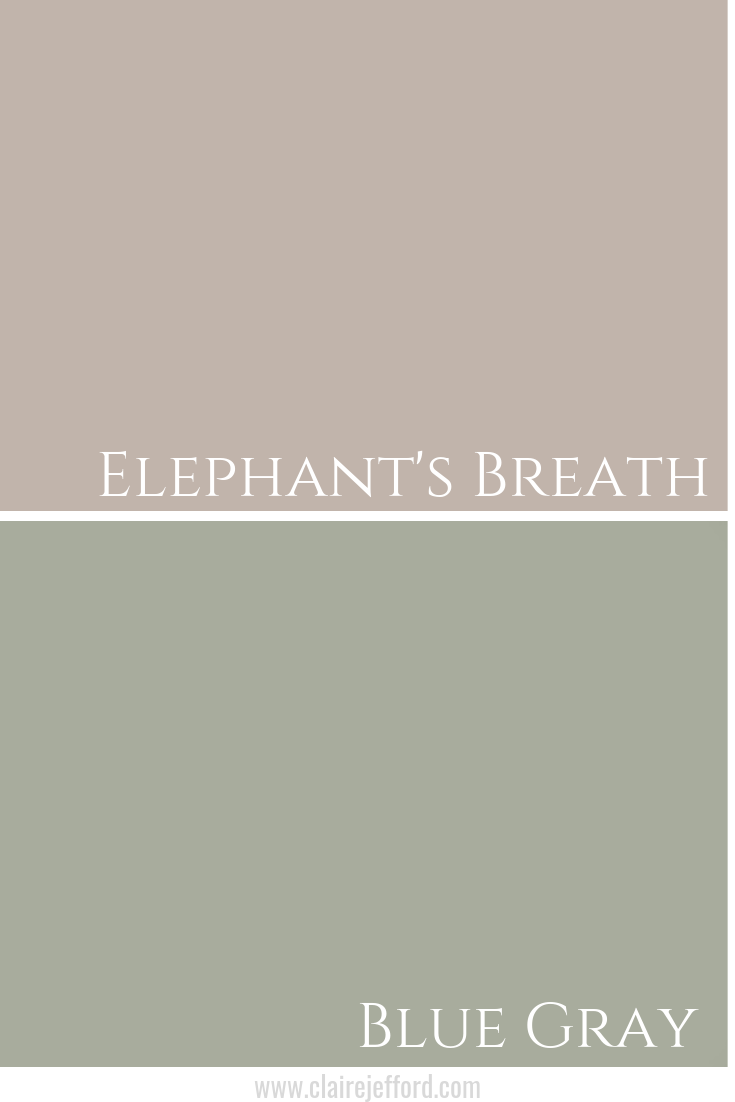
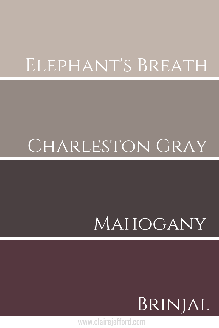
Fabulous Colour Combinations
Cornforth White No.228, Blue Gray No.91, & Brinjal No.222
What’s the average salary for an Interior Designer working for another company?
What jobs are available within the Interior Design industry?
Although most of the designers whom I coach or who are in my Private Facebook Group for Interior Design Professionals run their own design business, perhaps you are still studying for your degree or recently graduated and wondering what the next step is in your journey.
Or maybe you are already running your own business, but it’s not quite bringing you in the revenue you need or it’s proving to be more difficult to get established with steady clients than you had anticipated.
If you are going to design school; or recently graduated or are simply looking at the options available to you in the interior design field, watch my video to better understand the types of jobs currently listed in both the US & Canada & what to expect in terms of an estimated annual Interior Designer salary.
Let me start by saying that everyone has different goals in terms of what they want to achieve and how much money they want to make.
I love this about life.
We are all different.
No two people are the same and ‘There is more than one path to the top of the mountain.’ I freakin’ love that expression.
So even if we all had similar goals, there are many different ways and strategies for achieving those goals.
I started my Interior Design Firm as a second career as soon as I received my Interior Decorating Certification. Despite applying for a couple of Interior Design jobs similar to the examples that I share with you in the video, I never worked for anyone else, nor had any previous retail experience.
However, I did work in Human Resources at Ford Motor Company in the UK when I lived in England for 6 years. That role was pivotal for me in terms of understanding the importance of having organized processes and developing effective communication skills.
Average Salary Ranges
If you watched the video you will see that the average annual salary for an Interior design job ranges from $40k – $120k. The higher end of that pay scale favours those who work in retail and are likely heavily commission based wages. Remember though that retail positions will also mean that you must work evenings and weekends.
There are other pros and cons of working for another company, all of which I cover in the video so be sure to watch it.
I’d Much Rather Be My Own Boss!
If you prefer to work for yourself (or if you already are) make sure you are signed up to email list here, where I share my no-nonsense approach to success based on my own experiences.
I’m a ‘walk the walk kind of girl’ in case you didn’t already know that. If I said it, you can bet that I did it!
One on One Coaching
Not quite making the salary you want to be making in your business?
Are you unsure of your processes or how to market yourself to target your ideal client and get more business?
Stop wasting time and making excuses! Get expert advice from someone who has been there.
One on one coaching sessions available. Find out more here.
Do you want to know more about this rich and luxurious paint colour? Wondering if this hue is for you? I’m here to help. Let’s do this!
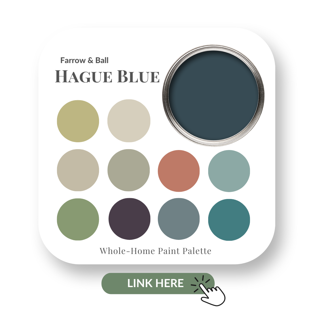
In this colour review video of Hague Blue by Farrow And Ball, I share:
The undertone of my featured colour
Colour comparisons in order to easily see the different colour tones
Best white paint colours for the trim and ceilings
Beautiful colour combinations to inspire you for your decorating project
After you watch the video if you would like all this information conveniently laid out for you in one place plus have even more paint colour combinations to use with Hague Blue, take a look at my new Perfect Colour Palette.
A must-have for any colour enthusiast or design professional.
I’m a Certified True Colour Expert and an award-winning interior design professional having worked with many homeowners on various design projects. I want to give you the confidence to make educated decisions about your own paint choices.
Watch the video below of my Hague Blue Colour Review
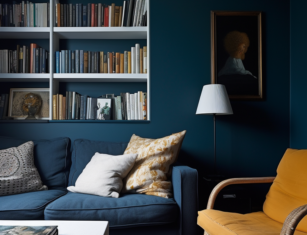
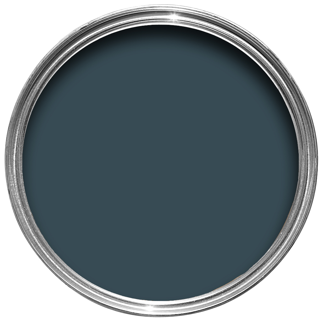
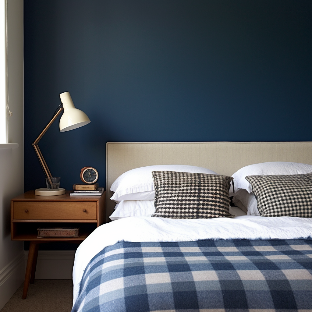
In this living room, you can see the richness and depth of Hague Blue.
Undertones: Blue/Green
Farrow and Ball’s website describes Hague Blue as a deep, dark, blue with a green undertone.
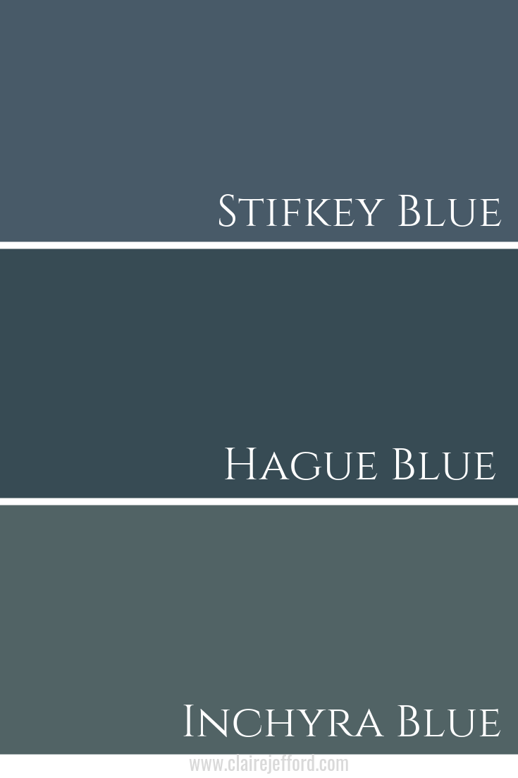
Colour Comparisons:
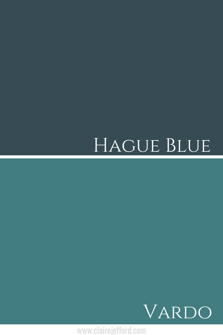
Stifkey Blue No.281 & Inchyra Blue No.289
You can see in my colour comparison how Stifkey Blue is the ‘bluest’ of the three Farrow and Ball paint colours. Inchyra Blue is greener and Hague Blue sits nicely in the middle as a go-between.
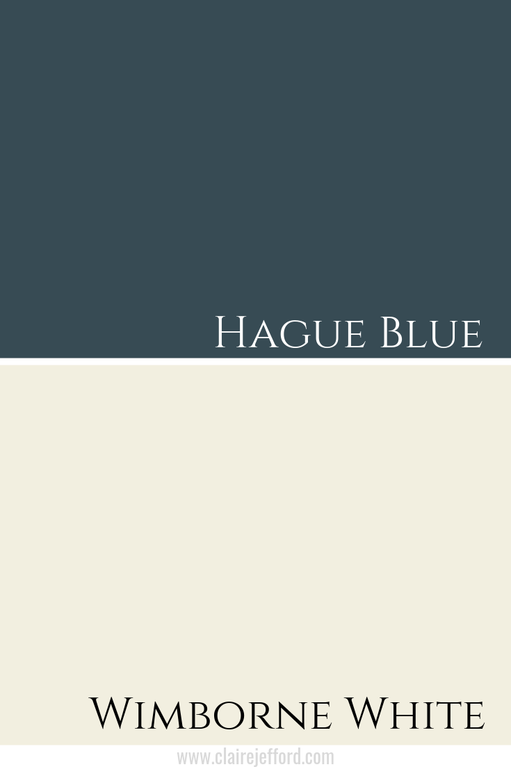
Best Whites To Pair With Hague Blue
Wimborne White No.239 By Farrow & Ball
James White No.2010 By Farrow & Ball
Shadow White No.282 By Farrow & Ball
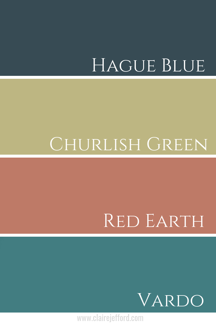
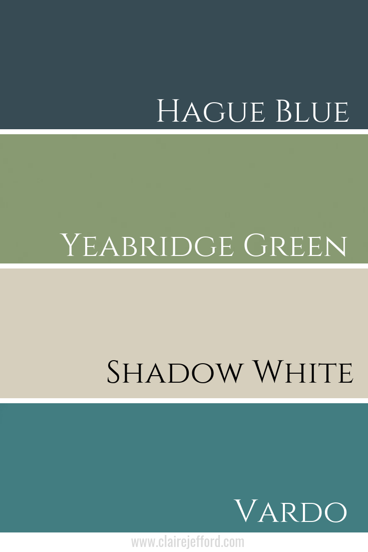
Fabulous Colour Combinations
Churlish Green No.251, Red Earth No.64 & Vardo No.288
Churlish Green No.251 By Farrow & Ball
Red Earth No.64 By Farrow & Ball
Vardo No.288 By Farrow & Ball
Yeabridge Green No.287, Shadow White No.282 & Vardo No.288
Yeabridge Green No.287 By Farrow & Ball
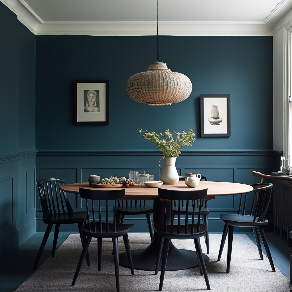
Walls in Hague Blue by Farrow & Ball
Convenience At Your Fingertips
Get the convenience of having everything you need to know about using Hague Blue with even more colour combinations at your fingertips! Get my Hague Blue Perfect Colour Palette.
People think I’m a rock star when I send them an Instagram voice message, but guess what? It’s super easy and even faster than writing out a text!
(But don’t tell anyone that it’s super easy, I like people calling me a Rock star 🙂 )
If you aren’t using voice messages on Instagram yet, there’s no excuse now because I’m sharing a tutorial that is less than 2 minutes to show you exactly how to do this.
Don’t start any interior design work without a signed contract and retainer payment.
It’s your business:
You make the rules
You set the boundaries
You are in control
And guess what? The good clients love that you run an organized business with streamlined processes!
If you missed my previous video, ‘What is a Retainer Agreement’, please watch that first. You can find it here. In that post, I go into more detail about the purpose of the Letter of Agreement itself.
In today’s video, I focus on the retainer fee amount and how to work the retainer with your clients.
If you have ever chased clients for outstanding payments or had to reissue invoices & reminders time and again, then you know what a lousy feeling that is. It’s a terrible place to be.
Since the beginning of my career, I have been successfully reviewing my contracts and collecting retainer payments from clients at the end of the initial consultation meeting, before moving ahead with design services.
You can too!
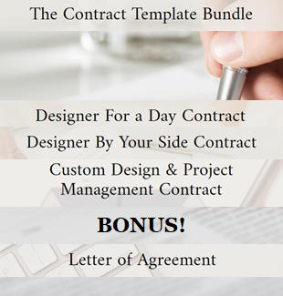
Need A Contract? Get mine!
Exude the confidence to take control & manage clients’ expectations on your various processes with my Letter of Agreement.
But my most popular offering for designers when it comes to these all important interior design documents is my Contract Bundle.
If your business has evolved over the years you may find yourself needing more than an LOA.
Having these contracts – each of which includes an easily editable Services Outline to use for your marketing – are powerful tools that shows clients you are organized and on top of your game.
When you invest in any of my contracts you’ll also receive a link to a walk through video where I explain in more detail why you need a contract; when to use it & how to walk your client effortlessly through it.
Let me help make your life easier and give you Claire-ity in your business processes.
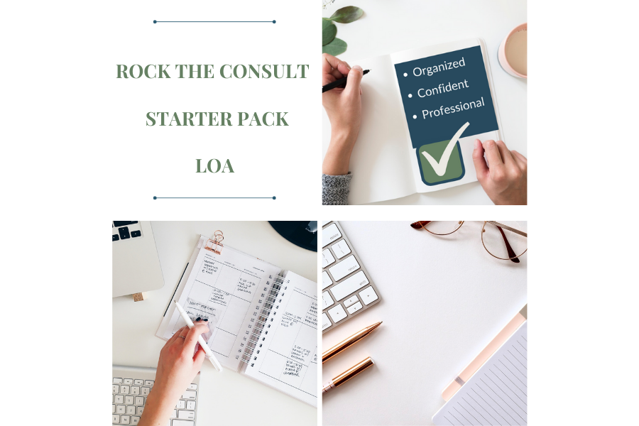
Want Total Confidence in Your Consultation Process? Let’s ROCK this!
An unbeatable value for 3 incredibly helpful resources for your interior design business, bundle and save! Link here to purchase.
Whether you are just starting out in the business or are a well seasoned interior design professional, don’t waste any more of your precious time trying to refine your initial consultation process, because I’ve already done it all here for you.
Gain the confidence to charge your worth and impress your clients from the very first phone call. My simplified, yet super effective 3-in-1 bundle package includes:
More than 20 templates
Over 7 drafted emails
An easy to follow process flow chart – all from the discovery call to the end of the initial consultation meeting
My one-page Letter of Agreement (LOA) template with a walk-through video with details of how to present your LOA and how to communicate the terms confidently to your clients.
PLUS – NEVER DONE BEFORE!
I include videos showing you how I speak to a potential client on an initial phone call and another video on how to conduct an initial consultation. Be a fly on the wall and learn how to avoid the BIGGEST MISTAKE designers are making in this first meeting!
There are also 4 scenarios where I show you how to deal with awkward client situations such as:
Asking about your discount
Having friends & other family members give decorating advice
How to handle if a client who challenges your process
How to deal with the ‘other half’ who may not be fully on board with hiring your extremely helpful services
Why re-invent the wheel with every new client or fly by the seat of your pants creating new templates and forms with each consultation meeting? Gain more confidence & get organized NOW.
AND – you’ll also get my Interior Design Starter Pack that addresses branding your business; establishing relationships with trades and suppliers; must-have tools for your business and more.
The time and stress you will save yourself by getting super organized, super-fast, is invaluable.
Claire's Guide to Services & Pricing
FREE DOWNLOAD:
Interior Design Services and Rates Guide
This website uses cookies to improve your experience while you navigate through the website. Out of these cookies, the cookies that are categorized as necessary are stored on your browser as they are essential for the working of basic functionalities of the website. We also use third-party cookies that help us analyze and understand how you use this website. These cookies will be stored in your browser only with your consent. You also have the option to opt-out of these cookies. But opting out of some of these cookies may have an effect on your browsing experience.
Necessary cookies are absolutely essential for the website to function properly. This category only includes cookies that ensures basic functionalities and security features of the website. These cookies do not store any personal information.
Any cookies that may not be particularly necessary for the website to function and is used specifically to collect user personal data via analytics, ads, other embedded contents are termed as non-necessary cookies. It is mandatory to procure user consent prior to running these cookies on your website.