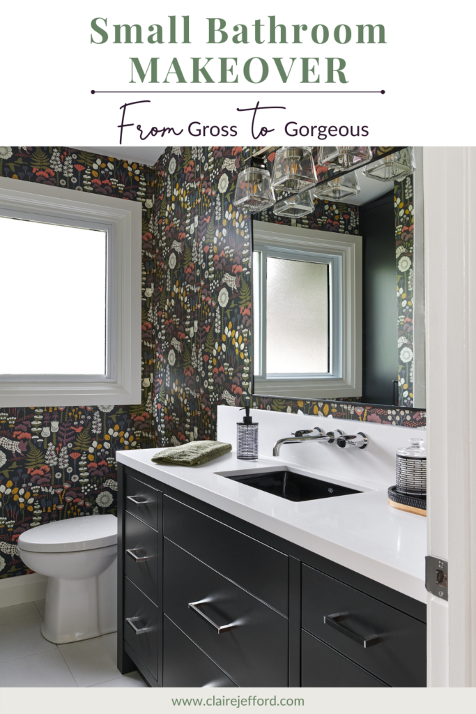
It’s time to finally reveal my own bathroom makeover that we renovated earlier this year!
This bathroom was pretty much untouched since our Burlington bungalow was originally built in the late 1960’s. We had only done some very minor updates- basically lipstick on a pig – over the past 16 years of living here. So this bathroom project was well overdue to say the least!
After you see the transformation and all my before and after photos, comment below to tell me what you love best about my updated bathroom.
For all my ‘Behind the Design’ secrets, watch the video below.
Incredible Transformation
Now, there is no judging and no saying that I didn’t warn you that some of the ‘before’ photos may be disturbing. You may laugh, but I’m not joking! This was one of the last rooms in my home to get renovated and boy let me tell ya, it was well overdue!
Everyone loves seeing before and after photos of interior design projects and I promise that this transformation will not disappoint you. I love my new bathroom so much now and am so appreciative of everyone who helped make this dream come true.
If you missed my earlier blog post about my new small bathroom redesign, including a live unboxing video that I did on Facebook, you can see that post here.
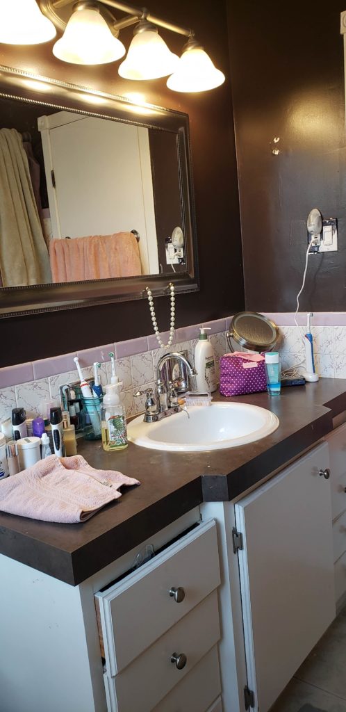
The Vanity Before
The Problem:
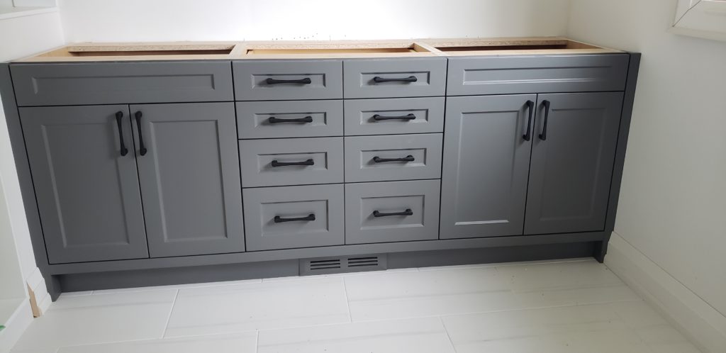
Our previous vanity had a jut out to accommodate the round sink. This style is traditionally an older look, normally implemented when space is limited.
Also, the configuration with a drawer under the sink wasn’t the best for storage. In a tiny bathroom like ours, we needed to be smart about maximizing every bit of space in the best way possible.
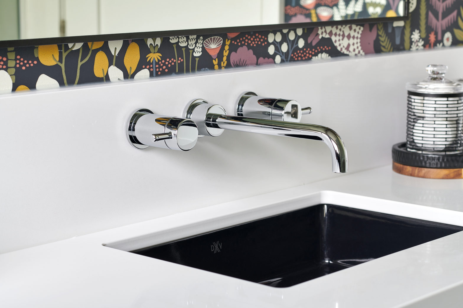
The Solution: Use a wall-mounted faucet to save some room needed on top of the counter, as well as install a more narrow sink.
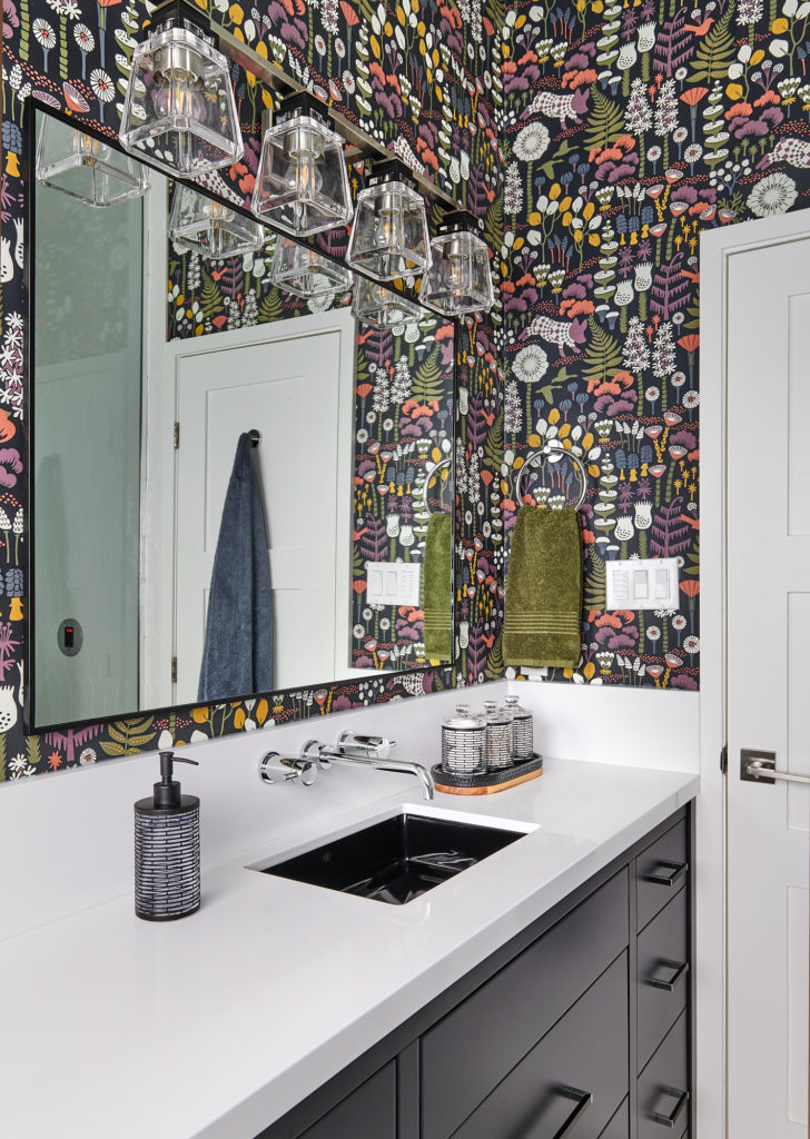
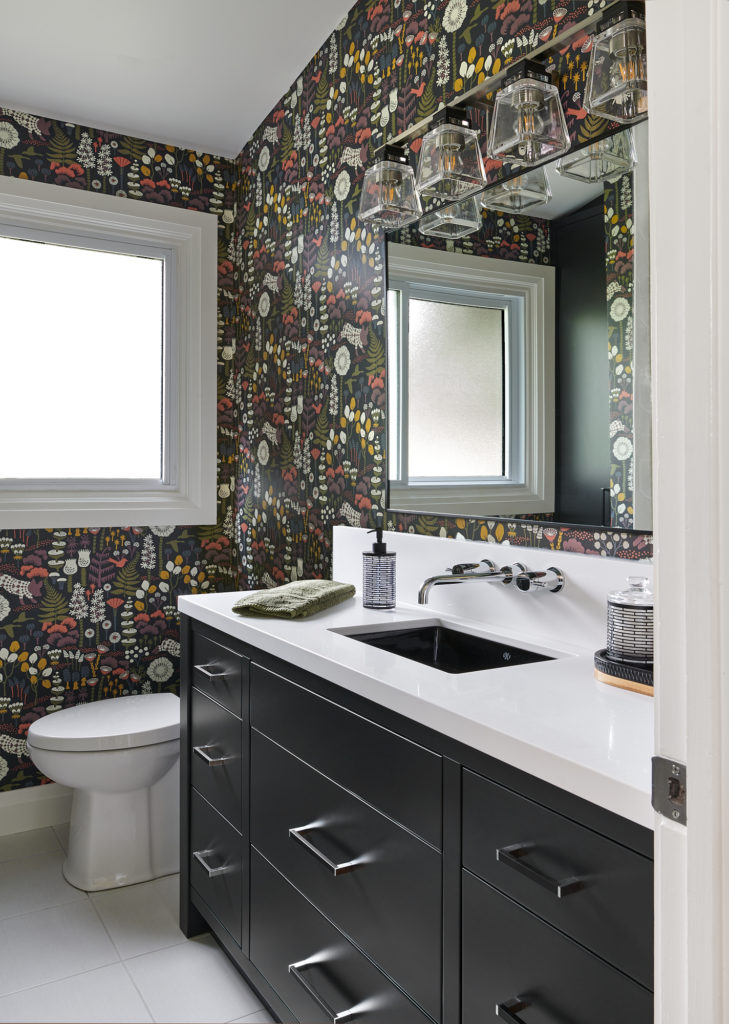
Let’s take a closer look at the sleek faucet and black sink.

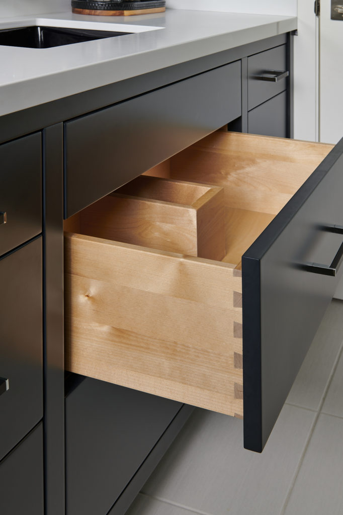
To solve our concerns around storage within the vanity, we did all drawers and my cabinet maker even did a cut-out for the plumbing, as you can see in the above photo.
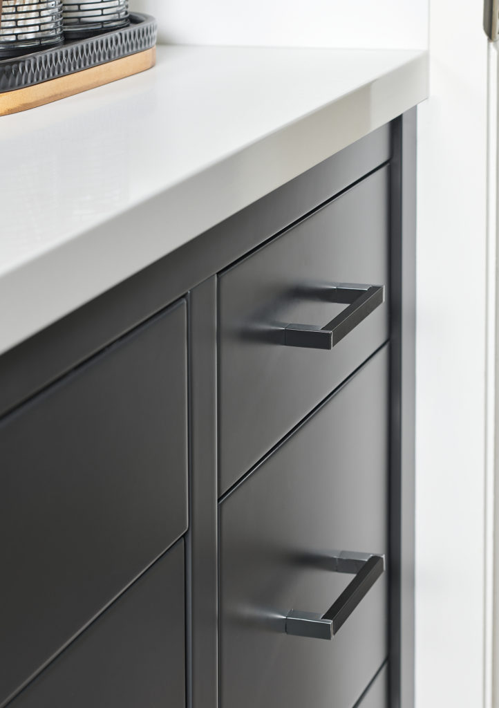
The hardware I purposely kept ‘quiet’ with a black handle that matched the Farrow & Ball Pitch Black finish. There’s a little bit of a chrome finish at each end of the handle which gives a nice separation between the two beautiful black finishes.
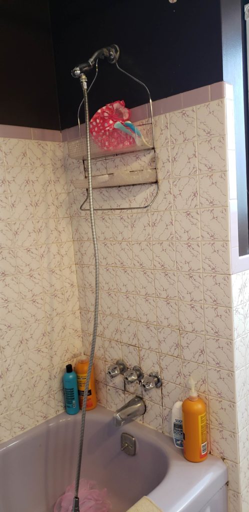
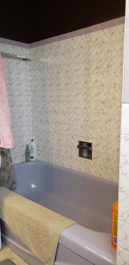
The Shower Before
The Problem: So many issues with the previous bathroom, where do I start?!
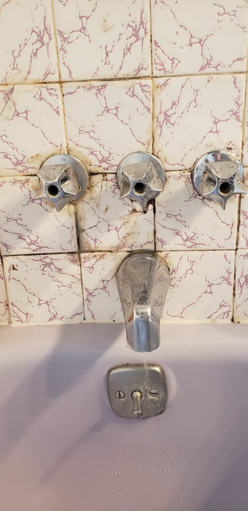
First, the tile itself is just gross. The dated pattern and the two different tones of purple were not doing it for me, but let’s be fair, this was initially designed in 1967.
Despite purple being my favourite colour, this is not my idea of ‘colour love’ when I see these violet and lilac tones together in this way. The tiles do not go to the ceiling either, they don’t even go as far as where the shower head that is fixed to the wall!
Also, it wasn’t enjoyable to take a shower here because the shower head itself was cheap and flimsy. You know how it is, we put off investing in something decent because we knew the bathroom renovation was upcoming.
The bigger issue here though was the mold that we had by the tub faucet and controls. More on that in a minute.
Another downside to an older bathroom design is the limited space for shampoo bottles, shower gel, razors, etc. This is why we had one of those unsightly shower caddy’s that you can see hooked precariously over the shower head.
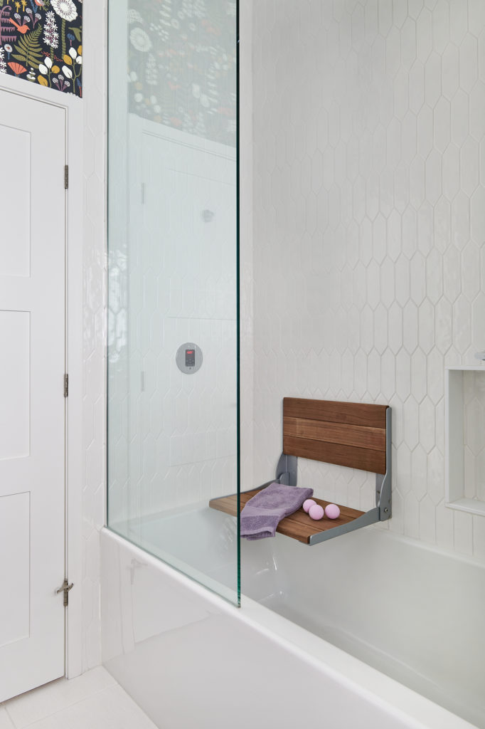
The Solution for the gross tile: New beautiful white picket fence wall tiles that go all the way to the ceiling. Much more fresh, clean and bright, don’t you agree? Seriously, there isn’t anyone on this earth that could argue that with me!
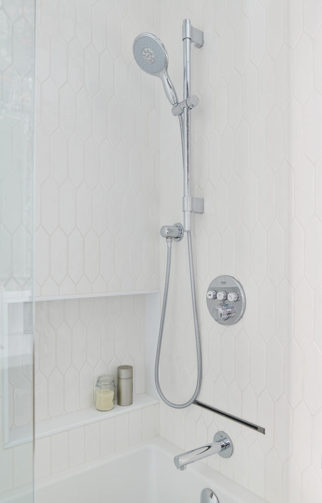
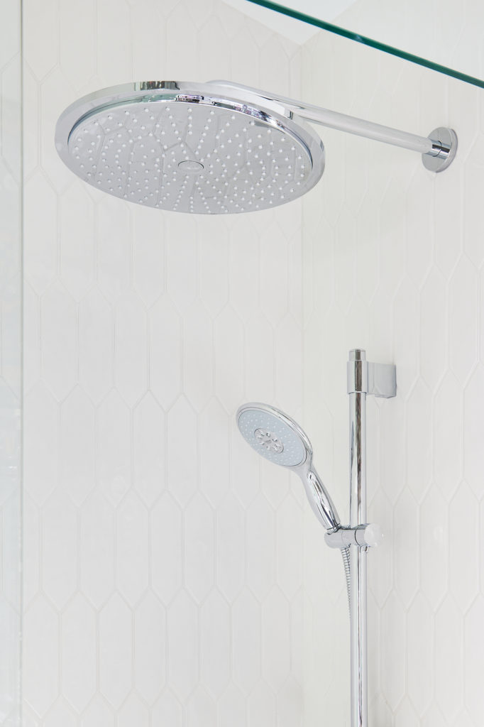
The Solution for the dissatisfying and cheap shower head: My new Grohe Power&Soul handheld shower with sleek shower rail.
I love how easy it is to slide up and down, especially since everyone else in my family is taller than me (not difficult when I’m 5′ tall!) and I need to readjust it almost daily.
I like that it has four settings for the spray itself because who doesn’t like to have options? Now I have five choices for how I want to enjoy my shower, if you include our new rainfall shower head.
Below is the Rainshower Cosmopolitan 310 model. At 12″ in diameter, I don’t have to move around anymore to get wet.
Do you have a rainfall shower head? I now wonder how we lived without it. Isn’t it funny how that happens? I could get used to being spoiled in this way!
Now remember when I said there was no judging and warned you that there may be some ‘before’ shots that you might find disturbing?
Look away now if you can’t handle the truth. No getting mad at me if you bring up your last meal…
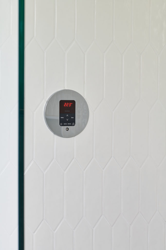
The Solution for the mold around the tiles and the faucet controls: The Grohe Smartcontrol. This was something that I had my eye on for a while. When I partnered with this fabulous brand, I knew that this would be top of my list!
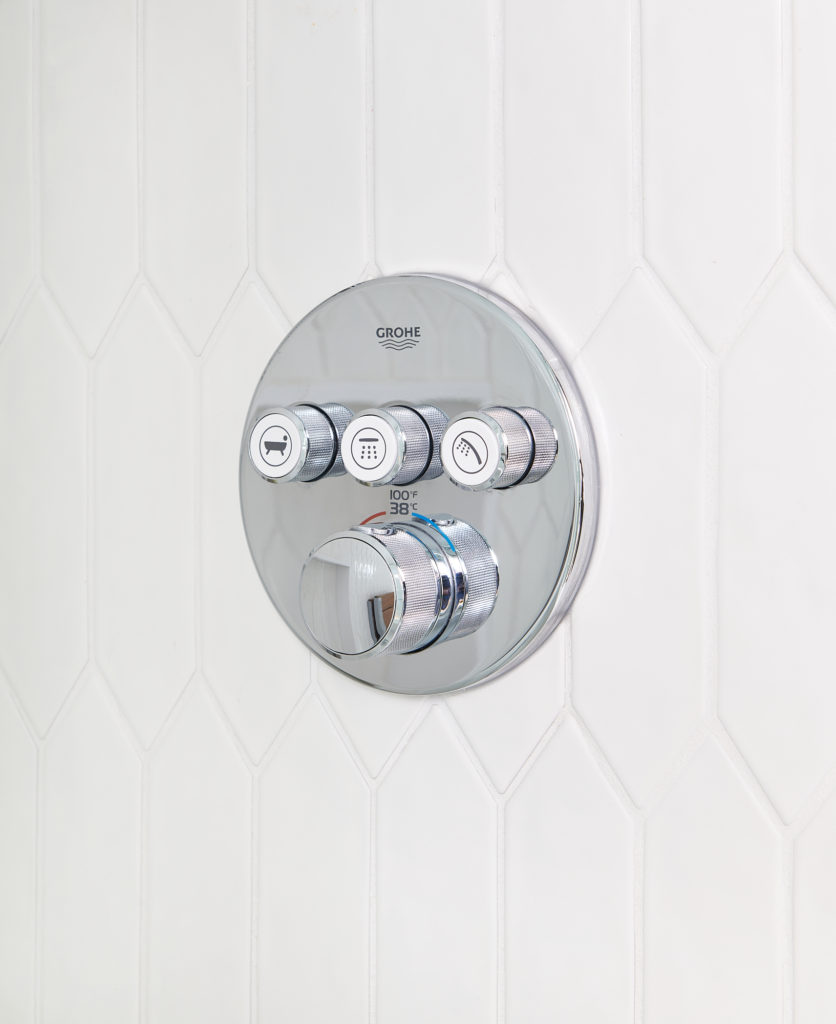
That’s a breath of fresh air, isn’t it?! I can’t tell you how much I love this, and not just because what I had before was unbearable to look at. It’s so great to now have an all in one solution for the controls.
I also like the simplicity of the touch button features and easy to turn knob for getting the temperature just right for either a shower or a bath. Not to mention, how bloody wonderful it looks too!
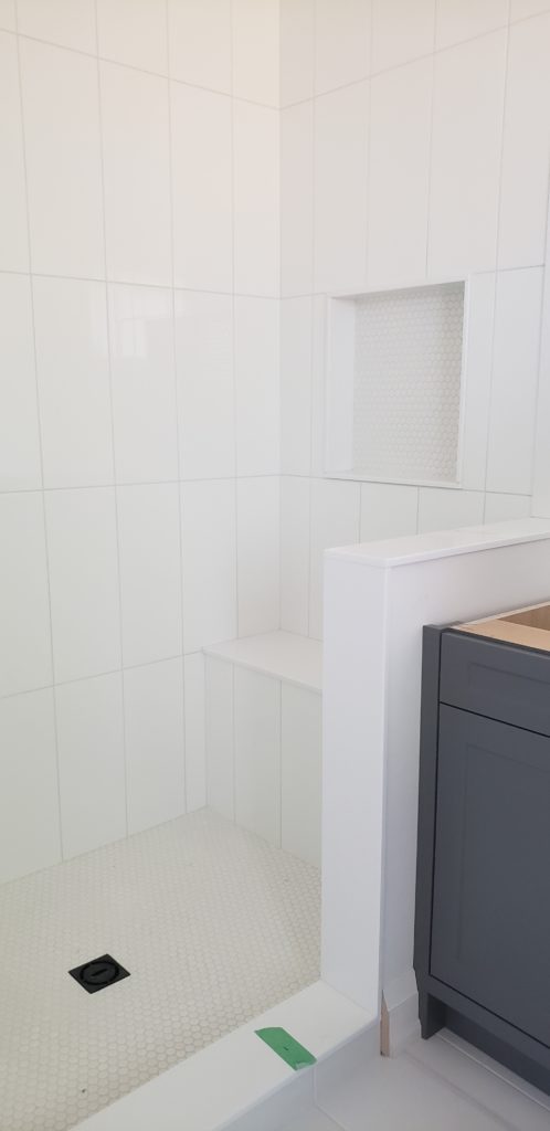
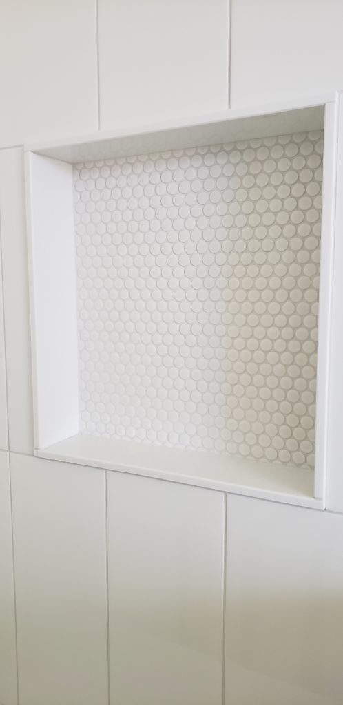
The Solution for limited storage: A custom shower niche in the wall. We purposely kept it low in order to easily access items needed for when we take a bath. The size is perfect.
TOP DESIGN TIP: Always make sure you measure your shampoo and shower gel bottles before you finalize the size of a custom shower niche to make sure everything you use regularly will fit.
In the image above, you can see the linear steam head of my Mr Steam unit between the Smartcontrol and the tub spout. I’m getting to that goodness next.
A sanctuary to call our own
The Problem: The shower curtain.
Now don’t get me wrong, I know that they have their place in some bathroom designs and with the options these days being plentiful, you can get some really lovely ones.
But, when this is your ONLY bathroom on the main floor of a bungalow, shared with 3 other people, having a place to escape that feels more of a retreat for your precious alone time isn’t too much for a girl to ask for, is it?
The Solution: I decided to up the anti and when I partnered with Mr. Steam, not only did I get my glass shower, but I also splurged on a steam unit!
Did you know that there are so many benefits to using steam? I have enjoyed using this feature more than I ever thought possible.
I hadn’t really been in many steam rooms before, at least not for years that I can remember, and so I didn’t really know what I was missing. But now, I’m not sure that I would ever design a bathroom for myself that didn’t have one. Yes, I am a changed woman!
Here is a list of just some of the benefits of using steam regularly:
- Helps to relieve stress
- Promotes deep, restful sleep
- Cleanses skin (think of all the money you spend on those face creams over the years!)
- Improves circulation
- Burns calories (BONUS!)
See the full list of benefits with more details on the Mr. Steam website.
You can never have enough Storage
We are nearly at the end of reviewing all of the details of my stunning bathroom makeover, but first you need to see the ‘peek a boo’ surprise in my tall cabinet that sits between the window and the shower wall.
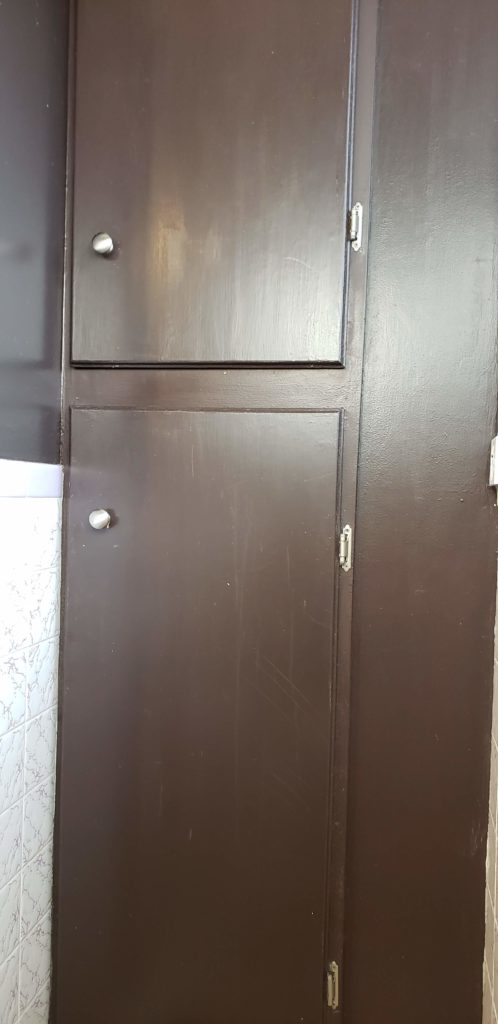
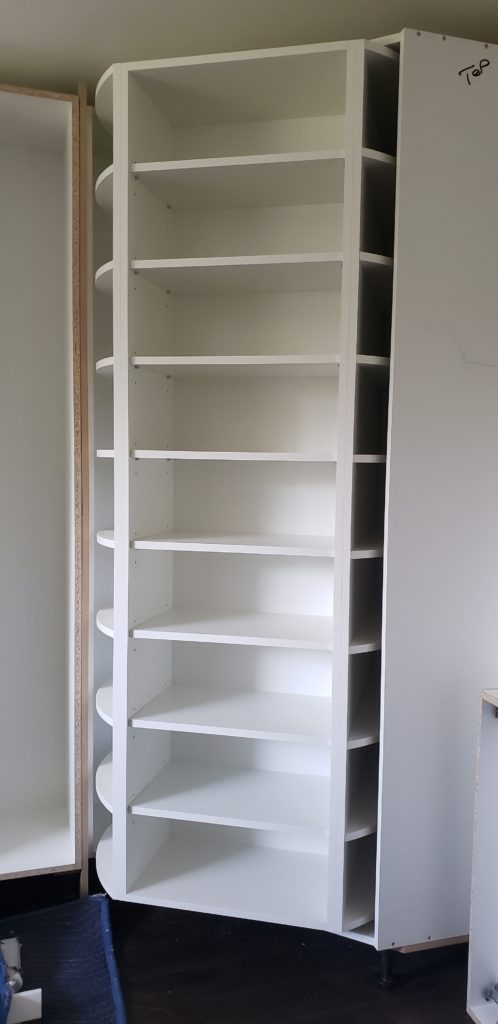
This was my uninspiring wall unit that we used for toiletries and towels. It sits just opposite the toilet.
Within that wall at the back and on the right hand side, there is a pipe that runs into the basement which is why you see the door is more towards the left side. And this is why I talk a lot about investing in custom cabinetry…
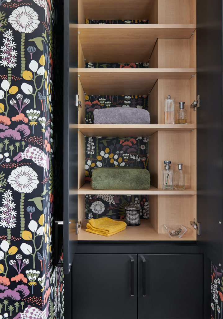
My brilliant cabinet maker designed the inside to allow for shelving to be built around that pipe that is hidden on the far right at the back.
Doing this meant that we could eliminate the ugly medicine cabinet that we used to have above the toilet, as these new shelves are the same depth and on each shelf within the unit.
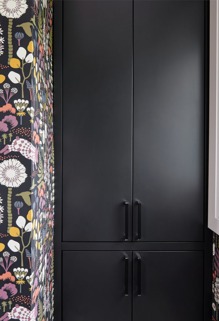
Below you will see how freakin awesome it also looks when it’s closed.
That, my friends, nearly brings me to the end of my bathroom reveal! Almost, but not quite yet.
My penultimate mention has to be about the Aria vent. This is a Canadian company and we are using their products almost exclusively on most projects now. I absolutely adore how they integrate into pretty much any floor type.
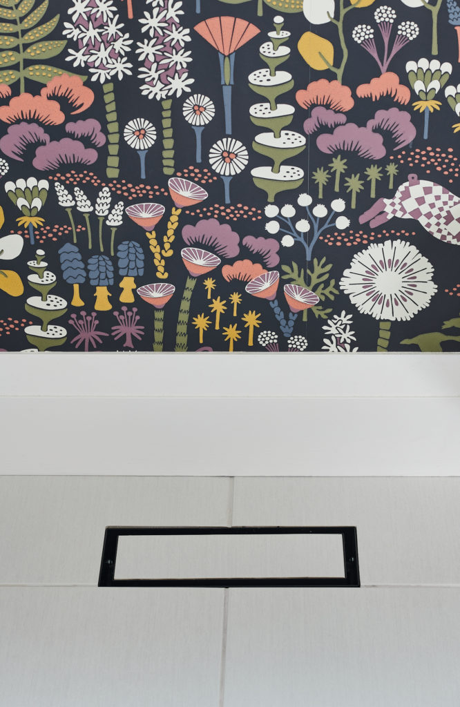
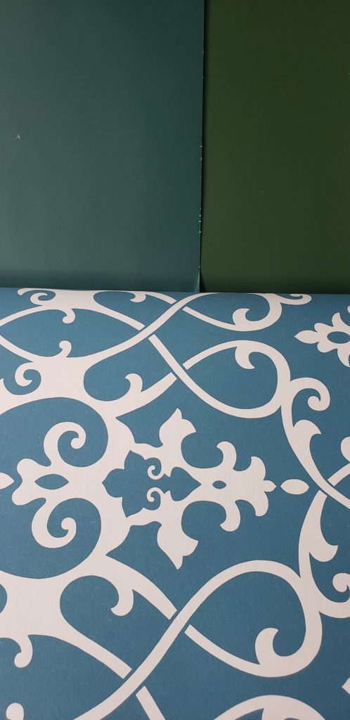
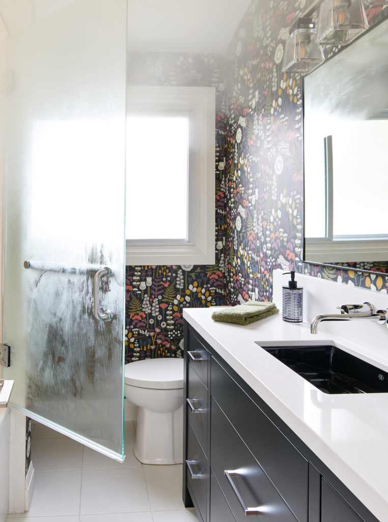
I can’t do a post about this bathroom design without mentioning the brilliant, playful and colourful wallpaper. I am thrilled with my new bathroom design and this bold backdrop really brings it all to life. It also has an organic feel that I was drawn to and did you notice those carefree purple pigs? Look carefully!
We colour matched the hues in the wallpaper to coordinating hand and bath towels, with everything else being neutral, mainly black and white.
I couldn’t be happier with the final result and am proud to show off my bathroom! Comment below to let me know what design element is your favourite.
A final thank you to my brand sponsors for collaborating with me on my small bathroom makeover. I appreciate you all very much!