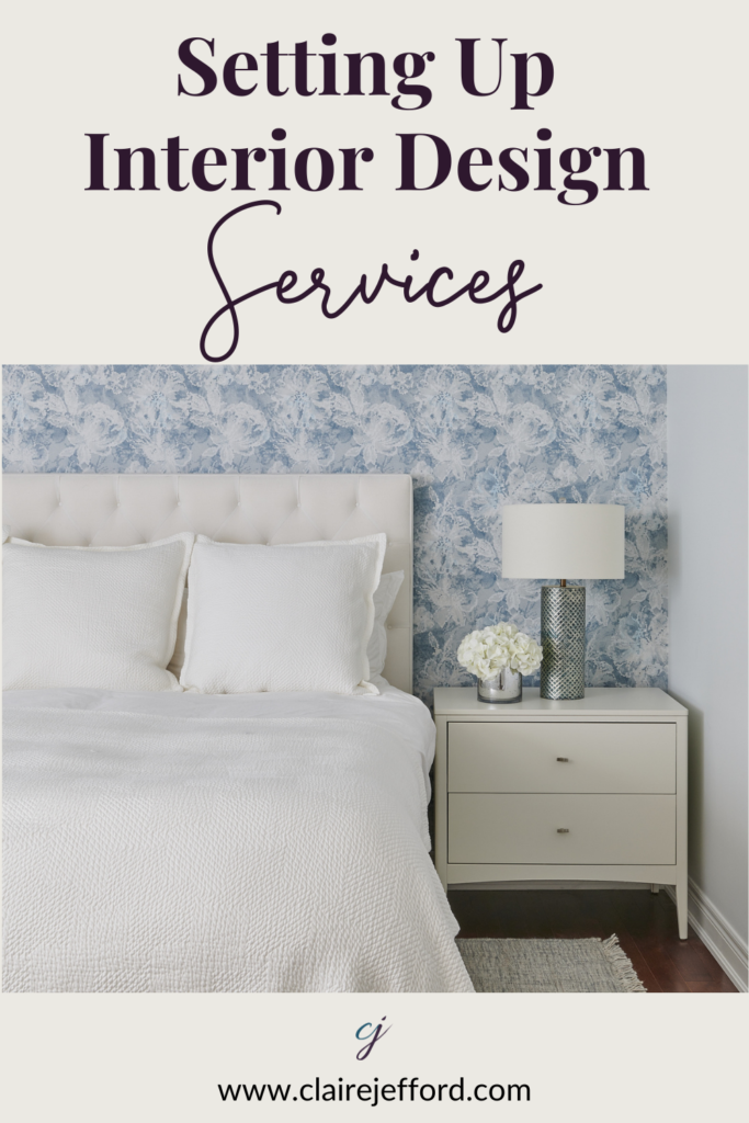
Have you established details of your valuable interior design services?
Are your rates clearly structured in a way that allows you to effectively market these services to potential clients?
If you are unsure or answered NO to either of these questions, you’ll want to grab my FREE DOWNLOAD. It’s a Guide to Interior Design Services and Pricing.
In the video below, I walk you through this document. Before you hit play, get your own copy hereso that you can follow along with me as I share insightful tips and practical advice on how to establish your interior design services and rates.
I created this FREE download for you because as professional interior designers and interior decorators, I understand that it can be overwhelming to know what you should offer in terms of Design Services. And if that part wasn’t difficult enough, figuring out what to charge is often even more stressful.
There is so much to consider. You can become paralyzed trying to figure it all out, so let me help!
I encourage you to watch the video, but will share here a bullet point version of what is included in this Free 4 page PDF download.
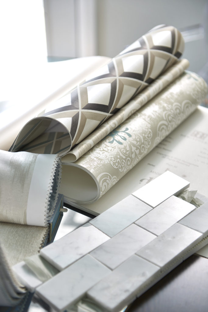
At my interior design firm, this meeting is a minimum of 2 hours. It may be a one-off appointment only which we refer to as a ‘Working Design Session‘. You can see here some of the items that I might bring with me to this type of meeting.
Alternatively, if the client is going to be moving forward with further services, this first appointment is more of a ‘Getting to Know You Meeting‘ where we gather as much information as we can about the client’s lifestyle, needs, desires, timelines, and investment amount.
Regardless, our fee for this all important first meeting is always the same. (Currently – December 2020 – we bill $700 for our initial consultation meeting)
At a Working Design Session Consultation, I am happy to bring samples.
2. Suggested fees
Always charge more for the initial consultation fee than your hourly rate.
For example, if you charge $125/hr then you should consider making the fee for your 2-hr initial consult $300 – 350 or more.
When asked why I bill more for the consultation, here is my reason. There is an onboarding process and a fair amount of preparation involved for an initial consultation appointment. I will share a ton of valuable information at the consult, no holding back, so I am confident in the value I bring to that first client meeting.
We also bill at a higher rate because we are looking to work with a certain level of clientele. Those who are willing to invest in a higher consult fee, are more likely to invest in further services. My hourly rate is lower once someone commits to working with me for ongoing services.
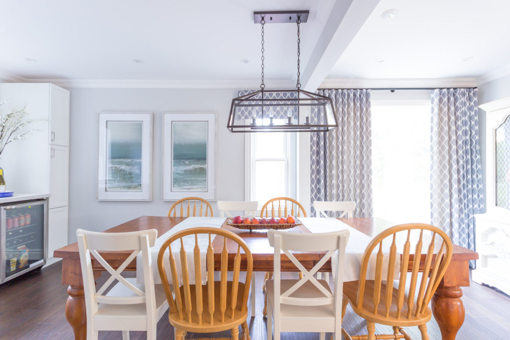
Open dining room design by Claire Jefford Inc.
Overall, rates will be dependent on your experience, location, business model and targeted clientele
You can see the fees that I bill for the consultation and all of our services on my Interior Design Services page.
In the video of this post, I go into more detail about how much to charge for this initial consultation and why I recommend you bill more than your normal hourly rate.
3. Design Services to Offer
I am not one to preach about zoning in on a specific ‘niche’ but I do recommend not to offer too many services which may only confuse potential clients. Keep the list streamlined so that it is easy for visitors to your website (and for you!) to clearly understand the ways in which you can help with a design or decorating project.
In my Free Download, I provide a list of a of potential services that you may want to consider offering such as Kitchen & Bath Design, Custom Window Treatments and Home Staging. This is not an exhaustive list and you may want to include several in your business model or concentrate on a couple only.
4. Presentation of services
Now that you have a list of detailed services that you will provide, consider how you will present these on your website and to potential clients at the consultation.
At Claire Jefford Inc. we have created 5 service offerings:
What you charge will vary considerably depending on your experience, your confidence level, and the type of clients you wish to attract.
Please remember that this is meant as a guideline, edit as needed to best reflect the way YOU want to set up your business model.
The key to estimating how long a project will take is for you to have generated a detailed scope of work based on all of the information gathered at the initial consultation.
I’ll quickly walk you through an example of Phase 1 of a Custom Design Project – our most robust service that we offer.
We based our calculations below on a one room design.
PHASE 1 ● Site visit for a check measures / GC meeting to discuss structural aspects of the design – est @1 hour ● 2D / 3D space planning drawings – est @2-3 hours ● Sourcing of furnishings and other elements for designing the space – est @4-5hours ● Preparing the presentation of design plans – est @2-3 hours ● The actual presentation of design plans – est @1-2 hours ● Any revisions based on the terms in your contract – est @2 hours
TOTAL ESTIMATION OF 12 – 16 HOURS X YOUR HOURLY FEE: ➔ 12 hours x $150 = $1800 / Up to 16 hours x $150 = $2400
Phase 2 would involve the project management of this project. You can see the estimated fees for this and more on my Design Services & Rates download.
Establishing a clear list of services and setting corresponding rates is crucial to the success of your Interior Design or Decorating Business. Once you have established your services and rates the task of getting great clients will be so much easier!
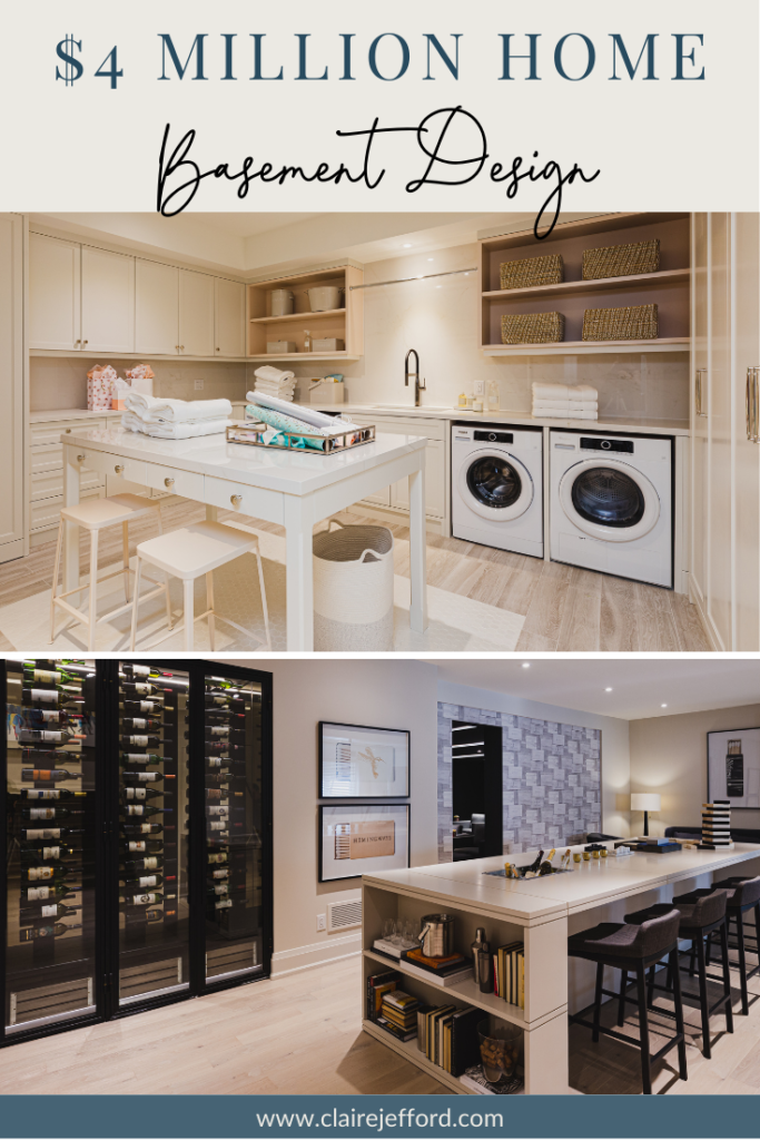
In Part 2 we are heading down to the incredible basement and then outdoors to the beautiful backyard space.
While I do not doubt that you will adore the laundry room, there’s one other room that I really gush over – it’s absolutely awesome.
Which one is that you ask? Come join me to find out!
Hit the play button on the image below and let’s check out this basement together
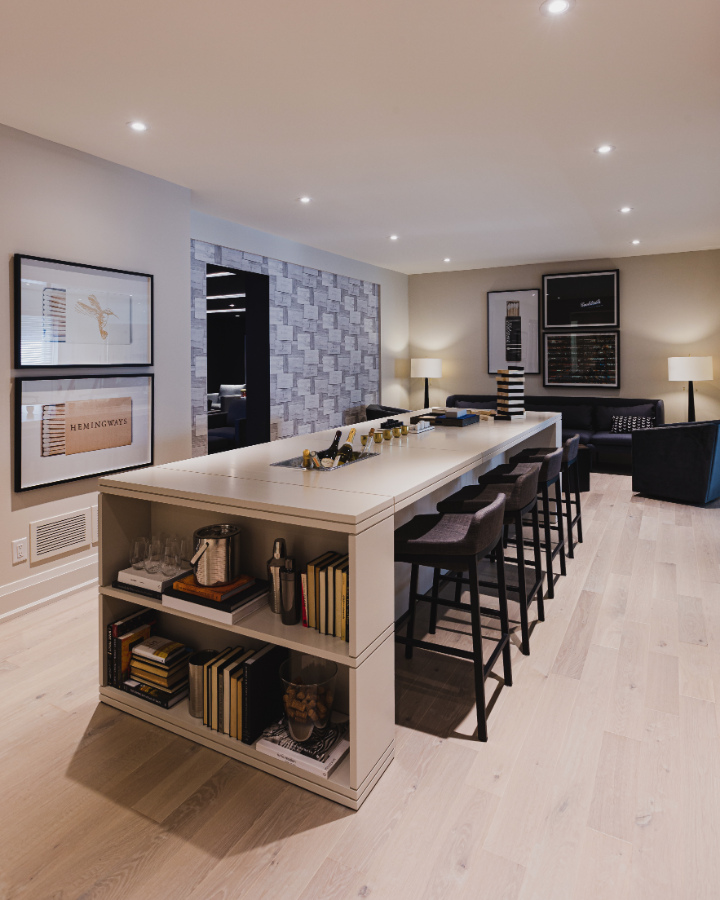
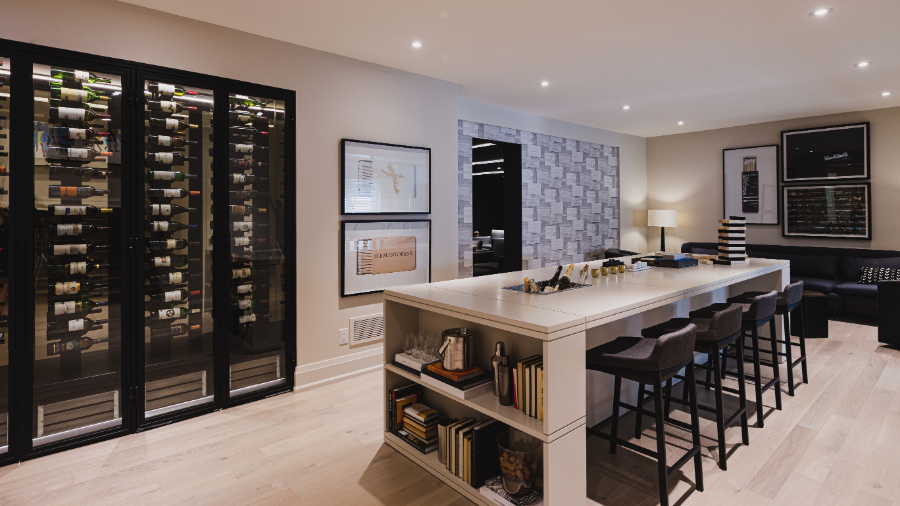
This Ain’t Your Ordinary Basement!
It’s hard to tell exactly where the stairs leading to the basement take you, but I believe it opens up to this exceptional lounge and entertaining area.
Lower level lounge area with long island table with seating
Here, I do quite like the details on the lip of the island. It’s more of an area for sitting, sipping, chatting, and playing games, not eating per se, so there’s not the concern with food crumbs like there was on the island in the kitchen as I mentioned in the previous blog post of the main floor.
Plenty of wine storage here and a long table to sit and enjoy it.
Did I mention the sipping of wine? Take a look at all of your choices, housed beautifully in this 4 door wine storage area!
Psst! Do you notice the opening in the middle of the room behind the island and to the right of the framed artwork? That is a hidden door that you would not know was even there if it were closed.
So which room does that secret door lead to? Keep reading, I’m saving that reveal for closer to the end of the tour.
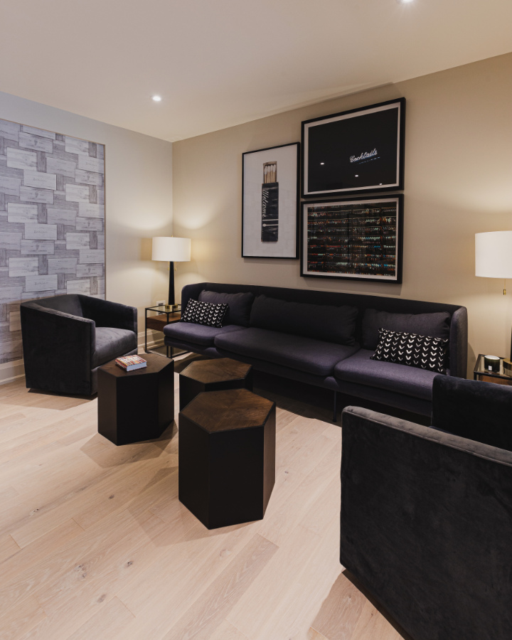
What’s Missing that would make this area more cozy?
The lower level lounge / sitting area. Pale Oak OC-20
I love this lounge area, but do feel that there is one important interior décor element missing…
Yep, an area rug! Knowing how to choose the right size area rug is important, as it can help to bring all the furnishings nicely together and add some much-needed softness to the room.
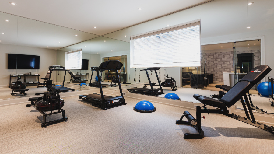
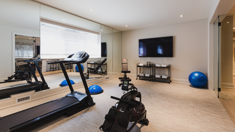
After all that wine tasting, you might feel the need to get up and get moving. No better place to do that than your own personal fitness room.
Just head across from the sitting area to your personal gym. This room is painted the same colour as much of the home including the lounge area from where we entered. It’s Pale Oak by Benjamin Moore.
Working out may not seem so hard in this fully outfitted basement fitness room.
This gym has everything you need and I love the light from those extra-large windows. The outside window wells would have been dug out to be larger than normal to accommodate such an opening for these basement windows.
Basement home gym with all the gear plus a mirrored wall to keep an eye on your form.
A mirrored wall is always nice to have in your workout area, but the thing that I really love here is the detail in the trim work around the vent. Those small details are fabulous and make the room really look finished.
I am not exactly sure where the next two rooms are within the floor plan of the basement. I wish I could have been there to actually tour the house like I did last year, then there would be no guessing involved!
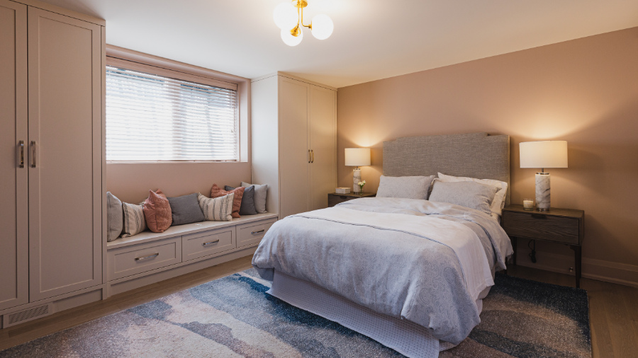
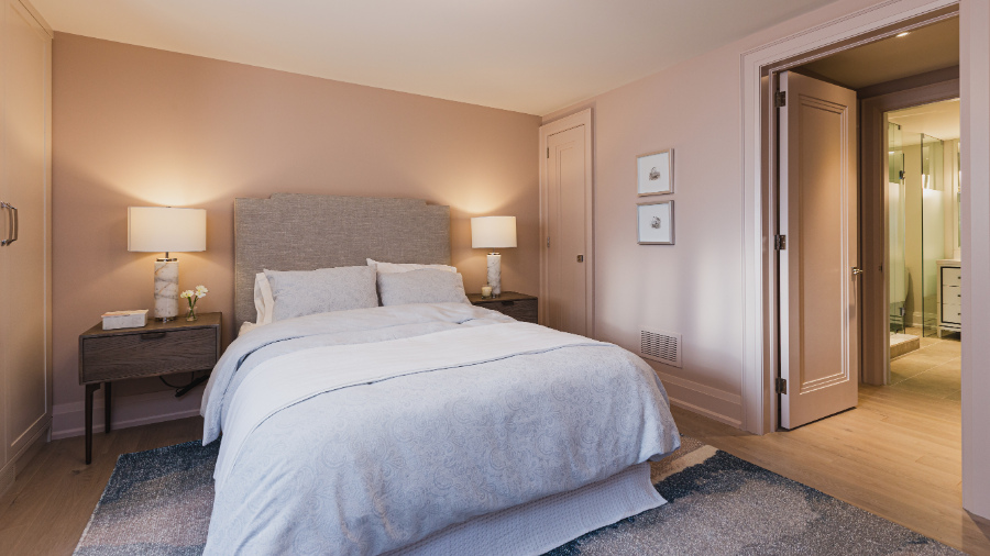
Guests won’t feel like they are in the basement in this serene guest bedroom.
Here we come to a lovely guest bedroom with one of those huge windows once again, allowing so much natural light in you don’t feel like you are in a basement.
Don’t you just love the colour on the walls, trim, and doors? It’s Old Stone OC-424 by Benjamin Moore.
Guest Bedroom with ensuite – walls, trim and doors Old Stone OC-424
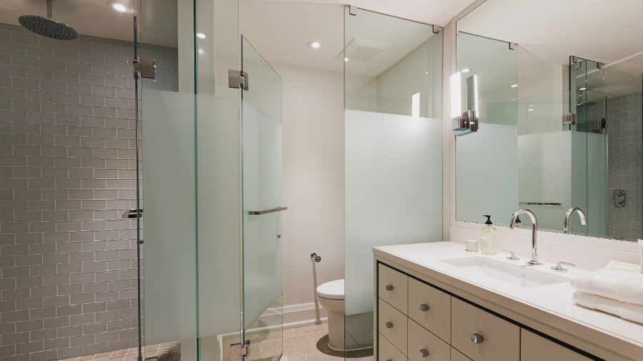
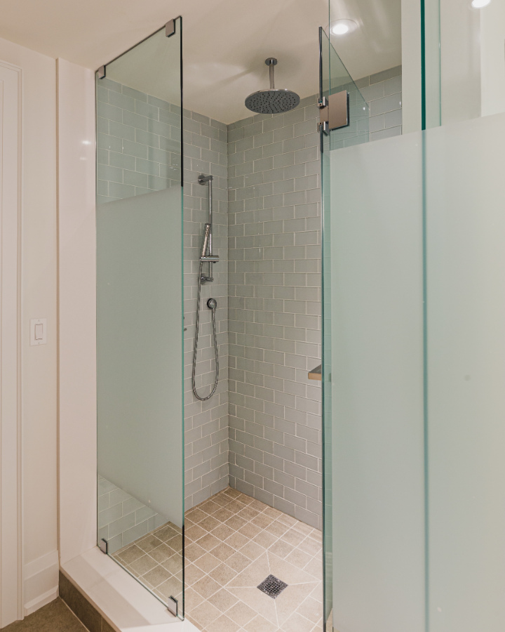
A well-appointed ensuite with simple and subdued subway tiles on the walls in the shower and again a DXV sink, faucet, and shower system.
Roomy tiled shower with DXV shower system
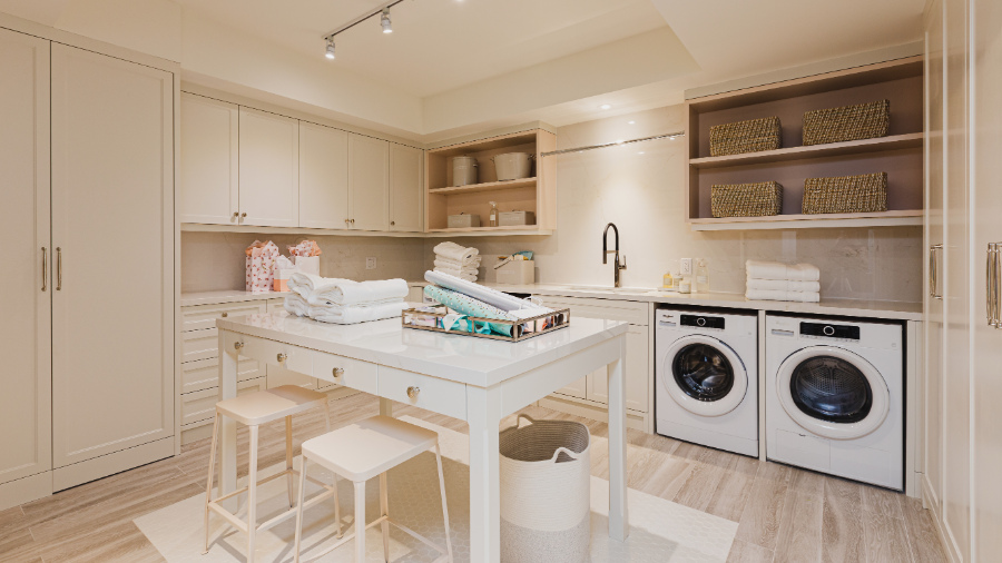
LAUNDRY ROOM LOVE!
Basement laundry room – super organised. Cabinetry and walls in Old Country by Benjamin Moore
I might not mind doing laundry so much if I had such a beautifully organized room that looked like this. A table for folding, wrapping, or crafting…YES PLEASE!
The soft colour tone of the cabinets is soothing and easy on the eyes. I have not used this Benjamin Moore paint colour either, it’s OC- 76 Old Country. Don’t you agree that it looks great here on all of the cabinetry and walls?!
There is no lack of storage with all the custom cabinetry, plus with the built-in rod for hanging clothes to dry and open shelving, this room is getting full marks for function.
Did you notice the detail of the white tile inlay under the table? Love it or leave it? Personally, I LOVE IT!
Ok, you’ve waited long enough…
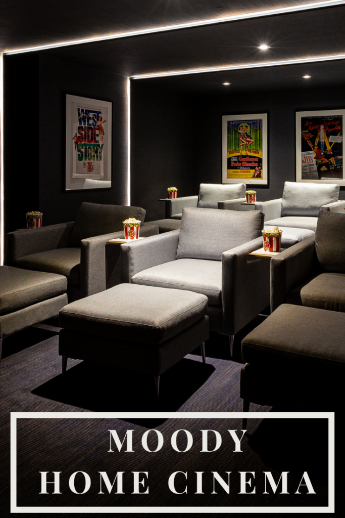
As wonderful as all of the preceding rooms have been, this last one is the star of the entire basement design in my opinion.
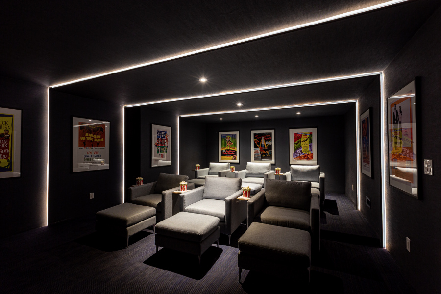
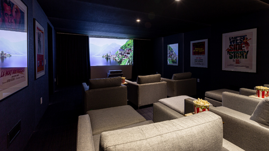
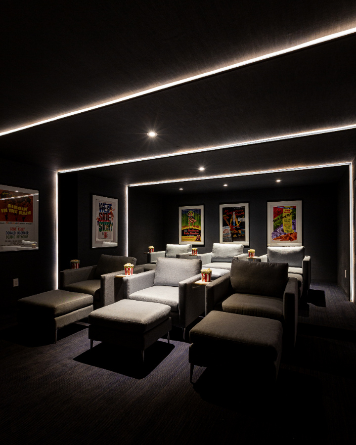
Better than going to the cinema – dark wall coverings and movie posters make a great home theatre
My family may never set foot in a Cineplex again if we had a theatre room like this in our basement.
The strip lighting is fantastic and the dark wall coverings are so perfect to set the mood in this purposeful space.
The movie posters add some fun and colour to the overall vibe with the white mats offering a great contrast to the dark gray textured walls.
This is definitely a room where a family could all hang out together enjoying the most current blockbuster movie.
Oversized chairs with ottomans are a great way to stretch out or offer additional seating if required.
Any movie would be enjoyed being watched from the vantage point of these chairs.
Did you ever see the amazing movie theatre I designed? The colour scheme was totally different, but it was just as fun and functional as this one here in the Princess Margaret Lottery Home.
Heading Outdoors
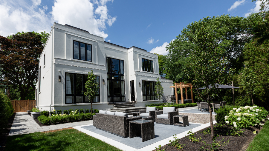
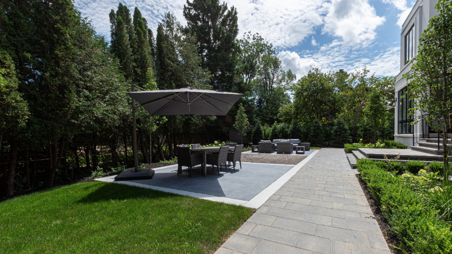
Come out into the light now and see what’s happening in the backyard. What’s really nice is the maturity of the surrounding neighbourhood. I love the trees and the grounds all seem fairly private.
While it’s a nice sized garden with different ‘zones’, each with a purpose, I’d love to see a pool back here.
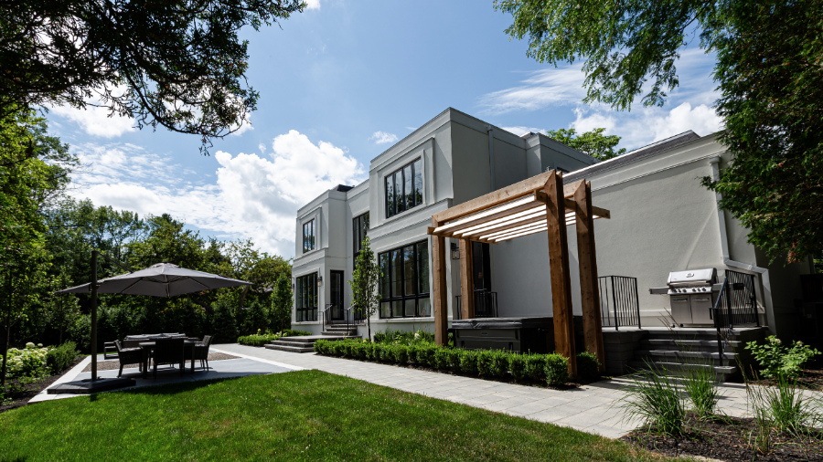
Outdoor space with hot tub and BBQ area on the upper level, and dining on the lower level.
There is a hot tub closer to the home in this courtyard, which is a nice amenity to have.
But where is the gorgeous outdoor kitchen that should be coupled with a grand home such as this? A stand-alone BBQ just doesn’t cut it in my opinion!
The trend of a home’s outdoor living space being an extension of the home falls well short in this $4.8 million house. This is especially a shame nowadays with all the extra time families are having to spend at home.
Outdoor living at the Princess Margaret showhome, Oakville.
For the price tag of this home, would you LOVE IT OR LEAVE IT?
This brings us to the end of the tour. What did you love? Did you see some things that I missed?
Let me know in the comments below.
PERFECT FOR PINNING!
Pin these to your Pinterest for easy reference when you need it.
For Your Convenience
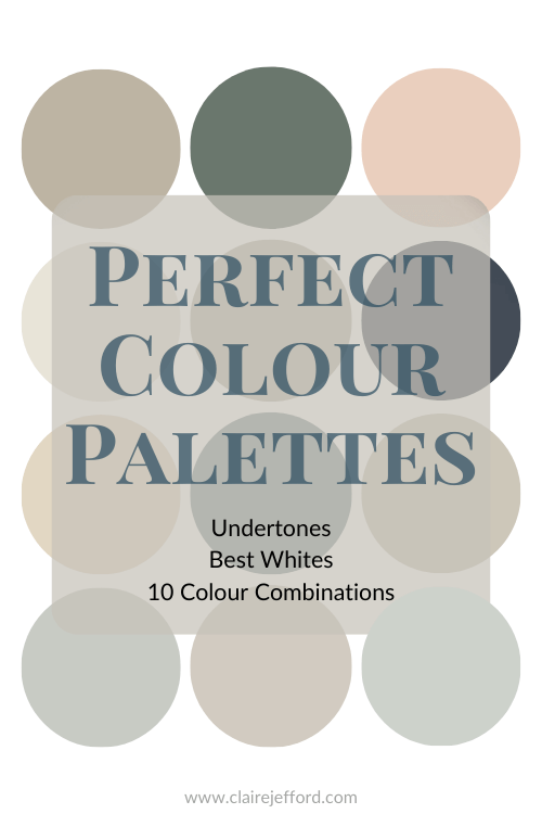
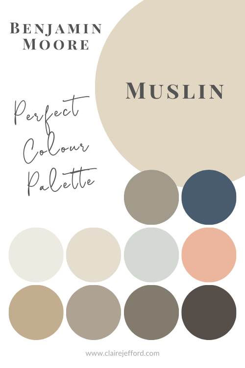
If you’d like a beautifully curated colour palette like the Princess Margaret home has, look for further than my Perfect Colour Palettes.
These perfectly curated colour palettes will help to bring a home’s décor together flawlessly.
Confidently select the best colour for your home, and see which trim, ceiling, and accent colours pair well with your selected colour.
While I’m disappointed I didn’t get the chance to tour this stunning house in person this year, I was definitely excited to receive the entire portfolio of images from this year’s $4+ million Princess Margaret Lottery Home.
Of course what excites me most, is that I get to share these photos with you!
In part one of my two part series, I take you on a walk through video tour of both the main floor open plan design, as well as the second floor.
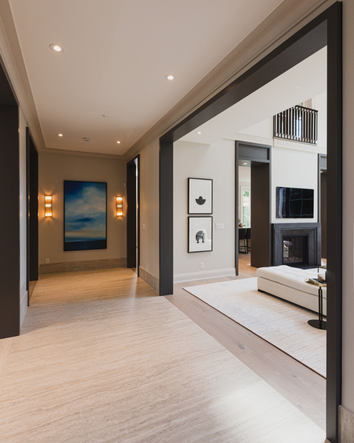
Princess Margaret Showhome – Great Room
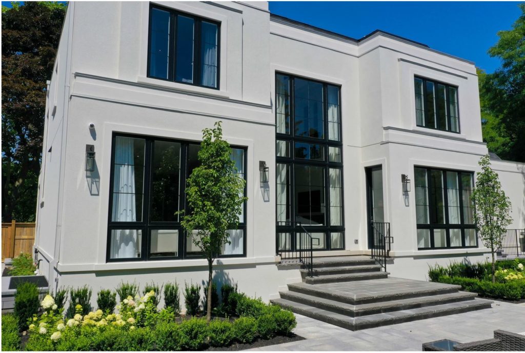
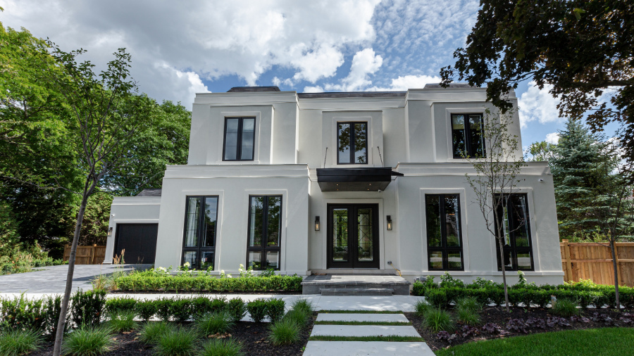
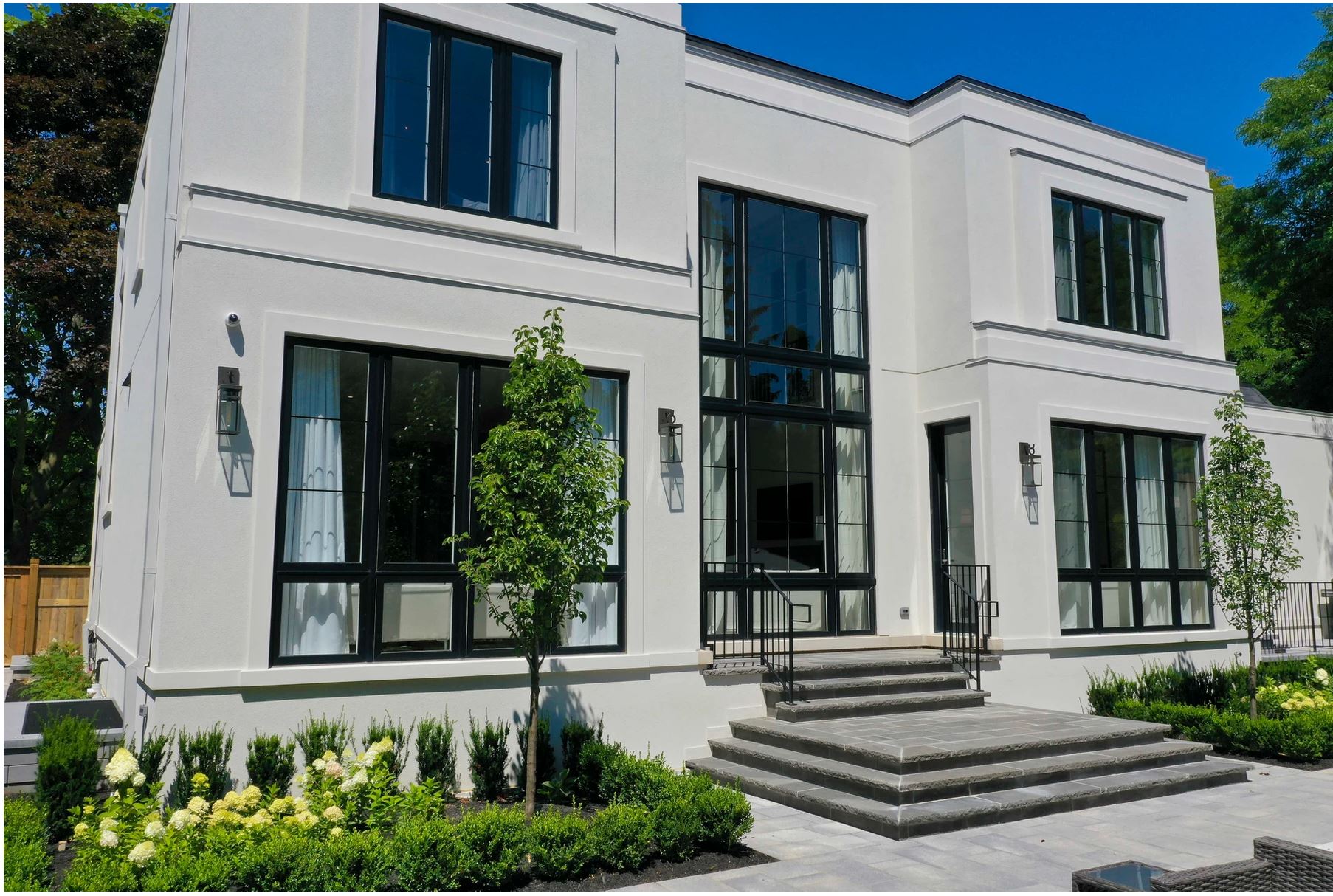
This stunning 7,500 square foot art deco inspired home designed by the super talented interior designer Brian Gluckstein is on a beautiful tree lined street in southeast Oakville, Ontario.
I want you to take note of how the windows are bumped out on the upper level, as this plays a key role in one of my favourite design elements you’ll find in each of the bedrooms.
Come with me now as I take you through the house, room by room. You’ll hear what elements of the interior design I loved and what I feel could have been done better, mostly in terms of function.
See what Benjamin Moore colours were used throughout the space, I share them all with you in the video. You may just be suprised by the bold colours used in some of the bedrooms!
To get a better look of each space, I’ve included even more photos in this blog post than what you will see in the video tour. But don’t skip ahead, be sure to watch the video below and then tell me your thoughts in the comments.
Let’s do this!
Welcome!
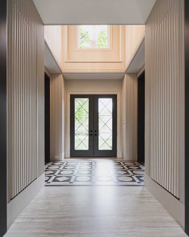
Let’s start our tour right from the beginning – the front entrance. And what an entrance! What a joy it would be to walk through this front door at the end of long day.
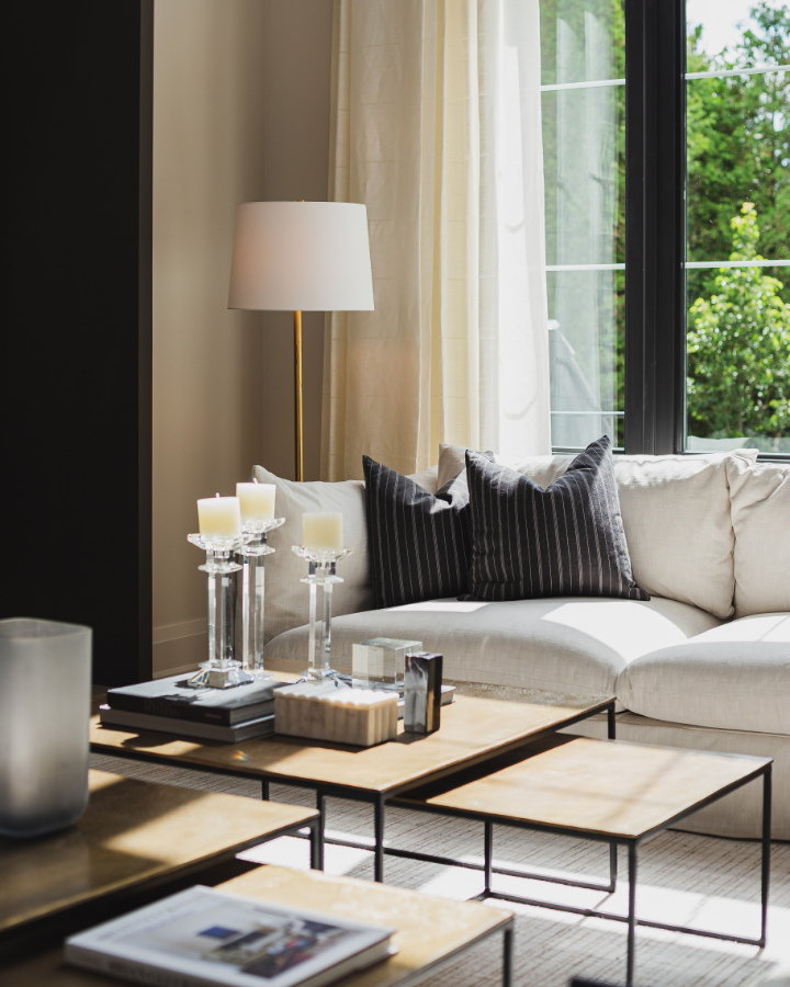
This foyer and much of the main main floor is painted Pale Oak by Benjamin Moore. We recently used this colour in our Burlington client’s living and dining room.
It really is such a soft and pretty colour tone, one of the most popular new neutrals that we see being used more and more. Here, you can see why!
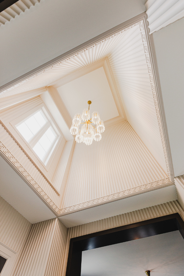
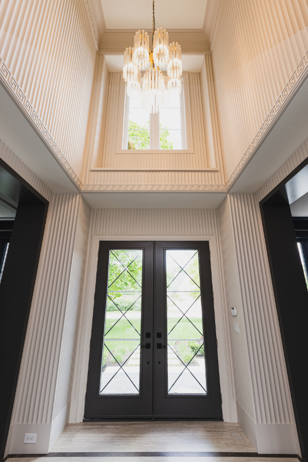
Amazing details in the foyer, from the pattern in the floor tile to the fluted wall treatments, the Greek key pattern in the trim work and window surround.
This home gets a ton of natural light that fills each room, bringing the spaces to life even more, effortlessly highlighting the exquisite details in the custom millwork.
Wall Details…Love it or Leave it?
Foyer with intricate key trim detail and Babylon chandelier
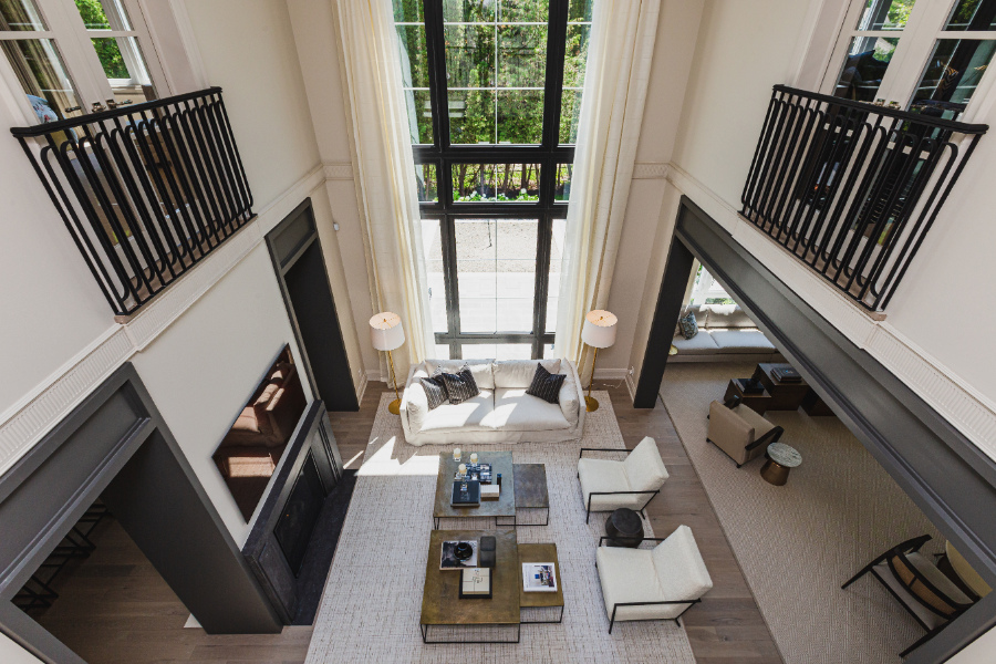
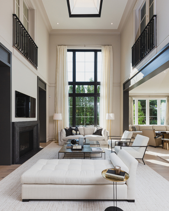
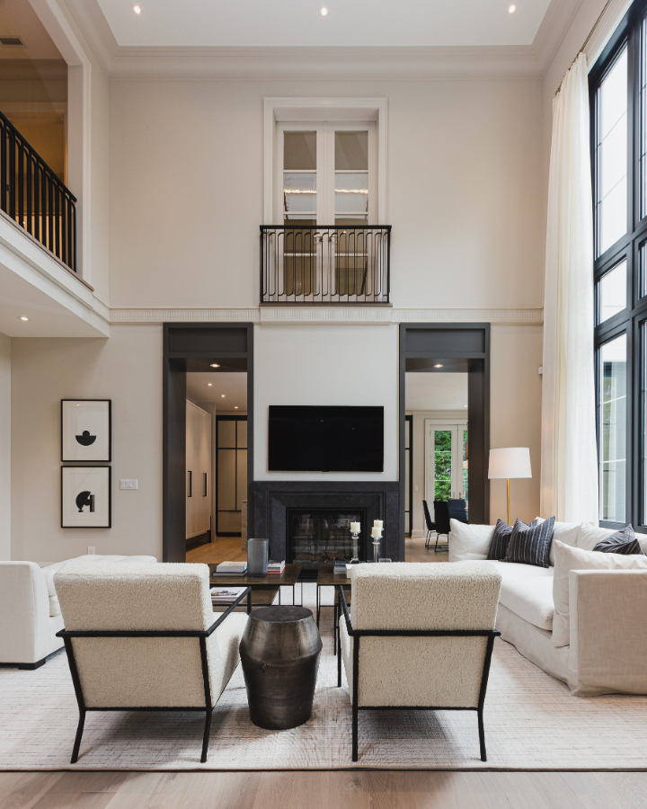
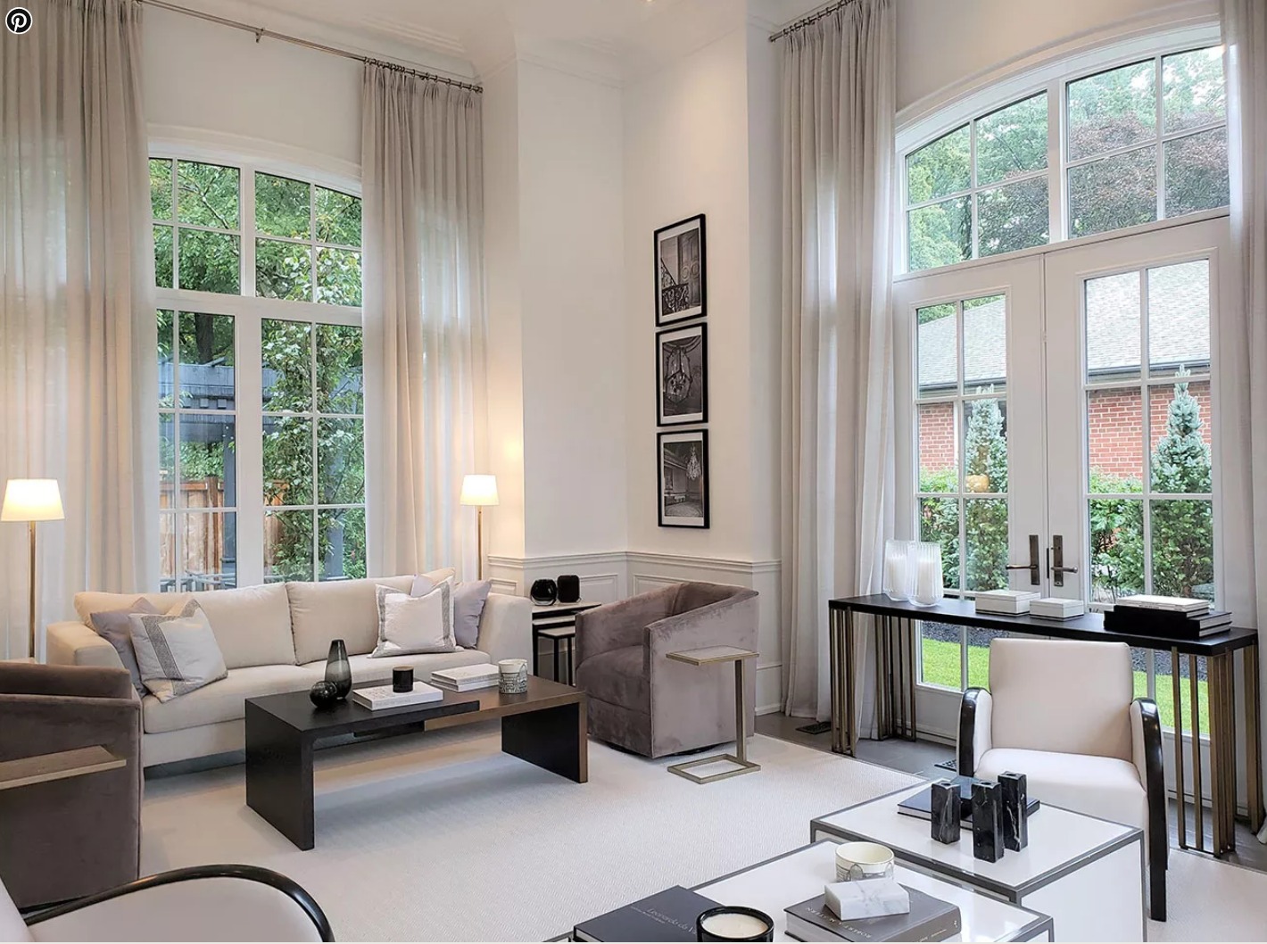
From the foyer you can see through to the true highlight of this house – The Great Room….and how great is it?! Those ceilings, seem to go on forever.
The contrasting trim around the archways and that gorgeous natural light shining through that two story window are stand out features that I absolutely love about this room.
How are you feeling about the contrast between the Pale Oak walls and trim and the Kendall Charcoal on the archways? Too heavy? Just Right?
Personally I love it. I also love how fabulously these two colours work together.
Contrasting archways…Love it or Leave it?
Great room out to the front hall and main entrance to the house.
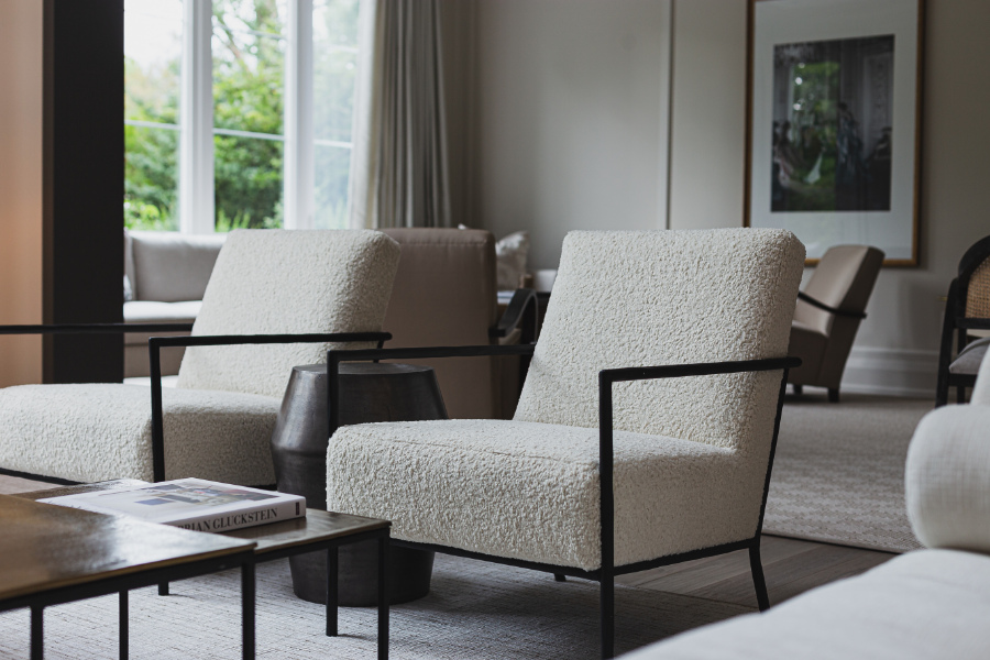
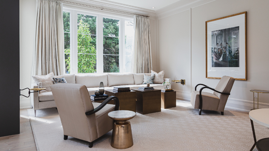
The majority of the furniture throughout the Princess Margaret Lottery Home is from Glucksteinhome. Many of these pieces have a very neutral feel, done in soft neutrals with hits of striking gold and dark metals.
Two of my absolute favourite furnishings are these two armchairs. They remind me of a little lamb. I’m not sure if I should sit on them or pet and name them!
Neutral furniture with accents of gold and metallics
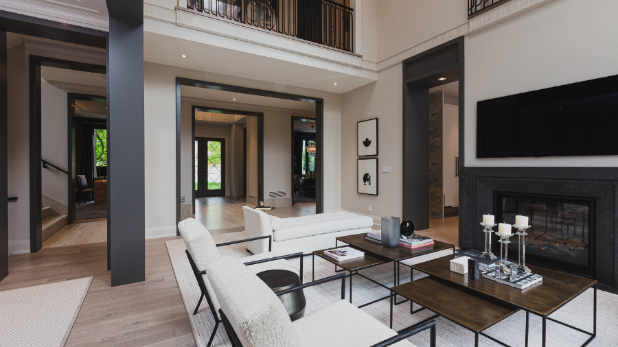
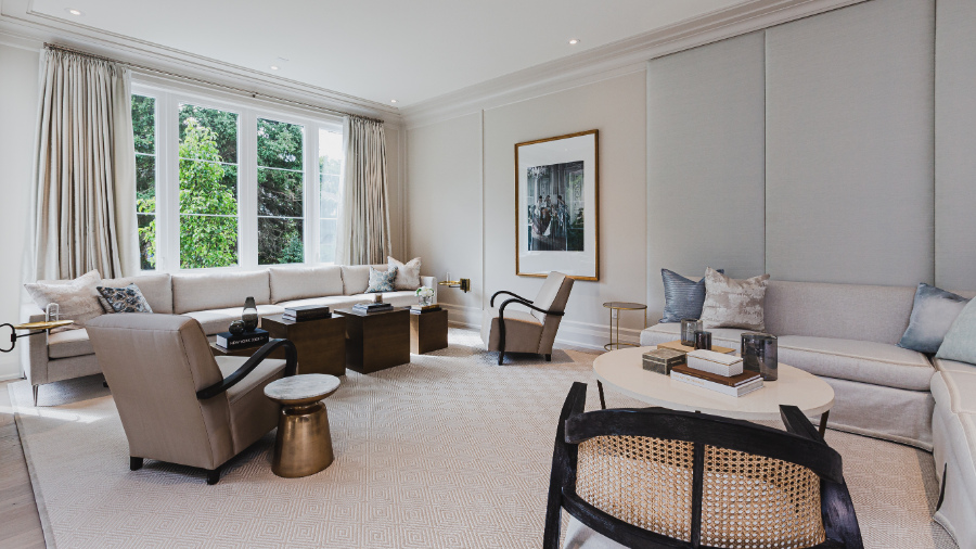
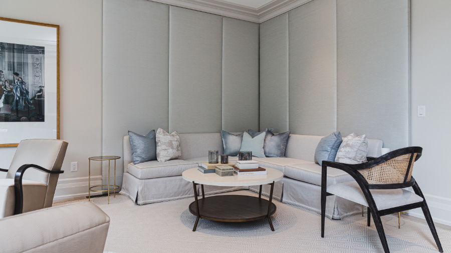
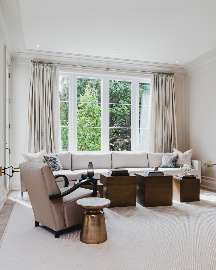
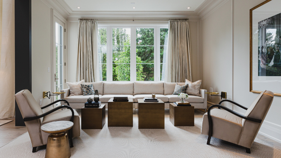
Adjoining The Great Room through the large archway to the right is a second area for relaxing, chatting, or entertaining.
I consider this space, more a living room or sitting room. It doesn’t have the same grandiose feeling as the adjoining Great Room. Mainly because the great room has such high ceilings!
Notice the Great room with the high ceilings, compared with the adjoining living space. Still bright and airy though!
Between both of these rooms, there is ample seating for those days we all long for, when you can once again have more than just your immediate family in your home.
The one decorative element I am not loving is that wall with the pale blue fabric panels. I mean, it’s pretty but for some reason, it’s just not doing it for me.
What I love though, is the addition of the round tables and curved pieces, especially when the majority of the furniture is square and rectangular in shape.
I especially adore those little wall mounted round brass tables. Can you spot them on either side of the room near the sofa by the window in the photo above?
Soft Blue Fabric Panels…Love it or Leave it?
Corner sitting area, with fabric paneled walls, skirted neutral sofa and round table. Additional sitting area with wall mounted round brass tables
Next…
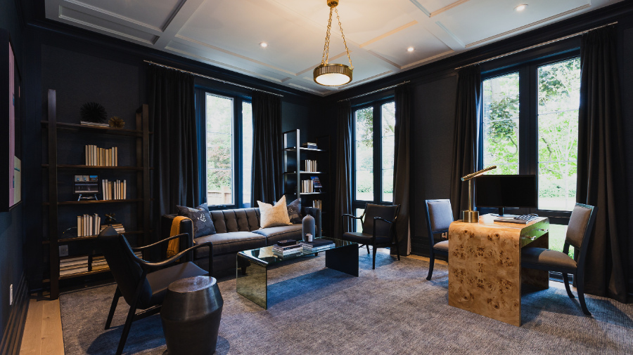
We’re going to cross the hall and check out the study / den.
This is a very dark, very moody room. The walls here have been wallpapered in a gorgeous rich blue covering. The trim and baseboards have been painted Benjamin Moore Blue Note 2129-30 to match the walls and drapery. I love it!
The desk made out of Burl Wood is outstanding. You can see how Brian has repeated this light orange hue in the toss cushion, the throw and in the way they have displayed the books with the spines facing inwards.
These accents offer a welcome warm tone to an otherwise dark and moody space. I do feel that there is a lack of efficient lighting in this room though.
A couple of lamps either side of the sofa would not hurt to provide task lighting as needed.
Burl Wood Desk…Love it or Leave it?
Back down the hall…
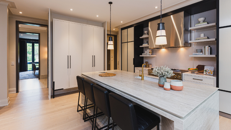
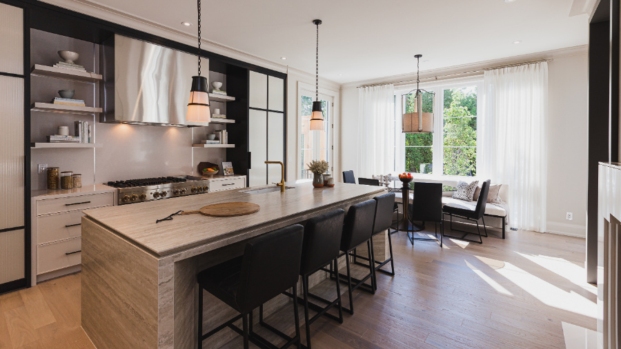
On the other side of that two sided fireplace in the great room you can catch a glimpse of the kitchen – that’s where we’re checking out next.
From the great room looking into the Kitchen with breakfast nook to the right
I do wonder about the size of the kitchen when compared to the overall size of the house.
When we entertain, people often gravitate towards the kitchen. This space would not accommodate a very large gathering, especially when compared with the grand scale of the other rooms. Nor does it appear to provide ample counter space for food prep.
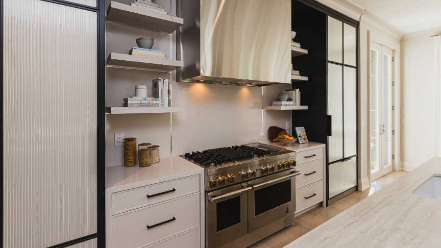
Look at how little room is on either side of that huge and yes, gorgeous, range unit!
Not a lot of counter space here!
Then we have the open floating shelves which don’t quite make it all the way to the wall units that flank them on either side.
This look has become increasingly popular over the years, but I question how practical this set up actually is. Unless you’re not actually cooking in your 4.8 million dollar home, this area has the potential to get covered in grease and dust.
Open shelving… Love it or Leave it?
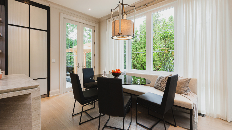
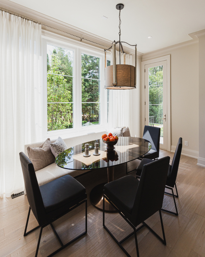
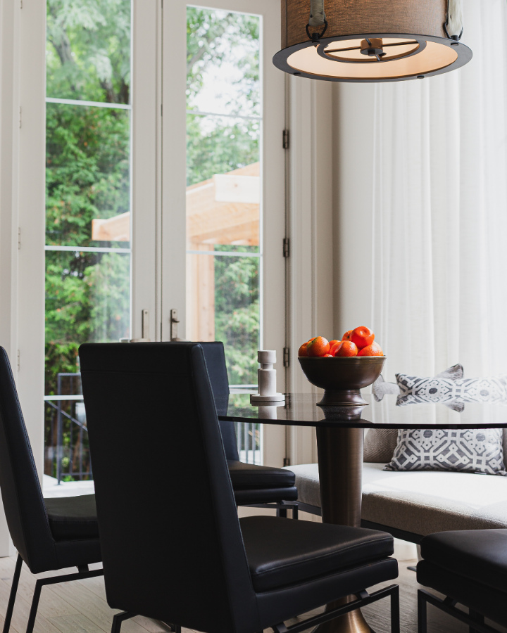
At the far end of the kitchen, we have this relaxed, yet sophisticated breakfast nook. I do love the bench seat and seeing that wonderful contrast once again, this time with the black chairs and the neutral banquette.
The Dekton island is undeniably gorgeous. But that detailed lip around the edge is a trap for crumbs and dust.
That faucet is fantastic and in the same gold finish that we’ve seen in other design elements throughout the main floor in the house. But unless there is a hidden sink that we can’t see, this one, narrow single basin sink does not seem like enough for a busy family.
Of course, I love the undermounted DXV sink itself, I would just like to have seen it be a bit bigger.
Kitchen Design…Love it or Leave it?
The glass tulip style table with a tinted glass top is super cute. Although I’m not a huge fan of that light fixture. It seems rather busy with the curves, the straps and the metal piece underneath. What are your thoughts? Love it or leave it?
Across the hall…
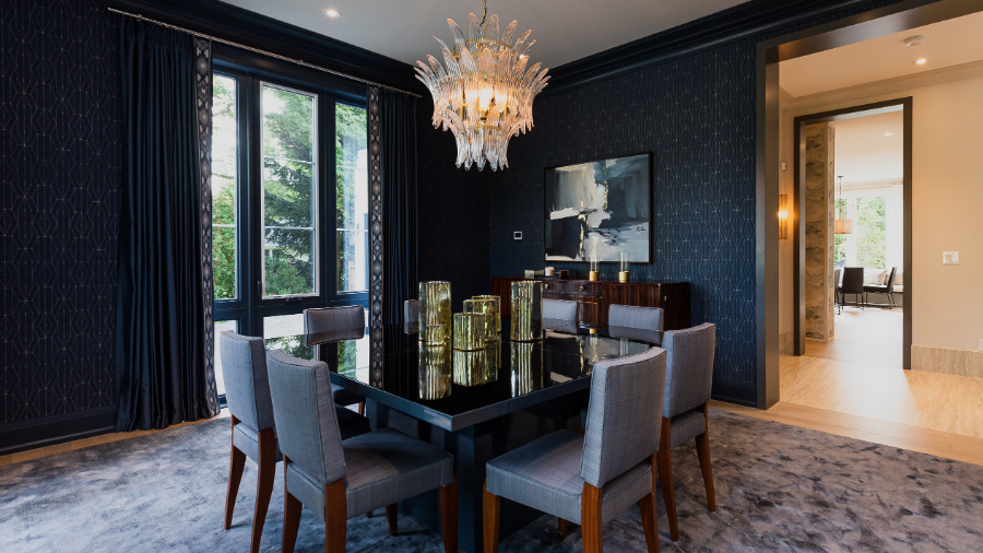
You’ve prepared a gourmet meal and now you need somewhere to sit and enjoy it. This room is the perfect place. It is sumptuous, just don’t spill any food on that lush and luxurious area rug!
The Dining Room mimics the study in location and with its moody colour. The room has deep, rich wall coverings.
The dark blue drapery with the patterned lead edge is gorgeous. For those of you who are colour enthusiasts like me, the trim and baseboards are painted Blue Note 2129-30 by Benjamin Moore.
Bold, dramatic dining room…Love it or Leave it?
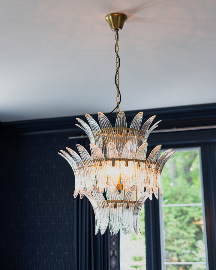
What a statement piece this glass and brass chandelier is, eh?
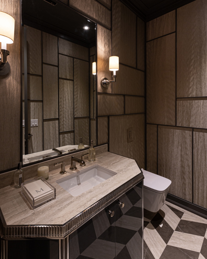
The last room to visit on the main floor is the powder room with its dramatic colour tones and beautiful finishes.
Don’t be afraid to overdo it in a powder room, this is the perfect place to have some fun! I encourage people to go for that WOW factor and Brian has done just that with this shimmering and unique wall feature.
The countertop here is Dekton by Cosentino. The sink and faucet are divine high-end fixtures from DXV.
Second floor:
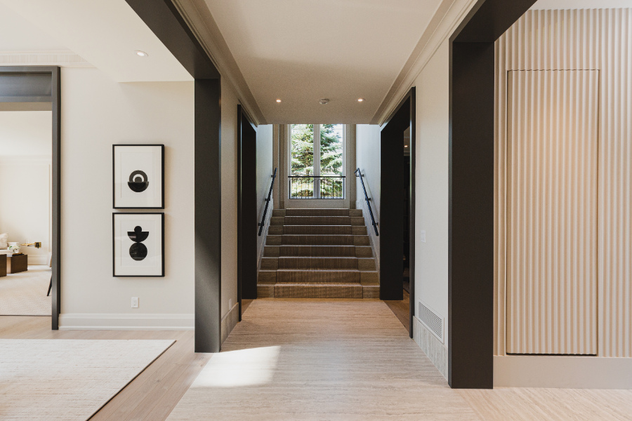
A wide stair case leads you to the second floor of the Princess Margaret Showhome
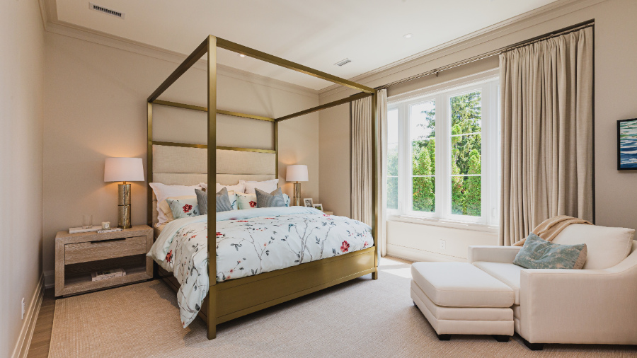
1st Stop is the principal bedroom suite. Do you notice the window walls in every bedroom? This is why I asked you to carefully look at the exterior of the home, at the beginning of the post.
This is a brilliant architectural and design feature! This is perfect for having the window treatments like these custom draperies be flush with the wall. Even more so because the colour of the drapery is the exact same colour as the walls.
The canopy bed with a brass finish is a real statement piece in this room. It has strong lines, but at the same time, the cream upholstered headboard gives it a soft, feminine feel.
Canopy bed in a brass finish…Love it or Leave it?
Principal bedroom with canopy bed with brass finishes. Walls Pale Oak OC-20 by Benjamin MooreAnte room with floating mirrored vanity and ghost chair
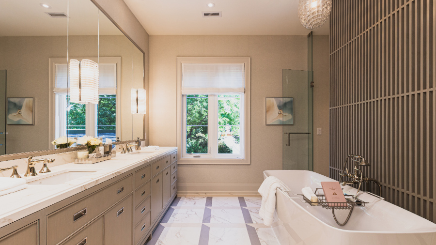
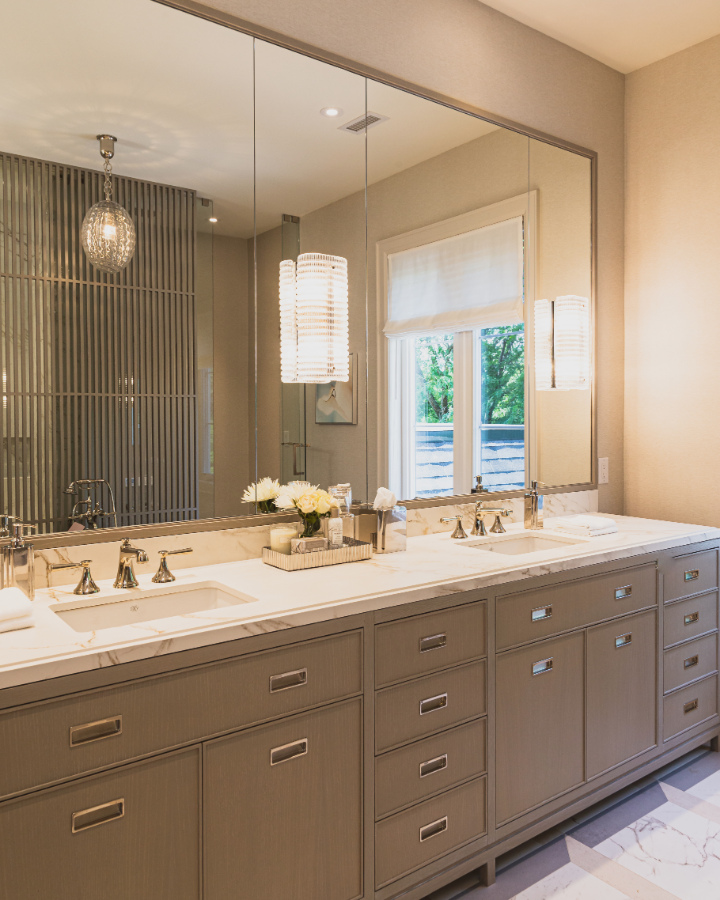
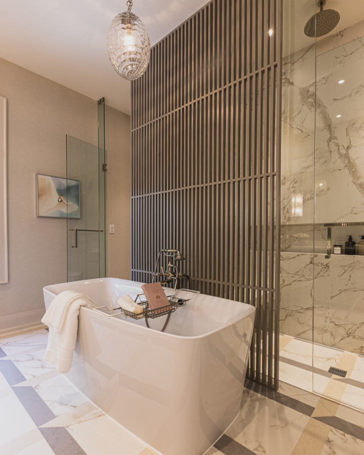
The principal ensuite is my favourite room so far. There are so many beautiful design details here, I don’t think that I would change a thing!
You may not be able to see the backdrop of the wall covering at the far end with the window. It’s appears to be a neutral wallpaper, it may have some texture, but it’s difficult to say for sure. The trim and baseboard is painted Balboa Mist by Benjamin Moore.
You don’t need any more of my words here to distract you, just soak up the beauty in these next few photos.
Principal ensuite with double vanity and stunning patterned tile floorNeutral vanity with brass finishes
Freestanding bath with slat separation wall and shower niche with marble walls
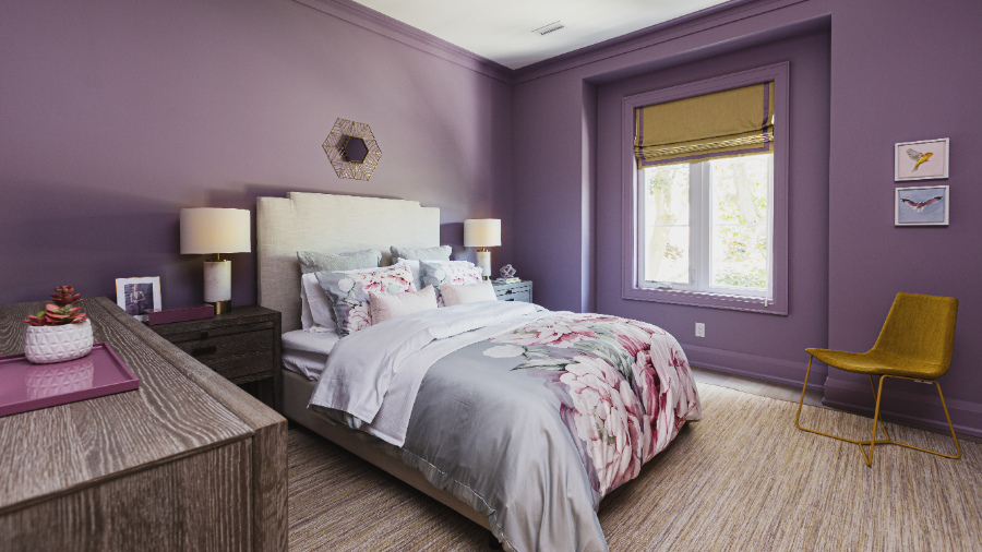
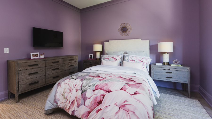
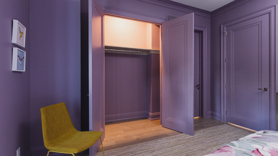
We find three additional rooms on the second floor, starting with this room that is painted a lilac purple. It’s Inspired AF-595 by Benjamin Moore and it’s everywhere! The walls, the trim, the baseboards, and even the doors, all painted purple.
What do you think…Love it or Leave it?
Love, love, love the window treatment. Both the flat roman style with detailed trim and the fabric colour.Upholstered headboard with floral beddingI love purple, but this is a bit much even for me!
The second bedroom is painted Amsterdam AF -550 by Benjamin Moore. Although it doesn’t look like the colour they’ve specified in the brochure, I have been assured by a reliable source that this room is indeed that colour.
Similarly to the purple room above, in this space, we also see everything is painted the same colour.
2nd bedroom walls painted Amsterdam by Benjamin Moore AF-550There seems to be a theme going on here.
The bedrooms above each have a door into this serene shared bathroom. Interesting that neither room colour is repeated or even looks like it would be part of the same design space. This Jack and Jill bathroom colour palette is quite the departure from the boldly painted bedrooms.
I do love all of the plumbing fixtures though and the sconces mounted directly onto the vanity mirror.
Beautiful wallpapered bathroom with white Dekton counter, undermount DXV sinks and glass showerDouble sink vanity with gorgeous wall-mounted sconces
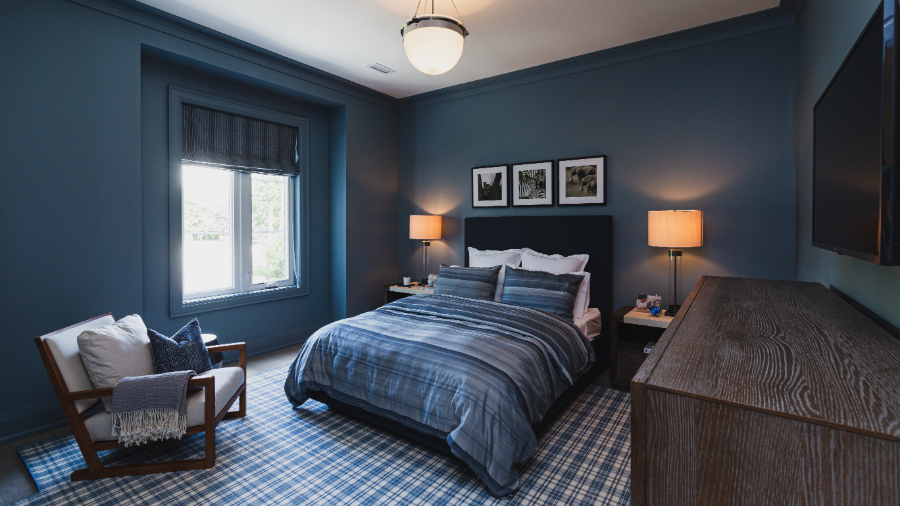
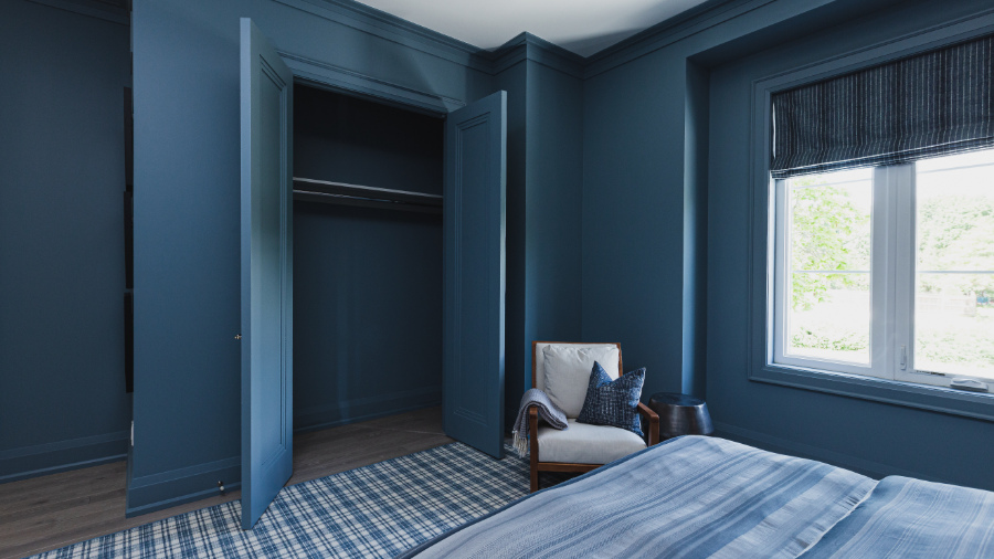
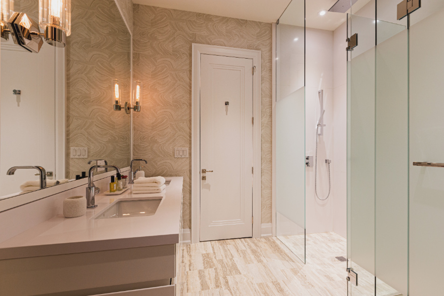
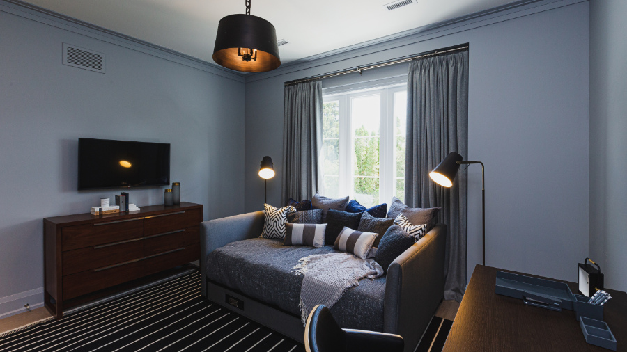
The fourth bedroom has been designed to be somewhat multifunctional. This definitely could be used as a guest bedroom or an office. This room comes with its own ensuite as well.
Versatile room – bedroom / office. Eternity by Benjamin Moore AF-695
The furniture layout looks quite tight to me though, with limited access on each side of the daybed to the desk and dresser. But for a spare room that would only be used on occasion, I think you can get away with that.
Alright, so there you have it. I told you what I thought and now it’s your turn! Do you agree with my opinions of the design, or do you have some different thoughts to share?
Be sure to stay connected with me by taking my Colour Quiz here, because in my next post, I’ll be taking you on a tour of the basement which showcases my ABSOLUTE FAVOURITE room in the whole house!
PERFECT FOR PINNING!
Pin these to your Pinterest for easy reference when you need it.
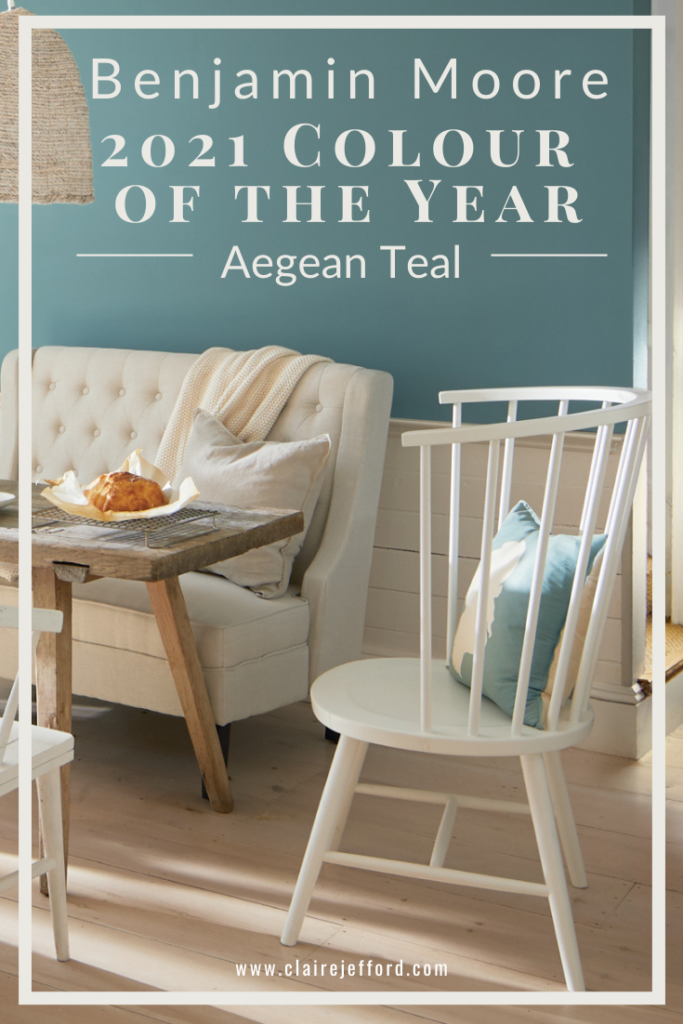
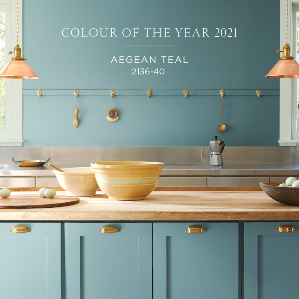
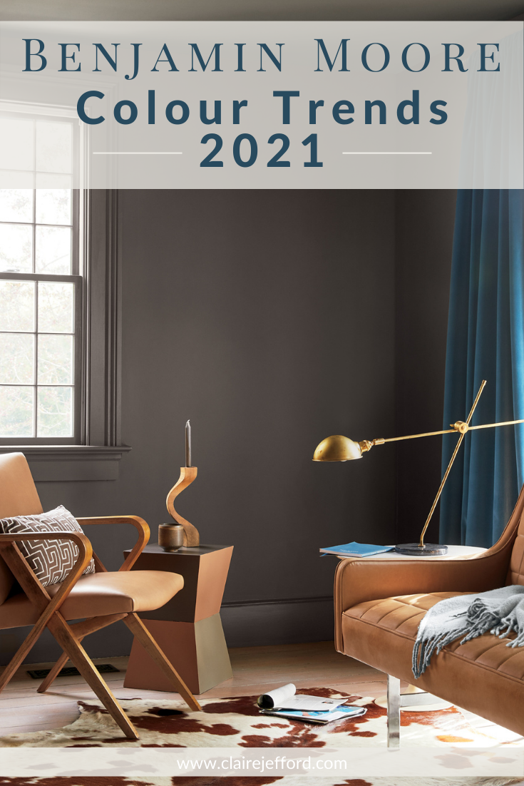
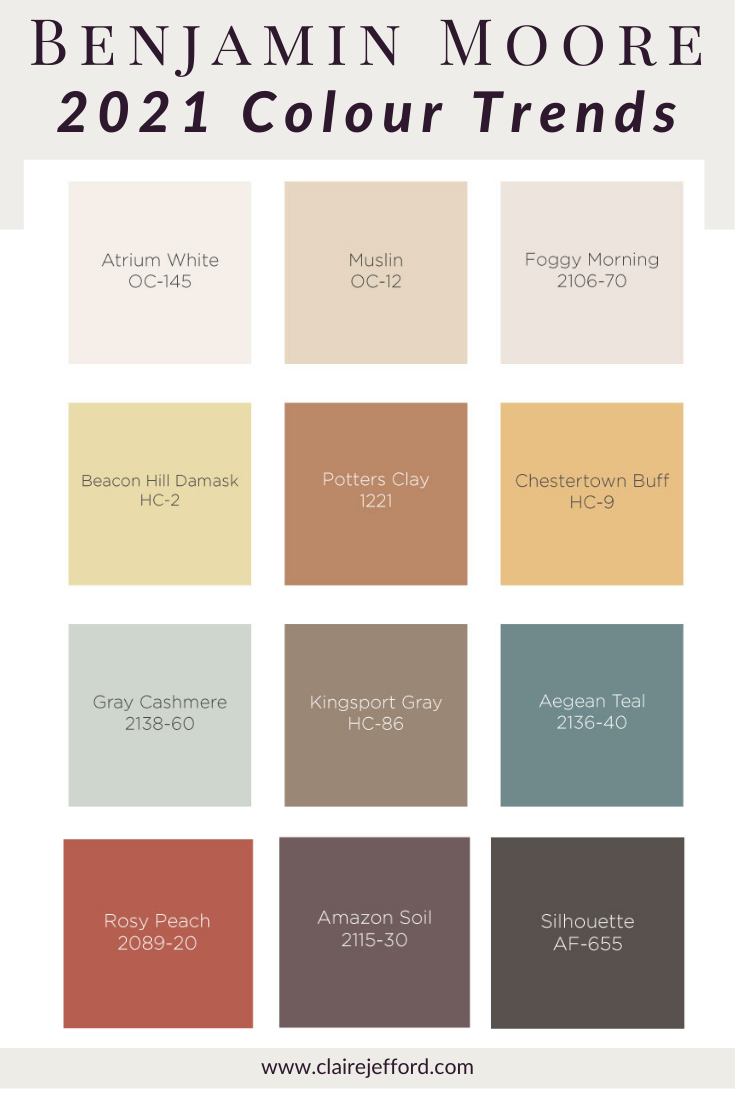
The Colour of the Year by Benjamin Moore has been revealed!
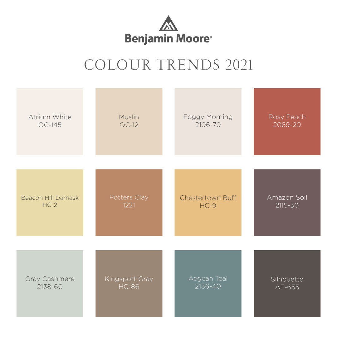
In addition to this announcement, Benjamin Moore has also released their entire Colour Trends palette for 2021 and guess what? This palette is a lot warmer than what you may have expected.
Pin it for easy reference!
Watch my Colour review and see how I was ahead of the trend since I used the 2021 Colour of the Year in my home studio more than 3 years ago!
Are you ready? Let’s do this.
Benjamin Moore Colour of the Year:
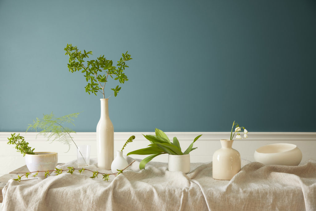
Aegean Teal 2136-40
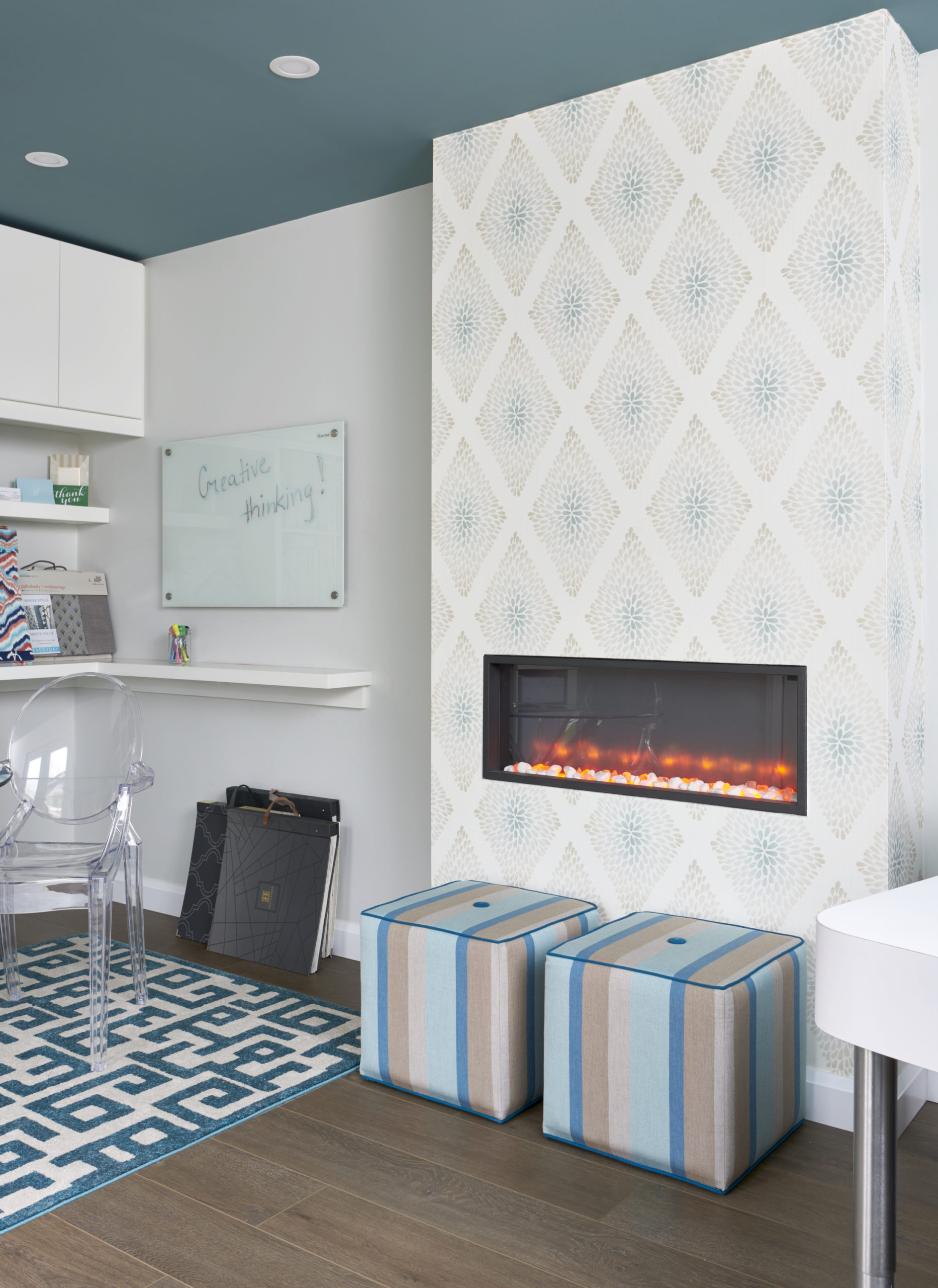
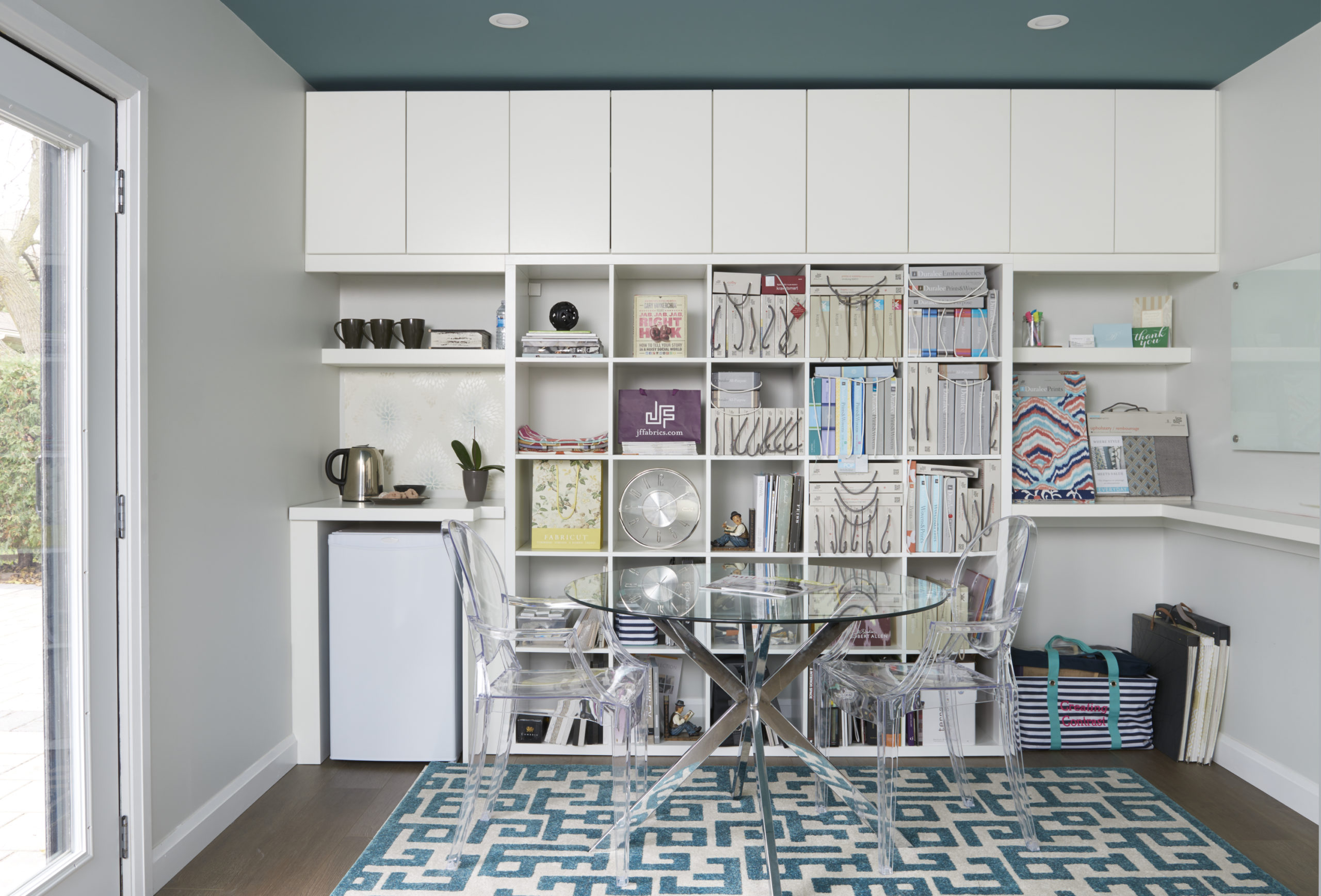
I painted my studio ceiling Aegean Teal because it worked beautifully with other decorative items in the space.
The secret is in finding the best tone that will work with other elements in your home. For this space, it was my fireplace wallpaper, the fabric on my window treatment and the area rug that provided inspiration to specify Aegean Teal on the ceiling.
Claire’s Studio – Aegean Teal CeilingMy Studio with Aegean Teal 2136-40Design by Claire Jefford. Photography by Stephani Buchman.
Aegean Teal 2136-40 by Benjamin Moore
Amid uncertainty, people yearn for stability
With their reveal of the colour of the Year, Benjamin Moore’s press release stated the following:
“Amid uncertainty, people yearn for stability. The colours we surround ourselves with can have a powerful impact on our emotions and wellbeing,” said Andrea Magno, Benjamin Moore Director of Colour Marketing & Development.
“Aegean Teal 2136-40 and the corresponding Colour Trends 2021 palette express a welcoming, lived-in quality that celebrates the connections and real moments that take place within the home.”
Nature and Natural Colours with Aegean Teal 2136-40
The entire Colour Trends palette for 2021 can be seen below. Photos are courtesy of Benjamin Moore.
What do you think of these Colour Trends 2020 from Benjamin Moore? I think they’ve put together a beautiful colour palette, with many great paint combinations that you could easily mix and match.
If you are struggling with choosing paint colours, be sure to check out my Perfect Colour Palettes.
More paint colour guides will be added over time, so be sure to check back here often for new paint colours.
Take my Colour Quiz to discover what your Perfect Colour Palette is.
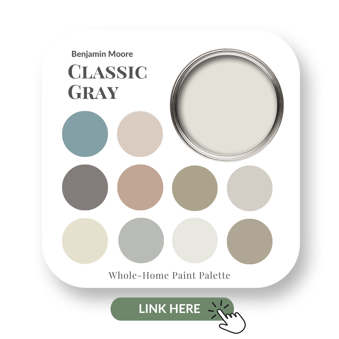
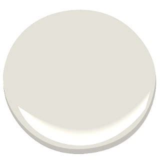
Classic Gray is just that, Classic. It’s a sophisticated light gray that can add calmness to any room.
In this colour review video of Classic Gray by Benjamin Moore, I share:
The undertone of my featured colour
Colour comparisons in order to easily see the different colour tones
Best white paint colours for the trim and ceilings
Beautiful colour combinations to inspire you for your decorating project
After you watch the video, if you would like all this information conveniently laid out for you in one place and have even more paint colour combinations to use with Classic Gray, take a look at my new Perfect Colour Palette.
As a Certified True Colour Expert and an award-winning interior design professional, I’ve worked with many homeowners on various residential interior design projects.
My goal is to give you the confidence to make educated decisions about your own paint choices. I appreciate that it can be very overwhelming to figure out how best to choose paint colours.
When you get to the end of this paint colour review post, you will see our interior design projects where we have used this beauty, Classic Gray by Benjamin Moore. Now, let’s do this!
Watch the video of my Classic Gray Colour Review
Undertone: Green
This warm gray paint colour may appear lighter or darker depending on the lighting and what other decorative elements you pair with it in your interior decorating project.
Looking at the Benjamin Moore colour comparisons below will help give you a better idea of where Classic Gray fits in as a neutral.
Colour Comparisons
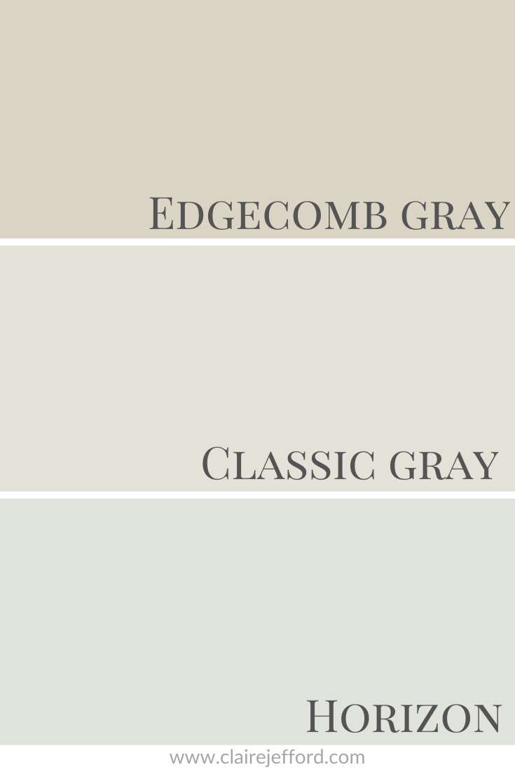
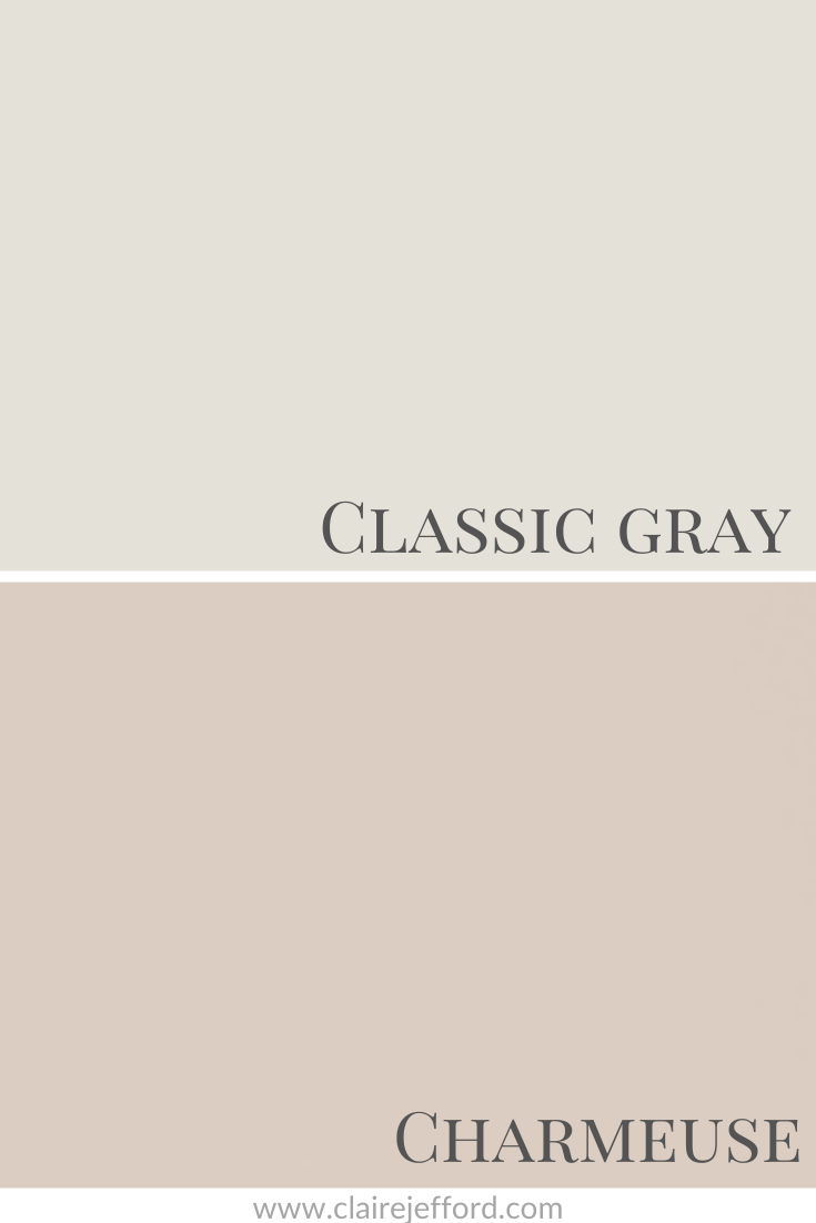
Edgecomb Gray HC-173 & Horizon OC-53
Edgecomb Gray is also a green gray and when it’s next to Classic Gray, you can see that it looks slightly more beige. Whereas Horizon, show at the bottom of this colour palette, is a soft blue gray.
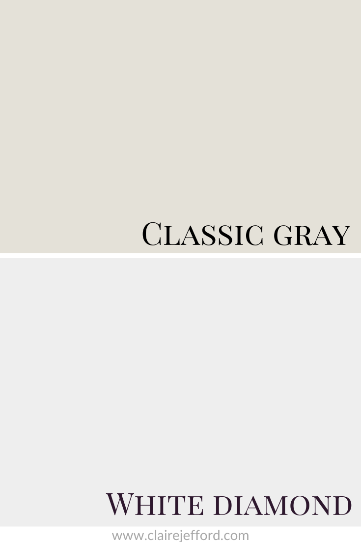
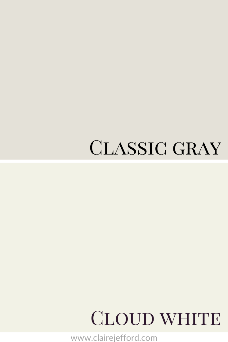
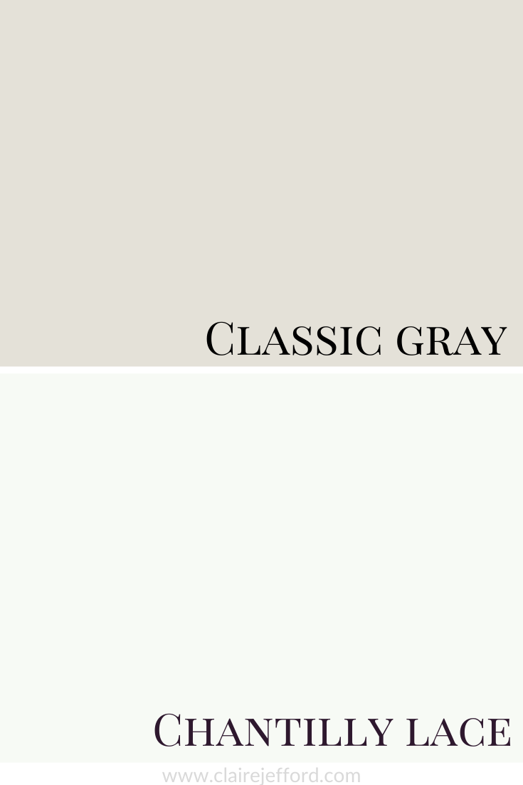
Best Whites To Pair With Classic Gray
White Diamond OC-61 by Benjamin Moore
Cloud White CC-40 by Benjamin Moore
Chantilly Lace OC-45 by Benjamin Moore
I have around 6-8 white paint colours that are my best whites for trim and ceilings. You don’t need all of the thousands of whites available to you to get the right one and you definitely don’t need to mix two different whites or use only a certain percentage of paint colour to get the right one for you. The right white is out there.
When people try to get fancy and create a ‘custom colour’, what that really means is that they don’t really understand colour.
There are over 5132 paint colours alone between Benjamin Moore, Sherwin Williams and Farrow & Ball – if you know what you are doing when specifying paint colour, you don’t need to create something new.
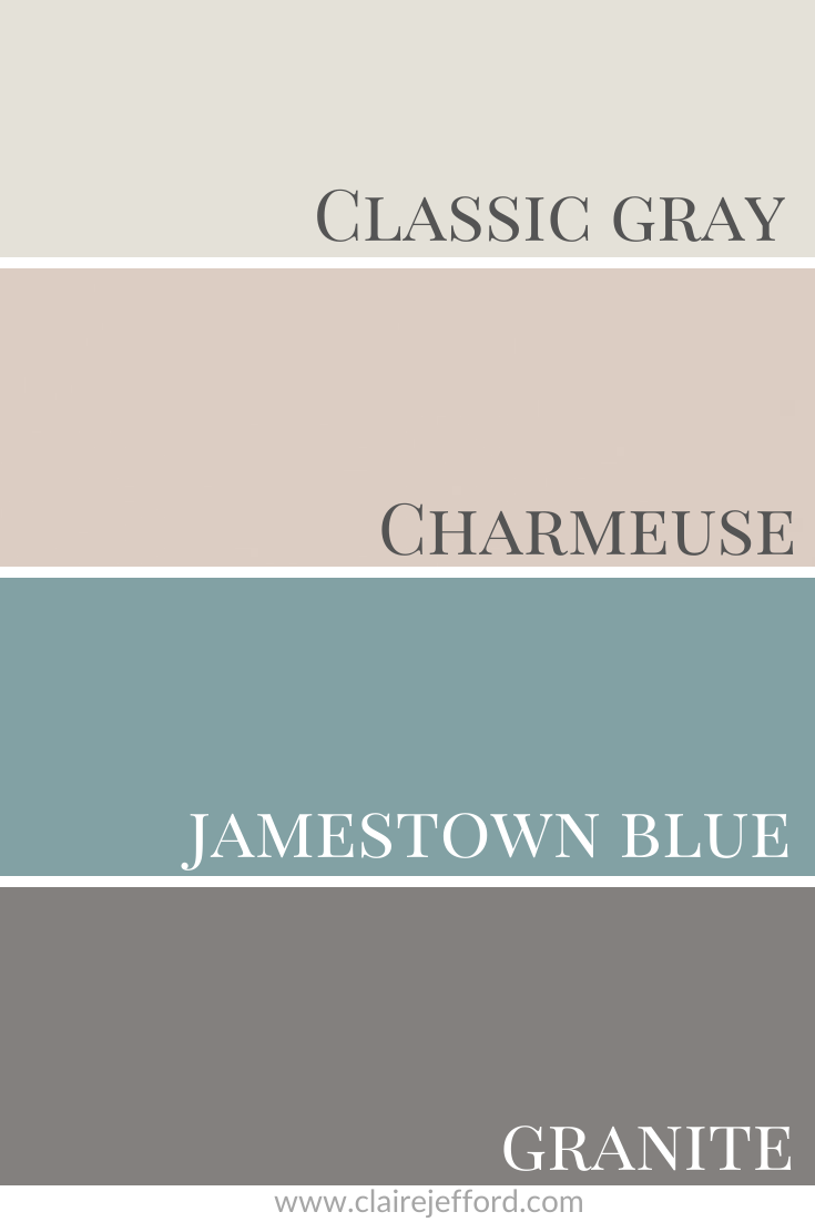
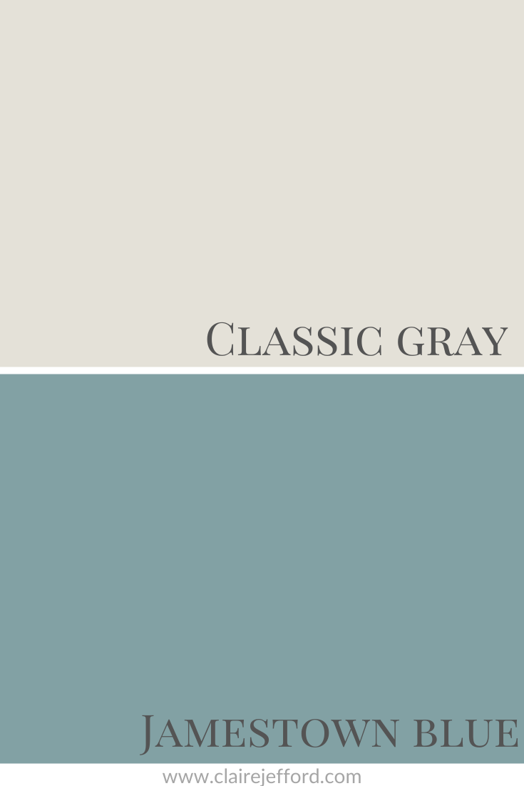
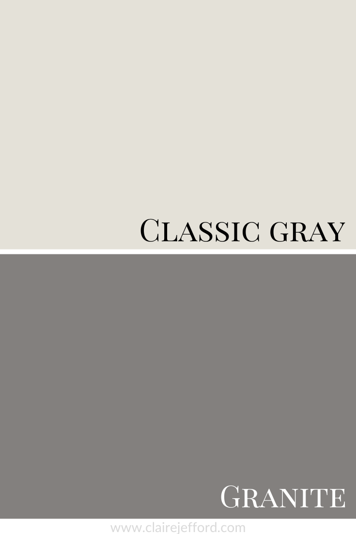
Classic Gray with Charmeuse, Jamestown Blue & Granite
Charmeuse AF-265 by Benjamin Moore
Jamestown Blue HC-148 by Benjamin Moore
Granite AF-660 by Benjamin Moore
Classic Gray in Interior Design
Below are professional photos from my portfolio where you can see Classic Gray by Benjamin Moore in two different projects that we’ve done for Burlington clients. I referenced these in the video, but here you will see more images to get extra interior design and colour inspiration!
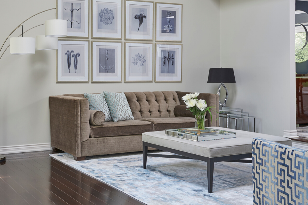
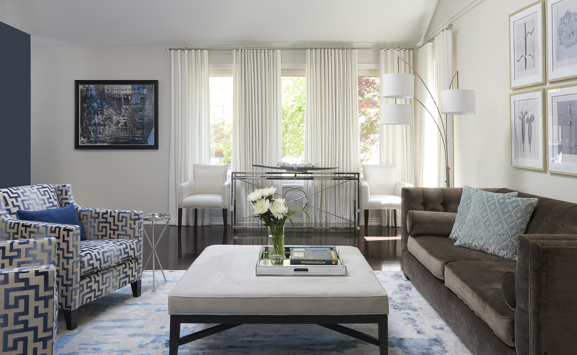
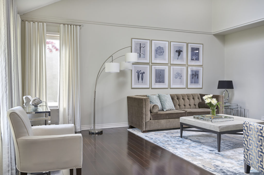
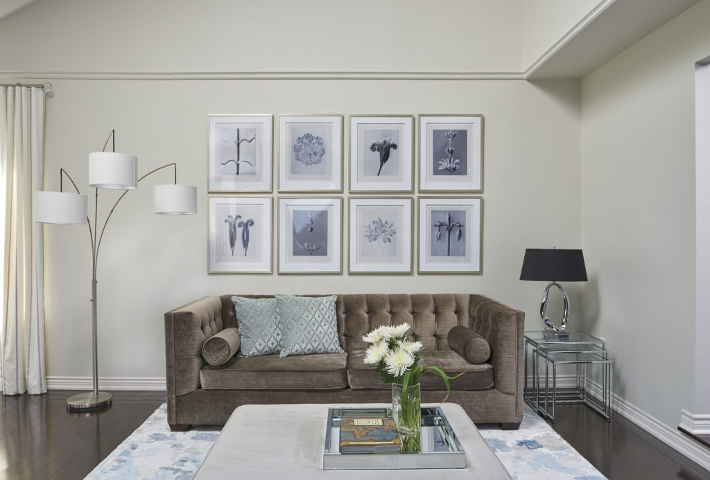
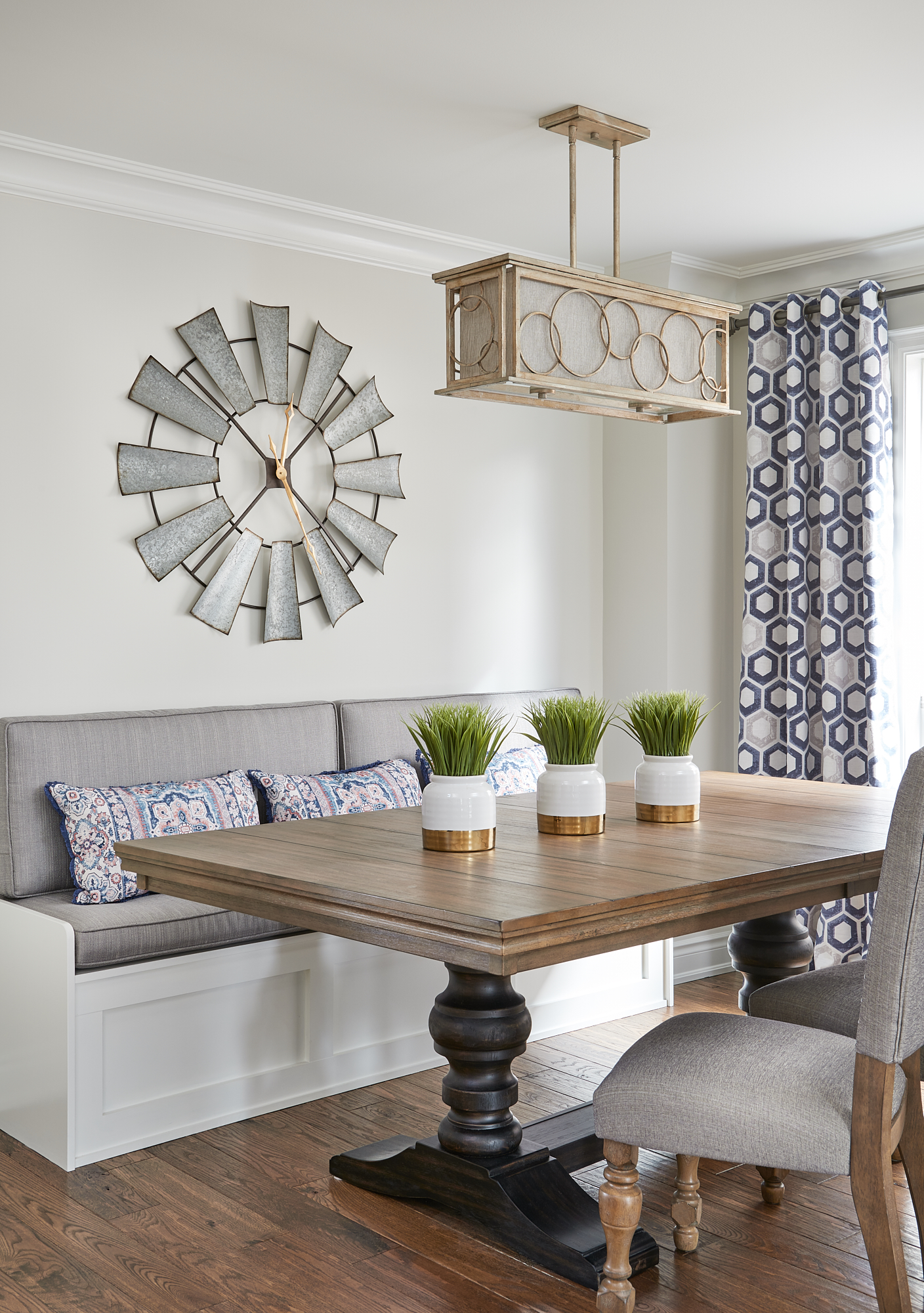
This first project is a formal living room off the front foyer of my client’s home. You can see how beautifully it pairs with the accent wall painted Hale Navy by Benjamin Moore. I love creating contrast in my designs!
See more photos from this project in my portfolio.
Beautiful contemporary living room with Benjamin Moore Classic Gray walls. Classic Gray Living RoomClassic Gray Gallery WallClassic Gray Living Room with Hale Navy accent wall.
When working on this next project, the clients were looking for a more neutral palette overall. You can view the entire project here of this stunning main floor renovation.
Gorgeous Built-Ins painted Oxford White, walls are Classic Gray.
Beautiful Front Foyer and Staircase with walls in Classic Gray
Casual Chic Dining Room. Classic Gray walls and Oxford White bench seat.
Have you used Classic Gray in any of your home projects? Comment below to share your experience with this exquisite, warm green gray paint colour.
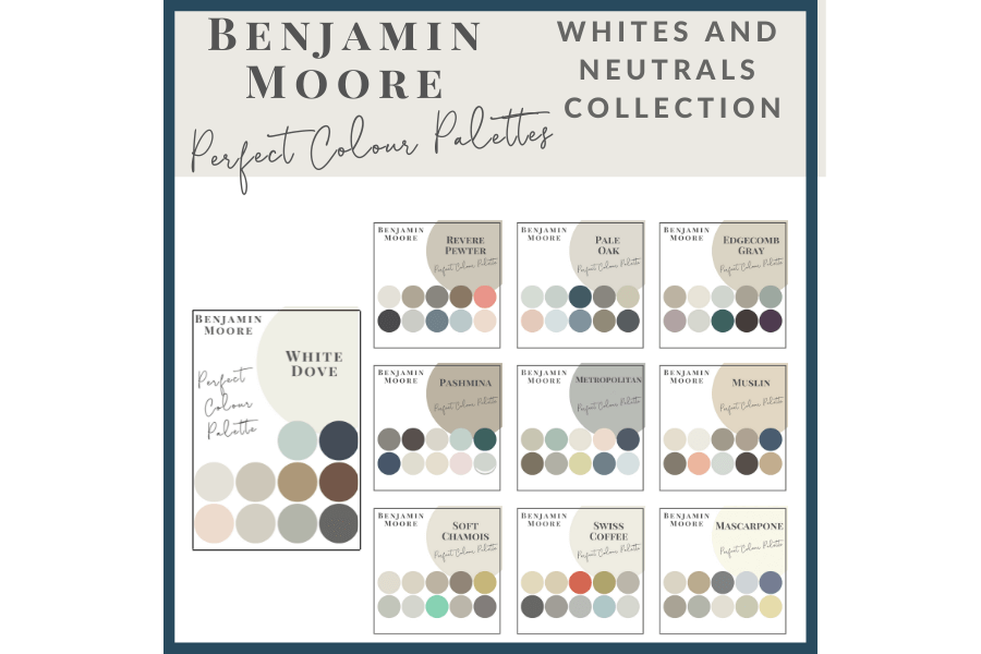
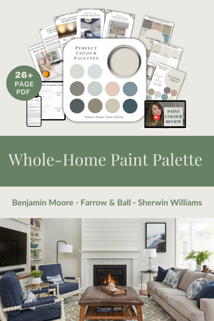
My Perfect Colour Palette library is expanding with more colours to help guide you through the process of choosing the best paint colour for your home.
Click here to see all of our Perfect Colour Palettes, including my carefully curated Collections for the best price.
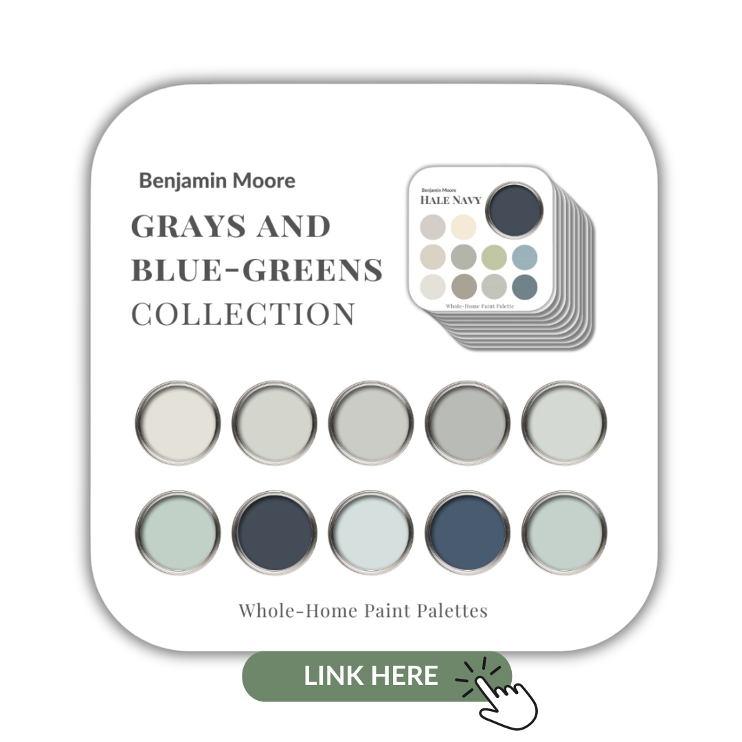
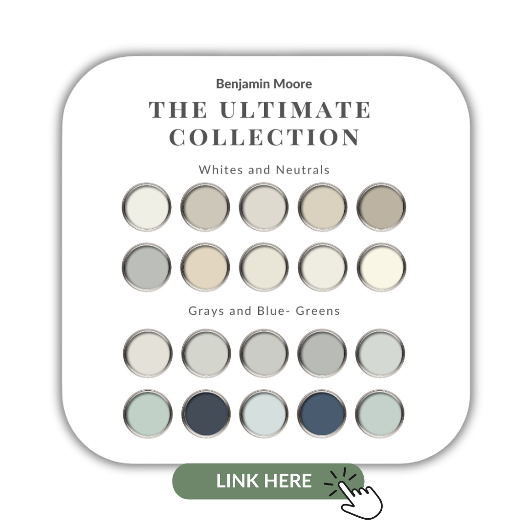
If you want to get all my Benjamin Moore colour guides in one place, look no further than my Benjamin Moore Ultimate Collection. All 20 of my Benjamin Moore guides in one handy collection.
Remember, it only takes one mistake to take your home decorating project from divine to disaster. Don’t let the paint be what stresses you out!
Perfect For Pining
Take my Colour Quiz to find your Perfect Colour Palette.
Honest Feedback for Friends, Job Venting, Number of Jobs on the Go at One Time, Cheap Significant Others & Instagram Likes
Click on the video below to watch the podcast where I talk about the Top 5 posts from my private Facebook Group – Interior Design Business Strategies – IDBS.
In this solo episode, I review the Top 5 posts in my private Facebook Group for interior design professionals – Interior Desing Business Strategies, from the past month or so. These are the hottest topics, the posts that received the most engagement in my group during this time.
Topics Include:
When a friend or family member asks you for your feedback, how honest are you? How honest should you be?
Venting. Some days you just have to let off a little (or a lot of) steam.
Are you a solo business owner? How many projects do you juggle at any given time?
Does this sound familear? Me: “How often should we change out our furniture?” My Husband: “25 years to never”.
Instagram likes: genuine or phony? Is there an ulterior motive for all of those sudden likes?
Interior Design Business Strategies
If you’re not in my private Facebook group, IDBS – where there is no BS, join now. Be a part of this talented group of design professionals. A group of like-minded professionals supporting each other and discussing current news and topics for today’s interior designers.
For those of you who know me well and have invested in any of my helpful online products or heard me speak, you know I am all about FOLLOWING my processes.
So, the title of this week’s Real Client podcast may have shocked some of you. But just know that there are exceptions to every rule.
Click on the video below to watch the podcast as I talk about a Real Client Project where I strayed slightly from my process and hear what happened when I did.
Prefer to listen on the go? Click here to download this episode.
I am a firm believer that one of the best ways to learn how to run a successful interior design business is from others who are in the industry. Both from their successes and their missteps.
That is why I do what I do and why I’m so passionate about brining you The Naked Truth.
My ‘Real Client Project’ Episodes are all about sharing the details of past projects. This is already my fourth episode of this kind! As I revisit them, I remind myself of some of the lessons that I learned and hope you benefit from hearing about them as well.
In this week’s episode…
In this weeks’ Real Client Project episode, ‘I Strayed From My Process’, I talk about listening to your gut and to recognize that, on occasion, it’s okay to deviate from the process path.
These fabulous clients were a professional couple from my local city, both busy with work and their two young children. They hired me to do a complete sitting room makeover.
The project went very well and the end result was beautiful. Along the way, I did come to realize though that sometimes you need a little wiggle room in your processes. No two projects are the same and no two clients are the same.
At times you are going to need to bend a little and not follow your process down to the letter. Can you believe I said that?!
To hear the full story, be sure to listen to the entire podcast.
See all my podcast episodes here. New episodes published every other Friday!
Free Resources
Here is a fabulous FREE resource to help excel your interior design business.
If you’re like me, when a delivery person arrives at your door with a parcel it’s a good day! Not every package is exciting, but today’s was definitely well worth the wait.
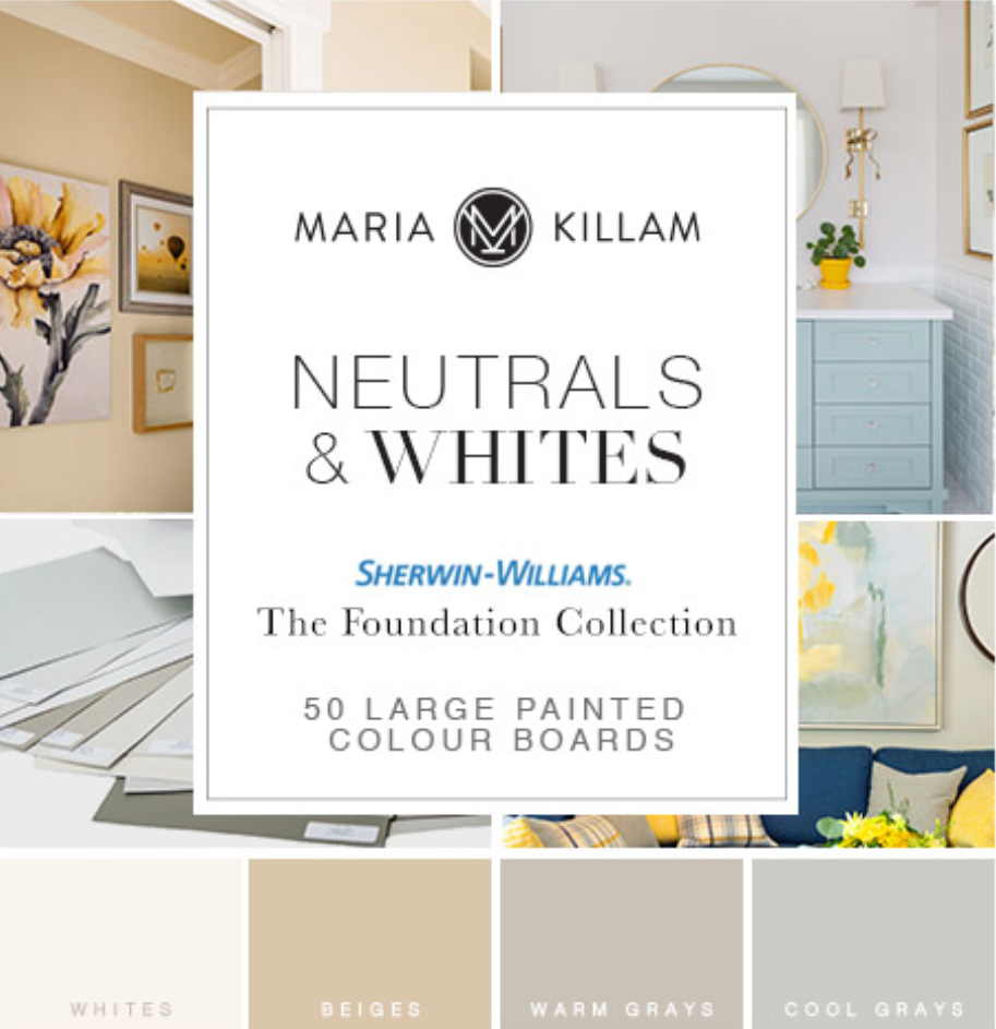
Of course, I’m talking about the arrival of my large painted colour boards of Sherwin Williams’ Neutrals and Whites from my dear friend and original True Colour Expert, Maria Killam.
Maria has curated her top 50 whites, beiges and grays from Sherwin Williams.
I don’t often specify Sherwin Williams paint colours, but now that I am armed with their most popular neutrals, I can’t wait to start using them more!
Before we go any further, if you haven’t already done so, you’ll want to grab my 3 FREE downloads for confidently Choosing Paint Colours.
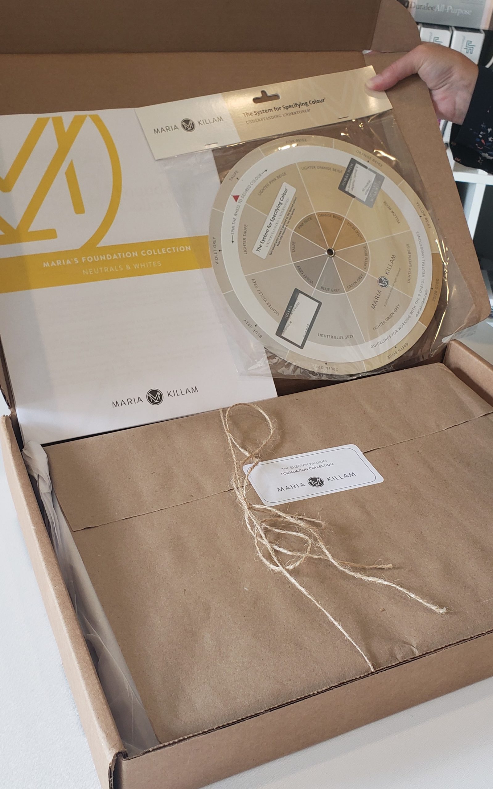
Today I am sharing with you my unboxing video of Maria’s new Sherwin Williams Foundation Collection, a fantastic set of 50 large 11″ x 14″ painted boards.
Inside each of her colour board collections, Maria includes clear and easy to follow instructions on how to use your new colour boards. Plus, as a Bonus, Maria’s new colour wheel is also included!
These are both extremely helpful tools that will guide you in understanding how to use your large painted boards and identify the undertones of each colour.
All is revealed here in my unboxing video below. Eeek, it was just like Christmas tearing open this box!
It’s a good day when something arrives on my doorstep that ticks off two of my favourite things; colour and organization!
Can you tell how happy I am with my new Sherwin Williams Colour boards? LOL
I never leave home without them!
I bring my boards with me almost everywhere I go when I’m working. Whether I’m meeting with clients for a colour and design consultation or sourcing furniture, accessories or fabrics and finishes.
If I have an appointment related to interior design or decorating, my boards are by my side.
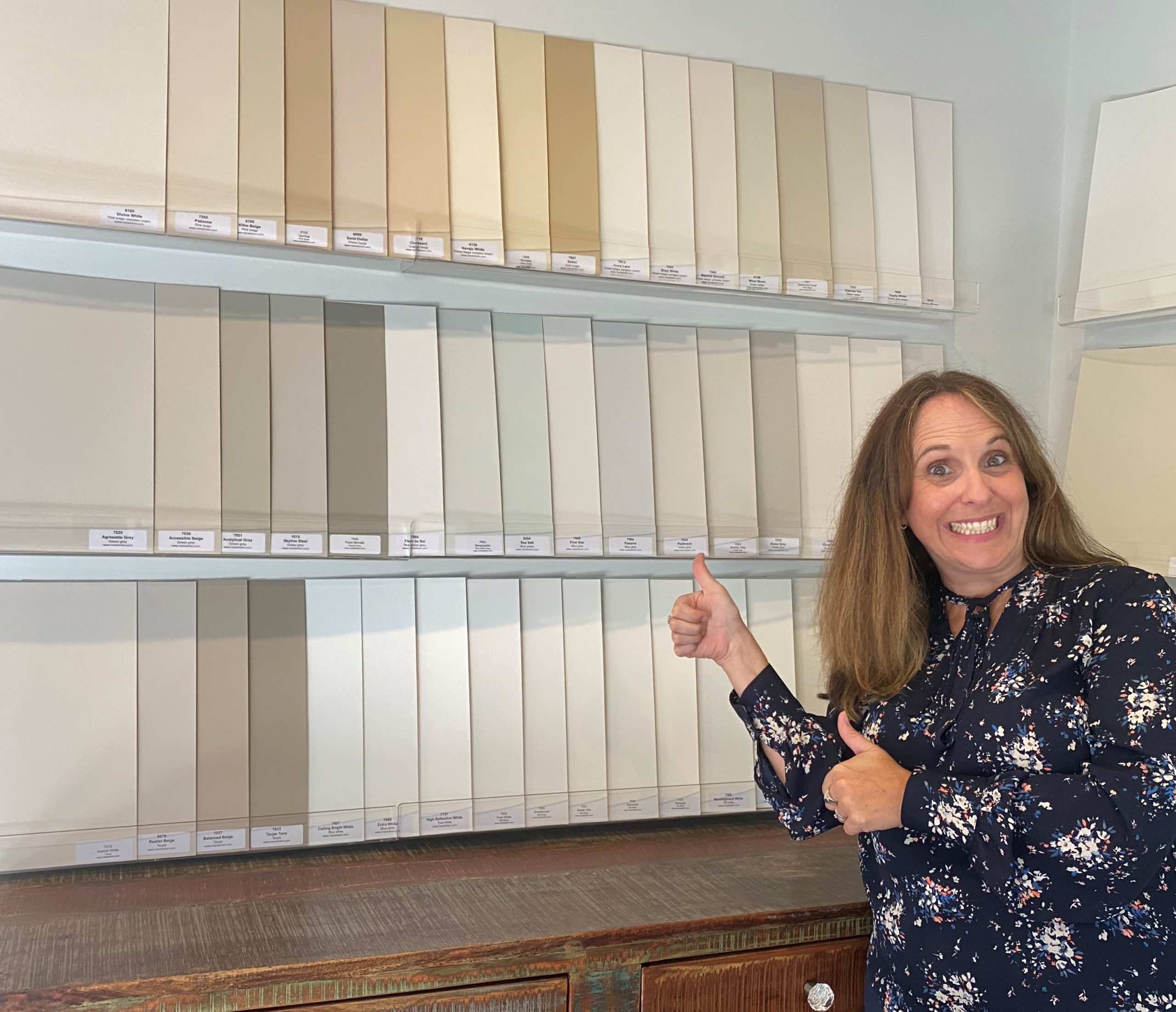
Sherwin Williams 11″ x 14″ painted colour boards
These large painted boards are easily my most used resource. Maria’s Benjamin Moore collections have been amazing tools for my business that have helped make colour consultations effortless.
It’s also not uncommon for me to pull out my boards and use them to make a quick video, responding to a colour question that I receive from my blog, YouTube channel, or via a direct message on Instagram.
My large colour boards can also be seen in all of my colour review vlogs. So, when I say they are a bit like a VISA, I mean it: Don’t leave home without them!
Once I had someone comment to complain about a previous unboxing video, saying that they felt it was like an infomercial.
Well, I don’t let that sort of stuff bother me and here’s why:
We all have the choice to read/watch what we want. I’m not forcing anyone to view my content.
I know that I’m sharing something of great value, an extremely helpful resource that I believe in and use EVERY SINGLE DAY.
Maria and I from 2012, the first time I attended her True Colour Expert Colour class in Toronto
Over the years Maria and I have become very close, we’ve formed a lovely friendship and I respect her immensely as a businesswoman. My vast knowledge of colour would not be what it is today, had I not found Maria’s blog, her colour course and boards.
My bedroom with walls painted in Sherwin Williams Poetry Plum
Long before we started working together to support each other in our businesses, I was already openly sharing details of Maria’s course and colour boards. I shared these on social media and with many of the interior designers, I have had the pleasure of meeting over the years.
So, if this sounds like a promotional blog post for Maria’s amazingly helpful products, I guess you could say that it is and I’ll tell you, I’m not sorry.
On my YouTube channel for colour and design, I see how choosing colour is daunting for most people, including so many interior design professionals. Selecting paint colours isn’t stressful when you understand how to view colour and identify undertones.
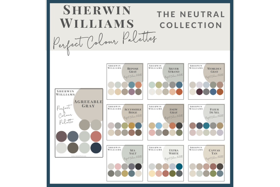
Now that my new colour boards have arrived I can start adding to my Perfect Colour Palettes collection for Sherwin Williams.
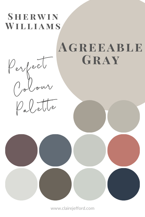
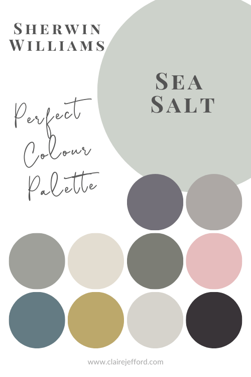
I currently have Perfect Colour Palettes for 10 of Sherwin Williams most popular neutrals including Agreeable Gray and Sea Salt.
I’ve mentioned the courses that Maria offers. These are live colour workshops held throughout North America. I attended my first in 2012 and then went again in 2018.
The course is brilliant and well worth the investment. You can see this post from my trip to New York when I took the True Colour Expert course the second time in 2018.
In the video, you’ll see Maria and I discuss details of her workshop and how it transforms the way you see colour.
Do you use Sherwin Williams paint colours? Which is your favourite? Comment below to let me know!
// DISCLOSURE: Thank you for trusting me with my truthful and reliable opinion on any future purchase you may make. I always disclose affiliate or sponsored information when it is the case. If you purchase Maria's boards, I will earn a small commission from the sale. This doesn’t affect you in any way, the price remains the same regardless. Thank you for supporting me and entrusting me to be your go-to for all things Colour and Interior Design!
Remember, it only takes one mistake to take your home decorating project from divine to disaster. Don’t let the paint be what stresses you out!
Take my Colour Quiz to discover your Perfect Colour Palette.
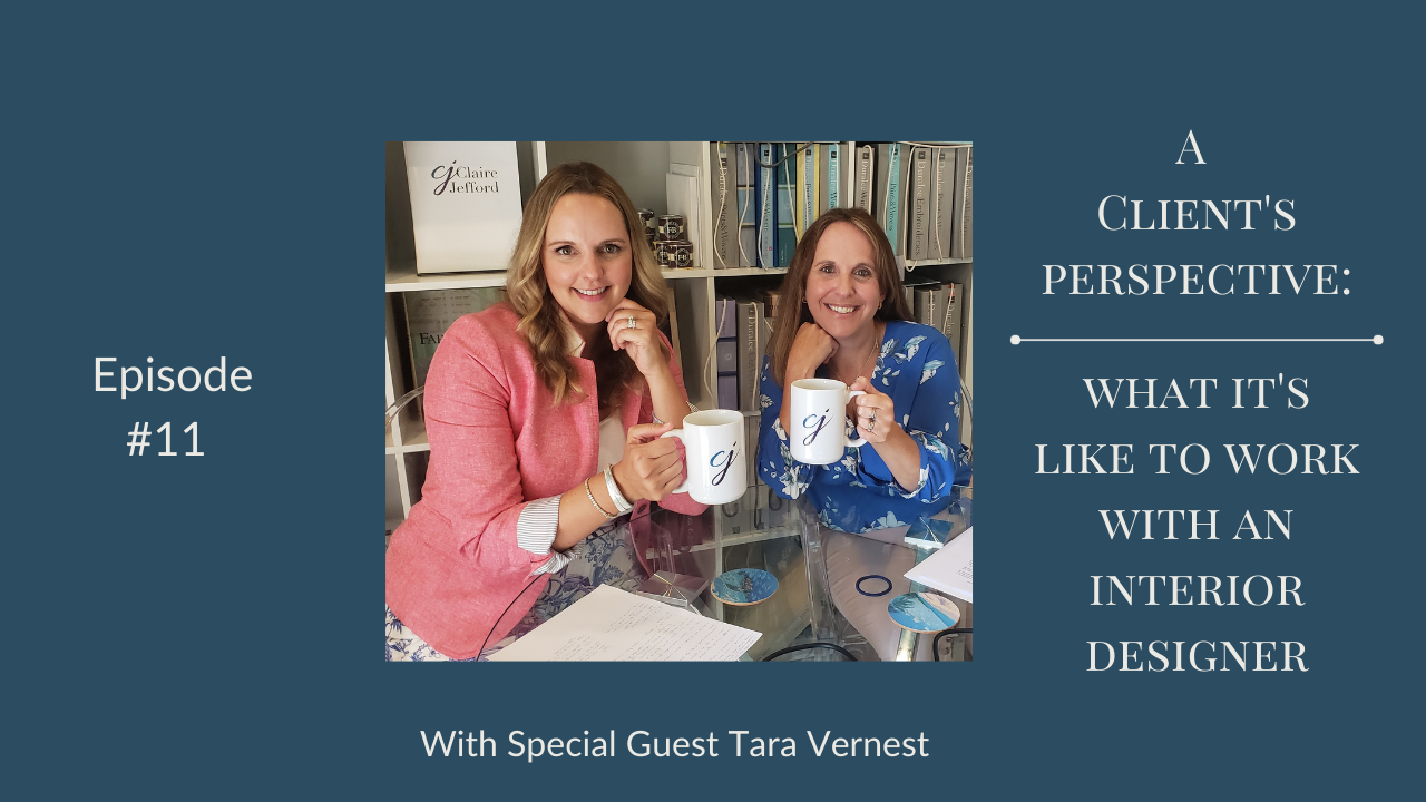
I am continuing my Client’s Perspective series today with the 2nd part of my conversation with my former client Tara Vernest.
Click on the video below to watch the podcast where Tara and I resume our discussion on what it’s like to work with an interior design professional.
Prefer to listen on the go? Click here to download this episode.
Tara and I carry on from where we left off last the last time we sat down to chat.
If you recall from our initial conversation, Tara did not hire me at the very beginning of her reno project. As things became more complicated she realized ‘I need a bit of help here’. So now fast forward a bit, she’s hired me and in this episode, we discuss how she found working with me. Were her expectations met?
We also talk about having contractors and designers on-site together and who a homeowner should turn to when looking at different aspects of a project and making specific design decisions.
Tara talks about the worth of a professional’s experience and lessons learned. She details how designers should use this knowledge to demonstrate to clients the incredible value they will bring to the project so that the homeowner is asking themselves ‘How Can I Live Without A Designer?” And really, isn’t that what we as designers all want to hear? And of course, there is mention of what she would have done differently – ahhh, that good old thing we call hindsight!
It’s so refreshing to hear the client’s side of a renovation so please sit back and enjoy listening to another candid and informative conversation with my client Tara.
Guest Bio
Tara Vernest
Tara grew up in Kitchener-Waterloo. She attended the University of Guelph where she fell in love with the city and her future husband, Cameron. She’s the mother of two beautiful children, Avery, her 6-year-old sporty daughter and her gorgeous son Noah who is just about to turn 1!
She trained as a Brand Marketer, but her eye can’t help being drawn to home and design—a passion that she attributes to her late mom’s keen eye.
Tara and her husband lived in Singapore for five years. After welcoming Avery, they relocated back to Canada, where they faced a new set of desires for their home that they had been renting out while overseas. This is where our working relationship began.
Tara is joining the Insta – world in a big way. You can find her @whitelinenlifestyle sharing what she loves, favourite designs and advice.
We started off with many laughs and I’m so pleased that we’ve stayed close through social media. I am thrilled that Tara has agreed to be on my podcast. She is the first client to be on my show and I couldn’t be more pleased!
See all my podcast episodes here. New episodes are published every other Friday!
Free Resources
A fabulous FREE resource to help excel your interior design business.
Claire's Guide to Services & Pricing
FREE DOWNLOAD:
Interior Design Services and Rates Guide
This website uses cookies to improve your experience while you navigate through the website. Out of these cookies, the cookies that are categorized as necessary are stored on your browser as they are essential for the working of basic functionalities of the website. We also use third-party cookies that help us analyze and understand how you use this website. These cookies will be stored in your browser only with your consent. You also have the option to opt-out of these cookies. But opting out of some of these cookies may have an effect on your browsing experience.
Necessary cookies are absolutely essential for the website to function properly. This category only includes cookies that ensures basic functionalities and security features of the website. These cookies do not store any personal information.
Any cookies that may not be particularly necessary for the website to function and is used specifically to collect user personal data via analytics, ads, other embedded contents are termed as non-necessary cookies. It is mandatory to procure user consent prior to running these cookies on your website.