Princess Margaret Lottery Home 2020: Part 1
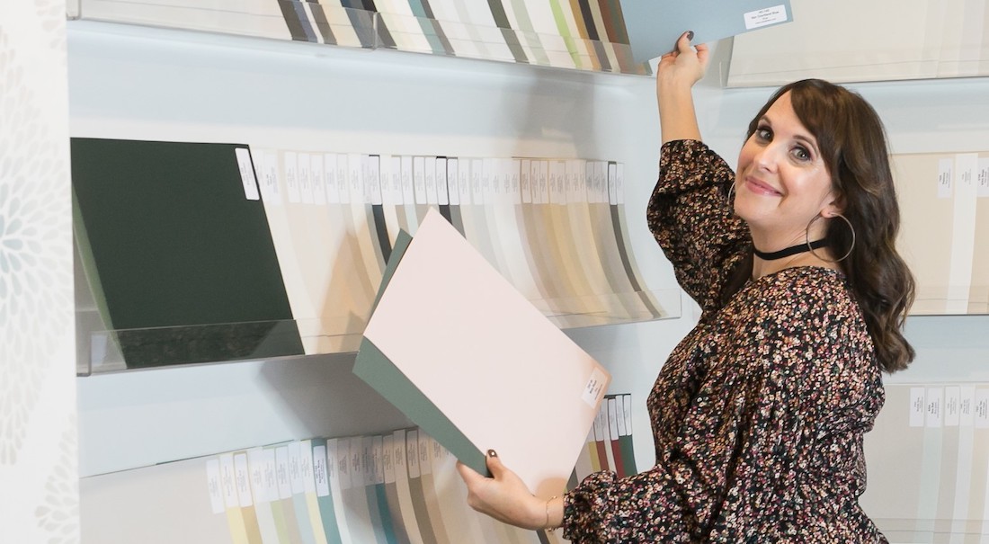
Choose the right paint colour
the first time Let me show you how in just 5 easy steps!
BONUS: The Top 15 Shades of Gray by Benjamin Moore

While I’m disappointed I didn’t get the chance to tour this stunning house in person this year, I was definitely excited to receive the entire portfolio of images from this year’s $4+ million Princess Margaret Lottery Home.
Of course what excites me most, is that I get to share these photos with you!
In part one of my two part series, I take you on a walk through video tour of both the main floor open plan design, as well as the second floor.
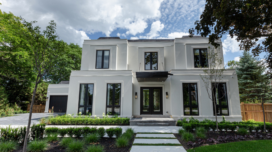
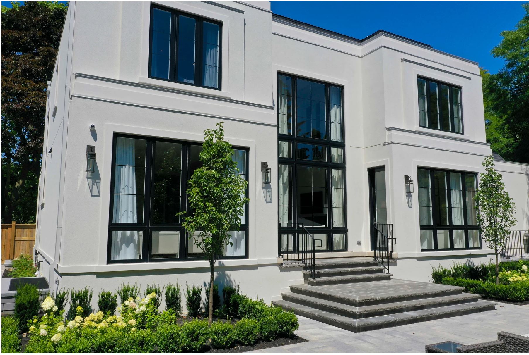
This stunning 7,500 square foot art deco inspired home designed by the super talented interior designer Brian Gluckstein is on a beautiful tree lined street in southeast Oakville, Ontario.
I want you to take note of how the windows are bumped out on the upper level, as this plays a key role in one of my favourite design elements you’ll find in each of the bedrooms.
All of the images are courtesy of the Princess Margaret Lottery and Nourish Agency.
Join me on the tour!
Come with me now as I take you through the house, room by room. You’ll hear what elements of the interior design I loved and what I feel could have been done better, mostly in terms of function.
See what Benjamin Moore colours were used throughout the space, I share them all with you in the video. You may just be suprised by the bold colours used in some of the bedrooms!
To get a better look of each space, I’ve included even more photos in this blog post than what you will see in the video tour. But don’t skip ahead, be sure to watch the video below and then tell me your thoughts in the comments.
Let’s do this!
Welcome!
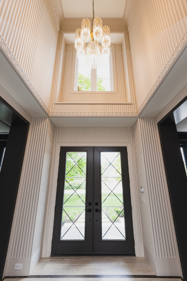
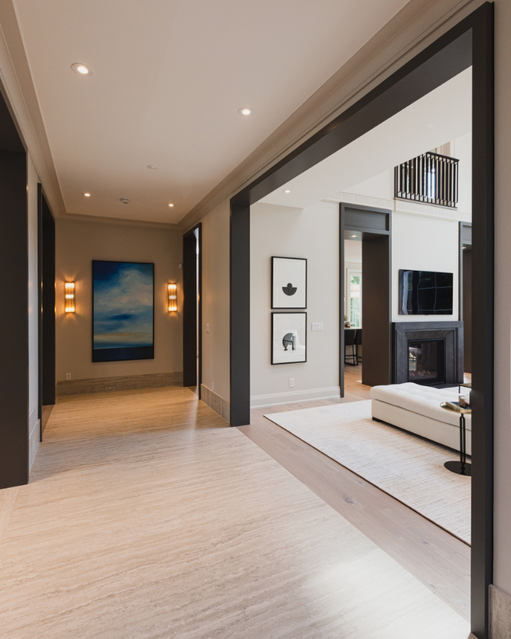
Let’s start our tour right from the beginning – the front entrance. And what an entrance! What a joy it would be to walk through this front door at the end of long day.
This foyer and much of the main main floor is painted Pale Oak by Benjamin Moore. We recently used this colour in our Burlington client’s living and dining room.
It really is such a soft and pretty colour tone, one of the most popular new neutrals that we see being used more and more. Here, you can see why!
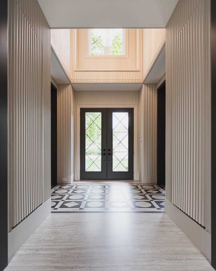
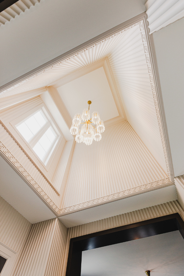
Amazing details in the foyer, from the pattern in the floor tile to the fluted wall treatments, the Greek key pattern in the trim work and window surround.
This home gets a ton of natural light that fills each room, bringing the spaces to life even more, effortlessly highlighting the exquisite details in the custom millwork.
Wall Details…Love it or Leave it?
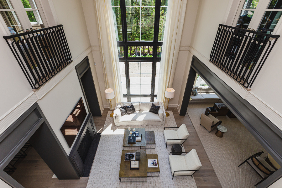
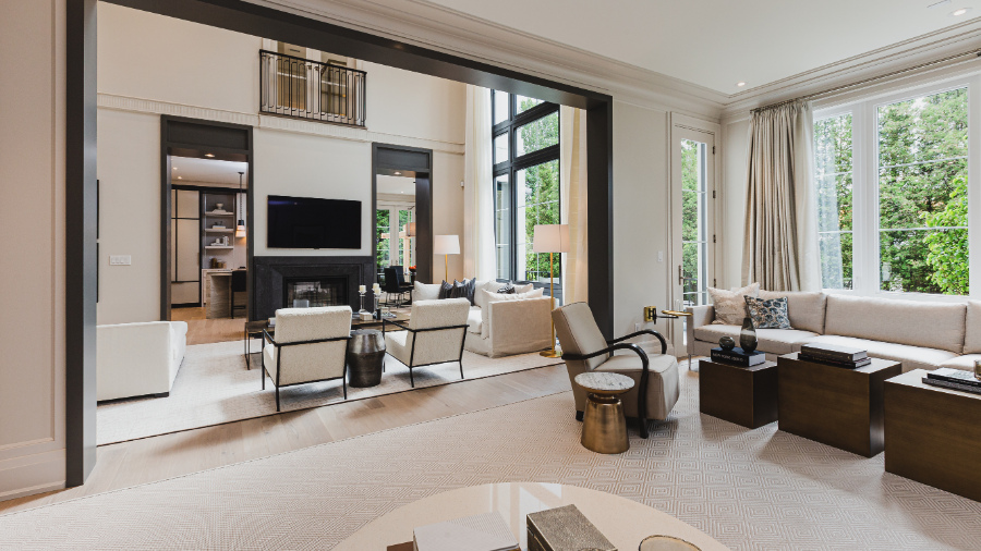
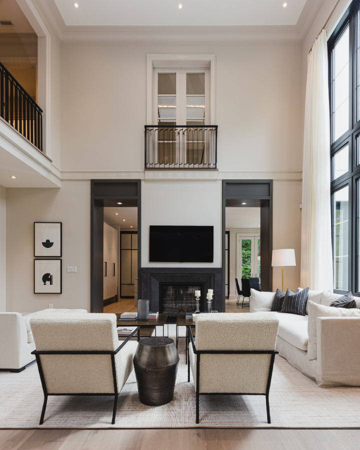
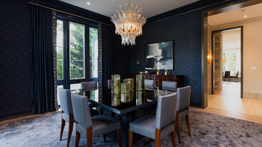
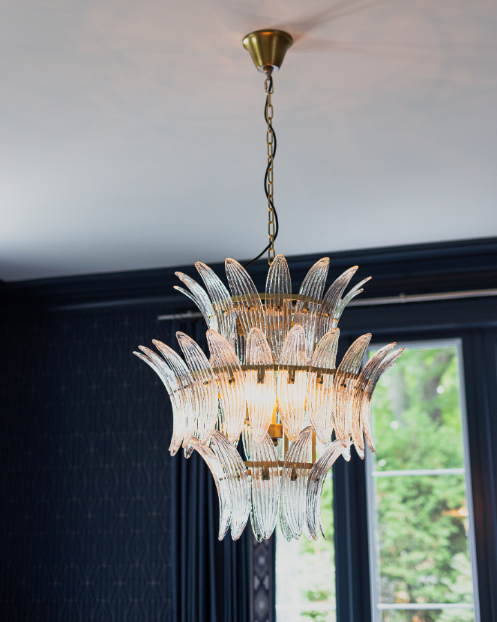
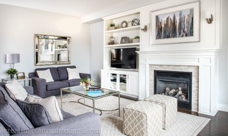
From the foyer you can see through to the true highlight of this house – The Great Room….and how great is it?! Those ceilings, seem to go on forever.
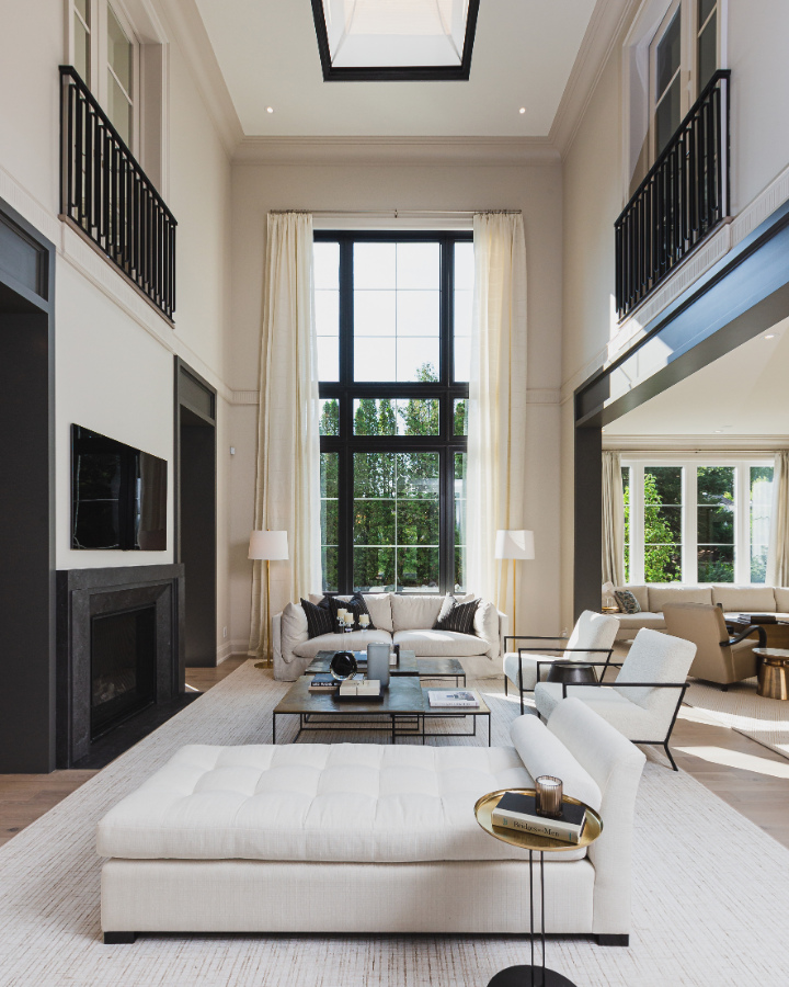
The contrasting trim around the archways and that gorgeous natural light shining through that two story window are stand out features that I absolutely love about this room.
How are you feeling about the contrast between the Pale Oak walls and trim and the Kendall Charcoal on the archways? Too heavy? Just Right?
Personally I love it. I also love how fabulously these two colours work together.
Contrasting archways…Love it or Leave it?
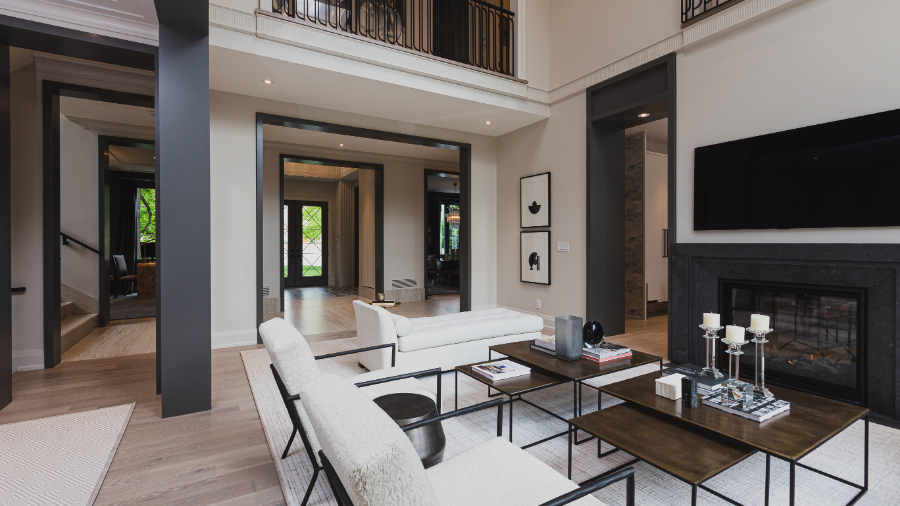
The majority of the furniture throughout the Princess Margaret Lottery Home is from Glucksteinhome. Many of these pieces have a very neutral feel, done in soft neutrals with hits of striking gold and dark metals.
Two of my absolute favourite furnishings are these two armchairs. They remind me of a little lamb. I’m not sure if I should sit on them or pet and name them!
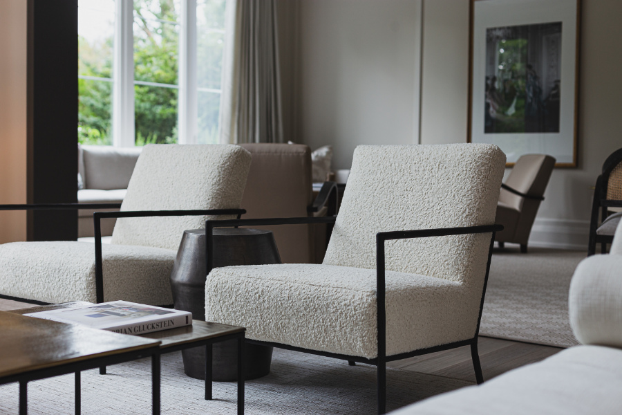

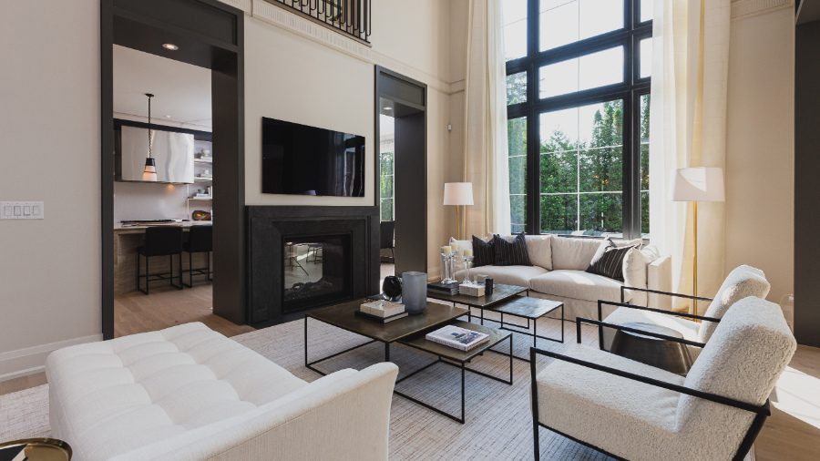
Neutral furniture with accents of gold and metallics
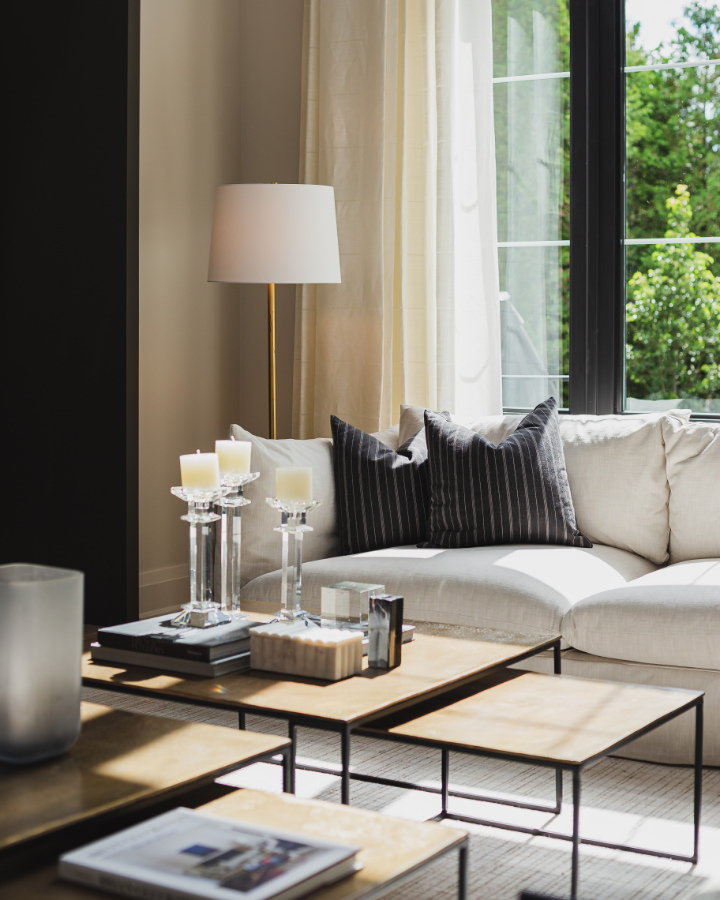
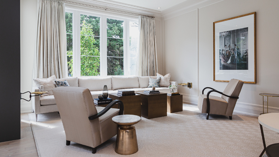
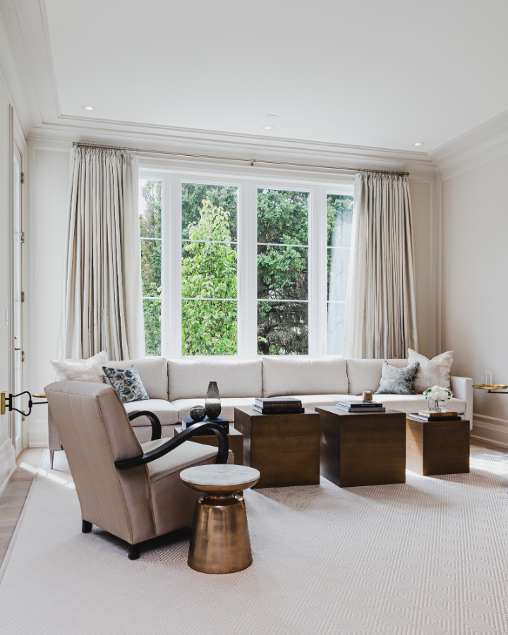
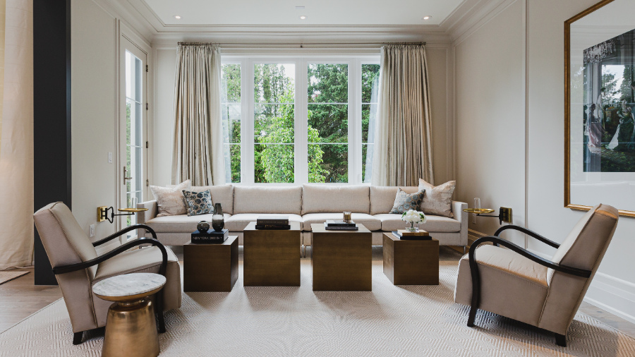
Adjoining The Great Room through the large archway to the right is a second area for relaxing, chatting, or entertaining.
I consider this space, more a living room or sitting room. It doesn’t have the same grandiose feeling as the adjoining Great Room. Mainly because the great room has such high ceilings!
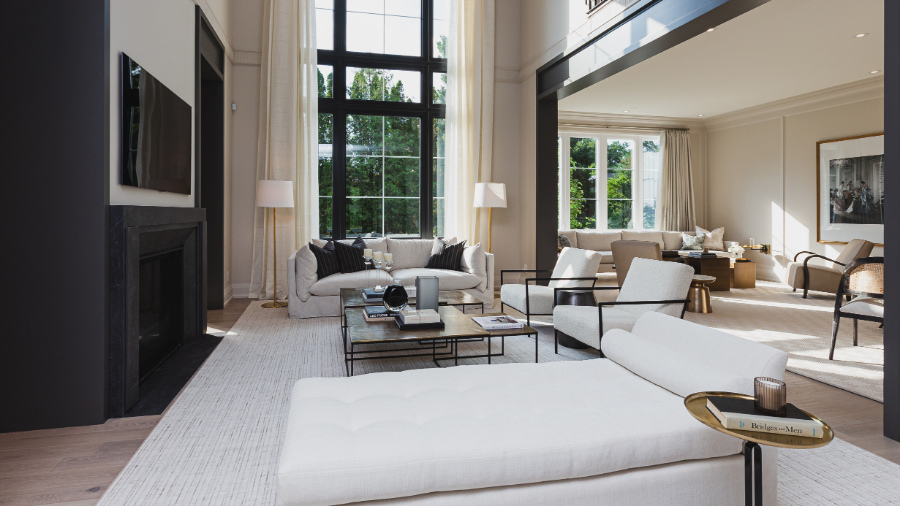
Between both of these rooms, there is ample seating for those days we all long for, when you can once again have more than just your immediate family in your home.
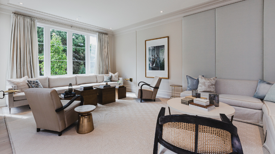
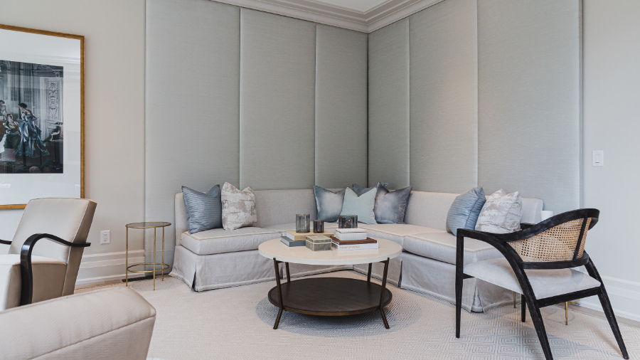
The one decorative element I am not loving is that wall with the pale blue fabric panels. I mean, it’s pretty but for some reason, it’s just not doing it for me.
What I love though, is the addition of the round tables and curved pieces, especially when the majority of the furniture is square and rectangular in shape.
I especially adore those little wall mounted round brass tables. Can you spot them on either side of the room near the sofa by the window in the photo above?
Soft Blue Fabric Panels…Love it or Leave it?
Next…
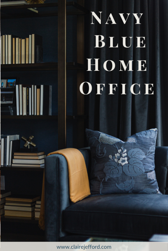
We’re going to cross the hall and check out the study / den.
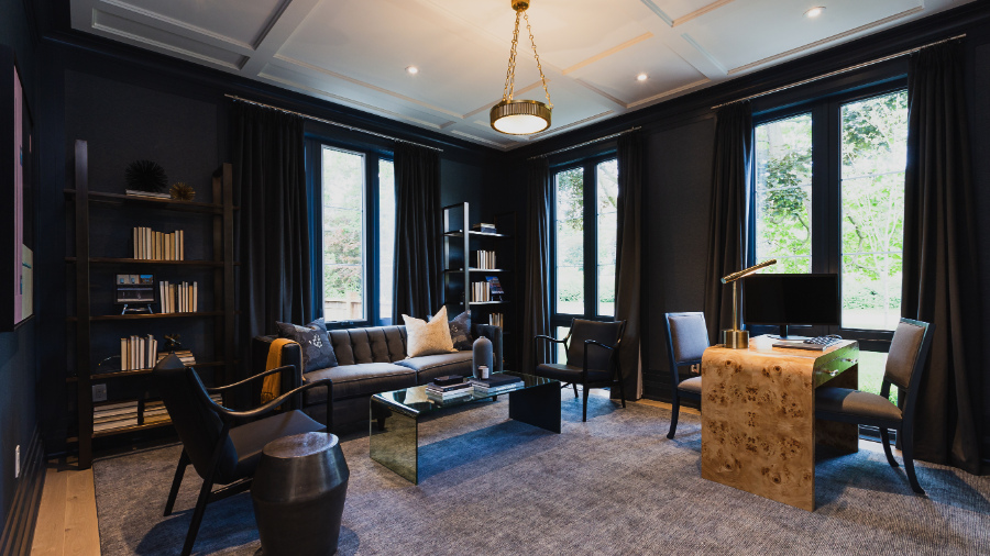
This is a very dark, very moody room. The walls here have been wallpapered in a gorgeous rich blue covering. The trim and baseboards have been painted Benjamin Moore Blue Note 2129-30 to match the walls and drapery. I love it!
The desk made out of Burl Wood is outstanding. You can see how Brian has repeated this light orange hue in the toss cushion, the throw and in the way they have displayed the books with the spines facing inwards.
These accents offer a welcome warm tone to an otherwise dark and moody space. I do feel that there is a lack of efficient lighting in this room though.
A couple of lamps either side of the sofa would not hurt to provide task lighting as needed.
Burl Wood Desk…Love it or Leave it?
Back down the hall…
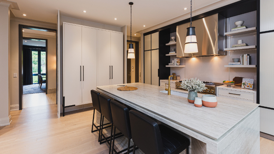
On the other side of that two sided fireplace in the great room you can catch a glimpse of the kitchen – that’s where we’re checking out next.
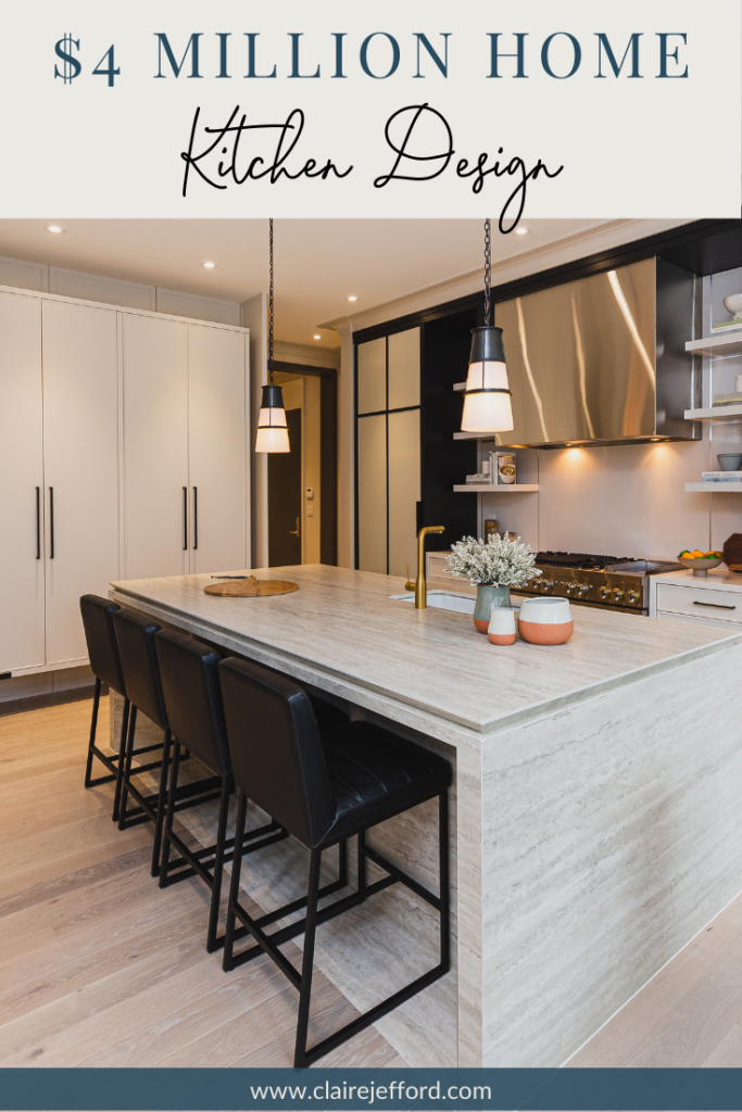
I like this kitchen much more than last years kitchen design with it’s bookshelf paneled ends.
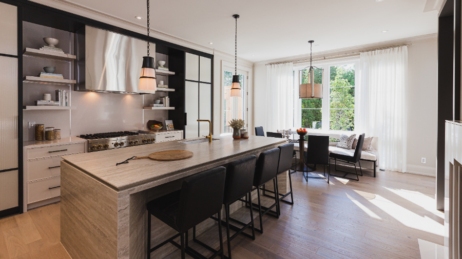
I do wonder about the size of the kitchen when compared to the overall size of the house.
When we entertain, people often gravitate towards the kitchen. This space would not accommodate a very large gathering, especially when compared with the grand scale of the other rooms. Nor does it appear to provide ample counter space for food prep.
Look at how little room is on either side of that huge and yes, gorgeous, range unit!
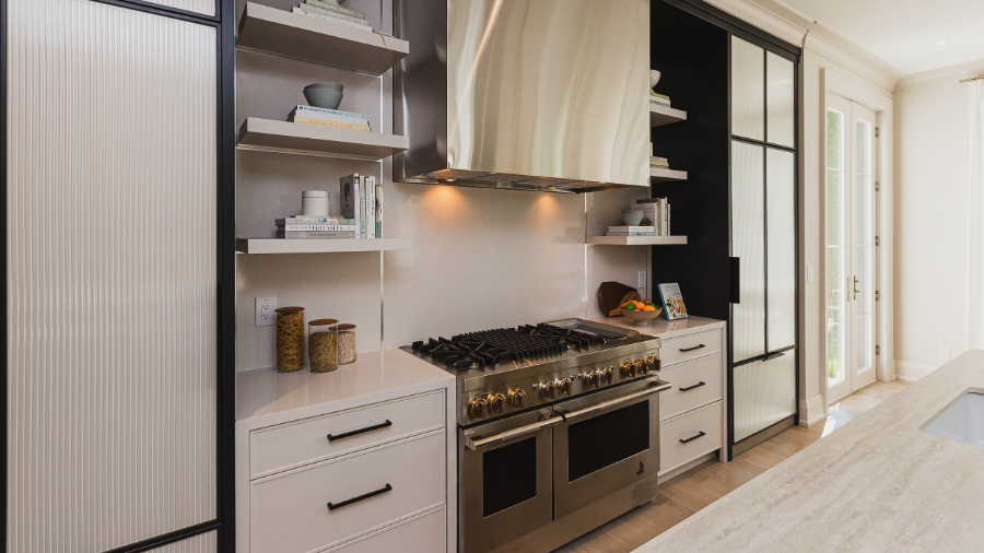
Then we have the open floating shelves which don’t quite make it all the way to the wall units that flank them on either side.
This look has become increasingly popular over the years, but I question how practical this set up actually is. Unless you’re not actually cooking in your 4.8 million dollar home, this area has the potential to get covered in grease and dust.
Open shelving… Love it or Leave it?
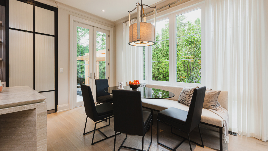
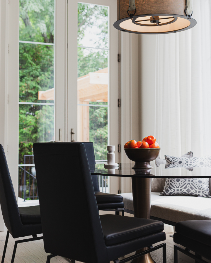
At the far end of the kitchen, we have this relaxed, yet sophisticated breakfast nook. I do love the bench seat and seeing that wonderful contrast once again, this time with the black chairs and the neutral banquette.
That faucet is fantastic and in the same gold finish that we’ve seen in other design elements throughout the main floor in the house. But unless there is a hidden sink that we can’t see, this one, narrow single basin sink does not seem like enough for a busy family.
Of course, I love the undermounted DXV sink itself, I would just like to have seen it be a bit bigger.
Kitchen Design…Love it or Leave it?
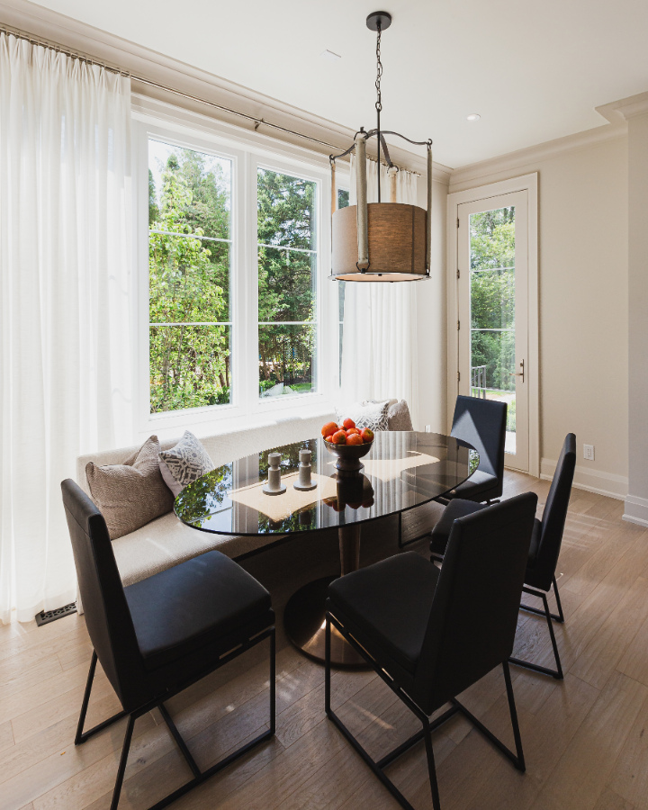
The glass tulip style table with a tinted glass top is super cute. Although I’m not a huge fan of that light fixture. It seems rather busy with the curves, the straps and the metal piece underneath. What are your thoughts? Love it or leave it?
Across the hall…
You’ve prepared a gourmet meal and now you need somewhere to sit and enjoy it. This room is the perfect place. It is sumptuous, just don’t spill any food on that lush and luxurious area rug!
The Dining Room mimics the study in location and with its moody colour. The room has deep, rich wall coverings.
The dark blue drapery with the patterned lead edge is gorgeous. For those of you who are colour enthusiasts like me, the trim and baseboards are painted Blue Note 2129-30 by Benjamin Moore.
Bold, dramatic dining room…Love it or Leave it?
The last room to visit on the main floor is the powder room with its dramatic colour tones and beautiful finishes.
Don’t be afraid to overdo it in a powder room, this is the perfect place to have some fun! I encourage people to go for that WOW factor and Brian has done just that with this shimmering and unique wall feature.
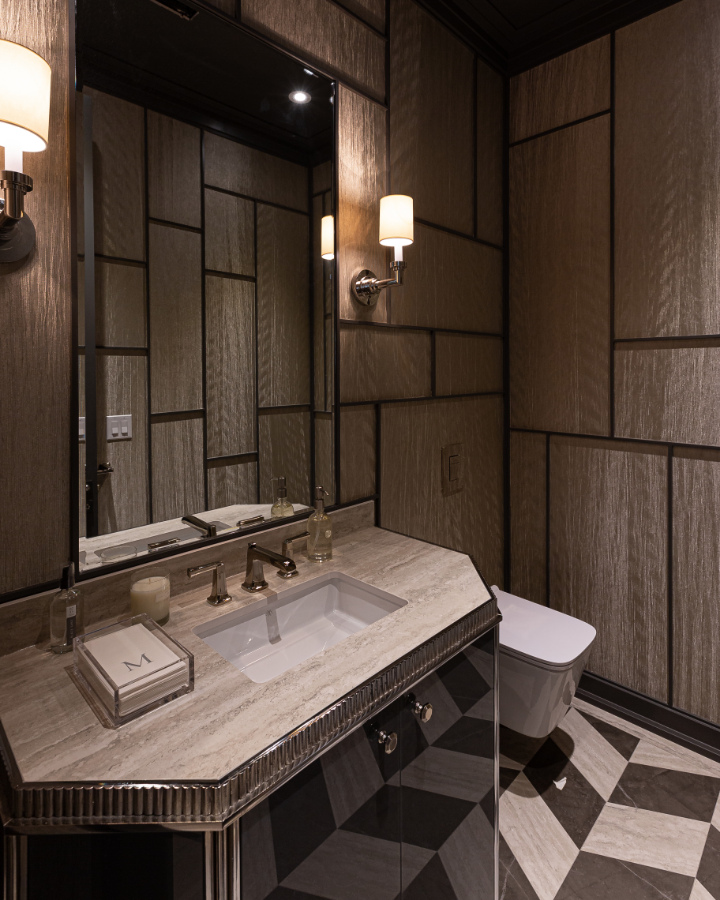
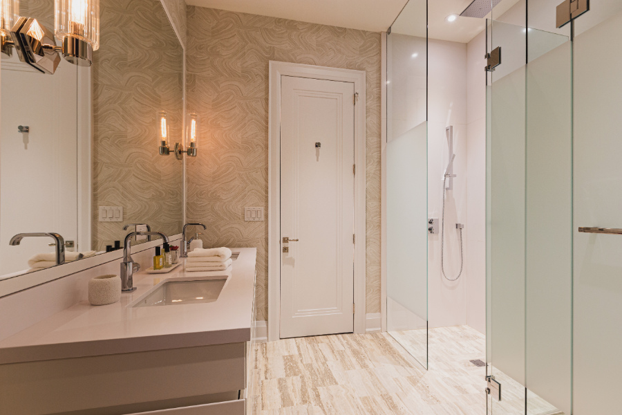
The countertop here is Dekton by Cosentino. The sink and faucet are divine high-end fixtures from DXV.
Second floor:
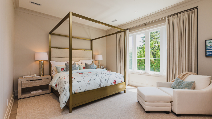
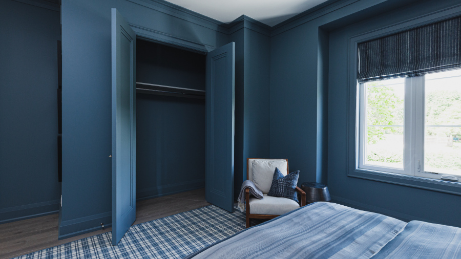
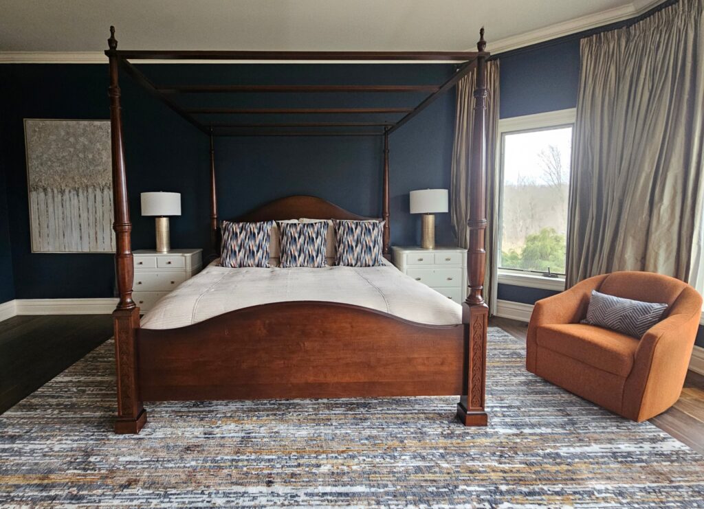
1st Stop is the principal bedroom suite. Do you notice the window walls in every bedroom? This is why I asked you to carefully look at the exterior of the home, at the beginning of the post.
This is a brilliant architectural and design feature! This is perfect for having the window treatments like these custom draperies be flush with the wall. Even more so because the colour of the drapery is the exact same colour as the walls.
The canopy bed with a brass finish is a real statement piece in this room. It has strong lines, but at the same time, the cream upholstered headboard gives it a soft, feminine feel.
Canopy bed in a brass finish…Love it or Leave it?

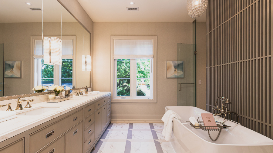
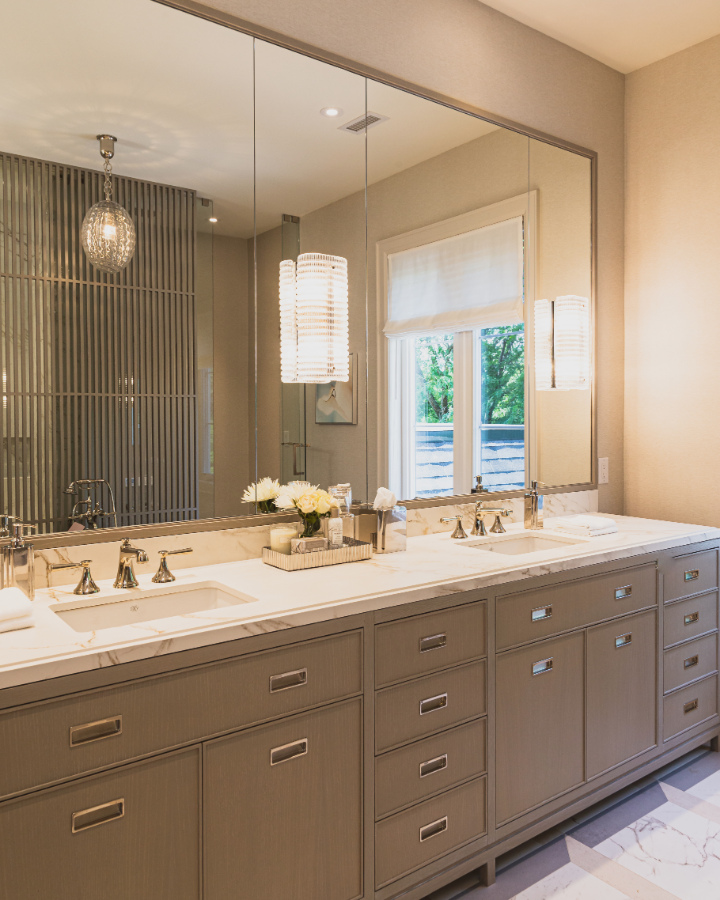
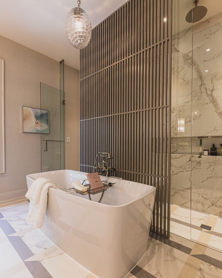
The principal ensuite is my favourite room so far. There are so many beautiful design details here, I don’t think that I would change a thing!
You may not be able to see the backdrop of the wall covering at the far end with the window. It’s appears to be a neutral wallpaper, it may have some texture, but it’s difficult to say for sure. The trim and baseboard is painted Balboa Mist by Benjamin Moore.
You don’t need any more of my words here to distract you, just soak up the beauty in these next few photos.
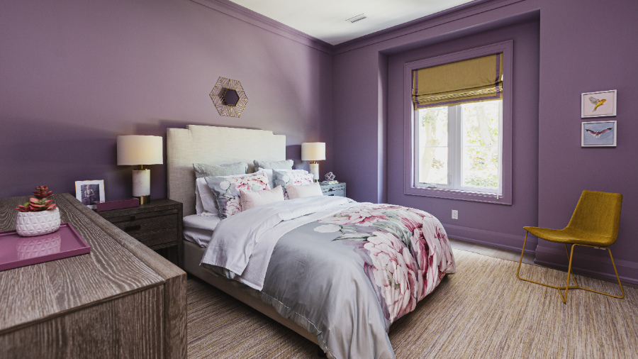
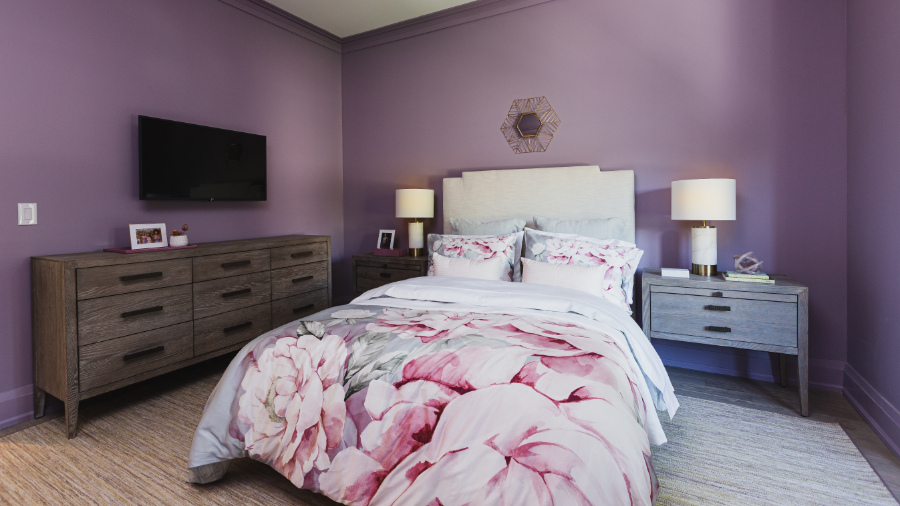
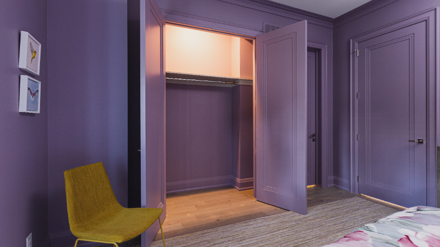
We find three additional rooms on the second floor, starting with this room that is painted a lilac purple. It’s Inspired AF-595 by Benjamin Moore and it’s everywhere! The walls, the trim, the baseboards, and even the doors, all painted purple.
What do you think…Love it or Leave it?
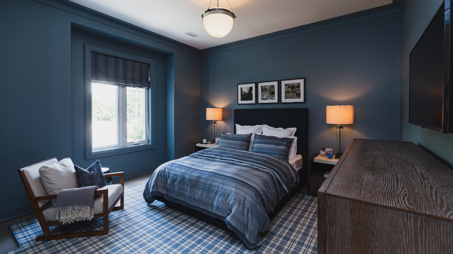
The second bedroom is painted Amsterdam AF -550 by Benjamin Moore. Although it doesn’t look like the colour they’ve specified in the brochure, I have been assured by a reliable source that this room is indeed that colour.
Similarly to the purple room above, in this space, we also see everything is painted the same colour.
The bedrooms above each have a door into this serene shared bathroom. Interesting that neither room colour is repeated or even looks like it would be part of the same design space. This Jack and Jill bathroom colour palette is quite the departure from the boldly painted bedrooms.
I do love all of the plumbing fixtures though and the sconces mounted directly onto the vanity mirror.

The fourth bedroom has been designed to be somewhat multifunctional. This definitely could be used as a guest bedroom or an office. This room comes with its own ensuite as well.
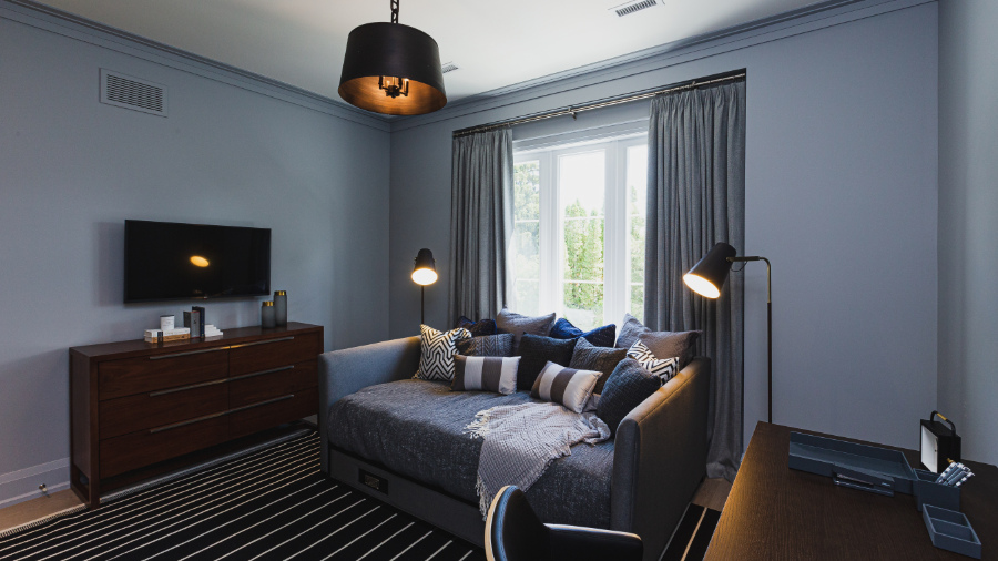
The furniture layout looks quite tight to me though, with limited access on each side of the daybed to the desk and dresser. But for a spare room that would only be used on occasion, I think you can get away with that.
Alright, so there you have it. I told you what I thought and now it’s your turn! Do you agree with my opinions of the design, or do you have some different thoughts to share?

Be sure to stay connected with me by taking my Colour Quiz here, because in my next post, I’ll be taking you on a tour of the basement which showcases my ABSOLUTE FAVOURITE room in the whole house!
PERFECT FOR PINNING!
Pin these to your Pinterest for easy reference when you need it.
Related Post: Princess Margaret Lottery Home 2019
For Your Convenience
If you’d like a beautifully curated colour palette like the Princess Margaret home has, look for further than my Perfect Colour Palettes.
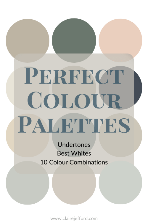
These perfectly curated colour palettes will help to bring a home’s décor together flawlessly.
Confidently select the best colour for your home, and see which trim, ceiling, and accent colours pair well with your selected colour.
Our Perfect Colour Palette Library is growing. Click here to see some of the most popular colours from three of the top Paint Companies.


Kristine C.
| 14 November 2020Hi Claire! Not only do I agree with you, I find it so refreshing to read thoughtful and honest critiques of a designed space. So much in design is subjective, but I’m always reading how much is loved about a space and never things that I feel don’t work (or aren’t practical, like you point out about the kitchen). Thank you for sharing your point of view and I look forward to reading more posts like these.
Claire Jefford
| 14 November 2020Thanks Kristine, I really appreciate you saying so. I know everyone will not see things in the same way and I do think there were a lot of wonderful design elements in this home. But for $4.8 million, I’d like to think that I’d have a little more useful space in the kitchen and master closet. Cheers for reading!
Deb
| 17 November 2020Hi Claire! This is the first time I’ve seen you do a critique and was wowed by your thoughts on function as well as design elements. I loved the window treatments, the chairs and the foyer flooring. Contrast archway color is a yes. Blue fabric walls, no; it looks like office room dividers. Overall, I felt like this entire house was very masculine feeling, even in the large living room. I did think the grates over the windows above was visually interesting. The whole house scheme appeared unbalanced. Either very light or very dark rooms and not much tying them together. I totally agree with you on the kitchen shelving. That’s all for now. Thanks for sharing.
Claire Jefford
| 7 March 2021Hey Deb, thanks for reading and for sharing your own thoughts on this Princess Margaret Lottery Home!