Princess Margaret Lottery Home
Choose the right paint colour
the first time Let me show you how in just 5 easy steps!
BONUS: The Top 15 Shades of Gray by Benjamin Moore
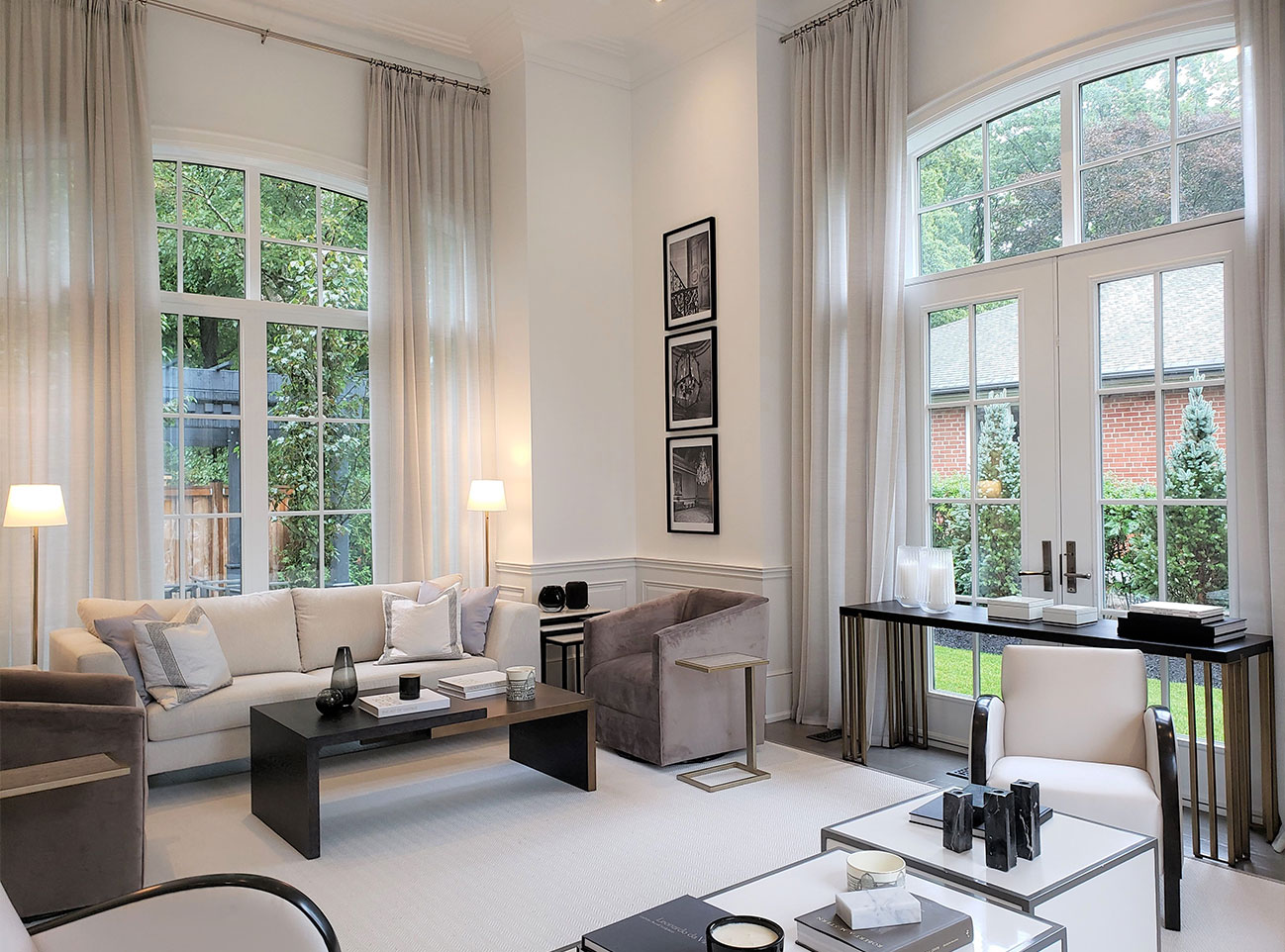
What type of home can you expect for a cool $4.8 million in Oakville, Ontario? How about this beauty that is the 2019 Princess Margaret Lottery Home?!
I had the pleasure of receiving an exclusive invitation from the Lixil Group to attend the open house recently before it went public and today I want to share my experience with you.
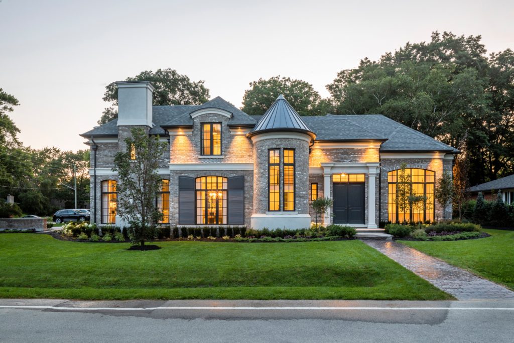
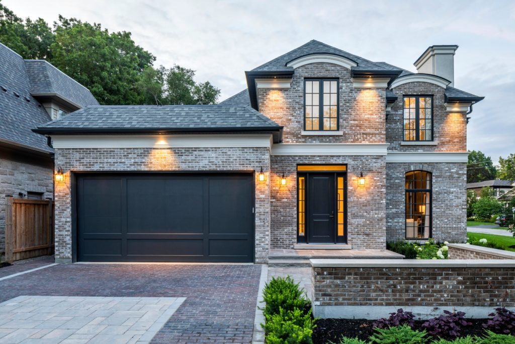
The house is on a corner lot and the photo above shows the ‘front’ of the home, while the image below is of the side entrance with a double garage.
Most of the images in my blog post are courtesy of the Princess Margaret Lottery Home, which you can visit here to buy your ticket to conquer cancer.
In this week’s video, I share both my favourite interior decorating features inside the home and the ‘Design Disappointments’.
Hey, I appreciate that not everything in a residential interior design project is going to resonate with everybody and there will always be critics.
As an Interior Design Professional who works with clients on a daily basis to redesign and redecorate their homes, I wanted to share my perspective and thoughts. I welcome your feedback as well, please leave a comment here on my blog.
Also, what kind of Colour Expert would I be if I didn’t mention the Benjamin Moore paint colours?! Read on past the video to find out what paint colours were used in this home.
My Favourite Things
Mill Work & Trim
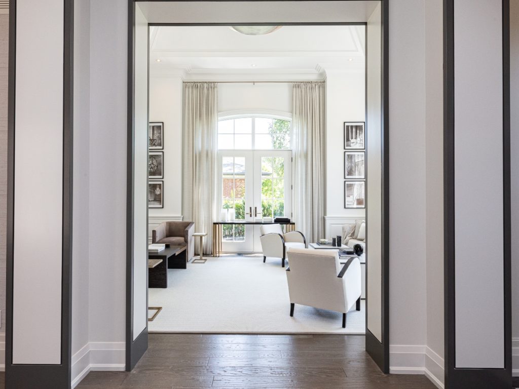
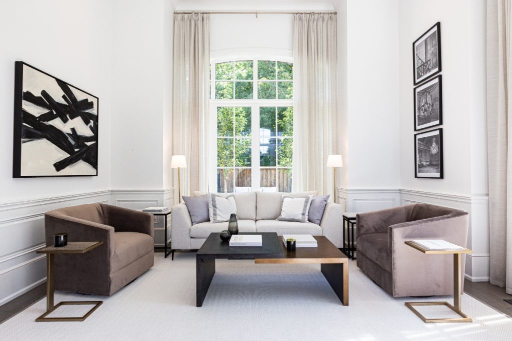
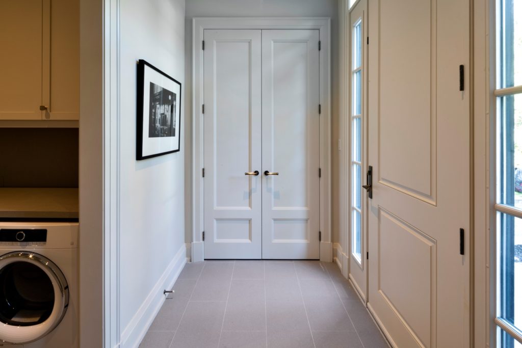
When you hear the expression, ‘It’s all in the details‘ you cannot argue that in this home, each room has substantial elements of beautiful, detailed custom millwork.
Wallpaper and Drapery
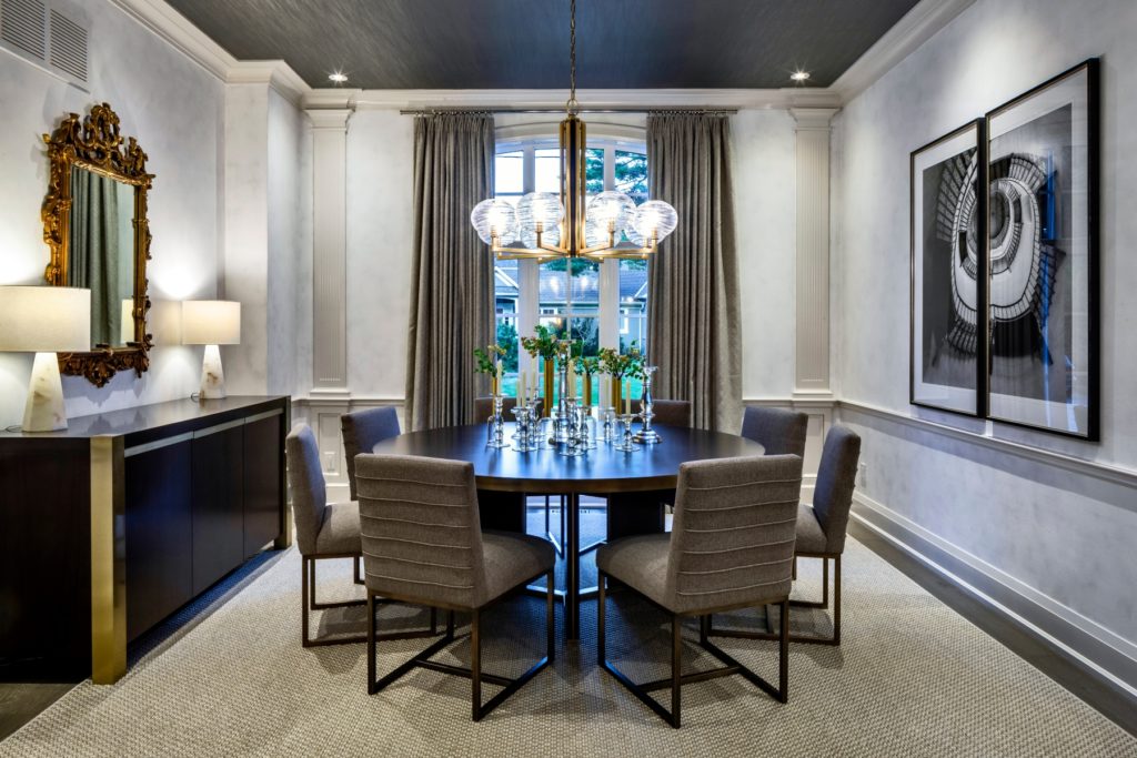
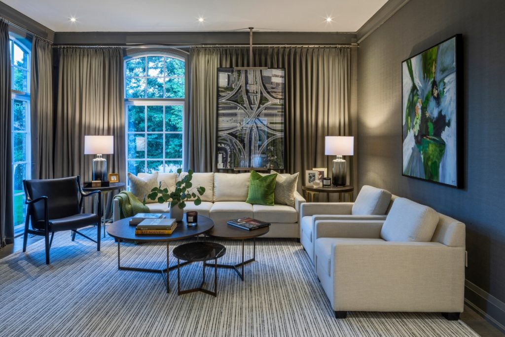
Interior Designer Brian Gluckstein is well known for using subtle and sophisticated wallpaper and drapery in his projects. This Princess Margaret Lottery Showhome is no exception. Here are some of my favourite rooms with these exquisite decorative elements.
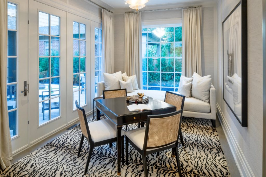
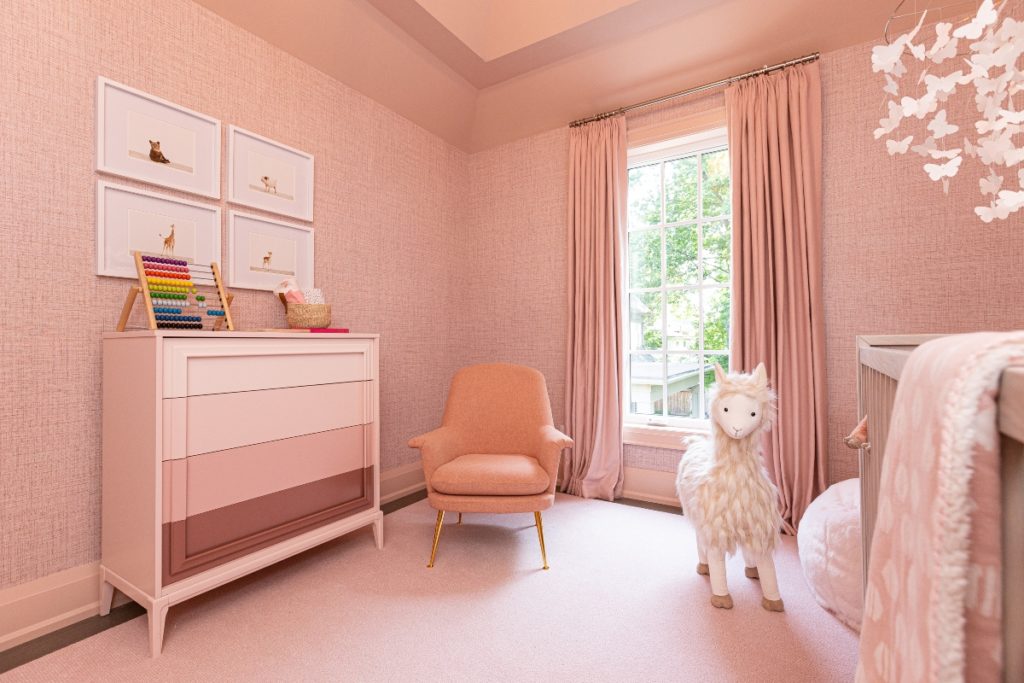
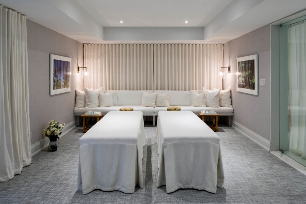
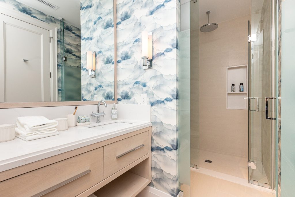
Gallery Wall & Artwork
In terms of wall art for home decor, we have been seeing large prints either framed or on canvas for quite some time.
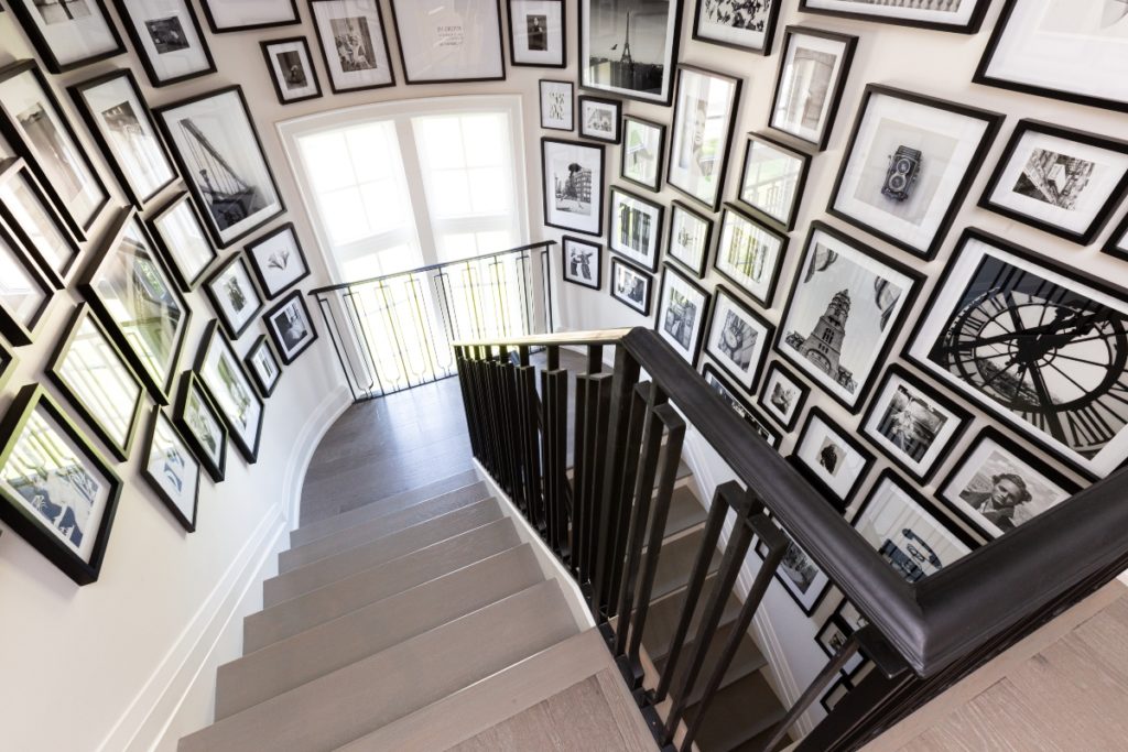
Here in the Princess Margaret Lottery Home, that trend was no exception. But first, you’ve got to see this gallery wall which is one of the most interesting I’ve ever seen!
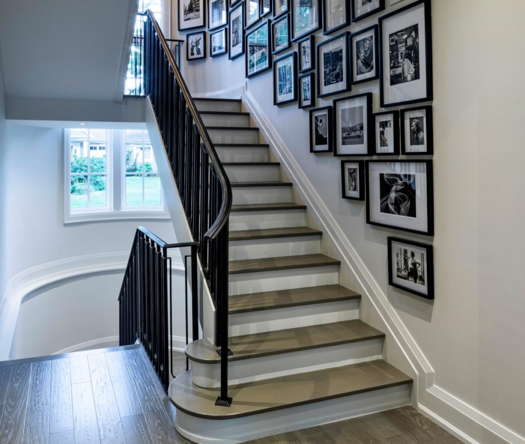
The main reason it’s so unique is that it wraps around a curved wall in the stairway. All photos are in black and white with black frames. Quite the statement, wouldn’t you agree?
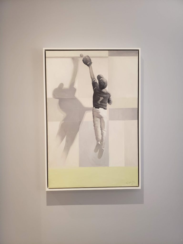
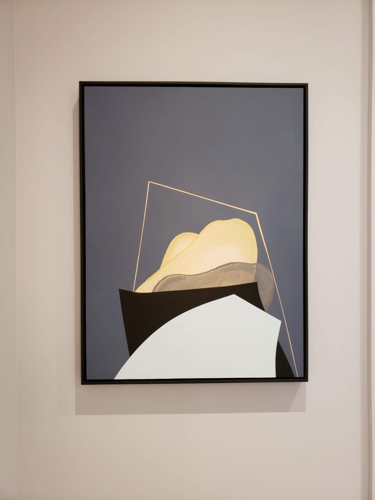
Here are two more art pieces that could be found on the second level of the Princess Margaret Lottery Home.
Design Disappointments
In the video, I am able to easily convey my feelings about why I feel the way that I do about some of the main areas within the home. (This is why I always promote video for your business as the best way to share your message!)
Please watch the video if you want to hear opinions straight from the ‘horse’s mouth’. -that’s me! I’ve made bullet points below to list elements of the design that I was deeply disappointed in for such a luxurious family home.
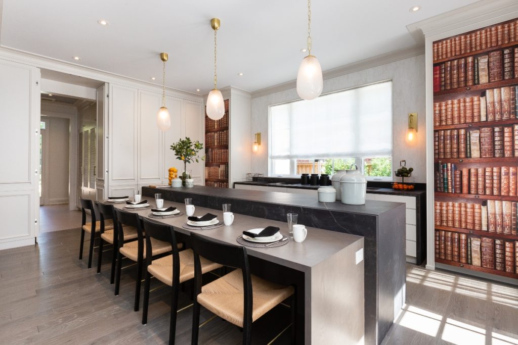
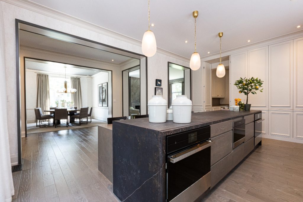
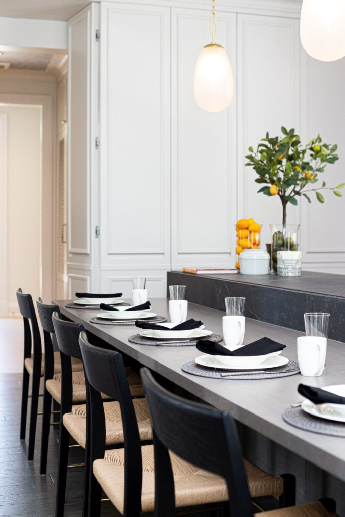
The Kitchen – Things that make you go ‘hmmm’
- The bookcase murals that cover each fridge on both ends of the kitchen
- Seating configuration at the island -are we in a hibachi restaurant?
- Lack of counter space between the stove and the sink
- The kitchen is open to the hallway, but not open to other rooms
The Laundry Room – Or Lack Thereof
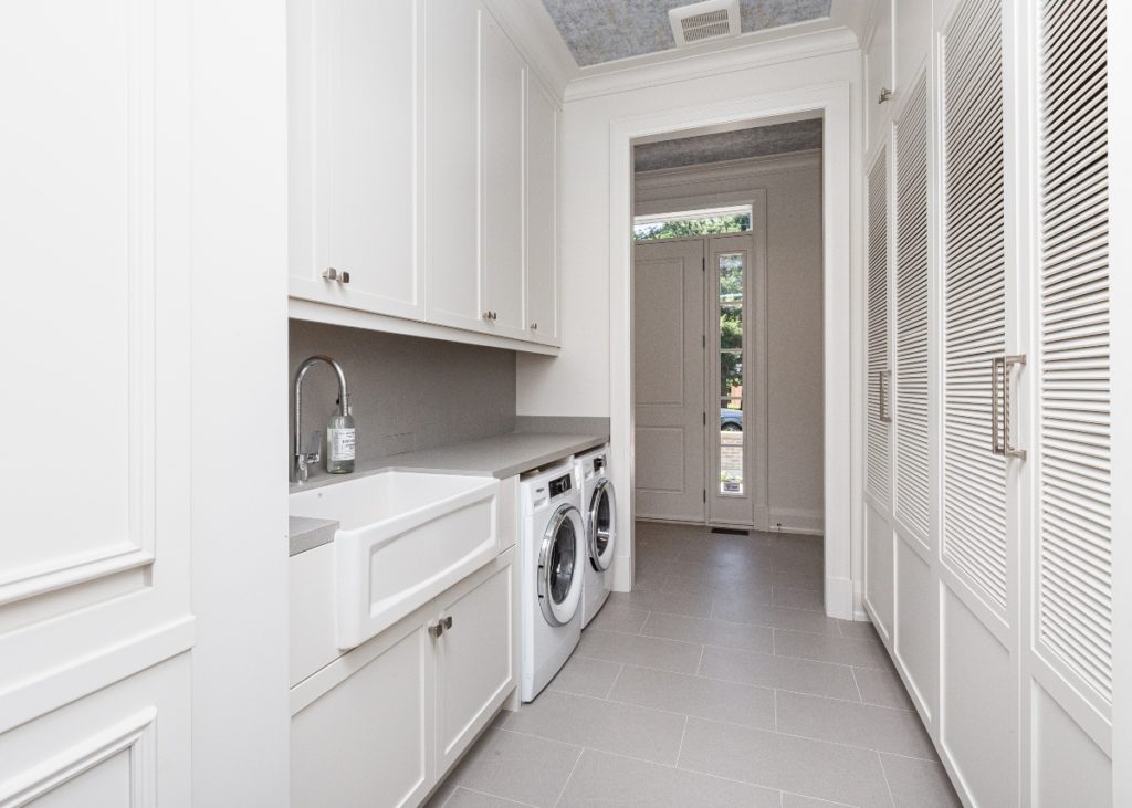
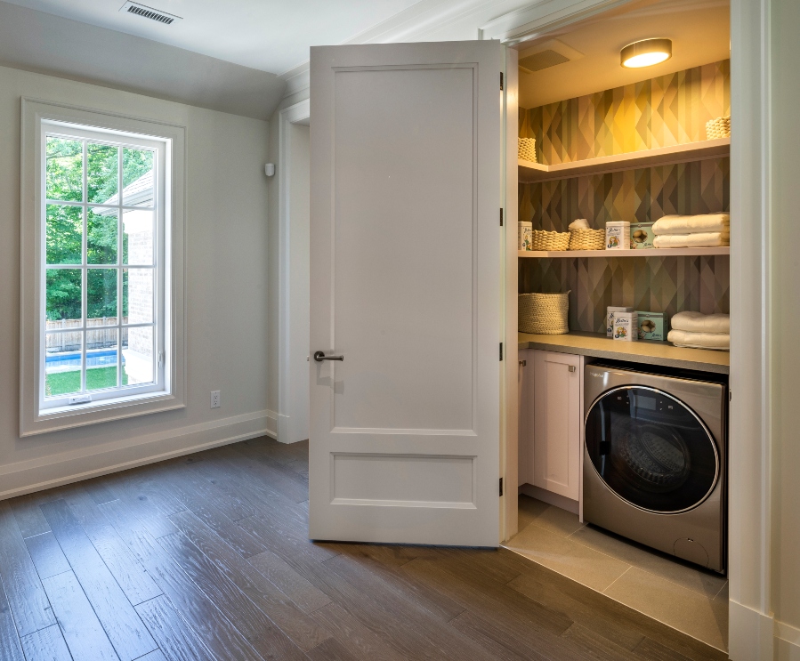
- No actual laundry ‘room’, but rather a walk through laundry area between the kitchen and the pathway to the garage & side door
- No rod nor a dedicated area to hang delicate items to dry
- Not enough space to place a laundry basket AND fold your laundry at the same time
- Second floor laundry is in an awkward location, at top of the stairs in the middle of the main hallway (see below, second image)
- With the ‘all in one washer & dryer’, the linen closet doesn’t leave much room for linens, pillows, or duvets
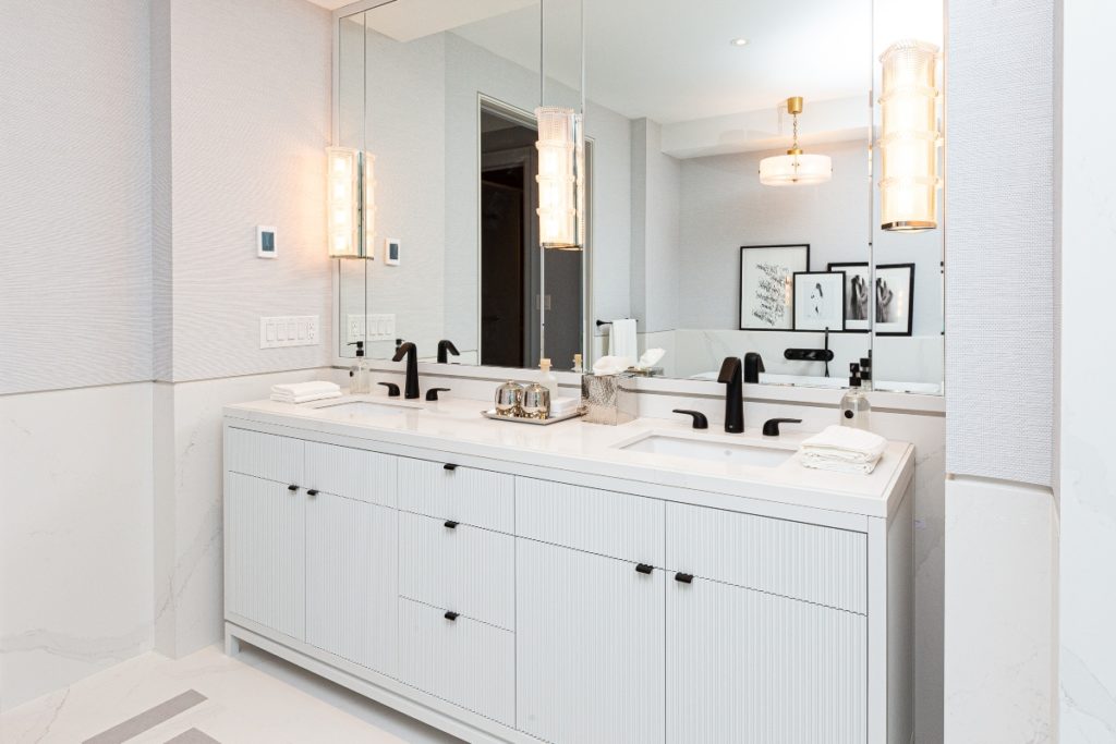
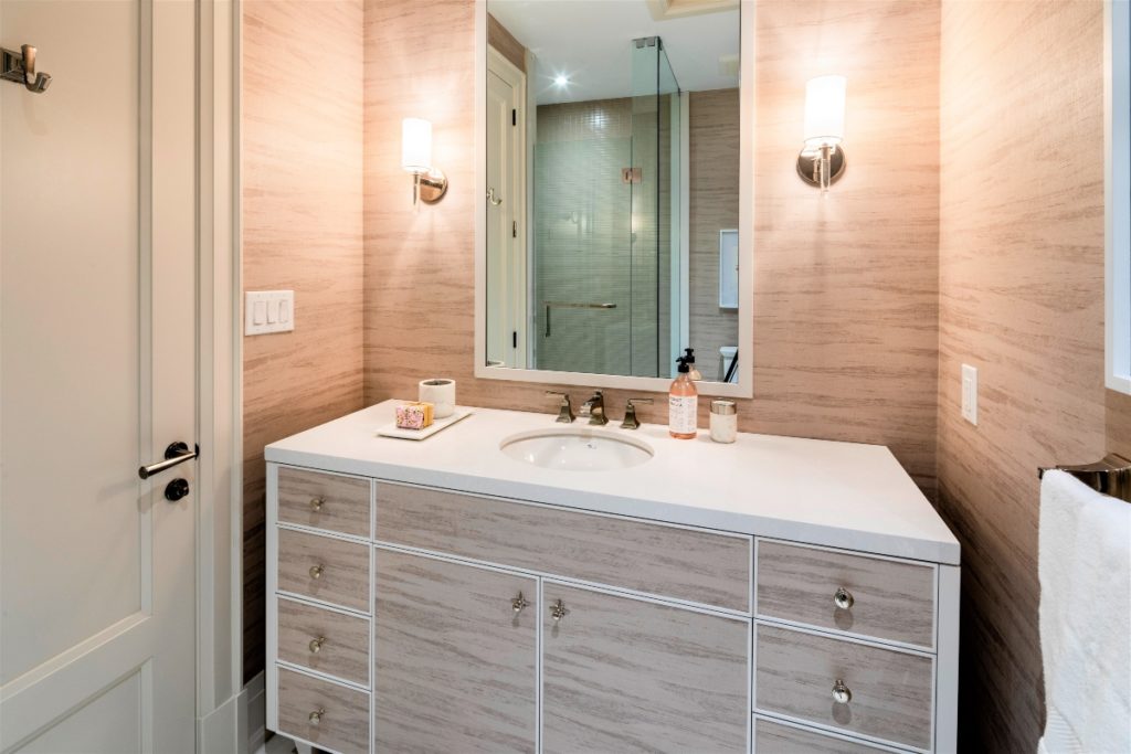
Custom Vanities Fall Short
I absolutely appreciate that these two vanities were likely built to look like furniture – and there is no denying they are absolutely GORGEOUS!
But why not have them custom-built wall to wall? The gaps between the walls on either side are not practical & you run the risk of having toiletries that will inevitably be placed here, likely falling to the floor.
These ‘gaps’ also become a dust trap, especially with the area underneath being open. I mean, can you imagine how many dust bunnies would be playing under there at any given time? Hopefully, the eventual owners will be able to employ a daily cleaner.
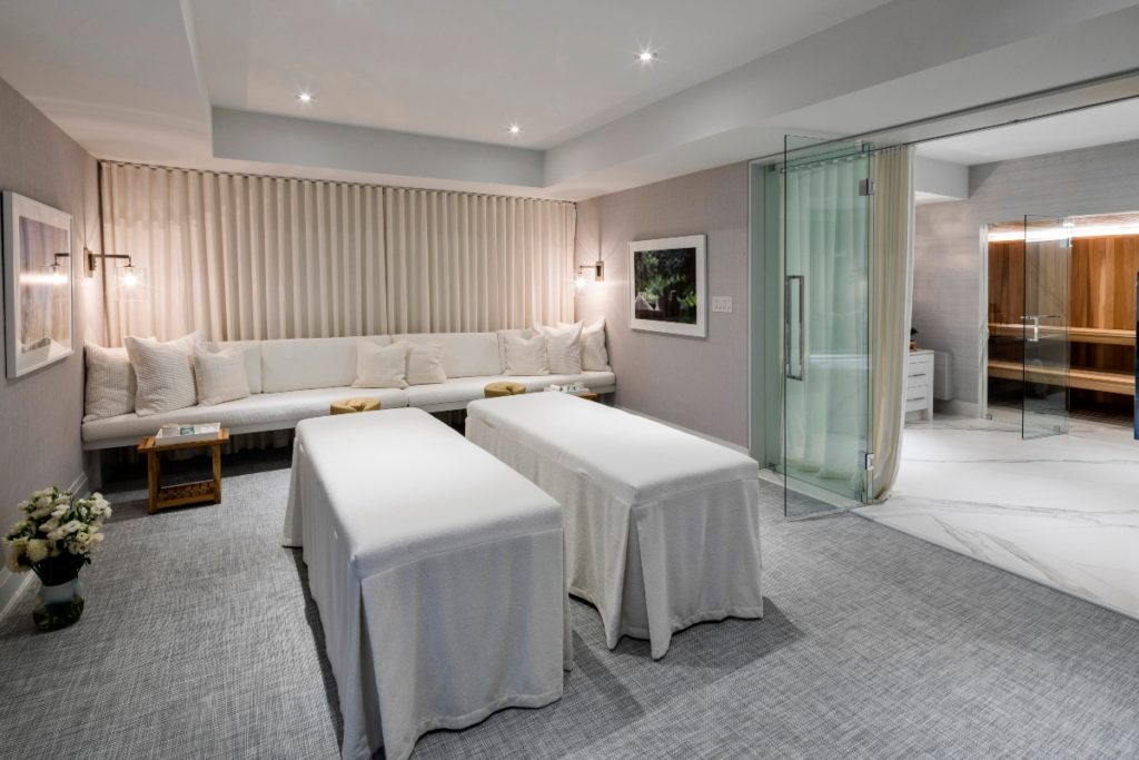
A Basement Fit for a….a…..Spinning instructor and Masseuse
Most families I know, including my own, love to spend time playing board games, cards, darts or watching movies. Often, these activities take place in the basement -especially for us since we live in a small 3 bedroom bungalow.
Having designed a 3000 square foot basement for a past client project of which their wish list included: a movie theatre, concessions area, a 400 square foot gym, a sauna, designated space to play poker and pool, PLUS a Secret Xbox room, I’m fully aware of what a daunting and detailed task designing the basement layout for the Princess Margaret Lottery Home could be.
I also understand that every year there is added pressure to come up with a design that has an incredible ‘Wow’ factor. Last year the home had this 2 lane bowling alley. Now that was fun!

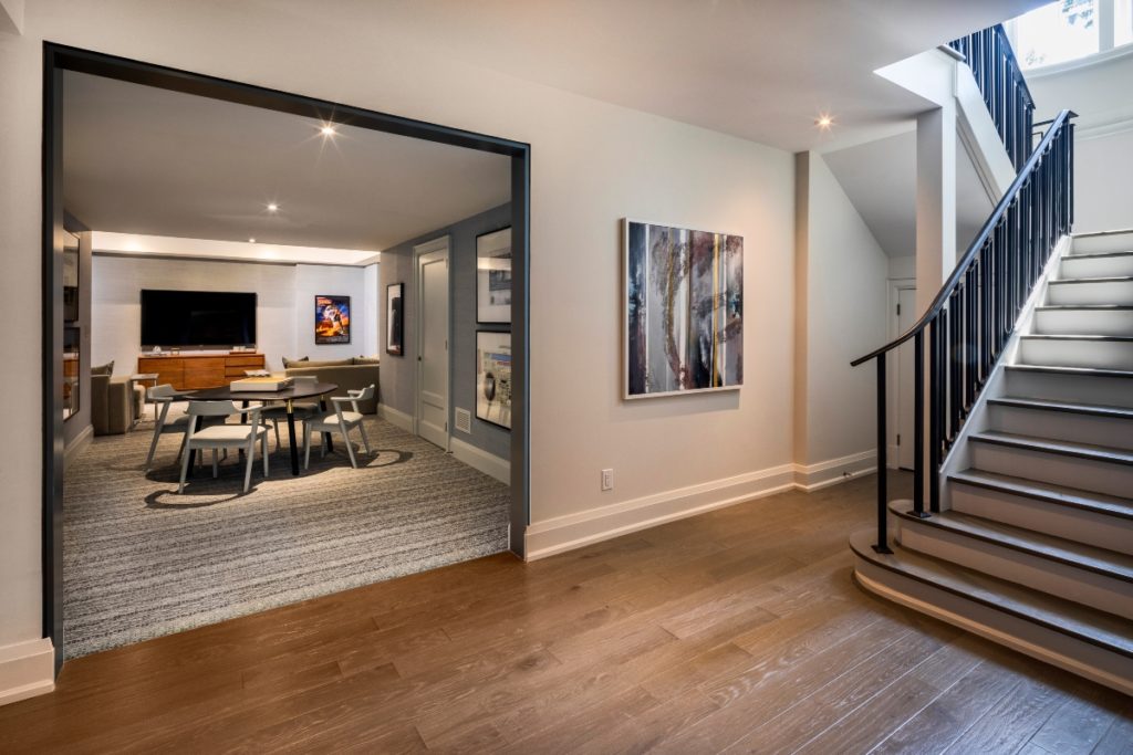
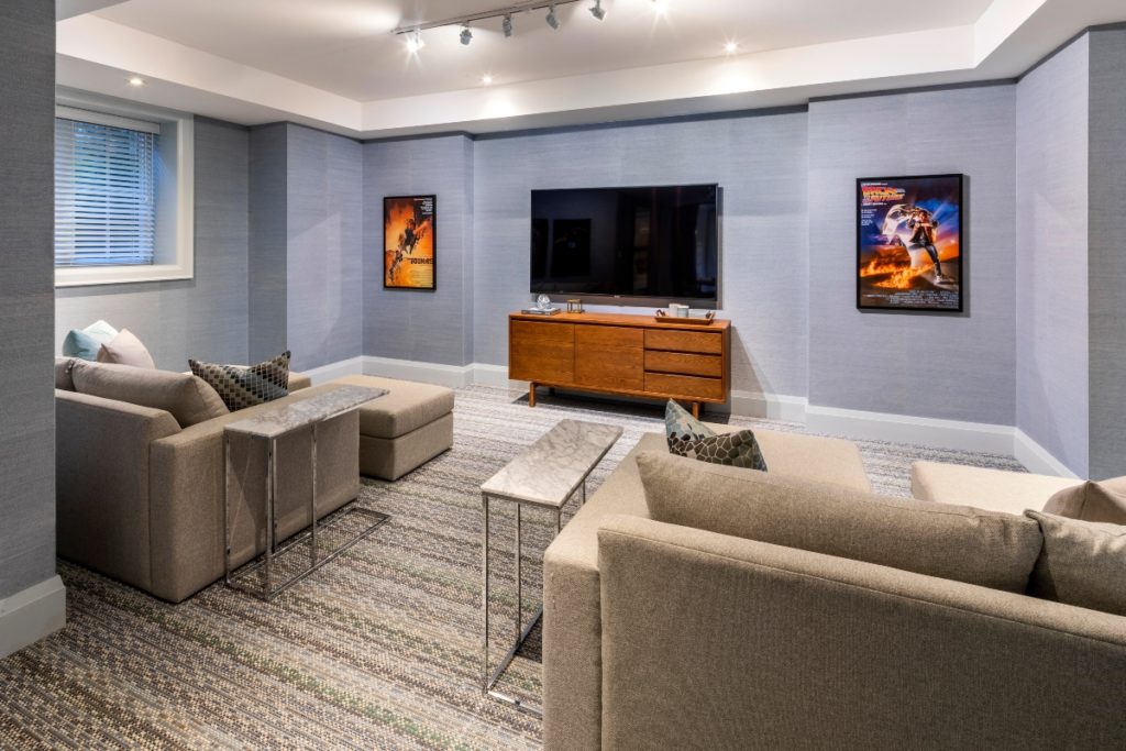
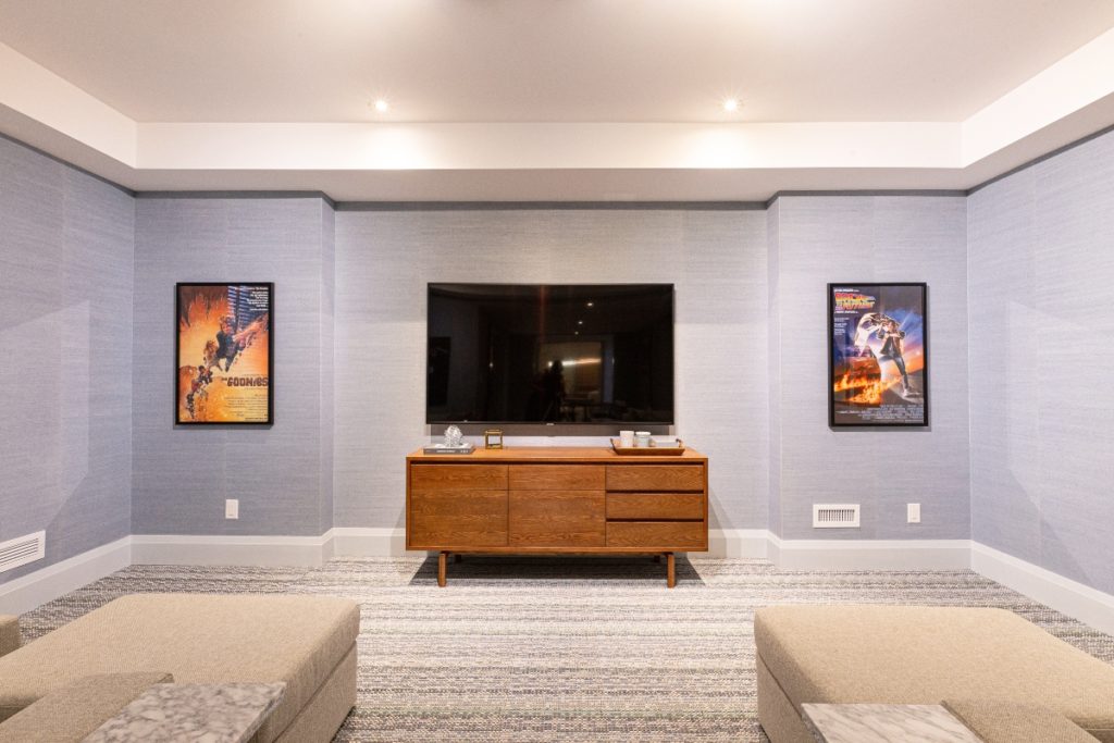
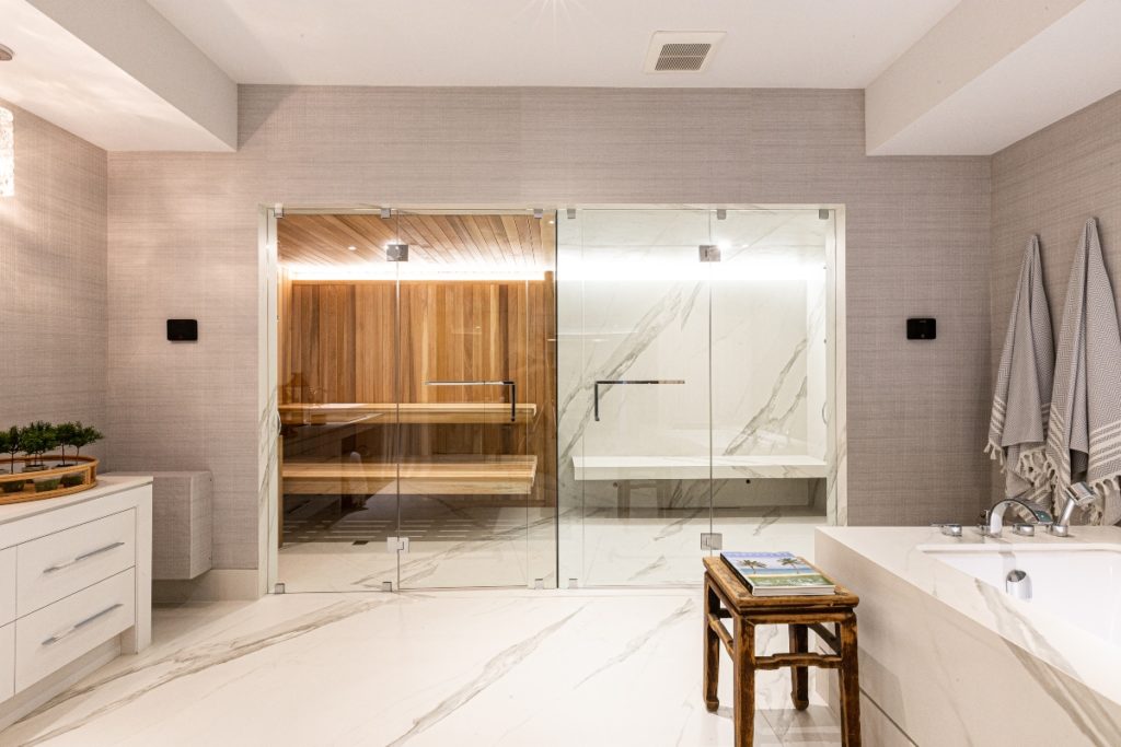
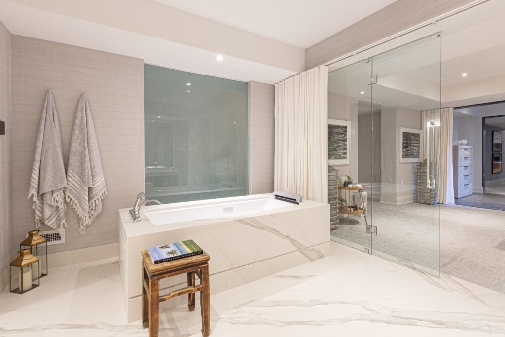
This year it was all about wellness, with a Spinning room and large spa area. There is no denying that the space is absolutely worthy of a jaw drop when you first enter but is it the best use of space for a family basement?
In my opinion, no. Here’s a summary of what I felt the basement was lacking:
- A games area with storage -where is all the storage for board games, video games, DVD’s?
- The TV/Movie space was small with seating arranged in a way that did not look like everyone could adequately and easily view the TV
- A wet bar…there is no bar! Nowhere to make popcorn, no mini fridge to grab a pop. Must I walk all the way upstairs to get the wine?
- Privacy in the open tub, sauna and shower area.
Alright, so there you have it. I told you what I thought and now it’s your turn! Comment below to let me know what you think about this Lottery Showhome?
Regardless of whether you feel the same as me, the event the Princess Margaret Lottery Home stands for is worthy of support.
Go get your tickets here now. Good luck!
Psst! Love Colour? Take my new colour quiz to determine which colour palette suits you best!
Convenience at your fingertips
Remember, it only takes one mistake to take your home decorating project from divine to disaster. Don’t let the paint be what stresses you out!
Choosing Paint Colours
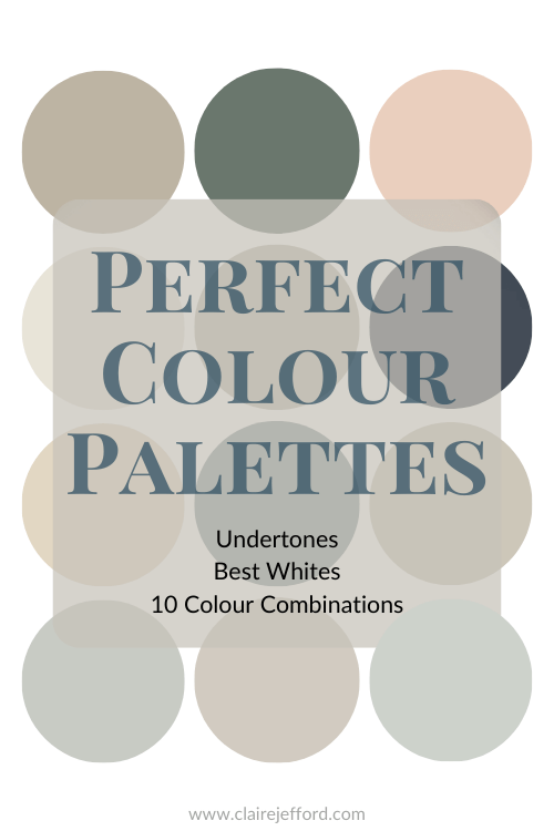
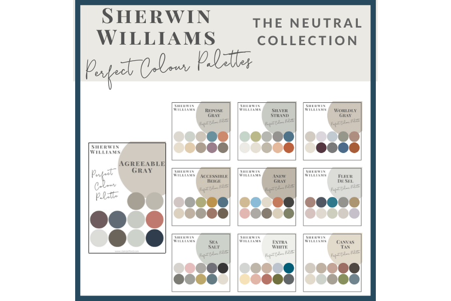
If you struggle with choosing paint colours, be sure to check out my Perfect Colour Palettes.
I now have 40 individual guides to help inspire you.
Collections
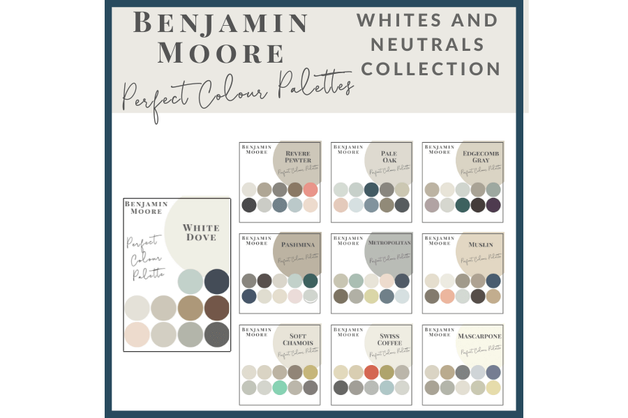
I also offer collections that showcase a group of 10 similar colours from Benjamin Moore,
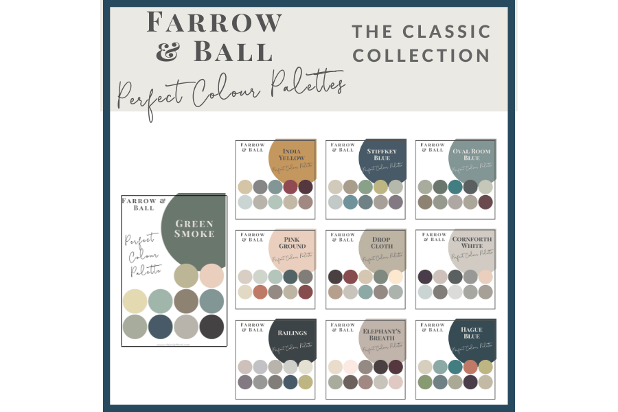
Farrow & Ball
and my newest addition, Sherwin Williams.






Judi Chevalier
| 10 October 2019Claire totally agree with your comments. I always look to the PMSH for inspiration. Other than some of the paint and wallpaper there is nothing that inspires me. However I do love the exterior of this house and feel reaffirmed we chose well (similar) for our new house (much smaller scale) for which we have yet to see the completed exterior.
Thanks for all the paint color info.
Claire Jefford
| 11 October 2019I agree that the selections for the exterior are lovely. I’m glad you were able to see it and that you are even more assured now in the choices you made for your own new home. Happy Thanksgiving weekend Judi!
Kelly Clark
| 10 October 2019Great info and overview, Claire! I love the way you give all the good details and pics!
For me, I love the tone on tone look—so sophisticated and timeless. I also love that they found ways to use color (nursery) but kept to the overall feel.
This home strikes me more as a retreat center or getaway where you go to be serviced, rather than a place that you have to live and do your daily thing. It feels as if they didn’t want the kitchen to actually to appear to be a kitchen—feels more like I should arrive to be served my meals. The lower level with the relaxation lounge, games area, etc. again all feel more like I’m at a place to visit and have a unique experience, not actually live.
Beautiful in so many ways though! Thanks again for sharing, Claire!
Claire Jefford
| 11 October 2019Hey Kelly, great insights that you share here. I wish I had a place like this to use as a ‘retreat centre’…maybe if I win that’s what I’ll use it for. LOL Thanks for reading!
Carol
| 10 October 2019The first thing I would do if I won the house ………rip those murals out of the kitchen! What were they thinking? I agreed with everything else you said also, and that sauna room…….has to go as well, lol! Do you know what the flooring was (wood or laminate) and brand? Loved the wallpaper and colours used too. All in all a bit too modern for my taste, but I hope whoever wins it, loves it.
Claire Jefford
| 11 October 2019Haha, I think I would do the same with those murals Carol! The flooring in the ‘relaxation’ area is listed in the resource guide as ‘Chilewich’, Pattern Wave, Colour Gray. It was like a textured weave. I’ve never actually seen anything quite like it before. In the spa area the flooring was by Cosentino, Dekton, Opera. Hope that helps! Cheers for watching.
Sheri Bruneau
| 10 October 2019The millwork is absolutley stunning! I LOVE the way the entrance to the rooms are featured with a different colour.
I have only seen this home through your video, but I too am feeling like the busy, well used spaces, are not functional. Function, in my eyes, has to trump everything else. So if a laundry room is too small, how functional will that really be? If the vanity doesn’t go all the way to the wall (like in this home), it does become a dust trap.
I am not a fan of the bookends in a kitchen. I’m a book lover and I don’t get it.
Setting aside the ‘picky’, we also know that this is to get people talking (in positive and negative ways). We all know beauty is in the eye of the beholder. When I walk through lottery homes here in Calgary, I find myself saying one of two things: I can see myself living here or I’d sell this in a heart beat and not even move in.
I love that about design…is that we all love different things, we all see things through different lenses.
Claire Jefford
| 11 October 2019Thanks for your sharing your thoughts Sheri. You are absolutely right that we all see things differently and that these homes do get people talking. There has definitely been a lot of talk about this one, this year! Cheers my friend.
Laura Koshel
| 12 October 2019The house looks stunning and design is so well curated! Thank you for sharing, Claire!
Claire Jefford
| 12 October 2019Cheers for watching Laura!
Janet R Lorusso
| 12 October 2019Love hearing your take on this! We don’t have anything like it around here, that I know of, just showhouses. I agree with the disturbing lack of functionality in all the places you mentioned and I wouldn’t want that kitchen AT ALL, at least speaking for myself! the wallcoverings, and millwork were all lovely, though…I love the contrasts and textures.
Claire Jefford
| 13 October 2019Function must come first. The decor is beautiful though. Thanks for watching Janet!
JIL SONIA INTERIORS
| 13 October 2019Am I seeing correctly that there is some black trim and some white trim? Is it all out of the same material or different. I’ve got to say that’s a bold move but I do like it!
Claire Jefford
| 13 October 2019Hey Jil! The darker trim was used in the archways of the open hallway on the main floor. They were actually Kendall Charcoal by Benjamin Moore. Within the rooms the trim was white. I really liked the way they did that contrasting trim, as you said it’s bold, but we like it!
Mary Ann Benoit
| 13 October 2019Love the millwork, trim and wallpapers!
Claire Jefford
| 14 October 2019Yes, those design details were exquisite Mary Ann!
S ggem
| 13 October 2019I super duper want that spa.
And for a chef to flip some veggies into their hat.
Claire Jefford
| 14 October 2019If you have a spa like this, I’m making an appointment and coming to visit you!