Picture Framing
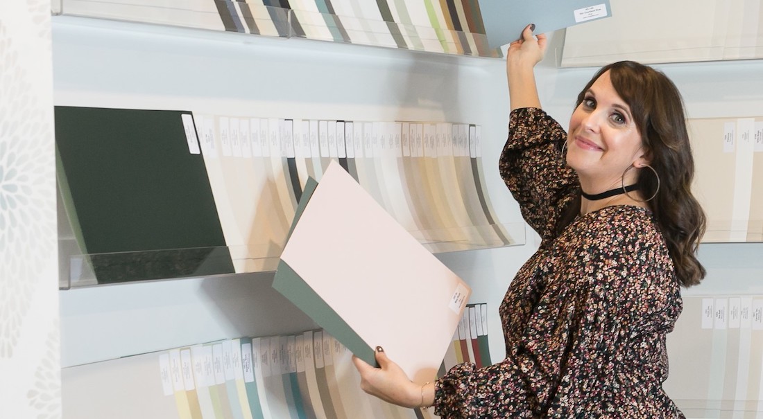
Choose the right paint colour
the first time Let me show you how in just 5 easy steps!
BONUS: The Top 15 Shades of Gray by Benjamin Moore

WWWOW!
What We’re Working on Wednesday
Custom picture framing. Is it worth the investment? We sure think so!
I’m thrilled to share with you this third episode of my new WWWOW video series.
What We’re Working on Wednesday is my way of bringing you behind the scenes of our interior design and decorating projects, in a way that I hope you will find helpful and entertaining.

Today we are at my custom picture framing gallery in Burlington, Ontario.
I’m giving you an exclusive look at our thought process and final selections for a wonderful client’s special piece of art.
Join me as I share why this specific print is discoloured and what could have been done to avoid that from happening.
Also, I share one of my best Trade Secrets and design tips for selecting the best glass!
Video Transcript & Photos
Today we’re at my trade-only art gallery and it’s a gorgeous place! I come here often to do a lot of picture framing for clients.
We find so much inspiration here and have many more clients who are custom framing their artwork.
There are so many options and they want it to look the best that it can in their homes.
I want to show you a piece that we’re working on for a client specifically.
This was a piece that belonged to my client’s mother.
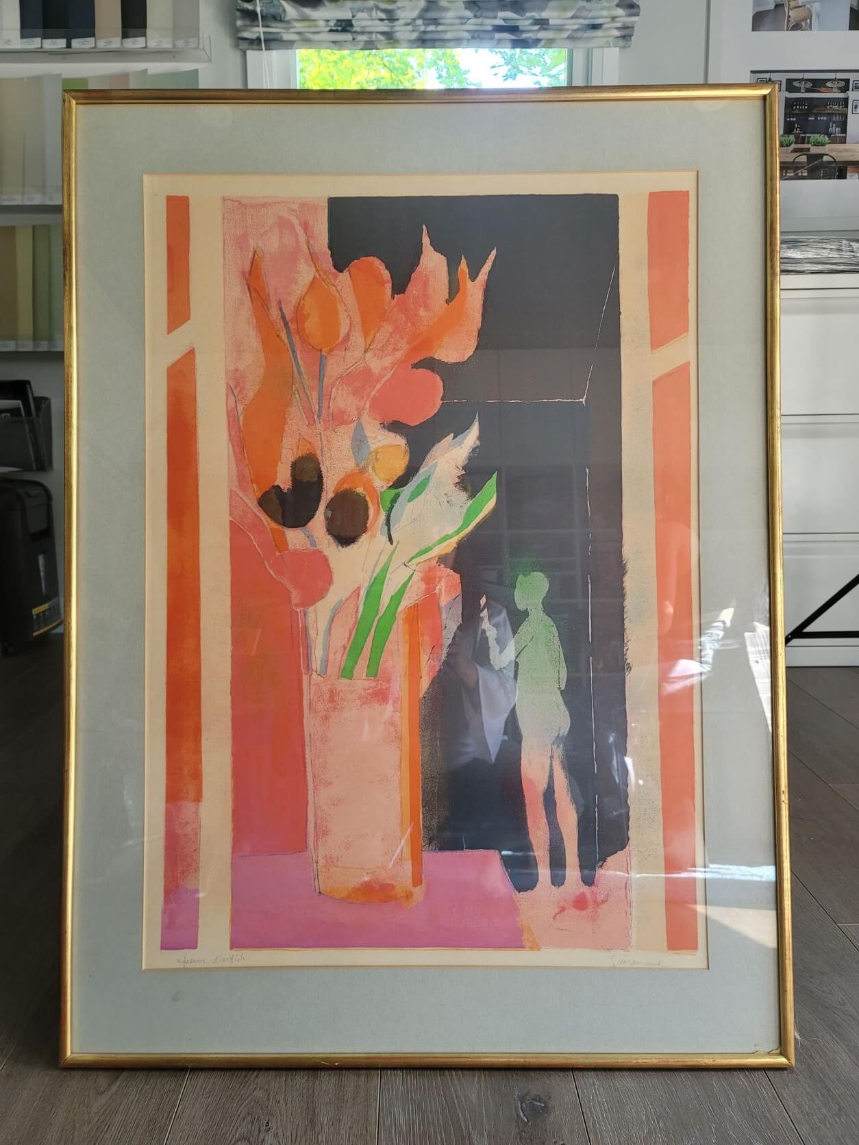
We actually pulled inspiration for the entire room design and colour palette from this one piece of artwork!
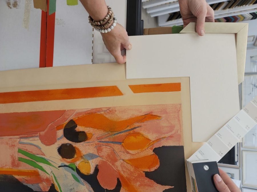
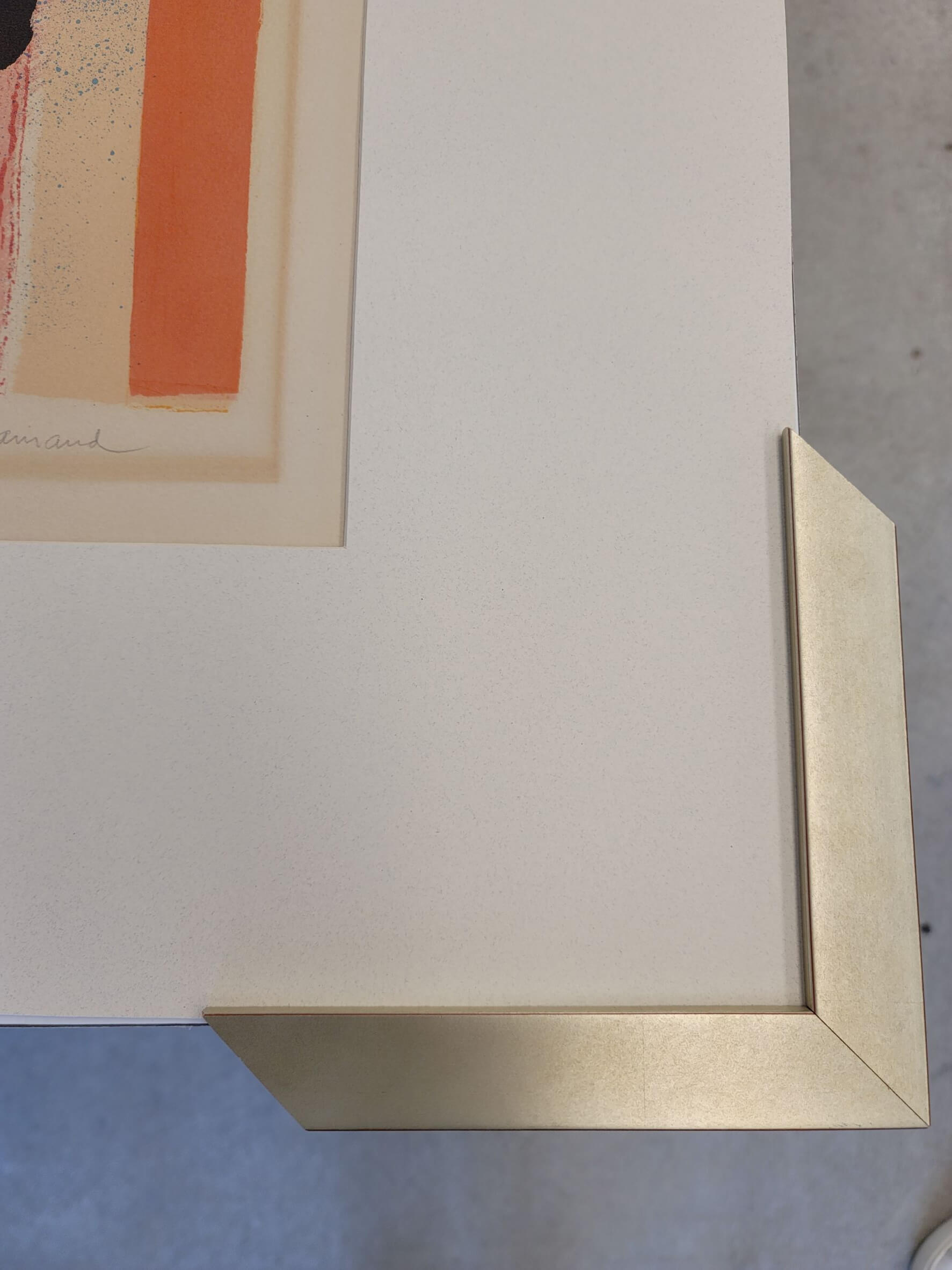
The thing to note with this is that once we took off the frame and the mat you can see here the discoloration, which is nice in a way because it’s actually showing you that this is authentic.
But what it actually means is that the proper mat wasn’t used when it was originally framed and nor the undermount of the mat.
So the oils mixed together and that’s how you get that discoloration.
When you do it properly, you don’t get that. But, we’re going to embrace this authenticity since there is nothing we can do about it now.
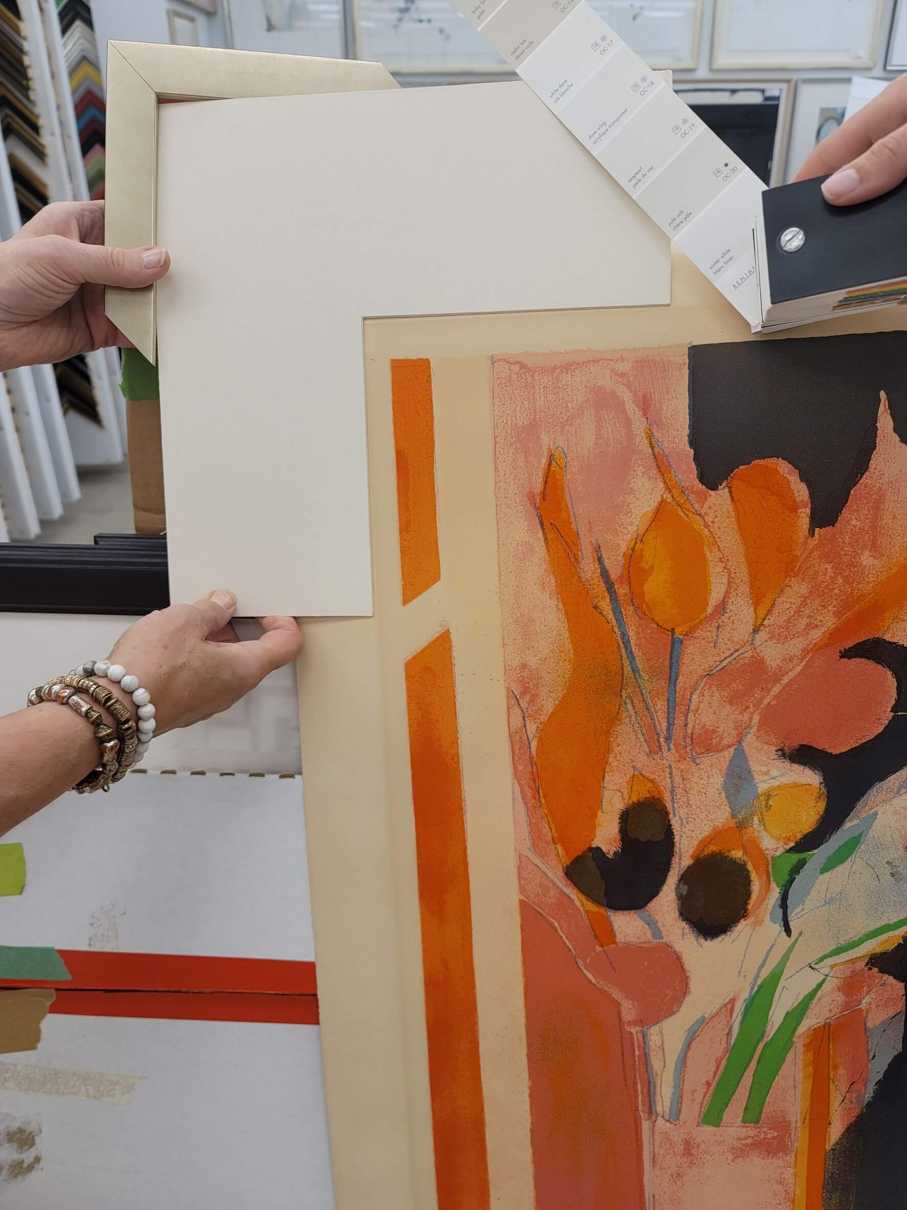
Then, you can see here what we’re looking at doing is we could go one of two ways.
We could come out of this little border around, but if we come out of it at the top end,
we’ve got little lines here, which I don’t really love seeing.
So I actually want it to come in more, so that’s how we’re going to do it.
**Please watch the video if this seems confusing to follow!**
You’re going to be able to see just the edge just a little bit here like that.
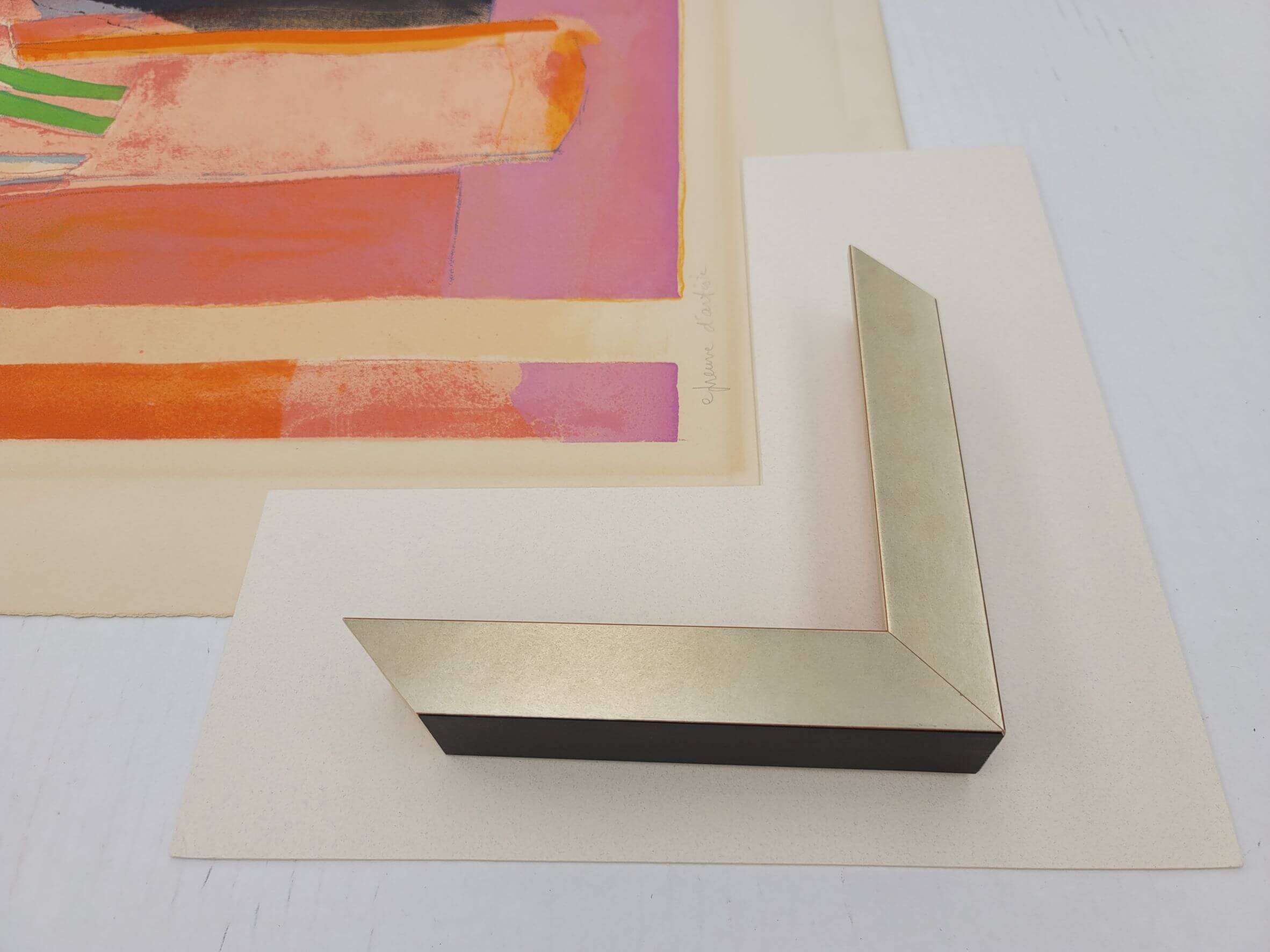
I want to share with you a couple of different options we looked at for the frames.
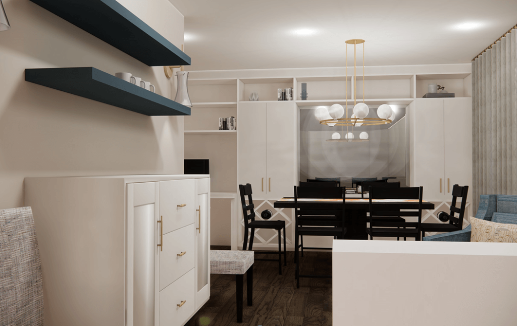
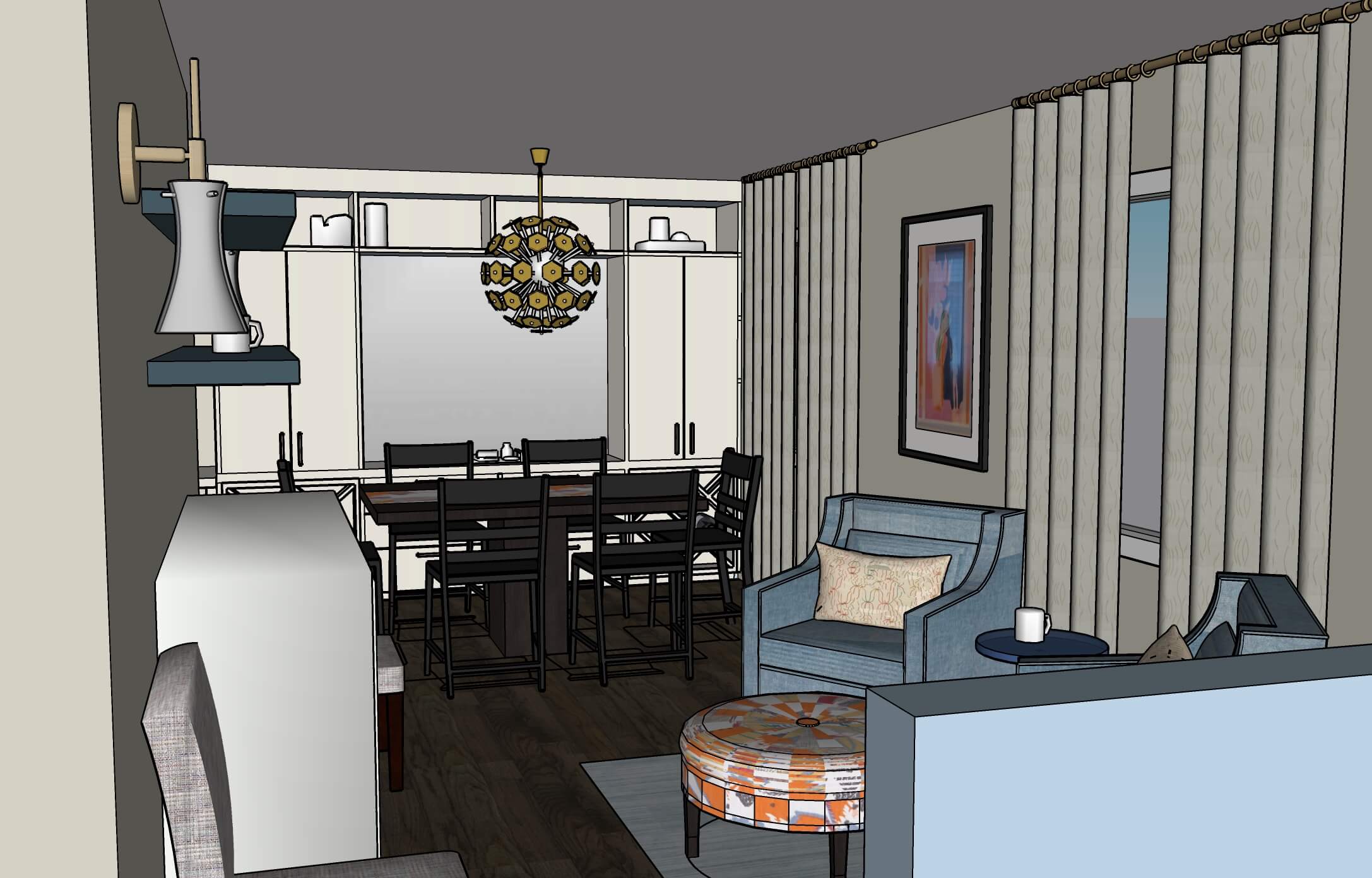
The finishes that we have in the space for the hardware on the custom built-ins and the stunning lighting fixture in the dining room are more of a gold champagne colour. You can see that in the 3D design below.
The original frame on this piece of art was much more brassy. It would not have looked very good with the new finishes and light fixture we chose for this project.
What we decided to do was go with this one here shown below, which I think is gorgeous.
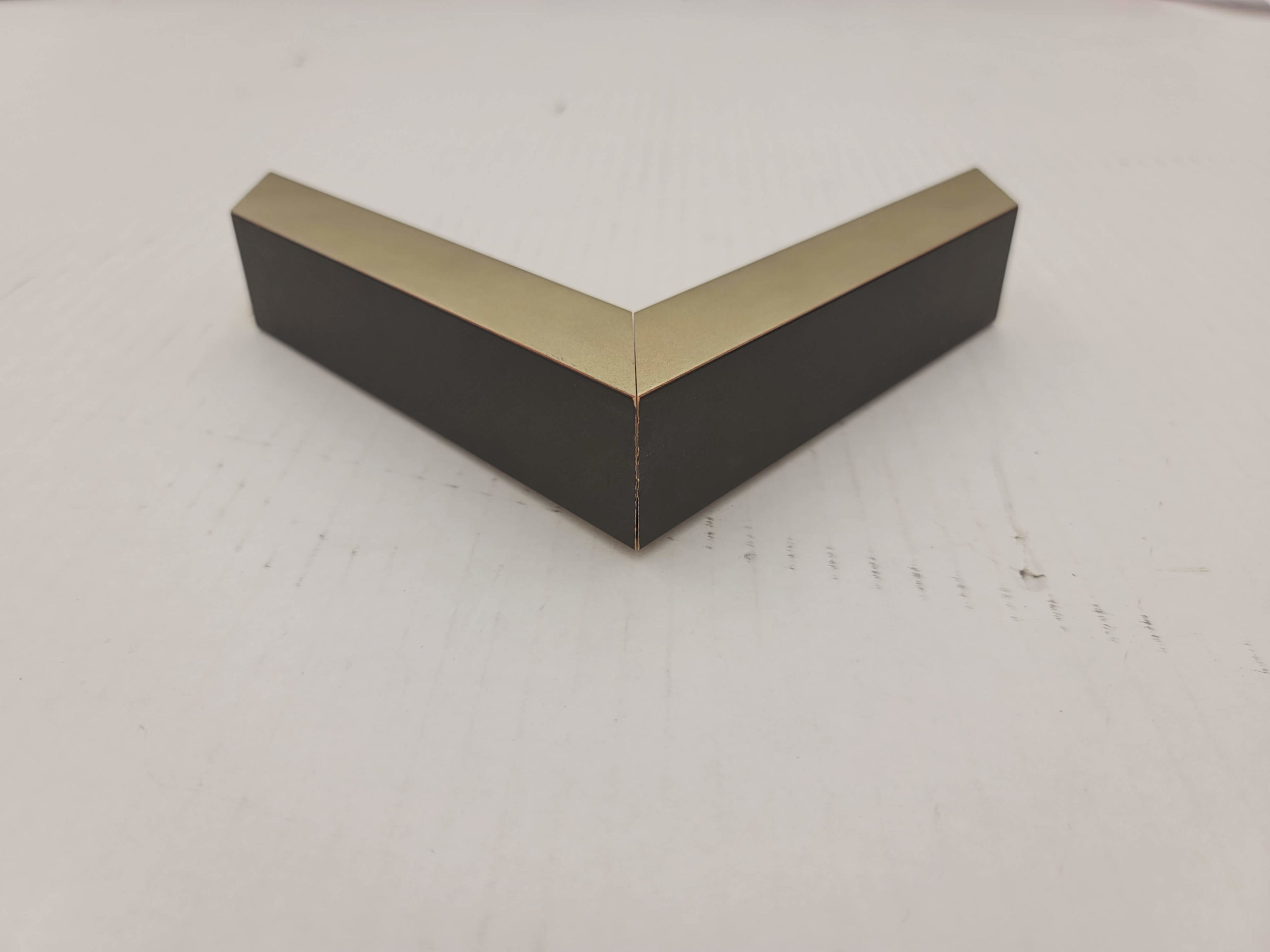
I love the colour and thought it looked beautiful with our light fixture selections.
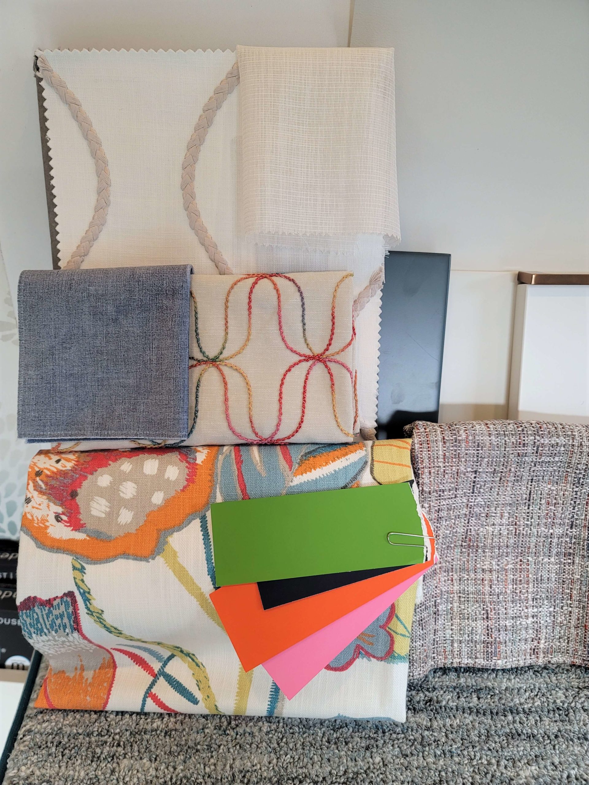
In the client’s dining room, we’re keeping her current dining room table which is a dark espresso.
Now, as you can see in the 3D renderings below, that frame is going to complement two of the main finishes we’ve used in this dining room design.
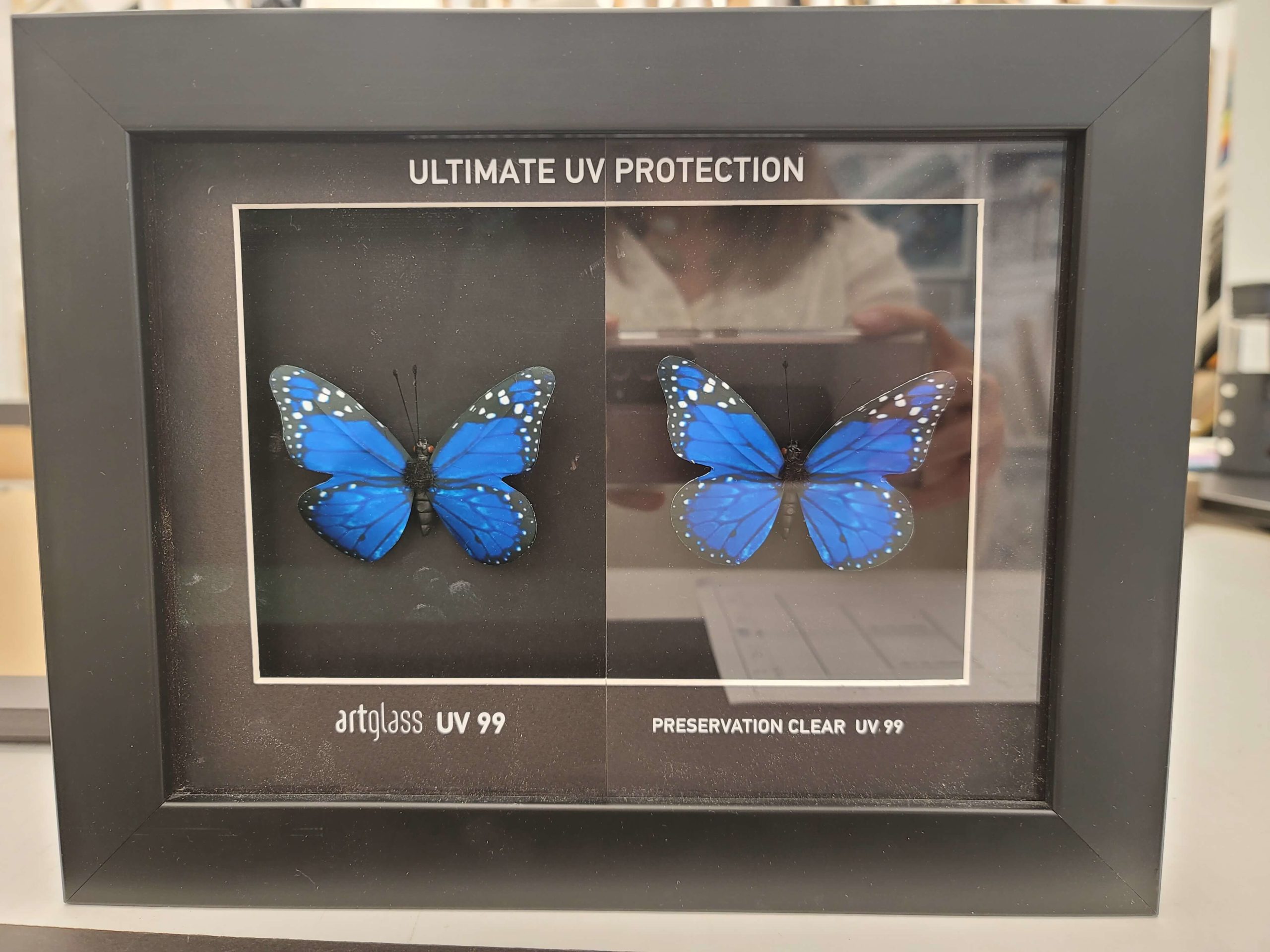
The other thing I haven’t mentioned yet which is such a crucial consideration when custom picture framing is the glass. I always do art glass now. No exceptions.
It doesn’t reflect nearly as much as normal glass. It gives the impression that you could actually just touch the piece of art like there’s no glass there. It is a bit of an upgrade, but it’s totally worth it!
Psst – if you love art and want to create a Gallery Wall, check out this blog post with tips on how to successfully create one in your own home.
So that is what we were working on this Wednesday.
Thank you for joining me for another episode and I hope to see you again soon!
I’m Claire Jefford. Cheers.
Comment to let me know your feedback and I’ll see you next time.
Find Colour Claire-ity Here
Do you know my 5 Steps on how to choose the right paint colour the first time?

Convenience At Your Finger tips
To help with choosing the best colour and a palette to go with it I have created 40 Perfect Colour Palettes.
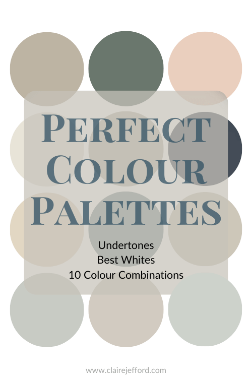
I have 20 of Benjamin Moore’s most popular colours, 10 stunning neutrals from Sherwin Williams and 10 classics from Farrow & Ball.
These Perfect Colour Palettes will show you colour comparisons, the best whites to use and 10 additional colours to make a perfect palette for your next design or decorating project.
Remember, it only takes one mistake to take your home decorating project from divine to disaster. Don’t let the paint be what stresses you out!