Benjamin Moore – Hale Navy
Choose the right paint colour
the first time Let me show you how in just 5 easy steps!
BONUS: The Top 15 Shades of Gray by Benjamin Moore
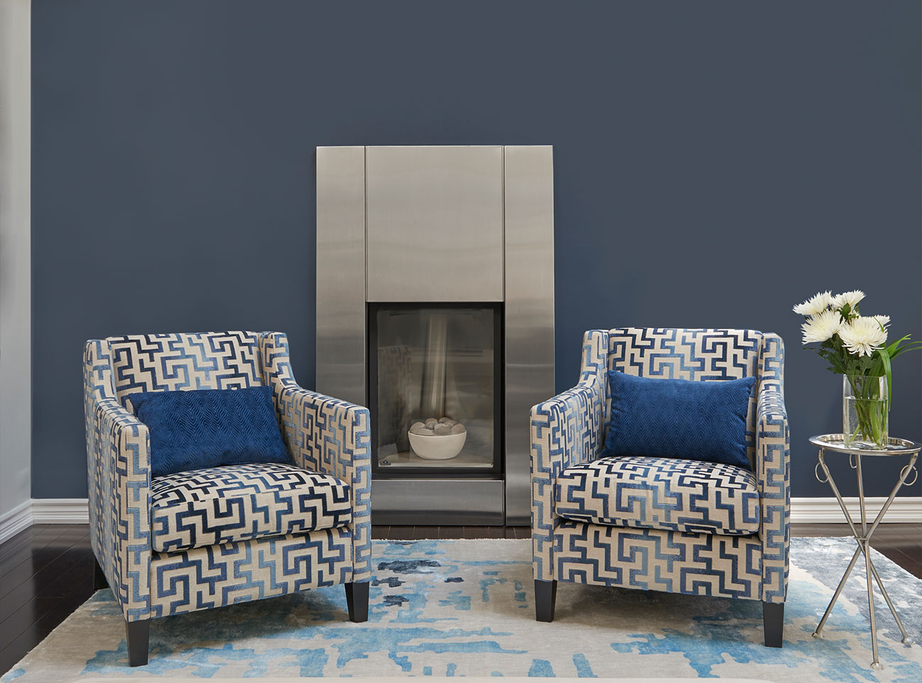
Hale Navy, HC-154, by Benjamin Moore is one of my absolute FAVOURITE colours for interior design and decor!
I am super excited to share more details about this colour and a couple of client projects where I’ve used this sumptuous colour.
LET ME SHOW YOU:
- Colour Comparisons to Hale Navy
- Best Whites for Ceilings, Doors and Trim to pair with this dramatic and moody colour
- Fabulous Colour Combinations
- My Favourite Applications of Where To Use Hale Navy In Interior Design
Are you ready? Let’s do this!
Hale Navy by Benjamin Moore
The choices one has for paint colours are infinite. Selecting the best colour for your home and then choosing additional colours to compliment it is a daunting task, but it doesn’t need to be anymore.
My Perfect Colour Palettes are an incredibly helpful tool for homeowners and designers alike.
Click here to learn more about what every PDF download includes.
We are adding new colours all the time so be sure to check back often! My Hale Navy Perfect Colour Palette was one of the first ones we created as it’s such a hugely popular colour.
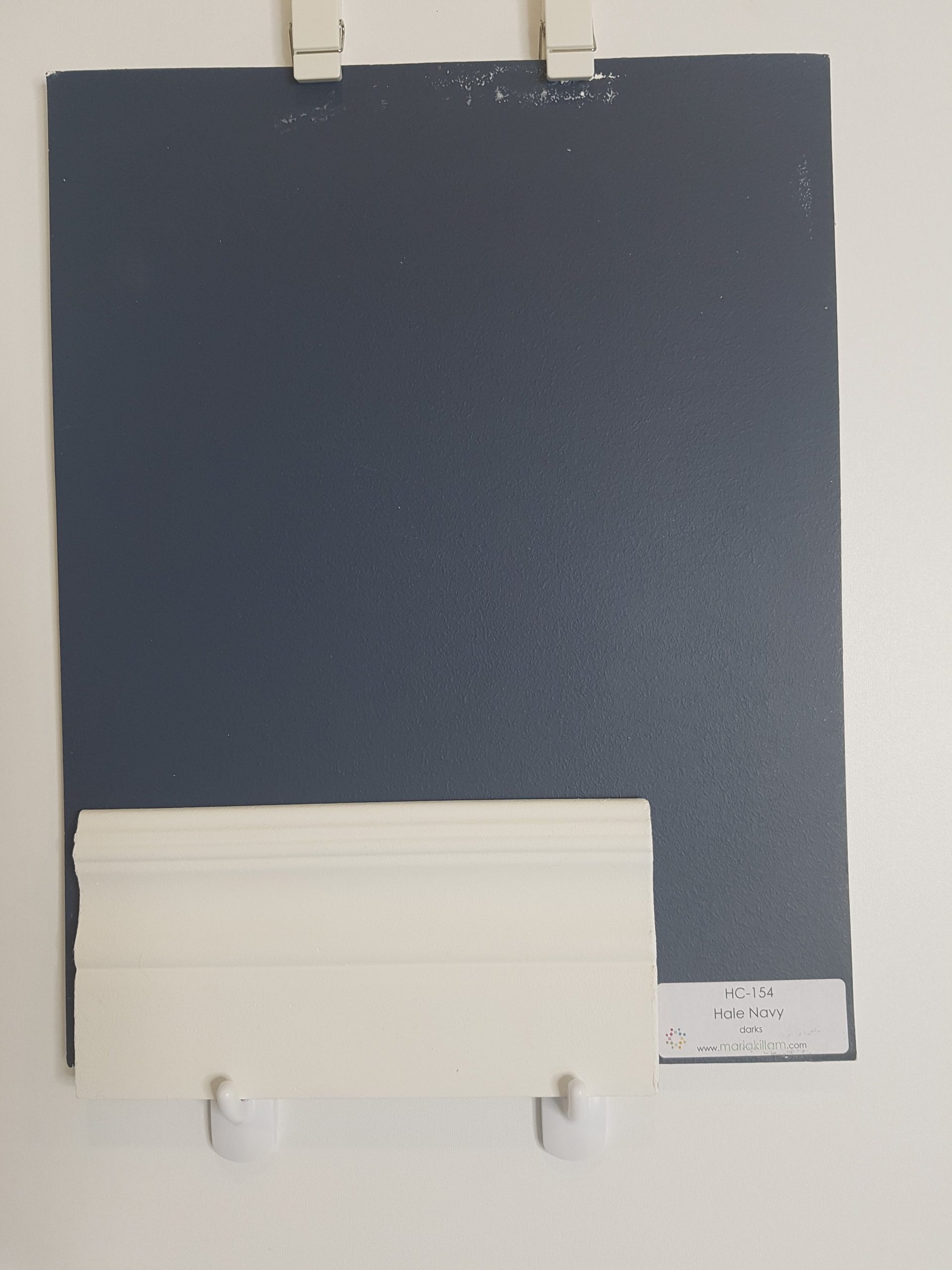
Hale Navy HC-154 by Benjamin Moore

Colour Comparisons:
Forgive my tattered large colour boards, they have been very well used!
Below you can see comparisons between Black Pepper 2130-40 on the far right and Flint AF-560 to the left. Both colours are a blue-gray with Black Pepper being lighter and bluer than Flint.
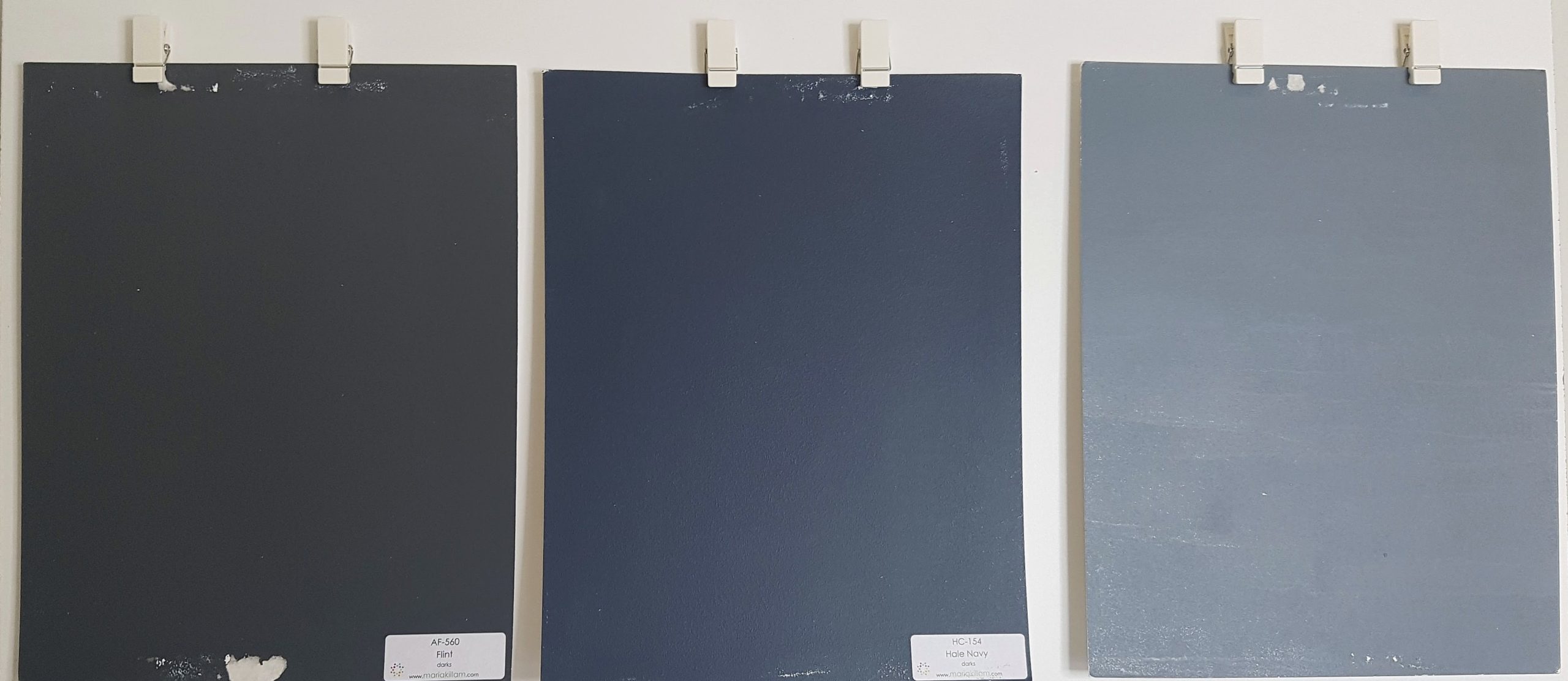
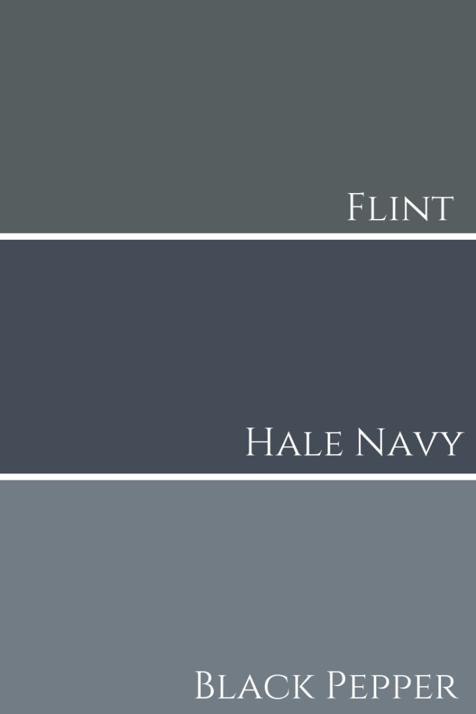
See these three paint colours used in different projects we designed below.
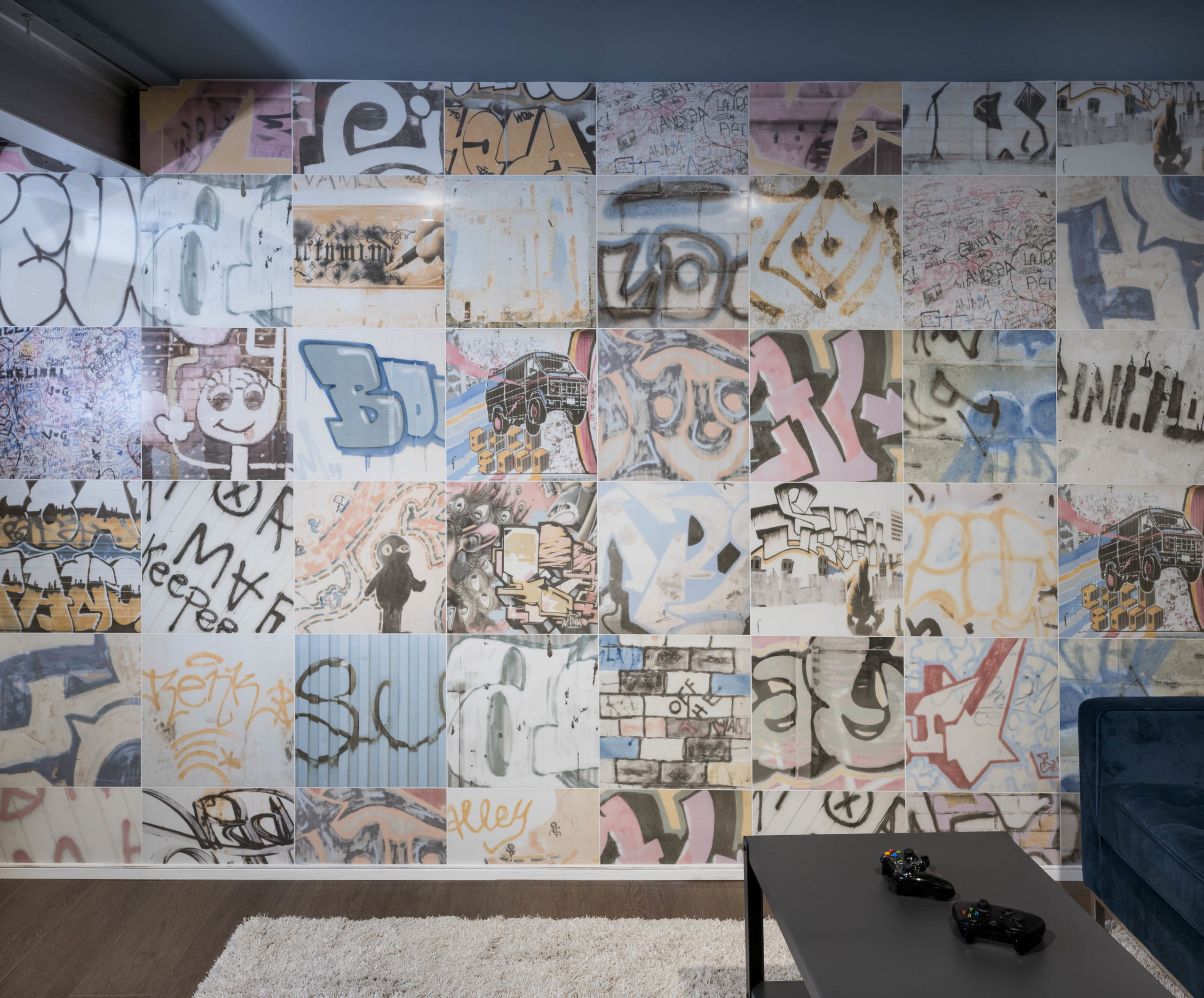
I used Black Pepper in one of my most exciting and largest projects to date!
The image below shows our clients secret Xbox room with this blue-gray colour on the ceiling.
The walls are painted an even lighter blue-gray tone, Boothbay Gray by BM.
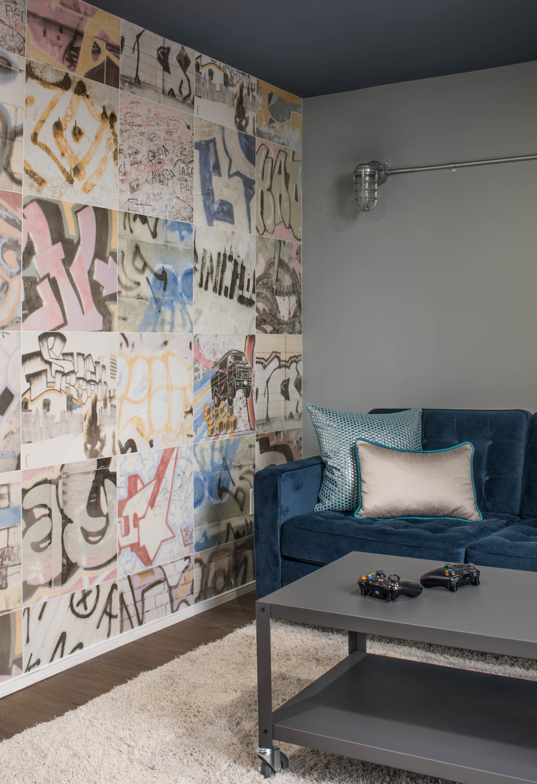
To check out that incredible 3000-square-foot contemporary basement design, click here.
As I mentioned in my video, here’s my own living room (shown below) painted Flint by BM. You can see how much darker it is and also, how much more gray it is when compared to Hale Navy.
Best White Paint Colours
So many whites work well with this sensuous dark blue tone. You’ll see below how you can use it with either a creamy white or a crisper white depending on the direction you wish to go and, of course, being guided by the fixed elements within the space.

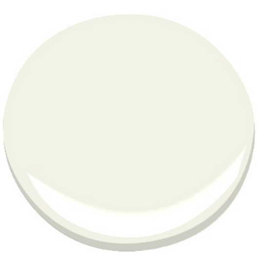
White Dove, OC-17, is a creamy white. This white works wonderfully with Hale Navy, offering a soft, yet rich feel. Check out my colour review of White Dove in this post.
Here are some other great whites you can use for ceiling and trim in your next interior design project with Hale Navy:

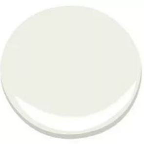

For a more crisp pairing, you can use Chantilly Lace OC-65 or White Diamond OC-61, of which the latter has a slight blue undertone.
FABULOUS COLOUR COMBINATIONS
Creating striking paint palettes with Hale Navy is limitless really.
Think about it, what doesn’t go with dark blue jeans??? That’s what’s so great about dark blues like this, they can essentially work with pretty much any colour.
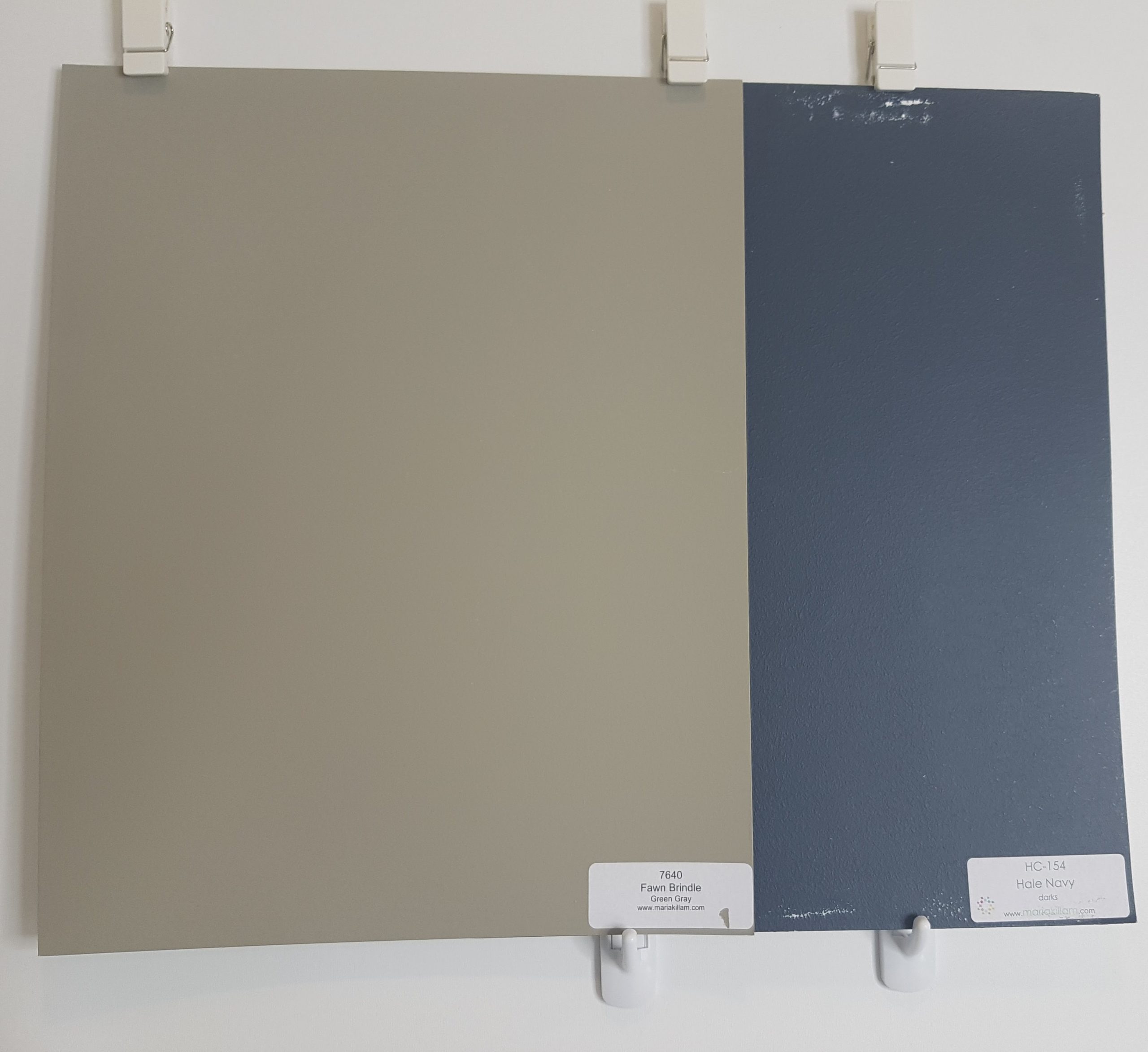

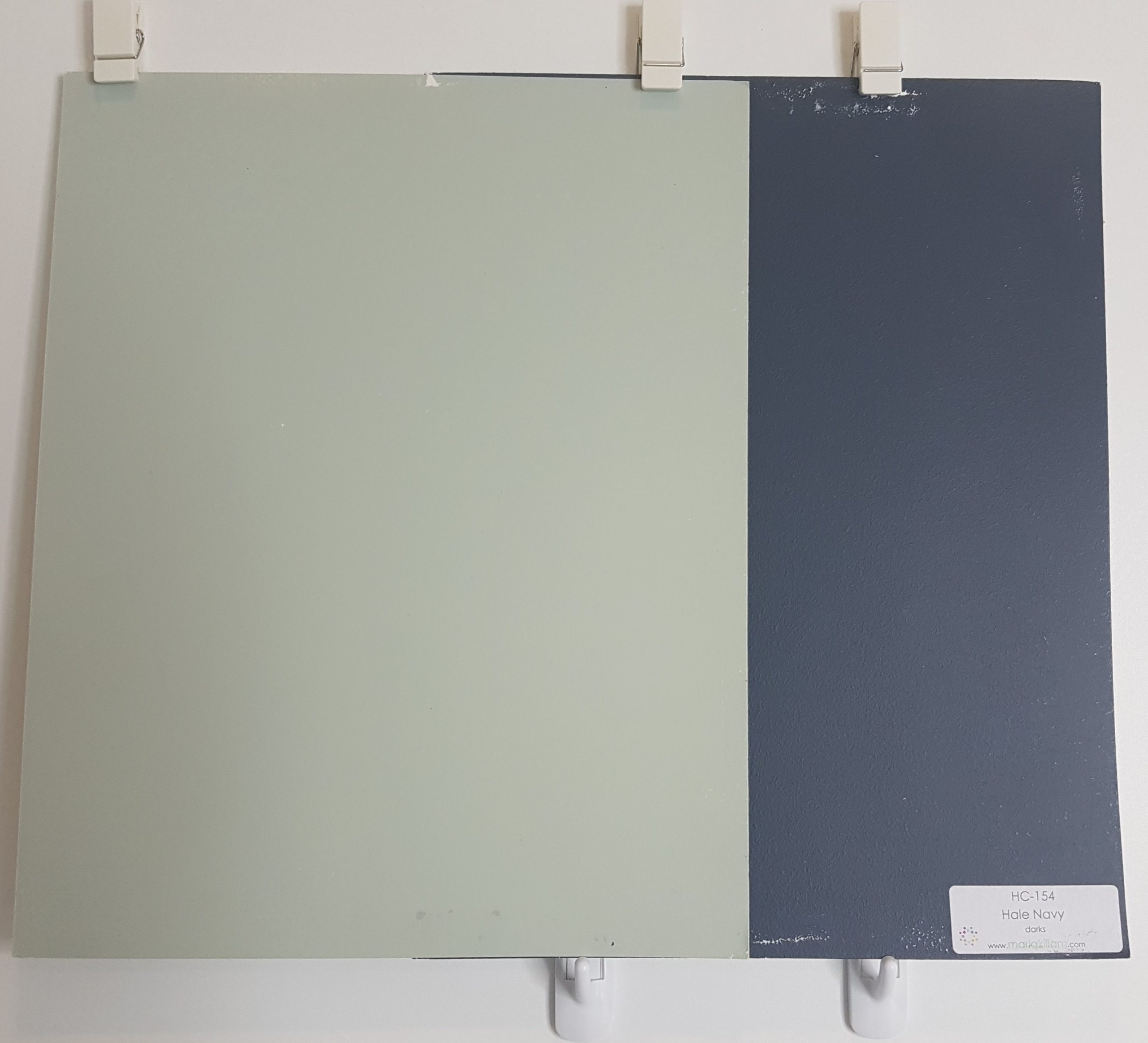

Here’s a couple of gorgeous paint colour palettes…
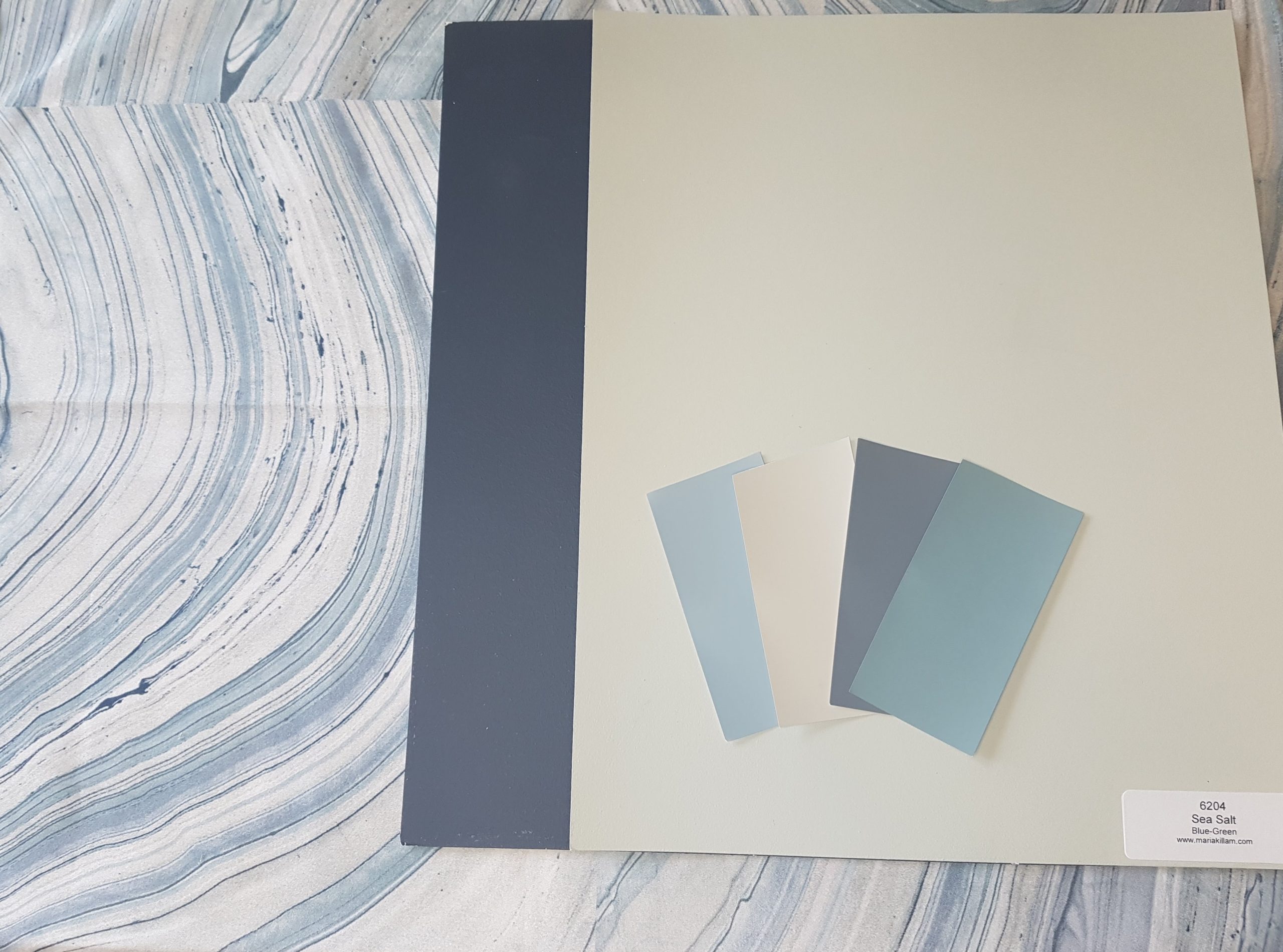
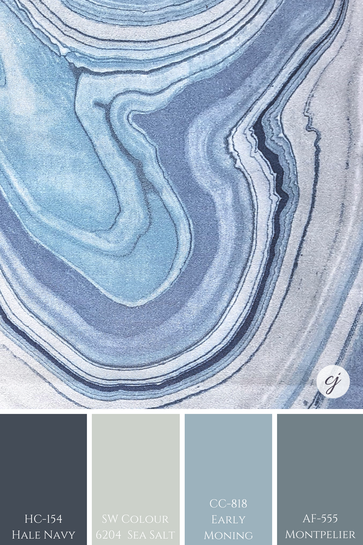
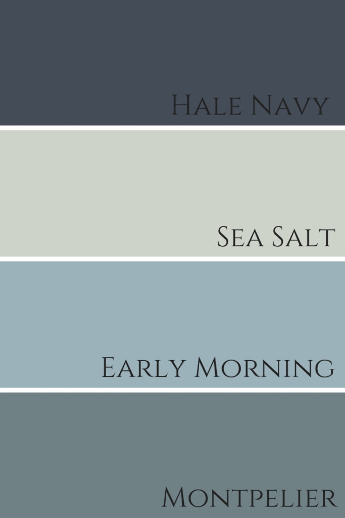
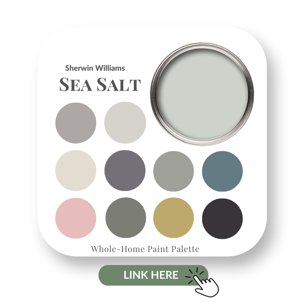
We did a colour review of Sea Salt by Sherwin Williams here, it’s one of their most popular colours.
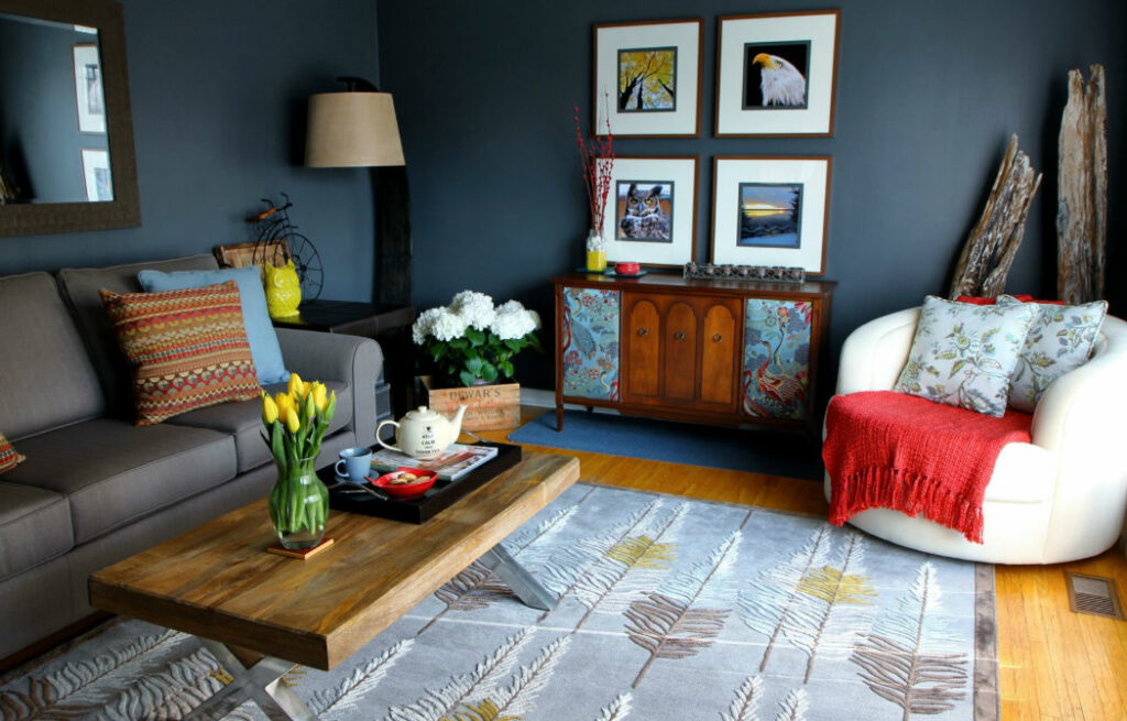
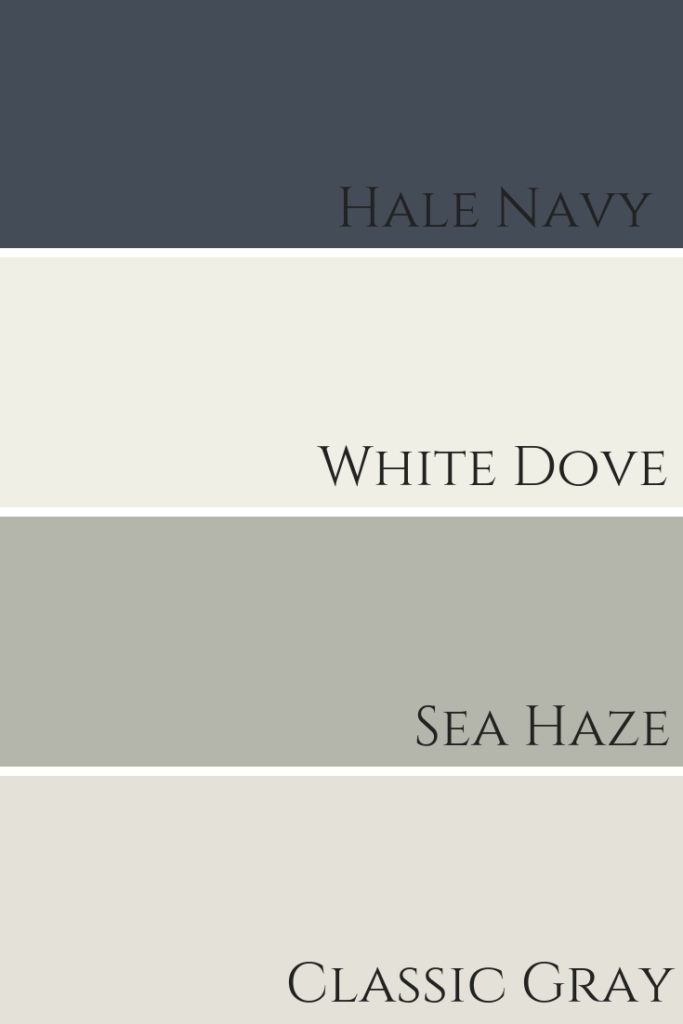
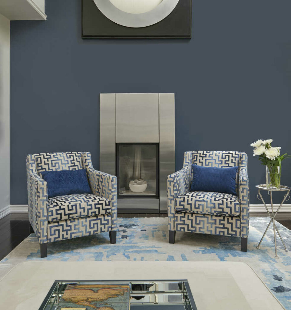
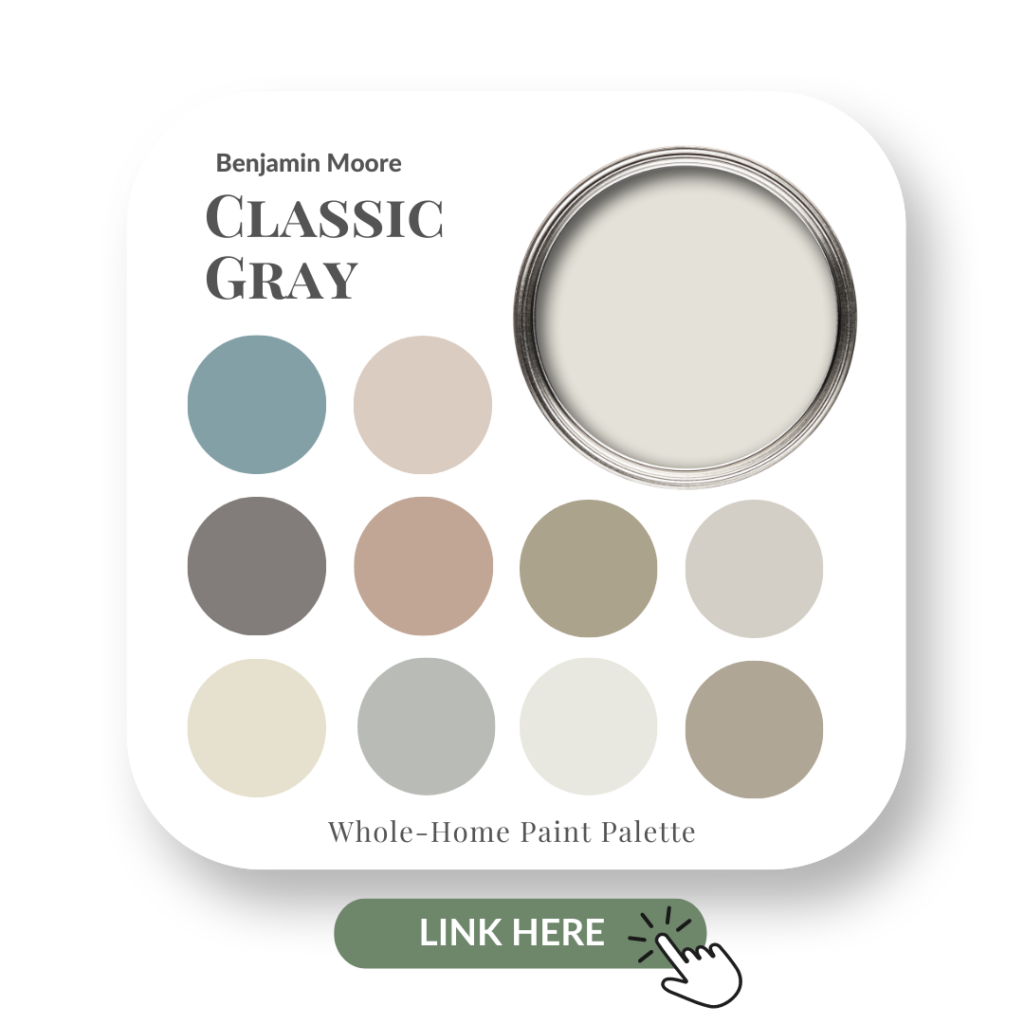
Hale Navy with Classic Gray OC-23 is a sumptuous pairing that we used in a client’s exquisite living room re-design shown here.
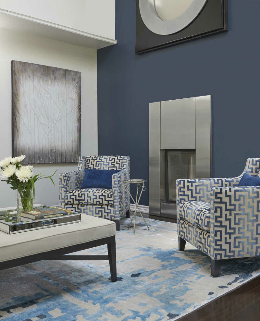
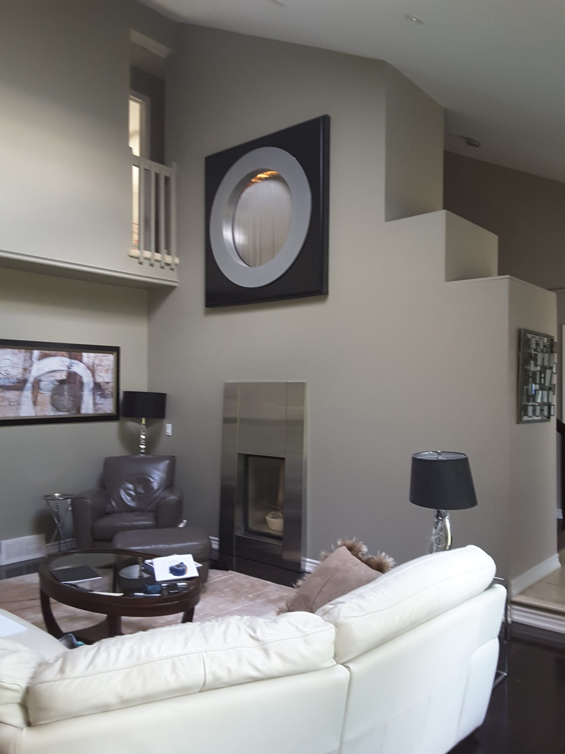
On a side note, can you guess what that large black square is above those fabulous patterned chairs & stainless steel fireplace?
It’s a water fountain feature!!
Before my clients hired me, this stuck out so much that this ‘black square’ was the focal point of the room.
By painting the wall Hale Navy & adding some beautifully patterned chairs in front of the stainless steel fireplace, the frame of the fountain was less ‘in your face’ and not so much the focus of the room.
Here’s a before…
Okay, I digress. Back to paint colour combinations with Hale Navy.
When decorating a space, in order to have flow, you need to repeat some key colours from room to room.
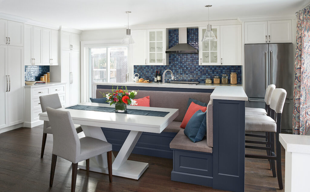
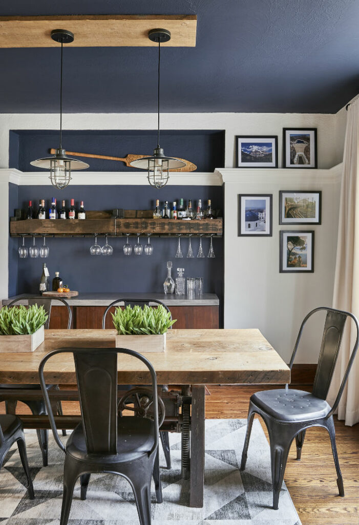
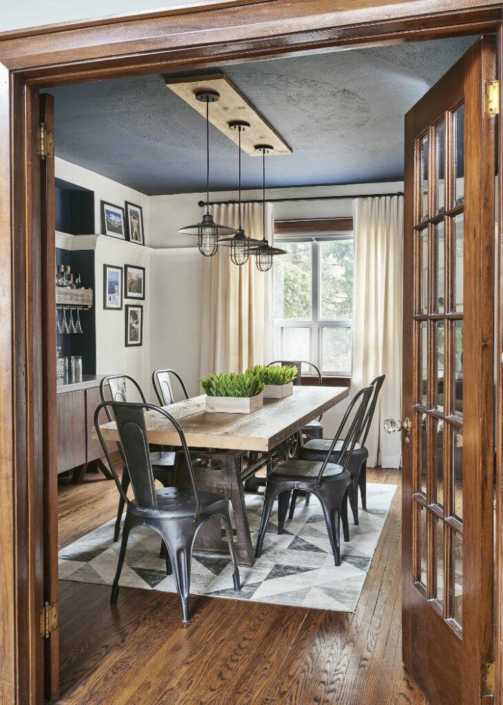
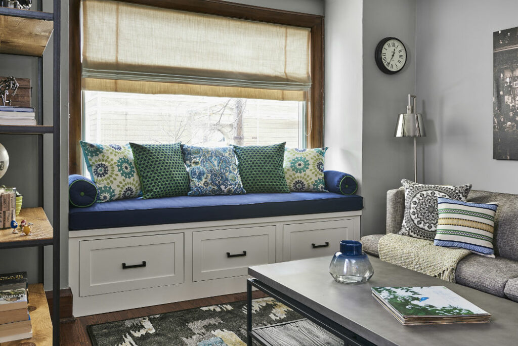
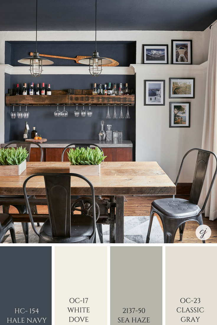
For example, in our clients’ dining room where we painted the niche wall & ceiling Hale Navy, we repeated the dark blue in the accent pillows and the custom window seat. See the full portfolio of this stunning project here.
This colour palette graphic shows you how flawlessly all these hues look together.
HAVE YOU USED HALE NAVY OR WOULD YOU USE THIS COLOUR IN YOUR HOME? COMMENT BELOW TO LET ME KNOW.
My Favourite Places to Use Hale Navy
As you can see from the professional photography of my work, I love using Hale Navy as an accent wall or to make a bold statement on a ceiling. We are also finishing up another clients dining room where we used this dark blue on all the walls and it really is striking and dramatic.
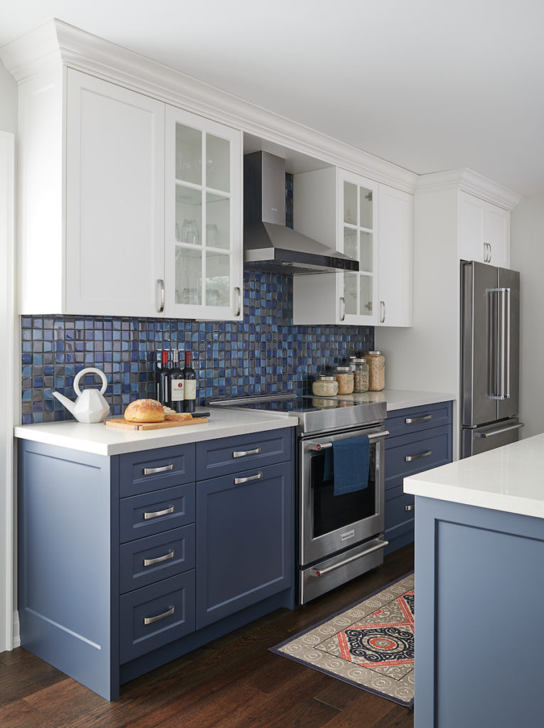
I also ADORE Hale Navy for cabinetry in kitchens, bathrooms or on an antique piece of furniture. And did I mention that I love to see it on other millwork such as wainscoting and stairs?
My Hale Navy Perfect Colour Palette is a great resource. You’ll have all the info right at your fingertips plus more gorgeous colour combinations.
Hale Navy is now part of my Benjamin Moore Grays and Blue-Green Collection showcasing all 10 of my Benjamin Moore grays and blue-green Perfect Colour Palettes.
Our Perfect Colour Palette library is expanding. See all them all here.
If you want to get all my Benjamin Moore colour guides in one place, look no further than my Benjamin Moore Ultimate Collection. All 20 of my Benjamin Moore guides in one handy collection.
Here are the Perfect Colour Palettes for some of the colours I mentioned above:
White Dove
Sea Salt
Classic Gray
Remember, it only takes one mistake to take your home decorating project from divine to disaster. Don’t let the paint be what stresses you out!
Perfect For Pinning
Not sure where to start?? Take my colour quiz and find out which palette best suits your style.
I LOVE HEARING FROM YOU!
For colour advice, please note that I can’t always give advice based on simply reading about a scenario. If it were that easy for me to recommend the perfect paint hue, without knowing more about the specific space; the lighting situation; what other fixed elements to consider etc, then I really would be even more magical than I already am. HAHA!
Nine times out of ten, I will always recommend that you either seek advice from a local Colour Professional or I might be able to hook you up with an online colour consultation.
Contact me here to see how I can help you transform your home.













Vella Ashley
| 9 January 2019Hi I did my studio condo in Palm beach in hale navy,dove white trim and ceiling. Love it. What do you think of coral gable for the bath.
Claire Jefford
| 15 February 2019Hey Vella! I replied to your question by doing a vlog about it. Thanks for asking, you can check out my suggestion here –> https://clairejefford.com/colour-combinations-with-blues/
Dana Brown
| 25 February 2019I really liked this because I’ve been struggling with painting my craftsman exterior with SW Indigo Batik.
When I saw Hale, I fell in love with that.
So when I put the two together, and found your video, it instantly made up my mind.
Thank you for sharing.:))))
Claire Jefford
| 26 February 2019So great to hear this Dana! How fabulous this will be on an exterior. Cheers for your comment!
Katie Milligan
| 29 May 2019Hi Dana,
I am also struggling with what to do my craftsman interior in! Hale navy is currently the front runner. Do you happen to have a pic of your house? (if it’s finished!)
Thanks,
Katie
Claire Jefford
| 4 June 2019Hi Katie, Claire here. Although I haven’t got a photo from a project where I’ve used Hale Navy on the exterior, have a look on Pinterest and search ‘Hale Navy Exteriors’. That’s where I found this picture –> https://www.pinterest.ca/pin/403705554092052549/ There will be lots of photo results in the search. I love it on exteriors!
Tracy Greene
| 9 March 2019We’re waiting for primer to dry and then will paint our IKEA bookcases Hale Navy. Walls are Revere Pewter. If I love it, I’ll try to remember to post a picture. So glad I found you just now!
Claire Jefford
| 15 March 2019Wow, sounds very interesting! Send me a photo when it’s done and we may share it to our Instagram story. Cheers for sharing, I’m glad you found me too! 🙂
Jackson
| 26 June 2019I love your review on hale navy Claire! I’m debating on this color as I’m choosing one for my theatre room in the basement (with minimal natural lighting). Do you think it’s a reasonable option? I’m also looking at Old Navy by Benjamin Moore and it seems like it’s more blue whereas Hale Navy is more gray. What’s your opinion on these two? Thanks in advance!!
Claire Jefford
| 1 July 2019Both colours are beautiful. Choose your other finishes first and if there are no fixed elements like stone or tile, look to your textiles. Then choose the best colour from those. Your project sounds exciting! For inspiration, you can check out a theatre room that I did here in this 3000 square foot basement–> https://clairejefford.com/portfolio/gallery/second-line/
Janice Shackelton
| 27 October 2019We are building our retirement home where our cottage once stood. We have a great room/kitchen/dining (one large room). Lower kitchen cupboards and island in hale navy (no uppers). We are trying to maintain the cottage feel.
I am looking at painting the walls in either BM Manchester Tan or BM Stone House. We have west/southwest windows in the great room WITH a covered deck that does block most direct sunlight.
Love navy and beige/tan colour combinations in anything…. clothing to decorating?
Which paint colour would you suggest for walls?
Claire Jefford
| 31 October 2019Hi Janice. Personally I prefer the Manchester Tan if we are looking at those two colours. But that is my preference, so there is not necessarily a right or wrong as long as the paint colour works with other finishes in your home.
Tania
| 26 November 2019I have one wall in my dining room painted Hale Navy. I am now re-doing my kitchen and my lower cabinets (some on one side) will be Hale Navy. What colour White to paint the other cabinets?? I like white white, not so much creamy — maybe for the walls.
And what colour would you recommend for the kitchen and dining room walls?
Claire Jefford
| 9 December 2019Hi Tania, take a look at Chantilly Lace or White Diamond – the latter has a blue undertone. Look at possible paint colours with your counters and other fixed elements in the room. You can check out my Essential Colour Guide for more colour pairings to put with Hale Navy. Link here –> https://clairejefford.com/product/hale-navy/
Austin Collins
| 19 December 2019We have just painted a big majority of our living room chantilly lace and stuck with same color for trim.
Our half bath or powder room I have done the tile flooring in this tile which has an almost black/charcoal:
https://tilesinspired.com/collections/decorative-pattern-tiles/products/remix
Then I am doing one wall full floor to ceiling of this charcoal 2.5×10 tile in herringbone (this is the wall behind the toilet and vanity,mirror etc.)
https://tilesinspired.com/products/manhattan-charcoal
I was going to leave the walls chantilly lace (may be a safe option) but originally I wanted to go BOLD in this powder room and do all the walls dark.
What do you think of Hale Navy for the remaining 2.5 walls and ceiling? Or do you suggest any other Benjamin Moore dark charcoal/navy colors you have used before?
Not sure it makes sense to “paint match” the herringbone tile but wasn’t sure which direction to go.
Also would you leave the trim chantilly lace? Or what is suggested since all walls are dark? Dark trim?
Vanity will be a walnut or white oak with white quartz sink, brass mirror and pendant lights from ceiling.
Thank you for your blog and inspiration!
Claire Jefford
| 4 January 2020Hello Austin, thanks for reading my blog! This question is very in depth, therefore I would recommend contacting my good friend and True Colour Expert Maria Killam who does online colour consulting. She will have you send images of your home and links to those items you have mentioned in your comment and can take you through her process in order to choose the best colour for your project. Here is her link –> https://www.mariakillam.com/edesign-sales-page/
Betty
| 12 April 2020Why do your recommendations for Hale Navy (shutters) not include Navajo White (siding) as a good combination (though Navajo White has yellow undertones, they are not as prominent on the exterior as on the interior). Is this combination not a good fit (i.e., one that would not pop like the other whites you mentioned)? I would be immensely interested in your opinion. Thank you.
Claire Jefford
| 23 April 2020Navajo White looks like it would work lovely as well! I can’t mention every white that would work with Hale Navy or I would never get to the end of the video. 😉 That’s why I list a few and not to overwhelm.
Anne
| 30 April 2020Thank you for your great info on color combinations. I especially appreciated seeing the example of your living room, a relatively small space, with a bold dark color– so often it’s hard to get inspiration when all the examples are million dollar homes. We’re thinking of painting our small home office a dark blue/gray. I think it may work because we have a lot of art covering the walls, so hopefully won’t be too overwhelming, also the light from the windows is super bright– reflected off the house next door. On the other hand, we have a lot of dark furniture and a black rug. Most of the photos I see with this style have a wood floor and lighter furniture. I’d love your opinion if you have time. https://imgur.com/a/WaZ307G
Claire Jefford
| 5 May 2020Hey Anne, I say go for it! Especially since you can balance light and dark tones with your ceiling paint (typically white) and any drapery and an area rug. These can all be complimentary to the dark colour, but create contrast to mix things up.
Bernice
| 11 May 2020Any suggestion on which metal trim is best with Hale Navy? I want to paint all my interior doors with Hale Navy and I can’t decide on which metal color for door knobs. All my bathroom hardwares are chrome, so I’m thinking polished chrome (my house was build 1950s). But I also like satin nickel & Hale Navy combo, as well as the look of gold/brass with Hale Navy.
Claire Jefford
| 12 May 2020Hey Bernice. We have done brushed nickel in the past with Hale Navy cabinetry and for my sister’s renovation she would like to use a rose gold with Van Deusen Blue -another beautiful blue by BM. I especially love the gold because I think it looks fabulous with the dark blue. Chrome could work too, as it’s a classic. No right or wrong, just look at your overall design style and the look you are trying to achieve.
James
| 4 June 2020Thank you so much for this information! I have a house that is red brick and white siding. I plan on painting the shutters hale navy, and I am trying to decide on a yellow front door paint color. I don’t want anything to bright, and color I am thinking of is Benjamin Moore Hawthorne Yellow. https://www.benjaminmoore.com/en-us/color-overview/find-your-color/color/HC-4/hawthorne-yellow?color=HC-4
What do you think of this combination?
Do you have other suggestions?
I live about 1 3/4 hours away from you and may be looking for some home design work once it is safe.
Thanks!
James
| 4 June 2020I really like the chairs in the top photo! Where can I find them?
Claire Jefford
| 7 June 2020Hi James. If you are referring to the accent chairs in the living room with the Hale Navy wall behind them, they are custom.
Claire Jefford
| 7 June 2020Hi James. I love that colour combination and think it would look lovely with how you are describing your home.
Sabi
| 9 June 2020I love navy blue and was looking for a blue to paint my bathroom vanity cabinets. I saw the swatch on the BM website and even though I loved the colour, I was afraid it would be too dark. After reading your post and seeing some examples of it used in different rooms, I am almost sold on using this colour. I absolutely love the way it looks matched with the certain paint colours you’ve suggested. Its gorgeous!! I currently have cloud white on my walls and I’m almost tempted to re paint them with white dove or simply white because I love the way they complement each other.
I love your blog and your videos, they are very helpful and informative. You’ve got a new subscriber.
Claire Jefford
| 10 June 2020This is so great to hear!! Thanks so much for sharing Sabi. I’m confident you will LOVE the Hale Navy!
Cindy
| 29 June 2020I’m considering Hale Navy for a library. The room has a brick fireplace. Do you think the blue will work with the brick?
Claire Jefford
| 30 June 2020Hi Cindy. Dark Blue and a red brick can look fabulous together. But because brick is no longer a ‘standard’ colour and I can’t see your space specifically, then it’s impossible to say if it will work in your case. Please grab my Free Download on Five Steps to Choosing the Right Paint Colour the First Time, that should help –> https://clairejefford.com/ccd-freebies/
Courtenay
| 6 July 2020Hi! I was so happy to find your YouTube review of Hale Navy as I just selected it for the exterior of my home. Thank you! I am using Chantilly Lace for the trim and would like to use a pale pink on the front door. I tried First Light but it is reading as white due to the amount of light on the door. Do you recommend any other blush, with just a hint more of color, that would compliment the Hale Navy? I have tried several other pinks and just can’t get it right. Any suggestion would be greatly appreciated. I love your blog; you are so knowledgable and warm 🙂 Thank you! Courtenay
Claire Jefford
| 7 July 2020Hi Courtnenay and thanks so much for your kind words! Yes, First Light is likely looking washed out because when you apply a paint colour outdoors, it goes much lighter with the sun. You can try Odessa Pink HC-59 by BM or simply go into the paint store and view samples that are darker than First Light, but have a similar tone if that’s they type of blush you are looking for. Be sure to look at them in daylight to get a better read on how they will look and to check them with Hale Navy. But you should be fine because it’s such a pretty colour combination! Good luck!
Courtenay
| 8 July 2020Thank you so much for your response; I appreciate it! I will pick up some Odessa Pink to try today. Stay safe. Courtenay
Chuck Matthews
| 8 July 2020Thanks Claire, I am venturing to have a navy blue paint as my exterior brick paint on my Northeast facing home. I want a rich dark blue that is dark enough to not be tacky/gaudy but light enough to make the black windows pop and grey/slate colored roof pop. My trim is a pale grey stone with dark wood accents over the black windows. I fear Hale Navy will be too dark against the black windows facing north..thoughts on Van Deusen blue? Is there another blue you would recommend? Thanks Much!
Claire Jefford
| 12 July 2020Hi Chuck. Both of the blues you mention are lovely, Van Deusen is slightly less dark. Remember that as you are painting the exterior, any colour you choose will look much lighter than it would on the interior of a home.
Amanda
| 9 July 2020We were looking for an accent wall color for our office and came across your review. Absolutely fell in love with the Hale Navy color! And I plan on adding some gold accents in it! Question, what kind of the paint finish should we use considering it’s a wall in the office? (Matte, glossy, etc) Thank you!
Claire Jefford
| 10 July 2020Hi Amanda. Hale Navy is so wonderful, isn’t it? In terms of a paint finish, the most common for wall cololurs has historically been the ‘egg shell’ option. However, we find that lately more people tend to like the ‘matte’ look. Matte has typically been used mainly for ceilings. It has less of sheen and didn’t have a great reputation for being easy to wipe down and clean. But I know that they have come a long way since then, which is partially why we are seeing it more. Speak with your local paint store when ordering your paint to discuss with them and to get their recommendations. All the best with your project!
Amanda
| 10 July 2020Wonderful! Thanks so much for your suggestions Claire!
Jan
| 2 October 2020I’m using Hale Navy to update some furniture in an otherwise very neutral room. I’d also like to add a touch of red paint on the far side of the living area. What shade of red would you suggest pairing with Hale Navy?
Claire Jefford
| 4 October 2020Hi Jan. Before you use a random red colour to paint your wall, choose a fabric for a pillow or drapery, or find an area rug that you want to use in the space that has a red tone. Then colour match that tone with a paint colour. This way you can be confident that colour will work as opposed to choosing a random red.
Judy
| 7 January 2021Hi…thank you for all this great information. We live in a condo and are thinking of painting the kitchen cabinets Hale Navy and also the extra bedroom Hale Navy, Old Navy or Stunning. Was possibly thinking of doing the floor and window trim…as well as possibly the inside of door and closet doors the same color as walls? How does that look compared with white trim…the ceiling color and trim color I use regularly is Chantilly Lace…I really could use your help and advice!
Thanks so much! Please stay safe and Healthy!
Judy
Claire Jefford
| 16 July 2021Hi Judy. It’s hard to comment with practical advice pertaining particularly to this project without seeing your space. I see I am late in replying to this comment anyway, so maybe you have already done your project. It sounds like a lot of dark blue though, if you are thinking about doing floors and the walls in the same tone. It really depends what else you have going on in the space, how it’s pulled together and the look you are trying to achieve.
Elaine
| 17 February 2021I have hale navy on dining room walls it looks black if I paint navy blue over top will it look more blue
Claire Jefford
| 7 March 2021Maybe get some better lighting. It shouldn’t look black unless the room itself is very dark.
Colleen
| 17 February 2021Hello Claire- I’m doing an addition needing paint and painting existing brick on rancher. Love the Hale Navy as shutters maybe? Having trouble with the main color and door color. Philadelphia cream for the main? Door?? Would love your thoughts!
Claire Jefford
| 16 July 2021Hi Colleen. I suggest reaching out to a colour expert and investing in a consultation if you haven’t already done this project.
Alicia
| 13 March 2021I enjoyed this blog post as I have decided on Hale Navy for the exterior of our home. (Now I just have to decide on a painter!) I want to do white trim, but Im struggling deciding on the trim that will best compliment the Hale Navy on my South facing home. Something that I think is very much underrepresented in blogs and vlogs on paint colors is what a huge difference it makes for paint color depending on the direction the room faces. I think lighting is such an important topic to discuss because the same color can look very different depending on the direction the light comes from and it can mean the difference between loving and hating a color.
Claire Jefford
| 16 July 2021Hello Alicia. Thanks for your comment. When it comes to lighting, there are different factors to consider of course. Most times though, if you choose the right colour that will work with your finishes, you will be fine. But this is why I always recommend to paint a large sample board and move it around your room at different times of the day to see how the light affects the colour. People like to blame the light when a colour doesn’t work, when in fact, most of the time they just chose the wrong colour.
Funda
| 30 August 2021Thank you so much for this wonderful article . Cool light grays are perfect for all the rooms.
Claire Jefford
| 8 September 2021Glad you found this colour review of Hale Navy helpful Funda!
Carol
| 1 September 2021Hello. I am debating between Flint and Hale Navy for the walls of a family room/library where the wooden bookcase (2 story/one whole wall) is golden oak. Opposite wall is windows with white shutters. Going for a dark, cozy, moody room, not a nautical look, but not somber with too much gray either. Rose/rust brick fireplace. Cognac leather sofa/pops of color with accent chairs. I see you have flint in your home, but I have not found a color review of flint. Advice?
Claire Jefford
| 8 September 2021Hi Carol, I love a moody dark painted room. I haven’t done a colour review of Flint, it’s more gray than Hale Navy. Take a look at the two colours together, grab paint chips from the Benjamin Moore store to compare the two to see which works best with your other furnishings. We love Flint in our front room, but I’m also a sucker for Hale Navy! Just depends if you want to go more blue or gray. Good luck!
steph
| 20 December 2021Hello, I am looking to do Hale Navy as an accent wall in our master bedroom. I will do the trim and ceiling white, but wanted to do the other walls cream to match a cream chandelier. What color cream would you recommend to go with Hale Navy and white trim? Thanks.
Claire Jefford
| 27 January 2022Take a look at White Dove or Cloud Cover, those could be good options Steph.
Laurie
| 5 January 2022Hi Claire, we are using Hale Navy for our kitchen island, white for the cabinets, calacatta lux quartzite for the counters and backsplash, and medium oak flooring. The kitchen is south-west facing and the brightest room in the house. We can’t decide between Cloud Cover or White Dove by Benjamin for the cabinets. The moulding throughout our house is White Dove (not sure that makes a difference). Any suggestions on which white to go with for our kitchen cabinets?
Claire Jefford
| 27 January 2022I would keep it simple and stick to White Dove if you already have it for your trim.
Paula
| 20 June 2022I painted an accent wall in my primary bedroom Hale Navy. Used Wickham Gray on other 3 walls – mistake. Wickham Gray is reading very green. I want to do gold accents in this room; which paint colour should I use to cover the Wickham Gray? I don’t want beige/greige – a warm white perhaps? Had Silver Satin on walls before but too cold for the exposure (* north facing room, not a huge window, ravine behind house so lots of green from foliage).
Claire Jefford
| 26 June 2022Hi Paula. It may be reading more green because it’s directly beside a dark blue. But I still believe that colour combination is gorgeous. If you prefer a white you could try one of the ones I suggest to pair with Hale Navy by Benjamin Moore in the blog.
Jane
| 19 July 2023Will a front door in BM Hale Navy work with FB Card Room Green, which is the exterior color of my modern Craftsman? The shutters are black, and the wood garage is stained Cedar. Am I introducing too much color? Thanks for your lovely color reviews!
Claire Jefford
| 24 July 2023Hi Jane. I can tell you that Hale Navy and Farrow & Ball Card Room Green make a beautiful combination. Whether it’s too much for your home with the cedar stained wood garage and black shutters, I can’t say without seeing it.
Nina
| 7 February 2024Hi Claire, I’m remodeling a southeast facing bathroom using light gray hex tile and a Hale Navy vanity. Shower walls will be gray subway tile. What white or off white would you suggest for the walls? Thanks!
Claire Jefford
| 8 February 2024Hi Nina. In the blog and video I share 3 best whites to use with Hale Navy, so look at each of those with your tile samples to determine if one works best with the combinations you are considering.
Susan
| 2 November 2024Love your site! I am going to be using a whole house pallet of Hale Navy, Chantilly White, Iron Ore, a light cool grey color for most of the walls. Would love to add a sage green close in there but having trouble. Any suggestions?
Claire Jefford
| 17 November 2024Hi Susan. There are so many you could choose from, so I’d look at what green you already have in some of your accessories and pull from that. Off the top of my head, Tate Olive by Benjamin Moore is a gorgeous green we’ve specified for clients.