Behind the Design
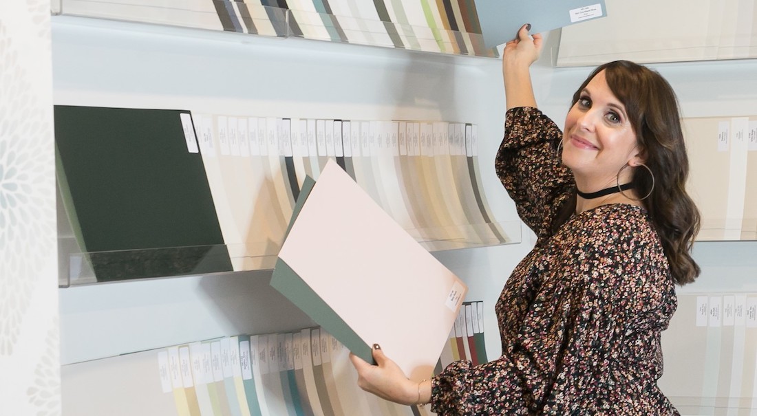
Choose the right paint colour
the first time Let me show you how in just 5 easy steps!
BONUS: The Top 15 Shades of Gray by Benjamin Moore

It’s easy to find pretty photos online of finished interior decorating projects. Inspiration can be found everywhere from Pinterest, to Instagram and of course, in my portfolio too!
But wouldn’t you like to learn more about the details that go into the thought process for designing a beautiful space? After all, it didn’t just happen easily and by coincidence with all the pieces falling perfectly into place.
If that was the case, then my job would be super easy or even redundant altogether.
Welcome to ‘Behind the Design’!
Here I’ll share a quick round-up of a few different design elements to bring you a better understanding of why I make the choices that I do when working on clients’ projects.
Today’s post includes interior design tips from the main floor redesign that we did in a Burlington client’s home.
1,2,3, take a look Behind the Design with me
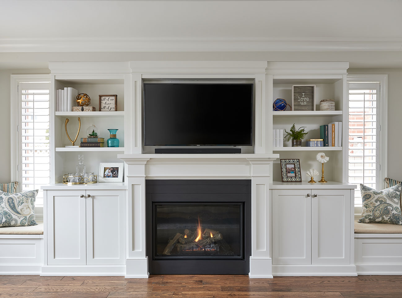
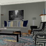
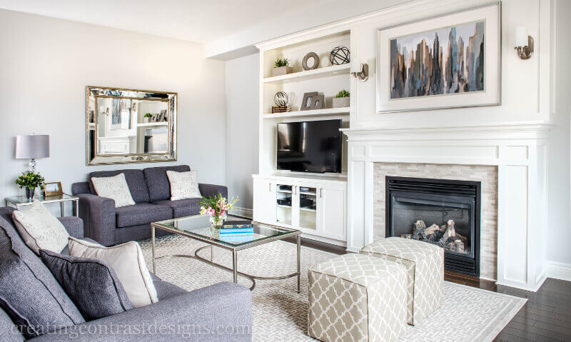
#1. Make Sense of Your Space
In our Burlington client’s home, we removed a wall between the formal dining room and the traditional living room in order to create a larger kitchen. The living room was not needed as my clients had a family room on the main floor as well as a fully finished basement. (FYI – the wall is behind the angle from where the photo is being taken.)
Space Saving Tip:
Our suggestion was to turn the living room into the dining room and custom build a large banquette on the far wall for seating. A wall banquette saves on space usually required for pulling out the dining chairs.
In addition, a dining table with a pedestal (opposed to legs) allows for extra seating space around each end of the table when needed to accommodate more guests.
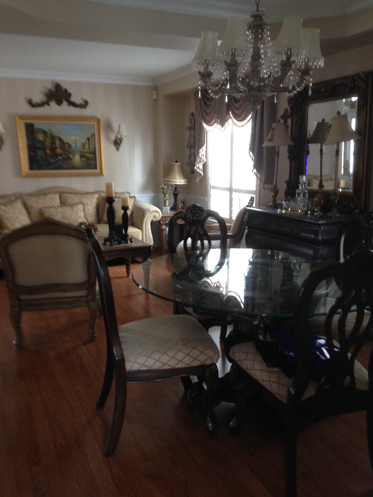
#2. Out With the Old
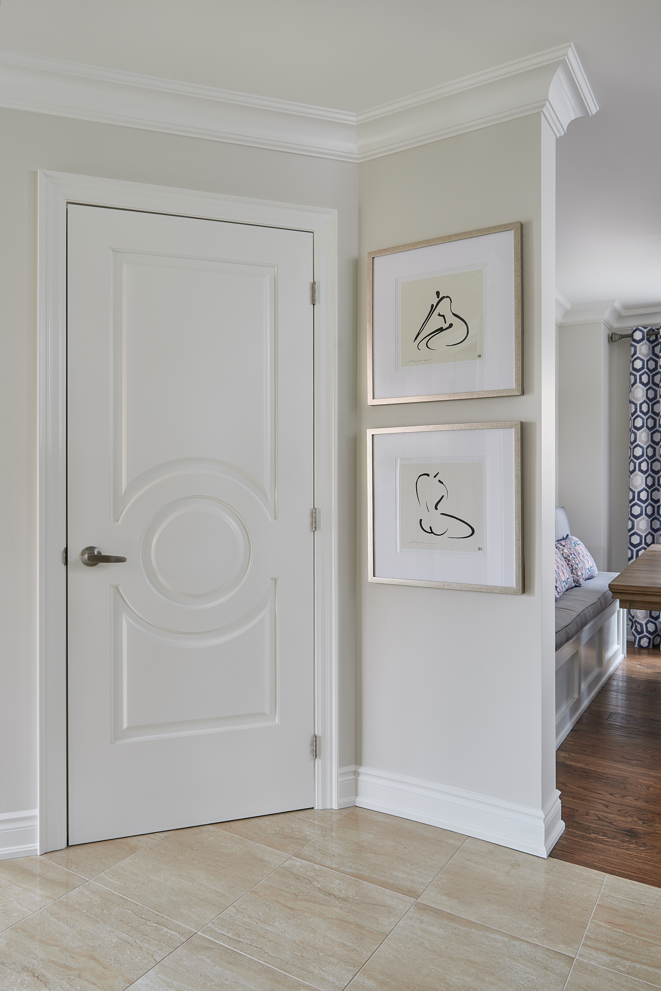
Within the same area, there was a half wall that bordered the front foyer with a pillar on the end closest to the room opening (see below). In addition to the new flooring and overall renovation work done to update their home, removing this traditional column helped us to eliminate a structural element that is indicative of a more traditional style.
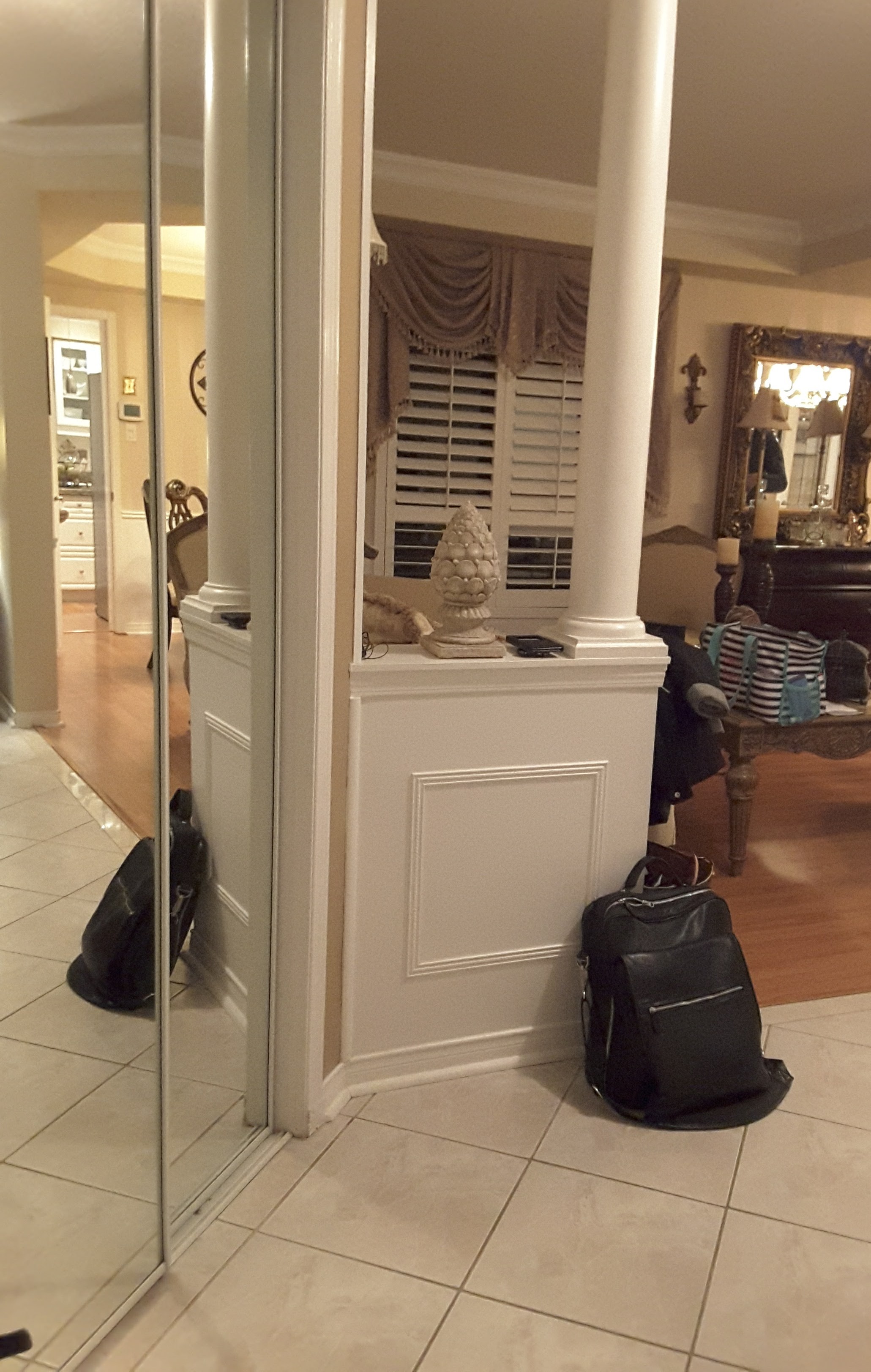
A Plan With Purpose
We took that narrow wall all the wall to the ceiling and beautifully finished it with a detailed crown moulding. This wall divides the space and enabled the addition of our clients’ simple, yet sophisticated artwork that greets you when you enter the front foyer area. So pretty, right?!
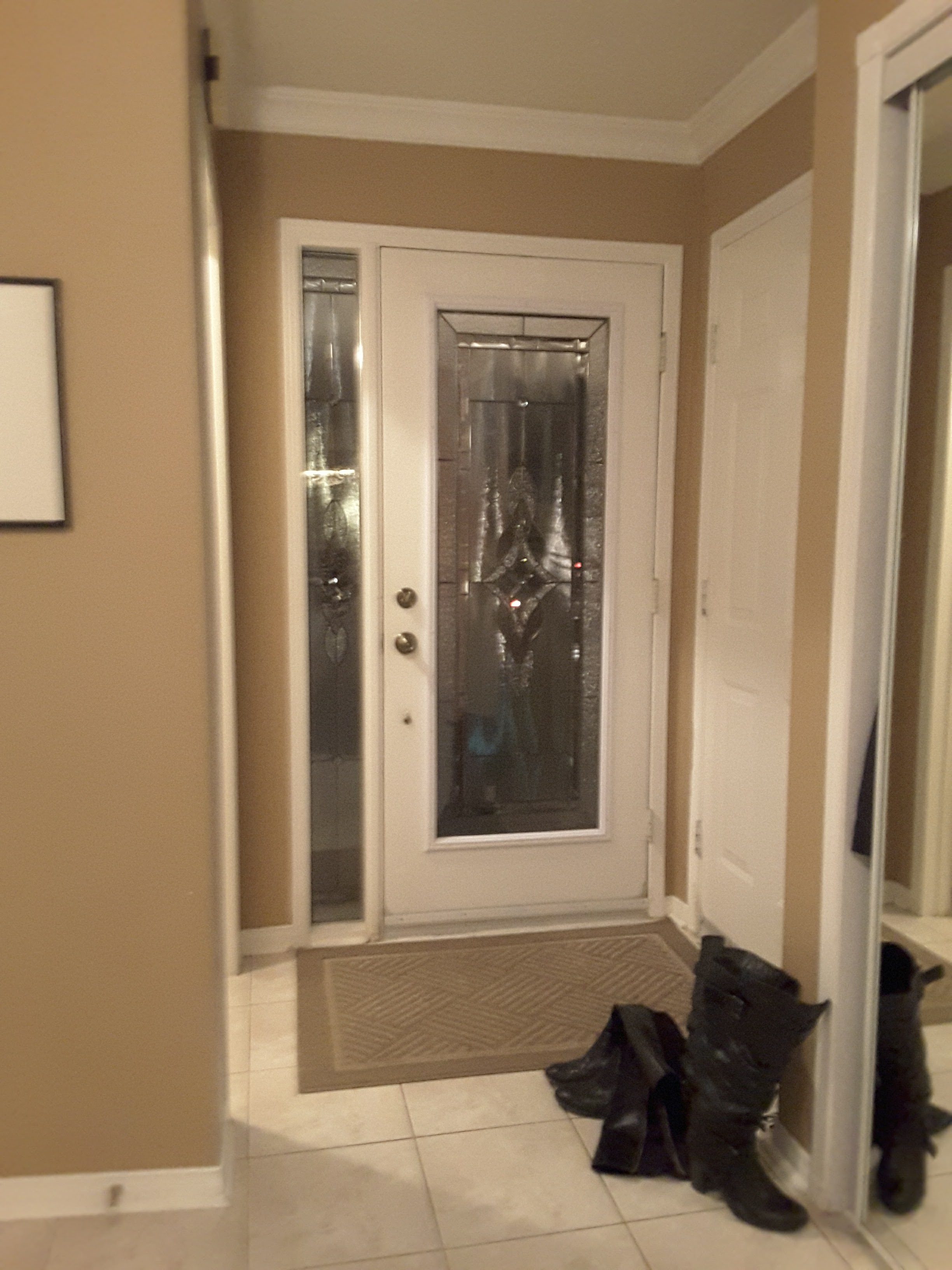
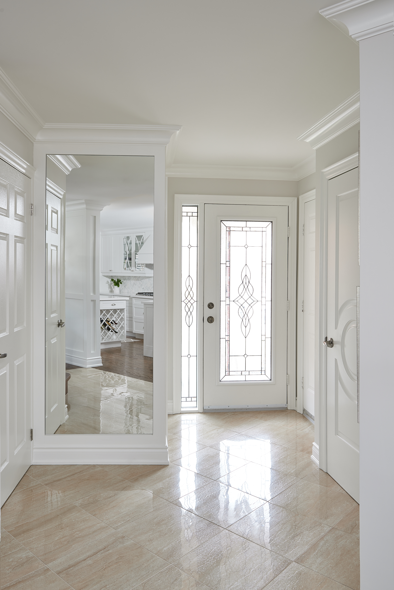
#3. Tricks of the Trade
There are so many doors in this small entryway that the contrasting wall colour, made the space feel very busy and closed in.
Bright & Welcoming
By lightening up the paint colour (Classic Gray by Benjamin Moore) and adding a custom mirror within the millwork on the wall, the front entry now feels bigger and is much more welcoming. Don’t you agree?
To see more of this kitchen in my portfolio, click here.
Which of these 3 updates was your favourite? Comment below to let me know which one you liked best.
It’s amazing how different a home can look and feel when you have a good design plan and a professional to help you along the way.
We would love to work with you on your next project. Reach out and contact us here.
Psst! Love Colour? Take my new colour quiz to determine which colour palette suits you best!

Convenience at your fingertips
Remember, it only takes one mistake to take your home decorating project from divine to disaster. Don’t let the paint be what stresses you out!
Choosing Paint Colours
If you struggle with choosing paint colours, be sure to check out my Perfect Colour Palettes.
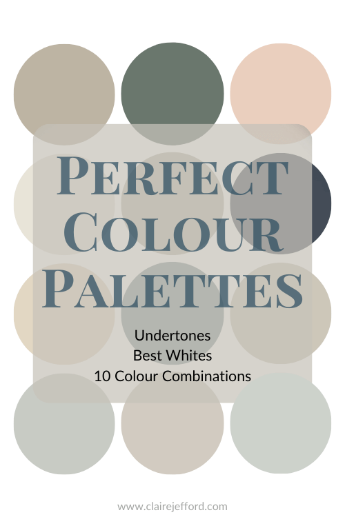
I now have 40 individual guides to help inspire you.
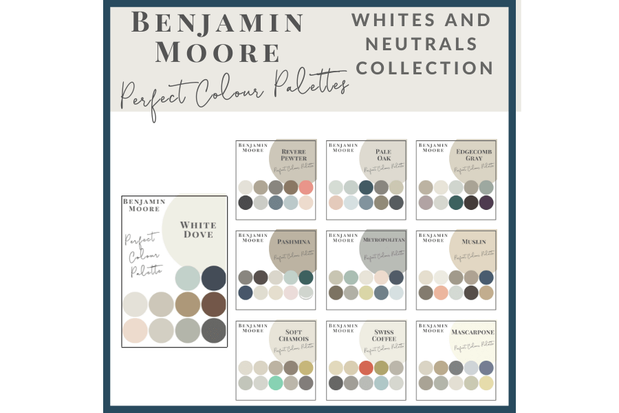
Collections
I also offer collections that showcase a group of 10 similar colours from Benjamin Moore,
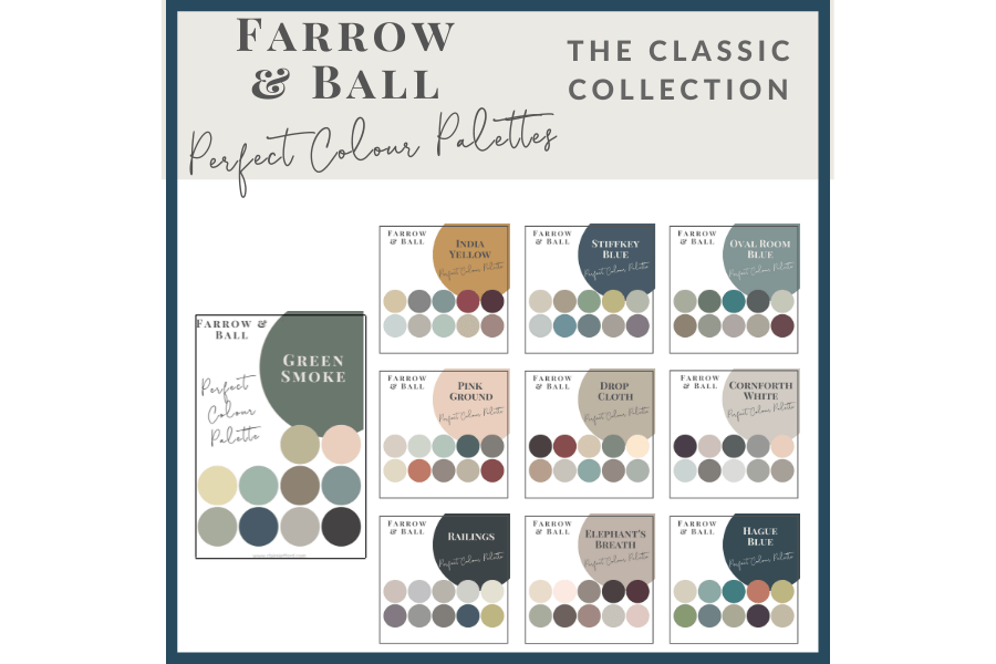
Farrow & Ball
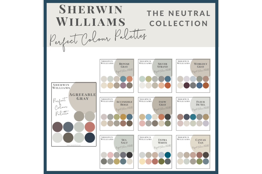
and my newest addition, Sherwin Williams.


Anne Kurek
| 16 January 2020I love that you took out the pillar! Makes perfect sense.
Claire Jefford
| 16 January 2020Thanks Anne! Client loves the updated look too and that’s the most important.
Cynthia Taylor-Luce
| 16 January 2020Claire, I love what you’ve done. What a difference it makes to remove that classic column! And the big mirror in the foyer is brilliant. Thanks for sharing these great ideas.
Claire Jefford
| 16 January 2020Thanks so much Cynthia. That means a lot coming from you! Glad you enjoyed the post.
Deborah Main
| 18 January 2020Great post Claire! I can’t choose because I love how you completely transformed the entire area! From the entry way to the wall and of course the banquette!! Beautiful design work Claire! Thanks for sharing!
Claire Jefford
| 18 January 2020Well I guess that’s not a bad thing that you can’t choose, right? LOL!! Cheers for reading Deb.
Janet Lorusso
| 18 January 2020Love the mirror built into the millwork in the foyer, and the new flooring and lighter brighter colors. Lovely transformation!
Claire Jefford
| 18 January 2020Thanks Janet. That was a very cool design detail, eh?! 😉
Mary Ann Benoit
| 18 January 2020I love that you shared your thought process so clients know what goes into creating a design. It all came out beautifully and love the way the Classic Gray looks!
Claire Jefford
| 19 January 2020Thank you Mary Ann. Classic Gray is one of my favourite colours right now. And yes, so important to show more than just our final portfolio images so people understand more of what we do and how we help.
Darla Powell
| 19 January 2020What a difference you’ve made here! Well done!
Claire Jefford
| 19 January 2020Thanks Darla!
Sheri Bruneau
| 20 January 2020Oh those pillars! While they were once considered ‘grand’, I can’t tell you how many times we have taken them out.
My favourite part however, is adding the mirror to the front foyer space.
Claire Jefford
| 20 January 2020Oh my goodness yes! The problem is that sometimes if we are not renovating an entire floor, it’s a challenge to match or transition hardwood floors from where we remove them from. I say ‘Good Riddance’ when you can take them out as they are so dated and take up soooo much space! Thanks for reading Sheri.