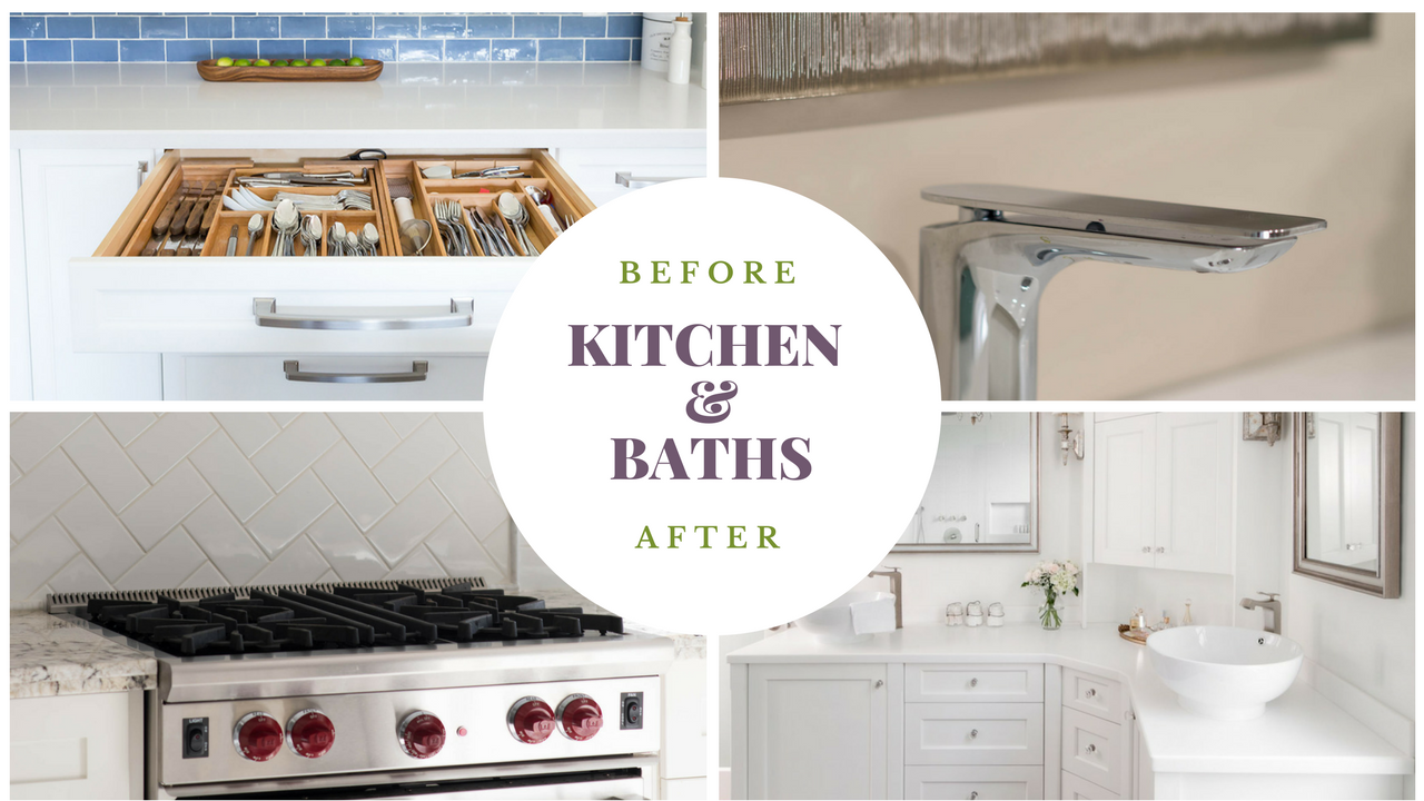
Before and After photographs are so compelling for any Interior Design business. We can’t help but love seeing how spaces can be transformed from Fugly to Fantastic!
This is especially true if you feel there is a space in your home of which there is no hope for and it’s almost impossible to see past it’s current state…the key word there being ‘almost’.
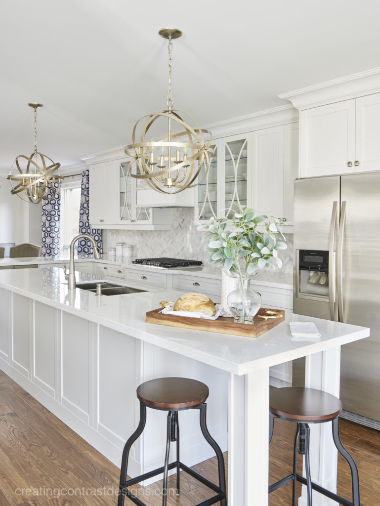
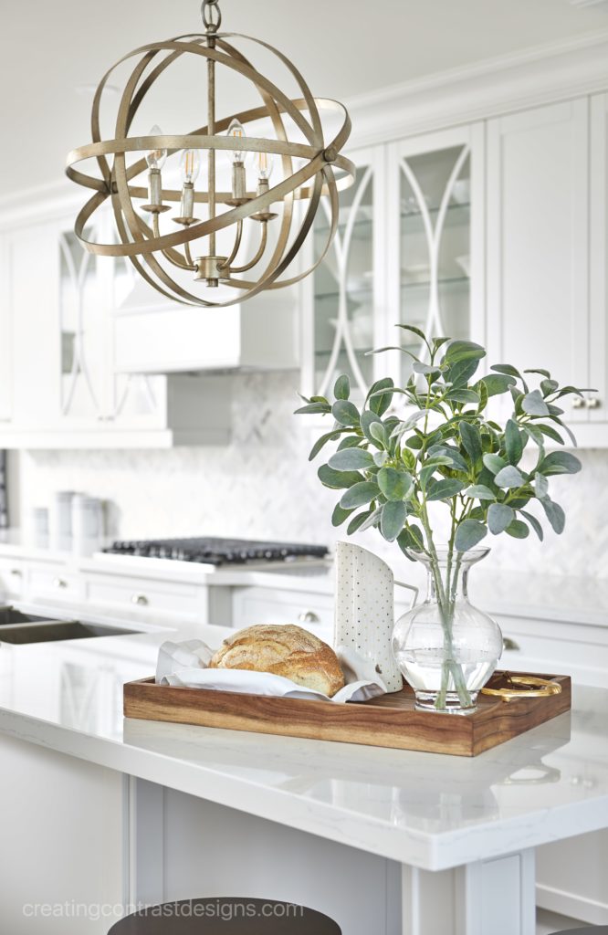
In my latest video, I showcase all of my Kitchen & Bathroom Designs that have been professionally photographed, starting with the before photo and followed by the inspiring afters.
You can see these incredible transformations in my video below.
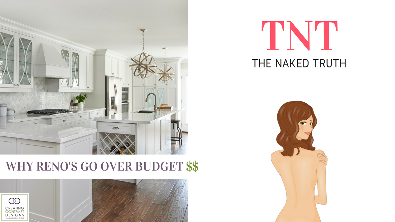
Home Renovations can go over budget for a variety of reasons and this can make it very frustrating for many home owners to plan a renovation. I lay much of the blame on networks such as HGTV which provide only ‘half truths’ to it’s audience about the projects they do. Creating drama and good entertainment overrules educating viewers on the details of a renovation which can be deceiving & confusing for home owners. But there’s also another reason…
In my latest video, I review a recent Houzz article that surveyed more than 120,000 home owners who renovated their home from 2015-2016. I break it down for you and explain why renovations go over budget and also how to prepare yourself for your next interior design or home renovation project. Being prepared will save you time & money!
The reasons projects frequently exceed the original budget, are not suprising, but what you can do to avoid over spending isn’t as difficult a task as you may think. It’s all in the planning!
This is the second video in my ‘Naked Truth’ series which is all about being transparent when it comes to costs for renovating and interior design projects. You can see all of my playlist in that series by clicking here. I try to upload new videos every Wednesday, so be sure to subscribe if you haven’t already and I’ll see you there!
Wanna work with me on your next home renovation or interior decorating project? Contact me here and let’s do this!
Thanks to TV programs like HGTV, most homeowners struggle with establishing a realistic budget for their renovation or decorating project. Many people simply do not understand what everything will cost or the level of detail that’s involved in putting together a fabulously functioning and beautifully tailored space.
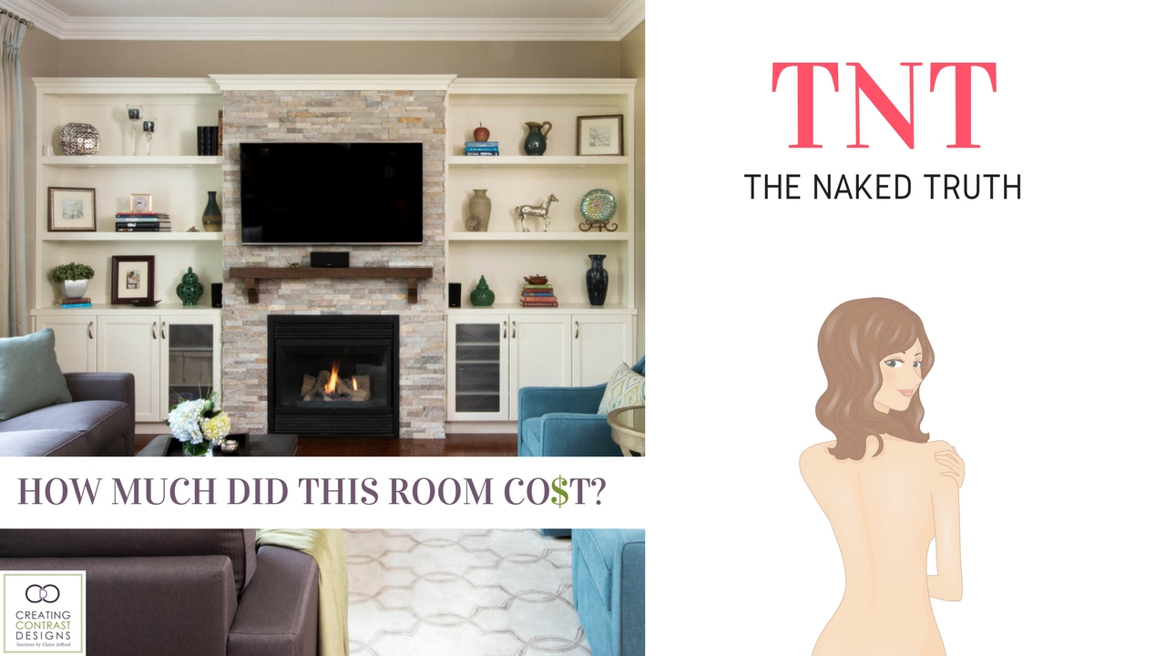
With my lovely clients consent, I am thrilled to reveal the total cost of a stunning custom family room design that I did last year. In the video, I disclose the price of each item of furniture, the cost for custom built ins & paint work, as well as the total fees for my design services.
My Elite Interior Decorating Package includes:
2 Hour Intial Consultation Meeting at clients home
Visit to My Trade Only Design Centre to gage preferences for sofas and other furnishings
3D Designs with 2 options for layout; fabrics; furnishings & paint colours
Virtual Renderings/Drawings with inspirational photos & a Virtual Video Tour
Scope of Work & Considerations for the Design
Presentation & One Revision (up to 4 changes)
Implementation of all purchases and scheduling of all trades
REVEAL DAY! All installations (except for built ins done previously) & accessories/styling
(See all the service packages I provide by clicking here.)
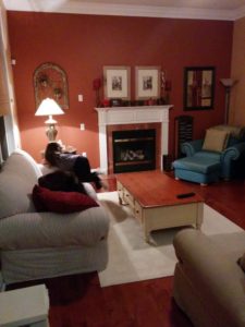
Below is a photograph of my clients family room ‘before’ so you can get a sense of the amazing transformation that took place.
Click the play button on the image below to see all costs involved for this project. Are there any suprised here for you or are costs what you would expect for a custom family room project?
This video is the first in a new series on my Youtube channel called ‘The ‘Naked Truth‘…Naked because I’m not holding anything back!
Pricing of products and trades services will vary depending on the quality of the furnishings and finishes you select for your home project and the experience/demand of the trade professionals you hire. There is always opportunities to go ‘high’ or ‘low’ on certain items in order to stay within your budget – providing it was a realistic investment amount in the first place – and that’s what good design is all about!
Are you ready to hire a design professional to help you Love Where You Live? Contact me here and let’s do this!
Bringing the ‘Indoors Out’ is a phrase we hear frequently these days. To connect with nature, feel a soft breeze in our hair and smell various fragrances from our gardens is a beautiful thing! This was a big part of what motivated us to undergo a large scale landscaping project in May of 2015.
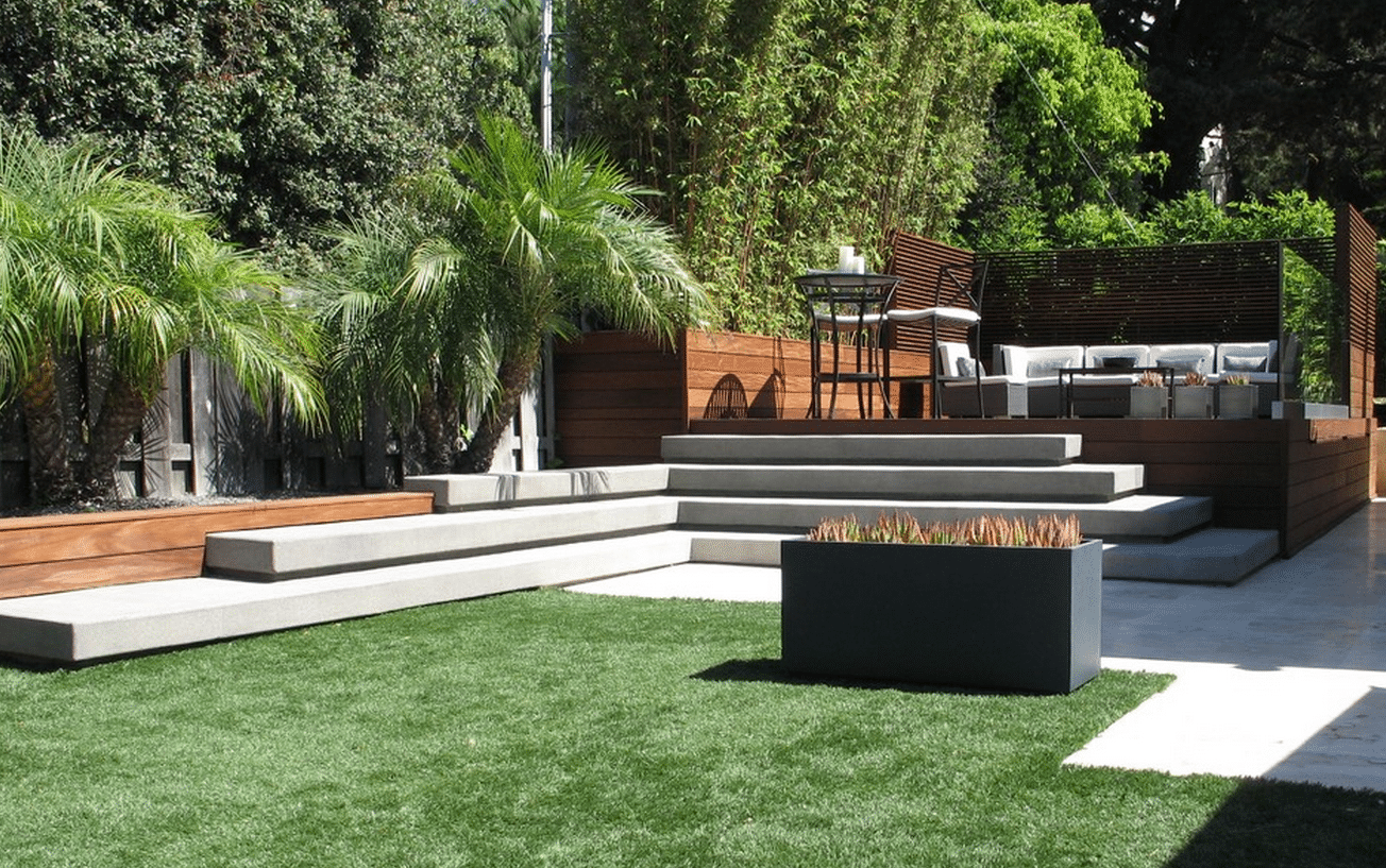
Here’s an inspiration photo for our outdoor space. Gray stone, stained cedar & greenery – link here
We also wanted to create an outdoor studio for my Interior Design business here in my home town of Burlington, Ontario and thought this would be a great opportunity to bring the two elements together.
Planning is key to any successful design – this is my mantra! Therefore, our landscaping project began with the interior layout of my studio in order to determine what space would be remaining in the backyard for the patio section.
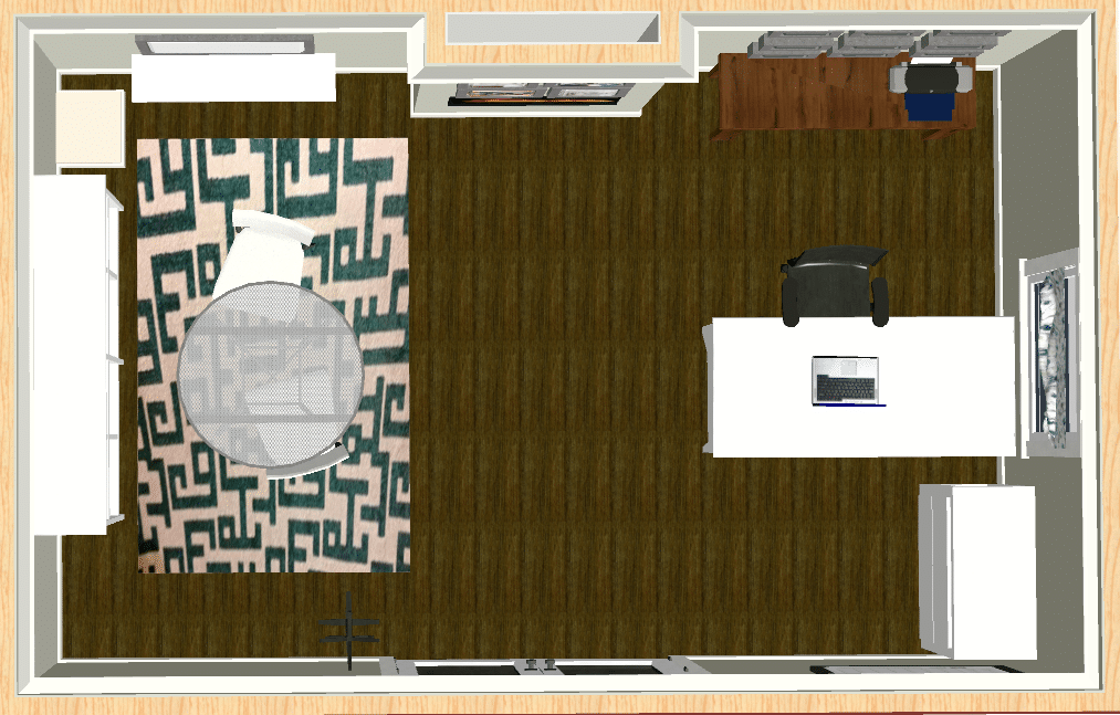
My Rendering of the Inside of the Studio
I had outgrown my small, dark office in our basement. It no longer functioned in a way that was productive to my needs nor was it even a pleasant working environment if I’m honest. Also, as I often bring home samples and items that I’ve purchased for clients, to bring these items into my home, down the stairs and through the basement was not practical. If I wanted my business to continue to grow, implementing a change was necessary. Below is one of my first drawings for the new studio layout.
First I measured out my current office space to evaluate how much bigger I require my new studio to be. With function being a priority, all new furnishings were necessary. I also wanted a completely different look with a more ‘clean’ and fresh colour palette so it was a good excuse to start from scratch. (Any excuse for new furniture!)
I sent the drawings and dimensions to my landscaping company along with some inspiration photographs from my houzz studio ideabook that I created to share with them. (This is a great tool that I use with clients all the time) Below is the drawing that they came up with based on the information and inspirational pictures that I provided them with.
Studio rendering with dimensions
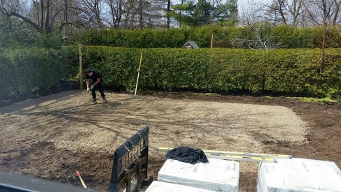
After some slight tweaking and minor revisions, we broke ground in March of 2015. I took plenty of photographs to document the project before and during the renovation. It’s interesting now to look back and see how the work progressed over time.
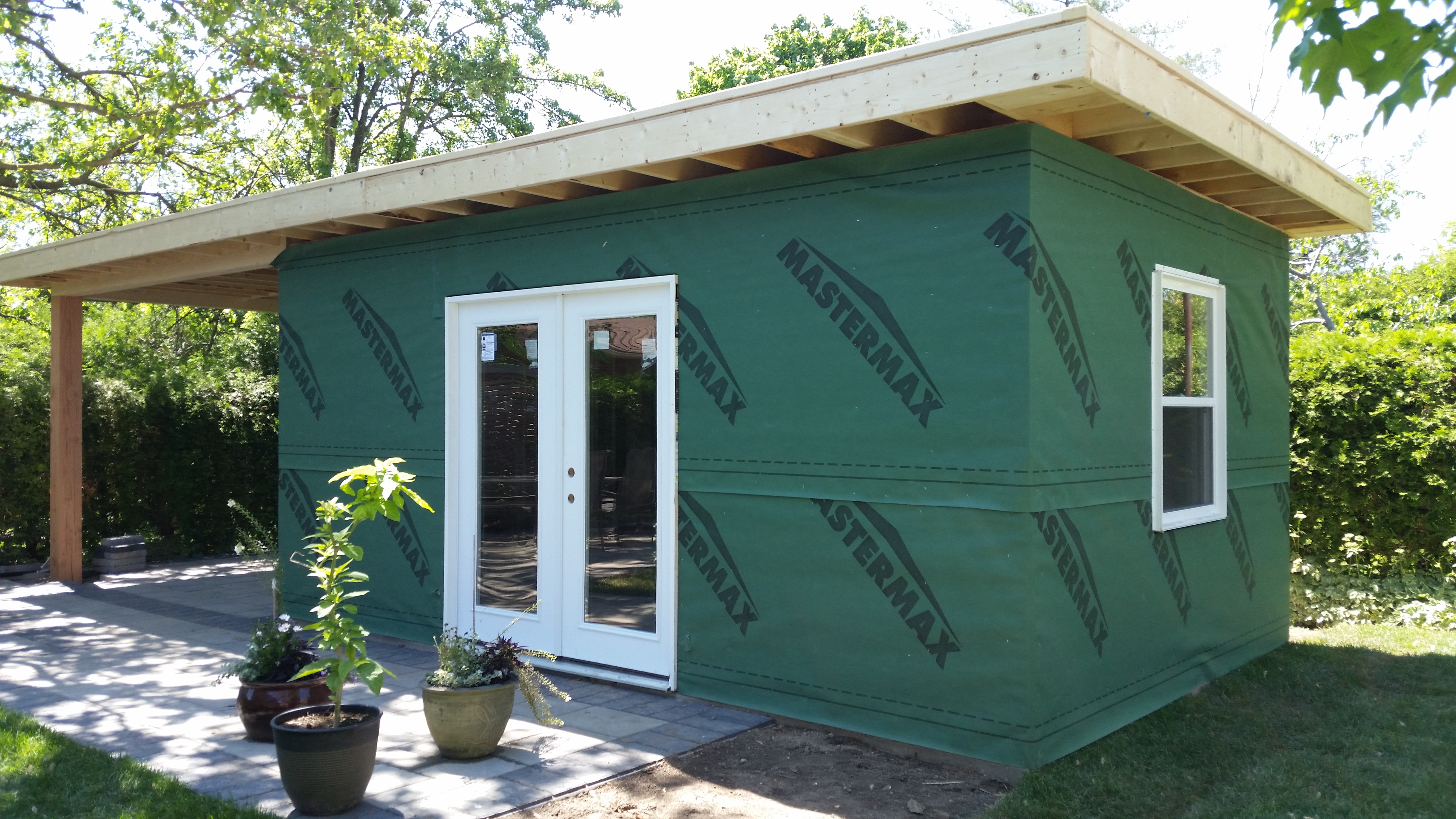
Here is our backyard once we removed the swing setA family affair…the kids and Chris took up the old stones while I took the photos. LOLThe grass was dug up and the ground was leveled outFraming out the base of the studio before pouring the concrete padThe patio stones are laid, concrete pad poured and new grass was laid down.The framing of our outdoor structure begins
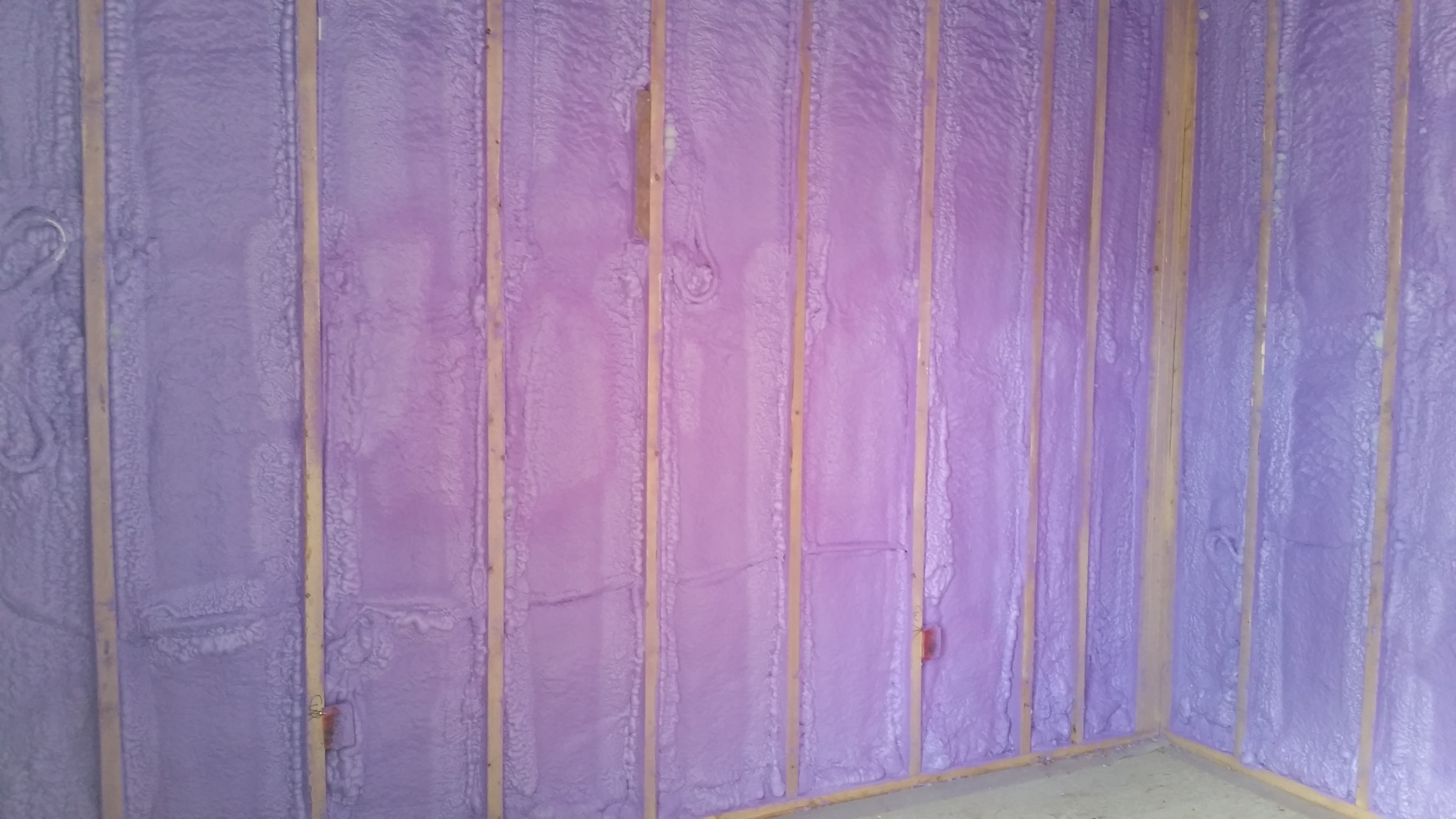
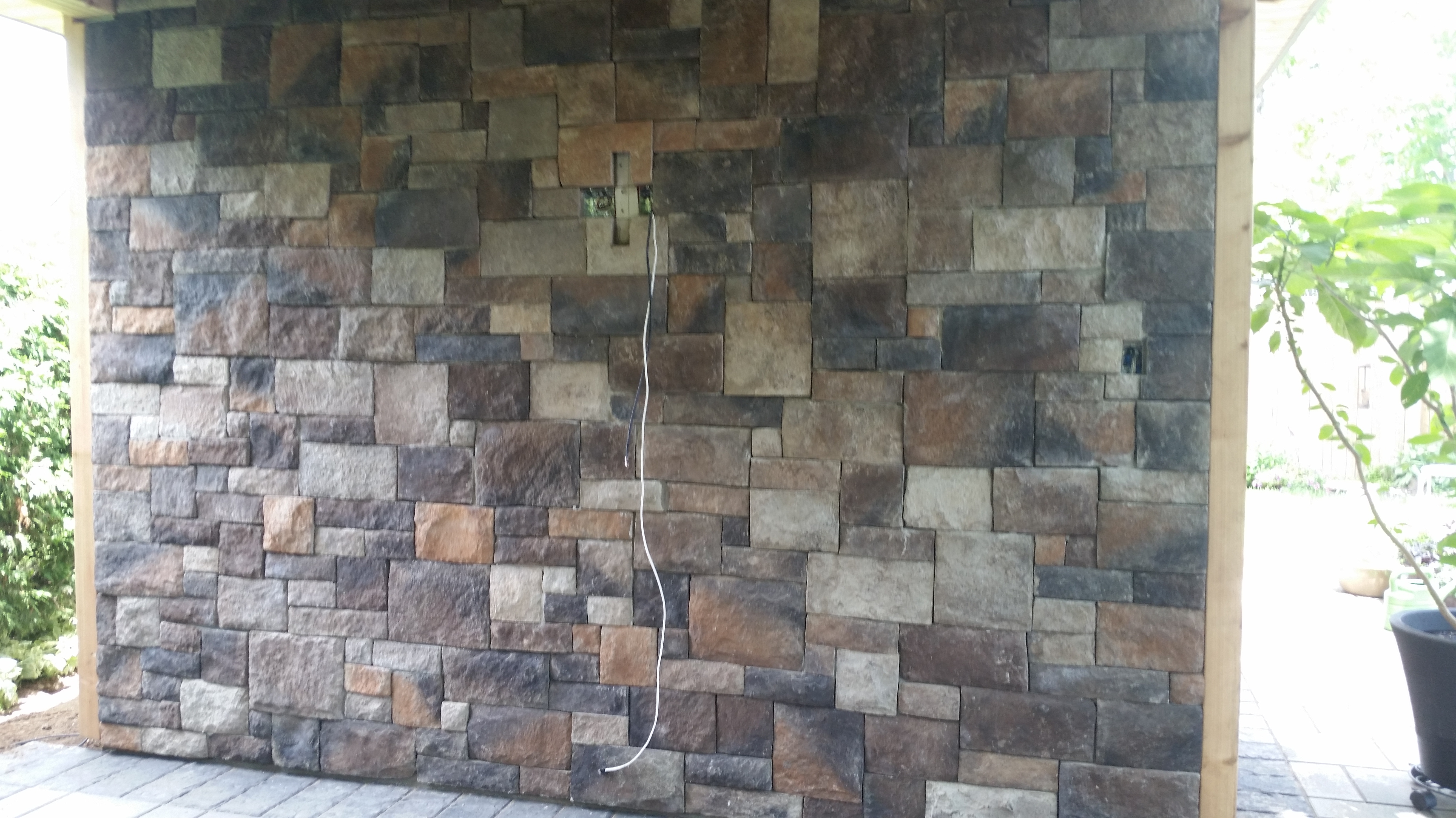
The black roof was put on with eavestroughs at the backInsulating with spray foam was well worth the extra moneyThe Stone Brick Focal Wall
I decided on this natural brick with individual stones for our focal wall that would house the TV in our seating area. The stones incorporated both the cooler tones of the grays we used on the patio and the warmer hues which tied in nicely with the final stain of the cedar and the overall decor.
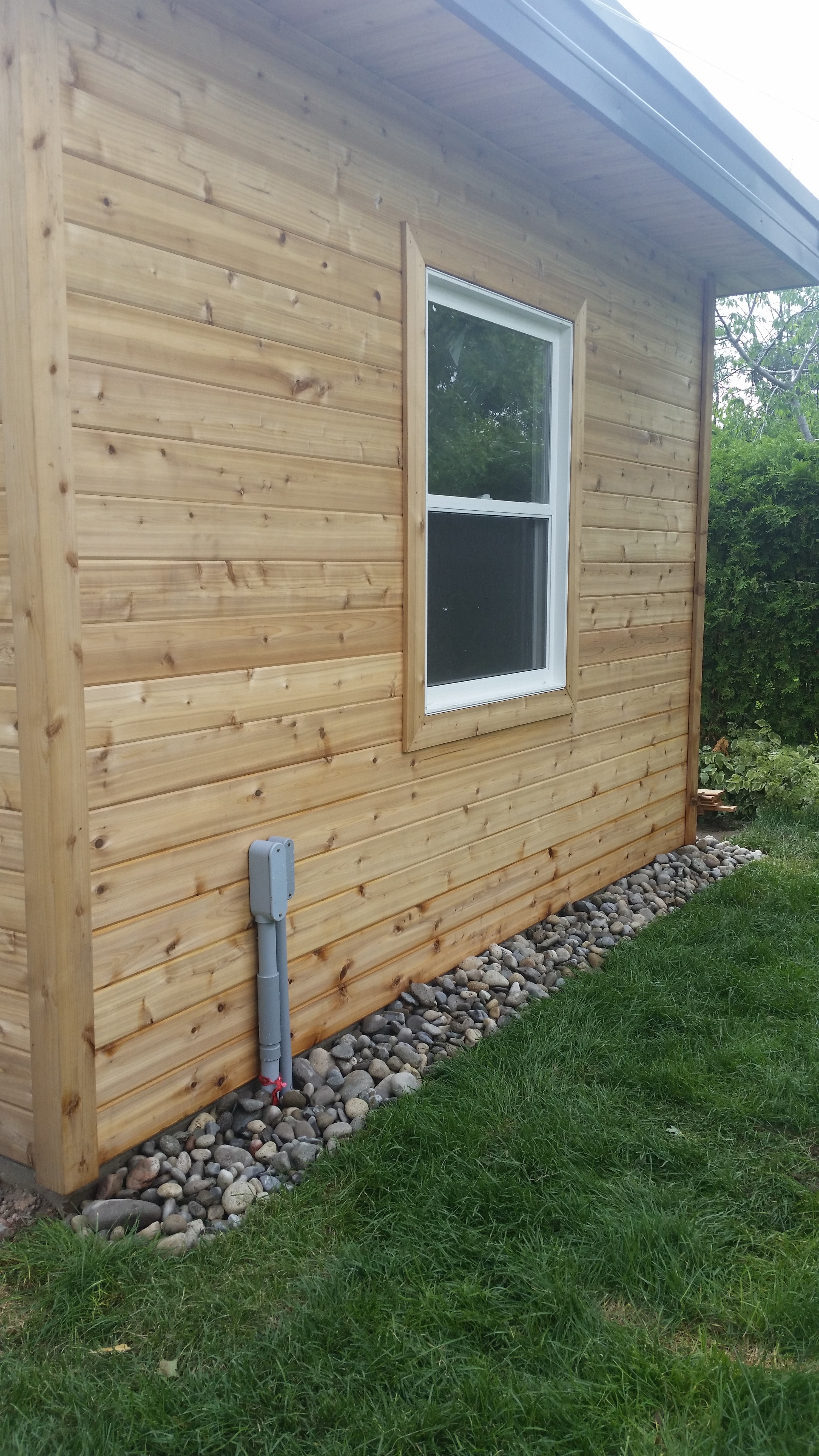
Opposite side with river rock to assist with drainage, my window to view the birds
So once again, here is the original rendering…
Studio rendering with dimensions
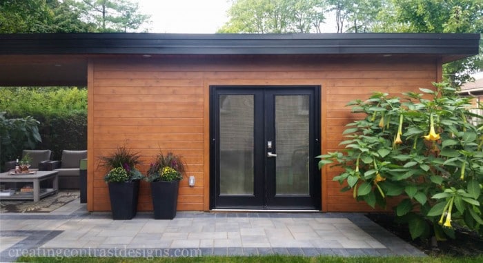
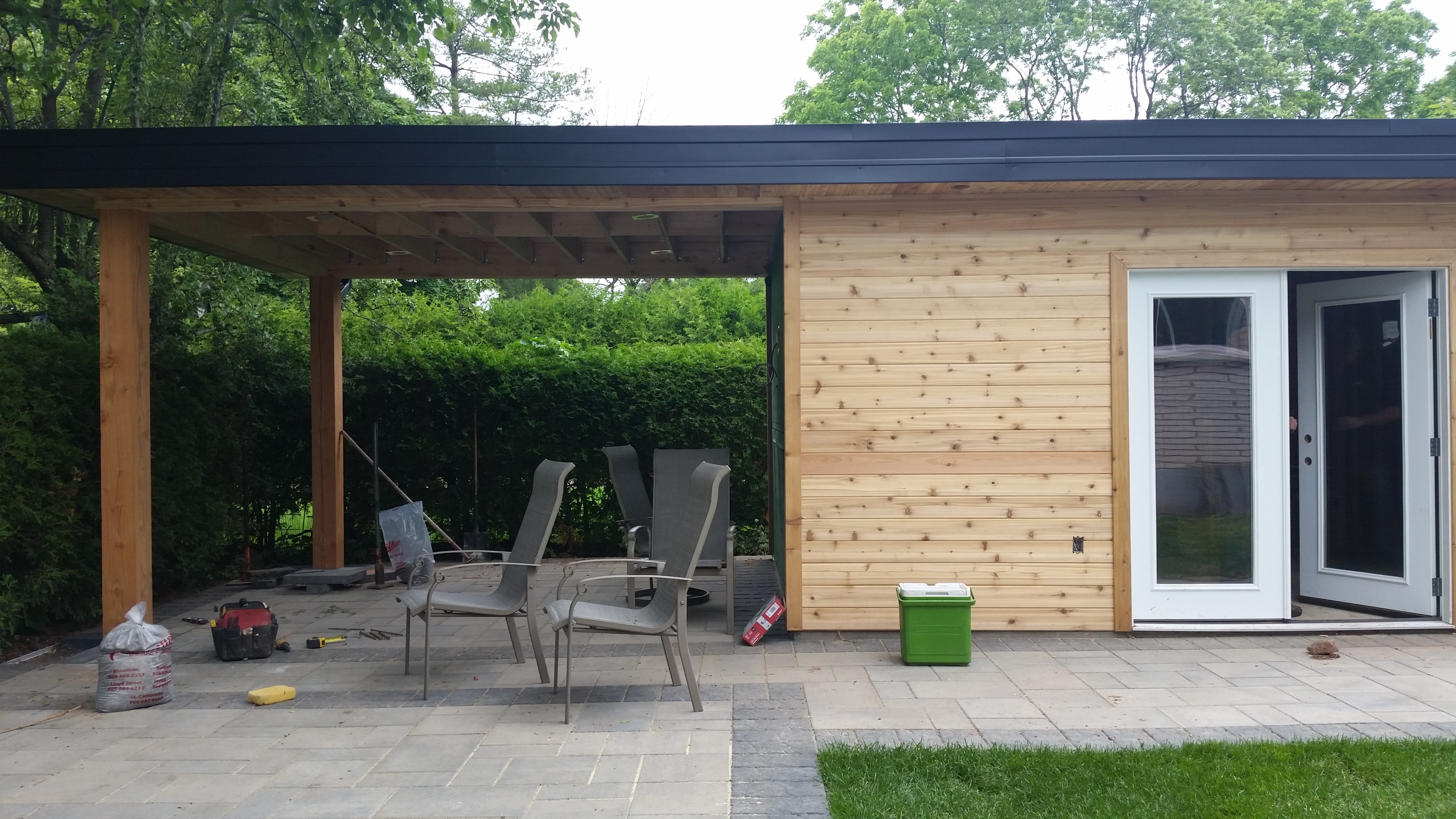
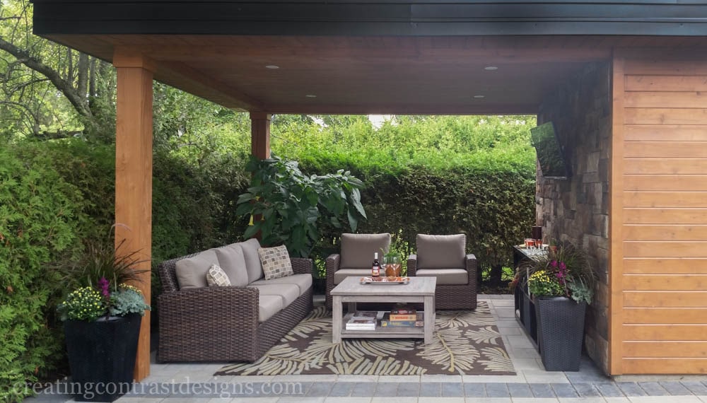
And here is our outdoor studio structure! (sorry the image is so small…grr!!)
I can’t tell you how much we love our new space! The outdoor living area is fabulous and a truly beautiful new ‘room’ of our home. We play games with the kids, watch movies and sporting events (Coronation Street too) and relax with wine and friends!
Although I have been working from my studio since late July last year, it’s not fully finished with artwork and custom built ins. However, I will definitely share with you when I am ready for the final reveal! (see the video here, it tours the insdie of my studio, but please note that it’s not yet finished)
Have you brought the ‘Indoors Out’? Comment below and share how you have extended the life of your backyard living season.
Not subscribed to my Youtube channel yet? What’cha waitin for? Click here to subscribe & let’s do this!
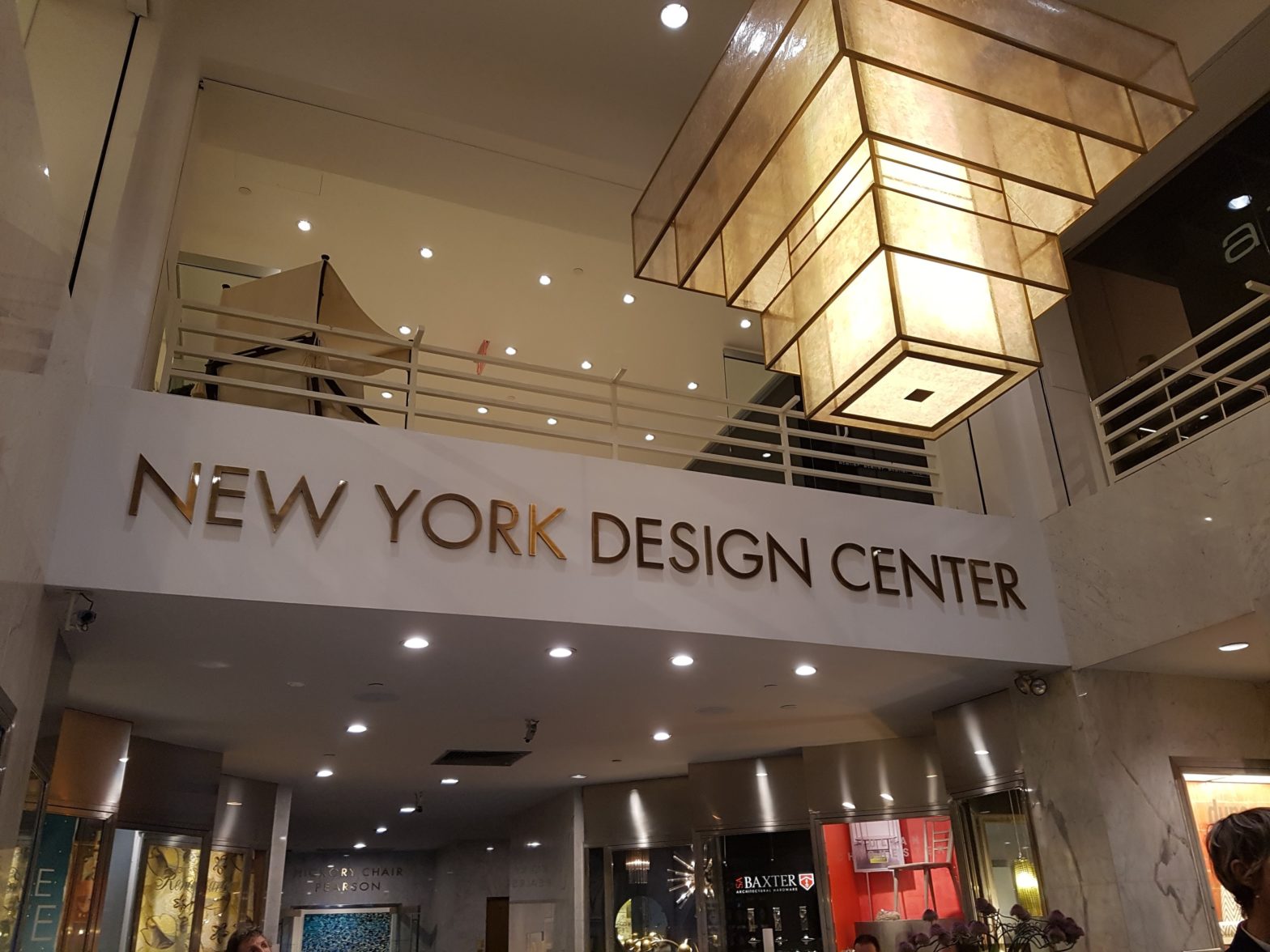
Whoever said that the Big Apple is the city that never sleeps weren’t kidding! For the long weekend my Mom, daughter and 50 others (from my daughters Musical Theatre Group) headed to NYC for a fun filled weekend, jam packed with plenty of sites to see and places to go. Continue reading “NEW YORK DESIGN CENTRE – 1st dibs”
One of the areas of a home that I love to design the most is…the unfinished basement! That may come as no suprise if you’ve been following my blog for any length of time and saw my posts on the 3000 square foot basement that I designed last year for Baeumler Quality Construction. The beauty of the unfinished basement is the potential I find within them for all that my clients desire!
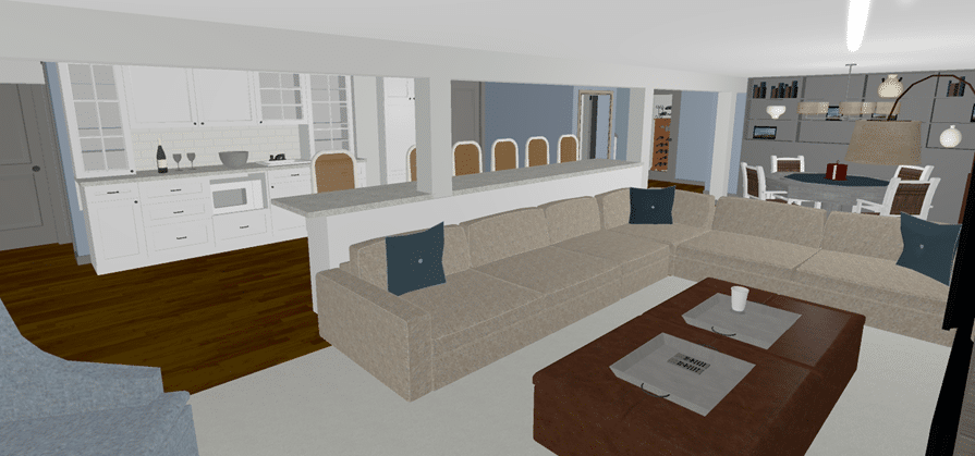
Just last week I presented to clients my two design options for a 1500 square foot basement and they also requested that I re-design their ensuite. Check out the virtual tour I put together for them in the video below. (remember, these specific plans are for space planning, not for specifying finishes)
When I present to clients on my laptop in person, after the presentation meeting I follow up by sending them a virtual tour of the space I’ve designed. This way they can take their time to look at it, pause it and even share it with others if they wish.
For these clients their wish list consisted of: Bar; living space with fireplace & built ins; spare guest bedroom; full bathroom; an office for hubby and an area for poker or playing games. The treadmill was a bit awkward to place as you will see in Option#1, but we found a better place for it in the second layout option.
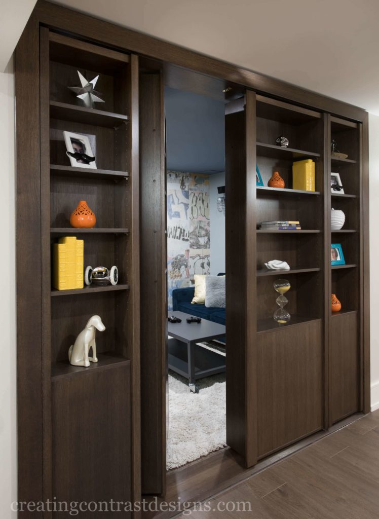
The furnace room was already framed in and it offered lots of storage space within it which was great. Clients also requested a hidden bookcase similar to the one I did to the Xbox room in the contemporary basement, that lead to the office space.
To see both options for the basement as well as the ensuite redesign, watch my youtube video here.
The jury is still out on which design my clients will choose, but at the time of presenting, they were leaning towards option#1 with a few tweaks. I can’t wait to see what they decide upon for both projects.
Some big decisions for them to make now! Which design layout option do you like best? Comment below after watching the video to let me know.
Looking for space planning in your home? Contact me here and let’s do this!
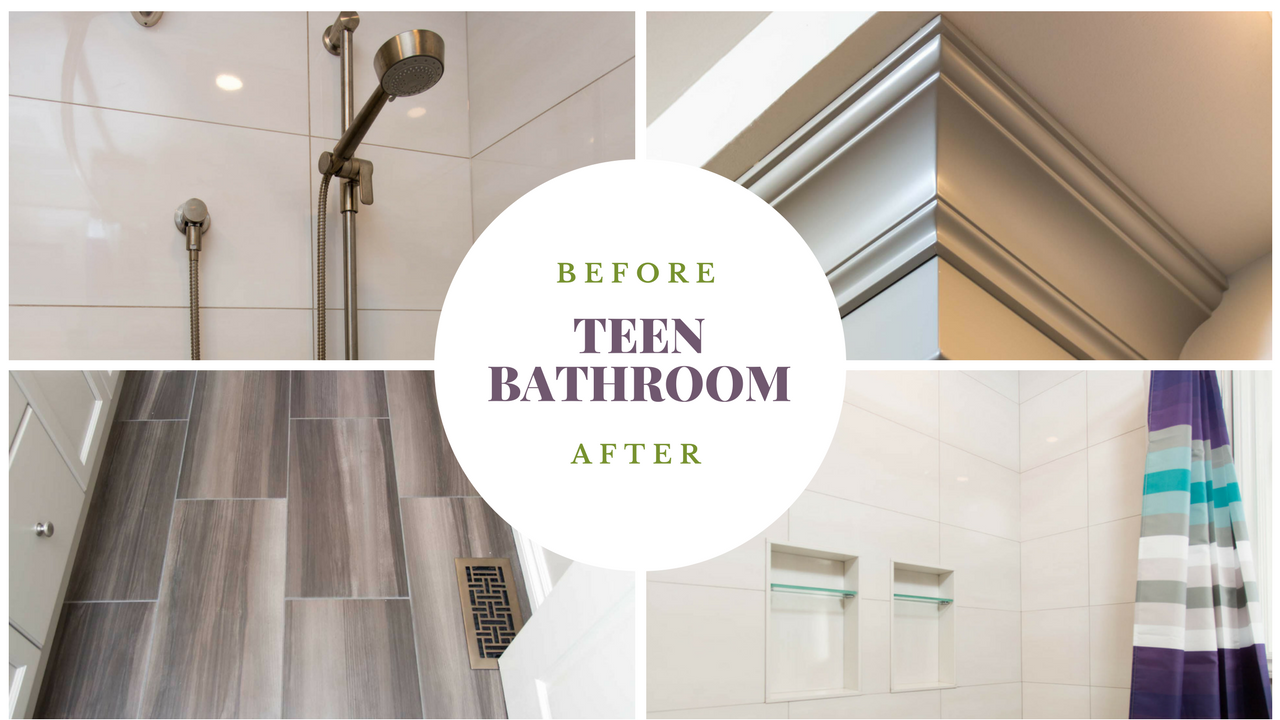
For this ‘Teen Bathroom Renovation’, I once again had the wonderful opportunity to work with Bryan Baeumlers company, Baeumler Quality Construction. Clients were looking to renovate their kitchen and part of the second floor in their Oakvillle Ontario home, so I was called in to create various layouts for both spaces.
In this post I want to share with you the before photos, renderings of my two interior design options and the final reveal of the teen bathroom makeover. I’ll show you how we went ‘high and low’ on certain design elements without compromising the overall look of the space.
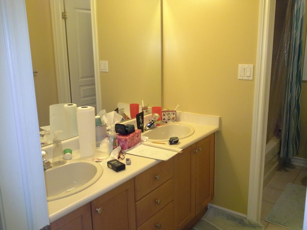
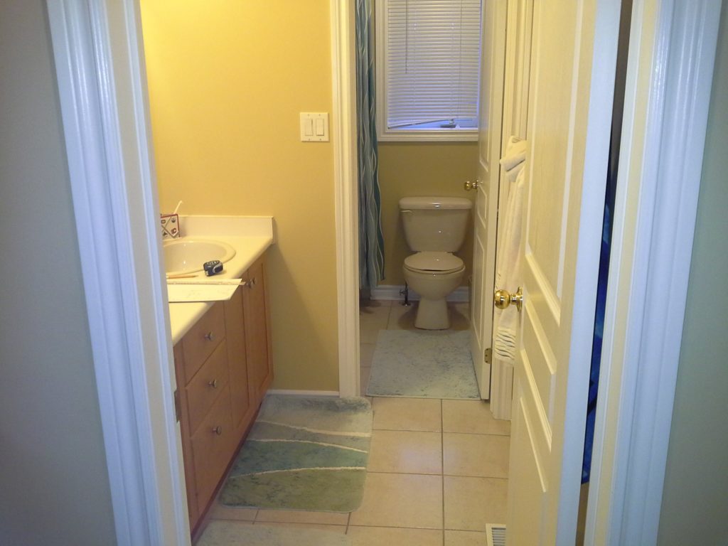
Before
Here is what the bathroom looked like when I first arrived to consult with my clients.
The need for more storage space was definitely a main prioritySeparate vanity and shower/toilet area is great for shared bathrooms, but updates were needed
One of my clients pet peeves was that you can see the toilet from the hallway as you walked up the stairs. They requested I consider moving the toilet so it was not the first thing people see as they approach the second floor.
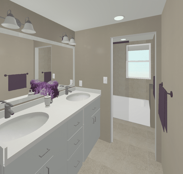
Below is Option #1 where I moved the tub& shower along the wall with the window and the toilet to the left of the door, behind the wall as you enter this area of the bathroom.
Option #1 – Move Shower and Toilet
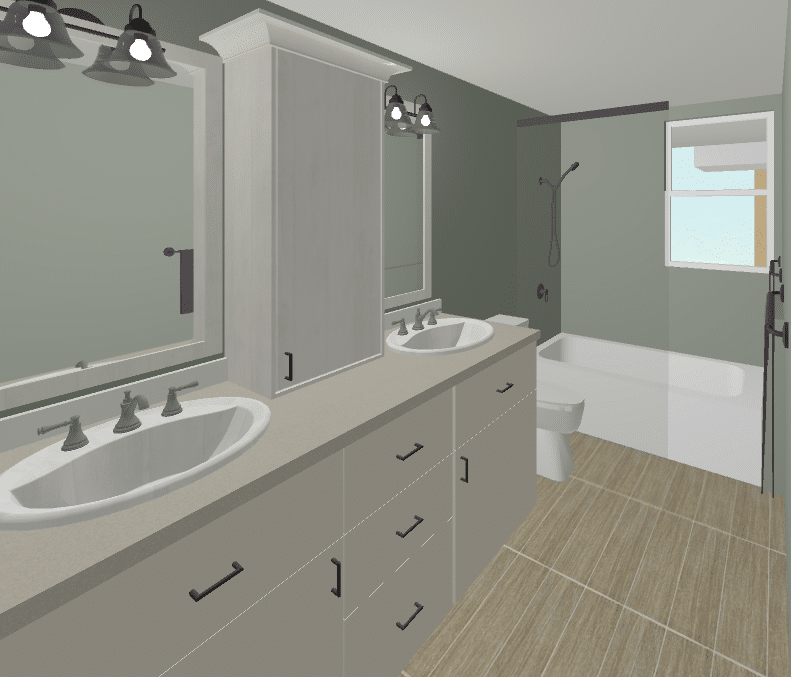
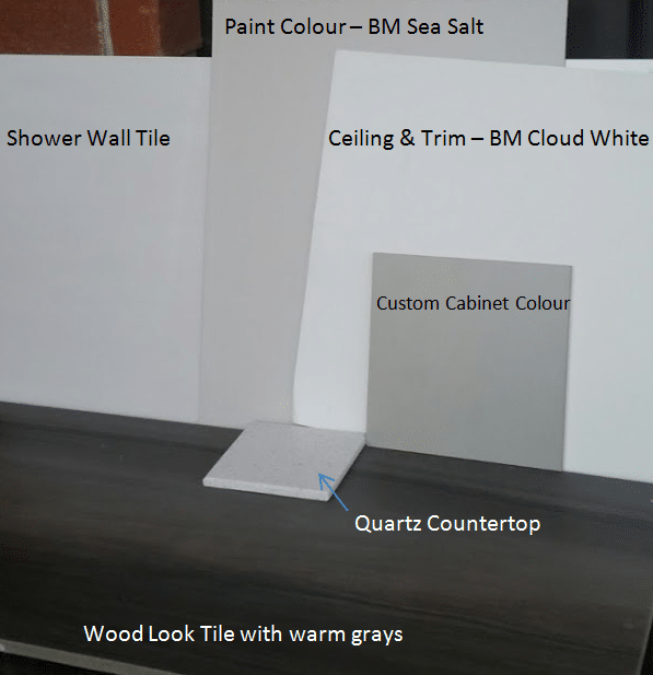
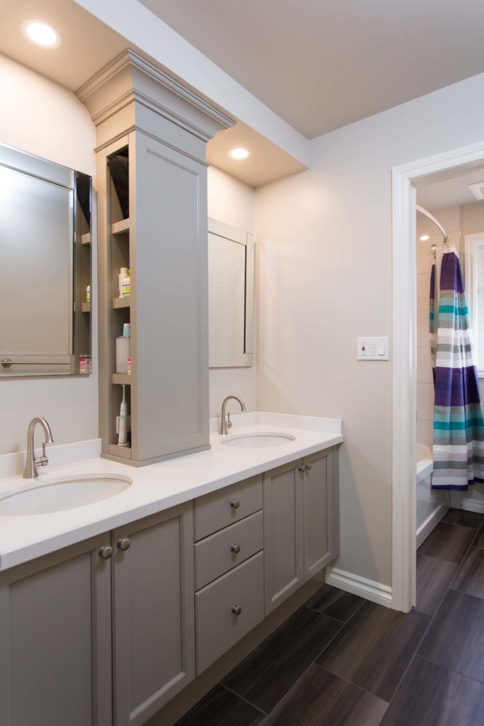
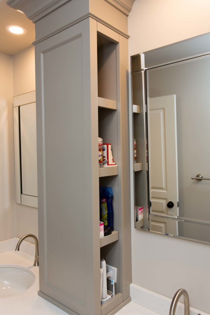
For Design Option #2, I removed the wall between the two rooms to make one large bathroom. This allowed for more room between the toilet and the tub. I also added a tower on top of the counter top of the vanity for extra storage space.
Option #2, removed the wall to make it one big washroom as oppose to a divider
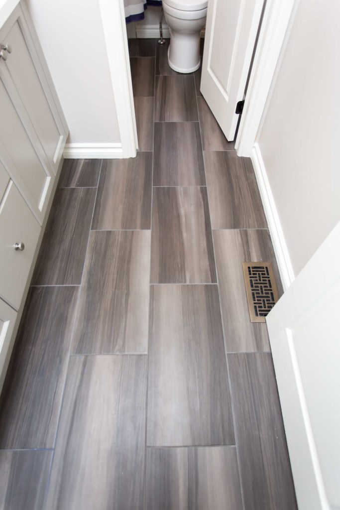
As my clients were also renovating the main floor, they decided in the end not to make any changes to the layout of the kids bathroom in order to keep costs down. We did however, custom build a tower unit as shown in Option #2 and clients also splurged on heated flooring, as per my recommendation of things to consider for the design.
Fifty shades of Grey! LOL
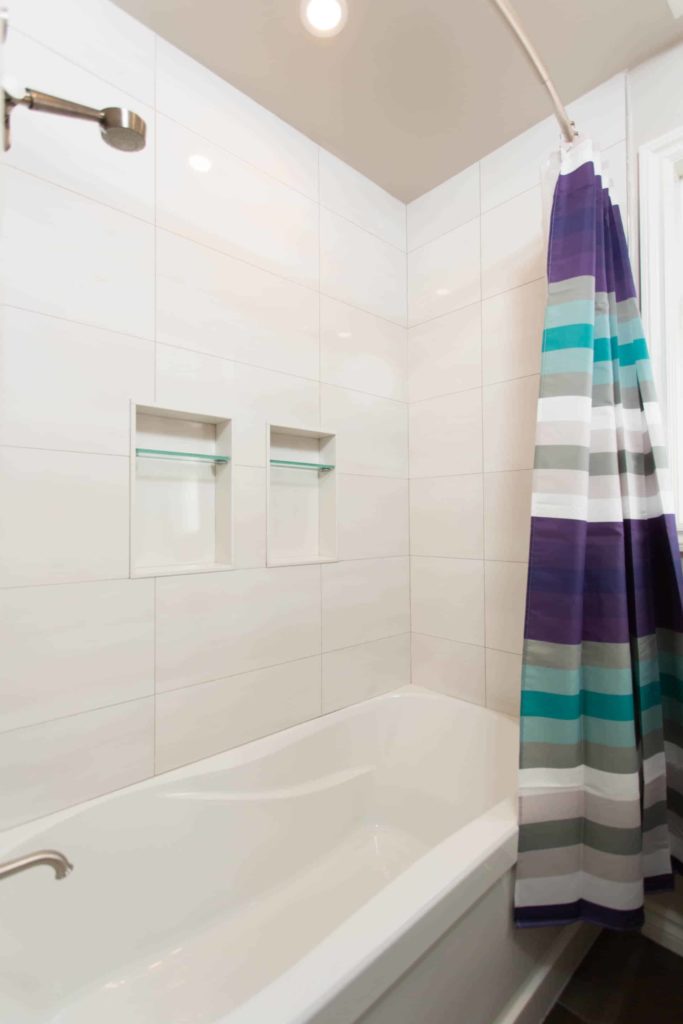
Bathroom After…
Updated Bathroom with soft Greys and White Quartz CountertopThe tower provides shelving either side for each siblingHardwood Looking Tile that is heated, lovely!New Shower with ‘His and Her’ Niches
In an effort to save on costs, we opted to keep the existing vanity cabinet & doors but have them painted to work with the new colour palette. Also, as oppose to installing a glass shower enclosure, we decided a shower curtain was sufficient. After all, the kids did get the heated tile and a beautifully updated washroom, so they can’t really complain!
Contact me here if you need help with your upcoming bathroom renovation and want to see the possibilities before you renovate! 905-581-0776. My full portfolio can be seen here.
Photography & Renovations by Baeumler Quality Construction
Can you believe that this is one of the most common mistakes that I see in Interior Design? Many home owners often purchase area rugs that are too small for their space. The purpose of an area rug -other than adding softness & helping with acoustics – is that it defines a space. It brings together groupings of furnishings to create an ‘oasis’ and a connection between them all.
Click on the video above to see my 3D drawings of a clients Great Room where I show the wrong size and the perfect size for the space.
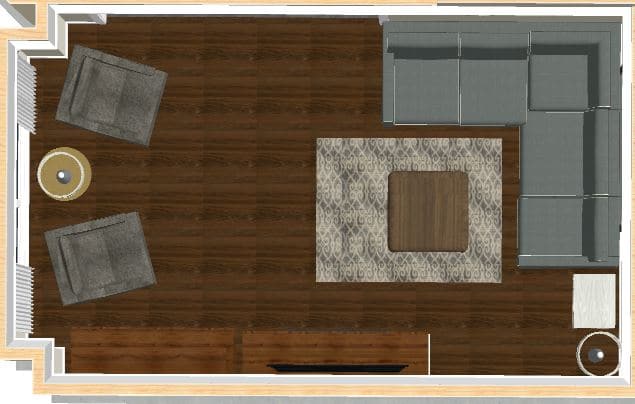
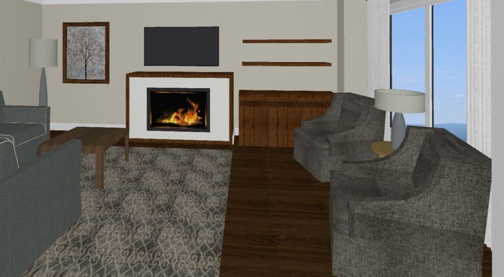
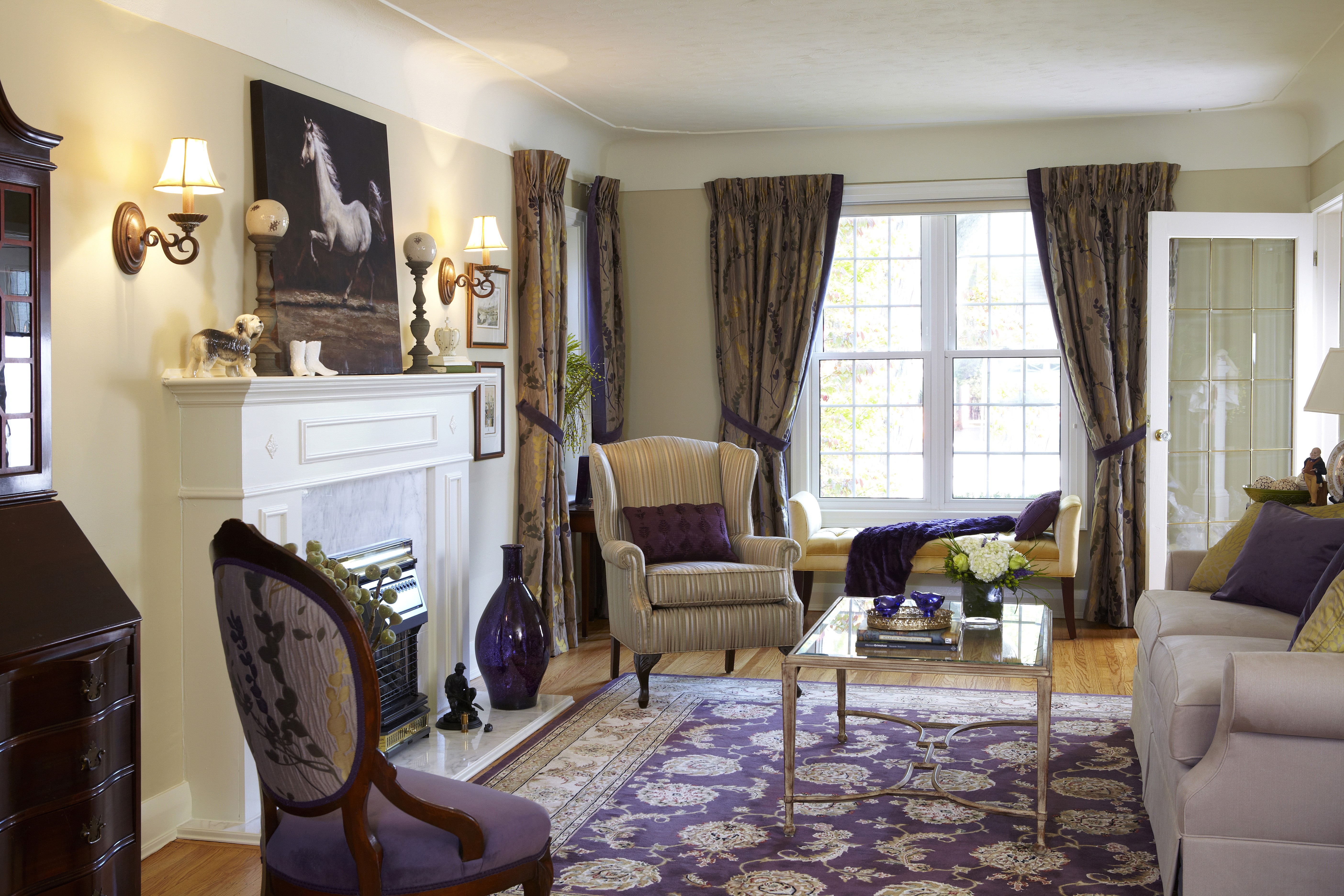
Below is a photo of another clients family room in Oakville Ontario where I purposely show the rug too small.
Area rug is Too Small
The rule I like to live by is that an area rug must be under the front legs (at the very least) of all of the furniture within an area. For the family room above, we did not want to extend the rug to the occasional chairs by the window and there was two reasons for this.
1) I suggested the chairs by the window with the table and lamp were a separately defined area in the space. They are far away enough from the sectional for this to work.
2) If we did choose to have a rug that extended to the chairs, the rug size would need to be customised and therefore the price tag increases dramatically.
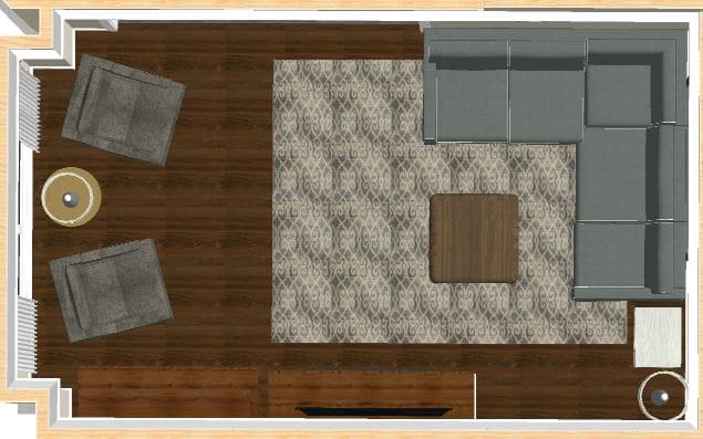
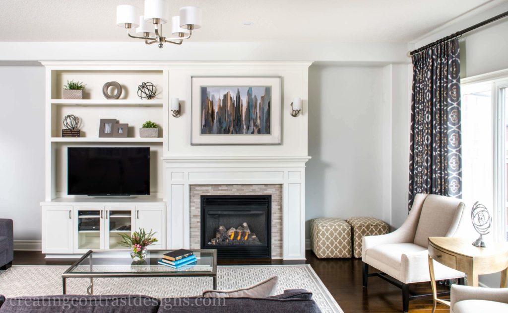
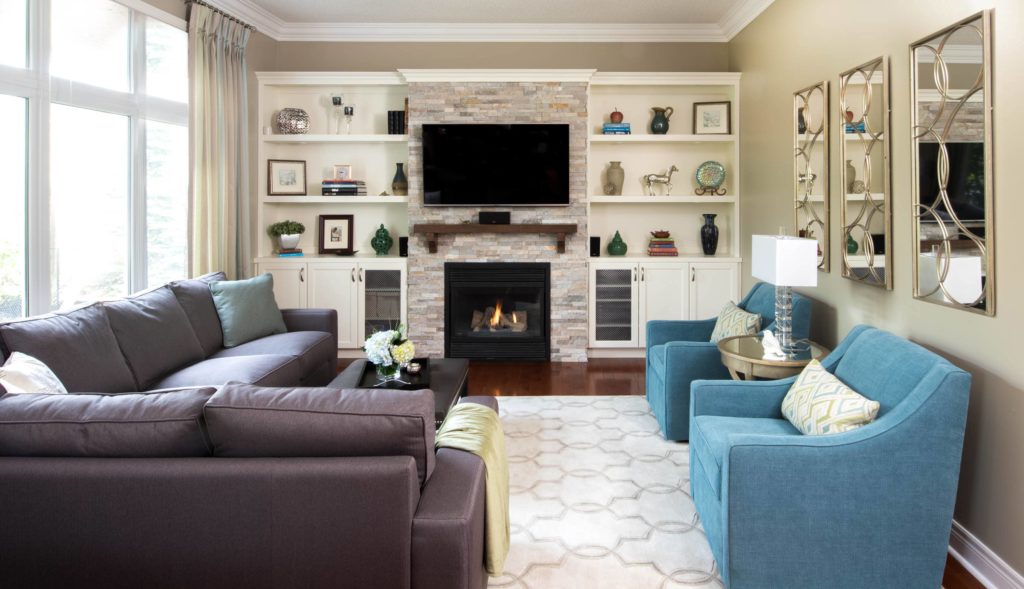
Below the rug is shown in a more appropriate size for the family room.
Area Rug Shown in a Better Size -8×10
I also purposely pulled the rug to the edge of the fireplace so as you enter the room it doesn’t draw the eye to show the rug only half way to the fireplace.
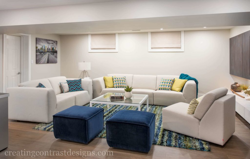
Here are some more examples of my designs showing the right size area rug.
Below in this family room the width of the space wasn’t overly big so the area rug (non customised) was able to fit perfectly and go all the way under the stunning blue swivel chairs.
Rug fits beautifully to fit the entire room
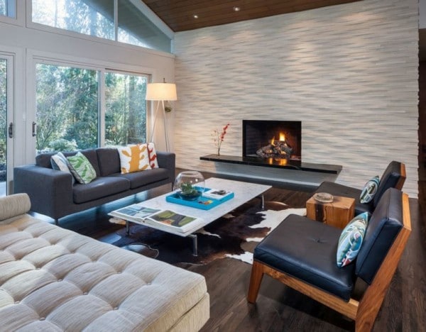
One of the only exceptions to this rule is if you are using an animal hide rug as shown below in this photo by Christie Architecture. This is a different style – often Mid Century Modern Style – and so it’s meant to exude a specific look.
If I’m totally honest, when I first began my Interior Decorating course more than 7 years ago now and the instructor told the class of this rule, I realised that my own area rug was too small in my living room. I went out and bought a brand new one immediately and it made such a difference in how the room looked!
Undoubtedly, this is one of the biggest pet peeves for many designers. Does it bother you? Is your area rug too small for your room? I would love to know if you have made this mistake, comment below and share your thoughts. Let’s get the conversation going!
Not signed up for my weekly blog posts yet? Whatcha waitin for?! Get the goods each week by clicking here and let’s do this! I’m on Youtube as well, subscribe to my channel here and I’ll see you there!
There are so many things that I love about what I do, which is why I followed my dream & started up my business of Interior Design just 5 short years ago. But this post is not about me, it’s about my clients. Everything I do in my business is with the focus of Continue reading “Client Main Floor Redesign – Virtual Tour”
Claire's Guide to Services & Pricing
FREE DOWNLOAD:
Interior Design Services and Rates Guide
This website uses cookies to improve your experience while you navigate through the website. Out of these cookies, the cookies that are categorized as necessary are stored on your browser as they are essential for the working of basic functionalities of the website. We also use third-party cookies that help us analyze and understand how you use this website. These cookies will be stored in your browser only with your consent. You also have the option to opt-out of these cookies. But opting out of some of these cookies may have an effect on your browsing experience.
Necessary cookies are absolutely essential for the website to function properly. This category only includes cookies that ensures basic functionalities and security features of the website. These cookies do not store any personal information.
Any cookies that may not be particularly necessary for the website to function and is used specifically to collect user personal data via analytics, ads, other embedded contents are termed as non-necessary cookies. It is mandatory to procure user consent prior to running these cookies on your website.