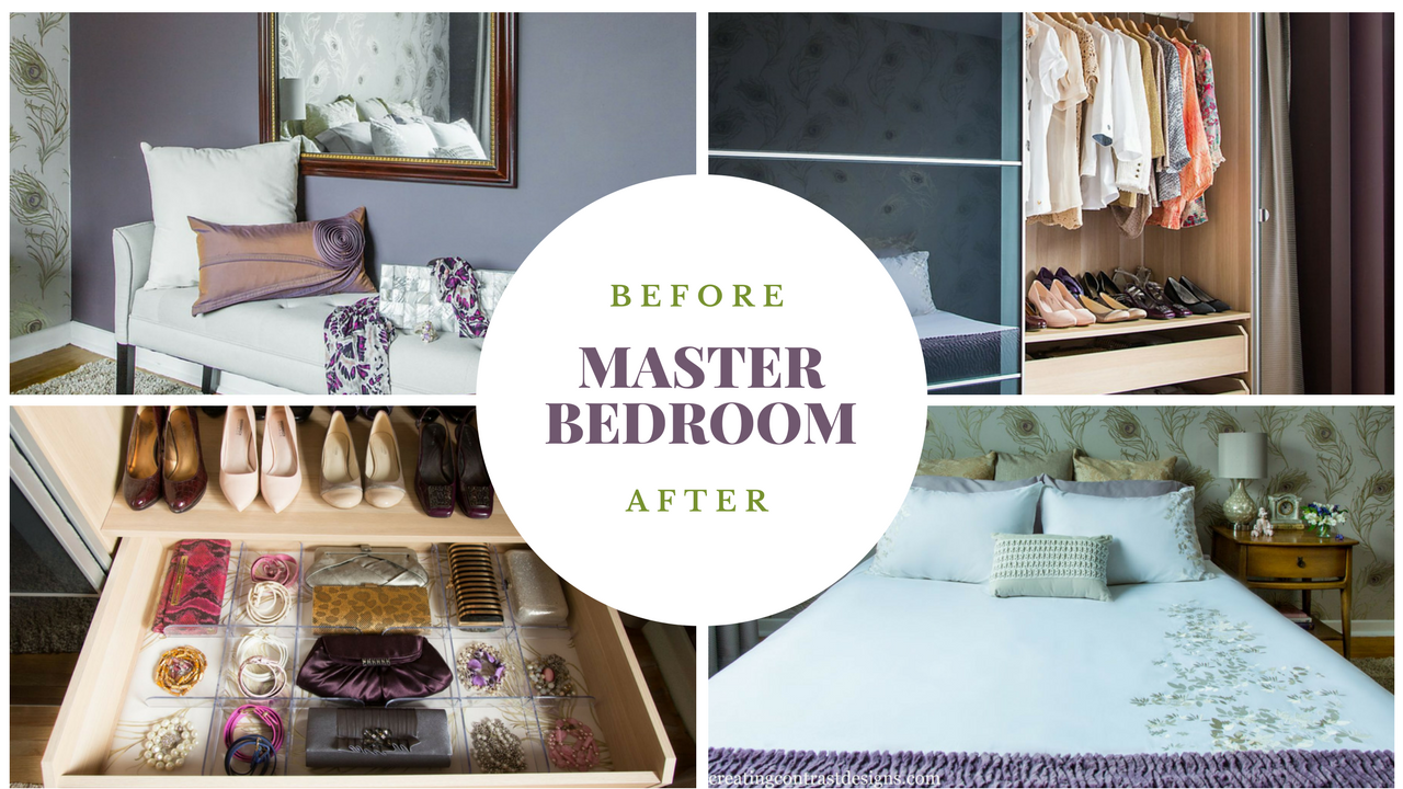
I did something last year that most people hardly ever get around to doing in their home. I know it may be hard to believe, but this is so true of many homeowners.
When we decorate our homes, we concentrate on the main living spaces, which makes sense right? We need the hubs of our homes to function, especially the kitchen and other rooms that we use the most with our families and where we entertain in with friends. But what about Continue reading “My Master Bedroom – From Fugly to Fantastic!”
You know the saying “You wear 20% of your wardrobe 80% of the time?” The reason why many of us do this is that we understand what works for our body types, with our skin tones and our preferred style sense.
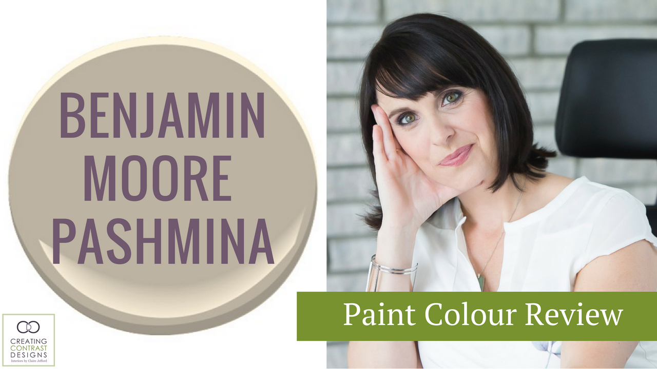
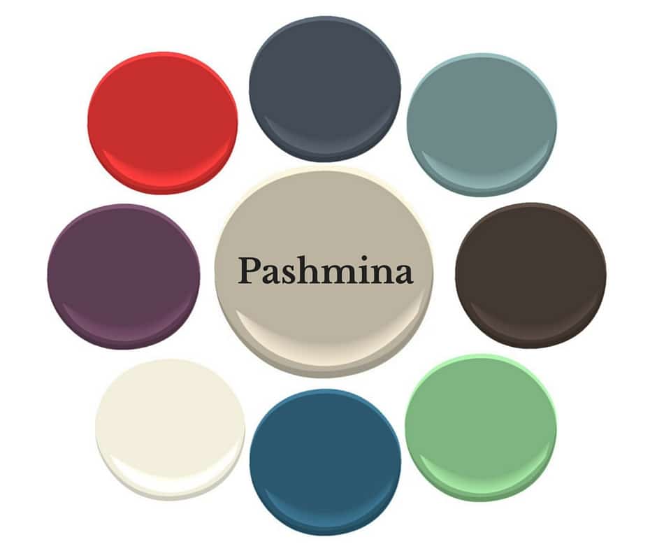
Believe it or not, the same can be true for choosing paint colours. This is part of the reason why I specify Benjamin Moore’s Pashmina so often.
Pashmina by Benjamin Moore
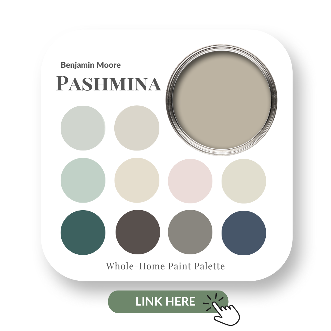
Pashmina, AF100 is from the Affinity Line by Benjamin Moore.
I have created a Perfect Colour Palette for Pashmina. In it, you will find info on undertone(s), comparable colours, best whites and 10 gorgeous colours that look amazing with it.
It’s a muddy colour with a green undertone and has slightly more intensity & depth than the popular Revere Pewter.
It’s one of those rare colours that often works well with both the beiges and the grays.
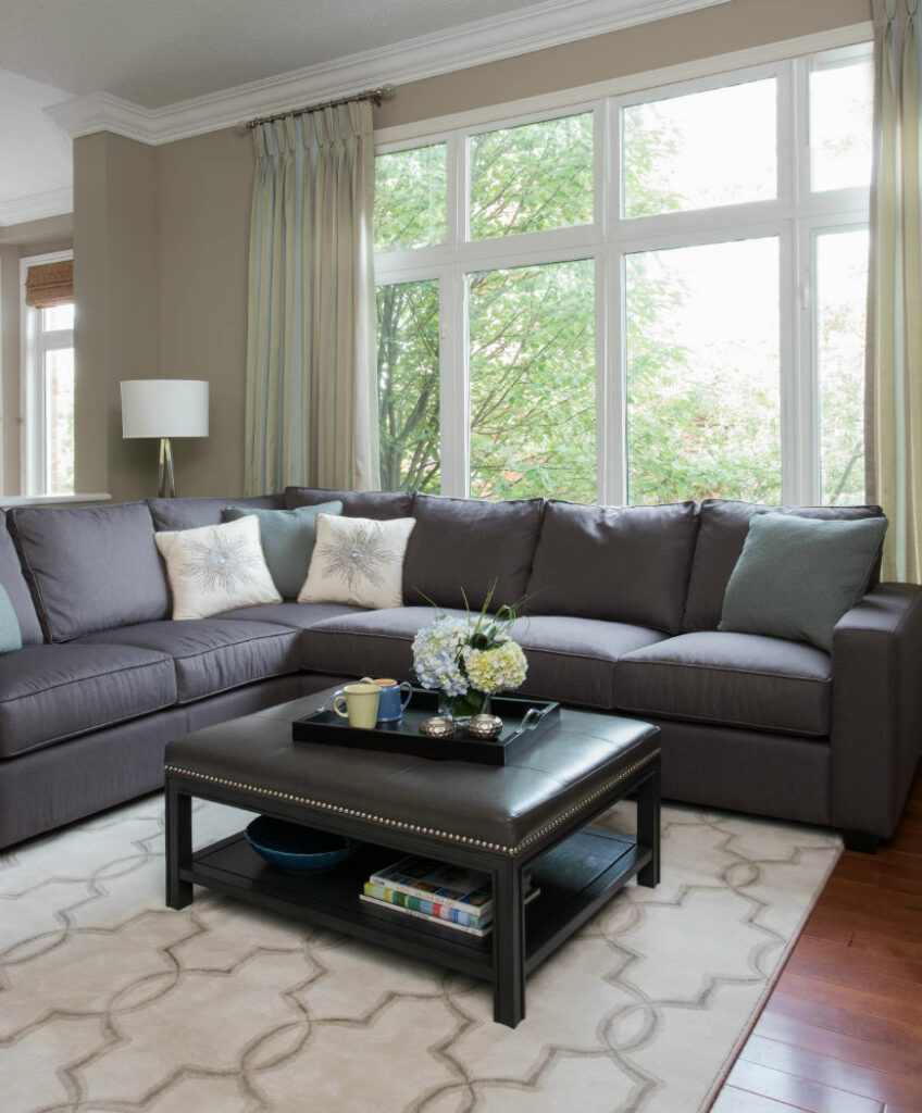
If you’re looking to update your home’s decor without necessarily changing out fixed elements such as floor tiles & countertops, Pashmina may be the answer for you.
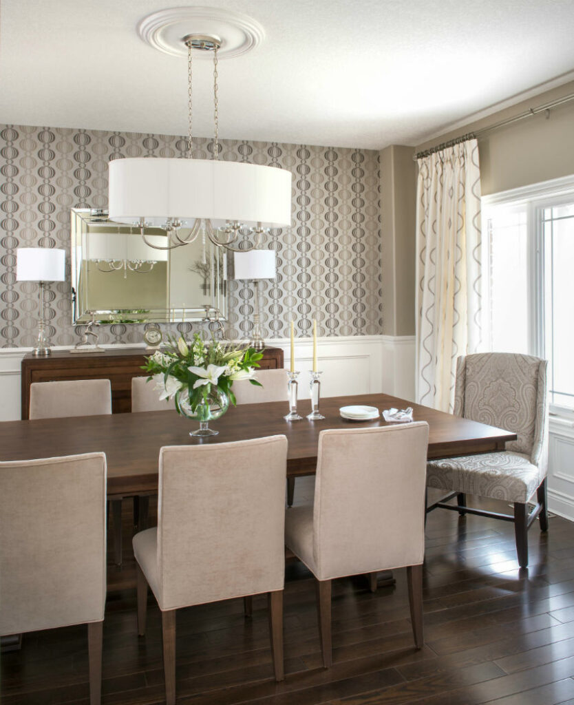
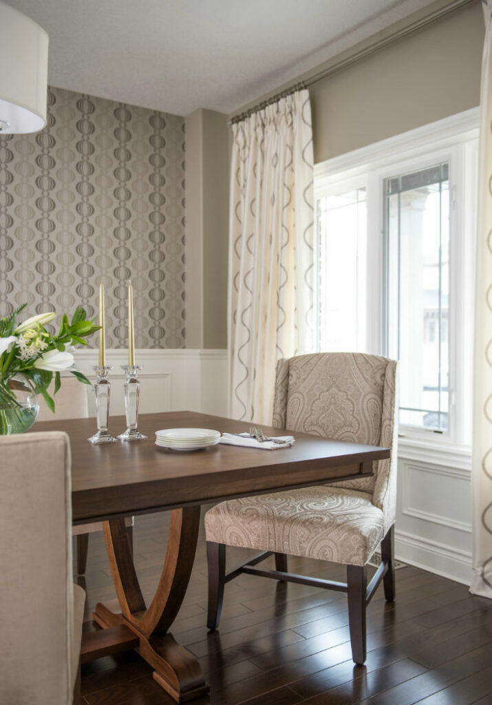
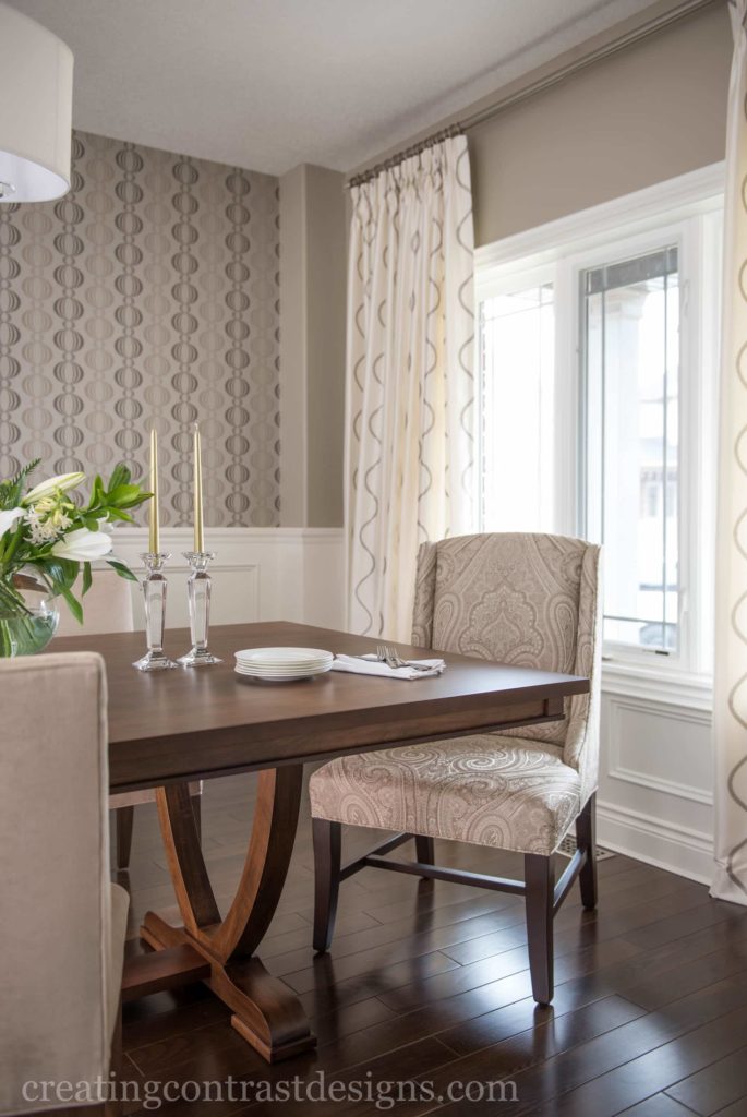
In my client’s elegant dining room design, our ‘jumping off point’ was this wallpaper (above) that I sourced for the accent wall behind the beautifully handcrafted custom wood buffet.
I created a soft monochromatic, neutral palette for an understated yet very refined & elegant look in this space which also happens to be the first room you see as you enter the home.
This meant that I wanted to set the tone of what guests can expect, design and style-wise, for the rest of the home’s décor.
Pashmina provided a rich yet subtle tone that complemented all other aspects of the design.
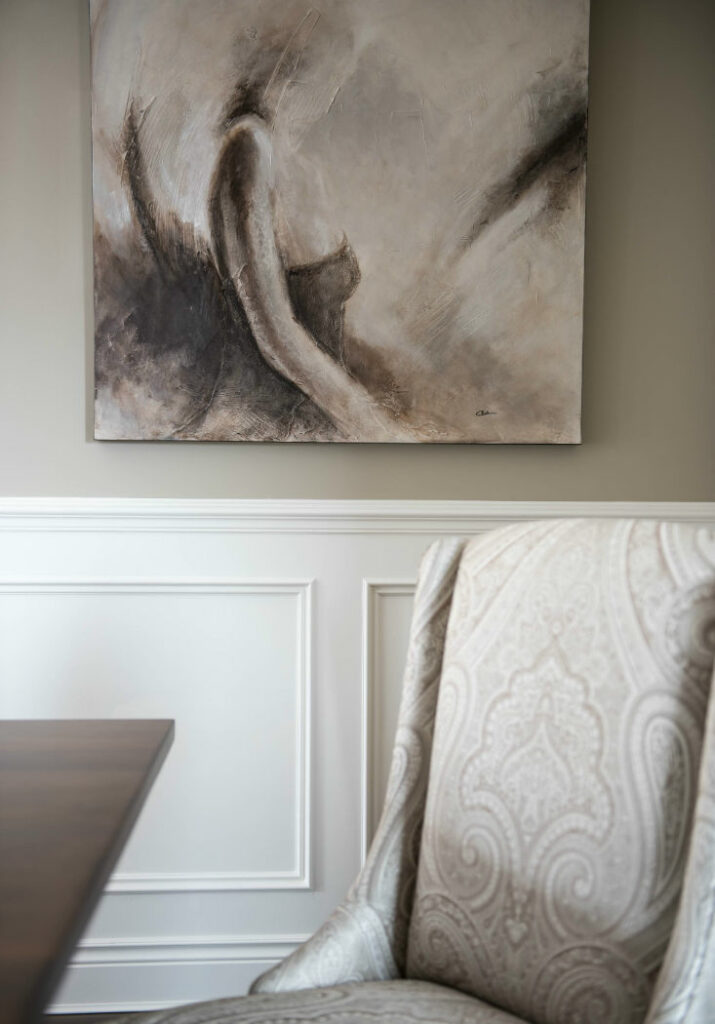
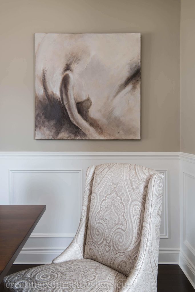
The Host and Hostess Chairs were custom made in this stunning large scale fabric from Duralee. The artwork is an abstract canvas of a lady in a bodice and it again repeats all the neutral ‘greige’ tones that we used in the space.
Pinch pleated custom drapery with a cream backdrop works wonderfully with the Pashmina and we repeated this lighter tone in the lampshades as well as in the beautiful oval-shaped, drum chandelier which takes centre stage in this elegant dining room.
Versatility at its Best!
The other thing that I absolutely love about Pashmina is that it rarely discriminates against any other colour.
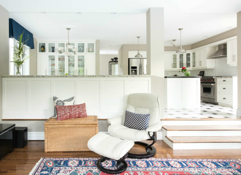
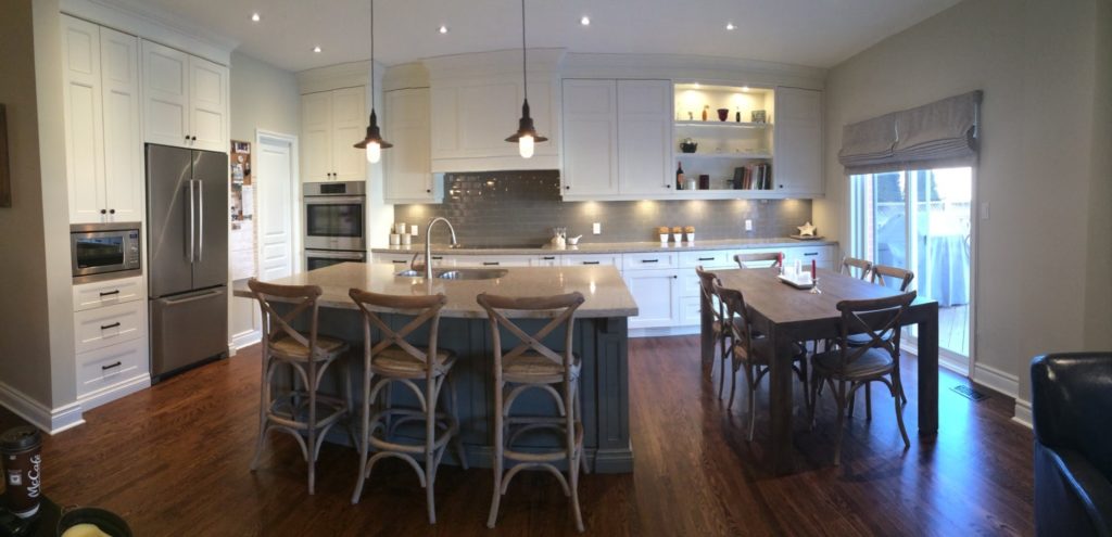
The granite counters in my client’s kitchen (below) had such variations of neutral tones within them.
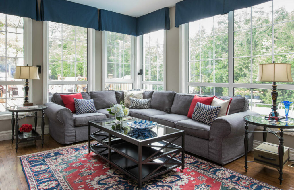
Not only did that allow me to introduce the colour Pashmina to work with this fixed element, but it also worked very well with the bold colours of their original heirloom area rug (shown above) and the accent pillows that I sourced to work with the colour scheme.
My clients are thrilled with the paint colour and tell me that they are always receiving compliments on this space. YAY!
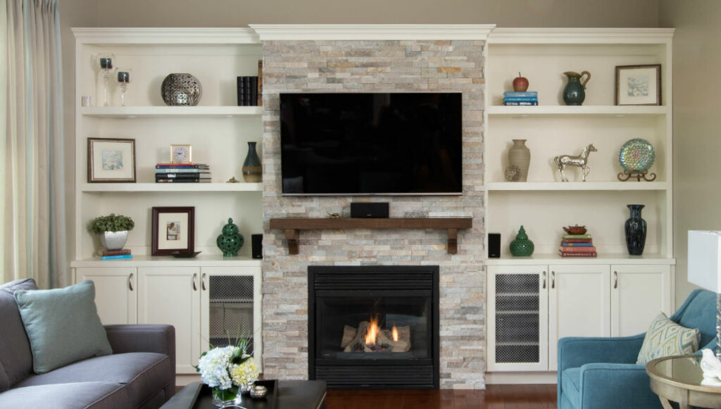
This chameleon of a colour worked well with the design palette I created with the custom finishes & fabrics as well as with the countertops and backsplash in their adjacent kitchen (not shown).
Always be guided by fixed elements in adjoined rooms to achieve successful flow within your design.
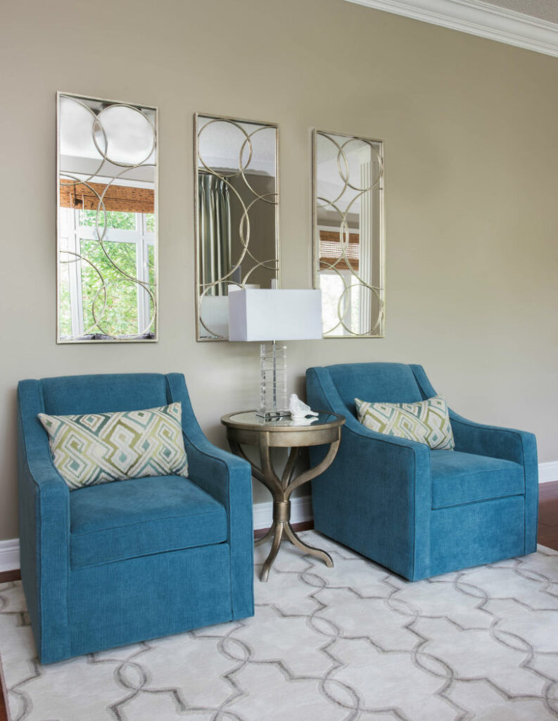
Pashmina with Blues
Pashmina with dark tones of the furniture and complementing beautifully with the area rug design
Custom Cabinetry design by Claire Jefford, cabinetry painted Ivory White by Benjamin Moore
It can be used with so many other colours which is why I just love it so much!
Which colour do you think it looks the best with?
I feel Pashmina will continue to be one of my favourite colours for a long time seeing as the grays are slowly being taken over by these ‘Greige’ tones.
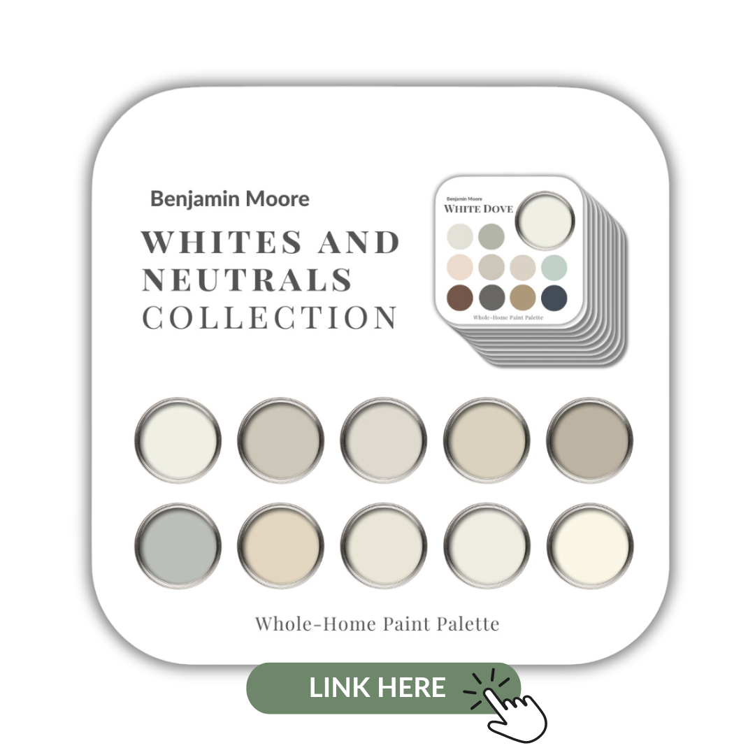
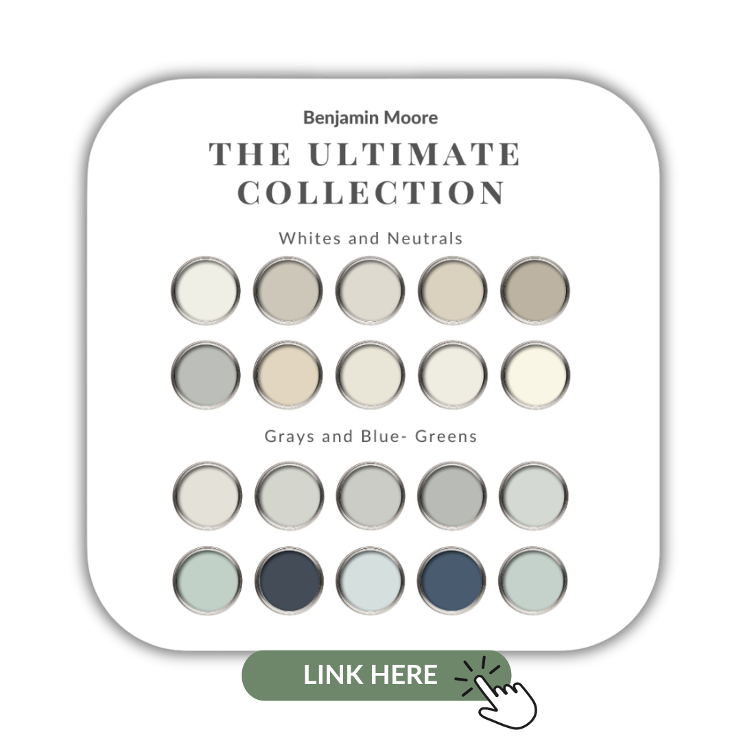
If you want to get all my Benjamin Moore colour guides in one place, look no further than my Benjamin Moore Ultimate Collection. All 20 of my guides in one handy collection.
Remember, it only takes one mistake to take your home decorating project from divine to disaster. Don’t let the paint be what stresses you out!
Perfect For Pinning
Take my Colour Quiz to discover your Perfect Colour Palette.
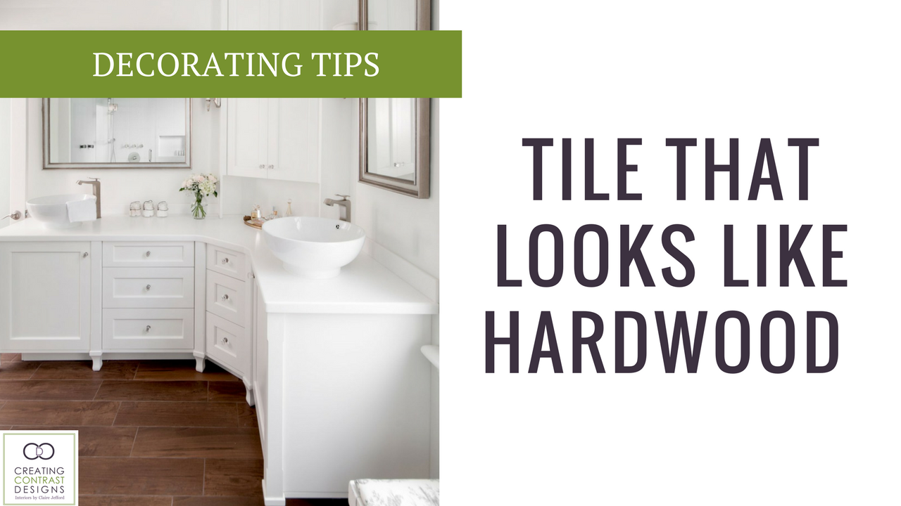
Have you wanted to use a ceramic tile that looks like hardwood in your home design but aren’t sure how or where to incorporate this fabulous material? There are so many interesting shapes, patterns, tones and styles available today that it can be difficult to decide which is the best choice for you. Here I will giving you my expert advice on this topic to share everything you need to know Continue reading “What You Need To Know When Using Hardwood Looking Tile”
Would you like to understand the costs and benefits to hiring an Interior Design Professional to help you with your renovation or decorating project?
There seems to be so much mystery around the costs associated with hiring professional design services and because every designer works differently, this can add to the confusion for many home owners looking for assistance with their renovation or decorating project.
I break it all down for you in a video today as I found it easier to say it, than to write it. So let’s do this!
If you want to Love Where You Live, contact me to hep you with your upcoming renovation or decorating project, I’d love to help! 905-599-2588 or email us: info@clairejefford.com.
The biggest mistakes I see in residential design are related to colour, hands down!
Whether it’s incorrect choices in the undertones of paint colours, mismatched colour tones in counter and flooring, or home owners trying to introduce the now popular cool grays with their fixed elements of warm and beige finishes, I’ve seen it all.
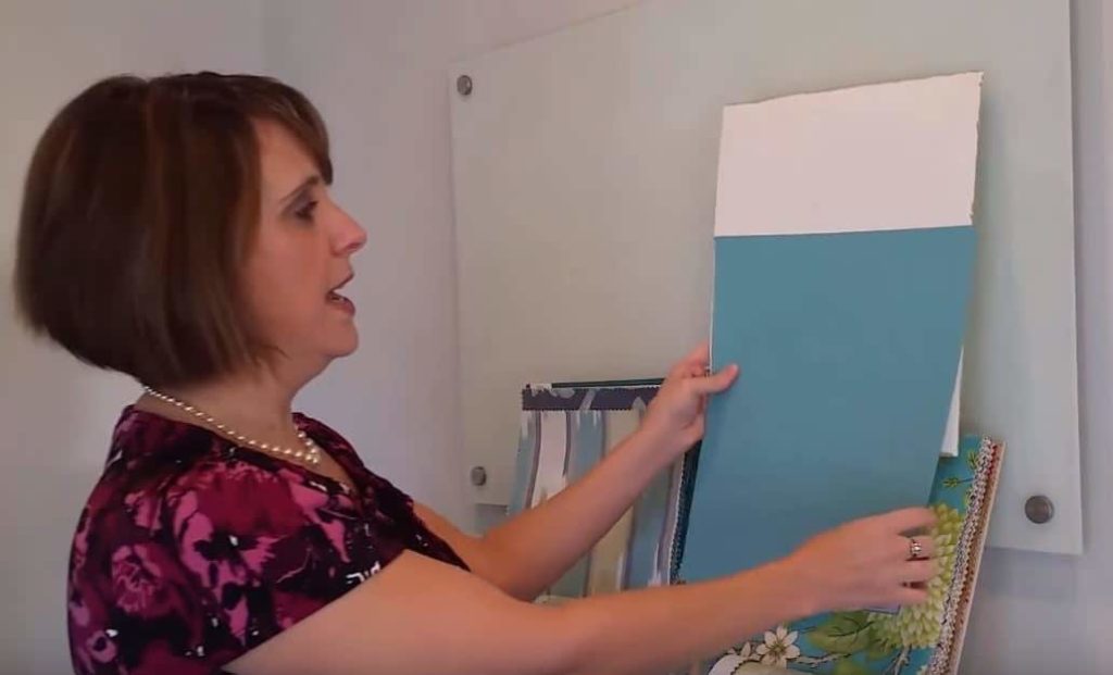
In this post I share tips on ‘How To Choose A Paint Colour’ by using large sample boards. I always encourage clients to get the largest samples of finishes that they can when trying to make informed decisions about choosing finishes for their home.
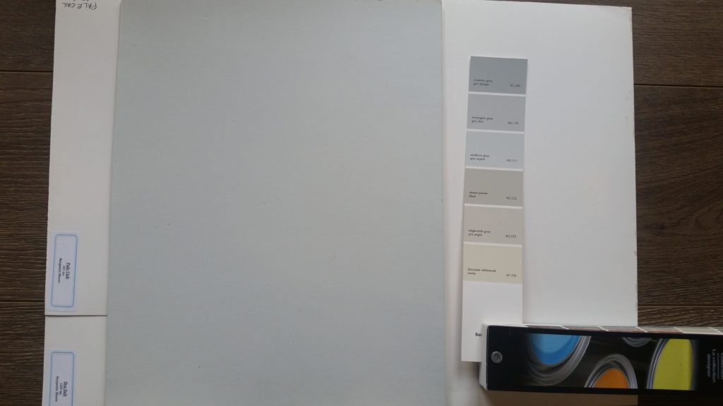
Stop Using Small Paint Chips!
Look at the difference in my large painted board in comparison to the chip colour in my Benjamin Moore fan deck. It really is no wonder mistakes are made in choosing paint colours so frequently when this is how most people pick a colour for an entire room.
I can’t imagine choosing the largest area in square footage of a room based on the smallest sample ever! If you are a colour consultant and you are still using small paint chips to specify colours for your clients, shame on you.
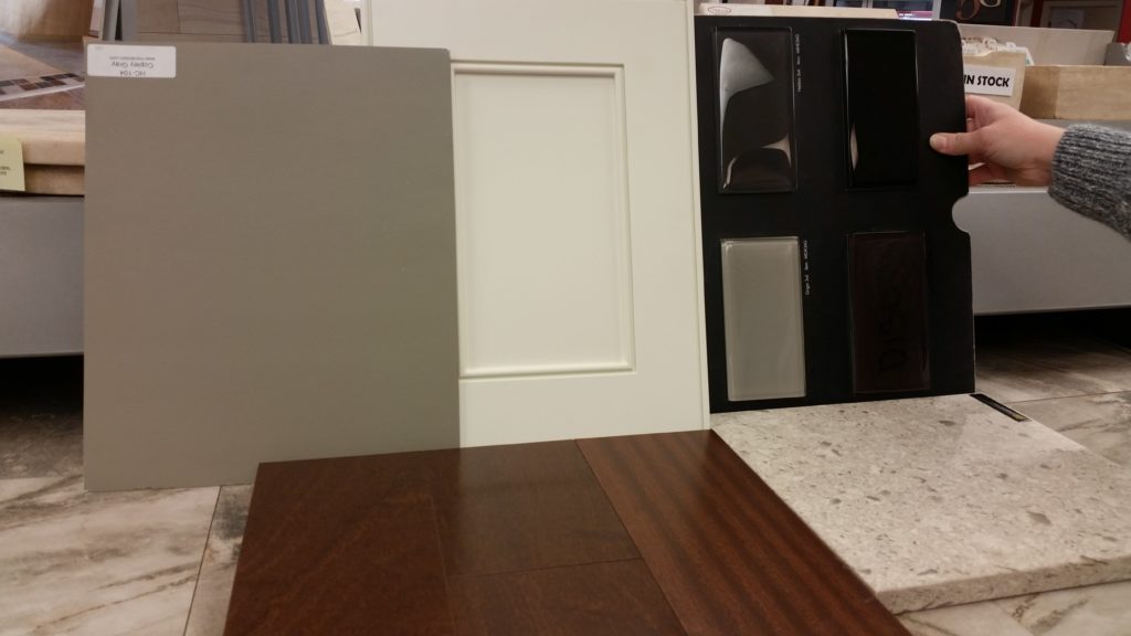
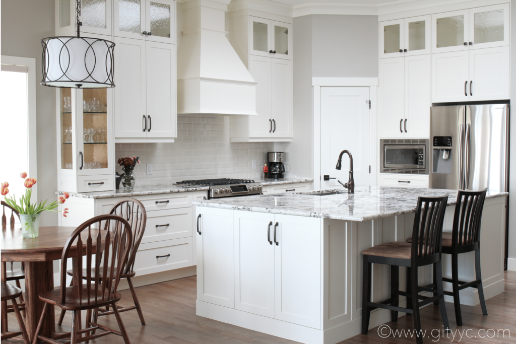
While shopping with my client to select finishes for her kitchen design, I brought all 150 of my large paint samples. We chose the counter top first, then the cabinet & island colour, followed by the subway tile for her backsplash and lastly, the paint colour for her walls.
In the photos below, it’s clear to see with the large painted board how the island and cabinet colour we choose work wonderfully with the tones in the sample of our Cambria Countertop (shown in the bottom right of the photo).
Copley Gray for the island cabinets & Ivory White for the other cabinetry
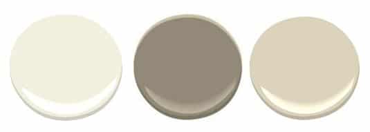
Ivory White was chosen for the rest of the kitchen cabinetry and we used Manchester Tan for the wall colour in the kitchen & throughout the main floor. I have all of these large painted boards so I was able to easily show my client why these choices all worked well together with the finishes we were using for her kitchen design.
Ivory White – Copley Gray – Manchester Tan – all colours by Benjamin Moore
I never worry about choosing a wrong colour for clients and am always super confident in my choices. This means no second guessing and no costly mistakes. Below is a picture I took of my clients gorgeous kitchen in Oakville Ontatio. See the full gallery in my portfolio here.
Photo by me – How Beautifully it all came together, eh?!
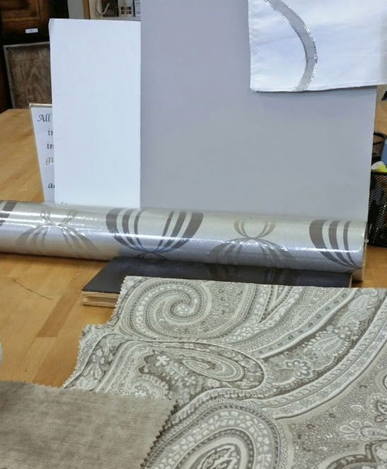
Gather ALL Your Samples
Because you know that choosing your paint colour LAST is the only way to accurately choose the best colour for your interior design project, it’s imperative to have all your samples together in order to make that informed decision.
Lay your samples out in the same way in which they will be used within your space & use large paint boards to determine which colour works best with all your finishes.
Drapery & upholstery fabrics, wallpaper & hardwood samples shown with large paint chip
This palette was for my clients monochromatic dining room design we created. We could have gone with either Pashmina or Revere Pewter by Benjamin Moore for the wall colour.
Both colour options worked well with all the finishes, but ultimately we choose Pashmina as it has slightly more intensity and depth which I felt worked best for this calming and sophisticated space.
Dining room by Claire Jefford Inc, Photography by Stephani Buchman
The paint colour worked lovely with the artwork as well
Use a White Background When Sampling Colour Boards
It’s really important to ensure you use a white backdrop behind your painted colour board. A common mistake that people make is taking a roller and painting an area on top of their wall current wall colour, but this is incorrect for two reasons:
1) You will find yourself comparing the new colour to your current wall colour as opposed to viewing it independently with other finishes & with a neutral background.
2) You are only looking at the proposed wall colour in one area of the room, so fully understanding how it will work at various times of the day under different light sources is not possible.
Use a White Backdrop to view possibly new paint colours
Painting is not inexpensive if you are hiring a professional to do the job. Even if you are doing the paint work yourself, it’s really time consuming. Take the extra step and save yourself time and money in the long run by painting large sample boards, you won’t regret it!
Below is my latest Youtube video on this very subject, click on the picture to watch the video.
Do you live in my area and want help choosing the right paint colours for your home? Professional design services are just a click away. Contact me here and let me help you to Live Beautifully.
We are located in Burlington Ontario in Canada & service the following areas: Burlington, Oakville, Milton, Stoney Creek, Grimsby and the surrounding Greater Toronto Area.
When designing with subway tile for your next home renovation project, not only do you need to look at the sizes and finishes as I did in my posting last week, but it’s also important to consider the pattern in which you want to layout your tile and grout colour options to choose from.
There’s no doubt that it can get pretty overwhelming to be making so many decisions…
With so many choices, you can easily want to pull out your hair!
But don’t worry, I’m here to help! So, let’s do this.
Pattern Options
There are 4 common ways in which you can layout your subway tile in your kitchen or bathroom design. The first and most commonly seen pattern is the Brick style – shown below.
Brick pattern style layout
If you are looking to create a more modern and streamlined look, this Stacked pattern shown in my clients bar design below may be the better choice for you.
Stacked Subway tile pattern with white grout
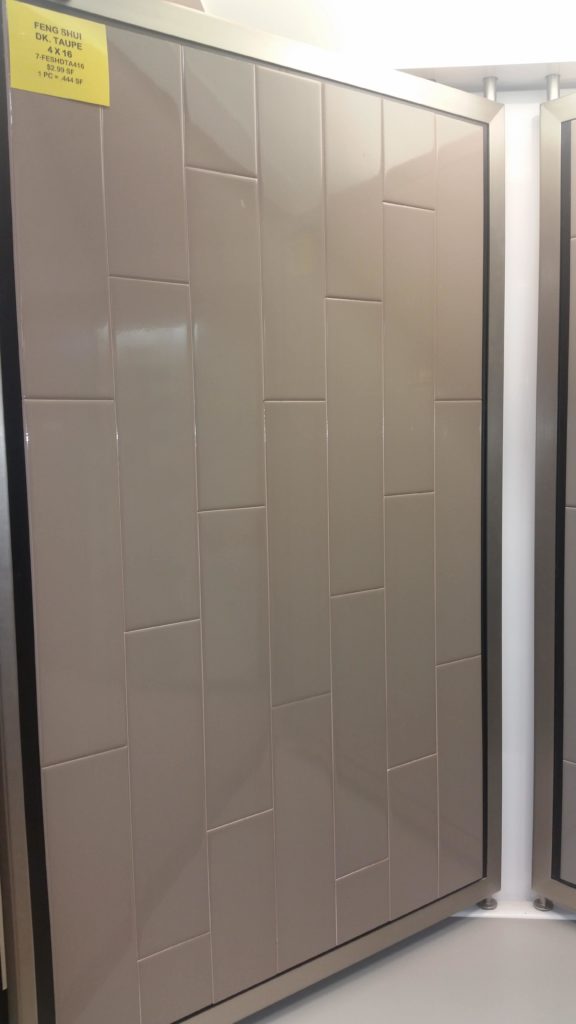
One pattern style that is not as common as the others is the ‘One Third‘ layout option. This means that every third tile is laid out the same. Here you can see it displayed vertically with 4″x16″ tiles.
Vertically shown in a 1/ 3 pattern layout – similar to how hardwood is laid on your floor
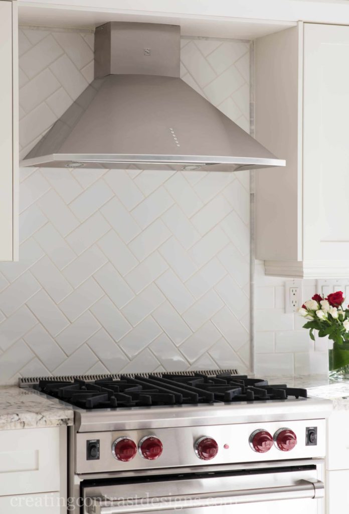
If you wish to introduce a focal point in your design, the Herringbone pattern – shown below – is a great way to highlight a certain area of a space.
Subtle and Interesting
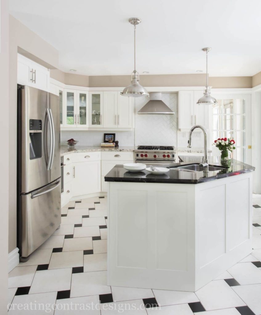
This is my clients kitchen where you can see that the majority of the white subway tile is laid in a brick pattern with the exception of this focal point area by the lovely Wolf Range.
See more of this kitchen I designed with my clients here
Grout Colours
When it comes to choosing grout colour for your flooring or tile, you can either match it for a seamless look or contrast the grout so the tile design stands out more. Think about what look you are you trying to achieve. White on white is seamless and stunning.
White on White is the most refined look, beautifully shown here by Jil Sonia Interiors from BC
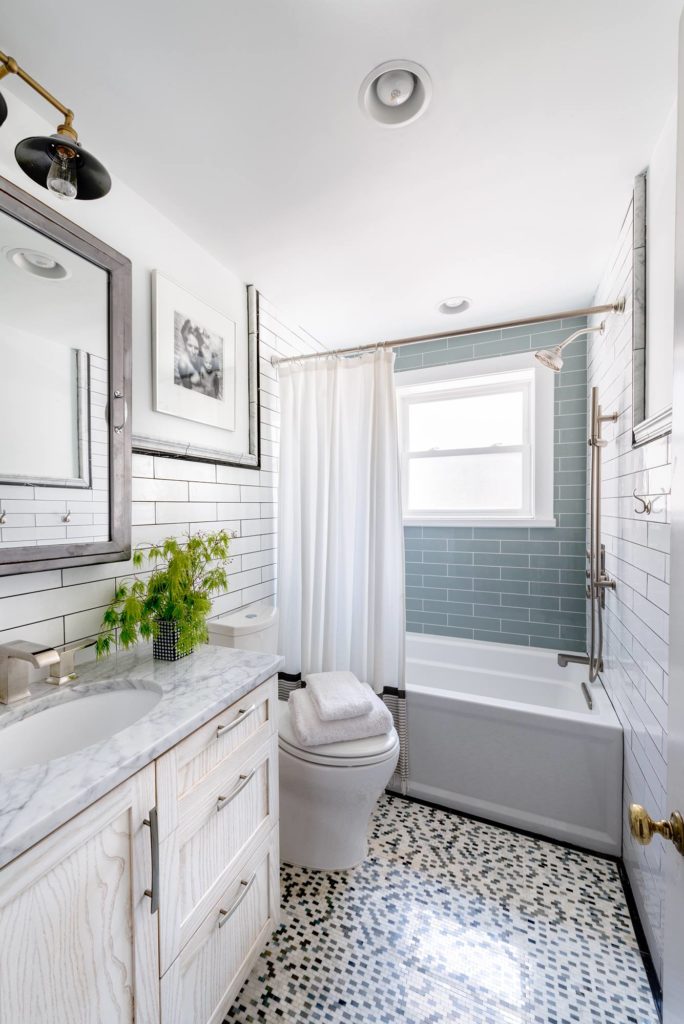
Dark grout with light tiles is indicative of a more relaxed and rustic look. The bathroom below shows 3″ x 12″ tiles with contrasting grout on the main walls as well as the back wall that is a focal point with the beautiful blue subway tiles with white grout.
So, over to you – Which layout style do you prefer and why? Let me know by commenting below.
For my FREE tip sheet on Patterns and Grout colours for Subway Tile, click here.
In case you missed part one of my Subway Tile series, click here for the blog post and click here for the video where I look at sizes, finishes and why the subway tile is such a popular choice for home designs. See you next week!
Subway tile is by far one of the most popular tiles I see in residential design today for kitchen back splashes and bathrooms. I recommend them often to clients and always with satisfying results. However, there are so many things to consider when choosing the right subway tile for you and the application in which you are using it.
Not only do Subway tiles now come in various sizes, they also come in different colours and finishes, all of which can dictate the style of your overall design. Below you can see just a few photos showing how subway tiles have been used in both kitchens and bathrooms.
Sheri Bruneau of Get It Together uses a 3″x6″ White Beveled Subway Tile in this Fabulous Kitchen Design
In this bathroom Hannah Dee of Hannah Dee Interiors uses colourful 1″x2″ subway tile on the floor
In my clients kitchen we used a 4″ x 16″ glass subway tile in a stacked pattern
There are so many things to consider when using subway tiles! In my latest video I talk about the following three elements of this widely used tile:
Why is it so popular?
Different Sizes
Various Textures and Finishes
Click below to watch my video and learn more about this classic tile and how to use it in your next home renovation project.
I also created a FREE tip sheet too ‘FIVE THINGS TO CONSIDER WHEN CHOOSING THE RIGHT SUBWAY TILE FOR YOU. Download that by clicking here.
Have you used Subway tile in your home and if so, which style and colour did you choose? Are you happy with how it looks in your design? Comment below and share your experience, I’d love to hear from you.
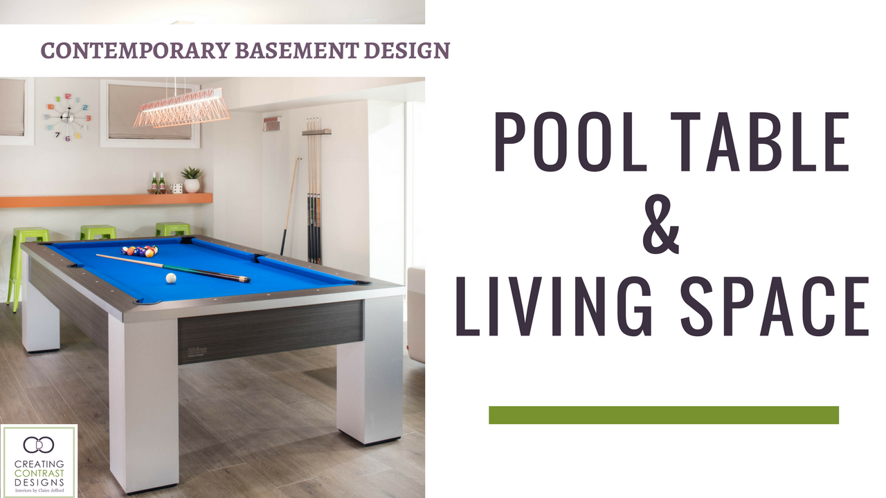
We have come to the last post in my Contemporary Basement Design series, thanks for hanging out with me! In this post I show you the unbelievable stair construction by the Baeumler team. As well, I reveal the other half of the living space that includes a custom media unit with a 6 foot fireplace, concrete hearth, lots of pops of colour and a pool table area. So, let’s do this! Continue reading “Basement Design Living Space & Pool Table”
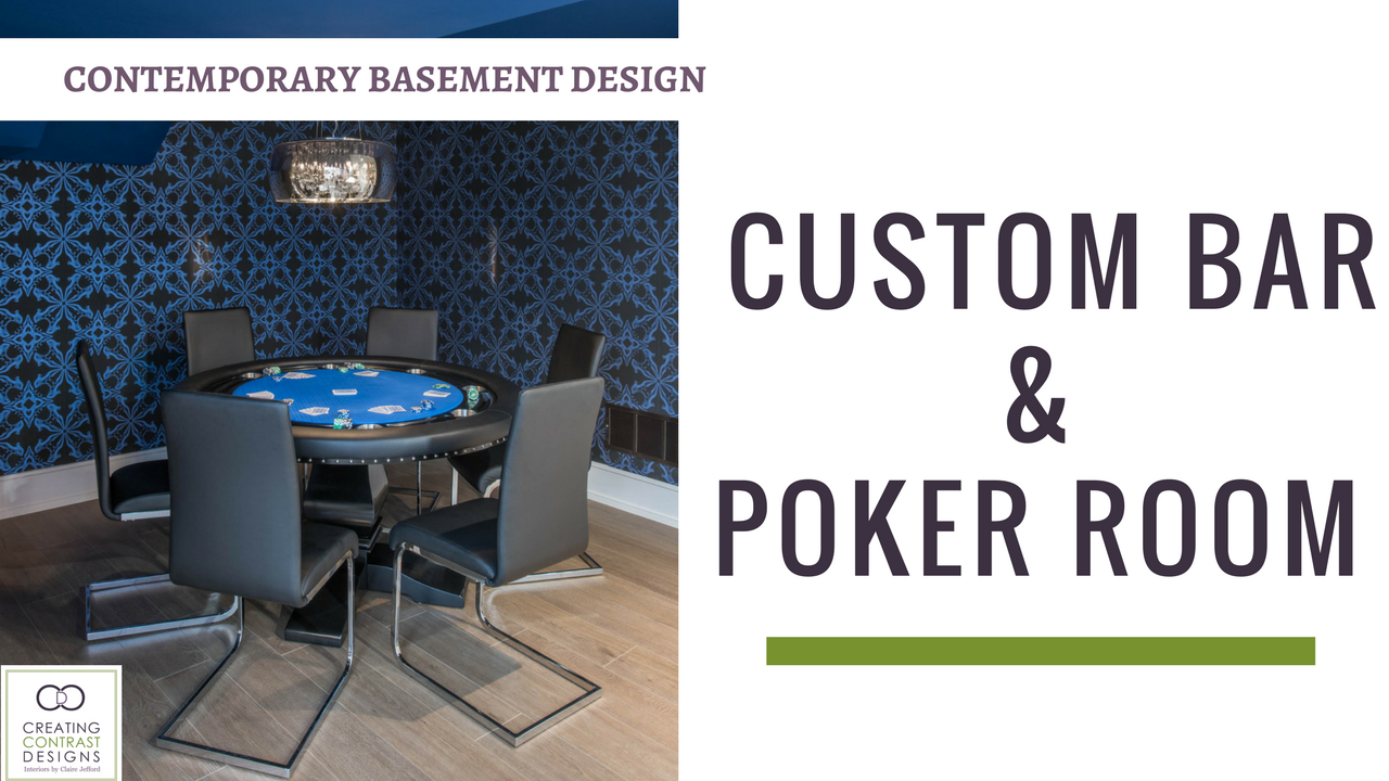
We are nearing the end of the series in my clients contemporary basement design, I hope you have enjoyed it so far! In the final two posts, I take you on a tour of the main living space in this spectacular basement. Today, I am focusing on the modern custom white bar cabinetry with it’s colourful & bold backsplash as well as the moody, yet oh so sexy poker area Continue reading “Basement Bar & Poker Room Design”
Claire's Guide to Services & Pricing
FREE DOWNLOAD:
Interior Design Services and Rates Guide
This website uses cookies to improve your experience while you navigate through the website. Out of these cookies, the cookies that are categorized as necessary are stored on your browser as they are essential for the working of basic functionalities of the website. We also use third-party cookies that help us analyze and understand how you use this website. These cookies will be stored in your browser only with your consent. You also have the option to opt-out of these cookies. But opting out of some of these cookies may have an effect on your browsing experience.
Necessary cookies are absolutely essential for the website to function properly. This category only includes cookies that ensures basic functionalities and security features of the website. These cookies do not store any personal information.
Any cookies that may not be particularly necessary for the website to function and is used specifically to collect user personal data via analytics, ads, other embedded contents are termed as non-necessary cookies. It is mandatory to procure user consent prior to running these cookies on your website.