Why Don’t More People Do This?
Choose the right paint colour
the first time Let me show you how in just 5 easy steps!
BONUS: The Top 15 Shades of Gray by Benjamin Moore
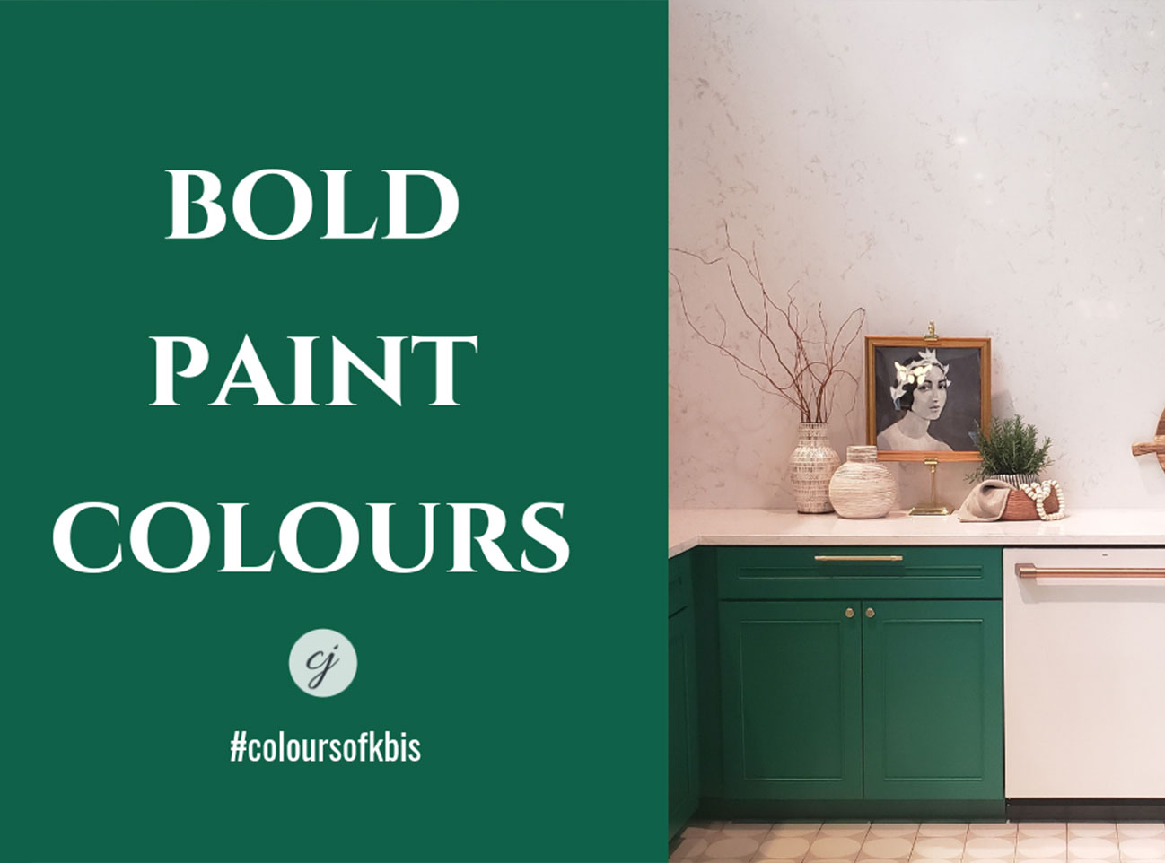

Bold Paint Colours Never Disappoint
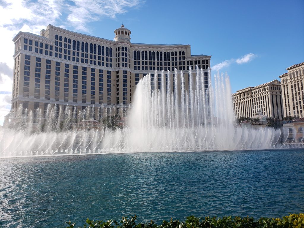
Fresh off the heels of another KBIS (Kitchen and Bath Industry Show) event from Las Vegas and I can’t wait to show you the latest colours in Interior Design!
Sadly, the weather in Las Vegas was such that it was the first time in nearly 10 years that they had snow – yes snow! But I wasn’t going to let anything dampen my spirits, this event was going to be way too exciting.
Sidenote – Did you know that I got married in Las Vegas? And before you ask, no, it wasn’t officiated by Elvis, nor in a drive-thru and yes, I’m still married!

In addition to the excitement of being at the show to see the latest in Kitchen and Bath Design, I was also speaking on two panels and meeting up with plenty of my interior designer friends with who I’ve been connected on social media for years. You can see me speaking on one panel here in the #dmmtalks lounge about running a successful interior design business.
Please note, the footage appears to be sideways and the panel is 2 hours long, but there is a ton of incredibly helpful information if you are a business owner in the interior design industry.
Colour talk, let’s get to it!
Have you ever noticed how the most talked about and exciting displays at these events are always the most vibrant and colourful ones? Yet in our own homes, most of us prefer to play it safe with whites and neutrals.
Of course, resale value comes into play, as well as whether or not you will tire of something so bold and ‘in your face’ over time. However, I think that design needs to tell a story and include layers of patterns, texture and colour – unless the look you are going for is super contemporary and has a monochromatic feel.
Maybe today’s video and colour combinations will make you think twice when considering what finishes to use in your next home renovation project. I know it’s already got me thinking about my upcoming bath renovation this spring!
Click the play button to see what colour inspiration I found at KBIS and to get a closer look at the colour palettes shown in the video, see more of the blog post below or check out my Pinterest Bold Colour Board here.
Perfect for Pinning!
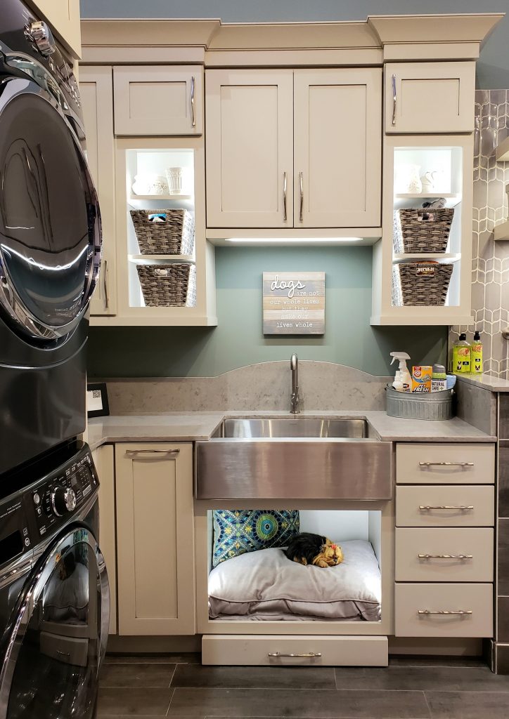
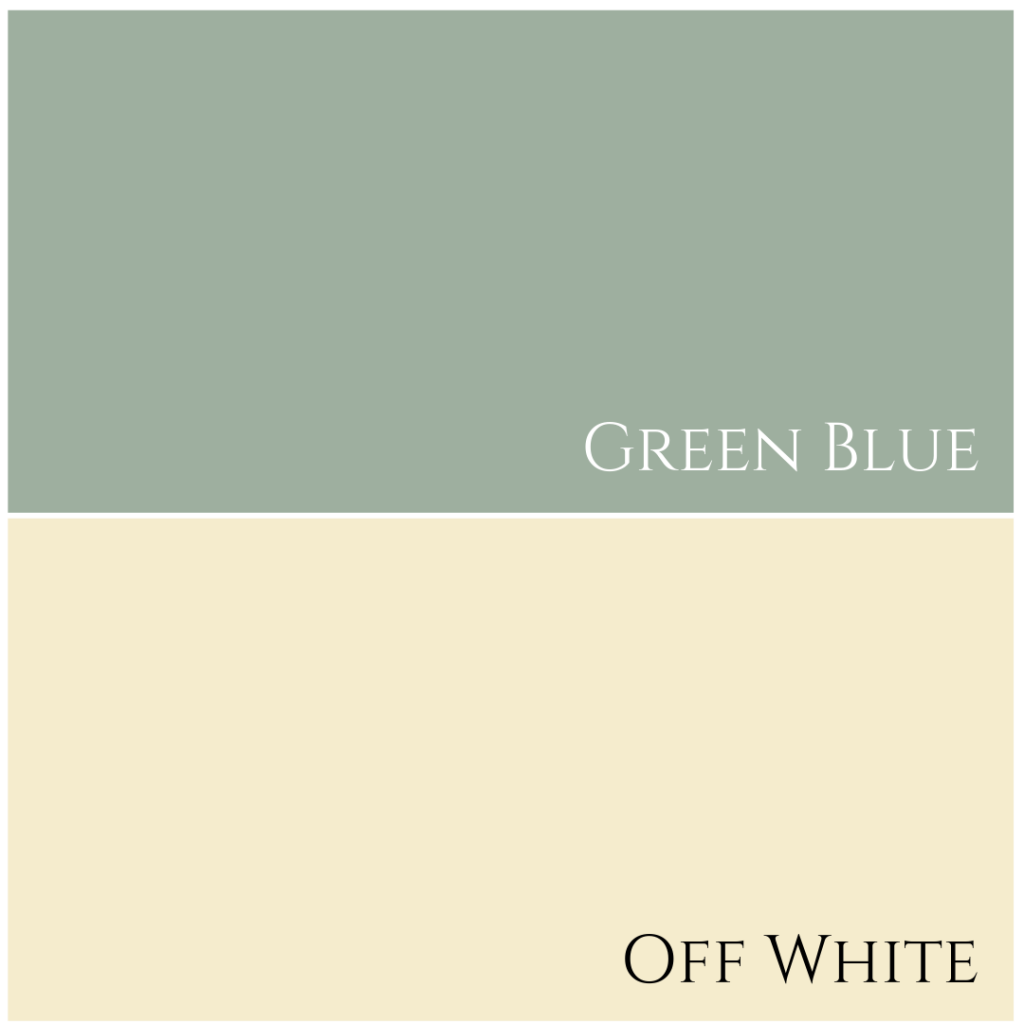
Starting off with a couple of the sponsors from the #designhounds Modenus Tour, the first being this exceptional cabinetry design. For those of us with pets, isn’t this what we all dream of? A well-organized space for the laundry, including a dedicated area for pet grooming. How wonderful.
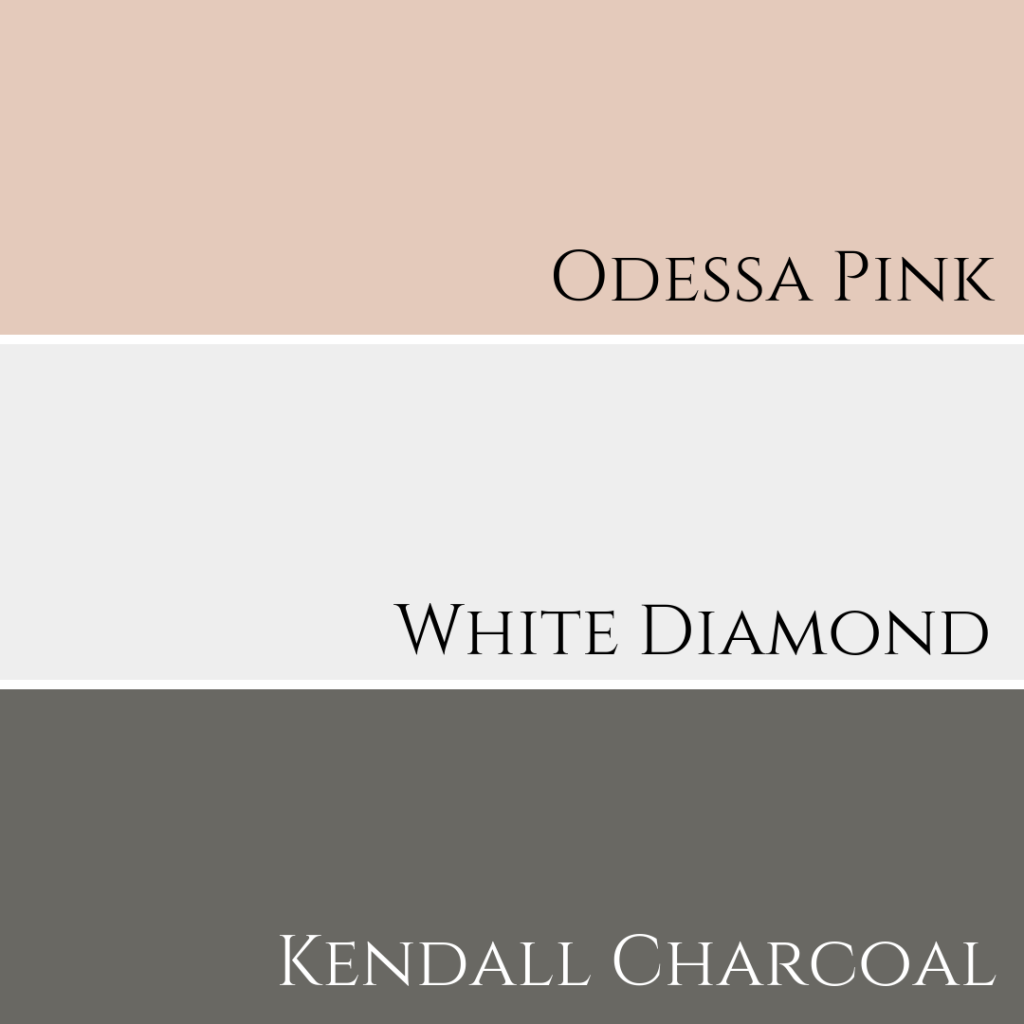
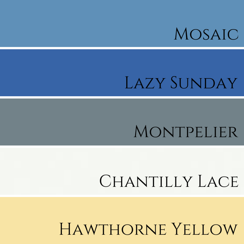
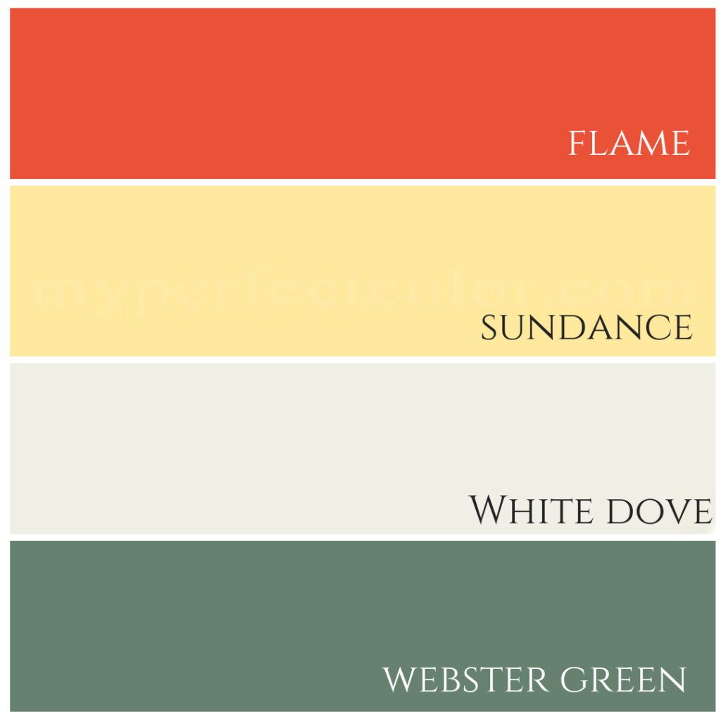
NOTE: Some colours in the palettes I created may appear slightly different to the actual design photos, depending on your monitor. But I can assure you that the colour combinations all work beautifully together. Also, with the exception of this palette below, all others are Benjamin Moore colours.
Two years ago I also visited the Wellborn Cabinetry booth, here is a video if you want to see more of their custom cabinetry designs.
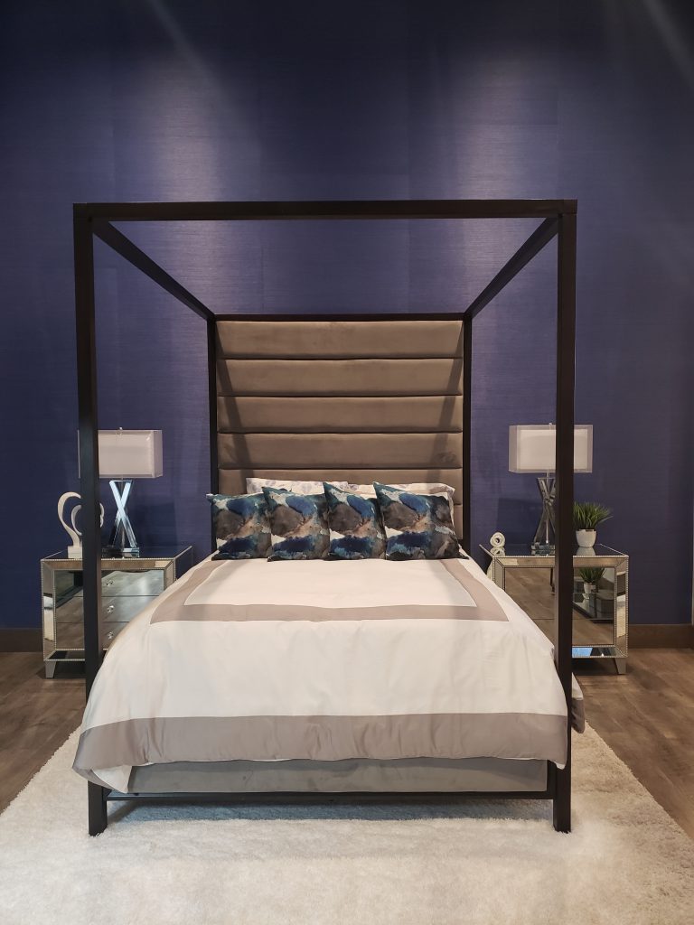
The New American Home with Caesarstone
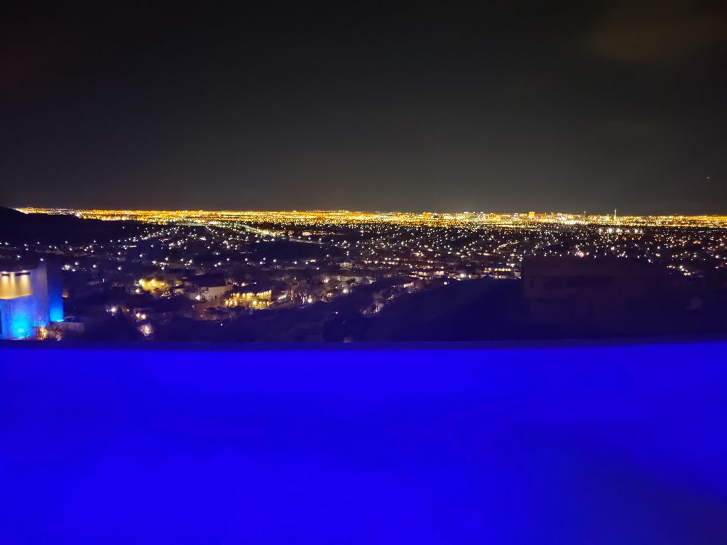
I was super excited to receive an exclusive invitation to The New American Home with Caesarstone. Despite the nearly freezing temperatures that are almost unheard of in the Las Vegas desert, this spectacular view from the New American Home soon warmed me up!
Caesarstone introduced 5 new colours, which I’ll be sharing soon over on my IGTV channel. Follow me here over on IG to make sure you don’t miss it! Here I managed to get a photo with just a few of the models who were each painted in the new colours – how cool, eh?


This blue is similar in tone (just slightly lighter) to a backsplash we installed in this client’s White kitchen design.
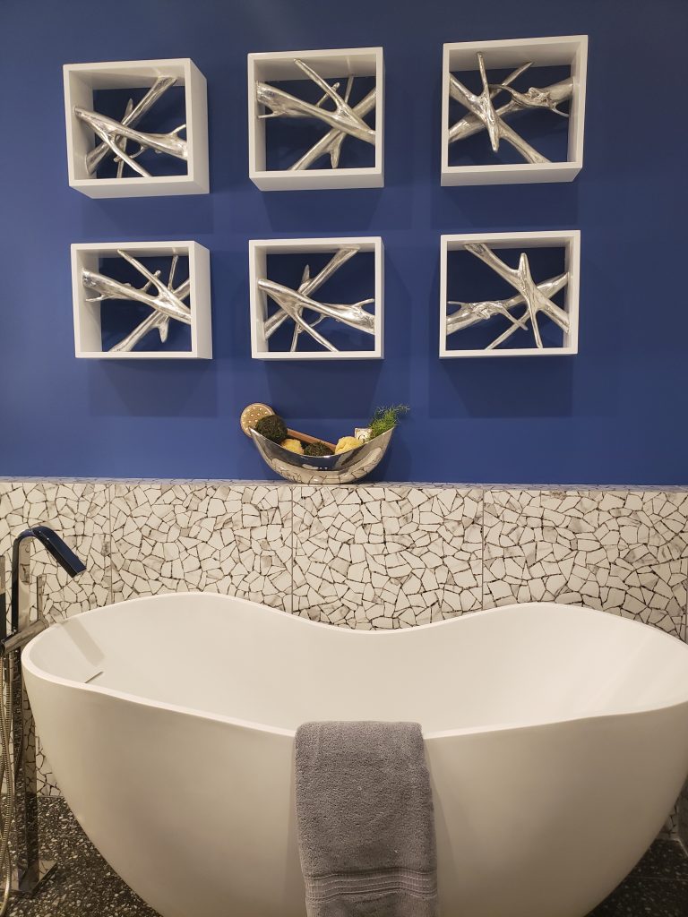
Here is another bathroom in The New American Home, but with a much different vibe than the first. Hexagon wall tile in different tones, including a marble!
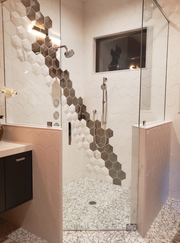
The colour palette though, yes, that I could live with!
Cafe Distinct by Design
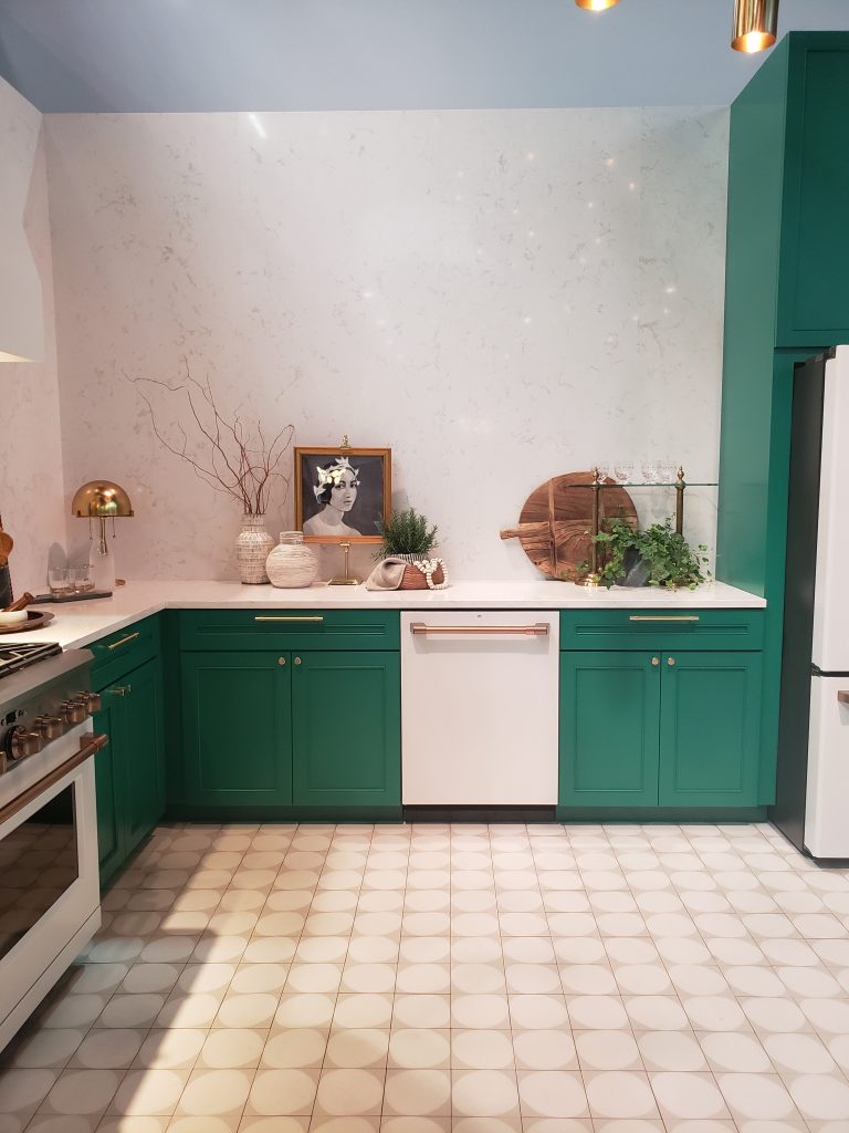
True Green 2042-10 by Benjamin Moore is what I colour matched it to by looking at the photos…I left my fan deck in my suitcase at the hotel, doh! It appears to be very similar to what one considers to be a shade of ‘Kelly Green’.

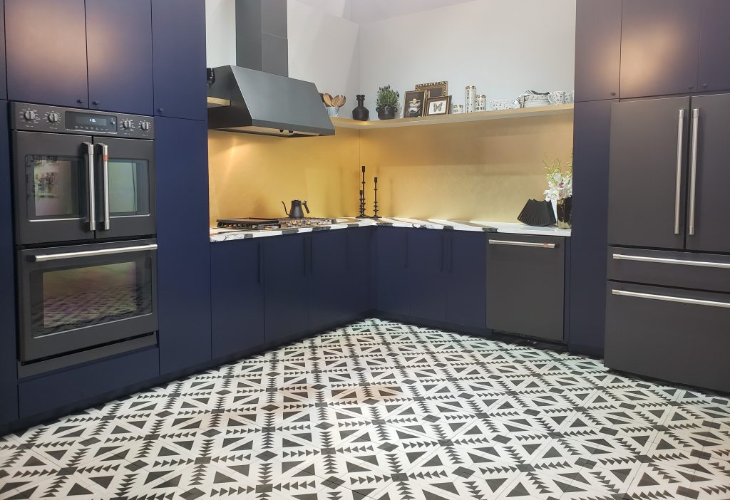
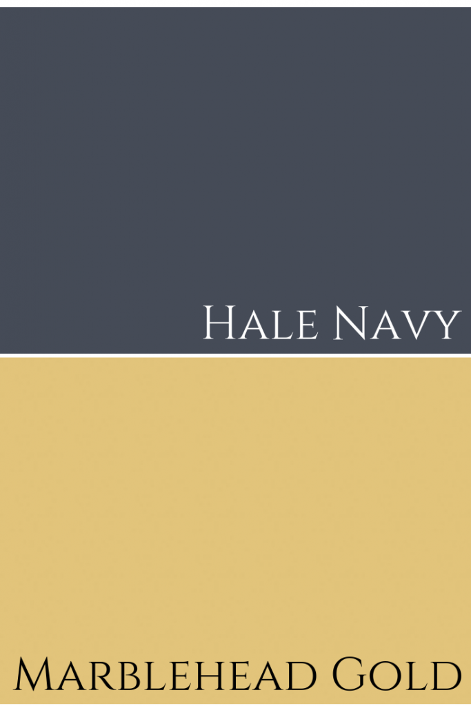
Did I tell you that we are starting work on a kitchen refresh for a Burlington client next month and that we are using Hale Navy for the cabinetry colour? I couldn’t be more thrilled.
As you probably already know from watching my videos, this dark, dramatic blue is one of my favourite colours of all time.
Look at the dark blue cabinets here, paired with that exquisite golden backsplash. The counters and floors are in black and white design patterns. I think I’m in love.
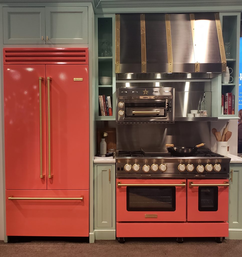
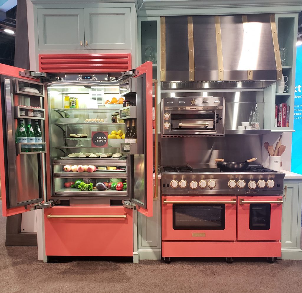
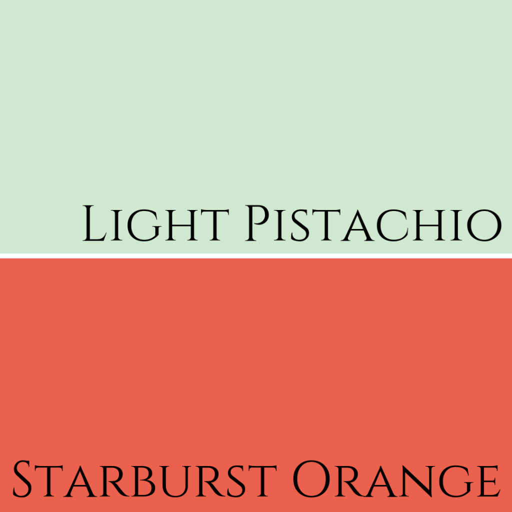
Coloured Appliances
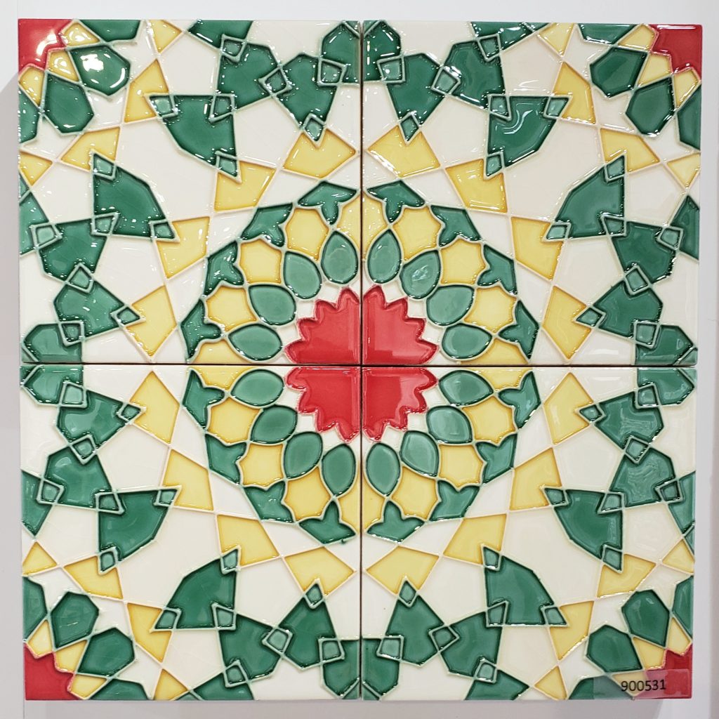
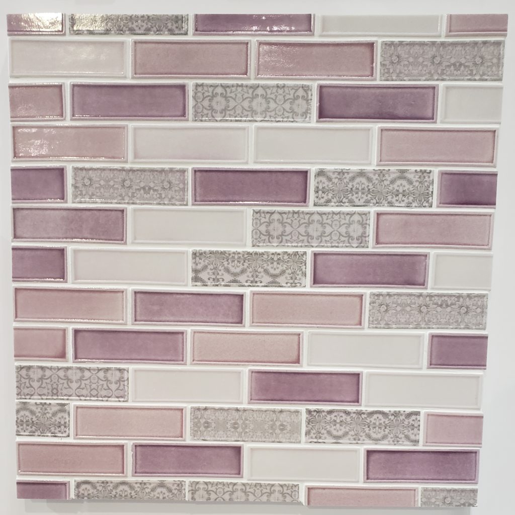
Funky Tile Styles!
These glass wall tiles were super vibrant. They would definitely be a commitment, but how fun would these be in a kitchen as a backsplash or in the bathroom on the shower wall?
Feeling blue? See more than 20 blue paint colour combinations here.
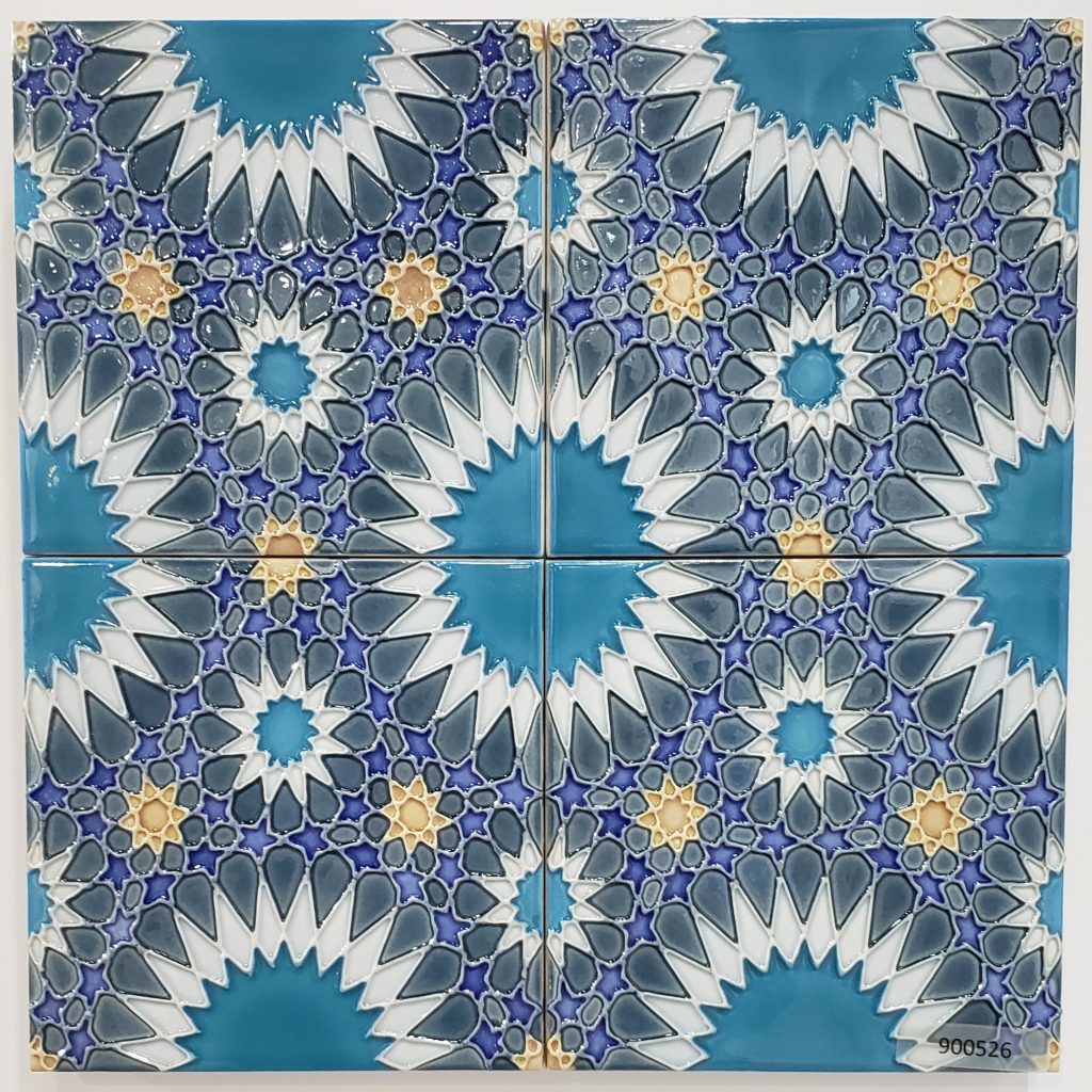
Finishing up on a more subtle, yet striking colour combination and delicate tile design that certainly has a style all of its own.
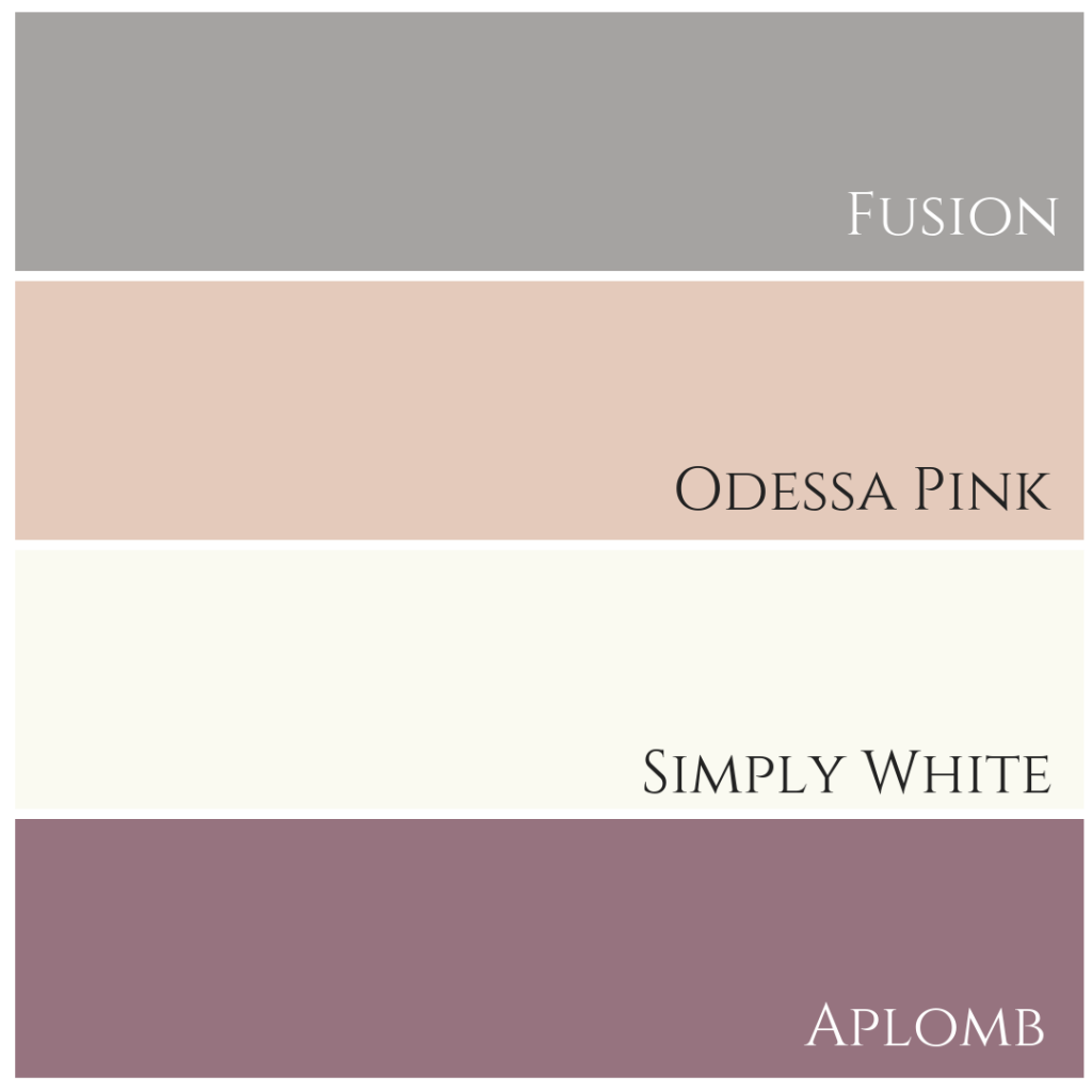
Or try this pink, it’s less pale than Odessa Pink shown above…

Now, tell me the truth. Would you be daring enough to use either big-ticket items and/or fixed elements in bright or dramatic colours to make a statement in your home? Comment below to share your thoughts. Until next time, dream in colour!
Convenience at your fingertips
Remember, it only takes one mistake to take your home decorating project from divine to disaster. Don’t let the paint be what stresses you out!
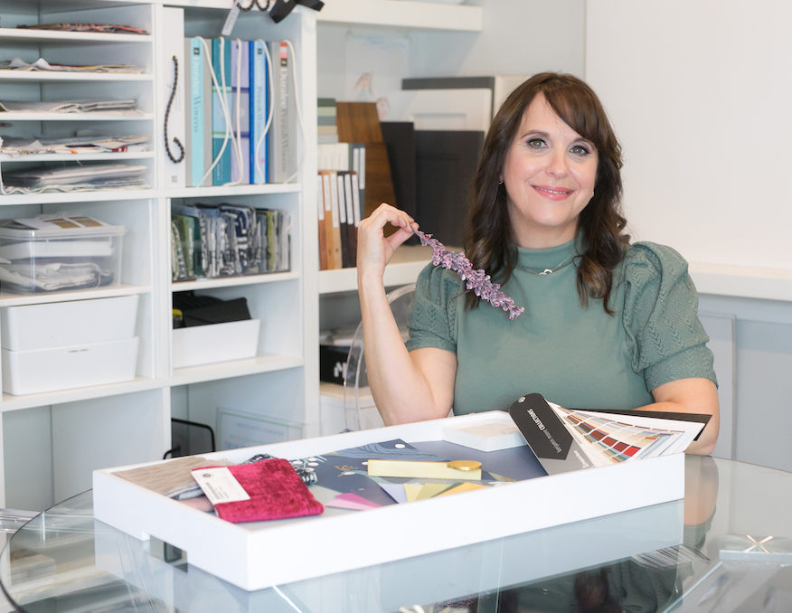
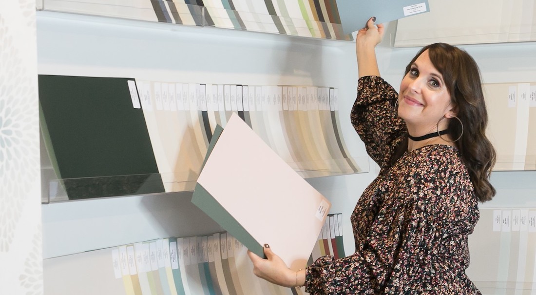
Choosing Paint Colours
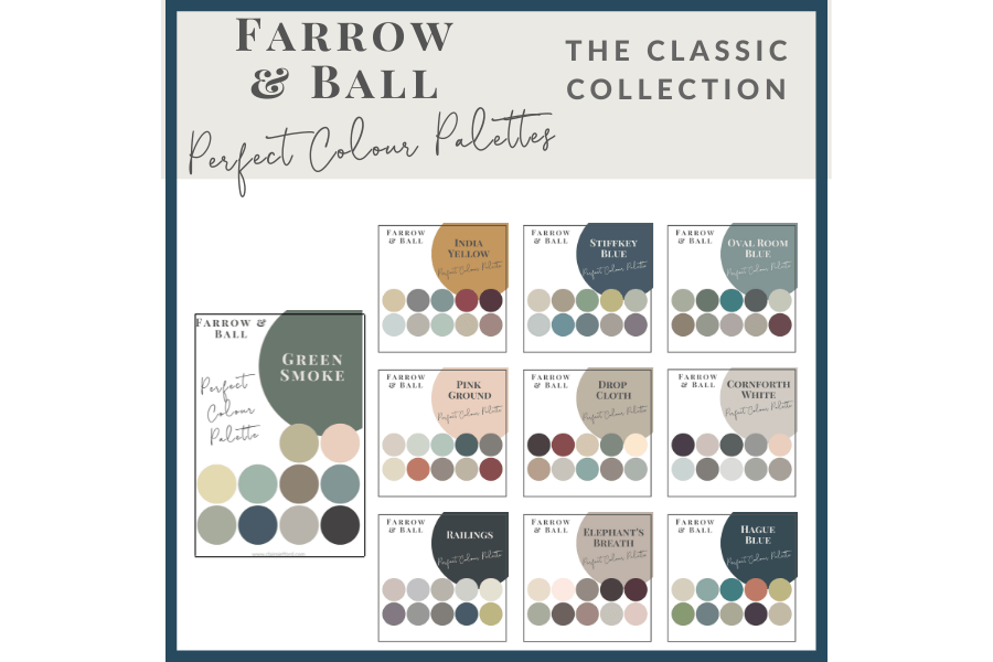
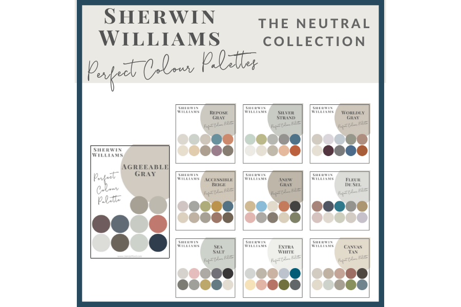
If you struggle with choosing paint colours, be sure to check out my Perfect Colour Palettes.
I now have 40 individual guides to help inspire you.
Collections
I also offer collections that showcase a group of 10 colours from Benjamin Moore,
Farrow & Ball
and my newest addition, Sherwin Williams.
Psst! Love Colour? Take my new colour quiz to determine which colour palette suits you best!


Darla Powell
| 3 March 2019I’m obsessed with that saturated green.
Claire Jefford
| 3 March 2019Hey Darla! I love it too, but have to say that I’m worried of getting sick of it soon already. I’ve been seeing it since KBIS 2017, specifically I recall it on cabinetry. Now it’s everywhere -fashion, interior design, dog accessories! LOL. I don’t think I will ever tire of a navy blue though. Our kitchen is slated to be renovated next year and Navy or black are still my top choices for the cabinetry. We will see how that unfolds over the next 12 months!