Colour Combinations with Blues
Choose the right paint colour
the first time Let me show you how in just 5 easy steps!
BONUS: The Top 15 Shades of Gray by Benjamin Moore

ASK ME ANYTHING!
There are so many fabulous colour combinations in the world of Interior Decorating that the possibilities really are endless when creating a design for any space in your home.
If you aren’t used to working with colour or are unsure of what colour tones will work together to create flow, I’ve got you covered!
There are definitely elements that guide your choice when creating a palette and things that cannot be ignored. I talk more about that in today’s video.
But first, I welcome you to comment below or email me here to Ask Me Anything (#AMA) about paint colours or interior design, as that’s exactly what inspired this week’s vlog.
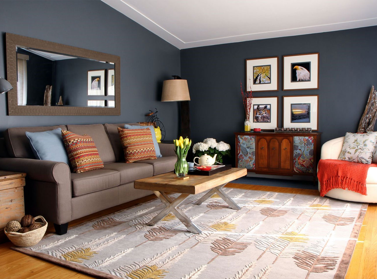
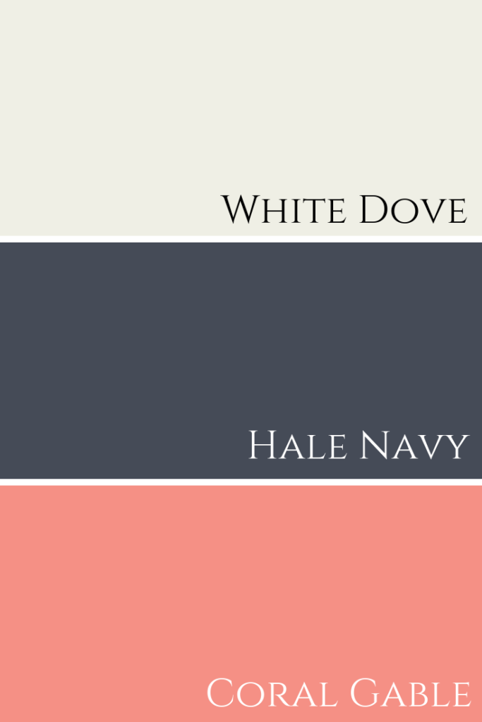
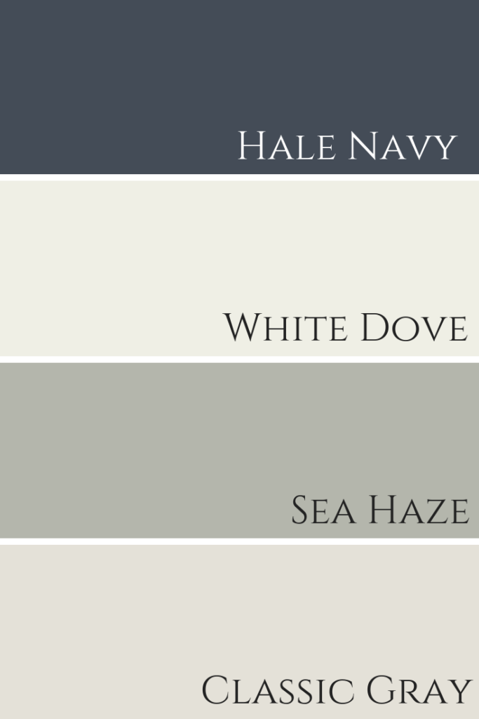
A lovely reader commented on my Hale Navy post to ask me this question:
“Hi, Claire! I did my studio condo in Palm Beach in Hale Navy and used White Dove for the ceiling and trim. I love it! What do you think if I used the colour coral gable in the bathroom?”
pulled these three colours to see how they worked together. Watch my video below to see my response.
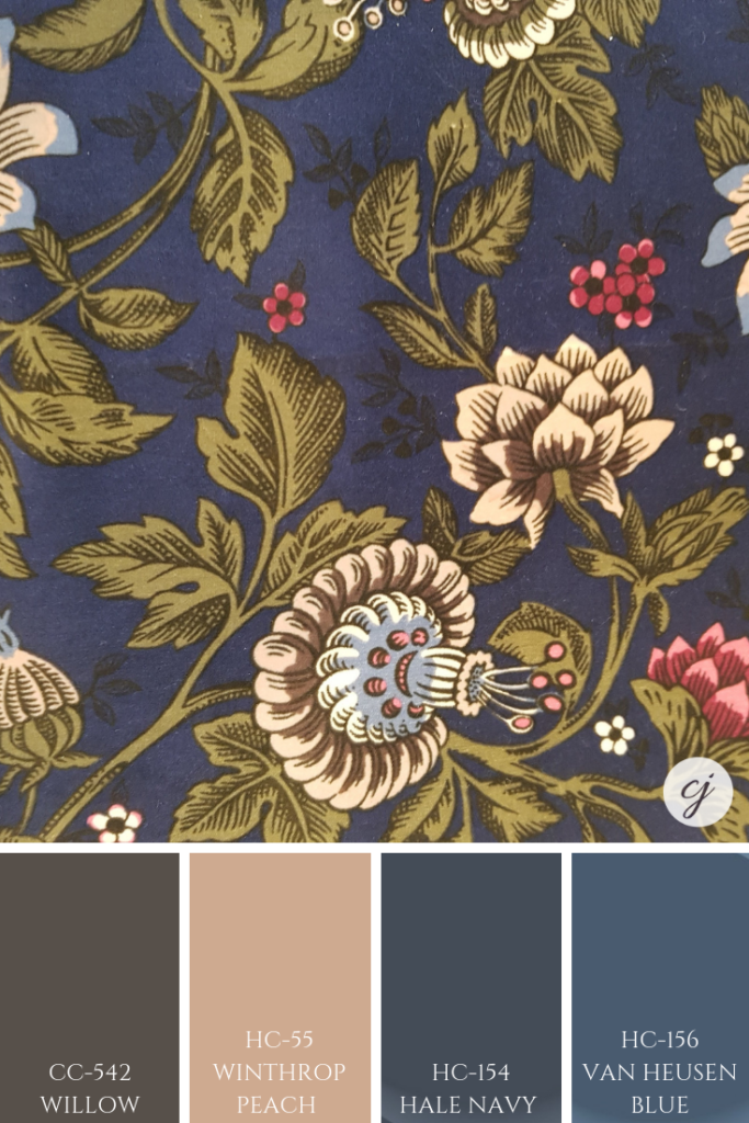
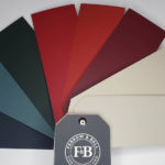
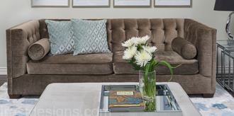
Here you can clearly see this striking paint palette combination of White Dove, Hale Navy and Coral Gable by Benjamin Moore.
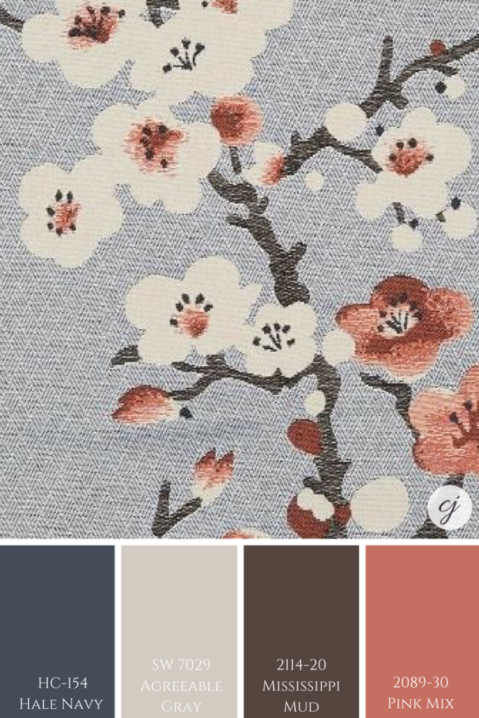
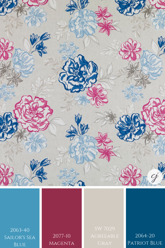
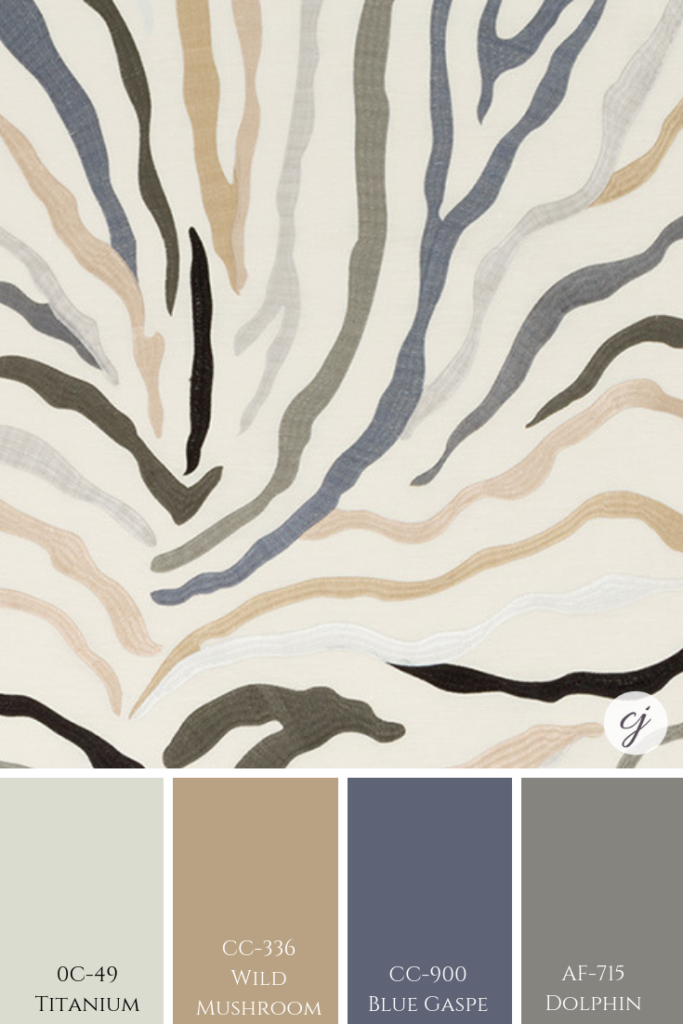
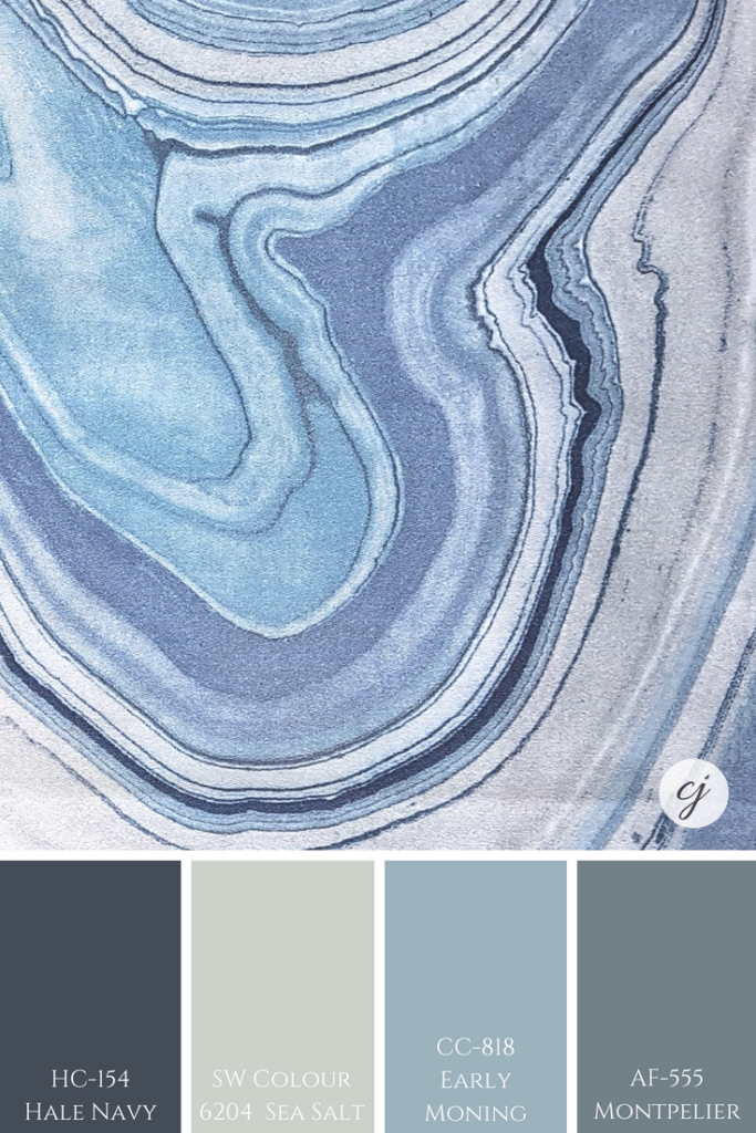
This paint palette below was inspired by similar tones that you can see in the fabric.
Perfect For Pinning!
A little more feminine and fresh blue colour combinations are below.
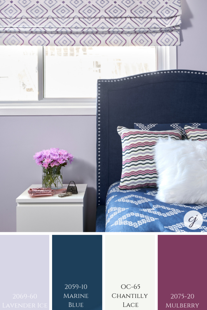
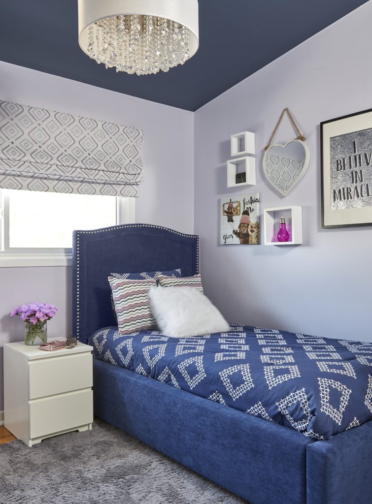
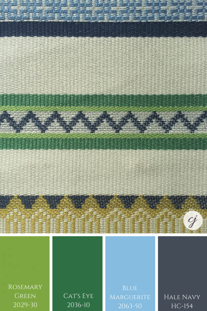
The below paint palette is inspired by my daughter Elise’s bedroom which I designed with her a couple of years ago. The wavy fabric was our inspiration piece for her room.
Do you love a painted ceiling? Comment below to let me know which room you have painted (or would paint) the ceiling in.
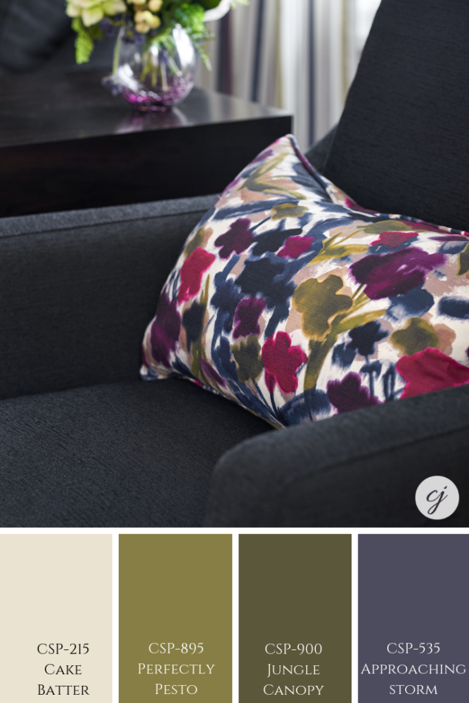
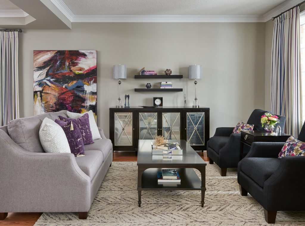
Although we didn’t tie in too much of the purple-blue found in the fabric of the custom pillow, that colour can be found in the striped pleated drapery. See more of this clients home here.
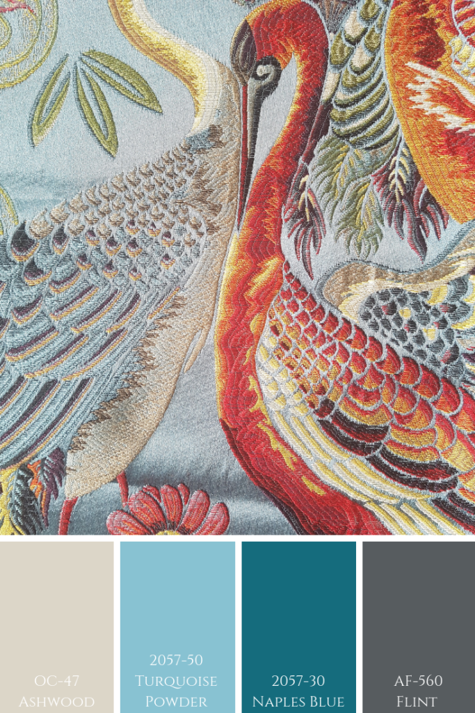
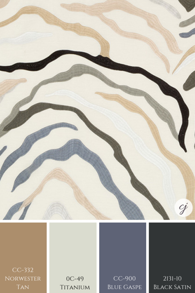
Here is another fabric with a purply blue tone. Mixed with very different colours that are slightly more subtle.
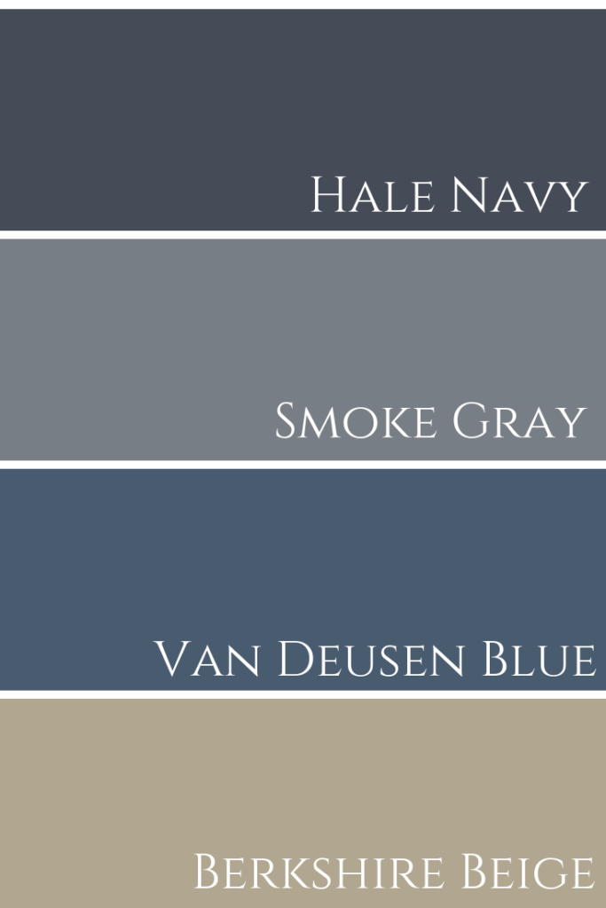
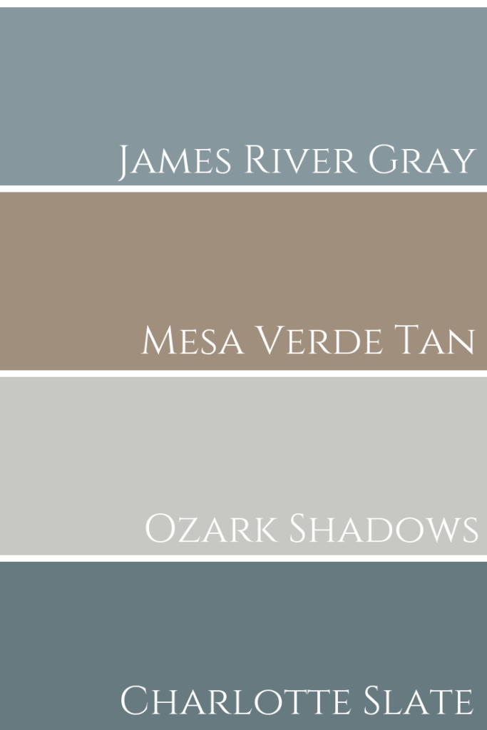
Most of the paint palettes below have more of a masculine feel to them. Which one is your favourite?
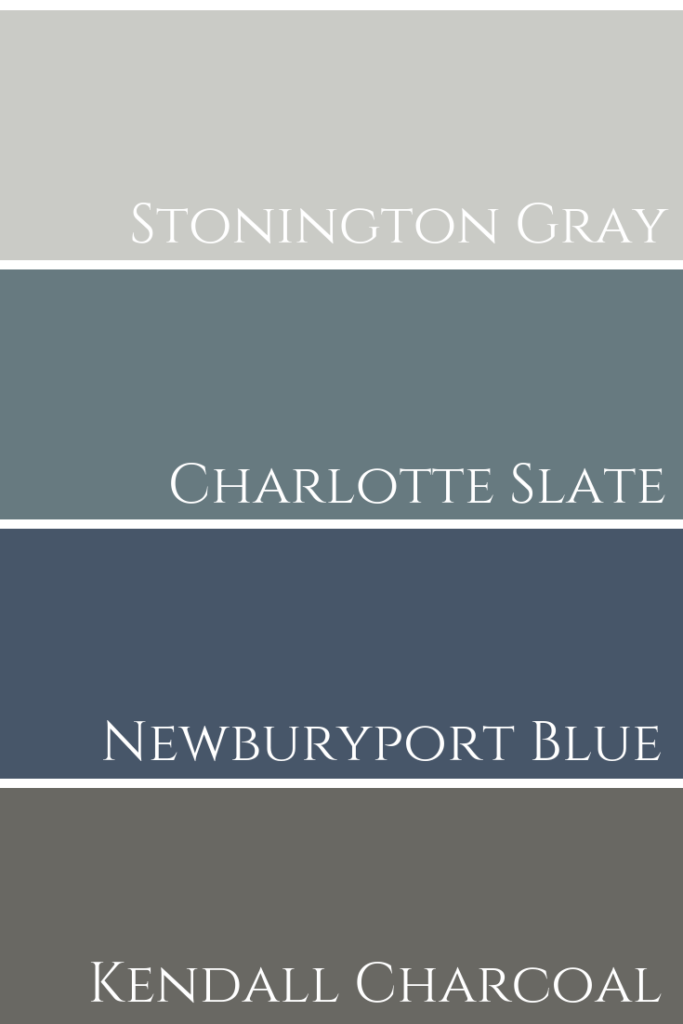
In the photograph below (taken by Stephani Buchman photography) the colour Classic Gray is not shown, but could easily tie in with this paint palette.
We created 2 palettes for the Geode inspired fabric shown below. Sea Salt by Sherwin Williams is shown and if you want to see my colour review of that gorgeous colour, click here.
The fabric shown above was used for a custom accent cushion in our Toronto client’s living room design. See more photos of their project in our portfolio here.
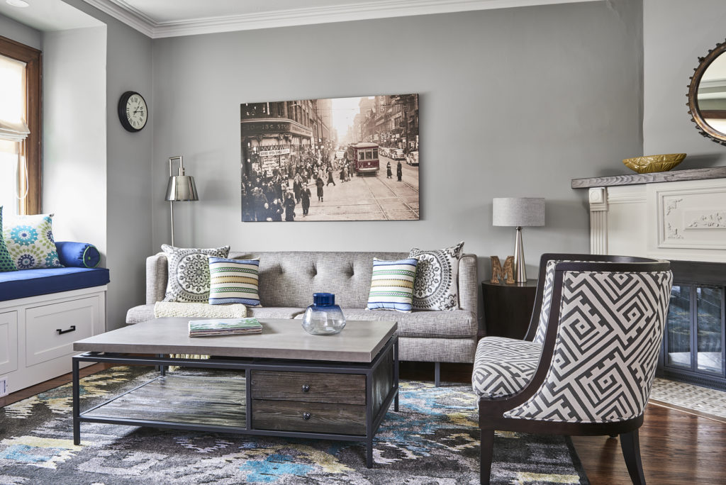
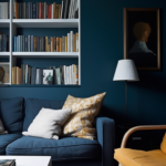
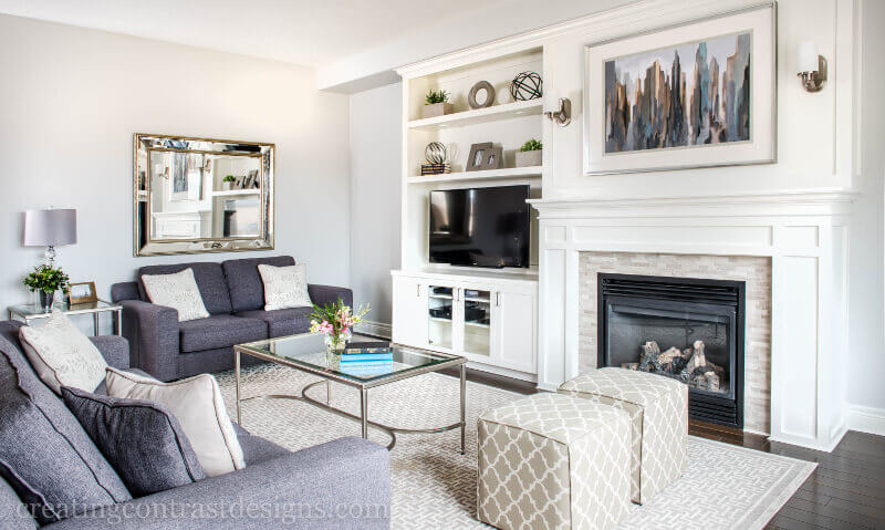
My colour review of Hale Navy post has not only my TNT (THE NAKED TRUTH) video but also a second video where you can find out exactly how I created the design for the living room above, as well as the dining area where we painted the niche and the ceiling Hale Navy.
Best White Trims to pair with Hale Navy


Final pairing ideas for Hale Navy


Hopefully, you’ve found some inspiration here.
Remember, it only takes one mistake to take your home decorating project from divine to disaster. Don’t let the paint be what stresses you out!
Convenience at your fingertips
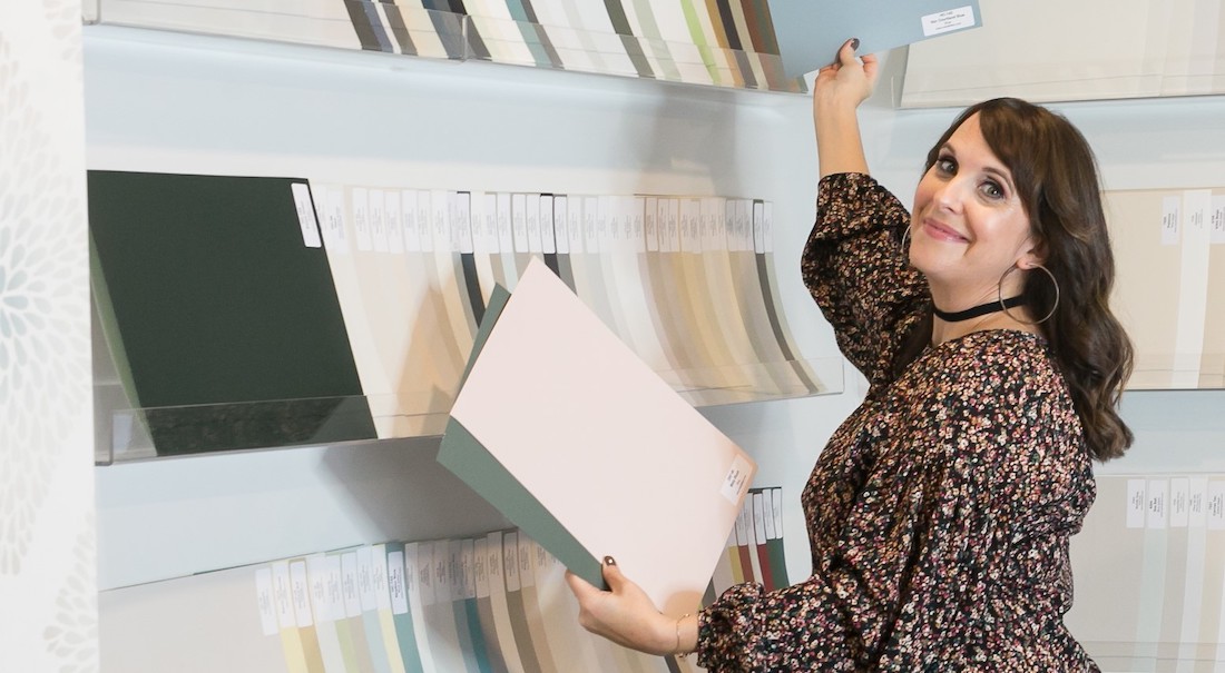
Choosing Paint Colours
If you struggle with choosing paint colours, be sure to check out my Perfect Colour Palettes.
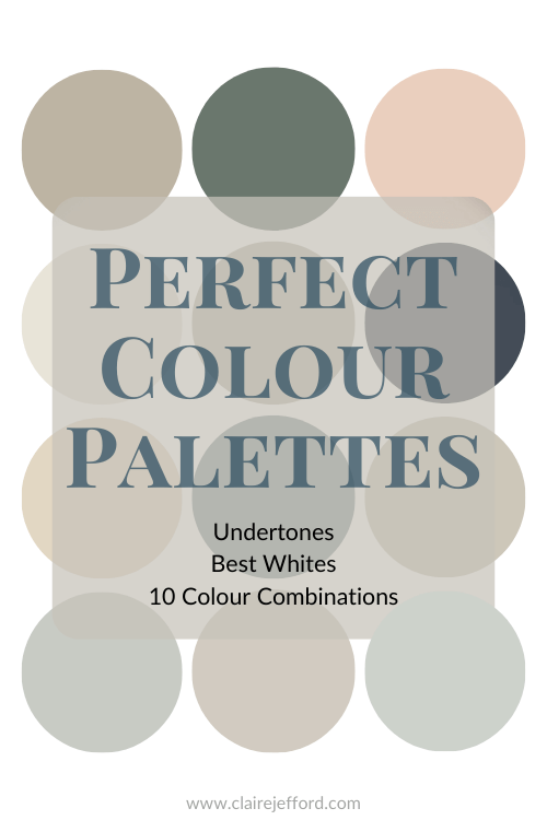
I now have over 50 individual guides to help inspire you.
Collections
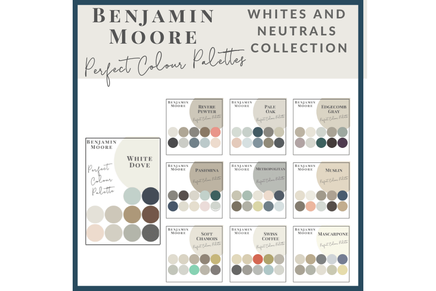
I also offer collections that showcase a group of 10 colours from Benjamin Moore,
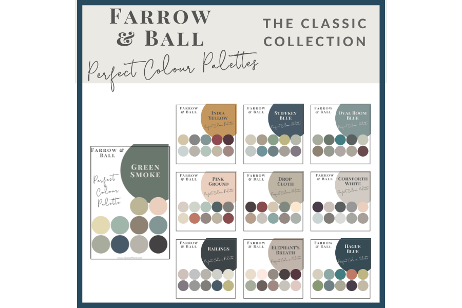
Farrow & Ball
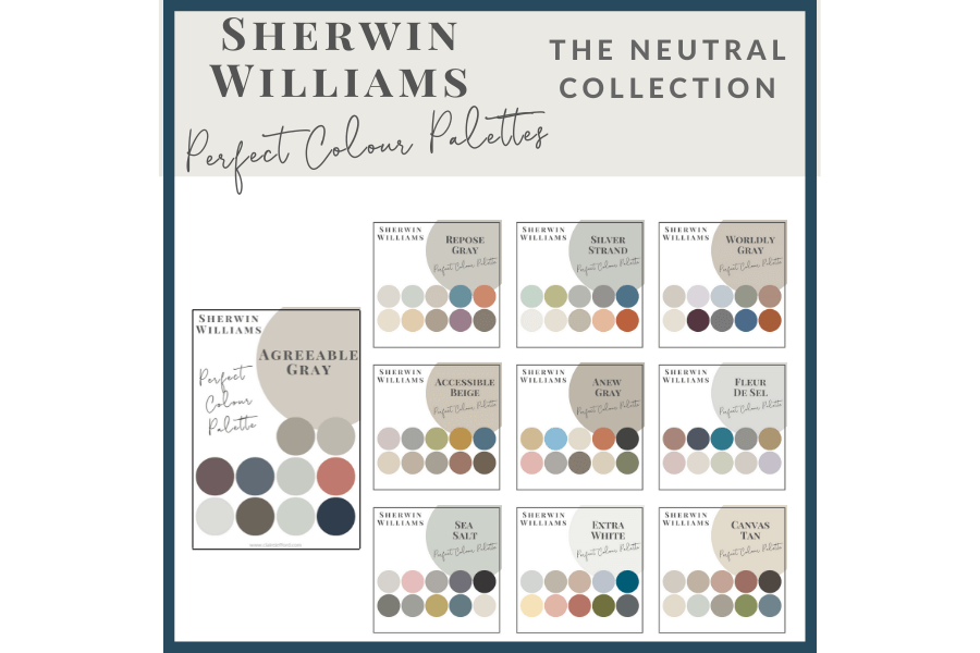
and my newest addition, Sherwin Williams.
Psst! Love Colour? Take my new colour quiz to determine which colour palette suits you best!

Are you in my local area of Burlington, Oakville, Mississauga, Waterdown or in the surrounding GTA? If so, I’d love to help you in choosing the RIGHT paint colours for your home. Email me here and let’s do this!
Got a question for me? Ask Me Anything by direct messaging me on my Instagram


Carla Aston
| 3 February 2019Great post, Claire. People always love to know the paint colors you use in your projects. This is a good way to share that info.
Claire Jefford
| 3 February 2019Thanks Carla, I always appreciate your feedback!
Dian Suess
| 3 February 2019Claire, I love your posts and videos. You are knowledgeable, professional and so much fun!
Thanks for sharing?
Claire Jefford
| 3 February 2019Thanks so much Dian!!
Jill Laine
| 3 February 2019Love the video, Claire! You gave us a lot of gorgeous color palettes to work with, thanks for sharing.
Claire Jefford
| 3 February 2019Glad you enjoyed the colour combinations Jill!
Janet Lorusso
| 3 February 2019Awesome video, Claire! And great combos starring shades of blue!
Claire Jefford
| 4 February 2019Thanks for watching Janet!
Nicole Janes
| 3 February 2019Love all these color combinations!
Claire Jefford
| 4 February 2019Thanks Nicole. So many to choose from!
Leslie Wood
| 9 February 2019Great color combos. Blues can be tricky and these color palettes are a great start for any design.
All the best,
Leslie Wood
Claire Jefford
| 15 February 2019Cheers Leslie!
Gordana
| 17 July 2019Hi Claire,
I enjoyed watching your videos and tips. I would really appreciate your take on my dilemma.
I am not a decorator, but we’re building and we choose our colours already.
We went with calm neutral colours on walls (Dulux – Beige royal quarter). Also, our tiles are light brown/grey finish, carpets are light brown colour, as well the flooring in the living areas. The only stronger colour is the top cabinetry in the kitchen (carbon; between darker brown/grey with a hint of “silverish” ).
It all looks in tune, however I am stuck with window furnishings, as we have heaps of windows (2 large outdoor doors, large panoramic window, 2 smaller windows and another large window all in the living/ kitchen/ dining area).There will be also a large fireplace with the same brown/grey metallic finish in the room.
We have decided to install vertical blinds, but I am not sure if I should go with the browns or with light blue/ greens I am afraid that I am going to add to much of the same, it will make area look too dull and cramped as the blinds will be there for many years to come. Hope you can help. Kind regards from Australia.
Claire Jefford
| 11 August 2019Hi Gordana from Australia! Unfortunately it’s almost impossible to comment with a helpful response without seeing your home. There are a lot of elements to successful decorating and making a space look well put together. Please consider hiring a design professional in your local area to assist. Thanks for watching.
Kathy
| 11 August 2019Would Hail Navy work below our chair rail with Ben Moore Mayonnaise on the upper wall. We have a very dark navy leather sofa and a deep red oriental rug
Claire Jefford
| 11 August 2019Hi Kathy. I would need to take the entire decor of the room into consideration and see photos etc to know how best to advise you. For example, if you paint the lower wall Hale Navy and you have a dark leather sofa up against it and a dark red rug, but the walls above are all white, how will you balance these elements? And is the dark navy sofa the exact same tone as Hale Navy or not quite? They may not even compliment each other. I have never used Mayonnaise with Hale Navy, but I pulled it out of the fan deck to see them together and they would work. Hope that helps.